По-русски

First among Equals

The building of a kindergarten in the town of Beloyarsky is more than just another example of a modern educational space. Its design began a long time ago; it is located in Russia’s Far North; it is also a state-owned facility that is subject to regulations, and had to cut costs during construction (as usual). However, the design is contemporary, the layout is modern, and the building feels very fresh. The project is planned to be replicated.

24 April 2023
Object
mainImg

The architectural company City-Arch developed the project for a 220-children kindergarten back in 2014 – at that time, such projects in the field of education were rare, and there were none within the framework of state commissions. In other words, this project is the first of its kind in this country.

So it is especially noteworthy that it was the authorities of the small northern town of Beloyarsky, with a population of about 20,000 people and an average winter air temperature of about 43 degrees below zero Celsius, who initiated the construction of a truly innovative kindergarten. Back in 2014, the “City-Arch” project seemed so remote from traditional views that the prospect of its implementation looked vague and required serious reform of the regulatory framework. This is one of the reasons why the implementation took more than seven years.

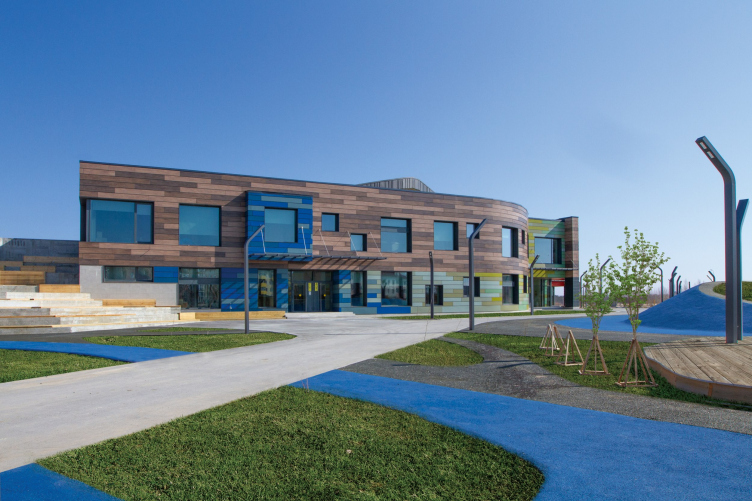
Kindergarten in Beloyarsky.
Copyright: City-Arch


As Anton Lukomsky, the chief architect and managing partner of City-Arch, explained, at the initial stage, the architects closely collaborated with the creators of the educational program “Yugorsky Tramplin”, specially developed for the Khanty-Mansi Autonomous District, as well as thoroughly studied the European and global standards of modern educational facilities, based on the principles of a comprehensive approach to the education and upbringing of children. As a result, an unconventional layout of the kindergarten appeared, which allows children of different ages to communicate with each other.

In addition to creating a modern educational environment, the architects faced difficult tasks of optimizing the area and achieving energy efficiency of the building in the conditions of the Far North. The process of project approval and passing it through the expertise was even more complicated, taking into account the strict construction and sanitary norms, most of which were outdated at that time.

The struggle against restrictions and bureaucratic processes significantly prolonged the construction process.

To implement this project in collaboration with the Ministry of Construction, the Ministry of Education, and Rospotrebnadzor, it was necessary to make a few amendments to the regulatory framework. Fire safety standards, sanitary norms, and much more were changed. As a result, we were still able to pass the examination and practically implement a federally owned project with limited budget, which was ordered by the Department of Education of the Khanty-Mansi Autonomous District.


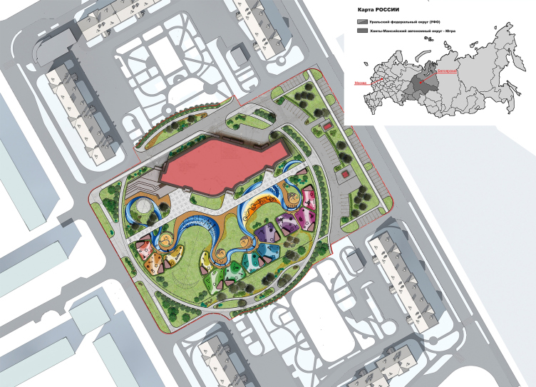
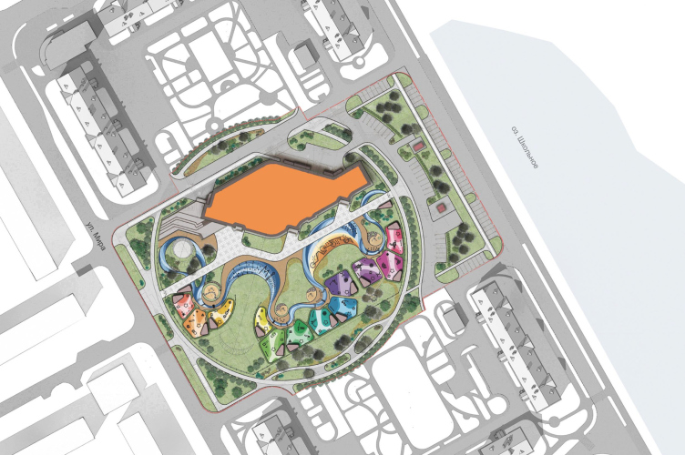
If the task set before the architects, which was to design a kindergarten based on modern pedagogical principles, could be understood as a conceptual challenge, then the location became a challenge in its own right in terms of natural geography. The building is located in a new residential District 3A. The plot is delineated on one side by the Mira Street, and on the other by the large Shkolnoye Lake, which serves as the natural eastern boundary of the city and is part of a vast system of rivers, streams, canals, lakes, and swamps – there are about a thousand of them in the Beloyarsky district. Permafrost here is combined with swampy wetlands, and besides, the city is small and located far from large settlements, and the period of relatively comfortable delivery of building materials is short: the nearest railway station Priobye is 240 km away in winter, and 48 km away in summer if you use a ferry crossing.

Kindergarten in Beloyarsky. Master plan. Project, 2014 © City-Arch
Copyright: City-Arch


Kindergarten in Beloyarsky. Location plan
Copyright: City-Arch


And yet, if the design and approval took six years, then the construction was carried out quickly and took approximately one year – work began in 2020, and in early May 2021, the grand opening took place.

“It turned out that all European methods for building a kindergarten in such a harsh climate do not work – said Anton Lukomsky, chief architect and managing partner of City-Arch – Therefore, in order to achieve good energy efficiency performance, we had to conduct a kind of scientific work, which involves serious analysis and energy modeling.”

The authors based the design of the building on the concept of a passive house, which includes efficient orientation with respect to the cardinal points. The building is placed in the northern part of the site, which is calm and flat without any elevation changes. This allows the illuminated southern side to be maximally cleared for sports fields and playgrounds.

Kindergarten in Beloyarsky.
Copyright: City-Arch


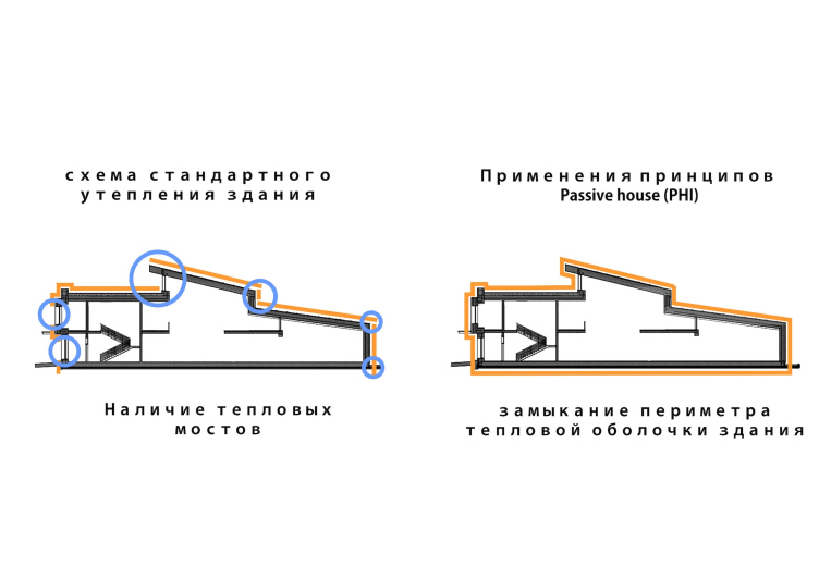
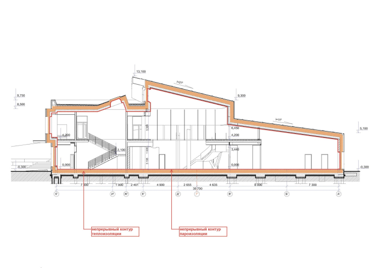
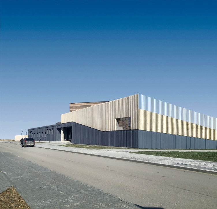
In terms of structure, two main volumes can be identified that form the building: a stretched two-story block with classrooms, oriented southward, and an adjacent diamond-shaped block with a sloping roof, located in the north. The roof height decreases from the south to the north, protecting the volume from cold winds. Under its slope, there are music and sports halls, a swimming pool, a medical office, a food block with a kitchen equipped with a separate entrance and loading area, as well as technical, domestic, and administrative rooms. That is, everything that does not require a large amount of light and can generally get by with a minimal amount of windows to retain heat. At the same time, on the south side, the windows are large, square, with triple-glazed units, capturing maximum sunlight and, in terms of their heat engineering, are virtually as effective as the walls covered with 400 mm thick mineral wool insulation. During the short but sunny summer in Beloyarask, the same windows protect the rooms from overheating due to special multifunctional spraying. The building is also protected from heat loss by a massive airtight shell with a closed thermal perimeter without “cold bridges” and a well-insulated foundation and roof. The thermal contour of the foundation, which protects against permafrost melting, allowed the volume not to be raised above the ground on supports.

Kindergarten in Beloyarsky. Plan of implementing the new warming principle. Project, 2014 © City-Arch
Copyright: City-Arch


Kindergarten in Beloyarsky. Passive House Institute (PHI) concept. Project, 2014 © City-Arch
Copyright: City-Arch


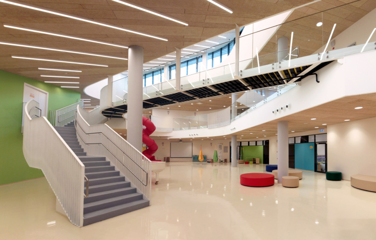
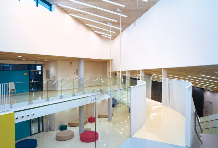
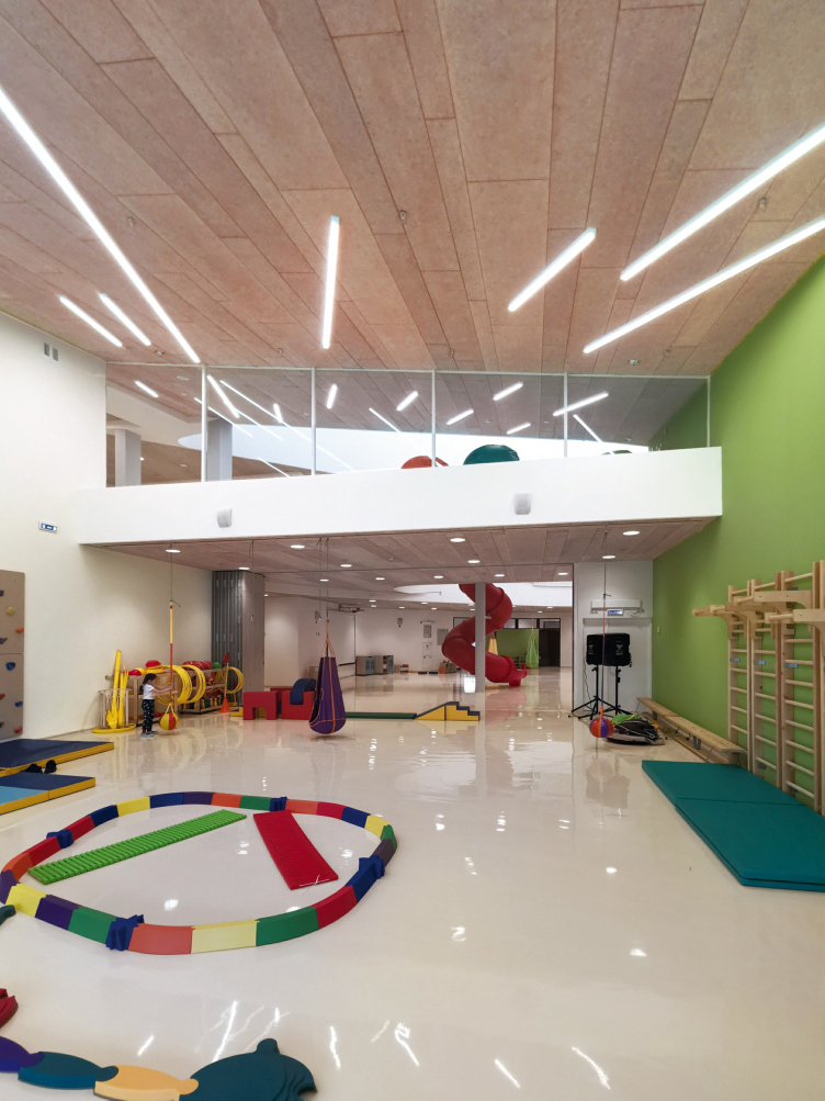
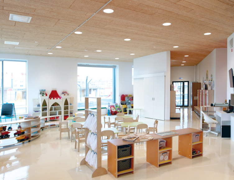
The junction of the two main volumes of the building is the highest point. Here, the architects have placed a large double-height play area, which became the main innovation of the project, opposing the traditional corridor system and the principle of isolated classrooms. The latter is still considered a mandatory condition for the construction of any Russian kindergarten. In Beloyarsk, however, according to the architects’ concept, children of all ages have the opportunity to communicate and play with each other. They spend about two hours a day in the common play area – before breakfast, when they are first brought to the kindergarten, and after dinner, when the little ones are waiting for their parents. In addition, the play area is an excellent place for holding holidays and events, in which all children can participate together, rather than separate groups, as is customary in most kindergartens. And this is also a great opportunity for communication.

Kindergarten in Beloyarsky. The central game space
Copyright: City-Arch


Kindergarten in Beloyarsky. The central game space
Copyright: City-Arch


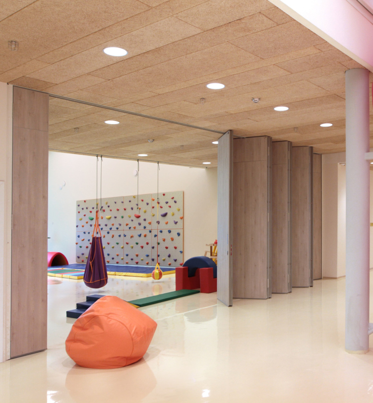
The central communication core with designated soft resting zones gathers around itself all the rooms of the kindergarten. Group rooms, classrooms, and a swimming pool open onto it. It is overlooked by the bypass galleries of the second floor, connected to the first floor by a staircase and a spiral slide. Transformable partitions connect the play area with the sports and music halls.

Kindergarten in Beloyarsky. The gym
Copyright: City-Arch


Kindergarten in Beloyarsky. The pull-out partitions
Copyright: City-Arch


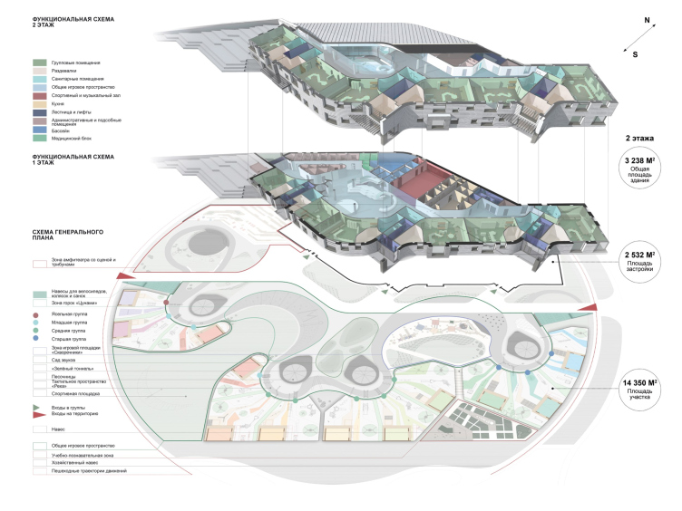
The proposed layout, in which not only corridors but also a basement level are absent, allowed, among other things, to reduce the total area of the building to 14.7 m² per child, which means reducing heating costs. At the same time, the play area for one child has increased by more than four times.

Kindergarten in Beloyarsky. The functional diagram
Copyright: City-Arch


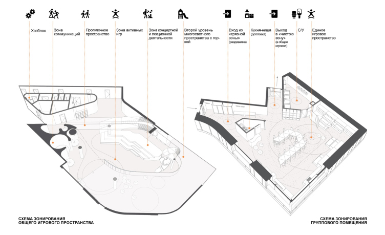
Kindergarten in Beloyarsky. The planning specifics
Copyright: City-Arch


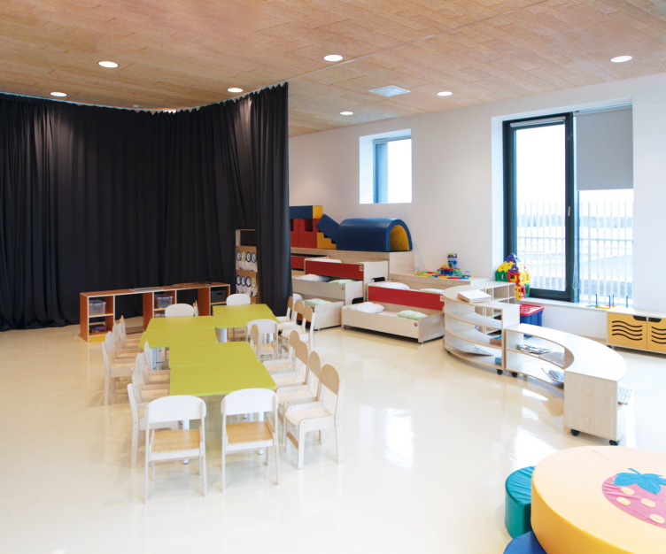
On the first floor, there are classrooms for younger children, while the second floor is for older ones, with the possibility of transforming them into elementary school classrooms. The group rooms in the Beloyarsk kindergarten are designed as a single space that is zoned with the help of soft sliding partitions and transformable furniture. Using partitions during quiet hours, a sleeping area is made, and sliding triple bunk beds are used for sleep. At other times, the entire area of the room, including the changing rooms, is used for games and activities.

Kindergarten in Beloyarsky. The group premises
Copyright: City-Arch


Kindergarten in Beloyarsky. The group premises
Copyright: City-Arch


There was no specific order to work on the interior design of the group rooms, but the architects from City-Arch, as is often the case, took responsibility for it, offering recommendations on space organization, color codes, and selecting convenient, lightweight, and transformable furniture.

However, the specific features of these interiors were largely predetermined by the architecture of the building, with varying-sized square windows, some of which are located almost at the ceiling, while others are slightly above the floor level, allowing children to observe what is happening outside.

Kindergarten in Beloyarsky
Copyright: City-Arch


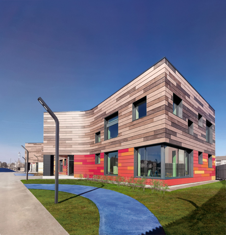
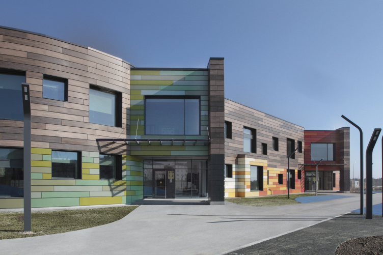
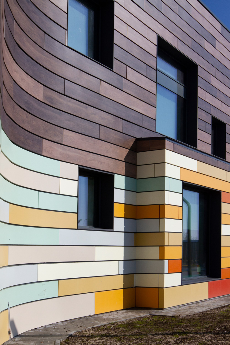
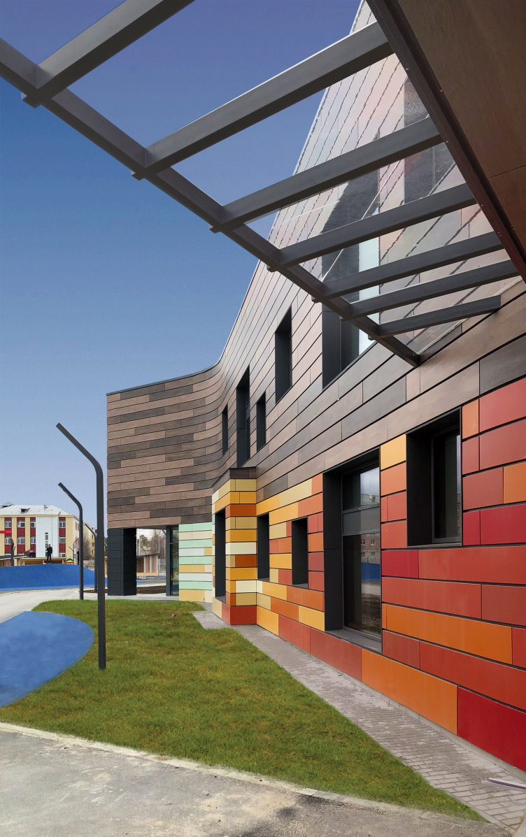
The facades were initially supposed to be faced with porcelain stoneware with a wood texture, but due to budget constraints, preference was given to aluminum cassettes. And to maintain the architectural image proposed in the project, the manufacturer specially executed color printing under the wood on the aluminum surface for the Beloyarsky kindergarten. This was a kind of experiment. The first floor, also made of metal cassettes, turned out to be brighter. Three entrance areas on the south side, allowing children to find their group without error, were highlighted in color.

Kindergarten in Beloyarsky
Copyright: City-Arch


Kindergarten in Beloyarsky
Copyright: City-Arch


Kindergarten in Beloyarsky. The north facade
Copyright: City-Arch


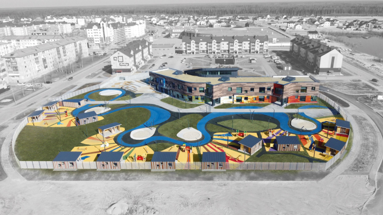
The architects also experimented with the territory of the kindergarten. Despite the regulation standards, it is inevitably surrounded by a fence, yet the kindergarten yard became an important accent for the entire residential area. The paving of the paths resembles the winding rivers of the Beloyarsky district, and in addition to separate playgrounds, a common “mini-square” is provided, which serves as a communication hub, similar to the common play area inside the building.

Kindergarten in Beloyarsky. The landscaping
Copyright: City-Arch


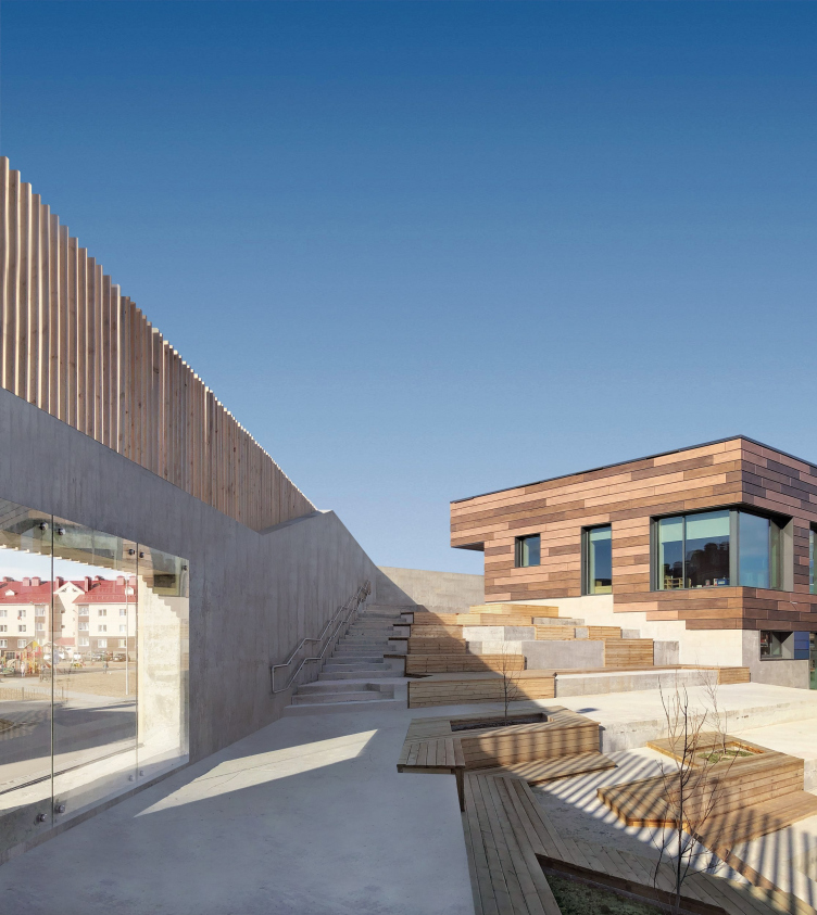
Part of the sloping roof of the building was planned to be turned into a slide, but this idea was later abandoned in favor of an amphitheater in the western part of the second floor level; however, in winter, children do use it as a slide.

Kindergarten in Beloyarsky. The amphitheater
Copyright: City-Arch


The kindergarten in Beloyarysk is an example of a high-quality educational space designed for comfortable communication between children. There are more and more such examples today, and such new schools and kindergartens are widely discussed. Another interesting thing about the Beloyarsk kindergarten is that, first of all, it admits children of a very young age, secondly, it is not state-owned, and finally, it was built very far away and in very difficult conditions, and very quickly too. It represents an example of architects’ persistent struggle for the values of the modern world: openness, communication, light, and beauty. All of this is achievable and implementable if you set the task and put your heart into it. Currently, there is a discussion about the idea of replicating the project in other areas of the Khanty-Mansi Autonomous District.

24 April 2023

Headlines now
The Golden Crown
The concept for a dental clinic in Yekaterinburg, developed by CNTR Studio, revolves around the idea of a “mouth full of gold”: pristine white porcelain stoneware walls are complemented by matte brass details. To avoid an overly literal interpretation, the architects focused on the building’s proportions, skillfully navigating between sunlight requirements and fire safety regulations.
Flexibility and Integration
Not long ago, we covered the project for the fourth phase of the ÁLIA residential complex, designed by APEX. Now, we’ve been shown different fence concepts they developed to enclose the complex’s private courtyards, incorporating a variety of public functions. We believe that the sheer fact that the complex’s architects were involved in such a detail as fencing speaks volumes.
A Step Forward
The HIDE residential complex represents a major milestone for ADM architects and their leaders Andrey Romanov and Ekaterina Kuznetsova in their quest for a fresh high-rise aesthetic – one that is flexible and layered, capable of bringing vibrancy to mass and silhouette while shaping form. Over recent years, this approach has become ADM’s “signature style”, with the golden HIDE tower playing a pivotal role in its evolution. Here, we delve into the project’s story, explore the details of the complex’s design, and uncover its core essence.
Gold in the Sands
A new office for a transcontinental company specializing in resource extraction and processing has opened in Dubai. Designed by T+T Architects, masters of creating spaces that are contemporary, diverse, flexible, and original, this project exemplifies their expertise. On the executive floor, a massive brass-clad partition dominates, while layered textures of compressed earth create a contextually resonant backdrop.
Layers and Levels of Flight
This project goes way back – Reserve Union won this architectural competition at the end of 2011, and the building was completed in 2018, so it’s practically “archival”. However, despite being relatively unknown, the building can hardly be considered “dated” and remains a prime example of architectural expression, particularly in the headquarters genre. And it’s especially fitting for an aviation company office. In some ways, it resembles the Aeroflot headquarters at Sheremetyevo but with its own unique identity, following the signature style of Vladimir Plotkin. In this article, we take an in-depth look at the United Aircraft Corporation (UAC) headquarters in the Moscow agglomeration town of Zhukovsky, supplemented by recent photographs from Alexey Naroditsky – a shoot that became only recently possible due to the fact that improvements were finally made in the surrounding area.
Light and Shadow
In this article, we delve into the architectural design of the “Chaika” house by DNK ag architects, which was recently completed in 2023 as part of the collection of signature designs at ZILArt. As is well-known, all the buildings in this complex follow a design code, yet each one is distinct. This particular building stands out not only for its whiteness and minimalism but also for the refined use of a limited number of techniques that, together, create what can confidently be called synergy.
Casus Novae
A master plan was developed for a large residential area with a name of “DNS City”, but now that its implementation began, the plan has been arbitrarily reformatted and replaced with something that, while similar on the surface, is actually quite different. This is not the first time such a thing happens, but it’s always frustrating. With permission from the author, we are sharing Maria Elkina’s post.
Treasure Hunting
The GAFA bureau, in collaboration with Tegola and Arkhitail, organized an expedition to the island of Kilpola in Karelia as part of Moskomarkhitektura’s “Open City” festival. There, amidst moss and rocks, the students sought answers to questions like: what is the sacred, where does it dwell, and what sustains it? Assisting the participants in this quest were landscape engineer Evgeny Levin, artist Nicholas Roerich, a moose, and the lack of cellular connection. Here’s how the story unfolded.
Depths of the Earth, Streams of Water
In the Malaya Okhta district, the Akzent building, designed by Stepan Liphart, was constructed. It follows a classic tripartite structure, yet it’s what you might call “hand-drawn”: each façade is unique in its form and details, some of which aren’t immediately noticeable. In this article, we explore the context and, together with the architect, delve into how the form was developed.
Fir Tree Dynamics
The “Airports of Region” holding is planning to build an airport in Karachay-Cherkessia, aiming to make the Arkhyz and Dombay resorts more accessible to travelers. The project that won in an invitation-only competition, submitted by Sergey Nikeshkin’s KPLN, blends natural imagery inspired by the shape of a conifer seed, open-air waiting spaces, majestic large trees, and a green roof elevated on needle-like columns. The result is both nature-inspired and WOW.
​A Brick Shell
In the process of designing a clubhouse situated among pine trees in a prestigious suburban area near Moscow, the architectural firm “A.Len” did the façade design part. The combination of different types of brick and masonry correlates with the volumetric and plastique solutions, further enhanced by the inclusion of wood-painted fragments and metal “glazing”.
Word Forms
ATRIUM architects love ambitious challenges, and for the firm’s thirtieth anniversary, they boldly play a game of words with an exhibition that dives deep into a self-created vocabulary. They immerse their projects – especially art installations – into this glossary, as if plunging into a current of their own. You feel as if you’re flowing through the veins of pure art, immersed in a universe of vertical cities, educational spaces – of which the architects are true masters – and the cultural codes of various locations. But what truly captivates is the bold statement that Vera Butko and Anton Nadtochy make, both through their work and this exhibition: architecture, above all, is art – the art of working with form and space.
Flexibility and Acuteness of Modernity
Luxurious, fluid, large “kokoshniks” and spiral barrel columns, as if made from colorful chewing gum: there seem to be no other mansion like this in Moscow, designed in the “Neo-Russian-Modern” style. And the “Teremok” on Malaya Kaluzhskaya, previously somewhat obscure, has “come alive with new colors” and gained visibility after its restoration for the office of the “architectural ecosystem” as the architects love to call themselves. It’s evident that Julius Borisov and the architects at UNK put their hearts into finding this new office and bringing it up to date. Let’s delve into the paradoxes of this mansion’s history and its plasticity. Spoiler: two versions of modernity meet here, both balancing on the razor’s edge of “what’s current”.
Yuri Vissarionov: “A modular house does not belong to the land”
It belongs to space, or to the air... It turns out that 3D printing is more effective when combined with a modular approach: the house is built in a workshop and then adapted to the site, including on uneven terrain. Yuri Vissarionov shares his latest experience in designing tourist complexes, both in central Russia and in the south. These include houseboats, homes printed from lightweight concrete using a 3D printer, and, of course, frame houses.
​Moscow’s First
“The quality of education largely depends on the quality of the educational environment”. This principle of the last decade has been realized by Sergey Skuratov in the project for the First Moscow Gymnasium on Rostovskaya Embankment in the Khamovniki district. The building seamlessly integrates into the complex urban landscape, responding both to the pedestrian flow of the city and the quiet alleyways. It skillfully takes advantage of the height differences and aligns with modern trends in educational space design. Let’s take a closer look.
Looking at the Water
The site of Villa Sonata stretches from the road to the water’s edge, offering its own shoreline, pier, and a picturesque river panorama. To reveal these sweeping views, Roman Leonidov “cut” the façade diagonally parallel to the river, thus getting two main axes for the house and, consequently, “two heads”. The internal core – two double-height spaces, a living room and a conservatory, with a “bridge” above them – makes the house both “transparent” and filled with light.
The White Wing
Well, it’s not exactly white. It’s more of a beige, white-stone structure that plays with the color of limestone – smoother surfaces are lighter, while rougher ones are darker. This wing unites various elements: it absorbs and interprets the surrounding themes. It responds to everything, yet maintains a cohesive expression – a challenging task! – while also incorporating recognizable features of its own, such as the dynamic cuts at the bottom, top, and middle.
Urban Dunes
The XSA Ramps team designed and built a three-part sports hub for a park in Rostov-on-Don, welcoming people of all ages and fitness levels. The skate plaza, pump track, and playground are all meticulously crafted with details that attract a diverse range of visitors. The technical execution of the shapes and slopes transforms this space into a kind of sculptural composition.
Proportional Growth
The project for the fourth phase of the ÁLIA residential area has been announced. The buildings are situated on an elongated plot – almost a “ray” that shoots out from the center of the area towards the river. Their layout reflects both a response to Moscow’s architectural preferences over the past 15 years, shifting “from blocks to towers”, and an interpretation of the neighboring business park designed by SOM. Additionally, the best apartments here are not located at the very top but closer to the middle, forming a glowing “waistline”.
The “Staircase” Building
In designing the “Details” residential complex in New Moscow, Rais Baishev spiced up the now-popular Moscow theme of a “courtyard” building with an idea drawn from the surrealist drawings by Maurits Escher. He envisioned the stepped silhouettes and descending slopes as a metaphysical mega-staircase, creating a key void within the courtyard that gave the project an internal “spine”. This concept is felt both in the building’s silhouette and on its façades.
Projection of the Quarter
No one doubted that the building that Vladimir Plotkin designed as part of the “Garden Quarters” would be the most modernist of all. And it turned out just that way: while adhering to the common design code, the building successfully combines brick and white stone, rhythmically responding to the neighboring building designed by Ostozhenka, yet tactfully and persistently making a few statements of its own. This includes the projection of the ideal urban development composition “14–9–6”, which can be found right next door, mathematical calculations, including those for various types of terraces (and perhaps the only reminder of the Soviet past of the Kauchuk rubber factory!), and the white “cross-stitch” pattern of the façade grid.
Domus Aurea
In this issue, we examine the “Tessinsky-1” house, designed by Sergey Skuratov and completed in 2023. Located in the middle of the Serebryanicheskaya Embankment district, at the intersection of its main streets, this house assumes a sort of “nodal” role: it not only responds to everything around it and preserves many memories of the former EMA factory within itself, but it weaves all this into a newly directed pattern, reconciling bright “gold” and dark-colored brick, largely with the help of the new, modern-yet-archaic Columba brick, which, come to think about it, is the most precious element here.
The Chimney of Nikola-Lenivets
In this issue, we are examining the “Obelisk House” designed by KATARSIS and built for the Arkhstoyanie 2023 festival. However, it was only finished later on, and this is why we are examining it now. It seems to us that after the “Obelisk House” appeared in Nikola-Lenivets, a dialogue and a few inner connections appeared between the temporary structures built here. These houses no longer look like “accidental neighbors”, more of which below.
​Periscope by the Bay
The jury awarded the second place in the competition for a public and cultural center in Petropavlovsk-Kamchatsky to the companies GORA (“Mountain”) and M4. In the consortium’s proposal, the building resembles a sperm whale with a calf swimming next to it or a periscope, whose lenses capture the most spectacular views from the surrounding landscape.
From Arcs to Dolmens
While working on the competition project for Petropavlovsk-Kamchatsky, ASADOV Architects prioritized the value of the natural and urban environment, aiming to preserve the balance of the location while minimizing the resemblance of the volume that they designed to a “traditional building”. The task was challenging, and the architects created three versions, one of which having been developed after the competition, where their main proposal took third place. However, the point of interest here is not the competition result but the continuity of creative thinking.
Hide and Seek
The ID Moskovskiy house, designed by Stepan Liphart in St. Petersburg, in the courtyards near Moskovskiy Avenue beyond the Obvodny Canal and recently completed, is notable for several reasons. Firstly, it has been realized with considerable accuracy, which is particularly significant as this is the first building where the architect was responsible not only for the facades but also for the layouts, allowing for better integration between the two. On the other hand, this building is interesting as an example of the “germination” of new architecture in the city: it draws on the best examples from the neighborhood and becomes an improved and developed sum of ideas found by the architect in the surrounding context.
The Big Twelve
Yesterday, the winners of the Moscow Mayor’s Architecture Award were announced and honored. Let’s take a look at what was awarded and, in some cases, even critique this esteemed award. After all, there is always room for improvement, right?
Above the Golden Horn
The residential complex “Philosophy” designed by T+T architects in Vladivostok, is one of the new projects in the “Golubinaya Pad” area, changing its development philosophy (pun intended) from single houses to a comprehensive approach. The buildings are organized along public streets, varying in height and format, with one house even executed in gallery typology, featuring a cantilever leaning on an art object.
Nuanced Alternative
How can you rhyme a square and space? Easily! But to do so, you need to rhyme everything you can possibly think of: weave everything together, like in a tensegrity structure, and find your own optics too. The new exhibition at GES-2 does just that, offering its visitor a new perspective on the history of art spanning 150 years, infused with the hope for endless multiplicity of worlds and art histories. Read on to see how this is achieved and how the exhibition design by Evgeny Ace contributes to it.
Blinds for Ice
An ice arena has been constructed in Domodedovo based on a project by Yuri Vissarionov Architects. To prevent the long façade, a technical requirement for winter sports facilities, from appearing monotonous, the architects proposed the use of suspended structures with multidirectional slats. This design protects the ice from direct sunlight while giving the wall texture and detail.