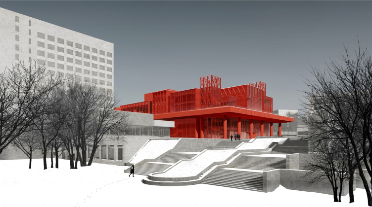
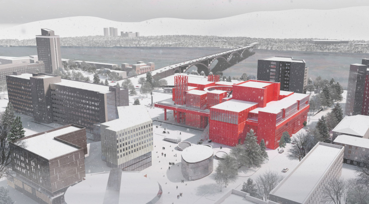
What makes this particular project different is the fact that although the architects considerably expand the old building of the theater, designed by Ivan Mikhalev and built in 1966-1978, they do not demolish it altogether.
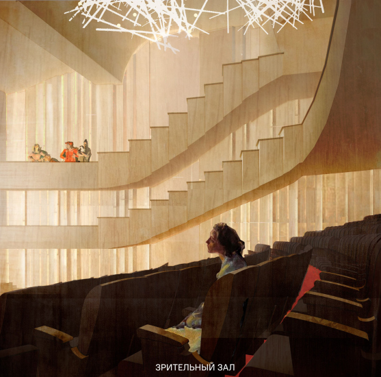
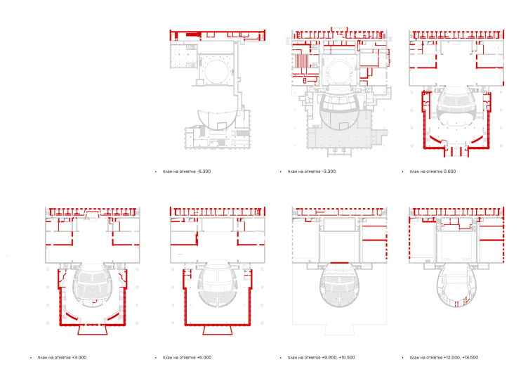
Another interesting thing is the rationale behind this solution – according to the architects, the theater was designed and built in accordance with a pattern popular in the 1960s-80s, which essentially consisted of a “stage + spectator seats” core (very sturdy, in excellent condition even now) and periphery, which has long since become obsolete and irrelevant. Accordingly, the authors retain the hall, which remains similar to the existing one, and the stage, expanding its side pockets and adding additional columns. The architects also retain the side colonnades, adding a similar colonnade to the space in front of the main entrance.
Diagram of structures to be dismantled. Gray = retained, red = dismantled. The concept of reconstruction of the D.A. Khvorostovsky Krasnoyarsk State Opera and Ballet Theater. Scheme of structures to be dismantled.
Copyright: © Studio 44
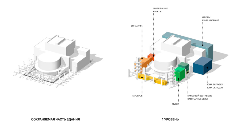
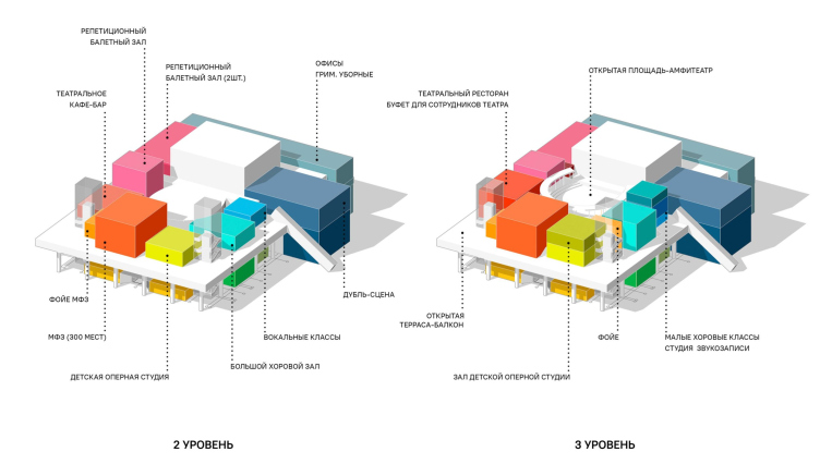
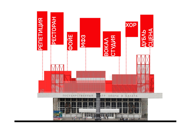
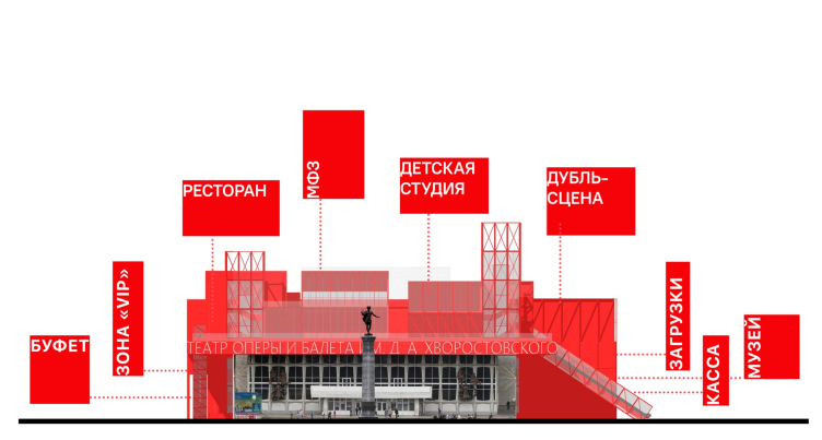
All of this is perceptibly reinterpreted both visually and volumetrically, and is included in a new conglomerate of buildings and volumes, each of which is assigned a function of its own.
Functional zoning. Scheme for the distribution of functions in the attached volumes. The concept of the reconstruction of the Krasnoyarsk State Opera and Ballet Theater named after D.A. Khvorostovsky
Copyright: © Studio 44
Functional zoning. Scheme for the distribution of functions in the attached volumes. The concept of the reconstruction of the Krasnoyarsk State Opera and Ballet Theater named after D.A. Khvorostovsky
Copyright: © Studio 44
Another thing that comes to mind here is the Roman theaters, some of which received later additions built by city people of later centuries; this “antique” theme of breathing a new life into an old theater is probably also present here, but in a remote context.
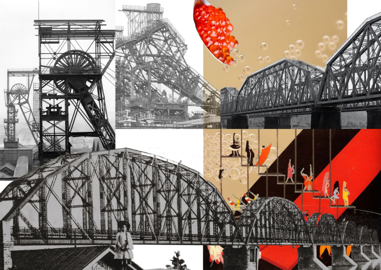
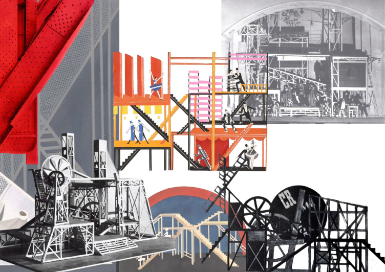
The architects do not place the main accent on it; instead, they bring forward the image of the theater machine of avant-garde, built not only on the simplicity of operation but also on the beauty of exposed functional structures; a machine with numerous grilles and trusses, which boost the transparency and straightforwardness of artistic statement. The industrial look of the trusses is supported by the aestheticization of the machine, typical of the avant-garde, and at the same time becomes a contextual reminder of the Krasnoyarsk metallurgical plants.
The idea is further illustrated by original collages, sometimes grotesque: they combine theatrical and factory structures, or even metal bridge trusses with, for example, red caviar, which turns into soap bubbles over the stage structure. This freshness of the approach is explained not only by the theatrical background of the task, but probably also by the young composition of the author team: young students of the Academy of Arts participated in the work on the project, under the guidance of Nikita Yavein and Ivan Kozhin.
The prime idea. Concept for the reconstruction of the D.A. Khvorostovsky Krasnoyarsk State Opera and Ballet Theater
Copyright: © Studio 44
What makes avant-garde decorations different from the classical theater is the fact that, while in the latter case the conventionalities are mitigated by (a) visual plausibility that the set designer deliberately aims to achieve and (b) the viewer’s perception, which gets involved in this plausibility game, the avant-garde theater turns this conventionality into a part of the game, obstructing the viewer’s desire to get immersed in the “illusion of the performance”, deliberately breaking it up and shocking the viewer by demonstrating the under-the-hood details, which were hitherto deemed to be inappropriate. Sometimes, the avant-garde theater bases its set design on demonstrating the mechanics of the “illusion”, at the same time making it a part of the scene and continuing to play. We also know that a similar approach became quite common in architecture: first, because of people’s curiosity for exposed structures (this is something that was already done by the architects of the 19th century), and, second, thanks to the well-known technique of exposing the inner functional structure of the building on its facade.
Concept for the reconstruction of the D.A. Khvorostovsky Krasnoyarsk State Opera and Ballet Theater
Copyright: © Studio 44
Building around the theater building, Studio 44 uses both of these principles. The architects enhance the genetic connection of their solutions to the avant-garde tradition: “this is an urge to take a look at the monuments of ripe modernism of the 1960s-70s through the prism of its ideological precursor – Russian avant-garde and constructivism of the 1920s-1930s”.
This way, come to think of it, the architects turn everything “inside out” twice – the building and its ideological content as well. Preserving the core, they fit in and add new volumes of different sizes that ultimately devour the nucleus. The process of “packing the functions” takes place with the obviousness of the multiple volumes that contain them – the multifunctionality, honestly reflected in the stereometric spatial construction, becomes not even a part, but the basis of the image.
Concept for the reconstruction of the D.A. Khvorostovsky Krasnoyarsk State Opera and Ballet Theater
Copyright: © Studio 44
Volumetric and spatial solutions. Concept for the reconstruction of the D.A. Khvorostovsky Krasnoyarsk State Opera and Ballet Theater
Copyright: © Studio 44
At the same time, it is curious that early modernism, aka avant-garde – with the prefix neo-, of course – in this case “seizes” the work of late modernism. On the one hand, it preserves the original, does not tear it down, and on the other, it subordinates it to a new, more powerful statement, and merges it with this statement, which appeals somewhere to Meerhold. The story here, in the project, is looped, to a degree, like a paradox.
Concept for the reconstruction of the D.A. Khvorostovsky Krasnoyarsk State Opera and Ballet Theater
Copyright: © Studio 44
Or we may look at it from a slightly different angle: it is not so much the “avant-garde” in a modern interpretation by Nikita Yavein, who has been long and firmly interested in this hereditary direction for the architect, that is, strictly speaking, the theater itself, in which since the 1910s and 1920s there has been much more of a circus than there was before. This is further emphasized by the authors of the project in their story about the solution of the upper tier: “the geometry and the graphic silhouettes of the buildings are inspired by the sketches of theatrical scenery by Aleksandra Exter, Aleksandr Vesnin and Lyubov Popova. In the images of the “upper theater” there is something from the fairground tents, from the wooden stages for Russian Skomorokhi performances, but also from the metal constructions produced by Krasnoyarsk steel factories”.
The prime idea. Concept for the reconstruction of the D.A. Khvorostovsky Krasnoyarsk State Opera and Ballet Theater
Copyright: © Studio 44
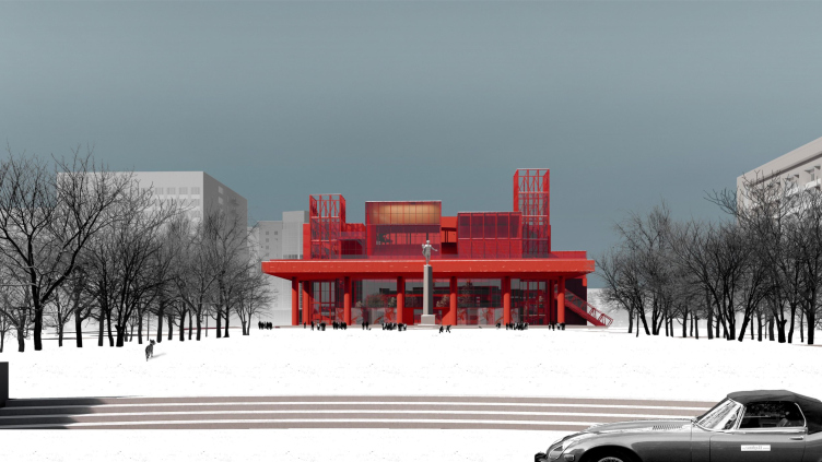
In a word, the statement that the architects proposed was inspired by many things, yet this is still a no-compromise statement: you cannot tear it down, you cannot make an imitation, and what you ultimately end up getting is a tense and immersive dialogue between the theater building and the city surroundings. Such a theater does not mask itself, and it’s not even “there” in the city space in the conventional sense of the word – it intrudes, it is agile, and it imposes its own rules on the surroundings.
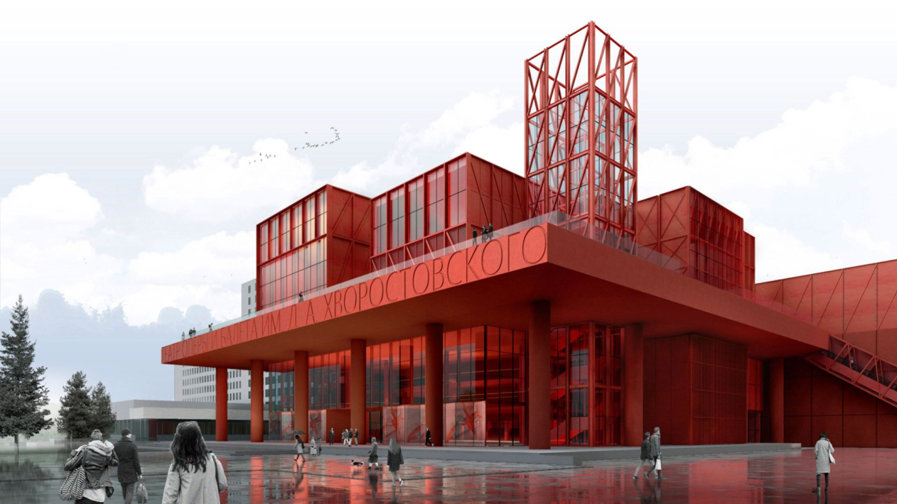
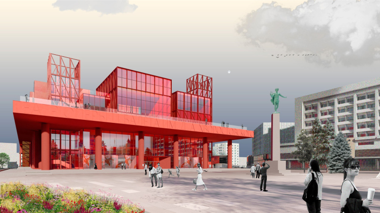
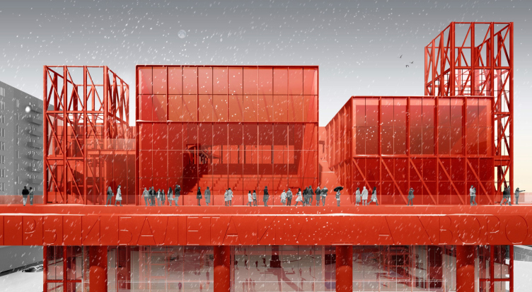
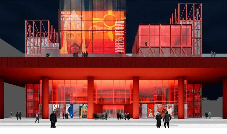
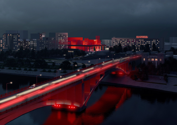
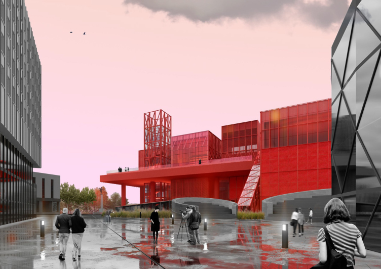
However, this was less than enough for architects, and they painted the building stark red.
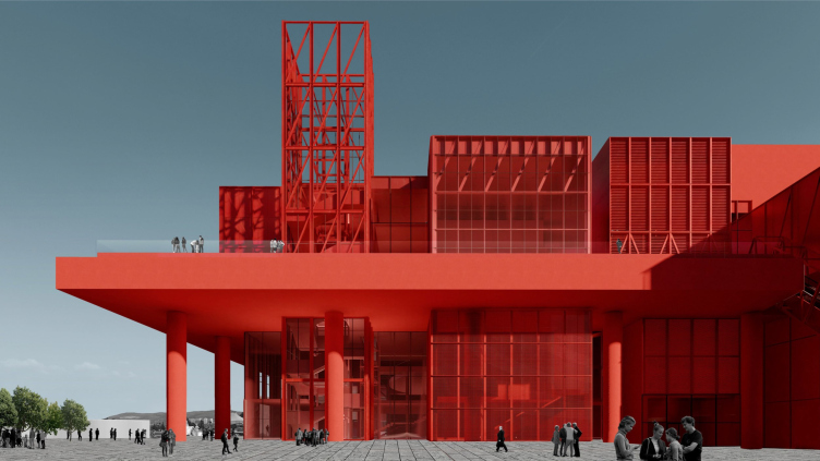
The project proposes massively painted concrete and red paint on the metal constructions. In other words, the entire building is red: the columns, the volumes, the interior of the foyer, the bindings of the windows, and the glass on the outside are ruby-like (although the inside is transparent and is essentially stained glass).
Concept for the reconstruction of the D.A. Khvorostovsky Krasnoyarsk State Opera and Ballet Theater
Copyright: © Studio 44
Concept for the reconstruction of the D.A. Khvorostovsky Krasnoyarsk State Opera and Ballet Theater
Copyright: © Studio 44
Concept for the reconstruction of the D.A. Khvorostovsky Krasnoyarsk State Opera and Ballet Theater
Copyright: © Studio 44
Obviously, the red color unambiguously interprets the name of the city of Krasnoyarsk: Krasny Yar (“Red Ravine”). It is impossible to ignore both the love of the avant-garde – stated in this case as a direction-image – for the color of the red banner, and the fact that the theater was created and built during the Soviet era...
Meanwhile, over the past 30 years we have experienced several waves of architects, artists, and even art critics’ love for the avant-garde, and very often their search was limited to the “Mayakovsky” gray, black, white and red color scheme from the cover of the book by Selim Khan-Magomedov. The combination quickly bored everyone and was replaced by a “sure-thing” light-gray and black.
Making, as a tribute to avant-garde, the whole building red is not exactly a precedent but, on the other hand, it rarely happens on such a grand scale. Very few architects make such bold statements.
And if the comparison with “turning inside out” came to mind above, then the semantic reversal continues here as well: according to the author’s description, the inspiration for the choice of red was not at all the “proletarian red”, but quite the opposite – the scarlet satin fabric that was used in the 19th century to cover the walls of the foyer of the Imperial Bolshoi Theater. On the one hand, it was pompous, luxurious, noble and bourgeois. But on the other hand – a little clue – the architects discovered somewhere: back then, in Imperial times, the red color of satin was compared to the color of molten iron. This is not the most obvious, but still a “bridge” to Krasnoyarsk metallurgy, for one thing, and, second, through industry to the avant-garde.
The clue does not seem the most obvious to me personally, but it contains the same potential for a “werewolf”, a gesture through which the scarlet interior of theatrical luxury, when turned from the inside out, acquires – first of all at the level of emotional perception, and then everything else – another, obviously “detached” meaning, as is required of contemporary art.
The theater would have become such a bright accent, that any Marseille would have been jealous.
Concept for the reconstruction of the D.A. Khvorostovsky Krasnoyarsk State Opera and Ballet Theater
Copyright: © Studio 44
Concept for the reconstruction of the D.A. Khvorostovsky Krasnoyarsk State Opera and Ballet Theater
Copyright: © Studio 44
Concept for the reconstruction of the D.A. Khvorostovsky Krasnoyarsk State Opera and Ballet Theater
Copyright: © Studio 44
Nikita Yavein, Studio 44
The red color was suggested by my colleague Ivan Kozhin. I must say, it comes not only from the name of the city: there is one absolutely red building nearby – the local history museum, designed by Leonid Chernyshev in 1912-1914 in the “Egyptian style”. It stands by the bridge on the bank of the Yenisei River, in direct sight of the theater.
We understood, of course, that making the building red was a bold decision, but we decided to take this risk because we found it interesting and, as you can see, not devoid of direct contextual justification.
We understood, of course, that making the building red was a bold decision, but we decided to take this risk because we found it interesting and, as you can see, not devoid of direct contextual justification.
In general, it could be in all senses a vivid statement on the subject of theater and the life of modern theater in general. Needless to say, the project fits well in the context of Studio 44’s creative search. One of the first things that come to mind is the Museum of Science and Technology in Tomsk, where there was also a lot of frame and distribution of functions into distinctly separate volumes, and the project Museum of Modern Art in Ufa, where multifunctional, transformable, including public, spaces were “packed” into several giant plates with lattice trusses.
Now let us examine some of the details of the proposal by Studio 44.
Since the authors presrve the old hall and stage, the building is less deep than the Wowhaus project (6 m versus 10 m), but the top is more prominent (the top mark is 36 m). In the foyer, there is a buffet and checkroom, on the left there is a VIP hall and on the right there is a museum. On the stage, there is a turntable and stage mechanics. Behind the stage, there are warehouses, above the side wings are ballet classes, on the right, there is a duplicating stage. To the west end of the building, behind the stage, a 20-meter-long “beam” of the administrative part is attached on the back side; it contains all the offices, which are quite numerous.
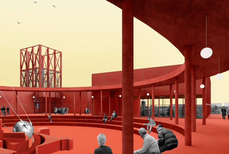
In the eastern entrance area above the double-height foyer, which is historic in its entirety, there is a whole mini-city of additional volumes. The technical floor separates the upper part from the lower part, and above it there is a children’s opera studio, a recording studio, a choir room, a multifunctional hall with its own foyer for individual performances, and a restaurant with a kitchen and dining room in the lower tier. All of this first surrounds the main auditorium as an integral conglomerate, and then, higher up, is divided into volumes grouped along the contour of the open amphitheater on its roof – a kind of volumetric “crown” that can also be compared with the buildings around the town square.
The theater on the roof. Concept of reconstruction of the Krasnoyarsk State Opera and Ballet Theatre named after D.A. Khvorostovsky. The inner square
Copyright: © Studio 44
The architects compare their open amphitheater to a city square and even propose a slogan “meet you ON the Opera”.
The phrase “meet me ON the opera” is not our invention, but a kind of Krasnoyarsk meme.
We started the project by interviewing Krasnoyarsk residents, trying to find out what they think and say about the opera building. We found out a couple of popular sayings and we used them, I would say literally, in our building. Since we have a public square on the roof, it would be possible to “meet ON the opera” here in about as literal sense as you can imagine.
We started the project by interviewing Krasnoyarsk residents, trying to find out what they think and say about the opera building. We found out a couple of popular sayings and we used them, I would say literally, in our building. Since we have a public square on the roof, it would be possible to “meet ON the opera” here in about as literal sense as you can imagine.
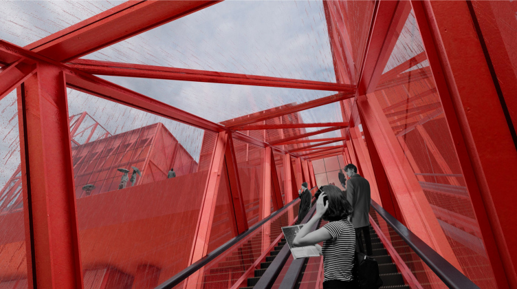
Thus, the upper plaza is planned as open and accessible. According to the plan, it would be accessible via external glass escalators.
And these escalators are not, of course, hidden in round tubes, as on the facade of the Pompidou Center, but in square ones – yet the analogy still suggests itself. To put it bluntly, the avant-garde urge to take the interior outside was at one time successfully supported by the experiments of deconstructivism in general, and Piano and Rogers in particular. In this case, Nikita Yavein’s Krasnoyarsk project 2023 is neither one nor the other, but a certain sum of experiments of the whole century /as well as, I remind you, of the author himself / with a certain amount of retro, pulling the 1970s (Bobur) to the 1920s (Melnikov?).
The energy of the external elevators support, and perhaps even decorate, the grids of the stair-elevator towers, and in some places the loggias: they both balance the composition and strengthen the avant-garde associations of the project.
The escalator. Concept of reconstruction of the Krasnoyarsk State Opera and Ballet Theater named after D.A. Khvorostovsky
Copyright: © Studio 44
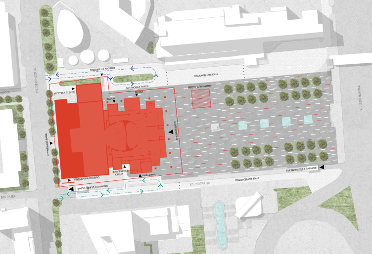
We must admit that the Studio 44 architects were so focused on the public and other stuffing of the theater itself that they treated the square in quite a matter-of-fact fashion. One can understand them: such a bright and complex building demands pause in front of itself, it is so saturated by itself – not only with its function but also with its form, movement, and color – that it seems excessive to fill the city around with something. And the concise approach, the wide step of parallelepipeds and columns, inherited from the theater and repeatedly developed, also requires not a park, but a square similar to the one that was originally conceived here.
The master plan. Concept of reconstruction of the Krasnoyarsk State Opera and Ballet Theater named after D.A. Khvorostovsky
Copyright: © Studio 44
In general, it is quite clear why this project came second. It is a wow statement on the edge, tuned, I would allow myself to put it this way: for the taste comparable to the views of some avid contemporary theatergoer or art connoisseur (well, maybe not any, but some kinds), in general, for the audience, quite sophisticated in the spectacle and, at the same time, the one who is not afraid of a bright statement. In itself, brightness is both a minus, because it gets boring, although in this case it is compensated by the scale and simplicity of forms, and a plus, because it makes the building exceptional and provides integrity, gathering many parts into one.
What the project is obviously not designed for is domestic nostalgia. This is probably why there is no mention of the sculptures of the muses on the facade, even though they could always be kept and exhibited in the Theater Museum, or even of the stained-glass window, which is indeed present in the colleagues’ concept. But then again, on the other hand, if we remember about the casts and “turning inside out”, we will see that there the hall was replaced by a completely new one, and here it is preserved: the seasoned spectator of the Krasnoyarsk Theater, coming to a performance and passing by the red facade and red foyer, would probably feel like home afterwards.
Concept of reconstruction of the Krasnoyarsk State Opera and Ballet Theater named after D.A. Khvorostovsky
Copyright: © Studio 44
That is, the architectural solutions are in some ways identical, and in some ways diametrically opposite. I wonder how the Commission for the Unification of Ideas will deal with them now.

