По-русски

Garage-Garage

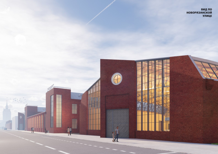
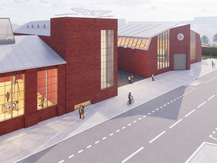
Recently, Moscow saw the presentation of a project by Yuri Grigoryan, devoted to turning the truck garage on Novoryazanskaya Street, designed by Konstantin Melnikov, into the Museum of Moscow Transport. The project involves restoring the monument of architecture, adding a new underground floor and a new entrance, as well as a whole park. The implementation is already underway.

07 June 2023
News
mainImg
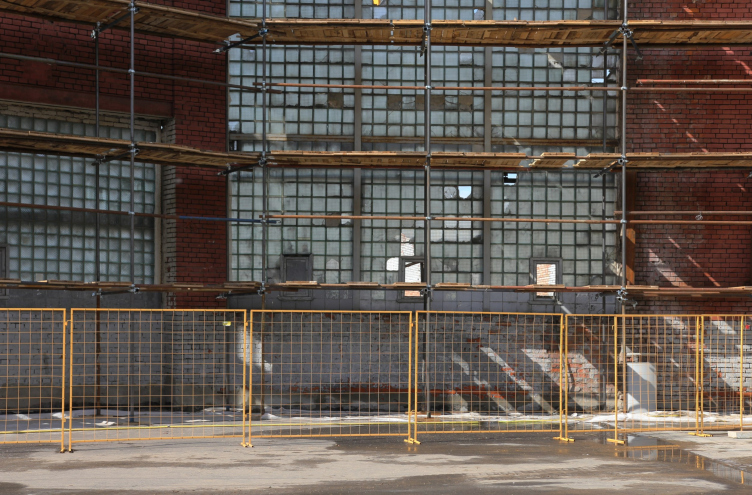
This city has a habit of “presenting” architectural projects when they are in fact completed or nearly completed. This case is no exception – the reinforced wall underneath the monument has already been built, the restored structures are being assembled in their proper place – and we were shown a “sketch” project of transforming the truck garage, designed by Konstantin Melnikov at Novoryazanskaya Street, 27, into the Museum of Moscow Transport.

Moscow Transportation Museum, conceptual design, 2020-2023
Copyright: © Meganom/ provided by Moscow Transportation Museum


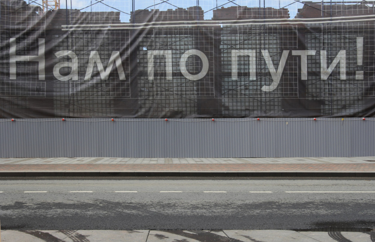
The museum is planned to be open in 2024; the project of the first stage of restoration was approved by the Department of Cultural Heritage still in 2019. The work on the “adjustment project” began in 2020, and the decision to hand the garage over to the museum, according to its director, Oxana Bondarenko, was made in 2015-2017, even though the mayor only signed the appropriate decree in 2022. The banner “Nam po puti” (“We’re on the same road”) has been hanging for years now, and the work is underway.

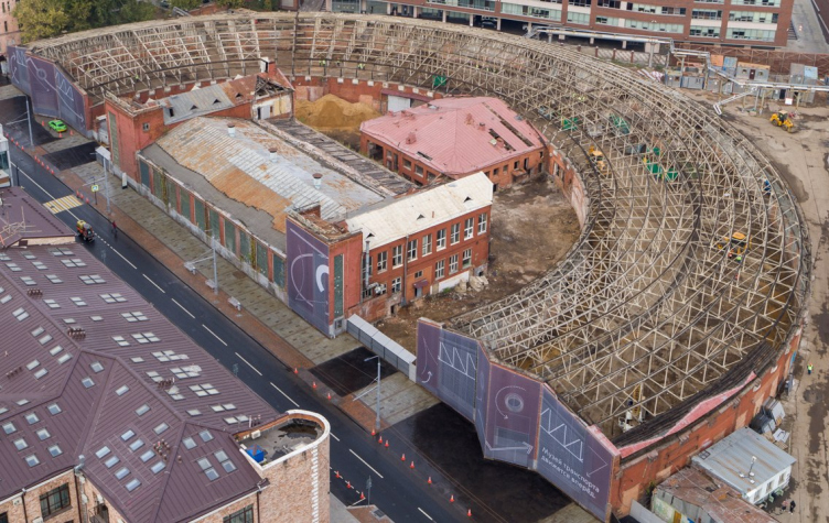
A cargo garage on Novoryazanskaya Street. Konstantin Melnikov, 1929-1931. In the process of remodeling, 06.2023
Copyright: Photograph © Julia Tarabarina, Archi.ru


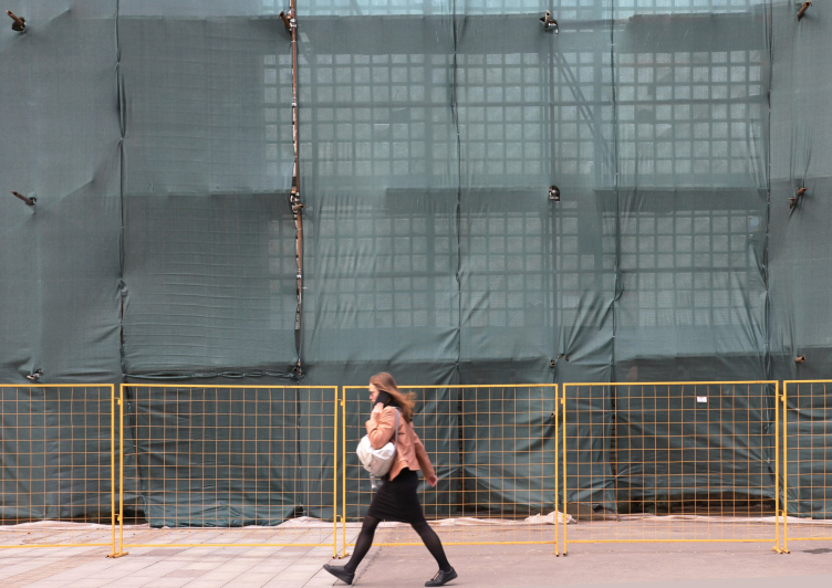
A cargo garage on Novoryazanskaya Street. Konstantin Melnikov, 1929-1931. In the process of remodeling, 06.2023
Copyright: Photograph © Julia Tarabarina, Archi.ru


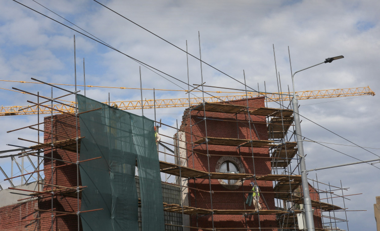
A cargo garage on Novoryazanskaya Street. Konstantin Melnikov, 1929-1931. In the process of remodeling, 06.2023
Copyright: Photograph © Julia Tarabarina, Archi.ru


A cargo garage on Novoryazanskaya Street. Konstantin Melnikov, 1929-1931. In the process of remodeling, 06.2023
Copyright: Photograph © Julia Tarabarina, Archi.ru


The garage is a cultural heritage site of regional importance; according to the chief architect of the Transport Museum, Natalia Vorontsova, the protected status has been granted to the “composition of the architectural ensemble, materials and the composition of the facades, and the architectural and planning solutions”. The restoration is performed by the studio “Faros”; the museum exposition by Planet9 (design), Pitch (multimedia), and Solarsense (content).

The main hero of the show, however, is the project of adjusting the building authored by Yuri Grigoryan and AB Meganom. We asked the author, and, yes, the Project and Project Documentation stages are also done by Meganom.

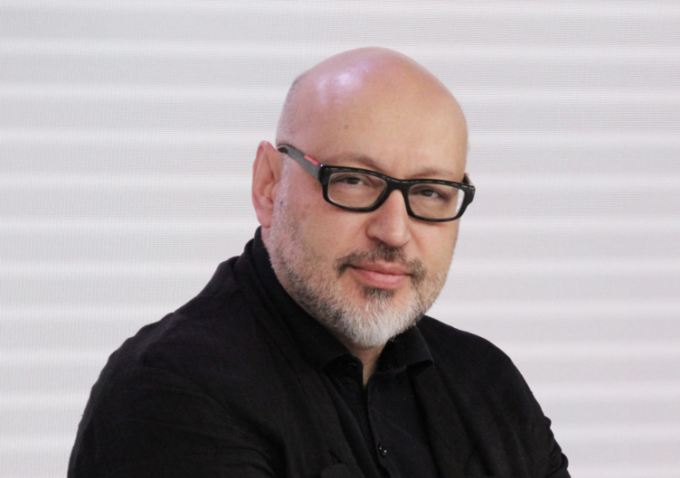
Yuri Grigoryan at the press conference on 06.06.2023
Copyright: Photograph © Julia Tarabarina, Archi.ru


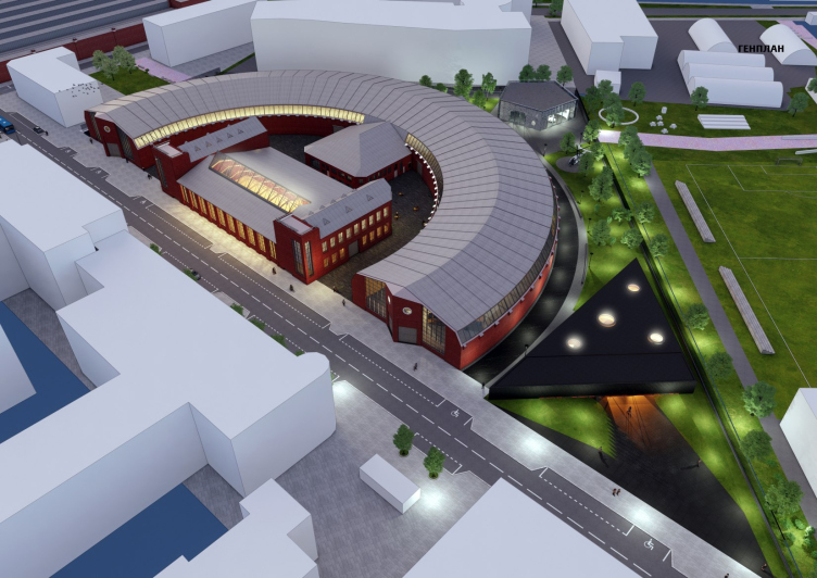
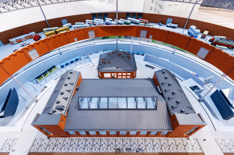
The project includes 9,027 m2 of new construction: the Melnikov garage is essentially a horseshoe-shaped semicircle where the trucks were parked. The “semi-bagel” of the garage is one story high; it rests on the ground; the axis of circumference includes the building of the repair shop, it is two stories high, with an underground tier.

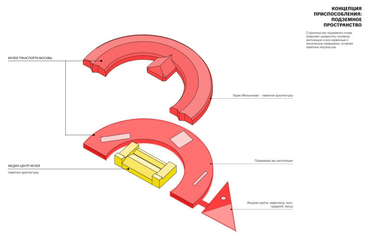
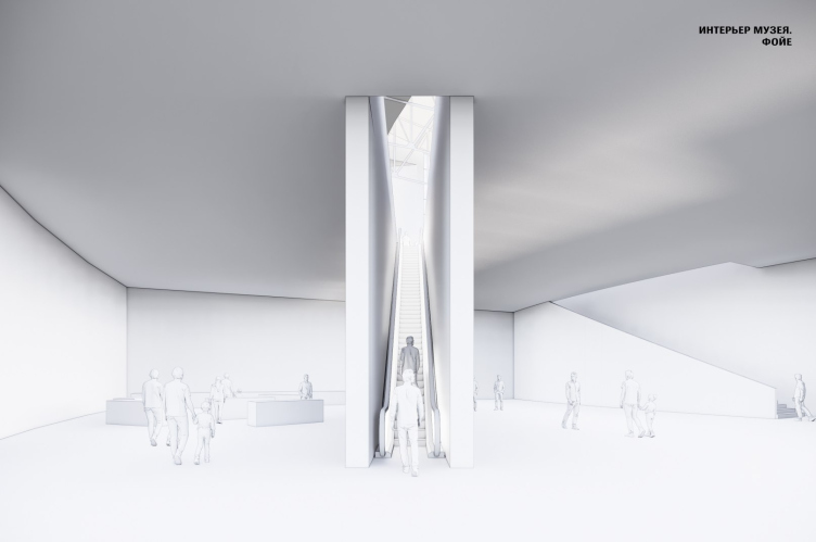
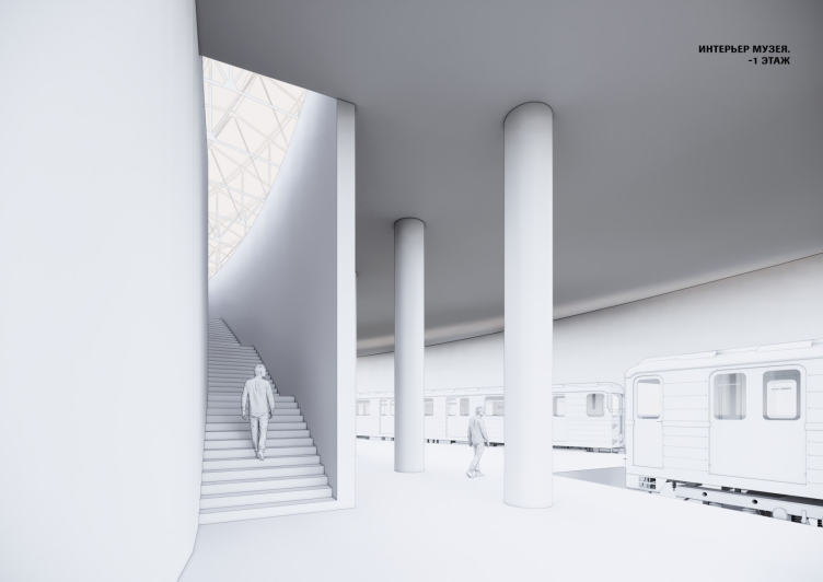
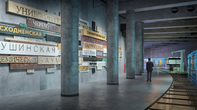
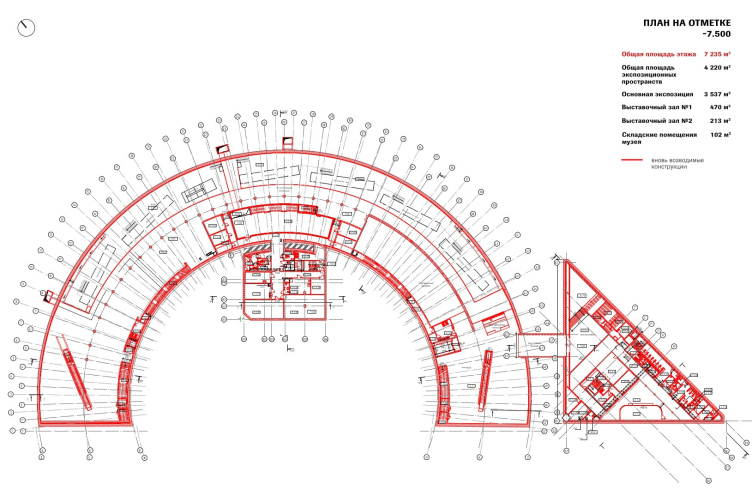
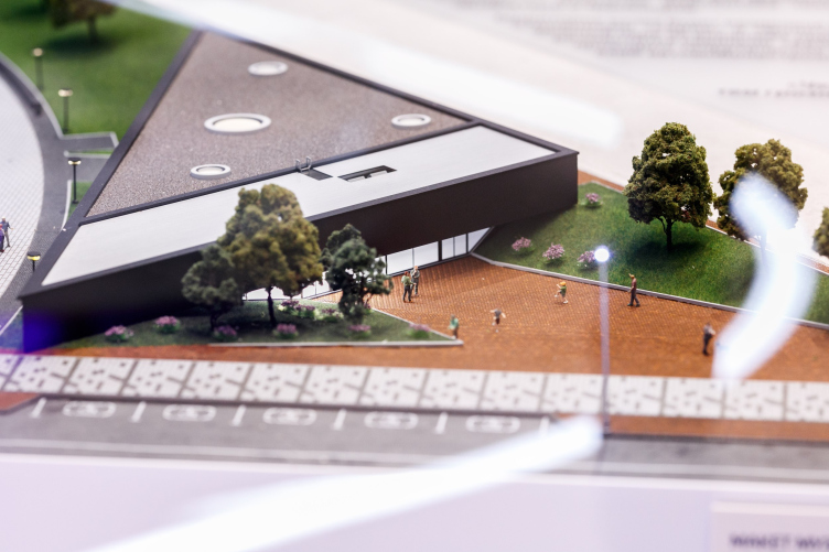
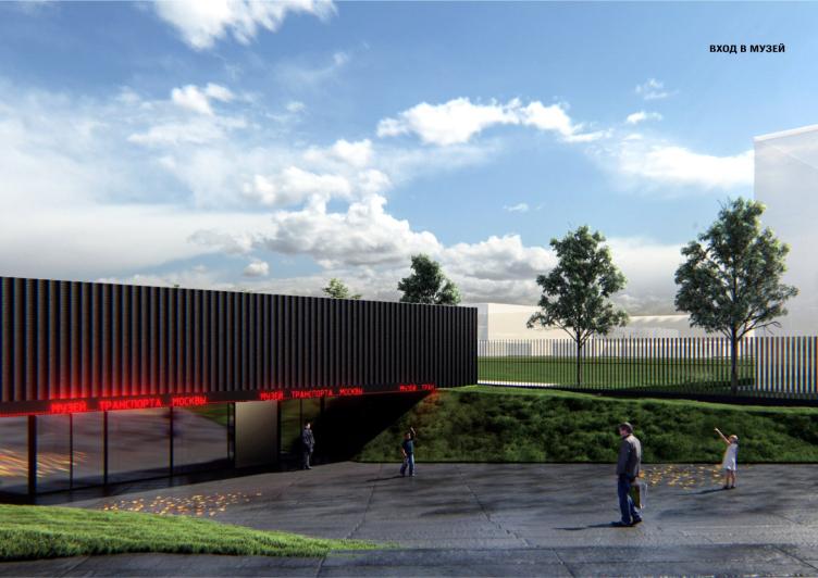
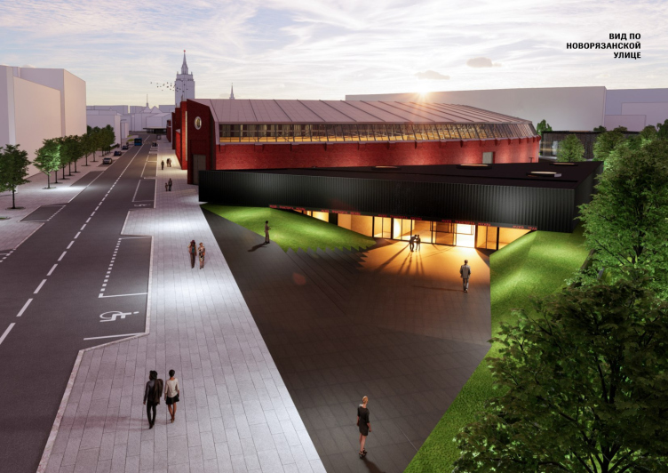
According to the project, there is a new underground tier that is built underneath the “horseshoe” of the garage, and it will include a foyer, and the part devoted to the metro, which makes perfect sense. The visitors to the museum will get to the bottom tier through the new entrance – a triangular structure with an imposing attic, which is added to the garage from the east side. The former repair shop will host the museum’s media center.

Moscow Transportation Museum, conceptual design, 2020-2023
Copyright: © Meganom/ provided by Moscow Transportation Museum


Moscow Transportation Museum, conceptual design, 2020-2023
Copyright: © Meganom/ provided by Moscow Transportation Museum


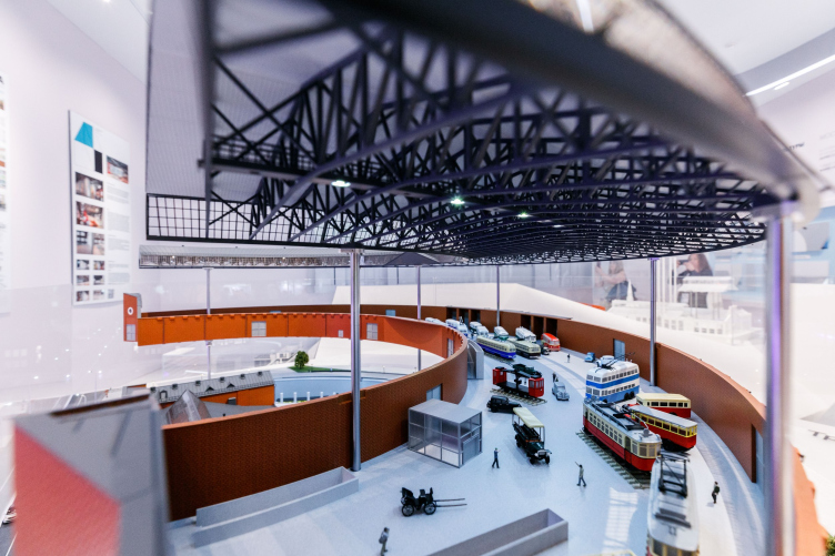
A model. View of the media center in the building of former machine shops. Moscow Transportation Museum, conceptual design, 2020-2023
Copyright: © Meganom/ provided by Moscow Transportation Museum


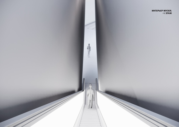
There will be no entrances to the upper tier of the permanent exposition – i.e. to the garage – from the ground; the visitors will ride escalators, which Yuri Grigoryan places in narrow spaces between walls.

Moscow Transportation Museum, conceptual design, 2020-2023
Copyright: © Meganom/ provided by Moscow Transportation Museum


Moscow Transportation Museum, conceptual design, 2020-2023
Copyright: © Meganom/ provided by Moscow Transportation Museum


There are stairs too – they stretch along the inner arc of the semicircle, and are also present in the sector-like communication node of the central part. The stairs are also delimited by a laconic “shell” wall – it actively builds the plastique of the interior space of the museum, distancing the attention of the viewer ascending to the upper hall from the foyer and the exposition of the lower tier. A little daylight will also get down through the stairs, but since there is a “subway” down there, then a lot of light is probably not that necessary according to the logic of the original design.

Moscow Transportation Museum, conceptual design, 2020-2023
Copyright: © Meganom/ provided by Moscow Transportation Museum


Moscow Transportation Museum, conceptual design, 2020-2023
Copyright: © Meganom & Planet9 / provided by Moscow Transportation Museum


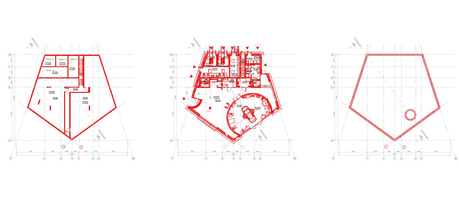
Minus first floor, elevation -7.5 m. Moscow Transportation Museum, sketch concept, 2023. New construction is marked in red.
Copyright: © Meganom/ provided by Moscow Transportation Museum


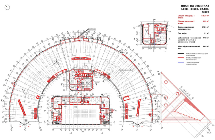
Plan at the 0 elevation. Moscow Transportation Museum, sketch concept, 2023. New construction is marked in red.
Copyright: © Meganom/ provided by Moscow Transportation Museum


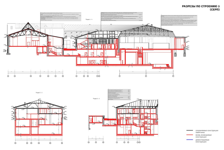
Section view. new structures are marked in red. Moscow Transportation Museum, conceptual design, 2020-2023
Copyright: © Meganom/ provided by Moscow Transportation Museum


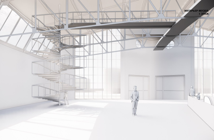
The elevators and stairs take the visitors upstairs, into the space of the “monument” garage itself. The bridges above, under the floor structures here are historical, but the spiral staircases leading to them are an addition by the architects. The exposition can thus also be viewed from above.

Moscow Transportation Museum, conceptual design, 2020-2023
Copyright: © Meganom/ provided by Moscow Transportation Museum


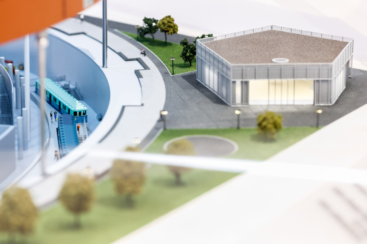
At the back of the yard, a pentagonal (temporary) pavilion of educational vehicle workshops is planned for conducting master classes and children’s education sessions.

zooming
The auto laboratory. Moscow Transportation Museum, conceptual design, 2020-2023
Copyright: © Meganom/ provided by Moscow Transportation Museum


A model. Moscow Transportation Museum, conceptual design, 2020-2023
Copyright: © Meganom/ provided by Moscow Transportation Museum


Let’s return to the new entrance group, however. The auto workshop pavilion is pentagonal, while the entrance, which, I remind you, leads underground to the new ground floor, is triangular – in both cases, the simple but energetic geometry serves as a paraphrase of Melnikov’s work, who, as we remember, loved bold shapes.

A model. Moscow Transportation Museum, conceptual design, 2020-2023
Copyright: © Meganom/ provided by Moscow Transportation Museum


In addition, the architect plans to cover the facade of the attic with specially made dark bricks of concave shape, which will yield a surface of laconic “flute” grooves – because (and I quote Yuri Grigoryan’s words here) Melnikov is essentially an Art Deco architect.

Moscow Transportation Museum, conceptual design, 2020-2023
Copyright: © Meganom/ provided by Moscow Transportation Museum


Moscow Transportation Museum, conceptual design, 2020-2023
Copyright: © Meganom/ provided by Moscow Transportation Museum


Basically, the entrance turned out to be a modernist “beam”; such a solution is quite imaginable in some 1970s museum, but here I want to see concrete or metal for some reason. I wonder how the bricks will ultimately look.

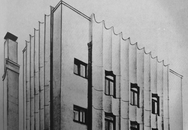
My colleagues were somewhat confused by this Art Deco statement, but to me it seemed largely correct. Melnikov, of course, is far from being the most typical representative, but he loved Art Deco (or did at some point), and he was always interested in the art of plastique. Looking for hereditary grooves, I opened Melnikov’s album – I found at least the Gosplan garage. Why not add grooves from one garage to another? And the half-grooves of the Intourist garage come to mind too.

Konstantin Melnikov. The Gosplan Garage. Project
Copyright: From the book: S.O. Khan-Magomedov. Konstantin Melnikov. М., 1990. Page 119.


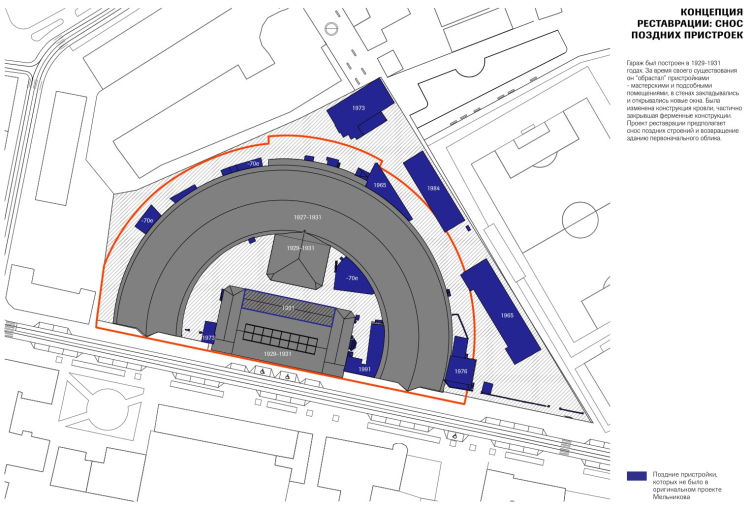
The restoration of the historical part is being done according to all the rules under the supervision of the Department of Cultural Heritage. According to Yuri Grigoryan, the brick repair covered about 7-8% of the masonry in the upper part, only where the masonry was severely damaged. In addition, when inspecting the building, the architects found wooden side windows somewhere upstairs under the trusses, which had been closed for a long time – it is planned to open them.

It was decided to restore the metal trusses not on site, but in the workshop; now, I remind you, they are being installed. According to the chief architect of the Museum of Transport, about 10% of new metal had to be added in the process of mending, the rest was preserved, “including rivets”. It turns out that the public in December 2022 was worried for nothing.

There is another, additional, story about the trusses. They are universally spoken of as the work of Vladimir Shukhov. This information goes back to Selim Khan-Magomedov’s book (1990), but according to Mark Hakobyan, who curated the 2019 Shukhov exhibition at the Museum of Architecture, there is no confirmation of Shukhov's involvement either here or in the Bakhmetev Garage – in the latter case, historians have studied the materials in the archive of the Central State Archive of Moscow, and the drawings there are signed by Melnikov, while Shukhov’s signature is nowhere to be found. Shukhov’s post-revolution works, Mark Hakobyan explains, are generally difficult to document: the sources are scarce, and you have to determine them by the type of construction: the mesh vault patented by Shukhov is more likely to be associated with him, but the great engineer was also engaged in calculations of simpler truss structures – like the cargo garage on Novolyazanskaya. Meanwhile, such a calculation could have been made by some other engineer.

The constructions of the garage are quite simple: there is no special engineering beauty, which could be seen in the exhibition pavilions of the XIX century – after all, the task was rather technical, and the main advantage of the structures was that they covered the span of 35 m without supports and allowed trucks to maneuver more freely. By the way, at first 5-ton German trucks were parked in the garage, then Soviet “1.5-ton-trucks”, then, during the war, it served as a repair shop, and finally, after the war and until its closure, it was the 4th bus park.

Garage on Novolyazanskaya Street in 2022. The structures have not yet been dismantled
Copyright: Photograph: Mos.ru / CC BY 4.0


A model. Moscow Transportation Museum, conceptual design, 2020-2023
Copyright: © Meganom/ provided by Moscow Transportation Museum


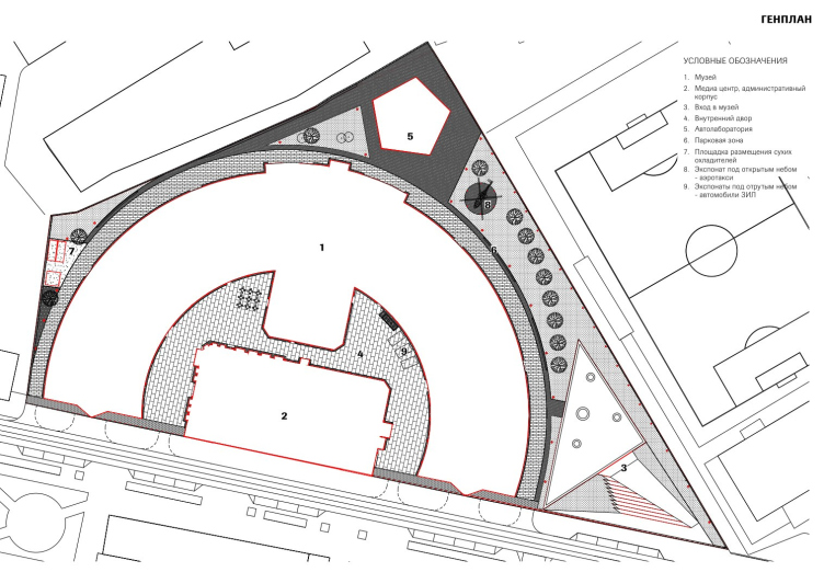
Another part of the project is landscaping. As it is customary nowadays, there is a special emphasis on it, especially since the museum is a public place and requires the appropriate space around it. To the east of the garage a park called Milyutinsky is planned – let’s not forget about the legendary Commissar. Besides, the alley-circumference between the “garage” museum and the former workshop (now the media center), will be opened for walks – and not to surround the museum with any fences at all. “The city will receive”, as they say nowadays, a new park, a quiet street, plus the improvement of Novoryazanskaya Street running near the museum.

General Plan. At the top, there is a pentagon of workshops, to the right an entrance triangle and a park. In the center, there is the acr of the pedestrian stree. Moscow Transportation Museum, conceptual design, 2020-2023
Copyright: © Meganom/ provided by Moscow Transportation Museum


later additions shown in blue. Moscow Transportation Museum, conceptual design, 2020-2023
Copyright: © Meganom/ provided by Moscow Transportation Museum


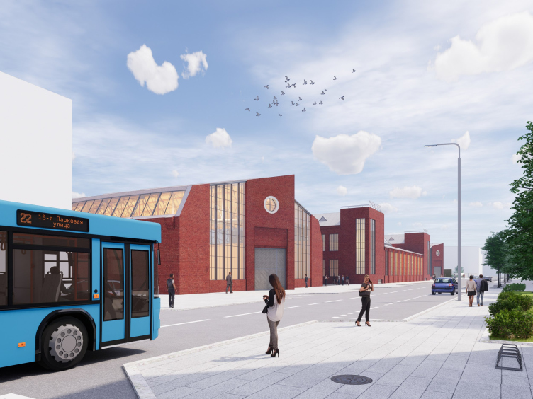
Moscow Transportation Museum, conceptual design, 2020-2023
Copyright: © Meganom/ provided by Moscow Transportation Museum


Thus, the fears of the public turned out to be largely groundless: the garage is a monument, it is being restored, and the difficulties associated with the poor quality of technical construction (after all, the garage is just a garage) are being overcome. On the other hand, there is a lot of new construction in the project, a little less than half of the original area. It is not very clear why the project was shown so late – it would have been possible to calm everyone’s misgivings from the very start, wouldn’t it?

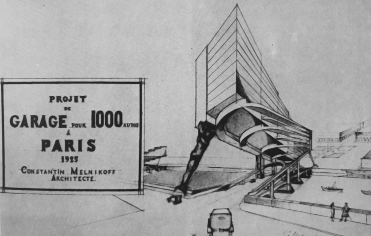
One more thing. I think it would be nice if the Museum of Transport allotted a special room for an exposition devoted to Melnikov’s other garages, because – let’s not forget it – garages were one of Melnikov’s most frequently done projects. He designed two garages for Paris, one of them with cantilevered ramps over the bridge over the Seine – in both of them, back in 1925, he proposed the famous one-way traffic. No, it’s not the first time Melnikov had it on Novolyazanskaya; it’s the core idea in all of his garages – not to make the car egress. The words written by Melnikov while designing a garage for English buses on Ordynka (not implemented) are remarkable and very textured: “... it was neither caprice nor autocratic, but the daring power of beauty to stop wasting millions on ugly things”.

Moscow Transportation Museum, conceptual design, 2020-2023
Copyright: © Meganom/ provided by Moscow Transportation Museum


In Moscow, Melnikov designed five garages, four of which were actually built: bus Bakhmetyevsky, cargo Novovyazansky, Intourist garage on Suschevsky Val, and Gosplan garage on Aviamotornaya. All of them were with straight-through traffic (or essentially one-way), only organized differently: Bakhmetyevsky garage for the sake of convenience of buses’ movement received slanted contours, and Novobiazansky – a horseshoe-shaped plan, which, by the way, if we look at the map of the district as a whole, is very similar, in shape and size, to the steam locomotive circular depots of the XIX century. For example, 300 meters from the Novoryazansky Garage, a slightly smaller, but very similar in parameters, depot of the 1890s – was it the source of inspiration that helped the great architect Melnikov to cope with the triangular shape of the site? Who knows? It is clear that there were locomotives, which were placed along the radii to reconnect to trains, and here were trucks, but still: the garage on Novoryazanskaya is quite in line with the search for transportation architecture.

Another thing that comes to mind here is the museum of the Oktyabrskaya railway, which Nikita Yavein designed in the railway depot in St. Petersburg (open since 2017 ). You can still feel some rhyme arising between the two large transport museums.

Meanwhile, the project of the Transport Museum in the Melnikov’s Garage is grand-scale, and unique to a large extent. At the same time, however, it does fall in line with modern trends. Today, Novoryazanskaya Street is being actively developed; gradually, it stops being the “backyard” of the “square of three railway stations”, and already a restaurant complex opened on it. The complex is called “Depot” (it is opened in another depot, the tram one, not the steam engine one we talked about before), and the street is being paved with granite – for all intents and purposes, the museum will also soon be completed. And life will be beautiful then. What’s next? A museum of private garage construction?
Konstantin Melnikov. garage over Saine. Project. 1925
Copyright: From the book: S.O. Khan-Magomedov. Konstantin Melnikov. М., 1990. Page 103.


07 June 2023

Headlines now
The Golden Crown
The concept for a dental clinic in Yekaterinburg, developed by CNTR Studio, revolves around the idea of a “mouth full of gold”: pristine white porcelain stoneware walls are complemented by matte brass details. To avoid an overly literal interpretation, the architects focused on the building’s proportions, skillfully navigating between sunlight requirements and fire safety regulations.
Flexibility and Integration
Not long ago, we covered the project for the fourth phase of the ÁLIA residential complex, designed by APEX. Now, we’ve been shown different fence concepts they developed to enclose the complex’s private courtyards, incorporating a variety of public functions. We believe that the sheer fact that the complex’s architects were involved in such a detail as fencing speaks volumes.
A Step Forward
The HIDE residential complex represents a major milestone for ADM architects and their leaders Andrey Romanov and Ekaterina Kuznetsova in their quest for a fresh high-rise aesthetic – one that is flexible and layered, capable of bringing vibrancy to mass and silhouette while shaping form. Over recent years, this approach has become ADM’s “signature style”, with the golden HIDE tower playing a pivotal role in its evolution. Here, we delve into the project’s story, explore the details of the complex’s design, and uncover its core essence.
Gold in the Sands
A new office for a transcontinental company specializing in resource extraction and processing has opened in Dubai. Designed by T+T Architects, masters of creating spaces that are contemporary, diverse, flexible, and original, this project exemplifies their expertise. On the executive floor, a massive brass-clad partition dominates, while layered textures of compressed earth create a contextually resonant backdrop.
Layers and Levels of Flight
This project goes way back – Reserve Union won this architectural competition at the end of 2011, and the building was completed in 2018, so it’s practically “archival”. However, despite being relatively unknown, the building can hardly be considered “dated” and remains a prime example of architectural expression, particularly in the headquarters genre. And it’s especially fitting for an aviation company office. In some ways, it resembles the Aeroflot headquarters at Sheremetyevo but with its own unique identity, following the signature style of Vladimir Plotkin. In this article, we take an in-depth look at the United Aircraft Corporation (UAC) headquarters in the Moscow agglomeration town of Zhukovsky, supplemented by recent photographs from Alexey Naroditsky – a shoot that became only recently possible due to the fact that improvements were finally made in the surrounding area.
Light and Shadow
In this article, we delve into the architectural design of the “Chaika” house by DNK ag architects, which was recently completed in 2023 as part of the collection of signature designs at ZILArt. As is well-known, all the buildings in this complex follow a design code, yet each one is distinct. This particular building stands out not only for its whiteness and minimalism but also for the refined use of a limited number of techniques that, together, create what can confidently be called synergy.
Casus Novae
A master plan was developed for a large residential area with a name of “DNS City”, but now that its implementation began, the plan has been arbitrarily reformatted and replaced with something that, while similar on the surface, is actually quite different. This is not the first time such a thing happens, but it’s always frustrating. With permission from the author, we are sharing Maria Elkina’s post.
Treasure Hunting
The GAFA bureau, in collaboration with Tegola and Arkhitail, organized an expedition to the island of Kilpola in Karelia as part of Moskomarkhitektura’s “Open City” festival. There, amidst moss and rocks, the students sought answers to questions like: what is the sacred, where does it dwell, and what sustains it? Assisting the participants in this quest were landscape engineer Evgeny Levin, artist Nicholas Roerich, a moose, and the lack of cellular connection. Here’s how the story unfolded.
Depths of the Earth, Streams of Water
In the Malaya Okhta district, the Akzent building, designed by Stepan Liphart, was constructed. It follows a classic tripartite structure, yet it’s what you might call “hand-drawn”: each façade is unique in its form and details, some of which aren’t immediately noticeable. In this article, we explore the context and, together with the architect, delve into how the form was developed.
Fir Tree Dynamics
The “Airports of Region” holding is planning to build an airport in Karachay-Cherkessia, aiming to make the Arkhyz and Dombay resorts more accessible to travelers. The project that won in an invitation-only competition, submitted by Sergey Nikeshkin’s KPLN, blends natural imagery inspired by the shape of a conifer seed, open-air waiting spaces, majestic large trees, and a green roof elevated on needle-like columns. The result is both nature-inspired and WOW.
​A Brick Shell
In the process of designing a clubhouse situated among pine trees in a prestigious suburban area near Moscow, the architectural firm “A.Len” did the façade design part. The combination of different types of brick and masonry correlates with the volumetric and plastique solutions, further enhanced by the inclusion of wood-painted fragments and metal “glazing”.
Word Forms
ATRIUM architects love ambitious challenges, and for the firm’s thirtieth anniversary, they boldly play a game of words with an exhibition that dives deep into a self-created vocabulary. They immerse their projects – especially art installations – into this glossary, as if plunging into a current of their own. You feel as if you’re flowing through the veins of pure art, immersed in a universe of vertical cities, educational spaces – of which the architects are true masters – and the cultural codes of various locations. But what truly captivates is the bold statement that Vera Butko and Anton Nadtochy make, both through their work and this exhibition: architecture, above all, is art – the art of working with form and space.
Flexibility and Acuteness of Modernity
Luxurious, fluid, large “kokoshniks” and spiral barrel columns, as if made from colorful chewing gum: there seem to be no other mansion like this in Moscow, designed in the “Neo-Russian-Modern” style. And the “Teremok” on Malaya Kaluzhskaya, previously somewhat obscure, has “come alive with new colors” and gained visibility after its restoration for the office of the “architectural ecosystem” as the architects love to call themselves. It’s evident that Julius Borisov and the architects at UNK put their hearts into finding this new office and bringing it up to date. Let’s delve into the paradoxes of this mansion’s history and its plasticity. Spoiler: two versions of modernity meet here, both balancing on the razor’s edge of “what’s current”.
Yuri Vissarionov: “A modular house does not belong to the land”
It belongs to space, or to the air... It turns out that 3D printing is more effective when combined with a modular approach: the house is built in a workshop and then adapted to the site, including on uneven terrain. Yuri Vissarionov shares his latest experience in designing tourist complexes, both in central Russia and in the south. These include houseboats, homes printed from lightweight concrete using a 3D printer, and, of course, frame houses.
​Moscow’s First
“The quality of education largely depends on the quality of the educational environment”. This principle of the last decade has been realized by Sergey Skuratov in the project for the First Moscow Gymnasium on Rostovskaya Embankment in the Khamovniki district. The building seamlessly integrates into the complex urban landscape, responding both to the pedestrian flow of the city and the quiet alleyways. It skillfully takes advantage of the height differences and aligns with modern trends in educational space design. Let’s take a closer look.
Looking at the Water
The site of Villa Sonata stretches from the road to the water’s edge, offering its own shoreline, pier, and a picturesque river panorama. To reveal these sweeping views, Roman Leonidov “cut” the façade diagonally parallel to the river, thus getting two main axes for the house and, consequently, “two heads”. The internal core – two double-height spaces, a living room and a conservatory, with a “bridge” above them – makes the house both “transparent” and filled with light.
The White Wing
Well, it’s not exactly white. It’s more of a beige, white-stone structure that plays with the color of limestone – smoother surfaces are lighter, while rougher ones are darker. This wing unites various elements: it absorbs and interprets the surrounding themes. It responds to everything, yet maintains a cohesive expression – a challenging task! – while also incorporating recognizable features of its own, such as the dynamic cuts at the bottom, top, and middle.
Urban Dunes
The XSA Ramps team designed and built a three-part sports hub for a park in Rostov-on-Don, welcoming people of all ages and fitness levels. The skate plaza, pump track, and playground are all meticulously crafted with details that attract a diverse range of visitors. The technical execution of the shapes and slopes transforms this space into a kind of sculptural composition.
Proportional Growth
The project for the fourth phase of the ÁLIA residential area has been announced. The buildings are situated on an elongated plot – almost a “ray” that shoots out from the center of the area towards the river. Their layout reflects both a response to Moscow’s architectural preferences over the past 15 years, shifting “from blocks to towers”, and an interpretation of the neighboring business park designed by SOM. Additionally, the best apartments here are not located at the very top but closer to the middle, forming a glowing “waistline”.
The “Staircase” Building
In designing the “Details” residential complex in New Moscow, Rais Baishev spiced up the now-popular Moscow theme of a “courtyard” building with an idea drawn from the surrealist drawings by Maurits Escher. He envisioned the stepped silhouettes and descending slopes as a metaphysical mega-staircase, creating a key void within the courtyard that gave the project an internal “spine”. This concept is felt both in the building’s silhouette and on its façades.
Projection of the Quarter
No one doubted that the building that Vladimir Plotkin designed as part of the “Garden Quarters” would be the most modernist of all. And it turned out just that way: while adhering to the common design code, the building successfully combines brick and white stone, rhythmically responding to the neighboring building designed by Ostozhenka, yet tactfully and persistently making a few statements of its own. This includes the projection of the ideal urban development composition “14–9–6”, which can be found right next door, mathematical calculations, including those for various types of terraces (and perhaps the only reminder of the Soviet past of the Kauchuk rubber factory!), and the white “cross-stitch” pattern of the façade grid.
Domus Aurea
In this issue, we examine the “Tessinsky-1” house, designed by Sergey Skuratov and completed in 2023. Located in the middle of the Serebryanicheskaya Embankment district, at the intersection of its main streets, this house assumes a sort of “nodal” role: it not only responds to everything around it and preserves many memories of the former EMA factory within itself, but it weaves all this into a newly directed pattern, reconciling bright “gold” and dark-colored brick, largely with the help of the new, modern-yet-archaic Columba brick, which, come to think about it, is the most precious element here.
The Chimney of Nikola-Lenivets
In this issue, we are examining the “Obelisk House” designed by KATARSIS and built for the Arkhstoyanie 2023 festival. However, it was only finished later on, and this is why we are examining it now. It seems to us that after the “Obelisk House” appeared in Nikola-Lenivets, a dialogue and a few inner connections appeared between the temporary structures built here. These houses no longer look like “accidental neighbors”, more of which below.
​Periscope by the Bay
The jury awarded the second place in the competition for a public and cultural center in Petropavlovsk-Kamchatsky to the companies GORA (“Mountain”) and M4. In the consortium’s proposal, the building resembles a sperm whale with a calf swimming next to it or a periscope, whose lenses capture the most spectacular views from the surrounding landscape.
From Arcs to Dolmens
While working on the competition project for Petropavlovsk-Kamchatsky, ASADOV Architects prioritized the value of the natural and urban environment, aiming to preserve the balance of the location while minimizing the resemblance of the volume that they designed to a “traditional building”. The task was challenging, and the architects created three versions, one of which having been developed after the competition, where their main proposal took third place. However, the point of interest here is not the competition result but the continuity of creative thinking.
Hide and Seek
The ID Moskovskiy house, designed by Stepan Liphart in St. Petersburg, in the courtyards near Moskovskiy Avenue beyond the Obvodny Canal and recently completed, is notable for several reasons. Firstly, it has been realized with considerable accuracy, which is particularly significant as this is the first building where the architect was responsible not only for the facades but also for the layouts, allowing for better integration between the two. On the other hand, this building is interesting as an example of the “germination” of new architecture in the city: it draws on the best examples from the neighborhood and becomes an improved and developed sum of ideas found by the architect in the surrounding context.
The Big Twelve
Yesterday, the winners of the Moscow Mayor’s Architecture Award were announced and honored. Let’s take a look at what was awarded and, in some cases, even critique this esteemed award. After all, there is always room for improvement, right?
Above the Golden Horn
The residential complex “Philosophy” designed by T+T architects in Vladivostok, is one of the new projects in the “Golubinaya Pad” area, changing its development philosophy (pun intended) from single houses to a comprehensive approach. The buildings are organized along public streets, varying in height and format, with one house even executed in gallery typology, featuring a cantilever leaning on an art object.
Nuanced Alternative
How can you rhyme a square and space? Easily! But to do so, you need to rhyme everything you can possibly think of: weave everything together, like in a tensegrity structure, and find your own optics too. The new exhibition at GES-2 does just that, offering its visitor a new perspective on the history of art spanning 150 years, infused with the hope for endless multiplicity of worlds and art histories. Read on to see how this is achieved and how the exhibition design by Evgeny Ace contributes to it.
Blinds for Ice
An ice arena has been constructed in Domodedovo based on a project by Yuri Vissarionov Architects. To prevent the long façade, a technical requirement for winter sports facilities, from appearing monotonous, the architects proposed the use of suspended structures with multidirectional slats. This design protects the ice from direct sunlight while giving the wall texture and detail.