По-русски

The White Grove

This project by “Ginzburg Architects” scored first place in the international competition for a draft project of a Cathedral Mosque in Kazan, dedicated to the 1100th anniversary of the adoption of Islam in Volga Bulgaria. The concept of a “white garden”, which the architects presented in modern shapes, interprets the rules and notions of Islam and refers to historical figures. Below, we are examining the project in detail.

13 July 2022
Contest Results
mainImg
The construction of the new Cathedral Mosque is timed to coincide with a date that is important for Tatarstan – 1100 years ago, in the year of 922, Volga Bulgaria adopted Islam, this confession still being the predominant one in the republic. The current cathedral mosque Kul-Sharif was built for the 1000-year anniversary of Kazan, and became one of the most recognizable landmarks in the city, but today it partially performs a museum function, and, compared to the future building, it is rather modest in size, capable of housing 1,700 worshippers versus the expected 10,000.

The competition began in April on the eve of the first day of the holy month of Ramadan, and the winners were announced in July on the eve of the Eid al-Adha holiday. In May, the first memorial stone was laid, and construction work is planned to begin already this fall.

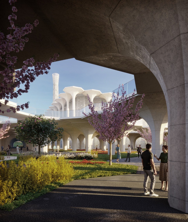
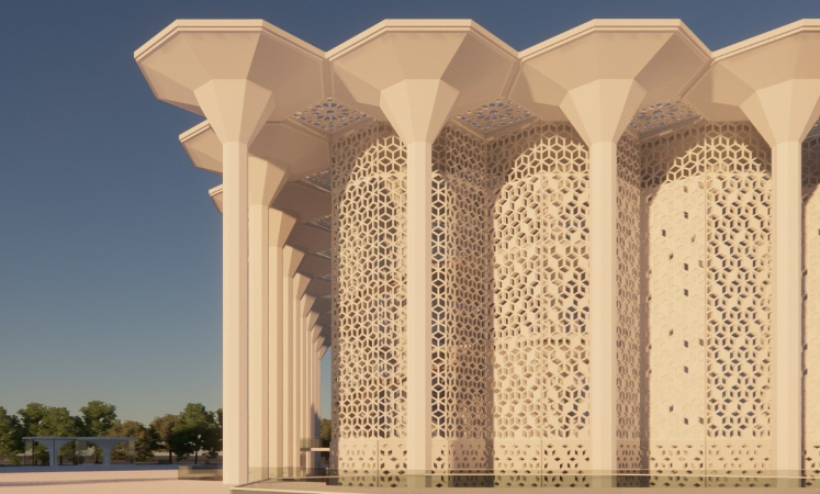
Preliminary design of the Cathedral Mosque in Kazan. The “concrete trees”
Copyright: © Ginzburg Architects


The Point of Convergence

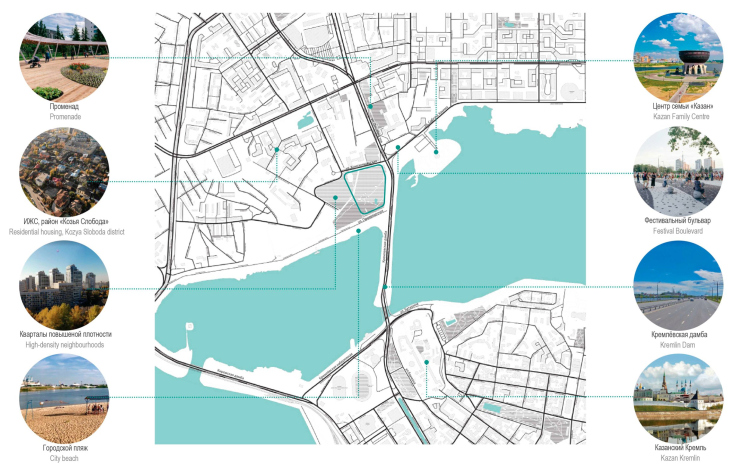
The location is extremely appropriate for a grand-scale project: the site is situated on the bank of the Kazanka River opposite from the Kremlin and next to the famous wedding palace, made in the shape of a cauldron bowl. The right bank of the Kazanka River is the modern part of the city with residential buildings and industrial estates, and, at the same time, it is a walking distance away from the historical center. This location on the bank is to be seen from many vantage points in the city, it is not encumbered by any surrounding construction – formerly, this site hosted an amusement park – and possesses such assets as water and trees. The area of eight plus hectares provides enough space for the building, the park, and a sufficient amount of infrastructure. 

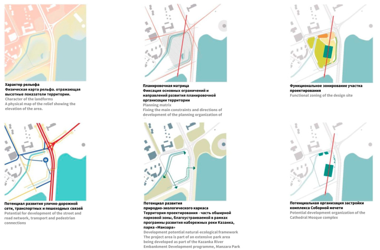
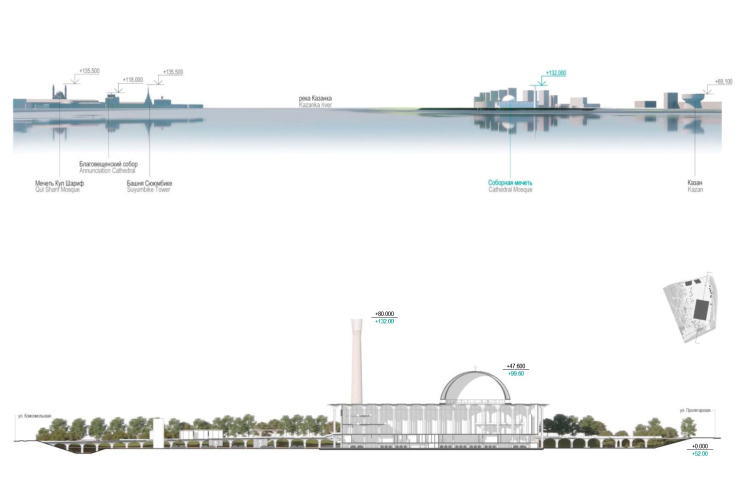
The only limitation of the site consists in the fact that it is sunk in respect to the level of the dam and the neighboring streets by 3 to 8 meters. According to the competition specifications, the height restriction for the new building is 80 meters; also, the contestants were to take into account the proximity of the historical and architectural ensemble of the Kazan Kremlin, a UNESCO protected site.

Preliminary design of the Cathedral Mosque in Kazan. The character of the environment
Copyright: © Ginzburg Architects


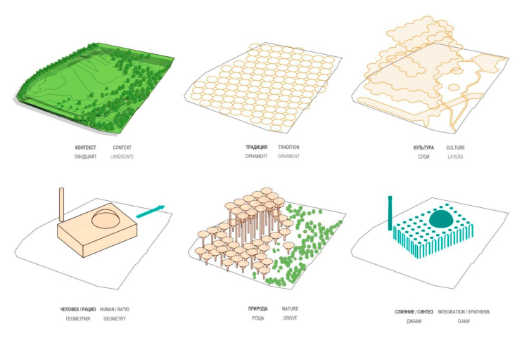
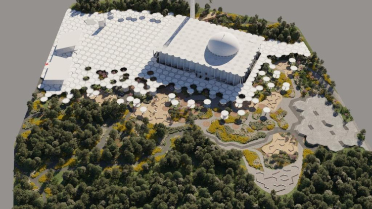
The architects place the mosque on a site free of trees, orienting it along the Qibla – the direction towards the Kaaba in Mecca.

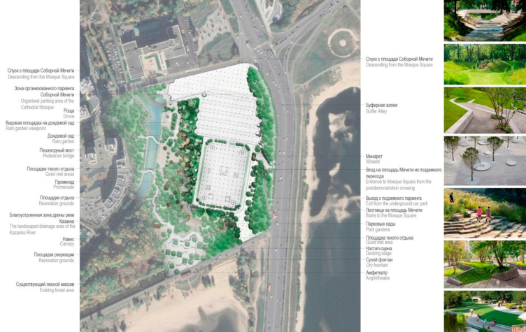
Preliminary design of the Cathedral Mosque in Kazan. Master plan
Copyright: © Ginzburg Architects


Preliminary design of the Cathedral Mosque in Kazan. The planning strategy
Copyright: © Ginzburg Architects


The Sacred Grove

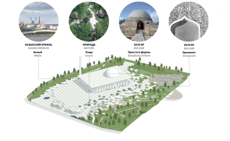
The authors of the winner concept drew inspiration from the history of Islam in Volga Bulgaria – a state that once existed in the Middle Volga region and the Kama Basin in the X–XIII centuries. 150 kilometers south of Kazan, there is a surviving complex of the buildings of its ancient capital – the city of Bulgar, which is also a UNESCO-protected site. It was here that the Volga Bulgarians, the ancestors of modern Kazan Tatars, adopted Islam back in 922. Laconic and simple, these impressive monuments of architecture prompted a composition of three simple shapes: the parallelepiped of the prayer hall, the hemisphere of the dome and the truncated cone of the minaret.

Preliminary design of the Cathedral Mosque in Kazan. The inspiring images
Copyright: © Ginzburg Architects


Preliminary design of the Cathedral Mosque in Kazan. The north facade
Copyright: © Ginzburg Architects


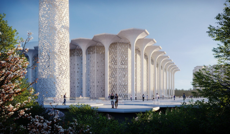
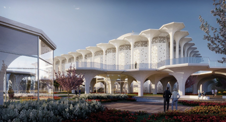
The key image of the complex is the white grove. On the one hand, it is a reference to the origins of Islam, to the times when the faithful prayed in sacred groves, installing mihrabs in them, on the other – a tribute to the natural riches of the Volga region. White is the color of the Kazan Kremlin and the leopard of Tatarstan’s coat of arms, the color that symbolizes purity of intentions. 

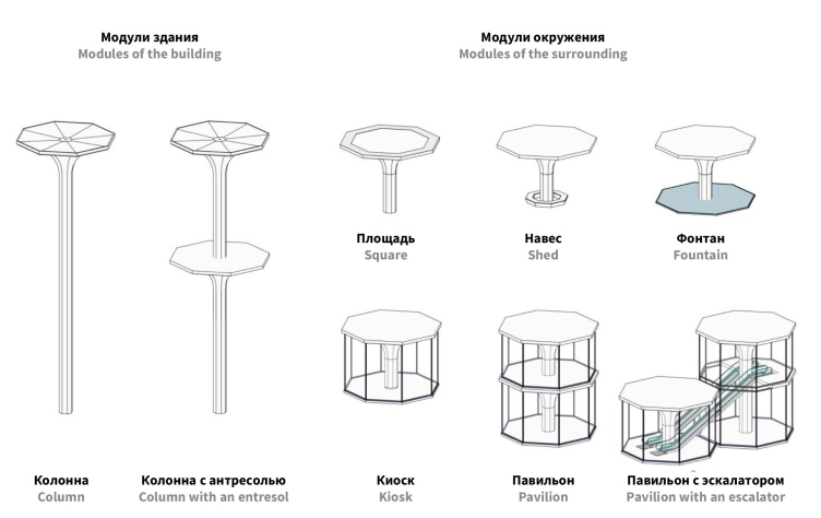
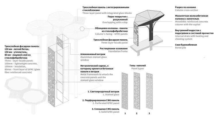
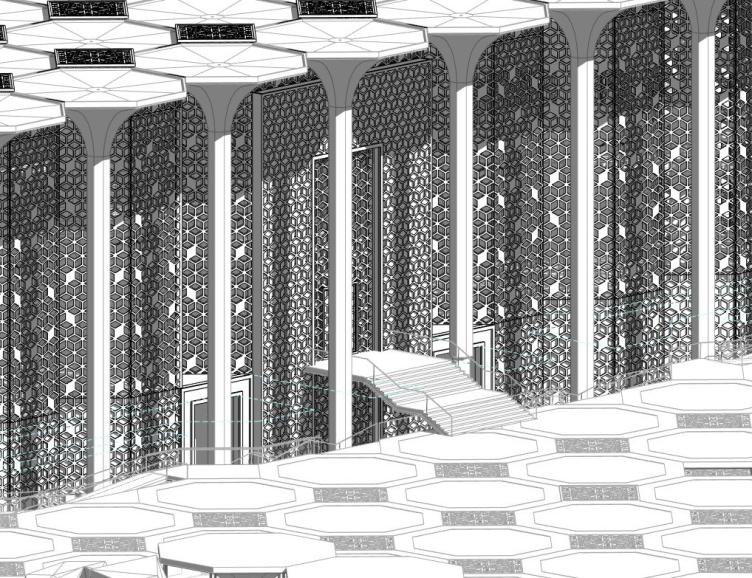
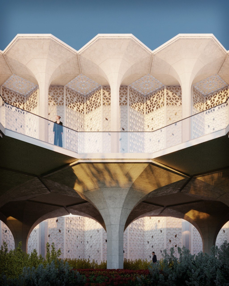
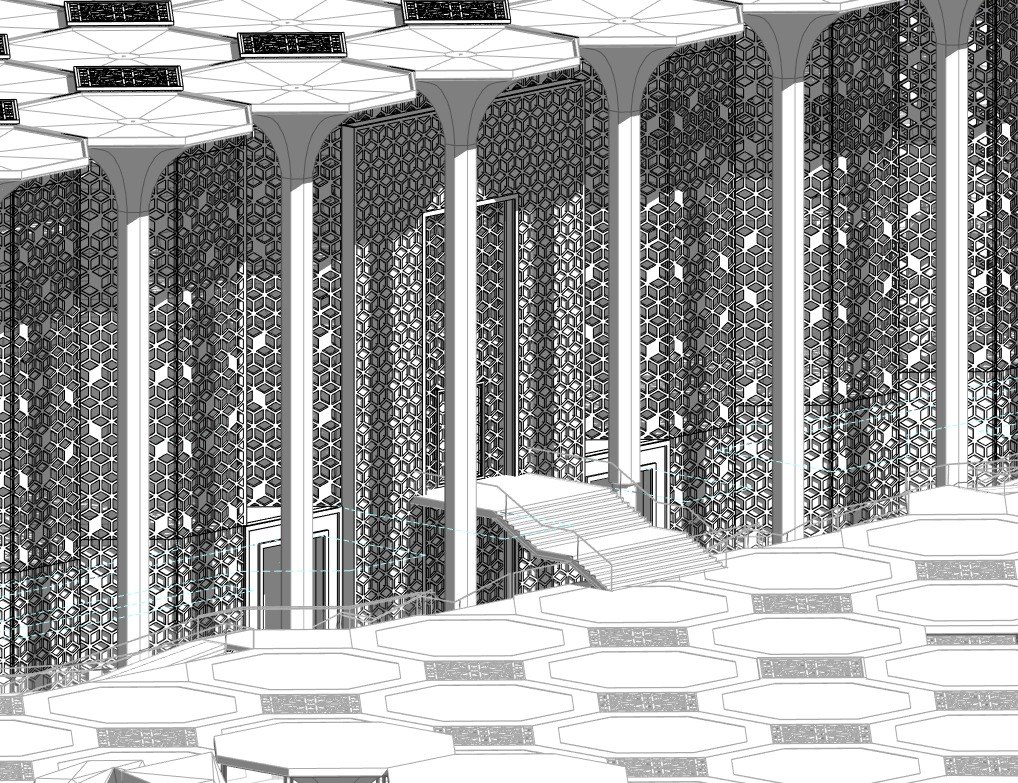
The mosque and the space around it are formed by “trees” – columns with eight-faceted crowns of the capitals. Essentially, these are modules, whose height depends upon the function of the specific space – the square, pavilion, fountain, or park. The tallest “trees” are linked to become the mosque itself. A similar principle can be traced in the Cathedral Mosque with a “forest of columns” in Cordoba.

Preliminary design of the Cathedral Mosque in Kazan. THe form making
Copyright: © Ginzburg Architects


Preliminary design of the Cathedral Mosque in Kazan. THe modular system
Copyright: © Ginzburg Architects


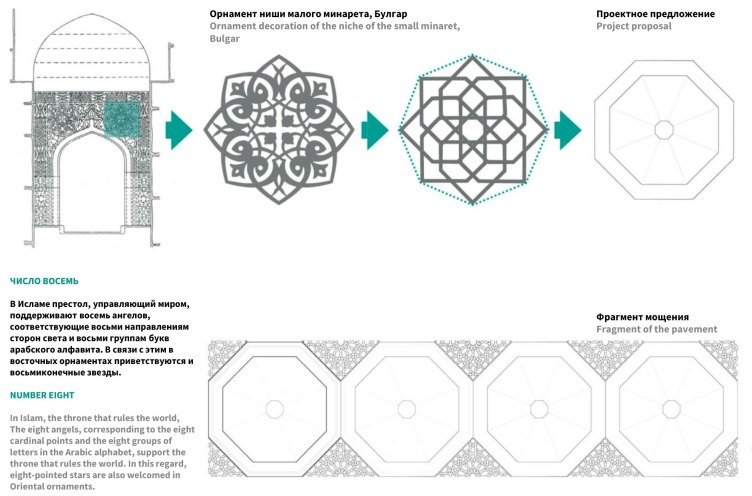
Another important part in the concept is played by the figure “8”: as the architects comment, “In Islam, the throne governing the world is supported by eight angels corresponding to the eight cardinal directions and eight groups of letters of the Arabic alphabet. In this regard, eight-pointed stars are also welcome in oriental ornaments.” The columns of the complex stand on the axes of the orthogonal grid that dissects the area around the mosque. The space between them is 922 cm, which reminds of the year Islam was adopted. 

Preliminary design of the Cathedral Mosque in Kazan. The Tatarstan ornament
Copyright: © Ginzburg Architects


Preliminary design of the Cathedral Mosque in Kazan. The structure
Copyright: © Ginzburg Architects


Light and Air

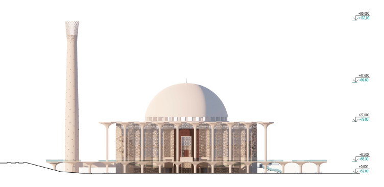
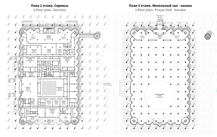
As we remember, the relief of the land site looks like a giant bowl. In order to make sure that the mosque is perceived from remote vantage points as standing on the ground, the architects decided to elevate the main bulk of the building to the level of the Komsomolskaya and Dekabristov streets. Immediately in front of the mosque, there is a parking lot for 600 cars with escalators, a lobby of the second floor, and the third floor hosts the prayer hall.

Preliminary design of the Cathedral Mosque in Kazan. The city panorama / cross-section on the land site
Copyright: © Ginzburg Architects


Preliminary design of the Cathedral Mosque in Kazan. The floor plans
Copyright: © Ginzburg Architects


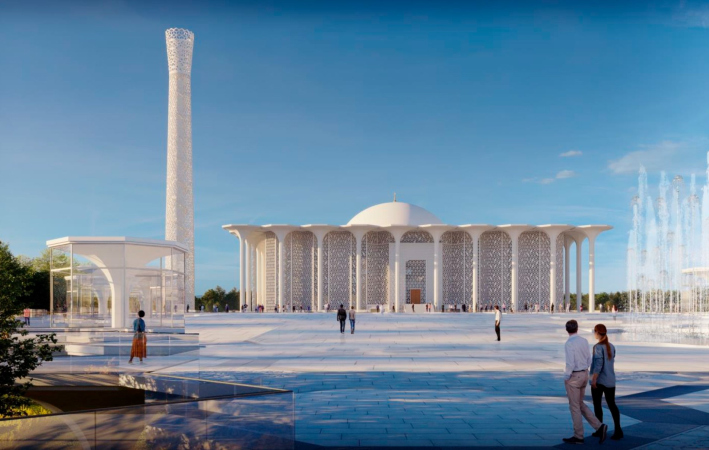
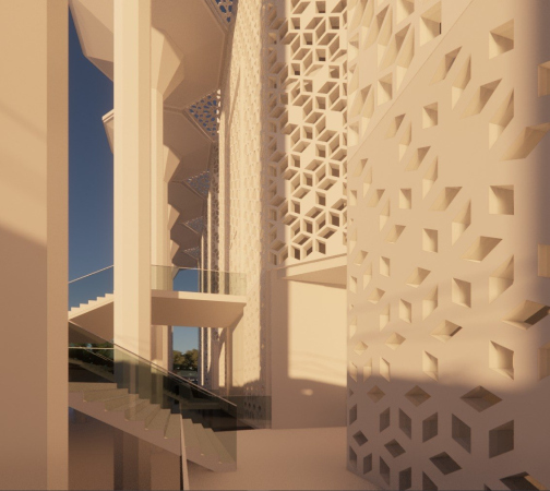
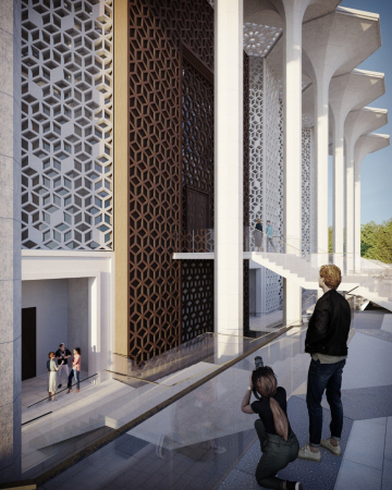
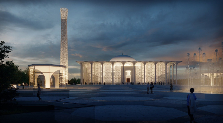
The walls of the mosque are executed from panels with ornament, partially filled with glass units, which makes it possible to adjust the amount of natural light inside the mosque. The north facade, where the main entrance is situated, is the most openwork and the most transparent one, through which you can see the outline of the lobby. The west and the east facades are not as transparent, and the south one has almost no openings in it since its central place is a prayer niche, a mihrab. Behind it, the architects placed two narrow windows, thanks to which a halo will appear around the mihrab on sunny days.

  • zooming
    1 / 5
    Preliminary design of the Cathedral Mosque in Kazan. The facades of the mosque
    Copyright: © Ginzburg Architects
  • zooming
    2 / 5
    Preliminary design of the Cathedral Mosque in Kazan
    Copyright: © Ginzburg Architects
  • zooming
    3 / 5
    Preliminary design of the Cathedral Mosque in Kazan
    Copyright: © Ginzburg Architects
  • zooming
    4 / 5
    Preliminary design of the Cathedral Mosque in Kazan
    Copyright: © Ginzburg Architects
  • zooming
    5 / 5
    Preliminary design of the Cathedral Mosque in Kazan
    Copyright: © Ginzburg Architects


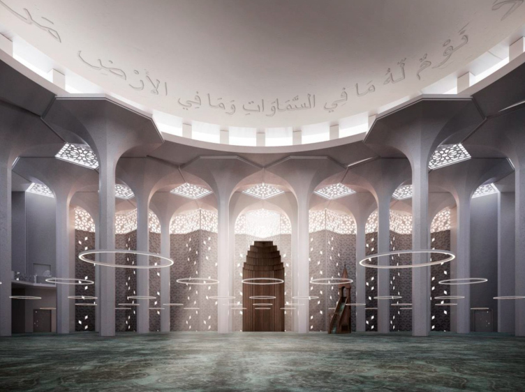
The hemisphere of the dome with a 20-meter radius, decorated with a calligraphic script of quotations from the Koran, is raised on special stands, so it looks as though it hovers over the prayer hall.

Preliminary design of the Cathedral Mosque in Kazan. The interior of the main hall
Copyright: © Ginzburg Architects


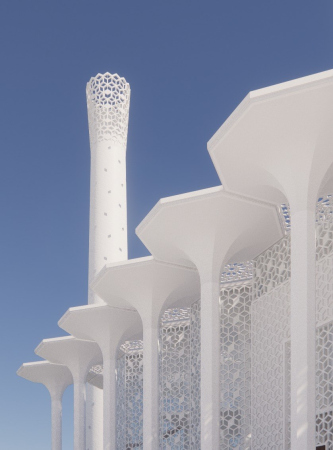
The height of the minaret reaches the 80 allowed meters (132 meters from the actual ground surface). Its walls are made of fiberglass and repeat the ornament of the main facades of the mosque. Towards the top, where the minaret expands in an unusual way, resembling an opening flower, the walls become ever more transparent, dissolving in the daylight and brightly lit at night. The minaret is linked to the main building with an underpass, while the staircase and the elevator make it possible to use it as a viewing platform as well.

Preliminary design of the Cathedral Mosque in Kazan. The evening lights
Copyright: © Ginzburg Architects


Preliminary design of the Cathedral Mosque in Kazan.
Copyright: © Ginzburg Architects


The Man-Made and Natural 

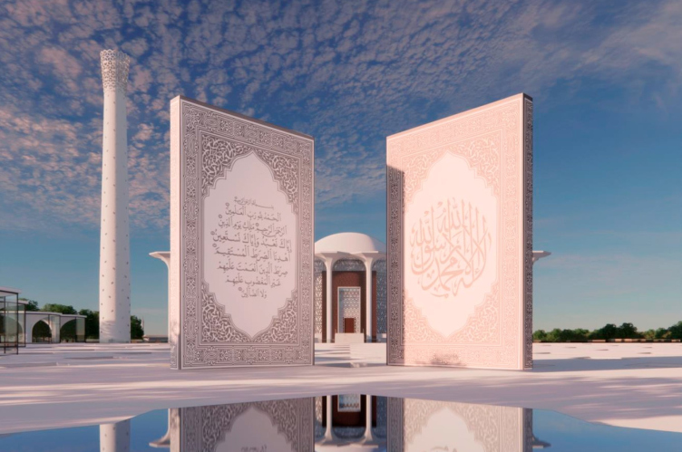
The space in front of the mosque is divided into two parts. The minor plaza with a wide grand staircase leads people to the complex. The major plaza is intended for the congregations of worshippers on religious holidays. The two spaces are divided by monumental steles that symbolize the first printed Quran in Russia, as well as by a man made pond with a fountain.

Preliminary design of the Cathedral Mosque in Kazan. The entrance to the square
Copyright: © Ginzburg Architects


Preliminary design of the Cathedral Mosque in Kazan
Copyright: © Ginzburg Architects


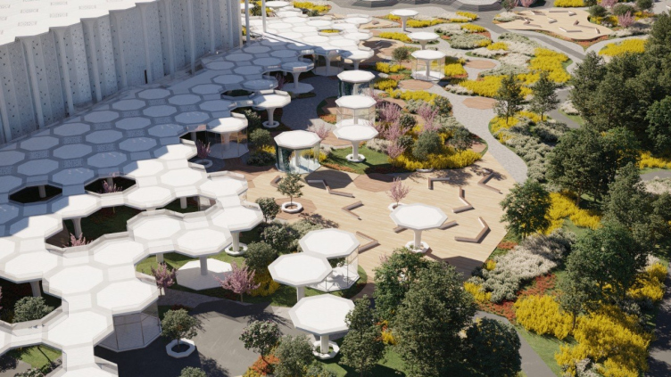
The plaza, just as the roof of the mosque, is composed of large octagons – the capitals of the columns linked by punctured squares, through which natural light penetrates to the lower level of the space, where pavilions, fountains, flowerbeds, and pedestrian walks are situated, protected from rain or summer heat. The further away from the mosque, the less dense the “stone grove” becomes. Gradually, it gives way to the natural landscape of the park, which, in turn, gives way to natural forestland on the outside perimeter.

Preliminary design of the Cathedral Mosque in Kazan
Copyright: © Ginzburg Architects


Preliminary design of the Cathedral Mosque in Kazan
Copyright: © Ginzburg Architects


Preliminary design of the Cathedral Mosque in Kazan
Copyright: © Ginzburg Architects


Along the Komsomolskaya Street, where one of the main entrances to the square is situated, the public buildings form the city front. The other boundaries of the land site are formed by natural obstacles – trees, hedges, the terrain, and the Proletarskaya dam.

Preliminary design of the Cathedral Mosque in Kazan. The landscape design
Copyright: © Ginzburg Architects


The authors of the concept strived to create a space, in which the magnitude of nature and human spirit would be united. Taking roots in the ground and growing from it, the man-made space gradually converges, becoming architecture that connects people and invites them to prayer and peace in their souls.

Preliminary design of the Cathedral Mosque in Kazan. The concrete trees
Copyright: © Ginzburg Architects


We will note that on the day the results were announced, two winners were named – the other first place in the competition was scored by Kazan architect Aidar Sattarov, who proposed the project in the form of Noah’s Arc. Reportedly, the decision was made by the President of Tatarstan Rustam Minnikhanov, the state councilor of the republic Mintimer Shaimiev and the head of the Ministry of Construction Irek Fayzullin behind closed doors, and the meeting lasted for more than two hours. Now it is not very clear whether the two winning projects will be “combined” or whether just one will be ultimately chosen.

There were also two second places: the Istanbul HASSA and the Sretensky Architectural Studio from Moscow, and the third – the Kazan studio OSTA. We hope that we will be able to cover all the winners of the competition in the foreseeable future.

13 July 2022

Headlines now
The Golden Crown
The concept for a dental clinic in Yekaterinburg, developed by CNTR Studio, revolves around the idea of a “mouth full of gold”: pristine white porcelain stoneware walls are complemented by matte brass details. To avoid an overly literal interpretation, the architects focused on the building’s proportions, skillfully navigating between sunlight requirements and fire safety regulations.
Flexibility and Integration
Not long ago, we covered the project for the fourth phase of the ÁLIA residential complex, designed by APEX. Now, we’ve been shown different fence concepts they developed to enclose the complex’s private courtyards, incorporating a variety of public functions. We believe that the sheer fact that the complex’s architects were involved in such a detail as fencing speaks volumes.
A Step Forward
The HIDE residential complex represents a major milestone for ADM architects and their leaders Andrey Romanov and Ekaterina Kuznetsova in their quest for a fresh high-rise aesthetic – one that is flexible and layered, capable of bringing vibrancy to mass and silhouette while shaping form. Over recent years, this approach has become ADM’s “signature style”, with the golden HIDE tower playing a pivotal role in its evolution. Here, we delve into the project’s story, explore the details of the complex’s design, and uncover its core essence.
Gold in the Sands
A new office for a transcontinental company specializing in resource extraction and processing has opened in Dubai. Designed by T+T Architects, masters of creating spaces that are contemporary, diverse, flexible, and original, this project exemplifies their expertise. On the executive floor, a massive brass-clad partition dominates, while layered textures of compressed earth create a contextually resonant backdrop.
Layers and Levels of Flight
This project goes way back – Reserve Union won this architectural competition at the end of 2011, and the building was completed in 2018, so it’s practically “archival”. However, despite being relatively unknown, the building can hardly be considered “dated” and remains a prime example of architectural expression, particularly in the headquarters genre. And it’s especially fitting for an aviation company office. In some ways, it resembles the Aeroflot headquarters at Sheremetyevo but with its own unique identity, following the signature style of Vladimir Plotkin. In this article, we take an in-depth look at the United Aircraft Corporation (UAC) headquarters in the Moscow agglomeration town of Zhukovsky, supplemented by recent photographs from Alexey Naroditsky – a shoot that became only recently possible due to the fact that improvements were finally made in the surrounding area.
Light and Shadow
In this article, we delve into the architectural design of the “Chaika” house by DNK ag architects, which was recently completed in 2023 as part of the collection of signature designs at ZILArt. As is well-known, all the buildings in this complex follow a design code, yet each one is distinct. This particular building stands out not only for its whiteness and minimalism but also for the refined use of a limited number of techniques that, together, create what can confidently be called synergy.
Casus Novae
A master plan was developed for a large residential area with a name of “DNS City”, but now that its implementation began, the plan has been arbitrarily reformatted and replaced with something that, while similar on the surface, is actually quite different. This is not the first time such a thing happens, but it’s always frustrating. With permission from the author, we are sharing Maria Elkina’s post.
Treasure Hunting
The GAFA bureau, in collaboration with Tegola and Arkhitail, organized an expedition to the island of Kilpola in Karelia as part of Moskomarkhitektura’s “Open City” festival. There, amidst moss and rocks, the students sought answers to questions like: what is the sacred, where does it dwell, and what sustains it? Assisting the participants in this quest were landscape engineer Evgeny Levin, artist Nicholas Roerich, a moose, and the lack of cellular connection. Here’s how the story unfolded.
Depths of the Earth, Streams of Water
In the Malaya Okhta district, the Akzent building, designed by Stepan Liphart, was constructed. It follows a classic tripartite structure, yet it’s what you might call “hand-drawn”: each façade is unique in its form and details, some of which aren’t immediately noticeable. In this article, we explore the context and, together with the architect, delve into how the form was developed.
Fir Tree Dynamics
The “Airports of Region” holding is planning to build an airport in Karachay-Cherkessia, aiming to make the Arkhyz and Dombay resorts more accessible to travelers. The project that won in an invitation-only competition, submitted by Sergey Nikeshkin’s KPLN, blends natural imagery inspired by the shape of a conifer seed, open-air waiting spaces, majestic large trees, and a green roof elevated on needle-like columns. The result is both nature-inspired and WOW.
​A Brick Shell
In the process of designing a clubhouse situated among pine trees in a prestigious suburban area near Moscow, the architectural firm “A.Len” did the façade design part. The combination of different types of brick and masonry correlates with the volumetric and plastique solutions, further enhanced by the inclusion of wood-painted fragments and metal “glazing”.
Word Forms
ATRIUM architects love ambitious challenges, and for the firm’s thirtieth anniversary, they boldly play a game of words with an exhibition that dives deep into a self-created vocabulary. They immerse their projects – especially art installations – into this glossary, as if plunging into a current of their own. You feel as if you’re flowing through the veins of pure art, immersed in a universe of vertical cities, educational spaces – of which the architects are true masters – and the cultural codes of various locations. But what truly captivates is the bold statement that Vera Butko and Anton Nadtochy make, both through their work and this exhibition: architecture, above all, is art – the art of working with form and space.
Flexibility and Acuteness of Modernity
Luxurious, fluid, large “kokoshniks” and spiral barrel columns, as if made from colorful chewing gum: there seem to be no other mansion like this in Moscow, designed in the “Neo-Russian-Modern” style. And the “Teremok” on Malaya Kaluzhskaya, previously somewhat obscure, has “come alive with new colors” and gained visibility after its restoration for the office of the “architectural ecosystem” as the architects love to call themselves. It’s evident that Julius Borisov and the architects at UNK put their hearts into finding this new office and bringing it up to date. Let’s delve into the paradoxes of this mansion’s history and its plasticity. Spoiler: two versions of modernity meet here, both balancing on the razor’s edge of “what’s current”.
Yuri Vissarionov: “A modular house does not belong to the land”
It belongs to space, or to the air... It turns out that 3D printing is more effective when combined with a modular approach: the house is built in a workshop and then adapted to the site, including on uneven terrain. Yuri Vissarionov shares his latest experience in designing tourist complexes, both in central Russia and in the south. These include houseboats, homes printed from lightweight concrete using a 3D printer, and, of course, frame houses.
​Moscow’s First
“The quality of education largely depends on the quality of the educational environment”. This principle of the last decade has been realized by Sergey Skuratov in the project for the First Moscow Gymnasium on Rostovskaya Embankment in the Khamovniki district. The building seamlessly integrates into the complex urban landscape, responding both to the pedestrian flow of the city and the quiet alleyways. It skillfully takes advantage of the height differences and aligns with modern trends in educational space design. Let’s take a closer look.
Looking at the Water
The site of Villa Sonata stretches from the road to the water’s edge, offering its own shoreline, pier, and a picturesque river panorama. To reveal these sweeping views, Roman Leonidov “cut” the façade diagonally parallel to the river, thus getting two main axes for the house and, consequently, “two heads”. The internal core – two double-height spaces, a living room and a conservatory, with a “bridge” above them – makes the house both “transparent” and filled with light.
The White Wing
Well, it’s not exactly white. It’s more of a beige, white-stone structure that plays with the color of limestone – smoother surfaces are lighter, while rougher ones are darker. This wing unites various elements: it absorbs and interprets the surrounding themes. It responds to everything, yet maintains a cohesive expression – a challenging task! – while also incorporating recognizable features of its own, such as the dynamic cuts at the bottom, top, and middle.
Urban Dunes
The XSA Ramps team designed and built a three-part sports hub for a park in Rostov-on-Don, welcoming people of all ages and fitness levels. The skate plaza, pump track, and playground are all meticulously crafted with details that attract a diverse range of visitors. The technical execution of the shapes and slopes transforms this space into a kind of sculptural composition.
Proportional Growth
The project for the fourth phase of the ÁLIA residential area has been announced. The buildings are situated on an elongated plot – almost a “ray” that shoots out from the center of the area towards the river. Their layout reflects both a response to Moscow’s architectural preferences over the past 15 years, shifting “from blocks to towers”, and an interpretation of the neighboring business park designed by SOM. Additionally, the best apartments here are not located at the very top but closer to the middle, forming a glowing “waistline”.
The “Staircase” Building
In designing the “Details” residential complex in New Moscow, Rais Baishev spiced up the now-popular Moscow theme of a “courtyard” building with an idea drawn from the surrealist drawings by Maurits Escher. He envisioned the stepped silhouettes and descending slopes as a metaphysical mega-staircase, creating a key void within the courtyard that gave the project an internal “spine”. This concept is felt both in the building’s silhouette and on its façades.
Projection of the Quarter
No one doubted that the building that Vladimir Plotkin designed as part of the “Garden Quarters” would be the most modernist of all. And it turned out just that way: while adhering to the common design code, the building successfully combines brick and white stone, rhythmically responding to the neighboring building designed by Ostozhenka, yet tactfully and persistently making a few statements of its own. This includes the projection of the ideal urban development composition “14–9–6”, which can be found right next door, mathematical calculations, including those for various types of terraces (and perhaps the only reminder of the Soviet past of the Kauchuk rubber factory!), and the white “cross-stitch” pattern of the façade grid.
Domus Aurea
In this issue, we examine the “Tessinsky-1” house, designed by Sergey Skuratov and completed in 2023. Located in the middle of the Serebryanicheskaya Embankment district, at the intersection of its main streets, this house assumes a sort of “nodal” role: it not only responds to everything around it and preserves many memories of the former EMA factory within itself, but it weaves all this into a newly directed pattern, reconciling bright “gold” and dark-colored brick, largely with the help of the new, modern-yet-archaic Columba brick, which, come to think about it, is the most precious element here.
The Chimney of Nikola-Lenivets
In this issue, we are examining the “Obelisk House” designed by KATARSIS and built for the Arkhstoyanie 2023 festival. However, it was only finished later on, and this is why we are examining it now. It seems to us that after the “Obelisk House” appeared in Nikola-Lenivets, a dialogue and a few inner connections appeared between the temporary structures built here. These houses no longer look like “accidental neighbors”, more of which below.
​Periscope by the Bay
The jury awarded the second place in the competition for a public and cultural center in Petropavlovsk-Kamchatsky to the companies GORA (“Mountain”) and M4. In the consortium’s proposal, the building resembles a sperm whale with a calf swimming next to it or a periscope, whose lenses capture the most spectacular views from the surrounding landscape.
From Arcs to Dolmens
While working on the competition project for Petropavlovsk-Kamchatsky, ASADOV Architects prioritized the value of the natural and urban environment, aiming to preserve the balance of the location while minimizing the resemblance of the volume that they designed to a “traditional building”. The task was challenging, and the architects created three versions, one of which having been developed after the competition, where their main proposal took third place. However, the point of interest here is not the competition result but the continuity of creative thinking.
Hide and Seek
The ID Moskovskiy house, designed by Stepan Liphart in St. Petersburg, in the courtyards near Moskovskiy Avenue beyond the Obvodny Canal and recently completed, is notable for several reasons. Firstly, it has been realized with considerable accuracy, which is particularly significant as this is the first building where the architect was responsible not only for the facades but also for the layouts, allowing for better integration between the two. On the other hand, this building is interesting as an example of the “germination” of new architecture in the city: it draws on the best examples from the neighborhood and becomes an improved and developed sum of ideas found by the architect in the surrounding context.
The Big Twelve
Yesterday, the winners of the Moscow Mayor’s Architecture Award were announced and honored. Let’s take a look at what was awarded and, in some cases, even critique this esteemed award. After all, there is always room for improvement, right?
Above the Golden Horn
The residential complex “Philosophy” designed by T+T architects in Vladivostok, is one of the new projects in the “Golubinaya Pad” area, changing its development philosophy (pun intended) from single houses to a comprehensive approach. The buildings are organized along public streets, varying in height and format, with one house even executed in gallery typology, featuring a cantilever leaning on an art object.
Nuanced Alternative
How can you rhyme a square and space? Easily! But to do so, you need to rhyme everything you can possibly think of: weave everything together, like in a tensegrity structure, and find your own optics too. The new exhibition at GES-2 does just that, offering its visitor a new perspective on the history of art spanning 150 years, infused with the hope for endless multiplicity of worlds and art histories. Read on to see how this is achieved and how the exhibition design by Evgeny Ace contributes to it.
Blinds for Ice
An ice arena has been constructed in Domodedovo based on a project by Yuri Vissarionov Architects. To prevent the long façade, a technical requirement for winter sports facilities, from appearing monotonous, the architects proposed the use of suspended structures with multidirectional slats. This design protects the ice from direct sunlight while giving the wall texture and detail.