По-русски

The Takeoff of a Multifunctional Approach

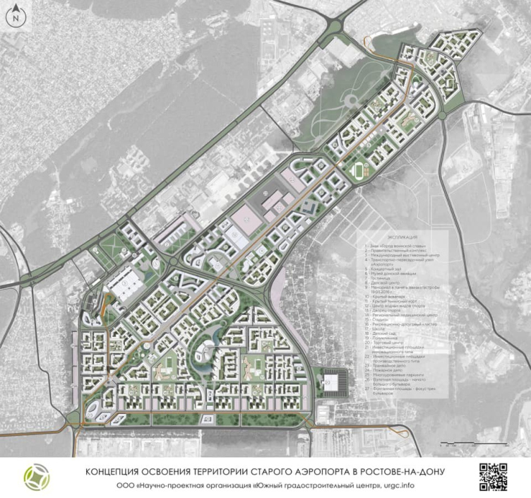
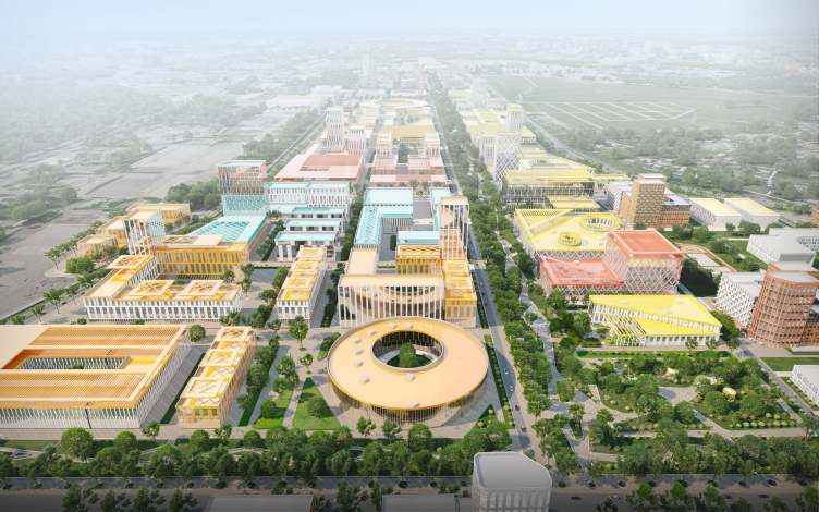
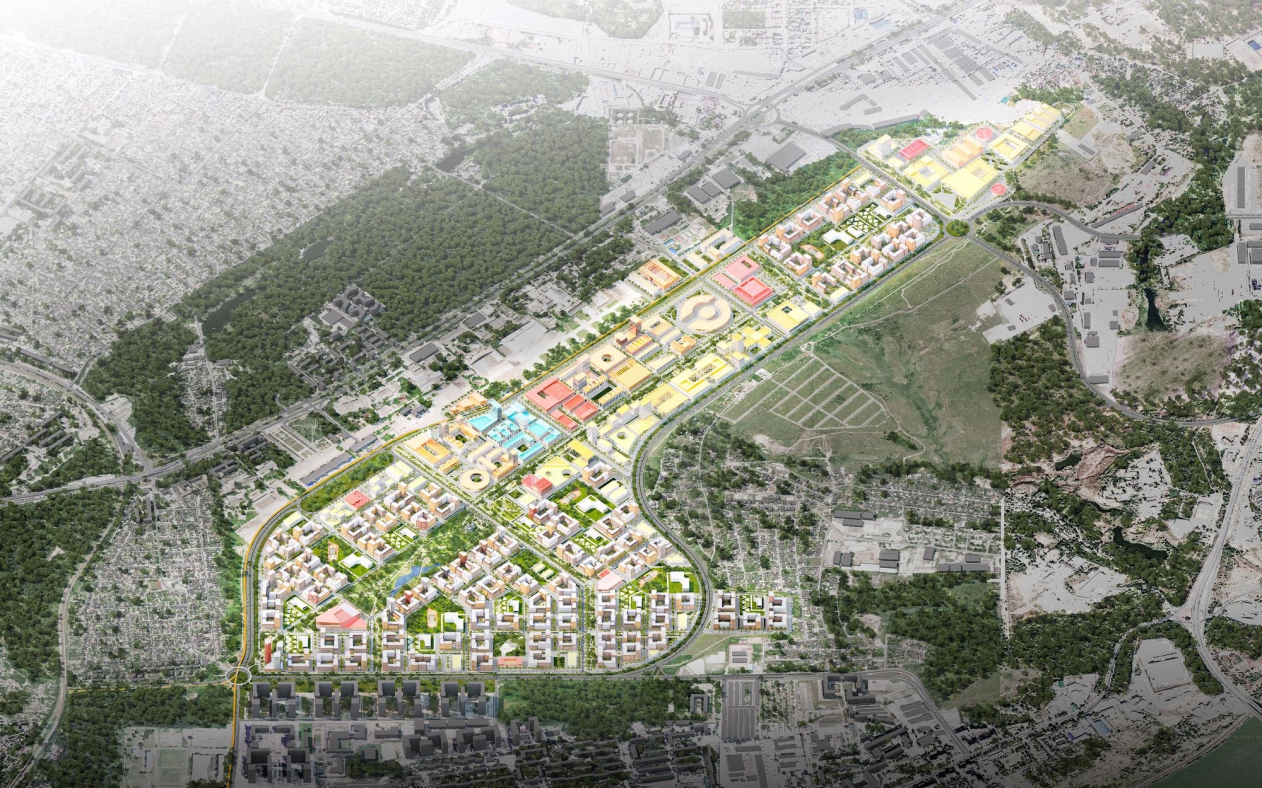
ASADOV architects presented a concept of developing the old airport in Rostov-on-Don. A four kilometer long boulevard stretching in the stead of the former runway and the block housing, multiplied by a wide range of business and public functions, possibly including the governmental one, will allow this area to claim the role of a new attraction point with a high level of self-sufficiency.

27 June 2022
Object
mainImg
The idea of renovating the territory of Rostov-on-Don’s old airport was in the air for more than ten years – since the day that the city received the right to host the games of the World Soccer Championship 2018. Already then it was clear that once the modern Platov airport would be put into operation, the territory of the old airport, situated significantly closer to the developed part of the city – it is 6.4 kilometers away from the Government Building but a whopping 35 kilometers away from Platov – will become a good greenfield venue for new construction and all-rounded development. Its area is about 360 hectares, which is comparable to Moscow’s Skolkovo.

One of the first concepts for developing the territory was prepared by the French architect Anthony Bechu, then the work was joined by Aleksey Polyansky, while the “South Town Planning Center”, headed by Sergey Trukhachev, initiated an alternative project and presented it to the public.

The concept of development of the territory of the old airport in Rostov-on-Don
Copyright: © “NGO Southern Urban Development Center”


In addition, recommendations for the strategy of development and construction density were given by ДОМ.рф, and the “construction set” for the mid-rise blocks, close in scale to a historical city, was taken from the arsenal of one of the Russian construction companies that successfully tested it in other regions. 

All these projects and concepts were studied and considered, and the proposals that they had in them were taken into account by ASADOV architects who started working on their own proposal for the territory of the old Rostov-on-Don airport in 2021. One must note that ASADOV architects do have a relevant expertise in this area – specifically, the architects not only designed the new Saratov airport but also worked on the concept of subsequent development of the territory of the old airport in the same city.

Aerocity. The concept of development of the territory of the old airport in Rostov-on-Don
Copyright: © ASADOV architects


Aerocity. The concept of development of the territory of the old airport in Rostov-on-Don
Copyright: © ASADOV architects


A Multi-City

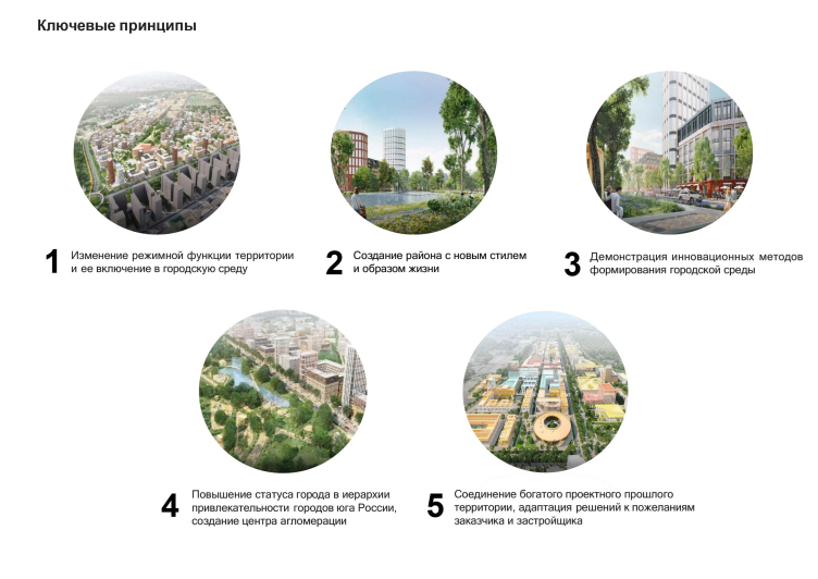
The main feature of the new district, inherited from the preceding concepts and supported by the city administration is that it must by no means become a “sleeping belt” neighborhood. The public buildings and offices – of remarkably different character, up to the government center, where, so far hypothetically, the city administration could reside – occupy almost as much space as the housing stock. The “Aerocity” district is meant to become the new center of attraction, and the driver of developing the multi-centric character of the city.

The concept of the old airport is being formed not as just another Liventsovka 3.0 residential area, but as a new social and business center for the Rostov agglomeration. Yes, it will have a residential function, but this area is not only for those who will live in it. That is why the planned volume of housing stock on the territory of the old airport is at least one and a half times less than in the new residential areas.


This area, of course, has never been considered as an exclusively residential area. Rather, it must become a new social and administrative center of the city, which could take over part of the functions of the central part of the city, thus relieving it. This area must also carry some new functions that would strengthen the position of Rostov as the capital of the Southern Federal District.


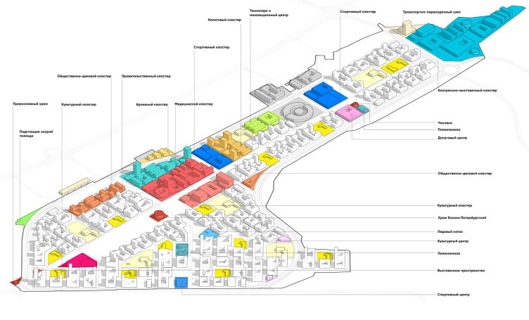
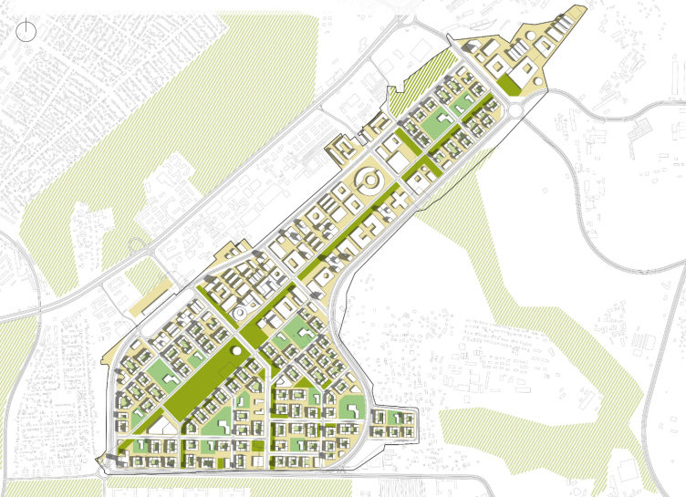
To a certain extent, the placement of public and business functions was prompted by the specifics of this area: its wider part is situated south, closer to the developed areas, while higher up towards northeast lies an elongated triangle. In the middle, the north border is adjoined by an industrial park that requires 300m of protection area – meaning, you cannot build housing stock here, but you can indeed build administrative and public buildings. Hence, the maximum of multifunctionality is concentrated in the middle part of the territory, forming a “waist” of sorts. In the north end, there is a triangle of the congress and exhibition center.

Aerocity. The concept of development of the territory of the old airport in Rostov-on-Don
Copyright: © ASADOV architects


Multifunctional cultural, sports and business part. Aerocity. Multifunctional cultural and business part. The concept of building the territory of the old airport in Rostov-on-Don
Copyright: © ASADOV architects


Meanwhile, this solution, definitely correct, in addition to the reasons of technical nature and the goodwill of the city administration, has two other interesting features. One – the area is not just filled with offices in addition to housing, but really, in the good way, can function as a small city within itself – which totally falls in both with the rule of modern urban planning and with the original conditions: the giant scale of the territory, its near-complete freedom of any preceding development, and the lucky position next to the “nearest satellite”, the highly developed part of Rostov.

In addition to the governmental center, the tax agency and office buildings, the multifunctional “waist” also has in it: a technology park / innovation center, a sports, a medical, a cultural center, and even an archive cluster. The center of the wide southern, mostly residential, part will be a cultural cluster with a choreographic school and an anchor in the form of a concert hall – a kind of response to the convention and exhibition center located in the north.

Aerocity. The concept of development of the territory of the old airport in Rostov-on-Don. The functional plan.
Copyright: © ASADOV architects


The southern part, predominantly residential, will be centered around a cultural cluster with a choreographic school and the “anchor” of the concert hall – something like a response to the northern convention and exhibition center.

The European Quarters

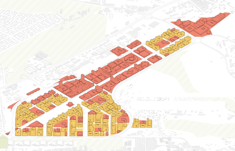
Meanwhile, in addition to the diversity of the program, which was, after all, was specified in the brief, the ASADOV architects tried to distribute the land sites as much as possible in such a way as to avoid mono-functionality – specifically, they tried to “inject” the residential function, mostly hotels, into the central business part.

Aerocity. The concept of development of the territory of the old airport in Rostov-on-Don. The ratio of the housing and bisiness/public functions
Copyright: © ASADOV architects


The same task is solved the concert and exhibition halls placed more to the south, and, of course, fitness centers, schools and medical facilities, as well as the rent-out outside contours of the ground floors of the residential blocks, most of which are concentrated in the wide south area, and are meant to be built first because it is also necessary to provide economic support for the project through the sale of housing.

There is a clear residential and public area on the territory, but it was important for us to mix the functions, introducing elements of the social structure into the housing, and vice versa. Separate sports and cultural facilities are evenly integrated into the residential blocks, and infrastructure was also placed in the first floors of houses, by analogy with the Moscow renovation program – this automatically enlivens the streets and makes them feel habitable. For renovation, by the way, when we made a competitive project, together with economists we calculated the optimal ratio of residential and non-residential functions in the city. The optimal proportion turned out to be 80 percent of housing and 20 percent of infrastructure. This 20 percent is enough for all able-bodied residents of the grounds to have jobs – in the service sector, in coworking spots or small office spaces. In the Rostov project, at the expense of all public facilities, this ratio is higher – 60 to 40 – which will provide additional jobs to adjacent areas and automatically relieve the city center.


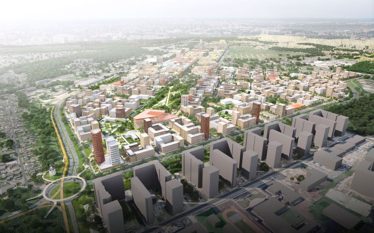
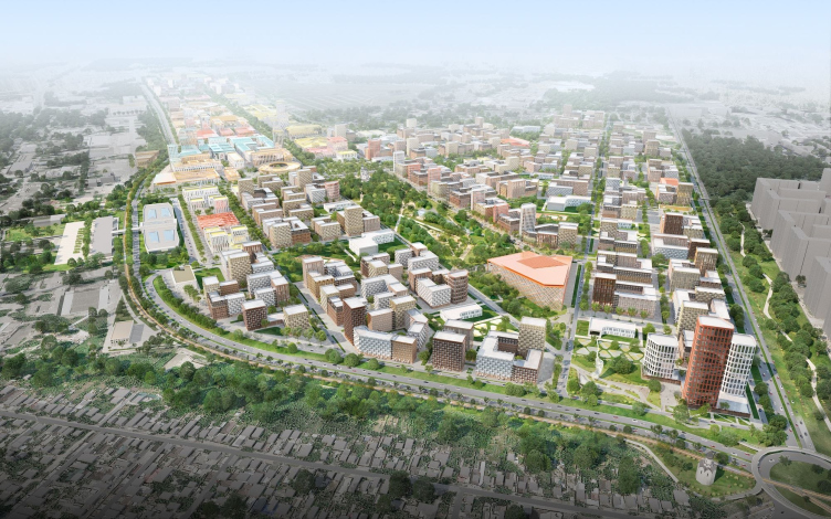
Yet another feature of the designed construction, mostly residential, is the city-block typology and small numbers of floors ranging from 6 to 10, interspersed with high-rise accents. Nearby, along the Berberovskaya Street, stands Veresaevo housing complex 20 stories high – while the new Aerocity district is offering an alternative from the field of new urbanism and modern trends: relatively small closed-perimeter blocks, car-free yards, and sections of different colors and different heights for better facade diversity. Such an approach is close to the ASADOV architects – but it was also set by the standards issued by Strelka and ДОМ.рф, as well as the developer’s “construction” set that was offered to the architects for their work. “As a matter of fact, one of our tasks was adapting the ДОМ.рф construction standards to the unique conditions of this specific site – Andrey Asadov shares – And the task was far from easy due to the large number of various restrictions; a painstaking work on detailing was required. But it was fun as well.”

View from the south, on the 1st plan – the residential complex “Veresaevo”. Aerocity. The concept of building the territory of the old airport in Rostov-on-Don
Copyright: © ASADOV architects


Aerocity. The concept of development of the territory of the old airport in Rostov-on-Don
Copyright: © ASADOV architects


The new houses are intended to house almost 57 thousand people. The social infrastructure will include seven kindergartens, six schools, a few outpatient facilities and an ambulance station.

The linear park: from “agora” to the park (and temple)

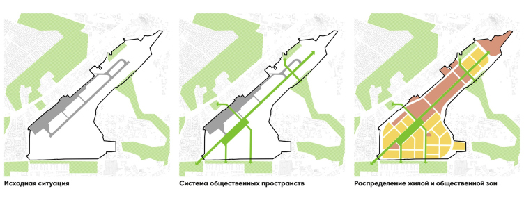
All the concepts for developing the territory of Rostov-on-Don’s old airport are ultimately united by one common solution – the idea of turning the former runway into a pedestrian area, the main axis that will tie in the string of public spaces and residential blocks. There are several reasons for that, chief of them being that dismantling a runway is a very expensive thing to do – it was kept even at Moscow’s Khodynka.

Aerocity. The concept of development of the territory of the old airport in Rostov-on-Don
Copyright: © ASADOV architects


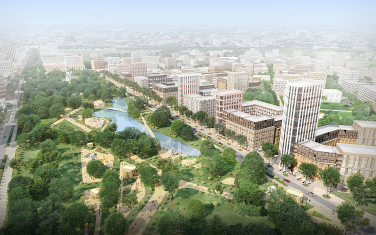
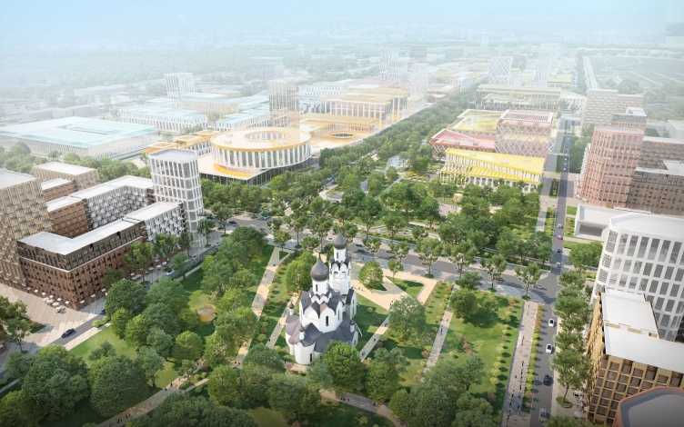
In addition, any new area needs, of course, a public axis – a spatial “backbone” capable of tying in the entire territory. In the project, the main boulevard is about 4 kilometers long; it starts in the northeast part from the convention center and leads in a perfectly straight line southwest, towards the “pivot” of the road junction that connects the territory to the developed part of the city. Three kilometers out of these four are heavy concrete slabs, dismantling which would be extremely problematic, but if you keep them as is, they will turn the public axis into a “concrete desert”. To avoid this, the architects proposed to treat the runway as an operated roof, and liven it up – not the entire length but at least some fragments – in accordance with the “green roof” principle. On the concrete field, the architects placed green islands, pavilions, and landscaping elements. Above the ring of the southern junction, there is a duplicate pedestrian ring with ramps running in different directions, which is meant to improve the connection with the city.

Aerocity. The concept of development of the territory of the old airport in Rostov-on-Don
Copyright: © ASADOV architects


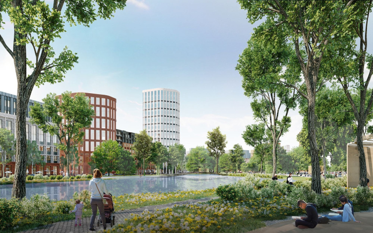
In the wider – and predominantly residential – part, the boulevard is adjoined by a park. The architects compare it to the Central Park in New York: it is rectangular, and there will be a pond in the middle. The park was also there in the “alternative” project by Sergey Trukhachev, but it was carried more to the south. Now this park is a large-scale widening of the boulevard, the nucleus of the territory, and the vestibule of the concert hall, which is located on the southern end of the green rectangle. Its northern side stops against the Temple of Xenia of St. Petersburg; there will be yet another temple of a smaller size standing next to the automotive/pedestrian junction, and a chapel in the northern part of the grounds. Hence, the architects jokingly call the axis boulevard “a road from agora (whose role is played by the congress center) to the temple.

Aerocity. The concept of development of the territory of the old airport in Rostov-on-Don
Copyright: © ASADOV architects


Aerocity. The concept of development of the territory of the old airport in Rostov-on-Don
Copyright: © ASADOV architects


The “affluents” of the green boulevard penetrate into the depth of the quarters, entwining the entire district in a network of leisure and recreational spaces. The boulevard is crossed by seven traversal drives, and yet another parallel drive duplicates it along its entire length.

The concept developed by ASADOV architects was approved by the governor council; on its basis, RNIIPI Gradistroitelstva developed the project for making a master plan of territory, which will shortly be showcased at public hearings. Then individual development of every stage will ensue. It is expected that the construction will begin already in 2023, the building of housing complexes, engineering infrastructure, and social facilities will be synchronized.

27 June 2022

Headlines now
The Golden Crown
The concept for a dental clinic in Yekaterinburg, developed by CNTR Studio, revolves around the idea of a “mouth full of gold”: pristine white porcelain stoneware walls are complemented by matte brass details. To avoid an overly literal interpretation, the architects focused on the building’s proportions, skillfully navigating between sunlight requirements and fire safety regulations.
Flexibility and Integration
Not long ago, we covered the project for the fourth phase of the ÁLIA residential complex, designed by APEX. Now, we’ve been shown different fence concepts they developed to enclose the complex’s private courtyards, incorporating a variety of public functions. We believe that the sheer fact that the complex’s architects were involved in such a detail as fencing speaks volumes.
A Step Forward
The HIDE residential complex represents a major milestone for ADM architects and their leaders Andrey Romanov and Ekaterina Kuznetsova in their quest for a fresh high-rise aesthetic – one that is flexible and layered, capable of bringing vibrancy to mass and silhouette while shaping form. Over recent years, this approach has become ADM’s “signature style”, with the golden HIDE tower playing a pivotal role in its evolution. Here, we delve into the project’s story, explore the details of the complex’s design, and uncover its core essence.
Gold in the Sands
A new office for a transcontinental company specializing in resource extraction and processing has opened in Dubai. Designed by T+T Architects, masters of creating spaces that are contemporary, diverse, flexible, and original, this project exemplifies their expertise. On the executive floor, a massive brass-clad partition dominates, while layered textures of compressed earth create a contextually resonant backdrop.
Layers and Levels of Flight
This project goes way back – Reserve Union won this architectural competition at the end of 2011, and the building was completed in 2018, so it’s practically “archival”. However, despite being relatively unknown, the building can hardly be considered “dated” and remains a prime example of architectural expression, particularly in the headquarters genre. And it’s especially fitting for an aviation company office. In some ways, it resembles the Aeroflot headquarters at Sheremetyevo but with its own unique identity, following the signature style of Vladimir Plotkin. In this article, we take an in-depth look at the United Aircraft Corporation (UAC) headquarters in the Moscow agglomeration town of Zhukovsky, supplemented by recent photographs from Alexey Naroditsky – a shoot that became only recently possible due to the fact that improvements were finally made in the surrounding area.
Light and Shadow
In this article, we delve into the architectural design of the “Chaika” house by DNK ag architects, which was recently completed in 2023 as part of the collection of signature designs at ZILArt. As is well-known, all the buildings in this complex follow a design code, yet each one is distinct. This particular building stands out not only for its whiteness and minimalism but also for the refined use of a limited number of techniques that, together, create what can confidently be called synergy.
Casus Novae
A master plan was developed for a large residential area with a name of “DNS City”, but now that its implementation began, the plan has been arbitrarily reformatted and replaced with something that, while similar on the surface, is actually quite different. This is not the first time such a thing happens, but it’s always frustrating. With permission from the author, we are sharing Maria Elkina’s post.
Treasure Hunting
The GAFA bureau, in collaboration with Tegola and Arkhitail, organized an expedition to the island of Kilpola in Karelia as part of Moskomarkhitektura’s “Open City” festival. There, amidst moss and rocks, the students sought answers to questions like: what is the sacred, where does it dwell, and what sustains it? Assisting the participants in this quest were landscape engineer Evgeny Levin, artist Nicholas Roerich, a moose, and the lack of cellular connection. Here’s how the story unfolded.
Depths of the Earth, Streams of Water
In the Malaya Okhta district, the Akzent building, designed by Stepan Liphart, was constructed. It follows a classic tripartite structure, yet it’s what you might call “hand-drawn”: each façade is unique in its form and details, some of which aren’t immediately noticeable. In this article, we explore the context and, together with the architect, delve into how the form was developed.
Fir Tree Dynamics
The “Airports of Region” holding is planning to build an airport in Karachay-Cherkessia, aiming to make the Arkhyz and Dombay resorts more accessible to travelers. The project that won in an invitation-only competition, submitted by Sergey Nikeshkin’s KPLN, blends natural imagery inspired by the shape of a conifer seed, open-air waiting spaces, majestic large trees, and a green roof elevated on needle-like columns. The result is both nature-inspired and WOW.
​A Brick Shell
In the process of designing a clubhouse situated among pine trees in a prestigious suburban area near Moscow, the architectural firm “A.Len” did the façade design part. The combination of different types of brick and masonry correlates with the volumetric and plastique solutions, further enhanced by the inclusion of wood-painted fragments and metal “glazing”.
Word Forms
ATRIUM architects love ambitious challenges, and for the firm’s thirtieth anniversary, they boldly play a game of words with an exhibition that dives deep into a self-created vocabulary. They immerse their projects – especially art installations – into this glossary, as if plunging into a current of their own. You feel as if you’re flowing through the veins of pure art, immersed in a universe of vertical cities, educational spaces – of which the architects are true masters – and the cultural codes of various locations. But what truly captivates is the bold statement that Vera Butko and Anton Nadtochy make, both through their work and this exhibition: architecture, above all, is art – the art of working with form and space.
Flexibility and Acuteness of Modernity
Luxurious, fluid, large “kokoshniks” and spiral barrel columns, as if made from colorful chewing gum: there seem to be no other mansion like this in Moscow, designed in the “Neo-Russian-Modern” style. And the “Teremok” on Malaya Kaluzhskaya, previously somewhat obscure, has “come alive with new colors” and gained visibility after its restoration for the office of the “architectural ecosystem” as the architects love to call themselves. It’s evident that Julius Borisov and the architects at UNK put their hearts into finding this new office and bringing it up to date. Let’s delve into the paradoxes of this mansion’s history and its plasticity. Spoiler: two versions of modernity meet here, both balancing on the razor’s edge of “what’s current”.
Yuri Vissarionov: “A modular house does not belong to the land”
It belongs to space, or to the air... It turns out that 3D printing is more effective when combined with a modular approach: the house is built in a workshop and then adapted to the site, including on uneven terrain. Yuri Vissarionov shares his latest experience in designing tourist complexes, both in central Russia and in the south. These include houseboats, homes printed from lightweight concrete using a 3D printer, and, of course, frame houses.
​Moscow’s First
“The quality of education largely depends on the quality of the educational environment”. This principle of the last decade has been realized by Sergey Skuratov in the project for the First Moscow Gymnasium on Rostovskaya Embankment in the Khamovniki district. The building seamlessly integrates into the complex urban landscape, responding both to the pedestrian flow of the city and the quiet alleyways. It skillfully takes advantage of the height differences and aligns with modern trends in educational space design. Let’s take a closer look.
Looking at the Water
The site of Villa Sonata stretches from the road to the water’s edge, offering its own shoreline, pier, and a picturesque river panorama. To reveal these sweeping views, Roman Leonidov “cut” the façade diagonally parallel to the river, thus getting two main axes for the house and, consequently, “two heads”. The internal core – two double-height spaces, a living room and a conservatory, with a “bridge” above them – makes the house both “transparent” and filled with light.
The White Wing
Well, it’s not exactly white. It’s more of a beige, white-stone structure that plays with the color of limestone – smoother surfaces are lighter, while rougher ones are darker. This wing unites various elements: it absorbs and interprets the surrounding themes. It responds to everything, yet maintains a cohesive expression – a challenging task! – while also incorporating recognizable features of its own, such as the dynamic cuts at the bottom, top, and middle.
Urban Dunes
The XSA Ramps team designed and built a three-part sports hub for a park in Rostov-on-Don, welcoming people of all ages and fitness levels. The skate plaza, pump track, and playground are all meticulously crafted with details that attract a diverse range of visitors. The technical execution of the shapes and slopes transforms this space into a kind of sculptural composition.
Proportional Growth
The project for the fourth phase of the ÁLIA residential area has been announced. The buildings are situated on an elongated plot – almost a “ray” that shoots out from the center of the area towards the river. Their layout reflects both a response to Moscow’s architectural preferences over the past 15 years, shifting “from blocks to towers”, and an interpretation of the neighboring business park designed by SOM. Additionally, the best apartments here are not located at the very top but closer to the middle, forming a glowing “waistline”.
The “Staircase” Building
In designing the “Details” residential complex in New Moscow, Rais Baishev spiced up the now-popular Moscow theme of a “courtyard” building with an idea drawn from the surrealist drawings by Maurits Escher. He envisioned the stepped silhouettes and descending slopes as a metaphysical mega-staircase, creating a key void within the courtyard that gave the project an internal “spine”. This concept is felt both in the building’s silhouette and on its façades.
Projection of the Quarter
No one doubted that the building that Vladimir Plotkin designed as part of the “Garden Quarters” would be the most modernist of all. And it turned out just that way: while adhering to the common design code, the building successfully combines brick and white stone, rhythmically responding to the neighboring building designed by Ostozhenka, yet tactfully and persistently making a few statements of its own. This includes the projection of the ideal urban development composition “14–9–6”, which can be found right next door, mathematical calculations, including those for various types of terraces (and perhaps the only reminder of the Soviet past of the Kauchuk rubber factory!), and the white “cross-stitch” pattern of the façade grid.
Domus Aurea
In this issue, we examine the “Tessinsky-1” house, designed by Sergey Skuratov and completed in 2023. Located in the middle of the Serebryanicheskaya Embankment district, at the intersection of its main streets, this house assumes a sort of “nodal” role: it not only responds to everything around it and preserves many memories of the former EMA factory within itself, but it weaves all this into a newly directed pattern, reconciling bright “gold” and dark-colored brick, largely with the help of the new, modern-yet-archaic Columba brick, which, come to think about it, is the most precious element here.
The Chimney of Nikola-Lenivets
In this issue, we are examining the “Obelisk House” designed by KATARSIS and built for the Arkhstoyanie 2023 festival. However, it was only finished later on, and this is why we are examining it now. It seems to us that after the “Obelisk House” appeared in Nikola-Lenivets, a dialogue and a few inner connections appeared between the temporary structures built here. These houses no longer look like “accidental neighbors”, more of which below.
​Periscope by the Bay
The jury awarded the second place in the competition for a public and cultural center in Petropavlovsk-Kamchatsky to the companies GORA (“Mountain”) and M4. In the consortium’s proposal, the building resembles a sperm whale with a calf swimming next to it or a periscope, whose lenses capture the most spectacular views from the surrounding landscape.
From Arcs to Dolmens
While working on the competition project for Petropavlovsk-Kamchatsky, ASADOV Architects prioritized the value of the natural and urban environment, aiming to preserve the balance of the location while minimizing the resemblance of the volume that they designed to a “traditional building”. The task was challenging, and the architects created three versions, one of which having been developed after the competition, where their main proposal took third place. However, the point of interest here is not the competition result but the continuity of creative thinking.
Hide and Seek
The ID Moskovskiy house, designed by Stepan Liphart in St. Petersburg, in the courtyards near Moskovskiy Avenue beyond the Obvodny Canal and recently completed, is notable for several reasons. Firstly, it has been realized with considerable accuracy, which is particularly significant as this is the first building where the architect was responsible not only for the facades but also for the layouts, allowing for better integration between the two. On the other hand, this building is interesting as an example of the “germination” of new architecture in the city: it draws on the best examples from the neighborhood and becomes an improved and developed sum of ideas found by the architect in the surrounding context.
The Big Twelve
Yesterday, the winners of the Moscow Mayor’s Architecture Award were announced and honored. Let’s take a look at what was awarded and, in some cases, even critique this esteemed award. After all, there is always room for improvement, right?
Above the Golden Horn
The residential complex “Philosophy” designed by T+T architects in Vladivostok, is one of the new projects in the “Golubinaya Pad” area, changing its development philosophy (pun intended) from single houses to a comprehensive approach. The buildings are organized along public streets, varying in height and format, with one house even executed in gallery typology, featuring a cantilever leaning on an art object.
Nuanced Alternative
How can you rhyme a square and space? Easily! But to do so, you need to rhyme everything you can possibly think of: weave everything together, like in a tensegrity structure, and find your own optics too. The new exhibition at GES-2 does just that, offering its visitor a new perspective on the history of art spanning 150 years, infused with the hope for endless multiplicity of worlds and art histories. Read on to see how this is achieved and how the exhibition design by Evgeny Ace contributes to it.
Blinds for Ice
An ice arena has been constructed in Domodedovo based on a project by Yuri Vissarionov Architects. To prevent the long façade, a technical requirement for winter sports facilities, from appearing monotonous, the architects proposed the use of suspended structures with multidirectional slats. This design protects the ice from direct sunlight while giving the wall texture and detail.