The housing complex "Medny 3.14"
Copyright: Photograph © Daniel Annenkov, 2021
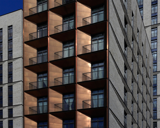
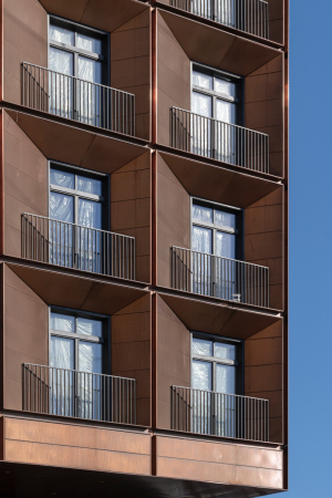
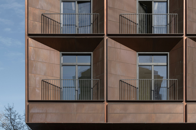
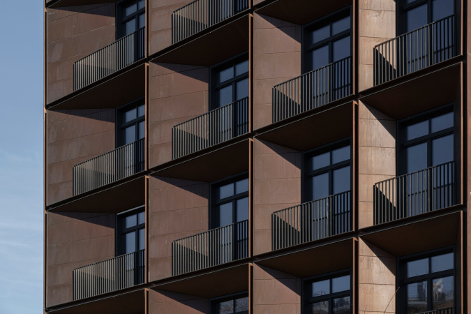
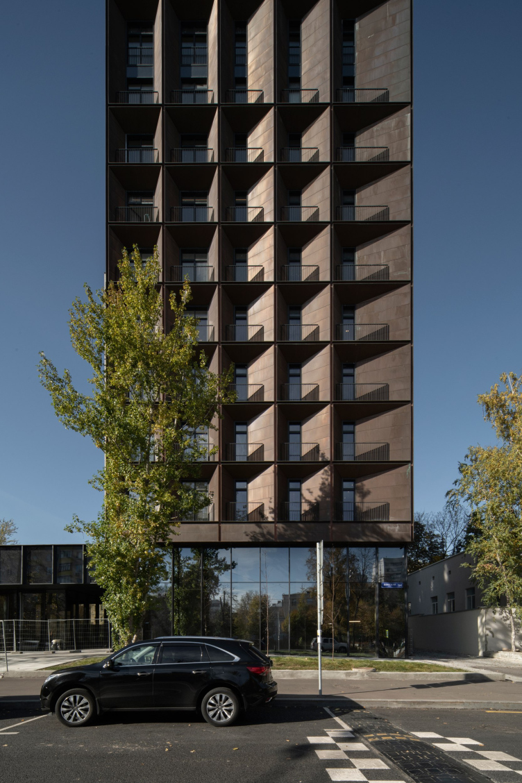
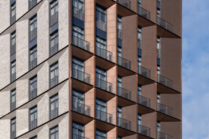
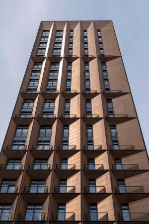
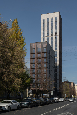
What makes this instance particularly interesting is the fact that the copper surface is meant to naturally and gracefully age long-term: in the spring of 2021, when the coating was just completed, the copper yielded a reddish glow and glittered in the sun like some samovar in a still life by Jean Baptiste Chardin.
Now, half a year later, the surfaces went dark and rather became brown, to the point of being greenish and gray in some spots, with dark inclusions of a “rusty” hue: the color transformations can put you in the mind of both old silvery wood of country houses, the dark domes of the nearby Church of the Deposition of the Robe, and the Cathedral of the Donskoy Monastery, visible a little further along the same street. All this in spite of the fact that sometimes the copper does flash bright flicks, particularly in the slits between the chamfers.
The resulting wealth of shades of color is interesting, first of all, because it is fully natural, which means that it luckily avoids any excessive brightness and garishness, and, second, because of the fact that, being natural, it is unpredictable. Here is what Sergey Skuratov himself shares about the texture that he used:
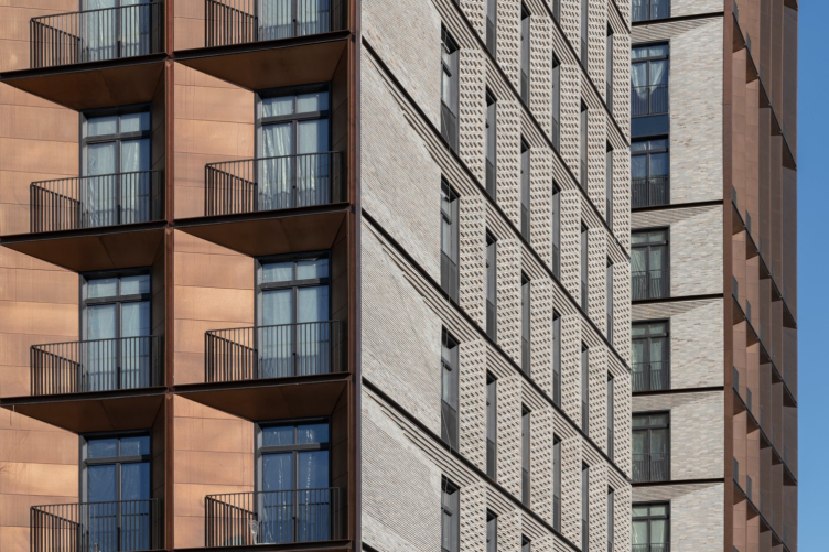
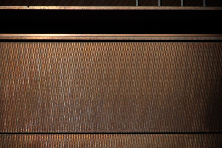
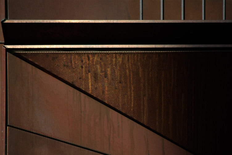
We opted out of darkening our copper, realizing that over time it would darken itself, and would be the same color as my other copper house, 3.3 in the Garden Quarters, designed earlier, but also completed recently – green streaks have already begun to appear there in different spots. In the Garden quarters, however, the surface is smooth, and in Medny 3.14 we tried relief stamping – one small factory in Germany makes it, they take Aurubis panels and put a pattern of their own upon them. I came to the factory, and got acquainted with the production – the place is great, by the way, a completely miniature German town. Because of the pattern, the surface becomes textured, like an expensive fabric – from a close range it is perceived completely differently than smooth copper. In addition, it reacts differently to the angle change: on an inclined vertical, it is not at all the same as on an inclined horizontal.
Fragment of the texture of the copper panels with a pattern. The housing complex "Medny 3.14"
Copyright: Photograph: Archi.ru
If you look at it from a close range, you will see that the texture of the copper surface is akin to a diagonal mesh that is often used in the construction of outdoor metallic staircases, even though it’s not really perforated but just textured. This eliminates any excessive glitter – you can already see that the house will be more on the opaque side.
Fragment of the texture of the copper panels with a pattern. The housing complex "Medny 3.14"
Copyright: Photograph: Archi.ru
When I asked him about how exactly the facades of Medny 3.14 would age, Sergey Skuratov replied: “Nobody knows. We all will witness these changes” – which sounds rather unexpected: as a rule, the architects, “creators of eternity”, prefer to leave nothing to chance. Here, however, what we are seeing is some kind of experiment that unfolds before our eyes. But then again, the changes will be gradual and subtle, not the kind that you would see on some media screen, rather, we are speaking about live transportation in a very long-term perspective – about what is now commonly called “graceful aging”, so widely discussed in the architectural environment lately.
The housing complex "Medny 3.14"
Copyright: Photograph © Daniel Annenkov, 2021
Meanwhile, the experiment appears to be manageable enough: first, this is not the first time that the architect is working with copper, and among Sergey Skuratov’s works we can even see some kind of evolution from a totally predictable green in the Copper House (2002-2004) to the smooth transition of shades in the fourth quarter of “Garden Quarters”, then to Quarter 3.3 of the same complex – with a very deep shade of copper – and now this new project. And we will note that although the architect leaves some nuances at the mercy of time, he quite confidently says that the whole process of forming the natural patina – which is essentially oxidation – will take about ten years.
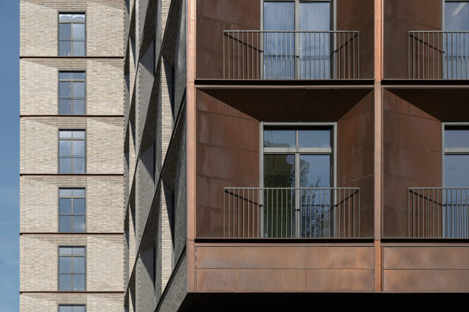
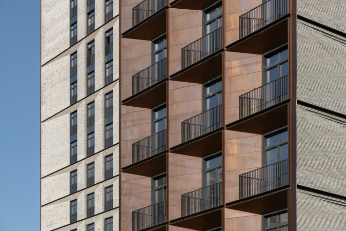
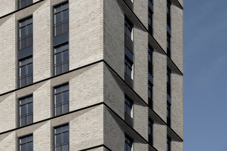
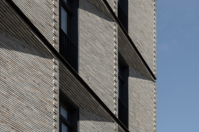
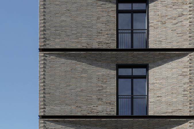
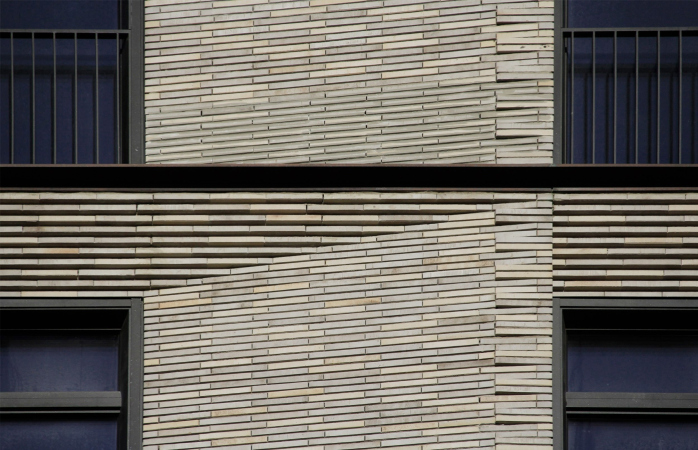
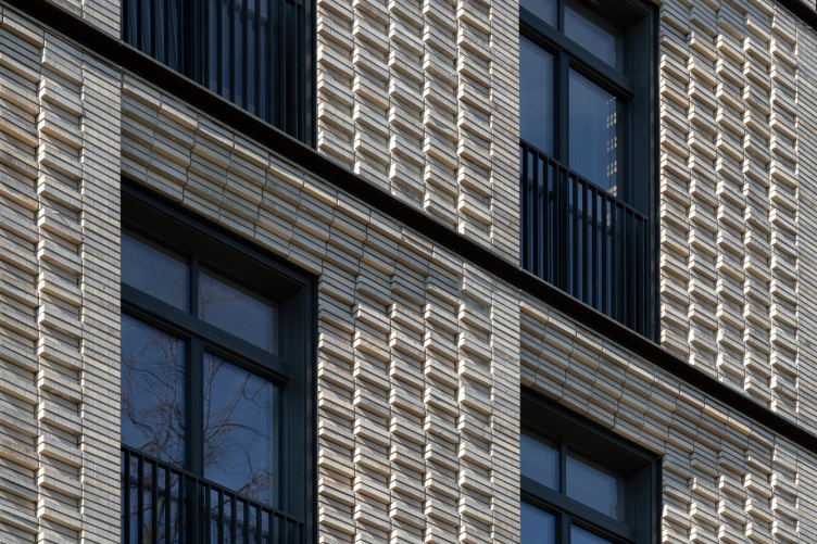
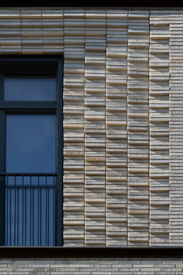
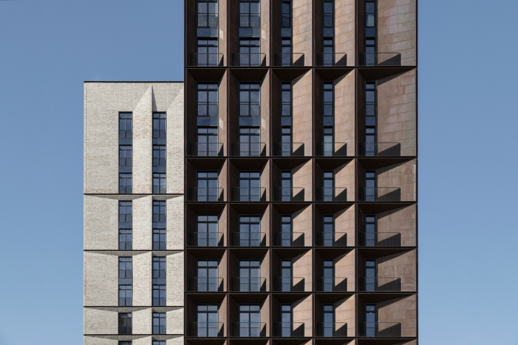
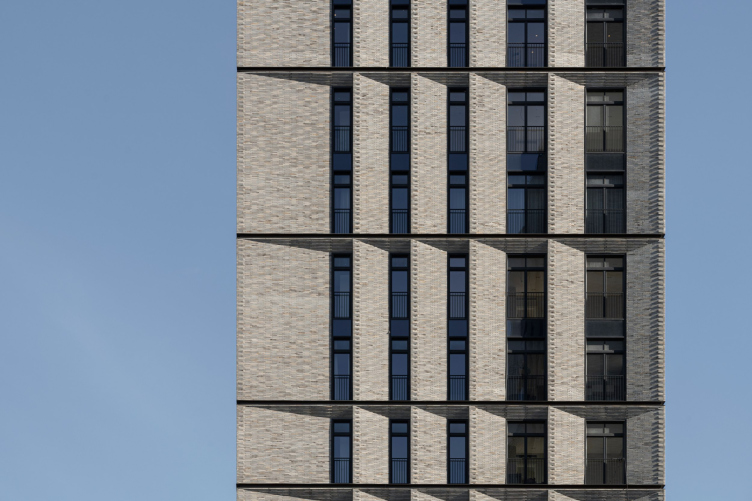
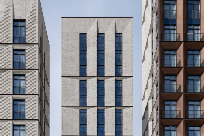
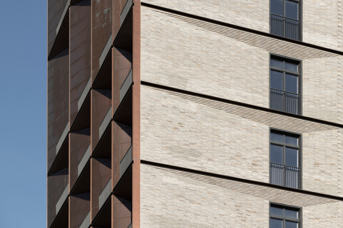
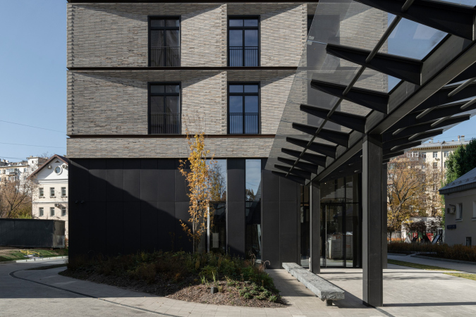
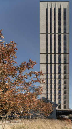
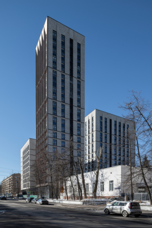
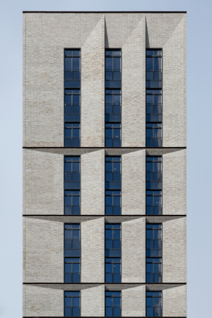
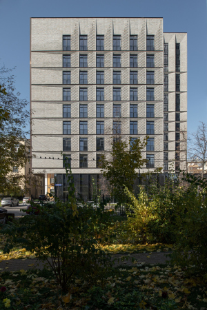
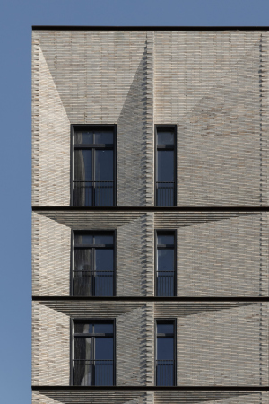
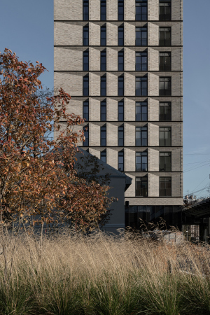
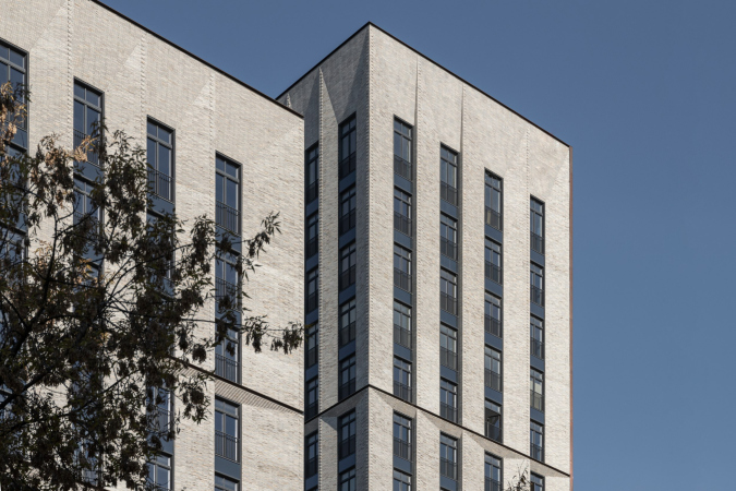
The second material – the brick – occupies three times as much space because it makes up three facades out of four on each of the units. Just as the copper, the brick is also of a special kind: thin and fine, like in Venice of the 13th century, differently toned, yet not speckled: the color varies in a very subtle way. The warm, restrained gray tone seems light in the sun, but in cloudy weather it darkens noticeably to the point of severity. The masonry is an all-stretcher bond, so that a zigzag meander arises vertically, but relief horizontal stripes are more noticeable – they resemble both limestone with striped scrapping and the concrete surfaces of brutalism with imprints of formwork boards.
The housing complex "Medny 3.14"
Copyright: Photograph © Daniel Annenkov, 2021
The chamfers above the windows are formed by brick ledges; the protruding angles are “fixed” with alternating masonry which resembles a delicate rustication and the technique of masonry in the window chamfers of the 19th century, when one brick is placed frontally, and the other at the angle required for the chamfer (now the open masonry of this kind can often be seen in restaurants Moscow’s center, so it is familiar to many people).
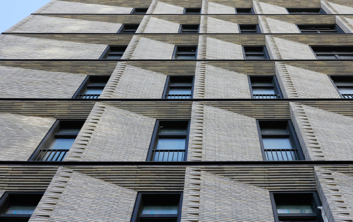
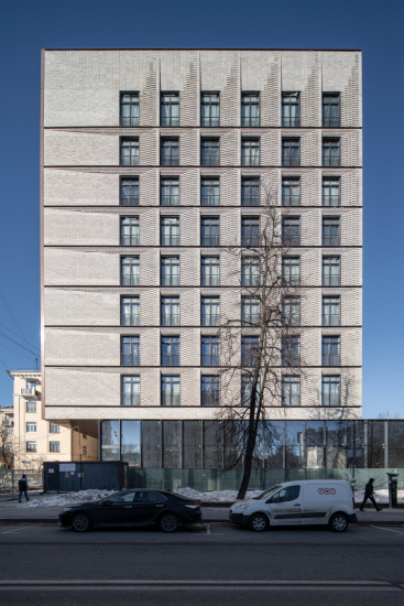
On the street facade, the same technique is used even more extensively – it extends to the chamfers entirely, going beyond the plane and forming a relief stonework of a checkerboard pattern.
The housing complex "Medny 3.14"
Copyright: Photograph © Daniel Annenkov, 2021
The housing complex "Medny 3.14"
Copyright: Photograph © Daniel Annenkov, 2021
All of this, even on an overcast day, forms a very clear graphic pattern – the facades look as if they were drawn by thin charcoal on toned gray paper, which produces an effect as spectacular as the copper surfaces do. Although the brick plays the background part, this is a very sturdy and serious background, and for this reason the brick facade even spills over to a portion of the wall in the street front, where it successfully holds its own against the “precious” metal, pushing us to examine and compare the two types of textures.
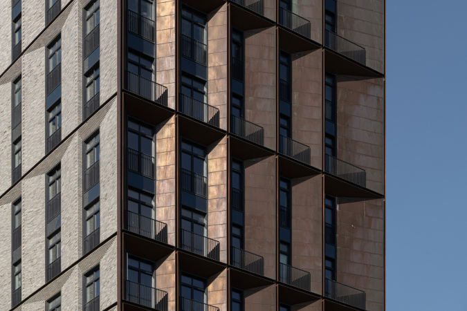
Something that both materials have in common is the edgy plastique of the chamfers: all the piers either come together to the windows or meet on the front surface of the facade at an angle, and the house looks a little bit like origami – this technique resembles Sergey Skuratov’a “Corten” house in ZILART, in which the facade presents a ribbed zigzag, as well as a whole number of other projects designed by the architect, such as the tower of the 5th quarter in Khamovniki with similar pointed buttresses.
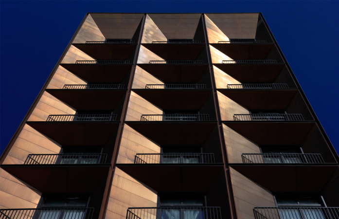
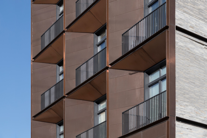
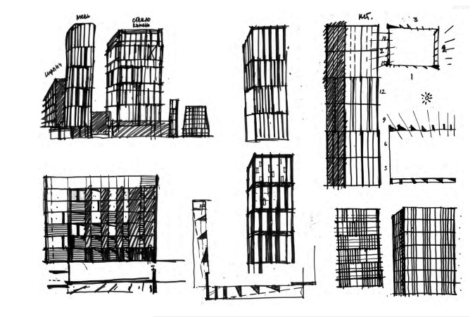
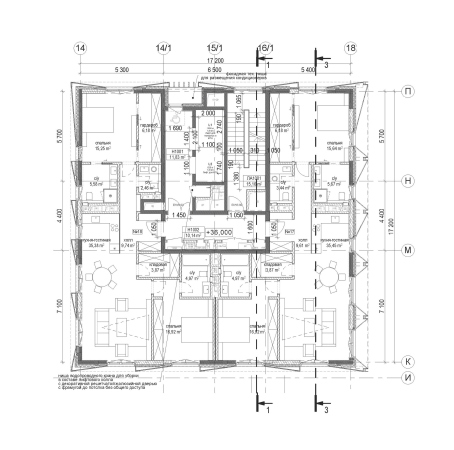
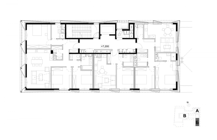
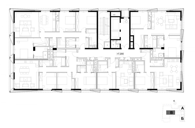
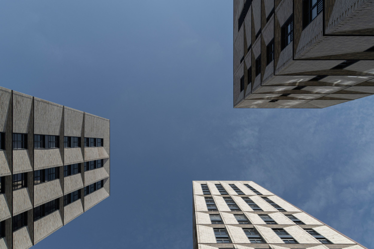
In this specific case, you will not see a single static frontal wall surface on the facades – there are just chamfers, ranging from wide flattened ones to deep and pointed. On the plan, they look like some kind of a bristling hedgehog with a sequential rotation of triangular protrusions between the windows, subject to the logic based on the movement of the sun – which is clearly visible both on plans and on sketches.
The play of the chamfers not only reveals the depth of the wall, but also – particularly in the copper part, where the ledges and indentations are smaller – masks this depth, turning it into nothing more nor less than a sculptural surface.
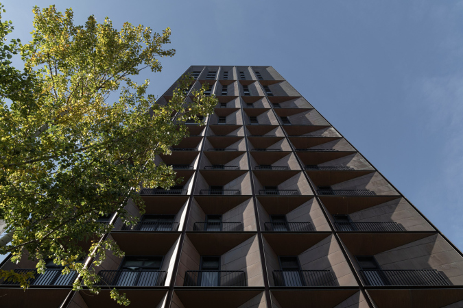
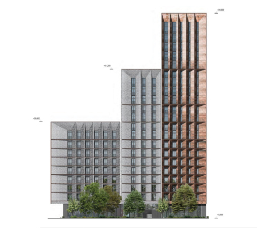
At the same time, you can easily notice that the diversity of the width and and turning angles of the chamfers is not endless, but teeters on the verge of diversity and regularity: it looks as though Sergey Skuratov “rocks” the form turning it into a “wave” of pylons turned at different angles with one hand, and soothes it, bringing it to steady pairs and adding consequential alternation so as not to overburden the form – with the other. Different types of rhythms appear – for example, on the copper facade of the tallest tower it is two-two-one.
The housing complex "Medny 3.14"
Copyright: Photograph © Daniel Annenkov, 2021
The housing complex "Medny 3.14"
Copyright: Photograph © Daniel Annenkov, 2021
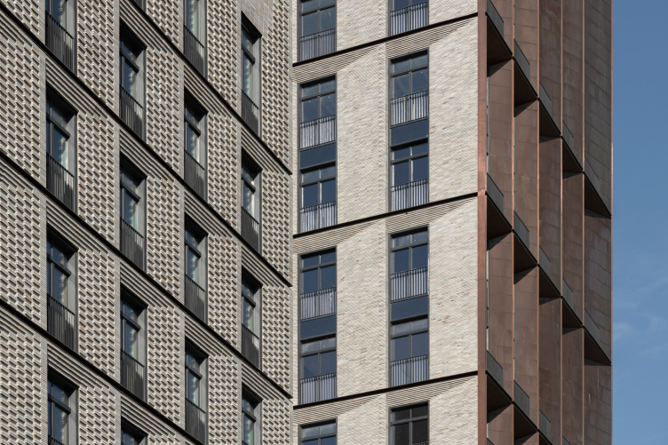
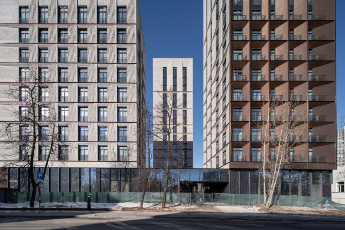
The two materials not just neighbor on each other – they “bleed” into each other too: the brick floors are separated by sunken-in copper horizontals, while the copper-clad recessed balconies are framed from all sides with similar indentations – being essentially a die-cast structure of reinforced concrete, the house makes the most out of the aesthetics of the compound system, as if there are copper seams between the brick panels, and the copper side ends are made from “cassettes”.
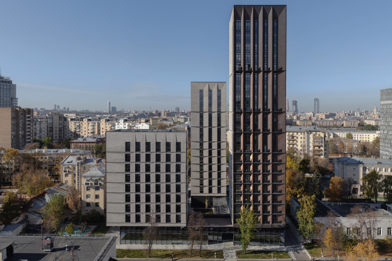
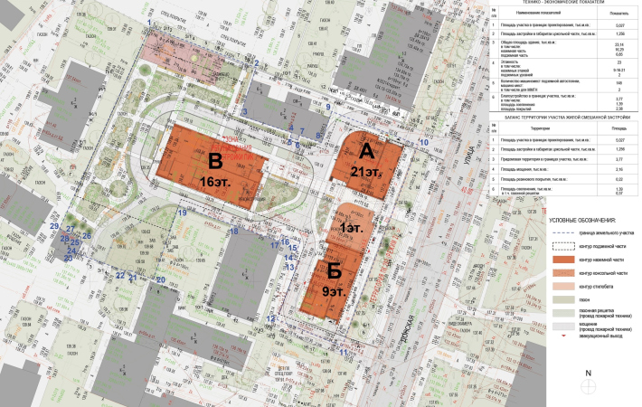
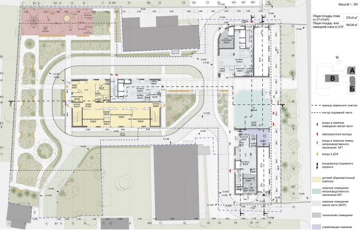
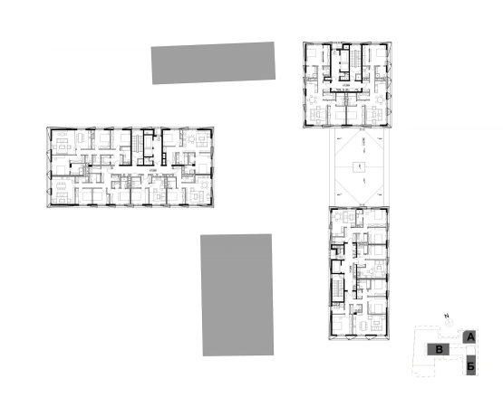
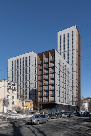
The volumetric composition of the buildings is confidently orchestrated within the constraints of the given T-shaped plan, just like the recently common, including in the Capital Group construction, “typology of three towers”.
The housing complex "Medny 3.14"
Copyright: Photograph © Daniel Annenkov, 2021
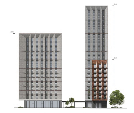
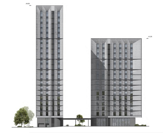
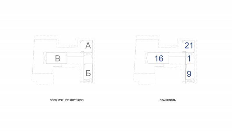
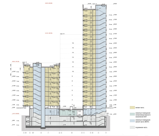
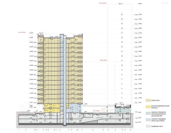
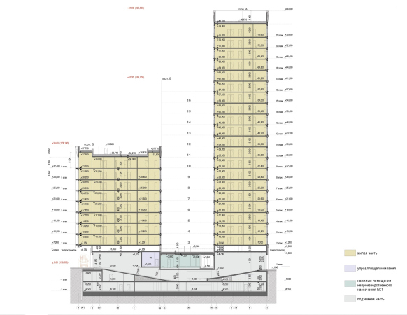
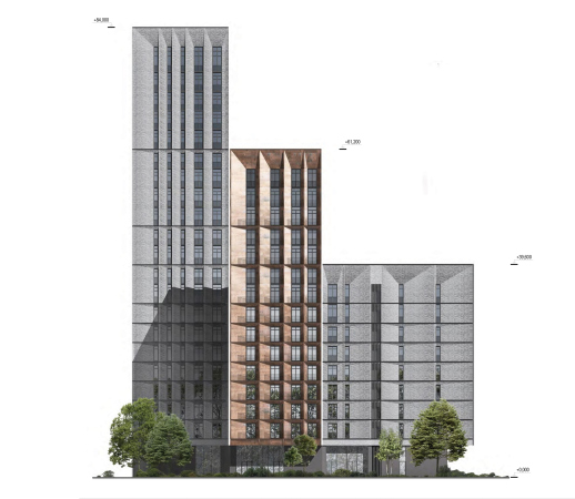
The two towers, one 21 stories high and slim, the other 9 stories high and more squatting by comparison, having a “slab” shape, are lined up along the street’s redline on a black glass stylobate with an arch opening leading into the yard.
The housing complex "Medny 3.14"
Copyright: Photograph © Daniel Annenkov, 2021
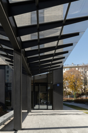
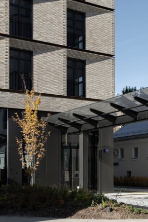
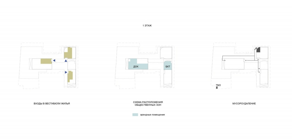
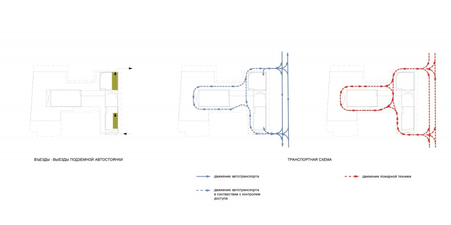
Behind the arch, a glass marquee begins, which rests on a row of black metal supports and leads into the depth of the site, towards the third unit.
Being situated at a considerable height of about 6 meters to ensure an unhindered passage of a fire truck, it is not really wide – about 5 meters – and will only provide partial protection from the rain. However, there is no real need for this: the residents will chiefly exit from the underground parking garage, while the marquee perfectly well marks the traversal axis – upon which the third, 16 stories high, unit is strung – and organizes the space of the small yard, squeezed by neighboring houses, which date back to the early 19th century, on both sides. Such an overpass inside the yard between the entrance and the residential building – a technique that both increases the residents’ comfort and makes the space more sophisticated – can also be seen in Sergey Skuratov’s EGODOM.
The shape of the marquee of the Copper House is the direct opposite of the pitched roof: it looks as though it was “spreading its wings” upwards, hinting at the conditional character of the practical task and the priority of the artistic part, at the same time echoing the corrugated surface of the facades.
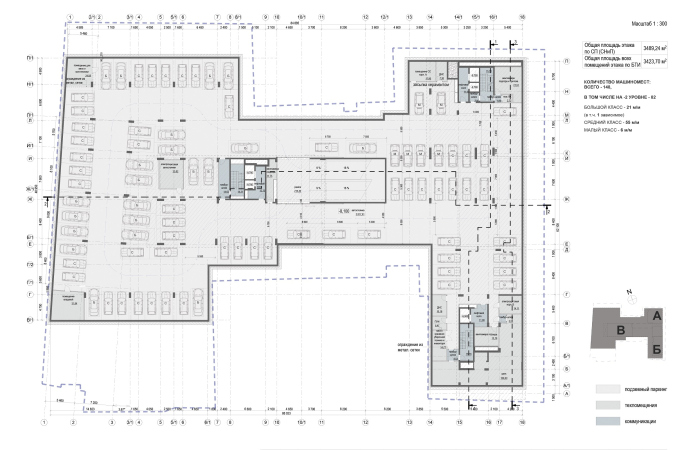
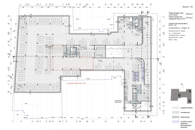
Under the ground, the entire accessible area is occupied by a 2-tier parking lot, but at the top, the surface of the yard does not protrude from the ground, remaining at the city level and is even open for observation in a friendly way, which, in turn, allows you to visually expand the small yard due to the openings to the neighboring spaces, especially to the city yard on the south side.
The copper end of each of the towers is oriented in the direction that is important for it: the minor unit faces the break in the construction front nearest to it (and the monastery in the farther perspective), the taller tower faces the street front, and the inner house is turned in the direction of the Leninsky Avenue. The complex looks like a three-headed creature facing three directions: south, east and west.
In the first and third instances, the copper facade is fastened about 5 meters off on a cantilever, which makes its “gaze” even more expressive. The south corner, however, must be considered to be the main one: this fragment, which gets more sunlight than the rest, presents the house to the city, and here, looking from Donskaya Street, one can see all the three buildings at once, and it is here that you can see the two main flashy solutions – the copper structure on the cantilever and the textured brick.
The laconic composition of three simple volumes of different heights and proportions – small and elongated, medium-sized and reserved, and a slender tower – is supported by the vertical facade pattern. The windows of the nine-story building support the traditional rhythm of the neighboring houses on Donskaya Street, and are distributed in accordance with their floor number. The two other buildings, starting from the 8th floor and higher up, group the floors in twos, then in threes and fours, and then, finally, in the main tower, the verticals consist of five top floors. This technique, as is known, allows you to visually reduce the building’s size, and at the same time makes one reflect on the gradual growth upwards, which is particularly noticeable if you look at the development drawing from the side of Leninsky Avenue.
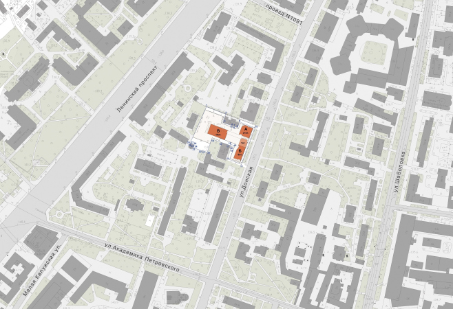
I would like to specifically dwell on the relationship between Medny 3.14 with its context. Sergey Skuratov is known to respond to man-made surroundings on many various levels but here he seems to have surpassed himself. The dialogue with the brick walls and the copper domes of the church and the monastery is something that I already wrote about, and here I want to write about something different. If you take a closer look, you will see that the house responds to every breath of its surroundings.
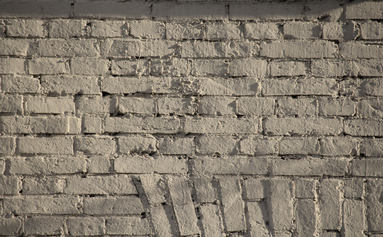
If you wander around the house and examine the neighboring buildings, at some point you notice how the jagged shadows of the unevenly stacked panels of the Soviet-era nine-story house echo the fascias of Medny 3.14, as well as notice how much brick there is around, both pink brick of the Stalin days, and the painted textured brickwork of the tenements, particularly beautiful in slanting rays of the setting sun, and facades sporting corner rustications, the echo of which seems to be the alternation of masonry at the corners of the new complex. This is a kind of quest – to find features in nearby buildings, sometimes hypothetically, and sometimes indisputably absorbed by the new house.
The house of the early 20th century next to "Medny 3.14"
Copyright: Photograph: Archi.ru
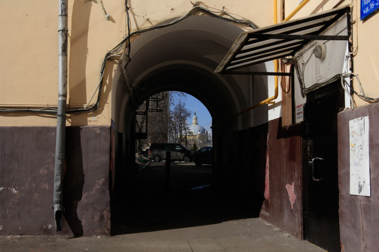
Having decided to circle Medny 3.14 from all sides, we pass through the old-Moscow arch with wires running over the walls and downpipes – and realize that this arch, for all its sloppiness, commands a stunning view of the Cossack Done of the First Gradsky Hospital – and then feel that the arch of the Copper House is parallel to the same axis, and the balconies of its western unit command the view of the same architectural ensemble.
The arch of the house next to "Medny 3.14"
Copyright: Photograph: Archi.ru
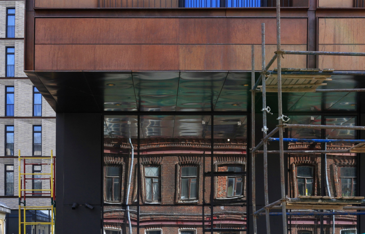
On the western side, we discover yet another building of the 19th century, from darkened red brick – it is reflected in the glass of the bottom tier of the 16-story building and echoes its copper sidewall, copying it virtually tone-for-tone.
Reflection of the house to the east from the complex in the glass of the 1st floor. The housing complex "Medny 3.14"
Copyright: Photograph: Archi.ru
These are all details, however, and here is the big picture.
The whole construction of the Leninsky Avenue up to the Third Transport Ring consists of alternating brick houses of a light-beige hue – and aluminum towers of Soviet modernism. The composition of the Copper House essentially recreates this “brick house + metallic tower” combination, summarizing it. One of the towers on the Leninsky Avenue, a later one, the Gorky Park Tower, obscures the modernist building of the Moscow Textile Institute, in whose huge cantilever one can see a parallel – distant, of course – to the chamfers of the Copper House, while its glass base with thin ribs can be compared to Sergey Skuratov’s stylobate.
If we look still a little bit further, on one pole we will see the Presidium of the Academy of Sciences building designed by Yuri Platonov – no, it looks nothing like the Copper House, but it also combines a large amount of decorative metal and light-colored natural cladding – this time it’s limestone. Possibly, this is the most ambitious example of a combination of stone and metal in Soviet architecture – just like the houses designed by Sergei Skuratov provide examples of such combinations in the architecture of modern Moscow. If we talk about metal in the city in general, I would like to mention the metal monument to Gagarin standing against the background of brick Stalin-era houses, and the Shukhov tower, which can be seen from Donskaya Street. At the other pole, closer to the city center, we will see the buildings of the Ministry of Internal Affairs on Oktyabrskaya Square, built in the early 1980s: from light stone, with ribbed slopes, with vertical joining of windows and a backstory about a tower that did not pass the approval session.
It is amazing that with all these allusions, both precise and distant, found in the surrounding urban fabric, the Copper House is not for a moment eclectic, but very solid and capacious in form. It is interesting to notice the nuances, but in its architecture, strictly speaking, there are no special equivalents: the house confidently stands in its place, as if it had always been here. It now seems to be one of the most confident and “solid” in appearance elements of the panorama seen from the Crimean Bridge. And at the same time – it “sprouts” from the peculiarities of the city around it, takes deep roots, summing up meanings, and leading them to their own denominator – a more contextual approach to high-rise construction is probably difficult to come up with.

