По-русски

​Dialectical Manifesto

The high-rise housing complex MOD, whose construction has begun in Moscow’s district of Maryina Roshcha next to the site, on which the new Russian Railways headquarters will be built, is responding to the “central” context of the future city surroundings, and at the same time is positioned by the architects as a “manifesto of Modernist minimalist principles in architecture”.

06 September 2021
Object
mainImg
The place for constructing the new premium-class housing complex MOD, designed for MR Group by Kleinewelt Architekten, is far from simple but very promising. 400 meters west from it, a new exit from “Maryina Roshcha” metro station belonging to the Moscow Big Circle is being constructed, 300 meters north – yet another exit belonging to the Moscow Central Diameter. A large-scale transport hub is expected to appear here. In short, this place has potential.

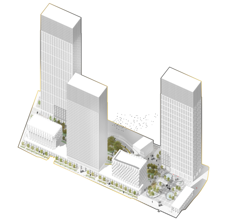
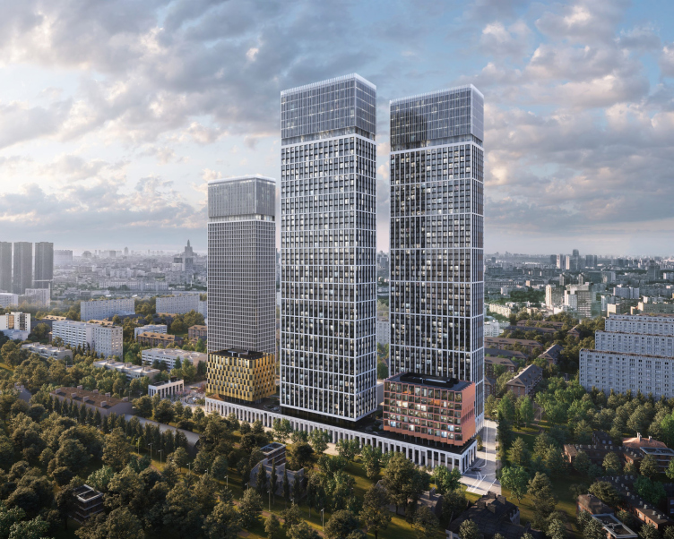
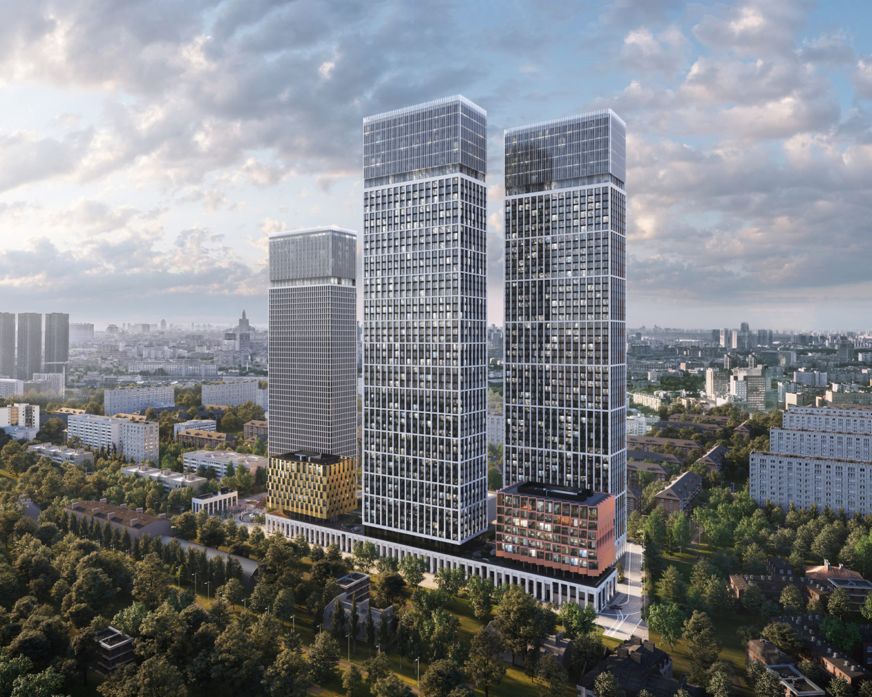
The MOD residential complex is being built on the grounds of the former industrial estate with an area of about 2.4 hectares. The land site stretches in the most convenient direction of “south-north” – which yields a maximum number of west and east facades, not too overshadowed and not too hot. Before the beginning of the construction, the land site hosted two elongated volumes parallel to each other – the new complex is inheriting that configuration: the residential towers, two 200 meters tall, one 165, and buildings of a smaller height stand in two parallel lines and alternate in a near-chessboard order.

The final diagram of the entire complex. MOD housing complex. The conceptual diagrams.
Copyright: © Kleinewelt Architekten


  • zooming
    1 / 10
    Building D. MOD housing complex. The project
    Copyright: © Kleinewelt Architekten
  • zooming
    2 / 10
    Building D. MOD housing complex. The project
    Copyright: © Kleinewelt Architekten
  • zooming
    3 / 10
    Building D. MOD housing complex. The project
    Copyright: © Kleinewelt Architekten
  • zooming
    4 / 10
    MOD housing complex. The project
    Copyright: © Kleinewelt Architekten
  • zooming
    5 / 10
    MOD housing complex. The project
    Copyright: © Kleinewelt Architekten
  • zooming
    6 / 10
    MOD housing complex. The project
    Copyright: © Kleinewelt Architekten
  • zooming
    7 / 10
    Building C. MOD housing complex. The project
    Copyright: © Kleinewelt Architekten
  • zooming
    8 / 10
    Building M. MOD housing complex. The project
    Copyright: © Kleinewelt Architekten
  • zooming
    9 / 10
    Buildin M. MOD housing complex. The project
    Copyright: © Kleinewelt Architekten
  • zooming
    10 / 10
    MOD housing complex. The project
    Copyright: © Kleinewelt Architekten


Interestingly, the “lines” are treated differently, proceeding from the architects’ understanding of the specifics of the context – not today’s one, but the one that will be formed after the construction of the Russian Railways headquarters will be completed in the place of the former loading bay. According to Nikken Sekkei’s plan, the headquarters building must be strung upon an inner covered roof, creating a new center for business and other activities. This way, the future east side, turned to the headquarters, will be more of the “city” kind typology-wise.

Accordingly, the authors of the project gave this part more of a city character. One tower and two 9-story houses 38.3 meters high each spring from an elongated two-story stylobate 9 meters high with cafes and shops in it. Its facades are designed as an austere pylonnade; there is a pedestrian gallery stretching along the shop windows from the headquarters side. In the north part, the stylobate makes a break: here, further away from the center of the headquarters, a square public plaza appears, open eastward, and stopped by a transversal 2-story volume, which looks like a fragment of the stylobate set aside, at the other end of the site.

MOD housing complex. The project
Copyright: © Kleinewelt Architekten


The plaza is situated on the territory of the housing complex, but it is open for everyone, and is meant, just as the “Rivoli Street” of shops and cafes in the stylobate, contribute to integrating the complex into the future city life.

  • zooming
    1 / 4
    The functional zoning flowchart. MOD housing complex. The conceptual diagrams
    Copyright: © Kleinewelt Architekten
  • zooming
    2 / 4
    MOD housing complex. The project
    Copyright: © Kleinewelt Architekten
  • zooming
    3 / 4
    A simplified master plan. MOD housing complex. The project
    Copyright: © Kleinewelt Architekten
  • zooming
    4 / 4
    The master plan. MOD housing complex. The project
    Copyright: © Kleinewelt Architekten


Further north between the two lines of houses, stretches the complex’s private yard, that looks more even like an inner promenade. It is separated from the plaza by a fence, but it is situated on the same level. On the roof of the stylobate in its eastern part, there will be two small private parks between the two windows – the architects call them “the second level of the private garden”; from here, one will be able to look at the “promenade” yard and at the city below. This way, several levels of openness / privacy are formed, as well as several emotional levels of perception of the space from within and from without.

  • zooming
    1 / 3
    MOD housing complex. The project
    Copyright: © Kleinewelt Architekten
  • zooming
    2 / 3
    MOD housing complex. The project
    Copyright: © Kleinewelt Architekten
  • zooming
    3 / 3
    MOD housing complex. The project
    Copyright: © Kleinewelt Architekten


The “promenade” yard is packed with functions, zoned by geoplastics, and is connected by a network of trails; playgrounds alternate with workouts, hills alternate with small ponds. The center of the complex is a spiral walkway raised above the ground – a spatial attraction that allows one to rise to the height of the roof of the eastern stylobate and then descend along a gentle curve.

  • zooming
    1 / 6
    View from north to south. MOD housing complex. The project
    Copyright: © Kleinewelt Architekten
  • zooming
    2 / 6
    The yard. MOD housing complex. The conceptual diagrams
    Copyright: © Kleinewelt Architekten
  • zooming
    3 / 6
    MOD housing complex. The project
    Copyright: © Kleinewelt Architekten
  • zooming
    4 / 6
    The inner promenade. MOD housing complex. The project
    Copyright: © Kleinewelt Architekten
  • zooming
    5 / 6
    The landscaped roof of the stylobate of the eastern part. MOD housing complex. The project
    Copyright: © Kleinewelt Architekten
  • zooming
    6 / 6
    MOD housing complex. The project
    Copyright: © Kleinewelt Architekten


In the eastern part, adjoining the stylobate, the planning lines are straighter and more austere, while in the west part, turned to the city in its current state, and to Maryina Roshcha with its abundant greenery and low-rise buildings, everything becomes more flexible and open. The architects are clearly treating this part of the city as a park, something like a “garden city”, as opposed to the business activity of the opposite side. Here two towers are situated, 200 and 165 meters high, with a 3-story volume 19 meters high between them – a school and a kindergarten.

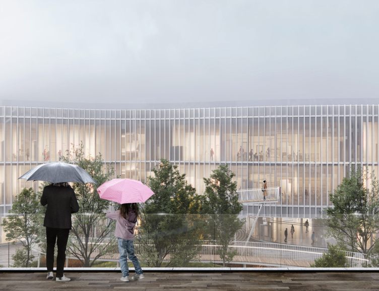
From the west side, there is no “beam” of the stylobate – hence, there are spaces between the buildings that allow you to peek from the street into the yard, while the school in the lower tier rests on glass supports of an oval section – short breaks appear between them as well, allowing you to look from the yard in the direction of Maryina Roshcha and vice versa, which forms “interflowing of spaces”, visual at least. The main facade of the school facing the inner promenade was formed, as the architects’ diagrams show, through a dialogue with a green hill under a spiral ramp – it seems to be “pressed through”, which makes it acquire a flexible outline that fits so well with milk lamellas, especially in perspective.

  • zooming
    1 / 7
    The landscaping of the roof and the stylobate. MOD housing complex. The project
    Copyright: © Kleinewelt Architekten
  • zooming
    2 / 7
    The landscaping of the errotory and the stylobate roof. MOD housing complex. The project
    Copyright: © Kleinewelt Architekten
  • zooming
    3 / 7
    MOD housing complex. The project
    Copyright: © Kleinewelt Architekten
  • zooming
    4 / 7
    MOD housing complex. The project
    Copyright: © Kleinewelt Architekten
  • zooming
    5 / 7
    The organization of the territory and the stylobate roof. MOD housing complex. The project
    Copyright: © Kleinewelt Architekten
  • zooming
    6 / 7
    The landscaping of the errotory and the stylobate roof. MOD housing complex. The project
    Copyright: © Kleinewelt Architekten
  • zooming
    7 / 7
    The organization of the territory and the stylobate roof. MOD housing complex. The project
    Copyright: © Kleinewelt Architekten


The facade plastique of the minor volumes picks up this theme: they are designed in deliberately different ways of emotional energetics, which will be formed on two different sides of the complex. The two 9-story houses, just like the school, grow from circular glass podiums – but their “legs” are strictly elliptical and rest on a stylobate. They carry parallelepipeds with a complex sculptural surface.

The facades of a red copper hue are composed of triangular bay windows framing each window as a relief cell; in each of the levels, the turning angle is different, which is why the top six floors begin to look like bands of conveyor belts, each one rotating in its own cycle, gradually changing pitch. The plastique is active; at the corners, at top and bottom, the volumetric elements stand almost at a 45-degree angle. The corner volume “works” as a giant sculpture.

  • zooming
    1 / 6
    The school building. MOD housing complex. The conceptual diagrams
    Copyright: © Kleinewelt Architekten
  • zooming
    2 / 6
    The concept of the school building. MOD housing complex. The conceptual diagrams.
    Copyright: © Kleinewelt Architekten
  • zooming
    3 / 6
    The school building. MOD housing complex. The conceptual diagrams.
    Copyright: © Kleinewelt Architekten
  • zooming
    4 / 6
    The school building. MOD housing complex. The conceptual diagrams.
    Copyright: © Kleinewelt Architekten
  • zooming
    5 / 6
    The school building. MOD housing complex. The conceptual diagrams.
    Copyright: © Kleinewelt Architekten
  • zooming
    6 / 6
    The school building. MOD housing complex. The conceptual diagrams.
    Copyright: © Kleinewelt Architekten


In the opposite building, which is golden yellow, the same techniques are softened, the offsets and the turns of the triangular bay windows are identical, even though aligned in a chessboard order – the image is less dramatic, and maybe even partly “jewelry-precious”.

  • zooming
    1 / 5
    MOD housing complex. The project
    Copyright: © Kleinewelt Architekten
  • zooming
    2 / 5
    MOD housing complex. The project
    Copyright: © Kleinewelt Architekten
  • zooming
    3 / 5
    MOD housing complex. The project
    Copyright: © Kleinewelt Architekten
  • zooming
    4 / 5
    MOD housing complex. The conceptual diagrams
    Copyright: © Kleinewelt Architekten
  • zooming
    5 / 5
    MOD housing complex. The project
    Copyright: © Kleinewelt Architekten


Together, the two houses and the tower that they flank create an axial composition with variations, which not only do not violate but even enhance the symmetry of the volumes on the sides of the significantly elevated center. 

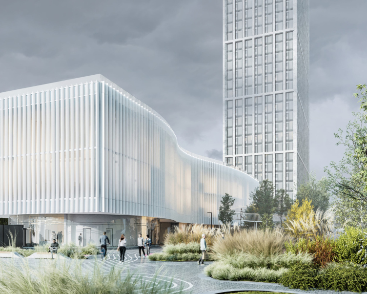
The third, relatively low-rise, volume, situated, as we remember, from the side of Maryina Roshcha between the two other residential towers, has a uniquely small – by the standards of this complex – height of 19.3 meters, a long length, a transparent bottom tier, as well as some flexibility and even softness of form. Unlike the other buildings, it stands not upon the stylobate but on the ground; the rounded glass volumes of the first floor are asymmetrical, and the wavy facade of the two upper floors is formed by milky glass and thin vertical lamellas. The third volume can be understood as something that is opposed to the two 9-story houses: those two are all glittering metal and jagged edges, and this volume is all flowing, enshrouded in a gentle opaque glow.

  • zooming
    1 / 8
    MOD housing complex. The project
    Copyright: © Kleinewelt Architekten
  • zooming
    2 / 8
    MOD housing complex. The project
    Copyright: © Kleinewelt Architekten
  • zooming
    3 / 8
    MOD housing complex. The project
    Copyright: © Kleinewelt Architekten
  • zooming
    4 / 8
    MOD housing complex. The project
    Copyright: © Kleinewelt Architekten
  • zooming
    5 / 8
    MOD housing complex. The project
    Copyright: © Kleinewelt Architekten
  • zooming
    6 / 8
    MOD housing complex. The project
    Copyright: © Kleinewelt Architekten
  • zooming
    7 / 8
    MOD housing complex. The conceptual diagrams
    Copyright: © Kleinewelt Architekten
  • zooming
    8 / 8
    MOD housing complex. The conceptual diagrams
    Copyright: © Kleinewelt Architekten


MOD housing complex. The project
Copyright: © Kleinewelt Architekten


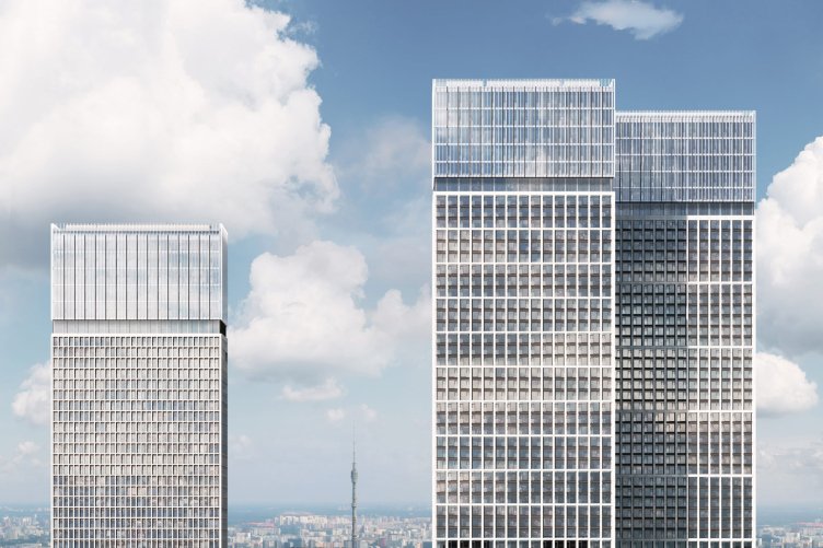
The contrastive and individual design of each small volume as part of the complex seems to make perfect sense: it is these small buildings that we subconsciously perceive as “human-friendly” – and they are responsible for building up a dialogue with the surrounding space. The towers, on the other hand, are a different matter – “soaring upwards”, they go to a whole new level of abstraction. The high-rise volumes are rather similar to one another; their planning solutions are optimized and all but identical, and their facades are subjugated to a fine light-colored grid with a significant, about 70 cm, offset of the ribs and a high degree of distribution. The difference between the grids is based on a decrease in the step from south to north: in the third tower of smaller height, the grid is crushed, the width is decreased by half, and the height by three times. The edges of the facade grid will be covered with light limestone.

MOD housing complex. The project
Copyright: © Kleinewelt Architekten


The towers are stretched lengthwise, the aspect ratio being one to two-something; in this, they echo the elongated shape of the site, so, when viewed en face, the volumes are slender, and, if you look from east or west, rather imposing.

  • zooming
    1 / 5
    MOD housing complex
    Copyright: © Kleinewelt Architekten
  • zooming
    2 / 5
    MOD housing complex
    Copyright: © Kleinewelt Architekten
  • zooming
    3 / 5
    MOD housing complex.
    Copyright: © Kleinewelt Architekten
  • zooming
    4 / 5
    MOD housing complex. The project
    Copyright: © Kleinewelt Architekten
  • zooming
    5 / 5
    Plan of the standard floor. MOD housing complex. The project
    Copyright: © Kleinewelt Architekten


All the three towers are crowned with golden “heads” of the attics with slender lamellas of anodized aluminum, which host 6 floors of penthouses: the ceilings height here is 4.8 meters instead of the standard 3.3 in the main part. These apartments can easily include lofts or double-height rooms.

  • zooming
    1 / 10
    MOD housing complex. The project
    Copyright: © Kleinewelt Architekten
  • zooming
    2 / 10
    MOD housing complex. The project
    Copyright: © Kleinewelt Architekten
  • zooming
    3 / 10
    MOD housing complex. The project
    Copyright: © Kleinewelt Architekten
  • zooming
    4 / 10
    MOD housing complex. The project
    Copyright: © Kleinewelt Architekten
  • zooming
    5 / 10
    MOD housing complex. The project
    Copyright: © Kleinewelt Architekten
  • zooming
    6 / 10
    MOD housing complex. The project
    Copyright: © Kleinewelt Architekten
  • zooming
    7 / 10
    MOD housing complex. The project
    Copyright: © Kleinewelt Architekten
  • zooming
    8 / 10
    MOD housing complex. The project
    Copyright: © Kleinewelt Architekten
  • zooming
    9 / 10
    MOD housing complex. The project
    Copyright: © Kleinewelt Architekten
  • zooming
    10 / 10
    MOD housing complex. The project
    Copyright: © Kleinewelt Architekten


Special mention should be given to the interiors – they are drawn for the lobbies for the standard floors even for the parking garages. They are laconic and are generally based on the optic contrast between black and white. From time to time an inversion occurs: black replaces weight and vice versa. This happens in the minor units and in the parking garages.

  • zooming
    1 / 4
    MOD housing complex. The project
    Copyright: © Kleinewelt Architekten
  • zooming
    2 / 4
    MOD housing complex. The project
    Copyright: © Kleinewelt Architekten
  • zooming
    3 / 4
    MOD housing complex. The project
    Copyright: © Kleinewelt Architekten
  • zooming
    4 / 4
    MOD housing complex. The project
    Copyright: © Kleinewelt Architekten


However, as the significance of the space grows, more significance is attached to the texture of various degrees of “preciousness”. It marks various important elements, chief of them being the reception desk; then it becomes more complex and richer in color in the towers. The height of all of the lobby ceilings is 6 meters. 

The intensity of color and the complexity of the pattern of stone streaks grow every so smoothly, from building to building, in order to make a “crescendo” in the dark crimson reception desk of Building 7, glowing from the inside. At the same time, the architects carefully observe the uniformity principle: the proportions of all the lobbies stay within the same limits.

  • zooming
    1 / 18
    Building S. MOD housing complex. The project
    Copyright: © Kleinewelt Architekten
  • zooming
    2 / 18
    Building S. MOD housing complex. The project
    Copyright: © Kleinewelt Architekten
  • zooming
    3 / 18
    MOD housing complex. The project
    Copyright: © Kleinewelt Architekten
  • zooming
    4 / 18
    The guest bathroom. MOD housing complex. The project
    Copyright: © Kleinewelt Architekten
  • zooming
    5 / 18
    MOD housing complex. The project
    Copyright: © Kleinewelt Architekten
  • zooming
    6 / 18
    The interior of the parking garage. MOD housing complex. The project
    Copyright: © Kleinewelt Architekten
  • zooming
    7 / 18
    MOD housing complex. The project
    Copyright: © Kleinewelt Architekten
  • zooming
    8 / 18
    MOD housing complex. The project
    Copyright: © Kleinewelt Architekten
  • zooming
    9 / 18
    the interior of the parking garage. MOD housing complex. The project
    Copyright: © Kleinewelt Architekten
  • zooming
    10 / 18
    The interior of the parking garage. MOD housing complex. The project
    Copyright: © Kleinewelt Architekten
  • zooming
    11 / 18
    The interior of the parking garage. MOD housing complex. The project
    Copyright: © Kleinewelt Architekten
  • zooming
    12 / 18
    The interior of the parking garage. MOD housing complex. The project
    Copyright: © Kleinewelt Architekten
  • zooming
    13 / 18
    The storage. MOD housing complex. The project
    Copyright: © Kleinewelt Architekten
  • zooming
    14 / 18
    MOD housing complex. The project
    Copyright: © Kleinewelt Architekten
  • zooming
    15 / 18
    MOD housing complex. The project
    Copyright: © Kleinewelt Architekten
  • zooming
    16 / 18
    MOD housing complex. The project
    Copyright: © Kleinewelt Architekten
  • zooming
    17 / 18
    MOD housing complex. The project
    Copyright: © Kleinewelt Architekten
  • zooming
    18 / 18
    MOD housing complex. The project
    Copyright: © Kleinewelt Architekten


It comes as no surprise that Kleinewelt Architekten describe their project as a “manifesto of Modernist minimalist principles in architecture”, and at the same time as “living, tactile, even romantic” – “sensual functionalism”. It includes a wide variety of techniques, its harmonies being based on a balance between bright and austere, strict repetitiveness and lively agility. Interestingly, the “lively” rather gravitates towards minor volumes and shapes: 9-story houses and the school, while the “lively” – towards the big ones, such as towers, even though they still react, albeit not without majestic calm, to this game – for example, with the differences of pitch of the facade grid, formed by the ventilation module sometimes on the left and sometimes on the right.

MOD housing complex. The project
Copyright: © Kleinewelt Architekten


Possibly, one could even say that this “activity gradient”, fading away in the volumes from small to large, takes a reverse path in the interiors, and completes the motion, offering the brightest accent inside one of the two largest towers. This is how a kind of dialectical spiral arises, within the framework of which a series of oscillations from regular and calm to bright and mobile are placed. It is possible that the ramp in the middle of the boulevard serves not only as the main attraction and the key to the emotional/spatial interaction between the courtyards, but also in some way a sign of the ambivalence of the architects’ manifesto presented here, combining a firm adherence to a strict “modernist” form and a willingness to “rock” it in order to breathe life into it.
The construction of the MOD housing complex began in June 2021.

06 September 2021

Headlines now
Layers and Levels of Flight
This project goes way back – Reserve Union won this architectural competition at the end of 2011, and the building was completed in 2018, so it’s practically “archival”. However, despite being relatively unknown, the building can hardly be considered “dated” and remains a prime example of architectural expression, particularly in the headquarters genre. And it’s especially fitting for an aviation company office. In some ways, it resembles the Aeroflot headquarters at Sheremetyevo but with its own unique identity, following the signature style of Vladimir Plotkin. In this article, we take an in-depth look at the United Aircraft Corporation (UAC) headquarters in the Moscow agglomeration town of Zhukovsky, supplemented by recent photographs from Alexey Naroditsky – a shoot that became only recently possible due to the fact that improvements were finally made in the surrounding area.
Light and Shadow
In this article, we delve into the architectural design of the “Chaika” house by DNK ag architects, which was recently completed in 2023 as part of the collection of signature designs at ZILArt. As is well-known, all the buildings in this complex follow a design code, yet each one is distinct. This particular building stands out not only for its whiteness and minimalism but also for the refined use of a limited number of techniques that, together, create what can confidently be called synergy.
Casus Novae
A master plan was developed for a large residential area with a name of “DNS City”, but now that its implementation began, the plan has been arbitrarily reformatted and replaced with something that, while similar on the surface, is actually quite different. This is not the first time such a thing happens, but it’s always frustrating. With permission from the author, we are sharing Maria Elkina’s post.
Treasure Hunting
The GAFA bureau, in collaboration with Tegola and Arkhitail, organized an expedition to the island of Kilpola in Karelia as part of Moskomarkhitektura’s “Open City” festival. There, amidst moss and rocks, the students sought answers to questions like: what is the sacred, where does it dwell, and what sustains it? Assisting the participants in this quest were landscape engineer Evgeny Levin, artist Nicholas Roerich, a moose, and the lack of cellular connection. Here’s how the story unfolded.
Depths of the Earth, Streams of Water
In the Malaya Okhta district, the Akzent building, designed by Stepan Liphart, was constructed. It follows a classic tripartite structure, yet it’s what you might call “hand-drawn”: each façade is unique in its form and details, some of which aren’t immediately noticeable. In this article, we explore the context and, together with the architect, delve into how the form was developed.
Fir Tree Dynamics
The “Airports of Region” holding is planning to build an airport in Karachay-Cherkessia, aiming to make the Arkhyz and Dombay resorts more accessible to travelers. The project that won in an invitation-only competition, submitted by Sergey Nikeshkin’s KPLN, blends natural imagery inspired by the shape of a conifer seed, open-air waiting spaces, majestic large trees, and a green roof elevated on needle-like columns. The result is both nature-inspired and WOW.
​A Brick Shell
In the process of designing a clubhouse situated among pine trees in a prestigious suburban area near Moscow, the architectural firm “A.Len” did the façade design part. The combination of different types of brick and masonry correlates with the volumetric and plastique solutions, further enhanced by the inclusion of wood-painted fragments and metal “glazing”.
Word Forms
ATRIUM architects love ambitious challenges, and for the firm’s thirtieth anniversary, they boldly play a game of words with an exhibition that dives deep into a self-created vocabulary. They immerse their projects – especially art installations – into this glossary, as if plunging into a current of their own. You feel as if you’re flowing through the veins of pure art, immersed in a universe of vertical cities, educational spaces – of which the architects are true masters – and the cultural codes of various locations. But what truly captivates is the bold statement that Vera Butko and Anton Nadtochy make, both through their work and this exhibition: architecture, above all, is art – the art of working with form and space.
Flexibility and Acuteness of Modernity
Luxurious, fluid, large “kokoshniks” and spiral barrel columns, as if made from colorful chewing gum: there seem to be no other mansion like this in Moscow, designed in the “Neo-Russian-Modern” style. And the “Teremok” on Malaya Kaluzhskaya, previously somewhat obscure, has “come alive with new colors” and gained visibility after its restoration for the office of the “architectural ecosystem” as the architects love to call themselves. It’s evident that Julius Borisov and the architects at UNK put their hearts into finding this new office and bringing it up to date. Let’s delve into the paradoxes of this mansion’s history and its plasticity. Spoiler: two versions of modernity meet here, both balancing on the razor’s edge of “what’s current”.
Yuri Vissarionov: “A modular house does not belong to the land”
It belongs to space, or to the air... It turns out that 3D printing is more effective when combined with a modular approach: the house is built in a workshop and then adapted to the site, including on uneven terrain. Yuri Vissarionov shares his latest experience in designing tourist complexes, both in central Russia and in the south. These include houseboats, homes printed from lightweight concrete using a 3D printer, and, of course, frame houses.
​Moscow’s First
“The quality of education largely depends on the quality of the educational environment”. This principle of the last decade has been realized by Sergey Skuratov in the project for the First Moscow Gymnasium on Rostovskaya Embankment in the Khamovniki district. The building seamlessly integrates into the complex urban landscape, responding both to the pedestrian flow of the city and the quiet alleyways. It skillfully takes advantage of the height differences and aligns with modern trends in educational space design. Let’s take a closer look.
Looking at the Water
The site of Villa Sonata stretches from the road to the water’s edge, offering its own shoreline, pier, and a picturesque river panorama. To reveal these sweeping views, Roman Leonidov “cut” the façade diagonally parallel to the river, thus getting two main axes for the house and, consequently, “two heads”. The internal core – two double-height spaces, a living room and a conservatory, with a “bridge” above them – makes the house both “transparent” and filled with light.
The White Wing
Well, it’s not exactly white. It’s more of a beige, white-stone structure that plays with the color of limestone – smoother surfaces are lighter, while rougher ones are darker. This wing unites various elements: it absorbs and interprets the surrounding themes. It responds to everything, yet maintains a cohesive expression – a challenging task! – while also incorporating recognizable features of its own, such as the dynamic cuts at the bottom, top, and middle.
Urban Dunes
The XSA Ramps team designed and built a three-part sports hub for a park in Rostov-on-Don, welcoming people of all ages and fitness levels. The skate plaza, pump track, and playground are all meticulously crafted with details that attract a diverse range of visitors. The technical execution of the shapes and slopes transforms this space into a kind of sculptural composition.
Proportional Growth
The project for the fourth phase of the ÁLIA residential area has been announced. The buildings are situated on an elongated plot – almost a “ray” that shoots out from the center of the area towards the river. Their layout reflects both a response to Moscow’s architectural preferences over the past 15 years, shifting “from blocks to towers”, and an interpretation of the neighboring business park designed by SOM. Additionally, the best apartments here are not located at the very top but closer to the middle, forming a glowing “waistline”.
The “Staircase” Building
In designing the “Details” residential complex in New Moscow, Rais Baishev spiced up the now-popular Moscow theme of a “courtyard” building with an idea drawn from the surrealist drawings by Maurits Escher. He envisioned the stepped silhouettes and descending slopes as a metaphysical mega-staircase, creating a key void within the courtyard that gave the project an internal “spine”. This concept is felt both in the building’s silhouette and on its façades.
Projection of the Quarter
No one doubted that the building that Vladimir Plotkin designed as part of the “Garden Quarters” would be the most modernist of all. And it turned out just that way: while adhering to the common design code, the building successfully combines brick and white stone, rhythmically responding to the neighboring building designed by Ostozhenka, yet tactfully and persistently making a few statements of its own. This includes the projection of the ideal urban development composition “14–9–6”, which can be found right next door, mathematical calculations, including those for various types of terraces (and perhaps the only reminder of the Soviet past of the Kauchuk rubber factory!), and the white “cross-stitch” pattern of the façade grid.
Domus Aurea
In this issue, we examine the “Tessinsky-1” house, designed by Sergey Skuratov and completed in 2023. Located in the middle of the Serebryanicheskaya Embankment district, at the intersection of its main streets, this house assumes a sort of “nodal” role: it not only responds to everything around it and preserves many memories of the former EMA factory within itself, but it weaves all this into a newly directed pattern, reconciling bright “gold” and dark-colored brick, largely with the help of the new, modern-yet-archaic Columba brick, which, come to think about it, is the most precious element here.
The Chimney of Nikola-Lenivets
In this issue, we are examining the “Obelisk House” designed by KATARSIS and built for the Arkhstoyanie 2023 festival. However, it was only finished later on, and this is why we are examining it now. It seems to us that after the “Obelisk House” appeared in Nikola-Lenivets, a dialogue and a few inner connections appeared between the temporary structures built here. These houses no longer look like “accidental neighbors”, more of which below.
​Periscope by the Bay
The jury awarded the second place in the competition for a public and cultural center in Petropavlovsk-Kamchatsky to the companies GORA (“Mountain”) and M4. In the consortium’s proposal, the building resembles a sperm whale with a calf swimming next to it or a periscope, whose lenses capture the most spectacular views from the surrounding landscape.
From Arcs to Dolmens
While working on the competition project for Petropavlovsk-Kamchatsky, ASADOV Architects prioritized the value of the natural and urban environment, aiming to preserve the balance of the location while minimizing the resemblance of the volume that they designed to a “traditional building”. The task was challenging, and the architects created three versions, one of which having been developed after the competition, where their main proposal took third place. However, the point of interest here is not the competition result but the continuity of creative thinking.
Hide and Seek
The ID Moskovskiy house, designed by Stepan Liphart in St. Petersburg, in the courtyards near Moskovskiy Avenue beyond the Obvodny Canal and recently completed, is notable for several reasons. Firstly, it has been realized with considerable accuracy, which is particularly significant as this is the first building where the architect was responsible not only for the facades but also for the layouts, allowing for better integration between the two. On the other hand, this building is interesting as an example of the “germination” of new architecture in the city: it draws on the best examples from the neighborhood and becomes an improved and developed sum of ideas found by the architect in the surrounding context.
The Big Twelve
Yesterday, the winners of the Moscow Mayor’s Architecture Award were announced and honored. Let’s take a look at what was awarded and, in some cases, even critique this esteemed award. After all, there is always room for improvement, right?
Above the Golden Horn
The residential complex “Philosophy” designed by T+T architects in Vladivostok, is one of the new projects in the “Golubinaya Pad” area, changing its development philosophy (pun intended) from single houses to a comprehensive approach. The buildings are organized along public streets, varying in height and format, with one house even executed in gallery typology, featuring a cantilever leaning on an art object.
Nuanced Alternative
How can you rhyme a square and space? Easily! But to do so, you need to rhyme everything you can possibly think of: weave everything together, like in a tensegrity structure, and find your own optics too. The new exhibition at GES-2 does just that, offering its visitor a new perspective on the history of art spanning 150 years, infused with the hope for endless multiplicity of worlds and art histories. Read on to see how this is achieved and how the exhibition design by Evgeny Ace contributes to it.
Blinds for Ice
An ice arena has been constructed in Domodedovo based on a project by Yuri Vissarionov Architects. To prevent the long façade, a technical requirement for winter sports facilities, from appearing monotonous, the architects proposed the use of suspended structures with multidirectional slats. This design protects the ice from direct sunlight while giving the wall texture and detail.
Frozen Magma
A competition for the creation of a public and cultural center was held in Petropavlovsk-Kamchatsky. Three architectural companies made it to the final, and we consider it important to share about the work of each. Let’s start with the winner – the consortium led by Wowhaus.
Campus within a Day
In this article, we talk about what the participants of Genplan Institute of Moscow’s hackathon were doing at the MosComArchitecture booth at the “ArchMoscow” exhibition. We also discuss who won the prize and why, and what can be done with the territory of a small university on the outskirts of Moscow.
Vertical Civilization
Genpro considered the development of the vertical city concept and made it the theme of their pavilion at the “ArchMoscow” exhibition.
Marina Yegorova: “We think in terms of hectares, not square meters”
The career path of architect Marina Yegorova is quite impressive: MARHI, SPEECH, MosComArchitectura, the Genplan Institute of Moscow, and then her own architectural company. Its name Empate, which refers to the words “to draw” in Portuguese and “to empathize” in English, should not be misleading with its softness, as the firm freely works on different scales, including Integrated Territorial Development projects. We talked with Marina about various topics: urban planning experience, female leadership style, and even the love of architects for yachting.