По-русски

​Alexander Balabin: “You must regard your every project as a chance”

The head of the company Severin Project, which has been successfully operating on the market for twenty years, is sharing about the history of his company, difficulties of landing big contracts, and about the creative chance that you must jump at.

27 August 2021
Interview
mainImg
Your new project, the “Skalisty Bereg” (“Rocky Shore”) winery which you built in Krasnodar Territory, is already fairly popular; recently, it received the “Golden Section” award, and now it was shortlisted at WAF among implemented projects, which is a success by any standards. Can you name it the main project of your life? Your favorite?

zooming


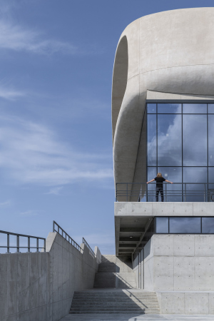
You can make architecture either for love or for money. And, of course, it’s just great if the two coincide. The gravitational winery “Rocky Shore” is precisely the case. Our client wanted a powerful architectural statement. When they came to us in 2017, we laid out four options before them: the traditional Tuscan, German in the style of Bauhaus, technology-based Swiss, and North-Italian a-la Scarpa. And there was a fifth one, the most radical, which I drew just for myself – and this was the one that they went for!

  • zooming
    1 / 6
    “Rocky Shore” winery
    Copyright © Severin Project
  • zooming
    2 / 6
    “Rocky Shore” wineryCopyright: Photograph © Daniel Annenkov / provided by Severin Project
    Copyright: Photograph © Daniel Annenkov / provided by Severin Project
  • zooming
    3 / 6
    “Rocky ShorCopyright: Photograph © Daniel Annenkov / provided by Severin Projecte” winery
    Copyright: Photograph © Daniel Annenkov / provided by Severin Project
  • zooming
    4 / 6
    “Rocky Shore” winery
    Copyright: Photograph © Daniel Annenkov / provided by Severin Project
  • zooming
    5 / 6
    “Rocky Shore” winery
    Copyright: Photograph © Daniel Annenkov / provided by Severin Project
  • zooming
    6 / 6
    “Rocky Shore” winery
    Copyright: Photograph © Daniel Annenkov / provided by Severin Project


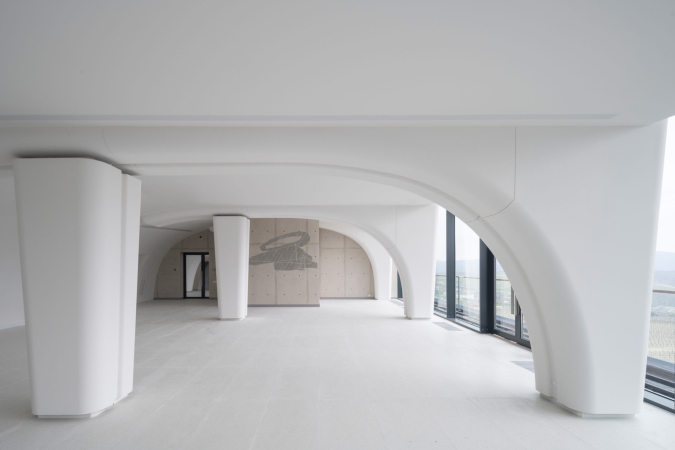
I wanted to build it from real exposed concrete. At the bottom, where the production and storage facilities are situated, there is a brutal technological volume. At the top, where the tasting room is, there is a bionic shape that looks like a pebble with a cut edge.

  • zooming
    1 / 4
    “Rocky Shore” winery, the interior
    Copyright © Severin Project
  • zooming
    2 / 4
    "Skalisty Bereg« (»Rocky Shore") winery, the interior
    Copyright: provided by Severin project
  • zooming
    3 / 4
    “Rocky Shore” winery, the interior
    Copyright: provided by Severin Project
  • zooming
    4 / 4
    “Rocky Shore” winery, the interior
    Copyright: provided by Severin Project


This was one heck of a story! The upper “pebble” part is actually a metal structure, upon which fiberglass reinforced concrete was stretched, like a frame. The rest of the building was built of monolithic reinforced concrete due to seismicity of 9 points. The lower part is architectural concrete in all its living glory, not covered up with anything. It took me a lot of time to draw up the sheeting maps. I made sure that the maps were of a certain size, that the fasteners were in certain places, that they correlated with the impost pattern, and with the horizontals too. For the window apertures in the shape of pebbles, we designed special binding, which was then made at a carpentry shop. And then we added aluminum frames that were inserted in the apertures without any stucco.

  • zooming
    1 / 6
    “Rocky Shore” winery
    Copyright: Photograph © Daniel Annenkov / provided by Severin Project
  • zooming
    2 / 6
    “Rocky Shore&#Copyright: Photograph © Daniel Annenkov / provided by Severin Project148; winery
    Copyright: Photograph © Daniel Annenkov / provided by Severin Project
  • zooming
    3 / 6
    "Skalisty Bereg« (»Rocky Shore") winery
    Copyright © Severin Project
  • zooming
    4 / 6
    "Skalisty Bereg« (»Rocky Shore") winery
    Copyright © Severin Project
  • zooming
    5 / 6
    “Rocky Shore” winery
    Copyright © Severin Project
  • zooming
    6 / 6
    “Rocky Shore” winery
    Copyright © Severin Project


We are very happy that our project got much critical acclaim from the professional community, both in Russia, at the Golden Section festival, and at the international WAF, where, as is known, the selection is very strict. This is an important achievement for us. 

When and how did you decide to do architecture?

According to the family legend, I’ve been drawing since I was five. I was born in Gorlovka in Donbas, then my family moved to Chernigov, where I finished high school. Then I entered the Odessa Engineering and Construction Institute, the architectural department. After my first year, I was going to go to the Budapest Design Academy as an exchange student. I came to check in at the military registration and enlistment office to settle a couple of formalities, and they said I was a draft dodger, and canned me there and then. So I unexpectedly did 3 years of navy service in Sevastopol. Then I decided to enter the Moscow Architectural Institute. I was introduced to the head of the drawing department. For two months, I would practice nine straight hours every day, not standing up from my easel for a minute. Then I scored an “A” at the entrance exam for drawing a head. And, since I finished high-school with a gold medal, and the first year of the Odessa Institute with honors, I was at once taken to the second year of Moscow Architectural Institute. I was really lucky because I got into the group led by Boris Barkhin. This group consisted of brilliant students because they were mostly the children of architects: Aleksey Ginzburg, Alexandra Gutnova, Ilia Voznesensky, Evgeny Raitsis, and others. During my last year in Moscow Institute of Architecture I went to study in Great Britain for half a year as an exchange student, and, after I got back, I defended my diploma project.

How did your career develop? Which project do you consider to be the milestone for you as an architect?

Immediately after graduation, in 1993, I founded my architectural company and designed interiors and furniture – we even made furniture ourselves. It was not until 2000 that I started doing big time architectural design. I can’t boast too many projects that were 100% made by my design. The first important project that was implemented really close to my original design was the reconstruction of the former EMO Factory in Nikolo-Vorobinsky alley for the office of RAO UES. Currently, the Tessinsky 1 housing complex is being built in that same place, designed by Sergey Skuratov. Our project was a reconstruction one, and it covered two buildings in the Tesinsky Alley: a Soviet one from the 1970s, and a building of the 19th century – it was a difficult one because it was built up many times. We kept the original brick vaults and the Mognet vaults, even though we did not manage to do the brickwork repair that we originally planned – the facades were just stuccoed. We made these buildings into an office center, and it successfully operated for almost 10 years.

  • zooming
    A-Class office center designed for RAO UES. Project, 2009
    Copyright © Severin Project
  • zooming
    The A-class office center for RAO UES, a sketch
    Copyright: provided by Severin Project


An office building in the center of Moscow… a pretty good start! On the whole, your portfolio includes more public buildings than housing projects. Is it by chance or by design?

Both. Public buildings always seemed more interesting to us. We were lucky to land a project of Russia’s first multiplex in 2001, a 4-hall multiplex KARO-1 in Auchan on Sheremetyevskaya Street, and movie theaters became a trend with us. We designed more than forty movie theaters all over Russia: from Yuzhno-Sakhalinsk to Nadym; in all Russian cities with a population of over one million, we have designed more than 400 screens (usually, a movie theater has from 4 to 11 screens). We worked with all major networks: Karo-1, Karo-2, Formula Kino and so on. Over the last twenty years we have created many projects of public facilities: shopping and entertainment centers, movie theaters, hotels, and many restaurant chains. In 2005-2008 we developed the concept of the Goodman steakhouse, Filimonova and Yankel restaurants, Aligato, Shokoladnitsa, and others.

Our special pride is the Center for Active Longevity that we designed and built in Malakhovka. This is a new type of nursing home, supplemented by a neuropsychiatric unit for old people with memory problems. Of course, it looks nothing like those houses of sorrow that have remained from the Soviet era. We thought through the ergonomics down to the smallest detail, drew 15 types of housing placement, of which we then chose the most optimal one.

  • zooming
    A boarding school of general type with a neuropsychiatric department
    Copyright © Severin Group
  • zooming
    A boarding school of general type with a neuropsychiatric department
    Copyright © Severin Group


So why did you decide later on to do housing projects as well?

After 2014, it became possible to do good housing architecture – and not just in the luxury segment, like, for example, in “Golden Mile”. And I wanted to do large-scale projects. But it was clear to us that we had to enter the market not from the front door (i.e. with concepts) but through the back door (i.e. with working documents). Our first work of this kind in Moscow was a contract with Strabe for DONSTROY for adjusting the project and developing working documents for the housing complex “Zhizn na Plyushchikhe”, 56,000 square meters, completed in 2014. This was our first contractual project in BIM, even though we began implementing BIM as early as in 2007.

Then we signed a contract with the company “City 21st Century” for designing the “Rafinad” housing complex in Khimki. It was 100,000 square meters big. Before we came around, five different architects were doing concepts for this site because the head of the developer company, an Orthodox Church member, and a Greek by birth, was endlessly trying to achieve perfection. We passed three stages of approvals with him. In Rafinad, we partly did the conceptual proposal, and a full-scale design development phase, working documentation, and the architectural and city development phase.

Parallel to that, we won a competition for the concept of the concept of the tower “Schastye na Lomonosovskom” for the company Leader Invest, which was part of AFK-Systema; that concept was fully developed by us. Every time we started working with an investor, we had to go through a lot of hard and unpleasant work. For Leader Invest, we first agreed to adjust the project and the working documentation of the house on Usievicha Street. Then we were confronted with a difficult situation. We passed through two gruelling approval sessions and completed the working documentation – and ultimately the house was built. After that, we won a tender for working documentation for the Lomonosovsky, and now the Schastye tower is almost ready.

  • zooming
    1 / 6
    “Schastye na Lomonosovskom” housing complex, the project
    Copyright © Severin Project
  • zooming
    2 / 6
    “Schastye na Lomonosovskom” housing complex, the project
    Copyright © Severin Project
  • zooming
    3 / 6
    “Schastye na Lomonosovskom” housing complex. A sketch by Alexander Balabin
    Copyright: provided by Severin Project
  • zooming
    4 / 6
    “Schastye na Lomonosovskom” housing complex. A sketch by Alexander Balabin
    Copyright: provided by Severin Project
  • zooming
    5 / 6
    “Schastye na Lomonosovskom” housing complex, the project
    Copyright © Severin Project
  • zooming
    6 / 6
    “Schastye na Lomonosovskom” housing complex, the project
    Copyright © Severin Project


Parallel to that, FSK-Leader invited us to work on the housing complex “Dvizhenie” (“Motion”) in Tushino, 106,000 square meters. We did the design development phase and the architectural and city development phase, then we won the tender for developing working documentation. This complex, consisting of three 22-story buildings and a 13-story one, is all but completed. On that project, we were faced with difficulties of purely legal nature: the owner is Tushino-2018, i.e. Spartak, and FSK-Sistema is both investor and developer.

  • zooming
    1 / 7
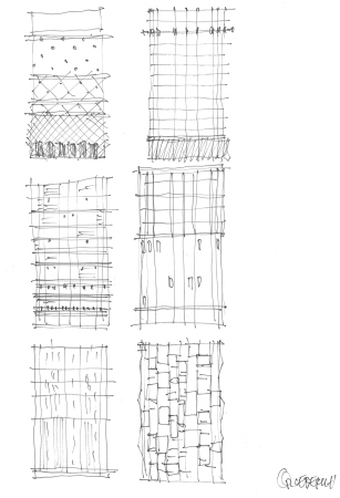
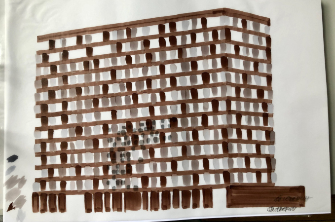
    An apartment complex within the bigger complex “City on the Tushino River 2018”. A sketch by Alexander Balabin
    Copyright © Severin Project
  • zooming
    2 / 7
    An apartment complex within the bigger complex “City on the Tushino River 2018”. A sketch by Alexander Balabin
    Copyright © Severin Project
  • zooming
    3 / 7
    An apartment complex within the bigger complex “City on the Tushino River 2018”. A sketch by Alexander Balabin
    Copyright © Severin Project
  • zooming
    4 / 7
    An apartment complex within the bigger complex “City on the Tushino River 2018”. A sketch by Alexander Balabin
    Copyright: provided by Severin Project
  • zooming
    5 / 7
    An apartment complex within the bigger complex “City on the Tushino River 2018”. A sketch by Alexander Balabin
    Copyright © Severin Project
  • zooming
    6 / 7
    An apartment complex within the bigger complex “City on the Tushino River 2018”. A sketch by Alexander Balabin
    Copyright: provided by Severin Project
  • zooming
    7 / 7
    An apartment complex within the bigger complex “City on the Tushino River 2018”. A sketch by Alexander Balabin
    Copyright: provided by Severin Project


It turns out that if you want to land a decent contract, you have to work like Jacob did for Rachel, for several years. Today, you have large-scale housing complexes in your portfolio, even giants. Can you please share about the “Roman Quarters”, and how the authorship was divided there? 

We landed a commission to do the 3rd stage of Roman Quarters for FSK. Mikhail Filippov created a concept for all the three stages. Then he did the design development for the first stage – and this is where his collaboration with the client ended. Then other architects did something else based on his concept. We had a task of fundamentally revising the concept, and increasing the output of useful floor space, which led to the overall area of the 3rd stage being 365,000 square meters. 

We gave our answer to the question what Roman Quarters must look like. The answer from Mikhail Filippov is more ensemble-like, more hierarchical. As for us, we tried to recreate the multiple overlapping levels, which are typical for Rome, this kind of uneven construction with a broken redline belonging to different epochs. Just think: there is a ruin from Antique architecture, then it gets overbuilt by the Barbarians. Then medieval castles appear, which are covered by Renaissance galleries later on. I even threw in a couple of modern facades. As a result, Stage 3 is already in construction. Too bad they “cut down” our ruins when we were getting the “city and architectural image” approval.

  • zooming
    1 / 7
    “Rimsky” housing complex (Stage III), the project
    Copyright © Severin Project
  • zooming
    2 / 7
    “Rimsky” housing complex (Stage III), the project
    Copyright © Severin Project
  • zooming
    3 / 7
    “Rimsky” housing complex (Stage III), the project
    Copyright © Severin Project
  • zooming
    4 / 7
    Rimsky (“Roman”) housing complex (Phase III), a project
    Copyright © Severin Project
  • zooming
    5 / 7
    Rimsky (“Roman”) housing complex (Phase III), a project
    Copyright © Severin Project
  • zooming
    6 / 7
    “Rimsky” housing complex (Stage III), the project
    Copyright © Severin Project
  • zooming
    7 / 7
    Rimsky (“Roman”) housing complex (Phase III), a project
    Copyright: provided by Severin Project


The complex consists of buildings that have a varying number of floors, which has to do with insolation. The yards are situated on stylobates. People go for walks on the upper level. All the vehicles, except for emergency ones, drive on the bottom level. There was yet another problem that we had to face: a chunk of land with a pipeline was alienated, and we had to provide the stipulated technical and economic performance on whatever land we had left. And we “squeezed” out of it 190,000 square meters of apartments alone. The client, however, did not appreciate our effort. Besides, they changed the subject of the contract several times. This was challenging work but we managed. Nobody before us did.

Speaking of challenging projects, I want to ask you how you deal with clients? How do you organize your relationship? What problems do you have to face?

Lacunae in legislation, and the absence of a single legal base for clients and architects oftentimes invites escalation of conflicts. While in construction you can submit your project in milestones (you close your volume and your materials with a control certificate and get paid). In the field of design, however, it is the working documentation that is considered to be the volume of work; 365,000 square meters is a truckload of project documentation. But until a positive expert opinion is signed, you cannot receive a signed act. As a consequence, you are “hanging” in advance payments. They can tell you: we don’t want your work, we are dissolving the contract. They may find issues, however small, like a comma in the wrong place, and refuse to accept your work. There is a good saying: “If you’ve made use of somebody, this does not mean that you’re smarter. What it means is they trusted you more than they should have.” The fact that the rules of the game are so vague creates difficulties for everyone. Hence, we want to work with more “quality” clients.

You do both traditional and modernist architecture. Where did you learn historicism?

You learn things that are interesting to you as you go along. I look around and I see what this or that thing is made of. In addition, I have a huge architectural library – a 9x4 wall with bookshelves. I examined the architecture of orders several times. The first time it was when I designed a hotel in the form of a small palazzo for Almaz-Antey on the Ivankovskoe Highway. I perused my books in search of the rhythm of windows and cornices. I drew about 200 studies in the process of searching for the right facade design. I studied proportions using a Palladio book. I realized that I could not use them in full effect because I would then have to change the dimensions of the building, but some of them I did use.

Another project that was very interesting to me was a fitness center on Marshala Rybalko street next to Marshal housing complex designed by Mikhail Filippov. Burov, for example, when he was studying Brunelleschi, tried to understand the proportions of arches in order to keep up their “elasticity” on the facade of the Central House of Architects. I also invested a fair amount of time, only I did not exactly calculate, but drew the rhythm of the arch belts, until I found the right proportions. It was a bright and resonant thing but they did not finish it.

  • zooming
    1 / 6
    Maeshal housing complex
    Copyright: Photograph © Alexander Balabin
  • zooming
    2 / 6
    The Marshal housing complex
    Copyright: Photograph © Alexander Balabin
  • zooming
    3 / 6
    The Marshal housing complex
    Copyright: Photograph © Alexander Balabin
  • zooming
    4 / 6
    The Marshal housing complex
    Copyright: Photograph © Daniel Annenkov
  • zooming
    5 / 6
    The Marshal housing complex
    Copyright: Photograph © Daniel Annenkov
  • zooming
    6 / 6
    The Marshal housing complex
    Copyright: Photograph © Daniel Annenkov


What was your role in designing the Wine House complex?

Our part in this project, which was done for Gals Development, was the former Smirnoff warehouses, which later hosted the “Cornet” factory. The case required reconstruction, restoration, and new construction. We kept the Mognet vaults and the perimeter. Down below, where there are the vaults, we placed a restaurant, and further up the apartments. Later on, we designed for the same client a rugby school in Zelenograd, and a kindergarten within the Nasledie complex.

  • zooming
    1 / 5
    Winehouse housing complex. Luxury Loft
    Copyright: Photograph © Archi.ru
  • zooming
    2 / 5
    Winehouse housing complex. Luxury Loft
    Copyright: Photograph: Archi.ru
  • zooming
    3 / 5
    Winehouse housing complex. Luxury Loft
    Copyright: Photograph: Archi.ru
  • zooming
    4 / 5
    Winehouse housing complex. Luxury Loft
    Copyright: Photograph: Archi.ru
  • zooming
    5 / 5
    Winehouse housing complex. Luxury Loft
    Copyright: Photograph: Archi.ru


As far as I see, Severin Project has a large functional scope, from shopping centers to housing projects and schools, to nursing homes and transport facilities… 

We are not scared of taking on new challenges. We love making sense out of functional diagrams. Then breathe life into architectural forms. We did the design development phase of a huge shopping mall for Hines Development, almost 300,000 in the vicinity of Vnukovo. But in 2015 the American investors left. Before that, it was a shopping mall in Vidnoe, 110,000 square meters big. We also did a lot of projects for Russian Railways. At their commission, we examined all the 1,500 suburban stations of the Moscow Railroad. We did the analytics, prepared a project, and reconstructed 26 stations. One of them, Ochakovo, I designed myself, and it turned out to be a great one. We also did flowcharts for Transport Interchange Hubs. But it was a closed-door thing, and the company, with which we cooperated, did not win. We also did a reconstruction project for the railway station in Sergiev Posad, and a reconstruction project for a tea-packaging factory.

Tell me how your company is wired. What number of coworkers do you need to cover such a tremendous scope of tasks?

In 2004, I reorganized my company into Severin Group. There were four companies with different partners: Severin Project, Severin Design, Severin Group, and Severin Development. Severin Development essentially performed the function of the technical commissioner in Moscow. We were more known as a technical commissioner, and less as a general designer. A year ago, I sold my shares in all of the companies, save for Severin Project and Severin Design. Now I am focused solely on design.

We had 146 employees at the peak. There were 40 architects, 40 designers, and engineers of all specializations, because we do all sorts of working documentation. Plus accountants and couriers. Now we had to cut our staff because of the pandemic. Today, we chiefly finish current projects, new things remaining in the concept phase.

What does the word Severin in the names of your companies stand for?

My great-grandfather, the Cossack Ivan Logvinovich Severin, was a cabinetmaker. I named my company after him.

What would be your advice to young aspiring architects?

I am now teaching a management course in architecture at the Institute of Business and Design. I tell students that any project must be regarded as a chance. Life is short, and the professional age of an architect is only 20-25 years of actual activity. You graduate at twenty-five, and the light in your head comes on about ten years later, when you can design a project from beginning to end, fully grasping it with your mind, being at the peak of your mental clarity. You really start off at thirty-five, and you must manage to do something before you are sixty. This means five or seven major projects. This does not mean that you will not have any work after that – you will. But such projects that are really worth it, and you have rapport with your customer, will be few and far between. This is important. I was really lucky with the “Rocky Shore” winery. This is one in a million. Nobody ordered a masterpiece. But the very shape of this building must become – and already has become – part of our brand. And the winery itself turned into a regional landmark.

27 August 2021

Headlines now
The Golden Crown
The concept for a dental clinic in Yekaterinburg, developed by CNTR Studio, revolves around the idea of a “mouth full of gold”: pristine white porcelain stoneware walls are complemented by matte brass details. To avoid an overly literal interpretation, the architects focused on the building’s proportions, skillfully navigating between sunlight requirements and fire safety regulations.
Flexibility and Integration
Not long ago, we covered the project for the fourth phase of the ÁLIA residential complex, designed by APEX. Now, we’ve been shown different fence concepts they developed to enclose the complex’s private courtyards, incorporating a variety of public functions. We believe that the sheer fact that the complex’s architects were involved in such a detail as fencing speaks volumes.
A Step Forward
The HIDE residential complex represents a major milestone for ADM architects and their leaders Andrey Romanov and Ekaterina Kuznetsova in their quest for a fresh high-rise aesthetic – one that is flexible and layered, capable of bringing vibrancy to mass and silhouette while shaping form. Over recent years, this approach has become ADM’s “signature style”, with the golden HIDE tower playing a pivotal role in its evolution. Here, we delve into the project’s story, explore the details of the complex’s design, and uncover its core essence.
Gold in the Sands
A new office for a transcontinental company specializing in resource extraction and processing has opened in Dubai. Designed by T+T Architects, masters of creating spaces that are contemporary, diverse, flexible, and original, this project exemplifies their expertise. On the executive floor, a massive brass-clad partition dominates, while layered textures of compressed earth create a contextually resonant backdrop.
Layers and Levels of Flight
This project goes way back – Reserve Union won this architectural competition at the end of 2011, and the building was completed in 2018, so it’s practically “archival”. However, despite being relatively unknown, the building can hardly be considered “dated” and remains a prime example of architectural expression, particularly in the headquarters genre. And it’s especially fitting for an aviation company office. In some ways, it resembles the Aeroflot headquarters at Sheremetyevo but with its own unique identity, following the signature style of Vladimir Plotkin. In this article, we take an in-depth look at the United Aircraft Corporation (UAC) headquarters in the Moscow agglomeration town of Zhukovsky, supplemented by recent photographs from Alexey Naroditsky – a shoot that became only recently possible due to the fact that improvements were finally made in the surrounding area.
Light and Shadow
In this article, we delve into the architectural design of the “Chaika” house by DNK ag architects, which was recently completed in 2023 as part of the collection of signature designs at ZILArt. As is well-known, all the buildings in this complex follow a design code, yet each one is distinct. This particular building stands out not only for its whiteness and minimalism but also for the refined use of a limited number of techniques that, together, create what can confidently be called synergy.
Casus Novae
A master plan was developed for a large residential area with a name of “DNS City”, but now that its implementation began, the plan has been arbitrarily reformatted and replaced with something that, while similar on the surface, is actually quite different. This is not the first time such a thing happens, but it’s always frustrating. With permission from the author, we are sharing Maria Elkina’s post.
Treasure Hunting
The GAFA bureau, in collaboration with Tegola and Arkhitail, organized an expedition to the island of Kilpola in Karelia as part of Moskomarkhitektura’s “Open City” festival. There, amidst moss and rocks, the students sought answers to questions like: what is the sacred, where does it dwell, and what sustains it? Assisting the participants in this quest were landscape engineer Evgeny Levin, artist Nicholas Roerich, a moose, and the lack of cellular connection. Here’s how the story unfolded.
Depths of the Earth, Streams of Water
In the Malaya Okhta district, the Akzent building, designed by Stepan Liphart, was constructed. It follows a classic tripartite structure, yet it’s what you might call “hand-drawn”: each façade is unique in its form and details, some of which aren’t immediately noticeable. In this article, we explore the context and, together with the architect, delve into how the form was developed.
Fir Tree Dynamics
The “Airports of Region” holding is planning to build an airport in Karachay-Cherkessia, aiming to make the Arkhyz and Dombay resorts more accessible to travelers. The project that won in an invitation-only competition, submitted by Sergey Nikeshkin’s KPLN, blends natural imagery inspired by the shape of a conifer seed, open-air waiting spaces, majestic large trees, and a green roof elevated on needle-like columns. The result is both nature-inspired and WOW.
​A Brick Shell
In the process of designing a clubhouse situated among pine trees in a prestigious suburban area near Moscow, the architectural firm “A.Len” did the façade design part. The combination of different types of brick and masonry correlates with the volumetric and plastique solutions, further enhanced by the inclusion of wood-painted fragments and metal “glazing”.
Word Forms
ATRIUM architects love ambitious challenges, and for the firm’s thirtieth anniversary, they boldly play a game of words with an exhibition that dives deep into a self-created vocabulary. They immerse their projects – especially art installations – into this glossary, as if plunging into a current of their own. You feel as if you’re flowing through the veins of pure art, immersed in a universe of vertical cities, educational spaces – of which the architects are true masters – and the cultural codes of various locations. But what truly captivates is the bold statement that Vera Butko and Anton Nadtochy make, both through their work and this exhibition: architecture, above all, is art – the art of working with form and space.
Flexibility and Acuteness of Modernity
Luxurious, fluid, large “kokoshniks” and spiral barrel columns, as if made from colorful chewing gum: there seem to be no other mansion like this in Moscow, designed in the “Neo-Russian-Modern” style. And the “Teremok” on Malaya Kaluzhskaya, previously somewhat obscure, has “come alive with new colors” and gained visibility after its restoration for the office of the “architectural ecosystem” as the architects love to call themselves. It’s evident that Julius Borisov and the architects at UNK put their hearts into finding this new office and bringing it up to date. Let’s delve into the paradoxes of this mansion’s history and its plasticity. Spoiler: two versions of modernity meet here, both balancing on the razor’s edge of “what’s current”.
Yuri Vissarionov: “A modular house does not belong to the land”
It belongs to space, or to the air... It turns out that 3D printing is more effective when combined with a modular approach: the house is built in a workshop and then adapted to the site, including on uneven terrain. Yuri Vissarionov shares his latest experience in designing tourist complexes, both in central Russia and in the south. These include houseboats, homes printed from lightweight concrete using a 3D printer, and, of course, frame houses.
​Moscow’s First
“The quality of education largely depends on the quality of the educational environment”. This principle of the last decade has been realized by Sergey Skuratov in the project for the First Moscow Gymnasium on Rostovskaya Embankment in the Khamovniki district. The building seamlessly integrates into the complex urban landscape, responding both to the pedestrian flow of the city and the quiet alleyways. It skillfully takes advantage of the height differences and aligns with modern trends in educational space design. Let’s take a closer look.
Looking at the Water
The site of Villa Sonata stretches from the road to the water’s edge, offering its own shoreline, pier, and a picturesque river panorama. To reveal these sweeping views, Roman Leonidov “cut” the façade diagonally parallel to the river, thus getting two main axes for the house and, consequently, “two heads”. The internal core – two double-height spaces, a living room and a conservatory, with a “bridge” above them – makes the house both “transparent” and filled with light.
The White Wing
Well, it’s not exactly white. It’s more of a beige, white-stone structure that plays with the color of limestone – smoother surfaces are lighter, while rougher ones are darker. This wing unites various elements: it absorbs and interprets the surrounding themes. It responds to everything, yet maintains a cohesive expression – a challenging task! – while also incorporating recognizable features of its own, such as the dynamic cuts at the bottom, top, and middle.
Urban Dunes
The XSA Ramps team designed and built a three-part sports hub for a park in Rostov-on-Don, welcoming people of all ages and fitness levels. The skate plaza, pump track, and playground are all meticulously crafted with details that attract a diverse range of visitors. The technical execution of the shapes and slopes transforms this space into a kind of sculptural composition.
Proportional Growth
The project for the fourth phase of the ÁLIA residential area has been announced. The buildings are situated on an elongated plot – almost a “ray” that shoots out from the center of the area towards the river. Their layout reflects both a response to Moscow’s architectural preferences over the past 15 years, shifting “from blocks to towers”, and an interpretation of the neighboring business park designed by SOM. Additionally, the best apartments here are not located at the very top but closer to the middle, forming a glowing “waistline”.
The “Staircase” Building
In designing the “Details” residential complex in New Moscow, Rais Baishev spiced up the now-popular Moscow theme of a “courtyard” building with an idea drawn from the surrealist drawings by Maurits Escher. He envisioned the stepped silhouettes and descending slopes as a metaphysical mega-staircase, creating a key void within the courtyard that gave the project an internal “spine”. This concept is felt both in the building’s silhouette and on its façades.
Projection of the Quarter
No one doubted that the building that Vladimir Plotkin designed as part of the “Garden Quarters” would be the most modernist of all. And it turned out just that way: while adhering to the common design code, the building successfully combines brick and white stone, rhythmically responding to the neighboring building designed by Ostozhenka, yet tactfully and persistently making a few statements of its own. This includes the projection of the ideal urban development composition “14–9–6”, which can be found right next door, mathematical calculations, including those for various types of terraces (and perhaps the only reminder of the Soviet past of the Kauchuk rubber factory!), and the white “cross-stitch” pattern of the façade grid.
Domus Aurea
In this issue, we examine the “Tessinsky-1” house, designed by Sergey Skuratov and completed in 2023. Located in the middle of the Serebryanicheskaya Embankment district, at the intersection of its main streets, this house assumes a sort of “nodal” role: it not only responds to everything around it and preserves many memories of the former EMA factory within itself, but it weaves all this into a newly directed pattern, reconciling bright “gold” and dark-colored brick, largely with the help of the new, modern-yet-archaic Columba brick, which, come to think about it, is the most precious element here.
The Chimney of Nikola-Lenivets
In this issue, we are examining the “Obelisk House” designed by KATARSIS and built for the Arkhstoyanie 2023 festival. However, it was only finished later on, and this is why we are examining it now. It seems to us that after the “Obelisk House” appeared in Nikola-Lenivets, a dialogue and a few inner connections appeared between the temporary structures built here. These houses no longer look like “accidental neighbors”, more of which below.
​Periscope by the Bay
The jury awarded the second place in the competition for a public and cultural center in Petropavlovsk-Kamchatsky to the companies GORA (“Mountain”) and M4. In the consortium’s proposal, the building resembles a sperm whale with a calf swimming next to it or a periscope, whose lenses capture the most spectacular views from the surrounding landscape.
From Arcs to Dolmens
While working on the competition project for Petropavlovsk-Kamchatsky, ASADOV Architects prioritized the value of the natural and urban environment, aiming to preserve the balance of the location while minimizing the resemblance of the volume that they designed to a “traditional building”. The task was challenging, and the architects created three versions, one of which having been developed after the competition, where their main proposal took third place. However, the point of interest here is not the competition result but the continuity of creative thinking.
Hide and Seek
The ID Moskovskiy house, designed by Stepan Liphart in St. Petersburg, in the courtyards near Moskovskiy Avenue beyond the Obvodny Canal and recently completed, is notable for several reasons. Firstly, it has been realized with considerable accuracy, which is particularly significant as this is the first building where the architect was responsible not only for the facades but also for the layouts, allowing for better integration between the two. On the other hand, this building is interesting as an example of the “germination” of new architecture in the city: it draws on the best examples from the neighborhood and becomes an improved and developed sum of ideas found by the architect in the surrounding context.
The Big Twelve
Yesterday, the winners of the Moscow Mayor’s Architecture Award were announced and honored. Let’s take a look at what was awarded and, in some cases, even critique this esteemed award. After all, there is always room for improvement, right?
Above the Golden Horn
The residential complex “Philosophy” designed by T+T architects in Vladivostok, is one of the new projects in the “Golubinaya Pad” area, changing its development philosophy (pun intended) from single houses to a comprehensive approach. The buildings are organized along public streets, varying in height and format, with one house even executed in gallery typology, featuring a cantilever leaning on an art object.
Nuanced Alternative
How can you rhyme a square and space? Easily! But to do so, you need to rhyme everything you can possibly think of: weave everything together, like in a tensegrity structure, and find your own optics too. The new exhibition at GES-2 does just that, offering its visitor a new perspective on the history of art spanning 150 years, infused with the hope for endless multiplicity of worlds and art histories. Read on to see how this is achieved and how the exhibition design by Evgeny Ace contributes to it.
Blinds for Ice
An ice arena has been constructed in Domodedovo based on a project by Yuri Vissarionov Architects. To prevent the long façade, a technical requirement for winter sports facilities, from appearing monotonous, the architects proposed the use of suspended structures with multidirectional slats. This design protects the ice from direct sunlight while giving the wall texture and detail.