По-русски

​Yards and Towers: the Samara Experiment

The project of “Samara Arena Park”, proposed by Sergey Skuratov, scored second place in the competition. The project is essentially based on experimenting with typology of residential buildings and gallery/corridor-type city blocks combined with towers – as well as on sensitive response to the context and the urge to turn the complex into a full-fledged urban space providing a wide range of functions and experiences.

11 March 2021
Object
mainImg
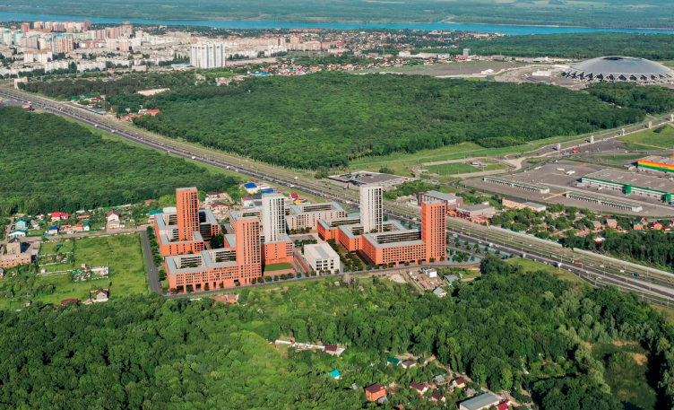
The competition for “Samara Arena Park”, conducted by MAAM in the past 2020, was devoted to the concept of developing the land site not far away from the new arena, built in Samara for the World Soccer Championship 2018, at the northern outskirt of the city, on the way to the Kurumoch Airport. Almost simultaneously with it, another competition was conducted, for landscaping the land around the Arena – it was clear that Samara decided to give a serious thought to actualizing the territories lying along the Moscow Highway. The Arena Park is located south of the stadium, and, if we are to drive from the city center to the airport, it will be lying right of the highway. The site is essentially greenfield – a vacant lot for construction with rather pleasant surroundings: it is flanked by woodland on either side, with dacha estates lying south of it.

First place in the “Arena Park competition was scored by the project submitted by the Danish company Juul | Frost Arkitekter, about which we already shared: it looks like a cross between a picturesque asymmetric medieval town and a “garden” city with liberal greenery, with grass growing even on the rooftops.

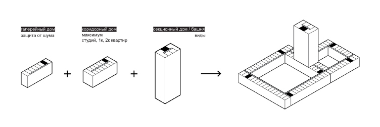
The project by Sergey Skuratov, which came second, is also characterized by keen attention to detail in terms of landscaping of public territories, but it is more focused on other tasks. The architects approached working with the concept as an opportunity to experiment with the typology of residential buildings: they abandoned the predominance of a sectional building, generally accepted in Russian construction design over the past 20 years, in favor of a mix of gallery and corridor houses with towers as part of city-block development.

The concept of the housing project near Samara Arena / competition project 2020


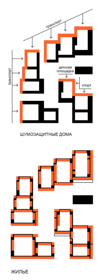
The project ended up consisting largely of city blocks, where in the northern part, closer to the roads, as well as sports fields and playgrounds, galleries are mainly located – spaces for movement, not life, for which noise and poor insolation are not as critical as for bedrooms or living rooms.

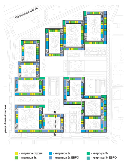
As a result, we are seeing a very unconventional planning approach: the thickness of the buildings that frame a city block varies from place to place because it is sometimes of the gallery type (consisting of one row of apartments), and sometimes of the corridor type (the apartments being grouped along the corridor, and the volume becoming thicker). Interestingly, the inner passage itself remains unbroken: the gallery bleeds into a corridor and vice versa, it meets the elevator halls, goes in loops, provides access to the neighboring block, and sometimes makes a zigzag, receding and making room for corner apartments. Furthermore, these corner apartments, mostly of a larger size than average, sometimes even stand out on their corners, not even trying to keep the contour intact, but, conversely, catching light and panoramas.

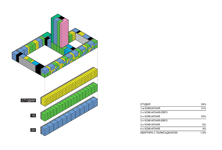
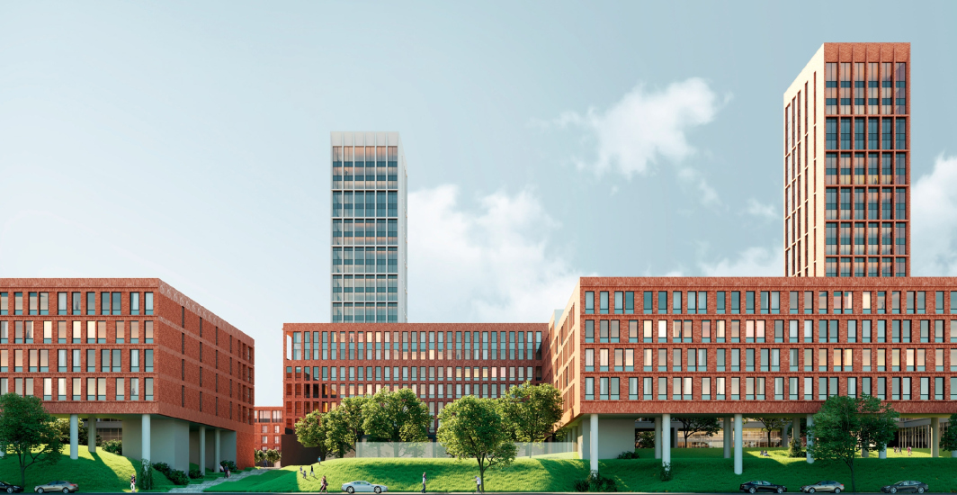
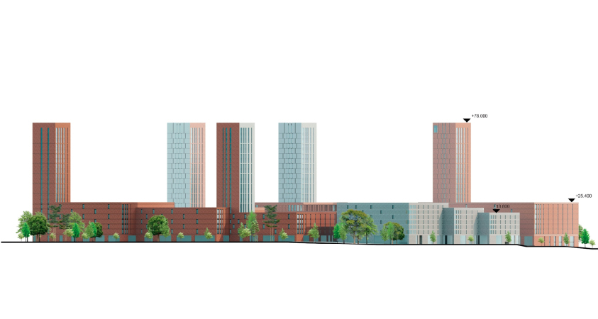
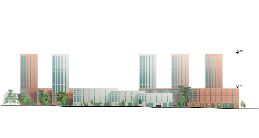
Above the “thick” corridor volumes in the spots of the staircase-and-elevator cores, grow five landmark towers 22 stories high, which comprise 25% of the housing stock. The other 75% fall on the low-rise houses from five to seven stories high.

  • zooming
    The concept of the housing project near Samara Arena / competition project 2020
  • zooming
    The concept of the housing project near Samara Arena / competition project 2020


The proposed layouts, flexible and coherent, allowed the architects to save up on the staircase-and-elevator units: they are fewer than they would have been in a regular house, divided into narrow isolated sections.

The adaptive character of the solution is highlighted by asymmetry: eleven blocks of different sizes are joined, like atoms, into molecules of two or three volumes, connected on the inside by galleries and corridors. The resulting composition has something of Brownian motion about it – one can see that it parametrically reacts to internal requirements and external conditions.

The apartment design is focused on the dominance of small flats, dictated by the market: studios and one-room apartments totally account for more than a half of the complex (these layouts are particularly numerous in the corridor planning). However, the offered line includes the entire range up to 4-room abodes – in the towers. The set includes both traditional and “European” layouts with kitchens functioning as living rooms. But then again, according to the architects, the apartments are designed flexibly and can be fine-tuned – what the complex offers is the approach, and not a solution carved in stone, which is what makes it even more interesting.

The concept of the housing project near Samara Arena / competition project 2020


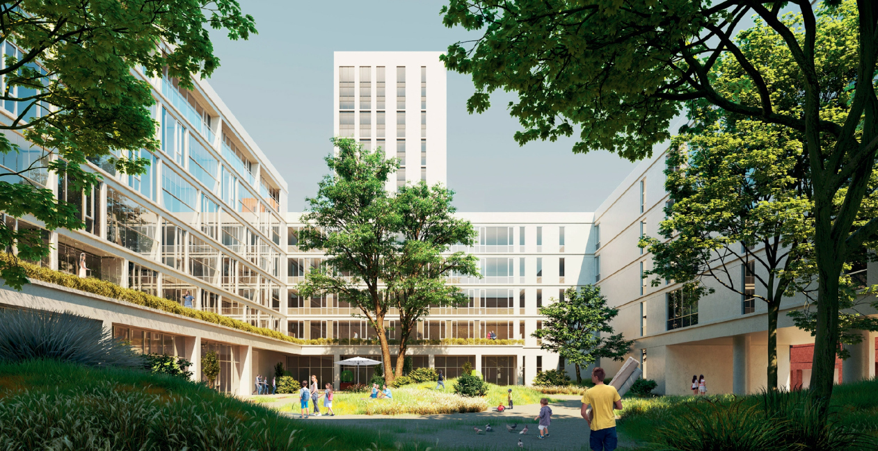
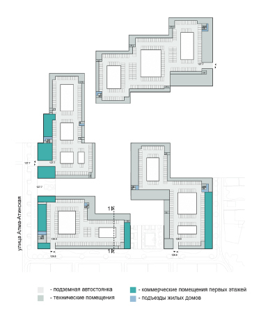
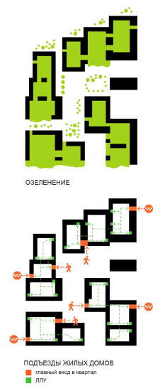
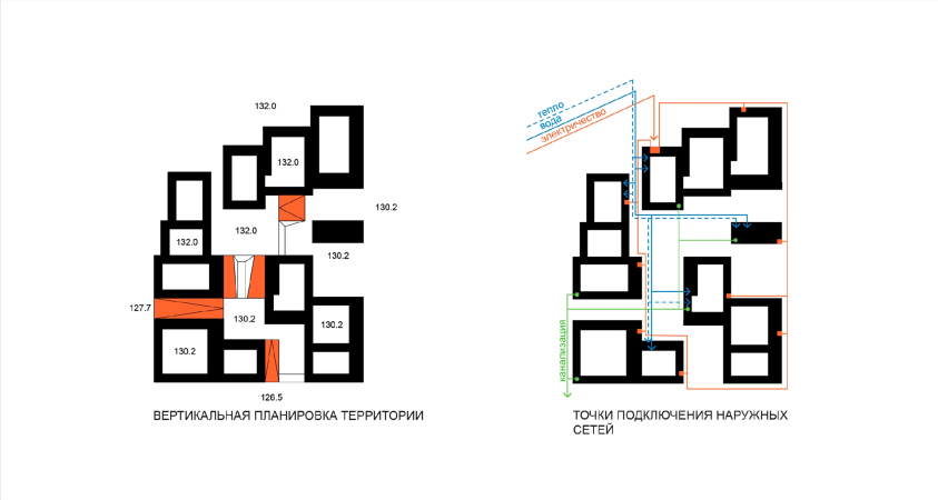
The low height of the blocks – we will note here that it decreases in the southern part, and increases to the north and towards the highway – made it possible to provide enough natural light to the courtyards. Interestingly, in order to make the yards as green as possible, the architects proposed to vacate their central parts from the underground car park: the single level of the car park gravitates towards the contours of the houses, and thus it will be possible to plant trees with a good root system in the center of each yard. We will also note that the degree of openness and closeness of the facades in the courtyard depends in a very noticeable way on the level of illumination: where the sun is, there is glass, where the shadow is, the walls prevail.

  • zooming
    1 / 3
    The concept of the housing project near Samara Arena / competition project 2020
  • zooming
    2 / 3
    The simplified plan of the private yards. The concept of the housing project near Samara Arena / competition project 2020
  • zooming
    3 / 3
    Plan of the -1st floor: car parks, public functions, and maintenance. The concept of the housing project near Samara Arena / competition project 2020


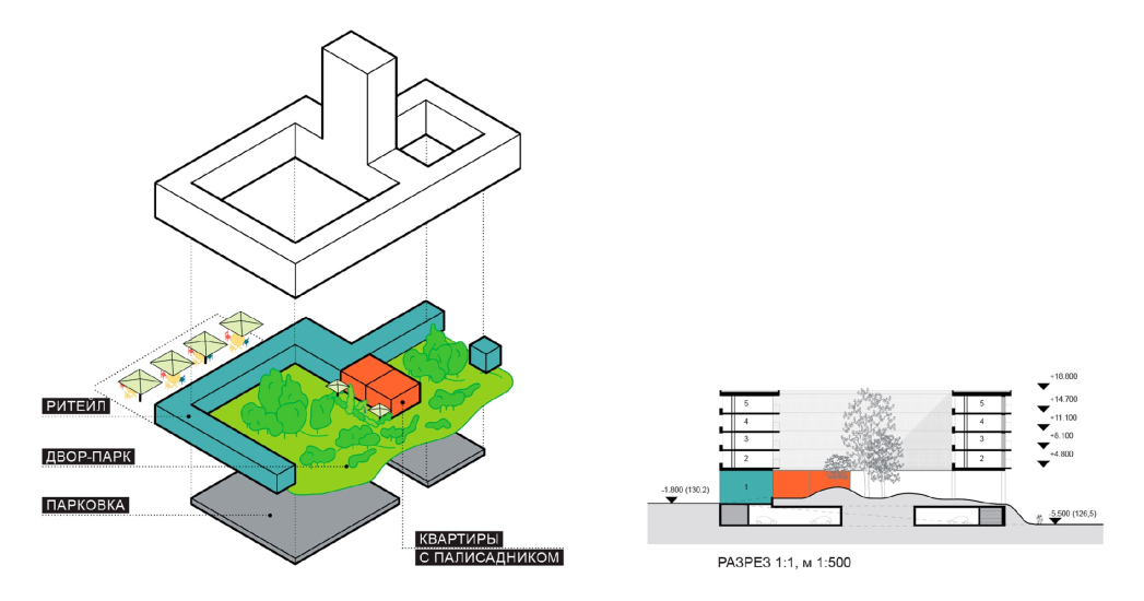
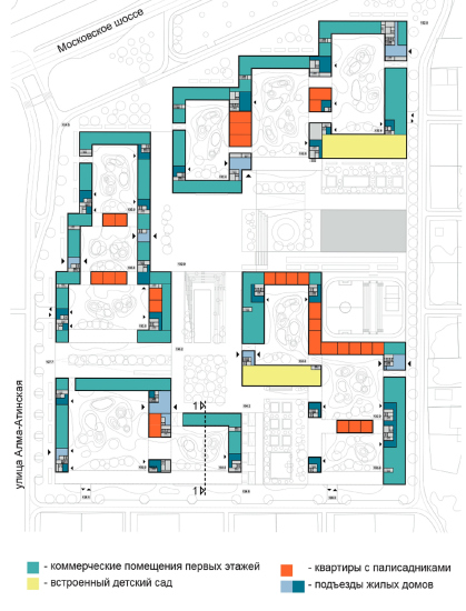
It is here on the first floors that apartments with private little gardens appear. According to the concept, the yards are only accessible to the residents.

  • zooming
    The plan for combining retail on the outer contour with little gardens in the yard. In the section view we can see the underground car park with “breaks” in the central parts of the yards. The concept of the housing project near Samara Arena / c
  • zooming
    The concept of the housing project near Samara Arena / competition project 2020


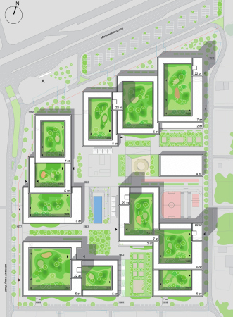
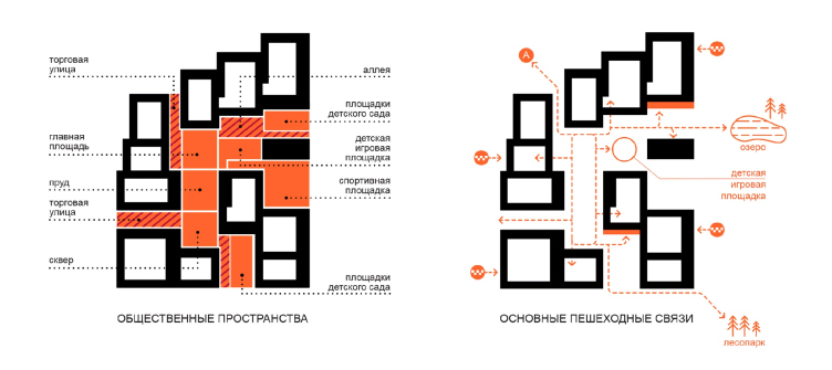
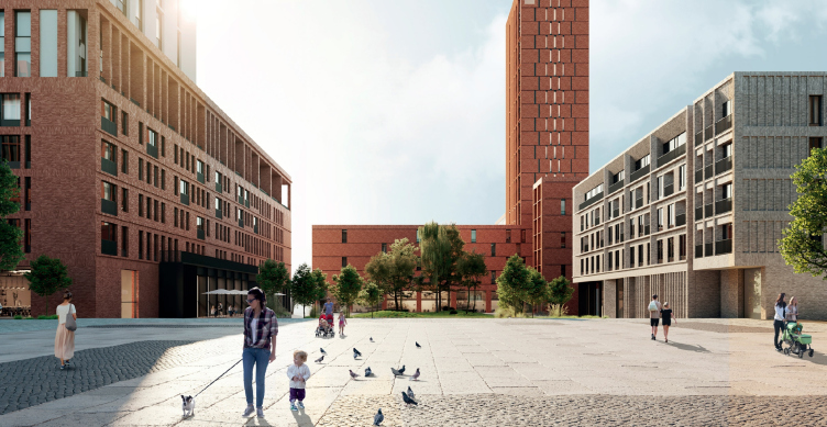
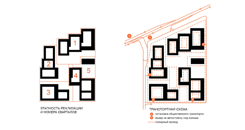
However, it does not just come down to the composition of the houses with their experimental layouts and “garden” yards. Sergey Skuratov interprets his housing project as a mini-city, paying a lot of attention to public spaces inside. Between the blocks, city squares form, the territory of each of which is comparable in size to the in-block courtyard. This way, the spatial unit becomes common for the yard and the plaza, while their functions and accessibility are different – the architects interpret the inner squares as the “city yards” and include them into the overall count – thus, together with the public spaces, there are 16 yards, 11 private (residents-only), and 5 accessible to the city people. 

The 11 residents-only yards. The concept of the housing project near Samara Arena / competition project 2020


The public spaces. The concept of the housing project near Samara Arena / competition project 2020


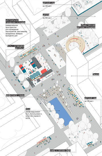
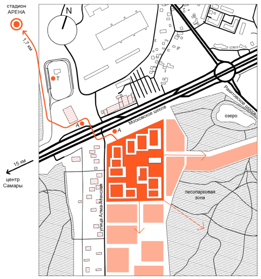
The entrances to the territory of the complex are located on each of the four sides, practically in the cardinal points, between the blocks, open to the surroundings, but not exactly “wide-open”. Interestingly, the passage from the side of the noisy highway is relatively narrow – it also provides protection from the noise. The squares are grouped closer to the center, three of them are strung on the meridian axis: the main, “noisy” square intended for gatherings and events, paved almost entirely, is located closest to the highway; to the south, a pond area adjoins it, with an amphitheater by the water, further, closer to the dachas, a square – the activity seems to “dissolve in nature” from the highway to the quiet village.

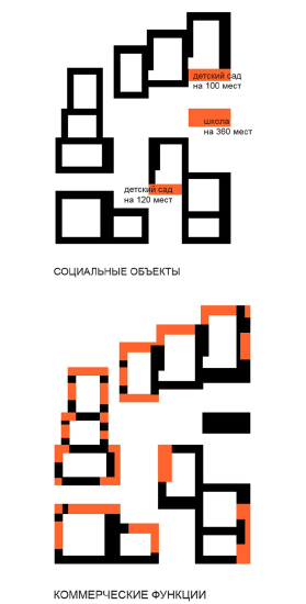
In the eastern part of the complex, between the blocks, there is a school; next to it, on the first floors of the residential buildings, there are two built-in kindergartens. Between the central square and the school there is a playground or a “children’s square” open to everyone, also with an amphitheater (note that both amphitheaters are built into the terrain, which rises here, in total, by 5 meters towards the highway, and in the center it has a drop of about 2 meters). South of the school, there is a “sports square”, fifth by count. The so-called commercial, a.k.a rentable, bottom floors with shops and cafes are grouped both on the outer contour of the complex and on the side of the inner plazas.

  • zooming
    The concept of the housing project near Samara Arena / competition project 2020
  • zooming
    The concept of the housing project near Samara Arena / competition project 2020


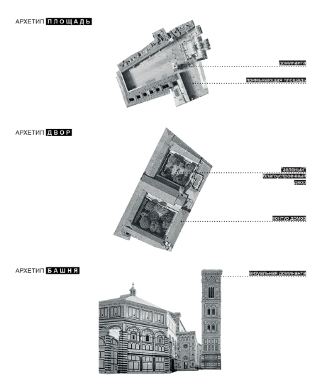
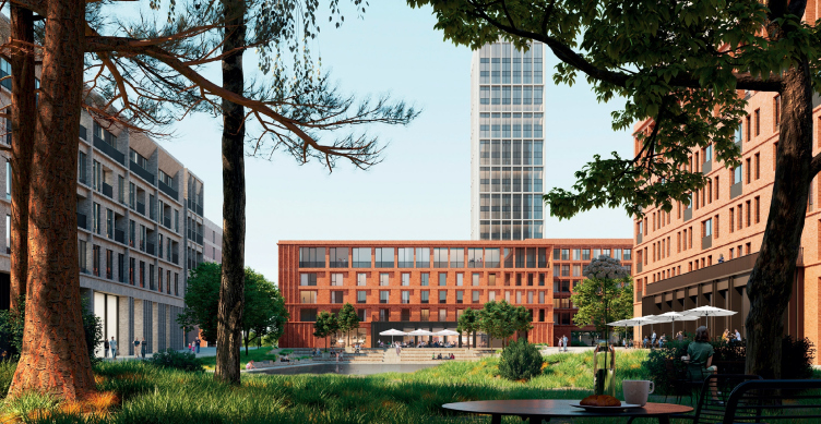
The entire volumetric and functional layout is interpreted as a mix of well-known morph types of urban construction: a square, a yard, and a tower – to which Sergey Skuratov makes a direct reference, presenting his project as a variant of a city tested by centuries. In other words, according to this experimental competition project at the edge of Samara, behind the belt of micro-district development, among forests, fields, dachas, and industrial parks, could arise a “small town” with quite diverse morphology and hierarchy of spaces, compact, structurally diverse, and well thought out.

  • zooming
    The concept of the housing project near Samara Arena / competition project 2020
  • zooming
    The concept of the housing project near Samara Arena / competition project 2020


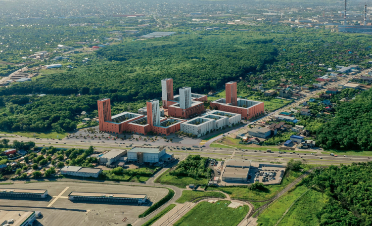
Outwardly, it does not imitate the forest environment at all, and does not try to present itself as a part of the natural relief – on the contrary, all lines and volumes are straight, rigid, very man-made and even somewhat brutal, even with a slight flavor of industrial architecture. To some extent, the town appears as a “fort” – mainly due to the straight contours and the closeness of the outer walls. Which, I will remind you here, provides protection from the outside noise, and is characterized by a much greater amount of glazing, and a greater number of courtyards. Tower houses also create the image of a solid and reliable town, which does not spread over the field, but is quite capable of “standing up for itself.”

When viewed from a distance, the Sergey Skuratov complex looks like a countryside Renaissance estate somewhere in the fields of Lombardy: the collected and regular volumes present a striking contrast to the pastoral surroundings. The yards and the towers make one recall the Castello Sforzesco – we will note here, and this is important, that the analogies that appear here are based not on the “natural” medieval but on the renaissance city – the latter is more governed by the rational component and larger forms. And, besides, it is only the renaissance palazzo that can be characterized by a combination of a large green yard and an imposing tower; this is what makes it different from the cramped middle-age construction, where such yards could only be seen in the monasteries, and from the tenements of the XIX century, where both yards and towers were “squeezed” to yield more useful floor space. Basically, the experiment, carried out in this project, goes far beyond the confines of a purely planning task, and proposes some kind of a detailed, if not groundbreaking, version of block housing construction, not alien to, let’s say, traces of semblance with a number of historical prototypes. 

The concept of the housing project near Samara Arena / competition project 2020


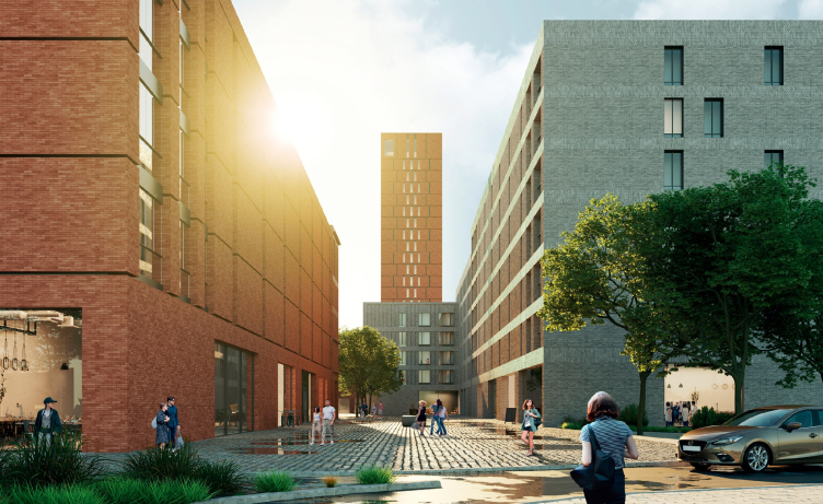
The façade color – Sergey Skuratov’s favorite combination of brick-red and white – also supports themes of both renaissance fort and industrial architecture. The two corner towers are fully red, the central one is white, and another two – again, the architect’s favorite technique – combine both colors, which ensures the diversity of beautiful views of the complex. The same thing with the city blocks: red prevail over white, yet in the yards the facades are light-colored. The school building is white.

The concept of the housing project near Samara Arena / competition project 2020


A beautiful view is presented by the portals of the south blocks from the side of the dacha settlement: the white rounded “legs” in the first floors and the hilly terrain below them make up an overpass, designed by the principle of the Narkomfin Building, designed by Moisei Ginzburg, just like the “green leg” underneath the houses, leading from the yard to the surroundings.

  • zooming
    The concept of the housing project near Samara Arena / competition project 2020
  • zooming
    The concept of the housing project near Samara Arena / competition project 2020


So, let us note that in addition to the planning and typological experiment in the project there is a significant proportion of responding to specific circumstances, and even of contextual “molding” of the complex that responds to the specifics of the environment: the difference in elevation and the contrast between the rigidity and activity of the environment near the highway, and natural relaxation on the border with the gardeners’ non-commercial partnership. 

Inside the complex, also appears an image teetering on the verge of old industrial architecture and a renaissance city, or maybe even post-renaissance, which emotion-wise can be likened to the postwar Milan: the towers, and the facades, reasonably straight, yet diverse in their texture. On the city squares, just like on the outside, there are quite a lot of walls, the glass does not prevail at all, and the space itself makes a smooth transition from the “city” square, regular and fully paved, to the more “lively” pond and little park. This vicinity, just as the diversity of the facades, ensures some kind of “gradient of impressions” built on the same leitmotif of going from city bustle to natural relaxation, which generated the yards open southward. 

The concept of the housing project near Samara Arena / competition project 2020


The concept of the housing project near Samara Arena / competition project 2020


The concept of the housing project near Samara Arena / competition project 2020


At first glance, much in this project is quite familiar, since it corresponds to modern trends: from the combination of blocks with the “correct” height of 5-7 floors with dominant towers, looking as if they were taken from a textbook on modern urbanism, and ending with the predominance of small apartments with a general variety of layouts, courtyards without cars, front gardens, public spaces, and a balance of natural and urban environment.

Yet, on the other hand, everything is very unusual. First of all, this is the asymmetry and the ostentatiously varied character of the city block “molecules” that look even more like cells viewed under a microscope: they stick to each other, split apart, their membranes sometimes thicker and sometimes thinner, and they respond both to inner logic and outside irritators. Another unusual thing is the set of layout options – it is common knowledge that gallery and corridor houses are not exactly popular nowadays. And why not? Provided the galleries prevail over corridors and are well lit (well, still worse than in the case of a “living room” layout, but still), this option could be in some respects quite attractive. Of course, I am not sure how many chances it stands to shake the already formed market trends: the market is a pretty inertial thing, and, unless forcefully taken out of its comfort zone, it will stick to time-tested solutions. Still, though, let’s not forget that this is an experimental project, even though it would be really interesting to implement it – it is highly unlikely that this will ever take place in Moscow with its trend to build complexes consisting of three towers each 200m high, but in Samara something like this is worth a shot.
  • zooming
    1 / 4
    The concept of the housing project near Samara Arena / competition project 2020
  • zooming
    2 / 4
    The concept of the housing project near Samara Arena / competition project 2020
  • zooming
    3 / 4
    The concept of the housing project near Samara Arena / competition project 2020
  • zooming
    4 / 4
    The concept of the housing project near Samara Arena / competition project 2020


11 March 2021

Headlines now
The Golden Crown
The concept for a dental clinic in Yekaterinburg, developed by CNTR Studio, revolves around the idea of a “mouth full of gold”: pristine white porcelain stoneware walls are complemented by matte brass details. To avoid an overly literal interpretation, the architects focused on the building’s proportions, skillfully navigating between sunlight requirements and fire safety regulations.
Flexibility and Integration
Not long ago, we covered the project for the fourth phase of the ÁLIA residential complex, designed by APEX. Now, we’ve been shown different fence concepts they developed to enclose the complex’s private courtyards, incorporating a variety of public functions. We believe that the sheer fact that the complex’s architects were involved in such a detail as fencing speaks volumes.
A Step Forward
The HIDE residential complex represents a major milestone for ADM architects and their leaders Andrey Romanov and Ekaterina Kuznetsova in their quest for a fresh high-rise aesthetic – one that is flexible and layered, capable of bringing vibrancy to mass and silhouette while shaping form. Over recent years, this approach has become ADM’s “signature style”, with the golden HIDE tower playing a pivotal role in its evolution. Here, we delve into the project’s story, explore the details of the complex’s design, and uncover its core essence.
Gold in the Sands
A new office for a transcontinental company specializing in resource extraction and processing has opened in Dubai. Designed by T+T Architects, masters of creating spaces that are contemporary, diverse, flexible, and original, this project exemplifies their expertise. On the executive floor, a massive brass-clad partition dominates, while layered textures of compressed earth create a contextually resonant backdrop.
Layers and Levels of Flight
This project goes way back – Reserve Union won this architectural competition at the end of 2011, and the building was completed in 2018, so it’s practically “archival”. However, despite being relatively unknown, the building can hardly be considered “dated” and remains a prime example of architectural expression, particularly in the headquarters genre. And it’s especially fitting for an aviation company office. In some ways, it resembles the Aeroflot headquarters at Sheremetyevo but with its own unique identity, following the signature style of Vladimir Plotkin. In this article, we take an in-depth look at the United Aircraft Corporation (UAC) headquarters in the Moscow agglomeration town of Zhukovsky, supplemented by recent photographs from Alexey Naroditsky – a shoot that became only recently possible due to the fact that improvements were finally made in the surrounding area.
Light and Shadow
In this article, we delve into the architectural design of the “Chaika” house by DNK ag architects, which was recently completed in 2023 as part of the collection of signature designs at ZILArt. As is well-known, all the buildings in this complex follow a design code, yet each one is distinct. This particular building stands out not only for its whiteness and minimalism but also for the refined use of a limited number of techniques that, together, create what can confidently be called synergy.
Casus Novae
A master plan was developed for a large residential area with a name of “DNS City”, but now that its implementation began, the plan has been arbitrarily reformatted and replaced with something that, while similar on the surface, is actually quite different. This is not the first time such a thing happens, but it’s always frustrating. With permission from the author, we are sharing Maria Elkina’s post.
Treasure Hunting
The GAFA bureau, in collaboration with Tegola and Arkhitail, organized an expedition to the island of Kilpola in Karelia as part of Moskomarkhitektura’s “Open City” festival. There, amidst moss and rocks, the students sought answers to questions like: what is the sacred, where does it dwell, and what sustains it? Assisting the participants in this quest were landscape engineer Evgeny Levin, artist Nicholas Roerich, a moose, and the lack of cellular connection. Here’s how the story unfolded.
Depths of the Earth, Streams of Water
In the Malaya Okhta district, the Akzent building, designed by Stepan Liphart, was constructed. It follows a classic tripartite structure, yet it’s what you might call “hand-drawn”: each façade is unique in its form and details, some of which aren’t immediately noticeable. In this article, we explore the context and, together with the architect, delve into how the form was developed.
Fir Tree Dynamics
The “Airports of Region” holding is planning to build an airport in Karachay-Cherkessia, aiming to make the Arkhyz and Dombay resorts more accessible to travelers. The project that won in an invitation-only competition, submitted by Sergey Nikeshkin’s KPLN, blends natural imagery inspired by the shape of a conifer seed, open-air waiting spaces, majestic large trees, and a green roof elevated on needle-like columns. The result is both nature-inspired and WOW.
​A Brick Shell
In the process of designing a clubhouse situated among pine trees in a prestigious suburban area near Moscow, the architectural firm “A.Len” did the façade design part. The combination of different types of brick and masonry correlates with the volumetric and plastique solutions, further enhanced by the inclusion of wood-painted fragments and metal “glazing”.
Word Forms
ATRIUM architects love ambitious challenges, and for the firm’s thirtieth anniversary, they boldly play a game of words with an exhibition that dives deep into a self-created vocabulary. They immerse their projects – especially art installations – into this glossary, as if plunging into a current of their own. You feel as if you’re flowing through the veins of pure art, immersed in a universe of vertical cities, educational spaces – of which the architects are true masters – and the cultural codes of various locations. But what truly captivates is the bold statement that Vera Butko and Anton Nadtochy make, both through their work and this exhibition: architecture, above all, is art – the art of working with form and space.
Flexibility and Acuteness of Modernity
Luxurious, fluid, large “kokoshniks” and spiral barrel columns, as if made from colorful chewing gum: there seem to be no other mansion like this in Moscow, designed in the “Neo-Russian-Modern” style. And the “Teremok” on Malaya Kaluzhskaya, previously somewhat obscure, has “come alive with new colors” and gained visibility after its restoration for the office of the “architectural ecosystem” as the architects love to call themselves. It’s evident that Julius Borisov and the architects at UNK put their hearts into finding this new office and bringing it up to date. Let’s delve into the paradoxes of this mansion’s history and its plasticity. Spoiler: two versions of modernity meet here, both balancing on the razor’s edge of “what’s current”.
Yuri Vissarionov: “A modular house does not belong to the land”
It belongs to space, or to the air... It turns out that 3D printing is more effective when combined with a modular approach: the house is built in a workshop and then adapted to the site, including on uneven terrain. Yuri Vissarionov shares his latest experience in designing tourist complexes, both in central Russia and in the south. These include houseboats, homes printed from lightweight concrete using a 3D printer, and, of course, frame houses.
​Moscow’s First
“The quality of education largely depends on the quality of the educational environment”. This principle of the last decade has been realized by Sergey Skuratov in the project for the First Moscow Gymnasium on Rostovskaya Embankment in the Khamovniki district. The building seamlessly integrates into the complex urban landscape, responding both to the pedestrian flow of the city and the quiet alleyways. It skillfully takes advantage of the height differences and aligns with modern trends in educational space design. Let’s take a closer look.
Looking at the Water
The site of Villa Sonata stretches from the road to the water’s edge, offering its own shoreline, pier, and a picturesque river panorama. To reveal these sweeping views, Roman Leonidov “cut” the façade diagonally parallel to the river, thus getting two main axes for the house and, consequently, “two heads”. The internal core – two double-height spaces, a living room and a conservatory, with a “bridge” above them – makes the house both “transparent” and filled with light.
The White Wing
Well, it’s not exactly white. It’s more of a beige, white-stone structure that plays with the color of limestone – smoother surfaces are lighter, while rougher ones are darker. This wing unites various elements: it absorbs and interprets the surrounding themes. It responds to everything, yet maintains a cohesive expression – a challenging task! – while also incorporating recognizable features of its own, such as the dynamic cuts at the bottom, top, and middle.
Urban Dunes
The XSA Ramps team designed and built a three-part sports hub for a park in Rostov-on-Don, welcoming people of all ages and fitness levels. The skate plaza, pump track, and playground are all meticulously crafted with details that attract a diverse range of visitors. The technical execution of the shapes and slopes transforms this space into a kind of sculptural composition.
Proportional Growth
The project for the fourth phase of the ÁLIA residential area has been announced. The buildings are situated on an elongated plot – almost a “ray” that shoots out from the center of the area towards the river. Their layout reflects both a response to Moscow’s architectural preferences over the past 15 years, shifting “from blocks to towers”, and an interpretation of the neighboring business park designed by SOM. Additionally, the best apartments here are not located at the very top but closer to the middle, forming a glowing “waistline”.
The “Staircase” Building
In designing the “Details” residential complex in New Moscow, Rais Baishev spiced up the now-popular Moscow theme of a “courtyard” building with an idea drawn from the surrealist drawings by Maurits Escher. He envisioned the stepped silhouettes and descending slopes as a metaphysical mega-staircase, creating a key void within the courtyard that gave the project an internal “spine”. This concept is felt both in the building’s silhouette and on its façades.
Projection of the Quarter
No one doubted that the building that Vladimir Plotkin designed as part of the “Garden Quarters” would be the most modernist of all. And it turned out just that way: while adhering to the common design code, the building successfully combines brick and white stone, rhythmically responding to the neighboring building designed by Ostozhenka, yet tactfully and persistently making a few statements of its own. This includes the projection of the ideal urban development composition “14–9–6”, which can be found right next door, mathematical calculations, including those for various types of terraces (and perhaps the only reminder of the Soviet past of the Kauchuk rubber factory!), and the white “cross-stitch” pattern of the façade grid.
Domus Aurea
In this issue, we examine the “Tessinsky-1” house, designed by Sergey Skuratov and completed in 2023. Located in the middle of the Serebryanicheskaya Embankment district, at the intersection of its main streets, this house assumes a sort of “nodal” role: it not only responds to everything around it and preserves many memories of the former EMA factory within itself, but it weaves all this into a newly directed pattern, reconciling bright “gold” and dark-colored brick, largely with the help of the new, modern-yet-archaic Columba brick, which, come to think about it, is the most precious element here.
The Chimney of Nikola-Lenivets
In this issue, we are examining the “Obelisk House” designed by KATARSIS and built for the Arkhstoyanie 2023 festival. However, it was only finished later on, and this is why we are examining it now. It seems to us that after the “Obelisk House” appeared in Nikola-Lenivets, a dialogue and a few inner connections appeared between the temporary structures built here. These houses no longer look like “accidental neighbors”, more of which below.
​Periscope by the Bay
The jury awarded the second place in the competition for a public and cultural center in Petropavlovsk-Kamchatsky to the companies GORA (“Mountain”) and M4. In the consortium’s proposal, the building resembles a sperm whale with a calf swimming next to it or a periscope, whose lenses capture the most spectacular views from the surrounding landscape.
From Arcs to Dolmens
While working on the competition project for Petropavlovsk-Kamchatsky, ASADOV Architects prioritized the value of the natural and urban environment, aiming to preserve the balance of the location while minimizing the resemblance of the volume that they designed to a “traditional building”. The task was challenging, and the architects created three versions, one of which having been developed after the competition, where their main proposal took third place. However, the point of interest here is not the competition result but the continuity of creative thinking.
Hide and Seek
The ID Moskovskiy house, designed by Stepan Liphart in St. Petersburg, in the courtyards near Moskovskiy Avenue beyond the Obvodny Canal and recently completed, is notable for several reasons. Firstly, it has been realized with considerable accuracy, which is particularly significant as this is the first building where the architect was responsible not only for the facades but also for the layouts, allowing for better integration between the two. On the other hand, this building is interesting as an example of the “germination” of new architecture in the city: it draws on the best examples from the neighborhood and becomes an improved and developed sum of ideas found by the architect in the surrounding context.
The Big Twelve
Yesterday, the winners of the Moscow Mayor’s Architecture Award were announced and honored. Let’s take a look at what was awarded and, in some cases, even critique this esteemed award. After all, there is always room for improvement, right?
Above the Golden Horn
The residential complex “Philosophy” designed by T+T architects in Vladivostok, is one of the new projects in the “Golubinaya Pad” area, changing its development philosophy (pun intended) from single houses to a comprehensive approach. The buildings are organized along public streets, varying in height and format, with one house even executed in gallery typology, featuring a cantilever leaning on an art object.
Nuanced Alternative
How can you rhyme a square and space? Easily! But to do so, you need to rhyme everything you can possibly think of: weave everything together, like in a tensegrity structure, and find your own optics too. The new exhibition at GES-2 does just that, offering its visitor a new perspective on the history of art spanning 150 years, infused with the hope for endless multiplicity of worlds and art histories. Read on to see how this is achieved and how the exhibition design by Evgeny Ace contributes to it.
Blinds for Ice
An ice arena has been constructed in Domodedovo based on a project by Yuri Vissarionov Architects. To prevent the long façade, a technical requirement for winter sports facilities, from appearing monotonous, the architects proposed the use of suspended structures with multidirectional slats. This design protects the ice from direct sunlight while giving the wall texture and detail.