По-русски

​The Energy Family

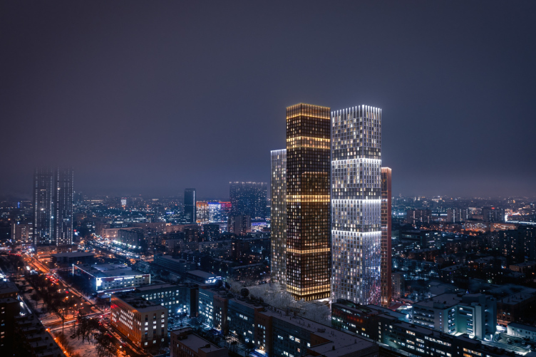
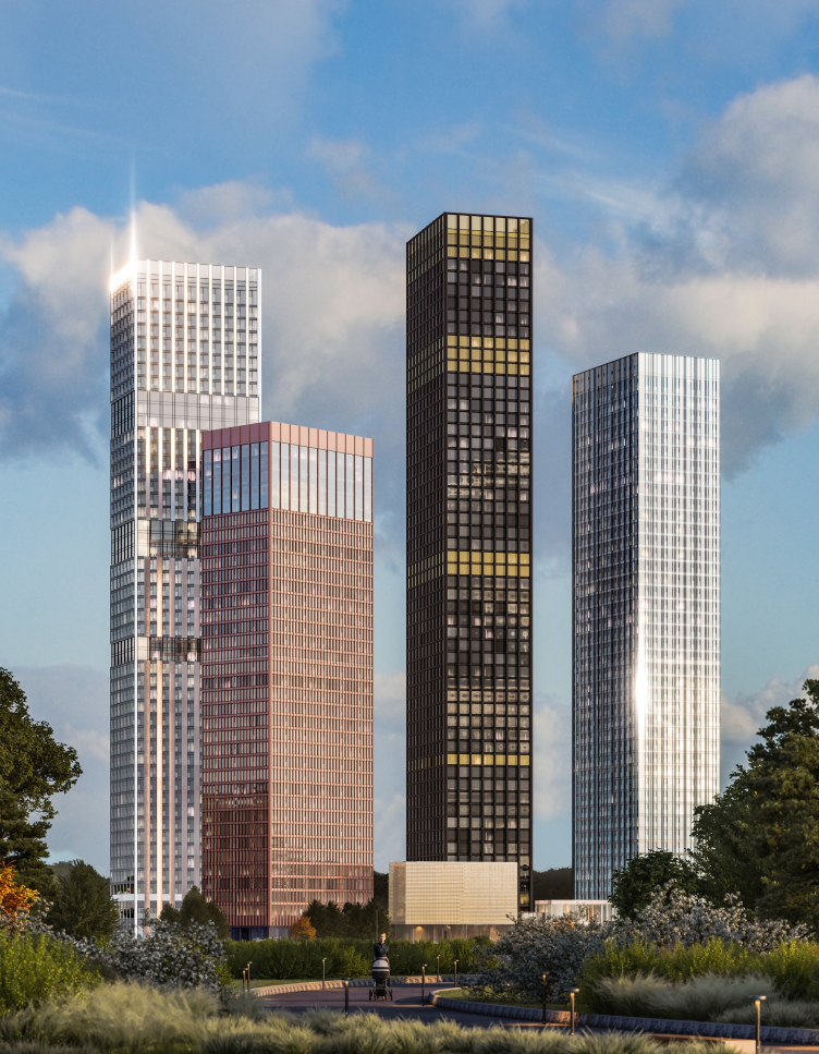
The housing complex Symphony 34 will be built in Moscow’s Savelovsky district; it will consist of four towers from 36 to 54 stories high. Each of the towers has an image of its own, but they all are gathered into a single architectural ensemble – a fragment of a new high-rise urban space lying outside the Third Transport Ring.

08 February 2021
Object
mainImg
The project of the high-rise housing complex Symphony 34 was developed by Kleinewelt Аrchitekten at the commission from MR Group. Its land site, small, 1.4 hectares, is situated in the north of Moscow, near Dmitrovskaya metro station, not far away from two other high-rise housing projects commissioned by the same developer: D1, designed by Kamen Architects, which is being finished mere 500 meters east of the metro station, and Savelovsky City, designed by SPEECH, which is plainly seen a bit farther away, behind the Dmitro Highway. Savelovsky was designed in the early 2010’s, the height of its buildings being 155m; D1 appeared a little bit later, in 2018, the height of its tallest tower being 191m. The new complex maintains the “growth trend” in the string of the residential skyscrapers, the topmost mark of its “main” tower being 190m. According to the architects, the town planning significance of the new high-rise project is that it “throws a visual bridge” from the already mentioned skyscrapers of Moscow’s north to the west, towards the high-rises of Leningrad Avenue. At the same time, in the East, in the distance, the string of high-rises is continued by the Ostankino TV tower and the 192-meter-high housing complex Tricolor.

Symphony 34 housing complex
Copyright: © Kleinewelt Architekten


Symphony 34 housing complex
Copyright: © Kleinewelt Architekten


Symphony 34 is one of the most recent high-rise projects of MR Group: the closed-door competition, which involved three architectural companies, took place in March 2020. Kleinewelt Аrchitekten won the competition and immediately got down working on the project.

The team of Sergey and Nikolai Pereslegins and George Trofimov offered the developer several versions of the future complex. As the chief architect of the project Xenia Vorobyeva shared, in all of the versions the architects aimed at creating a wow-effect by finding flashy solutions. Eventually, the developer opted for the version, which, as Xenia shares, the architects themselves liked best of all – the one with buildings of different height and expressive design of the facades.

Symphony 34 housing complex
Copyright: © Kleinewelt Architekten


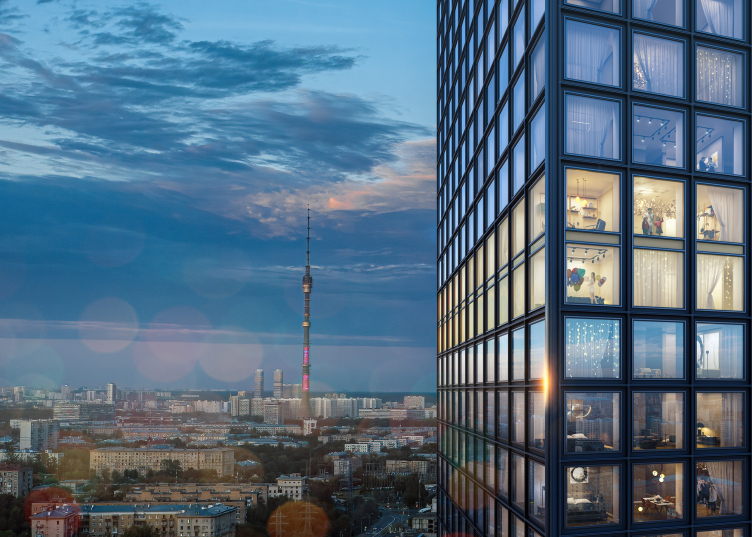
The architects had a task of forming a full-fledged living environment with a developed urban infrastructure, thoroughly organized yard space, extra public functions, and, of course, great views of the city. The towers will command panoramas of the Moscow City business center, Timiryazevsky park, and Ostankino TV tower.

Symphony 34 housing complex
Copyright: © Kleinewelt Architekten


The land site is situated next to the D2 line of Moscow Central High-Speed Diameter, which separates Savelovsky and Timiryazevsky districts; the Dmitrovskaya station of Moscow Central High-Speed Diameter will also be the closest entrance to the metro. Currently, the site is a small piece of industrial warehouse estate, the kind that usually alternates here with quite self-sufficient blocks of five-story houses.

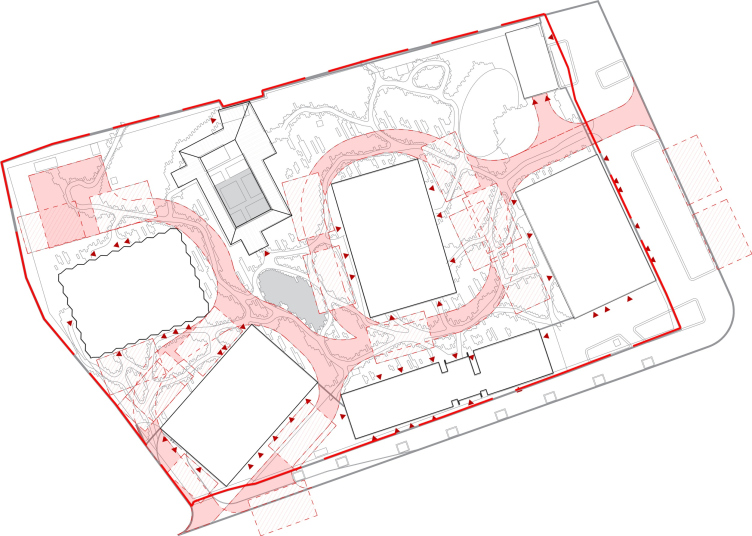
The arrangement of the four towers that make up Symphony 34 was conditioned by the proximity of the railroad line, views from the windows, but, above all, by the insolation requirements. According to Xenia Vorobyeva, the architects spent a lot of time moving the volumes and spinning them around their axes in order to let as much natural light as possible into the apartments – it was the insolation that determined the delicate turns of the towers in respect to one another, and their slight “waltzing” around the central Building A, the main high-rise centerpiece, proudly standing almost in the very center of the site.

Symphony 34 housing complex. The fire plan
Copyright: © Kleinewelt Architekten


As is known, making a composition of four towers is more difficult than two or three. Kleinewelt Аrchitekten took the path of the optimum balance of unity and diversity: the plans of all the buildings are based on the common column pitch of 3.3m, also reflected in the common “square” façade module. The unity is also enhanced by the materials – aluminum and glass (the apartment windows are no less than 2.1m high). The base spot of each tower is also of the same size. However, despite the unity of the mentioned parameters, each tower is endowed with a clear individual imagery: the color, the façade design, and the height of the towers are different. Hence, it comes as no surprise that all the four buildings got poetic names.

The architects emphasize that the complex will look really different when viewed from different vantage points, dynamically changing its silhouette, composition, and combinations of color accents.

The tallest Tower A has 54 floors in it, its height – 190m – meeting the height restrictions of the site. The tower was named Graphite after its pitch-black aluminum facets of the floor-by-floor panoramic stained glass windows 2.6x2.6m. The black color of the faceting pattern is echoed by polarized glass (whose tint, of course, works only on the outside, without blacking out the interiors of the apartments). The tallest tower, placed, as we remember, in the center of the composition, looks like a gigantic “graphic rod”, figuratively conveying the common words that skyscrapers both reflect and form the energy of a megalopolis. The four towers are as good as a nuclear power plant that generates the big city drive and processes its energy at the same time. The black skyscraper becomes a figurative paraphrase of the nuclear reactor graphite rod, the “moderator” of the city energy – visual in this specific case. At the same time, “sparks” are definitely flowing around it, and it does attract attention: by any standards, a tower is a pretty bold statement.

  • zooming
    Symphony 34 housing complex
    Copyright: © Kleinewelt Architekten
  • zooming
    Symphony 34 housing complex
    Copyright: © Kleinewelt Architekten


The tower is not completely black, however. In addition to the fact that the piers are livened up by a pattern of thin gray stripes, instead of the dark stained glass, some of the windows got transparent glass with a yellow tint. These light-colored windows form bands of varying width: two, one, two, three, and, finally, four floors up in the attic. The bands divide the skyscraper into unequal parts, playing with the scale; they look, particularly in the nighttime lighting, like some golden rings on a black glove, or maybe flames of pure energy running up and down the graphite core – which looks solemn and at the same time bold, just the way it should be with the main highlight. In a word, it is obvious that the black tower plays the first violin in this orchestra.

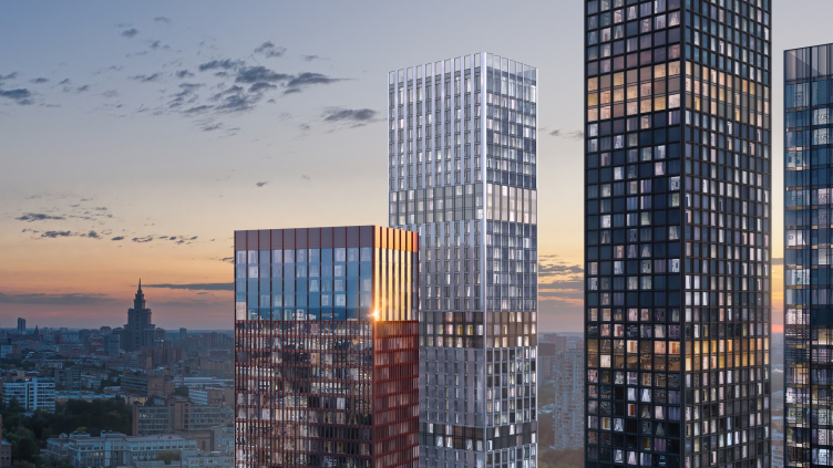
The second tallest tower, 49 stories high, is called Crystal. It is situated west of the center, and is turned to the central skyscraper at a 90-degree angle. It looks as though it was contradicting the main tower in every conceivable respect: while the black volume is smooth, Crystal is light and has a lot of ribs – yet at the same time it also looks like the main building’s Alter Ego in terms of height and the smooth glass “belts”, which also divide the volume into a few unequal parts, albeit in different proportions. Groups of towers are often described in “family” categories, such as “sister towers” or “spouse towers”, but, if you look from this side, the graphite and the crystal skyscrapers are, of course, mom and dad, or even yin and yang. At the same time, however, it would be hard to say which of the volumes the female one is: according to the Far East logic, it must be the black tower, but the European cultural tradition prompts us to consider the taller and the more austere volume to be the male one. However, no one insists on an uncompromising reading of the associative series in this case.

The volume of Crystal is elegant and silvery; it is composed of triangular bay windows, one half being tinted glass in the part between the floors, the other half being metallic surface. The bay windows are turned in such a way as to command the best views and let in as much as possible natural light. Everything works towards creating a “crystal” image with a multitude of facets and glitter of reflected light –and at the same time it all looks like a neat modernist pleating.

  • zooming
    Symphony 34 housing complex
    Copyright: © Kleinewelt Architekten
  • zooming
    Symphony 34 housing complex
    Copyright: © Kleinewelt Architekten


The two other towers of a smaller height could be interpreted as children of this imposing couple – not as babies but rather as teenagers. Tower C, called Silver – a 43-story volume in the eastern part – responds to the Crystal high-rise. It is the closest of all to the search of “classic modernism”: glass facades and thin aluminum molds running over the glass accentuate the vertical and make the surface glitter in the slanting rays of the setting sun. From a distance, it must look like a satin surface of polished metal. The difference from modernism is obvious: the stripes are unevenly distributed, sometimes thicker, sometimes thinner.

The smallest of the four towers – the copper 36-story tower D Siena – is rotated at a 45-degree angle, facing the brick block buildings, with which it echoes with a reddish hue, which can well be compared with Terra di Siena, explaining the name of the building.

  • zooming
    Symphony 34 housing complex
    Copyright: © Kleinewelt Architekten
  • zooming
    Symphony 34 housing complex
    Copyright: © Kleinewelt Architekten


But then again, on the facades the architects are planning to use aluminum the color of polished copper, while the modular squares of the windows are divided here by thin lamellas into three equal parts, which generally also accentuates the vertical, only this time without asymmetric livening up of the rhythm, as in the previous tower. The top five floors of the sienna copper tower do not have the vertical lamellas – they form a glass attic belt, responding to the design solutions of the high-rise “parent” towers.

  • zooming
    1 / 5
    Symphony 34 housing complex. Tower A. Facade
    Copyright: © Kleinewelt Architekten
  • zooming
    2 / 5
    Symphony 34 housing complex. Tower B. Facade
    Copyright: © Kleinewelt Architekten
  • zooming
    3 / 5
    Symphony 34 housing complex. Tower C. Facade
    Copyright: © Kleinewelt Architekten
  • zooming
    4 / 5
    Symphony 34 housing complex. Tower D. Facade
    Copyright: © Kleinewelt Architekten
  • zooming
    5 / 5
    Symphony 34 housing complex
    Copyright: © Kleinewelt Architekten


The main rhythmic ideas of the towers – so similar and so different – were reflected by the architects in an image that can deservedly become the logo of the complex.

  • zooming
    1 / 5
    Symphony 34 housing complex
    Copyright: © Kleinewelt Architekten
  • zooming
    2 / 5
    Symphony 34 housing complex. Tower B. Facade
    Copyright: © Kleinewelt Architekten
  • zooming
    3 / 5
    Symphony 34 housing complex. Tower D. Facades
    Copyright: © Kleinewelt Architekten
  • zooming
    4 / 5
    Symphony 34 housing complex. Tower A. Facades
    Copyright: © Kleinewelt Architekten
  • zooming
    5 / 5
    Symphony 34 housing complex. Tower C. Facades
    Copyright: © Kleinewelt Architekten


And the complex also has a “baby” building in it – an elongated two-story volume of a fitness club and a restaurant, which stretched along the 2md Khutorskaya Street. It serves as the main entrance area to the territory of the complex, which the architects are planning to turn into a park ensemble with a large number of grown-up trees. The yard has a minor difference in relief, about 2m, rising up to the north. This will help to create an extra natural border between the yard and the railway line.

  • zooming
    Symphony 34 housing complex
    Copyright: © Kleinewelt Architekten
  • zooming
    Symphony 34 housing complex
    Copyright: © Kleinewelt Architekten


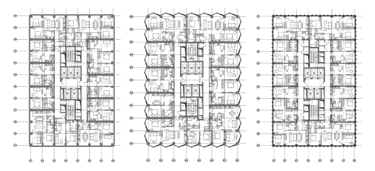
The buildings will feature all types of apartments, ranging from studios to four-room apartments, as well as penthouses from 129 to 162 meters square, which will occupy the top floors in three towers – on the 54th, 49th, 43rd floors. The bottom floors will host retail. There will also be a two-level underground parking garage.

Symphony 34 housing complex. Plans of the towers A, B, C
Copyright: © Kleinewelt Architekten


The complex was named in honor of the famous symphony by Mozart. The polyphony and richness of the sound of Mozart’s symphony inspired the architects to create this grand-scale project. Each building here has a unique “voice” of its own; each volume contains a gamut of emotions. Different in appearance and in character, they are nonetheless, resonant with one another and with the city.

The project has already received expert approval. The completion of its implementation is scheduled for 2024.


08 February 2021

Headlines now
The Golden Crown
The concept for a dental clinic in Yekaterinburg, developed by CNTR Studio, revolves around the idea of a “mouth full of gold”: pristine white porcelain stoneware walls are complemented by matte brass details. To avoid an overly literal interpretation, the architects focused on the building’s proportions, skillfully navigating between sunlight requirements and fire safety regulations.
Flexibility and Integration
Not long ago, we covered the project for the fourth phase of the ÁLIA residential complex, designed by APEX. Now, we’ve been shown different fence concepts they developed to enclose the complex’s private courtyards, incorporating a variety of public functions. We believe that the sheer fact that the complex’s architects were involved in such a detail as fencing speaks volumes.
A Step Forward
The HIDE residential complex represents a major milestone for ADM architects and their leaders Andrey Romanov and Ekaterina Kuznetsova in their quest for a fresh high-rise aesthetic – one that is flexible and layered, capable of bringing vibrancy to mass and silhouette while shaping form. Over recent years, this approach has become ADM’s “signature style”, with the golden HIDE tower playing a pivotal role in its evolution. Here, we delve into the project’s story, explore the details of the complex’s design, and uncover its core essence.
Gold in the Sands
A new office for a transcontinental company specializing in resource extraction and processing has opened in Dubai. Designed by T+T Architects, masters of creating spaces that are contemporary, diverse, flexible, and original, this project exemplifies their expertise. On the executive floor, a massive brass-clad partition dominates, while layered textures of compressed earth create a contextually resonant backdrop.
Layers and Levels of Flight
This project goes way back – Reserve Union won this architectural competition at the end of 2011, and the building was completed in 2018, so it’s practically “archival”. However, despite being relatively unknown, the building can hardly be considered “dated” and remains a prime example of architectural expression, particularly in the headquarters genre. And it’s especially fitting for an aviation company office. In some ways, it resembles the Aeroflot headquarters at Sheremetyevo but with its own unique identity, following the signature style of Vladimir Plotkin. In this article, we take an in-depth look at the United Aircraft Corporation (UAC) headquarters in the Moscow agglomeration town of Zhukovsky, supplemented by recent photographs from Alexey Naroditsky – a shoot that became only recently possible due to the fact that improvements were finally made in the surrounding area.
Light and Shadow
In this article, we delve into the architectural design of the “Chaika” house by DNK ag architects, which was recently completed in 2023 as part of the collection of signature designs at ZILArt. As is well-known, all the buildings in this complex follow a design code, yet each one is distinct. This particular building stands out not only for its whiteness and minimalism but also for the refined use of a limited number of techniques that, together, create what can confidently be called synergy.
Casus Novae
A master plan was developed for a large residential area with a name of “DNS City”, but now that its implementation began, the plan has been arbitrarily reformatted and replaced with something that, while similar on the surface, is actually quite different. This is not the first time such a thing happens, but it’s always frustrating. With permission from the author, we are sharing Maria Elkina’s post.
Treasure Hunting
The GAFA bureau, in collaboration with Tegola and Arkhitail, organized an expedition to the island of Kilpola in Karelia as part of Moskomarkhitektura’s “Open City” festival. There, amidst moss and rocks, the students sought answers to questions like: what is the sacred, where does it dwell, and what sustains it? Assisting the participants in this quest were landscape engineer Evgeny Levin, artist Nicholas Roerich, a moose, and the lack of cellular connection. Here’s how the story unfolded.
Depths of the Earth, Streams of Water
In the Malaya Okhta district, the Akzent building, designed by Stepan Liphart, was constructed. It follows a classic tripartite structure, yet it’s what you might call “hand-drawn”: each façade is unique in its form and details, some of which aren’t immediately noticeable. In this article, we explore the context and, together with the architect, delve into how the form was developed.
Fir Tree Dynamics
The “Airports of Region” holding is planning to build an airport in Karachay-Cherkessia, aiming to make the Arkhyz and Dombay resorts more accessible to travelers. The project that won in an invitation-only competition, submitted by Sergey Nikeshkin’s KPLN, blends natural imagery inspired by the shape of a conifer seed, open-air waiting spaces, majestic large trees, and a green roof elevated on needle-like columns. The result is both nature-inspired and WOW.
​A Brick Shell
In the process of designing a clubhouse situated among pine trees in a prestigious suburban area near Moscow, the architectural firm “A.Len” did the façade design part. The combination of different types of brick and masonry correlates with the volumetric and plastique solutions, further enhanced by the inclusion of wood-painted fragments and metal “glazing”.
Word Forms
ATRIUM architects love ambitious challenges, and for the firm’s thirtieth anniversary, they boldly play a game of words with an exhibition that dives deep into a self-created vocabulary. They immerse their projects – especially art installations – into this glossary, as if plunging into a current of their own. You feel as if you’re flowing through the veins of pure art, immersed in a universe of vertical cities, educational spaces – of which the architects are true masters – and the cultural codes of various locations. But what truly captivates is the bold statement that Vera Butko and Anton Nadtochy make, both through their work and this exhibition: architecture, above all, is art – the art of working with form and space.
Flexibility and Acuteness of Modernity
Luxurious, fluid, large “kokoshniks” and spiral barrel columns, as if made from colorful chewing gum: there seem to be no other mansion like this in Moscow, designed in the “Neo-Russian-Modern” style. And the “Teremok” on Malaya Kaluzhskaya, previously somewhat obscure, has “come alive with new colors” and gained visibility after its restoration for the office of the “architectural ecosystem” as the architects love to call themselves. It’s evident that Julius Borisov and the architects at UNK put their hearts into finding this new office and bringing it up to date. Let’s delve into the paradoxes of this mansion’s history and its plasticity. Spoiler: two versions of modernity meet here, both balancing on the razor’s edge of “what’s current”.
Yuri Vissarionov: “A modular house does not belong to the land”
It belongs to space, or to the air... It turns out that 3D printing is more effective when combined with a modular approach: the house is built in a workshop and then adapted to the site, including on uneven terrain. Yuri Vissarionov shares his latest experience in designing tourist complexes, both in central Russia and in the south. These include houseboats, homes printed from lightweight concrete using a 3D printer, and, of course, frame houses.
​Moscow’s First
“The quality of education largely depends on the quality of the educational environment”. This principle of the last decade has been realized by Sergey Skuratov in the project for the First Moscow Gymnasium on Rostovskaya Embankment in the Khamovniki district. The building seamlessly integrates into the complex urban landscape, responding both to the pedestrian flow of the city and the quiet alleyways. It skillfully takes advantage of the height differences and aligns with modern trends in educational space design. Let’s take a closer look.
Looking at the Water
The site of Villa Sonata stretches from the road to the water’s edge, offering its own shoreline, pier, and a picturesque river panorama. To reveal these sweeping views, Roman Leonidov “cut” the façade diagonally parallel to the river, thus getting two main axes for the house and, consequently, “two heads”. The internal core – two double-height spaces, a living room and a conservatory, with a “bridge” above them – makes the house both “transparent” and filled with light.
The White Wing
Well, it’s not exactly white. It’s more of a beige, white-stone structure that plays with the color of limestone – smoother surfaces are lighter, while rougher ones are darker. This wing unites various elements: it absorbs and interprets the surrounding themes. It responds to everything, yet maintains a cohesive expression – a challenging task! – while also incorporating recognizable features of its own, such as the dynamic cuts at the bottom, top, and middle.
Urban Dunes
The XSA Ramps team designed and built a three-part sports hub for a park in Rostov-on-Don, welcoming people of all ages and fitness levels. The skate plaza, pump track, and playground are all meticulously crafted with details that attract a diverse range of visitors. The technical execution of the shapes and slopes transforms this space into a kind of sculptural composition.
Proportional Growth
The project for the fourth phase of the ÁLIA residential area has been announced. The buildings are situated on an elongated plot – almost a “ray” that shoots out from the center of the area towards the river. Their layout reflects both a response to Moscow’s architectural preferences over the past 15 years, shifting “from blocks to towers”, and an interpretation of the neighboring business park designed by SOM. Additionally, the best apartments here are not located at the very top but closer to the middle, forming a glowing “waistline”.
The “Staircase” Building
In designing the “Details” residential complex in New Moscow, Rais Baishev spiced up the now-popular Moscow theme of a “courtyard” building with an idea drawn from the surrealist drawings by Maurits Escher. He envisioned the stepped silhouettes and descending slopes as a metaphysical mega-staircase, creating a key void within the courtyard that gave the project an internal “spine”. This concept is felt both in the building’s silhouette and on its façades.
Projection of the Quarter
No one doubted that the building that Vladimir Plotkin designed as part of the “Garden Quarters” would be the most modernist of all. And it turned out just that way: while adhering to the common design code, the building successfully combines brick and white stone, rhythmically responding to the neighboring building designed by Ostozhenka, yet tactfully and persistently making a few statements of its own. This includes the projection of the ideal urban development composition “14–9–6”, which can be found right next door, mathematical calculations, including those for various types of terraces (and perhaps the only reminder of the Soviet past of the Kauchuk rubber factory!), and the white “cross-stitch” pattern of the façade grid.
Domus Aurea
In this issue, we examine the “Tessinsky-1” house, designed by Sergey Skuratov and completed in 2023. Located in the middle of the Serebryanicheskaya Embankment district, at the intersection of its main streets, this house assumes a sort of “nodal” role: it not only responds to everything around it and preserves many memories of the former EMA factory within itself, but it weaves all this into a newly directed pattern, reconciling bright “gold” and dark-colored brick, largely with the help of the new, modern-yet-archaic Columba brick, which, come to think about it, is the most precious element here.
The Chimney of Nikola-Lenivets
In this issue, we are examining the “Obelisk House” designed by KATARSIS and built for the Arkhstoyanie 2023 festival. However, it was only finished later on, and this is why we are examining it now. It seems to us that after the “Obelisk House” appeared in Nikola-Lenivets, a dialogue and a few inner connections appeared between the temporary structures built here. These houses no longer look like “accidental neighbors”, more of which below.
​Periscope by the Bay
The jury awarded the second place in the competition for a public and cultural center in Petropavlovsk-Kamchatsky to the companies GORA (“Mountain”) and M4. In the consortium’s proposal, the building resembles a sperm whale with a calf swimming next to it or a periscope, whose lenses capture the most spectacular views from the surrounding landscape.
From Arcs to Dolmens
While working on the competition project for Petropavlovsk-Kamchatsky, ASADOV Architects prioritized the value of the natural and urban environment, aiming to preserve the balance of the location while minimizing the resemblance of the volume that they designed to a “traditional building”. The task was challenging, and the architects created three versions, one of which having been developed after the competition, where their main proposal took third place. However, the point of interest here is not the competition result but the continuity of creative thinking.
Hide and Seek
The ID Moskovskiy house, designed by Stepan Liphart in St. Petersburg, in the courtyards near Moskovskiy Avenue beyond the Obvodny Canal and recently completed, is notable for several reasons. Firstly, it has been realized with considerable accuracy, which is particularly significant as this is the first building where the architect was responsible not only for the facades but also for the layouts, allowing for better integration between the two. On the other hand, this building is interesting as an example of the “germination” of new architecture in the city: it draws on the best examples from the neighborhood and becomes an improved and developed sum of ideas found by the architect in the surrounding context.
The Big Twelve
Yesterday, the winners of the Moscow Mayor’s Architecture Award were announced and honored. Let’s take a look at what was awarded and, in some cases, even critique this esteemed award. After all, there is always room for improvement, right?
Above the Golden Horn
The residential complex “Philosophy” designed by T+T architects in Vladivostok, is one of the new projects in the “Golubinaya Pad” area, changing its development philosophy (pun intended) from single houses to a comprehensive approach. The buildings are organized along public streets, varying in height and format, with one house even executed in gallery typology, featuring a cantilever leaning on an art object.
Nuanced Alternative
How can you rhyme a square and space? Easily! But to do so, you need to rhyme everything you can possibly think of: weave everything together, like in a tensegrity structure, and find your own optics too. The new exhibition at GES-2 does just that, offering its visitor a new perspective on the history of art spanning 150 years, infused with the hope for endless multiplicity of worlds and art histories. Read on to see how this is achieved and how the exhibition design by Evgeny Ace contributes to it.
Blinds for Ice
An ice arena has been constructed in Domodedovo based on a project by Yuri Vissarionov Architects. To prevent the long façade, a technical requirement for winter sports facilities, from appearing monotonous, the architects proposed the use of suspended structures with multidirectional slats. This design protects the ice from direct sunlight while giving the wall texture and detail.