По-русски

​In the Space of Pobedy Park

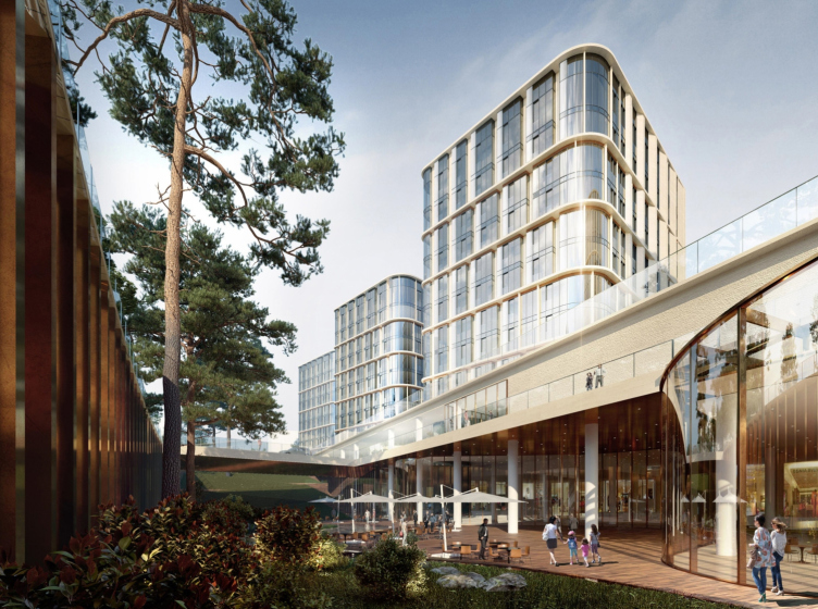
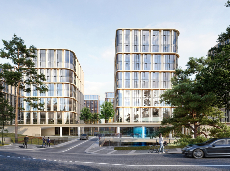
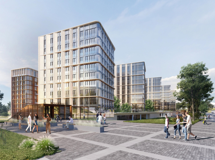
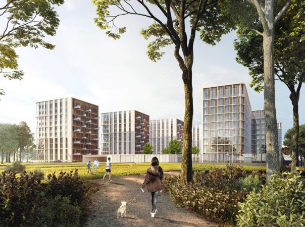
In the project of a housing complex designed by Sergey Skuratov, which is now being built near the park of the Poklonnaya Hill, a multifunctional stylobate is turned into a compound city space with intriguing “access” slopes that also take on the role of mini-plazas. The architecture of the residential buildings responds to the proximity of the Pobedy Park, on the one hand, “dissolving in the air”, and, on the other hand, supporting the memorial complex rhythmically and color-wise.

29 December 2020
Object
mainImg
The project of the high-end multifunctional residential complex Victory Park Residences was approved by the Architectural Council of Moscow two years ago, and last year in September, ANT Development launched property sales and construction.

The House on Fonchenko Brothers Street
Copyright: © Sergey Skuratov architects


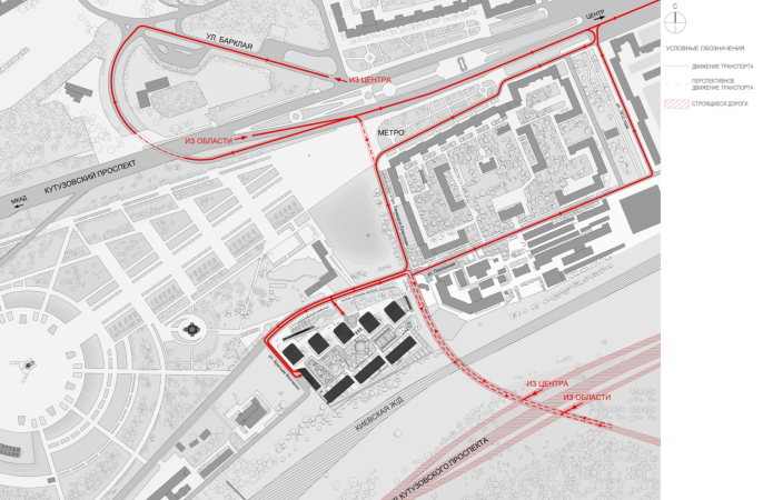
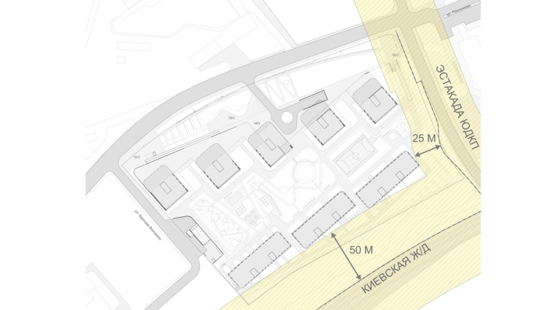
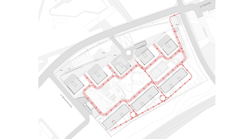
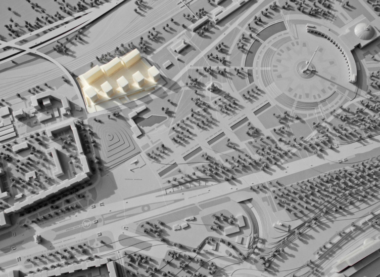
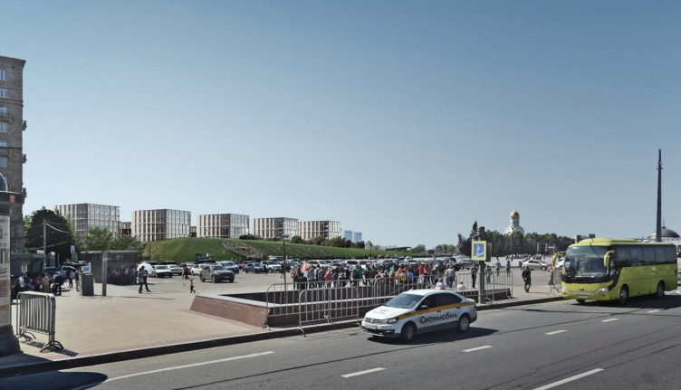
The land site is situated between the “entrance” eastern part of the park of the Poklonnaya Hill and a railway line of the Kiev railroad; it takes 5 minutes to get here from Moskva-Sortirovochnaya station. The western boundary of the complex is marked by the Bratiev Fonchenko Street, while the park is separated from the complex by the quiet two-lane Poklonnaya Street. However, east of the Victory Park grounds, there will be a road junction leading from General Dorokhov Avenue and the Third Transport Ring towards Barklaya Street. The new complex steps back from the railroad line and from the junction 50 and 25 meters respectively.

  • zooming
    1 / 5
    The House on Fonchenko Brothers Street
    Copyright: © Sergey Skuratov architects
  • zooming
    2 / 5
    The House on Fonchenko Brothers Street
    Copyright: © Sergey Skuratov architects
  • zooming
    3 / 5
    The House on Fonchenko Brothers Street
    Copyright: © Sergey Skuratov architects
  • zooming
    4 / 5
    The House on Fonchenko Brothers Street
    Copyright: © Sergey Skuratov architects
  • zooming
    5 / 5
    The House on Fonchenko Brothers Street
    Copyright: © Sergey Skuratov architects


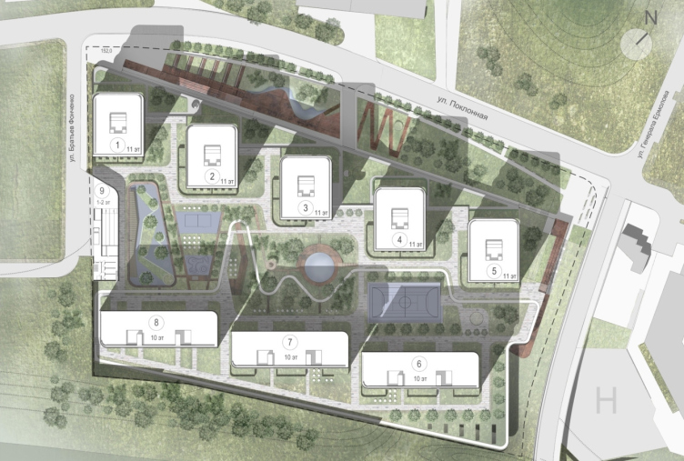
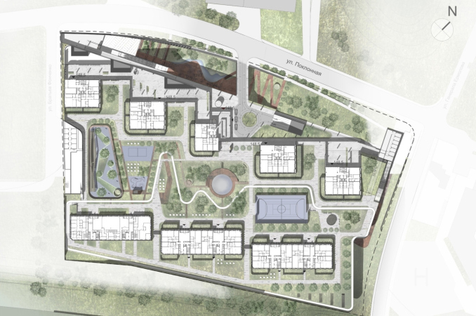
The specifics of the surroundings are first of all defined by the proximity of the Pobedy Park, the “Great Creation by Anatoly Polyansky”, as Sergey Skuratov describes it. The complex not just repeats the “victorious” name of the park but also continues its planning grid, turned at an angle to Kutuzovsky Avenue, from the stele in front of the museum, and towards the Triumphal Arch, designed by Osip Bove. The five buildings that stand along the Poklonnaya Street symbolically, on a diminished scale, respond to the five traversal alleys – the memorial grounds of the front part of the park symbolizing the five years of the Great Patriotic War – the author explains.

The House on Fonchenko Brothers Street
Copyright: © Sergey Skuratov architects


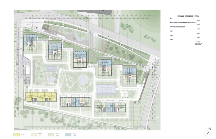
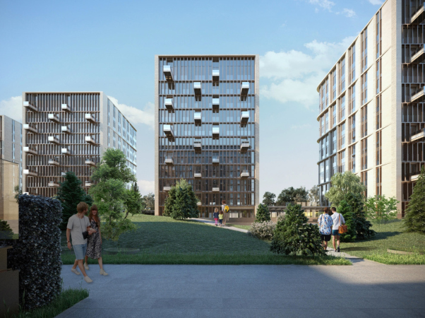
The northern line of residential buildings consists of five single-entrance towers, which allows the complex to be opened towards the Pobedy Park memorial complex, to emphasize the spatial connections with it, and provide more views towards it. The three buildings standing along the south border, on the other hand, are stretched lengthwise. These buildings, just like the transparent screens between them, are meant to protect the yard from the noise and the grime of the railroad – even though the buildings themselves are, of course, also protected from the noise, first of all, by glass units. Thus, the Victory Park complex stands with its “back” to the railway and its “face” to the park of the Poklonnaya Hill, just as to the avenue and the path from the namesake metro station.

The House on Fonchenko Brothers Street
Copyright: © Sergey Skuratov architects


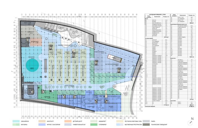
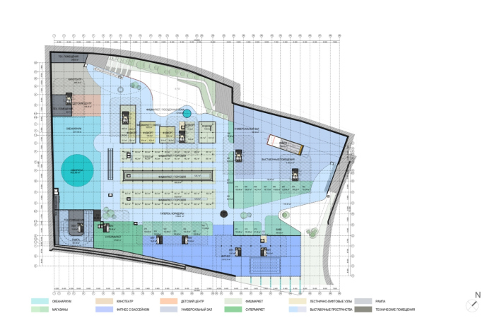
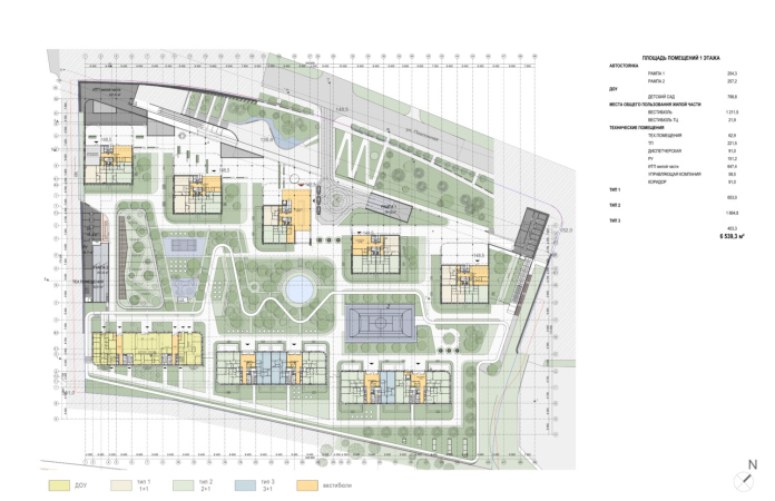
It must be said that the history of the land site, on which the complex is built is rather complicated: in the mid 2000’s, the city had plans to build here the Eastern Europe’s largest aquarium called “Poseidon Park”. A competition was organized, construction began in 2008, and a construction pit for two underground floors was dug out. The project uses the already-existing pit, and the idea of the aquarium “grew” into the sophisticated multifunctional space of the stylobate. Curiously, the designed functions do preserve a small – about 3000 sqm – aquarium in the western part, with a movie theater and a children’s center next to it, a little more to the north. In the northeast corner of the stylobate, closer to the metro station, there is an expo complex, the southeast part includes a fitness center with a SPA and a swimming pool, and the southeast one is occupied by a supermarket. The central space is occupied by a food court and a fish market, surrounded by cafes and shops, with an inner boulevard running in the middle. On the one hand, typologically, this is a sophisticated shopping mall with elements of a community center; on the other hand, this is a semblance of a city under a roof, grouped around the “market square”.

  • zooming
    1 / 3
    The House on Fonchenko Brothers Street. The minus-first level
    Copyright: © Sergey Skuratov architects
  • zooming
    2 / 3
    The House on Fonchenko Brothers Street. The minus-first level, second tier
    Copyright: © Sergey Skuratov architects
  • zooming
    3 / 3
    The House on Fonchenko Brothers Street. The minus-second level
    Copyright: © Sergey Skuratov architects


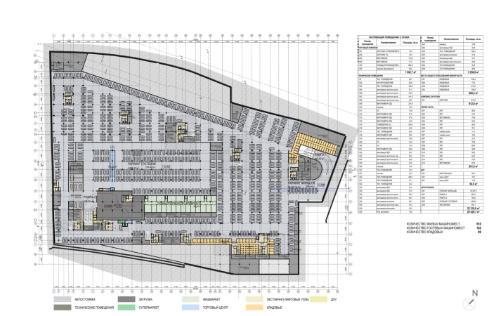
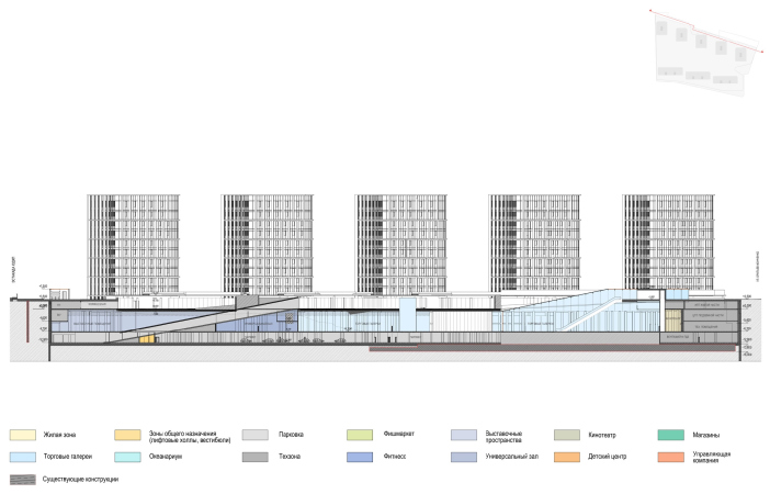
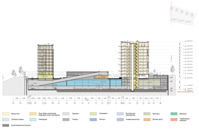
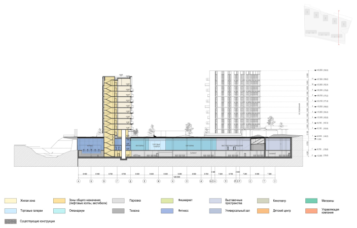
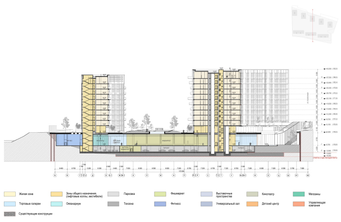
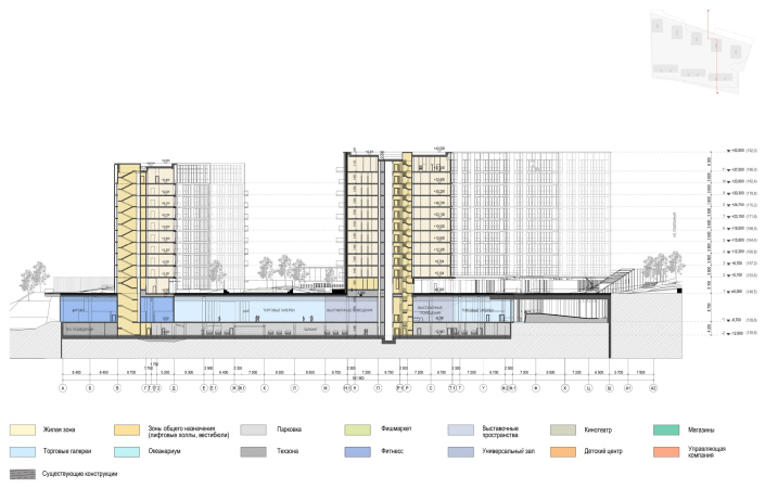
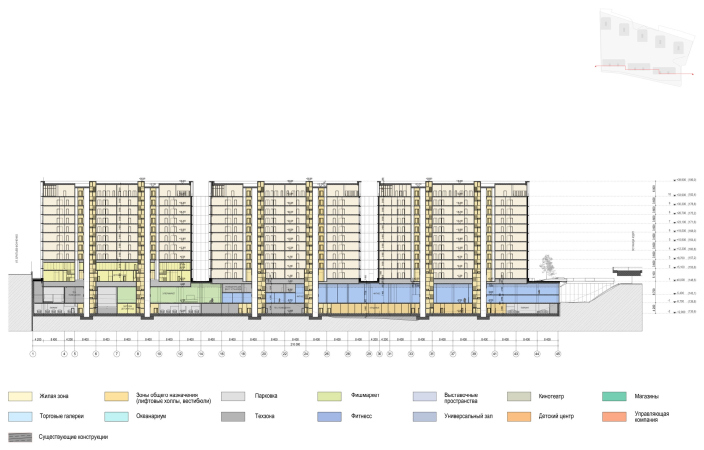
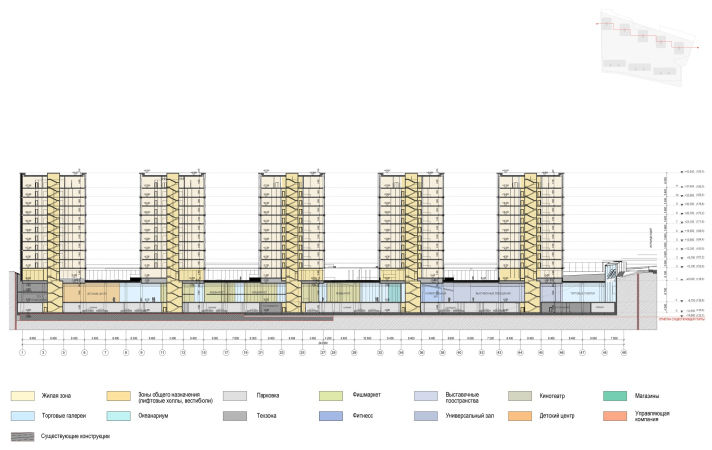
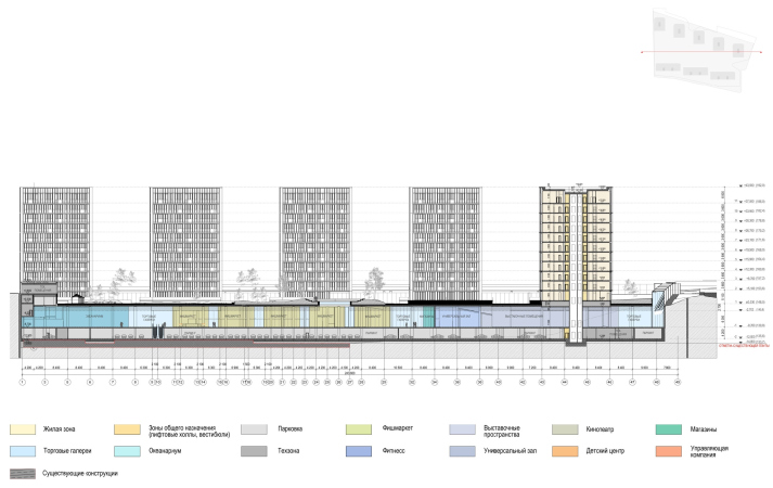
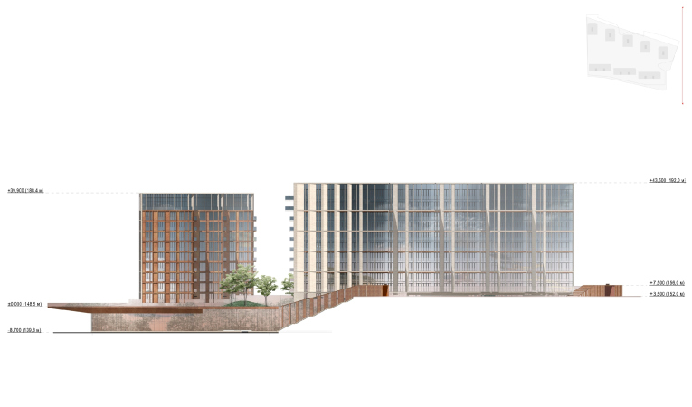
The public stylobate is situated on the minus first floor; the height of its ceilings is really high – a whopping 8 meters! Still lower, on the minus-second floor, there is an underground parking garage. Designing the stylobate, the architects masterfully used the height difference – and here it is both considerable, a little over 12 meters, and convenient, because from the side of the park and the metro the relief is raised, which allowed the architects to organized barrier-less entrances over the slopes, ramps, and straight through the bridge. From the south side, the height difference allowed the architects, first of all, to open the façade of the swimming pool in the fitness club to natural light, and, second, to elevate the private yard of the residential buildings on the roof of the stylobate, thus putting as much distance as possible between the yard and the railway line. On the inside, the spaces are interwoven – literally bound – with ramps, escalators, and travelators, which makes examining the structure in a section view rather exciting. In addition, the residents will be able to go down to the public area by elevator directly from the apartments.

  • zooming
    1 / 9
    The House on Fonchenko Brothers Street
    Copyright: © Sergey Skuratov architects
  • zooming
    2 / 9
    Section view 8-8. The House on Fonchenko Brothers Street
    Copyright: © Sergey Skuratov architects
  • zooming
    3 / 9
    Section view 1-1. The House on Fonchenko Brothers Street
    Copyright: © Sergey Skuratov architects
  • zooming
    4 / 9
    Section view 2-2. The House on Fonchenko Brothers Street
    Copyright: © Sergey Skuratov architects
  • zooming
    5 / 9
    Section view 3-3. The House on Fonchenko Brothers Street
    Copyright: © Sergey Skuratov architects
  • zooming
    6 / 9
    Section view 4-4. The House on Fonchenko Brothers Street
    Copyright: © Sergey Skuratov architects
  • zooming
    7 / 9
    Section view 5-5. The House on Fonchenko Brothers Street
    Copyright: © Sergey Skuratov architects
  • zooming
    8 / 9
    Section view 7-7. The House on Fonchenko Brothers Street
    Copyright: © Sergey Skuratov architects
  • zooming
    9 / 9
    Section view 6-6. The House on Fonchenko Brothers Street
    Copyright: © Sergey Skuratov architects


In addition to the fact that this whole structure allowed the architects to fulfill the challenging task posed by the developer and find room for the required functions on the land site, conveniently arranging them, it also creates a spatial intrigue. Already looking at the section views and 3D renders, one can feel that due to all these height drops, slopes and bridges, things on the inside will be far from trivial.

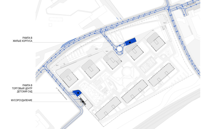
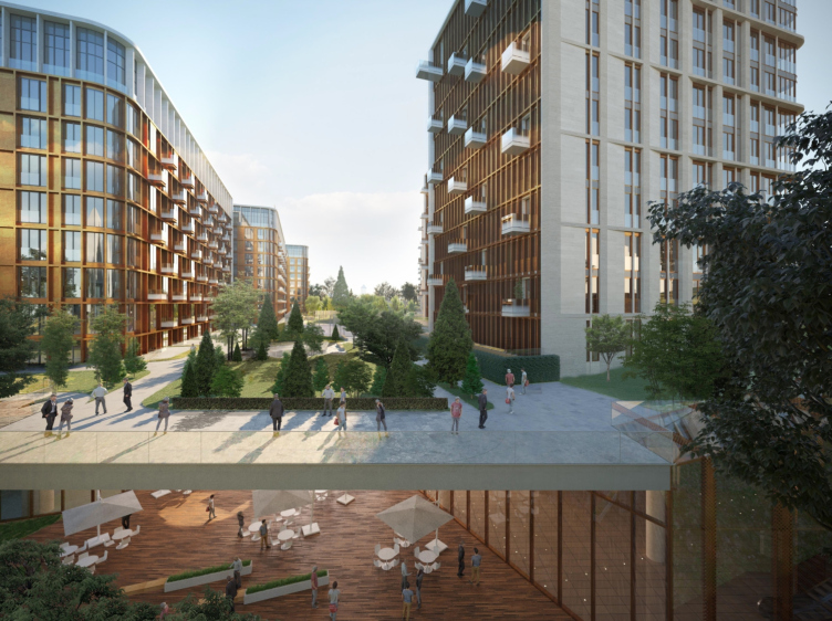
On the roof of the stylobate, there is a courtyard of the residential complex with geoplastics and trees. Its surface is strictly horizontal; we will remind you that it is raised 12-something meters above the drive on the side of the railroad line, while from the side of the park – approximately in the middle of the north façade – it is accessed by a bridge, by which one will be able to get into the yard by foot, or drive from the Poklonnaya Hill to the ramp that leads to the underground parking garage. On this side, there is a gallery running in front of the residential buildings – some kind of portico with trees on top; it delicately separates the yard of the complex from the city street.

The House on Fonchenko Brothers Street
Copyright: © Sergey Skuratov architects


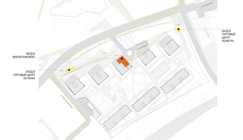
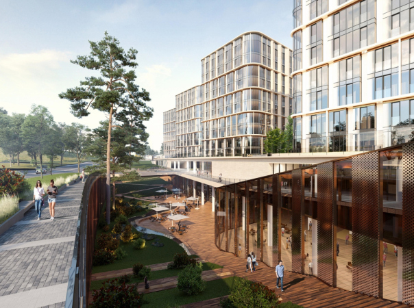
While you can enter the residential courtyard from the north side in a straight line, the entrances to the public parts of the stylobate, on the contrary, go up and down. The raised “head” of the corten “snake” in the northern corner accentuates the entrance from the metro station to the expo center. A similar “entrance head” on the northwest corner, on the side of the park, leads to the aquarium and to the movie theater.

The House on Fonchenko Brothers Street
Copyright: © Sergey Skuratov architects


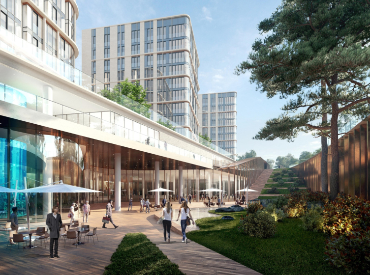
However, in both cases you can also take parallel paths – on the slope, gradually sinking underground in the cozy inclined park.

  • zooming
    1 / 3
    The House on Fonchenko Brothers Street
    Copyright: © Sergey Skuratov architects
  • zooming
    2 / 3
    The facade from the side of the Kutuzovsky Avenue relief road. The House on Fonchenko Brothers Street
    Copyright: © Sergey Skuratov architects
  • zooming
    3 / 3
    The facade from the side of the railroad. The House on Fonchenko Brothers Street
    Copyright: © Sergey Skuratov architects


The intrigue is that, in addition to the convenient separation of flows, the complex constantly offers us new spatial sensations, making us experience this space as indoor, outdoor, ostentatiously inclined, or, by contrast, with a straight surface underneath your feet. Different areas feature different shades of color and have different lighting angles; you will get lots of interesting impressions just by walking around here among these height drops and slopes. And we will also note that from the top level you can look down, and vice versa – they are also visually connected. It is expected that being here one will always feel the multilayered character of the stylobate: sometimes, there are two tiers, and sometimes, on the side of the north gallery, even three.

The House on Fonchenko Brothers Street
Copyright: © Sergey Skuratov architects


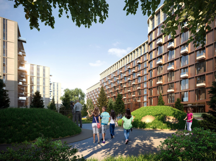
The slopes that lead to the multifunctional stylobate stop at small open-air plazas with terraced cafes – a kind of oasis of comfortable environment that we tend to associate with the central districts of European cities. The cafes are cozy and securely protected from the wind – their windows, as well as the windows of the shops emphasize the urban character of this space, inviting to wander between boutiques and café tables.

The House on Fonchenko Brothers Street
Copyright: © Sergey Skuratov architects


One must note that Sergey Skuratov – and he also stressed this in his interview – has long since been exploring the idea of a multilayered city space, which is a rather rare phenomenon by the standards of Moscow and other post-soviet cities, predictably flat en masse. As a rule, Sergey Skuratov creates around his buildings some sort of spatial intrigue that is one way or another connected to the surrounding city: it is composed of powerful or “head turning” cantilevered structures, of unconventional paving with Klinker brick, of areaways that form quiet passages by the shop windows, and, of course, of height differences. The houses that he designed – Egodom and Art House, the house in Tessinsky-1, and Skouratov House on the Burdenko Street – seem to embrace the height differences that they are challenged to cope with, because such height differences perfectly match the scenario of a “sculptural” city.

But, of course, the most complex multi-level spaces have been created in the Garden Quarters residential complex with its bridges in the courtyards, the end-to-end “Road to School” and a public plaza in the center: significant height differences in the artificial terrain form at least three levels of perception and in total give a very special aesthetic tension even if you take a simple walk through the complex: it literally makes you “read” itself not just horizontally, but also vertically, examining it from top to bottom, evaluating the height and the benefits of vertical thinking. Probably, Victory Park is the most vivid example of developing the ideas first used in Garden Quarters. It will be exciting to examine it in detail after the construction is completed.

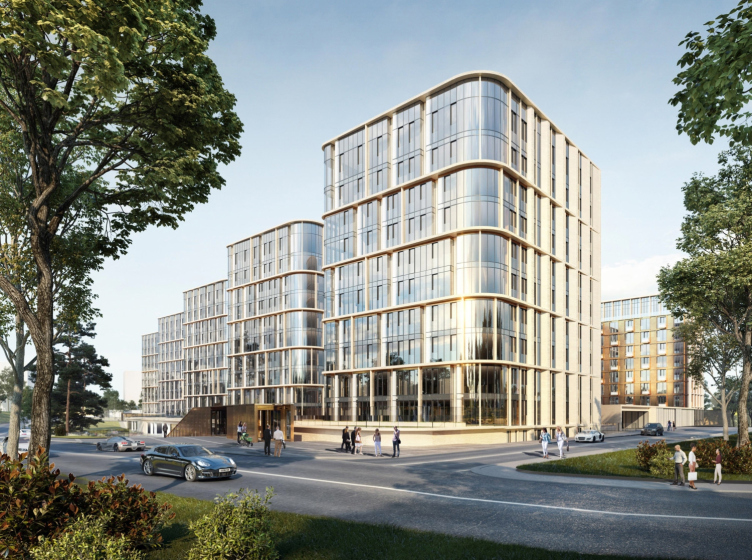
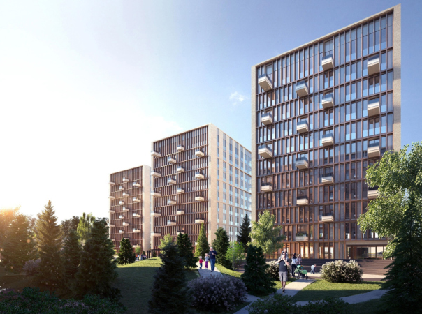
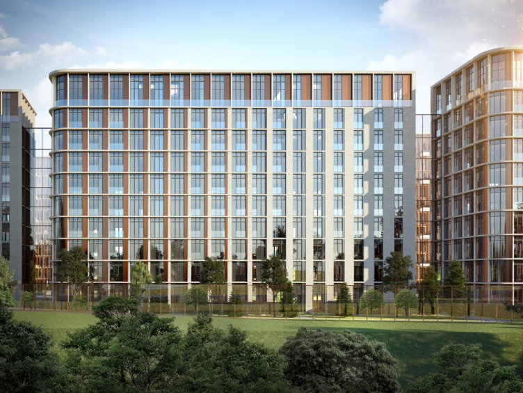
While the public part combines glass and Corten steel, the main facades of the buildings overlooking the park consist of stone and glass, the stories being grouped in twos, the verticals growing gradually thinner on the side of the park, and the glass on the rounded corners also being curvilinear, which allowed the architect to highlight the exclusiveness of its “precious” texture: the futuristic glass looks like some kind of force field, stretched between the slender verticals.

The House on Fonchenko Brothers Street
Copyright: © Sergey Skuratov architects


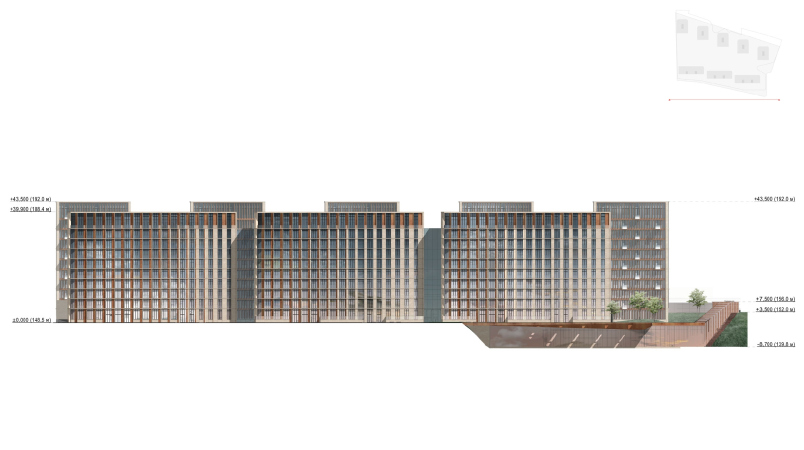
The lintels will be coated with light-beige dolomite, whose color matches that of the facades of the Victory Museum – yet another tribute to the proximity of the memorial park. Let us note, however, that their color is slightly brighter than that of the “Stalin” houses of the Kutuzovsky Avenue, yet still reminiscent of them; besides, observing the height restrictions, the 10-11 story houses pick up the height of the neighboring buildings. However, due to the fact that Victory Park stands 330 meters back from the avenue’s redline, from this side it looks like a remote city block, partially obscured by the hill: the houses even look as if they were lower in height than the St. George Chapel in the foreground. Thus, we can quite agree with Sergey Skuratov’s words about the complex “dissolving” in space – in the current state, the line of the houses coming up to the Poklonnaya Hill breaks abruptly, and after Victory Park is completed, it will receded gradually, smoothly taking on a more dispersed character – the wall will give way to an array of independent volumes with a gradient string of vertical “stele” piers, whose austere order, just as the color of the stone they are made of, is also reminiscent of the colonnades of the Victory Museum.

The House on Fonchenko Brothers Street, a project. Simulation, view from the Kutuzovsky Avenue.
Copyright: © Sergey Skuratov architects


The apartments, many of which, matching the class of the housing, are quite spacious, up to 300 sqm in the penthouses, have panoramic windows reaching to the floor that will command beautiful park views – the best lots are on this side.

  • zooming
    1 / 3
    The House on Fonchenko Brothers Street
    Copyright: © Sergey Skuratov architects
  • zooming
    2 / 3
    The House on Fonchenko Brothers Street
    Copyright: © Sergey Skuratov architects
  • zooming
    3 / 3
    The House on Fonchenko Brothers Street
    Copyright: © Sergey Skuratov architects


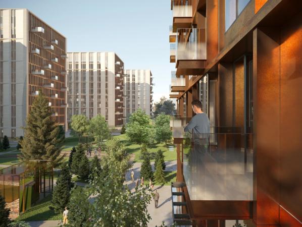
The yard facades are different from the outside ones: they will be decorated with reddish metal, Corten or copper; the close grid, vertically oriented, looks like crystal cell – as if the “limestone rocks” of the houses were slit through, and a yard appeared in the gorge. Above its hills and trees, however, overhang, like rocky cantilevers, balconies of different outsets – yet another level of space perception, this time for the residents of the apartments.

  • zooming
    1 / 4
    The House on Fonchenko Brothers Street
    Copyright: © Sergey Skuratov architects
  • zooming
    2 / 4
    The House on Fonchenko Brothers Street
    Copyright: © Sergey Skuratov architects
  • zooming
    3 / 4
    The House on Fonchenko Brothers Street
    Copyright: © Sergey Skuratov architects
  • zooming
    4 / 4
    The House on Fonchenko Brothers Street
    Copyright: © Sergey Skuratov architects


The facades of the three longitudinal buildings on the south side are designed slightly differently – the copper is more abundant here, the piers are wider, and the penthouses are accentuated. Even here, however, we can say that copper meets stone in a gradient rhythm that echoes the pattern of the side facades of the towers.

The House on Fonchenko Brothers Street
Copyright: © Sergey Skuratov architects


The House on Fonchenko Brothers Street
Copyright: © Sergey Skuratov architects


Summing up, one can say that the project of Victory Park Residences has a lot of Sergey Skuratov’s signature techniques about it – so much so that, probably, one can already say that Moscow is getting a whole number of premium-class residential complexes authored by this architect. They all are characterized by close attention to the surrounding landscape – in a sense, they “grow into” the land site or “grow out” of it, forming around themselves sophisticated urban space – unusual for Moscow people, yet defined both by the context and the specifics of the territory, which means that the building “takes root”. Another peculiar feature is a combination of rather laconic modern shapes with texture, color, and plastique diversity: if we take a tour around these buildings, they will always feel slightly different when viewed from a different angle – the facades, just as the multilevel space of the stylobate, will leave you without a chance of getting bored – yet at the same time they are rather reserved-looking. This is exactly the kind of house that should be built on the border of Moscow’s main memorial park – whose vicinity is doubtlessly more than obliging.


29 December 2020

Headlines now
Flexibility and Integration
Not long ago, we covered the project for the fourth phase of the ÁLIA residential complex, designed by APEX. Now, we’ve been shown different fence concepts they developed to enclose the complex’s private courtyards, incorporating a variety of public functions. We believe that the sheer fact that the complex’s architects were involved in such a detail as fencing speaks volumes.
A Step Forward
The HIDE residential complex represents a major milestone for ADM architects and their leaders Andrey Romanov and Ekaterina Kuznetsova in their quest for a fresh high-rise aesthetic – one that is flexible and layered, capable of bringing vibrancy to mass and silhouette while shaping form. Over recent years, this approach has become ADM’s “signature style”, with the golden HIDE tower playing a pivotal role in its evolution. Here, we delve into the project’s story, explore the details of the complex’s design, and uncover its core essence.
Gold in the Sands
A new office for a transcontinental company specializing in resource extraction and processing has opened in Dubai. Designed by T+T Architects, masters of creating spaces that are contemporary, diverse, flexible, and original, this project exemplifies their expertise. On the executive floor, a massive brass-clad partition dominates, while layered textures of compressed earth create a contextually resonant backdrop.
Layers and Levels of Flight
This project goes way back – Reserve Union won this architectural competition at the end of 2011, and the building was completed in 2018, so it’s practically “archival”. However, despite being relatively unknown, the building can hardly be considered “dated” and remains a prime example of architectural expression, particularly in the headquarters genre. And it’s especially fitting for an aviation company office. In some ways, it resembles the Aeroflot headquarters at Sheremetyevo but with its own unique identity, following the signature style of Vladimir Plotkin. In this article, we take an in-depth look at the United Aircraft Corporation (UAC) headquarters in the Moscow agglomeration town of Zhukovsky, supplemented by recent photographs from Alexey Naroditsky – a shoot that became only recently possible due to the fact that improvements were finally made in the surrounding area.
Light and Shadow
In this article, we delve into the architectural design of the “Chaika” house by DNK ag architects, which was recently completed in 2023 as part of the collection of signature designs at ZILArt. As is well-known, all the buildings in this complex follow a design code, yet each one is distinct. This particular building stands out not only for its whiteness and minimalism but also for the refined use of a limited number of techniques that, together, create what can confidently be called synergy.
Casus Novae
A master plan was developed for a large residential area with a name of “DNS City”, but now that its implementation began, the plan has been arbitrarily reformatted and replaced with something that, while similar on the surface, is actually quite different. This is not the first time such a thing happens, but it’s always frustrating. With permission from the author, we are sharing Maria Elkina’s post.
Treasure Hunting
The GAFA bureau, in collaboration with Tegola and Arkhitail, organized an expedition to the island of Kilpola in Karelia as part of Moskomarkhitektura’s “Open City” festival. There, amidst moss and rocks, the students sought answers to questions like: what is the sacred, where does it dwell, and what sustains it? Assisting the participants in this quest were landscape engineer Evgeny Levin, artist Nicholas Roerich, a moose, and the lack of cellular connection. Here’s how the story unfolded.
Depths of the Earth, Streams of Water
In the Malaya Okhta district, the Akzent building, designed by Stepan Liphart, was constructed. It follows a classic tripartite structure, yet it’s what you might call “hand-drawn”: each façade is unique in its form and details, some of which aren’t immediately noticeable. In this article, we explore the context and, together with the architect, delve into how the form was developed.
Fir Tree Dynamics
The “Airports of Region” holding is planning to build an airport in Karachay-Cherkessia, aiming to make the Arkhyz and Dombay resorts more accessible to travelers. The project that won in an invitation-only competition, submitted by Sergey Nikeshkin’s KPLN, blends natural imagery inspired by the shape of a conifer seed, open-air waiting spaces, majestic large trees, and a green roof elevated on needle-like columns. The result is both nature-inspired and WOW.
​A Brick Shell
In the process of designing a clubhouse situated among pine trees in a prestigious suburban area near Moscow, the architectural firm “A.Len” did the façade design part. The combination of different types of brick and masonry correlates with the volumetric and plastique solutions, further enhanced by the inclusion of wood-painted fragments and metal “glazing”.
Word Forms
ATRIUM architects love ambitious challenges, and for the firm’s thirtieth anniversary, they boldly play a game of words with an exhibition that dives deep into a self-created vocabulary. They immerse their projects – especially art installations – into this glossary, as if plunging into a current of their own. You feel as if you’re flowing through the veins of pure art, immersed in a universe of vertical cities, educational spaces – of which the architects are true masters – and the cultural codes of various locations. But what truly captivates is the bold statement that Vera Butko and Anton Nadtochy make, both through their work and this exhibition: architecture, above all, is art – the art of working with form and space.
Flexibility and Acuteness of Modernity
Luxurious, fluid, large “kokoshniks” and spiral barrel columns, as if made from colorful chewing gum: there seem to be no other mansion like this in Moscow, designed in the “Neo-Russian-Modern” style. And the “Teremok” on Malaya Kaluzhskaya, previously somewhat obscure, has “come alive with new colors” and gained visibility after its restoration for the office of the “architectural ecosystem” as the architects love to call themselves. It’s evident that Julius Borisov and the architects at UNK put their hearts into finding this new office and bringing it up to date. Let’s delve into the paradoxes of this mansion’s history and its plasticity. Spoiler: two versions of modernity meet here, both balancing on the razor’s edge of “what’s current”.
Yuri Vissarionov: “A modular house does not belong to the land”
It belongs to space, or to the air... It turns out that 3D printing is more effective when combined with a modular approach: the house is built in a workshop and then adapted to the site, including on uneven terrain. Yuri Vissarionov shares his latest experience in designing tourist complexes, both in central Russia and in the south. These include houseboats, homes printed from lightweight concrete using a 3D printer, and, of course, frame houses.
​Moscow’s First
“The quality of education largely depends on the quality of the educational environment”. This principle of the last decade has been realized by Sergey Skuratov in the project for the First Moscow Gymnasium on Rostovskaya Embankment in the Khamovniki district. The building seamlessly integrates into the complex urban landscape, responding both to the pedestrian flow of the city and the quiet alleyways. It skillfully takes advantage of the height differences and aligns with modern trends in educational space design. Let’s take a closer look.
Looking at the Water
The site of Villa Sonata stretches from the road to the water’s edge, offering its own shoreline, pier, and a picturesque river panorama. To reveal these sweeping views, Roman Leonidov “cut” the façade diagonally parallel to the river, thus getting two main axes for the house and, consequently, “two heads”. The internal core – two double-height spaces, a living room and a conservatory, with a “bridge” above them – makes the house both “transparent” and filled with light.
The White Wing
Well, it’s not exactly white. It’s more of a beige, white-stone structure that plays with the color of limestone – smoother surfaces are lighter, while rougher ones are darker. This wing unites various elements: it absorbs and interprets the surrounding themes. It responds to everything, yet maintains a cohesive expression – a challenging task! – while also incorporating recognizable features of its own, such as the dynamic cuts at the bottom, top, and middle.
Urban Dunes
The XSA Ramps team designed and built a three-part sports hub for a park in Rostov-on-Don, welcoming people of all ages and fitness levels. The skate plaza, pump track, and playground are all meticulously crafted with details that attract a diverse range of visitors. The technical execution of the shapes and slopes transforms this space into a kind of sculptural composition.
Proportional Growth
The project for the fourth phase of the ÁLIA residential area has been announced. The buildings are situated on an elongated plot – almost a “ray” that shoots out from the center of the area towards the river. Their layout reflects both a response to Moscow’s architectural preferences over the past 15 years, shifting “from blocks to towers”, and an interpretation of the neighboring business park designed by SOM. Additionally, the best apartments here are not located at the very top but closer to the middle, forming a glowing “waistline”.
The “Staircase” Building
In designing the “Details” residential complex in New Moscow, Rais Baishev spiced up the now-popular Moscow theme of a “courtyard” building with an idea drawn from the surrealist drawings by Maurits Escher. He envisioned the stepped silhouettes and descending slopes as a metaphysical mega-staircase, creating a key void within the courtyard that gave the project an internal “spine”. This concept is felt both in the building’s silhouette and on its façades.
Projection of the Quarter
No one doubted that the building that Vladimir Plotkin designed as part of the “Garden Quarters” would be the most modernist of all. And it turned out just that way: while adhering to the common design code, the building successfully combines brick and white stone, rhythmically responding to the neighboring building designed by Ostozhenka, yet tactfully and persistently making a few statements of its own. This includes the projection of the ideal urban development composition “14–9–6”, which can be found right next door, mathematical calculations, including those for various types of terraces (and perhaps the only reminder of the Soviet past of the Kauchuk rubber factory!), and the white “cross-stitch” pattern of the façade grid.
Domus Aurea
In this issue, we examine the “Tessinsky-1” house, designed by Sergey Skuratov and completed in 2023. Located in the middle of the Serebryanicheskaya Embankment district, at the intersection of its main streets, this house assumes a sort of “nodal” role: it not only responds to everything around it and preserves many memories of the former EMA factory within itself, but it weaves all this into a newly directed pattern, reconciling bright “gold” and dark-colored brick, largely with the help of the new, modern-yet-archaic Columba brick, which, come to think about it, is the most precious element here.
The Chimney of Nikola-Lenivets
In this issue, we are examining the “Obelisk House” designed by KATARSIS and built for the Arkhstoyanie 2023 festival. However, it was only finished later on, and this is why we are examining it now. It seems to us that after the “Obelisk House” appeared in Nikola-Lenivets, a dialogue and a few inner connections appeared between the temporary structures built here. These houses no longer look like “accidental neighbors”, more of which below.
​Periscope by the Bay
The jury awarded the second place in the competition for a public and cultural center in Petropavlovsk-Kamchatsky to the companies GORA (“Mountain”) and M4. In the consortium’s proposal, the building resembles a sperm whale with a calf swimming next to it or a periscope, whose lenses capture the most spectacular views from the surrounding landscape.
From Arcs to Dolmens
While working on the competition project for Petropavlovsk-Kamchatsky, ASADOV Architects prioritized the value of the natural and urban environment, aiming to preserve the balance of the location while minimizing the resemblance of the volume that they designed to a “traditional building”. The task was challenging, and the architects created three versions, one of which having been developed after the competition, where their main proposal took third place. However, the point of interest here is not the competition result but the continuity of creative thinking.
Hide and Seek
The ID Moskovskiy house, designed by Stepan Liphart in St. Petersburg, in the courtyards near Moskovskiy Avenue beyond the Obvodny Canal and recently completed, is notable for several reasons. Firstly, it has been realized with considerable accuracy, which is particularly significant as this is the first building where the architect was responsible not only for the facades but also for the layouts, allowing for better integration between the two. On the other hand, this building is interesting as an example of the “germination” of new architecture in the city: it draws on the best examples from the neighborhood and becomes an improved and developed sum of ideas found by the architect in the surrounding context.
The Big Twelve
Yesterday, the winners of the Moscow Mayor’s Architecture Award were announced and honored. Let’s take a look at what was awarded and, in some cases, even critique this esteemed award. After all, there is always room for improvement, right?
Above the Golden Horn
The residential complex “Philosophy” designed by T+T architects in Vladivostok, is one of the new projects in the “Golubinaya Pad” area, changing its development philosophy (pun intended) from single houses to a comprehensive approach. The buildings are organized along public streets, varying in height and format, with one house even executed in gallery typology, featuring a cantilever leaning on an art object.
Nuanced Alternative
How can you rhyme a square and space? Easily! But to do so, you need to rhyme everything you can possibly think of: weave everything together, like in a tensegrity structure, and find your own optics too. The new exhibition at GES-2 does just that, offering its visitor a new perspective on the history of art spanning 150 years, infused with the hope for endless multiplicity of worlds and art histories. Read on to see how this is achieved and how the exhibition design by Evgeny Ace contributes to it.
Blinds for Ice
An ice arena has been constructed in Domodedovo based on a project by Yuri Vissarionov Architects. To prevent the long façade, a technical requirement for winter sports facilities, from appearing monotonous, the architects proposed the use of suspended structures with multidirectional slats. This design protects the ice from direct sunlight while giving the wall texture and detail.
Frozen Magma
A competition for the creation of a public and cultural center was held in Petropavlovsk-Kamchatsky. Three architectural companies made it to the final, and we consider it important to share about the work of each. Let’s start with the winner – the consortium led by Wowhaus.