По-русски

The Path to New Ornamentation

The high-end residential complex “Aristocrat” situated next to a pine park at the start of the Rublev Highway presents a new stage of development of Moscow’s decorative historicist architecture: expensively decorated, yet largely based on light-colored tones, and masterfully using the romantic veneer of majolica inserts.

21 October 2020
Object
mainImg
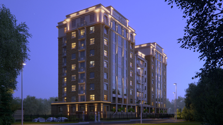
The high-end house “Aristocrat”, designed by Ilia Mashkov and Alexandra Kuzmina of AB “Mezonproekt”, was completed three years ago, in 2017. The complex has a rather advantageous location: almost at the junction of the elite Mozhaisk and Aminyevskoe highways. As we go north, the latter is continued by the Rublev Highway, so one can say that the complex stands at the beginning of the Rublev Highway, close to the busy Moscow thoroughfares. At the same time, it is fenced off from the Aminyevskoe Highway by “Kozlovsky Les” (“Goat’s Forest”), a part of the pine forest, where one can still see old wooden houses struggling along and a section of the unpaved Tyulpannaya Ulitsa – yes, Moscow is a really diverse city, and the urban environment here is slightly resonant with the Nikolina Mount (first of all, it’s the pines). However, this is where the similarities end: the 12-15 brick towers, first in the format of the late-Soviet, and then post-Soviet “elite” construction began to appear here as early as in the late 1980’s, also making the most out of the proximity to the pine trees, which are commonly known to purify the air. The “Aristocrat” complex is the newest one here; it is only 7-9 floors high, yet it puts a new spin on the old narrative, which is also confirmed by its name.

The high-end residential complex “Aristocrat”
Copyright: Photograph © Mezonproekt


The house stands at the edge of the forest, which muffles the highway noise almost completely; it's really quiet and peaceful here by the standards of a modern city. The architecture of the complex exactly matches the marketing task: as is known, the format of the Moscow premium-class house first of all presupposes the decorative style that combines the image of a palace with a reasonable degree of adornment. Today, this style is popularly defined as “Art Deco”, which is not entirely correct because the overall “rich and respectable” image also includes Art Nouveau and eclecticism, the Art Deco being the image that is closest in time. Alexandra Kuzmina and Ilia Mashkov have been working in this field for quite a while, and rather successfully, too – specifically, the direct predecessor of “Aristocrat” is the “House of the Academy of Sciences” built in 2009 on the Sergeya Kapitsy Street, right across from the entrance to the Yuri Platonov Academy, also situated in a quiet setting, not far away from the Moskva River. A brick background, stucco details, cantilevered structures, flutes, and sculptures. A podium, an attic, a cornice, and pilasters. Decorative inserts and wrought-iron balconies. Generally speaking, this set forms the minimum minimorum of a respectable-looking house. Its obvious merit is the comfortable scale combined with a rich texture. The main risk connected with working in this genre, so welcomed by the clients and marketers alike is the interpretation of historical prototypes. And, this risk is like a double-edged sword: it’s a bad thing if you do this true to the original, and it’s a bad thing if you do this too general, larger, and simpler. The professional community, well aware of the “minimalism” notion, accepts the decorative approach rather reluctantly, but society at large, tired of staying on the minimalist diet, is asking for more. Seemingly, after the 30 years of “textured city” the hunger must be satisfied, but decorated buildings are still popular. This is a challenge, and works by Mezonproject are providing their response to it. This answer is specific and proportionate enough, reserved in its way, teetering on the verge of generalized Neo-Greek, yet with a Palladian symmetric U-shaped plan, Art Nouveau that performs on the verge of theatrical orientalist “Egyptian” indulgences, and the modern ornamental architecture, whose techniques are gradually winning over the “realistic” architecture of orders and decorative sculpture, i.e. the recognizable elements of tenements of the historicism period.

  • zooming
    1 / 4
    The high-end residential complex “Aristocrat”
    Copyright: Photograph © Mezonproekt
  • zooming
    2 / 4
    The high-end residential complex “Aristocrat”
    Copyright: Photograph © Mezonproekt
  • zooming
    3 / 4
    The high-end residential complex “Aristocrat”
  • zooming
    4 / 4
    The high-end residential complex “Aristocrat”


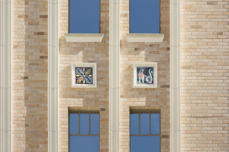
If we are to compare “Aristocrat” (built in 2017) to the Academy House (built in 2009) – there are eight years lying between them, but they still echo one another proportion-wise, like blood brothers, the difference being that the contrastive brown-and-beige tone became lighter, the brick acquired an almost flesh tint, and the decorative elements received a greater degree of generalization. The energetic lotus-shaped ornaments and the “gargoyle” cantilevered structures gave way to light greenish grids and majolica inserts, whose relationship with the Abramtsev and Talashkin ceramics, so much loved by many people, is perfectly obvious.

The high-end residential complex “Aristocrat”
Copyright: Photograph © Mezonproekt


Generally speaking, tile and majolica are the well-known soft spots of any anti-modernist, an urban creator looking to see something pleasing to the eye. Some of such joys are the tile of the second half of the XVII century in Yaroslavl, the Pertsova House on the Prechistenskaya Embankment, the Church of Holy Spirit in already-mentioned Talashkino; but not just them – virtually any glazed insert you may lay your eyes on the city facades. We cling to these colorful reliefs, and, probably, it would not be an exaggeration to say that this feast of color is something, among other things, that we love the Art Nouveau architecture for. The “Aristocrat” house responds to the subject: the windows in wide frames alternate with “tiles” with floral ornaments, birds and gryphons, and the attics above the projections are adorned by large majolica inserts. The patterns are large and bright, which is only fair, because they function as colorful spots and are meant to be seen from a distance. At the same time, low degree of elaboration is characteristic for later artists, which, one way or another, makes this solution look more contemporary. 

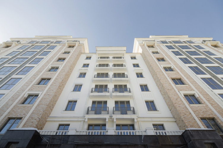
Generalizing the decorative details is also quite characteristic. An important part is played by the grilles: non-transparent metallic ones and transparent white ventilation grilles on the park facade, and balcony grilles all over the place. The pilasters here are in fact slender vertical molds. The attic receives ribs – conditional flutes, but without grooves, rather a striped relief. There are few cantilevered structures, no sculptures, large curbs prevail. In general, the decor has become not only lighter in terms of color, but more concise and lighter in terms of visual weight.

The high-end residential complex “Aristocrat”
Copyright: Photograph © Mezonproekt


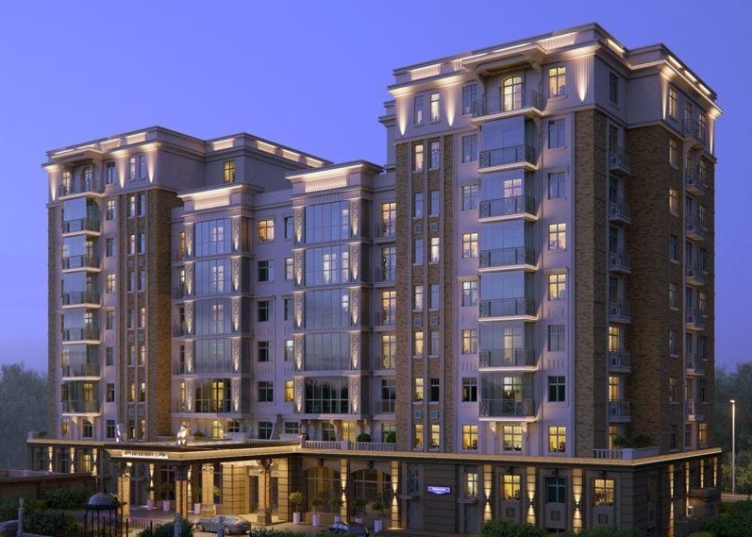
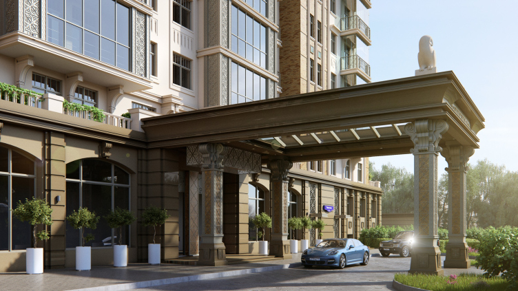
As was already mentioned earlier, the house has a U-shaped floor plan; it is embellished by projections on side ends, and by groups of recessed balconies in the main part. The basement floor, unlike the main light-colored volume, is coated with dark granite, made more sophisticated by horizontal rock-face plaques, and is made still heavier by a massive portico, stretched far forward between the wings of the house towards the Veresaeva Street, even slightly further than was required in order to provide a comfortable exit in a velvet dress from the limousine.

The high-end residential complex “Aristocrat”
Copyright: Photograph © Mezonproekt


The high-end residential complex “Aristocrat”
Copyright: Photograph © Mezonproekt


“In the project, the basement floor had even richer decoration – Ilia Mashkov shares – It was planned that in the lower part the house was to look expensive, to the point of excessive, solemn, and festive, becoming more reserved as we went up. The crowning cornice of the first floor is not made to project; the first floor turned out to be ascetic, and it is dissonant with the top one.”

The high-end residential complex “Aristocrat”
Copyright: Photograph © Mezonproekt


The high-end residential complex “Aristocrat”
Copyright: Photograph © Mezonproekt


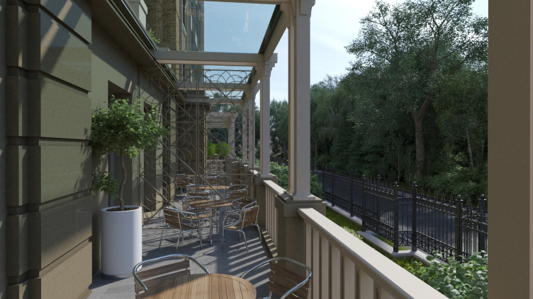
The apartments in this house are rather spacious, which corresponds to its class; on the corners, there are living rooms, 40 square meters, with three windows. Along the contour of the basement floor, as well as on the roof of the central part, whose height is slightly lower than that of the wings, terraces appear with a small garden and a green roof at the top. In the lobby at the entrance, the residents are welcomed by a double grand staircase. 

  • zooming
    1 / 6
    The high-end residential complex “Aristocrat”
    Copyright: Photograph © Mezonproekt
  • zooming
    2 / 6
    The high-end residential complex “Aristocrat”
    Copyright: Photograph © Mezonproekt
  • zooming
    3 / 6
    The high-end residential complex “Aristocrat”
  • zooming
    4 / 6
    The high-end residential complex “Aristocrat”
    Copyright: Photograph © Mezonproekt
  • zooming
    5 / 6
    The high-end residential complex “Aristocrat”
    Copyright: Photograph © Mezonproekt
  • zooming
    6 / 6
    The high-end residential complex “Aristocrat”
    Copyright: Photograph © Mezonproekt


Anyway, the facades of this high-end house, generally sticking to generalized historicism, are revisited in the spirit of modern decorative. Its tone is light, which is meant to, among other things, to lighten up the volume. The very seven and nine-story height makes the house a comfortable example of city construction against the 12-15 story environment, while the delicate ornaments and confident tread of symmetrical “U-plan” turns it into a kind of palace in front of a pine park at the very beginning of the Rublev Highway. The class of the housing speaks for itself: in Moscow, it is asking for a decorated solution. However, in this case we are seeing the approach to decoration taken to a whole new level: the elements of the historical facade become virtually the signs of themselves, laconic and light enough not to look excessive. The focus of attention is shifted to other motives: the ornamental band, textured brick, and inserts of color ceramics, attractive like pictures on the walls.

21 October 2020

Headlines now
The Golden Crown
The concept for a dental clinic in Yekaterinburg, developed by CNTR Studio, revolves around the idea of a “mouth full of gold”: pristine white porcelain stoneware walls are complemented by matte brass details. To avoid an overly literal interpretation, the architects focused on the building’s proportions, skillfully navigating between sunlight requirements and fire safety regulations.
Flexibility and Integration
Not long ago, we covered the project for the fourth phase of the ÁLIA residential complex, designed by APEX. Now, we’ve been shown different fence concepts they developed to enclose the complex’s private courtyards, incorporating a variety of public functions. We believe that the sheer fact that the complex’s architects were involved in such a detail as fencing speaks volumes.
A Step Forward
The HIDE residential complex represents a major milestone for ADM architects and their leaders Andrey Romanov and Ekaterina Kuznetsova in their quest for a fresh high-rise aesthetic – one that is flexible and layered, capable of bringing vibrancy to mass and silhouette while shaping form. Over recent years, this approach has become ADM’s “signature style”, with the golden HIDE tower playing a pivotal role in its evolution. Here, we delve into the project’s story, explore the details of the complex’s design, and uncover its core essence.
Gold in the Sands
A new office for a transcontinental company specializing in resource extraction and processing has opened in Dubai. Designed by T+T Architects, masters of creating spaces that are contemporary, diverse, flexible, and original, this project exemplifies their expertise. On the executive floor, a massive brass-clad partition dominates, while layered textures of compressed earth create a contextually resonant backdrop.
Layers and Levels of Flight
This project goes way back – Reserve Union won this architectural competition at the end of 2011, and the building was completed in 2018, so it’s practically “archival”. However, despite being relatively unknown, the building can hardly be considered “dated” and remains a prime example of architectural expression, particularly in the headquarters genre. And it’s especially fitting for an aviation company office. In some ways, it resembles the Aeroflot headquarters at Sheremetyevo but with its own unique identity, following the signature style of Vladimir Plotkin. In this article, we take an in-depth look at the United Aircraft Corporation (UAC) headquarters in the Moscow agglomeration town of Zhukovsky, supplemented by recent photographs from Alexey Naroditsky – a shoot that became only recently possible due to the fact that improvements were finally made in the surrounding area.
Light and Shadow
In this article, we delve into the architectural design of the “Chaika” house by DNK ag architects, which was recently completed in 2023 as part of the collection of signature designs at ZILArt. As is well-known, all the buildings in this complex follow a design code, yet each one is distinct. This particular building stands out not only for its whiteness and minimalism but also for the refined use of a limited number of techniques that, together, create what can confidently be called synergy.
Casus Novae
A master plan was developed for a large residential area with a name of “DNS City”, but now that its implementation began, the plan has been arbitrarily reformatted and replaced with something that, while similar on the surface, is actually quite different. This is not the first time such a thing happens, but it’s always frustrating. With permission from the author, we are sharing Maria Elkina’s post.
Treasure Hunting
The GAFA bureau, in collaboration with Tegola and Arkhitail, organized an expedition to the island of Kilpola in Karelia as part of Moskomarkhitektura’s “Open City” festival. There, amidst moss and rocks, the students sought answers to questions like: what is the sacred, where does it dwell, and what sustains it? Assisting the participants in this quest were landscape engineer Evgeny Levin, artist Nicholas Roerich, a moose, and the lack of cellular connection. Here’s how the story unfolded.
Depths of the Earth, Streams of Water
In the Malaya Okhta district, the Akzent building, designed by Stepan Liphart, was constructed. It follows a classic tripartite structure, yet it’s what you might call “hand-drawn”: each façade is unique in its form and details, some of which aren’t immediately noticeable. In this article, we explore the context and, together with the architect, delve into how the form was developed.
Fir Tree Dynamics
The “Airports of Region” holding is planning to build an airport in Karachay-Cherkessia, aiming to make the Arkhyz and Dombay resorts more accessible to travelers. The project that won in an invitation-only competition, submitted by Sergey Nikeshkin’s KPLN, blends natural imagery inspired by the shape of a conifer seed, open-air waiting spaces, majestic large trees, and a green roof elevated on needle-like columns. The result is both nature-inspired and WOW.
​A Brick Shell
In the process of designing a clubhouse situated among pine trees in a prestigious suburban area near Moscow, the architectural firm “A.Len” did the façade design part. The combination of different types of brick and masonry correlates with the volumetric and plastique solutions, further enhanced by the inclusion of wood-painted fragments and metal “glazing”.
Word Forms
ATRIUM architects love ambitious challenges, and for the firm’s thirtieth anniversary, they boldly play a game of words with an exhibition that dives deep into a self-created vocabulary. They immerse their projects – especially art installations – into this glossary, as if plunging into a current of their own. You feel as if you’re flowing through the veins of pure art, immersed in a universe of vertical cities, educational spaces – of which the architects are true masters – and the cultural codes of various locations. But what truly captivates is the bold statement that Vera Butko and Anton Nadtochy make, both through their work and this exhibition: architecture, above all, is art – the art of working with form and space.
Flexibility and Acuteness of Modernity
Luxurious, fluid, large “kokoshniks” and spiral barrel columns, as if made from colorful chewing gum: there seem to be no other mansion like this in Moscow, designed in the “Neo-Russian-Modern” style. And the “Teremok” on Malaya Kaluzhskaya, previously somewhat obscure, has “come alive with new colors” and gained visibility after its restoration for the office of the “architectural ecosystem” as the architects love to call themselves. It’s evident that Julius Borisov and the architects at UNK put their hearts into finding this new office and bringing it up to date. Let’s delve into the paradoxes of this mansion’s history and its plasticity. Spoiler: two versions of modernity meet here, both balancing on the razor’s edge of “what’s current”.
Yuri Vissarionov: “A modular house does not belong to the land”
It belongs to space, or to the air... It turns out that 3D printing is more effective when combined with a modular approach: the house is built in a workshop and then adapted to the site, including on uneven terrain. Yuri Vissarionov shares his latest experience in designing tourist complexes, both in central Russia and in the south. These include houseboats, homes printed from lightweight concrete using a 3D printer, and, of course, frame houses.
​Moscow’s First
“The quality of education largely depends on the quality of the educational environment”. This principle of the last decade has been realized by Sergey Skuratov in the project for the First Moscow Gymnasium on Rostovskaya Embankment in the Khamovniki district. The building seamlessly integrates into the complex urban landscape, responding both to the pedestrian flow of the city and the quiet alleyways. It skillfully takes advantage of the height differences and aligns with modern trends in educational space design. Let’s take a closer look.
Looking at the Water
The site of Villa Sonata stretches from the road to the water’s edge, offering its own shoreline, pier, and a picturesque river panorama. To reveal these sweeping views, Roman Leonidov “cut” the façade diagonally parallel to the river, thus getting two main axes for the house and, consequently, “two heads”. The internal core – two double-height spaces, a living room and a conservatory, with a “bridge” above them – makes the house both “transparent” and filled with light.
The White Wing
Well, it’s not exactly white. It’s more of a beige, white-stone structure that plays with the color of limestone – smoother surfaces are lighter, while rougher ones are darker. This wing unites various elements: it absorbs and interprets the surrounding themes. It responds to everything, yet maintains a cohesive expression – a challenging task! – while also incorporating recognizable features of its own, such as the dynamic cuts at the bottom, top, and middle.
Urban Dunes
The XSA Ramps team designed and built a three-part sports hub for a park in Rostov-on-Don, welcoming people of all ages and fitness levels. The skate plaza, pump track, and playground are all meticulously crafted with details that attract a diverse range of visitors. The technical execution of the shapes and slopes transforms this space into a kind of sculptural composition.
Proportional Growth
The project for the fourth phase of the ÁLIA residential area has been announced. The buildings are situated on an elongated plot – almost a “ray” that shoots out from the center of the area towards the river. Their layout reflects both a response to Moscow’s architectural preferences over the past 15 years, shifting “from blocks to towers”, and an interpretation of the neighboring business park designed by SOM. Additionally, the best apartments here are not located at the very top but closer to the middle, forming a glowing “waistline”.
The “Staircase” Building
In designing the “Details” residential complex in New Moscow, Rais Baishev spiced up the now-popular Moscow theme of a “courtyard” building with an idea drawn from the surrealist drawings by Maurits Escher. He envisioned the stepped silhouettes and descending slopes as a metaphysical mega-staircase, creating a key void within the courtyard that gave the project an internal “spine”. This concept is felt both in the building’s silhouette and on its façades.
Projection of the Quarter
No one doubted that the building that Vladimir Plotkin designed as part of the “Garden Quarters” would be the most modernist of all. And it turned out just that way: while adhering to the common design code, the building successfully combines brick and white stone, rhythmically responding to the neighboring building designed by Ostozhenka, yet tactfully and persistently making a few statements of its own. This includes the projection of the ideal urban development composition “14–9–6”, which can be found right next door, mathematical calculations, including those for various types of terraces (and perhaps the only reminder of the Soviet past of the Kauchuk rubber factory!), and the white “cross-stitch” pattern of the façade grid.
Domus Aurea
In this issue, we examine the “Tessinsky-1” house, designed by Sergey Skuratov and completed in 2023. Located in the middle of the Serebryanicheskaya Embankment district, at the intersection of its main streets, this house assumes a sort of “nodal” role: it not only responds to everything around it and preserves many memories of the former EMA factory within itself, but it weaves all this into a newly directed pattern, reconciling bright “gold” and dark-colored brick, largely with the help of the new, modern-yet-archaic Columba brick, which, come to think about it, is the most precious element here.
The Chimney of Nikola-Lenivets
In this issue, we are examining the “Obelisk House” designed by KATARSIS and built for the Arkhstoyanie 2023 festival. However, it was only finished later on, and this is why we are examining it now. It seems to us that after the “Obelisk House” appeared in Nikola-Lenivets, a dialogue and a few inner connections appeared between the temporary structures built here. These houses no longer look like “accidental neighbors”, more of which below.
​Periscope by the Bay
The jury awarded the second place in the competition for a public and cultural center in Petropavlovsk-Kamchatsky to the companies GORA (“Mountain”) and M4. In the consortium’s proposal, the building resembles a sperm whale with a calf swimming next to it or a periscope, whose lenses capture the most spectacular views from the surrounding landscape.
From Arcs to Dolmens
While working on the competition project for Petropavlovsk-Kamchatsky, ASADOV Architects prioritized the value of the natural and urban environment, aiming to preserve the balance of the location while minimizing the resemblance of the volume that they designed to a “traditional building”. The task was challenging, and the architects created three versions, one of which having been developed after the competition, where their main proposal took third place. However, the point of interest here is not the competition result but the continuity of creative thinking.
Hide and Seek
The ID Moskovskiy house, designed by Stepan Liphart in St. Petersburg, in the courtyards near Moskovskiy Avenue beyond the Obvodny Canal and recently completed, is notable for several reasons. Firstly, it has been realized with considerable accuracy, which is particularly significant as this is the first building where the architect was responsible not only for the facades but also for the layouts, allowing for better integration between the two. On the other hand, this building is interesting as an example of the “germination” of new architecture in the city: it draws on the best examples from the neighborhood and becomes an improved and developed sum of ideas found by the architect in the surrounding context.
The Big Twelve
Yesterday, the winners of the Moscow Mayor’s Architecture Award were announced and honored. Let’s take a look at what was awarded and, in some cases, even critique this esteemed award. After all, there is always room for improvement, right?
Above the Golden Horn
The residential complex “Philosophy” designed by T+T architects in Vladivostok, is one of the new projects in the “Golubinaya Pad” area, changing its development philosophy (pun intended) from single houses to a comprehensive approach. The buildings are organized along public streets, varying in height and format, with one house even executed in gallery typology, featuring a cantilever leaning on an art object.
Nuanced Alternative
How can you rhyme a square and space? Easily! But to do so, you need to rhyme everything you can possibly think of: weave everything together, like in a tensegrity structure, and find your own optics too. The new exhibition at GES-2 does just that, offering its visitor a new perspective on the history of art spanning 150 years, infused with the hope for endless multiplicity of worlds and art histories. Read on to see how this is achieved and how the exhibition design by Evgeny Ace contributes to it.
Blinds for Ice
An ice arena has been constructed in Domodedovo based on a project by Yuri Vissarionov Architects. To prevent the long façade, a technical requirement for winter sports facilities, from appearing monotonous, the architects proposed the use of suspended structures with multidirectional slats. This design protects the ice from direct sunlight while giving the wall texture and detail.