По-русски

​The Starting Point

In this article, we are reviewing two retro projects: one is 20 years old, the other is 25. One of them is Saint Petersburg’s first-ever townhouse complex; the other became the first example of a high-end residential complex on Krestovsky Island. Both were designed and built by Evgeny Gerasimov and Partners.

29 October 2020
Object
mainImg
Evgeny Gerasimov and Partners is one of the oldest commercial architectural companies in this city; this year its first project – the condominium in Kupchino – is turning 25. Over the next quarter of a century, the company collected a portfolio that is just as impressive as it is diverse: it includes high-end villas in the city’s most beautiful places, grand-scale public buildings, industrial park renovation projects, and neat-looking housing projects at the edge of the city. The company does not limit itself to any particular style, chiefly relying on context and relevance than on fashion trends or a course that has been set once and for all. This approach, characteristic of a “large company”, which is ready to tackle the task of any complexity, could be traced already in its first projects, more of which we are covering below.

Condominium in Kupchino
Copyright: © Evegeny Gerasimov and partners. Photograph © Andrey Belimov-Gushchin


At this point, we cannot do without a quick tour of the “primordial soup” of the 1990’s. According to the website Russian Architecture: the New Age, the most significant events of the decade were: the “Freedom of Trade” decree, the opportunity for the citizens of Russia to freely go abroad, the creation of UKOS oil company, the MMM bubble, terrorism, and the default of 1998. In the daily routine, it was the “Broken Streetlights” TV series, vouchers, the Dendy game console, and Michael Jackson performing at Luzhniki Arena. In the professional environment, it was the first Zodchestvo festival and the first articles by Grigory Revzin, the two keywords being freedom and courage.

1. Red

Townhouses in Kupchino


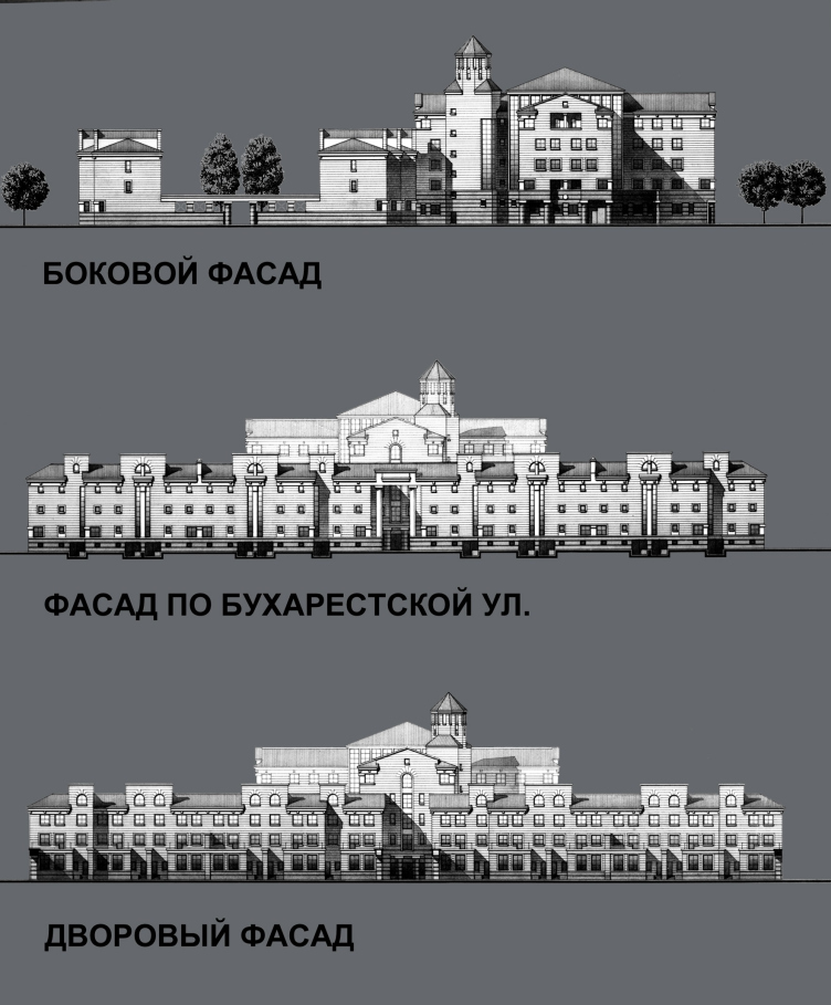
The company started designing the condominium on Bukharestskaya Street immediately after the collapse of the Soviet Union, in 1992, and finished it in 1995. From this commission from the Russo-Balt developers, the history of the company started. At that time, the young architect Evgeny Gerasimov drew inspiration from the masters of postmodernism, whose works he saw in library magazines – Vittorio Gregotti, Michael Graves, Aldo Rossi – and he would commute to the construction site by Tram 25, carrying around a gas handgun – “times were pretty tough back then”.

  • zooming
    1 / 4
    Condominium in Kupchino
    Copyright: © Evegeny Gerasimov and partners
  • zooming
    2 / 4
    Condominium in Kupchino
    Copyright: © Evegeny Gerasimov and partners
  • zooming
    3 / 4
    Condominium in Kupchino
    Copyright: © Evegeny Gerasimov and partners
  • zooming
    4 / 4
    Condominium in Kupchino
    Copyright: © Evegeny Gerasimov and partners


Parallel to the rise in the exchange rate of the US dollar, the Kupchino prefab houses saw the rise of something that was totally sci-fi by the standards of those days – not only in form but in content as well: a castle with fortress walls and a tower, which, upon closer inspection, consisted of US-style townhouses with unseen before heated garages, master’s studies, terraces.

The architectural critic Elena Gonzales wrote about this project in 2010:

Elena Gonsales

The post-perestroika era split the world of Russian housing construction into two poles: social and “elite”. The appearance of the latter in the 1990’s was brought about by the return of the private property – the millions of dollars that the “new rich” instantly made began to convert in “Euro-remodeling” projects and “condominiums”. What does this mean in architectural terms? Stylistically, this spells the revival of the “bourgeois” classicism in its Victorian version: conservative geometry-based architecture characterized by powerful red-brick walls, turrets, and robust bottom floors. As for the apartment design, it witnessed a veritable revolution that consisted in the appearance of a second bathroom, the so-called “guest” one.


Condominium in Kupchino
Copyright: © Evegeny Gerasimov and partners. Photograph © Andrey Belimov-Gushchin


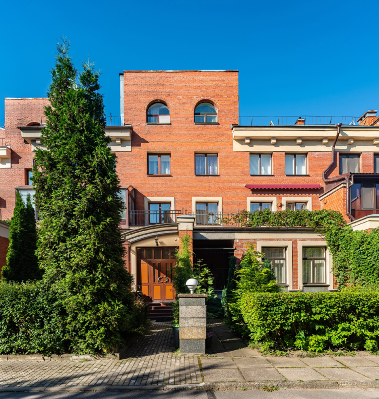
The architects of those days had to invent this new-formation technology from scratch, not having either analogues or predecessors to rely on – apart from photos from the “Architecture and Construction” magazine. Probably, this is why the complex turned out to be so brightly unique; it leaves nobody indifferent even today – people sometimes liken it to a Baptist church, and sometimes to a prison, but it definitely arrests everyone’s gaze.

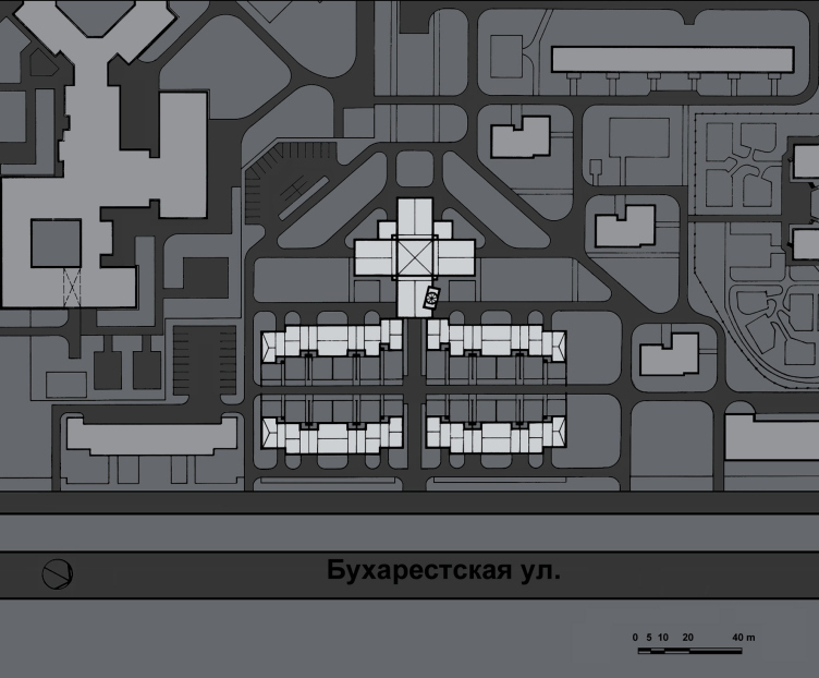
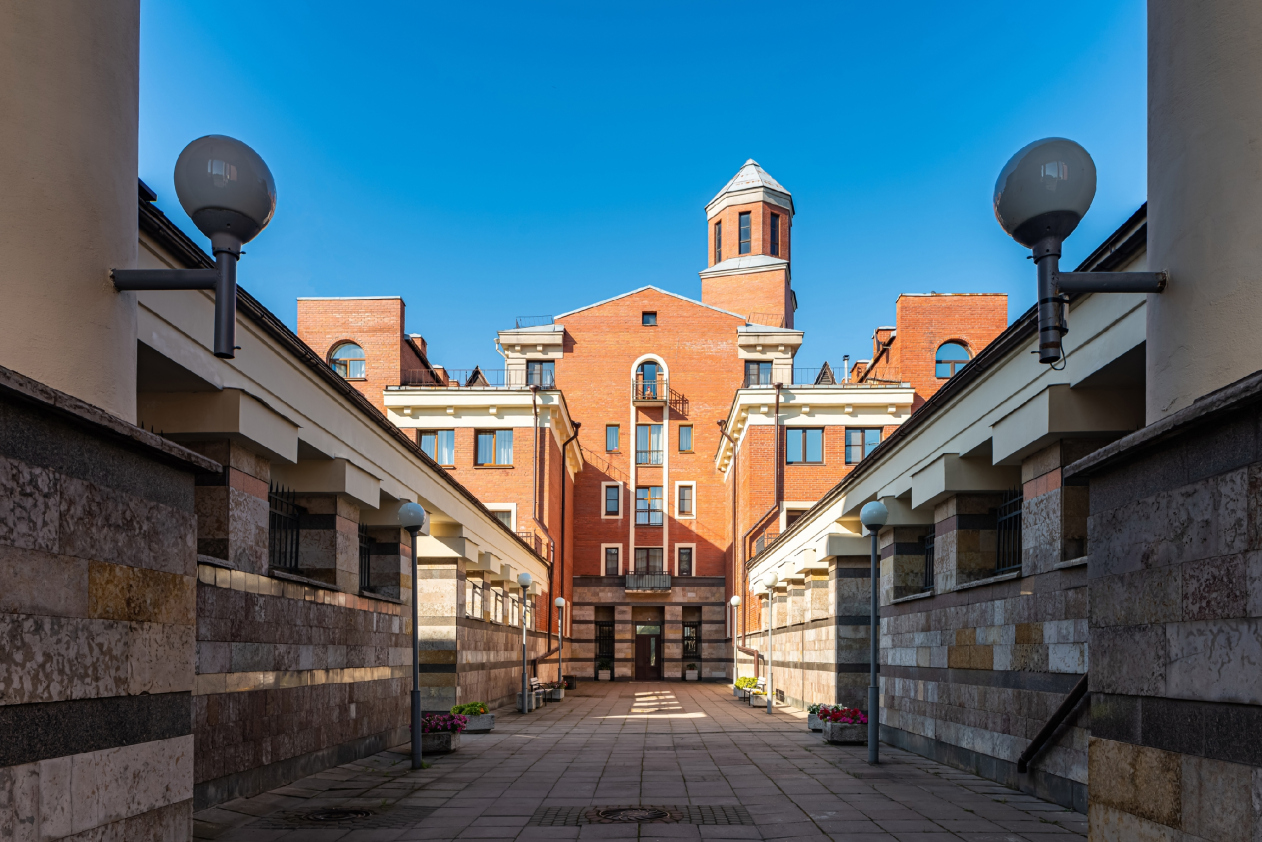
The composition of “Ivanhoe” (this was the name that the condominium got a while later) was designed as a symmetric one. The complex consists of four blocks with six townhouses in each, which are joined into two “walls” running parallel to Bukharestskaya Street and forming a closed rectangular yard. The traversal axis of the yard consists of a promenade and a cross-shaped (on the plan) centerpiece building with “regular” apartments and a “watchtower” highlight. Yet another block, which does not belong to the housing complex, but is designed in the same style, is the building of the Employment Agency of the Frunzensky district; what makes it different from the townhouses are the more habitual and friendly-looking “full-size” windows. One can get the exhaustive knowledge about the rather sophisticated construction of the complex from its model.

The master plan. Condominium in Kupchino
Copyright: © Evegeny Gerasimov and partners


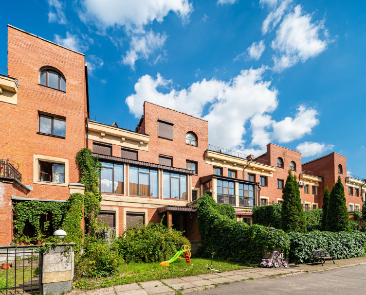
The somewhat excessively introverted character of the condominium can be explained by the time when it was built: comfort meant first of all security and privacy. In order to give the residents extra protection from the outside world, which was barging in with the rattling of the morning tram, the architects came up with noise-proof apartment design: the townhouses only face the street with the windows of bathrooms and staircases, while the bedrooms, children’s rooms, and libraries overlook the quiet inner “garden” yard.

Condominium in Kupchino
Copyright: © Evegeny Gerasimov and partners. Photograph © Andrey Belimov-Gushchin


Also, from the street side, there is a garage entrance, from which one can get up to their home, while the main entrance is situated from the side of the elevated yard. In each townhouse, there are six rooms, a kitchen, two bathrooms, and a mansard floor, the total area being 140 square meters.

The apartments in the “dungeon” have 4 to 6 rooms in them. The apartments are three-sided, with two bathrooms; also, there is an underground parking garage in the building. The turret, which has a staircase inside, is the only element to violate the perfect symmetry: the “eight-on-four” is turned 45 degrees in respect to the orthogonal lines. As Evgeny Gerasimov shared later, “this was a sensual solution meant to enrich the building’s look, and having no conceptual meaning whatsoever.”

  • zooming
    1 / 4
    Condominium in Kupchino
    Copyright: © Evegeny Gerasimov and partners. Photograph © Andrey Belimov-Gushchin
  • zooming
    2 / 4
    Condominium in Kupchino
    Copyright: © Evegeny Gerasimov and partners. Photograph © Andrey Belimov-Gushchin
  • zooming
    3 / 4
    Condominium in Kupchino
    Copyright: © Evegeny Gerasimov and partners. Photograph © Andrey Belimov-Gushchin
  • zooming
    4 / 4
    Condominium in Kupchino
    Copyright: © Evegeny Gerasimov and partners. Photograph © Andrey Belimov-Gushchin


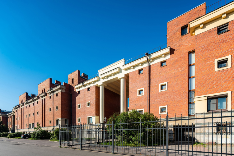
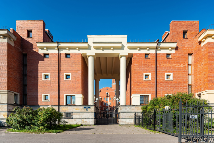
After many years of mass construction, this project became a challenge for everyone – the architects, the construction company, and even the city people. As was already said, nobody had hitherto heard about parking garages, and the metallic roof was also a novelty; the style that the architects chose was totally experimental. While the striped look of the bottom floors, covered by beautiful multicolored stone, sometimes metallically porous, the broad brick planes, and the “propylaea” of the main entrances all suggest the “fortress” narrative, the purity of the geometric forms, the columns, the cornice, and the trimming around the windows were inspired by Mario Botha. All of these elements are just as laconic as they are paradoxical: laconic cornices with an odd giant cantilevers, and empire windows above the pairs of the verticals of the staircases (originally, the architects designed columns of a “greater” order but it was only a pier that ultimately remained).

Condominium in Kupchino
Copyright: © Evegeny Gerasimov and partners. Photograph © Andrey Belimov-Gushchin


Condominium in Kupchino
Copyright: © Evegeny Gerasimov and partners


It is rather obvious that the pair of columns on either side of the entrance to the transverse promenade looks very similar to the arch of Saint Petersburg’s New Holland area, even though there is no arch top here – the romantic “castle” narrative is achieved here by very simple means. This is definitely not historicism – the building does not have any specific details – this is nothing but postmodernism, even though devoid of irony but still fresh enough to be different from the “style of the 1990’s”, which will come later on down the line.

Condominium in Kupchino
Copyright: © Evegeny Gerasimov and partners. Photograph © Andrey Belimov-Gushchin


2. Green

The first high-end residential complex on Krestovsky Island

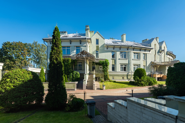
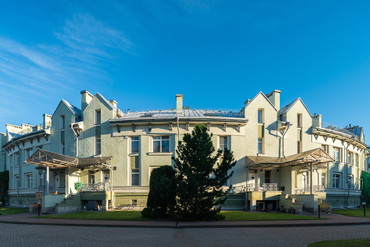
The “Zeleny Ostrov” (“Green Island”) the city’s first high-end residential complex, was built on the Krestovsky Island a little bit later, in 1996-1999, the typology and the overall design being similar: the “perimeter” of townhouses and the centerpiece apartment building. However, while the “fields” of Kupchino were not burdened by the context and could withstand any postmodernist experiments, the Krestovsky Island required attention to its history.

“Green Island” housing complex
Copyright: © Evegeny Gerasimov and partners


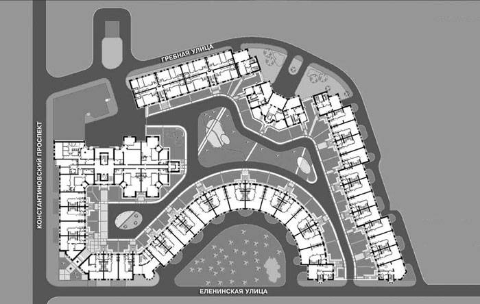
The change of location is already felt in the master plan of the complex: its outlines repeat the curves of the streets, carefully stepping back, wherever it is necessary to save the trees. The flowing character of the construction reminds of the proximity of the river and the “accidental” look of natural forms – up until the 1930’s, the Krestovsky Island chiefly hosted countryside homes, and was not “tamed” by a rigid town planning grid. From above, the plan of the complex looks like a snake, the “head” of which is a building with apartments that goes into the courtyard. A tenement house built in 1909, to which the new building adjoins closely, closing the quarter, as was customary in the central part of the city, does not allow the “snake” to bite itself by the tail.

“Green Island” housing complex. Construction, 2000
Copyright: © Evegeny Gerasimov and partners


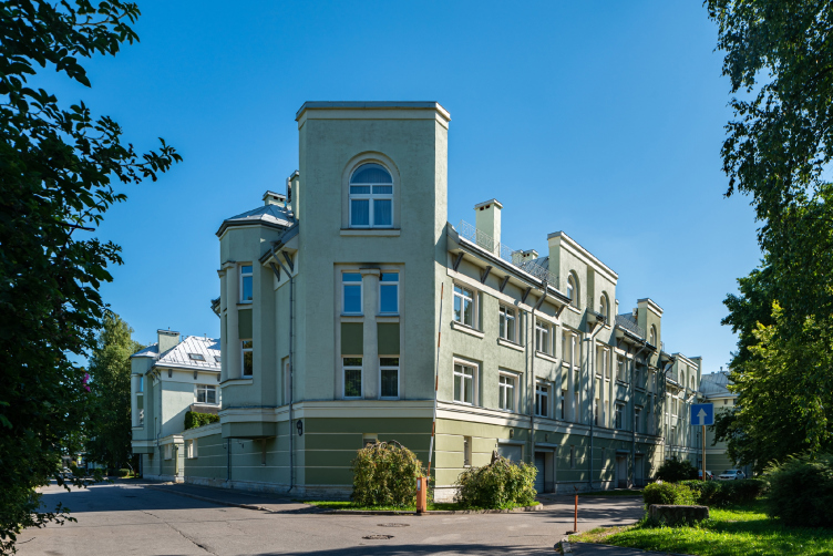
The whole complex is divided into five residential blocks, which differ in both facades and layout. The variety proposed by the architects consists of gabled roofs grouped in pairs on the sides of chimneys, hexagonal towers, post-constructivist windows with a column in the middle and recessed balconies with a column at the corner, as well as a “one-legged” portico, which Grigory Revzin was once surprised at back in the day.

“Green Island” housing complex
Copyright: © Evegeny Gerasimov and partners. Photograph © Andrey Belimov-Gushchin


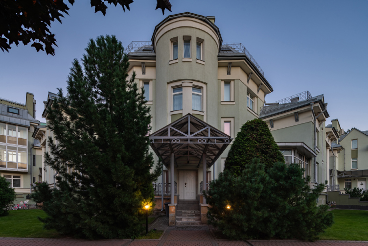
On one corner, the house faces the city with a rigid trapeze of the façade, which immediately reminds one of the “fifth corner”. The real highlight here, however, is the rounded façade that is turned to the yard, looking at which one indeed may think that they are looking at a “round” house.

“Green Island” housing complex
Copyright: © Evegeny Gerasimov and partners. Photograph © Andrey Belimov-Gushchin


“Green Island” housing complex
Copyright: © Evegeny Gerasimov and partners. Photograph © Andrey Belimov-Gushchin


Evgeny Gerasimov shares that this project was inspired by Saint Petersburg dachas of the early XX century. It indeed has a “dacha” look about it – first of all, its height of two or three floors is much lower than the habitual height of the Saint Petersburg tenements of the XIX/XX century, and, if I may say so, reminds the format of Moscow construction of 150 years ago, when Moscow was NOT the capital of Russia. The complex, of course, outgrows the country homes of the modernist periods, but not as significantly as the buildings that appeared on the Krestovsky Island later on, such as “Verona” and “Venice”, also designed by Evgeny Gerasimov, and referring to quite a different style of “palazzo” houses, working with the historical prototypes in all seriousness. On the other hand, Green Island became the first example in a series of high-end houses built on the Krestovsky Island in the following years.

The “Green Island” house, in contrast to the red-brick “Ivanhoe” residential complex, is plastered, which gives us yet another analogy – with the above-mentioned post-constructivism that manifested itself in the residential areas of the 1930’s, which have not yet lost their constructivist courage, but have already felt the joy of working with a column. To some extent, it also echoes the houses that were built after the Second World War in Soviet cities by captured Germans, sometimes according to German projects: two or three-story houses, they were usually equipped with pediments that grow out of walls without a cornice; however, similar districts were then built according to the designs of “Stalinist” architects, especially in districts located farther away from the city center.

Here, that city looks as if it was taken as an example, and “jam-packed”, due to which the gable roofs became even sharper, and the bay windows grew into turrets, which in turn leads to us perceiving the whole house as a non-classicist one – active, complex, and changing dramatically if viewed from different angles. By the way, this unpredictability, asymmetry and interest in towers were also characteristic of the Kamennostrovsky dachas, so their prototype is probably readable – except that the architects of those days lined up the dachas here, receiving their hybrid with urban development.

  • zooming
    1 / 4
    “Green Island” housing complex
    Copyright: © Evegeny Gerasimov and partners. Photograph © Andrey Belimov-Gushchin
  • zooming
    2 / 4
    “Green Island” housing complex
    Copyright: © Evegeny Gerasimov and partners. Photograph © Andrey Belimov-Gushchin
  • zooming
    3 / 4
    “Green Island” housing complex
    Copyright: © Evegeny Gerasimov and partners. Photograph © Andrey Belimov-Gushchin
  • zooming
    4 / 4
    “Green Island” housing complex
    Copyright: © Evegeny Gerasimov and partners. Photograph © Andrey Belimov-Gushchin


The two houses that we are now remembering – 20-25 years after the completion of their construction – are united not only by the design time and similar techniques. First of all, they are related by a low-rise scale, the mixed “apartments+townhouses”, the presence of direct entrances to houses from the street and front gardens. Subsequently, the townhouse format developed in two directions: affordable and more expensive, but it never became widespread in this country, which is probably a pity. Of course, in the experiments of the nineties there were many things that have long since been rejected by the authors as irrelevant; yet, meanwhile, there were a lot of interesting things in them – and that, with rare exceptions, did not receive development. In particular, the low-rise scale and the interest in experimenting with mixed typology.

29 October 2020

Headlines now
The Golden Crown
The concept for a dental clinic in Yekaterinburg, developed by CNTR Studio, revolves around the idea of a “mouth full of gold”: pristine white porcelain stoneware walls are complemented by matte brass details. To avoid an overly literal interpretation, the architects focused on the building’s proportions, skillfully navigating between sunlight requirements and fire safety regulations.
Flexibility and Integration
Not long ago, we covered the project for the fourth phase of the ÁLIA residential complex, designed by APEX. Now, we’ve been shown different fence concepts they developed to enclose the complex’s private courtyards, incorporating a variety of public functions. We believe that the sheer fact that the complex’s architects were involved in such a detail as fencing speaks volumes.
A Step Forward
The HIDE residential complex represents a major milestone for ADM architects and their leaders Andrey Romanov and Ekaterina Kuznetsova in their quest for a fresh high-rise aesthetic – one that is flexible and layered, capable of bringing vibrancy to mass and silhouette while shaping form. Over recent years, this approach has become ADM’s “signature style”, with the golden HIDE tower playing a pivotal role in its evolution. Here, we delve into the project’s story, explore the details of the complex’s design, and uncover its core essence.
Gold in the Sands
A new office for a transcontinental company specializing in resource extraction and processing has opened in Dubai. Designed by T+T Architects, masters of creating spaces that are contemporary, diverse, flexible, and original, this project exemplifies their expertise. On the executive floor, a massive brass-clad partition dominates, while layered textures of compressed earth create a contextually resonant backdrop.
Layers and Levels of Flight
This project goes way back – Reserve Union won this architectural competition at the end of 2011, and the building was completed in 2018, so it’s practically “archival”. However, despite being relatively unknown, the building can hardly be considered “dated” and remains a prime example of architectural expression, particularly in the headquarters genre. And it’s especially fitting for an aviation company office. In some ways, it resembles the Aeroflot headquarters at Sheremetyevo but with its own unique identity, following the signature style of Vladimir Plotkin. In this article, we take an in-depth look at the United Aircraft Corporation (UAC) headquarters in the Moscow agglomeration town of Zhukovsky, supplemented by recent photographs from Alexey Naroditsky – a shoot that became only recently possible due to the fact that improvements were finally made in the surrounding area.
Light and Shadow
In this article, we delve into the architectural design of the “Chaika” house by DNK ag architects, which was recently completed in 2023 as part of the collection of signature designs at ZILArt. As is well-known, all the buildings in this complex follow a design code, yet each one is distinct. This particular building stands out not only for its whiteness and minimalism but also for the refined use of a limited number of techniques that, together, create what can confidently be called synergy.
Casus Novae
A master plan was developed for a large residential area with a name of “DNS City”, but now that its implementation began, the plan has been arbitrarily reformatted and replaced with something that, while similar on the surface, is actually quite different. This is not the first time such a thing happens, but it’s always frustrating. With permission from the author, we are sharing Maria Elkina’s post.
Treasure Hunting
The GAFA bureau, in collaboration with Tegola and Arkhitail, organized an expedition to the island of Kilpola in Karelia as part of Moskomarkhitektura’s “Open City” festival. There, amidst moss and rocks, the students sought answers to questions like: what is the sacred, where does it dwell, and what sustains it? Assisting the participants in this quest were landscape engineer Evgeny Levin, artist Nicholas Roerich, a moose, and the lack of cellular connection. Here’s how the story unfolded.
Depths of the Earth, Streams of Water
In the Malaya Okhta district, the Akzent building, designed by Stepan Liphart, was constructed. It follows a classic tripartite structure, yet it’s what you might call “hand-drawn”: each façade is unique in its form and details, some of which aren’t immediately noticeable. In this article, we explore the context and, together with the architect, delve into how the form was developed.
Fir Tree Dynamics
The “Airports of Region” holding is planning to build an airport in Karachay-Cherkessia, aiming to make the Arkhyz and Dombay resorts more accessible to travelers. The project that won in an invitation-only competition, submitted by Sergey Nikeshkin’s KPLN, blends natural imagery inspired by the shape of a conifer seed, open-air waiting spaces, majestic large trees, and a green roof elevated on needle-like columns. The result is both nature-inspired and WOW.
​A Brick Shell
In the process of designing a clubhouse situated among pine trees in a prestigious suburban area near Moscow, the architectural firm “A.Len” did the façade design part. The combination of different types of brick and masonry correlates with the volumetric and plastique solutions, further enhanced by the inclusion of wood-painted fragments and metal “glazing”.
Word Forms
ATRIUM architects love ambitious challenges, and for the firm’s thirtieth anniversary, they boldly play a game of words with an exhibition that dives deep into a self-created vocabulary. They immerse their projects – especially art installations – into this glossary, as if plunging into a current of their own. You feel as if you’re flowing through the veins of pure art, immersed in a universe of vertical cities, educational spaces – of which the architects are true masters – and the cultural codes of various locations. But what truly captivates is the bold statement that Vera Butko and Anton Nadtochy make, both through their work and this exhibition: architecture, above all, is art – the art of working with form and space.
Flexibility and Acuteness of Modernity
Luxurious, fluid, large “kokoshniks” and spiral barrel columns, as if made from colorful chewing gum: there seem to be no other mansion like this in Moscow, designed in the “Neo-Russian-Modern” style. And the “Teremok” on Malaya Kaluzhskaya, previously somewhat obscure, has “come alive with new colors” and gained visibility after its restoration for the office of the “architectural ecosystem” as the architects love to call themselves. It’s evident that Julius Borisov and the architects at UNK put their hearts into finding this new office and bringing it up to date. Let’s delve into the paradoxes of this mansion’s history and its plasticity. Spoiler: two versions of modernity meet here, both balancing on the razor’s edge of “what’s current”.
Yuri Vissarionov: “A modular house does not belong to the land”
It belongs to space, or to the air... It turns out that 3D printing is more effective when combined with a modular approach: the house is built in a workshop and then adapted to the site, including on uneven terrain. Yuri Vissarionov shares his latest experience in designing tourist complexes, both in central Russia and in the south. These include houseboats, homes printed from lightweight concrete using a 3D printer, and, of course, frame houses.
​Moscow’s First
“The quality of education largely depends on the quality of the educational environment”. This principle of the last decade has been realized by Sergey Skuratov in the project for the First Moscow Gymnasium on Rostovskaya Embankment in the Khamovniki district. The building seamlessly integrates into the complex urban landscape, responding both to the pedestrian flow of the city and the quiet alleyways. It skillfully takes advantage of the height differences and aligns with modern trends in educational space design. Let’s take a closer look.
Looking at the Water
The site of Villa Sonata stretches from the road to the water’s edge, offering its own shoreline, pier, and a picturesque river panorama. To reveal these sweeping views, Roman Leonidov “cut” the façade diagonally parallel to the river, thus getting two main axes for the house and, consequently, “two heads”. The internal core – two double-height spaces, a living room and a conservatory, with a “bridge” above them – makes the house both “transparent” and filled with light.
The White Wing
Well, it’s not exactly white. It’s more of a beige, white-stone structure that plays with the color of limestone – smoother surfaces are lighter, while rougher ones are darker. This wing unites various elements: it absorbs and interprets the surrounding themes. It responds to everything, yet maintains a cohesive expression – a challenging task! – while also incorporating recognizable features of its own, such as the dynamic cuts at the bottom, top, and middle.
Urban Dunes
The XSA Ramps team designed and built a three-part sports hub for a park in Rostov-on-Don, welcoming people of all ages and fitness levels. The skate plaza, pump track, and playground are all meticulously crafted with details that attract a diverse range of visitors. The technical execution of the shapes and slopes transforms this space into a kind of sculptural composition.
Proportional Growth
The project for the fourth phase of the ÁLIA residential area has been announced. The buildings are situated on an elongated plot – almost a “ray” that shoots out from the center of the area towards the river. Their layout reflects both a response to Moscow’s architectural preferences over the past 15 years, shifting “from blocks to towers”, and an interpretation of the neighboring business park designed by SOM. Additionally, the best apartments here are not located at the very top but closer to the middle, forming a glowing “waistline”.
The “Staircase” Building
In designing the “Details” residential complex in New Moscow, Rais Baishev spiced up the now-popular Moscow theme of a “courtyard” building with an idea drawn from the surrealist drawings by Maurits Escher. He envisioned the stepped silhouettes and descending slopes as a metaphysical mega-staircase, creating a key void within the courtyard that gave the project an internal “spine”. This concept is felt both in the building’s silhouette and on its façades.
Projection of the Quarter
No one doubted that the building that Vladimir Plotkin designed as part of the “Garden Quarters” would be the most modernist of all. And it turned out just that way: while adhering to the common design code, the building successfully combines brick and white stone, rhythmically responding to the neighboring building designed by Ostozhenka, yet tactfully and persistently making a few statements of its own. This includes the projection of the ideal urban development composition “14–9–6”, which can be found right next door, mathematical calculations, including those for various types of terraces (and perhaps the only reminder of the Soviet past of the Kauchuk rubber factory!), and the white “cross-stitch” pattern of the façade grid.
Domus Aurea
In this issue, we examine the “Tessinsky-1” house, designed by Sergey Skuratov and completed in 2023. Located in the middle of the Serebryanicheskaya Embankment district, at the intersection of its main streets, this house assumes a sort of “nodal” role: it not only responds to everything around it and preserves many memories of the former EMA factory within itself, but it weaves all this into a newly directed pattern, reconciling bright “gold” and dark-colored brick, largely with the help of the new, modern-yet-archaic Columba brick, which, come to think about it, is the most precious element here.
The Chimney of Nikola-Lenivets
In this issue, we are examining the “Obelisk House” designed by KATARSIS and built for the Arkhstoyanie 2023 festival. However, it was only finished later on, and this is why we are examining it now. It seems to us that after the “Obelisk House” appeared in Nikola-Lenivets, a dialogue and a few inner connections appeared between the temporary structures built here. These houses no longer look like “accidental neighbors”, more of which below.
​Periscope by the Bay
The jury awarded the second place in the competition for a public and cultural center in Petropavlovsk-Kamchatsky to the companies GORA (“Mountain”) and M4. In the consortium’s proposal, the building resembles a sperm whale with a calf swimming next to it or a periscope, whose lenses capture the most spectacular views from the surrounding landscape.
From Arcs to Dolmens
While working on the competition project for Petropavlovsk-Kamchatsky, ASADOV Architects prioritized the value of the natural and urban environment, aiming to preserve the balance of the location while minimizing the resemblance of the volume that they designed to a “traditional building”. The task was challenging, and the architects created three versions, one of which having been developed after the competition, where their main proposal took third place. However, the point of interest here is not the competition result but the continuity of creative thinking.
Hide and Seek
The ID Moskovskiy house, designed by Stepan Liphart in St. Petersburg, in the courtyards near Moskovskiy Avenue beyond the Obvodny Canal and recently completed, is notable for several reasons. Firstly, it has been realized with considerable accuracy, which is particularly significant as this is the first building where the architect was responsible not only for the facades but also for the layouts, allowing for better integration between the two. On the other hand, this building is interesting as an example of the “germination” of new architecture in the city: it draws on the best examples from the neighborhood and becomes an improved and developed sum of ideas found by the architect in the surrounding context.
The Big Twelve
Yesterday, the winners of the Moscow Mayor’s Architecture Award were announced and honored. Let’s take a look at what was awarded and, in some cases, even critique this esteemed award. After all, there is always room for improvement, right?
Above the Golden Horn
The residential complex “Philosophy” designed by T+T architects in Vladivostok, is one of the new projects in the “Golubinaya Pad” area, changing its development philosophy (pun intended) from single houses to a comprehensive approach. The buildings are organized along public streets, varying in height and format, with one house even executed in gallery typology, featuring a cantilever leaning on an art object.
Nuanced Alternative
How can you rhyme a square and space? Easily! But to do so, you need to rhyme everything you can possibly think of: weave everything together, like in a tensegrity structure, and find your own optics too. The new exhibition at GES-2 does just that, offering its visitor a new perspective on the history of art spanning 150 years, infused with the hope for endless multiplicity of worlds and art histories. Read on to see how this is achieved and how the exhibition design by Evgeny Ace contributes to it.
Blinds for Ice
An ice arena has been constructed in Domodedovo based on a project by Yuri Vissarionov Architects. To prevent the long façade, a technical requirement for winter sports facilities, from appearing monotonous, the architects proposed the use of suspended structures with multidirectional slats. This design protects the ice from direct sunlight while giving the wall texture and detail.