По-русски

​In Search of Visual Clarity

In this article, we are reviewing a discussion devoted to the question of designing city space elements, which is quite complicated for the Russian expanses of land. The discussion was organized by the Genplan Institute of Moscow at the ArchMoscow convention in Gostiny Dvor.

13 October 2020
Overview
mainImg
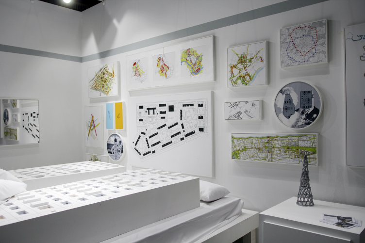
At the ArchMoscow convention in Gostiny Dvor, Genplan Institute of Moscow presented two interconnected narratives of a global nature. The main task of the exhibition booth, as we already shared, was to demonstrate “that renovation of the city is not just an independent phenomenon, but a natural continuation of the idea of industrial housing construction”. 

The booth of Genplan Institute of Moscow at ArchMoscow 2020
Copyright: Photograph: Archi.ru


The topic of renovation is broad, not to say immense. Currently, it is actively developing in Moscow; in addition, the last couple of years have witnessed an active discussion on the prospects that renovation has on a national scale – so, chances are, we are in for renovation of all (or almost all) of our cities. 

This is why the other discussion, initiated by Genplan of Moscow, called “Design code of town planning projects: order vs visual noise”, one way or another can be considered to be a continuation and development of the renovation theme stated earlier. All the more so because the moderator of the discussion, Vitaly Lutz, the head of the Agency for Perspective Projects of Genplan Institute of Moscow, started the discourse by stating the framework of the topic as being maximally broad, referring to the urban space in its entirety: “...the projects of planning the territory for renovation purposes now contain such a notion as town code. The subject penetrates deeper, and we see just how relevant it is.”

Convenient Regulations 

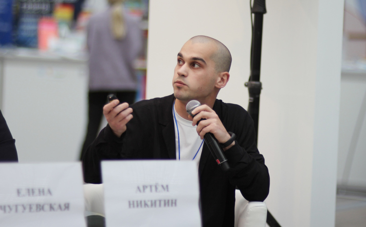
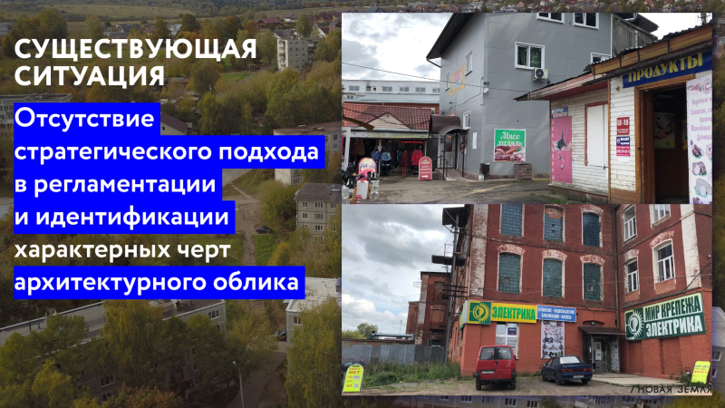
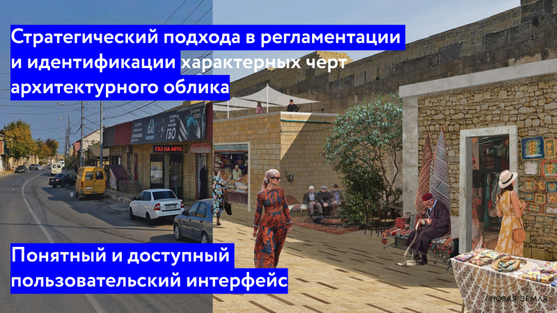
The story of Artem Nikitin from the company Novaya Zemlya developed the idea: the message became a call for a “strategic approach in the field of regulation and identification of the characteristic features of the architectural appearance of our cities.” Part of the strategy that Novaya Zemlya is proposing became the convenience of perception of these regulations by everyone who must implement them and make them become a reality.

Artem Nikitin

The leading architect of the branch of digital solutions in urban planning, Novaya Zemlya. 


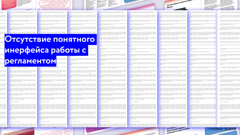
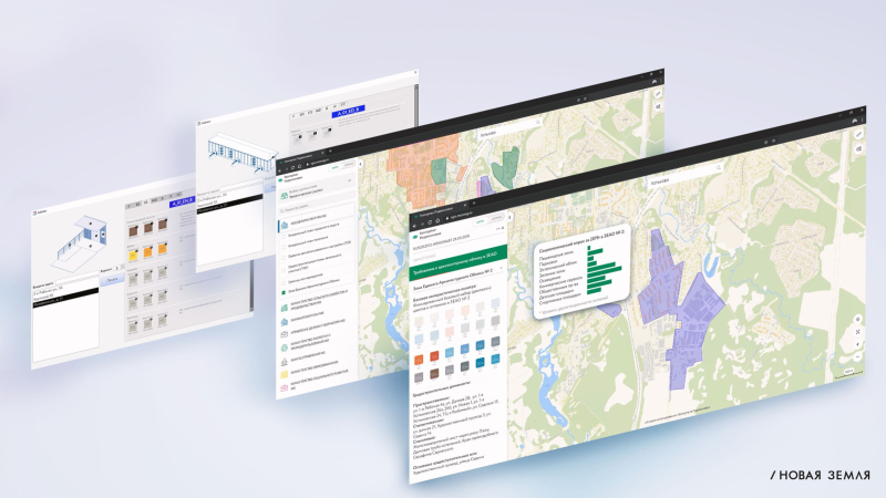
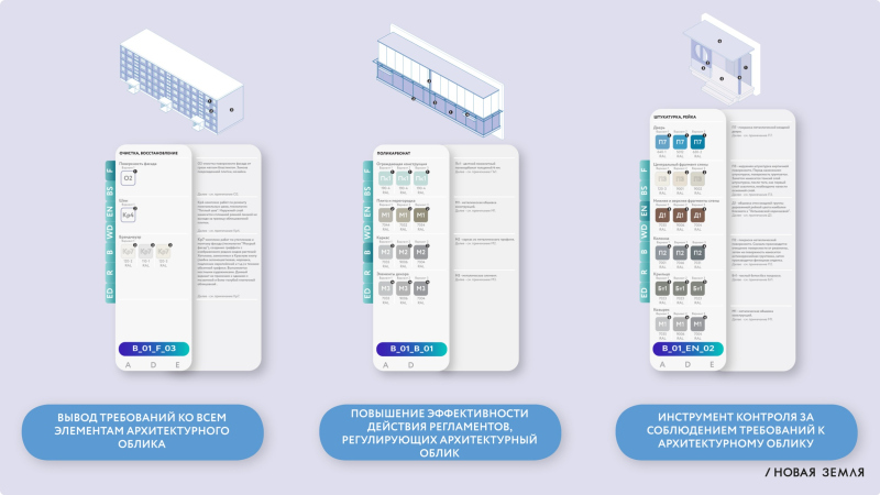
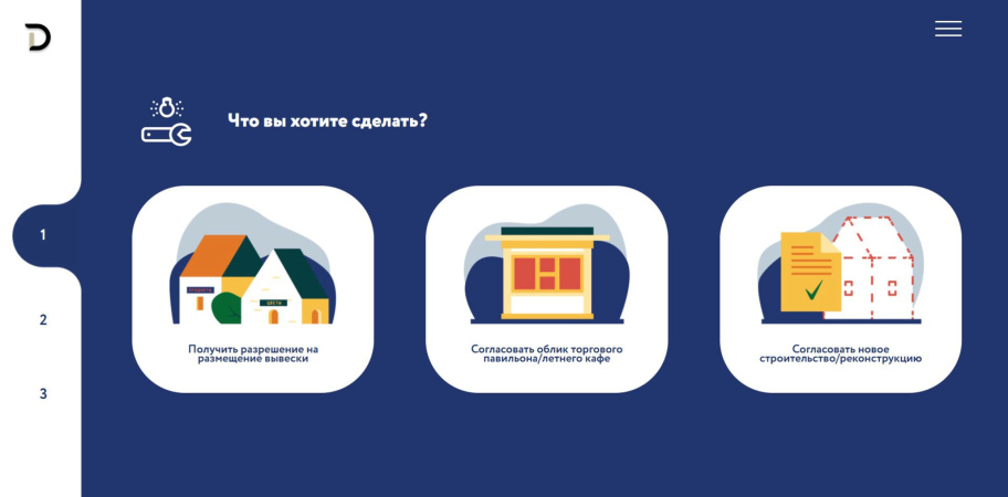
Artem Nikitin demonstrated developments for the Moscow region, Irkutsk, and Derbent. The purpose of these regulations is not just imposing certain restrictions but also proposing a convenient interface for complying with them. Today, recommendations on urban planning oftentimes look like a monster-sized bureaucratic document that is hard to read – Artem Nikitin emphasizes – Novaya Zemlya turns them into a user-friendly web application with up-to-date usability. 

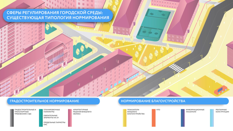
Regulating the city environment. An example of user interface
Copyright: © Novaya Zemplya / presentation


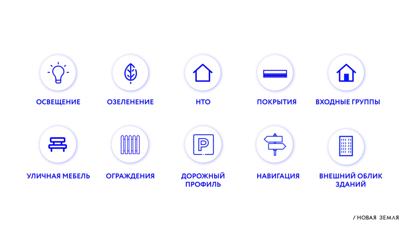
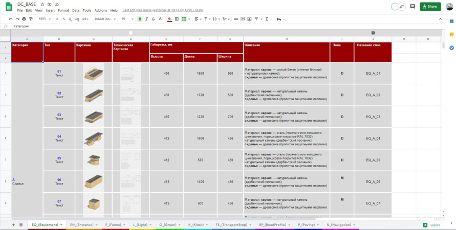
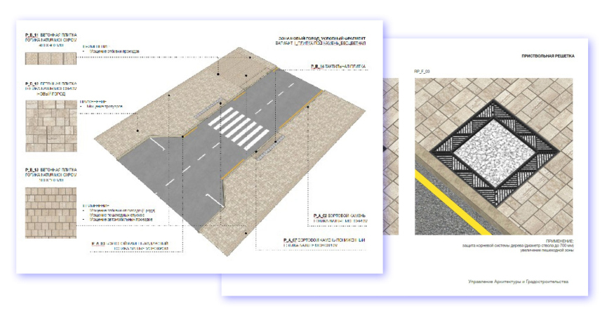
Both the application and the spreadsheet demonstrated by Artem Nikitin include all the available components of the urban environment: streetlights, outdoor furniture, information structures, and so on. The target audience of Novaya Zemlya can be conditionally divided into three categories: first of all, these are the municipal officials, then city environment designers, and, finally, the residents themselves. The latter is particularly important for Derbent as a city where low-rise construction prevails: a resident or a store owner will easily find all the guidelines and the restrictions prescribed by the new design code, and send their design project for the approval by the authorities directly from the application.

  • zooming
    1 / 12
    Town planning regulations: the design code
    Copyright: © Novaya Zemplya / presentation
  • zooming
    2 / 12
    Town planning regulations: the design code
    Copyright: © Novaya Zemlya / presentation
  • zooming
    3 / 12
    Town planning regulations: the design code
    Copyright: © Novaya Zemlya / presentation
  • zooming
    4 / 12
    Town planning regulations: the design code
    Copyright: © Novaya Zemlya / presentation
  • zooming
    5 / 12
    Town planning regulations: the design code
    Copyright: © Novaya Zemlya / presentation
  • zooming
    6 / 12
    Town planning regulations: the design code
    Copyright: © Novaya Zemlya / presentation
  • zooming
    7 / 12
    Town planning regulations: the design code. The catalogue of outdoor furniture.
    Copyright: © Novaya Zemlya / presentation
  • zooming
    8 / 12
    Town planning regulations: the design code. The catalogue of road design
    Copyright: © Novaya Zemlya / presentation
  • zooming
    9 / 12
    Town planning regulations: the design code
    Copyright: © Novaya Zemlya / presentation
  • zooming
    10 / 12
    Town planning regulations: the design code. New interface for the residents
    Copyright: © Novaya Zemlya / presentation
  • zooming
    11 / 12
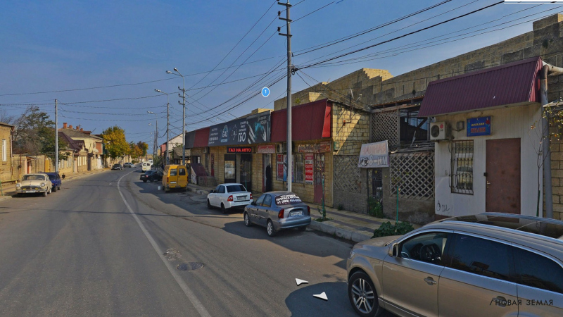
    Town planning regulations: the design code. Derbent, the current state
    Copyright: © Novaya Zemlya / presentation
  • zooming
    12 / 12
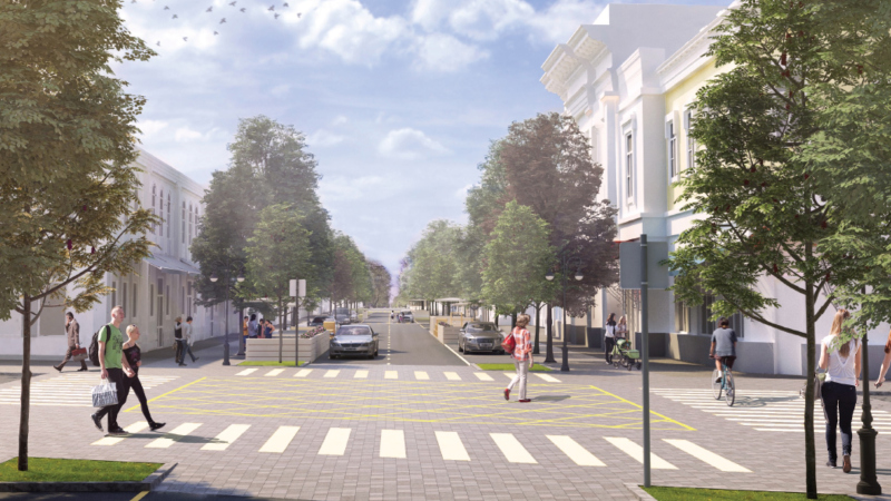
    Town planning regulations: the design code. Derbent, a project of improving the street in accordance with the design code
    Copyright: © Novaya Zemlya / presentation


So far, the proposed systems are still in a beta mode – even though in Derbent the designers are already implementing and using one of the interfaces that were showcased at the convention – by and large, the proposal makes perfect sense: the more understandable the rules, the easier they are to obey.

***

Freedom and Meanings

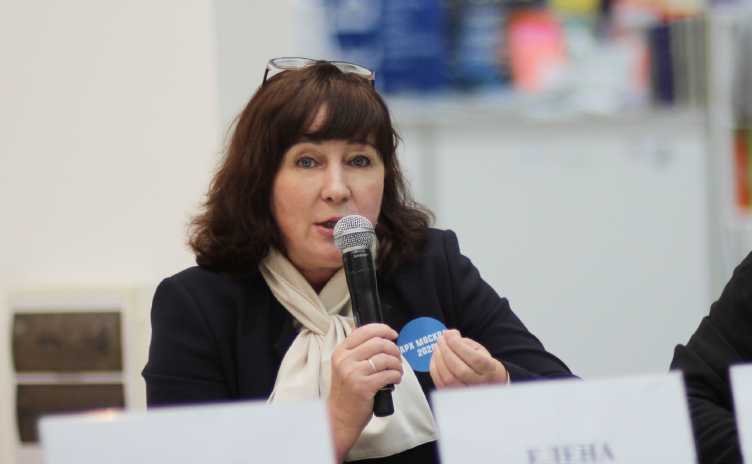
Elena Chuguevskaya

General Director of Giprogor Institute


In contrast to the story of Artem Nikitin, who, as we saw above, presented programs for small cities such as Derbent or Khotkovo, Elena Chuguevskaya, director of the institute, which celebrated its 90th anniversary last year, immediately spoke about large cities and raised the issue of diversity and the degree of flexibility of solutions that should be described by the regulations. “In our institute, we have a big discussion – what is our attitude towards pre-existing buildings? Do we issue strictly protective regulations or do we leave some room for “metabolic” changes in the environment? How do we set the delta of variability when planning hard constraints? Because it’s not always enough to just pick an element from the catalogue – simply because you cannot “securely enter everything into some sort of catalogue”.

At the same time, the director of Giprogor noted: “our masters in the thirties, forties, and fifties, when they were preparing the master plans, would graphically draw the downtown part at least. Which means that the city was originally created as a space. We need to bring that back”.

Thus, Elena Cuguevskaya called for a balance between freedom and restrictions, insisting at the same time on the necessity to think whole parts of the city as integrated architectural projects, going from the general to the particular, without dwelling on the sets of admissible elements, which in themselves do not provide the integrity of the solution. In conclusion, the director of Giprogor emphasized the importance of preserving the meanings and images, which “any city consists of”, and which can be represented by some historical details or some town planning specifics.

Looking to achieve the desired degree of flexibility, Giprogor divided construction into four morph-types: 1) zone of redevelopment; 2) zone of stabilization (historical construction); 3) zone of development (new construction);4) zone of conservation. As a practical case, they named the system of public spaces in Sevastopol, developed by the institute.

***

Devil in the details 

Erken Kagarov

Art director of Art. Lebedev Design Studio


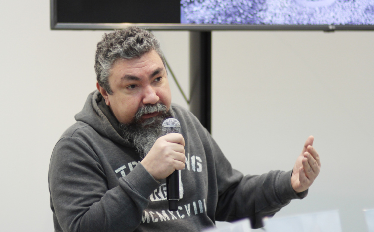
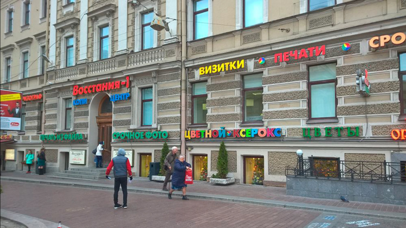
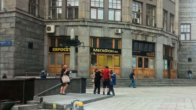
The presentation by Erken Kagarov was directly devoted to city environment elements, i.e. something that is usually associated with its design code: benches, trash cans, streetlights, and billboards – their design and compatibility, as well as examples of improving the appearance of city signs, which was done by Art. Lebedev Studio in collaboration with Moskomarkhitektura. It is popularly known that MKA has long been struggling for visual purity and uniformity, specifically when it comes to billboards, and Erken Kagarov gave a few examples of solving such tasks in the “before and after” format.

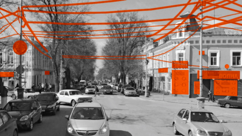
Before and after. Tverskaya Street. The design code. Yet-unused possibilities. Fonts regulated by height
Copyright: © Art. Lebedev Studio / fragment of the presentation


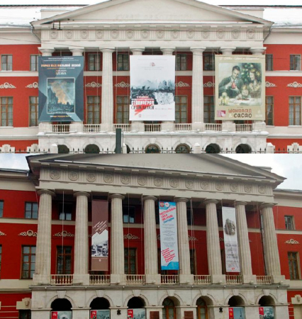
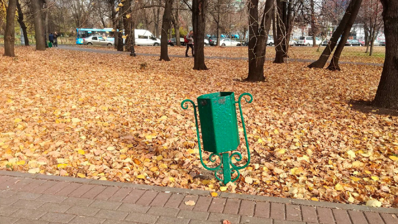
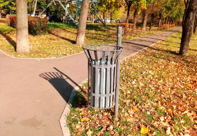
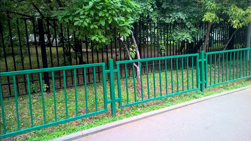
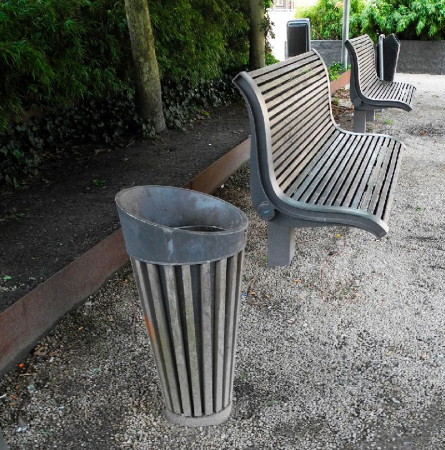
Just as meaningful was the part of the presentation, in which Erken Kagarov criticized the existing practices of advertisement placement – specifically, on the facades of museum buildings – as well as the shapes of outdoor trash cans and benches, oftentimes totally mismatched because they are done by different agencies. “Everything that the housing and public utilities service lays their hands on and up painted green” – Erken Kagarov said, emphasizing that some neutral color, such as gray or black, would look far more appropriate because it suits any season and does not immediately catch the eye.

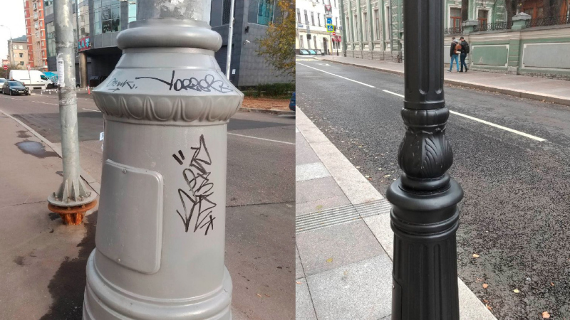
Erken Kagarov proposed a few more useful ideas of public small architectural forms. Specifically, according to him, narrow lamp posts with a textured surface are vandal-proof because drawing on a textured surface is inconvenient, and, besides, magic markers are usually black, and you cannot see black on black, can you?

  • zooming
    1 / 11
    Before and after. Tverskaya Street. The design code. Yet-unused possibilities. Fonts regulated by height
    Copyright: © Art. Lebedev Studio
  • zooming
    2 / 11
    Design code. Yet-unused possibilities. Fonts, regulated by height and color
    Copyright: © Art. Lebedev Studio
  • zooming
    3 / 11
    Design code. Yet-unused possibilities. Posting the advertising: wrong and right
    Copyright: © Art. Lebedev Studio
  • zooming
    4 / 11
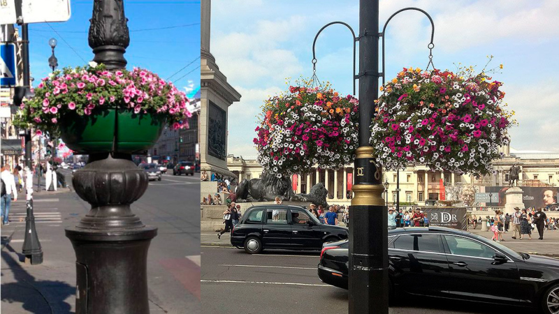
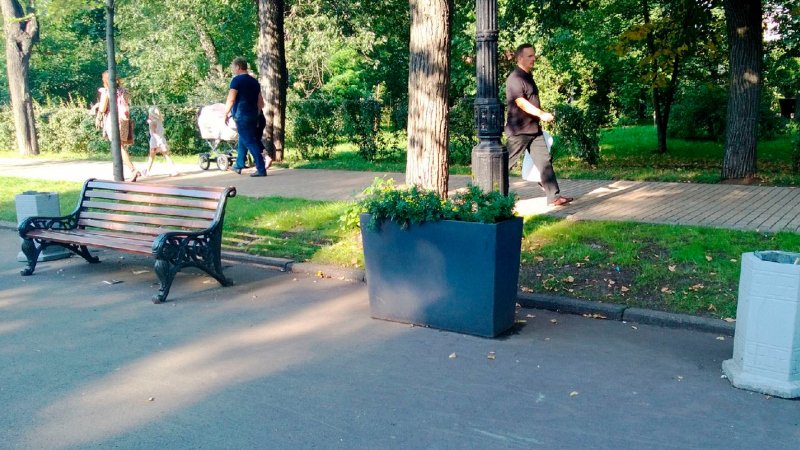
    Design code. Yet-unused possibilities. Constructions for outdoor flowerbeds: unsuccessful and successful
    Copyright: © Art. Lebedev Studio
  • zooming
    5 / 11
    Design code. Yet-unused possibilities. A green trash can dissonating with the scenery
    Copyright: © Art. Lebedev Studio
  • zooming
    6 / 11
    Design code. Yet-unused possibilities. A gray trash can going well with the scenery
    Copyright: © Art. Lebedev Studio
  • zooming
    7 / 11
    Design code. Yet-unused possibilities. An example of fences: garish green and neutral gray
    Copyright: © Art. Lebedev Studio
  • zooming
    8 / 11
    Design code. Yet-unused possibilities. Comparing the lamp posts from the standpoint of vandal-proof properties.
    Copyright: © Art. Lebedev Studio
  • zooming
    9 / 11
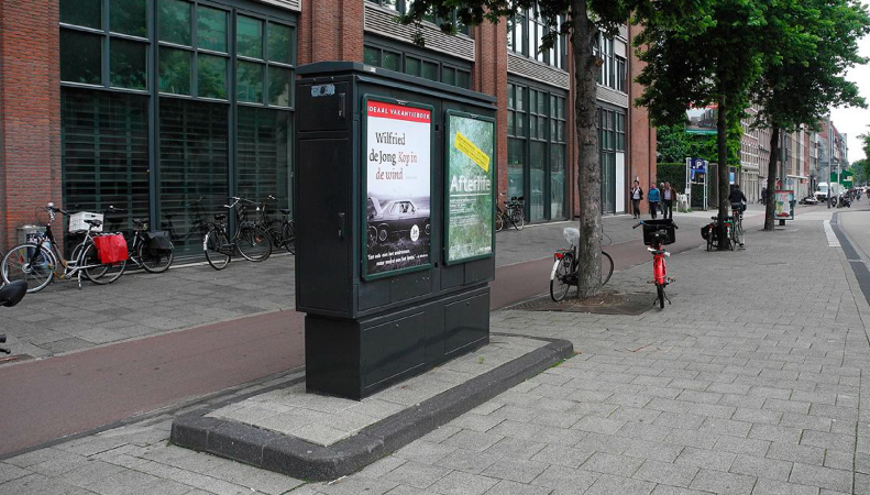
    Design code. Yet-unused possibilities. Commutators used as information booths
    Copyright: © Art. Lebedev Studio
  • zooming
    10 / 11
    Design code. Yet-unused possibilities. Odds and ends of the city environment
    Copyright: © Art. Lebedev Studio
  • zooming
    11 / 11
    Design code. Yet-unused possibilities. harmonized objects of the city environment
    Copyright: © Art. Lebedev Studio


Possibly, creating some specially designated department, for example, the department of Urban Environment, which would handle such issues, could be a solution to some of the problems- recapitulated Vitaly Lutz on Erken Kagarov’s presentation.

***

Moscow: the design code for individual territories 

Sergey Glubokin

Deputy Chief of the Office of the Architectural Council of the Committee for Architecture and Urban Planning Moscow

Sergey Glubokin mentioned the design codes of the European cities, specifically London, where, in addition to small architectural forms, signs, and billboards, a whole number of other aspects is regulated, down to the buildings’ outward appearance. Expressing some doubt as to whether something like this could be possible in Moscow, which is chiefly odds and ends, Glubokin, however, gave the example of ZILART as a case of integrated reconstruction with a single design code, which, as is known, was developed by Yuri Grigoryan. In ZILART, it is not just the signs that are subject to regulation, but also the facade materials, the percentage of glazing, and the landscape design, which, nonetheless, does not limit the architects’ creative freedom.

Sergey Glubokin also mentioned the design code of the city outpatient clinics, recently developed by MKA: “even if a company cannot design a top-notch project, within such a code it cannot fall below a certain bar”. Another example is the design code of the Alabushevo industrial park in Zelenograd, developed by ATRIUM in collaboration with Moskomarkhitektura.

*** 

Design for a highway

Vitaly Lutz

Head of the Agency for Perspective Projects of Genplan Institute of Moscow


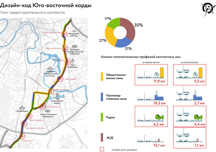
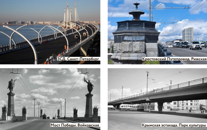
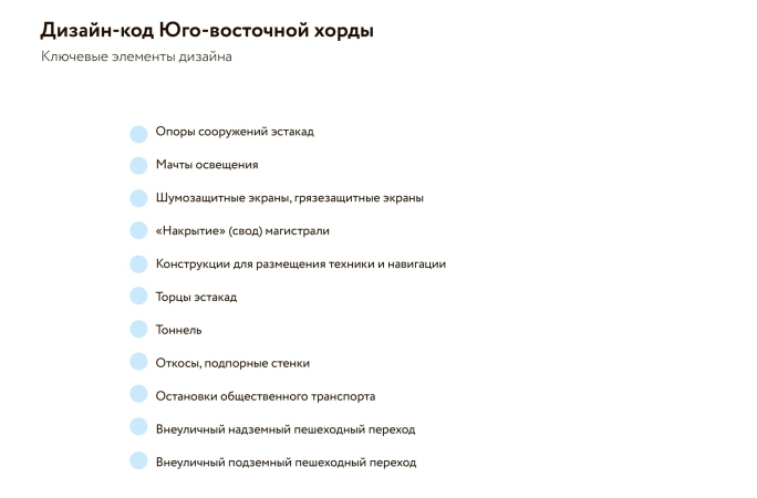
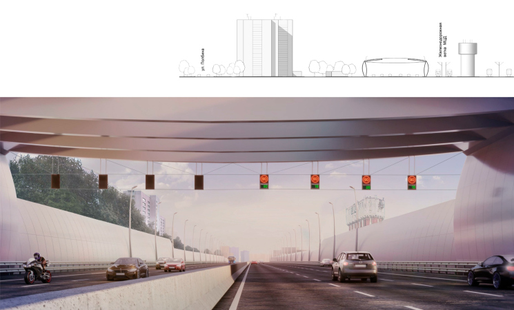
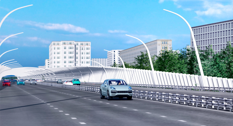
As for his own presentation “Design code for transport infrastructure”, Vitaly Lutz dedicated it to the roads of the nation’s capital, and specifically to the new highway “Southeast Expressway” 15 km long, which is now being built in Moscow. As a successful case, Lutz named Saint Petersburg’s West High-Speed Diameter, and named two most important goals in designing such highways: humanization of the “brutal” technological construction and creating a recognizable image.

Design code for the transport infrastructure projects.
Copyright: © Genplan Institute of Moscow / fragment of the presentation


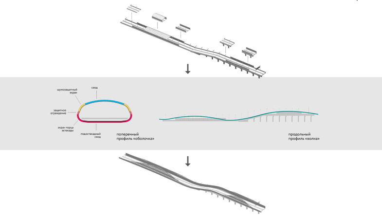
Vitaly Lutz proposed a set of elements, from which the graphic design of a highway could be constructed: bridge pylons, lampposts, side walls of road junctions, vaults, and noise screens. Then Vitaly presented projects of designing the expressway. The first one was created in collaboration with the bureau of Timur Bashkaev, and is essentially a longitudinal wave.

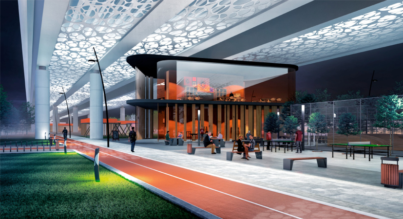
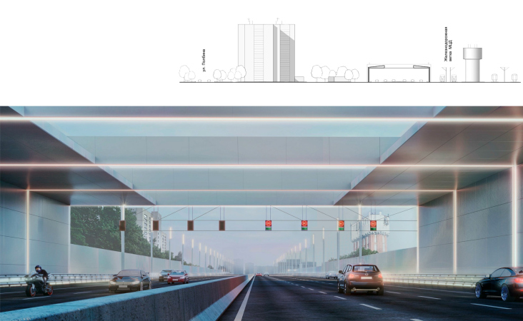
Project of the Southeast Expressway. Design code for the transport infrastructure projects.
Copyright: © Genplan Institute of Moscow / fragment of the presentation


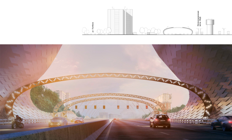
In this project, the space beneath the road junction becomes public, with cafes and Ping-Pong tables. There are also a minimalist and “natural” version, and quite unexpected one – with ornaments: all three were made in collaboration with the architectural company “Progress” headed by Peter Anurin.

  • zooming
    1 / 7
    Design code for the transport infrastructure projects. Modern and historical examples of the transport infrastructure with the design code
    Copyright: © Genplan Institute of Moscow / fragment of the presentation
  • zooming
    2 / 7
    Design code for the transport infrastructure projects
    Copyright: © Genplan Institute of Moscow / fragment of the presentation
  • zooming
    3 / 7
    Design code for the transport infrastructure projects. Project of the Southeast Expressway
    Copyright: © Genplan Institute of Moscow in collaboration with ABTB
  • zooming
    4 / 7
    Design code for the transport infrastructure projects. Project of the Southeast Expressway
    Copyright: © Genplan Institute of Moscow in collaboration with ABTB
  • zooming
    5 / 7
    Design code for the transport infrastructure projects. Project of the Southeast Expressway
    Copyright: © Genplan Institute of Moscow in collaboration with Progress
  • zooming
    6 / 7
    Design code for the transport infrastructure projects. Project of the Southeast Expressway
    Copyright: © Genplan Institute of Moscow in collaboration with Progress
  • zooming
    7 / 7
    Design code for the transport infrastructure projects. Project of the Southeast Expressway
    Copyright: © Genplan Institute of Moscow in collaboration with Progress


Thus is quite a new approach to designing flyover bridges and the spaces underneath them – true, the latter are already used today, but mostly for car washes and parking municipal vehicles. It would be good to include these spaces into active city life; in fact, just as renovating industrial parks, developing the spaces underneath raised highways would enrich the city fabric with new fragments, finding the resources inside, and not outside the city. 

***

The fence in a small city

Nikita Asadov 

An architect, the partner of ASADOV architects


Nikita Asadov came up with an ingenious presentation entitled “Design code and things to wear with it”, likening architecture to clothes and design to dress code. He shared about his experiences of working in small cities and spoke about the sore Russian issue of fences and plastic windows, which, regretfully, tend to replace valuable historical woodwork in privately owned buildings.

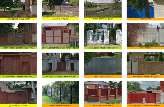
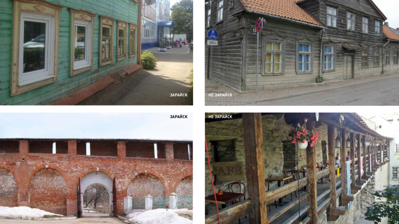
How do we go about implementing new ideas? Nikita Asadov believes that the best way to do it is by showing examples of “what is good and what is bad” – the slides that the company prepared for the town of Zaraisk. For example, a picket fence or a wooden gate in the spirit of the old city is good; a corrugated fence is bad.

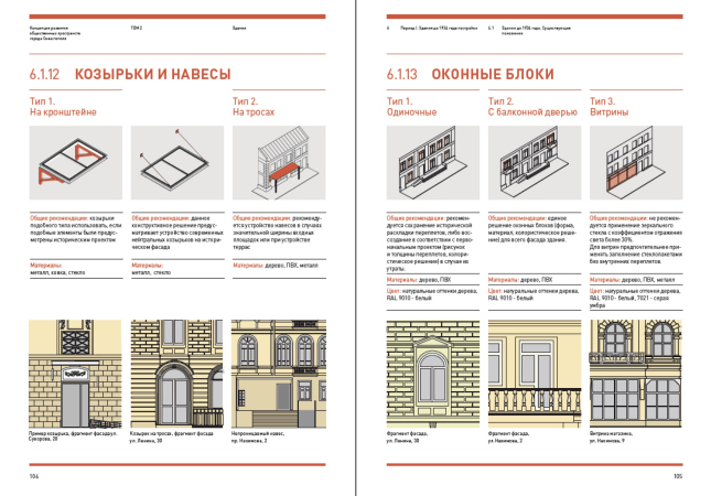
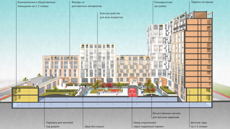
In the “Dry Cleaning” section, Nikita Asadov presented regulations for facade elements developed for the city of Sevastopol: canopies and window blocks, appropriate in this or that place. All you need to do is enter a specific building into the regulations software, and it will display the possible options. If, however, we are talking about new construction, setting the algorithm is even simpler – here Nikita Asadov showed a project that ASADOV Architects proposed for a pilot renovation project.

  • zooming
    1 / 6
    Design code and things to wear with it. Guidelines for Zaraisk
    Copyright: © ASADOV Architects
  • zooming
    2 / 6
    Design code and things to wear with it. Guidelines for Zaraisk
    Copyright: © ASADOV Architects
  • zooming
    3 / 6
    Design code and things to wear with it. Taganrog, the current state
    Copyright: © ASADOV Architects
  • zooming
    4 / 6
    Design code and things to wear with it. Taganrog, a fragment of city environment
    Copyright: © ASADOV Architects
  • zooming
    5 / 6
    Design code and things to wear with it. Sewvastopol. Regulations on canopies, awnings, and window blocks
    Copyright: © ASADOV Architects
  • zooming
    6 / 6
    Design code and things to wear with it. The algorithm for new construction
    Copyright: © ASADOV Architects


During the final discussion, Artem Nikitin once again emphasized the importance of a visual understandable explanation over a set of documents 500 pages long. Erken Kagarov reminded that Art. Lebedev Studio also contributed to developing the design code for Zaraisk – and it was there that the authors deemed it possible to support the idea of a wooden picket fence in a modern city. At the same time, in the European cities – Erken Kagarov emphasized – different design codes are developed for different areas of the city, based upon the specifics of the area: “this is normal; this is what makes a city diverse and interesting”.

***

Summing up the discussion, one can say that a design code is an elastic term: one of its poles is standardization and regulation of the most basic elements of the city space, from flowerbeds to benches and trash cans; the other is full-fledged architectural proposals and concepts that consider part of the city fabric as an integral work of art. In both cases, it is all about bringing chaos to order, but while the former proposes “school” rules and cares about the easiness of their implementation and obedience, the latter considers the city from the point of view of an architect that creates a new city.

How strongly are these two approaches at odds with each other, if at all? Possibly, the answer lies in recognizing the value of diversity. The urban planners of our time, in addition to asserting the necessity of regulations, still value identity and diversity of possible options, and even speak about the necessity of defining a “delta” for freedom of self-expression. Only such freedom, let’s face it, can ensure the diversity that has been so much spoken about. Because excessive regulation is at best fraught with monotony.

Hence, it logically follows that the main virtue of the modern author of the town planning code is not to cross the line, leaving space for self-expression, particularly in small towns. Convincing and explaining, not ordering, and if we are to introduce rules, then so that their observance is convenient. And – which is just as important – inviting artists, architects, and designers. In this sense, it is essential that the discussion featured not just sets of rules and regulations but also architectural projects of various scales, including those that were developed in collaboration with urbanists, yet demonstrating individual search for the unique form.
13 October 2020

Headlines now
The Golden Crown
The concept for a dental clinic in Yekaterinburg, developed by CNTR Studio, revolves around the idea of a “mouth full of gold”: pristine white porcelain stoneware walls are complemented by matte brass details. To avoid an overly literal interpretation, the architects focused on the building’s proportions, skillfully navigating between sunlight requirements and fire safety regulations.
Flexibility and Integration
Not long ago, we covered the project for the fourth phase of the ÁLIA residential complex, designed by APEX. Now, we’ve been shown different fence concepts they developed to enclose the complex’s private courtyards, incorporating a variety of public functions. We believe that the sheer fact that the complex’s architects were involved in such a detail as fencing speaks volumes.
A Step Forward
The HIDE residential complex represents a major milestone for ADM architects and their leaders Andrey Romanov and Ekaterina Kuznetsova in their quest for a fresh high-rise aesthetic – one that is flexible and layered, capable of bringing vibrancy to mass and silhouette while shaping form. Over recent years, this approach has become ADM’s “signature style”, with the golden HIDE tower playing a pivotal role in its evolution. Here, we delve into the project’s story, explore the details of the complex’s design, and uncover its core essence.
Gold in the Sands
A new office for a transcontinental company specializing in resource extraction and processing has opened in Dubai. Designed by T+T Architects, masters of creating spaces that are contemporary, diverse, flexible, and original, this project exemplifies their expertise. On the executive floor, a massive brass-clad partition dominates, while layered textures of compressed earth create a contextually resonant backdrop.
Layers and Levels of Flight
This project goes way back – Reserve Union won this architectural competition at the end of 2011, and the building was completed in 2018, so it’s practically “archival”. However, despite being relatively unknown, the building can hardly be considered “dated” and remains a prime example of architectural expression, particularly in the headquarters genre. And it’s especially fitting for an aviation company office. In some ways, it resembles the Aeroflot headquarters at Sheremetyevo but with its own unique identity, following the signature style of Vladimir Plotkin. In this article, we take an in-depth look at the United Aircraft Corporation (UAC) headquarters in the Moscow agglomeration town of Zhukovsky, supplemented by recent photographs from Alexey Naroditsky – a shoot that became only recently possible due to the fact that improvements were finally made in the surrounding area.
Light and Shadow
In this article, we delve into the architectural design of the “Chaika” house by DNK ag architects, which was recently completed in 2023 as part of the collection of signature designs at ZILArt. As is well-known, all the buildings in this complex follow a design code, yet each one is distinct. This particular building stands out not only for its whiteness and minimalism but also for the refined use of a limited number of techniques that, together, create what can confidently be called synergy.
Casus Novae
A master plan was developed for a large residential area with a name of “DNS City”, but now that its implementation began, the plan has been arbitrarily reformatted and replaced with something that, while similar on the surface, is actually quite different. This is not the first time such a thing happens, but it’s always frustrating. With permission from the author, we are sharing Maria Elkina’s post.
Treasure Hunting
The GAFA bureau, in collaboration with Tegola and Arkhitail, organized an expedition to the island of Kilpola in Karelia as part of Moskomarkhitektura’s “Open City” festival. There, amidst moss and rocks, the students sought answers to questions like: what is the sacred, where does it dwell, and what sustains it? Assisting the participants in this quest were landscape engineer Evgeny Levin, artist Nicholas Roerich, a moose, and the lack of cellular connection. Here’s how the story unfolded.
Depths of the Earth, Streams of Water
In the Malaya Okhta district, the Akzent building, designed by Stepan Liphart, was constructed. It follows a classic tripartite structure, yet it’s what you might call “hand-drawn”: each façade is unique in its form and details, some of which aren’t immediately noticeable. In this article, we explore the context and, together with the architect, delve into how the form was developed.
Fir Tree Dynamics
The “Airports of Region” holding is planning to build an airport in Karachay-Cherkessia, aiming to make the Arkhyz and Dombay resorts more accessible to travelers. The project that won in an invitation-only competition, submitted by Sergey Nikeshkin’s KPLN, blends natural imagery inspired by the shape of a conifer seed, open-air waiting spaces, majestic large trees, and a green roof elevated on needle-like columns. The result is both nature-inspired and WOW.
​A Brick Shell
In the process of designing a clubhouse situated among pine trees in a prestigious suburban area near Moscow, the architectural firm “A.Len” did the façade design part. The combination of different types of brick and masonry correlates with the volumetric and plastique solutions, further enhanced by the inclusion of wood-painted fragments and metal “glazing”.
Word Forms
ATRIUM architects love ambitious challenges, and for the firm’s thirtieth anniversary, they boldly play a game of words with an exhibition that dives deep into a self-created vocabulary. They immerse their projects – especially art installations – into this glossary, as if plunging into a current of their own. You feel as if you’re flowing through the veins of pure art, immersed in a universe of vertical cities, educational spaces – of which the architects are true masters – and the cultural codes of various locations. But what truly captivates is the bold statement that Vera Butko and Anton Nadtochy make, both through their work and this exhibition: architecture, above all, is art – the art of working with form and space.
Flexibility and Acuteness of Modernity
Luxurious, fluid, large “kokoshniks” and spiral barrel columns, as if made from colorful chewing gum: there seem to be no other mansion like this in Moscow, designed in the “Neo-Russian-Modern” style. And the “Teremok” on Malaya Kaluzhskaya, previously somewhat obscure, has “come alive with new colors” and gained visibility after its restoration for the office of the “architectural ecosystem” as the architects love to call themselves. It’s evident that Julius Borisov and the architects at UNK put their hearts into finding this new office and bringing it up to date. Let’s delve into the paradoxes of this mansion’s history and its plasticity. Spoiler: two versions of modernity meet here, both balancing on the razor’s edge of “what’s current”.
Yuri Vissarionov: “A modular house does not belong to the land”
It belongs to space, or to the air... It turns out that 3D printing is more effective when combined with a modular approach: the house is built in a workshop and then adapted to the site, including on uneven terrain. Yuri Vissarionov shares his latest experience in designing tourist complexes, both in central Russia and in the south. These include houseboats, homes printed from lightweight concrete using a 3D printer, and, of course, frame houses.
​Moscow’s First
“The quality of education largely depends on the quality of the educational environment”. This principle of the last decade has been realized by Sergey Skuratov in the project for the First Moscow Gymnasium on Rostovskaya Embankment in the Khamovniki district. The building seamlessly integrates into the complex urban landscape, responding both to the pedestrian flow of the city and the quiet alleyways. It skillfully takes advantage of the height differences and aligns with modern trends in educational space design. Let’s take a closer look.
Looking at the Water
The site of Villa Sonata stretches from the road to the water’s edge, offering its own shoreline, pier, and a picturesque river panorama. To reveal these sweeping views, Roman Leonidov “cut” the façade diagonally parallel to the river, thus getting two main axes for the house and, consequently, “two heads”. The internal core – two double-height spaces, a living room and a conservatory, with a “bridge” above them – makes the house both “transparent” and filled with light.
The White Wing
Well, it’s not exactly white. It’s more of a beige, white-stone structure that plays with the color of limestone – smoother surfaces are lighter, while rougher ones are darker. This wing unites various elements: it absorbs and interprets the surrounding themes. It responds to everything, yet maintains a cohesive expression – a challenging task! – while also incorporating recognizable features of its own, such as the dynamic cuts at the bottom, top, and middle.
Urban Dunes
The XSA Ramps team designed and built a three-part sports hub for a park in Rostov-on-Don, welcoming people of all ages and fitness levels. The skate plaza, pump track, and playground are all meticulously crafted with details that attract a diverse range of visitors. The technical execution of the shapes and slopes transforms this space into a kind of sculptural composition.
Proportional Growth
The project for the fourth phase of the ÁLIA residential area has been announced. The buildings are situated on an elongated plot – almost a “ray” that shoots out from the center of the area towards the river. Their layout reflects both a response to Moscow’s architectural preferences over the past 15 years, shifting “from blocks to towers”, and an interpretation of the neighboring business park designed by SOM. Additionally, the best apartments here are not located at the very top but closer to the middle, forming a glowing “waistline”.
The “Staircase” Building
In designing the “Details” residential complex in New Moscow, Rais Baishev spiced up the now-popular Moscow theme of a “courtyard” building with an idea drawn from the surrealist drawings by Maurits Escher. He envisioned the stepped silhouettes and descending slopes as a metaphysical mega-staircase, creating a key void within the courtyard that gave the project an internal “spine”. This concept is felt both in the building’s silhouette and on its façades.
Projection of the Quarter
No one doubted that the building that Vladimir Plotkin designed as part of the “Garden Quarters” would be the most modernist of all. And it turned out just that way: while adhering to the common design code, the building successfully combines brick and white stone, rhythmically responding to the neighboring building designed by Ostozhenka, yet tactfully and persistently making a few statements of its own. This includes the projection of the ideal urban development composition “14–9–6”, which can be found right next door, mathematical calculations, including those for various types of terraces (and perhaps the only reminder of the Soviet past of the Kauchuk rubber factory!), and the white “cross-stitch” pattern of the façade grid.
Domus Aurea
In this issue, we examine the “Tessinsky-1” house, designed by Sergey Skuratov and completed in 2023. Located in the middle of the Serebryanicheskaya Embankment district, at the intersection of its main streets, this house assumes a sort of “nodal” role: it not only responds to everything around it and preserves many memories of the former EMA factory within itself, but it weaves all this into a newly directed pattern, reconciling bright “gold” and dark-colored brick, largely with the help of the new, modern-yet-archaic Columba brick, which, come to think about it, is the most precious element here.
The Chimney of Nikola-Lenivets
In this issue, we are examining the “Obelisk House” designed by KATARSIS and built for the Arkhstoyanie 2023 festival. However, it was only finished later on, and this is why we are examining it now. It seems to us that after the “Obelisk House” appeared in Nikola-Lenivets, a dialogue and a few inner connections appeared between the temporary structures built here. These houses no longer look like “accidental neighbors”, more of which below.
​Periscope by the Bay
The jury awarded the second place in the competition for a public and cultural center in Petropavlovsk-Kamchatsky to the companies GORA (“Mountain”) and M4. In the consortium’s proposal, the building resembles a sperm whale with a calf swimming next to it or a periscope, whose lenses capture the most spectacular views from the surrounding landscape.
From Arcs to Dolmens
While working on the competition project for Petropavlovsk-Kamchatsky, ASADOV Architects prioritized the value of the natural and urban environment, aiming to preserve the balance of the location while minimizing the resemblance of the volume that they designed to a “traditional building”. The task was challenging, and the architects created three versions, one of which having been developed after the competition, where their main proposal took third place. However, the point of interest here is not the competition result but the continuity of creative thinking.
Hide and Seek
The ID Moskovskiy house, designed by Stepan Liphart in St. Petersburg, in the courtyards near Moskovskiy Avenue beyond the Obvodny Canal and recently completed, is notable for several reasons. Firstly, it has been realized with considerable accuracy, which is particularly significant as this is the first building where the architect was responsible not only for the facades but also for the layouts, allowing for better integration between the two. On the other hand, this building is interesting as an example of the “germination” of new architecture in the city: it draws on the best examples from the neighborhood and becomes an improved and developed sum of ideas found by the architect in the surrounding context.
The Big Twelve
Yesterday, the winners of the Moscow Mayor’s Architecture Award were announced and honored. Let’s take a look at what was awarded and, in some cases, even critique this esteemed award. After all, there is always room for improvement, right?
Above the Golden Horn
The residential complex “Philosophy” designed by T+T architects in Vladivostok, is one of the new projects in the “Golubinaya Pad” area, changing its development philosophy (pun intended) from single houses to a comprehensive approach. The buildings are organized along public streets, varying in height and format, with one house even executed in gallery typology, featuring a cantilever leaning on an art object.
Nuanced Alternative
How can you rhyme a square and space? Easily! But to do so, you need to rhyme everything you can possibly think of: weave everything together, like in a tensegrity structure, and find your own optics too. The new exhibition at GES-2 does just that, offering its visitor a new perspective on the history of art spanning 150 years, infused with the hope for endless multiplicity of worlds and art histories. Read on to see how this is achieved and how the exhibition design by Evgeny Ace contributes to it.
Blinds for Ice
An ice arena has been constructed in Domodedovo based on a project by Yuri Vissarionov Architects. To prevent the long façade, a technical requirement for winter sports facilities, from appearing monotonous, the architects proposed the use of suspended structures with multidirectional slats. This design protects the ice from direct sunlight while giving the wall texture and detail.