The multifunctional complex VTB Arena Park
Copyright: Photograph © Aleksey Naroditsky
The multifunctional complex VTB Arena Park
Copyright: Photograph © Aleksey Naroditsky
The multifunctional complex VTB Arena Park
Copyright: Photograph © Aleksey Naroditsky
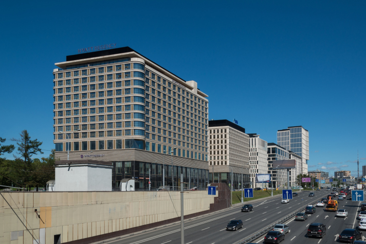
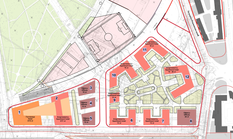
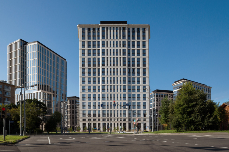
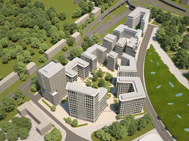
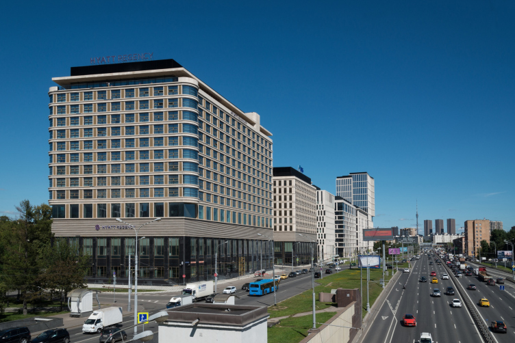
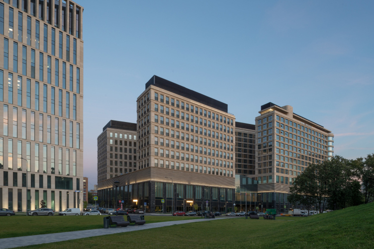
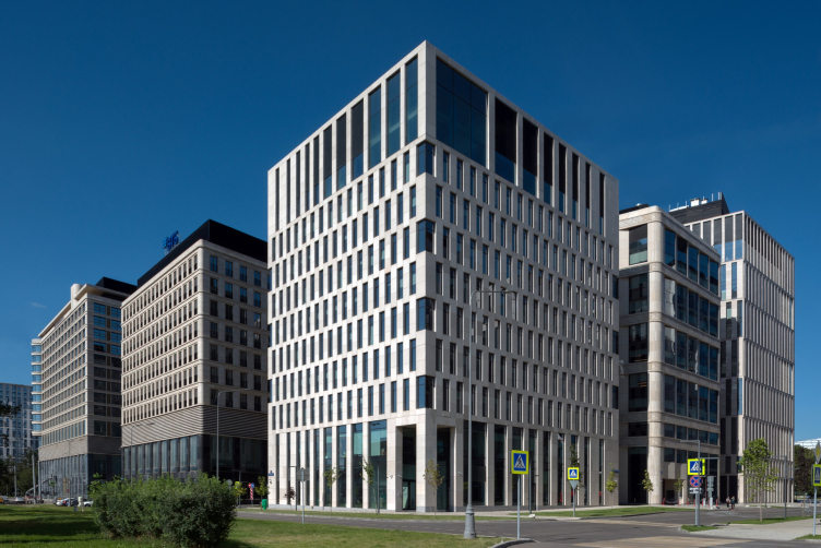
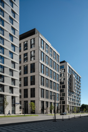
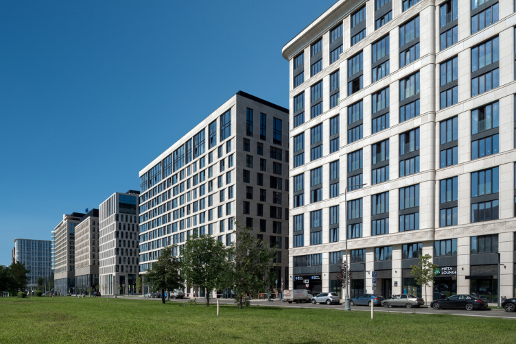
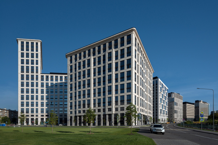
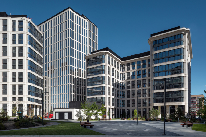
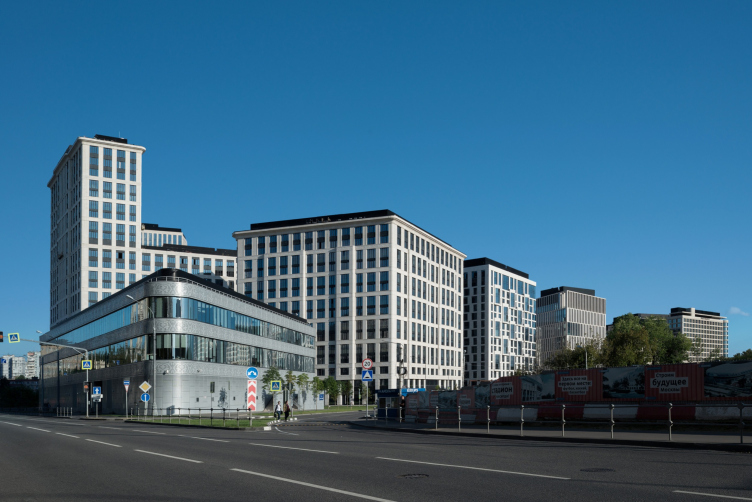
The twelve buildings are lined up along the Third Transport Ring where it coincides with the Novaya Bashilovka Street, on the territory that widens towards Maslovka. Next to the crossroads, stands the Hyatt Hotel, followed by three office buildings; the wide five-faceted part is occupied by the housing complex “VTB Arena Park” consisting of six houses with apartments. The outside east corner, the one that faces the Third Transport Ring, contains an office tower.
The multifunctional complex VTB Arena Park
Copyright: Photograph © Aleksey Naroditsky
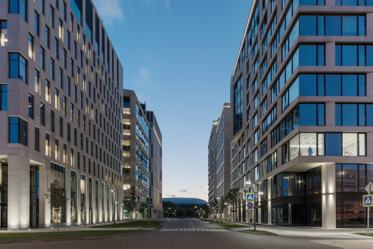
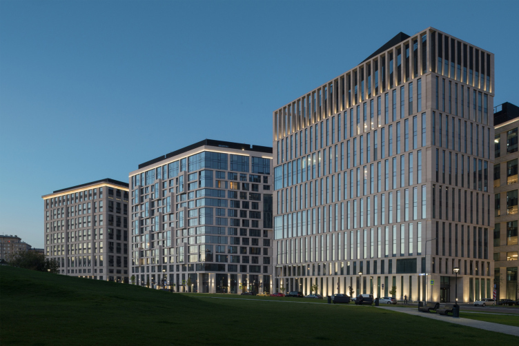
The line of the facades running along the highway is reasonably straight, while the landscaped park “Dynamo” is faced by a wide arc of the complex. The first and the second stages are separated by a boulevard, at the wide mouth of which one can plainly see the blue “cap” of the renovated stadium.
The multifunctional complex VTB Arena Park
Copyright: Photograph © Aleksey Naroditsky
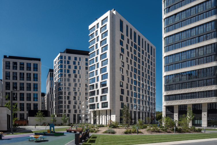
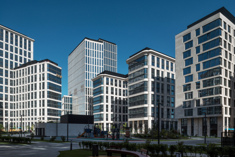
This street then leads to an underground crossing underneath the Third Transport Ring, providing a shortcut for getting from the Dinamo metro station to the houses on the opposite side, walking through the park. However, all the inner streets of the first stage are open and landscaped; one can already wander around them. The territory of the residential complex is closed with a fence, but the volumes are placed separately, with breaks between them, and this makes the complex permeable to the eye and the wind.
On both sides, from the side of the park, and from the side of the road, the buildings are placed rhythmically, almost like a musical scale, no bulges or mergers, house-rest-house-rest, different but similar, or the other way around.
The multifunctional complex VTB Arena Park
Copyright: Photograph © Aleksey Naroditsky
The whole scene looks as if somebody staged here an experiment on fostering in Moscow – a city, whose “raunchy” town planning character many people mistake for its genius loci – a habit of order and modesty without losing the subtlety in expressing various ideas.
The multifunctional complex VTB Arena Park
Copyright: Photograph © Aleksey Naroditsky
The multifunctional complex VTB Arena Park
Copyright: Photograph © Aleksey Naroditsky
The multifunctional complex VTB Arena Park
Copyright: Photograph © Aleksey Naroditsky
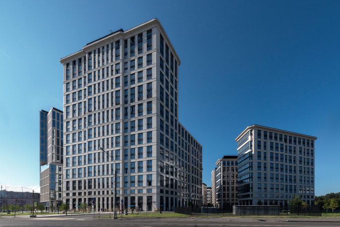
In many respects, the complex has become almost the perfect benchmark for developing a considerable chunk of land in a large modern city. It is big, yet not excessively tall, generally 11-16 stories high, and only the furthest volumes, the ones standing next to Maslovka – one residential, one offices – reach out to 26 and 24 floors respectively. The complex is indeed multifunctional; it is divided between offices, a hotel, and housing stock in comparable proportions. The buildings of the first stage already have cafes and shops open in the bottom floors, the second stage having a car-free yard.
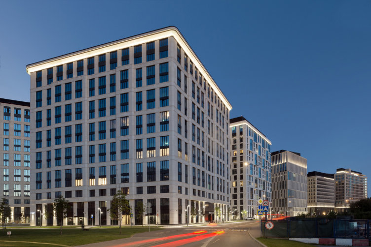
The complex is surrounded by greenery from all sides, both by trees and rather extended lawns: all of this is meant to compensate for the location at the crossing of the nation capital’s two busiest highways, which, on the other hand, ensure great transport accessibility. All the facades are covered by light-colored plasterwork, which unambiguously points to the high class of both housing and offices, at the same time creating an effect of inner integrity of this new city fragment. It is sufficiently remote from the Third Transport Ring, it is rather quiet, light, and cozy here, particularly on a sunny day, when the buildings cast shadows and highlights on one another, as well as numerous specks of light.
The multifunctional complex VTB Arena Park
Copyright: Photograph © Aleksey Naroditsky
The ensemble has two authors – Sergey Tchoban and Vladimir Plotkin. Within the framework of one common task, they, however, strictly obeyed the height restrictions, vertical proportions of the facade pattern, and the snow-white design code, combined with a fair amount of glass. Yet, at the same time, they both presented a vector of one’s own – conditionally speaking, modern classics and today’s modernism – in a way as clear as possible. And they also gave everyone who is interested an opportunity to compare these two styles in a real, albeit carefully designed, living environment.
The multifunctional complex VTB Arena Park
Copyright: Photograph © Aleksey Naroditsky
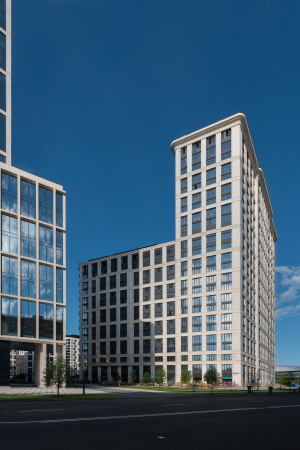
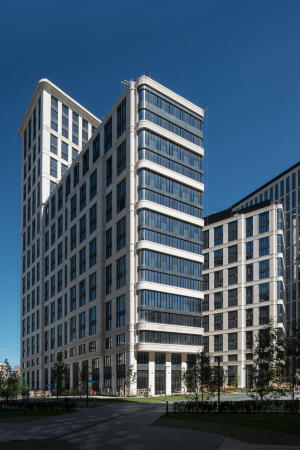
The buildings designed by SPEECH, accounting for the classical part, more agile, yet, at the same time, more massive, formed the framework of the composition and the basis for its stability. The Hyatt hotel opens up towards the center of the territory with the trapeze of its wings – and it is answered by a similar trapeze or the tallest (26 floors) residential building on the opposite side; its silhouette is slightly reminiscent of the head and the paws of a Sphinx, which is also quite a steady figure. On the sides, the house is “guarded” by two “semi-frame” city blocks, while in the central axis of the hotel there are two more, seemingly identical, volumes, designed by SPEECH.
The multifunctional complex VTB Arena Park
Copyright: Photograph © Aleksey Naroditsky
I will admit at this point that defining Sergey Tchoban’s buildings as “classicist” would be not entirely correct in this case. Rather, they might be considered as the pole of the “traditional” architecture (again, I use the term in inverted commas) within the logic of the overall narrative of this specific project.
The Hyatt hotel is turned to the Leningrad Highway and takes on the role of the “head” of the comet or the captain’s cabin of the steamer – the comparison is not accidental because the ventilation exits on the roof of the first building are designed as sculpted ship’s funnels. The forward motion is highlighted by the prevalence of the horizontal lines, yet it is at the same time restrained by the golden-bronze fluted verticals; the facades are treated as grids. The rounded corners and flexible ribbons gravitate towards retro-technical design, the funnel reminds of Le Corbusier's “steamer” house, or of steamships and steam locomotives in general, semicircular bay windows – of the Vesnins architecture. The very idea of likening the house to a steamer or a locomotive engine refers to avant-garde, yet here it became an organic part of Art Deco – the kind of post-constructivism that Russia has not seen yet. On the other hand, another thing that comes to mind is Samuel Marshak’s satirical poem “Mister Twister”: “Mister Twister, man of great worth, owner of factories, ships, journals, boats, is going to the USSR on a guided tour”. Such an “owner of factories” can easily fit in at such a hotel.
Hyatt Regency hotel. The multifunctional complex VTB Arena Park
Copyright: Photograph © Aleksey Naroditsky
The second building is a trailer for the locomotive. There is less metal in the second building but more flutes and piers. It trails in the wake, and it is lighter because all of it is beige and stone, while the first building looks more metallic yellow when viewed from a distance (for more details on the structure and interiors of the hotel, see here).
Hyatt Regency hotel. The multifunctional complex VTB Arena Park
Copyright: Photograph © Aleksey Naroditsky
The multifunctional complex VTB Arena Park
Copyright: Photograph © Aleksey Naroditskyv
Comparing the head building to a locomotive engine also makes you take a different look at the other buildings: they do indeed look like train cars of different shapes and sizes. However, the “tail of the comet” widens, and the string of cars turns into something more complex.
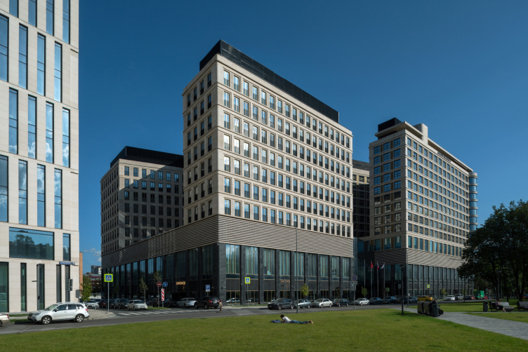
If in the second iteration, Hayat’s building was solid, but had two wings, at the third stage, the volumes were divided into three separate buildings: two on the sides were designed by Reserve Union, and the small central one was designed by SPEECH – this is the first place where one can see a proximity of two models, and, let’s note that the style of the “traditional” building is also different from what we see in the hotel, and is resonant with the ensuing buildings designed by the same architects. This third line looks like a pivot joint – here, in addition to other things, the turn of the arc of the border between the complex and the park is strengthened. All the three buildings are office ones, and it is them that park cut by the Chislenko Street, which divides the complex into two halves, separating the public part from the residential one.
The multifunctional complex VTB Arena Park
Copyright: Photograph © Aleksey Naroditsky
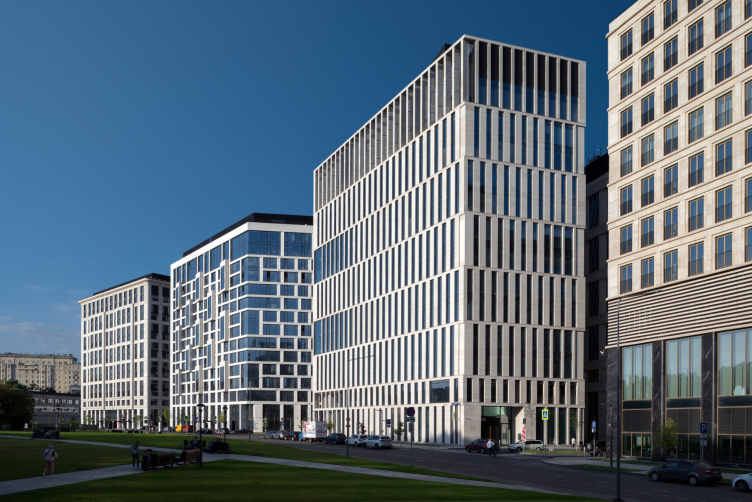
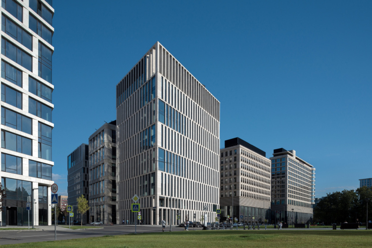
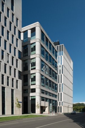
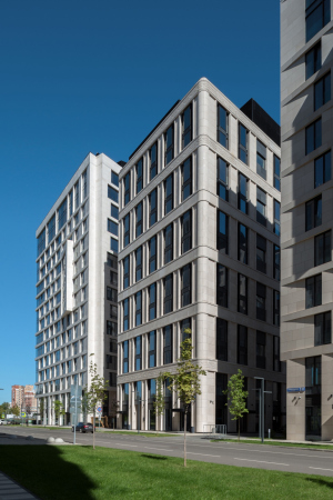
The contrast between the two approaches is particularly tangible here. The buildings designed by Vladimir Plotkin, standing on the sides and facing the two “facade” sides, i.e. the Third Transport Ring and the park, make unambiguous statements about the fact that they are different (see more about these differences here): white color instead of beige, no cornices, and an agile minimalist design, light and almost weightless. These buildings form a dynamic antithesis to the purposeful yet very robust-looking hotel building.
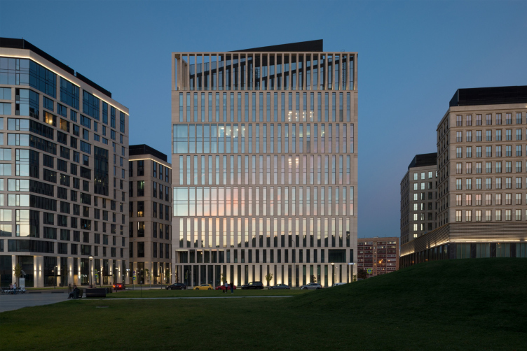
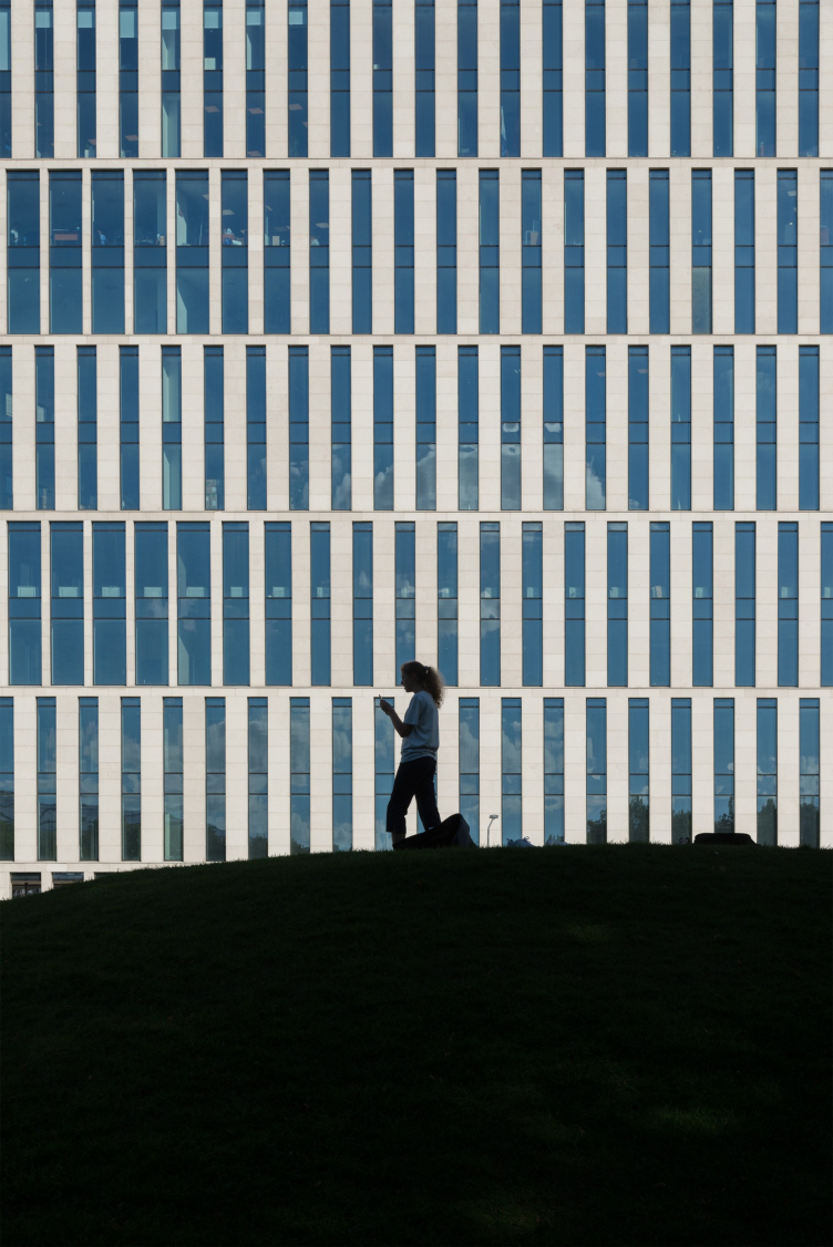
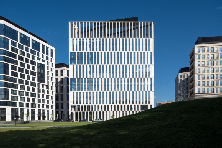
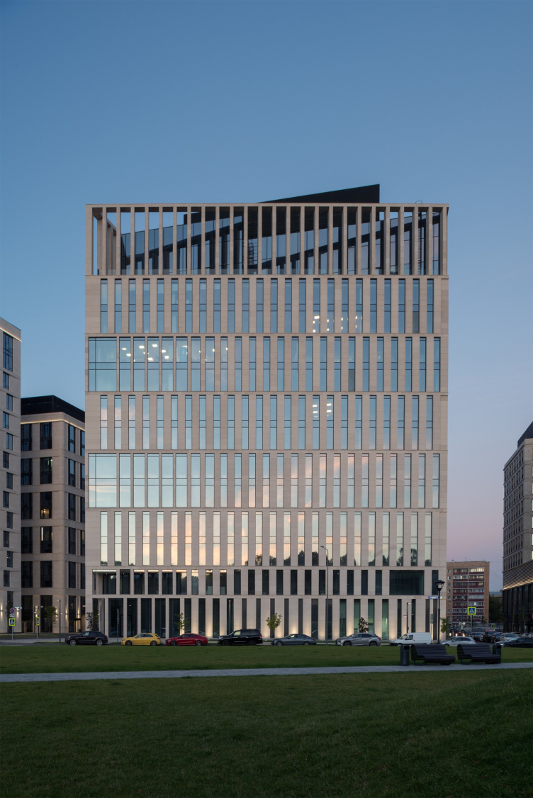
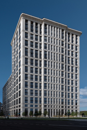
Turned onto the park, the west building, in spite of its considerable height (15 floors), is comparable, as far as its pattern goes, to the park pavilions made from white slender colonnades. A well-articulated set of white straight lines becomes a contrasting background for the flexible lines of the geo-plastic hills.
The multifunctional complex VTB Arena Park
Copyright: Photograph © Aleksey Naroditsky
The floors are grouped in twos here to form horizontal bands, while the verticals, slender and pure, are smoothly spaced out in the north corner, sharp on the plan. In the volumes of the upper and lower tiers, the acute angle is chamfered, and is only fenced off by a stone grille: one can pass underneath, while on top the slender colonnade surrounds the terrace, at the same time marking the ventilation outputs.
The multifunctional complex VTB Arena Park
Copyright: Photograph © Aleksey Naroditsky
The multifunctional complex VTB Arena Park
Copyright: Photograph © Aleksey Naroditsky
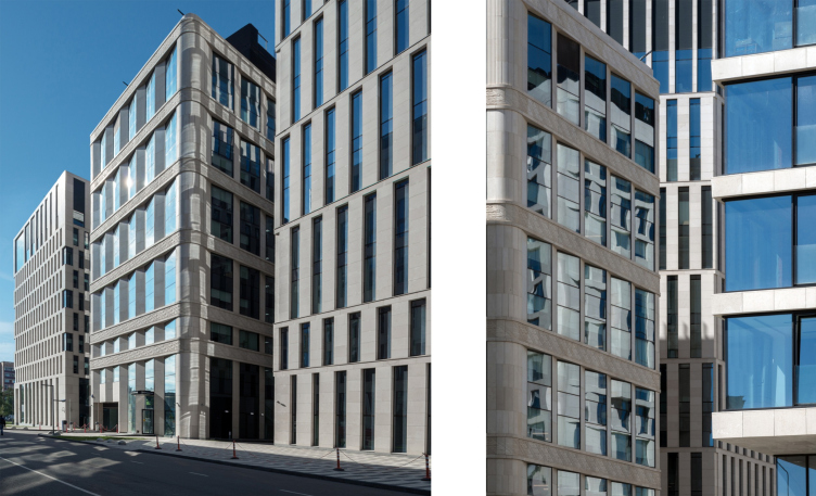
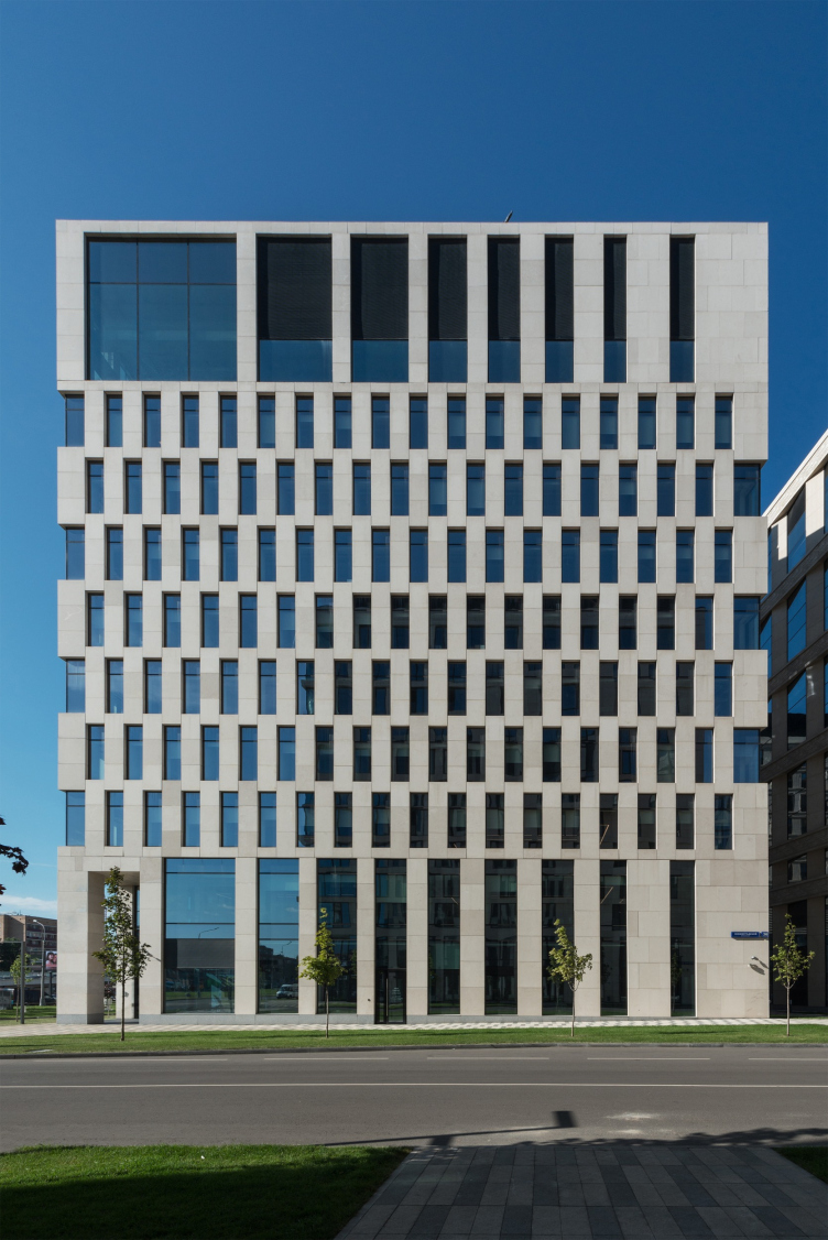
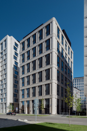
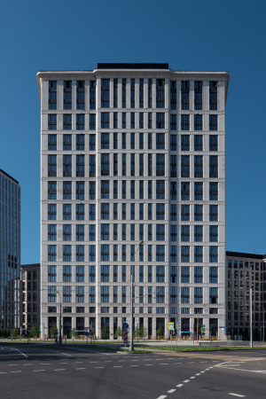
The other building, designed by Reserve Union, and situated closer to the Third Transport Ring, is more “of the city”; collected and material. The cells are single-tiered, and there are no horizontal trusses at all – the plaques between the windows are intertwined like fingertips or like some kind of metaphysical macramé: glass the warp, stone the weft.
The multifunctional complex VTB Arena Park
Copyright: Photograph © Aleksey Naroditsky
On the corners, glass and stone alternate, obeying the clear and almost infallible inner logic; the central part of the building is “pleated” consecutively, due to which it looks a little bit like a “thing in itself”. The livening-up asymmetry is provided by pylons at the top and at the bottom, i.e. at the basement floor and at the attic level – the imposing “undone queues” of the main belt. The volumetric character of the east building brings up associations with the novocento metaphysics, as if the Roman EUR were devoid of its arches and slightly turned, like a rubix cube, or unbraided, like fabric.
The multifunctional complex VTB Arena Park
Copyright: Photograph © Aleksey Naroditsky
Which gives us yet another variant of allusion to the 1930’s, contrastive to the hotel building, as if representing a different pole of ideas and events. But then again, all the conceptual layers are so subtle here that one should think that you could easily prove that they were never there in the first place. But still, this is much better than direct borrowing.
The multifunctional complex VTB Arena Park
Copyright: Photograph © Aleksey Naroditsky
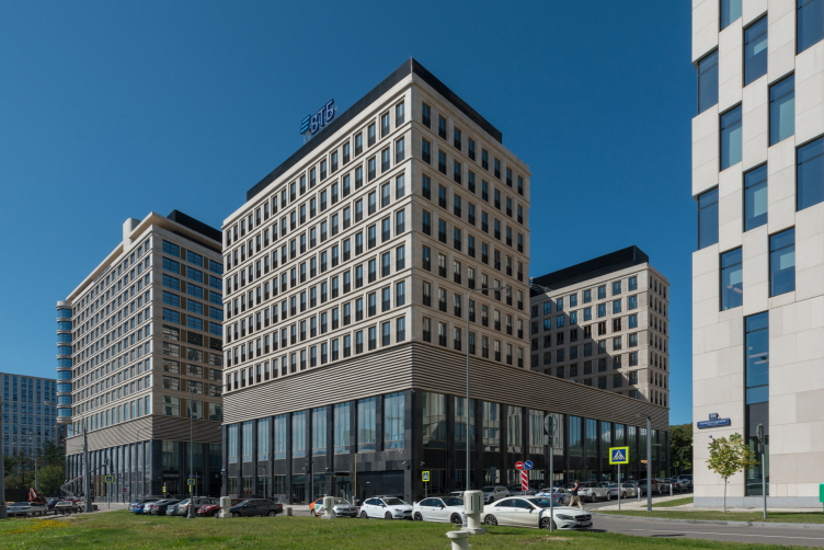
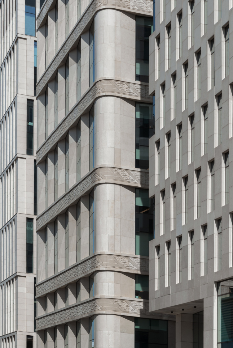
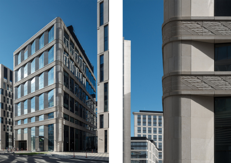
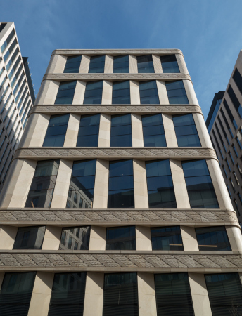
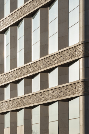
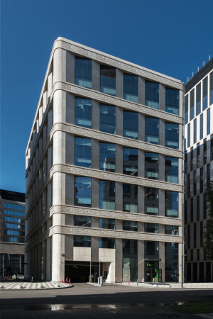
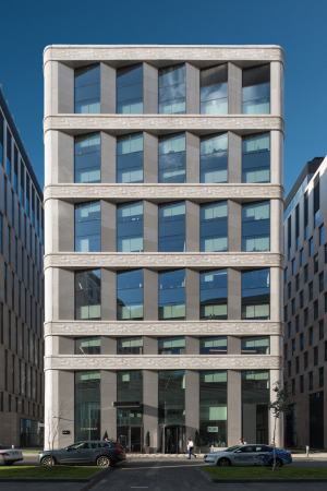
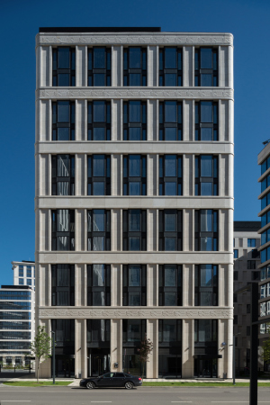
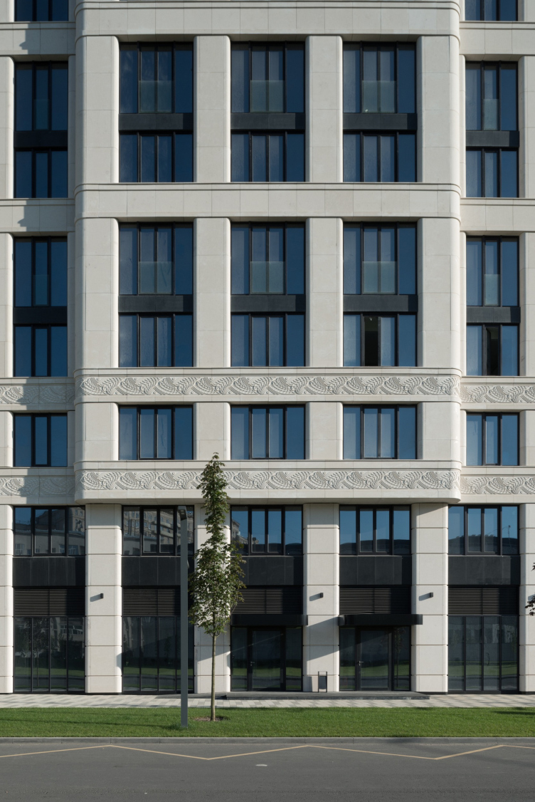
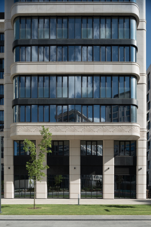
The office building – the one that was designed by SPEECH, and placed between these two – is declaratively unlike them in many respects, first of all in its completeness, steadiness, and, of course, its decoration – here the decoration reaches its climax: all the six broad bands running between the floors and collecting the building into a single whole, are beautifully ornamented.
The type of carving is large and flat, like the one you may see on the Byzantine House, Wine House, and the neighboring Czar Square; the motifs are neo-classical ones. The corners are rounded; there are flutes in the attic tier. All put together reminds the “bank” modernist style, such as in Moscow’s Kitay Gorod.
The multifunctional complex VTB Arena Park. Building 4, offices
Copyright: Photograph © Aleksey Naroditsky
However, despite all the classic nature of the pattern with the laurel wreath, the building does not have a crowning cornice; its floors between the bands consist of quite modernist triangular bay windows: one facet is glass, and the other is stone – as if the ornamental bands were holding the stripes of some volumetric stone-and-glass track. If we are to get back to the theme of the locomotive engine, set by the architecture of the hotel building, we will probably see the “mechanical core” of the entire composition. This is also the place where the decorative ornament is stated for the first time, and immediately in full effect, too – in both senses, the building justifies its central and symmetric location in the overall composition.
Building 9 on the opposite side of the Chislenko Street generally mirrors its “laureled” neighbor, even if only in terms of height, volume and the same kind of ornamental bands. This building, however, is more Art Nouveau, there are only three ornamental bands here, top and bottom, the pattern is less sophisticated, the corners are not as rounded and don’t look like “pillars”, while the “saw” of the projections is replaced by alternating windows and piers, which, for the record, do stand out a little bit in their middle part, taking on a certain resemblance to the triangular bay windows. But then again, the cornice here does not manifest itself either – it seems as though Building 9 were passing the baton of the imagery found in office building No. 5 to the apartment complex.
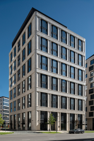
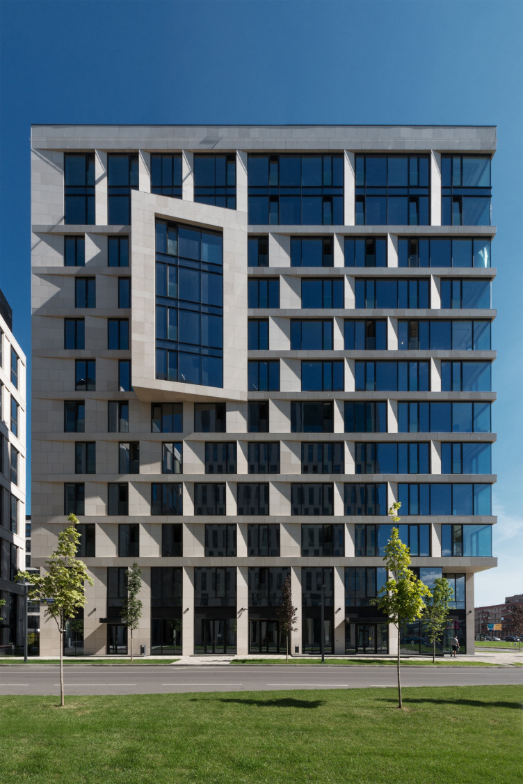
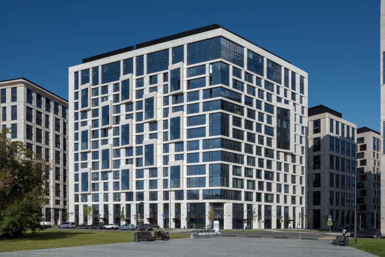
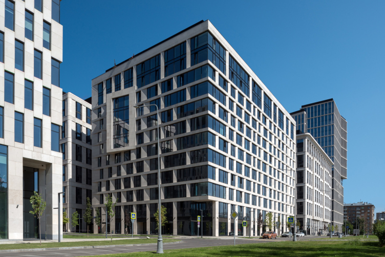
The smallish, yet capable of holding the composition axis, Building 9 is flanked on both sides by large semi-quarters designed by Reserve Union, specifically buildings No. 10 and 6. Both stand facing the above-described office buildings 3 and 5 standing across the road, but, whilst the two vis-a-vis of SPEECH noticeably echo each other, Vladimir Plotkin proposes a different solution for these residential buildings: the facades are subjugated by a relief grid, the main motif of which are chamfers – the chamfered piers that asymmetrically flank the glass patches, gathered into horizontal bands. Their sharp edges look like the blades of white ceramic knives, which once again highlight the contrast with totally rounded corners of the buildings designed by SPEECH. An oval there and a sharp corner here, no terms.
The multifunctional complex VTB Arena Park. Building 10
Copyright: Photograph © Aleksey Naroditsky
The chamfers are “combed” to one side, and the bay windows are turned in the same direction as well: a lot of them face the park, only one faces the street, and none are on the side of the Third Transport Ring.
The multifunctional complex VTB Arena Park. Building 10
Copyright: Photograph © Aleksey Naroditsky
The “grid” or the “mesh” behaves very freely – we have already compared Building 5 with pleating, but here the pattern looks like a stretched “hippie” sweater: there is a lot of glass at the two outer and southern corners, and the stone gradually thickens northward. From the side of the yards, the chamfers disappear, but the agile alternating rhythm remains, added by flat recessions.
The multifunctional complex VTB Arena Park. Building 6
Copyright: Photograph © Aleksey Naroditsky
The multifunctional complex VTB Arena Park
Copyright: Photograph © Aleksey Naroditsky
The multifunctional complex VTB Arena Park. Building 10
Copyright: Photograph © Aleksey Naroditsky
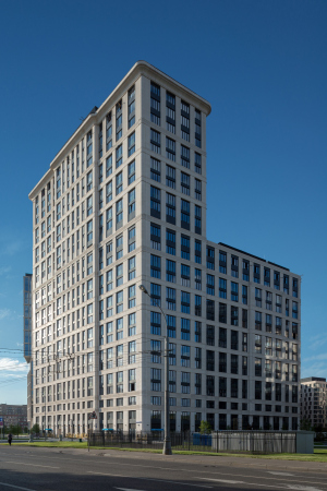
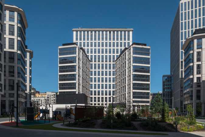
The three residential buildings designed by Sergey Tchoban also have a U-shaped plan with wings stretching out into the yard. The house on the far side of Maslovka, as we remember, rises significantly in its central part, up to 26 floors. We have already compared it with the Sphinx – it has a tangible importance, comparable to the impression produced by a Stalinist skyscraper, especially if viewed from the outside. If you want to bother such a person of consequence, you need to have a good reason for that.
All the three SPEECH houses are subjugated to one and the same theme, already stated in buildings 4 and 9 – referring to the modernist architecture of the early XX century, and to the buildings that could have become the climax of developing the typology of tenements and bank offices. Perhaps, even to the well-known ideal of 1913. This choice is quite understandable, both for residential and office buildings; at the same time, the prototype is interpreted here in a general manner – modernist architecture is diluted by a tangible taste for up-to-date technological solutions, and, as we saw earlier, by a slight twist of “Stalin” architecture.
In addition to the ornamental bands and the “flutes” in the attic tier, the three houses are getting crowning cornices – of smooth proportions, and, of course, without cantilevers. All the corners are rounded: corners of the houses, of the projections, and the vertical “blade” piers. All the houses feature risalits, wide and hollow; sometimes they are placed in the middle, and sometimes the facade is getting two asymmetric risalits.
The multifunctional complex VTB Arena Park
Copyright: Photograph © Aleksey Naroditsky
The multifunctional complex VTB Arena Park
Copyright: Photograph © Aleksey Naroditsky
The multifunctional complex VTB Arena Park. The yard of the housing complex
Copyright: Photograph © Aleksey Naroditsky
The risalits on the ends of the wings reaching out into the yard occupy their entire width; they are made of dark glass with dark lintels, and they look like jewelry cabochons. They significantly add to the “mirror-like” quality of the house and proudly sport the curvilinear glass.
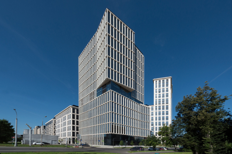
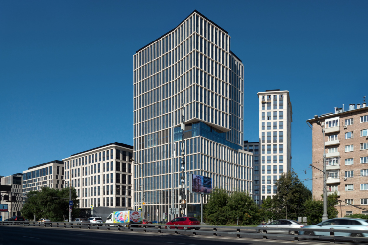
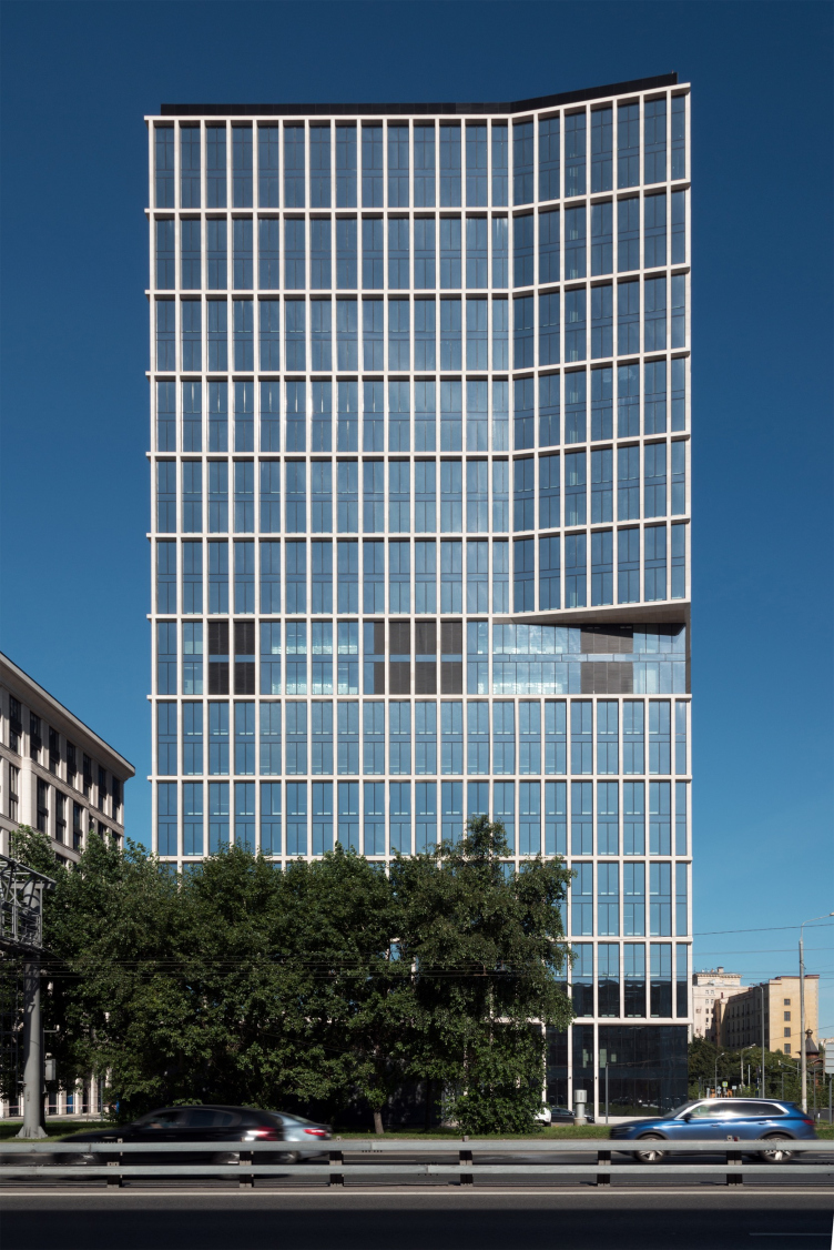
And, finally, the office building on the corner, authored by Vladimir Plotkin, Building No. 8, is only two floors smaller than its residential “neighbor”. While the whole complex presents itself to the city and the park with calm dignity, this building is slightly more on the active side. They take full advantage of both its height and its “corner” location at the bend of the Third Transport Ring; this building is one of the highlights, with which VTB Arena Park establishes itself with the city. When you come driving to the complex from the side of the Savelovsky railway station, at some point it seems that this buildings is about three times higher than the rest, and from the opposite side, from the Leningrad Highway, the height of the tower at first disappears, but then you can feel well how its corner is decomposed into parts, directing us to the right almost like a traffic controller.
The multifunctional complex VTB Arena Park. Building 12, offices
Copyright: Photograph © Aleksey Naroditsky
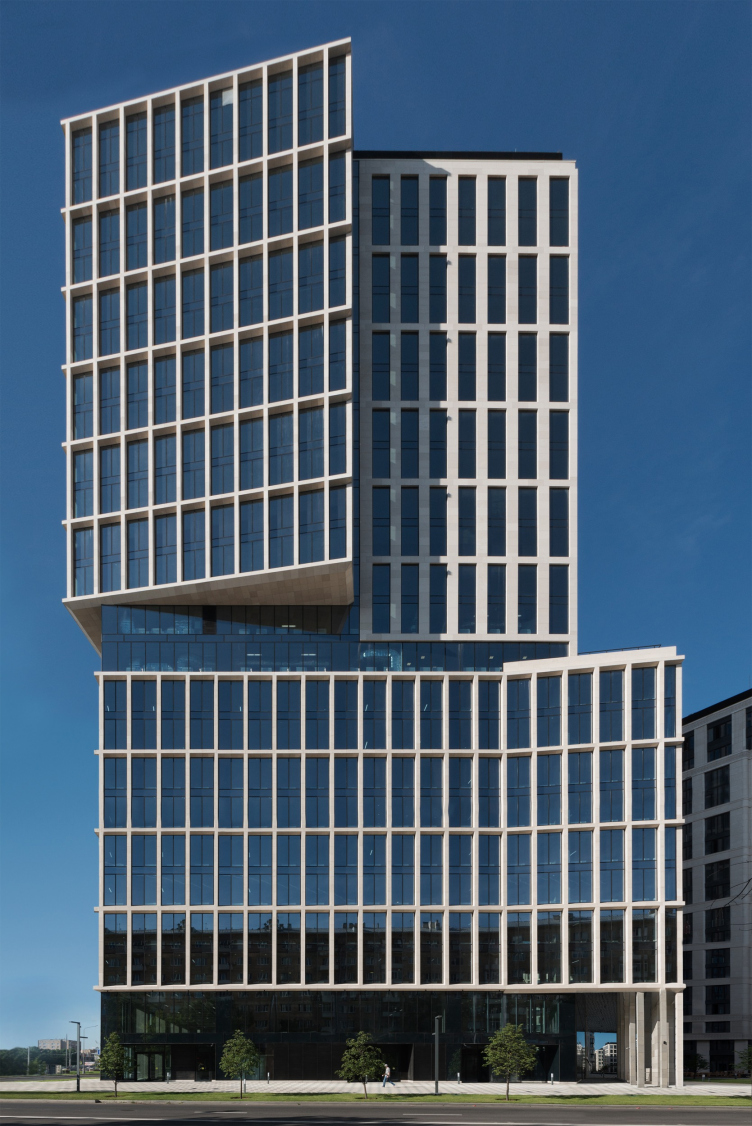
The office tower on the corner features virtually the same dynamics and openness as the two other office buildings designed by Reserve Union, Buildings 3 and 5, yet here it works in a slightly different way. The whole building is subjected to the light-colored grid, similar to the kind that is used on the facades of the Kommunarka clinic; the outside facades sport a mesh that is finely textured, on the inside facades the lines are wider and flatter, but it always has vertical proportions and is simple as parallels and meridians in the globe, is not to be measured by any gradient successions, does not “teeter” optically, and keeps perfect stability. On the other hand, the slenderness of the lines on the outside makes the building look deliberately fragile: the facade grid here is lighter than in any of the other buildings, and can only be compared to the attic tier of Building 3.
The clarity and the simplicity of the facade pattern highlight the partial turn of the volume: the building looks slightly like a volumetric puzzle at the beginning of the transformation movement. This turn is, of course, resonant with the turn of the highway, but some of the volume looks exactly as if it was “taken out” and “unfolded” – and it is echoed by the turn of the place in the lower tier of the north facade from the Maslovka side, under the same angle.
The multifunctional complex VTB Arena Park. Building 12, offices
Copyright: Photograph © Aleksey Naroditsky
In the same spot, the lower tier stands out northward, about three cells of the grid, in the direction of the residential Building 12. At the bottom, an arch appears – a cantilever with a mirror ceiling rests on two rows of very slender “legs” (and one support of a larger size). It opens yet another, additional, view into the courtyard, emphasizing the subtlety of the building, which seems to have set one elegant “leg” aside.
The multifunctional complex VTB Arena Park
Copyright: Photograph © Aleksey Naroditsky
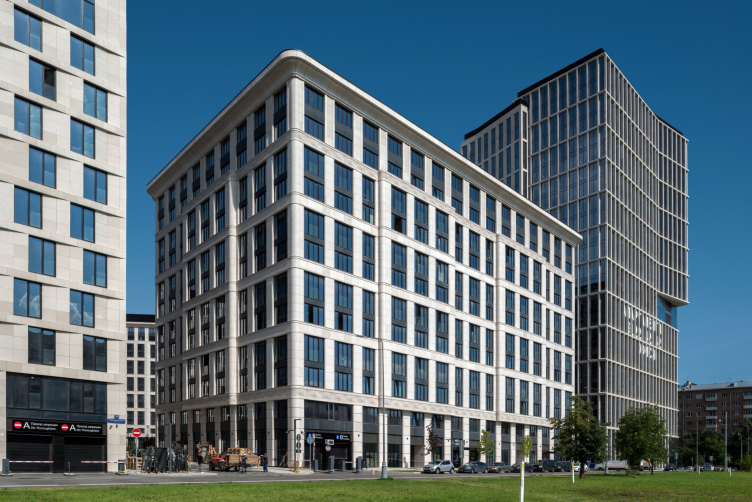
The two tall towers – the office one (24 floors, designed by Reserve), and the residential one (26 floors, designed by SPEECH) – become the high-rise highlights of the north part of the complex, which, as we remember, raises its height from the Leningrad Highway towards the Maslovka Street. These two buildings also enter a dialogue based on contrast: symmetric-asymmetric, rounded-sharp, robust-lightweight, a third one within this complex.
The multifunctional complex VTB Arena Park
Copyright: Photograph © Aleksey Naroditsky
The multifunctional complex VTB Arena Park. Foreground on the left: office of the management company of SPEECH, the chief contractor of the complex
Copyright: Photograph © Aleksey Naroditsky
Each of the dialogues built here is based on different techniques, and each time it takes on a new key. All of them are united by the balance of tension and coherence, coupled with the elaboration of each solution. Each building here is a statement, and one that must be viewed in the context of a joint conversation, built up consistently with the expectation of showing the strong sides of one method or another, highlighting the differences why their closeness, but reconciling them with one common denominator.
This is not the first time that Vladimir Plotkin and Sergey Tchoban venture into such an experiment, one of the close examples at hand (in terms of the approach) being the high-end residential complex Wine House, where the facades, including stone-white ones, are alternating. The case of VTB Arena Park is the largest in this paradigm. It even seems that the authors “walk” the observer through the entire history of the controversies of the architecture of the XX century: modernism, avant-garde, Art Deco, and metaphysics of the forms in the “cross-sectional” view – in a subtle manner, without thrusting their meditation on the city people, but saving them up for those who will want to think about the architecture in general. In addition, the two architects are meeting each other halfway: the modernism is rather on the classical side, it has a lot of vertical flavor about it, while the Art Nouveau and the Art Deco are significantly generalized and merged with the technology aesthetics, characteristic of modernism.
In this case, the very dialogue between the two major directions turns into a subject of creative work, which somehow entitles us to use, when describing its results, not just the clichéd market term “complex”, but, rather a more emotional and image-laden term “ensemble”. What is also interesting, by the way, is the fact that the interaction of the parts of the complex takes place not in accordance with the classic or modernist rules, but poses new questions, which are, possibly, the new agenda of our day and age, for example, the question of the need for diversity and the permissibility of using “different languages”.
We will note here that the topic that is developed here is resonant with a more global dialogue taking place in the nation’s capital: Moscow is essentially a conglomerate of classicist and modernist buildings, “Stalin” versions of these styles, and modernist statements, mixed sometimes by chance, and sometimes by design. Sometimes they are indifferent to one another, but more often they are bickering back and forth. Here, on the other hand, at the crossroads next to the Dinamo metro station, the conversation turned out to be different, regulated, and tolerant – some kind of special “architectural parliament” where no one interrupts anyone, as if the task is to set an example. At the same time, the two architects were able to form the proverbial “comfort town”, big enough to satisfy the developers’ interests, yet not excessively large and comparable, scale-wise, to the nearby streets.
If this is not perfection, then I don’t know what is.


