По-русски

​...The Other Was Just Railroad Gin*

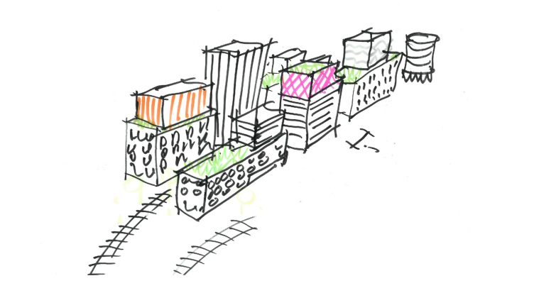
In their project of the third stage of “Ligovsky City” housing complex, located in the industrial “gray” belt of Saint Petersburg, the KCAP & Orange Architects & A-Len consortium set before themselves a task of keeping up the genius loci by preserving the contours of the railroad and likening the volumes of residential buildings to railroad containers, stacked up at the goods unloading station.

02 October 2020
Object
mainImg
Architect:
Ruurd Gietema
Jeroen Schipper
Patrick Meijers
Sergey Oreshkin
Object:
Ligovsky city
Russia

2019 — 2020
*In the headline of the original Russian version of this article, a quote from the song “Railroad Water” by the famous Russian rock singer Boris Grebenshchikov is used, obviously inspired by the Bob Dylan line, which is used in the English version.

The third stage of “Ligovsky City” housing complex is the second joint project by the consortium of the Dutch KCAP + Orange Architects and Saint Petersburg’s A-Len. Their creative alliance formed during the work on the “Golden City” housing complex – back then, in 2015, based on the results of an international competition, the judging panel awarded two first prizes, proposing that the winners unite for collaboration. The construction of a large-scale complex, crowned by impressive golden constructions, is currently underway; some of its parts are almost complete. The collaboration turned out to be successful, and last year the same client, Glorax Development, invited the consortium KCAP & Orange Architects & A-Len to design the third stage of the large housing complex in the “gray belt” of Saint Petersburg. Currently, the project is complete, and on its basis the site plan has been approved.

Golden City, the housing complex standing on wash-up land, i.e. the kind that quite recently did not yet exist – refers to the genius loci of Saint Petersburg in general, saluting with golden grates and spears to the Peter and Paul Fortress and the Admiralty. The core of the “Ligovsky City” housing project also lies in the history of the place, but its narrative is slightly different.

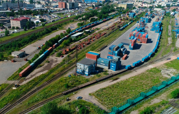
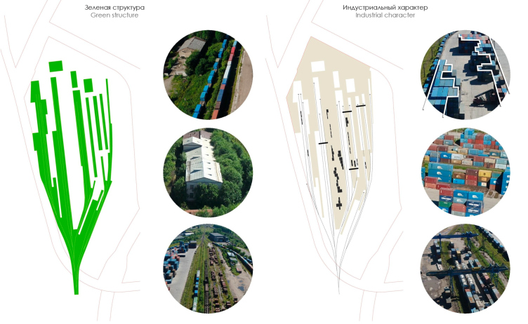
The grand-size land site, about 30 hectares and petal-shaped, is a part of the gray belt; up until 2018 it was occupied by Tovarno-Vitebskaya freight railroad station. The people of A-Len shared that in the early XVIII century there was the Ligovsky Channel dug nearby, which carried water for the fountains of the summer garden and was also a transportation artery. In 1837, south of this location, they laid down the Tsarskoe Selo railroad line, and in 1900 they built a station of the Moscow-Vindavo-Rybinsk railroad line. This land, although demarcated for housing development, was never inhabited – for many years it remained an industrial outskirts with vegetable gardens and an occasional cottage popping up here and there.

Ligovsky City
Copyright: © KCAP Architects & Planners, Orange Architects, A-Len


“Ligovsky City” is probably the first construction project of the gray belt, in which the architects are not trying to erase the past of this locality, turning chaotic underdeveloped land into linear high-rise city blocks, but are looking to keep up the spirit of the past. Specifically, for the construction of the two previous stages of the same block, quarters one and two, the Sausage Factory of 1905 was torn down altogether; the new houses of indifferently neutral architecture do not make the slightest attempt to tell us anything about the past. 

  • zooming
    1 / 3
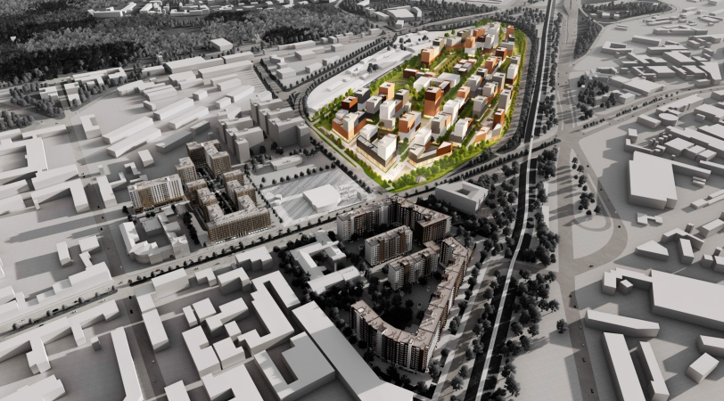
    Ligovsky City. The designed housing complex, as well as “First Quarter” and “Second Quarter”
    Copyright: © KCAP Architects & Planners, Orange Architects, A-Len
  • zooming
    2 / 3
    Ligovsky City
    Copyright: © KCAP Architects & Planners, Orange Architects, A-Len
  • zooming
    3 / 3
    Ligovsky City
    Copyright: © KCAP Architects & Planners, Orange Architects, A-Len


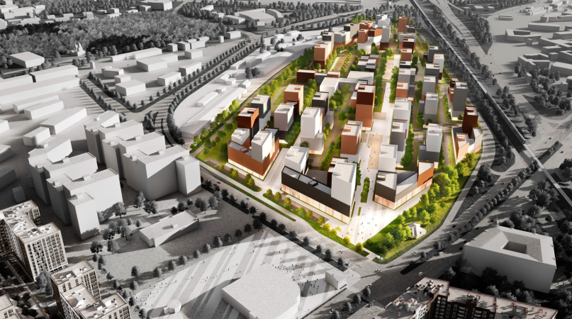
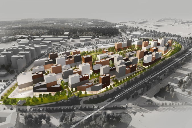
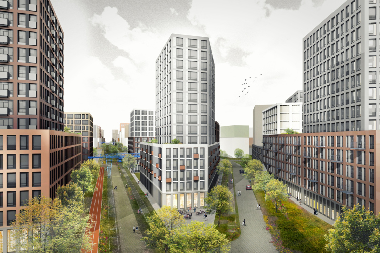
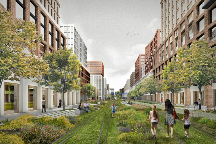
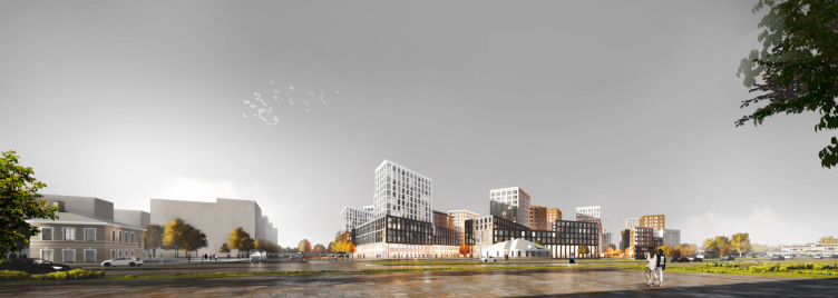
The concept of the new, third, stage is based on keeping up the pattern of the railroad track. The rails turn into linear parks and boulevards, and the railway station platforms give way to houses that look like train carriages and freight containers. Since the spatial structure of the territory is kept intact, the architects describe it as “adaptive reuse”. 

Ligovsky City
Copyright: © KCAP Architects & Planners, Orange Architects, A-Len


In fairness, it must be noted that a similar idea of “carriage” houses mounted on “rails” was already proposed for this land site in 2016 by Studio 44 when it took part in the competition for renovating the south part of the gray belt. At the city council sitting, where “Ligovsky City” got very positive feedback, Nikita Yavein spoke highly of this idea: “The architects came up with a compositional principle that proceeds from the history of the place, and the context. This creates a true diversity of the forms. It will be bad if the gray belt is developed in such a way as if residential construction has been here forever. Ideologically, I really like this concept.”

Sergey Oreshkin about the project and its consideration by the city council:


The project of “Ligovsky City” was developed by a large group of architects; the team of A-Len, and our long-standing partners – two companies, which are very well-known on the international design market – Rotterdam-based KCAP and Orange Architects. Our company took part in developing the project at all of its stages: from the idea to making the decision about its implementation. More than a year ago, the leaders of our architectural consortium gathered for a workshop, and, as a result of a brainstorming session singled out the advantageous idea of our colleagues from Orange – a concept of linear construction, inspired by the beauty of the railroad tracks, along which we positioned the houses and green corridors with private yards and public spaces. It was decided to preserve, as technical design elements, the objects that broadcast the importance of the pre-revolution “gray belt”. Most of the members of the town planning council appreciated the concept – currently, Saint Petersburg has no such project, executed in the European traditions of renovating industrial territories. The urban green island “Ligovsky City” that we designed once again proves the efficiency of consortiums, particularly with international colleagues.


The land site properties. Ligovsky City
Copyright: © KCAP Architects & Planners, Orange Architects, A-Len


Jeroen Schipper, partner of Orange Architects

We worked together on the Ligovsky City project from the very inception. The architects of A-Len not only supported the development of the project from the standpoint of their knowledge of local legislature, but they also took an active part in developing the concept itself. We relied on the expertise of three offices in order to create a very special project, all the members enriching each other with their approaches and best practices.

When we were in Saint Petersburg still before the beginning of our work, we had the time to take a walk around the future construction site for about two hours, feeling the genius loci – the history of the place is still very tangible here. It was interesting for us to keep up this feeling, even if we fundamentally changed the function of the place – from a freight railroad station, it turns into a bright housing project. Enhancing the character of the place, we are trying to make it worthy of Saint Petersburg.

The historical center of Saint Petersburg is magnificent – it is very well preserved, and, essentially, it is a classic example of a European city. However, the further away you move from the city center, the less humane, logical, and coherent construction becomes. We decided that it was important to trust the identity of this place and create something new for Saint Petersburg: based not so much on the classical as on the industrial heritage of this city.


View from the Vozdukhoplavatelnaya Street. Ligovsky City
Copyright: © KCAP Architects & Planners, Orange Architects, A-Len


Masha Pidodnia, associate partner of KCAP

A-Len knows the city; it knows the construction regulations that are particularly hard and complicated in Saint Petersburg, and it knows how to meet them. The complexity of town-planning legislature in Saint Petersburg leaves its mark on the appearance of the modern housing complexes – unfortunately, you need to be very creative if you want to come up with something different. Besides, Sergey Oreshkin is a member of the town planning council, and he knows how to present projects – without him, we would never have prepared the presentation for the Committee for Urban Development and Architecture. All of this helped our team to make the right choices.

Yet another plus: A-Len helped us to tell the story, which was also very important for building up a dialogue with the city and with the client – this was a guarantee that the concept would be implemented without major changes. We always try to study the context, find the strong points, and feel the spirit of the place. However, we need to admit the fact that we look from a different angle, based on our foreign experience and cultural background.

It is generally accepted that Saint Petersburg is primarily about the quarters of the historical center. We also often work with a block type of development, as, for example, on the Vasilievsky Island. In this case, however, we were inspired by the railroad tracks and the freight containers preserved on the site.


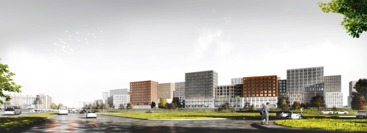
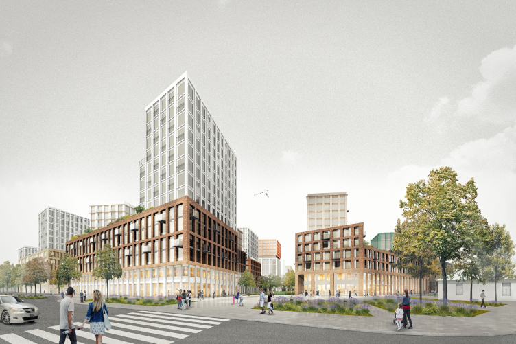
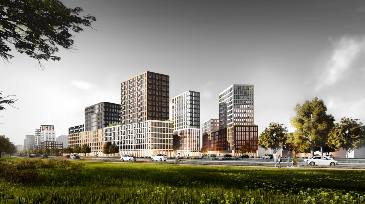
Anyway, the former freight platforms are replaced by buildings 6 to 15 floors high. Due to the unusual town planning factor, the configuration of the city blocks is indeed diverse and unique at the same time, the city blocks getting several dimensions at once.

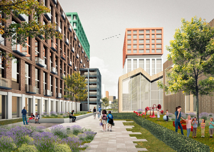
The first dimension is height. The two bottom floors are unified to a certain degree in all of the building and chiefly form the scale of the street. What adds to diversity and coziness here are the annexes no more than for stories high with contrastive decoration and form – for example, the rigidity of perpendicular lines can be diluted by a pitched roof, and the industrial spirit can be somewhat softened by warm wood. The level of the medium (and still comfortable) height is accentuated by broad sections, while the upper level is represented either by light-colored towers or by brightly colored “freight containers”, “stacked” on one another.

View from an in-yard alley. Ligovsky City
Copyright: © KCAP Architects & Planners, Orange Architects, A-Len


Ligovsky City
Copyright: © KCAP Architects & Planners, Orange Architects, A-Len


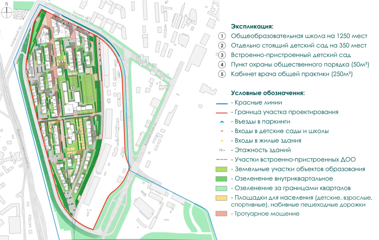
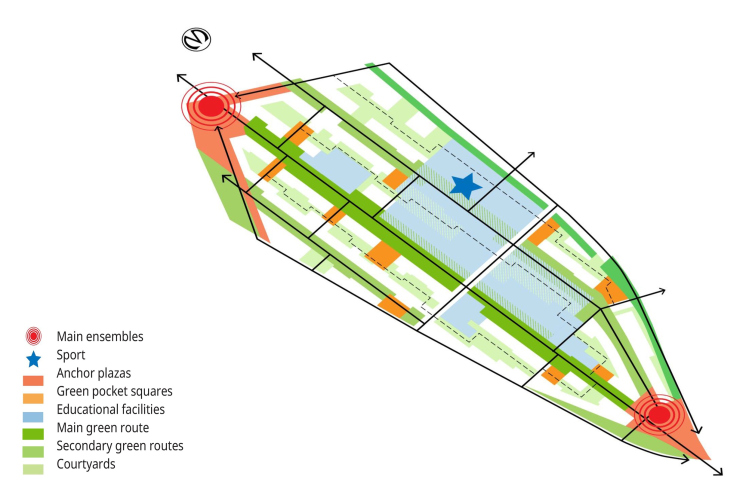
The other dimension – the “axis” is set by the vector of green corridors and boulevards, whose linear motion is broken but once by a school for 1,250 students. The above-mentioned “cocktail” technique of placing the volumes allowed the architects to avoid a “corridor” effect with blind walls, and achieve that of a gallery: the facades, opening onto the inner streets, are diverse in terms of decoration pattern and materials, and the residents will be able to easily identify their section.

The master plan. Ligovsky City
Copyright: © KCAP Architects & Planners, Orange Architects, A-Len


Ligovsky City
Copyright: © KCAP Architects & Planners, Orange Architects, A-Len


When walking in the linear parks, one can see, in addition to the habitual playgrounds and sports facilities, artifacts, the witnesses of the past – something that in other projects more often than not get rid of. However, it’s all different in the project of the third stage: the architects are planning to integrate into the public spaces and parks what remained of the industrial past of this area: the surviving cranes, pillars, rails, and warehouses. As for the only cultural heritage site that this place has got – the house of the station master built by the project by Stanislav Brzhozovsky, the author of the Vitebsky Railway Terminal – there are plans for restoring it and readjusting for a new function. The public parks are situated along the railroad lines, while the spaces between the buildings conceal cozier inner private yards that are connected to form a single pedestrian route. 

Ligovsky City
Copyright: © KCAP Architects & Planners, Orange Architects, A-Len


And, finally, the third position, from which you can review this complex is a broader town planning one. The whole land site is split approximately even by only one automobile road. Next to the north part of the “petal” soon the new metro station Borovaya will appear; the place is going to get a friendly-looking ensemble of a small height with an “inviting” plaza – a new center of attraction in this area. South of the land site, the construction height rises to a climax – an ensemble of three towers that looks like a powerful gate.

View from the intersection of the Ligovsky Avenue and the Tosina Street. Ligovsky City
Copyright: © KCAP Architects & Planners, Orange Architects, A-Len


View from the Vitebsky Avenue. Ligovsky City
Copyright: © KCAP Architects & Planners, Orange Architects, A-Len


Ligovsky City
Copyright: © KCAP Architects & Planners, Orange Architects, A-Len


The whole complex is designed to house 8,600 people; it includes four kindergartners, a large school, underground parking garages and parking lots. The third stage of “Ligovsky City” will be built in four phases, starting from the blocks near Borovaya metro station. In spite of the fact that the concept, which provides for a wide diversity of residential sections, is by default suggestive of organizing competitions, at the city council the client announced their intention to entrust the following design work to the KCAP & Orange Architects & A-Len consortium.

Architect:
Ruurd Gietema
Jeroen Schipper
Patrick Meijers
Sergey Oreshkin
Object:
Ligovsky city
Russia

2019 — 2020

02 October 2020

Headlines now
The Golden Crown
The concept for a dental clinic in Yekaterinburg, developed by CNTR Studio, revolves around the idea of a “mouth full of gold”: pristine white porcelain stoneware walls are complemented by matte brass details. To avoid an overly literal interpretation, the architects focused on the building’s proportions, skillfully navigating between sunlight requirements and fire safety regulations.
Flexibility and Integration
Not long ago, we covered the project for the fourth phase of the ÁLIA residential complex, designed by APEX. Now, we’ve been shown different fence concepts they developed to enclose the complex’s private courtyards, incorporating a variety of public functions. We believe that the sheer fact that the complex’s architects were involved in such a detail as fencing speaks volumes.
A Step Forward
The HIDE residential complex represents a major milestone for ADM architects and their leaders Andrey Romanov and Ekaterina Kuznetsova in their quest for a fresh high-rise aesthetic – one that is flexible and layered, capable of bringing vibrancy to mass and silhouette while shaping form. Over recent years, this approach has become ADM’s “signature style”, with the golden HIDE tower playing a pivotal role in its evolution. Here, we delve into the project’s story, explore the details of the complex’s design, and uncover its core essence.
Gold in the Sands
A new office for a transcontinental company specializing in resource extraction and processing has opened in Dubai. Designed by T+T Architects, masters of creating spaces that are contemporary, diverse, flexible, and original, this project exemplifies their expertise. On the executive floor, a massive brass-clad partition dominates, while layered textures of compressed earth create a contextually resonant backdrop.
Layers and Levels of Flight
This project goes way back – Reserve Union won this architectural competition at the end of 2011, and the building was completed in 2018, so it’s practically “archival”. However, despite being relatively unknown, the building can hardly be considered “dated” and remains a prime example of architectural expression, particularly in the headquarters genre. And it’s especially fitting for an aviation company office. In some ways, it resembles the Aeroflot headquarters at Sheremetyevo but with its own unique identity, following the signature style of Vladimir Plotkin. In this article, we take an in-depth look at the United Aircraft Corporation (UAC) headquarters in the Moscow agglomeration town of Zhukovsky, supplemented by recent photographs from Alexey Naroditsky – a shoot that became only recently possible due to the fact that improvements were finally made in the surrounding area.
Light and Shadow
In this article, we delve into the architectural design of the “Chaika” house by DNK ag architects, which was recently completed in 2023 as part of the collection of signature designs at ZILArt. As is well-known, all the buildings in this complex follow a design code, yet each one is distinct. This particular building stands out not only for its whiteness and minimalism but also for the refined use of a limited number of techniques that, together, create what can confidently be called synergy.
Casus Novae
A master plan was developed for a large residential area with a name of “DNS City”, but now that its implementation began, the plan has been arbitrarily reformatted and replaced with something that, while similar on the surface, is actually quite different. This is not the first time such a thing happens, but it’s always frustrating. With permission from the author, we are sharing Maria Elkina’s post.
Treasure Hunting
The GAFA bureau, in collaboration with Tegola and Arkhitail, organized an expedition to the island of Kilpola in Karelia as part of Moskomarkhitektura’s “Open City” festival. There, amidst moss and rocks, the students sought answers to questions like: what is the sacred, where does it dwell, and what sustains it? Assisting the participants in this quest were landscape engineer Evgeny Levin, artist Nicholas Roerich, a moose, and the lack of cellular connection. Here’s how the story unfolded.
Depths of the Earth, Streams of Water
In the Malaya Okhta district, the Akzent building, designed by Stepan Liphart, was constructed. It follows a classic tripartite structure, yet it’s what you might call “hand-drawn”: each façade is unique in its form and details, some of which aren’t immediately noticeable. In this article, we explore the context and, together with the architect, delve into how the form was developed.
Fir Tree Dynamics
The “Airports of Region” holding is planning to build an airport in Karachay-Cherkessia, aiming to make the Arkhyz and Dombay resorts more accessible to travelers. The project that won in an invitation-only competition, submitted by Sergey Nikeshkin’s KPLN, blends natural imagery inspired by the shape of a conifer seed, open-air waiting spaces, majestic large trees, and a green roof elevated on needle-like columns. The result is both nature-inspired and WOW.
​A Brick Shell
In the process of designing a clubhouse situated among pine trees in a prestigious suburban area near Moscow, the architectural firm “A.Len” did the façade design part. The combination of different types of brick and masonry correlates with the volumetric and plastique solutions, further enhanced by the inclusion of wood-painted fragments and metal “glazing”.
Word Forms
ATRIUM architects love ambitious challenges, and for the firm’s thirtieth anniversary, they boldly play a game of words with an exhibition that dives deep into a self-created vocabulary. They immerse their projects – especially art installations – into this glossary, as if plunging into a current of their own. You feel as if you’re flowing through the veins of pure art, immersed in a universe of vertical cities, educational spaces – of which the architects are true masters – and the cultural codes of various locations. But what truly captivates is the bold statement that Vera Butko and Anton Nadtochy make, both through their work and this exhibition: architecture, above all, is art – the art of working with form and space.
Flexibility and Acuteness of Modernity
Luxurious, fluid, large “kokoshniks” and spiral barrel columns, as if made from colorful chewing gum: there seem to be no other mansion like this in Moscow, designed in the “Neo-Russian-Modern” style. And the “Teremok” on Malaya Kaluzhskaya, previously somewhat obscure, has “come alive with new colors” and gained visibility after its restoration for the office of the “architectural ecosystem” as the architects love to call themselves. It’s evident that Julius Borisov and the architects at UNK put their hearts into finding this new office and bringing it up to date. Let’s delve into the paradoxes of this mansion’s history and its plasticity. Spoiler: two versions of modernity meet here, both balancing on the razor’s edge of “what’s current”.
Yuri Vissarionov: “A modular house does not belong to the land”
It belongs to space, or to the air... It turns out that 3D printing is more effective when combined with a modular approach: the house is built in a workshop and then adapted to the site, including on uneven terrain. Yuri Vissarionov shares his latest experience in designing tourist complexes, both in central Russia and in the south. These include houseboats, homes printed from lightweight concrete using a 3D printer, and, of course, frame houses.
​Moscow’s First
“The quality of education largely depends on the quality of the educational environment”. This principle of the last decade has been realized by Sergey Skuratov in the project for the First Moscow Gymnasium on Rostovskaya Embankment in the Khamovniki district. The building seamlessly integrates into the complex urban landscape, responding both to the pedestrian flow of the city and the quiet alleyways. It skillfully takes advantage of the height differences and aligns with modern trends in educational space design. Let’s take a closer look.
Looking at the Water
The site of Villa Sonata stretches from the road to the water’s edge, offering its own shoreline, pier, and a picturesque river panorama. To reveal these sweeping views, Roman Leonidov “cut” the façade diagonally parallel to the river, thus getting two main axes for the house and, consequently, “two heads”. The internal core – two double-height spaces, a living room and a conservatory, with a “bridge” above them – makes the house both “transparent” and filled with light.
The White Wing
Well, it’s not exactly white. It’s more of a beige, white-stone structure that plays with the color of limestone – smoother surfaces are lighter, while rougher ones are darker. This wing unites various elements: it absorbs and interprets the surrounding themes. It responds to everything, yet maintains a cohesive expression – a challenging task! – while also incorporating recognizable features of its own, such as the dynamic cuts at the bottom, top, and middle.
Urban Dunes
The XSA Ramps team designed and built a three-part sports hub for a park in Rostov-on-Don, welcoming people of all ages and fitness levels. The skate plaza, pump track, and playground are all meticulously crafted with details that attract a diverse range of visitors. The technical execution of the shapes and slopes transforms this space into a kind of sculptural composition.
Proportional Growth
The project for the fourth phase of the ÁLIA residential area has been announced. The buildings are situated on an elongated plot – almost a “ray” that shoots out from the center of the area towards the river. Their layout reflects both a response to Moscow’s architectural preferences over the past 15 years, shifting “from blocks to towers”, and an interpretation of the neighboring business park designed by SOM. Additionally, the best apartments here are not located at the very top but closer to the middle, forming a glowing “waistline”.
The “Staircase” Building
In designing the “Details” residential complex in New Moscow, Rais Baishev spiced up the now-popular Moscow theme of a “courtyard” building with an idea drawn from the surrealist drawings by Maurits Escher. He envisioned the stepped silhouettes and descending slopes as a metaphysical mega-staircase, creating a key void within the courtyard that gave the project an internal “spine”. This concept is felt both in the building’s silhouette and on its façades.
Projection of the Quarter
No one doubted that the building that Vladimir Plotkin designed as part of the “Garden Quarters” would be the most modernist of all. And it turned out just that way: while adhering to the common design code, the building successfully combines brick and white stone, rhythmically responding to the neighboring building designed by Ostozhenka, yet tactfully and persistently making a few statements of its own. This includes the projection of the ideal urban development composition “14–9–6”, which can be found right next door, mathematical calculations, including those for various types of terraces (and perhaps the only reminder of the Soviet past of the Kauchuk rubber factory!), and the white “cross-stitch” pattern of the façade grid.
Domus Aurea
In this issue, we examine the “Tessinsky-1” house, designed by Sergey Skuratov and completed in 2023. Located in the middle of the Serebryanicheskaya Embankment district, at the intersection of its main streets, this house assumes a sort of “nodal” role: it not only responds to everything around it and preserves many memories of the former EMA factory within itself, but it weaves all this into a newly directed pattern, reconciling bright “gold” and dark-colored brick, largely with the help of the new, modern-yet-archaic Columba brick, which, come to think about it, is the most precious element here.
The Chimney of Nikola-Lenivets
In this issue, we are examining the “Obelisk House” designed by KATARSIS and built for the Arkhstoyanie 2023 festival. However, it was only finished later on, and this is why we are examining it now. It seems to us that after the “Obelisk House” appeared in Nikola-Lenivets, a dialogue and a few inner connections appeared between the temporary structures built here. These houses no longer look like “accidental neighbors”, more of which below.
​Periscope by the Bay
The jury awarded the second place in the competition for a public and cultural center in Petropavlovsk-Kamchatsky to the companies GORA (“Mountain”) and M4. In the consortium’s proposal, the building resembles a sperm whale with a calf swimming next to it or a periscope, whose lenses capture the most spectacular views from the surrounding landscape.
From Arcs to Dolmens
While working on the competition project for Petropavlovsk-Kamchatsky, ASADOV Architects prioritized the value of the natural and urban environment, aiming to preserve the balance of the location while minimizing the resemblance of the volume that they designed to a “traditional building”. The task was challenging, and the architects created three versions, one of which having been developed after the competition, where their main proposal took third place. However, the point of interest here is not the competition result but the continuity of creative thinking.
Hide and Seek
The ID Moskovskiy house, designed by Stepan Liphart in St. Petersburg, in the courtyards near Moskovskiy Avenue beyond the Obvodny Canal and recently completed, is notable for several reasons. Firstly, it has been realized with considerable accuracy, which is particularly significant as this is the first building where the architect was responsible not only for the facades but also for the layouts, allowing for better integration between the two. On the other hand, this building is interesting as an example of the “germination” of new architecture in the city: it draws on the best examples from the neighborhood and becomes an improved and developed sum of ideas found by the architect in the surrounding context.
The Big Twelve
Yesterday, the winners of the Moscow Mayor’s Architecture Award were announced and honored. Let’s take a look at what was awarded and, in some cases, even critique this esteemed award. After all, there is always room for improvement, right?
Above the Golden Horn
The residential complex “Philosophy” designed by T+T architects in Vladivostok, is one of the new projects in the “Golubinaya Pad” area, changing its development philosophy (pun intended) from single houses to a comprehensive approach. The buildings are organized along public streets, varying in height and format, with one house even executed in gallery typology, featuring a cantilever leaning on an art object.
Nuanced Alternative
How can you rhyme a square and space? Easily! But to do so, you need to rhyme everything you can possibly think of: weave everything together, like in a tensegrity structure, and find your own optics too. The new exhibition at GES-2 does just that, offering its visitor a new perspective on the history of art spanning 150 years, infused with the hope for endless multiplicity of worlds and art histories. Read on to see how this is achieved and how the exhibition design by Evgeny Ace contributes to it.
Blinds for Ice
An ice arena has been constructed in Domodedovo based on a project by Yuri Vissarionov Architects. To prevent the long façade, a technical requirement for winter sports facilities, from appearing monotonous, the architects proposed the use of suspended structures with multidirectional slats. This design protects the ice from direct sunlight while giving the wall texture and detail.