По-русски

​Sergey Trukhanov: “The main thing is to find a solution to a challenge that originally seems insurmountable”

How will our workspaces change? Can you prepare your companies for similar situations in the future? What factors are generally important for modern offices? What are the subtleties of working with international companies, and what kind of architectural typology are we yet to discover?

19 October 2020
Interview
mainImg
We met with the leader of T+T Architects and talked to him about the most relevant questions of the last months, as well as about the things that are generally important for the profession.
 
This office at “Red October” – you moved into it quite recently, but why here? It’s understood that you were looking for an office in some renovated industrial park but why specifically this one?
 
Sergey Trukhanov:
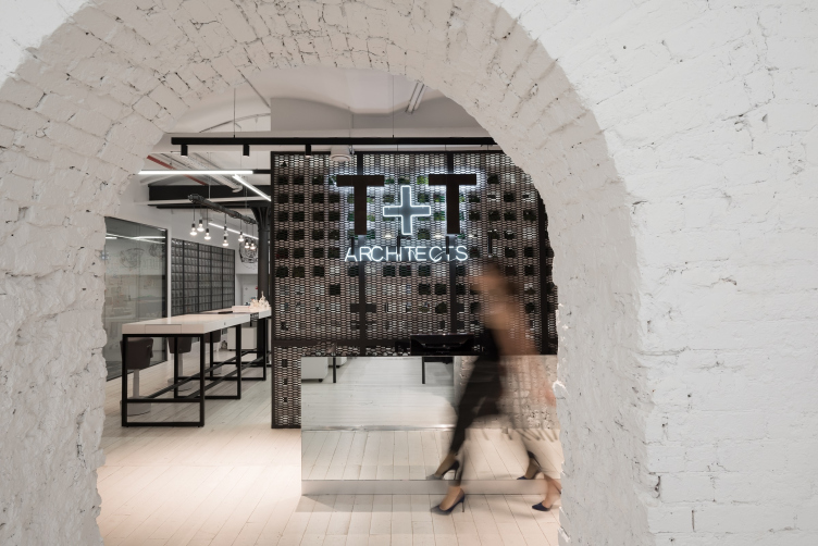
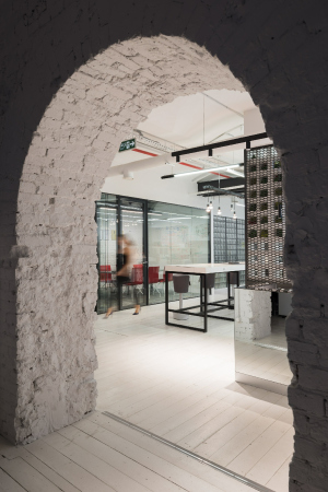
We were looking for a suitable place both location-wise, and in terms of transportation accessibility. At the same time, of course, this place had to be interesting in itself. We considered premises at “Rassvet” (another business park – editorial note) – but all of them required serious capital investments in repairs and engineering. We would have to stay there no less than 10 or 12 years to get a return in investment. In the long run, we settled on this place at “Red October” – by the way, Strelka was headquartered here back in the day. However, what ultimately influenced our decision was a different thing: the old lady that ran the elevator said that this place used to be ladies’ showers. We at once understood that this was our place.
 
Did you have to change a lot around here?
 
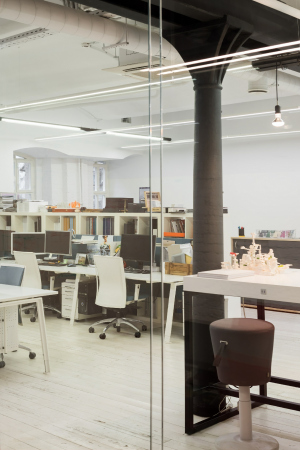
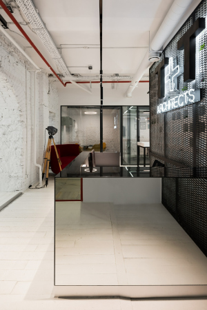
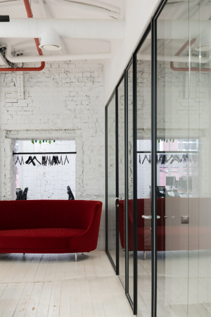
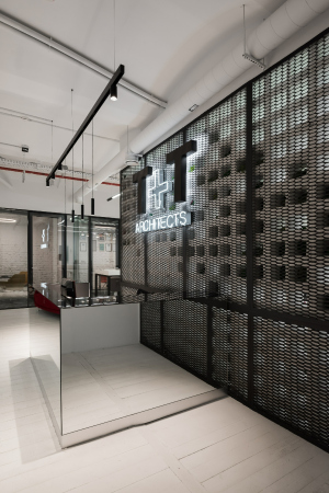
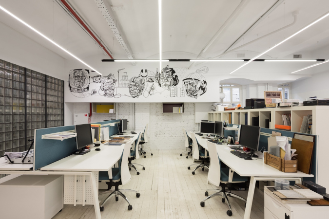
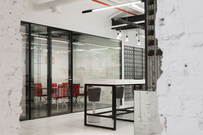
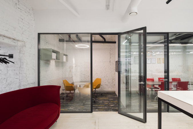
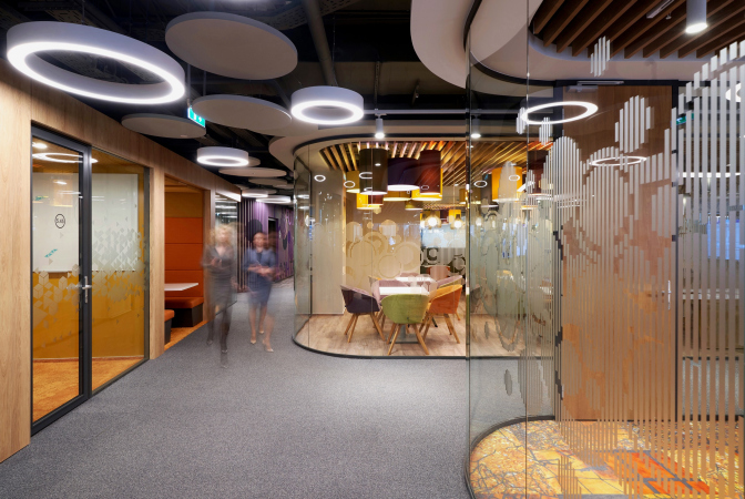
Mainly, what we did was get rid of the stuff that we didn’t need – old drywall, which was sheathed with brick walls, and other partitions. The cast iron columns, however, were a different matter. The thing is that they are part of the old steam heating system: “Red October” had one of the first such systems in this country. Inside the hollow cast iron column runs a pipe that gives off heat.

Т+Т Architects office at “Red October”
Copyright: © Ilia Ivanov

 
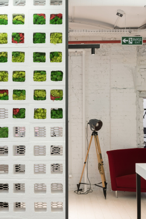
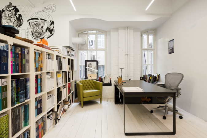
The windows here are also original: at first, we didn’t even realize that, and, squinting at our neighbors and their plastic frames, we immediately wanted to replace these windswept wooden things with stained glass windows in aluminum frames. However, as it turned out, nothing was to be changed here – the entire building had a protected status. Then we started clearing them off, got down to the original frames, and invited a restoration company to have them restored.

  • zooming
    1 / 4
    Т+Т Architects office at “Red October”
    Copyright: Photograph © Ilia Ivanov / provided by T+T Architects
  • zooming
    2 / 4
    Т+Т Architects office at “Red October”
    Copyright: Photograph © Ilia Ivanov / provided by T+T Architects
  • zooming
    3 / 4
    Т+Т Architects office at “Red October”
    Copyright: Photograph © Ilia Ivanov / provided by T+T Architects
  • zooming
    4 / 4
    Т+Т Architects office at “Red October”
    Copyright: Photograph © Ilia Ivanov / provided by T+T Architects

 
How is your zoning organized? What I see is clearly visible meeting areas, but I don’t seem to see the director’s office...
 
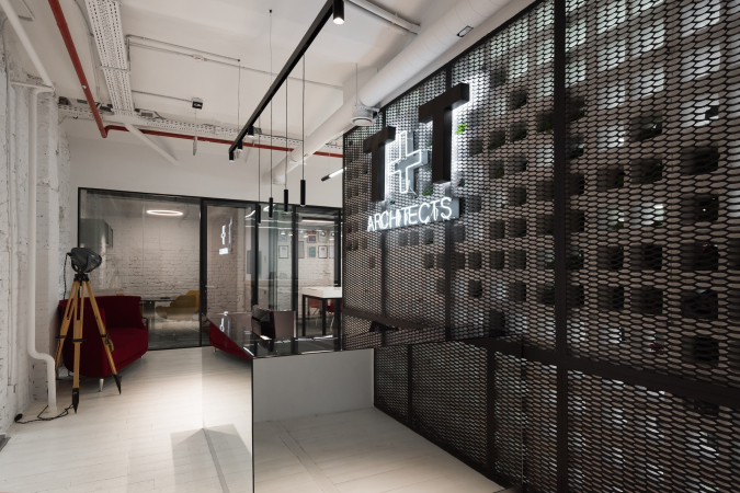
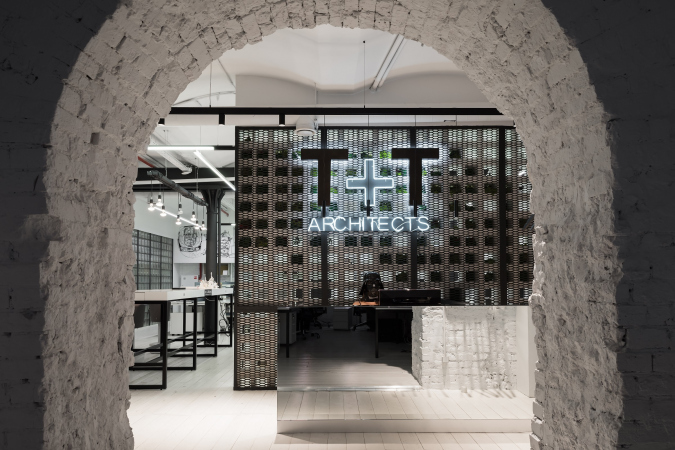
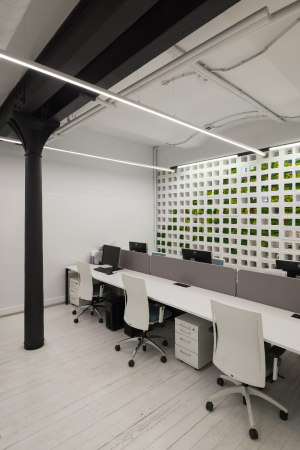
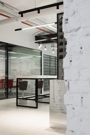
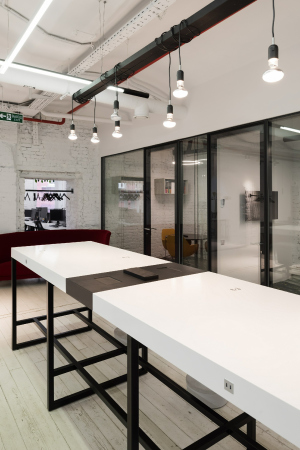
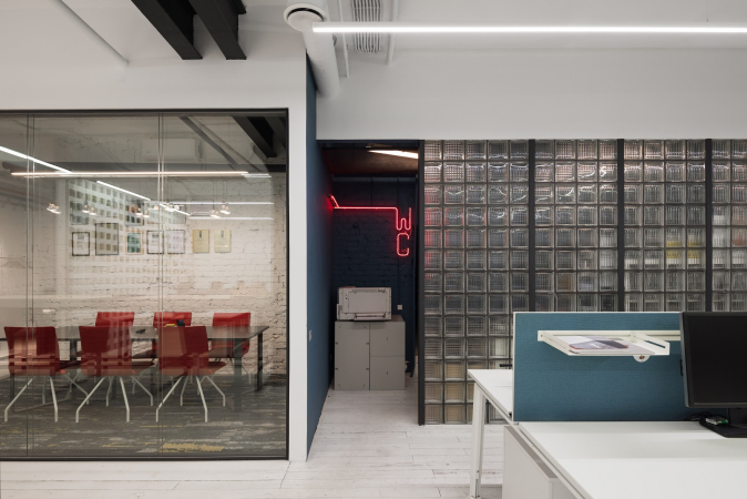
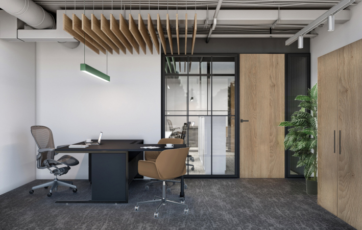
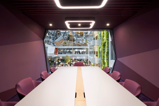
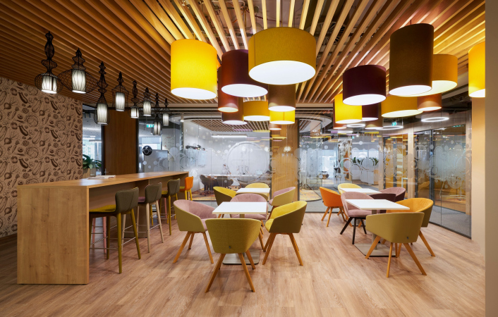
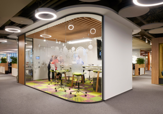
Left of the entrance, we have an architectural department, right of the entrance – the interior design one. In the middle, there is a main communication zone – the bar table. This is both the place for formal meetings with watching presentations on the big screen, and a place for informal communication and making parties. I didn't really want a personal office for myself, so I opted for a remote and secluded corner, yet still in an open area, so as not to lose visual contact with my colleagues. Everything is as democratic as possible, and I can always reach anyone I want, while the others can approach me at any moment if they have a question to ask.

  • zooming
    1 / 6
    Т+Т Architects office at “Red October”. Photograph
    Copyright: Photograph © Ilia Ivanov
  • zooming
    2 / 6
    Т+Т Architects office at “Red October”
    Copyright: Photograph © Ilia Ivanov / provided by T+T Architects
  • zooming
    3 / 6
    Т+Т Architects office at “Red October”
    Copyright: © Ilia Ivanov
  • zooming
    4 / 6
    Т+Т Architects office at “Red October”
    Copyright: Photograph © Ilia Ivanov / provided by T+T Architects
  • zooming
    5 / 6
    Т+Т Architects office at “Red October”
    Copyright: Photograph © Ilia Ivanov / provided by T+T Architects
  • zooming
    6 / 6
    Т+Т Architects office at “Red October”
    Copyright: Photograph © Ilia Ivanov / provided by T+T Architects

 
A standard question: how did you survive the lockdown? As it turned out, even within our small branch of architectural design it worked out totally different for different companies: some were quite happy with working remotely, and are now thinking about moving to a smaller office, and some, on the other hand, complain of low efficiency of remote work...
 
The way it turned out, we were fully prepared for such a situation operation-wise, management-wise, and technically as well. We had long since been organizing our business as a standardized and sometimes automated process that did not require any excessive manual control. The big-scale infrastructural software, which was written specifically for our company, and which has been developing with us since 2014, ticks a whole range of boxes for us – from financial management and accounting to goal setting for the projects and tracking their fulfillment. If this or that issue is within our set workflow, it is solved automatically. All of our communication goes through this program, and, since we managed pretty much everything through web services, we continued doing the usual thing.
 
However, we experienced a terrible lack of live communication and exchange of ideas. When you work with a great number of concepts, each of which requires an individual approach, it is very important that the whole team be in contact with each other, everyone must be on the same page, and everyone has the same vision of your end goal. Calling up a zoom conference, trying to get your point across, and making sure that everyone is on the same page as you – all of this slowed down the workflow and complicated the quality control. In order to achieve the KPI on a par with that of the “peaceful times”, our average employee had to be at their desk from 8 in the morning till 10 in the evening. It’s a lot easier when you can get together live and discuss things together. We soon realized that we missed this a lot, so, after the restrictions were lifted, it took us less than a week to get back into the office groove. It turned out that most of us were pretty social. At the same time, the teams and the employees who were doing long-term but purely technical assignments, felt great about working remotely, and they were the last to come back.
 
Did you change anything in your office due to the COVID-19 situation?
 
Nothing at all, for the exception of the general rules on daily temperature taking and regular testing! Although I am not COVID-dissident, and I stayed at home for almost three months, I think that the basic system of habits that has formed for years, as well as elementary hygiene, will help us overcome this panic. I think that, barring a few adjustments here and there, we will get “back to normal” by the beginning of next year. On the other hand, co-working spaces will be in much more demand because essentially they are a rather flexible service. They will be easier able to react to the stiffening of cleaning and social distancing protocols. Currently, by the way, they are just finishing the construction of one of the coworking spaces in the BusinessClub network in the OKO II business center built by our project.

  • zooming
    1 / 8
    Т+Т Architects office at “Red October”
    Copyright: Photograph © Ilia Ivanov / provided by T+T Architects
  • zooming
    2 / 8
    Т+Т Architects office at “Red October”
    Copyright: Photograph © Ilia Ivanov / provided by T+T Architects
  • zooming
    3 / 8
    Т+Т Architects office at “Red October”
    Copyright: Photograph © Ilia Ivanov / provided by T+T Architects
  • zooming
    4 / 8
    Т+Т Architects office at “Red October”
    Copyright: Photograph © Ilia Ivanov / provided by T+T Architects
  • zooming
    5 / 8
    Т+Т Architects office at “Red October”
    Copyright: Photograph © Ilia Ivanov / provided by T+T Architects
  • zooming
    6 / 8
    Т+Т Architects office at “Red October”
    Copyright: Photograph © Ilia Ivanov / provided by T+T Architects
  • zooming
    7 / 8
    Т+Т Architects office at “Red October”
    Copyright: Photograph © Ilia Ivanov / provided by T+T Architects
  • zooming
    8 / 8
    Т+Т Architects office at “Red October”
    Copyright: Photograph © Ilia Ivanov / provided by T+T Architects

 
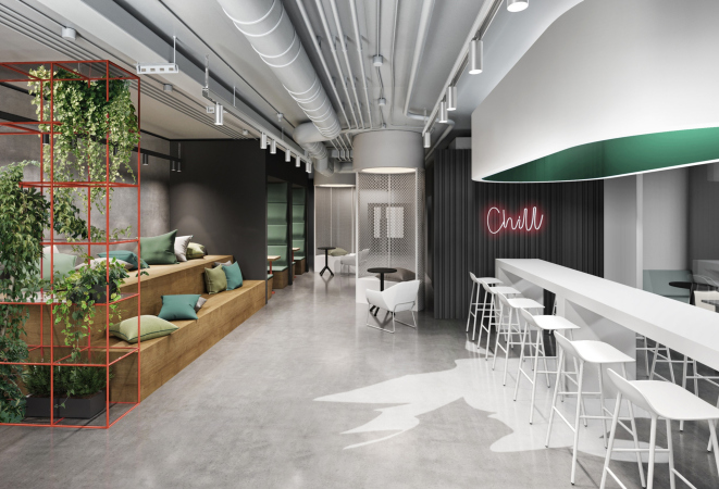
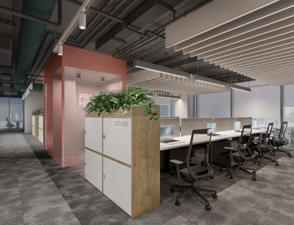
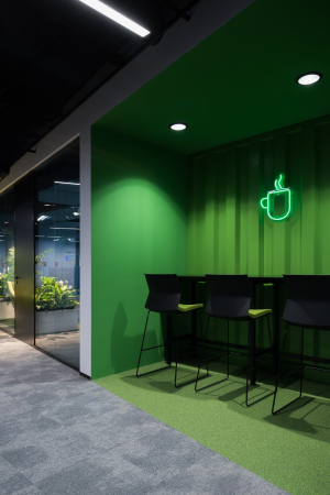
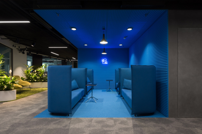
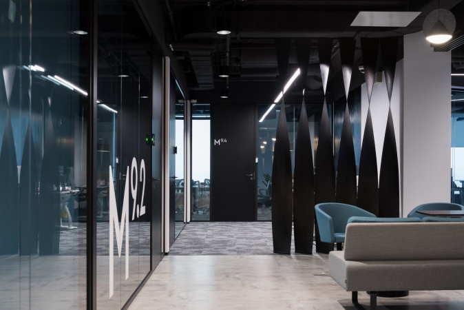
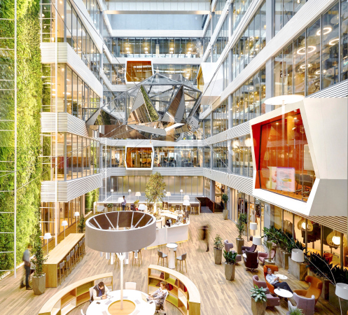
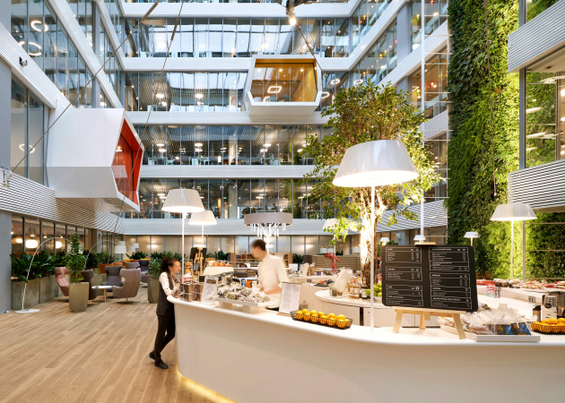
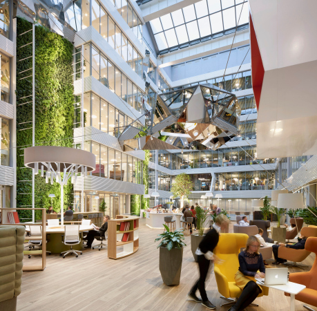
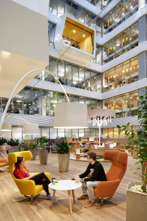
This is a large space for projects of such a format, more than 6,000 square meters. It offers both individual workspaces and meeting rooms for project groups. The thing is that when it comes to co-working spaces, particularly large ones, it is hard to find a happy medium between the working “business” mindset and an informal environment. Usually, this balance is maintained by a smart combination of different zones and technical equipment. We installed soft furniture with noise-cancelling properties, and complemented the finish with window walls. The interior decoration is not overburdened by color highlights or excessively bright elements. All of this allowed us to create a flexible product that can be easily fine-tuned depending on the changing situation or requirements.

Generally speaking, the concepts of flexible offices are getting increasingly popular. An office where the resident can choose not just the workspace but also the format and the content of this workspace both for themselves and for their working group, will be gaining more and more momentum. What matters here is the possibility for joint work, zones for individual or concentrated activity, as well as different formats of meeting rooms and booked offices. Special attention is given to service areas that tackle both utility and working issues. These are the locker rooms, showers, gyms, and even classrooms, which can be transformed into meeting rooms or large presentation areas.

  • zooming
    1 / 5
    Business Club office in OKO II business center
    Copyright: © Т+Т Architects
  • zooming
    2 / 5
    Business Club office in OKO II business center
    Copyright: © Т+Т Architects
  • zooming
    3 / 5
    Business Club office in OKO II business center
    Copyright: © Т+Т Architects
  • zooming
    4 / 5
    Business Club office in OKO II business center
    Copyright: © Т+Т Architects
  • zooming
    5 / 5
    Business Club office in OKO II business center
    Copyright: Photograph © Ilia Ivanov

 
And, if we are to get back to the subject of “post-COVID” adjustment of regular offices, once were we approached by our other client, Gaspromneft, on this subject. For one of their projects, they asked us to develop a scenario of adapting the office in case of an epidemic. We developed extra planning solutions, describing which zones in such a situation turn into workspaces from public or structural ones. First of all, the distance between the workgroups must increase dramatically. This is how we came up with the options for composing the workspaces and maximum allowed limits for meetings (meeting rooms for three people max, workgroups no more than four people, etc.) Second of all, some potential gathering zones must be readjusted to yield more square footage – for example, the cafeteria, which can be compensated by an increase in the number of coffee points scattered here and there. Gyms can also be turned into large studies that have partitions splitting them into a few sections. And the directors’ offices, which also have to move, become meeting rooms.

We also paid special attention to calculating the operation modes of the utility systems. Plus, we worked out the operational schedules. For example, if we see that there is still not enough room for some of the people in the department as in the “pre-crisis” time, we switch them over to “2 days in, 2 days out” shifts, vacating extra workspace. And, we have to do Gaspromneft justice – they have already brought all these recommendations to the attention of all their divisions.
 
How did you nail such a big client?
 
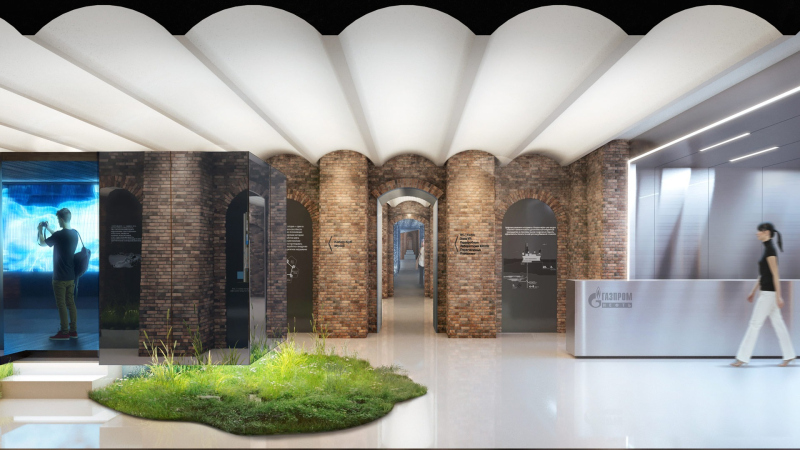
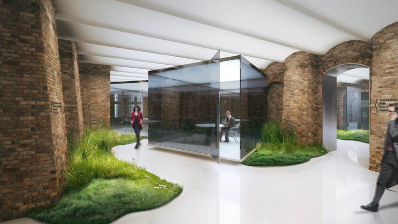
We met them at the competition for the “New Holland” in Saint Petersburg, where Gaspromneft is organizing the center for innovation in the new renovated “Dom 12”. We did not win the competition, but the same department – the directorate for digital transformation – invited us to design their back office in the “Nevskaya Ratusha” business center in Saint Petersburg.

  • zooming
    1 / 6
    The interiors of the “Directorate for Digital Transformation” office
    Copyright: Photograph © Ilia Ivanov / provided by T+T Architects
  • zooming
    2 / 6
    The interiors of the “Directorate for Digital Transformation” office
    Copyright: Photograph © Ilia Ivanov / provided T+T Architects
  • zooming
    3 / 6
    The interiors of the “Directorate for Digital Transformation” office
    Copyright: Photograph © Ilia Ivanov / provided by T+T Architects
  • zooming
    4 / 6
    The interiors of the “Directorate for Digital Transformation” office
    Copyright: Photograph © Ilia Ivanov / provided by T+T Architects
  • zooming
    5 / 6
    The interiors of the “Directorate for Digital Transformation” office
    Copyright: Photograph © Ilia Ivanov / provided T+T Architects
  • zooming
    6 / 6
    The interiors of the “Directorate for Digital Transformation” office
    Copyright: Photograph © Ilia Ivanov / provided by T+T Architects

 
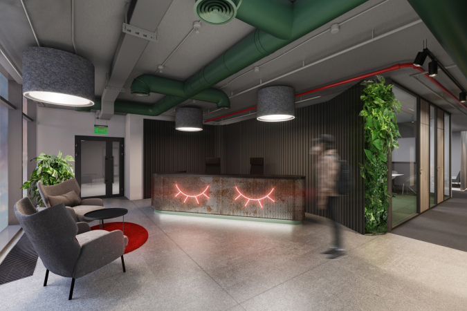
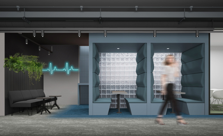
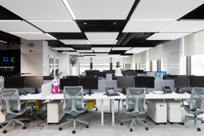
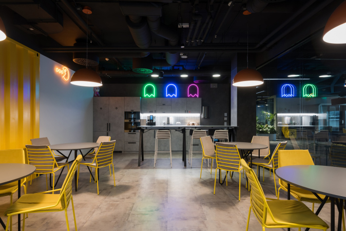
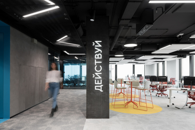
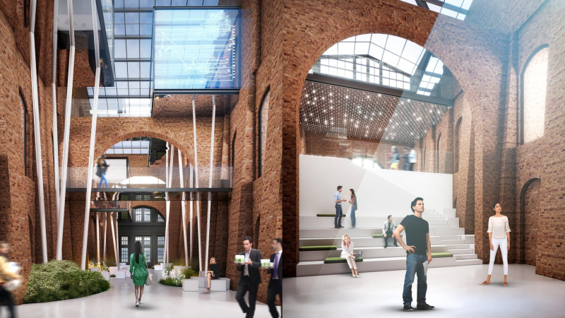
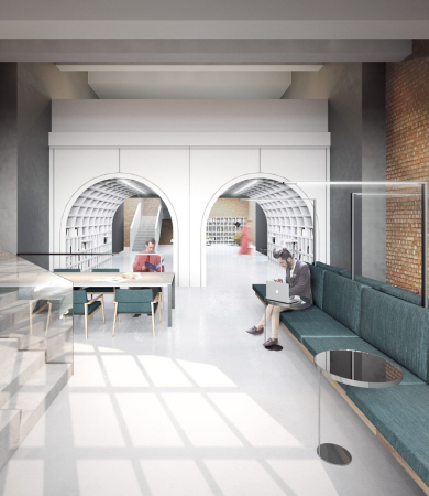
That task was interesting, on the one hand, because this was the office for a cutting-edge company that digitalizes everything you can think of. For example, before traveling to drill wells, the employees undergo training in VR rooms, where they work with digital twins of the complex equipment. On the other hand, due to the fact that the center in “New Holland” will open up sooner or later, a new division will come here, and this means that the office will be ready to get rebuilt. This is why, in addition to open spaces, designed for constant communication, we got a number of closed and clearly localized working areas that can be transformed into laboratories, studies, meeting rooms, and whatnot. As for the style, at first we wanted to do something in the vein of “Running on the Razor’s Edge” – some kind of cyberpunk, a techno drama with Chinese neon signs running the length of the corridor. And even in spite of the fact that eventually we softened the original design, we still ended up with a very emotional interior. For us, it was like an experiment of sorts: color coding of different chunks, and a crazy mix of different solutions in terms of materials and textures. The result looks “almost like CrosbyStudios”, as somebody commented on Instagram. At the same time, in some places we were able to create a really cozy environment, created with state-of-the-art technologies – “smart” light, “smart” climate, etc.
 
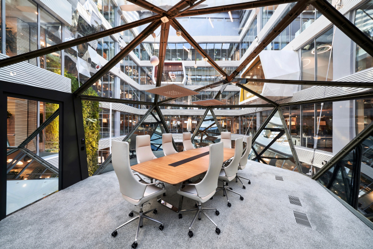
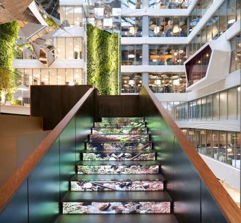
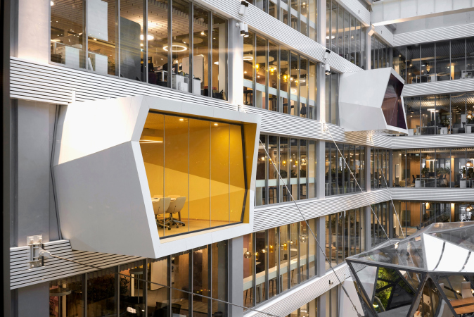
In addition to Gaspromneft, we have another “big fish” in our client portfolio – Sberbank. How did you make friends with EvolutionDesign, and what part of your project do you think brought you the victory in the competition for the HQ at Kutuzovsky Avenue? The famous hanging meeting room, perhaps?
 
For us, taking part in that competition was sheer luck. It was a miracle we found out at all where it was being conducted at that time. Then we got in touch with our Swiss colleagues, and we were like “you are handsome, we are awfully handsome, so why waste our time ©, you will need an adapting local company in any event”. It was them who came up with this meeting room, and Sberbank hopped on that wow-effect. And then we, together with the team of the client and the contractors, implemented the whole thing.

  • zooming
    1 / 7
    The interior of the Gazprom innovation center in “New Holland”. A competition project
    Copyright: © Т+Т Architects
  • zooming
    2 / 7
    The interior of the Gazprom innovation center in “New Holland”. A competition project
    Copyright: © Т+Т Architects
  • zooming
    3 / 7
    The interior of the Gazprom innovation center in “New Holland”. A competition project
    Copyright: © Т+Т Architects
  • zooming
    4 / 7
    The interior of the Gazprom innovation center in “New Holland”. A competition project
    Copyright: © Т+Т Architects
  • zooming
    5 / 7
    The interior of the Gazprom innovation center in “New Holland”. A competition project
    Copyright: © Т+Т Architects
  • zooming
    6 / 7
    The interior of the Gazprom innovation center in “New Holland”. A competition project
    Copyright: © Т+Т Architects
  • zooming
    7 / 7
    The interior of the Gazprom innovation center in “New Holland”. A competition project
    Copyright: © Т+Т Architects

 
What was ultimately your area of responsibility in this project?
 
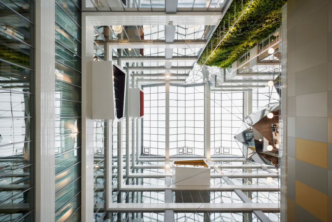
After the victory of EvolutionDesign was announced, it soon became clear that there was more to our task than just interior design. Concurrently, another company was doing the project of reconstructing the whole office-and-shopping complex on the Kutuzovsky Avenue (it used to be built by the project of Sergey Kiselev and Partners for MIRAX GROUP, and since 2016, it has belonged to PAO Sberbank, and is turning into “Sberbank City – editorial note). We always had to bother that company with questions: do you have this? Do you have that? When are you doing these things? And they eventually proposed that we design the entire volume – since we were so active and business-minded. Ultimately, we did the whole reconstruction project with all the ensuing consequences, such as expertise and working papers on various sections. At that moment it turned out that we were dealing with a unique project – because its basement part was more than 15 meters deep. Then all hell broke loose: scientific support of the construction, alternative calculations and, in general, the increased attention of the Expertise to us and our project. And as for the hanging meeting room, it was a battleground in itself! First, we hanged it on British-made wire ropes, then on French-made ones, but all the time something was missing – the Russian safety certificates, test protocols, etc. Ultimately, we found a Russian manufacturer that made wire ropes looking exactly like the French DETAN. A shouting thank you to SK “Struktura” because the results of the tests showed that their product was even stronger than the project required.

The interiors of Sberbank headquarters at Kutuzovsky Avenue, 32
Copyright: Photograph © Sergey Melnikov / provided by PAO Sberbank

 
It seems that in that project you broke a uniqueness record...
 
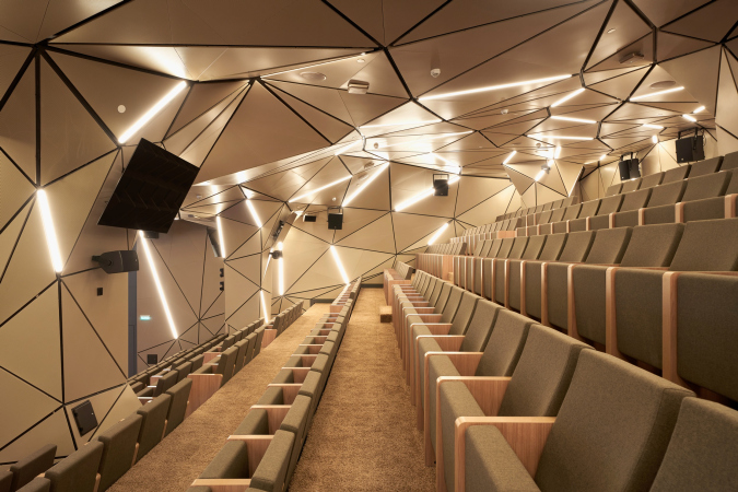
We sure did – because this place also has a unique conference hall added to it! In order to design that, we had to stop the whole atrium on the level of the second floor without using a single column. We had to come up with a very complex girder project with large-span constructions. And, most importantly, the hall had to meet the highest acoustic standards, compared to those that are expected from symphonic halls. Thus, we needed to marry this system of girders to the engineering and multimedia systems, and concert lighting and sound systems as well – it was an absolutely incredible mix of constructions! If you miss by 10 centimeters in your model, everyone is panicked and everyone is getting gray hairs: those who design metal structures, those who install sound and light, those who prepare cladding from 1380 (!) types of triangular acoustic panels that hide behind them all the utility lines. If just one component “slips”, everything else will follow suit. And it was such a challenge for every member of our team that when we assembled the model of this hall in its entirety in REVIT, and double-checked it for possible collisions, we literally burst into tears. At some point in time, our chief architect of the project realized that he was also the chief designer of the project.

  • zooming
    1 / 5
    The interiors of Sberbank headquarters at Kutuzovsky Avenue, 32
    Copyright: Photograph © Sergey Melnikov / provided by PAO Sberbank
  • zooming
    2 / 5
    The interiors of Sberbank headquarters at Kutuzovsky Avenue, 32
    Copyright: Photograph © Sergey Melnikov / provided by PAO Sberbank
  • zooming
    3 / 5
    The interiors of Sberbank headquarters at Kutuzovsky Avenue, 32
    Copyright: Photograph © Sergey Melnikov / provided by PAO Sberbank
  • zooming
    4 / 5
    The interiors of Sberbank headquarters at Kutuzovsky Avenue, 32
    Copyright: Photograph © Sergey Melnikov / provided by PAO Sberbank
  • zooming
    5 / 5
    The interiors of Sberbank headquarters at Kutuzovsky Avenue, 32
    Copyright: Photograph © Sergey Melnikov / provided by PAO Sberbank


And, although we are not the authors of the concept of the interiors or the facades, it was us who made this whole thing possible. We brought all of the solutions to one common denominator, made all the necessary elaboration, and issued the working documents, delving as deep as possible. Technically, it was a very complex and very interesting product. We realized that this was what the designer’s kick was all about – finding a solution to a problem that originally seems to be insurmountable.

And what about the Swiss? What are your impressions from working with them?
 
From the very start of the project, we had a good understanding, and they saw in us not just technical adapters, but full-fledged coauthors, in many respects trusted, and they tried not to slow us down in any way. And now this is how they write in all the applications for awards: “the Russian partner: T+T Architects”. And this is the main sign of success for us in collaborating with this international company.
 
We have an experience of working with the British, Italians, and Germans. As for the latter, for example, we are consulting a German company on the project of restoring the “Ambassador’s House” on the Povarskaya Street as a monument of architecture.
 
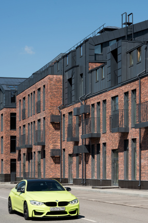
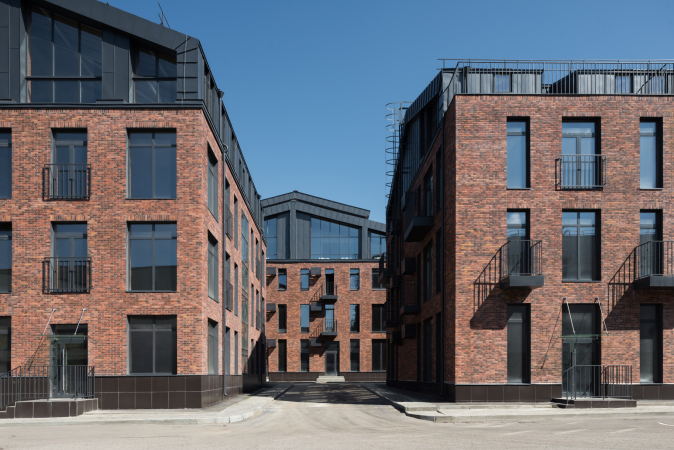
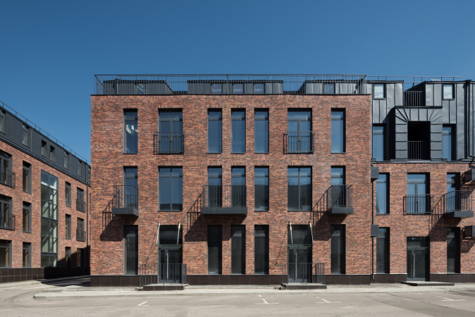
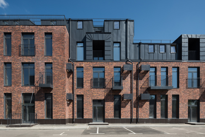
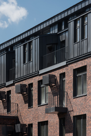
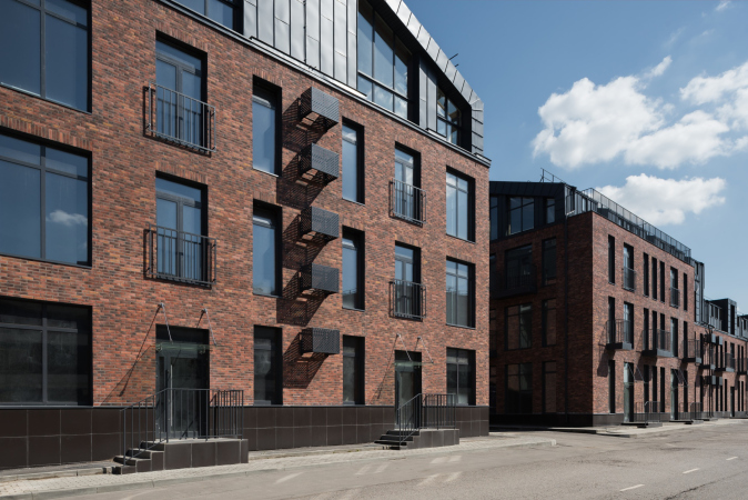
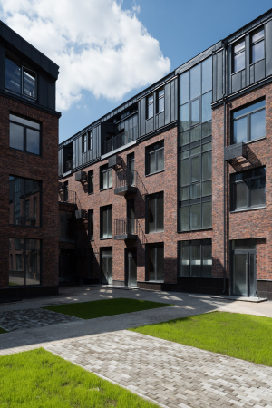
We have also released quite a number of projects of our own recently. We have finished the concepts of two high-end residential complexes and a housing project in Ekaterinburg, finished the decoration work in the public interiors in the Kutuzovsky XII housing complex for Capital Group, and a few office projects in Moscow and Saint Petersburg are neatly complete. We also finished the adaptation of the project of the winery, and we are supervising this project in the Crimea. We also completed the loft quarter Studio #12, which we started back in 2015 as a conceptual continuation of Studio #8. This format turned out to be very popular.

  • zooming
    1 / 8
    The interiors of Sberbank headquarters at Kutuzovsky Avenue, 32
    Copyright: Photograph © Sergey Melnikov / provided by PAO Sberbank
  • zooming
    2 / 8
    The interiors of Sberbank headquarters at Kutuzovsky Avenue, 32
    Copyright: Photograph © Sergey Melnikov / provided by PAO Sberbank
  • zooming
    3 / 8
    The interiors of Sberbank headquarters at Kutuzovsky Avenue, 32
    Copyright: Photograph © Sergey Melnikov / provided by PAO Sberbank
  • zooming
    4 / 8
    The interiors of Sberbank headquarters at Kutuzovsky Avenue, 32
    Copyright: Photograph © Sergey Melnikov / provided by PAO Sberbank
  • zooming
    5 / 8
    The interiors of Sberbank headquarters at Kutuzovsky Avenue, 32
    Copyright: Photograph © Sergey Melnikov / provided by PAO Sberbank
  • zooming
    6 / 8
    The interiors of Sberbank headquarters at Kutuzovsky Avenue, 32
    Copyright: Photograph © Sergey Melnikov / provided by PAO Sberbank
  • zooming
    7 / 8
    The interiors of Sberbank headquarters at Kutuzovsky Avenue, 32
    Copyright: Photograph © Sergey Melnikov / provided by PAO Sberbank
  • zooming
    8 / 8
    The interiors of Sberbank headquarters at Kutuzovsky Avenue, 32
    Copyright: Photograph © Sergey Melnikov / provided by PAO Sberbank

 
However, while on Sokol we had references to the artist village and its narrow streets, in Maryina Roshcha we had a more modernist narrative of a Star Town. The typology of the buildings changed, and the square footage grew bigger, with the houses becoming higher and deeper. More importantly, however, we were able to keep the idea of technical zoning and dividing the complex into a public and a residential part. There is a welcome public zone of this city block with low-rise construction, main planting, small architectural forms, and, of course, room for retail. The other zone is cozier; it is more private, and it is separated from the driveway. It also has less open spaces and plazas. There is a landscaped backyard, designed special for the residents. At the same time, the quarter is ridden with such passages, which just add up to an intricate pedestrian network, along which you can make your evening promenade.
 
I wonder if you will be able to create an atmosphere like in Studio #8. The reason I’m saying this is because the people in Maryina Roshcha are quite different...
 
Yes, a lot will depend upon the correct choice of residents. In the case of Studio #8, the developer made such a selection himself, and the fact that the project “hit the jackpot” as the infrastructure of the surrounding sleeping belt area is to a large extent to the development. If they keep up this approach, this project is sure to be a success. Currently, there are virtually no alternatives around the “Capitoliy” shopping mall, which has been accumulating the whole traffic in that area.
 
I remember you saying in one of our earlier interviews that the important thing was to find your niche and then develop it. And, at the same time, like in your case, this niche may evolve from public area development to commercial interiors and redevelopment. What niche would you like to occupy in the future?
 
Moscow has a program for the development of industrial zones – these are several territories marked in the master plan where production is preserved and it is planned to create technology parks and industrial clusters. We are currently working on one of such zones – #42. This zone contains a plant of measuring equipment that we need to preserve, car repair shops, garages, etc. The task is to unite them all into a full-fledged industrial cluster! And this is a new and unconventional typology – we are to arrange everything and create a comfortable environment for working and placing production facilities there, without adding in the housing function.
 
In addition, there are many artifacts situated here. For example, an old trolleybus depot with domed hangars is located nearby. There are also interesting samples of Soviet industrial architecture, which can be preserved and made into, if not iconic, then at least recognizable landmarks that will highlight the history of this area. Our vector of development has always been pointed in the direction of renovating industrial parks and architecture, and it remains this way, which is something that we are proud of. Come to think of it, over the last 10 years most Russian architectural companies have not had any “profitable” typology other than housing. Nobody took the industrial architecture seriously, but it has potential not just on a municipal but on a national scale. And I hope that this will become a large part of our work in the coming years.
  • zooming
    1 / 7
    Loft quarter Studio #12
    Copyright: Photograph © Ilia Ivanov
  • zooming
    2 / 7
    Loft quarter Studio #12
    Copyright: Photograph © Ilia Ivanov
  • zooming
    3 / 7
    Loft quarter Studio #12
    Copyright: Photograph © Ilia Ivanov
  • zooming
    4 / 7
    Loft quarter Studio #12
    Copyright: Photograph © Ilia Ivanov
  • zooming
    5 / 7
    Loft quarter Studio #12
    Copyright: Photograph © Ilia Ivanov
  • zooming
    6 / 7
    Loft quarter Studio #12
    Copyright: Photograph © Ilia Ivanov
  • zooming
    7 / 7
    Loft quarter Studio #12
    Copyright: Photograph © Ilia Ivanov


19 October 2020

Headlines now
The Golden Crown
The concept for a dental clinic in Yekaterinburg, developed by CNTR Studio, revolves around the idea of a “mouth full of gold”: pristine white porcelain stoneware walls are complemented by matte brass details. To avoid an overly literal interpretation, the architects focused on the building’s proportions, skillfully navigating between sunlight requirements and fire safety regulations.
Flexibility and Integration
Not long ago, we covered the project for the fourth phase of the ÁLIA residential complex, designed by APEX. Now, we’ve been shown different fence concepts they developed to enclose the complex’s private courtyards, incorporating a variety of public functions. We believe that the sheer fact that the complex’s architects were involved in such a detail as fencing speaks volumes.
A Step Forward
The HIDE residential complex represents a major milestone for ADM architects and their leaders Andrey Romanov and Ekaterina Kuznetsova in their quest for a fresh high-rise aesthetic – one that is flexible and layered, capable of bringing vibrancy to mass and silhouette while shaping form. Over recent years, this approach has become ADM’s “signature style”, with the golden HIDE tower playing a pivotal role in its evolution. Here, we delve into the project’s story, explore the details of the complex’s design, and uncover its core essence.
Gold in the Sands
A new office for a transcontinental company specializing in resource extraction and processing has opened in Dubai. Designed by T+T Architects, masters of creating spaces that are contemporary, diverse, flexible, and original, this project exemplifies their expertise. On the executive floor, a massive brass-clad partition dominates, while layered textures of compressed earth create a contextually resonant backdrop.
Layers and Levels of Flight
This project goes way back – Reserve Union won this architectural competition at the end of 2011, and the building was completed in 2018, so it’s practically “archival”. However, despite being relatively unknown, the building can hardly be considered “dated” and remains a prime example of architectural expression, particularly in the headquarters genre. And it’s especially fitting for an aviation company office. In some ways, it resembles the Aeroflot headquarters at Sheremetyevo but with its own unique identity, following the signature style of Vladimir Plotkin. In this article, we take an in-depth look at the United Aircraft Corporation (UAC) headquarters in the Moscow agglomeration town of Zhukovsky, supplemented by recent photographs from Alexey Naroditsky – a shoot that became only recently possible due to the fact that improvements were finally made in the surrounding area.
Light and Shadow
In this article, we delve into the architectural design of the “Chaika” house by DNK ag architects, which was recently completed in 2023 as part of the collection of signature designs at ZILArt. As is well-known, all the buildings in this complex follow a design code, yet each one is distinct. This particular building stands out not only for its whiteness and minimalism but also for the refined use of a limited number of techniques that, together, create what can confidently be called synergy.
Casus Novae
A master plan was developed for a large residential area with a name of “DNS City”, but now that its implementation began, the plan has been arbitrarily reformatted and replaced with something that, while similar on the surface, is actually quite different. This is not the first time such a thing happens, but it’s always frustrating. With permission from the author, we are sharing Maria Elkina’s post.
Treasure Hunting
The GAFA bureau, in collaboration with Tegola and Arkhitail, organized an expedition to the island of Kilpola in Karelia as part of Moskomarkhitektura’s “Open City” festival. There, amidst moss and rocks, the students sought answers to questions like: what is the sacred, where does it dwell, and what sustains it? Assisting the participants in this quest were landscape engineer Evgeny Levin, artist Nicholas Roerich, a moose, and the lack of cellular connection. Here’s how the story unfolded.
Depths of the Earth, Streams of Water
In the Malaya Okhta district, the Akzent building, designed by Stepan Liphart, was constructed. It follows a classic tripartite structure, yet it’s what you might call “hand-drawn”: each façade is unique in its form and details, some of which aren’t immediately noticeable. In this article, we explore the context and, together with the architect, delve into how the form was developed.
Fir Tree Dynamics
The “Airports of Region” holding is planning to build an airport in Karachay-Cherkessia, aiming to make the Arkhyz and Dombay resorts more accessible to travelers. The project that won in an invitation-only competition, submitted by Sergey Nikeshkin’s KPLN, blends natural imagery inspired by the shape of a conifer seed, open-air waiting spaces, majestic large trees, and a green roof elevated on needle-like columns. The result is both nature-inspired and WOW.
​A Brick Shell
In the process of designing a clubhouse situated among pine trees in a prestigious suburban area near Moscow, the architectural firm “A.Len” did the façade design part. The combination of different types of brick and masonry correlates with the volumetric and plastique solutions, further enhanced by the inclusion of wood-painted fragments and metal “glazing”.
Word Forms
ATRIUM architects love ambitious challenges, and for the firm’s thirtieth anniversary, they boldly play a game of words with an exhibition that dives deep into a self-created vocabulary. They immerse their projects – especially art installations – into this glossary, as if plunging into a current of their own. You feel as if you’re flowing through the veins of pure art, immersed in a universe of vertical cities, educational spaces – of which the architects are true masters – and the cultural codes of various locations. But what truly captivates is the bold statement that Vera Butko and Anton Nadtochy make, both through their work and this exhibition: architecture, above all, is art – the art of working with form and space.
Flexibility and Acuteness of Modernity
Luxurious, fluid, large “kokoshniks” and spiral barrel columns, as if made from colorful chewing gum: there seem to be no other mansion like this in Moscow, designed in the “Neo-Russian-Modern” style. And the “Teremok” on Malaya Kaluzhskaya, previously somewhat obscure, has “come alive with new colors” and gained visibility after its restoration for the office of the “architectural ecosystem” as the architects love to call themselves. It’s evident that Julius Borisov and the architects at UNK put their hearts into finding this new office and bringing it up to date. Let’s delve into the paradoxes of this mansion’s history and its plasticity. Spoiler: two versions of modernity meet here, both balancing on the razor’s edge of “what’s current”.
Yuri Vissarionov: “A modular house does not belong to the land”
It belongs to space, or to the air... It turns out that 3D printing is more effective when combined with a modular approach: the house is built in a workshop and then adapted to the site, including on uneven terrain. Yuri Vissarionov shares his latest experience in designing tourist complexes, both in central Russia and in the south. These include houseboats, homes printed from lightweight concrete using a 3D printer, and, of course, frame houses.
​Moscow’s First
“The quality of education largely depends on the quality of the educational environment”. This principle of the last decade has been realized by Sergey Skuratov in the project for the First Moscow Gymnasium on Rostovskaya Embankment in the Khamovniki district. The building seamlessly integrates into the complex urban landscape, responding both to the pedestrian flow of the city and the quiet alleyways. It skillfully takes advantage of the height differences and aligns with modern trends in educational space design. Let’s take a closer look.
Looking at the Water
The site of Villa Sonata stretches from the road to the water’s edge, offering its own shoreline, pier, and a picturesque river panorama. To reveal these sweeping views, Roman Leonidov “cut” the façade diagonally parallel to the river, thus getting two main axes for the house and, consequently, “two heads”. The internal core – two double-height spaces, a living room and a conservatory, with a “bridge” above them – makes the house both “transparent” and filled with light.
The White Wing
Well, it’s not exactly white. It’s more of a beige, white-stone structure that plays with the color of limestone – smoother surfaces are lighter, while rougher ones are darker. This wing unites various elements: it absorbs and interprets the surrounding themes. It responds to everything, yet maintains a cohesive expression – a challenging task! – while also incorporating recognizable features of its own, such as the dynamic cuts at the bottom, top, and middle.
Urban Dunes
The XSA Ramps team designed and built a three-part sports hub for a park in Rostov-on-Don, welcoming people of all ages and fitness levels. The skate plaza, pump track, and playground are all meticulously crafted with details that attract a diverse range of visitors. The technical execution of the shapes and slopes transforms this space into a kind of sculptural composition.
Proportional Growth
The project for the fourth phase of the ÁLIA residential area has been announced. The buildings are situated on an elongated plot – almost a “ray” that shoots out from the center of the area towards the river. Their layout reflects both a response to Moscow’s architectural preferences over the past 15 years, shifting “from blocks to towers”, and an interpretation of the neighboring business park designed by SOM. Additionally, the best apartments here are not located at the very top but closer to the middle, forming a glowing “waistline”.
The “Staircase” Building
In designing the “Details” residential complex in New Moscow, Rais Baishev spiced up the now-popular Moscow theme of a “courtyard” building with an idea drawn from the surrealist drawings by Maurits Escher. He envisioned the stepped silhouettes and descending slopes as a metaphysical mega-staircase, creating a key void within the courtyard that gave the project an internal “spine”. This concept is felt both in the building’s silhouette and on its façades.
Projection of the Quarter
No one doubted that the building that Vladimir Plotkin designed as part of the “Garden Quarters” would be the most modernist of all. And it turned out just that way: while adhering to the common design code, the building successfully combines brick and white stone, rhythmically responding to the neighboring building designed by Ostozhenka, yet tactfully and persistently making a few statements of its own. This includes the projection of the ideal urban development composition “14–9–6”, which can be found right next door, mathematical calculations, including those for various types of terraces (and perhaps the only reminder of the Soviet past of the Kauchuk rubber factory!), and the white “cross-stitch” pattern of the façade grid.
Domus Aurea
In this issue, we examine the “Tessinsky-1” house, designed by Sergey Skuratov and completed in 2023. Located in the middle of the Serebryanicheskaya Embankment district, at the intersection of its main streets, this house assumes a sort of “nodal” role: it not only responds to everything around it and preserves many memories of the former EMA factory within itself, but it weaves all this into a newly directed pattern, reconciling bright “gold” and dark-colored brick, largely with the help of the new, modern-yet-archaic Columba brick, which, come to think about it, is the most precious element here.
The Chimney of Nikola-Lenivets
In this issue, we are examining the “Obelisk House” designed by KATARSIS and built for the Arkhstoyanie 2023 festival. However, it was only finished later on, and this is why we are examining it now. It seems to us that after the “Obelisk House” appeared in Nikola-Lenivets, a dialogue and a few inner connections appeared between the temporary structures built here. These houses no longer look like “accidental neighbors”, more of which below.
​Periscope by the Bay
The jury awarded the second place in the competition for a public and cultural center in Petropavlovsk-Kamchatsky to the companies GORA (“Mountain”) and M4. In the consortium’s proposal, the building resembles a sperm whale with a calf swimming next to it or a periscope, whose lenses capture the most spectacular views from the surrounding landscape.
From Arcs to Dolmens
While working on the competition project for Petropavlovsk-Kamchatsky, ASADOV Architects prioritized the value of the natural and urban environment, aiming to preserve the balance of the location while minimizing the resemblance of the volume that they designed to a “traditional building”. The task was challenging, and the architects created three versions, one of which having been developed after the competition, where their main proposal took third place. However, the point of interest here is not the competition result but the continuity of creative thinking.
Hide and Seek
The ID Moskovskiy house, designed by Stepan Liphart in St. Petersburg, in the courtyards near Moskovskiy Avenue beyond the Obvodny Canal and recently completed, is notable for several reasons. Firstly, it has been realized with considerable accuracy, which is particularly significant as this is the first building where the architect was responsible not only for the facades but also for the layouts, allowing for better integration between the two. On the other hand, this building is interesting as an example of the “germination” of new architecture in the city: it draws on the best examples from the neighborhood and becomes an improved and developed sum of ideas found by the architect in the surrounding context.
The Big Twelve
Yesterday, the winners of the Moscow Mayor’s Architecture Award were announced and honored. Let’s take a look at what was awarded and, in some cases, even critique this esteemed award. After all, there is always room for improvement, right?
Above the Golden Horn
The residential complex “Philosophy” designed by T+T architects in Vladivostok, is one of the new projects in the “Golubinaya Pad” area, changing its development philosophy (pun intended) from single houses to a comprehensive approach. The buildings are organized along public streets, varying in height and format, with one house even executed in gallery typology, featuring a cantilever leaning on an art object.
Nuanced Alternative
How can you rhyme a square and space? Easily! But to do so, you need to rhyme everything you can possibly think of: weave everything together, like in a tensegrity structure, and find your own optics too. The new exhibition at GES-2 does just that, offering its visitor a new perspective on the history of art spanning 150 years, infused with the hope for endless multiplicity of worlds and art histories. Read on to see how this is achieved and how the exhibition design by Evgeny Ace contributes to it.
Blinds for Ice
An ice arena has been constructed in Domodedovo based on a project by Yuri Vissarionov Architects. To prevent the long façade, a technical requirement for winter sports facilities, from appearing monotonous, the architects proposed the use of suspended structures with multidirectional slats. This design protects the ice from direct sunlight while giving the wall texture and detail.