По-русски

​A Comfortable City in Itself

The project that we are about to cover is seemingly impossible amidst human anthills, chaotically interspersed with old semi-neglected dachas. Meanwhile, the housing complex built on the Comcity business part does offer a comfortable environment of decent city: not excessively high-rise and moderately private as a version of the perfect modern urbanist solution.

28 July 2020
Object
mainImg
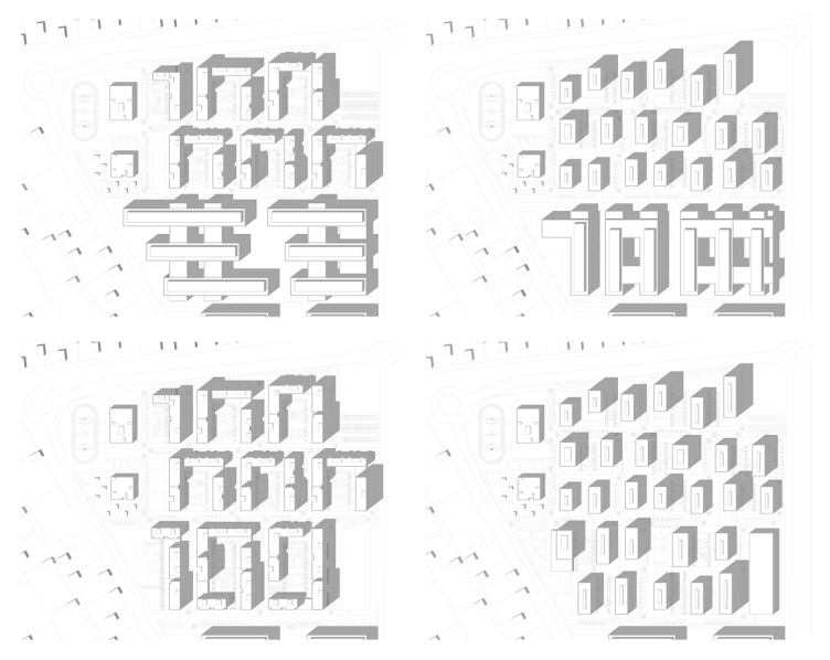
The land site of the housing complex “Homecity”, whose name is a derivative from the “mother name” of “Comcity”, is situated on the territory that belongs to the same owner as the business center, whose glass wings can be seen shortly after you drive out of Moscow down the Kiev Highway, on the right. Comcity here owns the territory that stretches in an elongated trapeze that widens as it distances the highway. If you inscribe it into a triangle in your mind’s eye, the sharp “nose” will be somewhere on the highway. In the narrow part of the site – the one that is closer to the highway – as early as in 2014, the first building of the Comcity business park was constructed, designed by the Czech architectural company Cigler Marani. Two years later, the owners of the complex turned to Sergey Kiselev and Partners with a request to inspect the territory for a possibility of adding a certain amount of housing function to the dominating office one, with a view of improving the site plan. Sergey Kiselev proposed a few options for developing the north side of the territory.

“HOMECITY” housing complex
Copyright: © Sergey Kiselev and partners


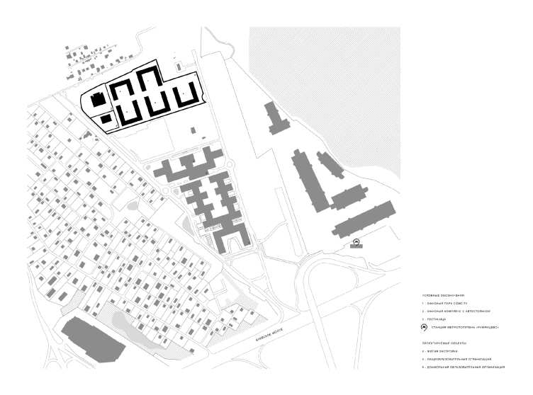
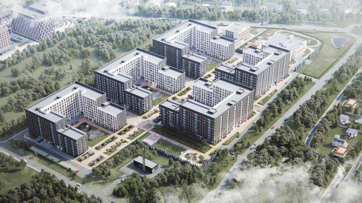
The site plan was changed, even if ever so slightly, the offices still prevalent. As a result, the territory is divided into 4 development stages: the first, Alpha, is an operating building; the second, Bravo, is also an office one, it is being designed directly behind Alpha by Sergey Kiselev and Partners, then goes “Charlie” site, also an office one, yet lacking a project now and for the time being used as a parking lot, and the line is completed by the one-of-a-kind “Delta” (aka “Homecity”) housing complex for about 2000 residents and 1513 apartments. It is expected that people working in the offices will be able to afford business class apartments here, and live in peace and quiet right next to their workplaces, which, as is popularly known, is one of the central ideas of the postindustrial city, in which functions are mixed, and distances are shortened.

“HOMECITY” housing complex. Location plan
Copyright: © Sergey Kiselev and partners


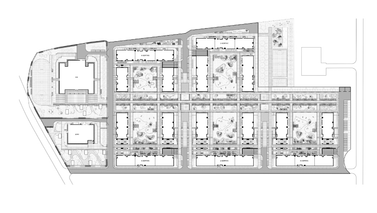
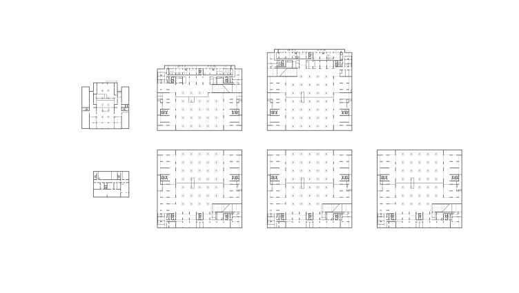
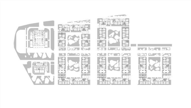
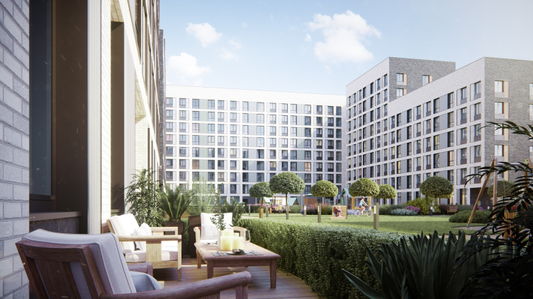
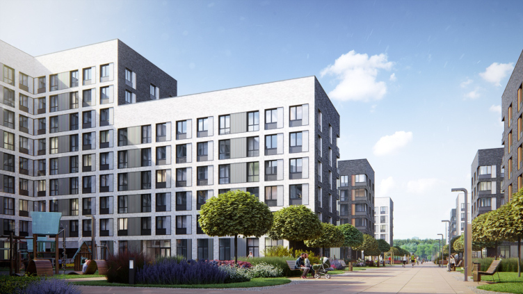
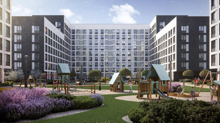
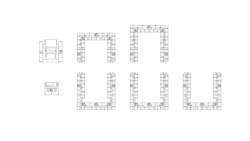
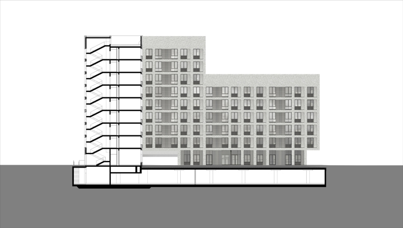
The housing complex consists of five U-shaped blocks, five sections in each, with a single-level underground parking garage underneath the entire construction blueprint and underneath the yard as well. The blocks are placed alongside a pedestrian promenade that serves as the axis of this territory, the yards of the blocks being open to one another and forming, together with the promenade, the public space of the complex. The height of the buildings descends in steps towards the promenade: 9 stories on the outside, 6 on the inside. It looks like the ideal that was announced in 2017 in the pilot projects of Moscow renovation, yet never was implemented.

“HOMECITY” housing complex
Copyright: © Sergey Kiselev and partners


More: in addition to the height restrictions having to do with the proximity of the Vnukovo Airport, the city development plan for land presupposed a comparatively small amount of housing square meters, and the developer did not want to violate the restrictions. Thus, the architects were facing the task of not exceeding the volume – which resulted in a multitude of arches in the bottom floors, making the space transparent on the pedestrian level. Such transparency is yet another signature technique of theirs, in the spirit of postindustrial urbanism, because it makes life easier, and enriches the facets of its perception. The arches are situated in places with poor insolation, unfit for making apartments in them.

“HOMECITY” housing complex. Master plan
Copyright: © Sergey Kiselev and partners


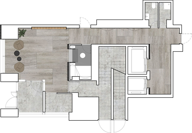
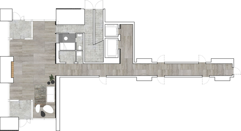
Also, in the first floors, and partially even on the underground level, the architects designed public and commercial facilities, which ensure the urban “multi-functionality” of the complex: cafes, shops, various services, a drugstore, a bank office, a fitness center, and so on. The list is rather long, but it may change as the complex develops. The height of the underground floors is 4.5 meters. To light the premises in the underground tier, the architects designed areaways, long and wide, running along the rear facades of buildings 1 and 2. The areaways are crossed by pedestrian bridges leading up to the first floor. This way, the technical solution not only makes the complex truly multifunctional but also ensures diversity of perception of this highly developed urban space that will be gradually forming here.

“HOMECITY” housing complex. Plan of the -1st floor. The areaways are seen on the plans of Buildings 1 and 2
Copyright: © Sergey Kiselev and partners


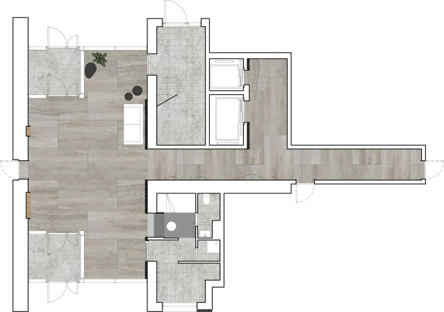
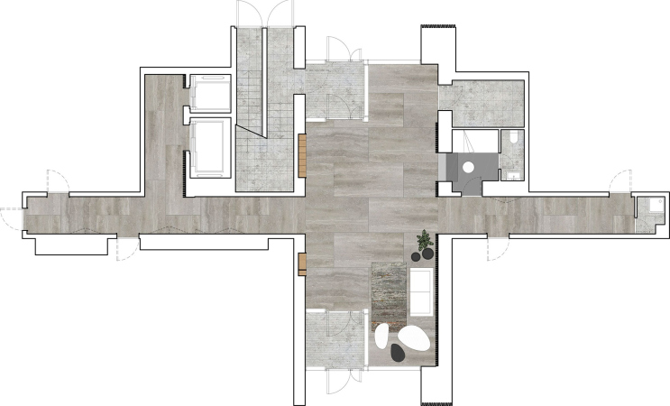
“HOMECITY” housing complex. Plan of the 1st floor
Copyright: © Sergey Kiselev and partners


This way, the number of apartments in the bottom floors is significantly smaller, but what apartments are there got cute little gardens and street entrances of their own – another popular modern technique that Sergey Kiselev and Partners already tested in the premium class award-winning “Literator” (“Man of Letters”) housing complex, situated in Moscow’s most prestigious area of Khamovniki. Sitting on the terrace, one will be able to watch their children play through a green hedge.

The volumes of the buildings look pretty similar, and are designed in a very laconic way: the regular grid of windows with differences marked by the color of the fiber cement slab inserts that make the piers look narrower, visually widening the windows. The recessions provided for air conditioning units are decorated by striped grates. No balconies are present here. On top, the facades get the “attic” strip that unobtrusively decorated the mechanical floor – its ledges are invisible from the ground.

“HOMECITY” housing complex
Copyright: © Sergey Kiselev and partners


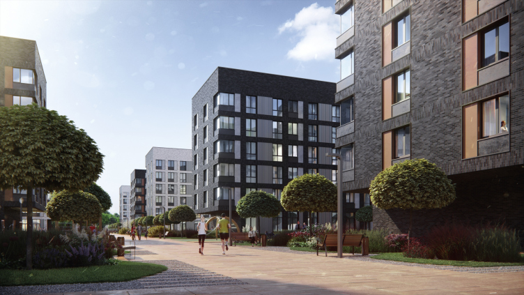
The outer facades – the ones that face outwards and the ones, with which the buildings face each other – are designed like dark “skin” from Klinker tiles, almost black, of a graphite hue with light scorch marks. The piers between the windows are not just made narrower – in most of the cases they have equal width and height, forming a smooth thin grid. The direction of their lines is highlighted by the tile pattern, vertical or horizontal, which turns the piers into a semblance of pleat work – Aleksey Medvedev likens this technique to half-timber technology because it helps to highlight the structure of the facade: the pattern manifests it in a very reserved way, like different knitting patterns in a monochrome sweater.

“HOMECITY” housing complex
Copyright: © Sergey Kiselev and partners


“HOMECITY” housing complex
Copyright: © Sergey Kiselev and partners


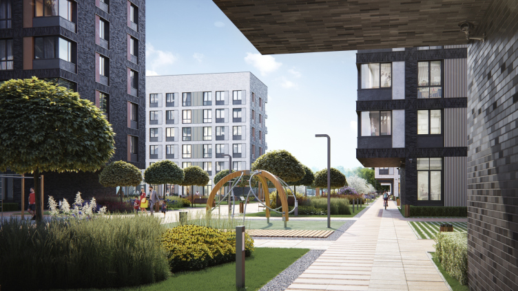
The houses face the promenade not only with their 6-story blocks but also with their cantilevered structures that hang above the roads forming canopies decorated with tiles, including from the downside.

“HOMECITY” housing complex
Copyright: © Sergey Kiselev and partners


The project of the housing complex, from the architectural concept to construction supervision, is done by Sergey Kiselev and Partners – this is sure how it is meant to be, but nowadays, regretfully, this is rarely the case, so let’s note the occasion.

The task of landscaping the inner promenade and the yards, at a joint solution by Sergey Kiselev and Partners and the developer, was done by a guest company MLA+, with which the architects has already collaborated, and now they again did a lot of joint work. This is yet another example of cooperation giving way to tough competition. An interesting fact: originally, the Dutch architects proposed a “changing of the seasons” concepts: shifting of impressions in different parts of the complex, but the client insisted on uniformity, the main theme ultimately being asymmetric spots, lush maple trees, and hosts of cereal plants. Using white pebbles on playgrounds was also the client’s idea.

“HOMECITY” housing complex
Copyright: © Sergey Kiselev and partners


The range of apartments is rather balanced and chiefly consists of single and two-room floor plans, the former accounting for more than a half, the latter for more than a third. However, there are also three and four-room apartments.

  • zooming
    1 / 13
    “HOMECITY” housing complex
    Copyright: © Sergey Kiselev and partners
  • zooming
    2 / 13
    “HOMECITY” housing complex
    Copyright: © Sergey Kiselev and partners
  • zooming
    3 / 13
    “HOMECITY” housing complex
    Copyright: © Sergey Kiselev and partners
  • zooming
    4 / 13
    “HOMECITY” housing complex
    Copyright: © Sergey Kiselev and partners
  • zooming
    5 / 13
    “HOMECITY” housing complex
    Copyright: © Sergey Kiselev and partners
  • zooming
    6 / 13
    “HOMECITY” housing complex
    Copyright: © Sergey Kiselev and partners
  • zooming
    7 / 13
    “HOMECITY” housing complex
    Copyright: © Sergey Kiselev and partners
  • zooming
    8 / 13
    “HOMECITY” housing complex
    Copyright: © Sergey Kiselev and partners
  • zooming
    9 / 13
    “HOMECITY” housing complex
    Copyright: © Sergey Kiselev and partners
  • zooming
    10 / 13
    “HOMECITY” housing complex
    Copyright: © Sergey Kiselev and partners
  • zooming
    11 / 13
    “HOMECITY” housing complex
    Copyright: © Sergey Kiselev and partners
  • zooming
    12 / 13
    “HOMECITY” housing complex
    Copyright: © Sergey Kiselev and partners
  • zooming
    13 / 13
    “HOMECITY” housing complex
    Copyright: © Sergey Kiselev and partners


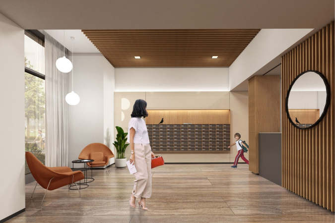
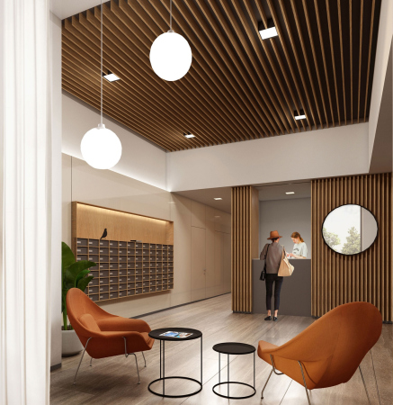
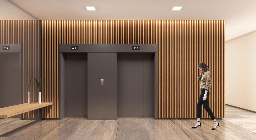
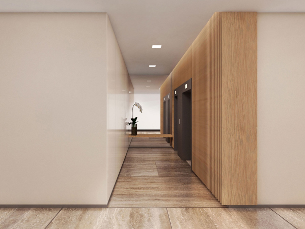
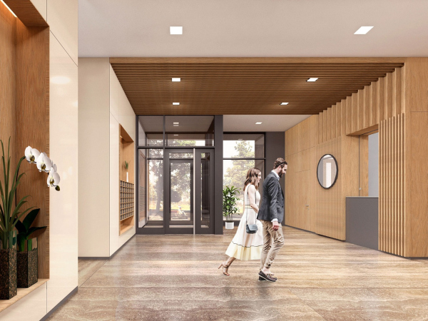
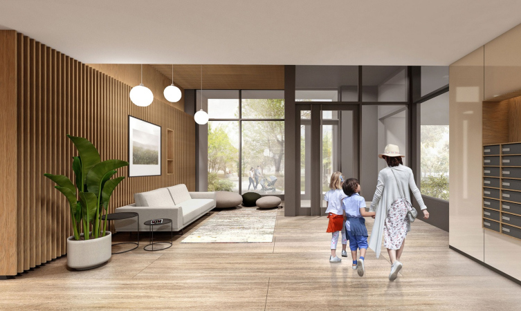
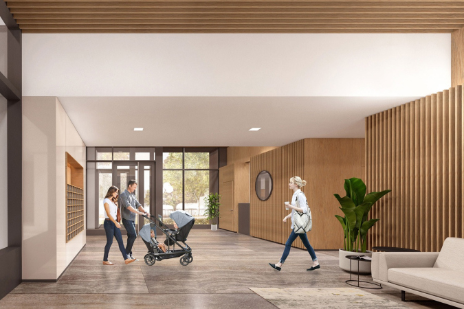
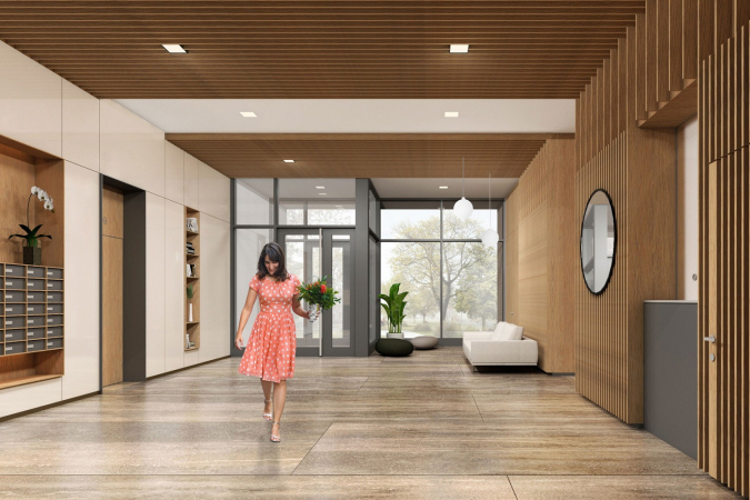
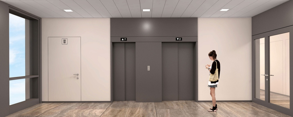
One of the main advantages of the complex is high-quality decoration of public spaces, laconic and dominated by vertical “grates” of light-colored wood.

  • zooming
    1 / 3
    “HOMECITY” housing complex
    Copyright: © Sergey Kiselev and partners
  • zooming
    2 / 3
    “HOMECITY” housing complex
    Copyright: © Sergey Kiselev and partners
  • zooming
    3 / 3
    “HOMECITY” housing complex
    Copyright: © Sergey Kiselev and partners


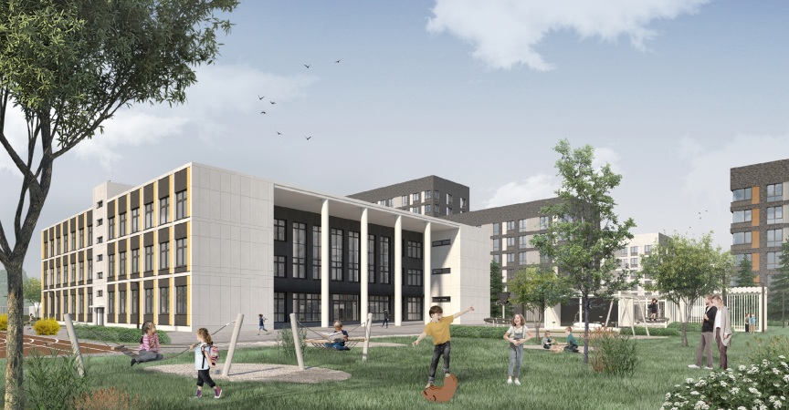
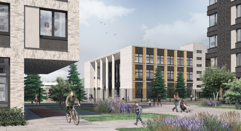
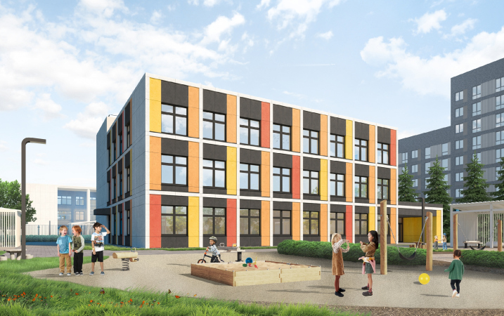
A junior school for 350 students and a kindergarten for 150 children are situated at the west end of the territory; these will be publicly funded, and the architects had to get a lot of approvals from the Department of Education, tightly packing all of the solutions within the state regulations and a rather constrained area. This is why the building plans are rectangular and not circular or sprawling, like with the most advanced schools of today. Meanwhile, the architects were able to squeeze all the necessary functions into the school building, the school library on the top floor being lit by a skylight.

The facades of the school building, just as the facades of the kindergarten, combine fiber cement of a light, almost white, hue and inserts the color of ochre for the school and three warm hues – red, yellow, and orange – for the kindergarten. These highlights echo the inserts on the facades of the residential buildings.

The school – a “temple of knowledge”, however small in this case – is marked by a recessed balcony with a portico of four slender columns, white against the black backdrop of the inner wall. The lightweight portico with a thin bridge above instead of an attic is reminiscent of Le Corbusier experiments, and about the seventies with their laconically minimalist attitude towards classical motifs.

  • zooming
    1 / 4
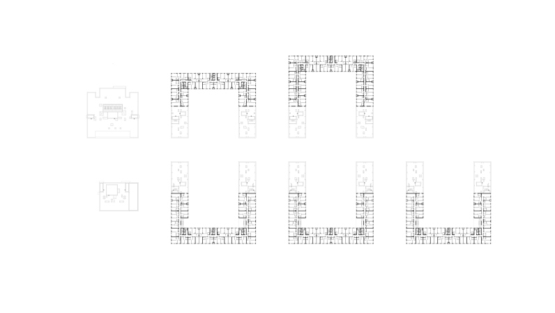
    “HOMECITY” housing complex. Plan of the 2nd floor
    Copyright: © Sergey Kiselev and partners
  • zooming
    2 / 4
    “HOMECITY” housing complex. Plan of the 9th floor
    Copyright: © Sergey Kiselev and partners
  • zooming
    3 / 4
    “HOMECITY” housing complex Section view
    Copyright: © Sergey Kiselev and partners
  • zooming
    4 / 4
    “HOMECITY” housing complex Section view
    Copyright: © Sergey Kiselev and partners


The place is 1.5 kilometers away from the Moscow Ring Road, but it is just a 10 or 15 minutes’ walk away from the recently opened Rumyantsevo metro station. The surrounding scenery is more than diverse: 17-story houses in the distance, and a village of the “dacha” type on the other side with stone fences; there is the Govorovsky Forest on the other side, which is a continuation of the Troparevsky Park beyond the Moscow border – one will be easily able to go for a walk in the forest because it steps up right to the eastern border of the complex. From the south side, as we remember, office buildings are situated. In spite of its diversity, the surrounding scenery is pretty balanced: a forest, a business park, and a dacha settlement. The highway is about 900 meters away, and here it is a lot quieter than, for example, on some Moscow’s busy thoroughfare. Homecity stands here like in the eye of the storm – a quiet haven that faces its own internal promenade, an element of the regular and comfortable city, which was formed here due to circumstances, and by the grace of the developers and the architects – in a comparatively unexpected place, at the beginning of the Kiev Highway.

28 July 2020

Headlines now
The Golden Crown
The concept for a dental clinic in Yekaterinburg, developed by CNTR Studio, revolves around the idea of a “mouth full of gold”: pristine white porcelain stoneware walls are complemented by matte brass details. To avoid an overly literal interpretation, the architects focused on the building’s proportions, skillfully navigating between sunlight requirements and fire safety regulations.
Flexibility and Integration
Not long ago, we covered the project for the fourth phase of the ÁLIA residential complex, designed by APEX. Now, we’ve been shown different fence concepts they developed to enclose the complex’s private courtyards, incorporating a variety of public functions. We believe that the sheer fact that the complex’s architects were involved in such a detail as fencing speaks volumes.
A Step Forward
The HIDE residential complex represents a major milestone for ADM architects and their leaders Andrey Romanov and Ekaterina Kuznetsova in their quest for a fresh high-rise aesthetic – one that is flexible and layered, capable of bringing vibrancy to mass and silhouette while shaping form. Over recent years, this approach has become ADM’s “signature style”, with the golden HIDE tower playing a pivotal role in its evolution. Here, we delve into the project’s story, explore the details of the complex’s design, and uncover its core essence.
Gold in the Sands
A new office for a transcontinental company specializing in resource extraction and processing has opened in Dubai. Designed by T+T Architects, masters of creating spaces that are contemporary, diverse, flexible, and original, this project exemplifies their expertise. On the executive floor, a massive brass-clad partition dominates, while layered textures of compressed earth create a contextually resonant backdrop.
Layers and Levels of Flight
This project goes way back – Reserve Union won this architectural competition at the end of 2011, and the building was completed in 2018, so it’s practically “archival”. However, despite being relatively unknown, the building can hardly be considered “dated” and remains a prime example of architectural expression, particularly in the headquarters genre. And it’s especially fitting for an aviation company office. In some ways, it resembles the Aeroflot headquarters at Sheremetyevo but with its own unique identity, following the signature style of Vladimir Plotkin. In this article, we take an in-depth look at the United Aircraft Corporation (UAC) headquarters in the Moscow agglomeration town of Zhukovsky, supplemented by recent photographs from Alexey Naroditsky – a shoot that became only recently possible due to the fact that improvements were finally made in the surrounding area.
Light and Shadow
In this article, we delve into the architectural design of the “Chaika” house by DNK ag architects, which was recently completed in 2023 as part of the collection of signature designs at ZILArt. As is well-known, all the buildings in this complex follow a design code, yet each one is distinct. This particular building stands out not only for its whiteness and minimalism but also for the refined use of a limited number of techniques that, together, create what can confidently be called synergy.
Casus Novae
A master plan was developed for a large residential area with a name of “DNS City”, but now that its implementation began, the plan has been arbitrarily reformatted and replaced with something that, while similar on the surface, is actually quite different. This is not the first time such a thing happens, but it’s always frustrating. With permission from the author, we are sharing Maria Elkina’s post.
Treasure Hunting
The GAFA bureau, in collaboration with Tegola and Arkhitail, organized an expedition to the island of Kilpola in Karelia as part of Moskomarkhitektura’s “Open City” festival. There, amidst moss and rocks, the students sought answers to questions like: what is the sacred, where does it dwell, and what sustains it? Assisting the participants in this quest were landscape engineer Evgeny Levin, artist Nicholas Roerich, a moose, and the lack of cellular connection. Here’s how the story unfolded.
Depths of the Earth, Streams of Water
In the Malaya Okhta district, the Akzent building, designed by Stepan Liphart, was constructed. It follows a classic tripartite structure, yet it’s what you might call “hand-drawn”: each façade is unique in its form and details, some of which aren’t immediately noticeable. In this article, we explore the context and, together with the architect, delve into how the form was developed.
Fir Tree Dynamics
The “Airports of Region” holding is planning to build an airport in Karachay-Cherkessia, aiming to make the Arkhyz and Dombay resorts more accessible to travelers. The project that won in an invitation-only competition, submitted by Sergey Nikeshkin’s KPLN, blends natural imagery inspired by the shape of a conifer seed, open-air waiting spaces, majestic large trees, and a green roof elevated on needle-like columns. The result is both nature-inspired and WOW.
​A Brick Shell
In the process of designing a clubhouse situated among pine trees in a prestigious suburban area near Moscow, the architectural firm “A.Len” did the façade design part. The combination of different types of brick and masonry correlates with the volumetric and plastique solutions, further enhanced by the inclusion of wood-painted fragments and metal “glazing”.
Word Forms
ATRIUM architects love ambitious challenges, and for the firm’s thirtieth anniversary, they boldly play a game of words with an exhibition that dives deep into a self-created vocabulary. They immerse their projects – especially art installations – into this glossary, as if plunging into a current of their own. You feel as if you’re flowing through the veins of pure art, immersed in a universe of vertical cities, educational spaces – of which the architects are true masters – and the cultural codes of various locations. But what truly captivates is the bold statement that Vera Butko and Anton Nadtochy make, both through their work and this exhibition: architecture, above all, is art – the art of working with form and space.
Flexibility and Acuteness of Modernity
Luxurious, fluid, large “kokoshniks” and spiral barrel columns, as if made from colorful chewing gum: there seem to be no other mansion like this in Moscow, designed in the “Neo-Russian-Modern” style. And the “Teremok” on Malaya Kaluzhskaya, previously somewhat obscure, has “come alive with new colors” and gained visibility after its restoration for the office of the “architectural ecosystem” as the architects love to call themselves. It’s evident that Julius Borisov and the architects at UNK put their hearts into finding this new office and bringing it up to date. Let’s delve into the paradoxes of this mansion’s history and its plasticity. Spoiler: two versions of modernity meet here, both balancing on the razor’s edge of “what’s current”.
Yuri Vissarionov: “A modular house does not belong to the land”
It belongs to space, or to the air... It turns out that 3D printing is more effective when combined with a modular approach: the house is built in a workshop and then adapted to the site, including on uneven terrain. Yuri Vissarionov shares his latest experience in designing tourist complexes, both in central Russia and in the south. These include houseboats, homes printed from lightweight concrete using a 3D printer, and, of course, frame houses.
​Moscow’s First
“The quality of education largely depends on the quality of the educational environment”. This principle of the last decade has been realized by Sergey Skuratov in the project for the First Moscow Gymnasium on Rostovskaya Embankment in the Khamovniki district. The building seamlessly integrates into the complex urban landscape, responding both to the pedestrian flow of the city and the quiet alleyways. It skillfully takes advantage of the height differences and aligns with modern trends in educational space design. Let’s take a closer look.
Looking at the Water
The site of Villa Sonata stretches from the road to the water’s edge, offering its own shoreline, pier, and a picturesque river panorama. To reveal these sweeping views, Roman Leonidov “cut” the façade diagonally parallel to the river, thus getting two main axes for the house and, consequently, “two heads”. The internal core – two double-height spaces, a living room and a conservatory, with a “bridge” above them – makes the house both “transparent” and filled with light.
The White Wing
Well, it’s not exactly white. It’s more of a beige, white-stone structure that plays with the color of limestone – smoother surfaces are lighter, while rougher ones are darker. This wing unites various elements: it absorbs and interprets the surrounding themes. It responds to everything, yet maintains a cohesive expression – a challenging task! – while also incorporating recognizable features of its own, such as the dynamic cuts at the bottom, top, and middle.
Urban Dunes
The XSA Ramps team designed and built a three-part sports hub for a park in Rostov-on-Don, welcoming people of all ages and fitness levels. The skate plaza, pump track, and playground are all meticulously crafted with details that attract a diverse range of visitors. The technical execution of the shapes and slopes transforms this space into a kind of sculptural composition.
Proportional Growth
The project for the fourth phase of the ÁLIA residential area has been announced. The buildings are situated on an elongated plot – almost a “ray” that shoots out from the center of the area towards the river. Their layout reflects both a response to Moscow’s architectural preferences over the past 15 years, shifting “from blocks to towers”, and an interpretation of the neighboring business park designed by SOM. Additionally, the best apartments here are not located at the very top but closer to the middle, forming a glowing “waistline”.
The “Staircase” Building
In designing the “Details” residential complex in New Moscow, Rais Baishev spiced up the now-popular Moscow theme of a “courtyard” building with an idea drawn from the surrealist drawings by Maurits Escher. He envisioned the stepped silhouettes and descending slopes as a metaphysical mega-staircase, creating a key void within the courtyard that gave the project an internal “spine”. This concept is felt both in the building’s silhouette and on its façades.
Projection of the Quarter
No one doubted that the building that Vladimir Plotkin designed as part of the “Garden Quarters” would be the most modernist of all. And it turned out just that way: while adhering to the common design code, the building successfully combines brick and white stone, rhythmically responding to the neighboring building designed by Ostozhenka, yet tactfully and persistently making a few statements of its own. This includes the projection of the ideal urban development composition “14–9–6”, which can be found right next door, mathematical calculations, including those for various types of terraces (and perhaps the only reminder of the Soviet past of the Kauchuk rubber factory!), and the white “cross-stitch” pattern of the façade grid.
Domus Aurea
In this issue, we examine the “Tessinsky-1” house, designed by Sergey Skuratov and completed in 2023. Located in the middle of the Serebryanicheskaya Embankment district, at the intersection of its main streets, this house assumes a sort of “nodal” role: it not only responds to everything around it and preserves many memories of the former EMA factory within itself, but it weaves all this into a newly directed pattern, reconciling bright “gold” and dark-colored brick, largely with the help of the new, modern-yet-archaic Columba brick, which, come to think about it, is the most precious element here.
The Chimney of Nikola-Lenivets
In this issue, we are examining the “Obelisk House” designed by KATARSIS and built for the Arkhstoyanie 2023 festival. However, it was only finished later on, and this is why we are examining it now. It seems to us that after the “Obelisk House” appeared in Nikola-Lenivets, a dialogue and a few inner connections appeared between the temporary structures built here. These houses no longer look like “accidental neighbors”, more of which below.
​Periscope by the Bay
The jury awarded the second place in the competition for a public and cultural center in Petropavlovsk-Kamchatsky to the companies GORA (“Mountain”) and M4. In the consortium’s proposal, the building resembles a sperm whale with a calf swimming next to it or a periscope, whose lenses capture the most spectacular views from the surrounding landscape.
From Arcs to Dolmens
While working on the competition project for Petropavlovsk-Kamchatsky, ASADOV Architects prioritized the value of the natural and urban environment, aiming to preserve the balance of the location while minimizing the resemblance of the volume that they designed to a “traditional building”. The task was challenging, and the architects created three versions, one of which having been developed after the competition, where their main proposal took third place. However, the point of interest here is not the competition result but the continuity of creative thinking.
Hide and Seek
The ID Moskovskiy house, designed by Stepan Liphart in St. Petersburg, in the courtyards near Moskovskiy Avenue beyond the Obvodny Canal and recently completed, is notable for several reasons. Firstly, it has been realized with considerable accuracy, which is particularly significant as this is the first building where the architect was responsible not only for the facades but also for the layouts, allowing for better integration between the two. On the other hand, this building is interesting as an example of the “germination” of new architecture in the city: it draws on the best examples from the neighborhood and becomes an improved and developed sum of ideas found by the architect in the surrounding context.
The Big Twelve
Yesterday, the winners of the Moscow Mayor’s Architecture Award were announced and honored. Let’s take a look at what was awarded and, in some cases, even critique this esteemed award. After all, there is always room for improvement, right?
Above the Golden Horn
The residential complex “Philosophy” designed by T+T architects in Vladivostok, is one of the new projects in the “Golubinaya Pad” area, changing its development philosophy (pun intended) from single houses to a comprehensive approach. The buildings are organized along public streets, varying in height and format, with one house even executed in gallery typology, featuring a cantilever leaning on an art object.
Nuanced Alternative
How can you rhyme a square and space? Easily! But to do so, you need to rhyme everything you can possibly think of: weave everything together, like in a tensegrity structure, and find your own optics too. The new exhibition at GES-2 does just that, offering its visitor a new perspective on the history of art spanning 150 years, infused with the hope for endless multiplicity of worlds and art histories. Read on to see how this is achieved and how the exhibition design by Evgeny Ace contributes to it.
Blinds for Ice
An ice arena has been constructed in Domodedovo based on a project by Yuri Vissarionov Architects. To prevent the long façade, a technical requirement for winter sports facilities, from appearing monotonous, the architects proposed the use of suspended structures with multidirectional slats. This design protects the ice from direct sunlight while giving the wall texture and detail.