По-русски

​Waves of Sound

The conceptual design of a music school: proximity to an Alvar Aalto building, expressive organics, and an attempt to draw public attention to a “low-profile” competition.

23 April 2020
Object
mainImg
In January of this year, the city administration of Vyborg conducted a competition for the conceptual design of a music school with a concert hall for 500 people, located at Keppa Street 4, directly across from the famous library built by an Alvar Aalto project. The competition was an open one, yet it got very little press coverage, ultimately racking up only five competitors. By sheer coincidence – a friend sent them a link to the competition – their list included A-Len. According to Sergey Oreshkin, “the competition passed in such a closed-door atmosphere that one had a hard time figuring out why it was organized in the first place.” The victory was won by the project, whose authors “were able to express their idea in the most cost-efficient way”.

To evoke more interest to the location that deserves public hearings and an international competition, A-Len decided to show its proposal.

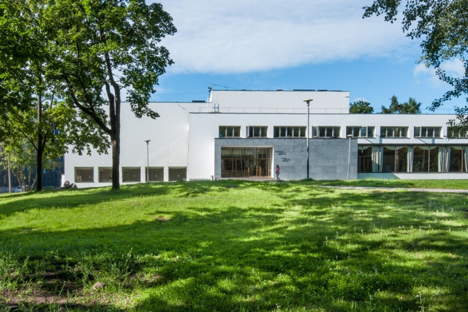
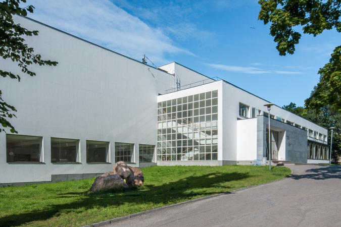
In addition to the obvious reasons why A-Len decided to take part in the competition – the center of the city boasting a status of a historical heritage site, proximity to the work of the legendary architect, and a rare typology – there was still another one: the leader of the company, Sergey Oreshkin, was born here in Vyborg, and here he graduated from the local art school, where he was “supercharged as a young pre-architect”. He describes Vyborg as a place with unique town planning, “just like from textbook”, which manifests itself particularly vividly next to the location in question.

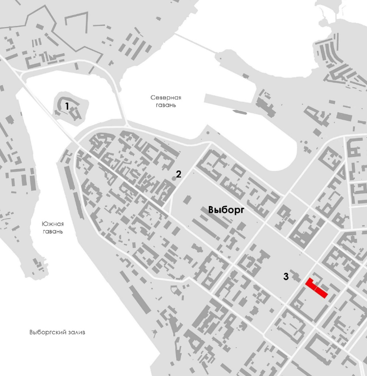
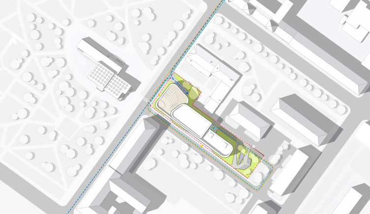
Location plan. The music school with a concert hall in Vyborg
Copyright: © A-Len Architectural Bureau


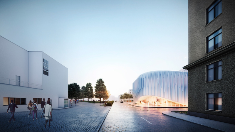
The Lenina Avenue, one of the main arteries of the city, links the Rynochnaya and the Paradnaya Squares; one side of the avenue is presented by dense “Saint Petersburg” construction, while the other side consists of several parks, including the “esplanade” park where the library is located. Across from the library, at the corner of the Suvorovsky Avenue and the Kepp Street, in the residential block with a few Stalin buildings, the school will be built. It will be added to the “recreational” strip along the Lenina Avenue, and it will further strengthen the front of the Suvorova Avenue, filling the lacuna.

  • zooming
    1 / 3
    The music school with a concert hall in Vyborg
    Copyright: © A-Len Architectural Bureau
  • zooming
    2 / 3
    The music school with a concert hall in Vyborg
    Copyright: © A-Len Architectural Bureau
  • zooming
    3 / 3
    The music school with a concert hall in Vyborg
    Copyright: © A-Len Architectural Bureau


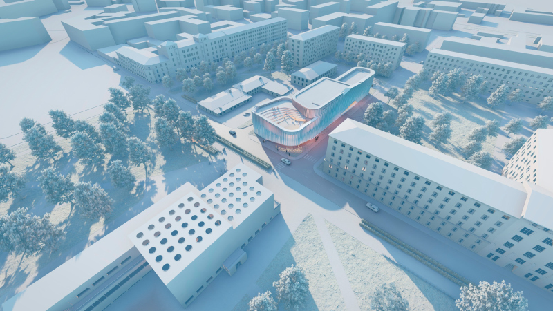
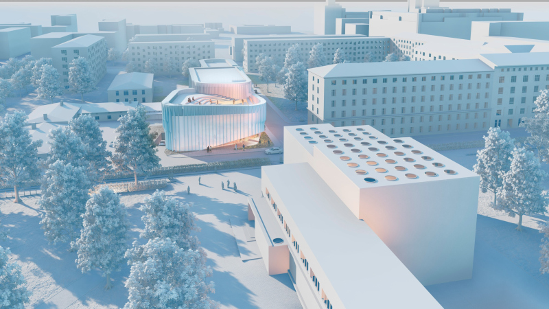
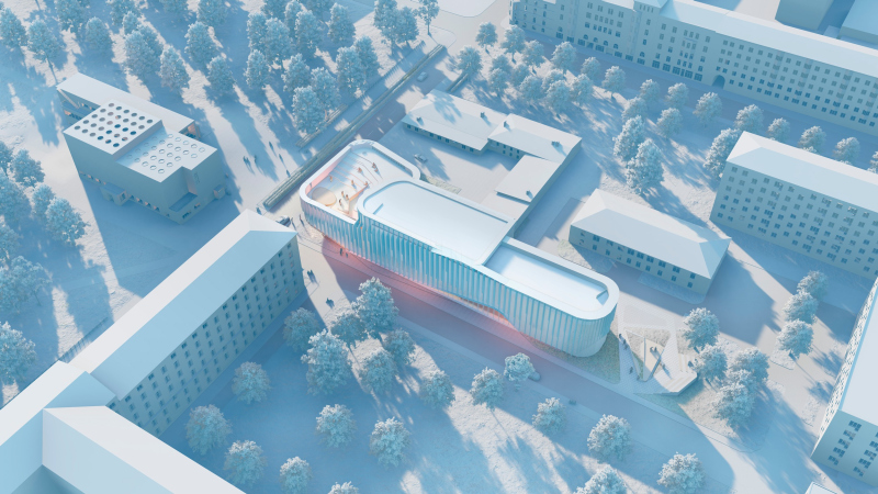
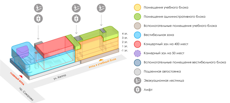
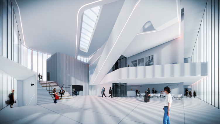
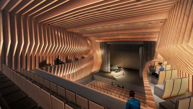
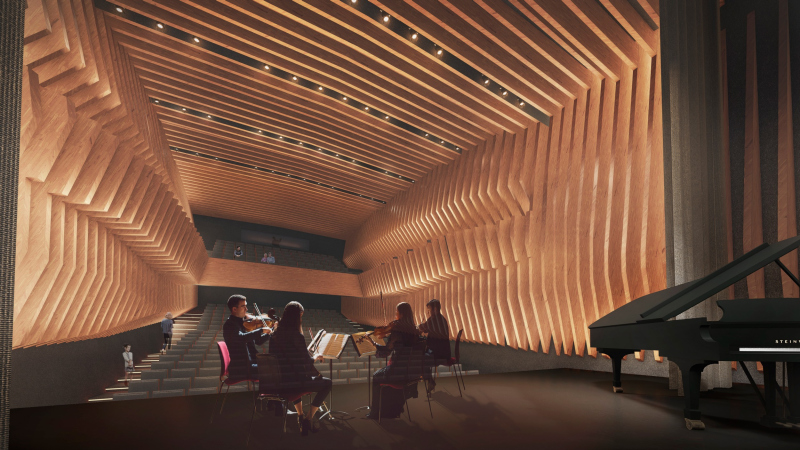
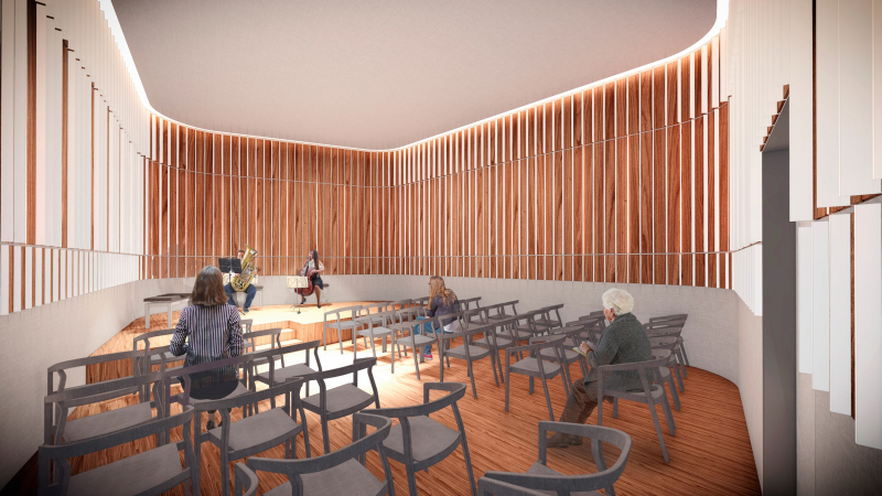
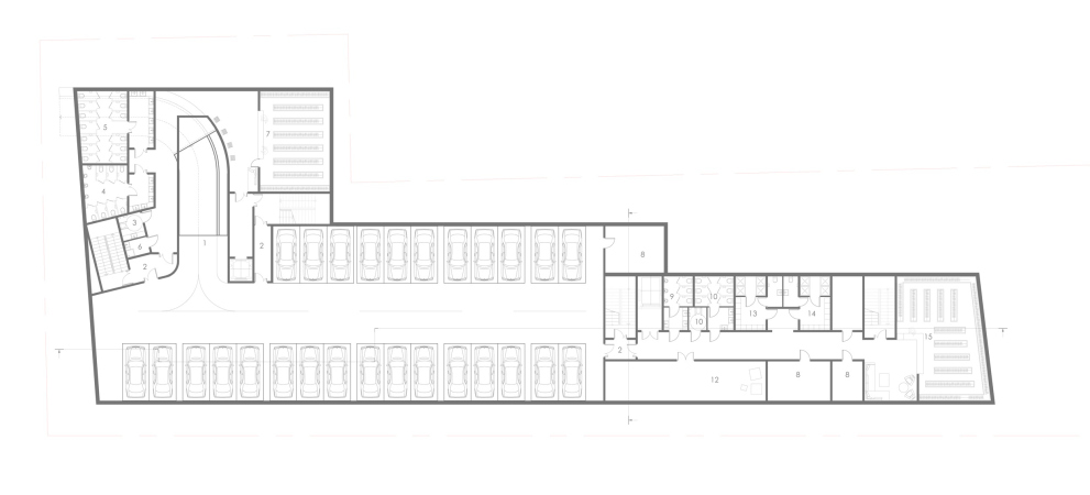
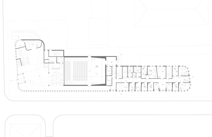
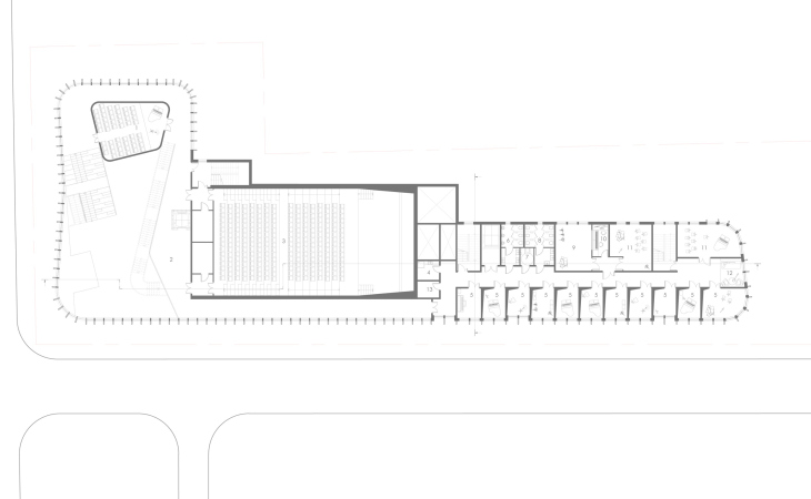
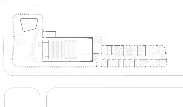
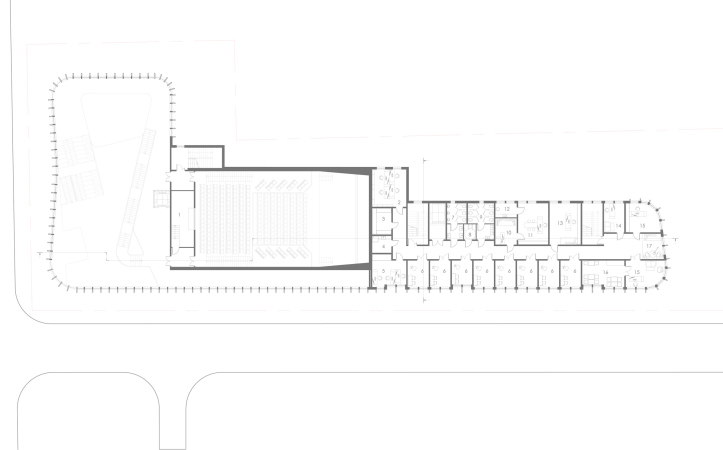
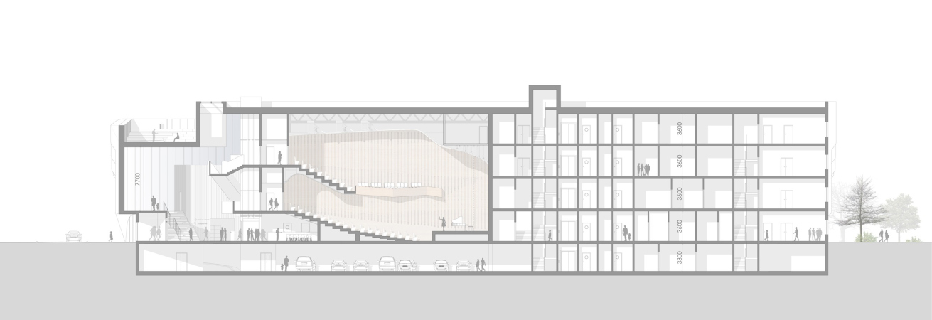
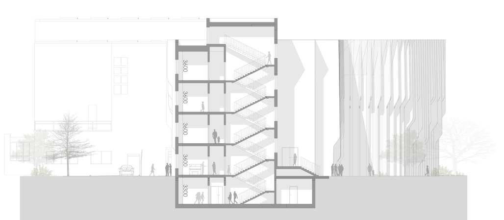
The members of the competition were to decide how to construct, on a comparatively small land site, a building that is filled with functions, and do that without compromising the processes that will go on inside of it. In the A-Len concept, the school consists of a few blocks of different height. The academic block accounts for almost half of the total volume, has an individual entrance, and is placed in the part that is the farthest from the Suvorovsky Avenue: this way, the classroom windows will overlook quiet green little yards. In the center, there is a concert hall, and the closest to the Aalto library is a lobby with a sophisticated system of tiers and staircases.

The music school with a concert hall in Vyborg
Copyright: © A-Len Architectural Bureau


The music school with a concert hall in Vyborg
Copyright: © A-Len Architectural Bureau


The arrangement of spaces is governed by the functional logic: the streams of children and the adults coming to the concerts are separated; the loading of the stage props takes place behind the scenes. The lobby space is adjusted to host micro events – in some of its corners, it will be possible to organize exhibitions, readings, or film runs. There are also two amphitheaters for open air sessions: one on the roof, and one on the little place that like an echo continues the building in the depth of the city block.

The music school with a concert hall in Vyborg
Copyright: © A-Len Architectural Bureau


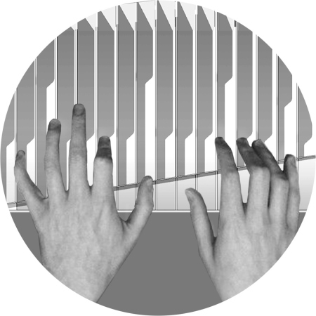
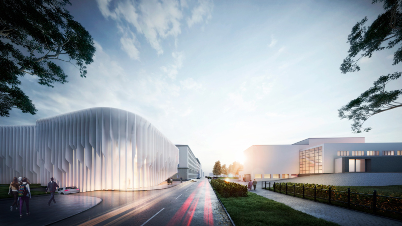
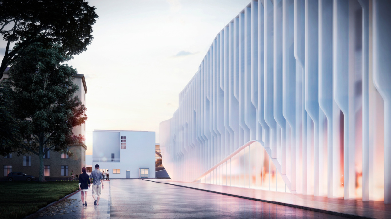
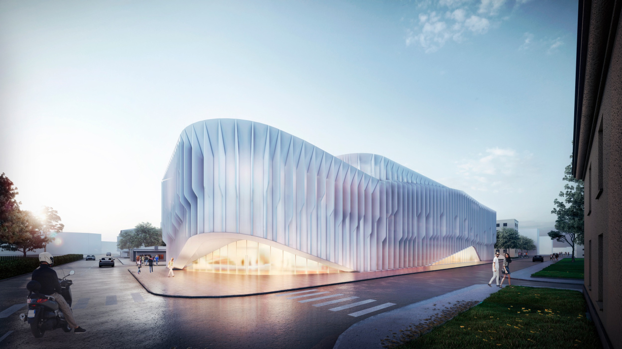
The architects deliberately opposed the expressive “shell” of the new building to the ascetic Aalto library. Sergey Oreshkin shares that the image was suggested by the building’s function: the lamellae of different width are meant to symbolize the piano keyboard. The stylistic device turned out to be as simple as capacious.

  • zooming
    1 / 5
    Concept. Project of the art school in Vyborg.
    Copyright: © A-Len Architectural Bureau
  • zooming
    2 / 5
    The concept. The music school with a concert hall in Vyborg
    Copyright: © A-Len Architectural Bureau
  • zooming
    3 / 5
    The concept. The music school with a concert hall in Vyborg
    Copyright: © A-Len Architectural Bureau
  • zooming
    4 / 5
    The concept. The music school with a concert hall in Vyborg
    Copyright: © A-Len Architectural Bureau
  • zooming
    5 / 5
    The concept. The music school with a concert hall in Vyborg
    Copyright: © A-Len Architectural Bureau


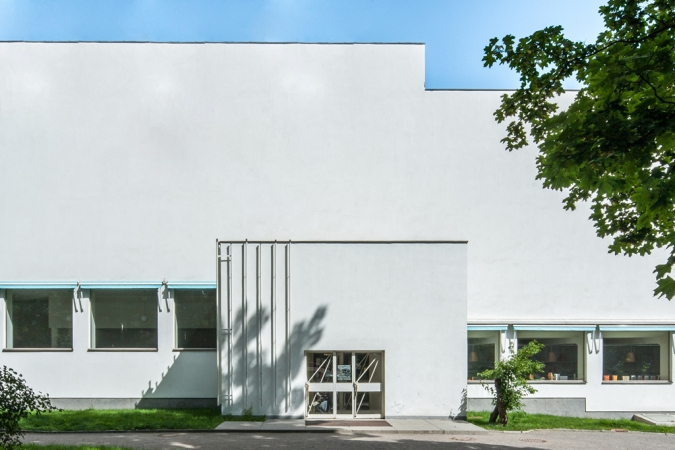
The 3D renders, in which the library and the school, separated by the road, are “looking” at each other, make one thinking that, should the new building be executed in the appropriate manner, the dialogue between the Aalto masterpiece and the music school would indeed be possible. In the A-Len project concept, the school makes a “female” pair to the minimalist building of the library, accentuating the beauty of the work by the Finnish architect by showing it in a new and different light.

  • zooming
    1 / 5
    Alvaro Aalto library in Vyborg
    Copyright: © A-Len Architectural Bureau
  • zooming
    2 / 5
    Alvaro Aalto library in Vyborg
    Copyright: © Denis Esakov
  • zooming
    3 / 5
    Alvaro Aalto library in Vyborg
    Copyright: © Denis Esakov
  • zooming
    4 / 5
    Alvaro Aalto library in Vyborg
    Copyright: © Denis Esakov
  • zooming
    5 / 5
    Alvaro Aalto library in Vyborg
    Copyright: © Denis Esakov


The “femininity” of the school building is also felt at the material level: the lamellas look like the folds of a dress, or ruffle, or a veil – and on the subtler subliminal level: the curves and the backlighting make one feel the warmth and the vibrations of life. “Femininity” is probably one of the most vivid signs of organic architecture, and on this specific project the “organic architecture” that this architectural company loves to make but cannot fully explore, for example, in the housing projects that it designs, finally sounds in full effect.

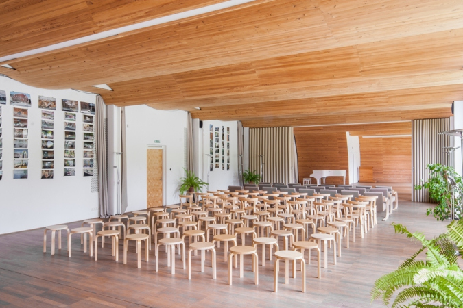
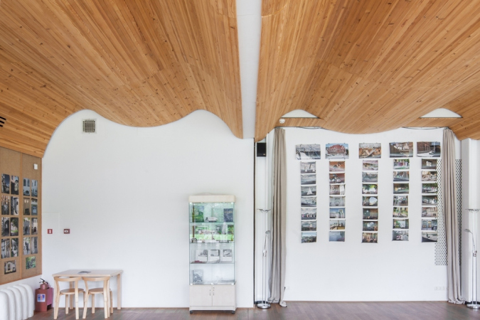
The two buildings are not only opposed to each other but also have a connection between them. In his works, Alvar Aalto oftentimes course combined organic architecture and functionalism; in addition, the architect’s surname translates as nothing less than “wave”, the most famous part of the Vyborg library is the wave-shaped ceiling. From this standpoint, the school can be viewed as the “insides” of the library presented to the observer. And if we are to continue the discourse about the paired relationship between the two buildings, then the wave-shaped facade of the school and the “corrugated pattern” superimposed upon it look like a seashell, while the library is the pearl, perfect in its purity.

  • zooming
    1 / 4
    The music school with a concert hall in Vyborg
    Copyright: © A-Len Architectural Bureau
  • zooming
    2 / 4
    The music school with a concert hall in Vyborg
    Copyright: © A-Len Architectural Bureau
  • zooming
    3 / 4
    The music school with a concert hall in Vyborg
    Copyright: © A-Len Architectural Bureau
  • zooming
    4 / 4
    The music school with a concert hall in Vyborg
    Copyright: © A-Len Architectural Bureau


Another important strong point of this project is that it is easily implementable. According to Sergey Oreshkin, the lamellae are essentially an inexpensive and aesthetically appealing material. The architects are proposing to make them from milky glass and install backlighting that will create an “aurora borealis” effect like the iridescent pearls that will change depending on the weather, ambient light, or concert program. Light is also a wave.

  • zooming
    1 / 3
    The music school with a concert hall in Vyborg
    Copyright: © A-Len Architectural Bureau
  • zooming
    2 / 3
    The music school with a concert hall in Vyborg
    Copyright: © A-Len Architectural Bureau
  • zooming
    3 / 3
    The music school with a concert hall in Vyborg
    Copyright: © A-Len Architectural Bureau


The 500-seat concert hall obliged to think about its technical contexts as well. According to Sergey Oreshkin, if you want such hall to host a variety of events, you need a full-fledged stage box: with housing machinery and turntables, orchestra stalls, dressing rooms, etc. The company has a formidable experience in designing concert halls, to name but the project of the Alla Pugacheva Song Theater, for which A-Len collaborated with the acoustic experts of the Mariinsky Theater.

  • zooming
    1 / 7
    The music school with a concert hall in Vyborg
    Copyright: © A-Len Architectural Bureau
  • zooming
    2 / 7
    The music school with a concert hall in Vyborg
    Copyright: © A-Len Architectural Bureau
  • zooming
    3 / 7
    The music school with a concert hall in Vyborg
    Copyright: © A-Len Architectural Bureau
  • zooming
    4 / 7
    The music school with a concert hall in Vyborg
    Copyright: © A-Len Architectural Bureau
  • zooming
    5 / 7
    The music school with a concert hall in Vyborg
    Copyright: © A-Len Architectural Bureau
  • zooming
    6 / 7
    The music school with a concert hall in Vyborg
    Copyright: © A-Len Architectural Bureau
  • zooming
    7 / 7
    The music school with a concert hall in Vyborg
    Copyright: © A-Len Architectural Bureau


Also, the architect believes that the building also needs an underground parking garage – if there is a full house, there can be too many cars for such a quiet city area – as well as a cafe to cater for the visitors of the library.

Sergey Oreshkin calls on to organize an open international competition, the first stage of which would be public hearings.

23 April 2020

Headlines now
The Golden Crown
The concept for a dental clinic in Yekaterinburg, developed by CNTR Studio, revolves around the idea of a “mouth full of gold”: pristine white porcelain stoneware walls are complemented by matte brass details. To avoid an overly literal interpretation, the architects focused on the building’s proportions, skillfully navigating between sunlight requirements and fire safety regulations.
Flexibility and Integration
Not long ago, we covered the project for the fourth phase of the ÁLIA residential complex, designed by APEX. Now, we’ve been shown different fence concepts they developed to enclose the complex’s private courtyards, incorporating a variety of public functions. We believe that the sheer fact that the complex’s architects were involved in such a detail as fencing speaks volumes.
A Step Forward
The HIDE residential complex represents a major milestone for ADM architects and their leaders Andrey Romanov and Ekaterina Kuznetsova in their quest for a fresh high-rise aesthetic – one that is flexible and layered, capable of bringing vibrancy to mass and silhouette while shaping form. Over recent years, this approach has become ADM’s “signature style”, with the golden HIDE tower playing a pivotal role in its evolution. Here, we delve into the project’s story, explore the details of the complex’s design, and uncover its core essence.
Gold in the Sands
A new office for a transcontinental company specializing in resource extraction and processing has opened in Dubai. Designed by T+T Architects, masters of creating spaces that are contemporary, diverse, flexible, and original, this project exemplifies their expertise. On the executive floor, a massive brass-clad partition dominates, while layered textures of compressed earth create a contextually resonant backdrop.
Layers and Levels of Flight
This project goes way back – Reserve Union won this architectural competition at the end of 2011, and the building was completed in 2018, so it’s practically “archival”. However, despite being relatively unknown, the building can hardly be considered “dated” and remains a prime example of architectural expression, particularly in the headquarters genre. And it’s especially fitting for an aviation company office. In some ways, it resembles the Aeroflot headquarters at Sheremetyevo but with its own unique identity, following the signature style of Vladimir Plotkin. In this article, we take an in-depth look at the United Aircraft Corporation (UAC) headquarters in the Moscow agglomeration town of Zhukovsky, supplemented by recent photographs from Alexey Naroditsky – a shoot that became only recently possible due to the fact that improvements were finally made in the surrounding area.
Light and Shadow
In this article, we delve into the architectural design of the “Chaika” house by DNK ag architects, which was recently completed in 2023 as part of the collection of signature designs at ZILArt. As is well-known, all the buildings in this complex follow a design code, yet each one is distinct. This particular building stands out not only for its whiteness and minimalism but also for the refined use of a limited number of techniques that, together, create what can confidently be called synergy.
Casus Novae
A master plan was developed for a large residential area with a name of “DNS City”, but now that its implementation began, the plan has been arbitrarily reformatted and replaced with something that, while similar on the surface, is actually quite different. This is not the first time such a thing happens, but it’s always frustrating. With permission from the author, we are sharing Maria Elkina’s post.
Treasure Hunting
The GAFA bureau, in collaboration with Tegola and Arkhitail, organized an expedition to the island of Kilpola in Karelia as part of Moskomarkhitektura’s “Open City” festival. There, amidst moss and rocks, the students sought answers to questions like: what is the sacred, where does it dwell, and what sustains it? Assisting the participants in this quest were landscape engineer Evgeny Levin, artist Nicholas Roerich, a moose, and the lack of cellular connection. Here’s how the story unfolded.
Depths of the Earth, Streams of Water
In the Malaya Okhta district, the Akzent building, designed by Stepan Liphart, was constructed. It follows a classic tripartite structure, yet it’s what you might call “hand-drawn”: each façade is unique in its form and details, some of which aren’t immediately noticeable. In this article, we explore the context and, together with the architect, delve into how the form was developed.
Fir Tree Dynamics
The “Airports of Region” holding is planning to build an airport in Karachay-Cherkessia, aiming to make the Arkhyz and Dombay resorts more accessible to travelers. The project that won in an invitation-only competition, submitted by Sergey Nikeshkin’s KPLN, blends natural imagery inspired by the shape of a conifer seed, open-air waiting spaces, majestic large trees, and a green roof elevated on needle-like columns. The result is both nature-inspired and WOW.
​A Brick Shell
In the process of designing a clubhouse situated among pine trees in a prestigious suburban area near Moscow, the architectural firm “A.Len” did the façade design part. The combination of different types of brick and masonry correlates with the volumetric and plastique solutions, further enhanced by the inclusion of wood-painted fragments and metal “glazing”.
Word Forms
ATRIUM architects love ambitious challenges, and for the firm’s thirtieth anniversary, they boldly play a game of words with an exhibition that dives deep into a self-created vocabulary. They immerse their projects – especially art installations – into this glossary, as if plunging into a current of their own. You feel as if you’re flowing through the veins of pure art, immersed in a universe of vertical cities, educational spaces – of which the architects are true masters – and the cultural codes of various locations. But what truly captivates is the bold statement that Vera Butko and Anton Nadtochy make, both through their work and this exhibition: architecture, above all, is art – the art of working with form and space.
Flexibility and Acuteness of Modernity
Luxurious, fluid, large “kokoshniks” and spiral barrel columns, as if made from colorful chewing gum: there seem to be no other mansion like this in Moscow, designed in the “Neo-Russian-Modern” style. And the “Teremok” on Malaya Kaluzhskaya, previously somewhat obscure, has “come alive with new colors” and gained visibility after its restoration for the office of the “architectural ecosystem” as the architects love to call themselves. It’s evident that Julius Borisov and the architects at UNK put their hearts into finding this new office and bringing it up to date. Let’s delve into the paradoxes of this mansion’s history and its plasticity. Spoiler: two versions of modernity meet here, both balancing on the razor’s edge of “what’s current”.
Yuri Vissarionov: “A modular house does not belong to the land”
It belongs to space, or to the air... It turns out that 3D printing is more effective when combined with a modular approach: the house is built in a workshop and then adapted to the site, including on uneven terrain. Yuri Vissarionov shares his latest experience in designing tourist complexes, both in central Russia and in the south. These include houseboats, homes printed from lightweight concrete using a 3D printer, and, of course, frame houses.
​Moscow’s First
“The quality of education largely depends on the quality of the educational environment”. This principle of the last decade has been realized by Sergey Skuratov in the project for the First Moscow Gymnasium on Rostovskaya Embankment in the Khamovniki district. The building seamlessly integrates into the complex urban landscape, responding both to the pedestrian flow of the city and the quiet alleyways. It skillfully takes advantage of the height differences and aligns with modern trends in educational space design. Let’s take a closer look.
Looking at the Water
The site of Villa Sonata stretches from the road to the water’s edge, offering its own shoreline, pier, and a picturesque river panorama. To reveal these sweeping views, Roman Leonidov “cut” the façade diagonally parallel to the river, thus getting two main axes for the house and, consequently, “two heads”. The internal core – two double-height spaces, a living room and a conservatory, with a “bridge” above them – makes the house both “transparent” and filled with light.
The White Wing
Well, it’s not exactly white. It’s more of a beige, white-stone structure that plays with the color of limestone – smoother surfaces are lighter, while rougher ones are darker. This wing unites various elements: it absorbs and interprets the surrounding themes. It responds to everything, yet maintains a cohesive expression – a challenging task! – while also incorporating recognizable features of its own, such as the dynamic cuts at the bottom, top, and middle.
Urban Dunes
The XSA Ramps team designed and built a three-part sports hub for a park in Rostov-on-Don, welcoming people of all ages and fitness levels. The skate plaza, pump track, and playground are all meticulously crafted with details that attract a diverse range of visitors. The technical execution of the shapes and slopes transforms this space into a kind of sculptural composition.
Proportional Growth
The project for the fourth phase of the ÁLIA residential area has been announced. The buildings are situated on an elongated plot – almost a “ray” that shoots out from the center of the area towards the river. Their layout reflects both a response to Moscow’s architectural preferences over the past 15 years, shifting “from blocks to towers”, and an interpretation of the neighboring business park designed by SOM. Additionally, the best apartments here are not located at the very top but closer to the middle, forming a glowing “waistline”.
The “Staircase” Building
In designing the “Details” residential complex in New Moscow, Rais Baishev spiced up the now-popular Moscow theme of a “courtyard” building with an idea drawn from the surrealist drawings by Maurits Escher. He envisioned the stepped silhouettes and descending slopes as a metaphysical mega-staircase, creating a key void within the courtyard that gave the project an internal “spine”. This concept is felt both in the building’s silhouette and on its façades.
Projection of the Quarter
No one doubted that the building that Vladimir Plotkin designed as part of the “Garden Quarters” would be the most modernist of all. And it turned out just that way: while adhering to the common design code, the building successfully combines brick and white stone, rhythmically responding to the neighboring building designed by Ostozhenka, yet tactfully and persistently making a few statements of its own. This includes the projection of the ideal urban development composition “14–9–6”, which can be found right next door, mathematical calculations, including those for various types of terraces (and perhaps the only reminder of the Soviet past of the Kauchuk rubber factory!), and the white “cross-stitch” pattern of the façade grid.
Domus Aurea
In this issue, we examine the “Tessinsky-1” house, designed by Sergey Skuratov and completed in 2023. Located in the middle of the Serebryanicheskaya Embankment district, at the intersection of its main streets, this house assumes a sort of “nodal” role: it not only responds to everything around it and preserves many memories of the former EMA factory within itself, but it weaves all this into a newly directed pattern, reconciling bright “gold” and dark-colored brick, largely with the help of the new, modern-yet-archaic Columba brick, which, come to think about it, is the most precious element here.
The Chimney of Nikola-Lenivets
In this issue, we are examining the “Obelisk House” designed by KATARSIS and built for the Arkhstoyanie 2023 festival. However, it was only finished later on, and this is why we are examining it now. It seems to us that after the “Obelisk House” appeared in Nikola-Lenivets, a dialogue and a few inner connections appeared between the temporary structures built here. These houses no longer look like “accidental neighbors”, more of which below.
​Periscope by the Bay
The jury awarded the second place in the competition for a public and cultural center in Petropavlovsk-Kamchatsky to the companies GORA (“Mountain”) and M4. In the consortium’s proposal, the building resembles a sperm whale with a calf swimming next to it or a periscope, whose lenses capture the most spectacular views from the surrounding landscape.
From Arcs to Dolmens
While working on the competition project for Petropavlovsk-Kamchatsky, ASADOV Architects prioritized the value of the natural and urban environment, aiming to preserve the balance of the location while minimizing the resemblance of the volume that they designed to a “traditional building”. The task was challenging, and the architects created three versions, one of which having been developed after the competition, where their main proposal took third place. However, the point of interest here is not the competition result but the continuity of creative thinking.
Hide and Seek
The ID Moskovskiy house, designed by Stepan Liphart in St. Petersburg, in the courtyards near Moskovskiy Avenue beyond the Obvodny Canal and recently completed, is notable for several reasons. Firstly, it has been realized with considerable accuracy, which is particularly significant as this is the first building where the architect was responsible not only for the facades but also for the layouts, allowing for better integration between the two. On the other hand, this building is interesting as an example of the “germination” of new architecture in the city: it draws on the best examples from the neighborhood and becomes an improved and developed sum of ideas found by the architect in the surrounding context.
The Big Twelve
Yesterday, the winners of the Moscow Mayor’s Architecture Award were announced and honored. Let’s take a look at what was awarded and, in some cases, even critique this esteemed award. After all, there is always room for improvement, right?
Above the Golden Horn
The residential complex “Philosophy” designed by T+T architects in Vladivostok, is one of the new projects in the “Golubinaya Pad” area, changing its development philosophy (pun intended) from single houses to a comprehensive approach. The buildings are organized along public streets, varying in height and format, with one house even executed in gallery typology, featuring a cantilever leaning on an art object.
Nuanced Alternative
How can you rhyme a square and space? Easily! But to do so, you need to rhyme everything you can possibly think of: weave everything together, like in a tensegrity structure, and find your own optics too. The new exhibition at GES-2 does just that, offering its visitor a new perspective on the history of art spanning 150 years, infused with the hope for endless multiplicity of worlds and art histories. Read on to see how this is achieved and how the exhibition design by Evgeny Ace contributes to it.
Blinds for Ice
An ice arena has been constructed in Domodedovo based on a project by Yuri Vissarionov Architects. To prevent the long façade, a technical requirement for winter sports facilities, from appearing monotonous, the architects proposed the use of suspended structures with multidirectional slats. This design protects the ice from direct sunlight while giving the wall texture and detail.