По-русски

The Regeneration Experience

The housing project “Metsenat”, which occupies the area next to the Resurrection Church in Moscow’s Kadashi, has a long and complicated history, full of protests, victories, and hopes. Now the project is complete: the architects were able to keep the views, the scale, and a few historical buildings; we can examine the end result now. The project was developed by Ilia Utkin.

26 December 2019
Object
mainImg
The history of the housing project “Metsenat” is complicated and unique in many respects. The idea of building something imposing in the stead of the former Soviet can factory, east of the famous Kadashi Resurrection Church, has been around for quite a while, at least since the 2000’s. Originally, the housing complex was called “Pyat Stolits” (“The Five Capitals”). 2009 saw the demolition of the factory buildings – and the project immediately caused a lot of public concern, both on the side of the parish, headed by the dean of the department of the devotional art of the St.Tikhon’s Orthodox University, the Father Superior, Alexander Saltykov, and on the side of the preservation group Arkhnadzor. The problem was best of all described by Alexander Mozhaev. It seems that nobody actually saw the project itself, yet the visualization of its buildings, five to six stories high (not thirty-five stories, it must be noted, to do the project justice), encircling the masterpiece of architecture of the late XVII century, the gem of Zamoskvorechye, went all over the press. While there is nothing new about this situation as such, what did come as a surprise was the fact that back in 2010 the then- Moscow Mayor, Yuri Luzhkov, halted the “Five Capitals” project. In the end of April of the same year, the city council was already considering a new proposal, which stayed within the confines of the so-called “regeneration” strategy consisting in restoring the city fabric without introducing any significant changes. The height of the buildings dropped from 5-6 floors down to 2-3, the overall area shrinking to about a third of the original size. In 2013, it became known that the project was further developed by Ilia Utkin, who back in 2011 was invited “to do the facades”; later on, however, the client commissioned the architect with the entire project.

The final project was supported by the local preservation activists, and in 2015 it passed the examination by the chief architect of Moscow, Sergey Kuznetsov.

This story is amazing in every respect: from the cancellation of the project by the mayor to the unexpected approval thereof – it turns out that one side does realize that building large-scale monsters next to a monument of architecture is an atrocity, yet it sort of does not fully realize it, while the other side agrees that something needs to be built here, all the more so because, when the scandal broke out, some of the apartments in this high-end residential complex in the center of Moscow were already sold (one cannot say that all of the problems were solved at once – Father Superior Alexander Saltykov continued his struggle against the construction as such, yet still, there was some sort of a ceasefire; see the interview with Ilia Utkin). The solution of the situation seemed to be the perfect, almost exemplary one. Since that time, there were a lot of changes, hopes, and disappointments; one could say that Moscow’s preservation of monuments has been through a very difficult decade with a beginning, a middle, and an end. As for the complex that caused so much controversy back in the day, it was finally completed last year – currently, they are cleaning up the land around it, liberally decorating it with various plants. We visited Kadashi together with the author of the project, Ilia Utkin, a convinced traditionalist, a “paper” architect, and a person who got an award of the Venice Architecture Biennale for a series of photos of ruins – and examined the end result. 

We enter the complex from the north, from the 2nd Kadashevsky Lane; or from the west, from the 1st – the new housing complex encircles the Kadashi Resurrection Church with its corner, following its main street: almost in the middle, it makes a 90-degree turn, which forms a small plaza lying before the main preserved and restored monument of architecture, the Olenev Chambers, which still keep the vaults of the XVII and XVIII centuries.

  • zooming
    1 / 7
    Moscow. Kadashevskaya Township, XXI century. The residential complex “Metsenat” in Kadashi
    Copyright: Watercolor painting by Maria Utkina
  • zooming
    2 / 7
    The master plan. The residential complex “Metsenat” in Kadashi
    Copyright: © U-Studio
  • zooming
    3 / 7
    The model. The residential complex “Metsenat” in Kadashi
    Copyright: © U-Studio
  • zooming
    4 / 7
    The historical plan as of the beginning of the XX century. The current state. The project proposal
    Copyright: © U-Studio
  • zooming
    5 / 7
    The restoration project. The residential complex “Metsenat” in Kadashi
    Copyright: © U-Studio
  • zooming
    6 / 7
    3D view. The residential complex “Metsenat” in Kadashi
    Copyright: © U-Studio
  • zooming
    7 / 7
    3D view. The residential complex “Metsenat” in Kadashi
    Copyright: © U-Studio


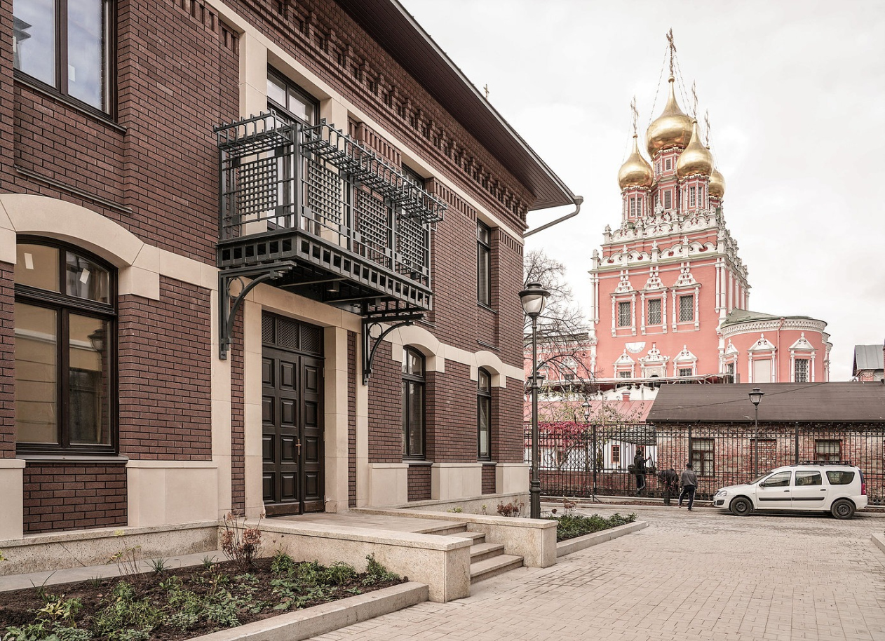
The residential buildings stand at a right angle to the main street with small branches between them; one can walk around some of the units – the structure of the master plan is quite clear, yet one can wander around for quite a while here. Because the main strong side of the urban space that has been formed inside the new housing complex is, of course, the views: of the Resurrection Church, and of the Kremlin with Ivan the Great Bell Tower. These two are not always present; rather, they suddenly open up in the perspective: what is consistent, however, is the fact that we always find ourselves in some peaceful and integral urban environment, occasionally seeing a bright landmark in between the houses – which constitutes a very “Moscow” effect of space perception; in this city, monuments of architecture oftentimes spring out of nowhere, without any spatial preparation, and the accidental character of the side scenes, from which we peek out in this or that case, is also a part of the game.

  • zooming
    1 / 5
    The residential complex “Metsenat” in Kadashi
    Copyright: Photograph © Ilia Utkin
  • zooming
    2 / 5
    The residential complex “Metsenat” in Kadashi
    Copyright: Photograph © Ilia Utkin
  • zooming
    3 / 5
    The residential complex “Metsenat” in Kadashi / architect: Ilia Utkin
    Copyright: Photograph: Julia Tarabarina, Archi.ru
  • zooming
    4 / 5
    The residential complex “Metsenat” in Kadashi / architect: Ilia Utkin
    Copyright: Photograph: Julia Tarabarina, Archi.ru
  • zooming
    5 / 5
    The residential complex “Metsenat” in Kadashi / architect: Ilia Utkin
    Copyright: Photograph: Julia Tarabarina, Archi.ru


The author of the project, Ilia Utkin, was facing a lot of tasks: to keep and partially even restore the old structures that were not yet demolished during the moment of heated discussion, to find the optimum scale that would fit the place and stay within the regeneration limits, to find the style that would have logical justification, and, finally, find the basis for the integrity of the new fragment of city environment – a land plot with a complex outline and a few historical inclusions. And, although, while working in a historical environment, the architects chiefly pay attention to the preserved monuments, the visual integrity and the emotional qualities of the freshly built architecture are also very important and are much more than just a backdrop.

The residential complex “Metsenat” in Kadashi / architect: Ilia Utkin
Copyright: Photograph: Julia Tarabarina, Archi.ru


The residential complex “Metsenat” in Kadashi / architect: Ilia Utkin
Copyright: Photograph: Julia Tarabarina, Archi.ru


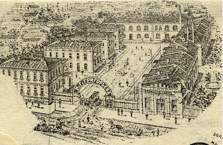
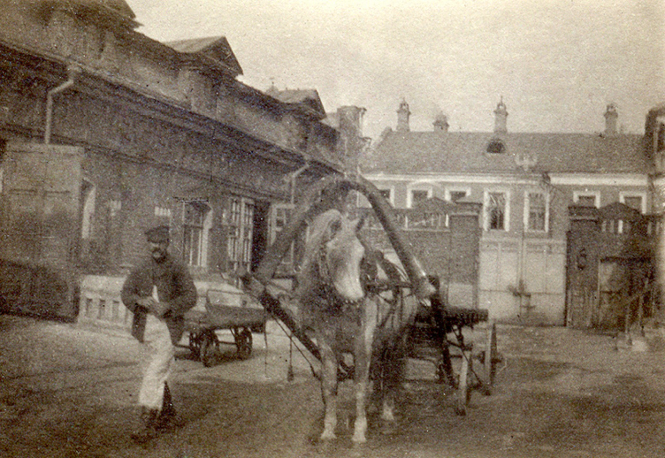
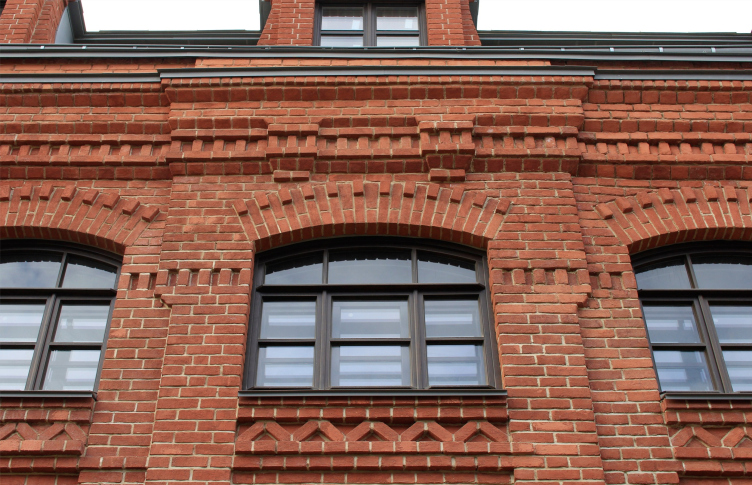
In this specific case, the author chose a style that is historically conditioned: in the late XIX century, this land was occupied by the Grigoryev Sausage Factory (which was later replaced by the Soviet experimental can factory) – low-rise squatting brick buildings with simple ornaments, characteristic for the historicist industrial construction of those days, such as dentils and square decorative brickwork.

  • zooming
    1 / 5
    Grigoryev Factory. View from the entrance gate, 1910
    Copyright: © provided by U-Studio
  • zooming
    2 / 5
    A fragment of historical brickwork used as the motif for ornament in the new project, 2013
    Copyright: © provided by U-Studio
  • zooming
    3 / 5
    Part of the construction in the Kadashevskaya township. The current state, 2013
    Copyright: © provided by U-Studio
  • zooming
    4 / 5
    Grigoryev Factory. The current state, 2013
    Copyright: © provided by U-Studio
  • zooming
    5 / 5
    The current state, 2013
    Copyright: © provided by U-Studio


“The land around the temple was essentially a rural production area: they would cut pigs here and make sausage – Ilia Utkin was explaining in 2013, justifying his decision to stick to “merchant” industrial architecture as an offset to the then-considered proposal that consisted of houses with columns – Next to the sausage factory, its owner built a large manor house, and there was a sausage store in the Kadashevsky lane. The workers from the factory lived in the mansards of the factory’s residential buildings, very densely packed. There was a special spirit about this place”.

Some of the factory buildings stood so close to one another that in the Soviet time they were covered by a single roof – and this is how a conglomerate of differently aged structures appeared, something that would be totally unthinkable nowadays, at least because of fire safety reasons: the spaces between the houses must be enough for at least one fire truck. However, from the pictures of the factory we can see that some of its buildings to the left of the 2nd Kadashevsky lane were standing in a row parallel to the lane – meaning, in about the same way as today’s buildings of the housing complex.

Grigoryev Factory. The entrance
Copyright: © provided by U-Studio


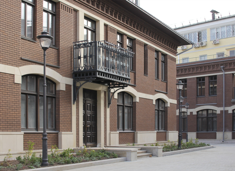
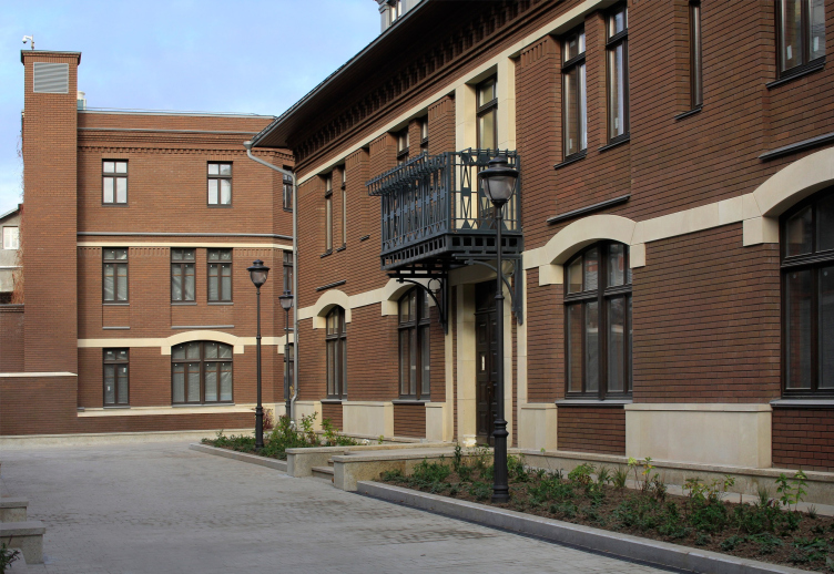
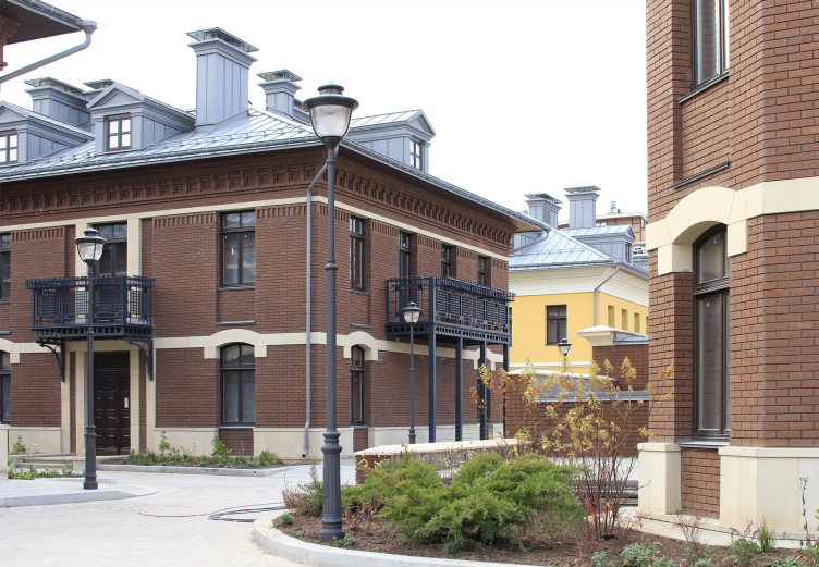
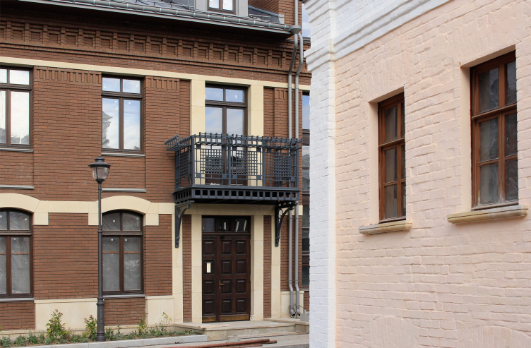
Thus, the basic image was defined by the industrial architecture of the XIX century, but the new buildings could not be, of course, fully identical to the factory buildings of the old days – the office function was cancelled still by Yuri Luzhkov back in 2010; today, this is a high-end complex in the center of Moscow, which simply cannot look like a factory. This is why the style of the old industrial architecture got an injection of “merchant” architecture, which is also historically correct for Zamoskvorechye. This is how the metal balconies came about, looking like cast-iron ones of the XIX century. The ventilating equipment is arranged in a semblance of chimneys, which looks quite traditional against the background of the hip roofs of steep pitch, and makes quite a good match for the mansards, whose outline was also borrowed from the industrial architecture – even though the mansards cannot be considered to be quite a “Moscow” element, they did occur in the architecture of this city from time to time, and here it is precisely the case when they are appropriate.

Grigoryev Factory. View from the yard
Copyright: © provided by U-Studio


The residential complex “Metsenat” in Kadashi / architect: Ilia Utkin
Copyright: Photograph: Julia Tarabarina, Archi.ru


Meanwhile, the architecture of the new residential buildings looks neater and more organized than that of the industrial buildings of the turn of the centuries: the overall impression is to a large extent defined by the dark-brown brick that looks somewhat like Art Nouveau tiles and just as neat, supported by broad bow-shaped cornices above the windows, made from fiber cement looking like white stone, inserted into smooth interfloor fasciae – all of this rather belongs to the early XX than to the late XIX century, while the pristine light verticals framing the entrances refer us to even more recent years, somewhere near the 1930’s. Generally, the result is something like a cross between industrial architecture and an Art Nouveau mansion, with a twist of Rome’s Piazza Augusto Imperatore. The industrial architecture lends the brick and the right composition of densely standing buildings, the mansion lends a graceful curve of the cornices and the “cast iron” balconies, the Piazza Augusto Imperatore lends an organized feel, unusual for the merchant Moscow, yet quite appropriate in a modern housing complex. After all, the architects also had to emphasize the fact that the complex is actually a modern construction to make sure people don’t confuse it with a fake – this is what the Venetian Charter demands – a new volume must be visually different than a historical one.

  • zooming
    1 / 8
    The residential complex “Metsenat” in Kadashi / architect: Ilia Utkin
    Copyright: Photograph: Julia Tarabarina, Archi.ru
  • zooming
    2 / 8
    The residential complex “Metsenat” in Kadashi / architect: Ilia Utkin
    Copyright: Photograph: Julia Tarabarina, Archi.ru
  • zooming
    3 / 8
    The residential complex “Metsenat” in Kadashi / architect: Ilia Utkin
    Copyright: Photograph: Julia Tarabarina, Archi.ru
  • zooming
    4 / 8
    The residential complex “Metsenat” in Kadashi
    Copyright: Photograph © Ilia Utkin
  • zooming
    5 / 8
    The residential complex “Metsenat” in Kadashi / architect: Ilia Utkin
    Copyright: Photograph: Julia Tarabarina, Archi.ru
  • zooming
    6 / 8
    The residential complex “Metsenat” in Kadashi / architect: Ilia Utkin
    Copyright: Photograph: Julia Tarabarina, Archi.ru
  • zooming
    7 / 8
    The residential complex “Metsenat” in Kadashi / architect: Ilia Utkin
    Copyright: Photograph: Julia Tarabarina, Archi.ru
  • zooming
    8 / 8
    The residential complex “Metsenat” in Kadashi / architect: Ilia Utkin
    Copyright: Photograph: Julia Tarabarina, Archi.ru


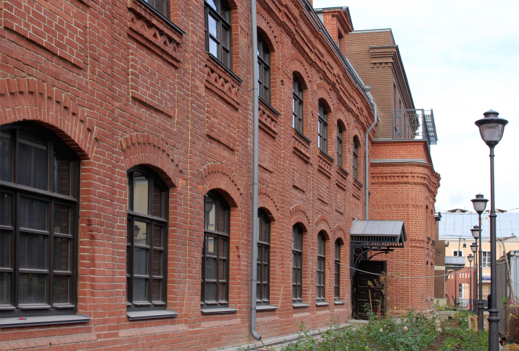
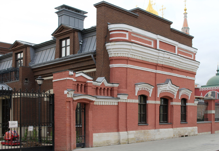
In this case, the required difference is beautifully observed. One must begin with the source of inspiration, the only surviving factory building – it is partially preserved and partially restored. The brick is traditional red, unlike the brown in the newly built houses. According to the modern principle of working with the industrial heritage, the facades were cleared up and covered with water resistant substance, so we can not only admire the texture, but also watch various brickwork mismatches, which make this building, once simple and purely utilitarian, a living monument of its time. This building is also residential, yet what makes it different is the fact that in some places its top floors include two-level apartments with mansards.

The residential complex “Metsenat” in Kadashi / architect: Ilia Utkin
Copyright: Photograph: Julia Tarabarina, Archi.ru


The residential complex “Metsenat” in Kadashi / architect: Ilia Utkin
Copyright: Photograph: Julia Tarabarina, Archi.ru


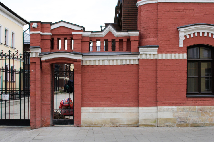
The factory building is stretched along the inner street behind the gate on the 2nd Kadashevsky Lane, the gate itself being completely restored. Now it marks the border of the complex along the lane, at the same time emphasizing the fact that it does belong to the old Moscow with its inevitable gate before every piece of real estate. What was also restored was the facade of the sausage store of the Grigoryev factory – currently, this is the only place where the new architecture meets the old one in a straight cut; the new dark brick house bears an old facade. Unlike the inner building, whose brick is cleared in full accordance with the trends of “loft” architecture, the gate and the facade that face the street are left painted in a Moscow way. This solution must be recognized to be the right one because if we are to keep the visual appearance of the side-street, then we must keep all of its traditions; the cleared brick would have been too much of an obvious thing here.

The residential complex “Metsenat” in Kadashi / architect: Ilia Utkin
Copyright: Photograph: Julia Tarabarina, Archi.ru


The residential complex “Metsenat” in Kadashi / architect: Ilia Utkin
Copyright: Photograph: Julia Tarabarina, Archi.ru


The most ancient building, the one with the deepest “roots” was dug out from its cultural layer; around it, quite recognizable areaways appeared, unambiguously indicating its historical value. The house is also different in its color – it’s white-pink – and the textured irregularity of the brickwork, which helps to emphasize the age of the walls, many times rebuilt. This building will become the city mansion.

The residential complex “Metsenat” in Kadashi / architect: Ilia Utkin
Copyright: Photograph: Julia Tarabarina, Archi.ru


Another story has to do with yet another construction that drops off the overall color range – the yellowing volume is situated approximately where the deacon’s house used to be, on the line of Kadashevsky dead end street, between two new buildings. The house was torn down in the summer of 2010, which caused a storm of protests from the parish, yet it had been refused the status of an architectural monument at least twice, and during the designing process it belonged to the client who owned this land. In a word, the deacon’s house (former merchant’s) was torn down, and the current building, its color different from the rest of the complex, serves as a reminder about it, at the same time making the construction sparser, and creating an impression as if these buildings were constructed at different times, not because of the architect’s whim, but motivated by the history of this place.

  • zooming
    1 / 4
    The residential complex “Metsenat” in Kadashi
    Copyright: Photograph © Ilia Utkin
  • zooming
    2 / 4
    The residential complex “Metsenat” in Kadashi / architect: Ilia Utkin
    Copyright: Photograph: Julia Tarabarina, Archi.ru
  • zooming
    3 / 4
    The residential complex “Metsenat” in Kadashi / architect: Ilia Utkin
    Copyright: Photograph: Julia Tarabarina, Archi.ru
  • zooming
    4 / 4
    The residential complex “Metsenat” in Kadashi / architect: Ilia Utkin
    Copyright: Photograph: Julia Tarabarina, Archi.ru


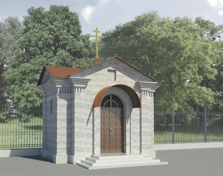
Still another micro-story: the factory building northeast of the church served as a chapel that was used by the revived parish; the building was torn down in the process of construction of the housing complex, yet the client built in this place a new chapel, also designed by Ilia Utkin, in simple classical forms, aimed at avoiding any kind of conflict with the architecture of the main church.

Project of the chapel on the territory of the Resurrection Church. The residential complex “Metsenat” in Kadashi
Copyright © U-Studio


It must be said that these historical and memorial inclusions do a lot of good to the housing complex: their presence substantially softens up its visual appearance and adds to its emotional content, saving the buildings from turning into a totally alien spot. These elements, just as unpredictable as motivated, falling out of the overall rhythm, with which they only occasionally resonate – I would say that these elements, although they do stand in the ranks, only stand “at ease”, thus producing the effect of the old town, if not of the “ancient Moscow” construction, however new this embodiment can be. But this embodiment, together with its complicated history, still looks like a positive experience. The complex’s website proudly displays fragments of a garden of the Versailles type, the lawns are being planted, the streets are paved with stones, and are nice and quiet – it would be great if the complex, in spite of the expensiveness of its real property, was open to the city, but this is probably up to the client and to the city authorities.

  • zooming
    1 / 18
    The residential complex “Metsenat” in Kadashi, visualization
    Copyright © U-Studio
  • zooming
    2 / 18
    The residential complex “Metsenat” in Kadashi, visualization
    Copyright: © U-Studio
  • zooming
    3 / 18
    The residential complex “Metsenat” in Kadashi, visualization
    Copyright: © U-Studio
  • zooming
    4 / 18
    Development drawing on the 2nd Kadashevsky lane. The residential complex “Metsenat” in Kadashi
    Copyright: © U-Studio
  • zooming
    5 / 18
    The administration building. The residential complex “Metsenat” in Kadashi
    Copyright: © U-Studio
  • zooming
    6 / 18
    Deacon′s house. The residential complex “Metsenat” in Kadashi
    Copyright: © provided by U-Studio
  • zooming
    7 / 18
    House №4. The residential complex “Metsenat” in Kadashi
    Copyright: © U-Studio
  • zooming
    8 / 18
    House №5. The residential complex “Metsenat” in Kadashi
    Copyright: © U-Studio
  • zooming
    9 / 18
    House №6. The residential complex “Metsenat” in Kadashi
    Copyright: © U-Studio
  • zooming
    10 / 18
    House №8. The residential complex “Metsenat” in Kadashi
    Copyright: © provided by U-Studio
  • zooming
    11 / 18
    House №8. The residential complex “Metsenat” in Kadashi
    Copyright: © U-Studio
  • zooming
    12 / 18
    House №3. The residential complex “Metsenat” in Kadashi
    Copyright: © U-Studio
  • zooming
    13 / 18
    House №3. The residential complex “Metsenat” in Kadashi
    Copyright: © U-Studio
  • zooming
    14 / 18
    The facade decoration material. The residential complex “Metsenat” in Kadashi
    Copyright: © U-Studio
  • zooming
    15 / 18
    The facade decoration material. The residential complex “Metsenat” in Kadashi
    Copyright: © U-Studio
  • zooming
    16 / 18
    The facade decoration material. The residential complex “Metsenat” in Kadashi
    Copyright: © U-Studio
  • zooming
    17 / 18
    Development drawing 1-1. The residential complex “Metsenat” in Kadashi
    Copyright: © U-Studio
  • zooming
    18 / 18
    Development drawing on the Kadashevsky dead end. The residential complex “Metsenat” in Kadashi
    Copyright: © U-Studio


Speaking of the architecture of the complex, this is definitely a true experience of regeneration – a genre that was once much talked about, yet the examples of which were not really quite successful. Here, however, thanks to the participation of Ilia Utkin with his love and passion for the old town, and, partially, thanks to the long history of protests from the local preservation activists, the result actually marches its official original definition – which means more than a lot for modern Moscow.

26 December 2019

Headlines now
The Golden Crown
The concept for a dental clinic in Yekaterinburg, developed by CNTR Studio, revolves around the idea of a “mouth full of gold”: pristine white porcelain stoneware walls are complemented by matte brass details. To avoid an overly literal interpretation, the architects focused on the building’s proportions, skillfully navigating between sunlight requirements and fire safety regulations.
Flexibility and Integration
Not long ago, we covered the project for the fourth phase of the ÁLIA residential complex, designed by APEX. Now, we’ve been shown different fence concepts they developed to enclose the complex’s private courtyards, incorporating a variety of public functions. We believe that the sheer fact that the complex’s architects were involved in such a detail as fencing speaks volumes.
A Step Forward
The HIDE residential complex represents a major milestone for ADM architects and their leaders Andrey Romanov and Ekaterina Kuznetsova in their quest for a fresh high-rise aesthetic – one that is flexible and layered, capable of bringing vibrancy to mass and silhouette while shaping form. Over recent years, this approach has become ADM’s “signature style”, with the golden HIDE tower playing a pivotal role in its evolution. Here, we delve into the project’s story, explore the details of the complex’s design, and uncover its core essence.
Gold in the Sands
A new office for a transcontinental company specializing in resource extraction and processing has opened in Dubai. Designed by T+T Architects, masters of creating spaces that are contemporary, diverse, flexible, and original, this project exemplifies their expertise. On the executive floor, a massive brass-clad partition dominates, while layered textures of compressed earth create a contextually resonant backdrop.
Layers and Levels of Flight
This project goes way back – Reserve Union won this architectural competition at the end of 2011, and the building was completed in 2018, so it’s practically “archival”. However, despite being relatively unknown, the building can hardly be considered “dated” and remains a prime example of architectural expression, particularly in the headquarters genre. And it’s especially fitting for an aviation company office. In some ways, it resembles the Aeroflot headquarters at Sheremetyevo but with its own unique identity, following the signature style of Vladimir Plotkin. In this article, we take an in-depth look at the United Aircraft Corporation (UAC) headquarters in the Moscow agglomeration town of Zhukovsky, supplemented by recent photographs from Alexey Naroditsky – a shoot that became only recently possible due to the fact that improvements were finally made in the surrounding area.
Light and Shadow
In this article, we delve into the architectural design of the “Chaika” house by DNK ag architects, which was recently completed in 2023 as part of the collection of signature designs at ZILArt. As is well-known, all the buildings in this complex follow a design code, yet each one is distinct. This particular building stands out not only for its whiteness and minimalism but also for the refined use of a limited number of techniques that, together, create what can confidently be called synergy.
Casus Novae
A master plan was developed for a large residential area with a name of “DNS City”, but now that its implementation began, the plan has been arbitrarily reformatted and replaced with something that, while similar on the surface, is actually quite different. This is not the first time such a thing happens, but it’s always frustrating. With permission from the author, we are sharing Maria Elkina’s post.
Treasure Hunting
The GAFA bureau, in collaboration with Tegola and Arkhitail, organized an expedition to the island of Kilpola in Karelia as part of Moskomarkhitektura’s “Open City” festival. There, amidst moss and rocks, the students sought answers to questions like: what is the sacred, where does it dwell, and what sustains it? Assisting the participants in this quest were landscape engineer Evgeny Levin, artist Nicholas Roerich, a moose, and the lack of cellular connection. Here’s how the story unfolded.
Depths of the Earth, Streams of Water
In the Malaya Okhta district, the Akzent building, designed by Stepan Liphart, was constructed. It follows a classic tripartite structure, yet it’s what you might call “hand-drawn”: each façade is unique in its form and details, some of which aren’t immediately noticeable. In this article, we explore the context and, together with the architect, delve into how the form was developed.
Fir Tree Dynamics
The “Airports of Region” holding is planning to build an airport in Karachay-Cherkessia, aiming to make the Arkhyz and Dombay resorts more accessible to travelers. The project that won in an invitation-only competition, submitted by Sergey Nikeshkin’s KPLN, blends natural imagery inspired by the shape of a conifer seed, open-air waiting spaces, majestic large trees, and a green roof elevated on needle-like columns. The result is both nature-inspired and WOW.
​A Brick Shell
In the process of designing a clubhouse situated among pine trees in a prestigious suburban area near Moscow, the architectural firm “A.Len” did the façade design part. The combination of different types of brick and masonry correlates with the volumetric and plastique solutions, further enhanced by the inclusion of wood-painted fragments and metal “glazing”.
Word Forms
ATRIUM architects love ambitious challenges, and for the firm’s thirtieth anniversary, they boldly play a game of words with an exhibition that dives deep into a self-created vocabulary. They immerse their projects – especially art installations – into this glossary, as if plunging into a current of their own. You feel as if you’re flowing through the veins of pure art, immersed in a universe of vertical cities, educational spaces – of which the architects are true masters – and the cultural codes of various locations. But what truly captivates is the bold statement that Vera Butko and Anton Nadtochy make, both through their work and this exhibition: architecture, above all, is art – the art of working with form and space.
Flexibility and Acuteness of Modernity
Luxurious, fluid, large “kokoshniks” and spiral barrel columns, as if made from colorful chewing gum: there seem to be no other mansion like this in Moscow, designed in the “Neo-Russian-Modern” style. And the “Teremok” on Malaya Kaluzhskaya, previously somewhat obscure, has “come alive with new colors” and gained visibility after its restoration for the office of the “architectural ecosystem” as the architects love to call themselves. It’s evident that Julius Borisov and the architects at UNK put their hearts into finding this new office and bringing it up to date. Let’s delve into the paradoxes of this mansion’s history and its plasticity. Spoiler: two versions of modernity meet here, both balancing on the razor’s edge of “what’s current”.
Yuri Vissarionov: “A modular house does not belong to the land”
It belongs to space, or to the air... It turns out that 3D printing is more effective when combined with a modular approach: the house is built in a workshop and then adapted to the site, including on uneven terrain. Yuri Vissarionov shares his latest experience in designing tourist complexes, both in central Russia and in the south. These include houseboats, homes printed from lightweight concrete using a 3D printer, and, of course, frame houses.
​Moscow’s First
“The quality of education largely depends on the quality of the educational environment”. This principle of the last decade has been realized by Sergey Skuratov in the project for the First Moscow Gymnasium on Rostovskaya Embankment in the Khamovniki district. The building seamlessly integrates into the complex urban landscape, responding both to the pedestrian flow of the city and the quiet alleyways. It skillfully takes advantage of the height differences and aligns with modern trends in educational space design. Let’s take a closer look.
Looking at the Water
The site of Villa Sonata stretches from the road to the water’s edge, offering its own shoreline, pier, and a picturesque river panorama. To reveal these sweeping views, Roman Leonidov “cut” the façade diagonally parallel to the river, thus getting two main axes for the house and, consequently, “two heads”. The internal core – two double-height spaces, a living room and a conservatory, with a “bridge” above them – makes the house both “transparent” and filled with light.
The White Wing
Well, it’s not exactly white. It’s more of a beige, white-stone structure that plays with the color of limestone – smoother surfaces are lighter, while rougher ones are darker. This wing unites various elements: it absorbs and interprets the surrounding themes. It responds to everything, yet maintains a cohesive expression – a challenging task! – while also incorporating recognizable features of its own, such as the dynamic cuts at the bottom, top, and middle.
Urban Dunes
The XSA Ramps team designed and built a three-part sports hub for a park in Rostov-on-Don, welcoming people of all ages and fitness levels. The skate plaza, pump track, and playground are all meticulously crafted with details that attract a diverse range of visitors. The technical execution of the shapes and slopes transforms this space into a kind of sculptural composition.
Proportional Growth
The project for the fourth phase of the ÁLIA residential area has been announced. The buildings are situated on an elongated plot – almost a “ray” that shoots out from the center of the area towards the river. Their layout reflects both a response to Moscow’s architectural preferences over the past 15 years, shifting “from blocks to towers”, and an interpretation of the neighboring business park designed by SOM. Additionally, the best apartments here are not located at the very top but closer to the middle, forming a glowing “waistline”.
The “Staircase” Building
In designing the “Details” residential complex in New Moscow, Rais Baishev spiced up the now-popular Moscow theme of a “courtyard” building with an idea drawn from the surrealist drawings by Maurits Escher. He envisioned the stepped silhouettes and descending slopes as a metaphysical mega-staircase, creating a key void within the courtyard that gave the project an internal “spine”. This concept is felt both in the building’s silhouette and on its façades.
Projection of the Quarter
No one doubted that the building that Vladimir Plotkin designed as part of the “Garden Quarters” would be the most modernist of all. And it turned out just that way: while adhering to the common design code, the building successfully combines brick and white stone, rhythmically responding to the neighboring building designed by Ostozhenka, yet tactfully and persistently making a few statements of its own. This includes the projection of the ideal urban development composition “14–9–6”, which can be found right next door, mathematical calculations, including those for various types of terraces (and perhaps the only reminder of the Soviet past of the Kauchuk rubber factory!), and the white “cross-stitch” pattern of the façade grid.
Domus Aurea
In this issue, we examine the “Tessinsky-1” house, designed by Sergey Skuratov and completed in 2023. Located in the middle of the Serebryanicheskaya Embankment district, at the intersection of its main streets, this house assumes a sort of “nodal” role: it not only responds to everything around it and preserves many memories of the former EMA factory within itself, but it weaves all this into a newly directed pattern, reconciling bright “gold” and dark-colored brick, largely with the help of the new, modern-yet-archaic Columba brick, which, come to think about it, is the most precious element here.
The Chimney of Nikola-Lenivets
In this issue, we are examining the “Obelisk House” designed by KATARSIS and built for the Arkhstoyanie 2023 festival. However, it was only finished later on, and this is why we are examining it now. It seems to us that after the “Obelisk House” appeared in Nikola-Lenivets, a dialogue and a few inner connections appeared between the temporary structures built here. These houses no longer look like “accidental neighbors”, more of which below.
​Periscope by the Bay
The jury awarded the second place in the competition for a public and cultural center in Petropavlovsk-Kamchatsky to the companies GORA (“Mountain”) and M4. In the consortium’s proposal, the building resembles a sperm whale with a calf swimming next to it or a periscope, whose lenses capture the most spectacular views from the surrounding landscape.
From Arcs to Dolmens
While working on the competition project for Petropavlovsk-Kamchatsky, ASADOV Architects prioritized the value of the natural and urban environment, aiming to preserve the balance of the location while minimizing the resemblance of the volume that they designed to a “traditional building”. The task was challenging, and the architects created three versions, one of which having been developed after the competition, where their main proposal took third place. However, the point of interest here is not the competition result but the continuity of creative thinking.
Hide and Seek
The ID Moskovskiy house, designed by Stepan Liphart in St. Petersburg, in the courtyards near Moskovskiy Avenue beyond the Obvodny Canal and recently completed, is notable for several reasons. Firstly, it has been realized with considerable accuracy, which is particularly significant as this is the first building where the architect was responsible not only for the facades but also for the layouts, allowing for better integration between the two. On the other hand, this building is interesting as an example of the “germination” of new architecture in the city: it draws on the best examples from the neighborhood and becomes an improved and developed sum of ideas found by the architect in the surrounding context.
The Big Twelve
Yesterday, the winners of the Moscow Mayor’s Architecture Award were announced and honored. Let’s take a look at what was awarded and, in some cases, even critique this esteemed award. After all, there is always room for improvement, right?
Above the Golden Horn
The residential complex “Philosophy” designed by T+T architects in Vladivostok, is one of the new projects in the “Golubinaya Pad” area, changing its development philosophy (pun intended) from single houses to a comprehensive approach. The buildings are organized along public streets, varying in height and format, with one house even executed in gallery typology, featuring a cantilever leaning on an art object.
Nuanced Alternative
How can you rhyme a square and space? Easily! But to do so, you need to rhyme everything you can possibly think of: weave everything together, like in a tensegrity structure, and find your own optics too. The new exhibition at GES-2 does just that, offering its visitor a new perspective on the history of art spanning 150 years, infused with the hope for endless multiplicity of worlds and art histories. Read on to see how this is achieved and how the exhibition design by Evgeny Ace contributes to it.
Blinds for Ice
An ice arena has been constructed in Domodedovo based on a project by Yuri Vissarionov Architects. To prevent the long façade, a technical requirement for winter sports facilities, from appearing monotonous, the architects proposed the use of suspended structures with multidirectional slats. This design protects the ice from direct sunlight while giving the wall texture and detail.