По-русски

Archimatika: “WAF is a festival that erases the architects’ snobbery”

An interview with Alexander Popov and Alexander Simonov about the WAF Festival, where Archimatika gets shortlisted for the final for the second consecutive time.

27 November 2019
Interview
mainImg
For two consecutive years, Archimatika gets shortlisted for the final of WAF Festival, remaining the only Ukrainian company represented at this world’s largest architectural festival. We talked to the company leader, Alexander Popov, and the manager of the competition branch, Alexander Simonov, about the benefits of taking part in such international festivals.

Archi.ru
What is your attitude towards project competitions and project awards? What guidelines do you follow when you decide, in which festival you will take part, and in which you will not?

zooming
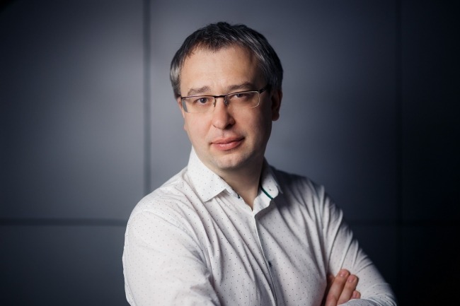
Alexander Popov
Copyright: © Archimatika


Alexander Popov,
The leader of Archimatika:
We did not have any special doctrine – WAF attracted us with the lineup of the projects that got shortlisted. Two years ago we went to Berlin to see how the whole thing was organized. We really liked the atmosphere, and we wanted to be a part of it – not as visitors but as exhibitors. We selected the projects that we thought were worth showing, and one of them got shortlisted. That was very inspiring – we did not even expect that you could simply sign up for the competition and get shortlisted. Because any competition is a lottery to a large extent! What is objective, however, is the certain classification, qualification, and professional bar, below which the project simply cannot drop. If you, let’s say, don’t get shortlisted this year but get shortlisted next year, yes, you could say that you were just lucky. But if you don’t ever get shortlisted, you might want to consider your professional level. This is a pleasant bonus to your professional activity that allows the architect to stop being alone one on one with the world and find himself in a great company of fellow colleagues.

Do you make a difference between the awards: what is valuable for you, for example, and what can make an impression on your potential client? 

A.P.: I would say that what’s most important for us is the pleasure of professional communication because there’s no pragmatic reason in this world that can explain why somebody would do architecture 24/7. There are contests that you really enjoy taking part in, and there are contests that we would not participate in, even if we got paid to do that. And there are also competitions, in which we take part “by proxy” – meaning, the project is submitted by our developer. As for developers, they do have a purely pragmatic reason: the investment status of the project. When the bankers are making a decision about the loan, they can go by this rationale: “this project has scored so many awards and professional accolades; it’s got so many stars on the fuselage...” We don’t like playing these games but our developers have to. In defense of such events I can also say that sometimes you get involved into interesting dialogues there, make new contacts and acquaintances. And this is not just about pleasure – this is also about business. These contacts generate a stream of activity, including projects and money. It’s impossible to calculate how much money we spent on WAF last year and where exactly we got the return on investment. We landed this or that commission not just because somebody saw us at the festival: we have an attractive website, our company is generally pretty active, there was an article about us in this or that publication; or the client simply may have called up his colleague, and he said “Yes, these are great guys!” What ultimately influenced the client’s buying decision? You cannot pinpoint this factor. But if the architectural communication brings you pleasure, you have to learn how to find projects and make money.

Getting pleasure from your work is very important. But this cannot be the only thing that motivates you?

Alexander Simonov
Copyright: © Archimatika


Alexander Simonov,
The manager of the competition branch of Archimatika:
In addition to getting pleasure from mingling with the professional community, taking part in competitions allows you to feel the momentum, to evaluate whether you are in the trend of today’s architectural thought or are falling behind. Or, as the case might be, whether you are so much ahead of time that it would be wiser to unveil your ideas only in a couple of years, when the rest of the world is ready to appreciate it. WAF is a unique venue; a place where you can see a friendly battle between, let’s say, Pierre de Meuron and some emerging Australian hipster company consisting of four people, and the odds for the victory will still be equal. It all depends only on who will defend his project, and how. Sometimes you see a category and think to yourself: well, I see Zaha Hadid Architects on the contestants’ list, these guys are going to win, it’s all settled. And they don’t even get shortlisted for consideration – instead, they shortlist some totally unknown architectural company of 10 people that made a house that’s really high quality, pouring their soul into it. When the members of the judging panel see a project, and the first question that comes to their mind is “Is it really possible to do this crazy thing?” it’s a 50% probability that your project will get shortlisted.

Norman Foster may be a legend in the outside world, that’s true. But when he’s inside, he is just your fellow colleague who came to defend his project or read a lecture. WAF is a place where everyone is equal. All the architects’ snobbery is erased here. People become open, welcoming, and totally ready for contact.

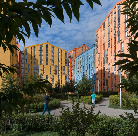
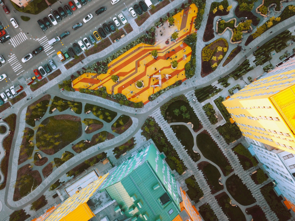
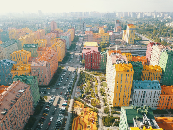
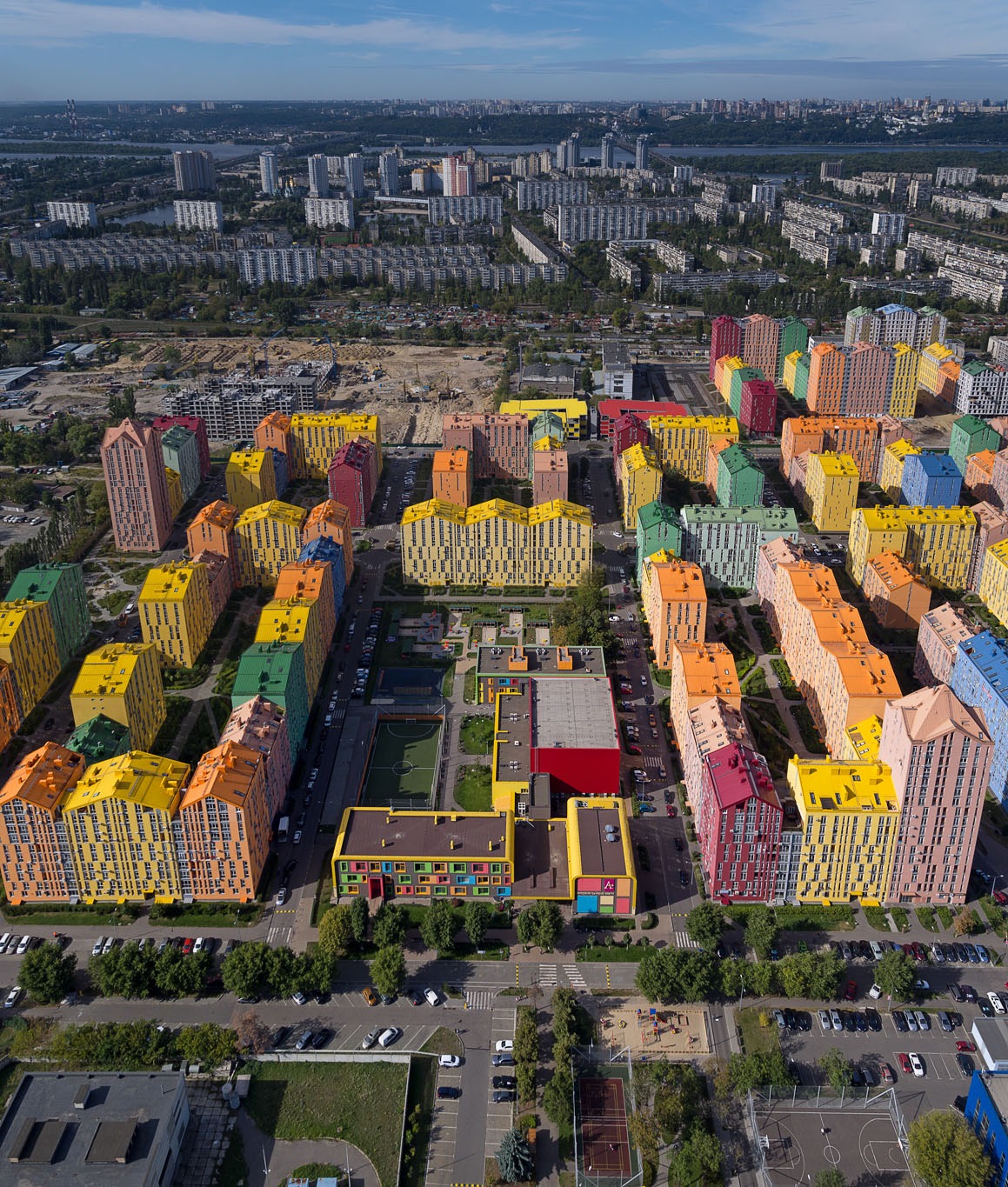
This year, we submitted two projects. We were not really sure of one of them, but as for the other, I was 100% sure that it would pass. This is one of our high-profile works – the housing project “Comfort Town”, 40 hectares of multicolored houses. This project is ten years old. The company KAN Development has been building it in stages, and the last houses will be put into operation in 2020. And the architectural solutions that we used in it are still relevant today. This is to say that ten years ago we were already ten years ahead of Europe and the rest of the world. This is great – to take pleasure from the fact that you are on the architectural trend of today, that you are ahead of the mainstream, that you share your ideas with your colleagues, and that your project got shortlisted.

  • zooming
    1 / 4
    “Comfort Town” housing area
    Copyright: Photograph © Andrey Avdeenko, 2017 / Archimatika
  • zooming
    2 / 4
    “Comfort Town” housing area
    Copyright: Photograph © Aleksey Ivanov, 2019 / Archimatika
  • zooming
    3 / 4
    “Comfort Town” housing area
    Copyright: Photograph © Aleksey Ivanov, 2019 / Archimatika
  • zooming
    4 / 4
    “Comfort Town” housing area
    Copyright: Photograph © Aleksey Ivanov, 2019 / Archimatika


Why did you have doubts about your other project?

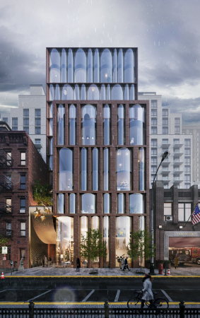
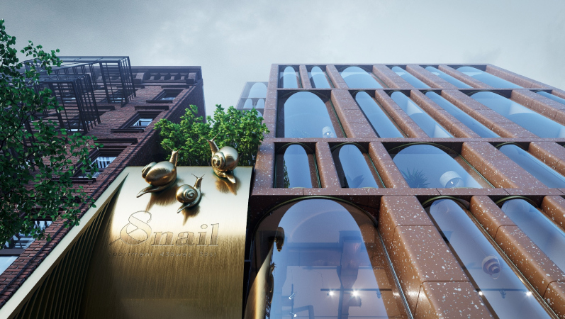
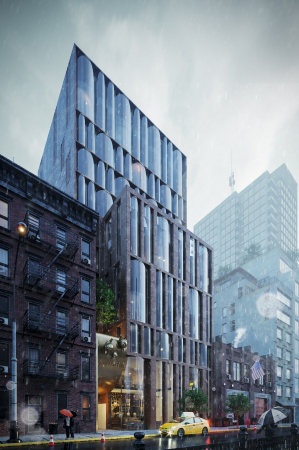
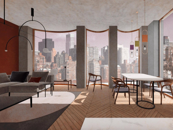
A.P.: The first project was the housing complex Snail Apartments in New York, USA. WAF is pretty much European in many respects, and only five-eight percent of American projects used to be shortlisted. Besides, housing is essentially a mass of product, 70% of the world’s architects design it. And there are categories, in which only twenty projects were submitted – the chance of getting shortlisted in them is significantly higher.

  • zooming
    1 / 4
    Snail Apartments
    Copyright: © Archimatika
  • zooming
    2 / 4
    Snail Apartments
    Copyright: © Archimatika
  • zooming
    3 / 4
    Snail Apartments
    Copyright: © Archimatika
  • zooming
    4 / 4
    Snail Apartments
    Copyright: © Archimatika


What was the most difficult thing for you during the presentation of your project?

A.P.: The main difficulty was to make a presentation about your work in good English. They say that nobody was able to understand Aldo Rossi’s English. So, it’s very important to be able to get your message across in the international language. There are two major constituent parts of any presentation. The architectural part is your solution, your structure, and your rationale. And the context – social, cultural, geographic, climatic, economic, and so on. It’s important to share about these two sides, how they are interconnected, and how they complement each other. Last time we did it, when we were four minutes into our presentation, the jury asked us to focus more on the architectural solutions. This year we will try to make it not two stories but just one.

Nowadays, many people use video and animated graphics in their presentations. In addition, what also matters a lot for the WAF judging panel is the social significance. Will you use any new techniques in your presentation? Will you consider the WAF specifics?

A.P.: Well, if we are to speak about “new tricks”, well, let’s just go ahead and present architecture with a beautiful dance. Speaking on the subject of video, I honestly don’t think it’s the right format because we ultimately are not trying to make a flashy impression on people but we are talking to our colleagues, piers, and professionals, and the architectural evaluation requires a static image that allows you to concentrate for at least several seconds and consider what you’re seeing. Since our first exposure to the festival, we started thinking about the culture, and about the connections not after the project is completed but from the moment that we get introduced to the client and see the future construction site. This is the algorithm that gets turned on the moment you understand that there will be a point in the development of the project when you will be able to make a stop share about it. Working on the current project, we answered the question that we got at last year’s WAF: what cultural specifics of the residents of the complex did we have in mind, and how was it reflected in the architecture? And now, doing projects in New York, we thought about it from our first exposure to the client. And we created houses for some certain lifestyle, and some specific cultural peculiarities.

The special atmosphere at WAF: the absence of hierarchical division. Perhaps, the architectural professional community is striving towards a horizontal system of interaction because a vertical system with “star” architects is at odds with the professional culture?

A.C.: As a matter of fact, some part of this vertical star thing does remain. This manifests itself in the fact, for example, that you just cannot get admitted to a presentation by a world-famous architect. When ZHA, Thomas Heatherwick, and Foster+Partners were doing their presentations, it was a real crowded house. Still, though, later on, nobody stopped you from approaching all of them and making your acquaintance. These people are open. And we all realize that all architects have one common cause – they create the world around us, regardless of what country they are based in, or how many “stars” their company has. This is how you erase the borders.

A.P.: I would even add: the reason for this vertical hierarchy and the fact that some of the “stars” are unapproachable is because they can be very private and afraid of some inadequate freak breaking into their privacy. And the reason why such barriers are virtually nonexistent in the world’s architectural community is very simple: we’ve got a very decent and sane audience.

I would like to ask how well the Ukrainian architecture fits in with the world’s context, and how the Ukrainian architects struggle for a place in the sun. Is this question relevant for you?

A.P.: The right answer: of course, it is.

The right answer or the truthful one?

A.P.: The right and partially truthful. The completely truthful answer will have to be slightly wider because architecture is global. A completely “national” architecture is only possible in a totally isolated state that has shut itself off from the outside world. In all other cases, to this or that extent, there is an exchange of ideas going on, as well as solutions, implementations, professional jealousy and admiration for your foreign colleagues. And in this respect the architects can be subdivided not so much into national schools as schools of thought. There are architects out there, for whom their social mission is more important than architecture per se, and there are those for whom the quality of the design solution matters the most. And I think that some Spanish architect who feels the same as me about some key points will be much closer to me than some Kiev colleague with an office a block away from me, but going by different methods. This is why, in this global world, the architectural values bring us much closer together than our national identity.

Probably, it is all about our understanding of social order. And this question was really relevant for me in the nineties when I was a student. Because during that time the society and the reality in the United States, Western Europe, and Japan, was vastly different from our post-Soviet reality! And this gap made it impossible to create in the Ukrainian context the architecture that would stand up to the level of the international school. Such border is nonexistent now, and some great solution that was developed by our colleague in some European country can be successfully implemented here. A European architect is confronted with the same questions that we are. Yes, there are climatic differences, and peculiarities of people’s mentality, but we still in one and the same cultural environment.

Can you please share about the modern architecture and architects of Ukraine?

A.P.: I can only say that there are some great architects here who design great buildings. Take the Library of the Lviv University, for example, designed and built by Stephan Behnisch and Julian Chaplinsky – I seriously consider it to be the best new building in the entire Ukraine. This is such a rich subject that I would suggest that we address it in another interview.

27 November 2019

Headlines now
The Golden Crown
The concept for a dental clinic in Yekaterinburg, developed by CNTR Studio, revolves around the idea of a “mouth full of gold”: pristine white porcelain stoneware walls are complemented by matte brass details. To avoid an overly literal interpretation, the architects focused on the building’s proportions, skillfully navigating between sunlight requirements and fire safety regulations.
Flexibility and Integration
Not long ago, we covered the project for the fourth phase of the ÁLIA residential complex, designed by APEX. Now, we’ve been shown different fence concepts they developed to enclose the complex’s private courtyards, incorporating a variety of public functions. We believe that the sheer fact that the complex’s architects were involved in such a detail as fencing speaks volumes.
A Step Forward
The HIDE residential complex represents a major milestone for ADM architects and their leaders Andrey Romanov and Ekaterina Kuznetsova in their quest for a fresh high-rise aesthetic – one that is flexible and layered, capable of bringing vibrancy to mass and silhouette while shaping form. Over recent years, this approach has become ADM’s “signature style”, with the golden HIDE tower playing a pivotal role in its evolution. Here, we delve into the project’s story, explore the details of the complex’s design, and uncover its core essence.
Gold in the Sands
A new office for a transcontinental company specializing in resource extraction and processing has opened in Dubai. Designed by T+T Architects, masters of creating spaces that are contemporary, diverse, flexible, and original, this project exemplifies their expertise. On the executive floor, a massive brass-clad partition dominates, while layered textures of compressed earth create a contextually resonant backdrop.
Layers and Levels of Flight
This project goes way back – Reserve Union won this architectural competition at the end of 2011, and the building was completed in 2018, so it’s practically “archival”. However, despite being relatively unknown, the building can hardly be considered “dated” and remains a prime example of architectural expression, particularly in the headquarters genre. And it’s especially fitting for an aviation company office. In some ways, it resembles the Aeroflot headquarters at Sheremetyevo but with its own unique identity, following the signature style of Vladimir Plotkin. In this article, we take an in-depth look at the United Aircraft Corporation (UAC) headquarters in the Moscow agglomeration town of Zhukovsky, supplemented by recent photographs from Alexey Naroditsky – a shoot that became only recently possible due to the fact that improvements were finally made in the surrounding area.
Light and Shadow
In this article, we delve into the architectural design of the “Chaika” house by DNK ag architects, which was recently completed in 2023 as part of the collection of signature designs at ZILArt. As is well-known, all the buildings in this complex follow a design code, yet each one is distinct. This particular building stands out not only for its whiteness and minimalism but also for the refined use of a limited number of techniques that, together, create what can confidently be called synergy.
Casus Novae
A master plan was developed for a large residential area with a name of “DNS City”, but now that its implementation began, the plan has been arbitrarily reformatted and replaced with something that, while similar on the surface, is actually quite different. This is not the first time such a thing happens, but it’s always frustrating. With permission from the author, we are sharing Maria Elkina’s post.
Treasure Hunting
The GAFA bureau, in collaboration with Tegola and Arkhitail, organized an expedition to the island of Kilpola in Karelia as part of Moskomarkhitektura’s “Open City” festival. There, amidst moss and rocks, the students sought answers to questions like: what is the sacred, where does it dwell, and what sustains it? Assisting the participants in this quest were landscape engineer Evgeny Levin, artist Nicholas Roerich, a moose, and the lack of cellular connection. Here’s how the story unfolded.
Depths of the Earth, Streams of Water
In the Malaya Okhta district, the Akzent building, designed by Stepan Liphart, was constructed. It follows a classic tripartite structure, yet it’s what you might call “hand-drawn”: each façade is unique in its form and details, some of which aren’t immediately noticeable. In this article, we explore the context and, together with the architect, delve into how the form was developed.
Fir Tree Dynamics
The “Airports of Region” holding is planning to build an airport in Karachay-Cherkessia, aiming to make the Arkhyz and Dombay resorts more accessible to travelers. The project that won in an invitation-only competition, submitted by Sergey Nikeshkin’s KPLN, blends natural imagery inspired by the shape of a conifer seed, open-air waiting spaces, majestic large trees, and a green roof elevated on needle-like columns. The result is both nature-inspired and WOW.
​A Brick Shell
In the process of designing a clubhouse situated among pine trees in a prestigious suburban area near Moscow, the architectural firm “A.Len” did the façade design part. The combination of different types of brick and masonry correlates with the volumetric and plastique solutions, further enhanced by the inclusion of wood-painted fragments and metal “glazing”.
Word Forms
ATRIUM architects love ambitious challenges, and for the firm’s thirtieth anniversary, they boldly play a game of words with an exhibition that dives deep into a self-created vocabulary. They immerse their projects – especially art installations – into this glossary, as if plunging into a current of their own. You feel as if you’re flowing through the veins of pure art, immersed in a universe of vertical cities, educational spaces – of which the architects are true masters – and the cultural codes of various locations. But what truly captivates is the bold statement that Vera Butko and Anton Nadtochy make, both through their work and this exhibition: architecture, above all, is art – the art of working with form and space.
Flexibility and Acuteness of Modernity
Luxurious, fluid, large “kokoshniks” and spiral barrel columns, as if made from colorful chewing gum: there seem to be no other mansion like this in Moscow, designed in the “Neo-Russian-Modern” style. And the “Teremok” on Malaya Kaluzhskaya, previously somewhat obscure, has “come alive with new colors” and gained visibility after its restoration for the office of the “architectural ecosystem” as the architects love to call themselves. It’s evident that Julius Borisov and the architects at UNK put their hearts into finding this new office and bringing it up to date. Let’s delve into the paradoxes of this mansion’s history and its plasticity. Spoiler: two versions of modernity meet here, both balancing on the razor’s edge of “what’s current”.
Yuri Vissarionov: “A modular house does not belong to the land”
It belongs to space, or to the air... It turns out that 3D printing is more effective when combined with a modular approach: the house is built in a workshop and then adapted to the site, including on uneven terrain. Yuri Vissarionov shares his latest experience in designing tourist complexes, both in central Russia and in the south. These include houseboats, homes printed from lightweight concrete using a 3D printer, and, of course, frame houses.
​Moscow’s First
“The quality of education largely depends on the quality of the educational environment”. This principle of the last decade has been realized by Sergey Skuratov in the project for the First Moscow Gymnasium on Rostovskaya Embankment in the Khamovniki district. The building seamlessly integrates into the complex urban landscape, responding both to the pedestrian flow of the city and the quiet alleyways. It skillfully takes advantage of the height differences and aligns with modern trends in educational space design. Let’s take a closer look.
Looking at the Water
The site of Villa Sonata stretches from the road to the water’s edge, offering its own shoreline, pier, and a picturesque river panorama. To reveal these sweeping views, Roman Leonidov “cut” the façade diagonally parallel to the river, thus getting two main axes for the house and, consequently, “two heads”. The internal core – two double-height spaces, a living room and a conservatory, with a “bridge” above them – makes the house both “transparent” and filled with light.
The White Wing
Well, it’s not exactly white. It’s more of a beige, white-stone structure that plays with the color of limestone – smoother surfaces are lighter, while rougher ones are darker. This wing unites various elements: it absorbs and interprets the surrounding themes. It responds to everything, yet maintains a cohesive expression – a challenging task! – while also incorporating recognizable features of its own, such as the dynamic cuts at the bottom, top, and middle.
Urban Dunes
The XSA Ramps team designed and built a three-part sports hub for a park in Rostov-on-Don, welcoming people of all ages and fitness levels. The skate plaza, pump track, and playground are all meticulously crafted with details that attract a diverse range of visitors. The technical execution of the shapes and slopes transforms this space into a kind of sculptural composition.
Proportional Growth
The project for the fourth phase of the ÁLIA residential area has been announced. The buildings are situated on an elongated plot – almost a “ray” that shoots out from the center of the area towards the river. Their layout reflects both a response to Moscow’s architectural preferences over the past 15 years, shifting “from blocks to towers”, and an interpretation of the neighboring business park designed by SOM. Additionally, the best apartments here are not located at the very top but closer to the middle, forming a glowing “waistline”.
The “Staircase” Building
In designing the “Details” residential complex in New Moscow, Rais Baishev spiced up the now-popular Moscow theme of a “courtyard” building with an idea drawn from the surrealist drawings by Maurits Escher. He envisioned the stepped silhouettes and descending slopes as a metaphysical mega-staircase, creating a key void within the courtyard that gave the project an internal “spine”. This concept is felt both in the building’s silhouette and on its façades.
Projection of the Quarter
No one doubted that the building that Vladimir Plotkin designed as part of the “Garden Quarters” would be the most modernist of all. And it turned out just that way: while adhering to the common design code, the building successfully combines brick and white stone, rhythmically responding to the neighboring building designed by Ostozhenka, yet tactfully and persistently making a few statements of its own. This includes the projection of the ideal urban development composition “14–9–6”, which can be found right next door, mathematical calculations, including those for various types of terraces (and perhaps the only reminder of the Soviet past of the Kauchuk rubber factory!), and the white “cross-stitch” pattern of the façade grid.
Domus Aurea
In this issue, we examine the “Tessinsky-1” house, designed by Sergey Skuratov and completed in 2023. Located in the middle of the Serebryanicheskaya Embankment district, at the intersection of its main streets, this house assumes a sort of “nodal” role: it not only responds to everything around it and preserves many memories of the former EMA factory within itself, but it weaves all this into a newly directed pattern, reconciling bright “gold” and dark-colored brick, largely with the help of the new, modern-yet-archaic Columba brick, which, come to think about it, is the most precious element here.
The Chimney of Nikola-Lenivets
In this issue, we are examining the “Obelisk House” designed by KATARSIS and built for the Arkhstoyanie 2023 festival. However, it was only finished later on, and this is why we are examining it now. It seems to us that after the “Obelisk House” appeared in Nikola-Lenivets, a dialogue and a few inner connections appeared between the temporary structures built here. These houses no longer look like “accidental neighbors”, more of which below.
​Periscope by the Bay
The jury awarded the second place in the competition for a public and cultural center in Petropavlovsk-Kamchatsky to the companies GORA (“Mountain”) and M4. In the consortium’s proposal, the building resembles a sperm whale with a calf swimming next to it or a periscope, whose lenses capture the most spectacular views from the surrounding landscape.
From Arcs to Dolmens
While working on the competition project for Petropavlovsk-Kamchatsky, ASADOV Architects prioritized the value of the natural and urban environment, aiming to preserve the balance of the location while minimizing the resemblance of the volume that they designed to a “traditional building”. The task was challenging, and the architects created three versions, one of which having been developed after the competition, where their main proposal took third place. However, the point of interest here is not the competition result but the continuity of creative thinking.
Hide and Seek
The ID Moskovskiy house, designed by Stepan Liphart in St. Petersburg, in the courtyards near Moskovskiy Avenue beyond the Obvodny Canal and recently completed, is notable for several reasons. Firstly, it has been realized with considerable accuracy, which is particularly significant as this is the first building where the architect was responsible not only for the facades but also for the layouts, allowing for better integration between the two. On the other hand, this building is interesting as an example of the “germination” of new architecture in the city: it draws on the best examples from the neighborhood and becomes an improved and developed sum of ideas found by the architect in the surrounding context.
The Big Twelve
Yesterday, the winners of the Moscow Mayor’s Architecture Award were announced and honored. Let’s take a look at what was awarded and, in some cases, even critique this esteemed award. After all, there is always room for improvement, right?
Above the Golden Horn
The residential complex “Philosophy” designed by T+T architects in Vladivostok, is one of the new projects in the “Golubinaya Pad” area, changing its development philosophy (pun intended) from single houses to a comprehensive approach. The buildings are organized along public streets, varying in height and format, with one house even executed in gallery typology, featuring a cantilever leaning on an art object.
Nuanced Alternative
How can you rhyme a square and space? Easily! But to do so, you need to rhyme everything you can possibly think of: weave everything together, like in a tensegrity structure, and find your own optics too. The new exhibition at GES-2 does just that, offering its visitor a new perspective on the history of art spanning 150 years, infused with the hope for endless multiplicity of worlds and art histories. Read on to see how this is achieved and how the exhibition design by Evgeny Ace contributes to it.
Blinds for Ice
An ice arena has been constructed in Domodedovo based on a project by Yuri Vissarionov Architects. To prevent the long façade, a technical requirement for winter sports facilities, from appearing monotonous, the architects proposed the use of suspended structures with multidirectional slats. This design protects the ice from direct sunlight while giving the wall texture and detail.