It must be said that project looked rather impressive and grand-scale even in its first version, which was submitted for the competition; after the expansion, however, it covers a significantly larger portion of the city of Klin, and can definitely claim the role of its “new center”, as well as the status of one of the nation’s largest architectural ensembles, wholly dedicated to music. It is called accordingly: the main theater and concert complex of the Moscow Region.
The main theater and concert complex of the Moscow Region “Tchaikovsky′s Universe”.
Copyright: © 4izmerenie
Which, of course, answers the circumstance and the significance of the museum, which in the recent years has been showing some serious festival activities, turning Klin into a new cultural center of the region or maybe of even the entire country. Meanwhile, hitherto the city has been missing an appropriate venue for concerts and similar events – which, incidentally, became the reason for the initiative proposed by Dmitry Bertman, Valery Georgiev, Yuri Bashmet, and Denis Matsuev, who wrote two years ago a letter to the President Vladimir Putin with a request for creating a musical center in Klin. Dmitry Bertman continues to support the project in the process of its development.
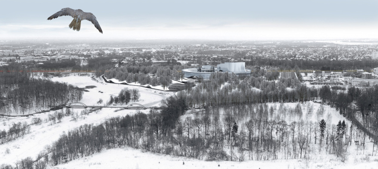
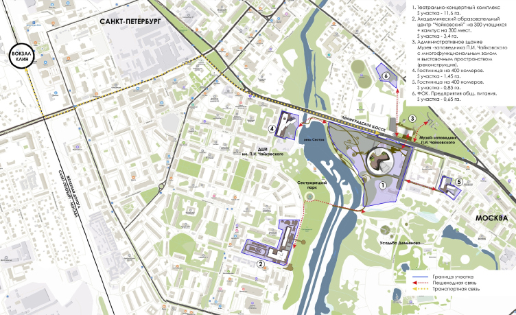
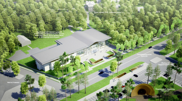
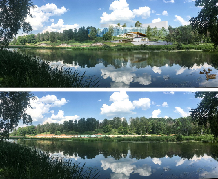
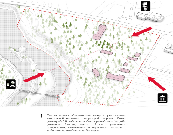
The project includes five land sites. The largest of them is a spacious 13-hectare triangle on the river bank, across from the Sestroretsky Park, north of the former Demyanovo Estate, presented today as a park with the ruins of the manor house and a small church, historically tied to many of well-known names, from the widow of Paul I, the Empress Maria Fedorovna, to the composers Rimsky-Korsakov and Tchaikovsky’s pupil Taneev. A while ago, the land site, which was chosen for the construction of the theater and music complex, hosted a hospital, whose buildings are mostly gone now, what has remained is a maternity house, which will later on be relocated. There are many old trees here, especially on the steep slope of the river bank, the height difference being 20 meters. The river is flooded and turned into a small lake with sandy beaches and a picturesque water area. The Demyanovo Estate forms the south border of the triangle, the river forms its western border, and the northwest border is marked by the Sportivnaya Street, a local fragment of the Leningrad highway, quite a busy one.
Behind the highway, there is the memorial estate house itself, a wooden one, known as “Tchaikovsky’s House in Klin”, which the composer actually rented during the last years of his life, with a small park, not so big as Demyanovo, but better protected, and hence in a better state today. The reconstruction of the museum’s administration building, which stretches along the Sportivnaya Street, is yet another subject of design. A little more to the north, behind the museum territory, on the Tchaikovsky Street, next to the Stroitel Stadium, the architects were able to find room for a new sports center, which is now also part of the entire complex. The land plot for one hotel was found more southeast, in the depth of the residential area behind the retirement home, a 5 minutes’ walk away from the concert hall. Yet another hotel is built on the opposite bank of the river, next to the busy highway.
And, finally, the educational complex, i.e. the branch of Moscow Conservatory – the second most important part of the ensemble – got a land plot behind the Sestroretsky Park, to the south of the pedestrian bridge, next to the city block consisting of renovated five-story buildings. It is about a ten minutes’ walk away from the main concert hall, and this is the longest of pedestrian passes between the different parts grouped around the central nucleus, thought out for each direction, and tied together into a single network.
The main theater and concert complex of the Moscow Region “Tchaikovsky′s Universe”.
Copyright: © 4izmerenie
The main theater and concert complex of the Moscow Region “Tchaikovsky′s Universe”.
Copyright: © 4izmerenie
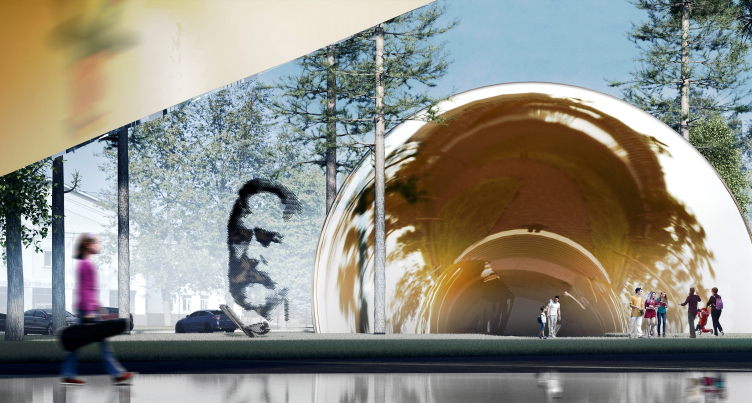
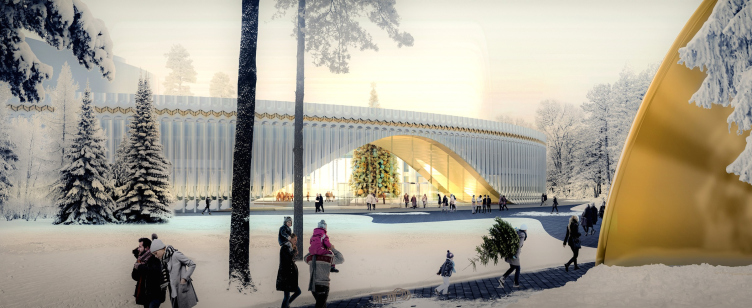
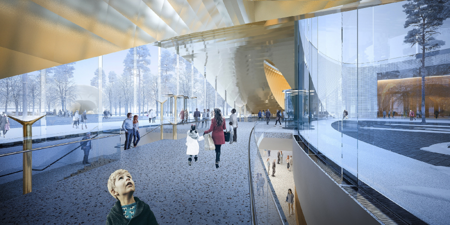
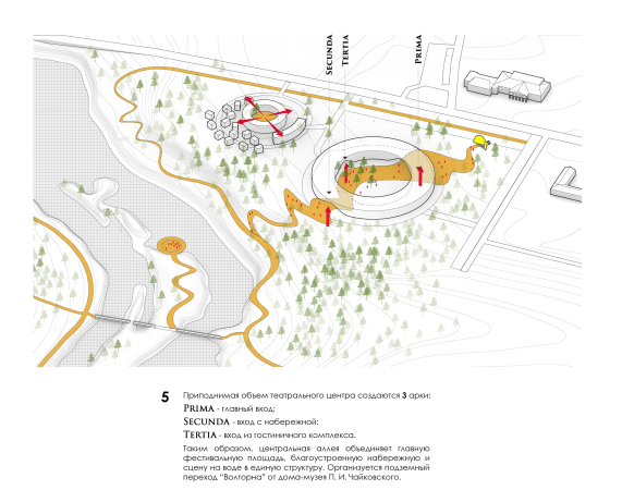
This network of pedestrian connections looks like the development and the derivative of one of the key ideas that were proposed still in the contest-stage version of the project and showed up in the current version as well: the underpass running beneath the Leningrad highway, proposed by the architects in order to improve the connection between the old museum and the new concert hall. Its exit is designed as a giant golden bell of a helicon – the funny cartoon kind that is sometimes depicted with notes flying out of it in order to picture the sound – only here it is people who come out of the faucet instead of notes.
The main theater and concert complex of the Moscow Region “Tchaikovsky′s Universe”.
Copyright: © 4izmerenie
The result looks nice and grand, as if the path to Tchaikovsky’s house were marked by a triumphal arch that honors the composer and at the same time looks like a mercury-like iridescent version of the Ladovsky arch at Moscow’s Krasnye Vorota Square. In the spirit of our time, all digital and sci-fi, one can see in this structure the arch of the quantum leap: between the old and the new, and between the XIX and the XXI centuries. Function-wise, this “faucet” or “bell” portal is meant to replace the current primitive overpass, yet, what is more important is the fact that it becomes the iconic clue of the entire idea: the underground “helicon” sculpture unambiguously indicates that this whole building is about music, inviting people to literally pass through sound, however imaginary – and, on the other hand, sets the plastique leitmotif of the arch, connected with the landscape and the volume, almost closed, yet at the same time wide open – a motif that runs through the entire project, only getting stronger down the line.
From the museum side, the entrance to the underpass echoes the main idea: the stairways in the openings lead downstairs, which is essentially the usual way, yet their walls are golden copper; they accentuate the fact that we are entering that “underground helicon”.
The main theater and concert complex of the Moscow Region “Tchaikovsky′s Universe”.
Copyright: © 4izmerenie
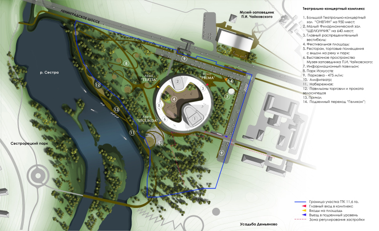
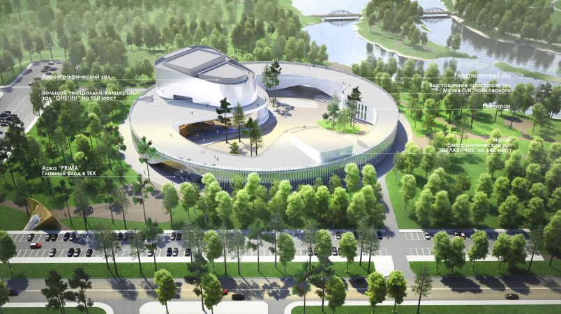
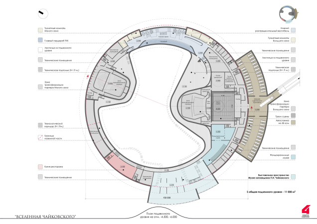
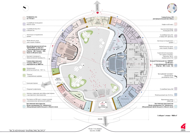
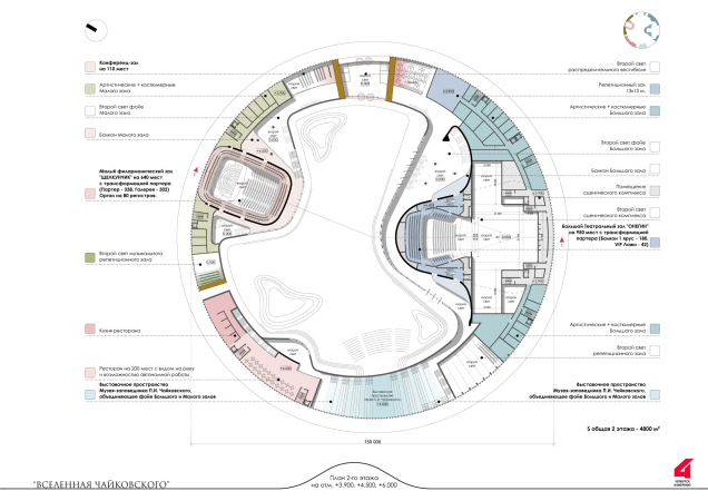
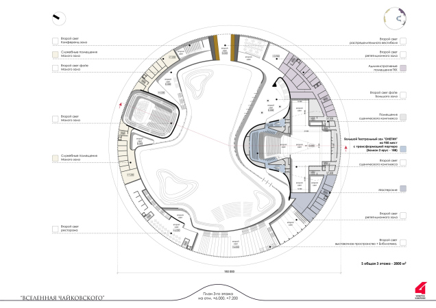
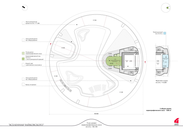
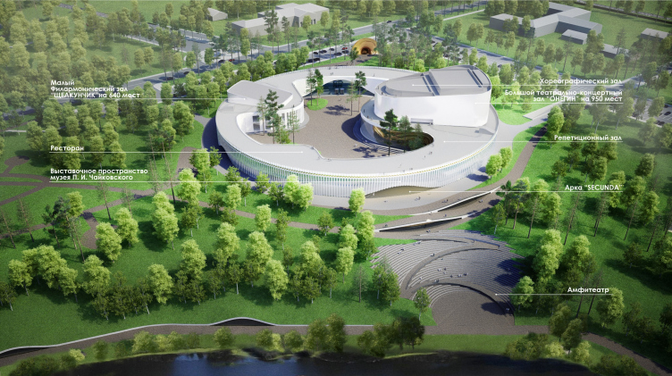
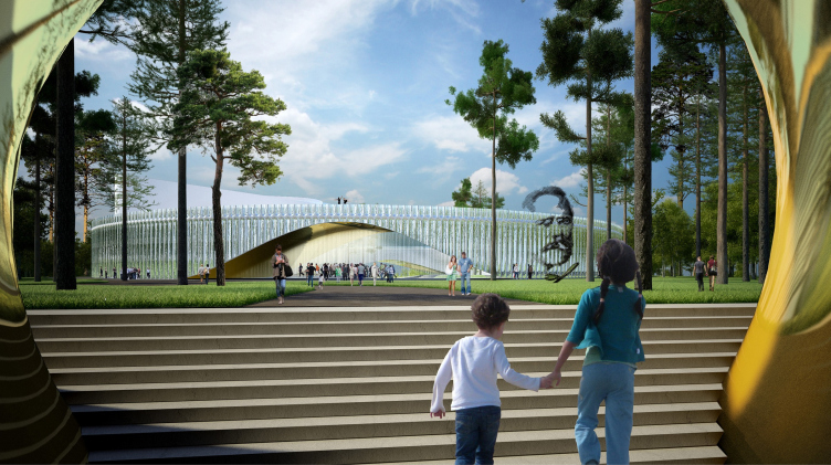
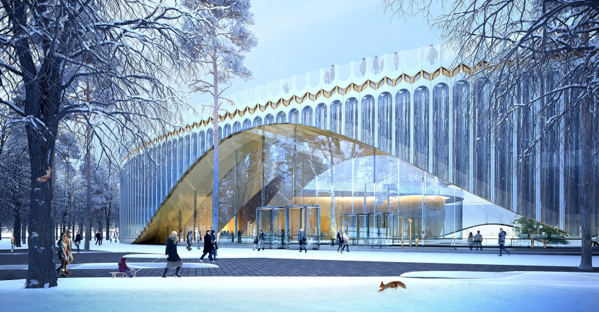
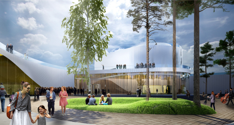
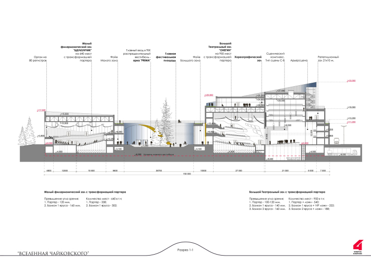
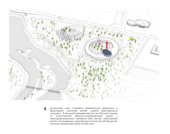
As for the the main complex, i.e. the nucleus of the project, the building that we approach when driving down the Leningrad highway or exiting from the “helicon” on the museum side, is essentially a giant ring, completely circular on its outside contour, with a diameter of 150 meters. The ring comprises two concert halls: the largest theater and concert one, named “Onegin”, for 950 seats, with a choreographic hall on its roof, and the minor philharmonic hall, named “Nut Cracker”, for 640 seats. The space between the halls will include mechanical rooms, rehearsal studios, a museum, and a restaurant. Both halls stand out from the ring, protruding into the yard; the restaurant also stands out, only to a lesser degree, so the yard becomes tripetalous.
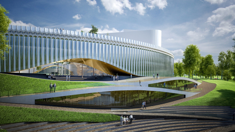
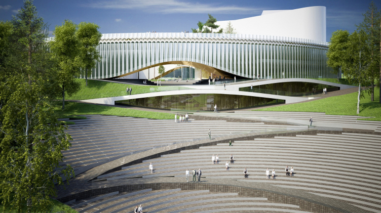
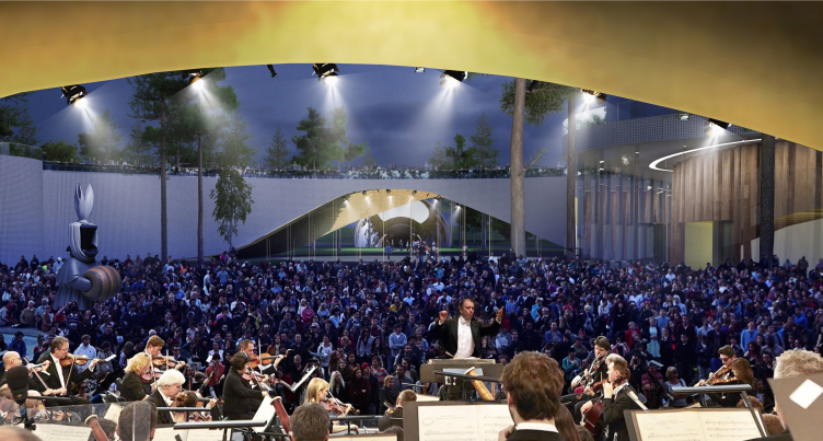
Between the projections, the building is opened to the outside world in three arches named prima, secunda, and tertia – these three overlook the corner of the “helicon” overpass, and the nearest descent to the river, where the architects are proposing to build an amphitheater, while the third smaller arch will overlook the park on the triangular cape.
The main theater and concert complex of the Moscow Region “Tchaikovsky′s Universe”.
Copyright: © 4izmerenie
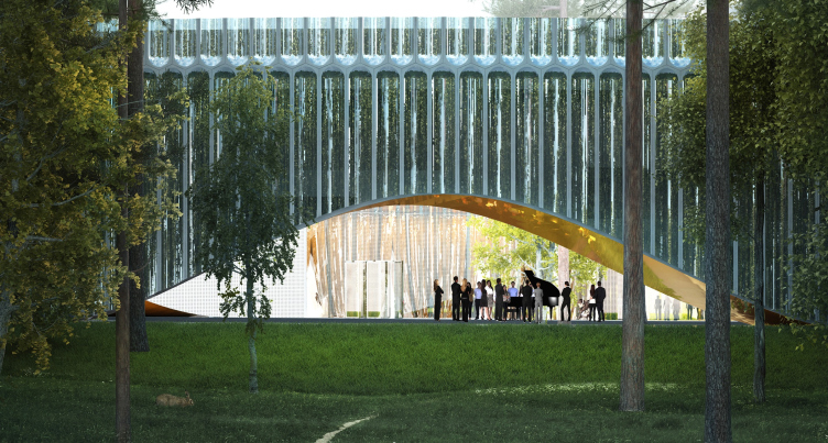
All of the arches are designed very smooth, and remind a curtain slightly drawn from below, yet not a literal picture of it, because no “folds” react to the movement, and it remains a wide flexible cut in the body of the building. Rather, they can be compared to the resonance to the sound wave from the pipe – let’s imagine that the music from Tchaikovsky’s old house pierced the building like a laser beam, leaving molten golden edges, like the matter of pure art. When viewed from a distance, these openings put one in the mind of the bridges in gothic estates, for example, in Tsaritsyno.
The main theater and concert complex of the Moscow Region “Tchaikovsky′s Universe”.
Copyright: © 4izmerenie
What makes these arches different from traditional ones is the absence of the classical bearing plates: the abutments are drawn as being particularly light, which serves to create the effect of lightness of the line, instead of resting on imposts. It must be said that the smoothly raised line became the symbol of the project, and is picked up by the landscaping part, which turns the river bank into a semblance of a karst formation.
The main theater and concert complex of the Moscow Region “Tchaikovsky′s Universe”.
Copyright: © 4izmerenie
The main theater and concert complex of the Moscow Region “Tchaikovsky′s Universe”.
Copyright: © 4izmerenie
Partially, the shape of the jack arches is inspired by today’s profile of the river, where the steep slopes expose clay landslides. The line of the waterfront makes the most of this form, enhancing it, and turning it from a casual natural formation into a theme that is resonant with the general leitmotif.
The main theater and concert complex of the Moscow Region “Tchaikovsky′s Universe”.
Copyright: © 4izmerenie
It must be said that the “helicon” of the underpass, although visually different, also conceptually picks up this theme of “surfacing” from underground, the theme of freely operating the terrain and the underground space.
The main theater and concert complex of the Moscow Region “Tchaikovsky′s Universe”.
Copyright: © 4izmerenie
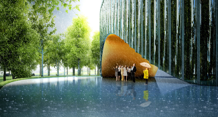
At the cuts, the arches are golden, which means that they will cast sunlight reflections even on rainy days. Furthermore, it is proposed to organize mini-concerts underneath them as well. This will present a cozy, warm, and joyful image: people listening to music underneath the golden vault, securely protected from the rain just outside. The surface, however, will be satin instead of high-gloss, the authors of the project explain, so as not to yield too many reflections on a sunny day.
The main theater and concert complex of the Moscow Region “Tchaikovsky′s Universe”.
Copyright: © 4izmerenie
The main theater and concert complex of the Moscow Region “Tchaikovsky′s Universe”.
Copyright: © 4izmerenie
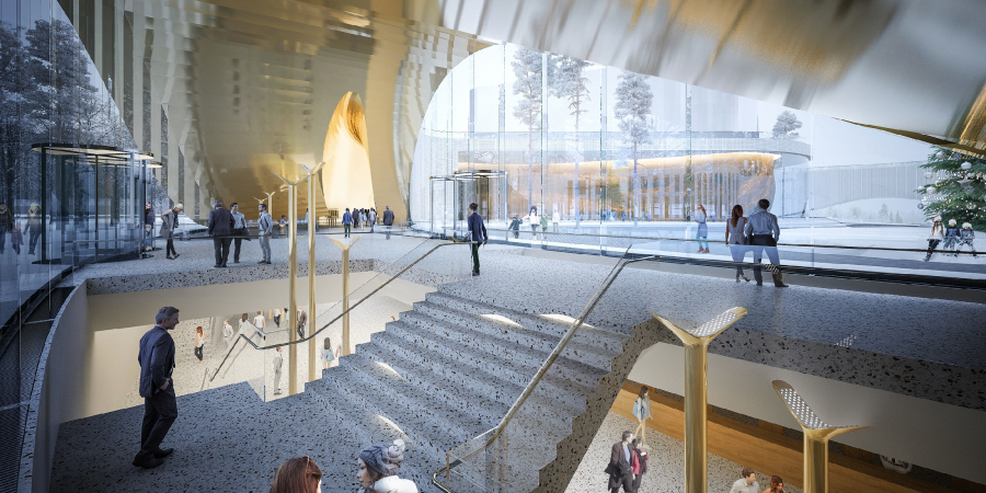
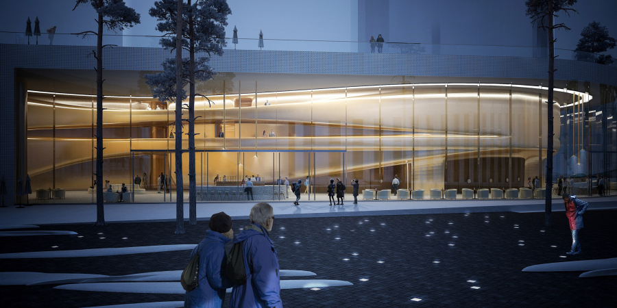
Meanwhile, the first arch Prima, in the course of the development of the competition project became glazed and turned into a joint lobby of both halls, which allows them to function 100% independently. The imagery, though, remained unchanged -the architects treated the glass like a light membrane, easily supporting the cylinders of revolving doors.
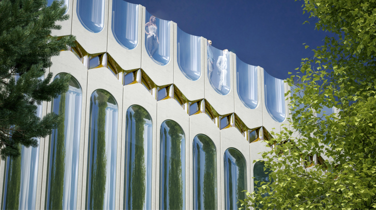
The outside surface of the building, on the other hand, totally consists of flecks of sunlight. The surface of the outside walls of this “crystal” well is composed of a multitude of mirror grooves looking like large flutes and reflecting, paradoxically, everything around them in a multitude of semi-vault exedras. The authors associate the little arches, which connect the caves up above, with the musical tuning fork; the iridescent verticals also remind the pipes of an organ.
The main theater and concert complex of the Moscow Region “Tchaikovsky′s Universe”.
Copyright: © 4izmerenie
In the final version, the architects thoroughly drew the upper “attic” part of the “tuning fork” pipes. The surface gets divided, and the pattern gets turned upside down, becoming a parapet of the operated roof, and gets pulled apart, exposing a semblance of golden carcass. What comes to mind is a comparison with a music box, a steam punk device by the standards of today. In this light, the whole building may seem like a “city in a snuff box”, a large-scale mechanism producing music. Essentially, this is how it is – therefore, the facades do an adequate job of reflecting the essence of the building, without being a mechanism themselves. On the other hand, the top role goes to the “cornice” frieze, giving the building, in addition to the technology image, a surprisingly classical regular look. Because one can also see something from the fust of an antique column in it, even though the “column” is now the entire huge circle, which ultimately resembles a cyclopean spoila that got into the context of a modern city as a marble column into a massive of medieval brickwork.
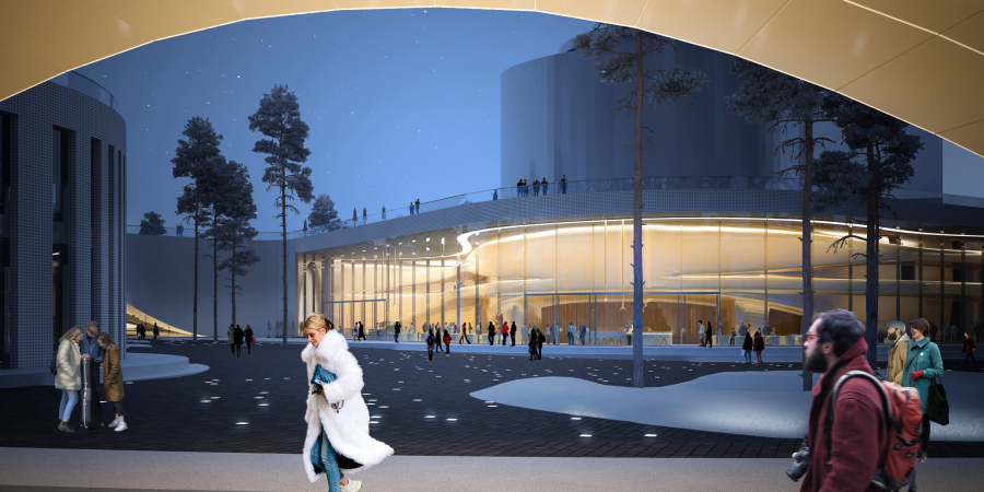
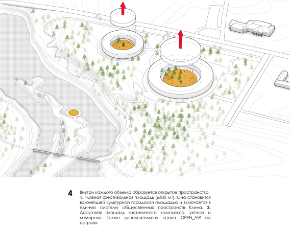
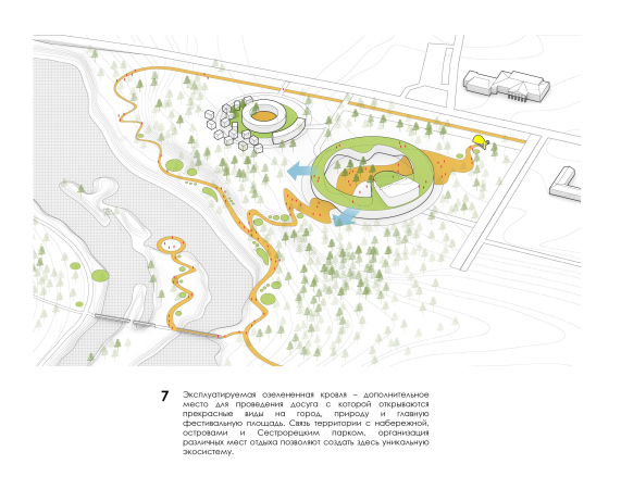
The most important part of the project is the yard with a public space, formed inside the circle between the volumes of the halls. Its area is about 6000 square meters; it is surrounded by the stairs of the amphitheater, and there are plans for organizing open air concerts in it, which is ever so important for the festival agenda. The architects interpret the yard as “the most important cultural city square”, “included in the system of the public spaces of Klin”. This is why the walls inside the yard are coated with, although neutral-looking, effective soundproof composite panels.
The main theater and concert complex of the Moscow Region “Tchaikovsky′s Universe”.
Copyright: © 4izmerenie
The square will be paved with slabs of natural wood – both for improving the acoustic properties and for getting a texture that is aesthetically pleasing, natural, and warm. In the central part, the architects will probably be able to keep the existing grown-up trees, changing the art installations on the square from time to time for the sake of variety.
The main theater and concert complex of the Moscow Region “Tchaikovsky′s Universe”.
Copyright: © 4izmerenie
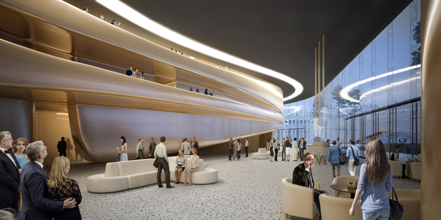
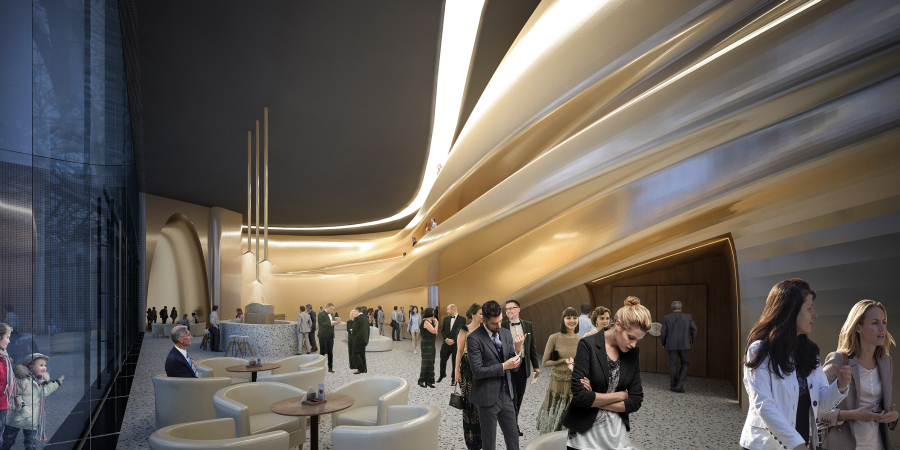
The glass of the foyer of the main stage, protruding into the square, is curvilinear acoustic triplex with a special type of coating and fastening. It turns into a huge volumetric “showcase”, smoothly curved, behind which, especially when the inner backlight is on, one will be able to clearly see the flexible moldings of the balconies that form, in the space of the foyer, a sculptural dance of interflowing shapes, looking like the embodiment of music, with a visual appearance of layers of fog, appearing in the evenings on the river banks. In a word, this is a characteristic for modern theater foyers approach to interior design as “sculpture behind glass”, bright and attractive; such interior works both from the inside out, enriching the space of the yard, and from the outside inwards, because the glass of the foyer seems to be an impalpable barrier, which barely separates the interior and its surroundings.
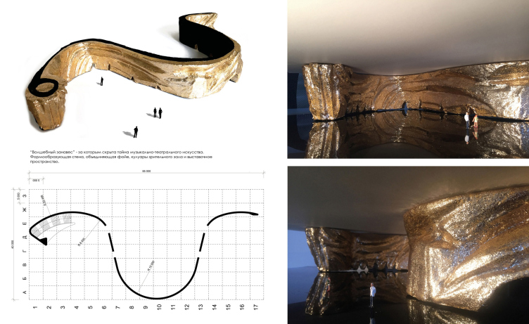
Behind the glass, amongst the light-colored streams of the balcony railings, glitters the “magic curtain” designed by the artist Maxim Lytov – a curvilinear wall that embraces the hall and forms its “anteroom”, including the exhibition areas, the cloakroom, and the spiral case behind it leading to the souvenir shop on the second level. The “curtain”, as the authors of the project figuratively put it, “conceals the mystery of the theater and music art”. The wall clearly resembles some valuable sort of fabric, maybe brocade, or maybe golden ballet gauze, something from Benoit sketches: a slightly crushed shape with a dark-red hue and enticing glittering, which promises a theatrical fairy tale. It could have been also covered with golden mosaic – supposes the leader of “The Fourth Dimension”, Vsevolod Medvedev.
The main theater and concert complex of the Moscow Region “Tchaikovsky′s Universe”.
Copyright: © 4izmerenie
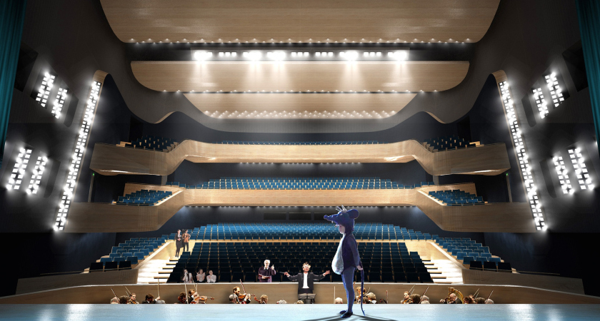
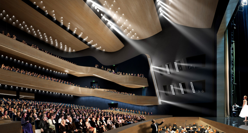
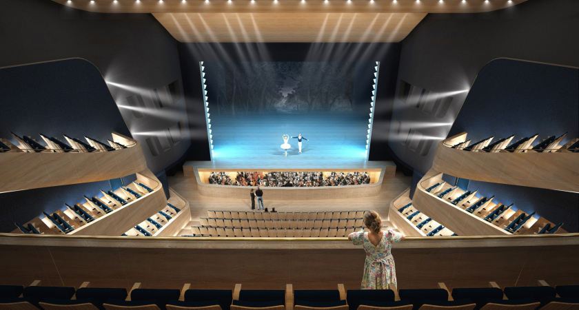
The main hall – with three tiers of balconies inside of it, which allowed the architects to design its interior in a rather compact way, and achieve better sight and sound for most of the spectators – has a rather moderate appearance; the light-colored balconies are only slightly bent against the dark background of the walls, meant to absorb light, thus allowing the spectators to focus on what is going on up on stage.
It must be said that the hall is of the specific theater kind – meaning, it can support not only philharmonic music, but also full-fledged theater productions. The stage is equipped with side stages of an impressive size, with plenty of headroom up and down for the stage machinery. The minimum height of a full-fledged theater box is 27 meters, and, because of that, trying to fit in with the height restrictions – and the place borders on two protected zones, a museum, and a cultural heritage site – the authors sank the basement part deep underground, down to 6.5 meters, and 8.5 meters underneath the main stage, providing on this underground level a driving access for the props and machinery trucks. The grounds in both halls are transformable; there is a function of fully hiding the seats and raising the floor to the same level with the stage, the way it is done in the Zaryadye Park in Moscow – to accommodate for the stylistic devices of the modern theater that is all about “going beyond” the confines of the conventional stage.
The main theater and concert complex of the Moscow Region “Tchaikovsky′s Universe”. Section view
Copyright: © 4izmerenie
On the whole, the task of proposing a clear and easily readable image, based on the modern interpretation of the latent classics can be considered as good as fulfilled. The ring of the main theater and concert complex can be traced back to the classical rotunda, the go-to solution of the manor estate architecture, and the perfect shape of the temple standing in an ideal city – when viewed from the river, it looks like a palace, and is even a bit reminiscent of Pavlovsk. At the same time, however, it puts on in the mind of some alien artifact – the contemporary character of the complex is set by the glitter of its materials, and is totally obvious. One will not even see here the proverbial tension between the classic and its modern interpretation: this is a large-scale and acutely contemporary image, neatly inscribed into the landscape, yet looking really impressive, designed to become a landmark and a center of attraction for miles around.
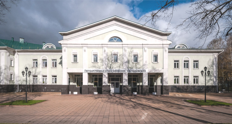
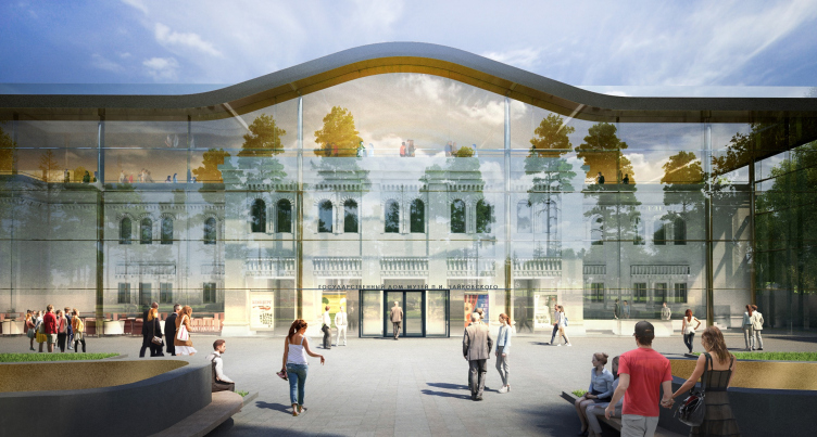
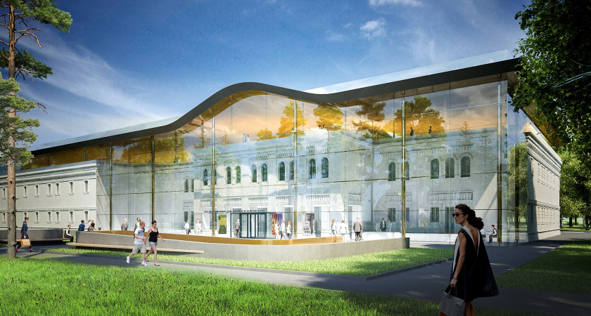
The school, the hotel, and the sports center buildings, now distributed all over the city, are still in the design stage, but the project of reconstructing the nearby administration building is already available. It was built in the 1990’s in the then-fashionable reserved postmodernist style, with stuccoed walls, and small windows in loosely decorated frames under a hefty fronton.
The main theater and concert complex of the Moscow Region “Tchaikovsky′s Universe”. The current state
Copyright: © 4izmerenie
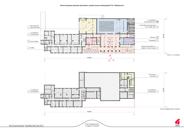
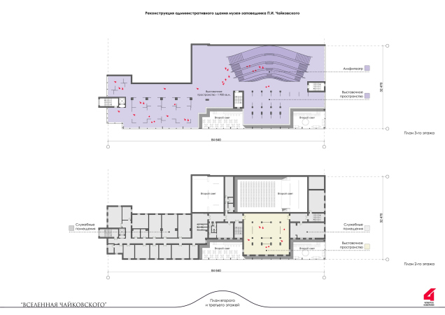
The architects of “The Fourth Dimension”, while keeping the construction of the building, do a radical reorganization of the facade. It is decorated in the vein of industrial architecture of the late XIX century: the building is getting more windows, hence, more light inside; the windows take on an arched look, getting a fractured decor of the “brick style” with cantilevered structures and little columns. The historicism of the building becomes more palpable. The main thing, though: the street facade gets encased in a glass casing, which forms a heated lobby, similar to the foyer of the theater. At the same time, the historicism facade is plainly visible behind the glass, like an exhibit in a showcase.
The main theater and concert complex of the Moscow Region “Tchaikovsky′s Universe”.
Copyright: © 4izmerenie
The stone fronton is now gone completely, and the roof level of the existing building gets extra space that the museum needs, covered by a new metallic roof – it gets bent in the middle, forming an accent, like a reminder about the fronton, whose contour is at the same time close to the smooth semi-arch, the symbol of the project.
Thus, the renewed administration building accentuates – through the “showcase” theme – the museum function; at the same time it gets connected image-wise with the theater and the concert complex, and looks nice and fresh, in spite of the “imposed” historicism theme borrowed from the old building and strengthened by the new facade.
***
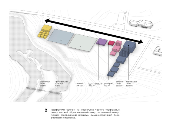
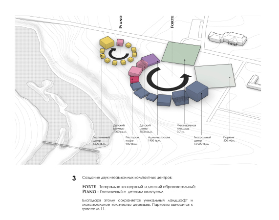
In conclusion, here is a small remark similar to how they sometimes show abortive takes after a movie in order to show the spectator the process of its creation. Originally, the idea was born from joining the functions to form two circles, and the author’s train of thought looked like this:


