По-русски

​Nagatino: Four Stories

The project of developing the western part of the Nagatinsky Peninsula was developed and readjusted by Ginzburg Architects four times; the company would superimpose, layer by layer, one concept after another, forming a unique case of urban development. In this article, we are bringing to your attention all the four of them, starting from the company’s collaboration with William Alsop.

05 December 2019
Object
mainImg

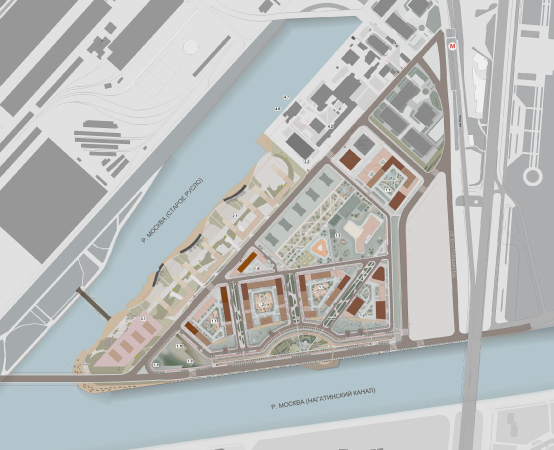
The land site in question is essentially a continuation of the industrial construction of the ZIL peninsula, yet still separated from it by the remains of the old riverbed of the Moskva River. Due to this particular circumstance, it looks quite self-sufficient composition-wise. This “minor” peninsula is crossed in its very middle by the Andropov Avenue; its eastern part includes the Ostrov Mechty (“Dream Island”) amusement park, and its western part for years has been the subject of town planning efforts, starting from the late 1980’s, when its conceptual design was done by Vladimir Ginzburg’s architectural studio in Mosproekt. This place is very promising from the town planning standpoint – the land site sports a picturesque “spit” at the confluence or the old and the main riverbeds, a large recreation potential of the riverside lands, and at the same time it is totally context-free, which gives the architects an opportunity to go as fancy with it as they would like. The existing industrial construction is sparse and low-value, and the only thing that can kind of serve as a starting point is the “sail” houses designed by Rimma Aldonina back in the 1970’s, which form the waterfront on the opposite side of the river.
***

2014/ Competition

Right about the time when the ideas for redeveloping the ZIL land took shape, there appeared thoughts about reorganizing its western part and constructing a housing block here. In 2014, the developer conducted the first of the series of competitions for this site, which involved Ginzburg Architects. For Aleksey Ginzburg, this was the first experience of working with the territory. In the first competition, he took part in consortium with two world stars – William Alsop and McAdam Architects.

The competition project for developing stages 3-5 of the Moscow city technopark “Nagatino-ZIL” as integrated construction. 2014.
Copyright: Ginzburg Architects (Moscow), All Design (Alsop Architects, London), McAdam Architects (London)
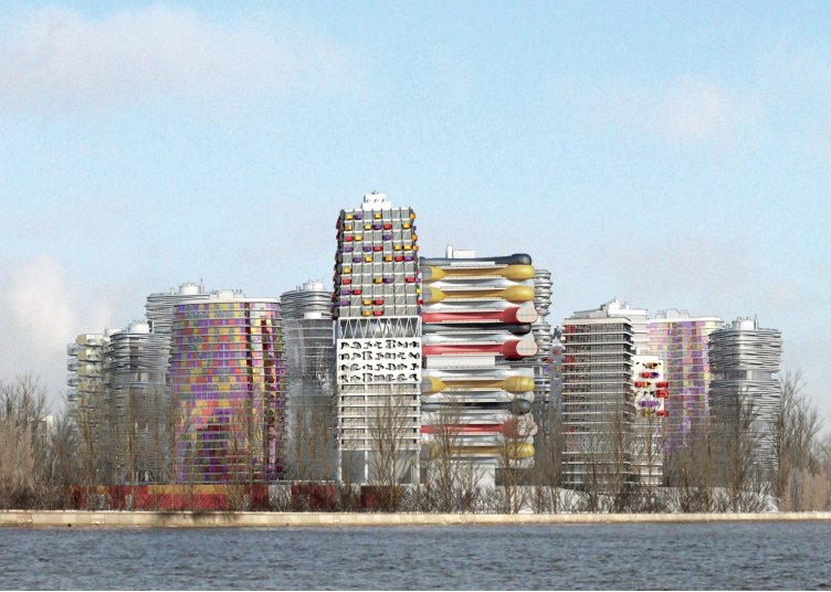
Architectural and town-planning concept of the mixed-use development in the western part of the Nagatinskaya Poima. Competition project, 2014
Copyright: Ginzburg Architects (Moscow), All Design (Alsop Architects, London), McAdam Architects (London)


The project was very bright, not to say flamboyant. However, the authors did want to make something shocking and conceptual. “During that first competition, I invited a good friend of mine, William Alsop, a great freethinking conceptualist architect; I would even say, there was something rebellious about him – Aleksey Ginzburg reminisces – We proposed a rather uncompromising idea that we thought was doomed from the very start, but we still wanted to make this bold statement”.

Architectural and town-planning concept of the mixed-use development in the western part of the Nagatinskaya Poima. Competition project, 2014
Copyright: Ginzburg Architects (Moscow), All Design (Alsop Architects, London), McAdam Architects (London)


Architectural and town-planning concept of the mixed-use development in the western part of the Nagatinskaya Poima. Competition project, 2014
Copyright: Ginzburg Architects (Moscow), All Design (Alsop Architects, London), McAdam Architects (London)


Architectural and town-planning concept of the mixed-use development in the western part of the Nagatinskaya Poima. Competition project, 2014
Copyright: Ginzburg Architects (Moscow), All Design (Alsop Architects, London), McAdam Architects (London)


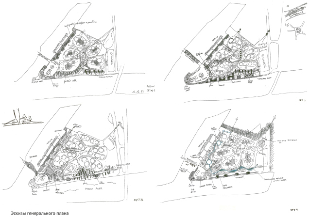
In the first competition project, the peninsula’s spit was developed in a highly urbanized way – a “choir” of eccentric-looking towers, each of which could make a worthy exhibit in the museum of modern art. This uncompromising approach was perfectly viable as a new town planning highlight. The proposal was powerful and very elegant imagery-wise – very much in the spirit of William Alsop. The master plan was executed in the shape of a flower; the complex also had a plinth part formed by underground parking garages turned into green hills – because of the high ground water, it was impossible to build parking garages really underground. The space was crossed by a green yard, which was to resurface later in the town planning developments of this territory.

  • zooming
    1 / 4
    Architectural and town-planning concept of the mixed-use development in the western part of the Nagatinskaya Poima. Competition project, 2014
    Copyright: Ginzburg Architects (Moscow), All Design (Alsop Architects, London), McAdam Architects (London)
  • zooming
    2 / 4
    The landscaping scheme. Architectural and town-planning concept of the mixed-use development in the western part of the Nagatinskaya Poima. Competition project, 2014
    Copyright: Ginzburg Architects (Moscow), All Design (Alsop Architects, London), McAdam Architects (London)
  • zooming
    3 / 4
    Architectural and town-planning concept of the mixed-use development in the western part of the Nagatinskaya Poima. Competition project, 2014
    Copyright: Ginzburg Architects (Moscow), All Design (Alsop Architects, London), McAdam Architects (London)
  • zooming
    4 / 4
    Architectural and town-planning concept of the mixed-use development in the western part of the Nagatinskaya Poima. Competition project, 2014
    Copyright: Ginzburg Architects (Moscow), All Design (Alsop Architects, London), McAdam Architects (London)
***

2016 / Competition

Architectural and town-planning concept of the mixed-use development in the western part of the Nagatinskaya Poima. Competition project, 2016
Copyright: Aleksey Ginzburg – Chief Architect of the Project; A.Orlov – Chief Architect of the Project; T.Arkhipova – the leading architect


The first competition concept did not get any further development but can now be remembered as a bold creative starting point of developing this land. The next concept came about in 2016, when Aleksey Ginzburg was again invited to the competition – to design the same land site, for which now a territory planning project had been developed. And it was the planning project that served as the brief that was presented to the contestants. The site plan, according to the architects, had a whole number of shortcomings, and, based on these shortcomings, the authors built their new concept.

Architectural and town-planning concept of the mixed-use development in the western part of the Nagatinskaya Poima. Competition project, 2016
Copyright: Aleksey Ginzburg – Chief Architect of the Project; A.Orlov – Chief Architect of the Project; T.Arkhipova – the leading architect


The multifunctional construction, which, in addition to housing, was now serving the public and business functions, was presented in this site plan as urban blocks that were placed alongside the perimeter of the site. On this site plan, the houses stood virtually on the very transportation mainline on the waterfront – the architect shares – We had to stretch the construction in a semicircular fashion so as to pull the buildings away from the traffic way and create a green recreational buffer zone”.

Architectural and town-planning concept of the mixed-use development in the western part of the Nagatinskaya Poima. Competition project, 2016
Copyright: Aleksey Ginzburg – Chief Architect of the Project; A.Orlov – Chief Architect of the Project; T.Arkhipova – the leading architect


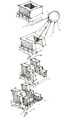
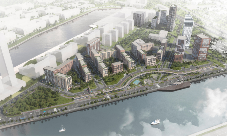
The architects tried to turn the residential yards southward as much as possible to make them face the river and the sun; at the same time, the side ends of the houses that were facing the water were used to form the waterfront. Aleksey Ginzburg shares that the green buffer idea came to him from his childhood associations: “I spent my entire childhood in the Architects’ House, which is on the Rostovskaya Embankment near the Kievsky railway station, and I remember that we had this little park that, thanks to the dip of the terrain, served as a screen between the waterfront highway and the residential buildings. This construction was designed still by Aleksey Shchusev as the waterfront in this section of the Moskva River. I thought that the logic of the Nagatinskaya riverbed required a similar solution”. 

  • zooming
    1 / 9
    Architectural and town-planning concept of the mixed-use development in the western part of the Nagatinskaya Poima. Competition project, 2016
    Copyright: Aleksey Ginzburg – Chief Architect of the Project; A.Orlov – Chief Architect of the Project; T.Arkhipova – the leading architect
  • zooming
    2 / 9
    Architectural and town-planning concept of the mixed-use development in the western part of the Nagatinskaya Poima. Competition project, 2016
    Copyright: Aleksey Ginzburg – Chief Architect of the Project; A.Orlov – Chief Architect of the Project; T.Arkhipova – the leading architect
  • zooming
    3 / 9
    Copyright: Aleksey Ginzburg – Chief Architect of the Project; A.Orlov – Chief Architect of the Project; T.Arkhipova – the leading architect
  • zooming
    4 / 9
    Architectural and town-planning concept of the mixed-use development in the western part of the Nagatinskaya Poima. Sketch. Competition project, 2016
    Copyright: Aleksey Ginzburg – Chief Architect of the Project; A.Orlov – Chief Architect of the Project; T.Arkhipova – the leading architect
  • zooming
    5 / 9
    Architectural and town-planning concept of the mixed-use development in the western part of the Nagatinskaya Poima. Competition project, 2016
    Copyright: Aleksey Ginzburg – Chief Architect of the Project; A.Orlov – Chief Architect of the Project; T.Arkhipova – the leading architect
  • zooming
    6 / 9
    Architectural and town-planning concept of the mixed-use development in the western part of the Nagatinskaya Poima. Competition project, 2016
    Copyright: Aleksey Ginzburg – Chief Architect of the Project; A.Orlov – Chief Architect of the Project; T.Arkhipova – the leading architect
  • zooming
    7 / 9
    Architectural and town-planning concept of the mixed-use development in the western part of the Nagatinskaya Poima. Competition project, 2016
    Copyright: Aleksey Ginzburg – Chief Architect of the Project; A.Orlov – Chief Architect of the Project; T.Arkhipova – the leading architect
  • zooming
    8 / 9
    Architectural and town-planning concept of the mixed-use development in the western part of the Nagatinskaya Poima. Competition project, 2016
    Copyright: Aleksey Ginzburg – Chief Architect of the Project; A.Orlov – Chief Architect of the Project; T.Arkhipova – the leading architect
  • zooming
    9 / 9
    Architectural and town-planning concept of the mixed-use development in the western part of the Nagatinskaya Poima. Competition project, 2016
    Copyright: Aleksey Ginzburg – Chief Architect of the Project; A.Orlov – Chief Architect of the Project; T.Arkhipova – the leading architect


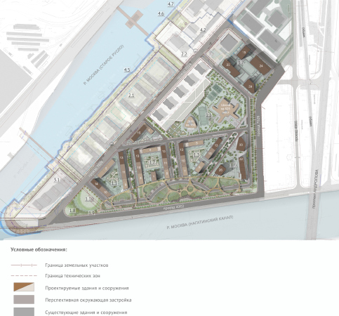
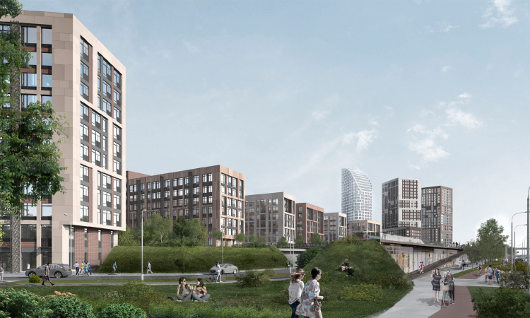
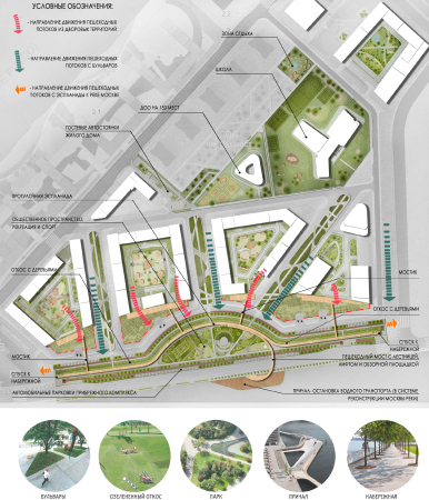
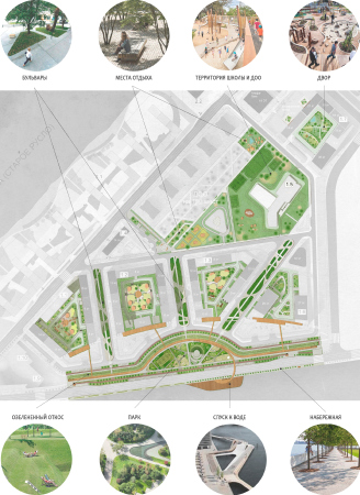
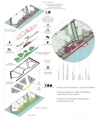
Since removing the highway was out of the question (it was an important segment of the ZIL transportation scheme) the green buffer zone could advantageously separate the highway from people’s homes and get turned into a mini park. Therefore, the pedestrian boulevard, which was already there on the site plan, was literally carried over to the waterfront, which yielded a rather broad recreational zone.
***

2017 / Development of the competition concept

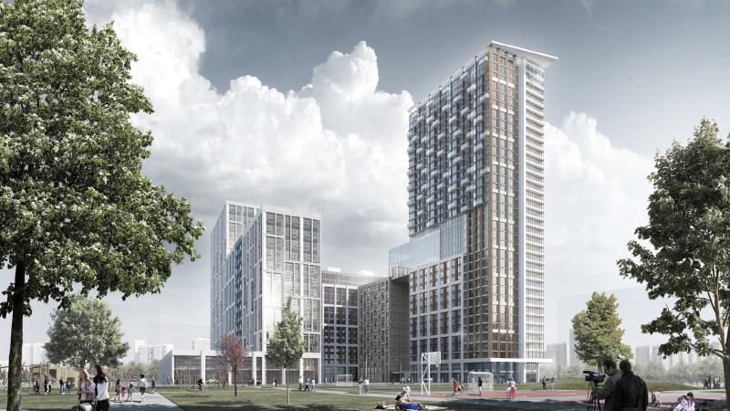
Ginzburg Architects won the competition, which came as a surprise even for themselves. Aleksey Ginzburg believes that this must have happened thanks to the carefully thought out public space that the project provided for, which also included the thought out plan of traffic and pedestrian flows. While in the stage of detailed elaboration of the project for getting the municipal approvals, Aleksey Ginzburg decided to invite a few other architectural companies to work on the project – the sheer construction volume was quite impressive – about 400 000 square meters. The project was joined by the “Laboratory or Virtual Architecture” header by Stanislav Kulish and Vadim Lipatov, “Popov and Architects”, and “SENAB PROJECT”.

  • zooming
    1 / 7
    Architectural and town-planning concept of the mixed-use development in the western part of the Nagatinskaya Poima. 2017
    Copyright: Ginzburg Architects, Laboratory of Virtual Architceture, Popov and Architects, SENAB Project
  • zooming
    2 / 7
  • zooming
    3 / 7
    Architectural and town-planning concept of the mixed-use development in the western part of the Nagatinskaya Poima. The landscaped park on the embankment
    Copyright: Ginzburg Architects, Laboratory of Virtual Architceture, Popov and Architects, SENAB Project
  • zooming
    4 / 7
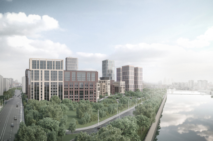
    Architectural and town-planning concept of the mixed-use development in the western part of the Nagatinskaya Poima. View from the boulevard leading to the park. Arkhsovet, 2017
    Copyright: Ginzburg Architects, Laboratory of Virtual Architceture, Popov and Architects, SENAB Project
  • zooming
    5 / 7
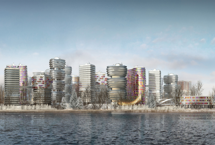
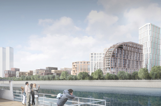
    Architectural and town-planning concept of the mixed-use development in the western part of the Nagatinskaya Poima. View of the complex from the river. Arkhsovet, 2017
    Copyright: Ginzburg Architects, Laboratory of Virtual Architceture, Popov and Architects, SENAB Project
  • zooming
    6 / 7
    Architectural and town-planning concept of the mixed-use development in the western part of the Nagatinskaya Poima. View of the complex from the river. Arkhsovet, 2017
    Copyright: Ginzburg Architects, Laboratory of Virtual Architceture, Popov and Architects, SENAB Project
  • zooming
    7 / 7
    Architectural and town-planning concept of the mixed-use development in the western part of the Nagatinskaya Poima. Simplified master plan. Arkhsovet, 2017
    Copyright: Ginzburg Architects, Laboratory of Virtual Architceture, Popov and Architects, SENAB Project


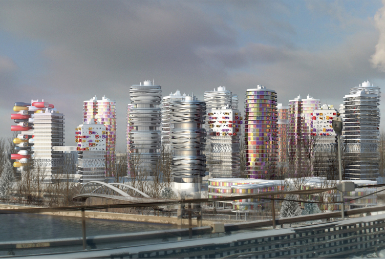
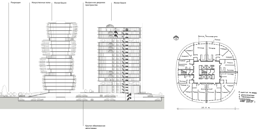
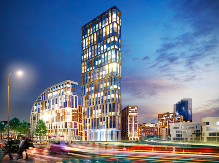
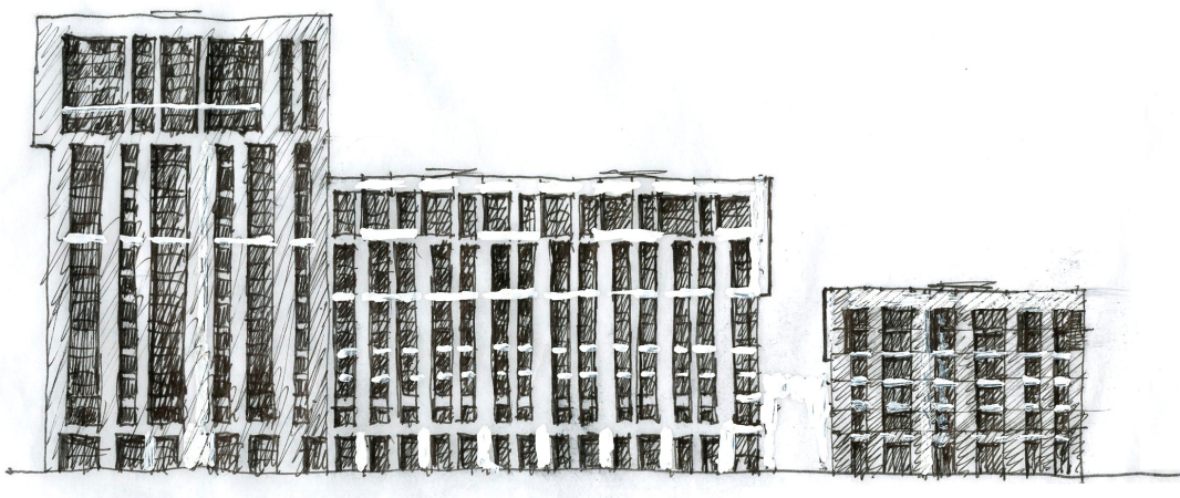
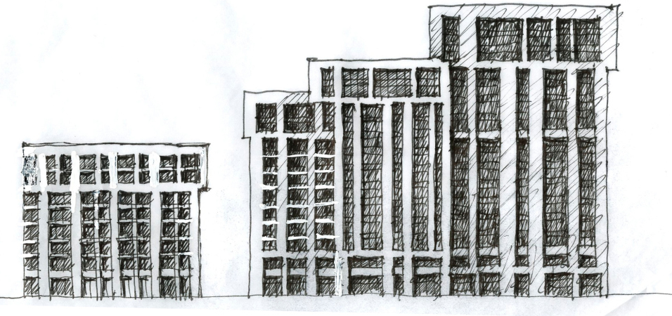
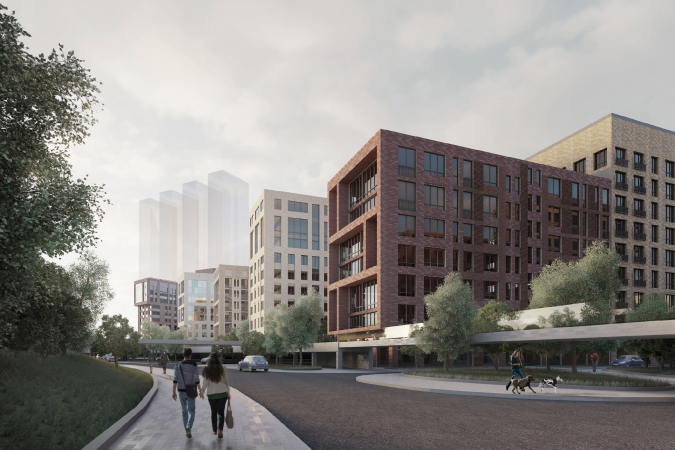
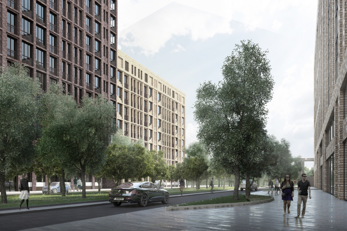
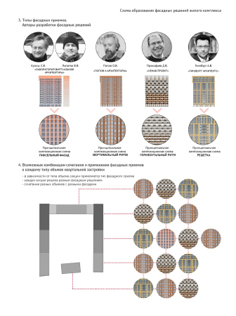
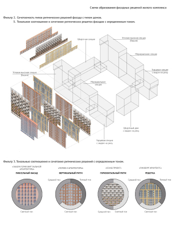
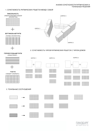
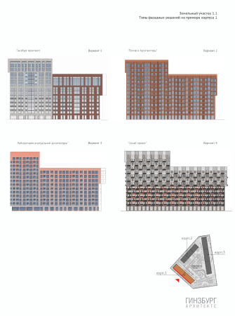
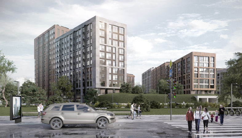
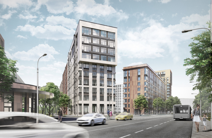
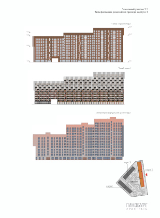
Due to the fact that the apartment plans were predetermined by the client’s brief, the architects focused on the outward appearance of the buildings. The houses within the block were divided into a few types, all the four companies designing the facades for each of them. Striving to maintain, for all the diversity of the individual solutions, the visual integrity of the complex, Aleksey Ginzburg proposed to unify all of the facade designs by obligatory use of brick.

“The shades of brick, as well as the ways and methods of its application, was something that we left to each partner’s discretion – the architect explains – Eventually, we got four patterns, each of which demonstrated an individual designer technique. In the version that was designed by our company, for example, the facade idea was expressed in large segments, while the version proposed by Kulish and Lipstov was essentially about what you might call pixel painting. Then we conducted a series of workshops in order to find the best way for combining our versions, ultimately coming up with a system of factors that would help bye to do this within one urban block on the basis of the compositional analysis”.

  • zooming
    1 / 5
    The facades. Architectural and town-planning concept of the mixed-use development in the western part of the Nagatinskaya Poima. View from the boulevard leading to the park. Arkhsovet, concept 2017
    Copyright: Ginzburg Architects, Laboratory of Virtual Architceture, Popov and Architects, SENAB Project
  • zooming
    2 / 5
    The facades. Architectural and town-planning concept of the mixed-use development in the western part of the Nagatinskaya Poima. View from the bridge. Arkhsovet, concept 2017
    Copyright: Ginzburg Architects, Laboratory of Virtual Architceture, Popov and Architects, SENAB Project
  • zooming
    3 / 5
    The facades. Architectural and town-planning concept of the mixed-use development in the western part of the Nagatinskaya Poima. View from the bridge. Arkhsovet, concept 2017
    Copyright: Ginzburg Architects, Laboratory of Virtual Architceture, Popov and Architects, SENAB Project
  • zooming
    4 / 5
    The facades. Architectural and town-planning concept of the mixed-use development in the western part of the Nagatinskaya Poima. View from the bridge. Arkhsovet, concept 2017
    Copyright: Ginzburg Architects, Laboratory of Virtual Architceture, Popov and Architects, SENAB Project
  • zooming
    5 / 5
    The facades. Architectural and town-planning concept of the mixed-use development in the western part of the Nagatinskaya Poima. View from the bridge. Arc
    Copyright: Ginzburg Architects, Laboratory of Virtual Architceture, Popov and Architects, SENAB Project


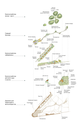
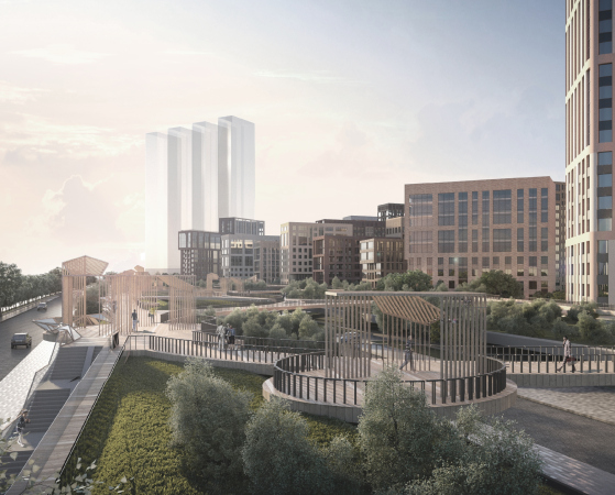
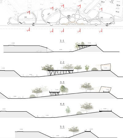
Parallel to that, the fourth compositional layer of the land site was developed – the concept of the public spaces. Essentially, it was based on the competition idea of the green buffer zone serving as a screen between the riverside highway and the residential area, adding a whole new level to it – an elevated system of pedestrian promenades, little bridges and ramps, making a landscaped park above the driveways that were originally included in the site plan. On the plan, this layer looked like a grid of large cells that connected the park to the level of the yards, also elevated because of the leveed parking garages.

  • zooming
    1 / 3
    Architectural and town-planning concept of the mixed-use development in the western part of the Nagatinskaya Poima. View from the boulevard leading to the park. Arkhsovet, 2017
    Copyright: Ginzburg Architects, Laboratory of Virtual Architceture, Popov and Architects, SENAB Project
  • zooming
    2 / 3
    The facades. Architectural and town-planning concept of the mixed-use development in the western part of the Nagatinskaya Poima. The section views of the pedestrian space. Arkhsovet, concept 2017
    Copyright: Ginzburg Architects, Laboratory of Virtual Architceture, Popov and Architects, SENAB Project
  • zooming
    3 / 3


While this work was in progress, Yuri Grigoryan designed for the city a concept of developing the Moskva River waterfronts, on which interesting “points of growth” appeared – the “ports” or multifunctional public spaces. Aleksey Ginzburg decided to “plug in to this narrative” and turned the already existing quay of the river boat into one of such “ports”, adding to it a semicircular pedestrian bridge. The future park will be called NAGA, which is short for Nagatino. But then again, so far it has remained on the level of conceptual development. 
***

2018 / competition

  • zooming
    1 / 4
    Architectural and town-planning concept of the mixed-use development in the western part of the Nagatinskaya Poima. Competition project, 2018
    Copyright: A.Ginzburg – Chief Architect of the Project; A.Orlov – Chief Architect of the Project; M.Dudin – Chief Architect of the Project, A.Puchkov – Chief Architect of the Project; M.Aleksandrova – the leading architect; V.Galimov – Architect
  • zooming
    2 / 4
    Architectural and town-planning concept of the mixed-use development in the western part of the Nagatinskaya Poima. Competition project, 2018
    Copyright: A.Ginzburg – Chief Architect of the Project; A.Orlov – Chief Architect of the Project; M.Dudin – Chief Architect of the Project, A.Puchkov – Chief Architect of the Project; M.Aleksandrova – the leading architect; V.Galimov – Architect
  • zooming
    3 / 4
    Architectural and town-planning concept of the mixed-use development in the western part of the Nagatinskaya Poima. Competition project, 2018
    Copyright: A.Ginzburg – Chief Architect of the Project; A.Orlov – Chief Architect of the Project; M.Dudin – Chief Architect of the Project, A.Puchkov – Chief Architect of the Project; M.Aleksandrova – the leading architect; V.Galimov – Architect
  • zooming
    4 / 4
    Architectural and town-planning concept of the mixed-use development in the western part of the Nagatinskaya Poima. Competition project, 2018
    Copyright: A.Ginzburg – Chief Architect of the Project; A.Orlov – Chief Architect of the Project; M.Dudin – Chief Architect of the Project, A.Puchkov – Chief Architect of the Project; M.Aleksandrova – the leading architect; V.Galimov – Architect


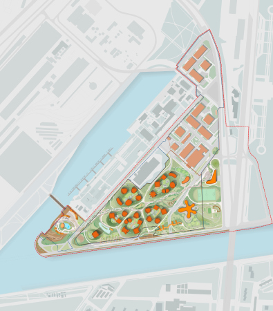
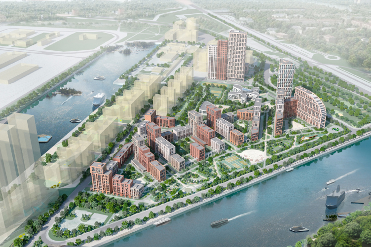
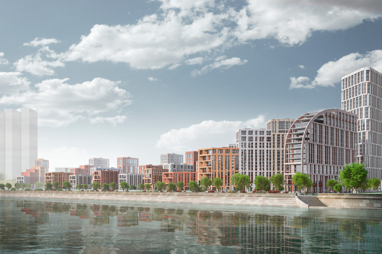
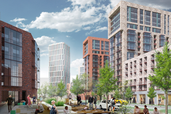
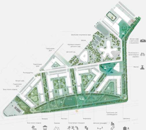
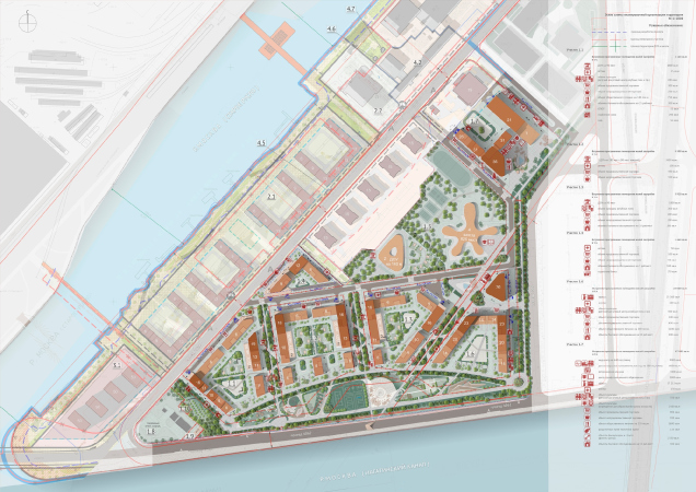
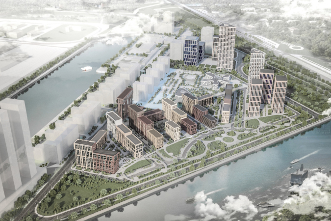
Yet another generation of managers, who replaced the old ones behind the wheel of the seemingly endless project, conducted still another competition in 2018, inviting western stars for participation. Aleksey Ginzburg also took part in this competition as a “long-standing contestant”. And, although the new clients wanted to break away from brick as the main building material in favor of the more budget-friendly prefab panels, the project still inherited a lot of things from the previous iterations. The arrangement of the city blocks changed a little bit, but the idea of a green buffer zone near the river, the elevated leveed parking garages, and the play of levels remained. Here, the architects again put their focus on the waterfront – the authors formed a single construction front from the side ends of the residential houses, creating an effect of a “sliced surface”, as the architect explains. By doing this, they joined by a slight arc all of the four housing blocks from the side of the river. Yet another highlight is the business part – as we remember, the developer considered the block to be multifunctional.

  • zooming
    1 / 4
    Architectural and town-planning concept of the mixed-use development in the western part of the Nagatinskaya Poima. Competition project, 2018
    Copyright: A.Ginzburg – Chief Architect of the Project; A.Orlov – Chief Architect of the Project; M.Dudin – Chief Architect of the Project, A.Puchkov – Chief Architect of the Project; M.Aleksandrova – the leading architect; V.Galimov – Architect
  • zooming
    2 / 4
    Architectural and town-planning concept of the mixed-use development in the western part of the Nagatinskaya Poima. Competition project, 2018
    Copyright: A.Ginzburg – Chief Architect of the Project; A.Orlov – Chief Architect of the Project; M.Dudin – Chief Architect of the Project, A.Puchkov – Chief Architect of the Project; M.Aleksandrova – the leading architect; V.Galimov – Architect
  • zooming
    3 / 4
    Architectural and town-planning concept of the mixed-use development in the western part of the Nagatinskaya Poima. Competition project, 2018
    Copyright: A.Ginzburg – Chief Architect of the Project; A.Orlov – Chief Architect of the Project; M.Dudin – Chief Architect of the Project, A.Puchkov – Chief Architect of the Project; M.Aleksandrova – the leading architect; V.Galimov – Architect
  • zooming
    4 / 4
    Architectural and town-planning concept of the mixed-use development in the western part of the Nagatinskaya Poima. The master plan. A competition project 2018
    Copyright: A.Ginzburg – Chief Architect of the Project; A.Orlov – Chief Architect of the Project; M.Dudin – Chief Architect of the Project, A.Puchkov – Chief Architect of the Project; M.Aleksandrova – the leading architect; V.Galimov – Architect


The project of 2018, however, wasn’t realized either. The concept of the territory was re-formatted again, and up to this day there is no clear understanding whether a new project will be developed or the earlier solutions will be implemented. “This large town planning project was something that we repeatedly tried to imbue with progressive ideas, observing the principles of the commercial approach that is dictated by today’s market – Aleksey Ginzburg says – rearranging and repacking these city blocks, never once did we break the rules, which, regrettably, really limit the range of possible architectural solutions. But still I think that we were able to solve two main tasks, the inner one being the task to create a human-friendly environment for the life of people, and the outer one being the task of forming a fragment of city fabric that would have both compositional and aesthetic connections with the Moscow environment”.


05 December 2019

Headlines now
The Golden Crown
The concept for a dental clinic in Yekaterinburg, developed by CNTR Studio, revolves around the idea of a “mouth full of gold”: pristine white porcelain stoneware walls are complemented by matte brass details. To avoid an overly literal interpretation, the architects focused on the building’s proportions, skillfully navigating between sunlight requirements and fire safety regulations.
Flexibility and Integration
Not long ago, we covered the project for the fourth phase of the ÁLIA residential complex, designed by APEX. Now, we’ve been shown different fence concepts they developed to enclose the complex’s private courtyards, incorporating a variety of public functions. We believe that the sheer fact that the complex’s architects were involved in such a detail as fencing speaks volumes.
A Step Forward
The HIDE residential complex represents a major milestone for ADM architects and their leaders Andrey Romanov and Ekaterina Kuznetsova in their quest for a fresh high-rise aesthetic – one that is flexible and layered, capable of bringing vibrancy to mass and silhouette while shaping form. Over recent years, this approach has become ADM’s “signature style”, with the golden HIDE tower playing a pivotal role in its evolution. Here, we delve into the project’s story, explore the details of the complex’s design, and uncover its core essence.
Gold in the Sands
A new office for a transcontinental company specializing in resource extraction and processing has opened in Dubai. Designed by T+T Architects, masters of creating spaces that are contemporary, diverse, flexible, and original, this project exemplifies their expertise. On the executive floor, a massive brass-clad partition dominates, while layered textures of compressed earth create a contextually resonant backdrop.
Layers and Levels of Flight
This project goes way back – Reserve Union won this architectural competition at the end of 2011, and the building was completed in 2018, so it’s practically “archival”. However, despite being relatively unknown, the building can hardly be considered “dated” and remains a prime example of architectural expression, particularly in the headquarters genre. And it’s especially fitting for an aviation company office. In some ways, it resembles the Aeroflot headquarters at Sheremetyevo but with its own unique identity, following the signature style of Vladimir Plotkin. In this article, we take an in-depth look at the United Aircraft Corporation (UAC) headquarters in the Moscow agglomeration town of Zhukovsky, supplemented by recent photographs from Alexey Naroditsky – a shoot that became only recently possible due to the fact that improvements were finally made in the surrounding area.
Light and Shadow
In this article, we delve into the architectural design of the “Chaika” house by DNK ag architects, which was recently completed in 2023 as part of the collection of signature designs at ZILArt. As is well-known, all the buildings in this complex follow a design code, yet each one is distinct. This particular building stands out not only for its whiteness and minimalism but also for the refined use of a limited number of techniques that, together, create what can confidently be called synergy.
Casus Novae
A master plan was developed for a large residential area with a name of “DNS City”, but now that its implementation began, the plan has been arbitrarily reformatted and replaced with something that, while similar on the surface, is actually quite different. This is not the first time such a thing happens, but it’s always frustrating. With permission from the author, we are sharing Maria Elkina’s post.
Treasure Hunting
The GAFA bureau, in collaboration with Tegola and Arkhitail, organized an expedition to the island of Kilpola in Karelia as part of Moskomarkhitektura’s “Open City” festival. There, amidst moss and rocks, the students sought answers to questions like: what is the sacred, where does it dwell, and what sustains it? Assisting the participants in this quest were landscape engineer Evgeny Levin, artist Nicholas Roerich, a moose, and the lack of cellular connection. Here’s how the story unfolded.
Depths of the Earth, Streams of Water
In the Malaya Okhta district, the Akzent building, designed by Stepan Liphart, was constructed. It follows a classic tripartite structure, yet it’s what you might call “hand-drawn”: each façade is unique in its form and details, some of which aren’t immediately noticeable. In this article, we explore the context and, together with the architect, delve into how the form was developed.
Fir Tree Dynamics
The “Airports of Region” holding is planning to build an airport in Karachay-Cherkessia, aiming to make the Arkhyz and Dombay resorts more accessible to travelers. The project that won in an invitation-only competition, submitted by Sergey Nikeshkin’s KPLN, blends natural imagery inspired by the shape of a conifer seed, open-air waiting spaces, majestic large trees, and a green roof elevated on needle-like columns. The result is both nature-inspired and WOW.
​A Brick Shell
In the process of designing a clubhouse situated among pine trees in a prestigious suburban area near Moscow, the architectural firm “A.Len” did the façade design part. The combination of different types of brick and masonry correlates with the volumetric and plastique solutions, further enhanced by the inclusion of wood-painted fragments and metal “glazing”.
Word Forms
ATRIUM architects love ambitious challenges, and for the firm’s thirtieth anniversary, they boldly play a game of words with an exhibition that dives deep into a self-created vocabulary. They immerse their projects – especially art installations – into this glossary, as if plunging into a current of their own. You feel as if you’re flowing through the veins of pure art, immersed in a universe of vertical cities, educational spaces – of which the architects are true masters – and the cultural codes of various locations. But what truly captivates is the bold statement that Vera Butko and Anton Nadtochy make, both through their work and this exhibition: architecture, above all, is art – the art of working with form and space.
Flexibility and Acuteness of Modernity
Luxurious, fluid, large “kokoshniks” and spiral barrel columns, as if made from colorful chewing gum: there seem to be no other mansion like this in Moscow, designed in the “Neo-Russian-Modern” style. And the “Teremok” on Malaya Kaluzhskaya, previously somewhat obscure, has “come alive with new colors” and gained visibility after its restoration for the office of the “architectural ecosystem” as the architects love to call themselves. It’s evident that Julius Borisov and the architects at UNK put their hearts into finding this new office and bringing it up to date. Let’s delve into the paradoxes of this mansion’s history and its plasticity. Spoiler: two versions of modernity meet here, both balancing on the razor’s edge of “what’s current”.
Yuri Vissarionov: “A modular house does not belong to the land”
It belongs to space, or to the air... It turns out that 3D printing is more effective when combined with a modular approach: the house is built in a workshop and then adapted to the site, including on uneven terrain. Yuri Vissarionov shares his latest experience in designing tourist complexes, both in central Russia and in the south. These include houseboats, homes printed from lightweight concrete using a 3D printer, and, of course, frame houses.
​Moscow’s First
“The quality of education largely depends on the quality of the educational environment”. This principle of the last decade has been realized by Sergey Skuratov in the project for the First Moscow Gymnasium on Rostovskaya Embankment in the Khamovniki district. The building seamlessly integrates into the complex urban landscape, responding both to the pedestrian flow of the city and the quiet alleyways. It skillfully takes advantage of the height differences and aligns with modern trends in educational space design. Let’s take a closer look.
Looking at the Water
The site of Villa Sonata stretches from the road to the water’s edge, offering its own shoreline, pier, and a picturesque river panorama. To reveal these sweeping views, Roman Leonidov “cut” the façade diagonally parallel to the river, thus getting two main axes for the house and, consequently, “two heads”. The internal core – two double-height spaces, a living room and a conservatory, with a “bridge” above them – makes the house both “transparent” and filled with light.
The White Wing
Well, it’s not exactly white. It’s more of a beige, white-stone structure that plays with the color of limestone – smoother surfaces are lighter, while rougher ones are darker. This wing unites various elements: it absorbs and interprets the surrounding themes. It responds to everything, yet maintains a cohesive expression – a challenging task! – while also incorporating recognizable features of its own, such as the dynamic cuts at the bottom, top, and middle.
Urban Dunes
The XSA Ramps team designed and built a three-part sports hub for a park in Rostov-on-Don, welcoming people of all ages and fitness levels. The skate plaza, pump track, and playground are all meticulously crafted with details that attract a diverse range of visitors. The technical execution of the shapes and slopes transforms this space into a kind of sculptural composition.
Proportional Growth
The project for the fourth phase of the ÁLIA residential area has been announced. The buildings are situated on an elongated plot – almost a “ray” that shoots out from the center of the area towards the river. Their layout reflects both a response to Moscow’s architectural preferences over the past 15 years, shifting “from blocks to towers”, and an interpretation of the neighboring business park designed by SOM. Additionally, the best apartments here are not located at the very top but closer to the middle, forming a glowing “waistline”.
The “Staircase” Building
In designing the “Details” residential complex in New Moscow, Rais Baishev spiced up the now-popular Moscow theme of a “courtyard” building with an idea drawn from the surrealist drawings by Maurits Escher. He envisioned the stepped silhouettes and descending slopes as a metaphysical mega-staircase, creating a key void within the courtyard that gave the project an internal “spine”. This concept is felt both in the building’s silhouette and on its façades.
Projection of the Quarter
No one doubted that the building that Vladimir Plotkin designed as part of the “Garden Quarters” would be the most modernist of all. And it turned out just that way: while adhering to the common design code, the building successfully combines brick and white stone, rhythmically responding to the neighboring building designed by Ostozhenka, yet tactfully and persistently making a few statements of its own. This includes the projection of the ideal urban development composition “14–9–6”, which can be found right next door, mathematical calculations, including those for various types of terraces (and perhaps the only reminder of the Soviet past of the Kauchuk rubber factory!), and the white “cross-stitch” pattern of the façade grid.
Domus Aurea
In this issue, we examine the “Tessinsky-1” house, designed by Sergey Skuratov and completed in 2023. Located in the middle of the Serebryanicheskaya Embankment district, at the intersection of its main streets, this house assumes a sort of “nodal” role: it not only responds to everything around it and preserves many memories of the former EMA factory within itself, but it weaves all this into a newly directed pattern, reconciling bright “gold” and dark-colored brick, largely with the help of the new, modern-yet-archaic Columba brick, which, come to think about it, is the most precious element here.
The Chimney of Nikola-Lenivets
In this issue, we are examining the “Obelisk House” designed by KATARSIS and built for the Arkhstoyanie 2023 festival. However, it was only finished later on, and this is why we are examining it now. It seems to us that after the “Obelisk House” appeared in Nikola-Lenivets, a dialogue and a few inner connections appeared between the temporary structures built here. These houses no longer look like “accidental neighbors”, more of which below.
​Periscope by the Bay
The jury awarded the second place in the competition for a public and cultural center in Petropavlovsk-Kamchatsky to the companies GORA (“Mountain”) and M4. In the consortium’s proposal, the building resembles a sperm whale with a calf swimming next to it or a periscope, whose lenses capture the most spectacular views from the surrounding landscape.
From Arcs to Dolmens
While working on the competition project for Petropavlovsk-Kamchatsky, ASADOV Architects prioritized the value of the natural and urban environment, aiming to preserve the balance of the location while minimizing the resemblance of the volume that they designed to a “traditional building”. The task was challenging, and the architects created three versions, one of which having been developed after the competition, where their main proposal took third place. However, the point of interest here is not the competition result but the continuity of creative thinking.
Hide and Seek
The ID Moskovskiy house, designed by Stepan Liphart in St. Petersburg, in the courtyards near Moskovskiy Avenue beyond the Obvodny Canal and recently completed, is notable for several reasons. Firstly, it has been realized with considerable accuracy, which is particularly significant as this is the first building where the architect was responsible not only for the facades but also for the layouts, allowing for better integration between the two. On the other hand, this building is interesting as an example of the “germination” of new architecture in the city: it draws on the best examples from the neighborhood and becomes an improved and developed sum of ideas found by the architect in the surrounding context.
The Big Twelve
Yesterday, the winners of the Moscow Mayor’s Architecture Award were announced and honored. Let’s take a look at what was awarded and, in some cases, even critique this esteemed award. After all, there is always room for improvement, right?
Above the Golden Horn
The residential complex “Philosophy” designed by T+T architects in Vladivostok, is one of the new projects in the “Golubinaya Pad” area, changing its development philosophy (pun intended) from single houses to a comprehensive approach. The buildings are organized along public streets, varying in height and format, with one house even executed in gallery typology, featuring a cantilever leaning on an art object.
Nuanced Alternative
How can you rhyme a square and space? Easily! But to do so, you need to rhyme everything you can possibly think of: weave everything together, like in a tensegrity structure, and find your own optics too. The new exhibition at GES-2 does just that, offering its visitor a new perspective on the history of art spanning 150 years, infused with the hope for endless multiplicity of worlds and art histories. Read on to see how this is achieved and how the exhibition design by Evgeny Ace contributes to it.
Blinds for Ice
An ice arena has been constructed in Domodedovo based on a project by Yuri Vissarionov Architects. To prevent the long façade, a technical requirement for winter sports facilities, from appearing monotonous, the architects proposed the use of suspended structures with multidirectional slats. This design protects the ice from direct sunlight while giving the wall texture and detail.