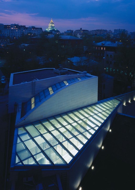
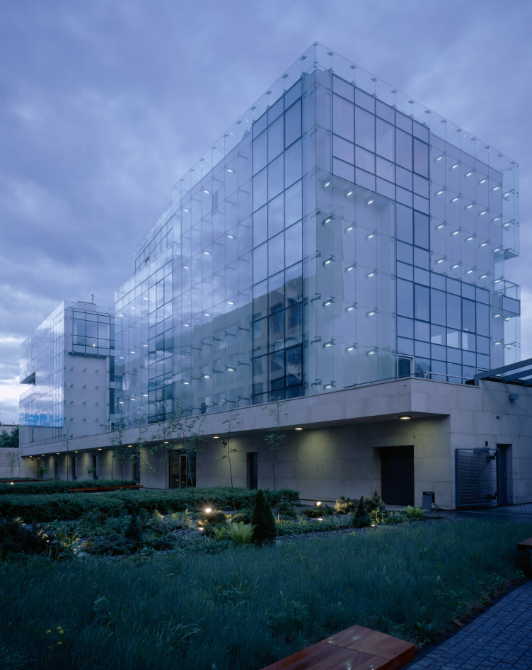
It’s not the architect’s business to give definitions, but for architecture critics or others who can look at this objectively. I would say that we are trying to find an image in the architecture of today. Image is very important to us. We are trying to find a human significance and expressiveness in simple forms. To find these forms. If you need one word that defines this, I would have difficulty in giving it: I do not know this word. I have a theory (in fact, it’s the only one I have) regarding the phenomenon of pure form: pure form is the highest state of form, and it’s this that the architect strives to attain. Architecture arises at the intersection of many different circumstances – spatial, functional, financial, political, personal, artistic; and they are all very interesting, exciting. But in the final analysis they should all be melded together and translated into form. In a bid to attain purity of expression. The incidental must become non-incidental. And this is the job of the architect. And quite possibly the result will be a form which will become part of the history of architecture. Everything that we observe in the history of architecture – and we in one way or another exist in this space too – is the history of ideas, of abstract forms, and not just the history of buildings that have been preserved. There is, of course, the tourist’s history of architecture, where you can go and look at fragments of Egyptian temples, the remains of Paestum…
But this is not so important?
No, it’s very important if we are to understand the link between pure form and landscape. Form occurs in a particular place and in a particular culture, at a particular time; sometimes it’s beneficial to understand what kind of rubbish it’s grown out of. But it can exist kind of abstractly, without this. In it its material circumstances, time, and space have been translated into harmony – and not necessarily simple harmony. It’s like DNA, which goes right through an organism from start to finish. It was very difficult to discover the structure of DNA. But the architect must find it each and every time.
Which is to say, you’re looking for the pure form of modernity.
I don’t think that’s a successful definition. ‘Modern’ is a word that is currently rather worn out. Attempts to contrast the modern and non-modern are so odious… This is not even entirely culture; it’s been infected by the market and advertising. No, I prefer not to use this kind of terminology (modern/non-modern). For me there is – and can be – no such division.
In general, if you think about it, when you contrast the past and the present, everything that’s done today is bound to be worse than the past, and so there’s hardly any point in trying. It’s not inspiring. But space is valuable in that it is unified. And history and modernity are essentially parts of the one and the same thing; they exist in the same system of coordinates. Now this is exciting. Time is cancelled.
And how is this achieved?
Well, everyone has his own technique. It may be meditative or may be almost scientific. It depends on your personal psychological constitution, I suppose. I remember Salvador Dali and his book Fifty Secrets of Magic Craftsmanship. It’s a work of genius written with a sense of humour, with his typical madness, but it also contains a description of a method. There’s a section about a dream that comes to the dreamer when he’s holding a key in his hand. Before painting a picture, you should sit down in a Spanish wooden chair, take a heavy door key in your hand, place a dish underneath it, and have your canvas standing in front of you. And at the moment when you fall asleep in the chair, trying to think about the picture you’re going to paint, the key falls out of your hand, the dish breaks, you wake up, and you start painting your picture. It’s a kind of reinterpretation of the ‘Vigil of Alexander of Macedon’. But that’s Dali’s technique. It’s not one that I use; it’s not my psychological constitution. Beyond all doubt, the amount of time spent on working with form plays a role. But it does not, of course, provide any sort of guarantee. Sometimes, an unexpected solution turns up during the course of working on something else. You’re making slow headway, for instance, and suddenly the solution to a different problem occurs – easily, freely, and quickly. This unexpected form can be even more precious. At the same time, you have to be constantly aware within yourself of what it is that you’re doing. When I began teaching, a year or 18 months ago, this was a great source of help to me. I began telling my students simple things (they’re hungry for information, it turns out) – and, in particular, I gave them a method for how to work on a project. And I told them about it at great length, set it down on paper, and then, on entering our office, I saw that in the quickness of our life we had already started to miss things out. I realized that we should take things slower, go through every stage.
How important is the urban-planning aspect of architectural form to you?
A city is a measure, a dimension of form. Should a new building strike a loud note? Should it take the lead, or not? There are situations where there’s a large number of ordinary buildings and you have to create just one, but the most important one. A theatre, for example – which is entitled to be, and should be, formally more expressive than its ‘neighbours’. Here I could make a direct analogy with music. The city and its street blocks are a kind of musical score with an inner harmony, a text which can be read and to which something may be added with that harmony being taken into account.
The rational model of the architect appeals to you more. You move methodically, step by step, testing the justifiability and appropriateness of each step.
No, I wouldn’t say that. The rational model comes later; it’s rationalization post factum. I may have moved in stages as if solving a system of equations. But, in actual fact, nothing of the sort has occurred. Everything happens simultaneously. And it always seems that I’ve left something out. And then a form appears and it’s already unimportant that something has been left out. If, that is, a form does appear. I have my own strategy: for me it’s important to begin by understanding what the idea, the concept, is – including the concept of whether to build or not to build at all. Many people regard the architect as a kind of Kalashnikov machine gun: give him a brief and he’ll shoot. You only have to bring along enough bullets, and you’ll get a skyscraper, a dacha, or an office. But it’s quite possible for the architect to think about it – and turn the job down. You have to understand what the client wants to do and what you want to do yourself. And whether this building will cause a great deal of harm. We have turned jobs down. We absolutely refuse to knock down old buildings and won’t even consider briefs that involve demolishing a monument and then replacing it with a replica. We now try to persuade people to preserve old buildings.
Participation in modern purely commercial architecture (I mean the kind of development project in which the determinant idea is the number of square metres) is likewise something we find completely unattractive. What is important is a human scale and not ‘dressing up’ square metres in architectural form. This does not, of course, mean that we do not handle projects with large numbers of metres. But if architecture’s only content is investment-led vacuity – décor for a large bank safe, – then it’s completely uninteresting.
So to accept or turn down a project is the first thing. The second is to reflect on what the building should be and why. There should be a programme specifying the kind of life that is to spring up on this site. Architects, after all, play a large part in shaping people’s lives. It is life that essentially has to be harmonized.
Life that does not yet exist, but which will exist on this site when the building is built?
Yes. There must be a responsible, interesting, humanly uplifting programme. A life scenario. This should not be a dreary enterprise. Otherwise, you can end up driving yourselves into a corner. And this is essentially a question to which architecture must provide an answer. When you ask yourself a direct question, you should answer it. In the belief that you have all the information you could possibly need. There is a definition of organic form that may be understood as follows. When an organism is alive, it may, like grass, not know the laws by which it lives, but behave as if it does know them. Ideally, pure form should be knowledgeable of everything. It should know its function, budget, the human scale, human perception of space (both internal and external), and human fears and subconscious feelings. It should know the history of architecture, in as much as it cannot exist outside that history. And even when it refuses to know the history of architecture, it, this form, nevertheless occupies a particular niche in history. It has absorbed all this; all this information is in its DNA. Form, in my opinion, is the contour of the required solution, the frontier of necessity, no more and no less than necessity itself.
I use the following criterion. If you’ve been successful, even if only provisionally, in something, there comes a point when you understand that it was not you who did it. And the thing you’ve made acquires the right to exist independently. It can be given away; it already has a life of its own. A sensation of absolute freedom arises. But if you don’t have this feeling and your head is still full of thoughts, then you can’t help suspecting that you haven’t yet found the right form.
How important for you is modern Western architecture?
I look at what comes before my eyes. When you see form made by someone else and when you know what question this form was intended to answer, then it’s interesting to critique it. This applies to modern Western architecture as well, because when I see the spatial result and read the floor plan, I ‘press rewind’ and understand where this chess game started – why it’s been done and what human principles it is based on.
But you have no desire to try out some of the techniques you’ve seen abroad?
Rather than look with the aim of making a copy, it’s better not to look at all. You do understand that there are different kinds of architecture arising from different conditions, with different approaches to society, ecology, and landscape? There is Brazilian architecture with its vitality, American architecture, various European schools. And there should be a Russian architecture too. All we have to do is draw it, elicit it from space, detach it from commerce. As yet, it’s only small; it’s hiding somewhere or currently being pulled apart by commercial interests. But I have no doubt that it will come to be. And when that happens, all questions about its provinciality or imitativeness will fall by the wayside.
Where are the first sprouts of this school? Are there architects whom you could cite as your fellow-travellers?
That’s very easy: Aleksandr Brodsky, Sergey Skuratov, Vladimir Plotkin, Aleksey Kozyr’, and several others. They are all different. They’re not fellow-travellers, but companions. They’re not a party or movement; they’re each man to himself.
What about the past? Is there some kind of link with the past or has this new Moscow architecture sprung up ‘ex nihilo’?
Well, our firm is even slightly captive to Soviet architecture of the 1970s. It’s strongly influenced by the latter, and is enchanted by the 1970s monumentality. One of our architects, you know, is Sasha Pavlova, daughter of Leonid Pavlov, and this likewise links us to that age. It’s not a question of schools, but we do feel a certain continuity.
I’ll return to my question about the West. On the one hand, we have Russian architecture – with its repertoire of figures, thoughts, and forms. And on the other, we have the West. Is there a danger that foreign stars will oppress the new architecture that’s emerging in Russia?
A conspicuous quality of foreign architects is their professionalism in work and everyday life. They are well organized, whereas Russian architects frequently lack this trait, and they are commercially oriented. This gives them a certain advantage. But from the point of view of the development of architecture, this is a good thing. It enables a dialogue – an active, even severe dialogue, but precisely a dialogue between local and foreign, residents and non-residents. And there’s nothing bad about this. It stimulates competition and provokes thought.
From the creative point of view, are there figures in Western architecture whom you find attractive?
There is interesting architecture that I keep an eye on constantly: Zumthor, Steven Holl, people who started late in architectural practice, who have something to say, and who are not afraid of seeming either complex or simple, but who always try to find exactly the right thing to say. This is ‘professorial’ architecture in the highest sense of that term; it’s the right kind of architecture.
I like your use of the word ‘professorial’. It reminds me of the methodicity you were talking about – step by step, stage by stage. Not the intuitive flash on the border between dream and waking as defined by Dali, but calm, well though-out statement.
Well, no, actually. I also value and am fond of architects who are much more spontaneous, such as Frank Gehry. The facade of his bank building overlooking the Brandenburg Gate in Berlin – the facade of whole pieces of stone – is one of my favourite works. It has a lot of drive and this is something I value – concealed, inner drive in architecture. And when I talk of professorial architecture, it’s not at all calm academicism that I love. No, the people I was talking about have drive. It’s just that they’re intelligent with it at the same time.
We know two types of attitude taken by Russian architects to architects from the West. The first could be described as that of Bazhenov, who studied in France and Italy and spent his whole life remembering all the beauty he had witnessed during his studies there. The second is that of, say, Shekhtel, who studied somewhere or other and saw something or other, but lived altogether without any connection with foreign architecture. How do you see this situation at the present time?
Architecture should have its roots not abroad, but in the ‘here and now’. It should not resemble either old architecture or biological forms, but should be a new organism born right here. Ideally, this will give rise to unique things and new forms. But, of course, there is the phenomenon of the school, of pupilage. There are influences – through teachers, magazines, the Internet, travelling. But here it’s a question of what you set about learning. In everything – schools and influences – you have to look at other things in order to learn to understand how they work organically and not quote or reproduce forms. What’s needed is not a formal dialogue with what you’ve seen, but a dialogue of essence. I’m always gladdened by good architecture, whether I come across it in the world, in the past, in Moscow, or in the work of my friends. But there are not enough good buildings. And when you start thinking about it, you realize that you’re alone with the problem, like any architect in the world: you have the same opportunities, the same pencil, the same brains, but the brief is unique and no readymade solution exists. It doesn’t matter whether your budget is large or small. A shed can be more important than a skyscraper – even if only because of the human scale of the former. So I think that all relations with the West should be free of imitation.
How important to you is the social element in architecture?
You know, Leonid Pavlov said that it’s easy to create architecture in a slave-owning or socialist society. The kind of work that Norman Foster is currently designing is largely explained by his working with developing countries, with ambitious political regimes. And he wouldn’t be able to build what he intends to build in Moscow anywhere else in the world. He gets criticized for it, but he came here to work on large projects. Moscow is the Olympus of large commissions. It’s nice to feel that you’re on top of Olympus.
But, to be serious, I regard the present situation as catastrophic. The situation today is as follows: ordinary people have no money, so buildings are built for capitalists. In general, money is a way of finding out from people how they see their own lives and the particular site in question. But the capitalist’s answer is very primitive: he sees both life and site as a means of growing his money; this is why he invests in construction. But it’s impossible to put this question to an ordinary resident: he has no money. In theory, if you ask a person right now whether he wants to live in an apartment house on the 20th floor with a balcony and bathroom, he’ll say he does, But he doesn’t know any different. And there are alternatives: he could live in a settlement hidden in the forest, with good roads and good health clinics – or in a low-rise, compact housing development. Ordinary people don’t even know that they can express society’s needs or define an ideal for what should be done with a site – an ideal of how they would like to live.
This lack of social ‘voices’ leads to crises. Very few people know what to do with Moscow as an environment in which to live. In the industrial zone that runs along the Third Ring Road factories are being demolished one after the other to make way for housing (in the region of Kutuzovsky prospekt) or offices (in the region of Volgogradsky prospekt). Business is inclined to play the same schemes over and over again; there’s less risk that way. But from the point of view of architecture this means tautology. The thinking is that a particular location is good for housing and housing here sells well, so we should exploit this and will again sell housing here; whereas this location, on the other hand, is bad, industrial, and unfit as a place to live in, so we’ll make it even worse. No one is interested in rehabilitating areas as cultural landscapes. And no one is happy; everyone is unhappy. That’s sad. All that’s left for us to do is look for pure forms.
