По-русски

​The Factory Formula

Designed by Alexandra Kuzmina, Ilia Mashkov, and Andrey Kolpikov, this house within ZILART residential complex seems to solve the eternal struggle of vertical versus horizontal, bringing the controversy to a minimum. The house is reminiscent of this factory’s golden age of the 1930’s.

24 June 2019
Object
mainImg

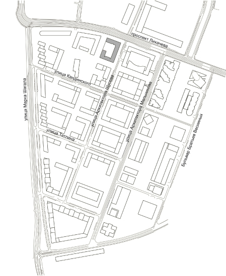
Lot №4 is a part of the first stage of ZILART, the grand-scale housing project of LSR company curated by Yuri Grigoryan, who, as is known, defined the master plan as well as the design code of the construction on this formerly automotive peninsula. The design of the first stage of each of the city blocks was commissioned to one reputed architectural company. The lot of “Mezonproekt” is situated on the north border of the complex that coincides with the Likhachev Avenue. Counting from the Moskva River, it is the third behind the buildings designed by Sergey Skuratov and Evgeniy Gerasimov, lying before the city block designed by Sergey Tchoban. Diagonally, its neighbors are the lots designed by Urbis and Meganom. The nearest neighbor from the inner south side is the building designed by “Tsimailo, Lyashenko and Partners”: the architects of Mezonproekt frequently met with its authors discussing the insolation, the color, and the height of the buildings. As a result, an interesting volumetric dialogue appeared: the low-rise houses are placed alongside each other, mutually complementing each other and forming the low-rise construction front along the Shchuseva Street, while the 14-story towers of the two lots are echoing one another.

ZILART housing complex (Lot #4)
Copyright: © Mezonproekt
  • zooming
    ZILART housing complex (Lot #4). Location plan
    Copyright: © Mezonproekt
  • zooming
    ZILART housing complex (Lot #4). Master plan
    Copyright: © Mezonproekt


Yet another specification was the design code that regulated the city block planning, the number of floors, the height of the first floors and their public function. The code also defines the façade coating materials: 70 percent brick, 40 percent other materials and colors: red, white, and shades of gray: dark-colored window transoms. As for the brick, LSR group manufactures it at its own production facility; for ZILART it’s always designer brick, custom-produced by the sketches and requirements from the architects, for the unique texture of each of the lots.

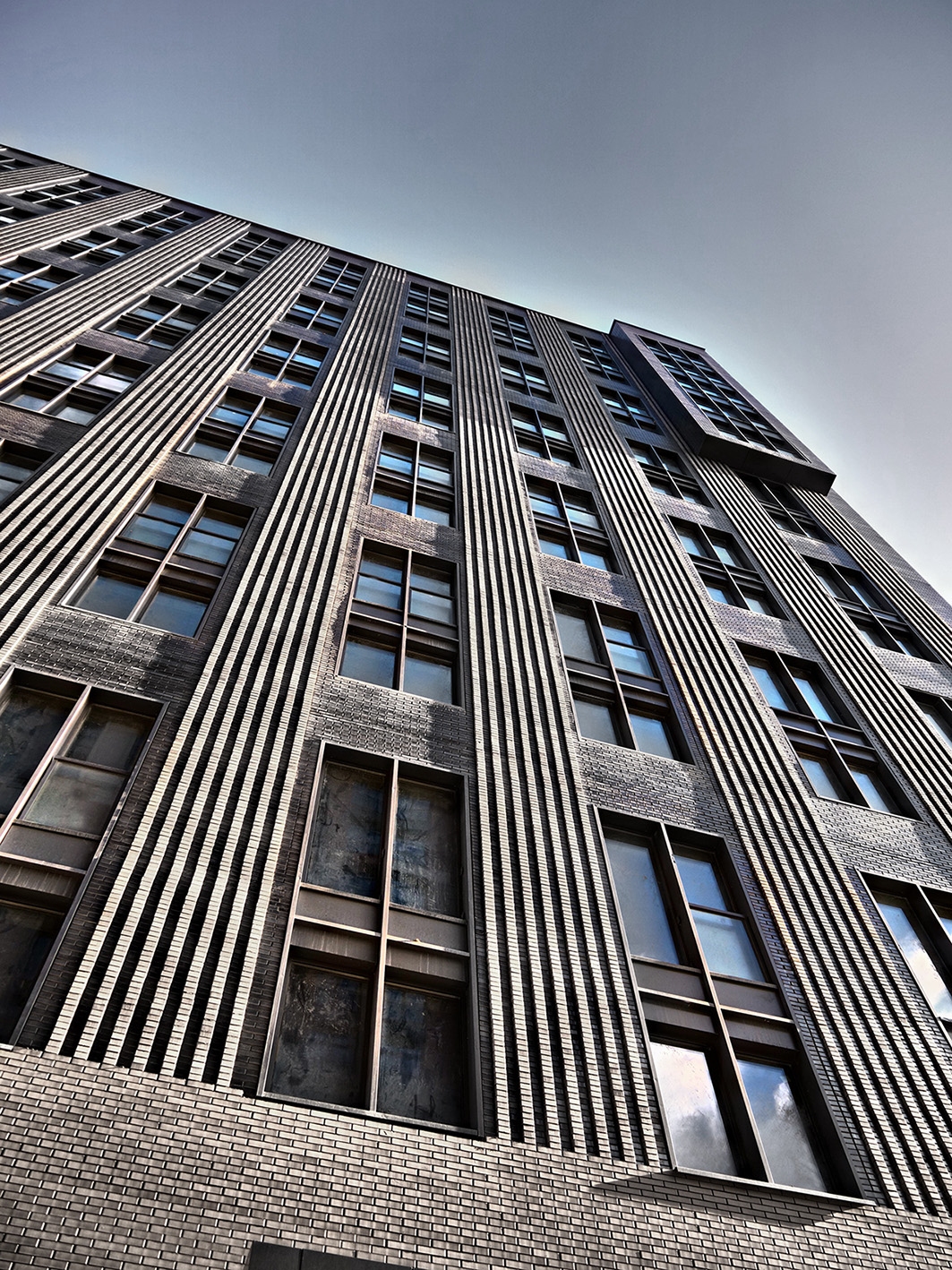
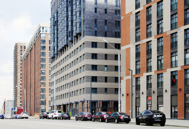
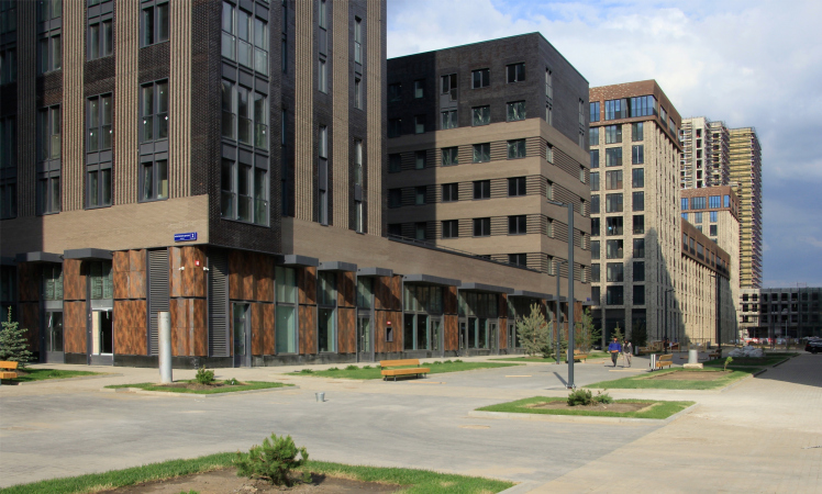
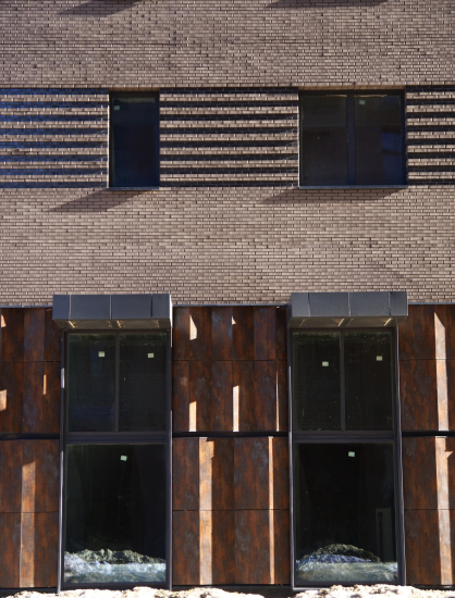
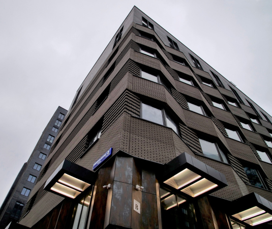
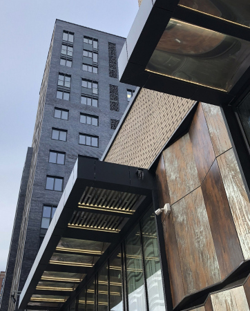
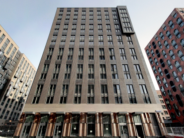
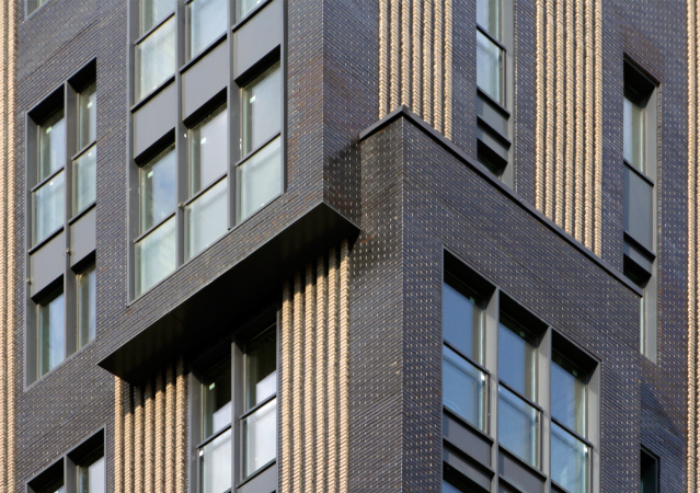
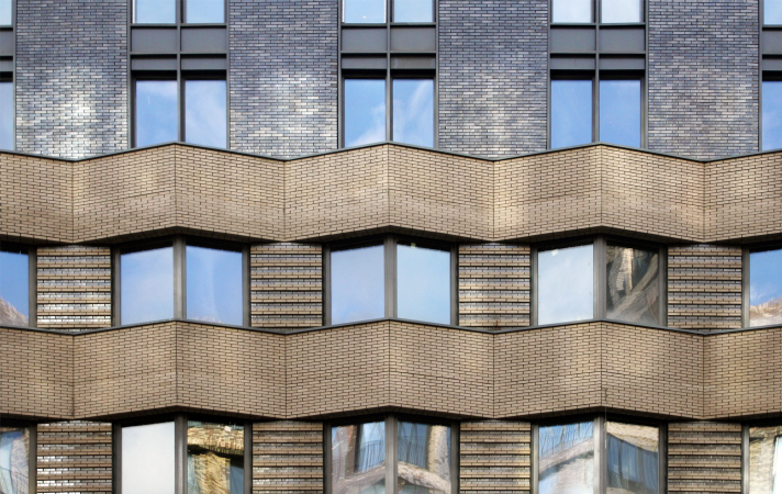
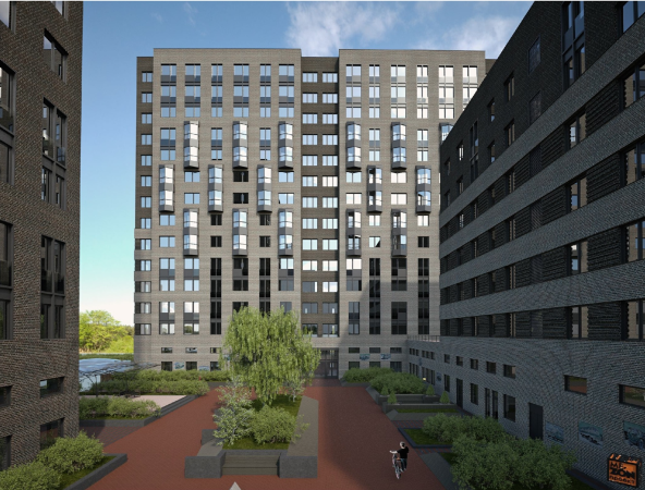
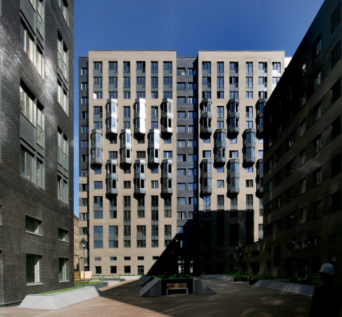
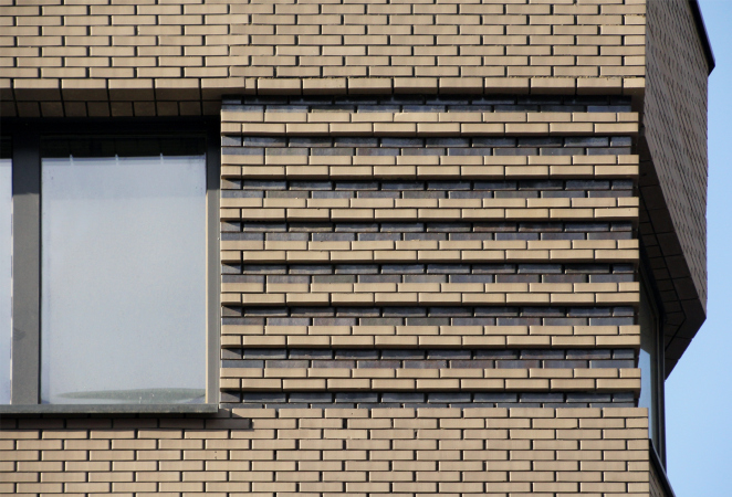
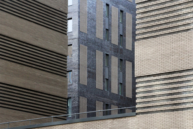
Mezonproekt proposed a solution that was laconic to the point of brutal. The architects selected two kinds of bricks: one dark engobed brick with a glittering surface that reflects the sky, changing color from black-brown to bluish. The other was neutral gray, rugged and looking like sandstone. Together they create a grisailles effect of a sepia hue, like an old faded photograph or an old newsreel. The tone is neutral, even dark.

  • zooming
    1 / 8
    ZILART housing complex (Lot #4)
    Copyright: Photograph: Archi.ru
  • zooming
    2 / 8
    ZILART housing complex (Lot #4)
    Copyright: © Mezonproekt
  • zooming
    3 / 8
    ZILART housing complex (Lot #4). Project
    Copyright: © Mezonproekt
  • zooming
    4 / 8
    ZILART housing complex (Lot #4). Project
    Copyright: © Mezonproekt
  • zooming
    5 / 8
    ZILART housing complex (Lot #4). Project
    Copyright: © Mezonproekt
  • zooming
    6 / 8
    ZILART housing complex (Lot #4). Project
    Copyright: © Mezonproekt
  • zooming
    7 / 8
    ZILART housing complex (Lot #4). Project
    Copyright: © Mezonproekt
  • zooming
    8 / 8
    ZILART housing complex (Lot #4). Project
    Copyright: © Mezonproekt


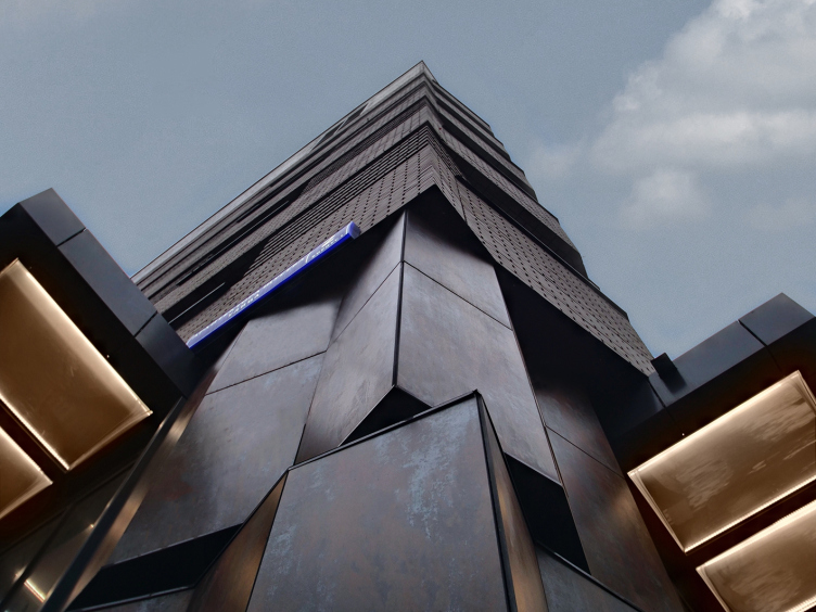
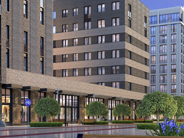
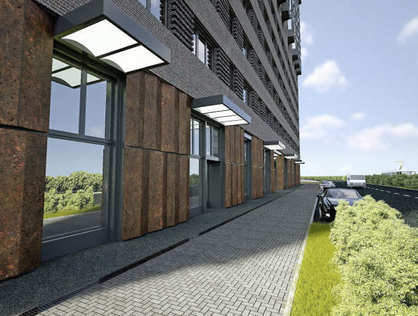
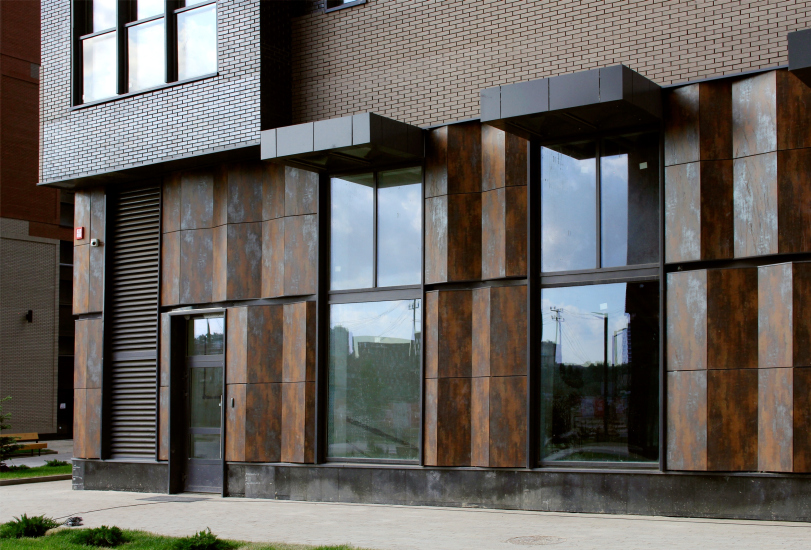
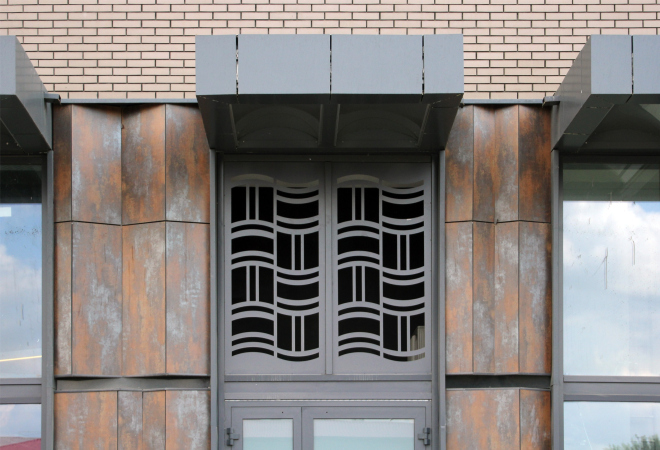
The third material will be ceramic granite: panels with a surface that looks like Corten steel, like old factory metal. This is the first analogy with ZIL. On the outside, all of the piers of the tall 6-meter high first floor consist of two “bellows” of such rusty-looking material: the bottom one slightly higher, the top one slightly shorter. The zigzagged line is deliberately broken to create an impression that the building is being supported by two belts of some kind of mechanism. At the corners, the intersections become more prominent, and the impression of an old apparatus that once came to a grinding halt but now woke up to support the weight of the house, is strengthened even more.

  • zooming
    ZILART housing complex (Lot #4)
    Copyright: © Mezonproekt
  • zooming
    ZILART housing complex (Lot #4)
    Copyright: Photograph: Archi.ru


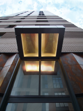
The “factory” allusions are supported by overnangs: their broad and short blocks with a concave surface backlit at nights look like hot metal molds.

  • zooming
    1 / 3
    ZILART housing complex (Lot #4)
    Copyright: © Mezonproekt
  • zooming
    2 / 3
    ZILART housing complex (Lot #4)
    Copyright: © Mezonproekt
  • zooming
    3 / 3
    ZILART housing complex (Lot #4)
    Copyright: © Mezonproekt


In spite of its certain brutality, this theme is akin to window shop design, which requires either neutrality or some bold statement. Let us note that it is resonant with the modern context of ZILART: Corten steel covers the bottom floors and the “tail” of the comet house #1; a Corten zigzag is also to be seen in the inner building of Lot 2. Lot#4 continues the “factory” theme set by the architect’s colleague, Sergey Skuratov.

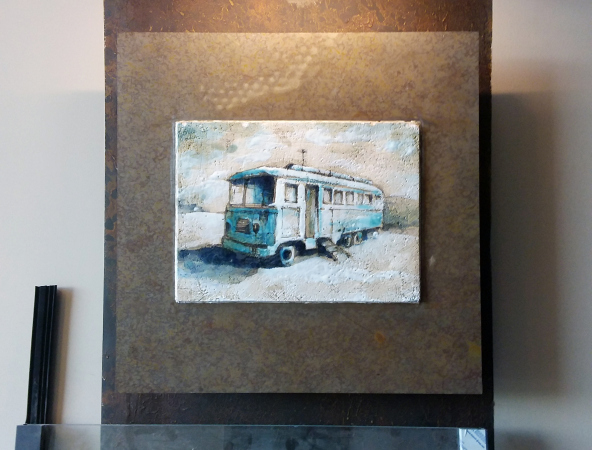
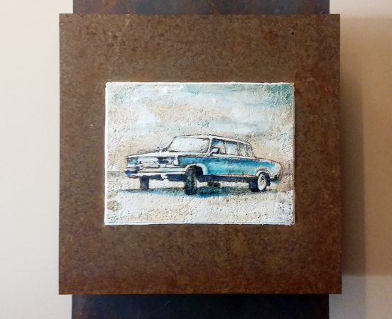
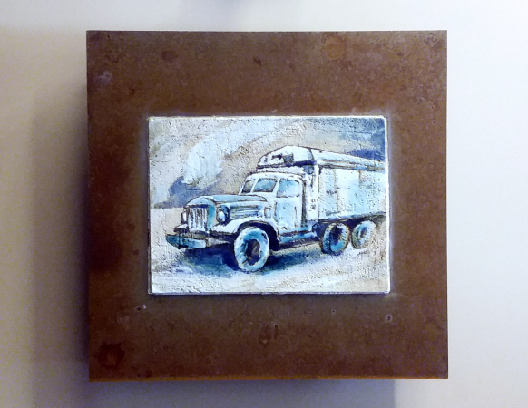
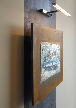
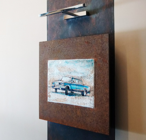
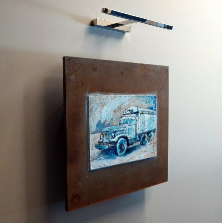
The third part of reminiscences about ZIL is to be found inside, and it has a totally graphic character; ceramic panels that display truck vividly remind not only about the factory, but also about Stalin metro stations or the postwar VDNKh exhibition.

  • zooming
    1 / 6
    ZILART housing complex (Lot #4): ceramic panels in the entrance areas
    Copyright: © Mezonproekt
  • zooming
    2 / 6
    ZILART housing complex (Lot #4): the ceramic panel in the entrance areas
    Copyright: © Mezonproekt
  • zooming
    3 / 6
    ZILART housing complex (Lot #4): the ceramic panels in the entrance areas
    Copyright: © Mezonproekt
  • zooming
    4 / 6
    ZILART housing complex (Lot #4): the ceramic panels in the entrance areas
    Copyright: © Mezonproekt
  • zooming
    5 / 6
    ZILART housing complex (Lot #4): the ceramic panel in the entrance areas
    Copyright: © Mezonproekt
  • zooming
    6 / 6
    ZILART housing complex (Lot #4): the ceramic panels in the entrance areas
    Copyright: © Mezonproekt


Let’s get back outside, however, and raise our gaze. Using two shades of color, the architects act a play dedicated to interrelation between the vertical and horizontal, two main antagonist themes of the architecture of the XX century. The horizontal is to some extent known as the manifesto of avant-garde architecture, like a steam engine tearing down the track, a symbol of ultimate freedom. At the same time, the horizontal is also a characteristic feature of a metallurgical shop, a rolling mill or an assembly line – it’s just not practical to place such things into any kind of tower. The vertical, on the other hand, is a technique that belongs with Art Deco, the antagonists of avant-garde. In the XX century, this became a standard practice: once modernism prevails, the buildings become elongated, their windows turning into “ribbon” ones or at least rectangular, lying on the long side. Once they get tired of modernism, the vertical growth of the towers is supported by pillars, the windows stringing up like a guitar string.

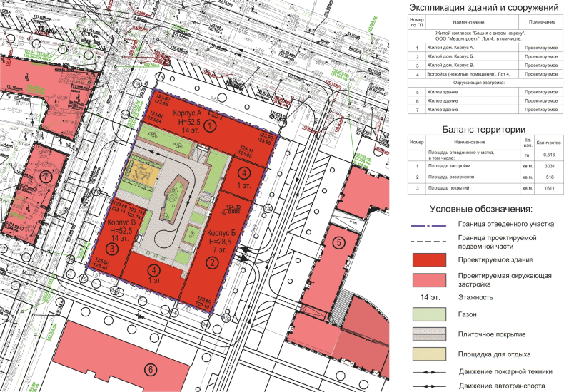
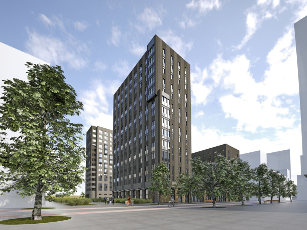
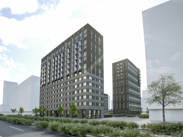
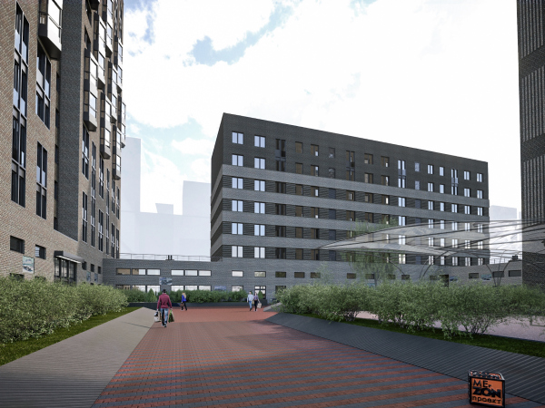
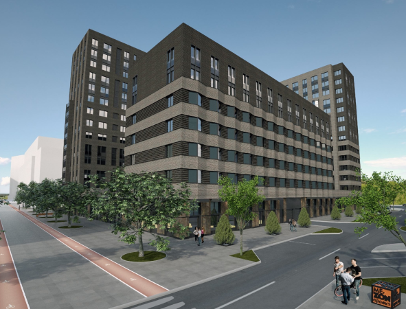
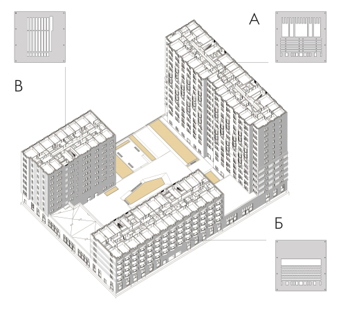
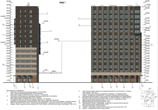
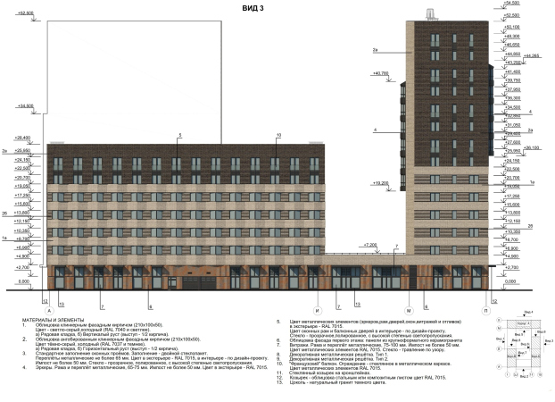
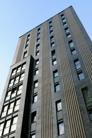
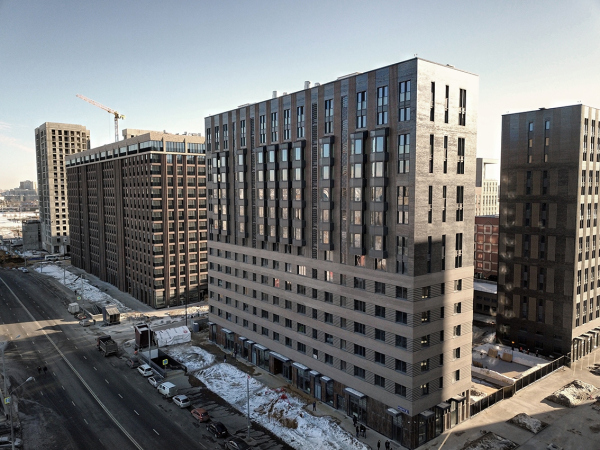
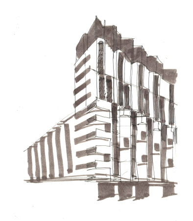
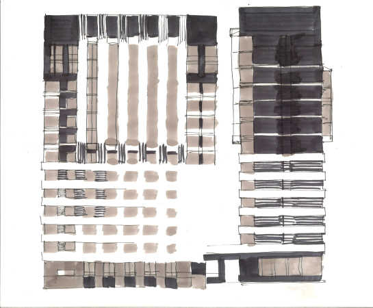
And, while in the XX century the vertical and the horizontal are waging trench warfare, alternately prevailing, today their struggle is more and more often becomes the subject for reflection. So the architects of Mezonproekt gave a chance to speak to both of them. Their scheme explains it all: one 14-story tower, at the corner of the Golosova and Kandinskogo Streets (sic, the names of the ZILART streets will not let us forget about the art of the XX century) – asserts the vertical. The seven-story building on the Shchusev Street cultivates the horizontal, just as the two single-tier buildings that close the contour left and right of it. The house on the Likhachev Avenue combines both themes, the seven bottom floors being subjugated to the horizontal, and the higher floors being vertical.

  • zooming
    1 / 3
    ZILART housing complex (Lot #4). Axonometric draft
    Copyright: © Mezonproekt
  • zooming
    2 / 3
    ZILART housing complex (Lot #4). Facade. View 1
    Copyright: © Mezonproekt
  • zooming
    3 / 3
    ZILART housing complex (Lot #4). Facade. View 3
    Copyright: © Mezonproekt


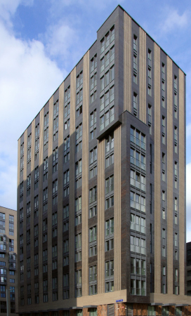
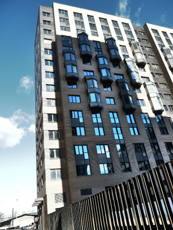
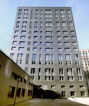
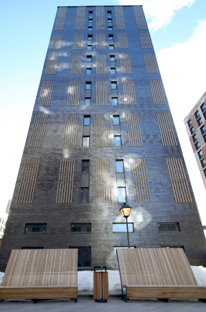
The vertical tower vividly reminds us about the 1930’s, and about of the State Duma building, as well as about many American (particularly Chicago) examples. A characteristic detail – windows grouped in vertical pairs and divided by a thin metallic lintel – leave no doubt that what we are seeing is Chicago. We are brought back to contemporary by a bay window that asymmetrically embraces the corner – two thirds at the bottom, one third at the top – unobtrusively reminding the observers about the number of the current century so as stop us from being carried away by allusions.

  • zooming
    1 / 7
    ZILART housing complex (Lot #4)
    Copyright: © Mezonproekt
  • zooming
    2 / 7
    ZILART housing complex (Lot #4)
    Copyright: Photograph: Archi.ru
  • zooming
    3 / 7
    ZILART housing complex (Lot #4)
    Copyright: © Mezonproekt
  • zooming
    4 / 7
    ZILART housing complex (Lot #4)
    Copyright: © Mezonproekt
  • zooming
    5 / 7
    ZILART housing complex (Lot #4)
    Copyright: Photograph: Archi.ru
  • zooming
    6 / 7
    ZILART housing complex (Lot #4)
    Copyright: Photograph: Archi.ru
  • zooming
    7 / 7
    ZILART housing complex (Lot #4)
    Copyright: Photograph: Archi.ru


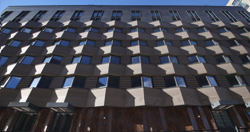
In the horizontal building, the stripes of the flutes make a 90-degree turn and connect the windows with their strokes, highlighting the “ribbon” direction. This Is a technique that can be traced back to the 1960’s-1980’s just as the zigzag of the stripes between the floors. The façade at once becomes volumetric and sculptural; it gets a clear rhythm and a prominent resemblance with the modernist interpretation of the horizontal. Upwards grow two dark flattened floors similar to the neighboring vertical tower – they can be interpreted as a buildup or as the nucleus of the house, surrounded by a large belt of light-colored brick.

  • zooming
    1 / 3
    ZILART housing complex (Lot #4)
    Copyright: © Mezonproekt
  • zooming
    2 / 3
    ZILART housing complex (Lot #4)
    Copyright: © Mezonproekt
  • zooming
    3 / 3
    ZILART housing complex (Lot #4)
    Copyright: Photograph: Archi.ru


Thus, two essentially opposite techniques, belonging one to Art Deco and one to modernism, are brought to one common denominator: a simple relief technique of the “strings” of the stripes. It looks as though the architects were deliberately showing that the heated discussion of the XX century was essentially the fight of Swift’s Lilliput and Blefuscu. And, if we are to reach a high level of generalization, we will be able to add and subtract them, like in a mathematical formula.

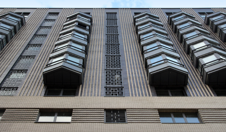
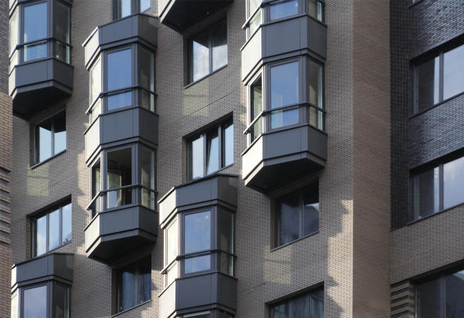
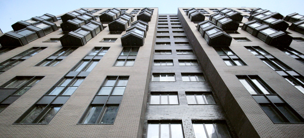
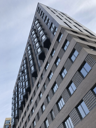
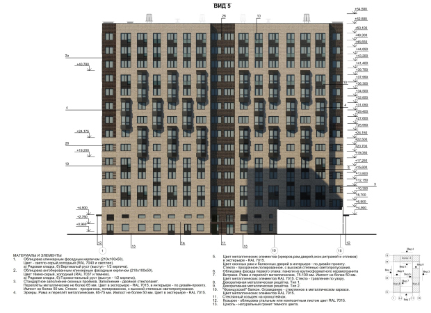
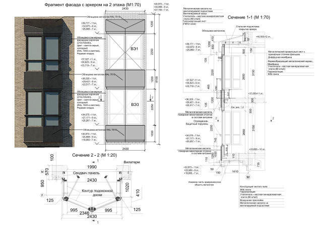
And addition is exactly what takes place in the third building: at the bottom, the grooves are horizontal, and they belt the building; higher up, after the seventh floor, they are vertical, like two strokes of the plus sign. The entire façade is subjugated to their rigorous framework. In the upper part the vertical is supported by glass-and-metal “capsules” of the bay windows that look like elevators – it seems, especially if one is looking from below, that they are frozen in mid-motion, and are about to slide up or down. An interesting way to solve the problem of the bay windows looking like a giant thermometer (a common problem for high-rise buildings) was to turn them into a part of the building’s narrative. The bay windows also become an addition to the floor space of the apartments: they stand out pretty far, about two meters from the surface of the inside wall, adding some variety and serving as “skylights” thanks to the triangular shape of their ledges.

  • zooming
    1 / 11
    ZILART housing complex (Lot #4)
    Copyright: Photograph: Archi.ru
  • zooming
    2 / 11
    ZILART housing complex (Lot #4)
    Copyright: Photograph: Archi.ru
  • zooming
    3 / 11
    ZILART housing complex (Lot #4)
    Copyright: © Mezonproekt
  • zooming
    4 / 11
    ZILART housing complex (Lot #4)
    Copyright: © Mezonproekt
  • zooming
    5 / 11
    ZILART housing complex (Lot #4). Project
    Copyright: © Mezonproekt
  • zooming
    6 / 11
    ZILART housing complex (Lot #4)
    Copyright: © Mezonproekt
  • zooming
    7 / 11
    ZILART housing complex (Lot #4)
    Copyright: © Mezonproekt
  • zooming
    8 / 11
    ZILART housing complex (Lot #4). Facade. View 5
    Copyright: © Mezonproekt
  • zooming
    9 / 11
    ZILART housing complex (Lot #4). Facade fragment
    Copyright: © Mezonproekt
  • zooming
    10 / 11
    ZILART housing complex (Lot #4). Typical floor. Building A.
    Copyright: © Mezonproekt
  • zooming
    11 / 11
    ZILART housing complex (Lot #4)
    Copyright: © Mezonproekt


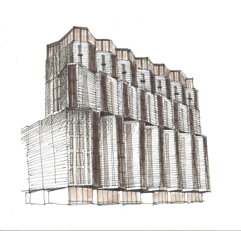
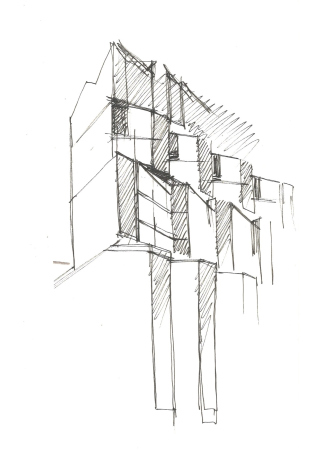
It must be noted that the building that overlooks the Likhachev Avenue had a lot more plastique about in the original sketches, and was essentially a stack of “bellow” ribbons composed from asymmetric triangular bay windows. So, very much in a steampunk fashion, the entire house looks like a sculpture of some frozen mechanism, a giant truck. Actually, the zigzag that belts the 7-story building and the triangular bay windows are echoes of that shape, its remnants remaining after its considerable “purge” and “pacifying” by parallel and perpendicular lines.

  • zooming
    1 / 4
    ZILART housing complex (Lot #4). Sketch 3
    Copyright: © Mezonproekt
  • zooming
    2 / 4
    ZILART housing complex (Lot #4). Sketch 2
    Copyright: © Mezonproekt
  • zooming
    3 / 4
    ZILART housing complex (Lot #4). Sketch 1
    Copyright: © Mezonproekt
  • zooming
    4 / 4
    ZILART housing complex (Lot #4). Sketch 4
    Copyright: © Mezonproekt


And now the lines of the main narratives of verticals and horizontals get ornamental additions here and there: sometimes these are strokes on a side wall of the tower, sometimes these are ornamental grilles of the ventilation systems (vertical and horizontal waves alternate in them) – this ornament became the symbol of the building; it is repeated above the entrances as well.

  • zooming
    1 / 5
    ZILART housing complex (Lot #4)
    Copyright: Photograph: Archi.ru
  • zooming
    2 / 5
    ZILART housing complex (Lot #4)
    Copyright: Photograph: Archi.ru
  • zooming
    3 / 5
    ZILART housing complex (Lot #4)
    Copyright: Photograph: Archi.ru
  • zooming
    4 / 5
    ZILART housing complex (Lot #4)
    Copyright: © Mezonproekt
  • zooming
    5 / 5
    ZILART housing complex (Lot #4)
    Copyright: © Mezonproekt


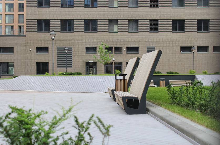
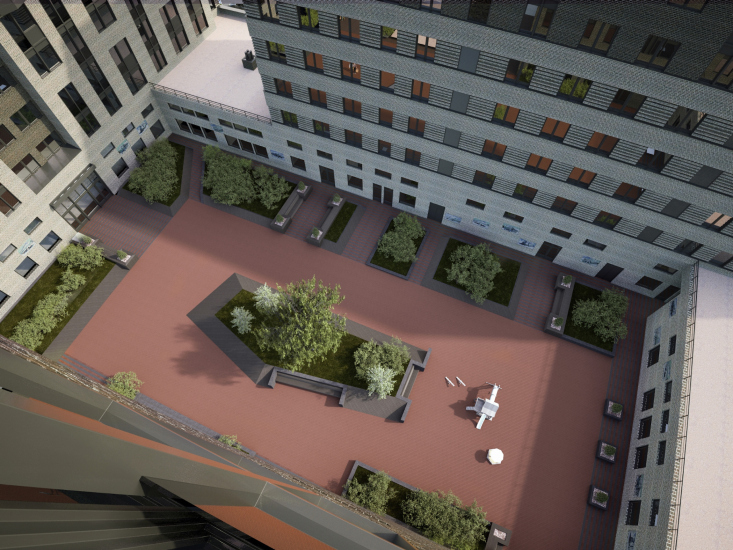
The landscaped yard with laconic chamfers in a frame of flowerbeds and ostentatiously tall backs of the wooden benches is only open in one place, from the side of the Golosova Street. Here it closed by a lattice gate and a door. According to the master plan, the Golosova and Kandinskogo streets, which surround Lot #4 from all sides – are pedestrian promenades, only accessible to emergency vehicles; right now wooden benches are installed here, as well as lawns with pine trees. The Shchusev Street from the east side is “inner automotive”; the Likhachev Avenue, which runs in the stead of a former in-factory drive, is a broad thoroughfare and a borderline of ZILART. In other words, it’s pretty quiet outside, and you can go for pleasant walks stepping out of the yard. However, the authors also provided still another route: stepping from the little door, you can get into the yard of the neighboring building designed by Evgeniy Gerasimov, from where you will be able to exit left, to the Kandinskogo Street. That is, of course, if the wickets are open – or are accessible to the residents by key – this will be yet another way to achieve the cohesiveness of space and improving its urban quality and transparency.

  • zooming
    ZILART housing complex (Lot #4)
    Copyright: Photograph: Archi.ru
  • zooming
    ZILART housing complex (Lot #4). Project
    Copyright: © Mezonproekt


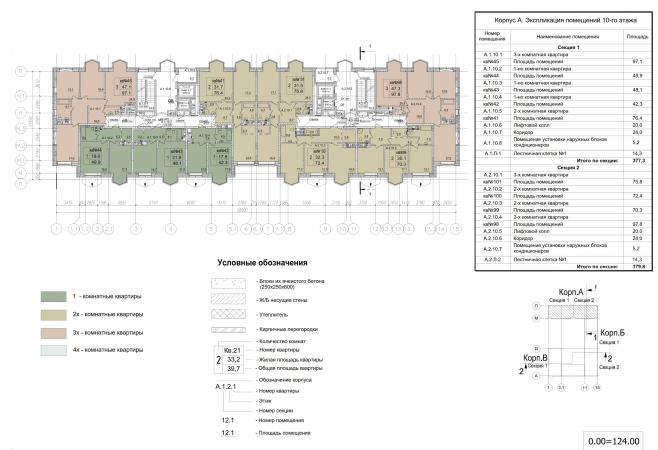
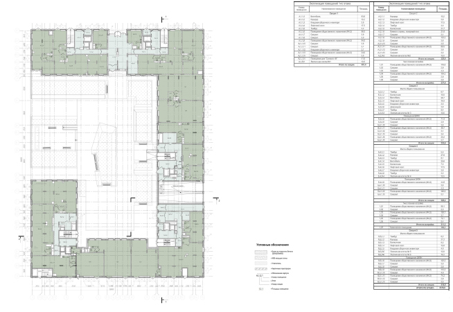
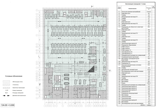
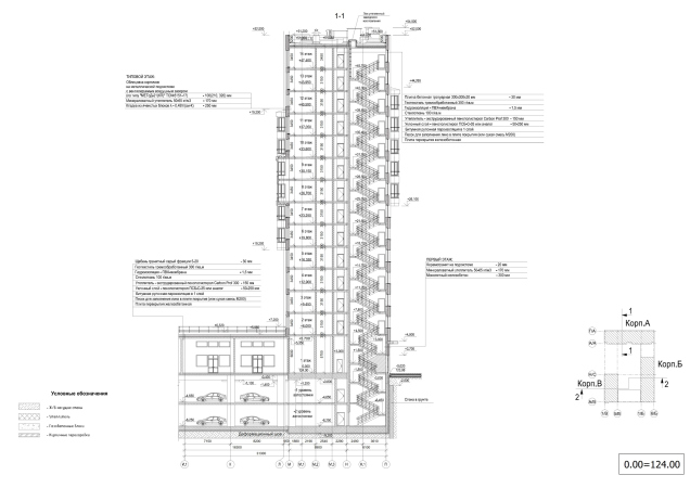
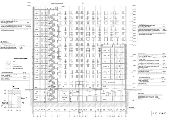
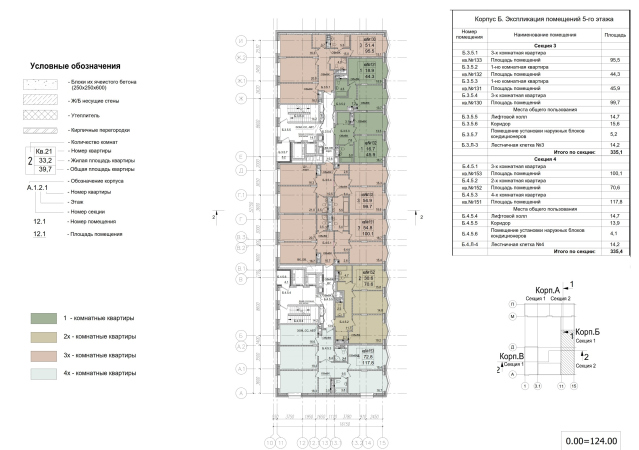
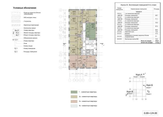
The plans and locations of the apartments are mostly traditional, not the Euro or studio type; they are designed based on the idea that even within a family a person needs a space of his or her own. Single-room apartments start from 42 square meters, and a 48-sqm apartment even has a wardrobe. The two-room apartments are often large, 70+ square meters, and they have two bathrooms (which is still a rare thing by Russian standards), like 3 and 4-room apartments do, the size of which being about 120 square meters. There are four or five apartments per landing. The numbers of the hallways are laid out in bricks from the yard side and are clearly visible.

  • zooming
    1 / 7
    Copyright: © Mezonproekt. Plan of the 1st floor
    Copyright: © Mezonproekt
  • zooming
    2 / 7
    ZILART housing complex (Lot #4). Plan of the – 1st floor
    Copyright: © Mezonproekt
  • zooming
    3 / 7
    ZILART housing complex (Lot #4). Section view 1-1
    Copyright: © Mezonproekt
  • zooming
    4 / 7
    ZILART housing complex (Lot #4). Section view 2-2
    Copyright: © Mezonproekt
  • zooming
    5 / 7
    ZILART housing complex (Lot #4). Typical floor. Building B.
    Copyright: © Mezonproekt
  • zooming
    6 / 7
    ZILART housing complex (Lot #4). Typical floor. Building B.
    Copyright: © Mezonproekt
  • zooming
    7 / 7
    ZILART housing complex (Lot #4). Apartment interior
    Copyright: © Mezonproekt


In comparison to the neighboring ZILART houses, Lot #4 is less bright and is more monochrome. It looks as though it were holding a pause, withdrawing into the world of black-and-white movies, into the reminiscences of the factory’s golden age. There were two golden ages, in fact; the industrialization of the thirties – even though the factory appeared in the stead of the Tyufeleva Grove still in 1916, the factory boomed in 1930-1931, when the nation’s first assembly line was launched. The second golden age was in the sixties and seventies, the time of “brutal style”, when the selfless country was building itself anew after the war. Generally speaking, the narrative of the building is clearly read from its architecture: the vertical tower signifies the first golden age, the time of Art Deco and constructivism, even parallels with Chicago are appropriate because in the 1930’s the plant was modernized by an American license. The horizontal building clearly symbolizes the 1960’s-1970’s, the time of the thaw, and also the time when ZIL manufactured thousands of trucks a year, plus refrigerators. The third tower add up the two themes. The house becomes a monument to the plant.

On the other hand, let us remember that Mezonproekt is a company, one of whose specialties is the modern interpretation of Art Deco. This is basically it comes as no surprise that the architects decided to base their scenario on a tower that refers to the thirties. However, the solution turned out to be quite different: much less detailed, simple and at some places even brutal. The building even looks great with the dust of the yet-uncleaned efflorescence – an interesting solution. It definitely fulfilled its task, adding to the predetermined scheme a little bit of the author’s statement.

24 June 2019

Headlines now
Living in the Architecture of One’s Own Making
Do architects design houses for themselves? You bet! In this article, we are examining a new book by TATLIN publishing house. This book – unprecedented for Russia – features 52 private homes designed and built by contemporary architects for themselves. It includes houses that are famous, even iconic, as well as lesser-known ones; large and small, stylish and eccentric. To some extent, the book reflects the history of Russian architecture over the past 30 years.
A City Block Isoline
Another competition project for a residential complex on the banks of the Volga in Nizhny Novgorod has been prepared by Studio 44. A team of architects led by Ivan Kozhin concluded that using a regular block layout in such a location would be inappropriate and developed a “custom design” approach: a chain of parceled multi-section buildings stretching along the entire embankment. Let’s explore the features and advantages of this unconventional method.
Competition: The Price of Creativity?
Any day now, we’re expecting the results of a competition held by the “Samolet” development group for a plot in Kommunarka. In the meantime, we share the impressions of Editor-in-Chief Julia Tarabarina, who managed to conduct a public talk. Though technically focused on the interaction between developers and architects, the public talk turned into a discussion about the pros and cons of architectural competitions.
Terraced Design
The “River Park” residential complex has confidently and securely shaped the Nagatinsky Backwater shoreline. Featuring a public embankment, elevated courtyards connected by pedestrian bridges, and brick façades, the development invites exploration of its nuanced response to the surrounding context, as well as hints of the architects’ megalithic design thinking.
A Kremlin’s Core and Meteorite Fragments
We continue our coverage of the competition projects for the residential district that the development company GloraX plans to build along the embankment of the Rowing Channel in Nizhny Novgorod. ASADOV Architects approached the concept through a deep dive into local identity, using storytelling to pinpoint a central idea for the design: the master plan and composition are imagined as if a meteorite had struck a “proto-Kremlin”. Sounds weird? Find more details below!
The Volga Regatta
GloraX plans to develop a residential complex spanning 14 hectares along the Volga River in Nizhny Novgorod. The winning design in a closed-door competition, created by GORA Architects, features housing typologies ranging from townhouses to terraced high-rise slabs, a balance of functions, diverse ways of engaging with the water, and even a dedicated island (no less!) for the city residents.
A New Track
We took a thorough look at D_Station, a railcar repair depot dating back to 1906, recently reconstructed while preserving its century-old industrial structure, upon the project by Sergey Trukhanov and T+T Architects. Though work on the interiors – set to house restaurants and public spaces – is still underway, the building’s exterior already offers plenty to see. Visitors can explore the blend of old and new brickwork, appreciate the architect’s unique interpretation of ruin aesthetics, and enjoy the newly built pedestrian route that connects the Citydel Business Center’s arches to Kazakova Street.
Four Different Surveys
The “Explore the City” competition, organized this year by the Genplan Institute of Moscow, stands out as a pretty unconventional one for the architectural field but aligns perfectly well with the character of urban planning work. The winning project analyzed contemporary residential complexes, combining urban planning insights with a realtor’s perspective to propose a hybrid approach. Other entries explored public centers, motivations for car ownership, and housing vacancy rates. A fifth participant withdrew. Here’s a closer look at the four completed works.
Scheduled Evolution
ASADOV Architects unveiled the EvyCenter pavilion, a microcultural hub for fostering personal growth, organizing workshops, and doing gymnastics. Additionally, this pavilion serves as a prototype for a scalable country house, drawing inspiration from the “Loskutok” project, and constructed from CLT panels in a factory. This marks the beginning of a developer project initiated by the architectural firm (sic!), which is seeking partners to expand both small Evy settlements and even larger Evy cities, which are, according to Andrey Asadov, aimed at fostering the “evolutionary” development of the people who will inhabit them.
The Golden Crown
The concept for a dental clinic in Yekaterinburg, developed by CNTR Studio, revolves around the idea of a “mouth full of gold”: pristine white porcelain stoneware walls are complemented by matte brass details. To avoid an overly literal interpretation, the architects focused on the building’s proportions, skillfully navigating between sunlight requirements and fire safety regulations.
Flexibility and Integration
Not long ago, we covered the project for the fourth phase of the ÁLIA residential complex, designed by APEX. Now, we’ve been shown different fence concepts they developed to enclose the complex’s private courtyards, incorporating a variety of public functions. We believe that the sheer fact that the complex’s architects were involved in such a detail as fencing speaks volumes.
A Step Forward
The HIDE residential complex represents a major milestone for ADM architects and their leaders Andrey Romanov and Ekaterina Kuznetsova in their quest for a fresh high-rise aesthetic – one that is flexible and layered, capable of bringing vibrancy to mass and silhouette while shaping form. Over recent years, this approach has become ADM’s “signature style”, with the golden HIDE tower playing a pivotal role in its evolution. Here, we delve into the project’s story, explore the details of the complex’s design, and uncover its core essence.
Gold in the Sands
A new office for a transcontinental company specializing in resource extraction and processing has opened in Dubai. Designed by T+T Architects, masters of creating spaces that are contemporary, diverse, flexible, and original, this project exemplifies their expertise. On the executive floor, a massive brass-clad partition dominates, while layered textures of compressed earth create a contextually resonant backdrop.
Layers and Levels of Flight
This project goes way back – Reserve Union won this architectural competition at the end of 2011, and the building was completed in 2018, so it’s practically “archival”. However, despite being relatively unknown, the building can hardly be considered “dated” and remains a prime example of architectural expression, particularly in the headquarters genre. And it’s especially fitting for an aviation company office. In some ways, it resembles the Aeroflot headquarters at Sheremetyevo but with its own unique identity, following the signature style of Vladimir Plotkin. In this article, we take an in-depth look at the United Aircraft Corporation (UAC) headquarters in the Moscow agglomeration town of Zhukovsky, supplemented by recent photographs from Alexey Naroditsky – a shoot that became only recently possible due to the fact that improvements were finally made in the surrounding area.
Light and Shadow
In this article, we delve into the architectural design of the “Chaika” house by DNK ag architects, which was recently completed in 2023 as part of the collection of signature designs at ZILArt. As is well-known, all the buildings in this complex follow a design code, yet each one is distinct. This particular building stands out not only for its whiteness and minimalism but also for the refined use of a limited number of techniques that, together, create what can confidently be called synergy.
Casus Novae
A master plan was developed for a large residential area with a name of “DNS City”, but now that its implementation began, the plan has been arbitrarily reformatted and replaced with something that, while similar on the surface, is actually quite different. This is not the first time such a thing happens, but it’s always frustrating. With permission from the author, we are sharing Maria Elkina’s post.
Treasure Hunting
The GAFA bureau, in collaboration with Tegola and Arkhitail, organized an expedition to the island of Kilpola in Karelia as part of Moskomarkhitektura’s “Open City” festival. There, amidst moss and rocks, the students sought answers to questions like: what is the sacred, where does it dwell, and what sustains it? Assisting the participants in this quest were landscape engineer Evgeny Levin, artist Nicholas Roerich, a moose, and the lack of cellular connection. Here’s how the story unfolded.
Depths of the Earth, Streams of Water
In the Malaya Okhta district, the Akzent building, designed by Stepan Liphart, was constructed. It follows a classic tripartite structure, yet it’s what you might call “hand-drawn”: each façade is unique in its form and details, some of which aren’t immediately noticeable. In this article, we explore the context and, together with the architect, delve into how the form was developed.
Fir Tree Dynamics
The “Airports of Region” holding is planning to build an airport in Karachay-Cherkessia, aiming to make the Arkhyz and Dombay resorts more accessible to travelers. The project that won in an invitation-only competition, submitted by Sergey Nikeshkin’s KPLN, blends natural imagery inspired by the shape of a conifer seed, open-air waiting spaces, majestic large trees, and a green roof elevated on needle-like columns. The result is both nature-inspired and WOW.
​A Brick Shell
In the process of designing a clubhouse situated among pine trees in a prestigious suburban area near Moscow, the architectural firm “A.Len” did the façade design part. The combination of different types of brick and masonry correlates with the volumetric and plastique solutions, further enhanced by the inclusion of wood-painted fragments and metal “glazing”.
Word Forms
ATRIUM architects love ambitious challenges, and for the firm’s thirtieth anniversary, they boldly play a game of words with an exhibition that dives deep into a self-created vocabulary. They immerse their projects – especially art installations – into this glossary, as if plunging into a current of their own. You feel as if you’re flowing through the veins of pure art, immersed in a universe of vertical cities, educational spaces – of which the architects are true masters – and the cultural codes of various locations. But what truly captivates is the bold statement that Vera Butko and Anton Nadtochy make, both through their work and this exhibition: architecture, above all, is art – the art of working with form and space.
Flexibility and Acuteness of Modernity
Luxurious, fluid, large “kokoshniks” and spiral barrel columns, as if made from colorful chewing gum: there seem to be no other mansion like this in Moscow, designed in the “Neo-Russian-Modern” style. And the “Teremok” on Malaya Kaluzhskaya, previously somewhat obscure, has “come alive with new colors” and gained visibility after its restoration for the office of the “architectural ecosystem” as the architects love to call themselves. It’s evident that Julius Borisov and the architects at UNK put their hearts into finding this new office and bringing it up to date. Let’s delve into the paradoxes of this mansion’s history and its plasticity. Spoiler: two versions of modernity meet here, both balancing on the razor’s edge of “what’s current”.
Yuri Vissarionov: “A modular house does not belong to the land”
It belongs to space, or to the air... It turns out that 3D printing is more effective when combined with a modular approach: the house is built in a workshop and then adapted to the site, including on uneven terrain. Yuri Vissarionov shares his latest experience in designing tourist complexes, both in central Russia and in the south. These include houseboats, homes printed from lightweight concrete using a 3D printer, and, of course, frame houses.
​Moscow’s First
“The quality of education largely depends on the quality of the educational environment”. This principle of the last decade has been realized by Sergey Skuratov in the project for the First Moscow Gymnasium on Rostovskaya Embankment in the Khamovniki district. The building seamlessly integrates into the complex urban landscape, responding both to the pedestrian flow of the city and the quiet alleyways. It skillfully takes advantage of the height differences and aligns with modern trends in educational space design. Let’s take a closer look.
Looking at the Water
The site of Villa Sonata stretches from the road to the water’s edge, offering its own shoreline, pier, and a picturesque river panorama. To reveal these sweeping views, Roman Leonidov “cut” the façade diagonally parallel to the river, thus getting two main axes for the house and, consequently, “two heads”. The internal core – two double-height spaces, a living room and a conservatory, with a “bridge” above them – makes the house both “transparent” and filled with light.
The White Wing
Well, it’s not exactly white. It’s more of a beige, white-stone structure that plays with the color of limestone – smoother surfaces are lighter, while rougher ones are darker. This wing unites various elements: it absorbs and interprets the surrounding themes. It responds to everything, yet maintains a cohesive expression – a challenging task! – while also incorporating recognizable features of its own, such as the dynamic cuts at the bottom, top, and middle.
Urban Dunes
The XSA Ramps team designed and built a three-part sports hub for a park in Rostov-on-Don, welcoming people of all ages and fitness levels. The skate plaza, pump track, and playground are all meticulously crafted with details that attract a diverse range of visitors. The technical execution of the shapes and slopes transforms this space into a kind of sculptural composition.
Proportional Growth
The project for the fourth phase of the ÁLIA residential area has been announced. The buildings are situated on an elongated plot – almost a “ray” that shoots out from the center of the area towards the river. Their layout reflects both a response to Moscow’s architectural preferences over the past 15 years, shifting “from blocks to towers”, and an interpretation of the neighboring business park designed by SOM. Additionally, the best apartments here are not located at the very top but closer to the middle, forming a glowing “waistline”.
The “Staircase” Building
In designing the “Details” residential complex in New Moscow, Rais Baishev spiced up the now-popular Moscow theme of a “courtyard” building with an idea drawn from the surrealist drawings by Maurits Escher. He envisioned the stepped silhouettes and descending slopes as a metaphysical mega-staircase, creating a key void within the courtyard that gave the project an internal “spine”. This concept is felt both in the building’s silhouette and on its façades.
Projection of the Quarter
No one doubted that the building that Vladimir Plotkin designed as part of the “Garden Quarters” would be the most modernist of all. And it turned out just that way: while adhering to the common design code, the building successfully combines brick and white stone, rhythmically responding to the neighboring building designed by Ostozhenka, yet tactfully and persistently making a few statements of its own. This includes the projection of the ideal urban development composition “14–9–6”, which can be found right next door, mathematical calculations, including those for various types of terraces (and perhaps the only reminder of the Soviet past of the Kauchuk rubber factory!), and the white “cross-stitch” pattern of the façade grid.