По-русски

Basmanny ​Manhattan

​Designed by City Arch, the city block on Moscow’s Malaya Pochtovaya Street, with its red-brick high-rises, terraces and penthouses, looks a little bit like Tribeca and other places in Lower Manhattan, New York City. The architecture of the complex explores a high potential of this university area and brings extra benefits to its residents.

11 June 2019
Object
mainImg

The housing complex on the Malaya Pochtovaya Street is being built next to Moscow State Technical University named after N.E.Bauman, a prestigious educational institution that defines the atmosphere of this part of the Basmanny district of Moscow. There are lots of buildings around here that belong to the university, as well as to the startup companies that some of the university alumni launch after graduation. That is to say that this place is dominated by young, smart, and active people, chiefly male. You could even say that this is the nest of Richard Florida’s creative class because in his world-famous book “The Rise of the Creative Class” the sociologist wrote first of all about IT specialists who are in great demand in the modern world. In the age of augmented intelligence, the brainpower is flourishing and feeling confident about tomorrow. And, although the technical progress is moving forward by leaps and bounds in this field, the town-planning progress in this area of the nation’s capital is decades behind.

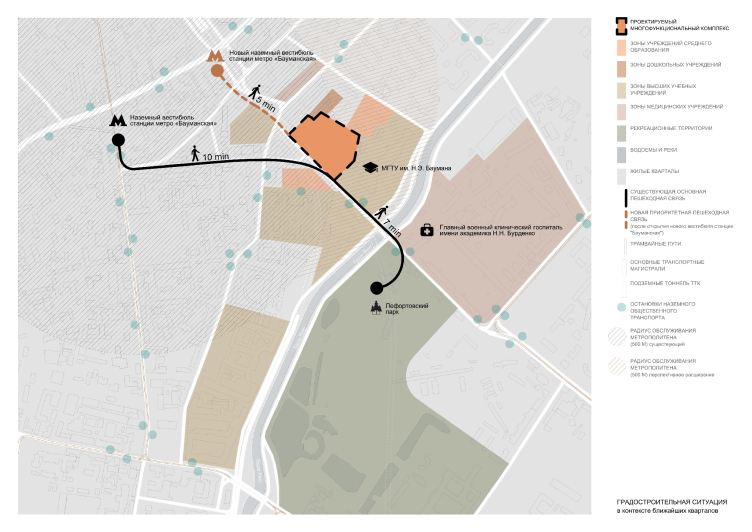
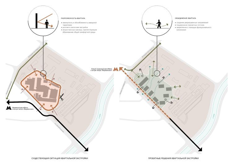
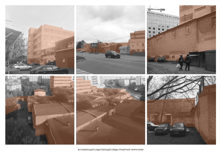
The development of this territory is expected to gain extra momentum thanks to the opening of a new additional entrance of the Baumanskaya metro station. The stream of commuters will be rerouted through the industrial park of the former plant of electrical equipment MZATE-2. Currently, the territory of the plant is outside of the life circle of the neighborhood, and the architectural environment does not meet people’s needs either. The endless walls and fences form labyrinths and dead-end alleys of a loosely organized, chaotic, and faceless industrial area. The residents of the nearby homes are forced to detour this area as an estrangement zone, while the university students have to contemplate the tar sheet roofs from the auditoriums.

The multifunctional housing complex at Malaya Pochtovaya, 12
Copyright: © City-Arch
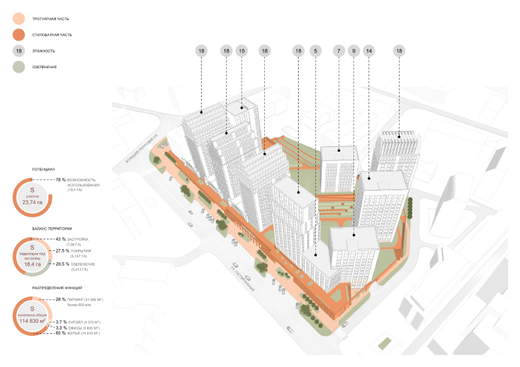
The town-planning situation
Copyright: © City-Arch


The block construction analysis
Copyright: © City-Arch


The current environment of the MZATE-2 factory
Copyright: © City-Arch


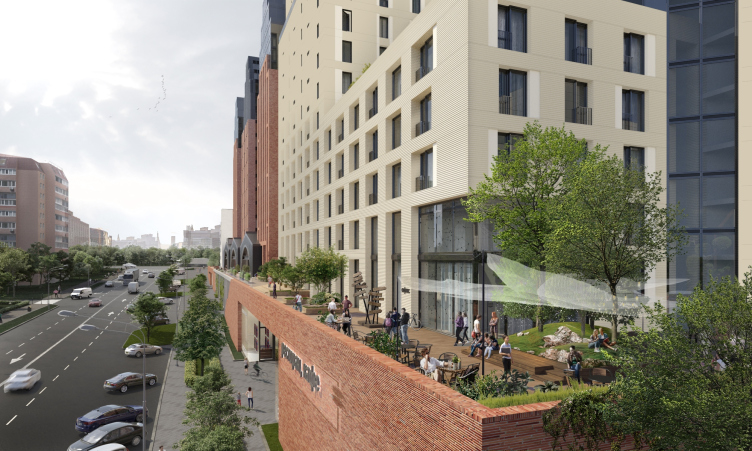
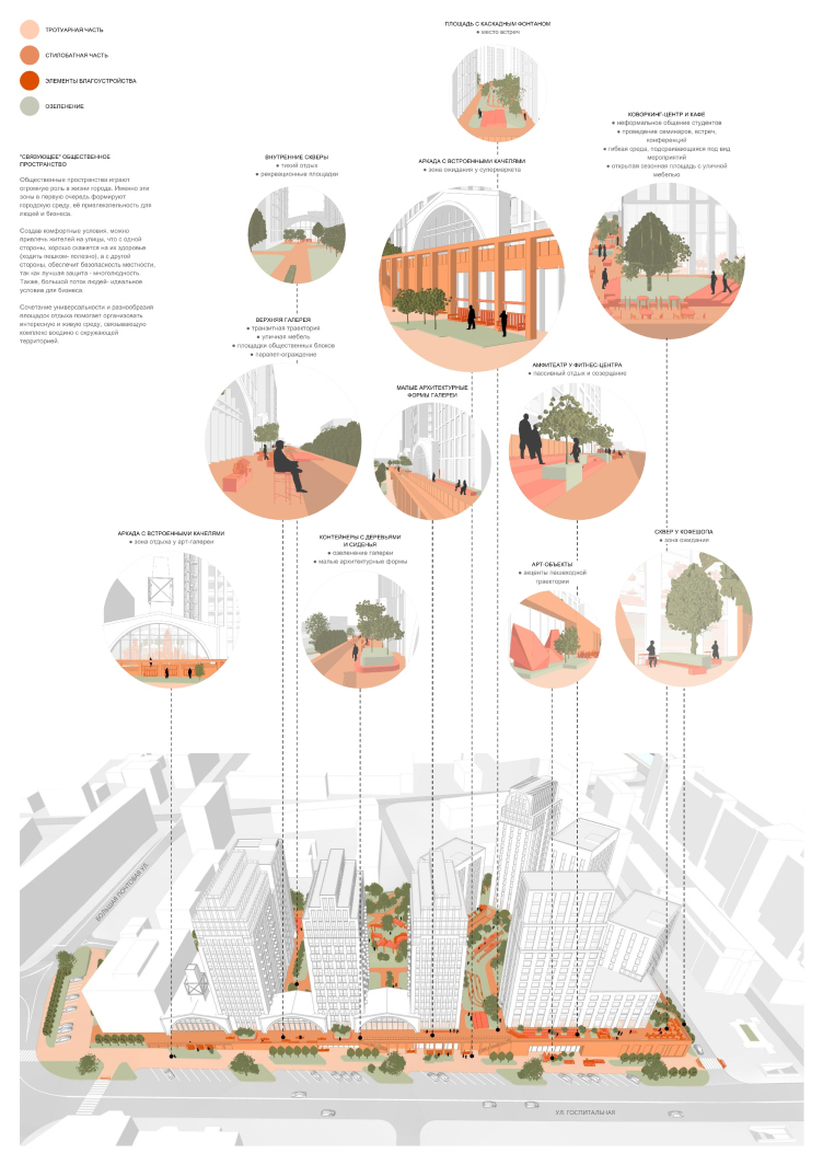
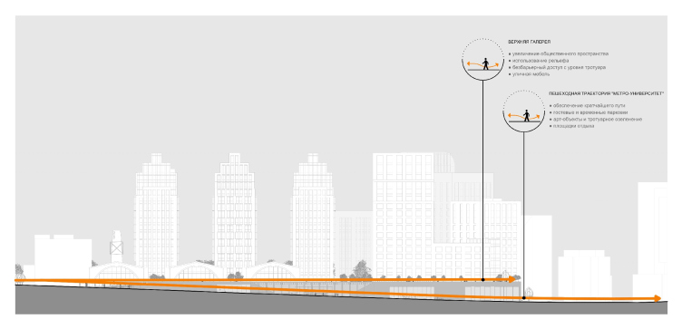
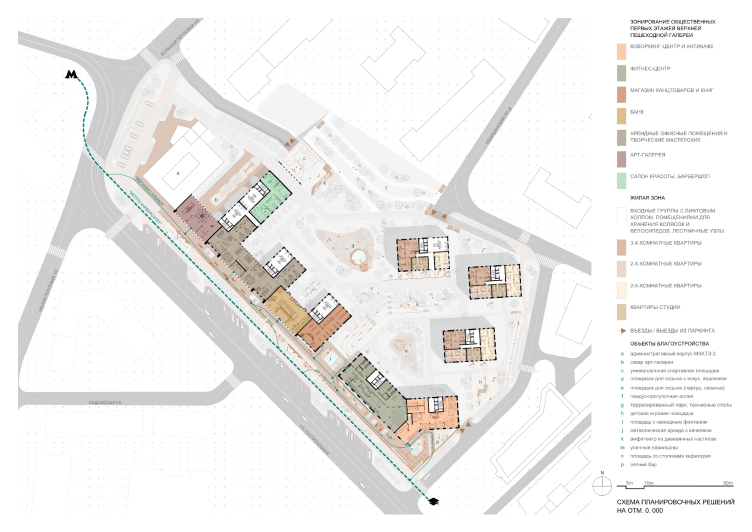
The architects of “City-Arch” are proposing their own solution for the town planning problems of this area as a multifunctional housing development. The prevalence of the housing function will not only add to the housing stock in the city center, but also ensure comfort and safety of the city block: the area will be “watched over” from the windows of the new homes 24/7. As for the residents of the new complex, they will get a 5-minute walking distance to the metro station, a 7-minute walking distance to the Lefortovsky Park, and functionally eventful bottom floors. Running down the Gospitalnaya Street, the path to the new entrance to Baumanskaya metro station (to be opened in 2020) will not run past the dull factory fence anymore but past shop windows and a landscaped pavement with art objects and recreation spots. Making use of the fact that the ground level goes down from the metro station towards the university the height of a whole floor, the architects were even able to make two levels for pedestrian walks. Thus, the first “New York” association comes to mind – it looks a little bit like the High Line Park that carries the public functions of the bottom multi-height floors. The metro station, the university, and the housing complex itself are significant gravity centers, so there is no double that street retail will be in demand here.

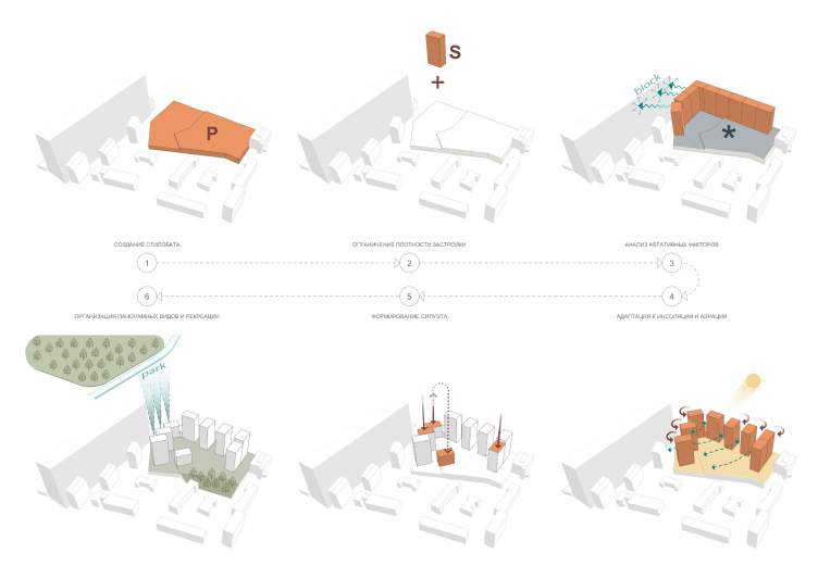
The form-making scheme of the complex
Copyright: © City-Arch


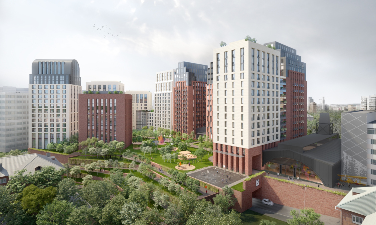
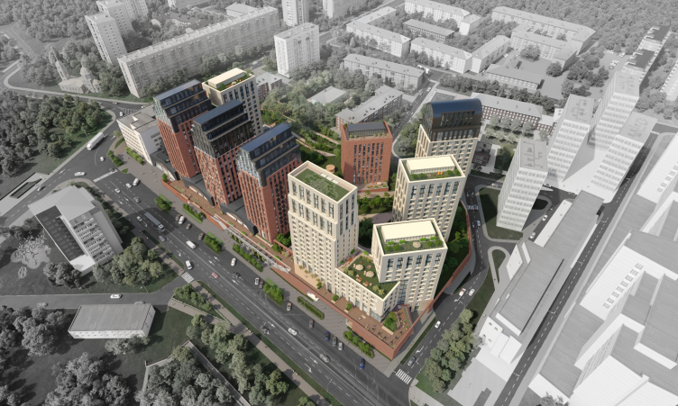
Thanks to its height difference, the construction site of an irregular shape gave the architects an opportunity to inscribe the underground parking garage into the podium part of the project, which ultimately vacated extra area for landscaping. The client – MZATE-2, the owner of the land – expectedly briefed great density – about 39 000 people per hectare. Proceeding from the required figure and the maximum allowed height, the architects positioned the “building blocks” (of a known yield of useful floor space) along the perimeter of the land site, then turned them around based on the insolation and aeration of the apartments, as well as the organization of the yard space. Playing around with the number of floors in each of the sections (it ranges from 7 to 18), the architects were able to come up with diverse silhouettes and provide most of the apartments with panoramic views.

The technical and economic performance of the complex
Copyright: © City-Arch


The complex consists of ten towers. Five towers are lined up alongside the street, three are turned at an angle; one, seven stories high, was fitted into the yard, and one duplicates the street lineup, at the same time forming an arch leading into the yard. The street-side lineup is continued by the already-existing office building that belongs to the client. It is planned that this building will host a museum or modern art.

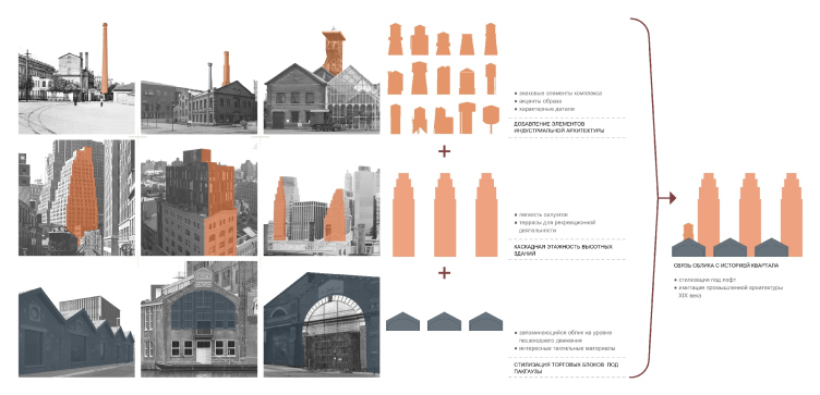
The creation of the image of the complex
Copyright: © City-Arch


The multifunctional housing complex with an underground parking garage at Malaya Pochtovaya, 12
Copyright: © City-Arch


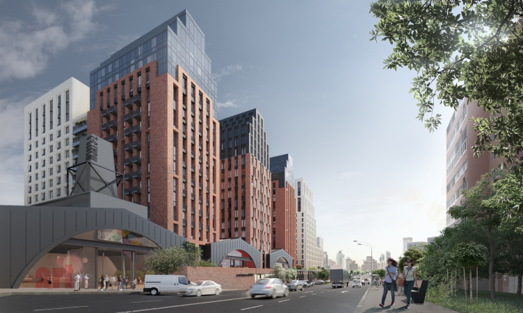
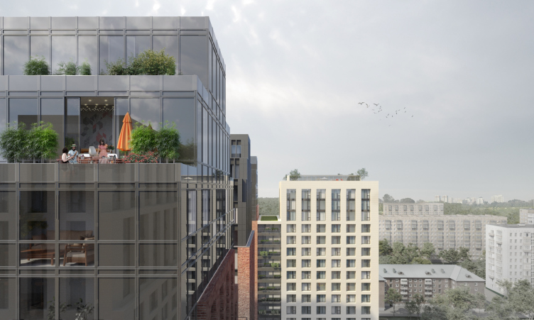
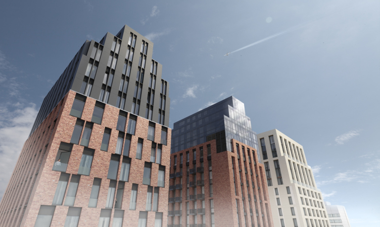
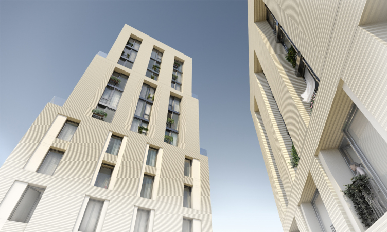
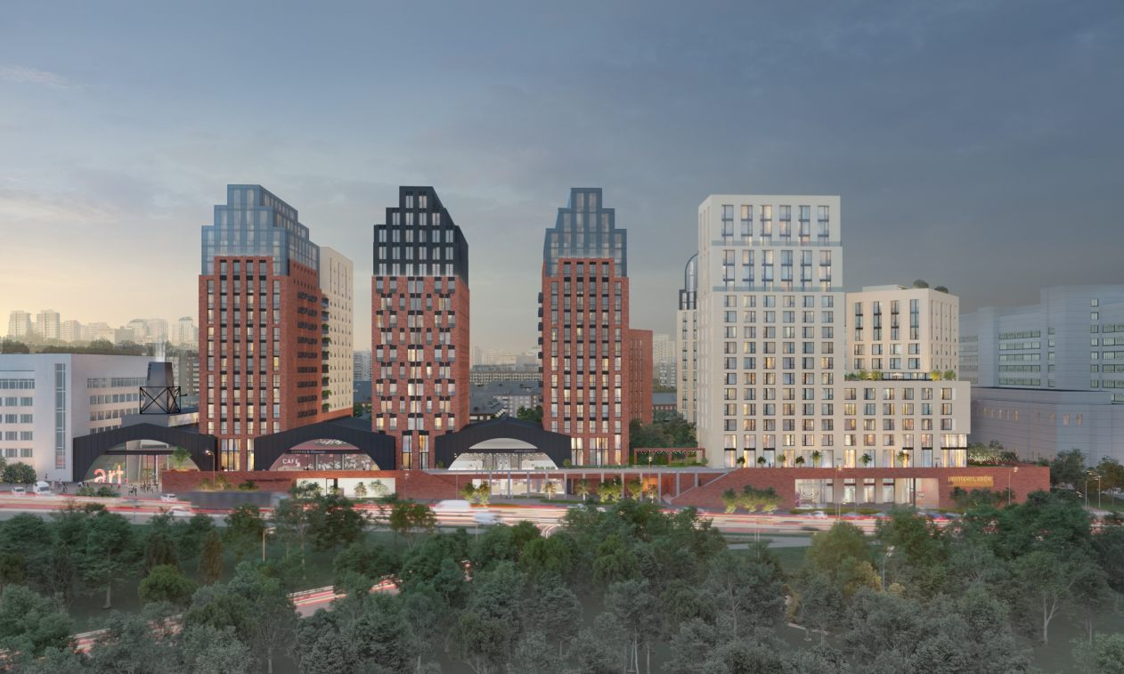
Responding to the “factory” theme, the façades of three towers standing along the street will be made of red Flemish brick – sturdy and warm tactile material. The light-colored towers will be decorated with ceramic tiles, hollow inside. The pattern of narrow windows grouped in two or three floors is a technique that visually diminishes the number of floors. The slender windows make the façade easily readable, and bring everything to human-friendly proportions. In the early versions of the project, the towers standing along the street were orthogonal but then the architects decided to make their top parts lighter and more narrow, and accentuate them with black color. This is how terraces with penthouses came around, which went a long way to increase the attractiveness and the price of the top-floor apartments, thus making up for some loss in useful floor space. The terraces on the roofs make the top floor make like classic textbook penthouses of the Tribeca so much loved by movie makers. In my opinion, the architects could have made the ledges on all the four sides, and not just on two – the more terraces the better.

The multifunctional housing complex with an underground parking garage at Malaya Pochtovaya, 12
Copyright: © City-Arch


The multifunctional housing complex with an underground parking garage at Malaya Pochtovaya, 12
Copyright: © City-Arch


The multifunctional housing complex with an underground parking garage at Malaya Pochtovaya, 12
Copyright: © City-Arch


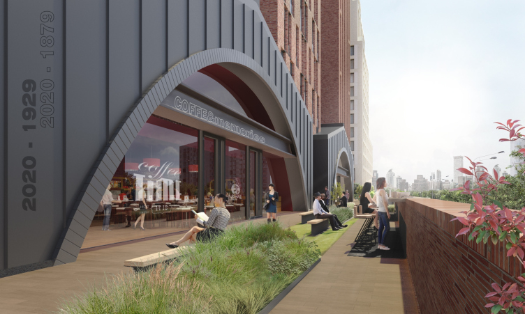
The public volumes, which unite the residential section on the bottom level, simulate the industrial architecture of the XIX century: squatting arches with triangular frontons look like the entrances to the factory or warehouse territory, even though the Ladovsky’s portal on the Krasnye Vorota also comes to mind. One of the arches has a skylight in it that is vaguely reminiscent of a factory chimney and conveys daylight to the tall inside space beneath the arch. This part of the podium is connected to the office building, and, if it is indeed to become a museum, it will make sense to exhibit large-scale installations here. The arches are made of concrete, while the framework of the stained glass windows is made of black steel. The horizontal steel girder under the fronton offers some space for advertising billboards. In the same style, and from the same double-L beams, the architects are planning to make the benches with wooden seats, streetlights, and other outdoor furniture, the main accent being a metallic arcade with swings.

The multifunctional housing complex with an underground parking garage at Malaya Pochtovaya, 12
Copyright: © City-Arch


The multifunctional housing complex with an underground parking garage at Malaya Pochtovaya, 12
Copyright: © City-Arch


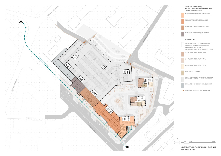
The first level of the podium is essentially a tall space – 6 meters high – and it is designed is such a way that one can use either the whole of it, or it can be divided among different renters having a loft floor in it. Supposedly, it will host a supermarket, a children’s store, a bookstore, a stationary store, as well as one of the floors of a 3-level co-working space, with a flexible interior that can be transformed for various events. The top level of the podium (the High Line) unites the bottom multi-height floors with various functions, meant both for the local residents and the transient flow “metro station – university”: a bank, a café, a restaurant, a drugstore, a fitness center, an exhibition gallery, and rentable premises for local businesses and startups, for example, the university alumni.

The multifunctional housing complex with an underground parking garage at Malaya Pochtovaya, 12
Copyright: © City-Arch


The section view (schemetic) along the Gospitalnaya Street
Copyright: © City-Arch


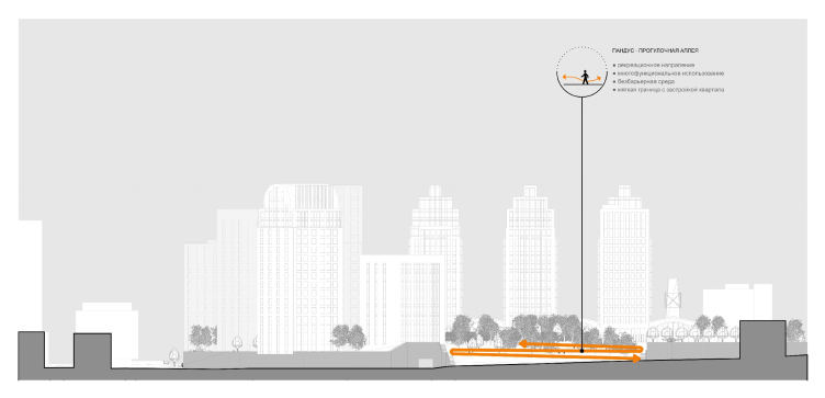
The section view (schemetic) from the side of the Cheshikhinsky Drive
Copyright: © City-Arch


The functional diagram of the complex from the Bolshaya Pochtovaya Street
Copyright: © City-Arch


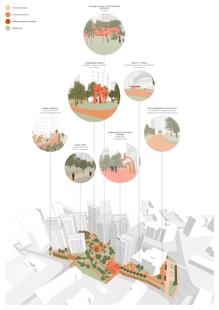
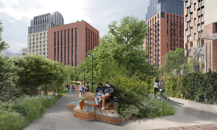
The yard space is conditionally divided into two levels by the terraced terrain. The highlights of the yard are playgrounds and sports fields for people of various age brackets, designed for passive and active recreation. What is also important is the fact that the yard is not isolated from the nearby “Brezhnev” houses: a winding ramp is lengthening the walking route and gradually descends towards the earlier-built houses, making a few great ice slides for children in the wintertime. Therefore, the neighbors will be also getting extra bonuses from the appearance of this new housing project with a thought out and picturesque recreational space.

The inside yard of the complex from the side of the Cheshikhinsky Drive
Copyright: © City-Arch


The landscaping design of the yard space
Copyright: © City-Arch


The multifunctional housing complex at Malaya Pochtovaya, 12. The scheme of the planning solutions at the 0.000 elevation
Copyright: © City-Arch


The multifunctional housing complex at Malaya Pochtovaya, 12. The scheme of the planning solutions at the -5.200 elevation
Copyright: © City-Arch


The apartment floor plans were designed with regard to the fluctuations of the housing market – specifically, they leave a possibility to increase the number of small apartments, should such need arise. In a standard three-room apartment, the living room and the kitchen have windows open on one side, the bedroom and the children room – on the other. The heating convectors are installed in the floor before the windows, which made it possible to make all the windows as floor-to-ceiling, thus further increasing the residents’ quality of life.

The overall view of the complex from the birds-eye view
Copyright: © City-Arch


The new complex is meant to improve the quality of the local urban environment, and, possibly, set a new town planning trend – a “Manhattan” one, where a person, put amidst high-rises, still feels safe and interested. And, in order to achieve that, you only need to get an organized public territory, a well-developed structure of the lower floors, and an unusual-looking silhouette of the rooftops.

11 June 2019

Headlines now
The Golden Crown
The concept for a dental clinic in Yekaterinburg, developed by CNTR Studio, revolves around the idea of a “mouth full of gold”: pristine white porcelain stoneware walls are complemented by matte brass details. To avoid an overly literal interpretation, the architects focused on the building’s proportions, skillfully navigating between sunlight requirements and fire safety regulations.
Flexibility and Integration
Not long ago, we covered the project for the fourth phase of the ÁLIA residential complex, designed by APEX. Now, we’ve been shown different fence concepts they developed to enclose the complex’s private courtyards, incorporating a variety of public functions. We believe that the sheer fact that the complex’s architects were involved in such a detail as fencing speaks volumes.
A Step Forward
The HIDE residential complex represents a major milestone for ADM architects and their leaders Andrey Romanov and Ekaterina Kuznetsova in their quest for a fresh high-rise aesthetic – one that is flexible and layered, capable of bringing vibrancy to mass and silhouette while shaping form. Over recent years, this approach has become ADM’s “signature style”, with the golden HIDE tower playing a pivotal role in its evolution. Here, we delve into the project’s story, explore the details of the complex’s design, and uncover its core essence.
Gold in the Sands
A new office for a transcontinental company specializing in resource extraction and processing has opened in Dubai. Designed by T+T Architects, masters of creating spaces that are contemporary, diverse, flexible, and original, this project exemplifies their expertise. On the executive floor, a massive brass-clad partition dominates, while layered textures of compressed earth create a contextually resonant backdrop.
Layers and Levels of Flight
This project goes way back – Reserve Union won this architectural competition at the end of 2011, and the building was completed in 2018, so it’s practically “archival”. However, despite being relatively unknown, the building can hardly be considered “dated” and remains a prime example of architectural expression, particularly in the headquarters genre. And it’s especially fitting for an aviation company office. In some ways, it resembles the Aeroflot headquarters at Sheremetyevo but with its own unique identity, following the signature style of Vladimir Plotkin. In this article, we take an in-depth look at the United Aircraft Corporation (UAC) headquarters in the Moscow agglomeration town of Zhukovsky, supplemented by recent photographs from Alexey Naroditsky – a shoot that became only recently possible due to the fact that improvements were finally made in the surrounding area.
Light and Shadow
In this article, we delve into the architectural design of the “Chaika” house by DNK ag architects, which was recently completed in 2023 as part of the collection of signature designs at ZILArt. As is well-known, all the buildings in this complex follow a design code, yet each one is distinct. This particular building stands out not only for its whiteness and minimalism but also for the refined use of a limited number of techniques that, together, create what can confidently be called synergy.
Casus Novae
A master plan was developed for a large residential area with a name of “DNS City”, but now that its implementation began, the plan has been arbitrarily reformatted and replaced with something that, while similar on the surface, is actually quite different. This is not the first time such a thing happens, but it’s always frustrating. With permission from the author, we are sharing Maria Elkina’s post.
Treasure Hunting
The GAFA bureau, in collaboration with Tegola and Arkhitail, organized an expedition to the island of Kilpola in Karelia as part of Moskomarkhitektura’s “Open City” festival. There, amidst moss and rocks, the students sought answers to questions like: what is the sacred, where does it dwell, and what sustains it? Assisting the participants in this quest were landscape engineer Evgeny Levin, artist Nicholas Roerich, a moose, and the lack of cellular connection. Here’s how the story unfolded.
Depths of the Earth, Streams of Water
In the Malaya Okhta district, the Akzent building, designed by Stepan Liphart, was constructed. It follows a classic tripartite structure, yet it’s what you might call “hand-drawn”: each façade is unique in its form and details, some of which aren’t immediately noticeable. In this article, we explore the context and, together with the architect, delve into how the form was developed.
Fir Tree Dynamics
The “Airports of Region” holding is planning to build an airport in Karachay-Cherkessia, aiming to make the Arkhyz and Dombay resorts more accessible to travelers. The project that won in an invitation-only competition, submitted by Sergey Nikeshkin’s KPLN, blends natural imagery inspired by the shape of a conifer seed, open-air waiting spaces, majestic large trees, and a green roof elevated on needle-like columns. The result is both nature-inspired and WOW.
​A Brick Shell
In the process of designing a clubhouse situated among pine trees in a prestigious suburban area near Moscow, the architectural firm “A.Len” did the façade design part. The combination of different types of brick and masonry correlates with the volumetric and plastique solutions, further enhanced by the inclusion of wood-painted fragments and metal “glazing”.
Word Forms
ATRIUM architects love ambitious challenges, and for the firm’s thirtieth anniversary, they boldly play a game of words with an exhibition that dives deep into a self-created vocabulary. They immerse their projects – especially art installations – into this glossary, as if plunging into a current of their own. You feel as if you’re flowing through the veins of pure art, immersed in a universe of vertical cities, educational spaces – of which the architects are true masters – and the cultural codes of various locations. But what truly captivates is the bold statement that Vera Butko and Anton Nadtochy make, both through their work and this exhibition: architecture, above all, is art – the art of working with form and space.
Flexibility and Acuteness of Modernity
Luxurious, fluid, large “kokoshniks” and spiral barrel columns, as if made from colorful chewing gum: there seem to be no other mansion like this in Moscow, designed in the “Neo-Russian-Modern” style. And the “Teremok” on Malaya Kaluzhskaya, previously somewhat obscure, has “come alive with new colors” and gained visibility after its restoration for the office of the “architectural ecosystem” as the architects love to call themselves. It’s evident that Julius Borisov and the architects at UNK put their hearts into finding this new office and bringing it up to date. Let’s delve into the paradoxes of this mansion’s history and its plasticity. Spoiler: two versions of modernity meet here, both balancing on the razor’s edge of “what’s current”.
Yuri Vissarionov: “A modular house does not belong to the land”
It belongs to space, or to the air... It turns out that 3D printing is more effective when combined with a modular approach: the house is built in a workshop and then adapted to the site, including on uneven terrain. Yuri Vissarionov shares his latest experience in designing tourist complexes, both in central Russia and in the south. These include houseboats, homes printed from lightweight concrete using a 3D printer, and, of course, frame houses.
​Moscow’s First
“The quality of education largely depends on the quality of the educational environment”. This principle of the last decade has been realized by Sergey Skuratov in the project for the First Moscow Gymnasium on Rostovskaya Embankment in the Khamovniki district. The building seamlessly integrates into the complex urban landscape, responding both to the pedestrian flow of the city and the quiet alleyways. It skillfully takes advantage of the height differences and aligns with modern trends in educational space design. Let’s take a closer look.
Looking at the Water
The site of Villa Sonata stretches from the road to the water’s edge, offering its own shoreline, pier, and a picturesque river panorama. To reveal these sweeping views, Roman Leonidov “cut” the façade diagonally parallel to the river, thus getting two main axes for the house and, consequently, “two heads”. The internal core – two double-height spaces, a living room and a conservatory, with a “bridge” above them – makes the house both “transparent” and filled with light.
The White Wing
Well, it’s not exactly white. It’s more of a beige, white-stone structure that plays with the color of limestone – smoother surfaces are lighter, while rougher ones are darker. This wing unites various elements: it absorbs and interprets the surrounding themes. It responds to everything, yet maintains a cohesive expression – a challenging task! – while also incorporating recognizable features of its own, such as the dynamic cuts at the bottom, top, and middle.
Urban Dunes
The XSA Ramps team designed and built a three-part sports hub for a park in Rostov-on-Don, welcoming people of all ages and fitness levels. The skate plaza, pump track, and playground are all meticulously crafted with details that attract a diverse range of visitors. The technical execution of the shapes and slopes transforms this space into a kind of sculptural composition.
Proportional Growth
The project for the fourth phase of the ÁLIA residential area has been announced. The buildings are situated on an elongated plot – almost a “ray” that shoots out from the center of the area towards the river. Their layout reflects both a response to Moscow’s architectural preferences over the past 15 years, shifting “from blocks to towers”, and an interpretation of the neighboring business park designed by SOM. Additionally, the best apartments here are not located at the very top but closer to the middle, forming a glowing “waistline”.
The “Staircase” Building
In designing the “Details” residential complex in New Moscow, Rais Baishev spiced up the now-popular Moscow theme of a “courtyard” building with an idea drawn from the surrealist drawings by Maurits Escher. He envisioned the stepped silhouettes and descending slopes as a metaphysical mega-staircase, creating a key void within the courtyard that gave the project an internal “spine”. This concept is felt both in the building’s silhouette and on its façades.
Projection of the Quarter
No one doubted that the building that Vladimir Plotkin designed as part of the “Garden Quarters” would be the most modernist of all. And it turned out just that way: while adhering to the common design code, the building successfully combines brick and white stone, rhythmically responding to the neighboring building designed by Ostozhenka, yet tactfully and persistently making a few statements of its own. This includes the projection of the ideal urban development composition “14–9–6”, which can be found right next door, mathematical calculations, including those for various types of terraces (and perhaps the only reminder of the Soviet past of the Kauchuk rubber factory!), and the white “cross-stitch” pattern of the façade grid.
Domus Aurea
In this issue, we examine the “Tessinsky-1” house, designed by Sergey Skuratov and completed in 2023. Located in the middle of the Serebryanicheskaya Embankment district, at the intersection of its main streets, this house assumes a sort of “nodal” role: it not only responds to everything around it and preserves many memories of the former EMA factory within itself, but it weaves all this into a newly directed pattern, reconciling bright “gold” and dark-colored brick, largely with the help of the new, modern-yet-archaic Columba brick, which, come to think about it, is the most precious element here.
The Chimney of Nikola-Lenivets
In this issue, we are examining the “Obelisk House” designed by KATARSIS and built for the Arkhstoyanie 2023 festival. However, it was only finished later on, and this is why we are examining it now. It seems to us that after the “Obelisk House” appeared in Nikola-Lenivets, a dialogue and a few inner connections appeared between the temporary structures built here. These houses no longer look like “accidental neighbors”, more of which below.
​Periscope by the Bay
The jury awarded the second place in the competition for a public and cultural center in Petropavlovsk-Kamchatsky to the companies GORA (“Mountain”) and M4. In the consortium’s proposal, the building resembles a sperm whale with a calf swimming next to it or a periscope, whose lenses capture the most spectacular views from the surrounding landscape.
From Arcs to Dolmens
While working on the competition project for Petropavlovsk-Kamchatsky, ASADOV Architects prioritized the value of the natural and urban environment, aiming to preserve the balance of the location while minimizing the resemblance of the volume that they designed to a “traditional building”. The task was challenging, and the architects created three versions, one of which having been developed after the competition, where their main proposal took third place. However, the point of interest here is not the competition result but the continuity of creative thinking.
Hide and Seek
The ID Moskovskiy house, designed by Stepan Liphart in St. Petersburg, in the courtyards near Moskovskiy Avenue beyond the Obvodny Canal and recently completed, is notable for several reasons. Firstly, it has been realized with considerable accuracy, which is particularly significant as this is the first building where the architect was responsible not only for the facades but also for the layouts, allowing for better integration between the two. On the other hand, this building is interesting as an example of the “germination” of new architecture in the city: it draws on the best examples from the neighborhood and becomes an improved and developed sum of ideas found by the architect in the surrounding context.
The Big Twelve
Yesterday, the winners of the Moscow Mayor’s Architecture Award were announced and honored. Let’s take a look at what was awarded and, in some cases, even critique this esteemed award. After all, there is always room for improvement, right?
Above the Golden Horn
The residential complex “Philosophy” designed by T+T architects in Vladivostok, is one of the new projects in the “Golubinaya Pad” area, changing its development philosophy (pun intended) from single houses to a comprehensive approach. The buildings are organized along public streets, varying in height and format, with one house even executed in gallery typology, featuring a cantilever leaning on an art object.
Nuanced Alternative
How can you rhyme a square and space? Easily! But to do so, you need to rhyme everything you can possibly think of: weave everything together, like in a tensegrity structure, and find your own optics too. The new exhibition at GES-2 does just that, offering its visitor a new perspective on the history of art spanning 150 years, infused with the hope for endless multiplicity of worlds and art histories. Read on to see how this is achieved and how the exhibition design by Evgeny Ace contributes to it.
Blinds for Ice
An ice arena has been constructed in Domodedovo based on a project by Yuri Vissarionov Architects. To prevent the long façade, a technical requirement for winter sports facilities, from appearing monotonous, the architects proposed the use of suspended structures with multidirectional slats. This design protects the ice from direct sunlight while giving the wall texture and detail.