По-русски

Oleg Carlson: “After I watched the Hugh Laurie TV series I realized that I am also a doctor, only I treat houses instead of people”

The architect is speaking about his Facebook project in which he shares about frequent cases of “healing” private residences designed with mistakes of various degrees of severity.

04 October 2018
Interview
mainImg

A country residence is a special architectural genre, which, as life shows, is something that not all of the architects can successfully master. A lot of country houses require major adjustments, they need therapy, and sometimes even surgery. Oleg Carlson has come up with an Internet project #ДокторHouse: the materials of the country residence projects that he cured are posted online in a “before-and-after” format on his Facebook page and the page of “ASB Carlson and K”.

How did your “Doctor House” story begin?

Surfing the Internet on long winter evenings, you can find lots of different things, including information about designing country houses. My colleagues post online their floor plans, the developers advertise their projects of country houses, and so on. And sometimes designers come with the project complaining about the fact that they do not understand how to do the interior design for the floor plan that was just thrust upon them.

Regretfully, most of houses built by such projects are subject to major reconstruction or even demolition. However, while the house is not yet in construction, it is not too late to put things right. And sometimes you just examine such a project, then you grab your pencil and start correcting the obvious limitations of the house planning. Or sometimes you just take the geo basis, the house plans, and make over the entire project – let’s say, revert the axis or apply the modular design principle.

This is how I started this “before and after” page on Facebook, where we posted the materials of the original and the revised projects, getting in touch with the authors in order to share our experience, to prove our solutions right, and to teach them the principles of architectural design.

And after I watched the Hugh Laurie TV series I realized that I am also a doctor, only I treat houses instead of people. House, M.D. has been out for thirty seasons (well, here we might want to ask Oleg what exactly he considers to be a “season”). Each year we “cure” from 20 to 30 projects. We have a goal of correcting the limitations of the project before the construction begins, thus saving the client’s time, money, and the customer's nervous system.

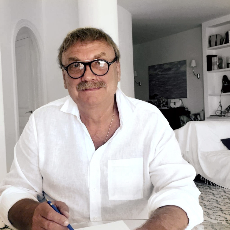
Oleg Carlson © ASB Carlson & K
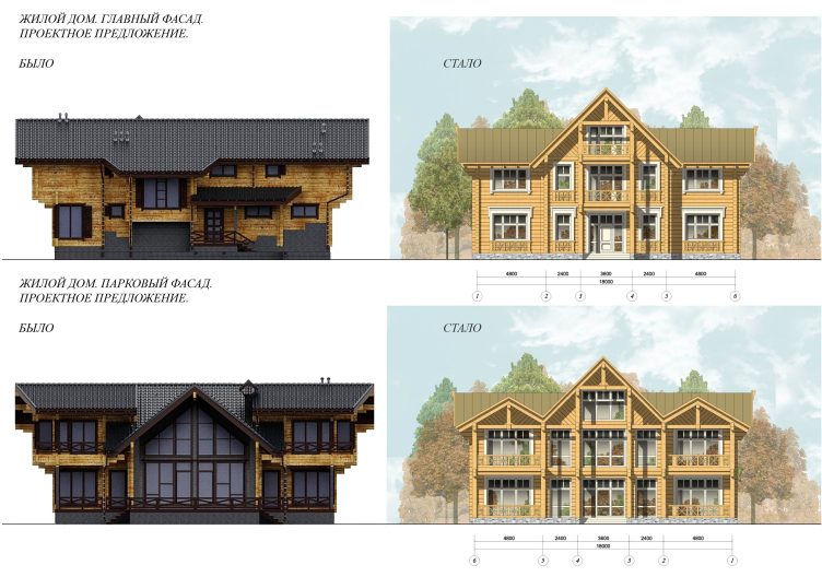
The facades of a country house: before and after © ASB Carlson & K


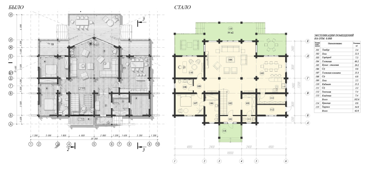
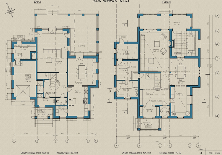
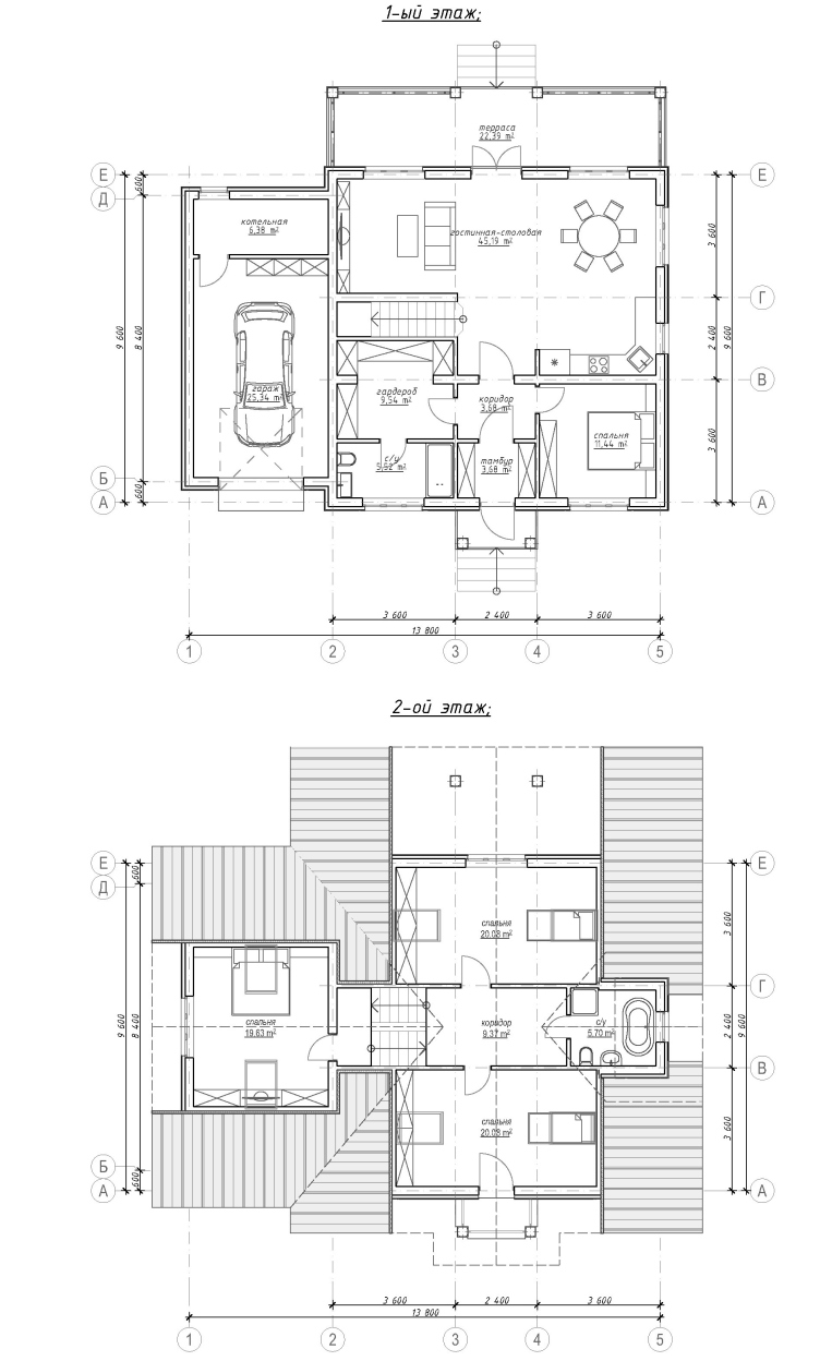
Plan of the 1st floor: before and after © ASB Carlson & K


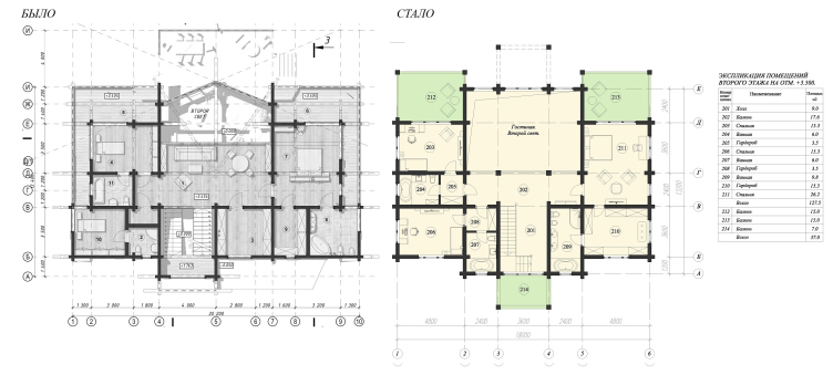
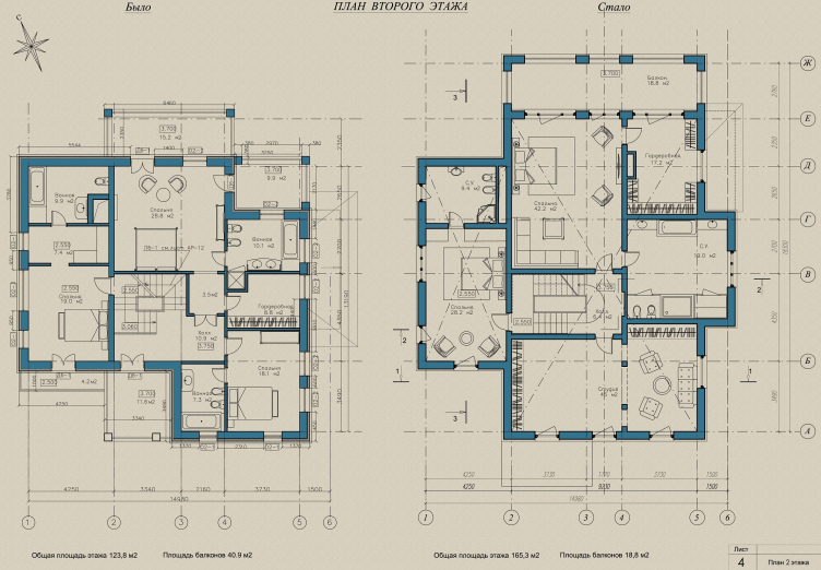
Plan of the 2nd floor: before and after © ASB Carlson & K


What are the main limitations of the projects that you undertake to make over?

The most common mistake is when you have a large total area and lots of useless premises in the house: corridors, some transient zones that are not included in the scenario of the life of the house, gigantic furnace rooms, and such like. Now add to this inconvenient and unsafe stairways – steep or narrow or dark – and incompetently designed bathrooms. A separate subject is the second-level space. You just cannot have second-level space in houses under 300 square meters because it steals the useful floor space from the bedroom. Say, why would you ever want to move from a cramped city apartment into a house of your own with bedrooms 10-12 square meters?

This is what goes on on the inside. On the outside, it is mostly open balconies and entrance groups that get piled up with snow, and flat roofs that start leaking every spring requiring some major repairs.

A lot of mistakes have to do with positioning your house in the site: the living room windows overlooking the fences, and the windows of some stupid mechanical rooms overlooking the gardens. The living rooms may look south, and the bedrooms may look north – and this is in our climate where you may not see the sun for weeks!

Once I was invited by the “Idealny Renont” (“Perfect Remodeling”) TV show on Channel 1 to the house of Sergey Yursky and his wife Natalia Tenyakova. This is where I had the complete set of designing mistakes! Starting from the wrong orientation of the house on the land site, which resulted in the fact that the house was turned to the plot with its rear façade, and the bedroom windows were stopped dead by the fences. There was yet another curious thing that was left off-screen in the TV show: how, with a bedroom on the second floor, the house got an extra outlaw bathroom, and how the stairway was made over in such a way that now the only way to climb it without running the risk of breaking your neck was doing it in groups holding each other’s hands.

What do you think is the cause of such unsuccessful projects?

Our architects are underpaid by their clients. Oftentimes, even very rich people look to pay for their project as little as possible, inviting “architects” who agree to design a house for 10 euros per square meter. So they end up getting what they later on take to us for a fix.

The quality of the project is not guaranteed by the client’s readiness to pay, either. I have had to make follow-up corrections in the projects done by an American firm that designed a house in the Wright style.

Wright houses are all about iron logic based on the modular design principle. But this logic has yet to be adapted to our climatic conditions, starting from organizing the tambour, which is nonexistent in Wright’s projects.

Another reason for these stupid mistakes – and this is something that I totally disagree with – is the belief of some of my colleagues that “the customer is always right”. The client comes to an architect assuming that he is a professional. The architect’s task is to ask his client lots of questions about how he sees his or her house, what kind of family they have, what their lifestyle is, hear the client out, and then propose his own solution, convincing, if necessary, the client of its advantages. The client’s will is no excuse for a bad project.

And what can you say about your own clients? Their wealth and social status alone must be enough of a reason to be intimidated to disagree with them, are they not?

As time goes by, you also develop your own authority, and when really rich clients come to you, they realize that they are coming to an acclaimed professional. These clients know how important it is to listen to the professional opinion.

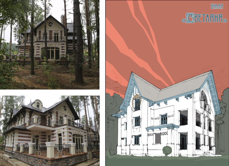
Villa "Svetlana": before and after © ASB Carlson & K


Villa "Svetlana", plan of the first floor: before and after © ASB Carlson & K


Villa "Svetlana", plan of the second floor: before and after © ASB Carlson & K


Could you say that all of the Russian clients prefer some specific style?

Classical houses are definitely more popular in this country because classics is something that our clients understand and are used to. The main problem is that oftentimes you have a land plot of about 30-40 hundred square meters, and the client wants to build on it a manor house or even a palace, oblivious of the fact that a palace, whatever kind it is, presupposes lots of space around it.

It’s not often that the clients come to me asking to design a house in modern style. In order to want to build a “modern” house, you need to have lived in a classical one for a while. The client must get ripe for the modern architecture, learn to appreciate the beauty of its shapes, technologies, and materials. So, most of the time we play classics.

Let’s take our settlement “Sokol” for example – the houses that were built here in the very beginning. Some will say that this is a boring and dull kind of architecture. But in reality, everything was done there in a beautiful, competent, and grand-scale manner.

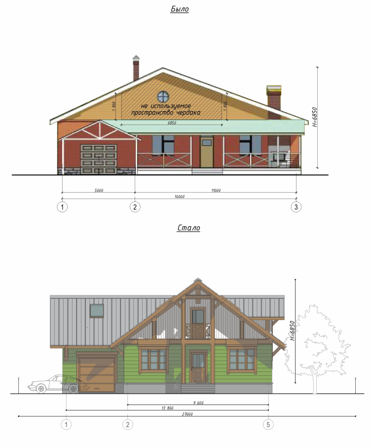
The facades of a country house: before and after © ASB Carlson & K


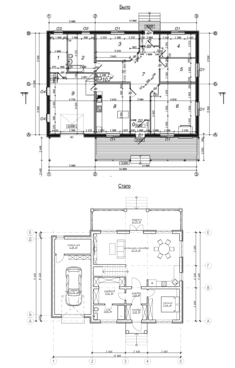
Floor plan: before and after © ASB Carlson & K


None


What kind of advice would you give to those who only begins to design houses on their own? How do you learn to make great projects?

Back in the day, you could only get information from specialized magazines, and those were few and far between. At the university, we could only get them with written acknowledgement of receipt. Today you have the Internet that shows you all the expertise that is out there. Just go for it, take it and use it but don’t forget to use your head as well. Again, because of the Internet, the same mistakes keep popping up in many different projects over and over again. And, again, there are lots of great projects out there – you don’t really have to design anything, everything was designed before you.

Also, you need to learn to explain to your client the benefits of professional architectural solutions, and then you are going to end up getting more great projects to be ultimately proud of.

The Internet is more and more becoming the leading educational resource. Do you plan to further develop your “Doctor House” project?

Today, the knowledge and experience that we accumulated in the course of design and construction of individual residences, as well as our appreciation of the architecture of the perfect house, is only our knowledge and experience, about which we share a little on our “Doctor House” page.

We also have plans for launching our YouTube channel in the nearest future. We are already posting videos online in which I share about the subtleties of making a floor plan for a private residence. We will be posting a new video every two weeks: sharing about our new projects as they are “on paper” and about our visits to our clients. So, we are planning to continue sharing our experience and we hope that in the future Doctor House will not only treat houses but also teach people.


04 October 2018

Headlines now
A Step Forward
The HIDE residential complex represents a major milestone for ADM architects and their leaders Andrey Romanov and Ekaterina Kuznetsova in their quest for a fresh high-rise aesthetic – one that is flexible and layered, capable of bringing vibrancy to mass and silhouette while shaping form. Over recent years, this approach has become ADM’s “signature style”, with the golden HIDE tower playing a pivotal role in its evolution. Here, we delve into the project’s story, explore the details of the complex’s design, and uncover its core essence.
Gold in the Sands
A new office for a transcontinental company specializing in resource extraction and processing has opened in Dubai. Designed by T+T Architects, masters of creating spaces that are contemporary, diverse, flexible, and original, this project exemplifies their expertise. On the executive floor, a massive brass-clad partition dominates, while layered textures of compressed earth create a contextually resonant backdrop.
Layers and Levels of Flight
This project goes way back – Reserve Union won this architectural competition at the end of 2011, and the building was completed in 2018, so it’s practically “archival”. However, despite being relatively unknown, the building can hardly be considered “dated” and remains a prime example of architectural expression, particularly in the headquarters genre. And it’s especially fitting for an aviation company office. In some ways, it resembles the Aeroflot headquarters at Sheremetyevo but with its own unique identity, following the signature style of Vladimir Plotkin. In this article, we take an in-depth look at the United Aircraft Corporation (UAC) headquarters in the Moscow agglomeration town of Zhukovsky, supplemented by recent photographs from Alexey Naroditsky – a shoot that became only recently possible due to the fact that improvements were finally made in the surrounding area.
Light and Shadow
In this article, we delve into the architectural design of the “Chaika” house by DNK ag architects, which was recently completed in 2023 as part of the collection of signature designs at ZILArt. As is well-known, all the buildings in this complex follow a design code, yet each one is distinct. This particular building stands out not only for its whiteness and minimalism but also for the refined use of a limited number of techniques that, together, create what can confidently be called synergy.
Casus Novae
A master plan was developed for a large residential area with a name of “DNS City”, but now that its implementation began, the plan has been arbitrarily reformatted and replaced with something that, while similar on the surface, is actually quite different. This is not the first time such a thing happens, but it’s always frustrating. With permission from the author, we are sharing Maria Elkina’s post.
Treasure Hunting
The GAFA bureau, in collaboration with Tegola and Arkhitail, organized an expedition to the island of Kilpola in Karelia as part of Moskomarkhitektura’s “Open City” festival. There, amidst moss and rocks, the students sought answers to questions like: what is the sacred, where does it dwell, and what sustains it? Assisting the participants in this quest were landscape engineer Evgeny Levin, artist Nicholas Roerich, a moose, and the lack of cellular connection. Here’s how the story unfolded.
Depths of the Earth, Streams of Water
In the Malaya Okhta district, the Akzent building, designed by Stepan Liphart, was constructed. It follows a classic tripartite structure, yet it’s what you might call “hand-drawn”: each façade is unique in its form and details, some of which aren’t immediately noticeable. In this article, we explore the context and, together with the architect, delve into how the form was developed.
Fir Tree Dynamics
The “Airports of Region” holding is planning to build an airport in Karachay-Cherkessia, aiming to make the Arkhyz and Dombay resorts more accessible to travelers. The project that won in an invitation-only competition, submitted by Sergey Nikeshkin’s KPLN, blends natural imagery inspired by the shape of a conifer seed, open-air waiting spaces, majestic large trees, and a green roof elevated on needle-like columns. The result is both nature-inspired and WOW.
​A Brick Shell
In the process of designing a clubhouse situated among pine trees in a prestigious suburban area near Moscow, the architectural firm “A.Len” did the façade design part. The combination of different types of brick and masonry correlates with the volumetric and plastique solutions, further enhanced by the inclusion of wood-painted fragments and metal “glazing”.
Word Forms
ATRIUM architects love ambitious challenges, and for the firm’s thirtieth anniversary, they boldly play a game of words with an exhibition that dives deep into a self-created vocabulary. They immerse their projects – especially art installations – into this glossary, as if plunging into a current of their own. You feel as if you’re flowing through the veins of pure art, immersed in a universe of vertical cities, educational spaces – of which the architects are true masters – and the cultural codes of various locations. But what truly captivates is the bold statement that Vera Butko and Anton Nadtochy make, both through their work and this exhibition: architecture, above all, is art – the art of working with form and space.
Flexibility and Acuteness of Modernity
Luxurious, fluid, large “kokoshniks” and spiral barrel columns, as if made from colorful chewing gum: there seem to be no other mansion like this in Moscow, designed in the “Neo-Russian-Modern” style. And the “Teremok” on Malaya Kaluzhskaya, previously somewhat obscure, has “come alive with new colors” and gained visibility after its restoration for the office of the “architectural ecosystem” as the architects love to call themselves. It’s evident that Julius Borisov and the architects at UNK put their hearts into finding this new office and bringing it up to date. Let’s delve into the paradoxes of this mansion’s history and its plasticity. Spoiler: two versions of modernity meet here, both balancing on the razor’s edge of “what’s current”.
Yuri Vissarionov: “A modular house does not belong to the land”
It belongs to space, or to the air... It turns out that 3D printing is more effective when combined with a modular approach: the house is built in a workshop and then adapted to the site, including on uneven terrain. Yuri Vissarionov shares his latest experience in designing tourist complexes, both in central Russia and in the south. These include houseboats, homes printed from lightweight concrete using a 3D printer, and, of course, frame houses.
​Moscow’s First
“The quality of education largely depends on the quality of the educational environment”. This principle of the last decade has been realized by Sergey Skuratov in the project for the First Moscow Gymnasium on Rostovskaya Embankment in the Khamovniki district. The building seamlessly integrates into the complex urban landscape, responding both to the pedestrian flow of the city and the quiet alleyways. It skillfully takes advantage of the height differences and aligns with modern trends in educational space design. Let’s take a closer look.
Looking at the Water
The site of Villa Sonata stretches from the road to the water’s edge, offering its own shoreline, pier, and a picturesque river panorama. To reveal these sweeping views, Roman Leonidov “cut” the façade diagonally parallel to the river, thus getting two main axes for the house and, consequently, “two heads”. The internal core – two double-height spaces, a living room and a conservatory, with a “bridge” above them – makes the house both “transparent” and filled with light.
The White Wing
Well, it’s not exactly white. It’s more of a beige, white-stone structure that plays with the color of limestone – smoother surfaces are lighter, while rougher ones are darker. This wing unites various elements: it absorbs and interprets the surrounding themes. It responds to everything, yet maintains a cohesive expression – a challenging task! – while also incorporating recognizable features of its own, such as the dynamic cuts at the bottom, top, and middle.
Urban Dunes
The XSA Ramps team designed and built a three-part sports hub for a park in Rostov-on-Don, welcoming people of all ages and fitness levels. The skate plaza, pump track, and playground are all meticulously crafted with details that attract a diverse range of visitors. The technical execution of the shapes and slopes transforms this space into a kind of sculptural composition.
Proportional Growth
The project for the fourth phase of the ÁLIA residential area has been announced. The buildings are situated on an elongated plot – almost a “ray” that shoots out from the center of the area towards the river. Their layout reflects both a response to Moscow’s architectural preferences over the past 15 years, shifting “from blocks to towers”, and an interpretation of the neighboring business park designed by SOM. Additionally, the best apartments here are not located at the very top but closer to the middle, forming a glowing “waistline”.
The “Staircase” Building
In designing the “Details” residential complex in New Moscow, Rais Baishev spiced up the now-popular Moscow theme of a “courtyard” building with an idea drawn from the surrealist drawings by Maurits Escher. He envisioned the stepped silhouettes and descending slopes as a metaphysical mega-staircase, creating a key void within the courtyard that gave the project an internal “spine”. This concept is felt both in the building’s silhouette and on its façades.
Projection of the Quarter
No one doubted that the building that Vladimir Plotkin designed as part of the “Garden Quarters” would be the most modernist of all. And it turned out just that way: while adhering to the common design code, the building successfully combines brick and white stone, rhythmically responding to the neighboring building designed by Ostozhenka, yet tactfully and persistently making a few statements of its own. This includes the projection of the ideal urban development composition “14–9–6”, which can be found right next door, mathematical calculations, including those for various types of terraces (and perhaps the only reminder of the Soviet past of the Kauchuk rubber factory!), and the white “cross-stitch” pattern of the façade grid.
Domus Aurea
In this issue, we examine the “Tessinsky-1” house, designed by Sergey Skuratov and completed in 2023. Located in the middle of the Serebryanicheskaya Embankment district, at the intersection of its main streets, this house assumes a sort of “nodal” role: it not only responds to everything around it and preserves many memories of the former EMA factory within itself, but it weaves all this into a newly directed pattern, reconciling bright “gold” and dark-colored brick, largely with the help of the new, modern-yet-archaic Columba brick, which, come to think about it, is the most precious element here.
The Chimney of Nikola-Lenivets
In this issue, we are examining the “Obelisk House” designed by KATARSIS and built for the Arkhstoyanie 2023 festival. However, it was only finished later on, and this is why we are examining it now. It seems to us that after the “Obelisk House” appeared in Nikola-Lenivets, a dialogue and a few inner connections appeared between the temporary structures built here. These houses no longer look like “accidental neighbors”, more of which below.
​Periscope by the Bay
The jury awarded the second place in the competition for a public and cultural center in Petropavlovsk-Kamchatsky to the companies GORA (“Mountain”) and M4. In the consortium’s proposal, the building resembles a sperm whale with a calf swimming next to it or a periscope, whose lenses capture the most spectacular views from the surrounding landscape.
From Arcs to Dolmens
While working on the competition project for Petropavlovsk-Kamchatsky, ASADOV Architects prioritized the value of the natural and urban environment, aiming to preserve the balance of the location while minimizing the resemblance of the volume that they designed to a “traditional building”. The task was challenging, and the architects created three versions, one of which having been developed after the competition, where their main proposal took third place. However, the point of interest here is not the competition result but the continuity of creative thinking.
Hide and Seek
The ID Moskovskiy house, designed by Stepan Liphart in St. Petersburg, in the courtyards near Moskovskiy Avenue beyond the Obvodny Canal and recently completed, is notable for several reasons. Firstly, it has been realized with considerable accuracy, which is particularly significant as this is the first building where the architect was responsible not only for the facades but also for the layouts, allowing for better integration between the two. On the other hand, this building is interesting as an example of the “germination” of new architecture in the city: it draws on the best examples from the neighborhood and becomes an improved and developed sum of ideas found by the architect in the surrounding context.
The Big Twelve
Yesterday, the winners of the Moscow Mayor’s Architecture Award were announced and honored. Let’s take a look at what was awarded and, in some cases, even critique this esteemed award. After all, there is always room for improvement, right?
Above the Golden Horn
The residential complex “Philosophy” designed by T+T architects in Vladivostok, is one of the new projects in the “Golubinaya Pad” area, changing its development philosophy (pun intended) from single houses to a comprehensive approach. The buildings are organized along public streets, varying in height and format, with one house even executed in gallery typology, featuring a cantilever leaning on an art object.
Nuanced Alternative
How can you rhyme a square and space? Easily! But to do so, you need to rhyme everything you can possibly think of: weave everything together, like in a tensegrity structure, and find your own optics too. The new exhibition at GES-2 does just that, offering its visitor a new perspective on the history of art spanning 150 years, infused with the hope for endless multiplicity of worlds and art histories. Read on to see how this is achieved and how the exhibition design by Evgeny Ace contributes to it.
Blinds for Ice
An ice arena has been constructed in Domodedovo based on a project by Yuri Vissarionov Architects. To prevent the long façade, a technical requirement for winter sports facilities, from appearing monotonous, the architects proposed the use of suspended structures with multidirectional slats. This design protects the ice from direct sunlight while giving the wall texture and detail.
Frozen Magma
A competition for the creation of a public and cultural center was held in Petropavlovsk-Kamchatsky. Three architectural companies made it to the final, and we consider it important to share about the work of each. Let’s start with the winner – the consortium led by Wowhaus.
Campus within a Day
In this article, we talk about what the participants of Genplan Institute of Moscow’s hackathon were doing at the MosComArchitecture booth at the “ArchMoscow” exhibition. We also discuss who won the prize and why, and what can be done with the territory of a small university on the outskirts of Moscow.