По-русски

​Activation by Amelioration

A most interesting idea of a pilot renovation project developed by Ostozhenka and the Institute for Urban Economics consists in building underground parking garages combined with soil drains. In addition, the project is all about preserving the valuable land assets combined with the city getting a new large-scale street and a few minor ones as well.

21 August 2018
News
mainImg
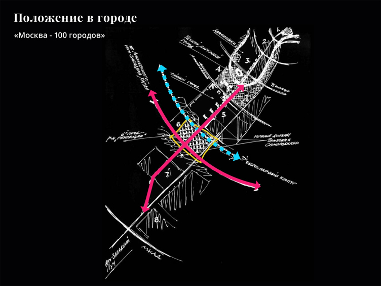
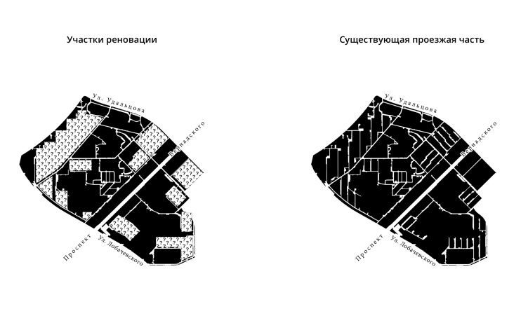
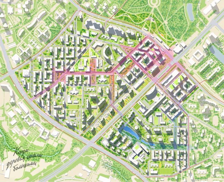
In this issue, we are continuing to share about the works submitted for the competition of pilot territory renovation projects. What makes the district of Vernadskogo Avenue different, stuck, like on a thumb pick, on the metro station of the same name, is the prestigious status, characteristic of most areas of Moscow’s southwest combined at the same time with insufficient cohesiveness. The main task that the Ostozhenka architects set for themselves in their pilot renovation project was joining the new construction sites, currently chaotically scattered, together, and livening up the internal life of the area.

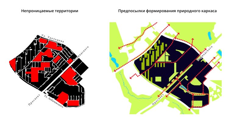
Naming their project “When the Trees Became Tall” (an allusion to the cult Soviet movie of the 1960’s “When the Trees Were Tall”), the architects stressed the importance of green framework to their project.

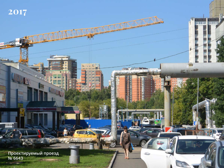
The renovation platform "Vernadskogo Avenue", Designed Drive 6640, the current state © Ostozhenka


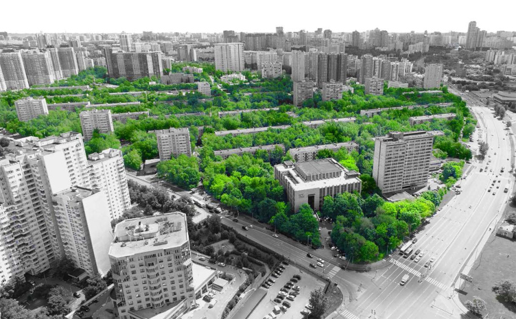
The renovation platform "Vernadskogo Avenue". The current state © Ostozhenka


The renovation platform "Vernadskogo Avenue". The current state © Ostozhenka


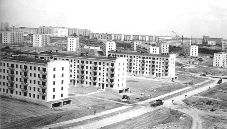
Construction of Vernadskogo Avenue © Ostozhenka


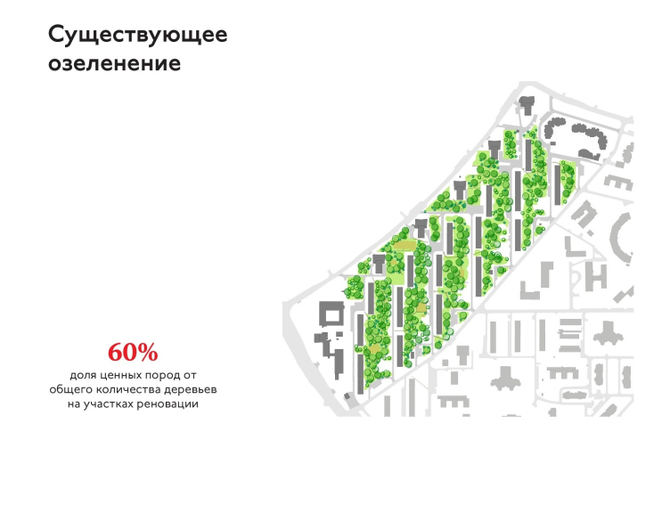
The renovation platform "Vernadskogo Avenue". The current state of greenery © Ostozhenka


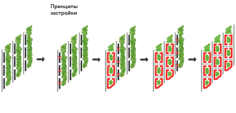
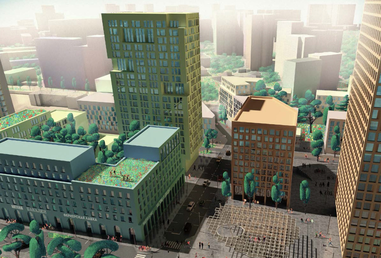
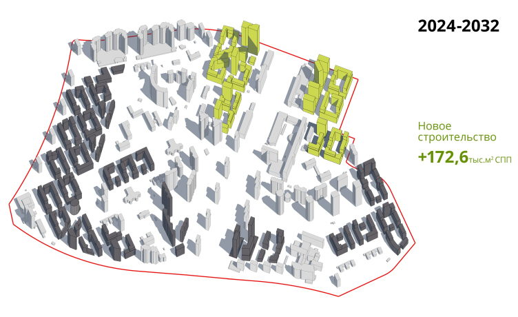
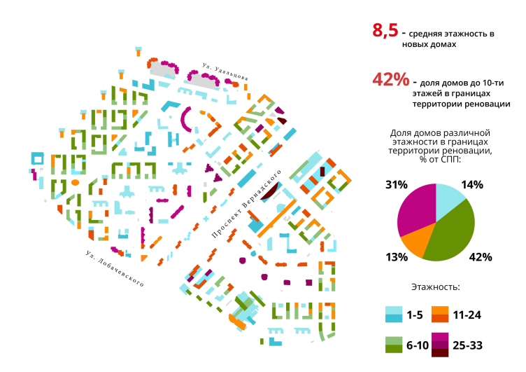
“We do not destroy the existing vegetation – we only add to it. The green spaces between the buildings became a peculiar token for us: they are like a clock’s hands counting time – Andrew Gnezdilov says – the new houses fit in almost perfectly with the existing planning structure without destroying the vegetation in between them. And it must be noted that the planning pattern of the 1960’s is vital to this day: arranging the houses from north to south is convenient for the construction because it answers today’s insolation norms”. As for the “string” or “horizontal row” construction principle, the architects do change it: in the depth of the neighborhood, buildings of relatively moderate height (up to 8 floors) form semi-closed urban blocks, while near the future transport interchange hub, next to the metro station and near the Vernadskogo Avenue the architects form the blocks that consist of high-rise towers. This way, they accentuate the meaningful points and support the visual correlation with the existing surroundings – housing complexes of the 2000’s.

In order to tie the existing recreations into a single system, the architects add overland pedestrian crossings of the Vernadskogo Avenue in the vital points, proposing to synchronize the mode of the existing traffic lights – one will be able to cross the avenue by a pedestrian crossing, even if somewhat remote from the set of traffic lights, while the cars remain standing, and the traffic will remain unhindered as well because the authors do not propose to build new lights, attaching their crossings to the already existing ones; one must admit that this is a very subtle solution indeed.

The renovation platform "Vernadskogo Avenue" © Ostozhenka


The renovation platform "Vernadskogo Avenue". The principle of construction © Ostozhenka


The renovation platform "Vernadskogo Avenue". The current state © Ostozhenka


The renovation platform "Vernadskogo Avenue" © Ostozhenka


The renovation platform "Vernadskogo Avenue". The system of public spaces © Ostozhenka


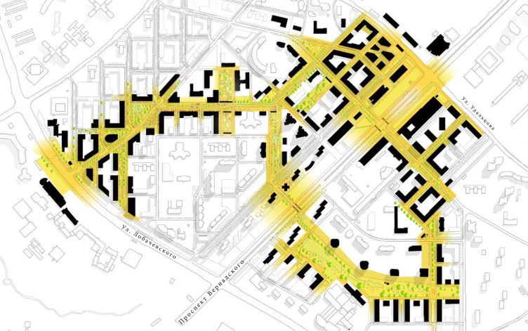
One of the interesting features of the Ostozhenka project that caused much controversy at the exhibition held in the “House on Brestskaya” is the fact that the district is getting a new main street that literally grows from the Borovskoe Highway and other “desire paths”, already mastered by the local residents but in no way attached in terms of urban planning.

The highway only coincides with a no-name fragment of the new main street near Moscow State Institute of International Relations. Then, near the triangular square, the street turns right towards the center of the business activity – the metro station and the future transport interchange hub, where the project has office towers in it, resonant, in terms of proportion, to the construction of the late 2000’s on the peripheral part of the territory.

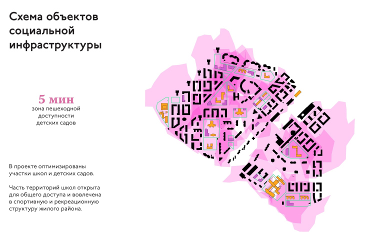
The street gets a zigzagging and winding contour with a few green branches but it is obvious that the main rod connects the metro station and the Moscow State Institute of International Relations, thus coinciding with the path that has already been tread upon but has not been organized and landscaped yet. This path runs past a few schools and medical centers; according to the project, their public zones must be widened. This way, these public zones will find themselves not deep inside the city blocks but on the axis of the city activity. The continuation of the main street – which runs beyond the pedestrian crossing of the avenue – coincides with what is today the Ulitsa Semenova-Tyan-Shanskogo. What is still more interesting is the fact that as far as the Ulitsa Semenova-Tyan-Shanskogo and Designed Drive 6640 are concerned, the architects are proposing to tie them from the inside by an automobile drive, which will cross the Vernadskogo Avenue – this way, the place gets on the inside a full-fledged street of district importance, which will connect the two parts of this area. This part of the street runs exactly by the water parting line.

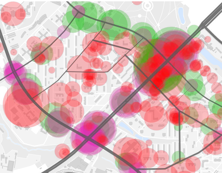
The renovation platform "Vernadskogo Avenue". The diagram of urban activities © Ostozhenka


The renovation platform "Vernadskogo Avenue". The urban activities. The most visited places © Ostozhenka


The renovation platform "Vernadskogo Avenue". THe plan of social infrastructure projects © Ostozhenka


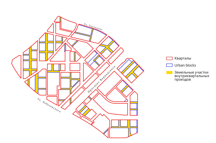
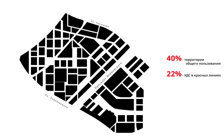
The renovation platform "Vernadskogo Avenue". THe dividing plan © Ostozhenka


The renovation platform "Vernadskogo Avenue" © Ostozhenka


The main street is only part of the framework that the architects are proposing to build. Its second part is a system of the parks and ponds in its southeast part, which require a certain amount of landscaping work.

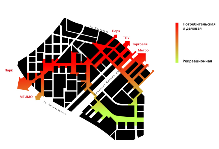
Their recreational semicircle locks on with the new city axis running through in-block passages at the end of the Ulitsa Semenova-Tyan-Shanskogo; on the other side it locks on with the new crossing over the avenue behind the string of ponds. The map clearly shows how the business function smoothly changes into the recreational one – they became the mutually penetrating halves of a single ring, whose purpose is to unite the two parts of the district.

As for the embellishments of the main “tree” of the street and the parks, these will be the in-block drives, which are much more numerous in the new construction plans, just as the revised paths and shortcuts, some of which become pedestrian-only, and some, on the contrary, take on more automobile importance. The main catalyst, however, is still the marked transport arteries.

“This looks very much like amelioration. If you take a swamp, the water is motionless in it – Andrew Gnezdilov comments on his project – What we do is create a channel, and then motion begins. We see our task in creating prerequisites for the qualitative changes. We also see the potential that this street has both in terms of commerce and as a driving force for developing a decent social life”. Thanks to this solution, the urban activities, which hitherto predominantly existed in the periphery of the district, are logically carried over to its center, and the district is “turned inside out”: along the pedestrians’ pathway unfolds infrastructure – social, commercial, and the kind that is meant to fill the route with impressions.

The renovation platform "Vernadskogo Avenue" © Ostozhenka


The renovation platform "Vernadskogo Avenue" © Ostozhenka


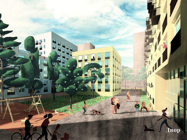
The renovation platform "Vernadskogo Avenue". The yard © Ostozhenka


The renovation platform "Vernadskogo Avenue" © Ostozhenka


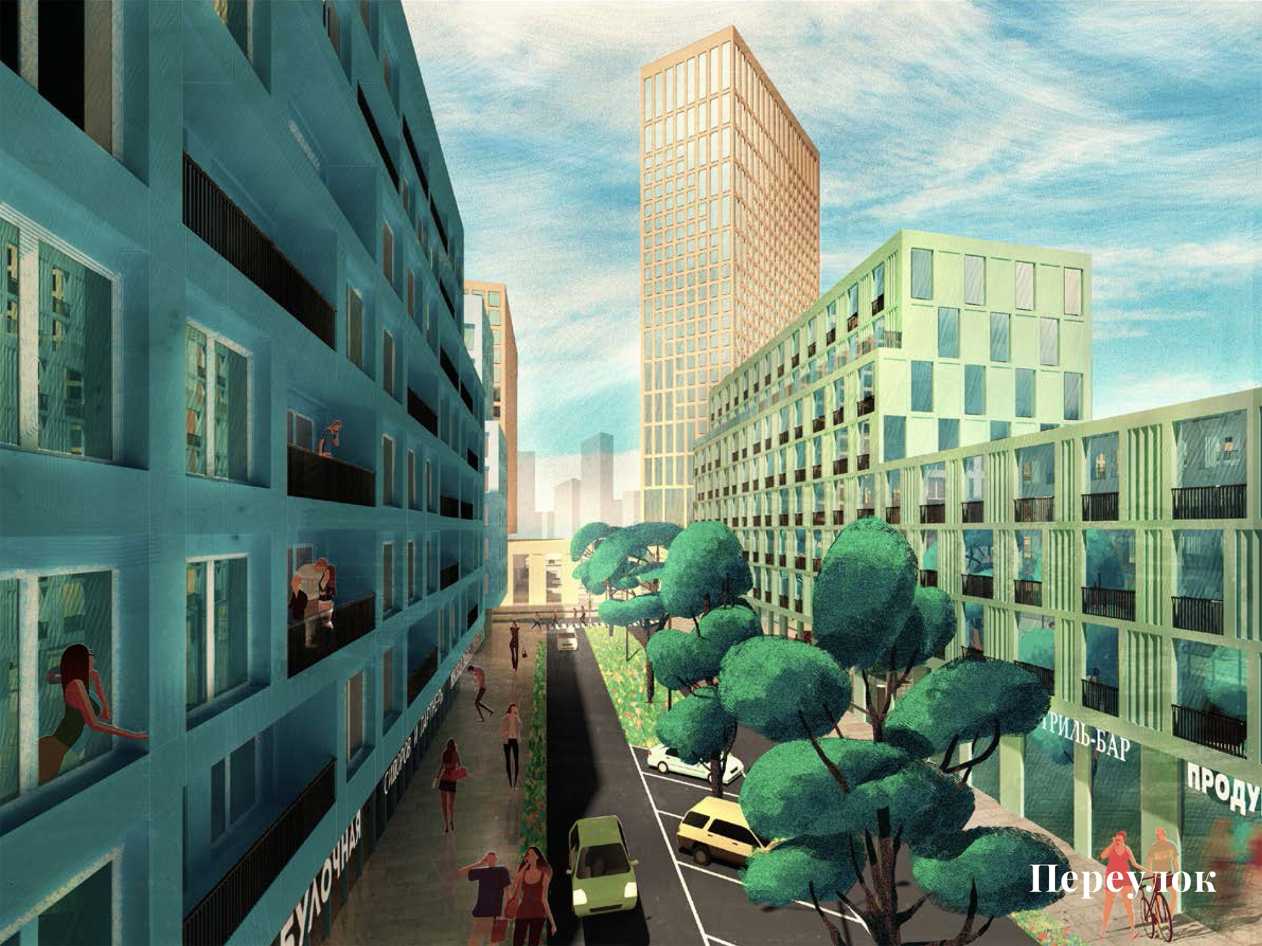
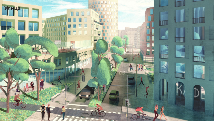
The renovation platform "Vernadskogo Avenue". Street © Ostozhenka


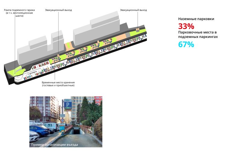
As far as the city blocks of the Vernadskogo Avenue are concerned, the problem of parking is particularly acute here. Answering this challenge, the Ostozhenka architects are proposing to place underground parking garages not in the basements of the buildings (which oftentimes complicated planning solutions due to the fact that the bearing columns in the basement have a space grid of their own) but underneath streets and alleys. The feasibility of using the streets to this purpose was calculated by the Institute for Urban Economics.

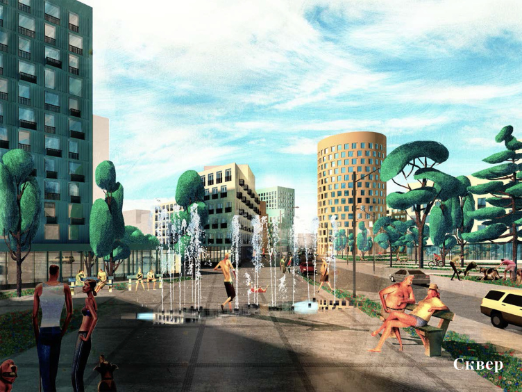
For years, Ostozhenka has been consistently guided by many of the principles outlined in this article in many of its projects, implementation get them both in Moscow and all across the nation. What’s remarkable is the fact that the 3D visualizations submitted by the office were notable for their conditional landscapes, while the other contestants were much after photographic realism. Although the façades of the volumes are but sketchily marked, the district in these pictures really came alive thanks to the shop signs and people that populated it. This is essentially what the company’s main principle is all about – when it does a renovation project it first of all cares about the environment, and not this or that specific building. “Life is smarter than we are – it is difficult to predict its exact scenario; we only create the basis for the qualitative changes – Andrew Gnezdilov explains – this is why we depicted those who will ultimately change this environment, the residents of this area who are the full-fledged stakeholders of this process”.

The renovation platform "Vernadskogo Avenue". Square © Ostozhenka


The renovation platform "Vernadskogo Avenue". The completion of the project © Ostozhenka


The renovation platform "Vernadskogo Avenue". The completion of the project © Ostozhenka


The renovation platform "Vernadskogo Avenue". The completion of the project © Ostozhenka


None


21 August 2018

Headlines now
The Golden Crown
The concept for a dental clinic in Yekaterinburg, developed by CNTR Studio, revolves around the idea of a “mouth full of gold”: pristine white porcelain stoneware walls are complemented by matte brass details. To avoid an overly literal interpretation, the architects focused on the building’s proportions, skillfully navigating between sunlight requirements and fire safety regulations.
Flexibility and Integration
Not long ago, we covered the project for the fourth phase of the ÁLIA residential complex, designed by APEX. Now, we’ve been shown different fence concepts they developed to enclose the complex’s private courtyards, incorporating a variety of public functions. We believe that the sheer fact that the complex’s architects were involved in such a detail as fencing speaks volumes.
A Step Forward
The HIDE residential complex represents a major milestone for ADM architects and their leaders Andrey Romanov and Ekaterina Kuznetsova in their quest for a fresh high-rise aesthetic – one that is flexible and layered, capable of bringing vibrancy to mass and silhouette while shaping form. Over recent years, this approach has become ADM’s “signature style”, with the golden HIDE tower playing a pivotal role in its evolution. Here, we delve into the project’s story, explore the details of the complex’s design, and uncover its core essence.
Gold in the Sands
A new office for a transcontinental company specializing in resource extraction and processing has opened in Dubai. Designed by T+T Architects, masters of creating spaces that are contemporary, diverse, flexible, and original, this project exemplifies their expertise. On the executive floor, a massive brass-clad partition dominates, while layered textures of compressed earth create a contextually resonant backdrop.
Layers and Levels of Flight
This project goes way back – Reserve Union won this architectural competition at the end of 2011, and the building was completed in 2018, so it’s practically “archival”. However, despite being relatively unknown, the building can hardly be considered “dated” and remains a prime example of architectural expression, particularly in the headquarters genre. And it’s especially fitting for an aviation company office. In some ways, it resembles the Aeroflot headquarters at Sheremetyevo but with its own unique identity, following the signature style of Vladimir Plotkin. In this article, we take an in-depth look at the United Aircraft Corporation (UAC) headquarters in the Moscow agglomeration town of Zhukovsky, supplemented by recent photographs from Alexey Naroditsky – a shoot that became only recently possible due to the fact that improvements were finally made in the surrounding area.
Light and Shadow
In this article, we delve into the architectural design of the “Chaika” house by DNK ag architects, which was recently completed in 2023 as part of the collection of signature designs at ZILArt. As is well-known, all the buildings in this complex follow a design code, yet each one is distinct. This particular building stands out not only for its whiteness and minimalism but also for the refined use of a limited number of techniques that, together, create what can confidently be called synergy.
Casus Novae
A master plan was developed for a large residential area with a name of “DNS City”, but now that its implementation began, the plan has been arbitrarily reformatted and replaced with something that, while similar on the surface, is actually quite different. This is not the first time such a thing happens, but it’s always frustrating. With permission from the author, we are sharing Maria Elkina’s post.
Treasure Hunting
The GAFA bureau, in collaboration with Tegola and Arkhitail, organized an expedition to the island of Kilpola in Karelia as part of Moskomarkhitektura’s “Open City” festival. There, amidst moss and rocks, the students sought answers to questions like: what is the sacred, where does it dwell, and what sustains it? Assisting the participants in this quest were landscape engineer Evgeny Levin, artist Nicholas Roerich, a moose, and the lack of cellular connection. Here’s how the story unfolded.
Depths of the Earth, Streams of Water
In the Malaya Okhta district, the Akzent building, designed by Stepan Liphart, was constructed. It follows a classic tripartite structure, yet it’s what you might call “hand-drawn”: each façade is unique in its form and details, some of which aren’t immediately noticeable. In this article, we explore the context and, together with the architect, delve into how the form was developed.
Fir Tree Dynamics
The “Airports of Region” holding is planning to build an airport in Karachay-Cherkessia, aiming to make the Arkhyz and Dombay resorts more accessible to travelers. The project that won in an invitation-only competition, submitted by Sergey Nikeshkin’s KPLN, blends natural imagery inspired by the shape of a conifer seed, open-air waiting spaces, majestic large trees, and a green roof elevated on needle-like columns. The result is both nature-inspired and WOW.
​A Brick Shell
In the process of designing a clubhouse situated among pine trees in a prestigious suburban area near Moscow, the architectural firm “A.Len” did the façade design part. The combination of different types of brick and masonry correlates with the volumetric and plastique solutions, further enhanced by the inclusion of wood-painted fragments and metal “glazing”.
Word Forms
ATRIUM architects love ambitious challenges, and for the firm’s thirtieth anniversary, they boldly play a game of words with an exhibition that dives deep into a self-created vocabulary. They immerse their projects – especially art installations – into this glossary, as if plunging into a current of their own. You feel as if you’re flowing through the veins of pure art, immersed in a universe of vertical cities, educational spaces – of which the architects are true masters – and the cultural codes of various locations. But what truly captivates is the bold statement that Vera Butko and Anton Nadtochy make, both through their work and this exhibition: architecture, above all, is art – the art of working with form and space.
Flexibility and Acuteness of Modernity
Luxurious, fluid, large “kokoshniks” and spiral barrel columns, as if made from colorful chewing gum: there seem to be no other mansion like this in Moscow, designed in the “Neo-Russian-Modern” style. And the “Teremok” on Malaya Kaluzhskaya, previously somewhat obscure, has “come alive with new colors” and gained visibility after its restoration for the office of the “architectural ecosystem” as the architects love to call themselves. It’s evident that Julius Borisov and the architects at UNK put their hearts into finding this new office and bringing it up to date. Let’s delve into the paradoxes of this mansion’s history and its plasticity. Spoiler: two versions of modernity meet here, both balancing on the razor’s edge of “what’s current”.
Yuri Vissarionov: “A modular house does not belong to the land”
It belongs to space, or to the air... It turns out that 3D printing is more effective when combined with a modular approach: the house is built in a workshop and then adapted to the site, including on uneven terrain. Yuri Vissarionov shares his latest experience in designing tourist complexes, both in central Russia and in the south. These include houseboats, homes printed from lightweight concrete using a 3D printer, and, of course, frame houses.
​Moscow’s First
“The quality of education largely depends on the quality of the educational environment”. This principle of the last decade has been realized by Sergey Skuratov in the project for the First Moscow Gymnasium on Rostovskaya Embankment in the Khamovniki district. The building seamlessly integrates into the complex urban landscape, responding both to the pedestrian flow of the city and the quiet alleyways. It skillfully takes advantage of the height differences and aligns with modern trends in educational space design. Let’s take a closer look.
Looking at the Water
The site of Villa Sonata stretches from the road to the water’s edge, offering its own shoreline, pier, and a picturesque river panorama. To reveal these sweeping views, Roman Leonidov “cut” the façade diagonally parallel to the river, thus getting two main axes for the house and, consequently, “two heads”. The internal core – two double-height spaces, a living room and a conservatory, with a “bridge” above them – makes the house both “transparent” and filled with light.
The White Wing
Well, it’s not exactly white. It’s more of a beige, white-stone structure that plays with the color of limestone – smoother surfaces are lighter, while rougher ones are darker. This wing unites various elements: it absorbs and interprets the surrounding themes. It responds to everything, yet maintains a cohesive expression – a challenging task! – while also incorporating recognizable features of its own, such as the dynamic cuts at the bottom, top, and middle.
Urban Dunes
The XSA Ramps team designed and built a three-part sports hub for a park in Rostov-on-Don, welcoming people of all ages and fitness levels. The skate plaza, pump track, and playground are all meticulously crafted with details that attract a diverse range of visitors. The technical execution of the shapes and slopes transforms this space into a kind of sculptural composition.
Proportional Growth
The project for the fourth phase of the ÁLIA residential area has been announced. The buildings are situated on an elongated plot – almost a “ray” that shoots out from the center of the area towards the river. Their layout reflects both a response to Moscow’s architectural preferences over the past 15 years, shifting “from blocks to towers”, and an interpretation of the neighboring business park designed by SOM. Additionally, the best apartments here are not located at the very top but closer to the middle, forming a glowing “waistline”.
The “Staircase” Building
In designing the “Details” residential complex in New Moscow, Rais Baishev spiced up the now-popular Moscow theme of a “courtyard” building with an idea drawn from the surrealist drawings by Maurits Escher. He envisioned the stepped silhouettes and descending slopes as a metaphysical mega-staircase, creating a key void within the courtyard that gave the project an internal “spine”. This concept is felt both in the building’s silhouette and on its façades.
Projection of the Quarter
No one doubted that the building that Vladimir Plotkin designed as part of the “Garden Quarters” would be the most modernist of all. And it turned out just that way: while adhering to the common design code, the building successfully combines brick and white stone, rhythmically responding to the neighboring building designed by Ostozhenka, yet tactfully and persistently making a few statements of its own. This includes the projection of the ideal urban development composition “14–9–6”, which can be found right next door, mathematical calculations, including those for various types of terraces (and perhaps the only reminder of the Soviet past of the Kauchuk rubber factory!), and the white “cross-stitch” pattern of the façade grid.
Domus Aurea
In this issue, we examine the “Tessinsky-1” house, designed by Sergey Skuratov and completed in 2023. Located in the middle of the Serebryanicheskaya Embankment district, at the intersection of its main streets, this house assumes a sort of “nodal” role: it not only responds to everything around it and preserves many memories of the former EMA factory within itself, but it weaves all this into a newly directed pattern, reconciling bright “gold” and dark-colored brick, largely with the help of the new, modern-yet-archaic Columba brick, which, come to think about it, is the most precious element here.
The Chimney of Nikola-Lenivets
In this issue, we are examining the “Obelisk House” designed by KATARSIS and built for the Arkhstoyanie 2023 festival. However, it was only finished later on, and this is why we are examining it now. It seems to us that after the “Obelisk House” appeared in Nikola-Lenivets, a dialogue and a few inner connections appeared between the temporary structures built here. These houses no longer look like “accidental neighbors”, more of which below.
​Periscope by the Bay
The jury awarded the second place in the competition for a public and cultural center in Petropavlovsk-Kamchatsky to the companies GORA (“Mountain”) and M4. In the consortium’s proposal, the building resembles a sperm whale with a calf swimming next to it or a periscope, whose lenses capture the most spectacular views from the surrounding landscape.
From Arcs to Dolmens
While working on the competition project for Petropavlovsk-Kamchatsky, ASADOV Architects prioritized the value of the natural and urban environment, aiming to preserve the balance of the location while minimizing the resemblance of the volume that they designed to a “traditional building”. The task was challenging, and the architects created three versions, one of which having been developed after the competition, where their main proposal took third place. However, the point of interest here is not the competition result but the continuity of creative thinking.
Hide and Seek
The ID Moskovskiy house, designed by Stepan Liphart in St. Petersburg, in the courtyards near Moskovskiy Avenue beyond the Obvodny Canal and recently completed, is notable for several reasons. Firstly, it has been realized with considerable accuracy, which is particularly significant as this is the first building where the architect was responsible not only for the facades but also for the layouts, allowing for better integration between the two. On the other hand, this building is interesting as an example of the “germination” of new architecture in the city: it draws on the best examples from the neighborhood and becomes an improved and developed sum of ideas found by the architect in the surrounding context.
The Big Twelve
Yesterday, the winners of the Moscow Mayor’s Architecture Award were announced and honored. Let’s take a look at what was awarded and, in some cases, even critique this esteemed award. After all, there is always room for improvement, right?
Above the Golden Horn
The residential complex “Philosophy” designed by T+T architects in Vladivostok, is one of the new projects in the “Golubinaya Pad” area, changing its development philosophy (pun intended) from single houses to a comprehensive approach. The buildings are organized along public streets, varying in height and format, with one house even executed in gallery typology, featuring a cantilever leaning on an art object.
Nuanced Alternative
How can you rhyme a square and space? Easily! But to do so, you need to rhyme everything you can possibly think of: weave everything together, like in a tensegrity structure, and find your own optics too. The new exhibition at GES-2 does just that, offering its visitor a new perspective on the history of art spanning 150 years, infused with the hope for endless multiplicity of worlds and art histories. Read on to see how this is achieved and how the exhibition design by Evgeny Ace contributes to it.
Blinds for Ice
An ice arena has been constructed in Domodedovo based on a project by Yuri Vissarionov Architects. To prevent the long façade, a technical requirement for winter sports facilities, from appearing monotonous, the architects proposed the use of suspended structures with multidirectional slats. This design protects the ice from direct sunlight while giving the wall texture and detail.