По-русски

Continuing What Was Once Started

The project of an office-and-hotel complex located on the first kilometer of the Rublevo-Uspenskoe Highway develops their old ideas and responds to the architecture of the buildings that “Sergey Kisselev and Partners” had built earlier in this area.

21 February 2018
Object
mainImg

The land site at the beginning of the Rublevo-Uspenskoe Highway has been explored by “Sergey Kisselev and Partners” for more than a decade now. In 2015, its south part saw the completion of the office center Pallau RB, the designing of which had been started still before the economic crisis of 2007. The north part of the territory lies vacant so far; it is meant to be used in another project that is now being considered by the government of the Moscow region.

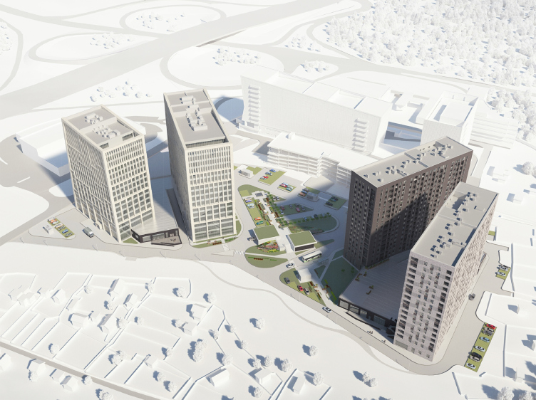
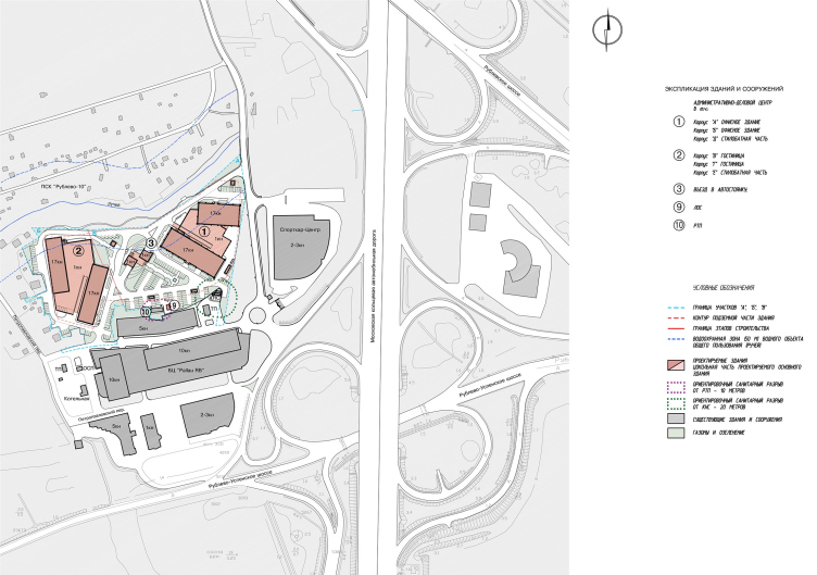
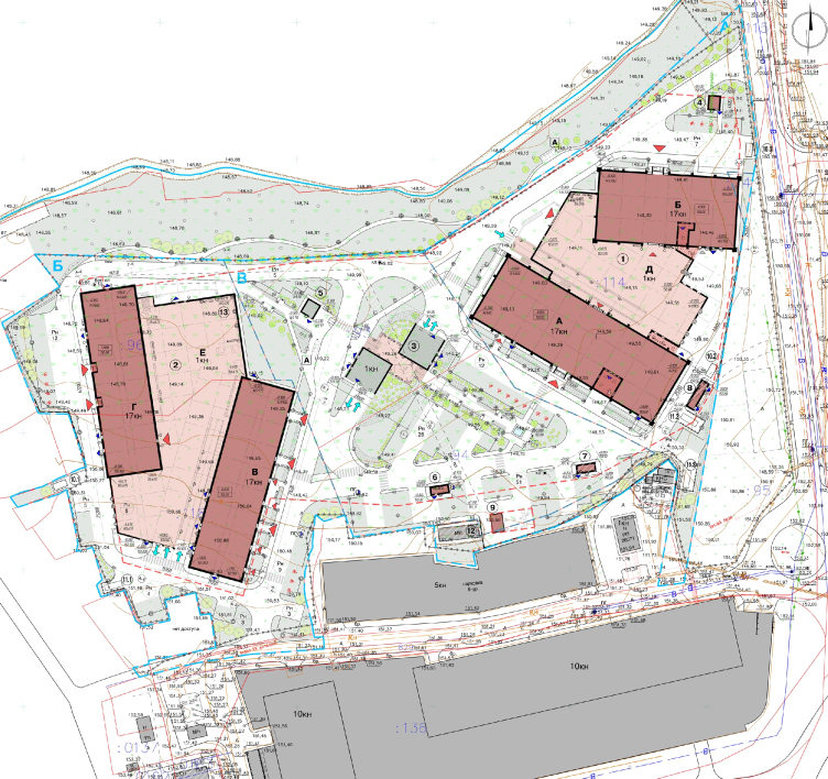
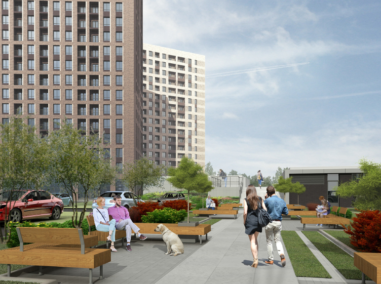
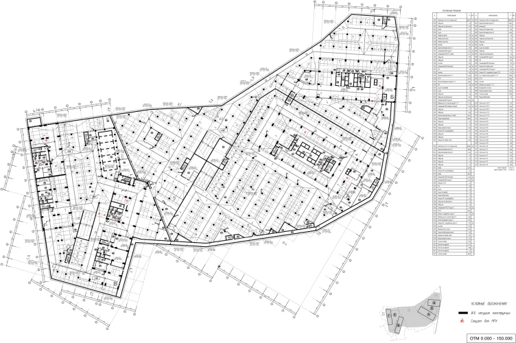
This place, in spite of the proximity of Moscow’s main thoroughfare, is rather quiet: it is separated from the highway by two buildings of car dealerships; it is 170 away from the Moscow Ring Road, its north part borders on the villa community “Rublevo-10”, and its south part borders on the Romashkovsky Forest. For this reason, it was planned very early on that, in addition to offices, a hotel would be built here as well. Ultimately, the territory was divided into two parts: the part that is closer to the Moscow Ring Road got the office buildings “А” and “Б”, while the part that is closer to the forest got the hotel buildings “В” and “Г”; each pair of the buildings is linked by a podium. Beneath the entire territory of the complex, there is single-level underground parking garage. The two pairs of volumes that stand in a fan-like fashion from north to south are separated by a landscaped triangle with a small pedestrian promenade. It is planned that the hotel complex will be built first; the offices and the landscaping part will become the second stage of construction and will appear later on down the line.

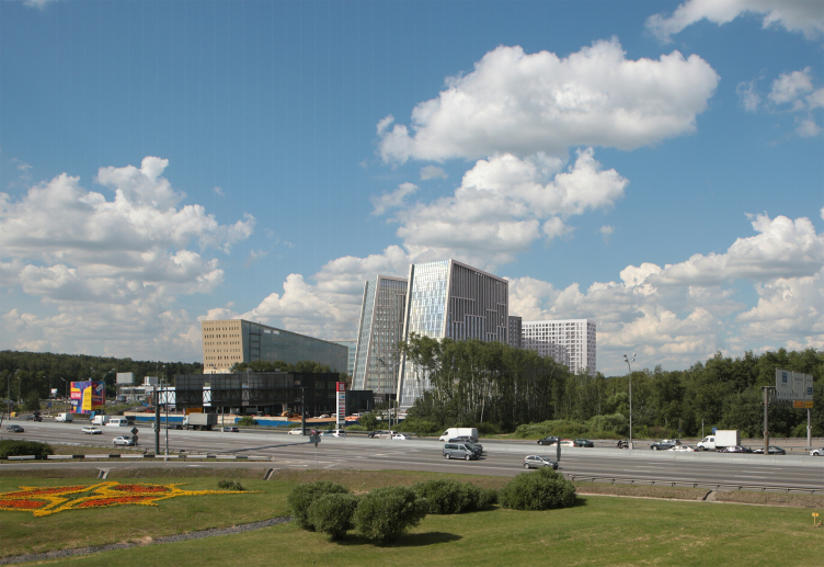
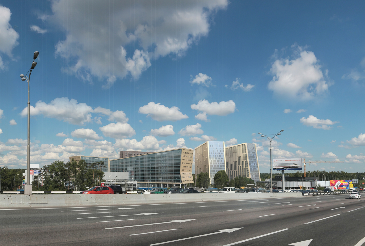
Hotel and business complex on the Rublevo-Uspenskoe Highway. Photo visualization. View from the Rublevskoe Highway © Sergey Kisselev and Partners
Hotel and business complex on the Rublevo-Uspenskoe Highway. Axonometry © Sergey Kisselev and Partners


Hotel and business complex on the Rublevo-Uspenskoe Highway. Location plan © Sergey Kisselev and Partners


Hotel and business complex on the Rublevo-Uspenskoe Highway. Masterplan © Sergey Kisselev and Partners


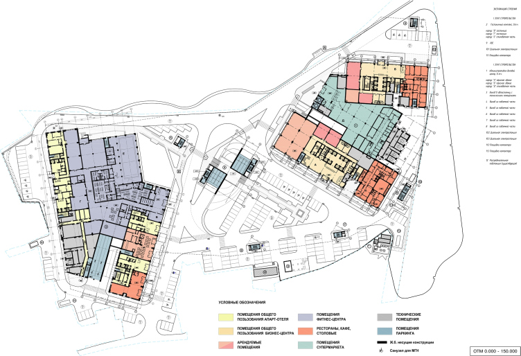
Hotel and business complex on the Rublevo-Uspenskoe Highway. Plan of the 1st floor © Sergey Kisselev and Partners


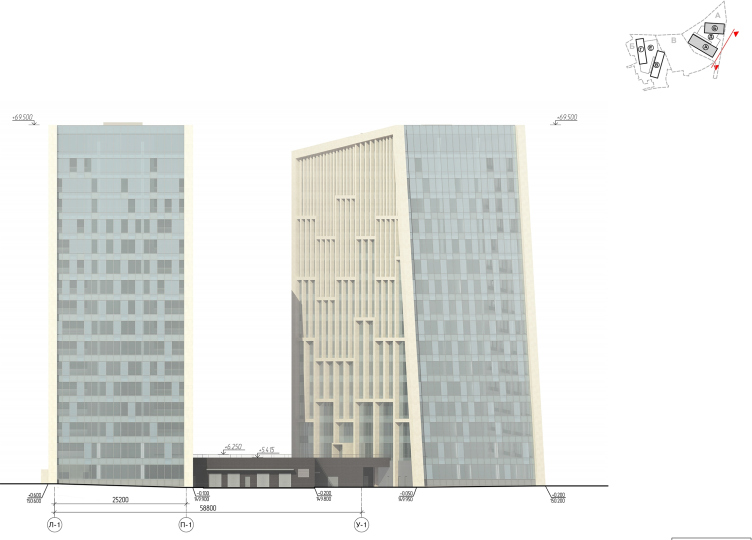
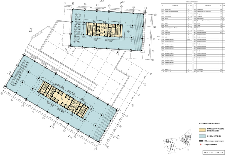
The two office buildings form a visual transition and follow the outlines of the Pallau buildings, inheriting not only the business function, but also the abundance of glass and the angles of the sloping planes, including those of the roofs – inwards from the outside, as if all the slabs turn their noses up before the formal border of the nation’s capital – the Moscow Ring Road. If one is to look from the southeast, the office buildings line themselves up as an incremental rhythmic array, alternating glittering glass and yellowish façades. But then again, while the façade panels of Pallau are metal, and their delicate metallic glitter can be traced back to the original concept of a glass volume clad in golden casing, it is planned that the new buildings will utilize Jurassic stone: its color and texture is different but, if viewed from a distance, they would still look pretty similar.

The glass casing is also designed in a “reverse” way to a certain degree: the new buildings will also have glass façades, only these will be the side ends instead of the longitudinal walls. Their pixel-like pattern, dark on the downside and light on the upside, is provided by this simple technique: instead of conjuring with various shades of blacked out glass (which inevitably leaves the building’s without some of the ambient light), the architects proposed to take some of the glass sections with the same UF-protection coefficient, and reverse them 180º – this way, the protective properties remained just as effective, while the sunlight reflection angle became different, which is meant to create an effect of soft pixel “dissolution” of the glass surfaces and a smooth transition to the sky. This is a technique that is cost-efficient and elegant at the same time.

Hotel and business complex on the Rublevo-Uspenskoe Highway. Photo visualization. View from the Moscow Ring Road © Sergey Kisselev and Partners


Thanks to the chamfers of the roofs – together they go 5 meters upwards – the architects were able not only to hide mechanical rooms but also to make the western part of the roofs usable – they will serve as venues for the office parties. According to the chief architect of the project, Anastasia Khomyakova, this place is sure to command fine forest views. The usable parts of the roofs are fenced off from the Moscow Ring Road by the overhangs of the mechanical rooms.

Hotel and business complex on the Rublevo-Uspenskoe Highway. Land site A, Buildings А, Б (offices) © Sergey Kisselev and Partners


Hotel and business complex on the Rublevo-Uspenskoe Highway. Land site A, Buildings А, Б (offices) © Sergey Kisselev and Partners


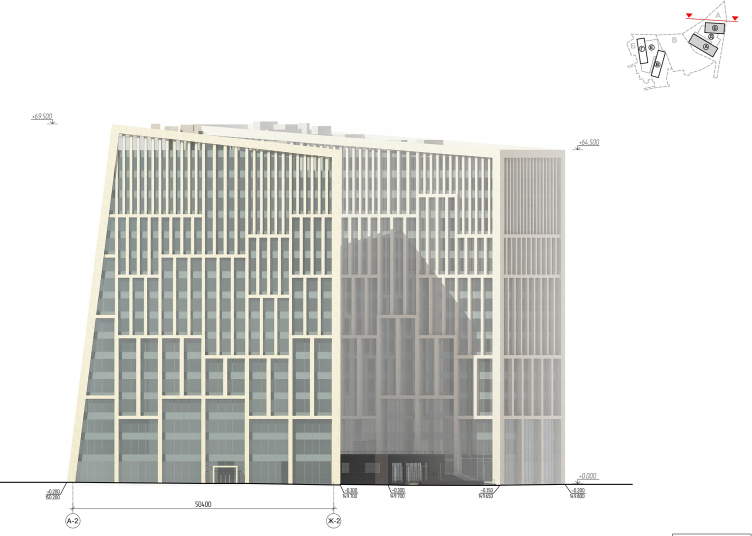
The other three façades are subjugated to a large-cell grid that vertically groups from three to five floors, the inner side wall sporting a regular grid with constant horizontals and verticals becoming denser but more slender with each upward step. As for the outer side façades, their horizontals are displaced: the result looks like a gigantic jigsaw puzzle or a simplified picture of some tectonic shift. The depth of the ribs also grows downwards, strengthening the geological or maybe gothic associations.

Hotel and business complex on the Rublevo-Uspenskoe Highway © Sergey Kisselev and Partners


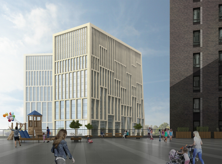
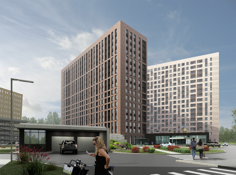
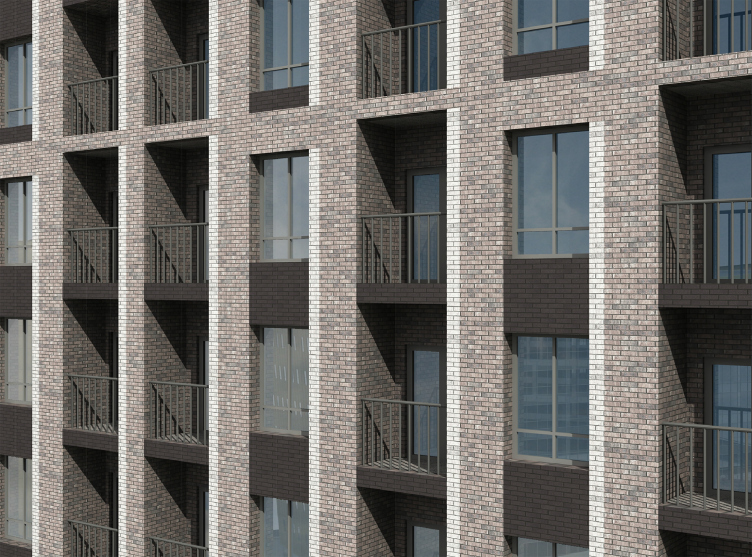
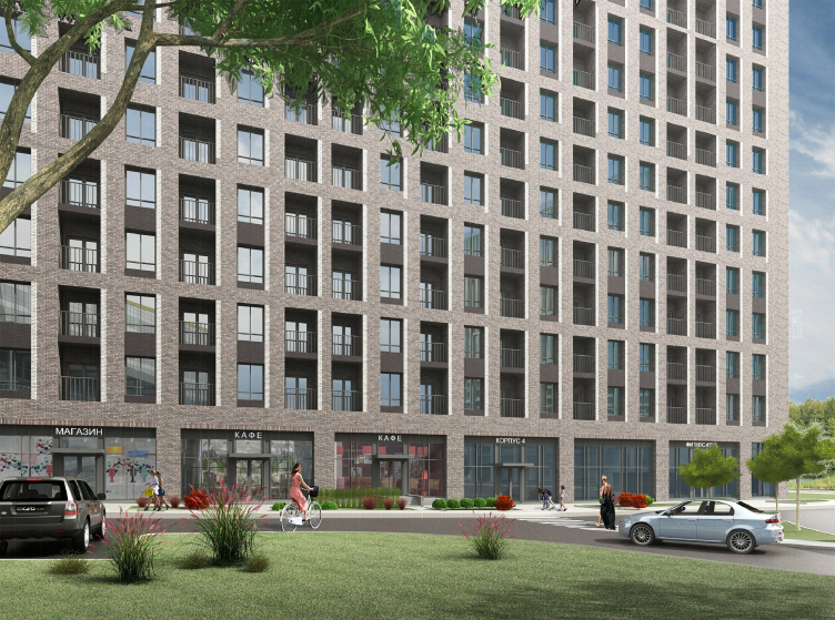
The two hotel buildings that stand in the western part of the territory look more conservative. The façades of the one that is closer to the center of the construction site are designed in dark brick, the architects planning to use hand-formed solid brick with a grisaille effect, which is created by the strips of lighter bricks running along the vertically grouped windows that make visible the sunlit chamfers – in order to raise people’s spirits and enhance the volume of the windows. Here, though to a smaller scale than on the office façades, the play of horizontals is also visible: the interfloor lintels are sometimes thinner and sometimes wider, and thus they form a semblance of a small wave. The lintels in the groups of windows are made of dark-brown brick; the frequent hollows of the stanza balconies are clad in dark metal bars, and all of this, put together, creates deep volumetric chocolate-colored façades. The tall 5-meter (as is the hot trend of today) ground floors are occupied by a cafe turned in the direction of the small park.

Hotel and business complex on the Rublevo-Uspenskoe Highway. Computer model © Sergey Kisselev and Partners


Hotel and business complex on the Rublevo-Uspenskoe Highway. Computer model, fragment of building B © Sergey Kisselev and Partners


Hotel and business complex on the Rublevo-Uspenskoe Highway. Computer model © Sergey Kisselev and Partners


Hotel and business complex on the Rublevo-Uspenskoe Highway. Computer model © Sergey Kisselev and Partners


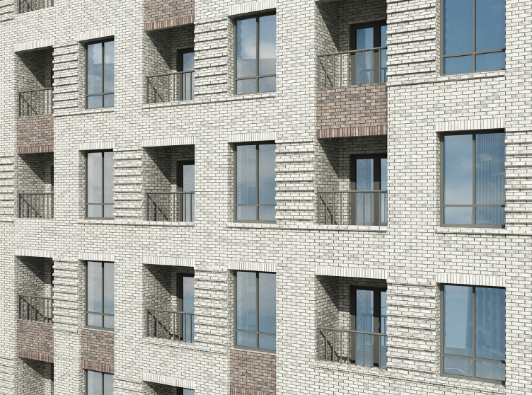
The second building, i.e. the one that stands closer to the woodland, is notable for its light-colored brick which is even closer to the color of white stone. The bricks here are also hand-formed, with crumpled “white-clay” texture – finding the right brick manufacturer turned out to be quite a chore. Neither verticals nor horizontals prevail here; rather, they are mixed up: the textured stripes put one in the mind of constructivist city blocks, and the dark inserts between the windows look as if they were borrowed from the neighboring building. The resulting hybrid is akin to a fragment of a strip of lace blown out of size – everything looks rather cozy, countryside-style, like a dappled shade on a summer terrace. But then again, let’s not forget that the warmth of the sepia grisaille is meant to compensate for the scale of the complex: each building here has 17 floors in it, and is 60 meters high, although, by the standards of buildings situated just beyond the Moscow Ring Road, this falls short of the notion of a “giant scale”, the common number of floors here being 25.

Hotel and business complex on the Rublevo-Uspenskoe Highway. Fragment of Building Г (hotel) © Sergey Kisselev and Partners


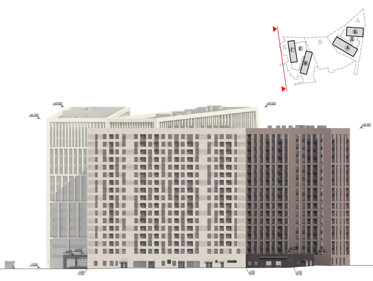
Hotel and business complex on the Rublevo-Uspenskoe Highway. West facade © Sergey Kisselev and Partners


zooming
Hotel and business complex on the Rublevo-Uspenskoe Highway. North facade © Sergey Kisselev and Partners


Hotel and business complex on the Rublevo-Uspenskoe Highway. South facade © Sergey Kisselev and Partners


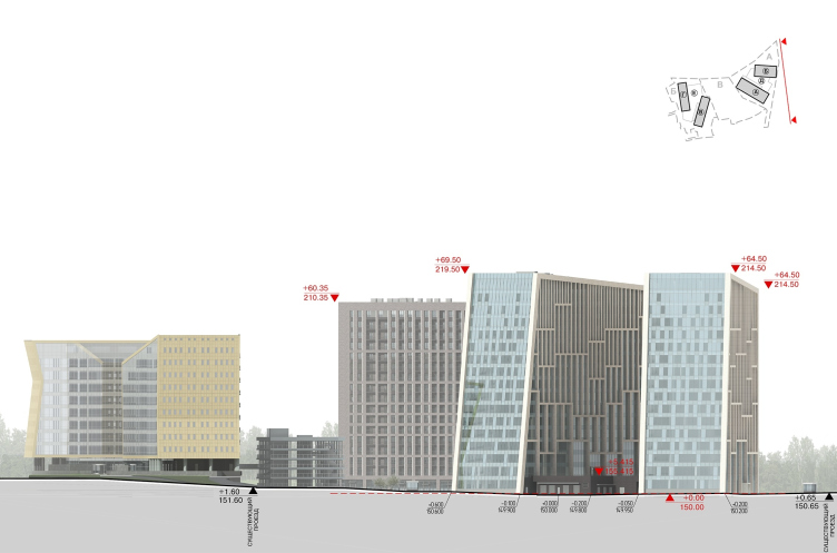
Hotel and business complex on the Rublevo-Uspenskoe Highway. Development drawing along the Rublevskoe Highway © Sergey Kisselev and Partners


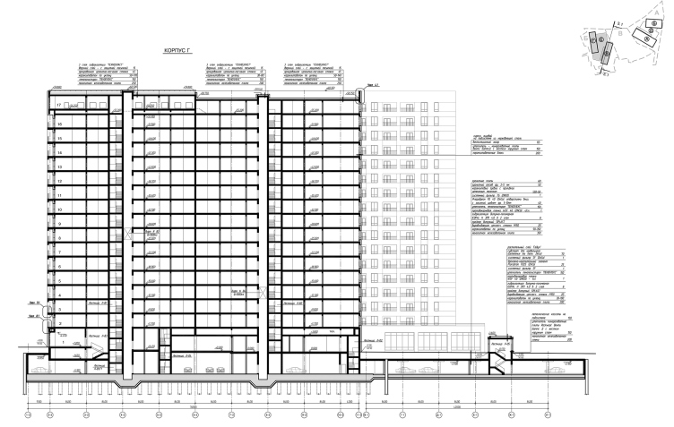
Hotel and business complex on the Rublevo-Uspenskoe Highway. Fragment of Buildings B,Г (hotel). Section view 3.1-3.1 © Sergey Kisselev and Partners


As we remember, the two hotel buildings are linked to each other by a podium which is the same 5 meters high as the public and commercial ground floors. It will host a fitness center with a spa; its landscaped roof will be turned into a walking promenade. This complex is interesting as the continuation of the work that “Sergey Kisselev and Partners” started here long ago. In this sense, their own creation (which, we have to admit, underwent some significant changes during the design process but still retained the architects’ original idea) becomes an important contextual fragment for the authors, requires a response, even some sort of resonance, to enhance and explore this theme even further. A keen observer may see here a kind of gothic tapering of the roofs of the office buildings that overlook the highway with two of their walls – and, at the same time, a slight transition to a different theme, which is homely, palpable, and is connected, let’s say, with the signs of the times; a theme which is defined by the functional requirements, and, possibly, by the relevance of the “Manhattan-type” high-rise brick imagery. The three blocks of buildings, the first of which is already complete, come together, one way or another, to form a certain chain, grow, turn around, change their materials, but remain parts of the same story.
Hotel and business complex on the Rublevo-Uspenskoe Highway. Fragment of Buildings B,Г (hotel). Plan of the 2nd floor © Sergey Kisselev and Partners
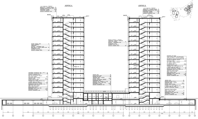
Hotel and business complex on the Rublevo-Uspenskoe Highway. Fragment of Buildings А,Б (offices). Section view 2.2-2.2 © Sergey Kisselev and Partners
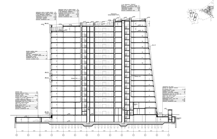
Hotel and business complex on the Rublevo-Uspenskoe Highway. Fragment of Buildings А,Б (offices). Section view 1.2-1.2 © Sergey Kisselev and Partners
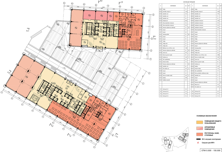
Hotel and business complex on the Rublevo-Uspenskoe Highway. Fragment of Buildings А,Б (offices). Plan of the 2nd floor © Sergey Kisselev and Partners
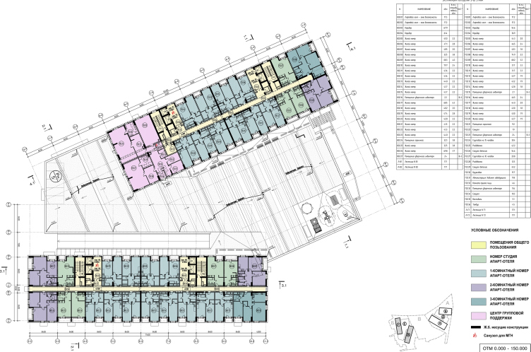
Hotel and business complex on the Rublevo-Uspenskoe Highway. Fragment of Buildings А,Б (offices). Planы of the 3rd-14th floors © Sergey Kisselev and Partners
Hotel and business complex on the Rublevo-Uspenskoe Highway. Fragment of Buildings А,Б (offices). Plan of the basement at a - 5100 mark © Sergey Kisselev and Partners

21 February 2018

Headlines now
The Golden Crown
The concept for a dental clinic in Yekaterinburg, developed by CNTR Studio, revolves around the idea of a “mouth full of gold”: pristine white porcelain stoneware walls are complemented by matte brass details. To avoid an overly literal interpretation, the architects focused on the building’s proportions, skillfully navigating between sunlight requirements and fire safety regulations.
Flexibility and Integration
Not long ago, we covered the project for the fourth phase of the ÁLIA residential complex, designed by APEX. Now, we’ve been shown different fence concepts they developed to enclose the complex’s private courtyards, incorporating a variety of public functions. We believe that the sheer fact that the complex’s architects were involved in such a detail as fencing speaks volumes.
A Step Forward
The HIDE residential complex represents a major milestone for ADM architects and their leaders Andrey Romanov and Ekaterina Kuznetsova in their quest for a fresh high-rise aesthetic – one that is flexible and layered, capable of bringing vibrancy to mass and silhouette while shaping form. Over recent years, this approach has become ADM’s “signature style”, with the golden HIDE tower playing a pivotal role in its evolution. Here, we delve into the project’s story, explore the details of the complex’s design, and uncover its core essence.
Gold in the Sands
A new office for a transcontinental company specializing in resource extraction and processing has opened in Dubai. Designed by T+T Architects, masters of creating spaces that are contemporary, diverse, flexible, and original, this project exemplifies their expertise. On the executive floor, a massive brass-clad partition dominates, while layered textures of compressed earth create a contextually resonant backdrop.
Layers and Levels of Flight
This project goes way back – Reserve Union won this architectural competition at the end of 2011, and the building was completed in 2018, so it’s practically “archival”. However, despite being relatively unknown, the building can hardly be considered “dated” and remains a prime example of architectural expression, particularly in the headquarters genre. And it’s especially fitting for an aviation company office. In some ways, it resembles the Aeroflot headquarters at Sheremetyevo but with its own unique identity, following the signature style of Vladimir Plotkin. In this article, we take an in-depth look at the United Aircraft Corporation (UAC) headquarters in the Moscow agglomeration town of Zhukovsky, supplemented by recent photographs from Alexey Naroditsky – a shoot that became only recently possible due to the fact that improvements were finally made in the surrounding area.
Light and Shadow
In this article, we delve into the architectural design of the “Chaika” house by DNK ag architects, which was recently completed in 2023 as part of the collection of signature designs at ZILArt. As is well-known, all the buildings in this complex follow a design code, yet each one is distinct. This particular building stands out not only for its whiteness and minimalism but also for the refined use of a limited number of techniques that, together, create what can confidently be called synergy.
Casus Novae
A master plan was developed for a large residential area with a name of “DNS City”, but now that its implementation began, the plan has been arbitrarily reformatted and replaced with something that, while similar on the surface, is actually quite different. This is not the first time such a thing happens, but it’s always frustrating. With permission from the author, we are sharing Maria Elkina’s post.
Treasure Hunting
The GAFA bureau, in collaboration with Tegola and Arkhitail, organized an expedition to the island of Kilpola in Karelia as part of Moskomarkhitektura’s “Open City” festival. There, amidst moss and rocks, the students sought answers to questions like: what is the sacred, where does it dwell, and what sustains it? Assisting the participants in this quest were landscape engineer Evgeny Levin, artist Nicholas Roerich, a moose, and the lack of cellular connection. Here’s how the story unfolded.
Depths of the Earth, Streams of Water
In the Malaya Okhta district, the Akzent building, designed by Stepan Liphart, was constructed. It follows a classic tripartite structure, yet it’s what you might call “hand-drawn”: each façade is unique in its form and details, some of which aren’t immediately noticeable. In this article, we explore the context and, together with the architect, delve into how the form was developed.
Fir Tree Dynamics
The “Airports of Region” holding is planning to build an airport in Karachay-Cherkessia, aiming to make the Arkhyz and Dombay resorts more accessible to travelers. The project that won in an invitation-only competition, submitted by Sergey Nikeshkin’s KPLN, blends natural imagery inspired by the shape of a conifer seed, open-air waiting spaces, majestic large trees, and a green roof elevated on needle-like columns. The result is both nature-inspired and WOW.
​A Brick Shell
In the process of designing a clubhouse situated among pine trees in a prestigious suburban area near Moscow, the architectural firm “A.Len” did the façade design part. The combination of different types of brick and masonry correlates with the volumetric and plastique solutions, further enhanced by the inclusion of wood-painted fragments and metal “glazing”.
Word Forms
ATRIUM architects love ambitious challenges, and for the firm’s thirtieth anniversary, they boldly play a game of words with an exhibition that dives deep into a self-created vocabulary. They immerse their projects – especially art installations – into this glossary, as if plunging into a current of their own. You feel as if you’re flowing through the veins of pure art, immersed in a universe of vertical cities, educational spaces – of which the architects are true masters – and the cultural codes of various locations. But what truly captivates is the bold statement that Vera Butko and Anton Nadtochy make, both through their work and this exhibition: architecture, above all, is art – the art of working with form and space.
Flexibility and Acuteness of Modernity
Luxurious, fluid, large “kokoshniks” and spiral barrel columns, as if made from colorful chewing gum: there seem to be no other mansion like this in Moscow, designed in the “Neo-Russian-Modern” style. And the “Teremok” on Malaya Kaluzhskaya, previously somewhat obscure, has “come alive with new colors” and gained visibility after its restoration for the office of the “architectural ecosystem” as the architects love to call themselves. It’s evident that Julius Borisov and the architects at UNK put their hearts into finding this new office and bringing it up to date. Let’s delve into the paradoxes of this mansion’s history and its plasticity. Spoiler: two versions of modernity meet here, both balancing on the razor’s edge of “what’s current”.
Yuri Vissarionov: “A modular house does not belong to the land”
It belongs to space, or to the air... It turns out that 3D printing is more effective when combined with a modular approach: the house is built in a workshop and then adapted to the site, including on uneven terrain. Yuri Vissarionov shares his latest experience in designing tourist complexes, both in central Russia and in the south. These include houseboats, homes printed from lightweight concrete using a 3D printer, and, of course, frame houses.
​Moscow’s First
“The quality of education largely depends on the quality of the educational environment”. This principle of the last decade has been realized by Sergey Skuratov in the project for the First Moscow Gymnasium on Rostovskaya Embankment in the Khamovniki district. The building seamlessly integrates into the complex urban landscape, responding both to the pedestrian flow of the city and the quiet alleyways. It skillfully takes advantage of the height differences and aligns with modern trends in educational space design. Let’s take a closer look.
Looking at the Water
The site of Villa Sonata stretches from the road to the water’s edge, offering its own shoreline, pier, and a picturesque river panorama. To reveal these sweeping views, Roman Leonidov “cut” the façade diagonally parallel to the river, thus getting two main axes for the house and, consequently, “two heads”. The internal core – two double-height spaces, a living room and a conservatory, with a “bridge” above them – makes the house both “transparent” and filled with light.
The White Wing
Well, it’s not exactly white. It’s more of a beige, white-stone structure that plays with the color of limestone – smoother surfaces are lighter, while rougher ones are darker. This wing unites various elements: it absorbs and interprets the surrounding themes. It responds to everything, yet maintains a cohesive expression – a challenging task! – while also incorporating recognizable features of its own, such as the dynamic cuts at the bottom, top, and middle.
Urban Dunes
The XSA Ramps team designed and built a three-part sports hub for a park in Rostov-on-Don, welcoming people of all ages and fitness levels. The skate plaza, pump track, and playground are all meticulously crafted with details that attract a diverse range of visitors. The technical execution of the shapes and slopes transforms this space into a kind of sculptural composition.
Proportional Growth
The project for the fourth phase of the ÁLIA residential area has been announced. The buildings are situated on an elongated plot – almost a “ray” that shoots out from the center of the area towards the river. Their layout reflects both a response to Moscow’s architectural preferences over the past 15 years, shifting “from blocks to towers”, and an interpretation of the neighboring business park designed by SOM. Additionally, the best apartments here are not located at the very top but closer to the middle, forming a glowing “waistline”.
The “Staircase” Building
In designing the “Details” residential complex in New Moscow, Rais Baishev spiced up the now-popular Moscow theme of a “courtyard” building with an idea drawn from the surrealist drawings by Maurits Escher. He envisioned the stepped silhouettes and descending slopes as a metaphysical mega-staircase, creating a key void within the courtyard that gave the project an internal “spine”. This concept is felt both in the building’s silhouette and on its façades.
Projection of the Quarter
No one doubted that the building that Vladimir Plotkin designed as part of the “Garden Quarters” would be the most modernist of all. And it turned out just that way: while adhering to the common design code, the building successfully combines brick and white stone, rhythmically responding to the neighboring building designed by Ostozhenka, yet tactfully and persistently making a few statements of its own. This includes the projection of the ideal urban development composition “14–9–6”, which can be found right next door, mathematical calculations, including those for various types of terraces (and perhaps the only reminder of the Soviet past of the Kauchuk rubber factory!), and the white “cross-stitch” pattern of the façade grid.
Domus Aurea
In this issue, we examine the “Tessinsky-1” house, designed by Sergey Skuratov and completed in 2023. Located in the middle of the Serebryanicheskaya Embankment district, at the intersection of its main streets, this house assumes a sort of “nodal” role: it not only responds to everything around it and preserves many memories of the former EMA factory within itself, but it weaves all this into a newly directed pattern, reconciling bright “gold” and dark-colored brick, largely with the help of the new, modern-yet-archaic Columba brick, which, come to think about it, is the most precious element here.
The Chimney of Nikola-Lenivets
In this issue, we are examining the “Obelisk House” designed by KATARSIS and built for the Arkhstoyanie 2023 festival. However, it was only finished later on, and this is why we are examining it now. It seems to us that after the “Obelisk House” appeared in Nikola-Lenivets, a dialogue and a few inner connections appeared between the temporary structures built here. These houses no longer look like “accidental neighbors”, more of which below.
​Periscope by the Bay
The jury awarded the second place in the competition for a public and cultural center in Petropavlovsk-Kamchatsky to the companies GORA (“Mountain”) and M4. In the consortium’s proposal, the building resembles a sperm whale with a calf swimming next to it or a periscope, whose lenses capture the most spectacular views from the surrounding landscape.
From Arcs to Dolmens
While working on the competition project for Petropavlovsk-Kamchatsky, ASADOV Architects prioritized the value of the natural and urban environment, aiming to preserve the balance of the location while minimizing the resemblance of the volume that they designed to a “traditional building”. The task was challenging, and the architects created three versions, one of which having been developed after the competition, where their main proposal took third place. However, the point of interest here is not the competition result but the continuity of creative thinking.
Hide and Seek
The ID Moskovskiy house, designed by Stepan Liphart in St. Petersburg, in the courtyards near Moskovskiy Avenue beyond the Obvodny Canal and recently completed, is notable for several reasons. Firstly, it has been realized with considerable accuracy, which is particularly significant as this is the first building where the architect was responsible not only for the facades but also for the layouts, allowing for better integration between the two. On the other hand, this building is interesting as an example of the “germination” of new architecture in the city: it draws on the best examples from the neighborhood and becomes an improved and developed sum of ideas found by the architect in the surrounding context.
The Big Twelve
Yesterday, the winners of the Moscow Mayor’s Architecture Award were announced and honored. Let’s take a look at what was awarded and, in some cases, even critique this esteemed award. After all, there is always room for improvement, right?
Above the Golden Horn
The residential complex “Philosophy” designed by T+T architects in Vladivostok, is one of the new projects in the “Golubinaya Pad” area, changing its development philosophy (pun intended) from single houses to a comprehensive approach. The buildings are organized along public streets, varying in height and format, with one house even executed in gallery typology, featuring a cantilever leaning on an art object.
Nuanced Alternative
How can you rhyme a square and space? Easily! But to do so, you need to rhyme everything you can possibly think of: weave everything together, like in a tensegrity structure, and find your own optics too. The new exhibition at GES-2 does just that, offering its visitor a new perspective on the history of art spanning 150 years, infused with the hope for endless multiplicity of worlds and art histories. Read on to see how this is achieved and how the exhibition design by Evgeny Ace contributes to it.
Blinds for Ice
An ice arena has been constructed in Domodedovo based on a project by Yuri Vissarionov Architects. To prevent the long façade, a technical requirement for winter sports facilities, from appearing monotonous, the architects proposed the use of suspended structures with multidirectional slats. This design protects the ice from direct sunlight while giving the wall texture and detail.