По-русски

Towers but Not Twins

Complete is the reconstruction of the “Belgrade” Hotel on the Smolenskaya Square – now it is part of the Azimut Hotels chain. In this issue, we are sharing about the details of the reconstruction project, what surprises came up along the way, and what the ultimate outcome looks like.

Written by:
Lilya Aronova
Translated by:
Anton Mizonov

16 January 2018
Object
mainImg


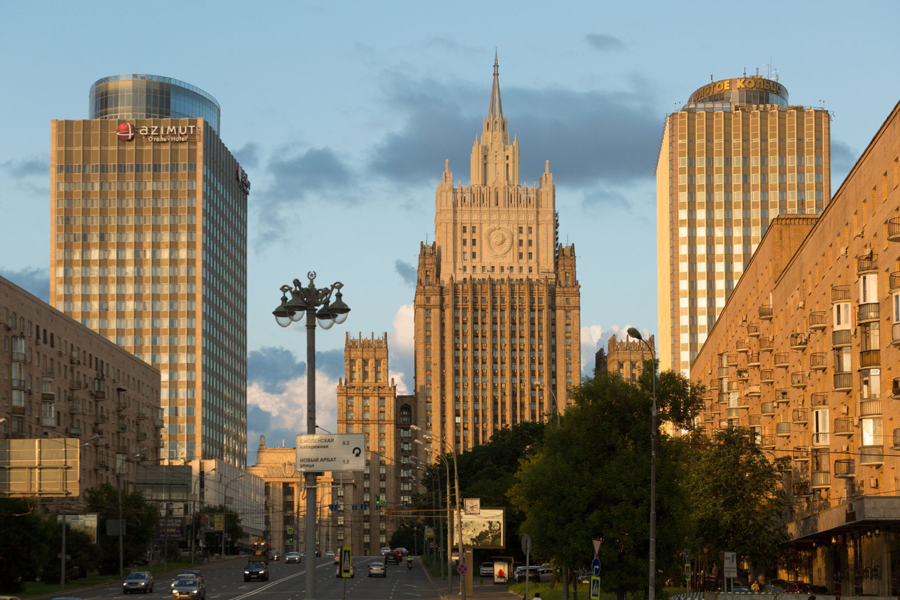
It seems that only recently we witnessed the “grand closing ceremony” of the Belgrade Hotel that hailed the start of its refurbishment and reconstruction, and – behold – the Azimuth Hotel Smolenskaya is receiving its first wave of guests. The authors of the reconstruction project, Т+Т Architects, are generally satisfied with both the work tempo and the end result.


To start with, we will remind you that Belgrade, or, rather, Belgrade-1 is in fact part of the architectural ensemble of the Smolenskaya Square and is one of the twin towers built in the 1970’s by the architects Vladimir Gelfreich, Vitaly Sokolov, and Alexander Kuzmin. Vladimir Gelfreich was also one of the authors of the Ministry of Foreign Affairs building, which is essentially a centerpiece and a conceptual dominant of the whole square; he was also the chief architect of the entire architectural ensemble. After a few decades of Belgrade flourishing as one of the most prestigious soviet hotels – and, of course, the haunt of the Moscow black marketeers and under-the-counter traders – the power in this country changed, and, paradoxically though this may sound, the towers went their separate ways. First, the younger one got lucky – Belgrade-2 was reconstructed to become the “Golden Ring” hotel. Over the last twenty years, there were two attempts of renovating Belgrade, and the second one was left incomplete: by the time the building was bought out by the Azimut Hotels chain, only half of its floors were functioning (“half” being a pretty optimistic estimate), the others stood under-remodeled, but, curiously enough, its top floor was fully occupied by the owner’s family.


Out of the four versions of the reconstruction project submitted by Т+Т Architects, the client chose the one that brought the appearance of the building as close as possible to the original, the way it was designed by Gelfreich and his coauthors. Still, there was one exception to be made, though – in order to revive the feeling of the architectural ensemble, and, to a large degree, for business reasons (it would be a waste to lose such a unique vantage point upon the roof!), it was decided that the roof (just as in the case of “Golden Ring”) will get a buildup of a restaurant. That was the only tribute that the architects paid to the building across the road – neither the architectural details of questionable value, such as the “crown” displaying the hotel name at the top edge, nor the counterintuitive color design solution were considered to be worth paying any special respect to. The elevation marks of both hotels are practically on a level but Azimuth’s buildup has two floors in it, and at the expense of the floor-to-ceiling stained glass windows and the “skirts” of the cupolas it looks much more slender and elegant. The restaurant got some extra height thanks to the decorative screen that conceals the engineering equipment routed out on the roof.


Initially, by the way, they wanted to give the buildup a rectangular shape – this form would better correspond to the tectonics of the building, and from the interior design standpoint the rectangular volume would be a lot easier to work with, too. Ultimately, however – again, out of the ensemble-factor reasons – the architects settled for an ellipse. But then again, a combination of such different shapes is quite in the spirit of the modernism of the 1970’s. Construction-wise, however, this created an extra task for the designers and builders: because of the vastly different floor plans, they had to make relieving platforms that cover the entire perimeter and transmit the load to the subjacent structures. But then again, the builders had to strengthen the building’s framework from top to bottom anyway, for the exception of the outside columns – even the foundation was slightly reinforced.


Originally it was planned that the buildup would be totally executed from curvilinear glass – no metal profiles whatsoever, just pure form, a play of reflections dissolving in the sky. However, due to the fact that the glass making technology has not yet advanced to the point of making such a sophisticated structure as a single piece, ultimately the glass surface had to be divided into sections. A few more months were taken up by the search for the manufacturer that would be able to make 6-meter sliding stained glass windows – this was the requirement of the future tenant. Ultimately, the manufacturer was found in one of the European countries but the thermal performance of his product fell miles short of the Russian requirements for energy efficiency. Thus, instead of one broad passage, sliding along the radius, they ultimately got several narrow passages distributed by segments – also a compromise but quite an acceptable one.

Oh, and, by the way, about the tenant – during the reconstruction, his name was already known: this was the famous restaurant owner Boris Zarkov. Until the moment the restaurant on the Belgrade roof was built, his project named “White Rabbit” could arguably boast the best panoramic view in this area of the nation’s capital, and the “preemptive occupation” of the rivaling vantage point was a coup de maître strategic decision.

The restaurant is designed in such a way that both of its floors overlook the Kutuzovsky Avenue. The waterfront of the Moskva River, the Moscow City, and the Ukraine Hotel – the views are truly unique and magnificent here. And as far as the building of the Ministry of Foreign Affairs is concerned, it looks at its absolute best if viewed from the terrace – the architects provided for a one-and-a-half-meter tall triplex screen running along the perimeter – in addition to the obvious safety function, it will provide extra protection from the wind. 


As for the façades (whose geometry was not altered in any way in the course of reconstruction), the architects’ main task was to give the building its original appearance but with the use of today’s hi-tech materials. The aluminum, out of which the cross-beams were made, turned yellow over the forty years of the building’s lifetime but originally, of course, it was a gray metallic – and the architects tried to reproduce this shade of color. And, after that color had been nailed down, the architects tried to find the matching shade of the tinted glass covering the hanging concrete slabs: at first, they picked a few samples out of two dozens, and then they finally zeroed in on the right tone that was the perfect match with the insulated glass units. The latter wasn’t a walkover either: there were two competing manufacturers in the competition that went neck and neck down to the very finish line. Ultimately, both of them brought to the construction site two samples of glass units each, these were test-installed in combination with a few kinds of decorative tinted glass, and the result was evaluated in real-life conditions, from the north and the south side of the building. Ultimately, the architects settled for Asahi Glass: their glass is tinted from inside out, and the resulting shade is the closest of all to the old façades – a greenish tone that perfectly matches the beige tinted glass.


The only thing that is left of the original façades is the massive marble pylons which cover the second and third floors. What got replaced were only the corner parts where the stonework seemed to be falling apart. Here the architects were also in for a surprise, though: after the stonework was cleaned it changed its color from gray to sugar-white, and the color of the already assembled corners was obviously mismatched. The problem was ultimately solved by double water-repellent treatment. After it turns round the corner, the beige belt between the first and second floor runs to the annex of the management office (not really viewable from the avenue) coated with the same stone.


The first floor was left fully glazed, its glass, unlike the glass of the main volume where a high level of sunlight protection is necessary, having the maximum transparency coefficient. The stained glass windows can now be pulled out – this is important for establishing a connection with the street outside because the whole first floor is occupied by bars and restaurants. At the client’s request, the reception area was raised up to the fourth floor, as well as the restaurant and the lobby bar.


Higher, up to the 19th floor, there are hotel rooms; the 20th floor is occupied by a fitness zone, and the basement floor is occupied by a small parking garage. The main staircase, which in the original building was made with a shift for every four floors, is now fitted in a single stairwell, which looks good, and is both convenient and more practical in terms of safety.


As for the interior design of the hotel rooms, Т+Т Architects based themselves on the Azimut Hotels brand book – this global chain has hotels in Germany, Austria, as well as in some regions of Russia; in Moscow, Belgrade has become already a third hotel of this chain, and it is going to be marketed as the “flagship” of the three. The trademark color of the chain also defined the image of the entrance group that is highlighted with a massive black outline with the Azimut logo. The earlier versions of the project also provided for a faceted glass marquee, it even got some of the necessary approvals, but, since its tip crossed the red construction line, it, regretfully, had to be left out in the long run.


Thus, the ensemble of the Smolenskaya Square can be considered as restored. It is still far from perfect – the ex-“twins” are still pretty different but their meaning of the “propylaea” of the Smolenskaya Square is revived, the function of the hotel is also there, the façades of Belgrade-1 are carefully renovated and are sporting the characteristic elements of the architecture of the 1970’s. Just as it was designed by the authors of the original project, the towers accentuate and develop the silhouette of the Stalin high-rise of the Ministry of Foreign Affairs. And as for nuances and differences, they seem to be natural and inevitable in an urban environment anyway.

The publication of the drafts of the project is temporarily suspended at the client’s request.
Azimut Hotel Smolenskaya © T+T Architects
Azimut Hotel Smolenskaya
Copyright: © T+T architects
Azimut Hotel Smolenskaya © T+T Architects
Project of renovating "Belgrade" Hotel © T+T Architects
Azimut Hotel Smolenskaya © T+T Architects
Azimut Hotel Smolenskaya. Interior design © T+T Architects
Project of renovating "Belgrade" Hotel. The entrance group without the marquee © T+T Architects
Project of renovating "Belgrade" Hotel. The entrance group with the marquee © T+T Architects
Azimut Hotel Smolenskaya
Copyright: © T+T architects
Project of renovating "Belgrade" Hotel. Facade © T+T Architects


16 January 2018

Written by:

Lilya Aronova
Translated by:
Anton Mizonov
Headlines now
​Streamline for City Canyons
Stepan Liphart has designed two houses for two small land sites situated in the area surrounding the Varshavsky Railway Station, which is being intensively developed now. The sites are situated close but not next to each other, and they are different, yet similar: the theme is the same but it is interpreted in different ways. In this issue, we are examining and comparing both projects.
​The Eastern Frontier
“The Eastern Arc” is one of the main land resources of Kazan’s development, concentrated in the hands of a single owner. The Genplan Institute of Moscow has developed a concept for the integrated development of this territory based on an analytical transport model that will create a comfortable living environment, new centers of attraction, and new workplaces as well.
A School of Our Time
On the eve of the presentation of the new book by ATRIUM, dedicated to the design of schools and other educational facilities, based on the architects’ considerable experience, as well as expert judgments, we are examining the Quantum STEM school building, constructed according to their project in Astana. Furthermore, this building is planned to be the first one to start a new chain. The architects designed it in full accordance with modern standards but sometimes they did break away from them – only to confirm the general development rules. For example, there are two amphitheaters in the atrium, and there is an artificial hill in the yard that is meant to make the flat terrain of the Kazakhstan steppe more eventful.
The Fluffy Space
Designing the passenger terminal of the Orenburg airport, ASADOV architects continue to explore the space theme that they first introduced in Saratov and Kemerovo airports. At the same time, the architects again combine the global and the local, reflecting topics inspired by the local conceptual context. In this case, the building is “covered” by an Orenburg downy shawl – an analogy that is recognizable enough, yet not literal; some will see the reference and some won’t.
The White Fitness Center
The white health and fitness center, designed by Futura Architects at the entrance to St. Petersburg’s New Piter residential complex, provides the developing area not only with functional but also with sculptural diversity, livening up the rows of the brick city blocks with the whiteness of its seamless facades, cantilevered structures, and dynamic inclined lines.
The New Dawn
In their project of a technology park to be built on the grounds of “Integrated Home-Building Factory 500” in Tyumen Oblast – the biggest in Russia – the HADAA architects preserve not just the industrial function of the giant hangar built in the late 1980s and 90% of its structures, but also respond to its imagery. They also propose a “gradient” approach to developing the available areas: from open public ones to staff-only professional spaces. The goal of this approach is to turn the technology park into the driver for developing the business function between the industrial zones and the future residential area in accordance with the Integrated Land Development program.
​Tame Hills for New Residents
T+T Architects have reported that they have completed the landscaping project for the yard of the first stage of Alexandrovsky Garden housing complex in Ekaterinburg – the landscape complements the contextual architecture, tailored for the buyers’ preferences and downtown standards, with bold neo modernist master strokes and lush and diverse vegetation.
The Crystal of the City Block
The typology and plastique of large housing complexes move with the times, and you can sometimes find new subtleties in the scope of seemingly familiar solutions. The Sky Garden complex combines two well-known themes, forming a giant residential area consisting of tall slender towers, placed at the perimeter of a large yard, in which a crossroads of two pedestrian promenades is “dissolved”.
Sunshine, Air, and Water
The construction of the “Solnechny” (“Sunny”) summer camp, designed by ARENA project institute, has been completed, the largest summer camp within the legendary Artek seaside resort for children. It was conceived still in Soviet time, but it was not implemented. The modern version surprises you with sophisticated engineering solutions that are combined with a clear-cut structure: together, they generate Asher-esque spaces.
​Art Deco at the Edge of Space
The competition project by Stepan Liphart – a high-end residential complex executed in a reserved classicist style in close proximity to the Kaluga Space Museum – responds equally well to the context and to the client’s brief. It is moderately respectable, moderately mobile and transparent, and it even digs a little into the ground to comply with strict height restrictions, without losing proportions and scale.
Going, Going, Gone!
The housing complex “Composers’ Residences” has been built in accordance with the project by Sergey Skuratov, who won the international competition back in 2011. It all began from the image search and “cutting off all spare”, and then implementing the recognizable Skuratov architecture. It all ended, however, in tearing down the buildings of the Schlichterman factory, whose conservation was stipulated by all the appropriate agencies prior to approving Skuratov’s project. This story seems to be educational and important for understanding the history of all the eleven years, during which the complex was designed and built.
The Life of Iron
The building of the Vyksa Metallurgy Museum, designed by Nikita Yavein and Sergey Padalko, provides for the natural aging of metal – it is planned that the iron will gradually rust – at the same time utilizing the advanced type of construction, based on metal’s ability to stretch. The building will be constructed from pipes and rolled steel supplied by OMK company, as well as from recycled bricks.
​And the Brook is Flowing
ASADOV Architects have designed a master plan for developing a residential area at the outskirts of Kaliningrad: a regular grid of housing blocks is enriched by large-scale public facilities, the main “artery” of the new area being the fortification channel that regains its original function.
Off We Go!
The new terminal of the Tomsk airport is being designed by ASADOV bureau. The architects keep on developing its identity, building the imagery upon the inventions of Nikolai Kamov, whose name the airport bears. The result is laconic, light, and, as always, levitating.
Maximum Flexibility
The Multispace Dinamo, which recently opened within the Arena business center, is an example of a project that is entirely based upon cutting-edge approaches and technologies. It is managed via a mobile application, special software was created for it, and the spaces are not just multifunctional but carefully mixed up, like some kind of jigsaw puzzle that allows the office workers to mix their working routine for better efficiency.
A Factory’s Path
Last week, the new center for constructivist studies “Zotov” hosted its first exhibition named “1922. Constructivism. The Inception”. The idea of creating this center belongs to Sergey Tchoban, while the project of the nearest houses and adjusting the building of the bread factory for the new museum function was done by the architect in collaboration with his colleagues from SPEECH. We decided that such a complex project should be examined in its entirety – and this is how we came up with this long-read about constructivism on Presnya, conservation, innovation, multilayered approach, and hope.
The Savelovsky Axis
The business center, situated right in the middle of a large city junction next to the Savelovsky Railway Station takes on the role of a spatial axis, upon which the entire place hinges: it spins like a spiral, alternating perfect glass of the tiers and deep recessions of inter-tier floors that conceal little windows invented by the architects. It is sculptural, and it claims the role of a new city landmark, in spite of its relatively small height of nine floors.
Parametric Waves
In the housing complex Sydney City, which FSK Group is building in the area of Shelepikhinskaya Embankment, Genpro designed the central city block, combining parametric facades and modular technology within its architecture.
The Multitone
The new interior of the Action Development headquarters can be regarded as an attempt to design the perfect “home” for the company – not just comfortable but broadcasting the values of modern development. It responds to the context, yet it is built on contrast, it is fresh but cozy, it is dynamic, yet it invites you to relax – everything of this coexists here quite harmoniously, probably because the architects found an appropriate place for each of the themes.
Refinement No Longer Relevant
A few days ago journalists were shown the building of Bread Factory #5, renovated upon the project by Sergey Tchoban. In this issue, we are publishing Grigory Revzin’s thoughts about this project.
The Comb of Strelna
In this issue, we are taking a close look at the project that won the “Crystal Daedalus” award – the “Veren Village” housing complex in Strelna, designed by Ostozhenka. Its low-rise format became a trigger for typological and morphological experiments – seemingly, we are seeing recognizable trends, yet at the same time there are a multitude of subtleties that are a pleasure to go into. Having studied this project in detail, we think that the award is well-deserved.
A Tectonic Shift
For several years now, Futura Architects have been working with the “New Peter” residential area in the south of St. Petersburg. In this article, we are covering their most recent project – a house, in which the architects’ architectural ideas peacefully coexist with the limitations of comfort-class housing, producing a “multilayered” effect that looks very attractive for this typology.
Three “Green” Stories
In this issue, we are examining three environmental urban projects showcased by the Genplan Institute of Moscow at the Zodchestvo festival. The scale of the projects is really diverse: from gathering information and suggestions from the residents on a city scale to growing meadow grass between houses to paintings, which, as it turned out, possess power to cure trees, healing their wounded bark. + a list of kinds of plants natural for Moscow to help the developer.
​The Slabs of Bagration
The construction of a new skyscraper designed by SPEECH within the complex of Moscow City has been announced. A keen observer may see in it: Moscow high-rises, Chicago architecture, Malevich architecton, and an attempt of deconstruction of the integral image of the Moscow skyscraper – a technique that has been actively employed by the architects in their recent works.
​Preserving the History of Clean Ponds
How do you make a comfortable high-end residential complex that meets the modern requirements for expensive downtown housing, and keep as much of the original 1915 building as possible? Ilia Utkin, together with Sminex, solved this charade for Potapovsky Lane, 5 – here is how.
​Living in a Forest
The apartment complex in Roshchino, designed by GAFA architects, looks very much like a glamping: the residents enjoy the untouched nature of the Karelian isthmus, while having urban amenities and opportunities for social life.
A Laboratory for Life
The building of the Laboratory of Oncomorphology and Molecular Genetics, designed by the author team headed by Ilya Mashkov (Mezonproject) uses the benefits of the natural context and offers space for cutting-edge research, both doctor- and patient-friendly.
The Logic of Life
The light installation, designed by Andrey Perlach in the atrium of Moscow's Federation Tower, balances on the edge between a mathematical order of construction and the diversity of perception when viewed from different angles.
An Architect in a Metaverse
In this interview, we talked to the participants of the festival of creative industries G8 about why metaverses are our tomorrow’s everyday routine, and how architects can already influence it today.