По-русски

​Julius Borisov: "You can’t make a positive difference to people’s lives with graphic design alone"

At the workshop called “Vesenniy Marsh” (“The Spring March”), the team of Julius Borisov proposed not just a project of renovating the settlement of Staroe Drozhanoye, but a whole new program of its ecological development – tying in ecological and economic considerations.

23 May 2017
Interview
mainImg
Archi.ru:
– What do you think were the benefits that you got from taking part in this workshop? 

Julius Borisov: 
– My educational mission was to get across to my audience that it’s not the beautiful picture of public territory design that ultimately makes a difference. What you need to do prior to design is get a full understanding of what your task is about, learn to be able to explain it to yourself, and understand what specific steps must be taken in order to solve the problems of some very specific people. And this is also the stereotype that I’m trying to dispel in the Moscow Institute of Architecture where I teach. Regretfully, our educational system pays very little attention, if any, to the project needs analysis and goal-setting, and a lot of attention – to graphic design. But you can’t make a difference to people’s lives with drawings alone! That way, you can, let’s say, divert people’s attention from their problems – and then only for a while.

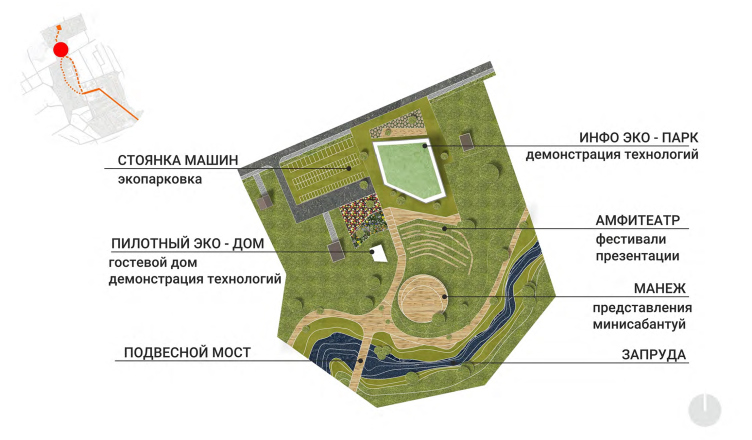
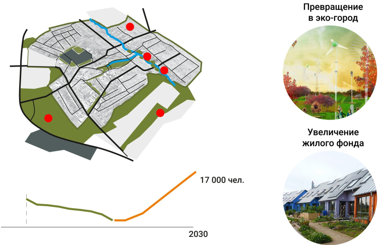
Improvement project of Staroe Drozhanoe. A healthy environment for working and living © UNK project


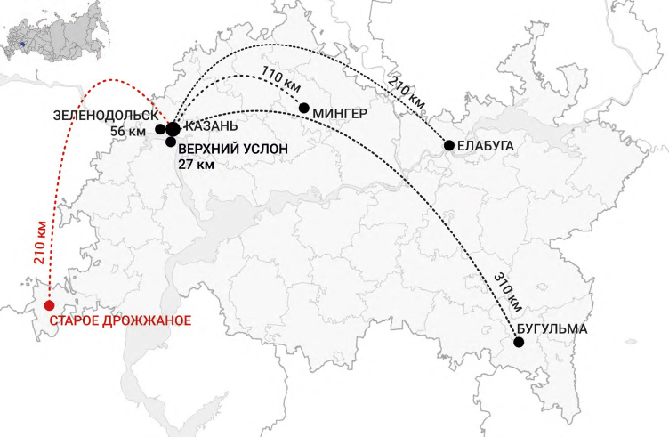
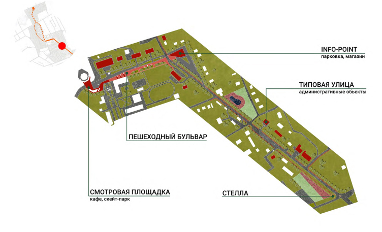
Improvement project of Staroe Drozhanoe. Location plan © UNK project


– What principle was the organization of the workshop based upon? 

– There were six tutors, and, accordingly, six groups, each of which was assigned its own specific task. These groups consisted of ten to twelve people – government officials, practicing architects, the local “architectural troops” that work on public territories in Tatarstan, and a few architectural students.

– What was the task that your group was assigned to work upon? 

– I was given this settlement of Staroe Drozhanoye with a population of about 4000 people, in a remote part of Tatarstan. It’s got the same issues that pretty much every Russian village has: deteriorating environment and out-migration, especially among the young people because they can’t seem to find a way to apply themselves in their home town. Formally, we had a task of developing a town improvement project: the public territories, parks, pedestrian routes – everything that, in the opinion of the municipality, was meant to solve the settlement’s problems. The main problem, however, was rooted much deeper: it was necessary to change the “underclass” status of that settlement.

Currently, one of the world’s hottest trends is the concept of “slow life” when people live in ecologically clean places where they have an opportunity to work online, and where there is a great living environment for adults and children alike. In this country, the value of such lifestyle is still underestimated. And our project was an example of how this situation could be changed.

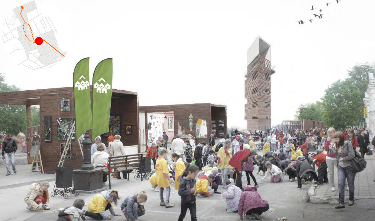
Improvement project of Staroe Drozhanoe. Central square © UNK project


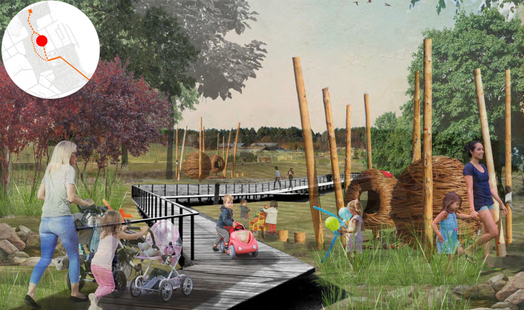
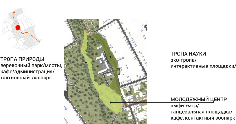
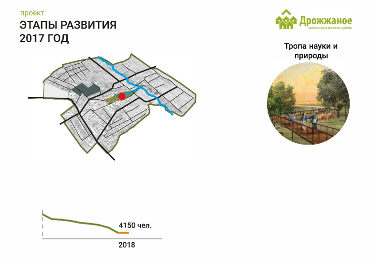
Improvement project of Staroe Drozhanoe. The Path of Science © UNK project


– Did you develop your project together with your audience?

– My role rather consisted in educating and consulting. Members of the audience – and there were quite serious practicing architects among them – did a very thorough analysis. They would go on location, studied the poll information, met with the head of the region that was of great help, and was genuinely interested in the project. As they learned, some serious budgets are being spent: they are building schools, hospitals and fitness centers – but the problem is that these are all independent pinpoint projects, and not some comprehensive system. There is no master program as such – neither conceptual nor municipal. And, because of that, these actions do not lead to the desired results. 

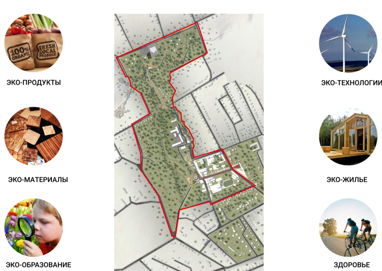
As for the second problem, it lies in the fact that, although some industrial grounds are being prepared, there is no clear-cut concept that can be presented either to the city people or to the investors. We analyzed the assets that this settlement possesses. It turned out that its soil is the top-grade black earth, and there are rare natural materials that can be used in construction. So, we proposed this idea of an eco-settlement that produces pure food and pure building materials. Granted, the idea is not exactly groundbreaking but for this region it is quite appropriate, and it has all the necessary prerequisites.

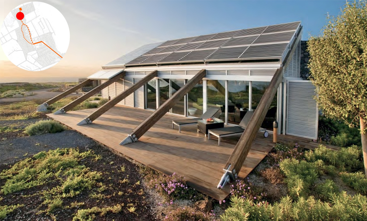
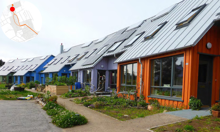
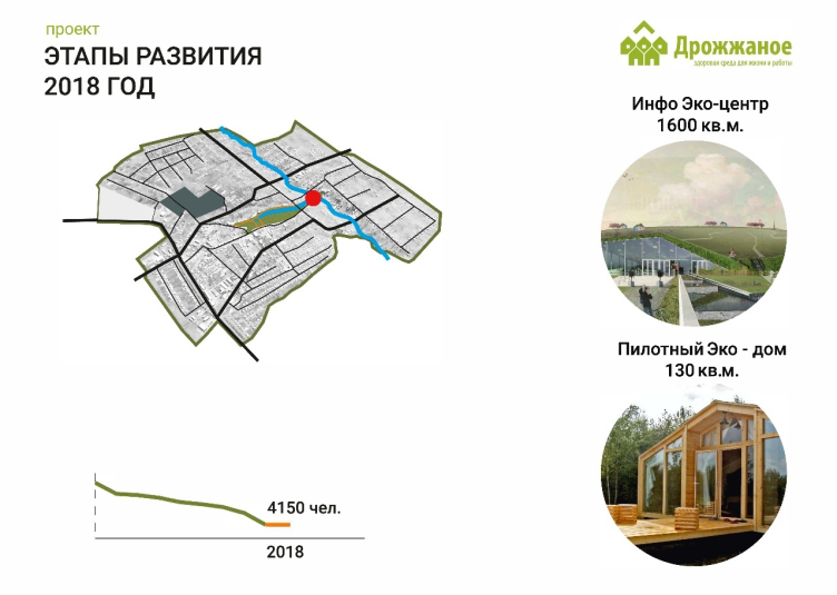
Further on, my team developed a program on how to attract people back to the settlement. We decided to build a center that would demonstrate to the town people and potential investors the future of the settlement, and we decided to build a pilot eco-house surrounded by public territories with educational and entertainment facilities that would show to people just what ecology is about.

Improvement project of Staroe Drozhanoe. Eco-housing © UNK project


Improvement project of Staroe Drozhanoe. Eco-housing © UNK project


– How long did this work take, and what are the prospects of implementing these ideas? 

– The entire project was created literally within a span of six days. It has already been submitted to the Minister of Construction; the government of the Republic of Tatarstan, and the local authorities have also shown interest. So, ultimately, we got quite a serious result. Maybe the project will not be implemented at once in its entirety, but some parts of it will, and sooner or later we will see the whole of it. I was pretty surprised and even a bit jealous when I saw just how much attention the government officials of Tatarstan pay to architectural actions, and how well they understand the value of the tools with which the architect creates an environment for the people to live in.

Improvement project of Staroe Drozhanoe. The old town center © UNK project


Improvement project of Staroe Drozhanoe. The youth center © UNK project


– Why did you decide to take part in the “Vesenniy Marsh”? 

– I have had to make three last-minute cancellations of my scheduled trips to Kazan, the capital of Tatarstan. Until that time, I’d never been there, and I decided that at a fourth try, I must finally make it there and visit Innopolis. Since this is the first city that has been built from scratch in years, it is a must-see for any practicing Russian architect. Second, I’ve been told by many of my colleagues that Tatarstan is a very dynamic region – very little time elapses between something is said, then drawn, and then built. And I had a chance to see for myself that this is really the case. And, third, since I teach at the Moscow Institute of Architecture, I was curious to check out the level of the students, practicing architects, and architectural officials in the regions. This program gave me such an opportunity: the local practicing architects demonstrated a fairly high level of competence, it is quite comparable to Moscow’s, and the students whom we taught as part of the project, have a great desire to grow and quite decent technical skills.

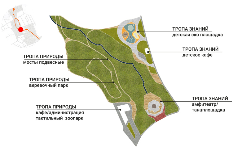
Improvement project of Staroe Drozhanoe. The Path of Science and Nature © UNK project


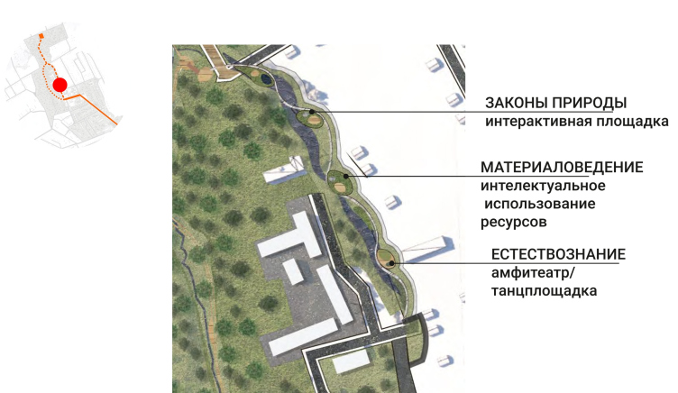
Improvement project of Staroe Drozhanoe. The Path of Science © UNK project


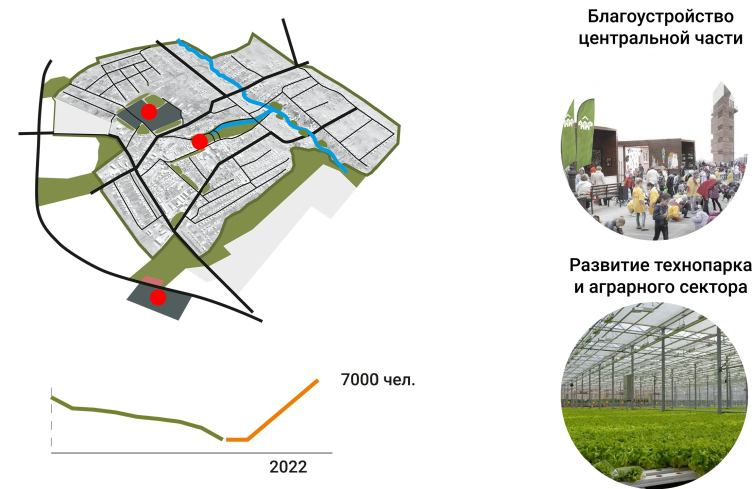
Improvement project of Staroe Drozhanoe. The new center of "ecopolis" © UNK project


Improvement project of Staroe Drozhanoe. Development stages © UNK project


Improvement project of Staroe Drozhanoe. Development stages © UNK project


23 May 2017

Headlines now
The Golden Crown
The concept for a dental clinic in Yekaterinburg, developed by CNTR Studio, revolves around the idea of a “mouth full of gold”: pristine white porcelain stoneware walls are complemented by matte brass details. To avoid an overly literal interpretation, the architects focused on the building’s proportions, skillfully navigating between sunlight requirements and fire safety regulations.
Flexibility and Integration
Not long ago, we covered the project for the fourth phase of the ÁLIA residential complex, designed by APEX. Now, we’ve been shown different fence concepts they developed to enclose the complex’s private courtyards, incorporating a variety of public functions. We believe that the sheer fact that the complex’s architects were involved in such a detail as fencing speaks volumes.
A Step Forward
The HIDE residential complex represents a major milestone for ADM architects and their leaders Andrey Romanov and Ekaterina Kuznetsova in their quest for a fresh high-rise aesthetic – one that is flexible and layered, capable of bringing vibrancy to mass and silhouette while shaping form. Over recent years, this approach has become ADM’s “signature style”, with the golden HIDE tower playing a pivotal role in its evolution. Here, we delve into the project’s story, explore the details of the complex’s design, and uncover its core essence.
Gold in the Sands
A new office for a transcontinental company specializing in resource extraction and processing has opened in Dubai. Designed by T+T Architects, masters of creating spaces that are contemporary, diverse, flexible, and original, this project exemplifies their expertise. On the executive floor, a massive brass-clad partition dominates, while layered textures of compressed earth create a contextually resonant backdrop.
Layers and Levels of Flight
This project goes way back – Reserve Union won this architectural competition at the end of 2011, and the building was completed in 2018, so it’s practically “archival”. However, despite being relatively unknown, the building can hardly be considered “dated” and remains a prime example of architectural expression, particularly in the headquarters genre. And it’s especially fitting for an aviation company office. In some ways, it resembles the Aeroflot headquarters at Sheremetyevo but with its own unique identity, following the signature style of Vladimir Plotkin. In this article, we take an in-depth look at the United Aircraft Corporation (UAC) headquarters in the Moscow agglomeration town of Zhukovsky, supplemented by recent photographs from Alexey Naroditsky – a shoot that became only recently possible due to the fact that improvements were finally made in the surrounding area.
Light and Shadow
In this article, we delve into the architectural design of the “Chaika” house by DNK ag architects, which was recently completed in 2023 as part of the collection of signature designs at ZILArt. As is well-known, all the buildings in this complex follow a design code, yet each one is distinct. This particular building stands out not only for its whiteness and minimalism but also for the refined use of a limited number of techniques that, together, create what can confidently be called synergy.
Casus Novae
A master plan was developed for a large residential area with a name of “DNS City”, but now that its implementation began, the plan has been arbitrarily reformatted and replaced with something that, while similar on the surface, is actually quite different. This is not the first time such a thing happens, but it’s always frustrating. With permission from the author, we are sharing Maria Elkina’s post.
Treasure Hunting
The GAFA bureau, in collaboration with Tegola and Arkhitail, organized an expedition to the island of Kilpola in Karelia as part of Moskomarkhitektura’s “Open City” festival. There, amidst moss and rocks, the students sought answers to questions like: what is the sacred, where does it dwell, and what sustains it? Assisting the participants in this quest were landscape engineer Evgeny Levin, artist Nicholas Roerich, a moose, and the lack of cellular connection. Here’s how the story unfolded.
Depths of the Earth, Streams of Water
In the Malaya Okhta district, the Akzent building, designed by Stepan Liphart, was constructed. It follows a classic tripartite structure, yet it’s what you might call “hand-drawn”: each façade is unique in its form and details, some of which aren’t immediately noticeable. In this article, we explore the context and, together with the architect, delve into how the form was developed.
Fir Tree Dynamics
The “Airports of Region” holding is planning to build an airport in Karachay-Cherkessia, aiming to make the Arkhyz and Dombay resorts more accessible to travelers. The project that won in an invitation-only competition, submitted by Sergey Nikeshkin’s KPLN, blends natural imagery inspired by the shape of a conifer seed, open-air waiting spaces, majestic large trees, and a green roof elevated on needle-like columns. The result is both nature-inspired and WOW.
​A Brick Shell
In the process of designing a clubhouse situated among pine trees in a prestigious suburban area near Moscow, the architectural firm “A.Len” did the façade design part. The combination of different types of brick and masonry correlates with the volumetric and plastique solutions, further enhanced by the inclusion of wood-painted fragments and metal “glazing”.
Word Forms
ATRIUM architects love ambitious challenges, and for the firm’s thirtieth anniversary, they boldly play a game of words with an exhibition that dives deep into a self-created vocabulary. They immerse their projects – especially art installations – into this glossary, as if plunging into a current of their own. You feel as if you’re flowing through the veins of pure art, immersed in a universe of vertical cities, educational spaces – of which the architects are true masters – and the cultural codes of various locations. But what truly captivates is the bold statement that Vera Butko and Anton Nadtochy make, both through their work and this exhibition: architecture, above all, is art – the art of working with form and space.
Flexibility and Acuteness of Modernity
Luxurious, fluid, large “kokoshniks” and spiral barrel columns, as if made from colorful chewing gum: there seem to be no other mansion like this in Moscow, designed in the “Neo-Russian-Modern” style. And the “Teremok” on Malaya Kaluzhskaya, previously somewhat obscure, has “come alive with new colors” and gained visibility after its restoration for the office of the “architectural ecosystem” as the architects love to call themselves. It’s evident that Julius Borisov and the architects at UNK put their hearts into finding this new office and bringing it up to date. Let’s delve into the paradoxes of this mansion’s history and its plasticity. Spoiler: two versions of modernity meet here, both balancing on the razor’s edge of “what’s current”.
Yuri Vissarionov: “A modular house does not belong to the land”
It belongs to space, or to the air... It turns out that 3D printing is more effective when combined with a modular approach: the house is built in a workshop and then adapted to the site, including on uneven terrain. Yuri Vissarionov shares his latest experience in designing tourist complexes, both in central Russia and in the south. These include houseboats, homes printed from lightweight concrete using a 3D printer, and, of course, frame houses.
​Moscow’s First
“The quality of education largely depends on the quality of the educational environment”. This principle of the last decade has been realized by Sergey Skuratov in the project for the First Moscow Gymnasium on Rostovskaya Embankment in the Khamovniki district. The building seamlessly integrates into the complex urban landscape, responding both to the pedestrian flow of the city and the quiet alleyways. It skillfully takes advantage of the height differences and aligns with modern trends in educational space design. Let’s take a closer look.
Looking at the Water
The site of Villa Sonata stretches from the road to the water’s edge, offering its own shoreline, pier, and a picturesque river panorama. To reveal these sweeping views, Roman Leonidov “cut” the façade diagonally parallel to the river, thus getting two main axes for the house and, consequently, “two heads”. The internal core – two double-height spaces, a living room and a conservatory, with a “bridge” above them – makes the house both “transparent” and filled with light.
The White Wing
Well, it’s not exactly white. It’s more of a beige, white-stone structure that plays with the color of limestone – smoother surfaces are lighter, while rougher ones are darker. This wing unites various elements: it absorbs and interprets the surrounding themes. It responds to everything, yet maintains a cohesive expression – a challenging task! – while also incorporating recognizable features of its own, such as the dynamic cuts at the bottom, top, and middle.
Urban Dunes
The XSA Ramps team designed and built a three-part sports hub for a park in Rostov-on-Don, welcoming people of all ages and fitness levels. The skate plaza, pump track, and playground are all meticulously crafted with details that attract a diverse range of visitors. The technical execution of the shapes and slopes transforms this space into a kind of sculptural composition.
Proportional Growth
The project for the fourth phase of the ÁLIA residential area has been announced. The buildings are situated on an elongated plot – almost a “ray” that shoots out from the center of the area towards the river. Their layout reflects both a response to Moscow’s architectural preferences over the past 15 years, shifting “from blocks to towers”, and an interpretation of the neighboring business park designed by SOM. Additionally, the best apartments here are not located at the very top but closer to the middle, forming a glowing “waistline”.
The “Staircase” Building
In designing the “Details” residential complex in New Moscow, Rais Baishev spiced up the now-popular Moscow theme of a “courtyard” building with an idea drawn from the surrealist drawings by Maurits Escher. He envisioned the stepped silhouettes and descending slopes as a metaphysical mega-staircase, creating a key void within the courtyard that gave the project an internal “spine”. This concept is felt both in the building’s silhouette and on its façades.
Projection of the Quarter
No one doubted that the building that Vladimir Plotkin designed as part of the “Garden Quarters” would be the most modernist of all. And it turned out just that way: while adhering to the common design code, the building successfully combines brick and white stone, rhythmically responding to the neighboring building designed by Ostozhenka, yet tactfully and persistently making a few statements of its own. This includes the projection of the ideal urban development composition “14–9–6”, which can be found right next door, mathematical calculations, including those for various types of terraces (and perhaps the only reminder of the Soviet past of the Kauchuk rubber factory!), and the white “cross-stitch” pattern of the façade grid.
Domus Aurea
In this issue, we examine the “Tessinsky-1” house, designed by Sergey Skuratov and completed in 2023. Located in the middle of the Serebryanicheskaya Embankment district, at the intersection of its main streets, this house assumes a sort of “nodal” role: it not only responds to everything around it and preserves many memories of the former EMA factory within itself, but it weaves all this into a newly directed pattern, reconciling bright “gold” and dark-colored brick, largely with the help of the new, modern-yet-archaic Columba brick, which, come to think about it, is the most precious element here.
The Chimney of Nikola-Lenivets
In this issue, we are examining the “Obelisk House” designed by KATARSIS and built for the Arkhstoyanie 2023 festival. However, it was only finished later on, and this is why we are examining it now. It seems to us that after the “Obelisk House” appeared in Nikola-Lenivets, a dialogue and a few inner connections appeared between the temporary structures built here. These houses no longer look like “accidental neighbors”, more of which below.
​Periscope by the Bay
The jury awarded the second place in the competition for a public and cultural center in Petropavlovsk-Kamchatsky to the companies GORA (“Mountain”) and M4. In the consortium’s proposal, the building resembles a sperm whale with a calf swimming next to it or a periscope, whose lenses capture the most spectacular views from the surrounding landscape.
From Arcs to Dolmens
While working on the competition project for Petropavlovsk-Kamchatsky, ASADOV Architects prioritized the value of the natural and urban environment, aiming to preserve the balance of the location while minimizing the resemblance of the volume that they designed to a “traditional building”. The task was challenging, and the architects created three versions, one of which having been developed after the competition, where their main proposal took third place. However, the point of interest here is not the competition result but the continuity of creative thinking.
Hide and Seek
The ID Moskovskiy house, designed by Stepan Liphart in St. Petersburg, in the courtyards near Moskovskiy Avenue beyond the Obvodny Canal and recently completed, is notable for several reasons. Firstly, it has been realized with considerable accuracy, which is particularly significant as this is the first building where the architect was responsible not only for the facades but also for the layouts, allowing for better integration between the two. On the other hand, this building is interesting as an example of the “germination” of new architecture in the city: it draws on the best examples from the neighborhood and becomes an improved and developed sum of ideas found by the architect in the surrounding context.
The Big Twelve
Yesterday, the winners of the Moscow Mayor’s Architecture Award were announced and honored. Let’s take a look at what was awarded and, in some cases, even critique this esteemed award. After all, there is always room for improvement, right?
Above the Golden Horn
The residential complex “Philosophy” designed by T+T architects in Vladivostok, is one of the new projects in the “Golubinaya Pad” area, changing its development philosophy (pun intended) from single houses to a comprehensive approach. The buildings are organized along public streets, varying in height and format, with one house even executed in gallery typology, featuring a cantilever leaning on an art object.
Nuanced Alternative
How can you rhyme a square and space? Easily! But to do so, you need to rhyme everything you can possibly think of: weave everything together, like in a tensegrity structure, and find your own optics too. The new exhibition at GES-2 does just that, offering its visitor a new perspective on the history of art spanning 150 years, infused with the hope for endless multiplicity of worlds and art histories. Read on to see how this is achieved and how the exhibition design by Evgeny Ace contributes to it.
Blinds for Ice
An ice arena has been constructed in Domodedovo based on a project by Yuri Vissarionov Architects. To prevent the long façade, a technical requirement for winter sports facilities, from appearing monotonous, the architects proposed the use of suspended structures with multidirectional slats. This design protects the ice from direct sunlight while giving the wall texture and detail.