По-русски

Sigeru Ban: “The sense of achievement after completion of a disaster relief project and a common project is the same”

In this interview Shigeru Ban shares his vision on social responsibility of architects, specificity of disaster relief projects, idea of a paper log house and one of Ban’s most recent disaster relief initiatives – сonstruction of temporary shelters and new housing, a Buddhist temple and an elementary school in Nepal.

17 April 2017
Interview
mainImg


– You have been involved in disaster relief architecture over two decades. In which way working in disaster relief is different from ordinary architectural practice?

– When I first started becoming involved in disaster relief projects, it was a challenge to balance the disaster relief projects and non-disaster relief projects. However, the only difference is whether or not the design fee can be obtained; the time it takes and sense of achievement after completion are the same. I feel that the barrier that had once divided the two categories is dissolved.

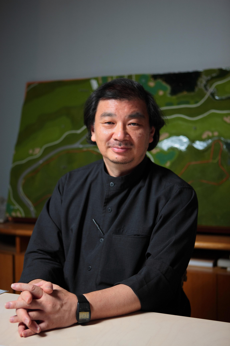
Shigeru Ban. Photo by Shigeru Ban Architects
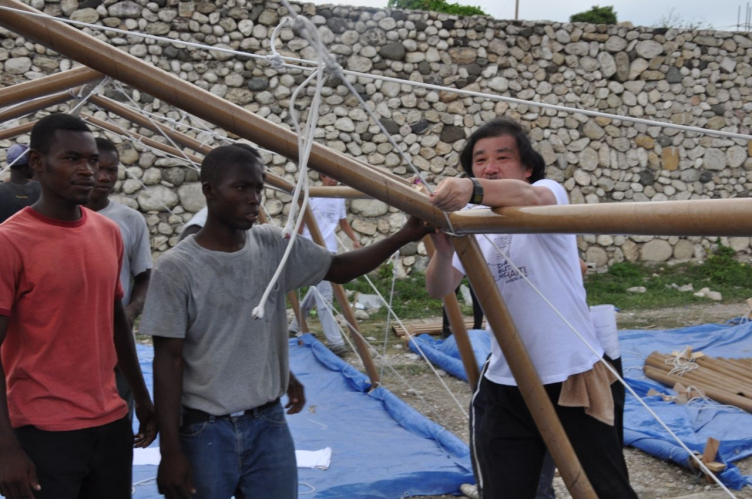
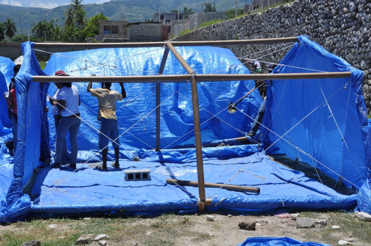
Shigeru Ban with volunteers constructing Paper Emergency Shelter in Haiti. Photo by Alex Martinez
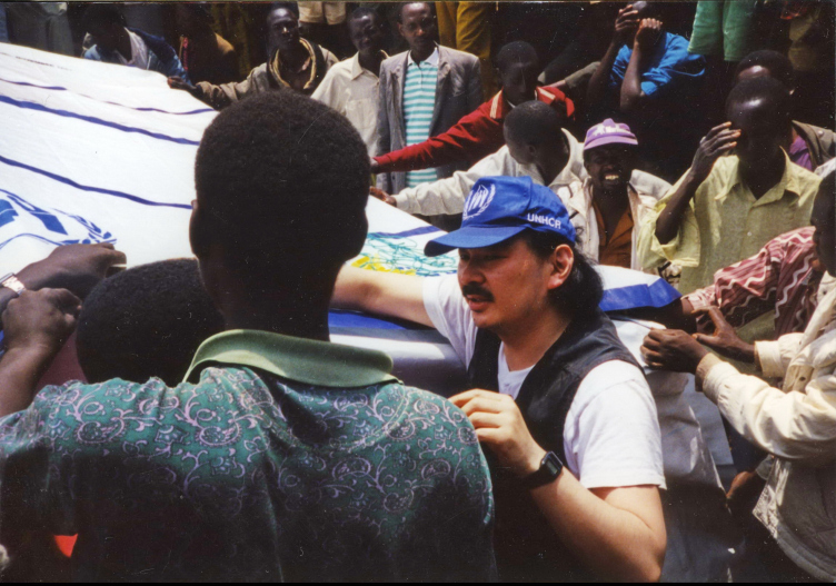
Shigeru Ban with volunteers constructing Paper Emergency Shelter for UNHCR in Rwanda. Photo by Shigeru Ban Architects.


– When and why did you decide to be involved in disaster relief as an architect?

– I always thought the recognition towards social responsibility of architects is weak in Japan. I decided to start disaster relief when the Kobe earthquake occurred in 1995. When the disaster relief activities had finished, I felt that I should organize the Voluntary Architects’ Network (hereinafter VAN) and continue to support it in the future. Today at VAN we work with several office staffs, university laboratory (Keio University Shigeru Ban Lab), and local architects and universities around the disaster-affected areas.

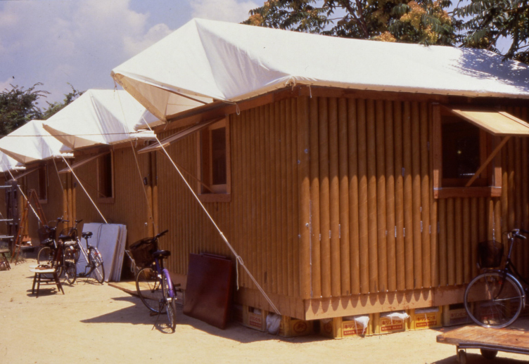
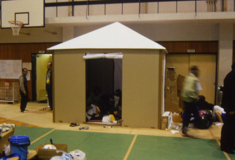
Paper Log Houses in Kobe, Japan, 1995. Photo by Takanobu Sakuma.
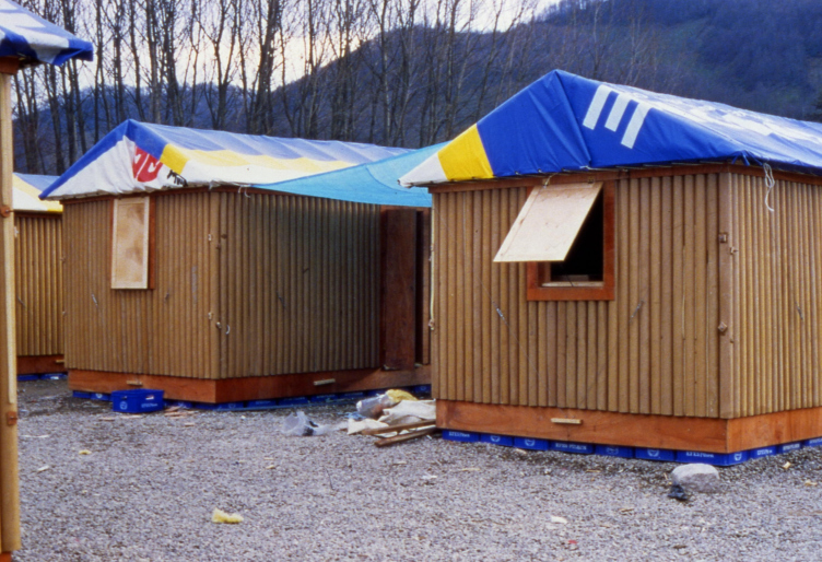
Paper Log House in Turkey, 2000. Photo by Shigeru Ban Architects


– Was your decision to be be involved in disaster relief somehow influenced by the fact that Japan is located in one of the most active seismic and volcanic zones in the world?

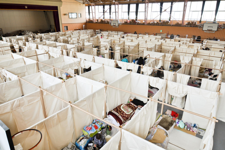
– Disasters can happen anywhere, and so do aids. The decision was not particularly influenced by that, but I was always concerned about the poor living environment for the victims in evacuation centers. Temporary housing built with paper tubes in Kobe in 1995 was the start of the disaster relief work, and we started to provide paper tube partition systems to protect privacy at evacuation centers since 2004 Niigata Earthquake.

 
Paper House for Niigata earthquake victims. Photo by Voluntary Architects' Network
Paper Partition System 4 in Iwate, Japan. Photo by Voluntary Architects' Network


– How and when the model of a paper log shelter was invented? How has it evolved?

– Paper Log House was developed when the 1995 Kobe earthquake occurred. Since the Vietnamese refugees who worked at the local shoe factory refused to relocate (in order to remain nearby the shoe factory), we built log house using paper tubes in a local park. After the first paper log house in Kobe, we have also built further developed iterations of shelters in Turkey, India, and the Philippines. Their designs were adjusted to each region after examining such factors as climate, culture, economy, religion and commonly used materials.

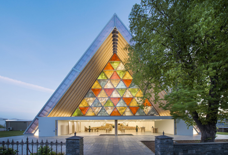
Christchurch Cardboard Cathedral. Photo by Stephen Goodenough
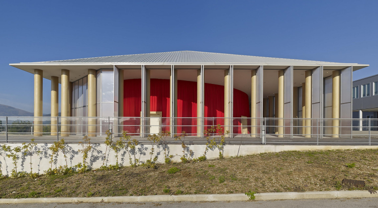
Paper Concert Hall in L'Aquila, Italy, 2011. Photo by Didier Boy de la Tour


– Is it desirable to make disaster relief architectural projects – universal in their nature? May there be one prototype of an emergency shelter/temporary housing/permanent housing after the earthquake struck applicable all over the globe?

– Looking at previous relief activities, there are no specific houses or shelters that can be applied in every disaster areas. It is important to design houses and shelters appropriate to each environment after considering the culture, economy, and typical construction methods of the affected region.

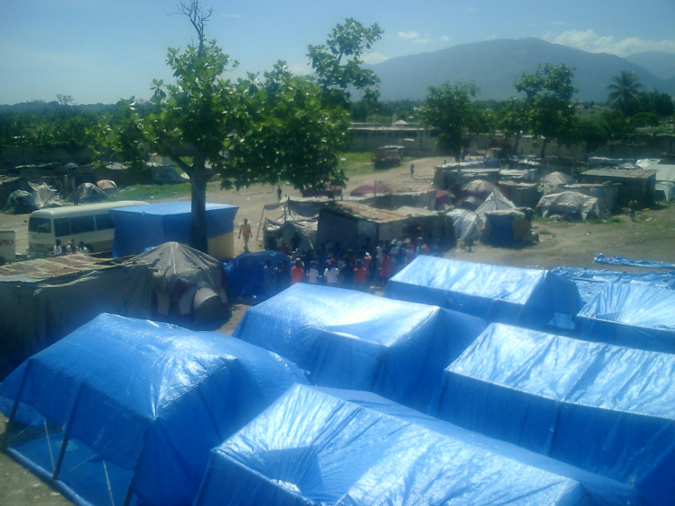
Paper Emergency Shelter for Haiti. 2010. Photo by Alex Martinez
Paper Emergency Shelter for Haiti. 2010. Photo by Shigeru Ban Architects


– There is a big number of natural disasters occurring throughout the world annually and it’s hardly possible to be involved in disaster relief of each of them. How do you choose places where you launch a disaster relief initiative?

– It is true that we cannot go to all the affected areas, but we may decide to take action on our own after acquiring information about scale of damage and current conditions, or decide to go when we get requests.

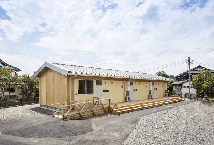
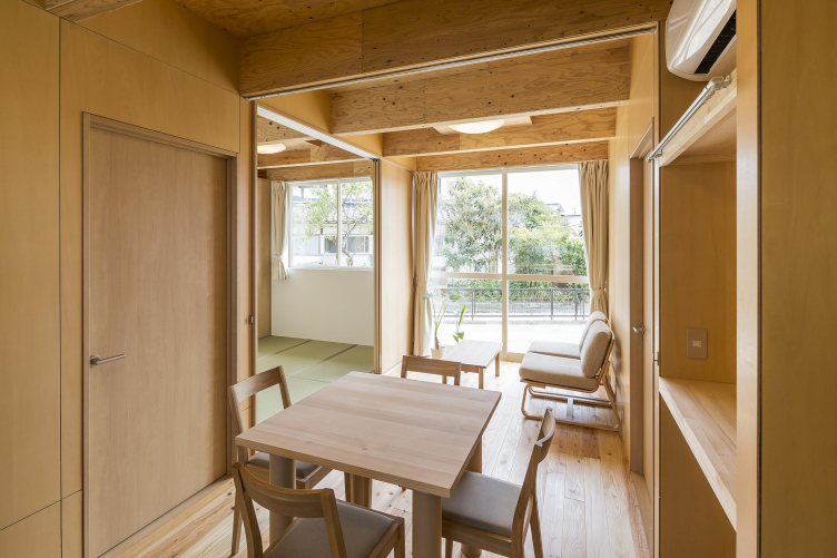
Wooden Prefabricated Temporary Housing – Kumamoto Earthquake, Japan. Photo by Hiroyuki Hirai


– How and when have you learnt about the Gorkha earthquake? What was its coverage in Japanese mass media?

– I was in Tokyo when the earthquake occurred in Nepal, and I learnt about the large scale of damage through the news. The earthquake was a big news in Japan, too.

– Why have you decided to launch the Nepalese project?

– A Nepali student studying in Tokyo sent us an email expressing that he would like to support those affected by the earthquake. Then I decided to visit Nepal and see the conditions in person.

– The Nepalese project was planned to have three phases – emergency response, temporary housing and permanent housing construction. How did the project implementation go in practice?

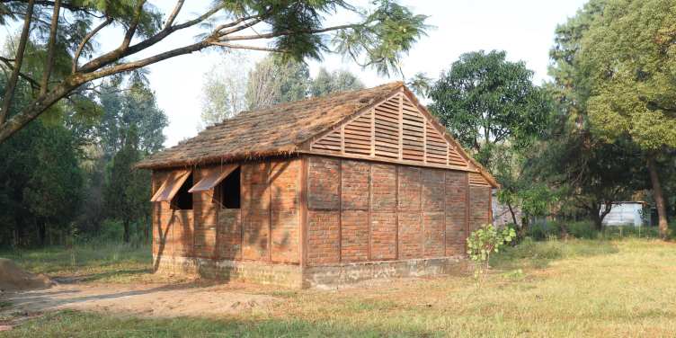
– Initially we visited the affected area to provide shelters that can be easily assembled with paper tubes. During the visit, we inspected the conditions and learned about their typical construction method, which is brick masonry, and high wood carving and processing techniques. Also, due to aftershocks, building that is resistant to earthquake was required. From this visit, the design for permanent housing arose.

– What are the main differences of the Nepalese project compared to other disaster relief initiatives done by VAN?

– Although it is not unique to Nepal, the design was generated after we carefully observed the economics and culture of the affected area, as well as construction customs and building materials, to best suit the local environment.

– When constructing emergency shelters, you use three types of joints – with duct tape, plastic or plywood connectors. Which of them do you consider preferable? Which one was used in Nepal?

– The Nepal shelter uses duct tape as joints, but rather than choosing which one is best, we are thinking about making optimal proposals from the materials readily available in the disaster areas.

Nepal House Project. Photo by Voluntary Architects' Network


– In Nepal you used a particular wall system that can be assembled by connecting modular wooden frames and infilling them with rubbled bricks. How have you tested this construction method? What were the results of those tests?

– Bricks are infilled in the wooden frame to allow the timber frame to bear the structural load and to ease the house assembling process. We have conducted several structural tests in a university in Japan to test for seismic performance and compare results to Japanese earthquake resistance standards. The results showed that by fixing plywood onto the timber frame, there is significantly less deformation. One element that we improved after tests was the timber frame design, namely fixing plywood in order to enhance shear strength.

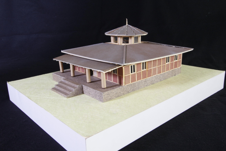
Nepal Gompa Project. Photo by Voluntary Architects' Network


– Besides providing people with housing, in Nepal you are keeping the tradition of creating a symbol of hope and recovery by constructing a temple (as in Kobe and Christchurch). How have you designed a Buddhist ecclesiastical fortification?

– We are designing a Buddhist temple in a place called Simigaon. Basis is using the same timber frame system as that of Nepal project, and a circular atrium with paper tube columns is incorporated to create sacred spatial atmosphere.

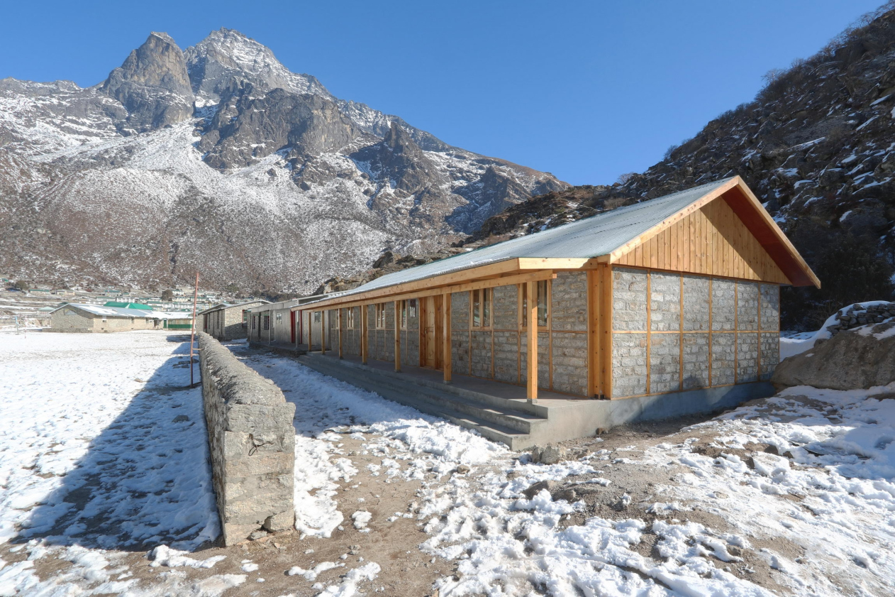
Secondary School in Khumjung, Nepal. Photo by Voluntary Architects' Network


– One of your objects that are under construction now is Khumjung School in Sagarmatha National Park. How is it different from Hualin temporary elementary school in Sichuan province in China?

– Hualin Temporary Elementary School is very different from the start. The Khumjung School was realized with the request from Doshisha University Alpine Club in Japan. Khumjung is situated at a much higher altitude, and we successfully utilized local construction method and materials. In Chengdu, on the other hand, we asked the local authority directly requesting to build elementary school while on our visit to affected areas believing we can provide support to those needed. Construction was carried out by Japanese and Chinese students and teachers, while in Khumjung, a local contractor was in charge of construction work.

– What is your impression of Nepal as a venue for disaster relief project? (Were there any specific challenges for project realization posed by mountainous location, governmental administrative system or mentality of locals? Were there any particular advantages for project realization in Nepal?)

– With many NGOs in Japan supporting, Nepal has a charm of attracting people. As regions around Kathmandu and those in the Himalayas have different available construction materials, the design has to be adjusted accordingly. For instance, the infills for the timber frames in Kathmandu region are bricks whereas stones are used in the mountainous regions of the Himalayas.

– Do you trace the performance of your constructions (disaster relief temporary and permanent housing) when the project is over? Do you come back to disaster struck zones you were revitalizing after the project is over?

– In Japan, we built temporary houses after the earthquakes in Tohoku (2011) and Kumamoto (2016). I still find time to visit these places and check what is needed locally. After the Kumamoto temporary houses were completed, we made a number of visits. After hearing back from the residents, we made furniture such as kitchen side tables to make best use of the space.

– In your disaster relief projects you usually develop partnerships with local actors – universities and architects. How do you choose these local partners? What is their role in implementing the disaster relief project?

– For the selection of project partners, we sometimes approach local universities or architectural offices, but we also at times receive offers from them. We often invite students to participate in the construction work, and ask local architectural offices to communicate with local authorities and contractors.

– Implementation of disaster relief projects usually is done with the help of volunteers. What is the most challenging part of working with volunteers for you?

– Working with volunteers stimulates design challenges, as it is important to think about the simplest construction methods and to provide safe construction environment in order to work with volunteers.

– How do you usually raise funds for disaster relief projects?

– We receive donations from individuals and companies. Several companies have been continuously supporting our projects.

– Do you follow activities of any other architectural practice that launches disaster relief initiatives? Have you ever been cooperating with any of them?

– Although not paying particular attention to the activities of other architects, we have been cooperating with AMDA, a medical NGO in Japan, for a number of projects.
17 April 2017

Headlines now
The Golden Crown
The concept for a dental clinic in Yekaterinburg, developed by CNTR Studio, revolves around the idea of a “mouth full of gold”: pristine white porcelain stoneware walls are complemented by matte brass details. To avoid an overly literal interpretation, the architects focused on the building’s proportions, skillfully navigating between sunlight requirements and fire safety regulations.
Flexibility and Integration
Not long ago, we covered the project for the fourth phase of the ÁLIA residential complex, designed by APEX. Now, we’ve been shown different fence concepts they developed to enclose the complex’s private courtyards, incorporating a variety of public functions. We believe that the sheer fact that the complex’s architects were involved in such a detail as fencing speaks volumes.
A Step Forward
The HIDE residential complex represents a major milestone for ADM architects and their leaders Andrey Romanov and Ekaterina Kuznetsova in their quest for a fresh high-rise aesthetic – one that is flexible and layered, capable of bringing vibrancy to mass and silhouette while shaping form. Over recent years, this approach has become ADM’s “signature style”, with the golden HIDE tower playing a pivotal role in its evolution. Here, we delve into the project’s story, explore the details of the complex’s design, and uncover its core essence.
Gold in the Sands
A new office for a transcontinental company specializing in resource extraction and processing has opened in Dubai. Designed by T+T Architects, masters of creating spaces that are contemporary, diverse, flexible, and original, this project exemplifies their expertise. On the executive floor, a massive brass-clad partition dominates, while layered textures of compressed earth create a contextually resonant backdrop.
Layers and Levels of Flight
This project goes way back – Reserve Union won this architectural competition at the end of 2011, and the building was completed in 2018, so it’s practically “archival”. However, despite being relatively unknown, the building can hardly be considered “dated” and remains a prime example of architectural expression, particularly in the headquarters genre. And it’s especially fitting for an aviation company office. In some ways, it resembles the Aeroflot headquarters at Sheremetyevo but with its own unique identity, following the signature style of Vladimir Plotkin. In this article, we take an in-depth look at the United Aircraft Corporation (UAC) headquarters in the Moscow agglomeration town of Zhukovsky, supplemented by recent photographs from Alexey Naroditsky – a shoot that became only recently possible due to the fact that improvements were finally made in the surrounding area.
Light and Shadow
In this article, we delve into the architectural design of the “Chaika” house by DNK ag architects, which was recently completed in 2023 as part of the collection of signature designs at ZILArt. As is well-known, all the buildings in this complex follow a design code, yet each one is distinct. This particular building stands out not only for its whiteness and minimalism but also for the refined use of a limited number of techniques that, together, create what can confidently be called synergy.
Casus Novae
A master plan was developed for a large residential area with a name of “DNS City”, but now that its implementation began, the plan has been arbitrarily reformatted and replaced with something that, while similar on the surface, is actually quite different. This is not the first time such a thing happens, but it’s always frustrating. With permission from the author, we are sharing Maria Elkina’s post.
Treasure Hunting
The GAFA bureau, in collaboration with Tegola and Arkhitail, organized an expedition to the island of Kilpola in Karelia as part of Moskomarkhitektura’s “Open City” festival. There, amidst moss and rocks, the students sought answers to questions like: what is the sacred, where does it dwell, and what sustains it? Assisting the participants in this quest were landscape engineer Evgeny Levin, artist Nicholas Roerich, a moose, and the lack of cellular connection. Here’s how the story unfolded.
Depths of the Earth, Streams of Water
In the Malaya Okhta district, the Akzent building, designed by Stepan Liphart, was constructed. It follows a classic tripartite structure, yet it’s what you might call “hand-drawn”: each façade is unique in its form and details, some of which aren’t immediately noticeable. In this article, we explore the context and, together with the architect, delve into how the form was developed.
Fir Tree Dynamics
The “Airports of Region” holding is planning to build an airport in Karachay-Cherkessia, aiming to make the Arkhyz and Dombay resorts more accessible to travelers. The project that won in an invitation-only competition, submitted by Sergey Nikeshkin’s KPLN, blends natural imagery inspired by the shape of a conifer seed, open-air waiting spaces, majestic large trees, and a green roof elevated on needle-like columns. The result is both nature-inspired and WOW.
​A Brick Shell
In the process of designing a clubhouse situated among pine trees in a prestigious suburban area near Moscow, the architectural firm “A.Len” did the façade design part. The combination of different types of brick and masonry correlates with the volumetric and plastique solutions, further enhanced by the inclusion of wood-painted fragments and metal “glazing”.
Word Forms
ATRIUM architects love ambitious challenges, and for the firm’s thirtieth anniversary, they boldly play a game of words with an exhibition that dives deep into a self-created vocabulary. They immerse their projects – especially art installations – into this glossary, as if plunging into a current of their own. You feel as if you’re flowing through the veins of pure art, immersed in a universe of vertical cities, educational spaces – of which the architects are true masters – and the cultural codes of various locations. But what truly captivates is the bold statement that Vera Butko and Anton Nadtochy make, both through their work and this exhibition: architecture, above all, is art – the art of working with form and space.
Flexibility and Acuteness of Modernity
Luxurious, fluid, large “kokoshniks” and spiral barrel columns, as if made from colorful chewing gum: there seem to be no other mansion like this in Moscow, designed in the “Neo-Russian-Modern” style. And the “Teremok” on Malaya Kaluzhskaya, previously somewhat obscure, has “come alive with new colors” and gained visibility after its restoration for the office of the “architectural ecosystem” as the architects love to call themselves. It’s evident that Julius Borisov and the architects at UNK put their hearts into finding this new office and bringing it up to date. Let’s delve into the paradoxes of this mansion’s history and its plasticity. Spoiler: two versions of modernity meet here, both balancing on the razor’s edge of “what’s current”.
Yuri Vissarionov: “A modular house does not belong to the land”
It belongs to space, or to the air... It turns out that 3D printing is more effective when combined with a modular approach: the house is built in a workshop and then adapted to the site, including on uneven terrain. Yuri Vissarionov shares his latest experience in designing tourist complexes, both in central Russia and in the south. These include houseboats, homes printed from lightweight concrete using a 3D printer, and, of course, frame houses.
​Moscow’s First
“The quality of education largely depends on the quality of the educational environment”. This principle of the last decade has been realized by Sergey Skuratov in the project for the First Moscow Gymnasium on Rostovskaya Embankment in the Khamovniki district. The building seamlessly integrates into the complex urban landscape, responding both to the pedestrian flow of the city and the quiet alleyways. It skillfully takes advantage of the height differences and aligns with modern trends in educational space design. Let’s take a closer look.
Looking at the Water
The site of Villa Sonata stretches from the road to the water’s edge, offering its own shoreline, pier, and a picturesque river panorama. To reveal these sweeping views, Roman Leonidov “cut” the façade diagonally parallel to the river, thus getting two main axes for the house and, consequently, “two heads”. The internal core – two double-height spaces, a living room and a conservatory, with a “bridge” above them – makes the house both “transparent” and filled with light.
The White Wing
Well, it’s not exactly white. It’s more of a beige, white-stone structure that plays with the color of limestone – smoother surfaces are lighter, while rougher ones are darker. This wing unites various elements: it absorbs and interprets the surrounding themes. It responds to everything, yet maintains a cohesive expression – a challenging task! – while also incorporating recognizable features of its own, such as the dynamic cuts at the bottom, top, and middle.
Urban Dunes
The XSA Ramps team designed and built a three-part sports hub for a park in Rostov-on-Don, welcoming people of all ages and fitness levels. The skate plaza, pump track, and playground are all meticulously crafted with details that attract a diverse range of visitors. The technical execution of the shapes and slopes transforms this space into a kind of sculptural composition.
Proportional Growth
The project for the fourth phase of the ÁLIA residential area has been announced. The buildings are situated on an elongated plot – almost a “ray” that shoots out from the center of the area towards the river. Their layout reflects both a response to Moscow’s architectural preferences over the past 15 years, shifting “from blocks to towers”, and an interpretation of the neighboring business park designed by SOM. Additionally, the best apartments here are not located at the very top but closer to the middle, forming a glowing “waistline”.
The “Staircase” Building
In designing the “Details” residential complex in New Moscow, Rais Baishev spiced up the now-popular Moscow theme of a “courtyard” building with an idea drawn from the surrealist drawings by Maurits Escher. He envisioned the stepped silhouettes and descending slopes as a metaphysical mega-staircase, creating a key void within the courtyard that gave the project an internal “spine”. This concept is felt both in the building’s silhouette and on its façades.
Projection of the Quarter
No one doubted that the building that Vladimir Plotkin designed as part of the “Garden Quarters” would be the most modernist of all. And it turned out just that way: while adhering to the common design code, the building successfully combines brick and white stone, rhythmically responding to the neighboring building designed by Ostozhenka, yet tactfully and persistently making a few statements of its own. This includes the projection of the ideal urban development composition “14–9–6”, which can be found right next door, mathematical calculations, including those for various types of terraces (and perhaps the only reminder of the Soviet past of the Kauchuk rubber factory!), and the white “cross-stitch” pattern of the façade grid.
Domus Aurea
In this issue, we examine the “Tessinsky-1” house, designed by Sergey Skuratov and completed in 2023. Located in the middle of the Serebryanicheskaya Embankment district, at the intersection of its main streets, this house assumes a sort of “nodal” role: it not only responds to everything around it and preserves many memories of the former EMA factory within itself, but it weaves all this into a newly directed pattern, reconciling bright “gold” and dark-colored brick, largely with the help of the new, modern-yet-archaic Columba brick, which, come to think about it, is the most precious element here.
The Chimney of Nikola-Lenivets
In this issue, we are examining the “Obelisk House” designed by KATARSIS and built for the Arkhstoyanie 2023 festival. However, it was only finished later on, and this is why we are examining it now. It seems to us that after the “Obelisk House” appeared in Nikola-Lenivets, a dialogue and a few inner connections appeared between the temporary structures built here. These houses no longer look like “accidental neighbors”, more of which below.
​Periscope by the Bay
The jury awarded the second place in the competition for a public and cultural center in Petropavlovsk-Kamchatsky to the companies GORA (“Mountain”) and M4. In the consortium’s proposal, the building resembles a sperm whale with a calf swimming next to it or a periscope, whose lenses capture the most spectacular views from the surrounding landscape.
From Arcs to Dolmens
While working on the competition project for Petropavlovsk-Kamchatsky, ASADOV Architects prioritized the value of the natural and urban environment, aiming to preserve the balance of the location while minimizing the resemblance of the volume that they designed to a “traditional building”. The task was challenging, and the architects created three versions, one of which having been developed after the competition, where their main proposal took third place. However, the point of interest here is not the competition result but the continuity of creative thinking.
Hide and Seek
The ID Moskovskiy house, designed by Stepan Liphart in St. Petersburg, in the courtyards near Moskovskiy Avenue beyond the Obvodny Canal and recently completed, is notable for several reasons. Firstly, it has been realized with considerable accuracy, which is particularly significant as this is the first building where the architect was responsible not only for the facades but also for the layouts, allowing for better integration between the two. On the other hand, this building is interesting as an example of the “germination” of new architecture in the city: it draws on the best examples from the neighborhood and becomes an improved and developed sum of ideas found by the architect in the surrounding context.
The Big Twelve
Yesterday, the winners of the Moscow Mayor’s Architecture Award were announced and honored. Let’s take a look at what was awarded and, in some cases, even critique this esteemed award. After all, there is always room for improvement, right?
Above the Golden Horn
The residential complex “Philosophy” designed by T+T architects in Vladivostok, is one of the new projects in the “Golubinaya Pad” area, changing its development philosophy (pun intended) from single houses to a comprehensive approach. The buildings are organized along public streets, varying in height and format, with one house even executed in gallery typology, featuring a cantilever leaning on an art object.
Nuanced Alternative
How can you rhyme a square and space? Easily! But to do so, you need to rhyme everything you can possibly think of: weave everything together, like in a tensegrity structure, and find your own optics too. The new exhibition at GES-2 does just that, offering its visitor a new perspective on the history of art spanning 150 years, infused with the hope for endless multiplicity of worlds and art histories. Read on to see how this is achieved and how the exhibition design by Evgeny Ace contributes to it.
Blinds for Ice
An ice arena has been constructed in Domodedovo based on a project by Yuri Vissarionov Architects. To prevent the long façade, a technical requirement for winter sports facilities, from appearing monotonous, the architects proposed the use of suspended structures with multidirectional slats. This design protects the ice from direct sunlight while giving the wall texture and detail.