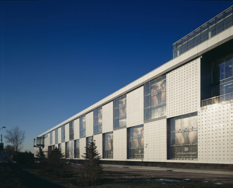
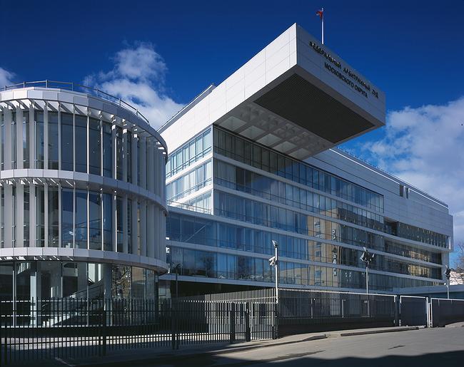
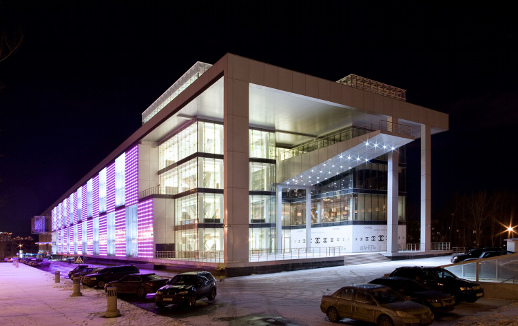
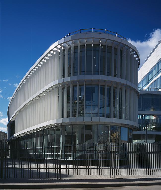
We continue to publish texts of interview with architects - participants of an exposition of the Russian pavilion on XI Venetian biennial
17 July 2008
Репортаж
Architect:
Firm:
In Moscow you have a reputation as an extravagant character; journalists call you ‘the first dandy of Russian architecture’.
That’s their problem.
My point is this. At the same time, you are a committed fan of contemporary architecture, but not of distortion of space or non-linearity but of rectilinear Neomodernism – of structuralist architecture, I would say.
I don’t really know what Neomodernism is. But I could agree to Neostructuralism – if there is such a term.
It’s the kind of architecture in which everything is simple and clear. Here it’s difficult to say something new after the founding fathers of Modernism.
It’s generally the case that a building is something new. An unrepeatable combination of circumstances. And then, contemporary architecture is bound up with progress. There’s always something new appearing.
Yes, I understand: new square metres, new technologies, new functions, contemporary materials, unrepeatable combinations of electricity networks, water supplies, sewerage systems, and radically new management systems. It’s all extremely fascinating. But it’s not exactly where you’d expect to come across dandyism. Aestheticism, that is.
I don’t at all think that technology is what’s most important. Although, of course, you can’t help wanting to be up to standard, in the vanguard of progress. But it’s in this that we encounter difficulties deriving from our economy, the lack of steady knowledge and skill in working with modern materials and components. In our projects technological innovation has not yet become a natural part of the artistic concept. I’m sure this will come in time, but if we today take the view that innovative technology is what’s most important, that means that we Russians shall have to do without architecture. Management is a separate subject, being subordinate to architecture. I don’t consider myself a skilled negotiator, and this is something that holds no interest for me. But what is unrepeatable is form, above all. But what exactly can be unrepeatable here? What new forms have arisen in modern architecture compared with Constructivism or Modernism in general. Respect for context? The contextual approach?
No, it’s not a matter of context either. In general, I think that orientation on contextuality is where we go wrong today. It leads to dullness, stagnation, and, most unpleasantly of all, progressive deterioration of the context. If you try to be more modest, less conspicuous than your neighbour, the next step thing to happen will be that your (very modest) work of architecture will become the context, the next architect will create something even more modest, and so on. Buildings will become increasingly less conspicuous – and worse. I can agree that today’s Modernism, including its superior versions, is based on very, very easily reproducible techniques. Techniques that are so easy that they can be turned into a canon. Or, at the very least we might formulate and classify those persistent techniques and combinations of forms which have become standards over the course of time and which are beloved of absolutely the entire architectural establishment. And it hardly needs to be said that canonicity must contradict the idea of newness…
But where, then, is there room for quest? A canon is like military uniform. Everyone is dressed identically.
No, the exact opposite is true. It’s precisely at this point that you get space in which to conduct a quest. You have to change your point of view. Take, for instance, Classical architecture. I grew up in St Petersburg, and my first architectural impressions relate to Classicism. In Classicism no one looks for new forms. They look for perfection in forms that have already been found. Proportions, relations between masses, textures, and spaces – within the canonical Classical prototypes. Perhaps it would be worth looking at modern architecture from this point of view.
Would it look any different?
In fact, yes! Radically different. Take Constructivism. Strangely enough, Russian Constructivism has never been much of an influence on me. Of course, we are justly proud of it. But the Constructivists were inventors. They invented a new form, but did not manage to find the correct proportions of windows, apertures, columns. Their work is very raw. Apart from Leonidov, who had a real feeling for architecture, but never had anything actually built. [The architecture critic] Khan-Magamedov once wrote that modern architecture is still only beginning and Constructivism and Modernism are like ancient classics. Like the first Doric temples of the 7th-6th centuries BC – they’re very expressive, but very coarse. They established the canon, but were followed by the architecture of the age of the Parthenon. This is a direction that I would consider worth moving in.
Yes, there are still plenty of places to head for. A long journey ahead of us.
You’re being ironic. In actual fact, there were architects who took decisive steps. Incidentally, for me Le Corbusier is not so much an inventor as someone with unique aesthetic intuition. He is, of course, innovator No. 1, but he nevertheless has an amazing sense of harmony and proportion. And when he began having ideas on the subject of the modulor, this was simply his desire to receive mathematical confirmation of his artistic intuition. There is another person like him – Mies. I adored Mies van der Rohe until I was weak in the knees. I am not at all a sentimental person and always thought that nothing could melt me, but when I first found myself in Barcelona and saw his pavilion, I could no longer understand the point of our doing architecture! Yes, of course, this is aesthetic architecture. Everything in it has been reduced to incredibly elegant formula. And it’s the elegance that’s the main thing; the formula itself is fairly elementary. On this subject I have a question for you. In the 70s criticism of Modernism and the rejection of it were a reaction to this elementariness, to the desire to reduce complexity and contradiction to, as Venturi put it, an elementary rectangular grid. And even the return to contemporary architecture that we experienced in the 90s was based on a rejection of this elementariness. This is where our non-linear architecture comes from. But your take is that all we need to do is merely polish the formulae of the simple Modernist grid?
No. That’s not it. In fact, everything is much more complex. First, not a grid. At least, not for me today – not a grid. A matrix, more like. A multidimensional matrix – two-, three-, or four-dimensional. Function, construction, urban-planning situation, physical space, human behaviour – all this has dimensionality; each element has its own – so you get a multitude of grids with different dimensionalities. The objective is to discover these grids, organize them, relate them to each another, and lay them on one another. The result is a multidimensional object with many different scales – relating to distance, time, function, structural elements. Each unit is a complex number. And it’s very important at this level to find the right scale of proportions to ensure that all units relate to one another harmoniously. These are complex harmonies where a single element fits into several harmonic sequences at the same time. As in classical music.
So you end up with a complex order instead of a simple one. Instead of a multiplication table, you get a table of logarithms. But it’s still a table. As for the essence of the Neomodernist revolution – although you’re not fond of this term, – it lay in an attempt to introduce the principle of indeterminacy, chance, unpredictability into modern architecture. An attempt to step away from the table into the chaos of the non-linear process.
Exactly. I’ve been talking only about what comes first. First, the matrix. But this is not yet architecture. It has neither beginning nor end; it’s the law for constructing a world for a given particular case, but it is not that world itself. There are laws of physics and there is the earth, which exists in accordance with these laws. And, when you know the laws, you can say a lot about the properties of the earth, but you cannot predict what it will look like. It’s the same here. For me the principle of dualism is important. There is both matter and spirit. The matrix is matter, the laws by which matter is constructed. And then there is life itself, which is unpredictable, incidental; this is spirit. It’s how an object lives. First, the matrix, and then life, which is the most interesting part! It’s precisely the unpredictable, unexpected, incidental movement of architectural matter that is the sign of the spirit. It’s important not to lose it, not to drown it in the grid. You have to contain this unpredictability, non-logicality in the rigid logic of the matrix that you have yourself created. Miss out a cell. Permit something not to be part of the matrix, to live its own life. Emphasize the weak beat, as in music. Here there’s a whole host of possibilities; it’s fascinating. When you arbitrarily fill in a proper matrix with various beautiful things, it can lead to unexpected, unpredictable, surprising results. In my projects I always try to surprise. There’s no art without surprise.
Are you a philosopher?
No, I’m an architect. For some reason, critics are fond of defining architects by other professions, seeing them as artists, businessmen, academics, or politicians. I’m an architect. In my opinion, this is the very essence of the architectural profession – to find the laws of life in the space that has been allocated to you, to impart to them the refined precision of the golden section, and then allow life to flow through the space in whatever way it will. This is difficult to describe; but you can see it immediately in the design for a building. Have any contemporary foreign architects been an influence on you?
No, I don’t think so. Le Corbusier, of course, but you’re asking about contemporary architects. I have somehow never needed such influences. I worked for Bofill’s office in Paris, but Bofill has very different tastes from me. I don’t try to create architecture that would resemble anyone else’s, even if a client likes a particular prototype. And I don’t try to create architecture that doesn’t resemble anyone else’s. I simply look for what needs to be done and do it.
So your architecture is your own, Russian?
No, that’s not true either. I don’t try to create specifically Russian architecture. I simply create contemporary architecture. In Russia – although I could also create it somewhere else.
The Golden Crown
The concept for a dental clinic in Yekaterinburg, developed by CNTR Studio, revolves around the idea of a “mouth full of gold”: pristine white porcelain stoneware walls are complemented by matte brass details. To avoid an overly literal interpretation, the architects focused on the building’s proportions, skillfully navigating between sunlight requirements and fire safety regulations.
Flexibility and Integration
Not long ago, we covered the project for the fourth phase of the ÁLIA residential complex, designed by APEX. Now, we’ve been shown different fence concepts they developed to enclose the complex’s private courtyards, incorporating a variety of public functions. We believe that the sheer fact that the complex’s architects were involved in such a detail as fencing speaks volumes.
A Step Forward
The HIDE residential complex represents a major milestone for ADM architects and their leaders Andrey Romanov and Ekaterina Kuznetsova in their quest for a fresh high-rise aesthetic – one that is flexible and layered, capable of bringing vibrancy to mass and silhouette while shaping form. Over recent years, this approach has become ADM’s “signature style”, with the golden HIDE tower playing a pivotal role in its evolution. Here, we delve into the project’s story, explore the details of the complex’s design, and uncover its core essence.
Gold in the Sands
A new office for a transcontinental company specializing in resource extraction and processing has opened in Dubai. Designed by T+T Architects, masters of creating spaces that are contemporary, diverse, flexible, and original, this project exemplifies their expertise. On the executive floor, a massive brass-clad partition dominates, while layered textures of compressed earth create a contextually resonant backdrop.
Layers and Levels of Flight
This project goes way back – Reserve Union won this architectural competition at the end of 2011, and the building was completed in 2018, so it’s practically “archival”. However, despite being relatively unknown, the building can hardly be considered “dated” and remains a prime example of architectural expression, particularly in the headquarters genre. And it’s especially fitting for an aviation company office. In some ways, it resembles the Aeroflot headquarters at Sheremetyevo but with its own unique identity, following the signature style of Vladimir Plotkin. In this article, we take an in-depth look at the United Aircraft Corporation (UAC) headquarters in the Moscow agglomeration town of Zhukovsky, supplemented by recent photographs from Alexey Naroditsky – a shoot that became only recently possible due to the fact that improvements were finally made in the surrounding area.
Light and Shadow
In this article, we delve into the architectural design of the “Chaika” house by DNK ag architects, which was recently completed in 2023 as part of the collection of signature designs at ZILArt. As is well-known, all the buildings in this complex follow a design code, yet each one is distinct. This particular building stands out not only for its whiteness and minimalism but also for the refined use of a limited number of techniques that, together, create what can confidently be called synergy.
Casus Novae
A master plan was developed for a large residential area with a name of “DNS City”, but now that its implementation began, the plan has been arbitrarily reformatted and replaced with something that, while similar on the surface, is actually quite different. This is not the first time such a thing happens, but it’s always frustrating. With permission from the author, we are sharing Maria Elkina’s post.
Treasure Hunting
The GAFA bureau, in collaboration with Tegola and Arkhitail, organized an expedition to the island of Kilpola in Karelia as part of Moskomarkhitektura’s “Open City” festival. There, amidst moss and rocks, the students sought answers to questions like: what is the sacred, where does it dwell, and what sustains it? Assisting the participants in this quest were landscape engineer Evgeny Levin, artist Nicholas Roerich, a moose, and the lack of cellular connection. Here’s how the story unfolded.
Depths of the Earth, Streams of Water
In the Malaya Okhta district, the Akzent building, designed by Stepan Liphart, was constructed. It follows a classic tripartite structure, yet it’s what you might call “hand-drawn”: each façade is unique in its form and details, some of which aren’t immediately noticeable. In this article, we explore the context and, together with the architect, delve into how the form was developed.
Fir Tree Dynamics
The “Airports of Region” holding is planning to build an airport in Karachay-Cherkessia, aiming to make the Arkhyz and Dombay resorts more accessible to travelers. The project that won in an invitation-only competition, submitted by Sergey Nikeshkin’s KPLN, blends natural imagery inspired by the shape of a conifer seed, open-air waiting spaces, majestic large trees, and a green roof elevated on needle-like columns. The result is both nature-inspired and WOW.
A Brick Shell
In the process of designing a clubhouse situated among pine trees in a prestigious suburban area near Moscow, the architectural firm “A.Len” did the façade design part. The combination of different types of brick and masonry correlates with the volumetric and plastique solutions, further enhanced by the inclusion of wood-painted fragments and metal “glazing”.
Word Forms
ATRIUM architects love ambitious challenges, and for the firm’s thirtieth anniversary, they boldly play a game of words with an exhibition that dives deep into a self-created vocabulary. They immerse their projects – especially art installations – into this glossary, as if plunging into a current of their own. You feel as if you’re flowing through the veins of pure art, immersed in a universe of vertical cities, educational spaces – of which the architects are true masters – and the cultural codes of various locations. But what truly captivates is the bold statement that Vera Butko and Anton Nadtochy make, both through their work and this exhibition: architecture, above all, is art – the art of working with form and space.
Flexibility and Acuteness of Modernity
Luxurious, fluid, large “kokoshniks” and spiral barrel columns, as if made from colorful chewing gum: there seem to be no other mansion like this in Moscow, designed in the “Neo-Russian-Modern” style. And the “Teremok” on Malaya Kaluzhskaya, previously somewhat obscure, has “come alive with new colors” and gained visibility after its restoration for the office of the “architectural ecosystem” as the architects love to call themselves. It’s evident that Julius Borisov and the architects at UNK put their hearts into finding this new office and bringing it up to date. Let’s delve into the paradoxes of this mansion’s history and its plasticity. Spoiler: two versions of modernity meet here, both balancing on the razor’s edge of “what’s current”.
Yuri Vissarionov: “A modular house does not belong to the land”
It belongs to space, or to the air... It turns out that 3D printing is more effective when combined with a modular approach: the house is built in a workshop and then adapted to the site, including on uneven terrain. Yuri Vissarionov shares his latest experience in designing tourist complexes, both in central Russia and in the south. These include houseboats, homes printed from lightweight concrete using a 3D printer, and, of course, frame houses.
Moscow’s First
“The quality of education largely depends on the quality of the educational environment”. This principle of the last decade has been realized by Sergey Skuratov in the project for the First Moscow Gymnasium on Rostovskaya Embankment in the Khamovniki district. The building seamlessly integrates into the complex urban landscape, responding both to the pedestrian flow of the city and the quiet alleyways. It skillfully takes advantage of the height differences and aligns with modern trends in educational space design. Let’s take a closer look.
Looking at the Water
The site of Villa Sonata stretches from the road to the water’s edge, offering its own shoreline, pier, and a picturesque river panorama. To reveal these sweeping views, Roman Leonidov “cut” the façade diagonally parallel to the river, thus getting two main axes for the house and, consequently, “two heads”. The internal core – two double-height spaces, a living room and a conservatory, with a “bridge” above them – makes the house both “transparent” and filled with light.
The White Wing
Well, it’s not exactly white. It’s more of a beige, white-stone structure that plays with the color of limestone – smoother surfaces are lighter, while rougher ones are darker. This wing unites various elements: it absorbs and interprets the surrounding themes. It responds to everything, yet maintains a cohesive expression – a challenging task! – while also incorporating recognizable features of its own, such as the dynamic cuts at the bottom, top, and middle.
Urban Dunes
The XSA Ramps team designed and built a three-part sports hub for a park in Rostov-on-Don, welcoming people of all ages and fitness levels. The skate plaza, pump track, and playground are all meticulously crafted with details that attract a diverse range of visitors. The technical execution of the shapes and slopes transforms this space into a kind of sculptural composition.
Proportional Growth
The project for the fourth phase of the ÁLIA residential area has been announced. The buildings are situated on an elongated plot – almost a “ray” that shoots out from the center of the area towards the river. Their layout reflects both a response to Moscow’s architectural preferences over the past 15 years, shifting “from blocks to towers”, and an interpretation of the neighboring business park designed by SOM. Additionally, the best apartments here are not located at the very top but closer to the middle, forming a glowing “waistline”.
The “Staircase” Building
In designing the “Details” residential complex in New Moscow, Rais Baishev spiced up the now-popular Moscow theme of a “courtyard” building with an idea drawn from the surrealist drawings by Maurits Escher. He envisioned the stepped silhouettes and descending slopes as a metaphysical mega-staircase, creating a key void within the courtyard that gave the project an internal “spine”. This concept is felt both in the building’s silhouette and on its façades.
Projection of the Quarter
No one doubted that the building that Vladimir Plotkin designed as part of the “Garden Quarters” would be the most modernist of all. And it turned out just that way: while adhering to the common design code, the building successfully combines brick and white stone, rhythmically responding to the neighboring building designed by Ostozhenka, yet tactfully and persistently making a few statements of its own. This includes the projection of the ideal urban development composition “14–9–6”, which can be found right next door, mathematical calculations, including those for various types of terraces (and perhaps the only reminder of the Soviet past of the Kauchuk rubber factory!), and the white “cross-stitch” pattern of the façade grid.
Domus Aurea
In this issue, we examine the “Tessinsky-1” house, designed by Sergey Skuratov and completed in 2023. Located in the middle of the Serebryanicheskaya Embankment district, at the intersection of its main streets, this house assumes a sort of “nodal” role: it not only responds to everything around it and preserves many memories of the former EMA factory within itself, but it weaves all this into a newly directed pattern, reconciling bright “gold” and dark-colored brick, largely with the help of the new, modern-yet-archaic Columba brick, which, come to think about it, is the most precious element here.
The Chimney of Nikola-Lenivets
In this issue, we are examining the “Obelisk House” designed by KATARSIS and built for the Arkhstoyanie 2023 festival. However, it was only finished later on, and this is why we are examining it now. It seems to us that after the “Obelisk House” appeared in Nikola-Lenivets, a dialogue and a few inner connections appeared between the temporary structures built here. These houses no longer look like “accidental neighbors”, more of which below.
Periscope by the Bay
The jury awarded the second place in the competition for a public and cultural center in Petropavlovsk-Kamchatsky to the companies GORA (“Mountain”) and M4. In the consortium’s proposal, the building resembles a sperm whale with a calf swimming next to it or a periscope, whose lenses capture the most spectacular views from the surrounding landscape.
From Arcs to Dolmens
While working on the competition project for Petropavlovsk-Kamchatsky, ASADOV Architects prioritized the value of the natural and urban environment, aiming to preserve the balance of the location while minimizing the resemblance of the volume that they designed to a “traditional building”. The task was challenging, and the architects created three versions, one of which having been developed after the competition, where their main proposal took third place. However, the point of interest here is not the competition result but the continuity of creative thinking.
Hide and Seek
The ID Moskovskiy house, designed by Stepan Liphart in St. Petersburg, in the courtyards near Moskovskiy Avenue beyond the Obvodny Canal and recently completed, is notable for several reasons. Firstly, it has been realized with considerable accuracy, which is particularly significant as this is the first building where the architect was responsible not only for the facades but also for the layouts, allowing for better integration between the two. On the other hand, this building is interesting as an example of the “germination” of new architecture in the city: it draws on the best examples from the neighborhood and becomes an improved and developed sum of ideas found by the architect in the surrounding context.
The Big Twelve
Yesterday, the winners of the Moscow Mayor’s Architecture Award were announced and honored. Let’s take a look at what was awarded and, in some cases, even critique this esteemed award. After all, there is always room for improvement, right?
Above the Golden Horn
The residential complex “Philosophy” designed by T+T architects in Vladivostok, is one of the new projects in the “Golubinaya Pad” area, changing its development philosophy (pun intended) from single houses to a comprehensive approach. The buildings are organized along public streets, varying in height and format, with one house even executed in gallery typology, featuring a cantilever leaning on an art object.
Nuanced Alternative
How can you rhyme a square and space? Easily! But to do so, you need to rhyme everything you can possibly think of: weave everything together, like in a tensegrity structure, and find your own optics too. The new exhibition at GES-2 does just that, offering its visitor a new perspective on the history of art spanning 150 years, infused with the hope for endless multiplicity of worlds and art histories. Read on to see how this is achieved and how the exhibition design by Evgeny Ace contributes to it.
Blinds for Ice
An ice arena has been constructed in Domodedovo based on a project by Yuri Vissarionov Architects. To prevent the long façade, a technical requirement for winter sports facilities, from appearing monotonous, the architects proposed the use of suspended structures with multidirectional slats. This design protects the ice from direct sunlight while giving the wall texture and detail.