По-русски

Evgeny Gerasimov: we are interested in designing for Saint Petersburg

In this article, we are speaking to the architect on the occasion of the 25th anniversary of the bureau “Evgeny Gerasimov and Partners”: about the lineup of his studio, about the diversity of tasks that his company handles, about the specifics of its working processes, about partnership with Sergey Tchoban, and about the soviet and post-soviet architecture.

26 December 2016
Interview
mainImg

Archi.ru:
– The name of your company is “Evgeny Gerasimov and Partners”, these partners being Zoe Petrova and Victor Khivrich?

Evgeny Gerasimov:
– Currently, we have two more partners: Karen Smirnov and Tatyana Komaldinova. Yes, Victor Khivrich and Zoe Petrova have been with us from the very start. We go back a long way with Zoe Petrova – we worked together when still in Lenniiproject. We build our relationship just like partners should: there is a senior partner, not in terms of his age but in terms of his share in the company, and the right to vote differs accordingly. I am the one who makes the final decisions.

– How do you make your decisions?

– We have absolute democracy when it comes to discussion and absolute dictatorship when it comes to implementation. Regardless of their position, be that a young architect or an experienced chief architect of the project, when we start working on a project we consider everybody’s ideas. For each project, we create a workgroup, and, together with me, they arrive at a final decision. Once we’ve made a decision, we cannot afford to swing back and forth and turn to the options that we’ve discarded.

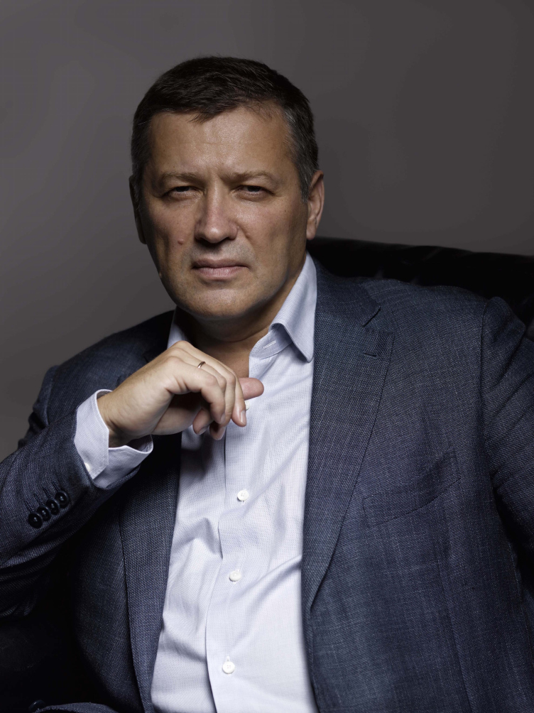
Evgeny Gerasimov. Photo courtesy by "Evgeny Gerasimov and Partners"
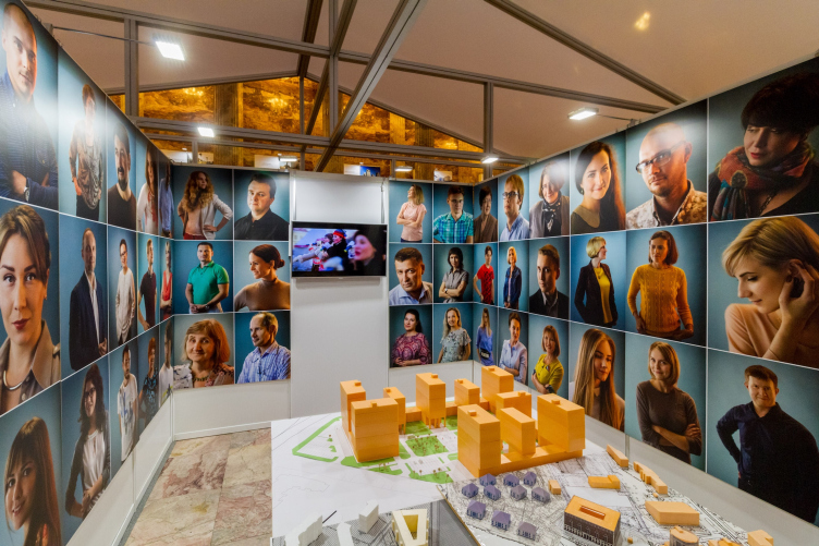
The inauguration of the exhibition for the 25th anniversary of "Eugene Gerasimov and Partners". Saint Petersburg, 11.10.2016. Photo © Ivan Kostin


– Are there groups of “classics” and “modernists” in your bureau?

– No, there is no such specialization. We proceed from the location, and, of course, from the customer. And, if the customer wants traditional architecture, you either agree to do the project or just opt out of it. Of course, you can choose one style only and then stick to it, and this is worthy of respect, but, the way I see it, such approach is monotonous.

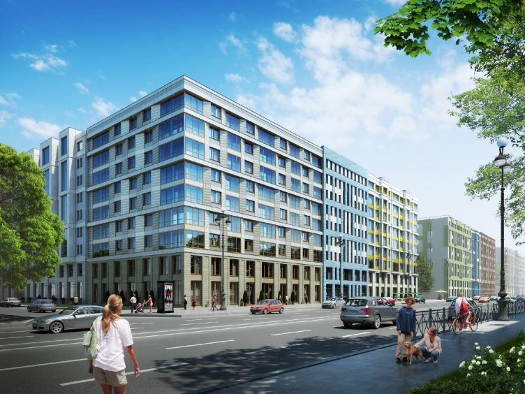
Multiapartment building with inserted premises on the Morskoy Avenue © Eugene Gerasimov and Partners


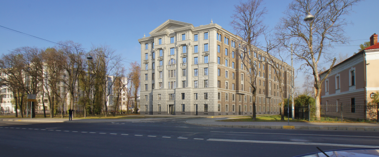
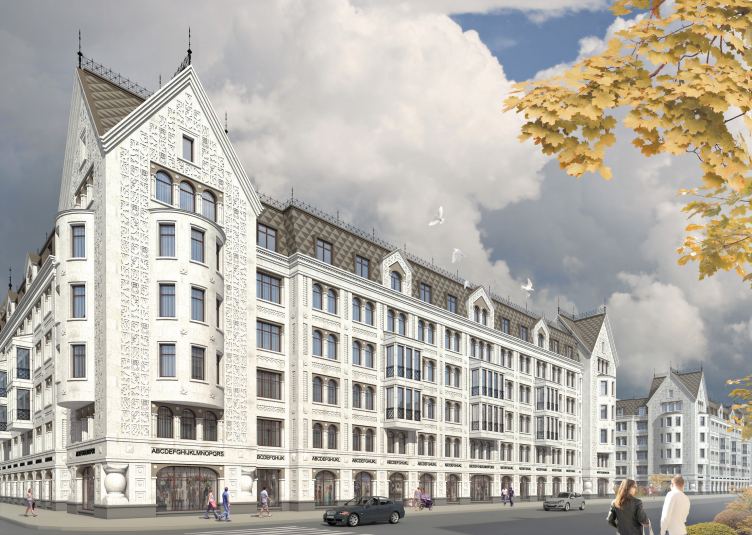
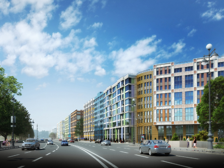
Multiapartment buildings on the Komendantsky Prospect. View from the Glukharskaya Street. Project, 2015 © Evgeny Gerasimov and Partners


– What would you name as the main achievement of your company?

– First of all, the sheer fact of its existence; we’ve been around since 1991, and that’s quite a while! And, of course, our projects that have been implemented! Whether somebody likes them or not is a different matter. What matters is the fact that there are a large number of implemented projects that we designed, and for which, among other things, we prepared the working documents.

Our company is focused on designing buildings from the original idea down to the last detailed drawing. We do not put ourselves above the “crude” work, furthermore, we are sure that only if you prepare your working documents yourself, you get a chance to have you project built exactly the way you designed it.

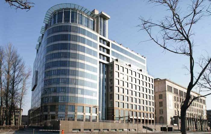
Administrative, business and public center "Nevskaya Ratusha". Construction, 2016. Evgeny Gerasimov and Partners, SPEECH, nps tchoban voss. Photos © Yuri Slavtsov


Multifunctional complex "Alkon III" at the Leningradsky Avenue. Project, 2014 © Evgeny Gerasimov and Partners


– Let’s speak about your background. How did you come into architecture?

– I finished an art school, and, on the one hand, I did not see myself as a pure artist, and, on the other hand, I wanted to have a profession that would still be related to arts and drawing. Back in those days, I was still pretty vague about such things... I was born in Siberia but my childhood, until I was seven, I think, fell on Saint Petersburg. Then we left, due to family circumstances. But when I decided to take up architecture I came to Leningrad again. In 1983 I finished Saint Petersburg State University of Architecture and Civil Engineering, and then I worked at Lenniiproject.

– Who would you name as your teacher?

– I learned from many people. In the college, my professor was Leonid Lavrov. In Lenniiproject, I worked for a long time under the supervision of Yuri Mityurev who was to become later on the chief architect of the city. The head of the studio that I worked at was Oleg Kharchenko who was also the main architect of the city for a long time. And they don’t appoint just anyone as the chief architect of the city. This has to be the right person with a certain frame of mind, and with certain architectural and organizational skills, and I am sure that I’ve been really lucky to work under the guidance of such great people. I saw how these people could draw, think, and work; how they prepared their presentations – because we had no computers back then, and you had to draw by hand – how expertly skillful these people were with the drafting pen, ink, water colors, gouache, and how they could draw perspective drawings simply by hand.

– You founded your company back in 1991. How did it happen?

– In 1990, Mityurev and I left Lenniiproject, and he founded an architectural studio of his own. For half a year, I worked as his deputy director, but a while later we decided to go our separate ways.

– How did your company get along in the nineties? 

– It was a very romantic time, in fact. We started in a loft at the Fontanka River that had been formerly occupied by some homeless artists. We disinfested the places of rats ourselves, did all the repairs, and all the electrical work as well. It was there that we got our first computers... We started with drawing boards: water colors, wash drawings… Nobody knew anything about this stuff – how the future would look like, and what things would come along. A whole new class of clients was being formed, new housing typologies were developing, and new construction materials and technologies were introduced. We had to catch all these things on the fly. We had to learn to live and work in a new country.

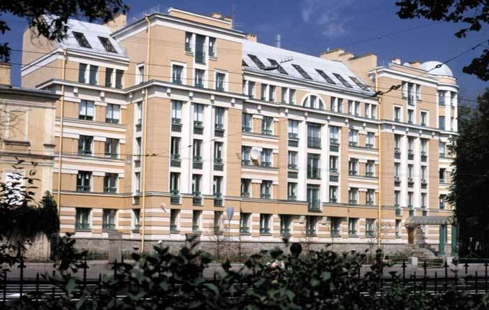
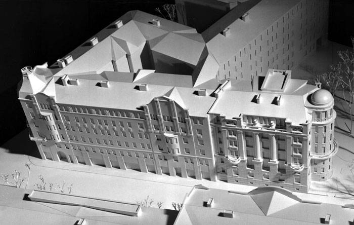
Multi-apartment building with integrated premises in Baskov Alley © Evgeny Gerasimov and Partners


– How did the idea come about of one of your earliest famous projects - that neoclassical and at the same time postmodernist house on the Kamennoostrovsky Avenue?

– This was the first project that we did for LSR Company. Yes, it was pure postmodernism because at that time we were still hungry for it. When in 1991 freedom was proclaimed, postmodernism was a field that was still unexplored by the soviet architects; we started to eagerly absorb the fruits of postmodernist aesthetics. But then again, we clearly saw the neoclassical nature of that project because it is part of the Kamennoostrovsky Avenue – right across from it, there are these masterpieces by Shchuko and Lancere. We were to complete the even side of the Kamennoostrovsky Avenue. And, as for the style of that building, yes, it is postmodernism of a neoclassical nature with details that are a bit on the rough side.

zooming
A housing project on the Suvorovsky Avenue. Construction, 1998. Photo © Evgeny Gerasimov, A. Naroditsky


zooming
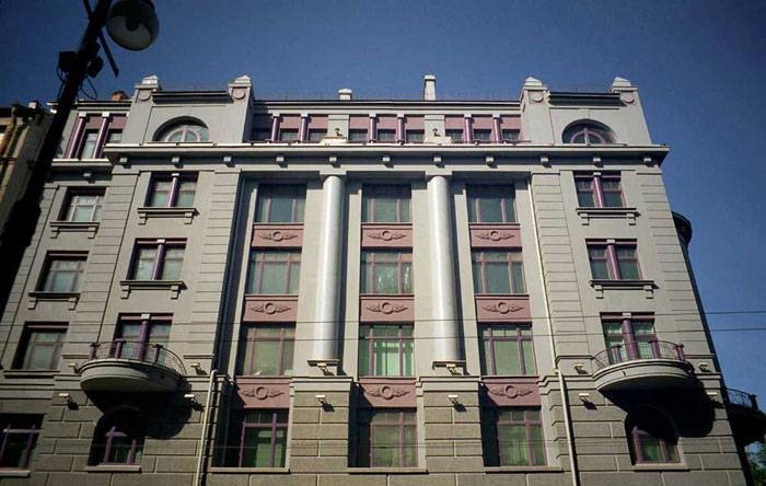
A residential building on the Kamennoostrovsky Avenue. Construction, 2000 © Evgeny Gerasimov and Partners


– In 2002, you got acquainted with your steady coauthor Sergey Tchoban. How did that acquaintance look to you at the time?

– I went to Berlin in order to examine its architecture that is iconic of postmodernism: Rob Krier, Mario Botta, and others, and the modern architecture of Berlin in general. Hitherto, I had never been to Berlin before. Oleg Kharchenko gave me Sergey Tchoban’s telephone number, and said that he thought it would be interesting for us to meet each other and maybe we would both benefit from it in some way. I had seen some works by Sergey, and he had seen some of mine but we had not met each other in person. So I called, Sergey invited me to his bureau, we had a short conversation, and agreed to have dinner together. We decided that we would give it a try working together, and in winter 2002 we worked on our joint project that we did for LSR – “House by the Sea”.

zooming
A residential building on the Kamennoostrovsky Avenue. Construction, 2000. Model © M.Pavlichuk


– How did you come up with the solution for this building? 

– Sergey and I work along the same lines. Each of us comes up with different versions, then we pick the most promising and ultimately it all comes down to one final version. Then we test our idea on the project models: they show both plan and volume, and I would even call these working project models the “sacred” basis of the design process, because it is at that period that a lot of things start to take shape. At a recent exhibition, we deliberately paid a lot of attention to it.

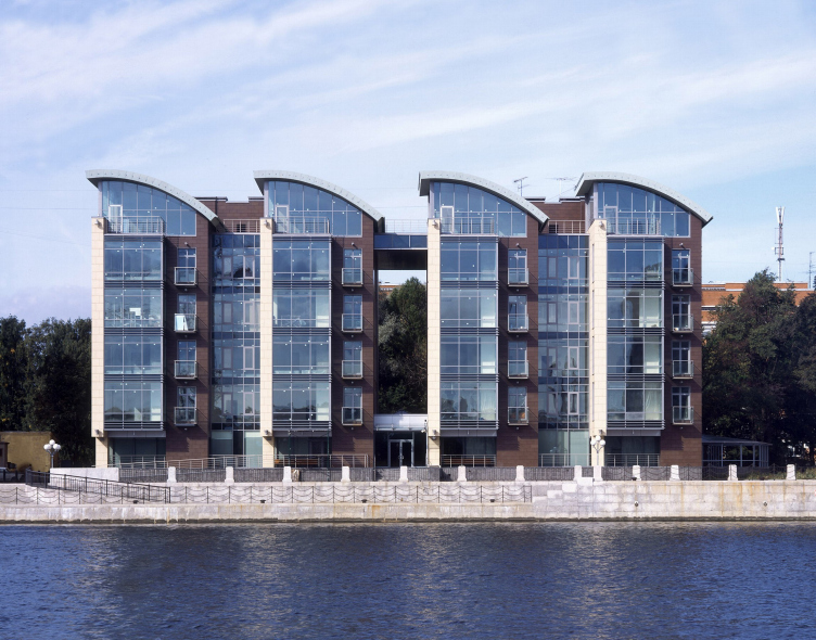
In the final version of “House by the Sea” we visually extended the axis of the Grebnoi Channel – “pulled it inside” and continued it. Out of all the apartments, you can see water, and trees on the other side. We used the principle of a city villa: each stairway provides access to three apartments that do not have mutual junctions, each of the apartments being oriented on three sides. We deliberately designed it in a reserved style: stone, metal profiles, and staggered windows... 

The housing project "House by the Sea". Construction, 2008. Evgeny Gerasimov and Partners, nps tchoban voss. Photo © A.Naroditsky

 
– What other works from the mid 2000’s would you specifically mention?

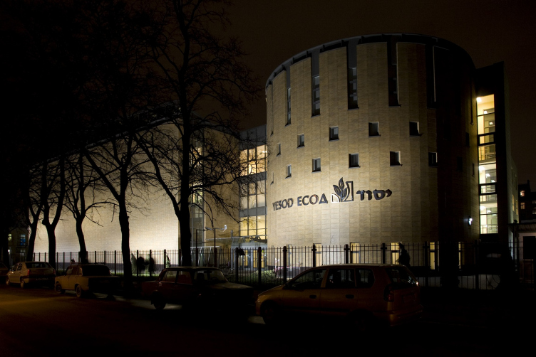
– Above all, the Saint-Petersburg Jewish community center YESOD, for which we got every possible award, and the house named Stella Maris. I don’t really feel comfortable within the confines of one style: I want to reinvent myself in the neoclassical, traditional, and modernist architecture. Both these two projects are definitely modernist. But we’ve done more projects than I care to remember. “Novaya Zvezda” on the Pesochnaya Embankment is also based on the combination of stone and glass...

zooming
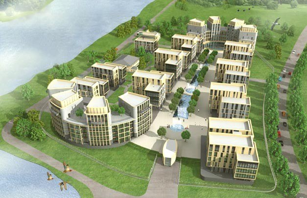
The housing project "House by the Sea". Visualization. Birds-eye view that allows to appreciate the architectural and town-planning solution and the effect of the gothic S-shaped curve of the complex © Evgeny Gerasimov and Partners, nps tchoban voss


The building of the Saint-Petersburg Jewish community center YESOD. Construction, 2006 © Evgeny Gerasimov and Partners


"Stella Maris" housing project. Construction, 2007. Photo © A.Naroditsky


zooming
"Novaya Zvezda" housing project. Construction, 2005. Photo © K.Smirnov


– Which customers do you prefer to work with – private or state-run companies? 

– We rarely work with state-run companies. 

– And what about the projects of the Olympic committee, and the buildings of the government of the Russian Federation?

– These were all contest projects. Regretfully, we lost all these competitions. There was only one state-run order in our history - the project of the Ushakovskaya road junction. “Sudebny Kvartal” (“Court of Law Quarter”) is but the second case in our 25-year history. We prefer to refrain from working with federal budgets.

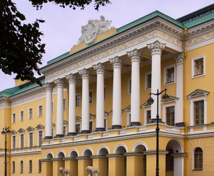
Four Seasons Lion Palace Hotel. Photo courtesy by Dornbracht


zooming
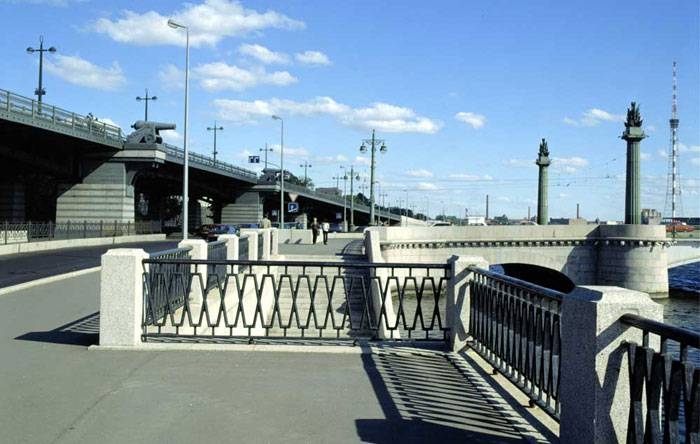
The Ushakovskaya road junction. Construction, 2000 © Evgeny Gerasimov and Partners


zooming
The building of the Olympic Committee of the Russian Federation © Evgeny Gerasimov and Partners


– How do you explain this? 

– The state is a rather faceless customer, and the people who are in charge of the project from their side rarely have the feeling of personal responsibility; they, come right down to it, are rather indifferent to architect in general. And we have a hard time working with a customer who is not personally interested in great architecture. So, we’d rather go for an end customer who is interested in getting a beautiful building because it will ultimately sell well.

– You won the competition “Gray Belt of Saint Petersburg”. How is this project developing now?

– We treated this competition from the very start as a show one, and, for that matter, the Committee for City Planning and Architecture did not make much of a secret of it either: they said it themselves that this competition was not of a great practical value. Basically, its idea came down to showing a beautiful picture that this city could be in the perfect world, to painting a dream: a house of your dreams, a block of your dreams, a “gray belt” of your dreams... We submitted our proposal, our idea, and then, well, let the city decide what it likes and what it doesn’t, and how to implement these things into reality.

zooming
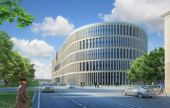
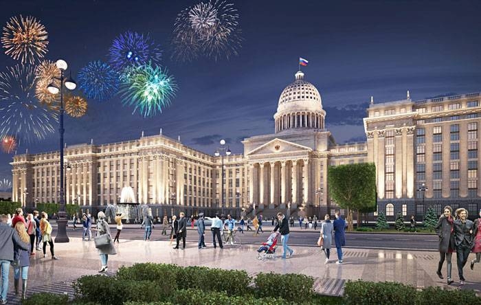
Concept of the Parliament Center of the Russian Federation. Project, 2015 © Evgeny Gerasimov and Partners


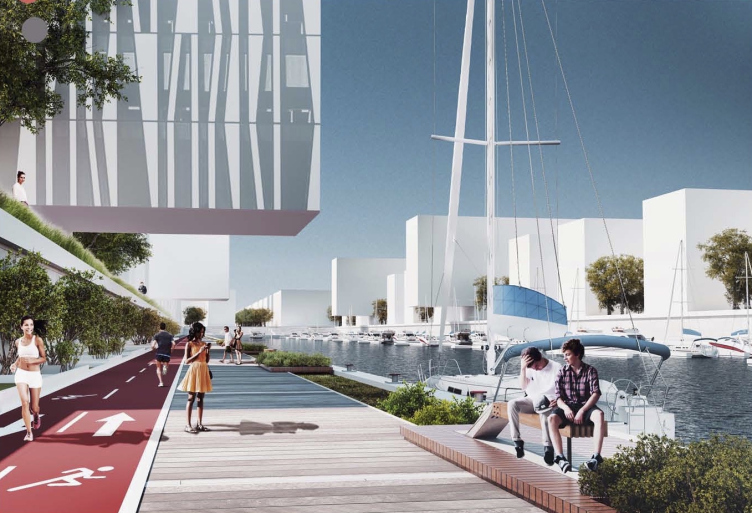
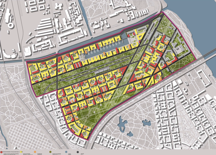
The concept pf transforming the "Gray Belt". Consortium of three architectural companies © Evgeny Gerasimov and Partners, SPEECH, nps tchoban voss


The concept pf transforming the "Gray Belt". Consortium of three architectural companies © Evgeny Gerasimov and Partners, SPEECH, nps tchoban voss


– What projects is your company doing now?

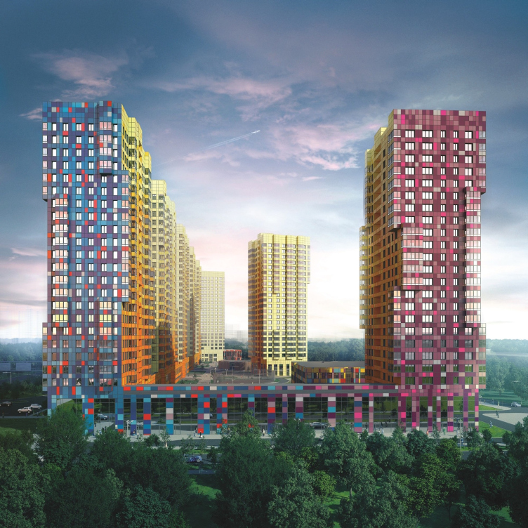
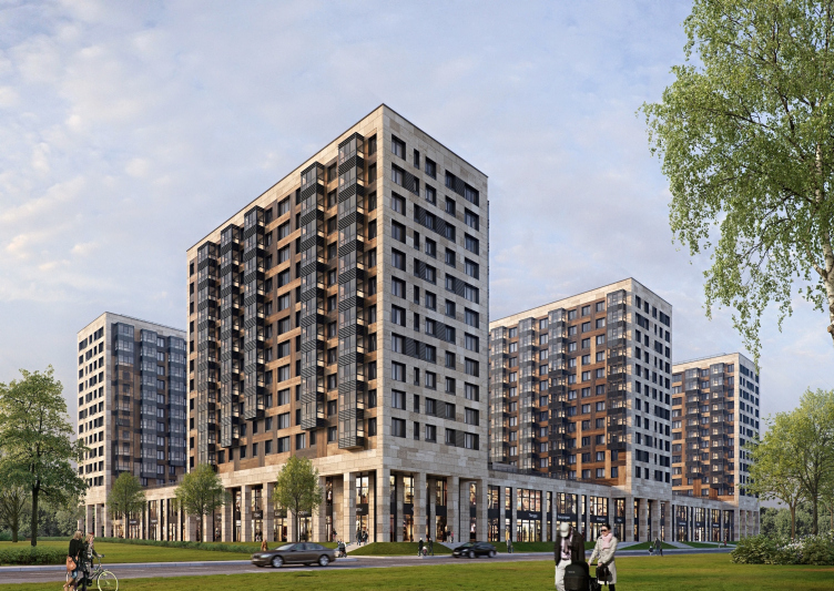
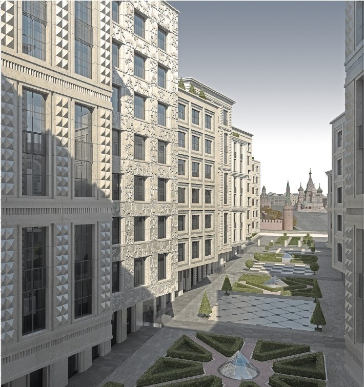
– Currently, we are working on a few housing projects for the company “Legend”: “Legend on the Komendantsky” and “Legend on the Dalnevostochny”. The project of “Sudebny Kvartal” got the appropriate approvals recently. A few housing projects are being built for LSR. On the Krestovsky Island, the buildings named “Russian House” and “Verona” will soon be completed. We are also designing a complex of buildings on the Petrovsky Island. A few construction projects are underway in Moscow: the ZIL is being completed, and the housing project named “Tsarev Sad” (“Tsar’s Garden”) is being built across from the Kremlin on the Sophiyskaya Embankment. We are also designing a new tower on the Leningrad Avenue. The construction of a large housing project called "Europe City" is being finished on the Medikov Avenue – it will be a huge project with interesting ceramic façades.

"LEGENDA on the Dalnevostochny, 12" housing project, 2015 © Evgeny Gerasimov and Partners


Multiapartment residential complex "Europe City" at the Medikov Avenue. Project, 2015 © Evgeny Gerasimov and Partners, SPEECH, nps tchoban voss


Multiapartment residential complex "Europe City" at the Medikov Avenue. Project, 2015 © Evgeny Gerasimov and Partners, SPEECH, nps tchoban voss


– How do you see yourselves on the Russian architectural scene in the recent years?
 
– We have no comment about that. We appreciate that our company is probably one of the best in Saint Petersburg. Arguably, our company is one of the best in Russia as well because we get invited to high-profile competitions here, and in Moscow. “One of the best” – we are quite cool with this position. We do not make a point of becoming the only top company. We are interested in designing for Moscow – we did three projects there. We are interested in designing for Saint Petersburg. In the regions, the customers are not ready to pay adequate prices, so the tasks are less interesting.

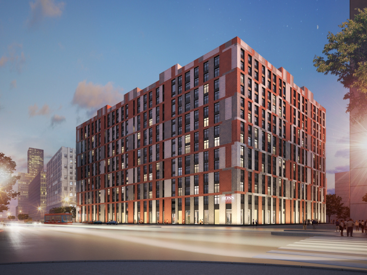
A housing project in the ZIL Art complex on Moscow. Project, 2015 © Evgeny Gerasimov and Partners


Year after year, we work with a small circle of customers: we’ve been working for decades with LSR, LenspetsSMU. We work with Setl City, RBI, “Legend”, and other companies with whom we’ve done one or two projects. I think that an established circle of steady customers is a great thing for an architect to develop.

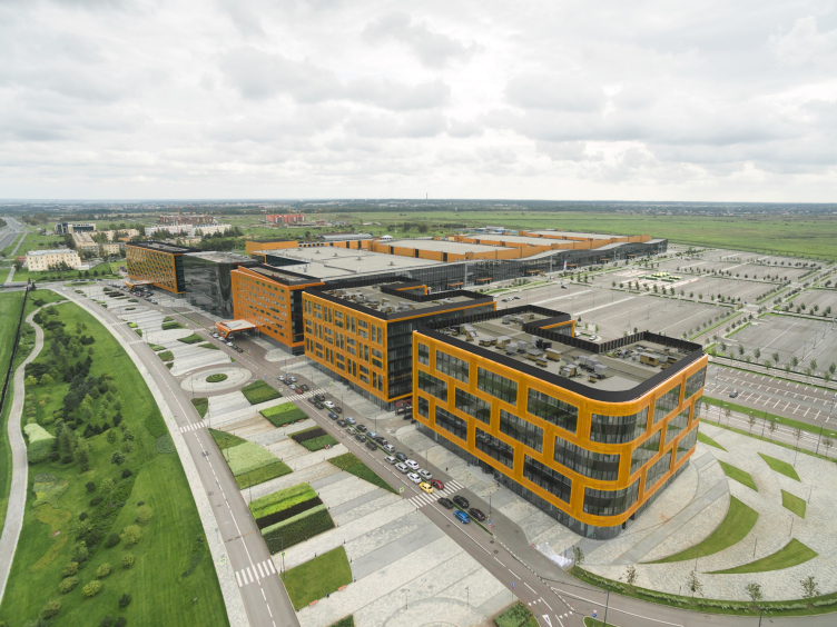
Congress and convention center "Expoforum" on the Peterburgskoe Highway. Construction, 2014. Evgeny Gerasimov and Partners, SPEECH, nps tchoban voss. Photo © D.Chebanenko
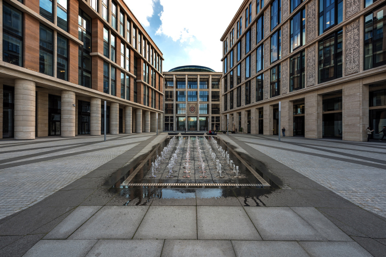
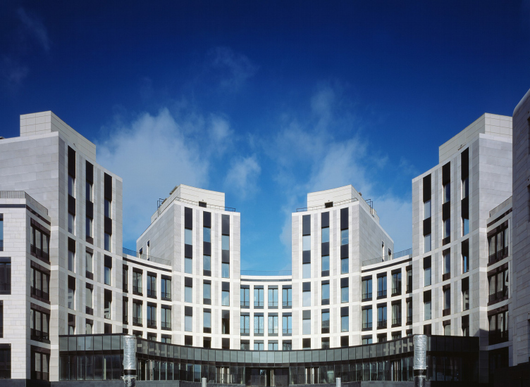
A project by "Evgeny Gerasimov and Partners". Decoration of the facades from natural stone and the organization of the inner yard

26 December 2016

Headlines now
The Golden Crown
The concept for a dental clinic in Yekaterinburg, developed by CNTR Studio, revolves around the idea of a “mouth full of gold”: pristine white porcelain stoneware walls are complemented by matte brass details. To avoid an overly literal interpretation, the architects focused on the building’s proportions, skillfully navigating between sunlight requirements and fire safety regulations.
Flexibility and Integration
Not long ago, we covered the project for the fourth phase of the ÁLIA residential complex, designed by APEX. Now, we’ve been shown different fence concepts they developed to enclose the complex’s private courtyards, incorporating a variety of public functions. We believe that the sheer fact that the complex’s architects were involved in such a detail as fencing speaks volumes.
A Step Forward
The HIDE residential complex represents a major milestone for ADM architects and their leaders Andrey Romanov and Ekaterina Kuznetsova in their quest for a fresh high-rise aesthetic – one that is flexible and layered, capable of bringing vibrancy to mass and silhouette while shaping form. Over recent years, this approach has become ADM’s “signature style”, with the golden HIDE tower playing a pivotal role in its evolution. Here, we delve into the project’s story, explore the details of the complex’s design, and uncover its core essence.
Gold in the Sands
A new office for a transcontinental company specializing in resource extraction and processing has opened in Dubai. Designed by T+T Architects, masters of creating spaces that are contemporary, diverse, flexible, and original, this project exemplifies their expertise. On the executive floor, a massive brass-clad partition dominates, while layered textures of compressed earth create a contextually resonant backdrop.
Layers and Levels of Flight
This project goes way back – Reserve Union won this architectural competition at the end of 2011, and the building was completed in 2018, so it’s practically “archival”. However, despite being relatively unknown, the building can hardly be considered “dated” and remains a prime example of architectural expression, particularly in the headquarters genre. And it’s especially fitting for an aviation company office. In some ways, it resembles the Aeroflot headquarters at Sheremetyevo but with its own unique identity, following the signature style of Vladimir Plotkin. In this article, we take an in-depth look at the United Aircraft Corporation (UAC) headquarters in the Moscow agglomeration town of Zhukovsky, supplemented by recent photographs from Alexey Naroditsky – a shoot that became only recently possible due to the fact that improvements were finally made in the surrounding area.
Light and Shadow
In this article, we delve into the architectural design of the “Chaika” house by DNK ag architects, which was recently completed in 2023 as part of the collection of signature designs at ZILArt. As is well-known, all the buildings in this complex follow a design code, yet each one is distinct. This particular building stands out not only for its whiteness and minimalism but also for the refined use of a limited number of techniques that, together, create what can confidently be called synergy.
Casus Novae
A master plan was developed for a large residential area with a name of “DNS City”, but now that its implementation began, the plan has been arbitrarily reformatted and replaced with something that, while similar on the surface, is actually quite different. This is not the first time such a thing happens, but it’s always frustrating. With permission from the author, we are sharing Maria Elkina’s post.
Treasure Hunting
The GAFA bureau, in collaboration with Tegola and Arkhitail, organized an expedition to the island of Kilpola in Karelia as part of Moskomarkhitektura’s “Open City” festival. There, amidst moss and rocks, the students sought answers to questions like: what is the sacred, where does it dwell, and what sustains it? Assisting the participants in this quest were landscape engineer Evgeny Levin, artist Nicholas Roerich, a moose, and the lack of cellular connection. Here’s how the story unfolded.
Depths of the Earth, Streams of Water
In the Malaya Okhta district, the Akzent building, designed by Stepan Liphart, was constructed. It follows a classic tripartite structure, yet it’s what you might call “hand-drawn”: each façade is unique in its form and details, some of which aren’t immediately noticeable. In this article, we explore the context and, together with the architect, delve into how the form was developed.
Fir Tree Dynamics
The “Airports of Region” holding is planning to build an airport in Karachay-Cherkessia, aiming to make the Arkhyz and Dombay resorts more accessible to travelers. The project that won in an invitation-only competition, submitted by Sergey Nikeshkin’s KPLN, blends natural imagery inspired by the shape of a conifer seed, open-air waiting spaces, majestic large trees, and a green roof elevated on needle-like columns. The result is both nature-inspired and WOW.
​A Brick Shell
In the process of designing a clubhouse situated among pine trees in a prestigious suburban area near Moscow, the architectural firm “A.Len” did the façade design part. The combination of different types of brick and masonry correlates with the volumetric and plastique solutions, further enhanced by the inclusion of wood-painted fragments and metal “glazing”.
Word Forms
ATRIUM architects love ambitious challenges, and for the firm’s thirtieth anniversary, they boldly play a game of words with an exhibition that dives deep into a self-created vocabulary. They immerse their projects – especially art installations – into this glossary, as if plunging into a current of their own. You feel as if you’re flowing through the veins of pure art, immersed in a universe of vertical cities, educational spaces – of which the architects are true masters – and the cultural codes of various locations. But what truly captivates is the bold statement that Vera Butko and Anton Nadtochy make, both through their work and this exhibition: architecture, above all, is art – the art of working with form and space.
Flexibility and Acuteness of Modernity
Luxurious, fluid, large “kokoshniks” and spiral barrel columns, as if made from colorful chewing gum: there seem to be no other mansion like this in Moscow, designed in the “Neo-Russian-Modern” style. And the “Teremok” on Malaya Kaluzhskaya, previously somewhat obscure, has “come alive with new colors” and gained visibility after its restoration for the office of the “architectural ecosystem” as the architects love to call themselves. It’s evident that Julius Borisov and the architects at UNK put their hearts into finding this new office and bringing it up to date. Let’s delve into the paradoxes of this mansion’s history and its plasticity. Spoiler: two versions of modernity meet here, both balancing on the razor’s edge of “what’s current”.
Yuri Vissarionov: “A modular house does not belong to the land”
It belongs to space, or to the air... It turns out that 3D printing is more effective when combined with a modular approach: the house is built in a workshop and then adapted to the site, including on uneven terrain. Yuri Vissarionov shares his latest experience in designing tourist complexes, both in central Russia and in the south. These include houseboats, homes printed from lightweight concrete using a 3D printer, and, of course, frame houses.
​Moscow’s First
“The quality of education largely depends on the quality of the educational environment”. This principle of the last decade has been realized by Sergey Skuratov in the project for the First Moscow Gymnasium on Rostovskaya Embankment in the Khamovniki district. The building seamlessly integrates into the complex urban landscape, responding both to the pedestrian flow of the city and the quiet alleyways. It skillfully takes advantage of the height differences and aligns with modern trends in educational space design. Let’s take a closer look.
Looking at the Water
The site of Villa Sonata stretches from the road to the water’s edge, offering its own shoreline, pier, and a picturesque river panorama. To reveal these sweeping views, Roman Leonidov “cut” the façade diagonally parallel to the river, thus getting two main axes for the house and, consequently, “two heads”. The internal core – two double-height spaces, a living room and a conservatory, with a “bridge” above them – makes the house both “transparent” and filled with light.
The White Wing
Well, it’s not exactly white. It’s more of a beige, white-stone structure that plays with the color of limestone – smoother surfaces are lighter, while rougher ones are darker. This wing unites various elements: it absorbs and interprets the surrounding themes. It responds to everything, yet maintains a cohesive expression – a challenging task! – while also incorporating recognizable features of its own, such as the dynamic cuts at the bottom, top, and middle.
Urban Dunes
The XSA Ramps team designed and built a three-part sports hub for a park in Rostov-on-Don, welcoming people of all ages and fitness levels. The skate plaza, pump track, and playground are all meticulously crafted with details that attract a diverse range of visitors. The technical execution of the shapes and slopes transforms this space into a kind of sculptural composition.
Proportional Growth
The project for the fourth phase of the ÁLIA residential area has been announced. The buildings are situated on an elongated plot – almost a “ray” that shoots out from the center of the area towards the river. Their layout reflects both a response to Moscow’s architectural preferences over the past 15 years, shifting “from blocks to towers”, and an interpretation of the neighboring business park designed by SOM. Additionally, the best apartments here are not located at the very top but closer to the middle, forming a glowing “waistline”.
The “Staircase” Building
In designing the “Details” residential complex in New Moscow, Rais Baishev spiced up the now-popular Moscow theme of a “courtyard” building with an idea drawn from the surrealist drawings by Maurits Escher. He envisioned the stepped silhouettes and descending slopes as a metaphysical mega-staircase, creating a key void within the courtyard that gave the project an internal “spine”. This concept is felt both in the building’s silhouette and on its façades.
Projection of the Quarter
No one doubted that the building that Vladimir Plotkin designed as part of the “Garden Quarters” would be the most modernist of all. And it turned out just that way: while adhering to the common design code, the building successfully combines brick and white stone, rhythmically responding to the neighboring building designed by Ostozhenka, yet tactfully and persistently making a few statements of its own. This includes the projection of the ideal urban development composition “14–9–6”, which can be found right next door, mathematical calculations, including those for various types of terraces (and perhaps the only reminder of the Soviet past of the Kauchuk rubber factory!), and the white “cross-stitch” pattern of the façade grid.
Domus Aurea
In this issue, we examine the “Tessinsky-1” house, designed by Sergey Skuratov and completed in 2023. Located in the middle of the Serebryanicheskaya Embankment district, at the intersection of its main streets, this house assumes a sort of “nodal” role: it not only responds to everything around it and preserves many memories of the former EMA factory within itself, but it weaves all this into a newly directed pattern, reconciling bright “gold” and dark-colored brick, largely with the help of the new, modern-yet-archaic Columba brick, which, come to think about it, is the most precious element here.
The Chimney of Nikola-Lenivets
In this issue, we are examining the “Obelisk House” designed by KATARSIS and built for the Arkhstoyanie 2023 festival. However, it was only finished later on, and this is why we are examining it now. It seems to us that after the “Obelisk House” appeared in Nikola-Lenivets, a dialogue and a few inner connections appeared between the temporary structures built here. These houses no longer look like “accidental neighbors”, more of which below.
​Periscope by the Bay
The jury awarded the second place in the competition for a public and cultural center in Petropavlovsk-Kamchatsky to the companies GORA (“Mountain”) and M4. In the consortium’s proposal, the building resembles a sperm whale with a calf swimming next to it or a periscope, whose lenses capture the most spectacular views from the surrounding landscape.
From Arcs to Dolmens
While working on the competition project for Petropavlovsk-Kamchatsky, ASADOV Architects prioritized the value of the natural and urban environment, aiming to preserve the balance of the location while minimizing the resemblance of the volume that they designed to a “traditional building”. The task was challenging, and the architects created three versions, one of which having been developed after the competition, where their main proposal took third place. However, the point of interest here is not the competition result but the continuity of creative thinking.
Hide and Seek
The ID Moskovskiy house, designed by Stepan Liphart in St. Petersburg, in the courtyards near Moskovskiy Avenue beyond the Obvodny Canal and recently completed, is notable for several reasons. Firstly, it has been realized with considerable accuracy, which is particularly significant as this is the first building where the architect was responsible not only for the facades but also for the layouts, allowing for better integration between the two. On the other hand, this building is interesting as an example of the “germination” of new architecture in the city: it draws on the best examples from the neighborhood and becomes an improved and developed sum of ideas found by the architect in the surrounding context.
The Big Twelve
Yesterday, the winners of the Moscow Mayor’s Architecture Award were announced and honored. Let’s take a look at what was awarded and, in some cases, even critique this esteemed award. After all, there is always room for improvement, right?
Above the Golden Horn
The residential complex “Philosophy” designed by T+T architects in Vladivostok, is one of the new projects in the “Golubinaya Pad” area, changing its development philosophy (pun intended) from single houses to a comprehensive approach. The buildings are organized along public streets, varying in height and format, with one house even executed in gallery typology, featuring a cantilever leaning on an art object.
Nuanced Alternative
How can you rhyme a square and space? Easily! But to do so, you need to rhyme everything you can possibly think of: weave everything together, like in a tensegrity structure, and find your own optics too. The new exhibition at GES-2 does just that, offering its visitor a new perspective on the history of art spanning 150 years, infused with the hope for endless multiplicity of worlds and art histories. Read on to see how this is achieved and how the exhibition design by Evgeny Ace contributes to it.
Blinds for Ice
An ice arena has been constructed in Domodedovo based on a project by Yuri Vissarionov Architects. To prevent the long façade, a technical requirement for winter sports facilities, from appearing monotonous, the architects proposed the use of suspended structures with multidirectional slats. This design protects the ice from direct sunlight while giving the wall texture and detail.