По-русски

Framework in Space

Developed by "Studio 44", the project of a judo school is based on the opposition of the modernist principle of point support and the openness of deconstruction - with their sources lying in the traditional Japanese architecture. A fair share of abstraction helps to add some stylistic discourse to the necessary level of generalization.

29 August 2016
Object
mainImg

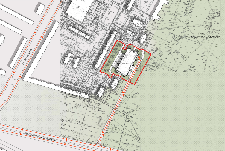
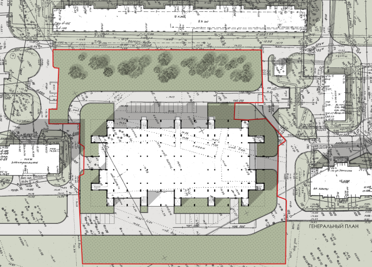
The judo school whose design "Studio 45" completed a few months ago will be built on the Vyborg side in the district of Polyustrovo - an area that was once occupied by large Dukes dachas, then factories, and now predominantly by Soviet-type apartment buildings with an odd fraction of smaller dachas and spots of die-hard industrial parks. The judo school will occupy a large rectangle on the borderline between the Academic Sakharov Park and a residential area that consists predominantly of the 1970's panel nine-story houses interspersed with later additions. The city backdrop here is a habitual checkered gray; anyone who was born in the Soviet Union would recognize this view from a mile away. And, as for the park, it is not just any park, but a descendant of the Abamelek-Lazarevs' dacha, which pretty much turns it into a piece of the preindustrial suburbs that were later merged with the industrial Saint Petersburg. Later on, it was renamed into a "Young Pioneer" Park, and its northern park has kept this name to this day, the southern part having been renamed into the "Sakharov" Park and getting a monument to the victims of Hiroshima and Nagasaki - a copy brought all the way down from Japan. And, not so much by design as by coincidence, it turned out that this Japanese theme took root here: across from the monument, a new school of a Japanese martial art will be built. The school will have in it training and performance halls - not only for judo but for gymnastics as well; it will also have a highly developed infrastructure that will include, among other things, about a dozen rooms for guest athletes. This is going to be a great up-to-date school the height of a nine-story house (28.8 meters), the height measurements of the building fitting in nicely with the surroundings.  

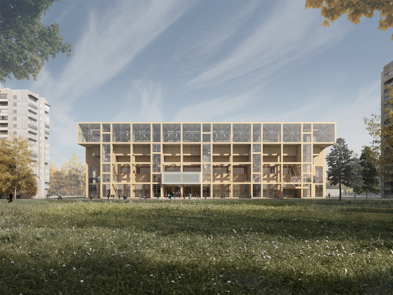
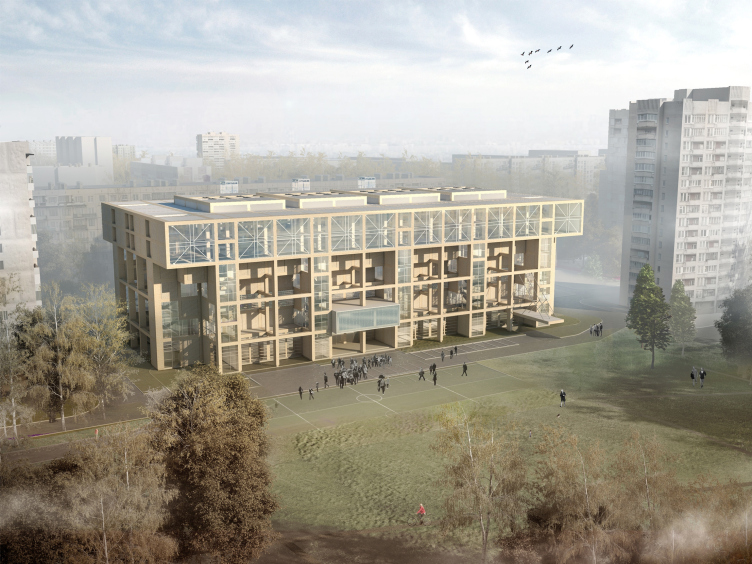
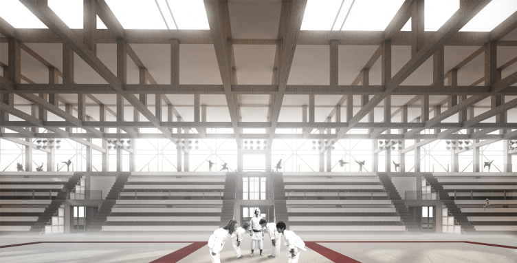
Sports and recreation complex of the judo school. Project, 2016 © Studio 44
Sports and recreation complex of the judo school. Location plan, 2016 © Studio 44


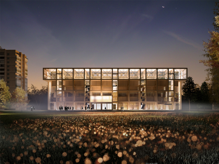
Sports and recreation complex of the judo school. Project, 2016 © Studio 44


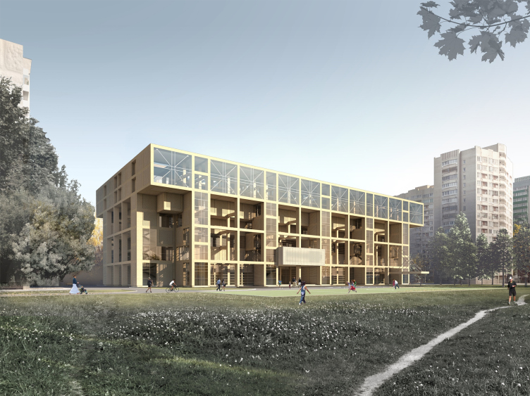
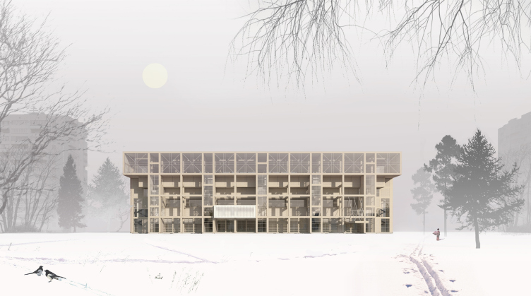
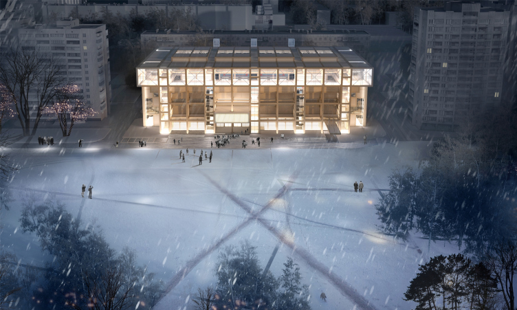
The school building consists of a voluminous "grid" framework with a large cell span of 7.2x7.2 meters. It is planned that the framework will be coated with wood that will bring out the wood construction both on the inside and outside, following its structural logic. To an outside observer it will look - just as it looks now on the project visualizations - that the building's framework is indeed made of wood. In an odd checkered pattern, it is at some places covered in glass and at some places is coated with panels but still mostly it is transparent, viewable, and is designed prominently on the outside. The walls recede into the depth of the building forming on the facade an intermediate space that is akin to shallow stanzas - but still uninhabited. The outer plane of the facade is touched by the "legs" of the glazed stairwells. Just like all the other pillars, they support the bowl of the main competition hall - an inverted stepping pyramid whose volume is partially readable from the outside. The entire building turns into a support for the bowl of the main hall elevated 12 meters above the ground, its edges "resting" on the outside framework, and its basis - on the volumes of the minor halls of the bottom floors that are still pierced with point supports, just as they should be in accordance with the tradition of the architecture of today. The narrow verticals of the stairwells are evenly placed, like buttresses of a gothic temple, and, coupled with the crowning band of panoramic windows, they form on the facade a composition that reminds, on the one hand, a horizontal skyscraper on slender pillars, and, on the other hand (especially when viewed from a distance of the park) - a temple portal of the Far East architectural tradition: an array of colums that support a beam with two long protruding "tails" of the cantilevers. The likeness is still further enhanced by the steps of the spectators’ stalls which add characteristic bulges to the silhouettes of the cantilevers. The whole façade is turned into a portal - a gate to sport, which is more than symbolic. This portal is, however, far from classic - it has a pillar in its middle which made the architects shift the entrance with its broad marquee to the left: the geometry of the main façade took on some "irresponsible" quality, while the likeness to the hyper portal stopped being literal. Behind the top glass horizontal, there are cafes that circle the stalls along their perimeter that will command, just like the stairwells, a great panoramic view of the park and the city. 

Sports and recreation complex of the judo school. Project, 2016 © Studio 44


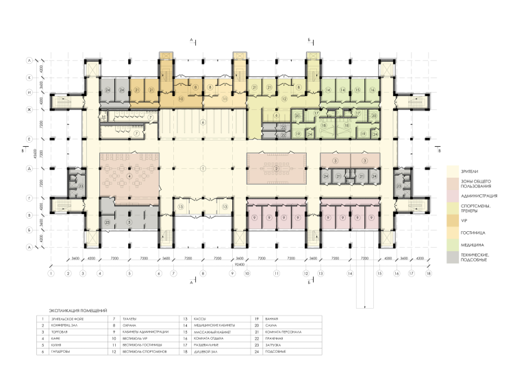
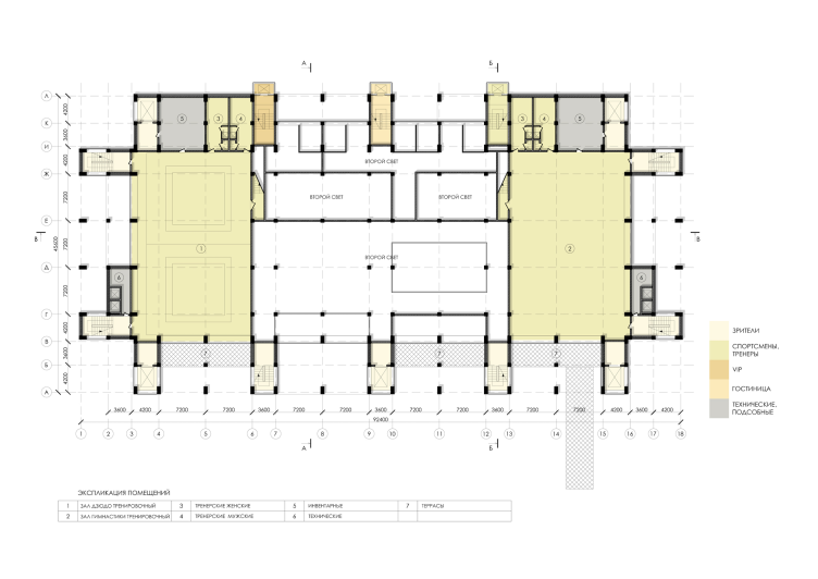
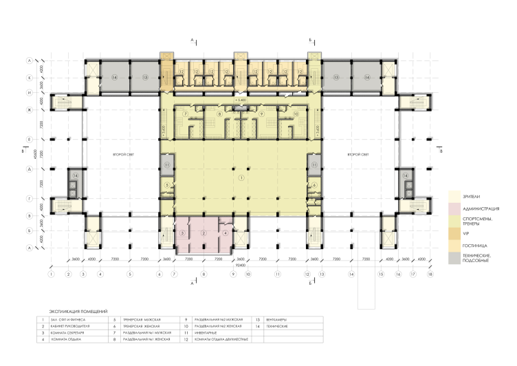
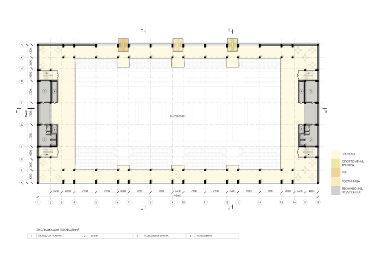
Sports and recreation complex of the judo school. Plan of the first floor © Studio 44


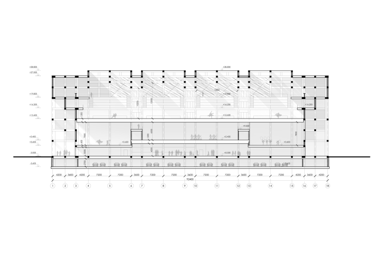
Sports and recreation complex of the judo school. Section view © Studio 44


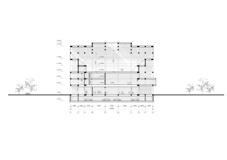
Sports and recreation complex of the judo school. Section view © Studio 44


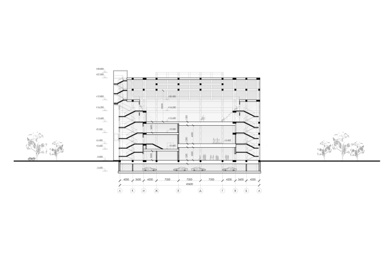
Sports and recreation complex of the judo school. Section view © Studio 44


This mixture of avant-grade and modernism with a tilt to Japanese postwar metabolic architecture - with references to the traditional Japanese house, and, most importantly, the classic judo halls - are to be found everywhere in this building. One grows into the other, which seems more or less self-explanatory, as one abstracts himself from the form. Just like on a Picasso painting, where somebody's nose can be at the same time an abstract triangle, we can see here, depending on our mood and angle of vision, either a Japanese temple with a broad roof or a wooden pavilion, the kind that is popular today at architectural festivals, or a huge building designed in full accordance with the rules of modern architecture (which it actually is). So - and it comes as no surprise at all - what we see is a curious version of Pompidou Center's Piano&Rogers Pyramid, only tested with squares of wooden structure and changed almost beyond recognition, the masterpiece and the manifesto of the deconstruction architecture. And why not? The staircases are brought forward, behind them, there is the "bustle" of the building works crossed by diagonal metallic beams - the likeness to the famous escalator and the metallic grids on the main façade of the Paris museum is obvious, even though here, in Saint Petersburg, everything is a lot more reserved and farther away from hi-tech, and, even, conversely, sunk in the tradition of wooden construction. Another thing that comes to mind is Nikolai Plissky's "Hadron Collider", a hint at the mechanism of state-of-the-art technologies, built from rough timber - but then again, the distance from the prototype is not so great. And if we are to talk about deconstruction, it is something that is contained inside here - the building does not cast any "protuberances" outside and stays compact; the main façade looks more like a cut or a section of some part of the building's structure. No irony is in sight - quite the opposite, what we see is, for all intents and purposes, quite a serious discourse on the subject of the basics of modernist culture and its origin lying in the traditional oriental cultures.

Sports and recreation complex of the judo school. Project, 2016 © Studio 44


Sports and recreation complex of the judo school. Project, 2016 © Studio 44


Sports and recreation complex of the judo school. Project, 2016 © Studio 44


And that's as true as it's going to get - the bare staircases that are brought forward here can be seen not only in Pompidou but also in many other modernist masterpieces - for example, in Andrew Meerson's "Pilots' House" with its oval stairwell towers. The crossings of sliced verticals and horizontals, on the other hand, put one in the mind of the Fuji Television building designed by Kenzo Tange, as well as some projects done by "Studio 44" itself where a "centipede" beam elevated on a multitude of supporting pillars is one of the favorite techniques; it is to be found, for example, in their contest project of a multifunctional complex on the alluvial land of the Vasilyevsky Island; or in the building of the defense ministry of Kazakhstan. 

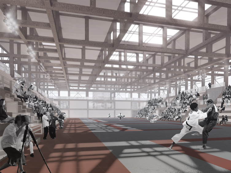
On the whole, however, the project is immersed in the Japanese tradition. The most obvious prototype is, of course, the Japanese house and the judo gyms with their wooden frameworks, lattices, and partitions covered in rice paper, light, transparent, agile, just as the spirit of a judo school should suggest. To a certain degree, the building of the Saint Petersburg school IS such a gym, only magnified manifold: 72x29 meters,12.6 meters to reach the beams, and 16 meters together with them - strictly speaking, it could contain a couple of 5-story residential buildings. Three tiers of ceiling beams - its main pride - also work to "explore the subject" directly referring us to the prototype of the Japanese red ceilings that in the old houses sometimes occupy a significant share of the home space dividing it into cubes. The ambient light that falls from all sides, including from the ceiling, is softened but still with a voluminous quality to it, and it enhances the Japanese framework feel of the space in which mass is seemingly completely inferior to structure.  

Sports and recreation complex of the judo school. Project, 2016 © Studio 44


Sports and recreation complex of the judo school. Project, 2016 © Studio 44


But, as was already said, the modernist basis and the Japanese prototypes are closely connected here. The architecture of contemporary history is all about framework, which accounts for 90% of its beauty and success; this is also one of the principles of Le Corbusier. The point supports are derived from the specifics of the technology of reinforced concrete, and they help save building materials and space, as well as make walls light and transparent. But at the same time this technology dates back to all framework houses known to man, less to modernism in its European half-timber form, and more to the framework of a Japanese house that so many classics of the wooden tradition fell for. In other words, this evergreen technology of framework construction that has been around for at least a century has its roots in a tradition. In this case, the theme luckily coincided with the theme of the judo school, making the meaning complete or getting back to the sources at the new helix of development. 

One cannot help recalling that "Studio 44" has already done another project built upon a wooden framework - the science museum in the city of Tomsk. Back then, it seemed that the architect revived the sculptural tradition of the early Soviet wooden avant-garde architecture, and that he was going to keep on using that language teetering on the verge of the literal, the recognizable, and the generalized. It is clear now that "Studio 44" views the idea - one of a wooden framework in this case - from many different angles, studying its numerous prototypes suggested by the context. Viewing the building's framework as a voluminous grid whose content is conditioned by the building's function, and, as a consequence, is rather flexible, is interesting in itself, and, besides, all through the XX century a lot was said on the subject, so the architects had a lot of starting points to lean on.

Sports and recreation complex of the judo school. Master plan © Studio 44


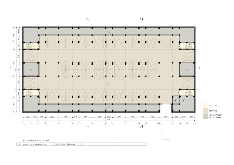
Sports and recreation complex of the judo school. Plan of the -1 floor © Studio 44


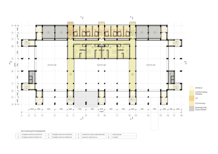
Sports and recreation complex of the judo school. Plan of the 2nd floor © Studio 44


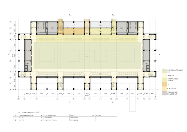
Sports and recreation complex of the judo school. Plan of the 3rd floor © Studio 44


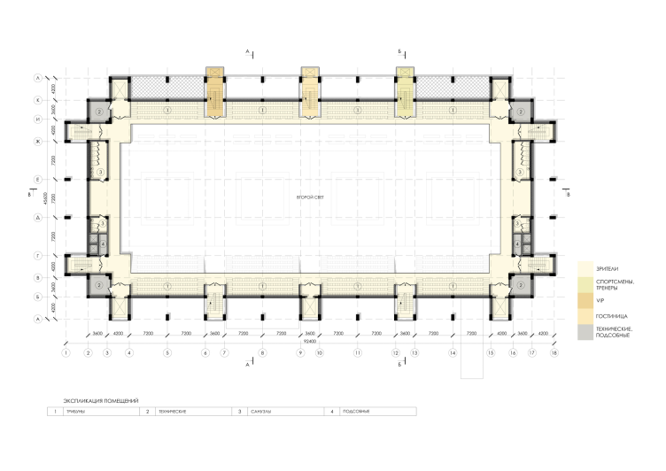
Sports and recreation complex of the judo school. Plan of the 4th floor © Studio 44


Sports and recreation complex of the judo school. Plan of the 5th floor © Studio 44


Sports and recreation complex of the judo school. Plan of the 6th floor © Studio 44


Sports and recreation complex of the judo school. Plan of the 7th floor © Studio 44


29 August 2016

Headlines now
The Golden Crown
The concept for a dental clinic in Yekaterinburg, developed by CNTR Studio, revolves around the idea of a “mouth full of gold”: pristine white porcelain stoneware walls are complemented by matte brass details. To avoid an overly literal interpretation, the architects focused on the building’s proportions, skillfully navigating between sunlight requirements and fire safety regulations.
Flexibility and Integration
Not long ago, we covered the project for the fourth phase of the ÁLIA residential complex, designed by APEX. Now, we’ve been shown different fence concepts they developed to enclose the complex’s private courtyards, incorporating a variety of public functions. We believe that the sheer fact that the complex’s architects were involved in such a detail as fencing speaks volumes.
A Step Forward
The HIDE residential complex represents a major milestone for ADM architects and their leaders Andrey Romanov and Ekaterina Kuznetsova in their quest for a fresh high-rise aesthetic – one that is flexible and layered, capable of bringing vibrancy to mass and silhouette while shaping form. Over recent years, this approach has become ADM’s “signature style”, with the golden HIDE tower playing a pivotal role in its evolution. Here, we delve into the project’s story, explore the details of the complex’s design, and uncover its core essence.
Gold in the Sands
A new office for a transcontinental company specializing in resource extraction and processing has opened in Dubai. Designed by T+T Architects, masters of creating spaces that are contemporary, diverse, flexible, and original, this project exemplifies their expertise. On the executive floor, a massive brass-clad partition dominates, while layered textures of compressed earth create a contextually resonant backdrop.
Layers and Levels of Flight
This project goes way back – Reserve Union won this architectural competition at the end of 2011, and the building was completed in 2018, so it’s practically “archival”. However, despite being relatively unknown, the building can hardly be considered “dated” and remains a prime example of architectural expression, particularly in the headquarters genre. And it’s especially fitting for an aviation company office. In some ways, it resembles the Aeroflot headquarters at Sheremetyevo but with its own unique identity, following the signature style of Vladimir Plotkin. In this article, we take an in-depth look at the United Aircraft Corporation (UAC) headquarters in the Moscow agglomeration town of Zhukovsky, supplemented by recent photographs from Alexey Naroditsky – a shoot that became only recently possible due to the fact that improvements were finally made in the surrounding area.
Light and Shadow
In this article, we delve into the architectural design of the “Chaika” house by DNK ag architects, which was recently completed in 2023 as part of the collection of signature designs at ZILArt. As is well-known, all the buildings in this complex follow a design code, yet each one is distinct. This particular building stands out not only for its whiteness and minimalism but also for the refined use of a limited number of techniques that, together, create what can confidently be called synergy.
Casus Novae
A master plan was developed for a large residential area with a name of “DNS City”, but now that its implementation began, the plan has been arbitrarily reformatted and replaced with something that, while similar on the surface, is actually quite different. This is not the first time such a thing happens, but it’s always frustrating. With permission from the author, we are sharing Maria Elkina’s post.
Treasure Hunting
The GAFA bureau, in collaboration with Tegola and Arkhitail, organized an expedition to the island of Kilpola in Karelia as part of Moskomarkhitektura’s “Open City” festival. There, amidst moss and rocks, the students sought answers to questions like: what is the sacred, where does it dwell, and what sustains it? Assisting the participants in this quest were landscape engineer Evgeny Levin, artist Nicholas Roerich, a moose, and the lack of cellular connection. Here’s how the story unfolded.
Depths of the Earth, Streams of Water
In the Malaya Okhta district, the Akzent building, designed by Stepan Liphart, was constructed. It follows a classic tripartite structure, yet it’s what you might call “hand-drawn”: each façade is unique in its form and details, some of which aren’t immediately noticeable. In this article, we explore the context and, together with the architect, delve into how the form was developed.
Fir Tree Dynamics
The “Airports of Region” holding is planning to build an airport in Karachay-Cherkessia, aiming to make the Arkhyz and Dombay resorts more accessible to travelers. The project that won in an invitation-only competition, submitted by Sergey Nikeshkin’s KPLN, blends natural imagery inspired by the shape of a conifer seed, open-air waiting spaces, majestic large trees, and a green roof elevated on needle-like columns. The result is both nature-inspired and WOW.
​A Brick Shell
In the process of designing a clubhouse situated among pine trees in a prestigious suburban area near Moscow, the architectural firm “A.Len” did the façade design part. The combination of different types of brick and masonry correlates with the volumetric and plastique solutions, further enhanced by the inclusion of wood-painted fragments and metal “glazing”.
Word Forms
ATRIUM architects love ambitious challenges, and for the firm’s thirtieth anniversary, they boldly play a game of words with an exhibition that dives deep into a self-created vocabulary. They immerse their projects – especially art installations – into this glossary, as if plunging into a current of their own. You feel as if you’re flowing through the veins of pure art, immersed in a universe of vertical cities, educational spaces – of which the architects are true masters – and the cultural codes of various locations. But what truly captivates is the bold statement that Vera Butko and Anton Nadtochy make, both through their work and this exhibition: architecture, above all, is art – the art of working with form and space.
Flexibility and Acuteness of Modernity
Luxurious, fluid, large “kokoshniks” and spiral barrel columns, as if made from colorful chewing gum: there seem to be no other mansion like this in Moscow, designed in the “Neo-Russian-Modern” style. And the “Teremok” on Malaya Kaluzhskaya, previously somewhat obscure, has “come alive with new colors” and gained visibility after its restoration for the office of the “architectural ecosystem” as the architects love to call themselves. It’s evident that Julius Borisov and the architects at UNK put their hearts into finding this new office and bringing it up to date. Let’s delve into the paradoxes of this mansion’s history and its plasticity. Spoiler: two versions of modernity meet here, both balancing on the razor’s edge of “what’s current”.
Yuri Vissarionov: “A modular house does not belong to the land”
It belongs to space, or to the air... It turns out that 3D printing is more effective when combined with a modular approach: the house is built in a workshop and then adapted to the site, including on uneven terrain. Yuri Vissarionov shares his latest experience in designing tourist complexes, both in central Russia and in the south. These include houseboats, homes printed from lightweight concrete using a 3D printer, and, of course, frame houses.
​Moscow’s First
“The quality of education largely depends on the quality of the educational environment”. This principle of the last decade has been realized by Sergey Skuratov in the project for the First Moscow Gymnasium on Rostovskaya Embankment in the Khamovniki district. The building seamlessly integrates into the complex urban landscape, responding both to the pedestrian flow of the city and the quiet alleyways. It skillfully takes advantage of the height differences and aligns with modern trends in educational space design. Let’s take a closer look.
Looking at the Water
The site of Villa Sonata stretches from the road to the water’s edge, offering its own shoreline, pier, and a picturesque river panorama. To reveal these sweeping views, Roman Leonidov “cut” the façade diagonally parallel to the river, thus getting two main axes for the house and, consequently, “two heads”. The internal core – two double-height spaces, a living room and a conservatory, with a “bridge” above them – makes the house both “transparent” and filled with light.
The White Wing
Well, it’s not exactly white. It’s more of a beige, white-stone structure that plays with the color of limestone – smoother surfaces are lighter, while rougher ones are darker. This wing unites various elements: it absorbs and interprets the surrounding themes. It responds to everything, yet maintains a cohesive expression – a challenging task! – while also incorporating recognizable features of its own, such as the dynamic cuts at the bottom, top, and middle.
Urban Dunes
The XSA Ramps team designed and built a three-part sports hub for a park in Rostov-on-Don, welcoming people of all ages and fitness levels. The skate plaza, pump track, and playground are all meticulously crafted with details that attract a diverse range of visitors. The technical execution of the shapes and slopes transforms this space into a kind of sculptural composition.
Proportional Growth
The project for the fourth phase of the ÁLIA residential area has been announced. The buildings are situated on an elongated plot – almost a “ray” that shoots out from the center of the area towards the river. Their layout reflects both a response to Moscow’s architectural preferences over the past 15 years, shifting “from blocks to towers”, and an interpretation of the neighboring business park designed by SOM. Additionally, the best apartments here are not located at the very top but closer to the middle, forming a glowing “waistline”.
The “Staircase” Building
In designing the “Details” residential complex in New Moscow, Rais Baishev spiced up the now-popular Moscow theme of a “courtyard” building with an idea drawn from the surrealist drawings by Maurits Escher. He envisioned the stepped silhouettes and descending slopes as a metaphysical mega-staircase, creating a key void within the courtyard that gave the project an internal “spine”. This concept is felt both in the building’s silhouette and on its façades.
Projection of the Quarter
No one doubted that the building that Vladimir Plotkin designed as part of the “Garden Quarters” would be the most modernist of all. And it turned out just that way: while adhering to the common design code, the building successfully combines brick and white stone, rhythmically responding to the neighboring building designed by Ostozhenka, yet tactfully and persistently making a few statements of its own. This includes the projection of the ideal urban development composition “14–9–6”, which can be found right next door, mathematical calculations, including those for various types of terraces (and perhaps the only reminder of the Soviet past of the Kauchuk rubber factory!), and the white “cross-stitch” pattern of the façade grid.
Domus Aurea
In this issue, we examine the “Tessinsky-1” house, designed by Sergey Skuratov and completed in 2023. Located in the middle of the Serebryanicheskaya Embankment district, at the intersection of its main streets, this house assumes a sort of “nodal” role: it not only responds to everything around it and preserves many memories of the former EMA factory within itself, but it weaves all this into a newly directed pattern, reconciling bright “gold” and dark-colored brick, largely with the help of the new, modern-yet-archaic Columba brick, which, come to think about it, is the most precious element here.
The Chimney of Nikola-Lenivets
In this issue, we are examining the “Obelisk House” designed by KATARSIS and built for the Arkhstoyanie 2023 festival. However, it was only finished later on, and this is why we are examining it now. It seems to us that after the “Obelisk House” appeared in Nikola-Lenivets, a dialogue and a few inner connections appeared between the temporary structures built here. These houses no longer look like “accidental neighbors”, more of which below.
​Periscope by the Bay
The jury awarded the second place in the competition for a public and cultural center in Petropavlovsk-Kamchatsky to the companies GORA (“Mountain”) and M4. In the consortium’s proposal, the building resembles a sperm whale with a calf swimming next to it or a periscope, whose lenses capture the most spectacular views from the surrounding landscape.
From Arcs to Dolmens
While working on the competition project for Petropavlovsk-Kamchatsky, ASADOV Architects prioritized the value of the natural and urban environment, aiming to preserve the balance of the location while minimizing the resemblance of the volume that they designed to a “traditional building”. The task was challenging, and the architects created three versions, one of which having been developed after the competition, where their main proposal took third place. However, the point of interest here is not the competition result but the continuity of creative thinking.
Hide and Seek
The ID Moskovskiy house, designed by Stepan Liphart in St. Petersburg, in the courtyards near Moskovskiy Avenue beyond the Obvodny Canal and recently completed, is notable for several reasons. Firstly, it has been realized with considerable accuracy, which is particularly significant as this is the first building where the architect was responsible not only for the facades but also for the layouts, allowing for better integration between the two. On the other hand, this building is interesting as an example of the “germination” of new architecture in the city: it draws on the best examples from the neighborhood and becomes an improved and developed sum of ideas found by the architect in the surrounding context.
The Big Twelve
Yesterday, the winners of the Moscow Mayor’s Architecture Award were announced and honored. Let’s take a look at what was awarded and, in some cases, even critique this esteemed award. After all, there is always room for improvement, right?
Above the Golden Horn
The residential complex “Philosophy” designed by T+T architects in Vladivostok, is one of the new projects in the “Golubinaya Pad” area, changing its development philosophy (pun intended) from single houses to a comprehensive approach. The buildings are organized along public streets, varying in height and format, with one house even executed in gallery typology, featuring a cantilever leaning on an art object.
Nuanced Alternative
How can you rhyme a square and space? Easily! But to do so, you need to rhyme everything you can possibly think of: weave everything together, like in a tensegrity structure, and find your own optics too. The new exhibition at GES-2 does just that, offering its visitor a new perspective on the history of art spanning 150 years, infused with the hope for endless multiplicity of worlds and art histories. Read on to see how this is achieved and how the exhibition design by Evgeny Ace contributes to it.
Blinds for Ice
An ice arena has been constructed in Domodedovo based on a project by Yuri Vissarionov Architects. To prevent the long façade, a technical requirement for winter sports facilities, from appearing monotonous, the architects proposed the use of suspended structures with multidirectional slats. This design protects the ice from direct sunlight while giving the wall texture and detail.