По-русски

Kiev's Miami

Designed by "Arkhimatika" Bureau for a remote area on the left bank of the Dnipro River, the residential complex "Slavutich" affirms a new, by the Ukraine's capital standards, type of a city "resort" housing project.

14 July 2016
Object
mainImg

Situated pretty far from the city center, this neighborhood on the left bank of the Dnipro has formed gradually since the early 1990's, and ended up being a multicolored "showcase" of controversial architectural experiments of a controversial epoch. On the other hand, this is almost a riverside resort area situated within the city limits with an abundance of trees, people's dachas, and free access to the river. "We always try to make our projects set a new trend for this or that city, and "Slavutich" is no exception - says one of the founders of "Arkhimatika", Dmitry Vasilyev - Here is the thing, though: while we always want to add color to the bleak and dreary construction of the soviet period, in this case, it is the direct opposite - in order to break away from the architectural "build-as-you-please" feast of the early 2000's, we had to completely refrain from using color and intricate designs in favor of the simple and pristine volumes. This project is a manifesto to laconism and simplicity, opting out of using "fancy" forms and silhouettes, and tiny unnecessary details. Naturally, it was formed by contrast with the existing buildings".

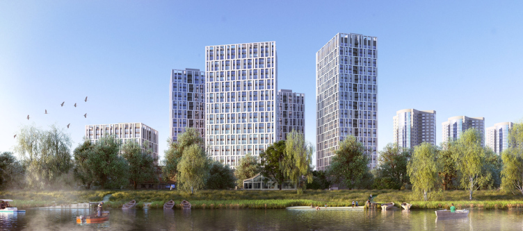
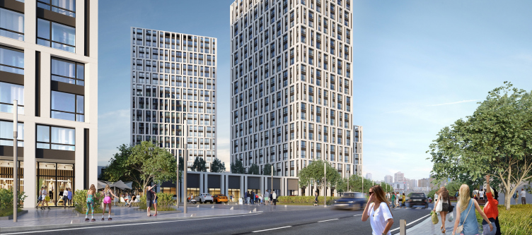
"Slavutich" housing project. View from the Bazhan Avenue. Project, 2016 © Arkhimatika
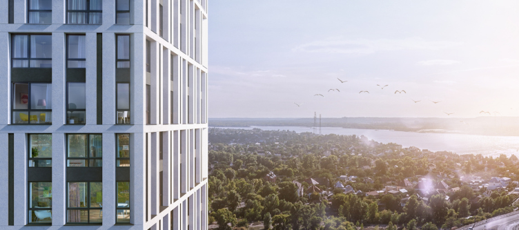
"Slavutich" housing project. View from the lake. Project, 2016 © Arkhimatika


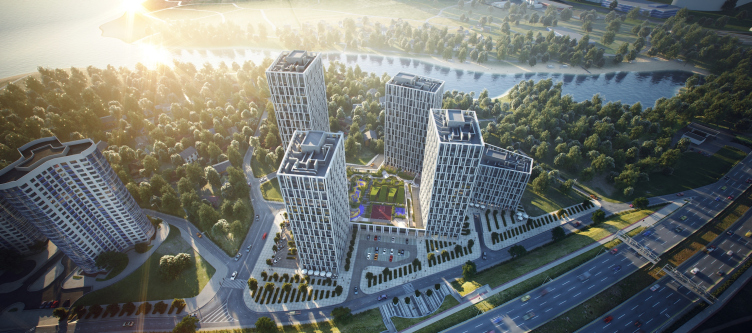
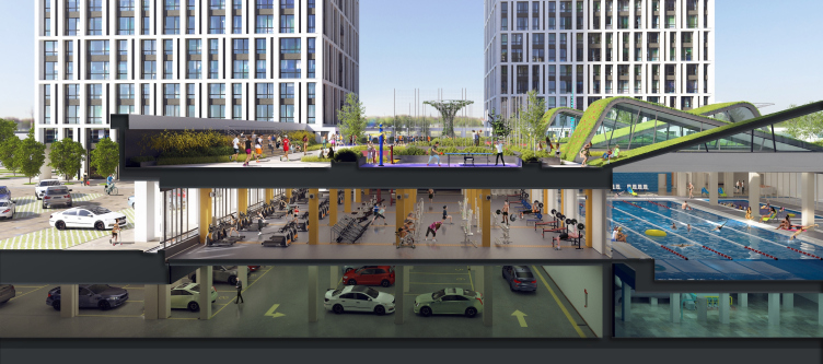
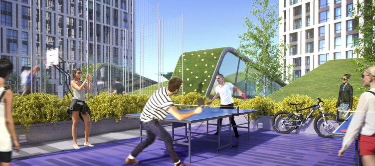
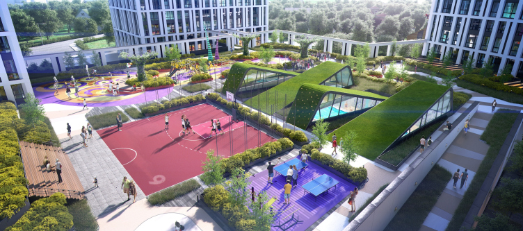
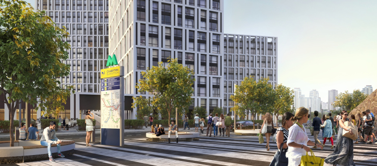
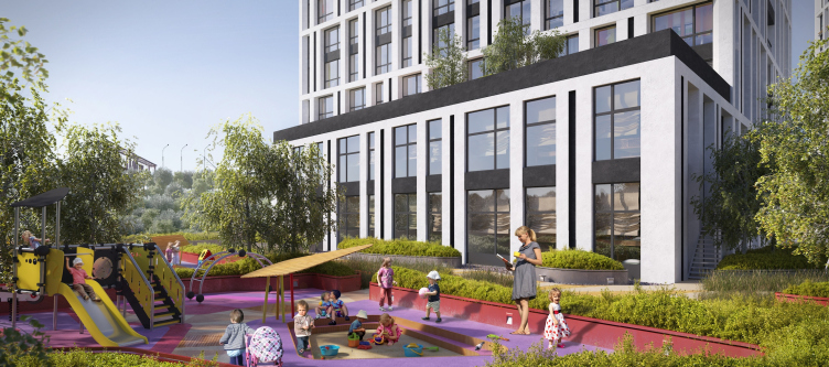
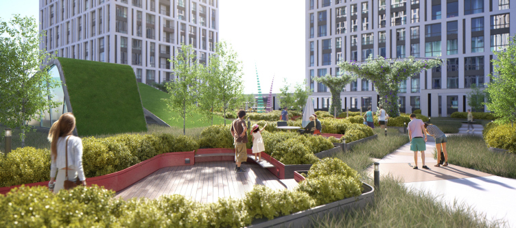
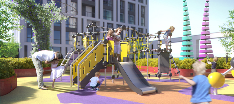
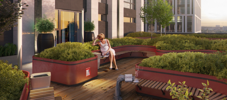
The complex is situated literally across the road from the "Slavutich" metro station. The large-scale project with a total area of 122000 square meters will house more than 1200 apartments. It is situated in five towers from 12 to 26 stories high, united by a single stylobate that includes a large fitness center with an area slightly less than 3000 square meters, with gyms, studios, and swimming pools. On its roof, a pedestrian yard is created, with green zones, sports grounds and playgrounds, this yard only opened to the residents. This, seemingly obvious and logic, solution, nevertheless caused a lot of problems. "The future operator of the fitness center insisted on the swimming pool being located in the central part of the stylobate, while the light was to issue from the cheapest kind of a lateral lantern - Dmitry Vasilyev shares - in the consequence of which in the middle of the yard we would be getting a rectangle, raised about two meters above the ground, with sun tubes all along its perimeter. This "billiard table", as we called it, stopped the whole yard and was terrible in every way". The architects solved the situation by breaking the roof of the swimming pool into four strips of a trapeze-shaped plan and elevating each one of their edges in a staggered order. The side facets of the resulting triangular "teeth" will be equipped with sun tubes - which will let in the ambient light inside the swimming pool, while their upper part will be covered with soil. This technique not only allowed the architects to fulfill the client's requirements but also get an illusion of knolls upon the yard's surface. 

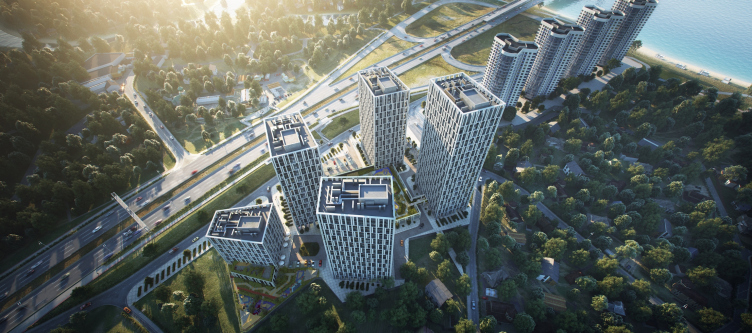
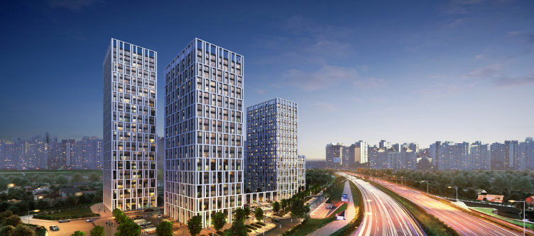
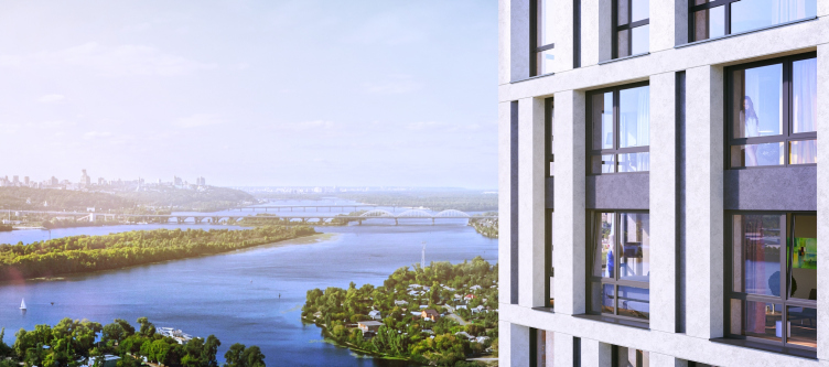
"Slavutich" housing project. Birds-eye view. Project, 2016 © Arkhimatika


"Slavutich" housing project. Birds-eye view. Project, 2016 © Arkhimatika


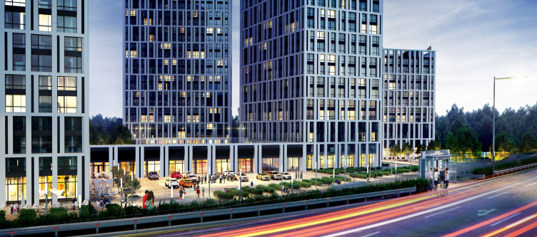
"Slavutich" housing project. View from the Bazhan Avenue. Project, 2016 © Arkhimatika


"Slavutich" housing project. Section view. Project, 2016 © Arkhimatika


"Slavutich" housing project. Yard. Project, 2016 © Arkhimatika


"Slavutich" housing project. Yard. Project, 2016 © Arkhimatika


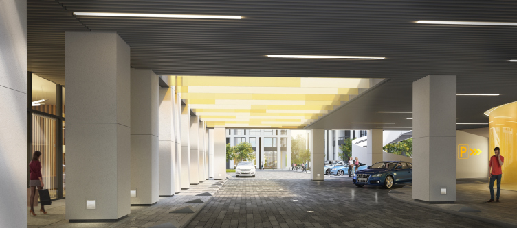
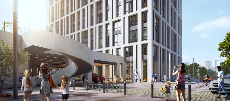
Yet another interesting solution came about as a result of separating the pedestrian and automotive traffic into two independent levels. All the driveways are situated on the ground level but at some places they are still routed under the pedestrian roof of the stylobate that forms sort of a tunnel over them. In order to keep these tunnels from looking dark and strictly utilitarian, the architects provided in some places inserts of colored glass beams that look a bit like Venetian blinds. They will also function like sun tubes, and the sun rays, passing through them, will create live colored spots on the walls and the floor, will introduce into the tunnels a play of light and shade, thus turning the tunnels into a stage for a play of sunlight.

"Slavutich" housing project. Arcade. Project, 2016 © Arkhimatika


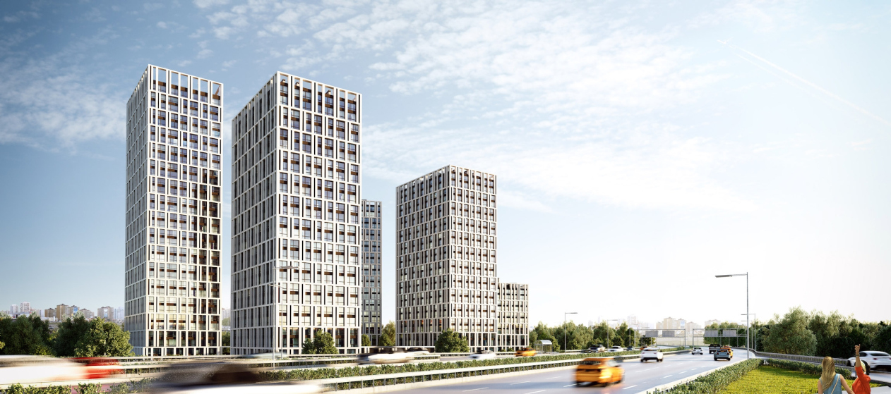
The unusual trapeze shape of the towers and their seeming "freehand" position are actually anything but accidental: they are in fact a result of careful calculations that helped the architects provide the required insolation, at the same time getting as much useful floor space as possible. 

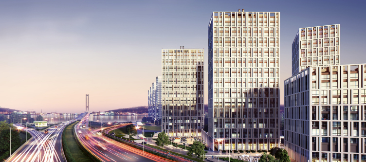
"The traditional standard of designing Kiev's riverside housing projects is aligning three to four typical sections at a same angle - we call them "firing squads" among ourselves - shares Alexander Popov, the founder of the company - and our project is in fact surrounded by several such monotonous alignments. The last such "firing squad" is located quite near (a ridge of towers that form something like a tail that stretches away from our project into the land), and it must be launched into operation pretty soon. As for our approach, we from the very start viewed our project as a single volume, and we would "cut away" the redundant pieces, ultimately getting a single composition of five towers and a stylobate. This went a long way to help us create that "natural" feel to our project and give an air of freedom to the entire composition that looks great when viewed both from the neighboring Bazhan Avenue and from the automotive South Bridge over the Dnipro".

"Slavutich" housing project. View from the Bazhan Avenue. Project, 2016 © Arkhimatika


"Slavutich" housing project. View from the bridge. Project, 2016 © Arkhimatika


The façades are designed in the form of a geometric grid "stretched" over the glass volumes. Its pattern is mainly conditioned by the architects' desire to increase the glazing area and clear the insides of the apartments from the bearing structures. The whole outside array of pylons is placed outside of the buildings' outer walls, forming a bearing casing. This way, the architects were not only able to create a pylon-free zone along the front of the outside wall, but also get a powerful and dramatic relief of the façade, enhancing it with protrusions of the intermediate floors every two stories. There are also extra pillars that perform a purely decorative function and give extra robustness to the pattern. This will be especially noticeable in the evening because the architects plan to backlight these "slit" recessions.

"Slavutich" housing project. View from the Bazhan Avenue. Project, 2016 © Arkhimatika


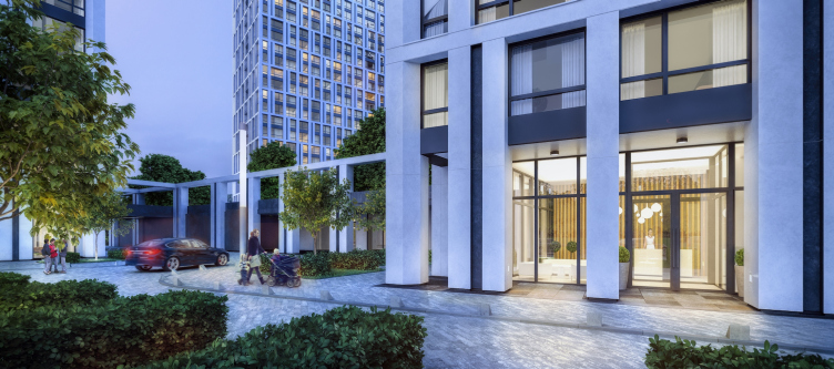
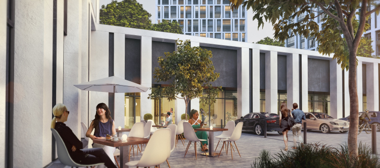
"Slavutich" housing project. Main entrance. Project, 2016 © Arkhimatika


"Slavutich" housing project. Project, 2016 © Arkhimatika


"Slavutich" housing project. Project, 2016 © Arkhimatika


As for the facade decoration, its solution is rather simple - it the classic "wet" system. This has to do with the fact that in spite of the rather pristine appearance, the apartments in this complex are rather democratically priced. It is this particular fact, as well as the smart planning, saturated infrastructure, and the tasteful design which, according to the architects, yields a feeling of prestige - and secure the success of the project whose apartments enjoy a fair share of demand in spite of the difficult economic situation in the country.

The construction is already underway and is expected to be completed in 2018. 
"Slavutich" housing project. Metro station. Project, 2016 © Arkhimatika
"Slavutich" housing project. Yard. Project, 2016 © Arkhimatika
"Slavutich" housing project. Kindergarten. Project, 2016 © Arkhimatika
"Slavutich" housing project. Yard. Project, 2016 © Arkhimatika
"Slavutich" housing project. Fitness center. Project, 2016 © Arkhimatika
"Slavutich" housing project. Project, 2016 © Arkhimatika

14 July 2016

Headlines now
The Golden Crown
The concept for a dental clinic in Yekaterinburg, developed by CNTR Studio, revolves around the idea of a “mouth full of gold”: pristine white porcelain stoneware walls are complemented by matte brass details. To avoid an overly literal interpretation, the architects focused on the building’s proportions, skillfully navigating between sunlight requirements and fire safety regulations.
Flexibility and Integration
Not long ago, we covered the project for the fourth phase of the ÁLIA residential complex, designed by APEX. Now, we’ve been shown different fence concepts they developed to enclose the complex’s private courtyards, incorporating a variety of public functions. We believe that the sheer fact that the complex’s architects were involved in such a detail as fencing speaks volumes.
A Step Forward
The HIDE residential complex represents a major milestone for ADM architects and their leaders Andrey Romanov and Ekaterina Kuznetsova in their quest for a fresh high-rise aesthetic – one that is flexible and layered, capable of bringing vibrancy to mass and silhouette while shaping form. Over recent years, this approach has become ADM’s “signature style”, with the golden HIDE tower playing a pivotal role in its evolution. Here, we delve into the project’s story, explore the details of the complex’s design, and uncover its core essence.
Gold in the Sands
A new office for a transcontinental company specializing in resource extraction and processing has opened in Dubai. Designed by T+T Architects, masters of creating spaces that are contemporary, diverse, flexible, and original, this project exemplifies their expertise. On the executive floor, a massive brass-clad partition dominates, while layered textures of compressed earth create a contextually resonant backdrop.
Layers and Levels of Flight
This project goes way back – Reserve Union won this architectural competition at the end of 2011, and the building was completed in 2018, so it’s practically “archival”. However, despite being relatively unknown, the building can hardly be considered “dated” and remains a prime example of architectural expression, particularly in the headquarters genre. And it’s especially fitting for an aviation company office. In some ways, it resembles the Aeroflot headquarters at Sheremetyevo but with its own unique identity, following the signature style of Vladimir Plotkin. In this article, we take an in-depth look at the United Aircraft Corporation (UAC) headquarters in the Moscow agglomeration town of Zhukovsky, supplemented by recent photographs from Alexey Naroditsky – a shoot that became only recently possible due to the fact that improvements were finally made in the surrounding area.
Light and Shadow
In this article, we delve into the architectural design of the “Chaika” house by DNK ag architects, which was recently completed in 2023 as part of the collection of signature designs at ZILArt. As is well-known, all the buildings in this complex follow a design code, yet each one is distinct. This particular building stands out not only for its whiteness and minimalism but also for the refined use of a limited number of techniques that, together, create what can confidently be called synergy.
Casus Novae
A master plan was developed for a large residential area with a name of “DNS City”, but now that its implementation began, the plan has been arbitrarily reformatted and replaced with something that, while similar on the surface, is actually quite different. This is not the first time such a thing happens, but it’s always frustrating. With permission from the author, we are sharing Maria Elkina’s post.
Treasure Hunting
The GAFA bureau, in collaboration with Tegola and Arkhitail, organized an expedition to the island of Kilpola in Karelia as part of Moskomarkhitektura’s “Open City” festival. There, amidst moss and rocks, the students sought answers to questions like: what is the sacred, where does it dwell, and what sustains it? Assisting the participants in this quest were landscape engineer Evgeny Levin, artist Nicholas Roerich, a moose, and the lack of cellular connection. Here’s how the story unfolded.
Depths of the Earth, Streams of Water
In the Malaya Okhta district, the Akzent building, designed by Stepan Liphart, was constructed. It follows a classic tripartite structure, yet it’s what you might call “hand-drawn”: each façade is unique in its form and details, some of which aren’t immediately noticeable. In this article, we explore the context and, together with the architect, delve into how the form was developed.
Fir Tree Dynamics
The “Airports of Region” holding is planning to build an airport in Karachay-Cherkessia, aiming to make the Arkhyz and Dombay resorts more accessible to travelers. The project that won in an invitation-only competition, submitted by Sergey Nikeshkin’s KPLN, blends natural imagery inspired by the shape of a conifer seed, open-air waiting spaces, majestic large trees, and a green roof elevated on needle-like columns. The result is both nature-inspired and WOW.
​A Brick Shell
In the process of designing a clubhouse situated among pine trees in a prestigious suburban area near Moscow, the architectural firm “A.Len” did the façade design part. The combination of different types of brick and masonry correlates with the volumetric and plastique solutions, further enhanced by the inclusion of wood-painted fragments and metal “glazing”.
Word Forms
ATRIUM architects love ambitious challenges, and for the firm’s thirtieth anniversary, they boldly play a game of words with an exhibition that dives deep into a self-created vocabulary. They immerse their projects – especially art installations – into this glossary, as if plunging into a current of their own. You feel as if you’re flowing through the veins of pure art, immersed in a universe of vertical cities, educational spaces – of which the architects are true masters – and the cultural codes of various locations. But what truly captivates is the bold statement that Vera Butko and Anton Nadtochy make, both through their work and this exhibition: architecture, above all, is art – the art of working with form and space.
Flexibility and Acuteness of Modernity
Luxurious, fluid, large “kokoshniks” and spiral barrel columns, as if made from colorful chewing gum: there seem to be no other mansion like this in Moscow, designed in the “Neo-Russian-Modern” style. And the “Teremok” on Malaya Kaluzhskaya, previously somewhat obscure, has “come alive with new colors” and gained visibility after its restoration for the office of the “architectural ecosystem” as the architects love to call themselves. It’s evident that Julius Borisov and the architects at UNK put their hearts into finding this new office and bringing it up to date. Let’s delve into the paradoxes of this mansion’s history and its plasticity. Spoiler: two versions of modernity meet here, both balancing on the razor’s edge of “what’s current”.
Yuri Vissarionov: “A modular house does not belong to the land”
It belongs to space, or to the air... It turns out that 3D printing is more effective when combined with a modular approach: the house is built in a workshop and then adapted to the site, including on uneven terrain. Yuri Vissarionov shares his latest experience in designing tourist complexes, both in central Russia and in the south. These include houseboats, homes printed from lightweight concrete using a 3D printer, and, of course, frame houses.
​Moscow’s First
“The quality of education largely depends on the quality of the educational environment”. This principle of the last decade has been realized by Sergey Skuratov in the project for the First Moscow Gymnasium on Rostovskaya Embankment in the Khamovniki district. The building seamlessly integrates into the complex urban landscape, responding both to the pedestrian flow of the city and the quiet alleyways. It skillfully takes advantage of the height differences and aligns with modern trends in educational space design. Let’s take a closer look.
Looking at the Water
The site of Villa Sonata stretches from the road to the water’s edge, offering its own shoreline, pier, and a picturesque river panorama. To reveal these sweeping views, Roman Leonidov “cut” the façade diagonally parallel to the river, thus getting two main axes for the house and, consequently, “two heads”. The internal core – two double-height spaces, a living room and a conservatory, with a “bridge” above them – makes the house both “transparent” and filled with light.
The White Wing
Well, it’s not exactly white. It’s more of a beige, white-stone structure that plays with the color of limestone – smoother surfaces are lighter, while rougher ones are darker. This wing unites various elements: it absorbs and interprets the surrounding themes. It responds to everything, yet maintains a cohesive expression – a challenging task! – while also incorporating recognizable features of its own, such as the dynamic cuts at the bottom, top, and middle.
Urban Dunes
The XSA Ramps team designed and built a three-part sports hub for a park in Rostov-on-Don, welcoming people of all ages and fitness levels. The skate plaza, pump track, and playground are all meticulously crafted with details that attract a diverse range of visitors. The technical execution of the shapes and slopes transforms this space into a kind of sculptural composition.
Proportional Growth
The project for the fourth phase of the ÁLIA residential area has been announced. The buildings are situated on an elongated plot – almost a “ray” that shoots out from the center of the area towards the river. Their layout reflects both a response to Moscow’s architectural preferences over the past 15 years, shifting “from blocks to towers”, and an interpretation of the neighboring business park designed by SOM. Additionally, the best apartments here are not located at the very top but closer to the middle, forming a glowing “waistline”.
The “Staircase” Building
In designing the “Details” residential complex in New Moscow, Rais Baishev spiced up the now-popular Moscow theme of a “courtyard” building with an idea drawn from the surrealist drawings by Maurits Escher. He envisioned the stepped silhouettes and descending slopes as a metaphysical mega-staircase, creating a key void within the courtyard that gave the project an internal “spine”. This concept is felt both in the building’s silhouette and on its façades.
Projection of the Quarter
No one doubted that the building that Vladimir Plotkin designed as part of the “Garden Quarters” would be the most modernist of all. And it turned out just that way: while adhering to the common design code, the building successfully combines brick and white stone, rhythmically responding to the neighboring building designed by Ostozhenka, yet tactfully and persistently making a few statements of its own. This includes the projection of the ideal urban development composition “14–9–6”, which can be found right next door, mathematical calculations, including those for various types of terraces (and perhaps the only reminder of the Soviet past of the Kauchuk rubber factory!), and the white “cross-stitch” pattern of the façade grid.
Domus Aurea
In this issue, we examine the “Tessinsky-1” house, designed by Sergey Skuratov and completed in 2023. Located in the middle of the Serebryanicheskaya Embankment district, at the intersection of its main streets, this house assumes a sort of “nodal” role: it not only responds to everything around it and preserves many memories of the former EMA factory within itself, but it weaves all this into a newly directed pattern, reconciling bright “gold” and dark-colored brick, largely with the help of the new, modern-yet-archaic Columba brick, which, come to think about it, is the most precious element here.
The Chimney of Nikola-Lenivets
In this issue, we are examining the “Obelisk House” designed by KATARSIS and built for the Arkhstoyanie 2023 festival. However, it was only finished later on, and this is why we are examining it now. It seems to us that after the “Obelisk House” appeared in Nikola-Lenivets, a dialogue and a few inner connections appeared between the temporary structures built here. These houses no longer look like “accidental neighbors”, more of which below.
​Periscope by the Bay
The jury awarded the second place in the competition for a public and cultural center in Petropavlovsk-Kamchatsky to the companies GORA (“Mountain”) and M4. In the consortium’s proposal, the building resembles a sperm whale with a calf swimming next to it or a periscope, whose lenses capture the most spectacular views from the surrounding landscape.
From Arcs to Dolmens
While working on the competition project for Petropavlovsk-Kamchatsky, ASADOV Architects prioritized the value of the natural and urban environment, aiming to preserve the balance of the location while minimizing the resemblance of the volume that they designed to a “traditional building”. The task was challenging, and the architects created three versions, one of which having been developed after the competition, where their main proposal took third place. However, the point of interest here is not the competition result but the continuity of creative thinking.
Hide and Seek
The ID Moskovskiy house, designed by Stepan Liphart in St. Petersburg, in the courtyards near Moskovskiy Avenue beyond the Obvodny Canal and recently completed, is notable for several reasons. Firstly, it has been realized with considerable accuracy, which is particularly significant as this is the first building where the architect was responsible not only for the facades but also for the layouts, allowing for better integration between the two. On the other hand, this building is interesting as an example of the “germination” of new architecture in the city: it draws on the best examples from the neighborhood and becomes an improved and developed sum of ideas found by the architect in the surrounding context.
The Big Twelve
Yesterday, the winners of the Moscow Mayor’s Architecture Award were announced and honored. Let’s take a look at what was awarded and, in some cases, even critique this esteemed award. After all, there is always room for improvement, right?
Above the Golden Horn
The residential complex “Philosophy” designed by T+T architects in Vladivostok, is one of the new projects in the “Golubinaya Pad” area, changing its development philosophy (pun intended) from single houses to a comprehensive approach. The buildings are organized along public streets, varying in height and format, with one house even executed in gallery typology, featuring a cantilever leaning on an art object.
Nuanced Alternative
How can you rhyme a square and space? Easily! But to do so, you need to rhyme everything you can possibly think of: weave everything together, like in a tensegrity structure, and find your own optics too. The new exhibition at GES-2 does just that, offering its visitor a new perspective on the history of art spanning 150 years, infused with the hope for endless multiplicity of worlds and art histories. Read on to see how this is achieved and how the exhibition design by Evgeny Ace contributes to it.
Blinds for Ice
An ice arena has been constructed in Domodedovo based on a project by Yuri Vissarionov Architects. To prevent the long façade, a technical requirement for winter sports facilities, from appearing monotonous, the architects proposed the use of suspended structures with multidirectional slats. This design protects the ice from direct sunlight while giving the wall texture and detail.