По-русски

Towers above the Forest

A residential complex PerovSky upon a project of ADM bureau is being built at the border of Terletskaya Dubrava, to become the embodiment of the spirit – not the form – of city block development ideology.

15 February 2016
Object
mainImg

The construction site where MP Group is building the new multi-functional residential complex is located in a unique natural environment considering the urban conditions. Not only is it separated from Entuziastov Shosse and Perovo residential districts with green territories of two hospitals and the House of Veterans of the Stage, but also, practically right by its east boarder, in a few minutes walking distance, begins the territory of Terletsky Park – a monument of landscaping with a cascade of ponds, an old forest and other joys of a park; not to mention the vast Izmaylovsky forest stretching out on the other side of the highway. This magnificent location from the point of view of ecology and future characterization, has another advantage – the architects did not have to think how to fit this project into the urban landscape due to complete absence of the latter. One of the authors of the complex under construction, Andrey Romanov, compares such objects with a submarine which exists autonomously and follows only its own rules. “The main thing – he adds, – is for the object to be by itself integral and have internal harmony”.

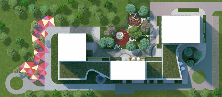
The main idea, on which Andrey Romanov and Ekaterina Kuznetsova founded the project, is the subject of “own territory”, in other words – the popular city block development; after all, a street block in its essence is nothing short of a cell of urban structure proportionate to a man, inside of which the residents must get the feeling of being home. It is clear that the easiest way to construct such a cell is traditionally – to insulate the inner space with a closed boundary. But, if it is not possible the same result can be achieved with less obvious architectural methods. PerovSky residential complex consists of three 23-storey towers: however hard you try, you will not build a traditional block with such components. That is why, the architects of ADM united the towers with a two-storey stylobate. Such method has already made a good showing: the low-rise volume does not oppress the on-looker, does not overshadow the yard but successfully fulfills its role as an interlink. The architects also used it in their previous work for MR Group, a residential complex on Vorobyovy Gory.          

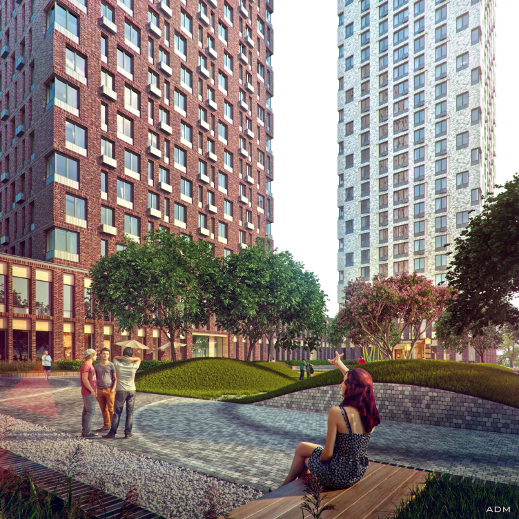
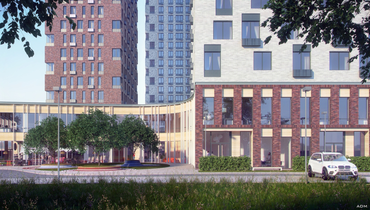
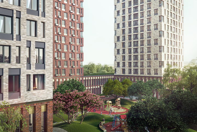
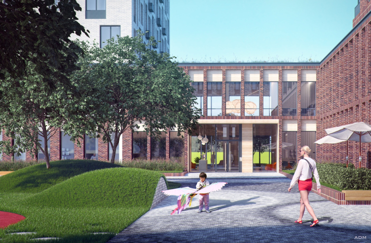
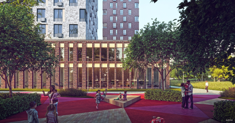
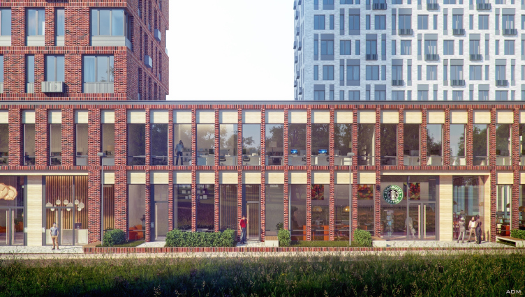
In this case, the volume complicated on plan – pedantically repeated straight lines of the towers in one place and suddenly drawn back parabolic curves – does not only place all the necessary infrastructure – from a supermarket and cafes to a fitness center – but also serves as a barrier separating the inside territory from the outside, street space. The main lobby of the stylobate leads to one of the residential buildings. To get into the other two, one must cross the yard. The opening of the second entrance leads to the kindergarten, built with a view to both the complex residents and their neighbors. The architects moved its promenade area decorated with colored triangles outside the yard – it adjoins the outer side of the stylobate.

Multifunctional building with residential and other kinds of premises on the Shosse Entuziastov. Project, 2015 © ADM
Multifunctional building with residential and other kinds of premises on the Shosse Entuziastov. Main entrance. Project, 2015 © ADM


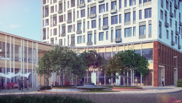
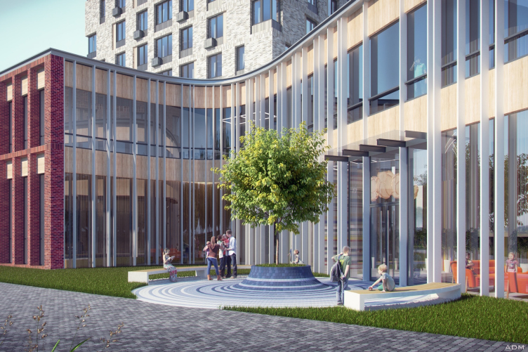
Multifunctional building with residential and other kinds of premises on the Shosse Entuziastov. Main entrance. Project, 2015 © ADM


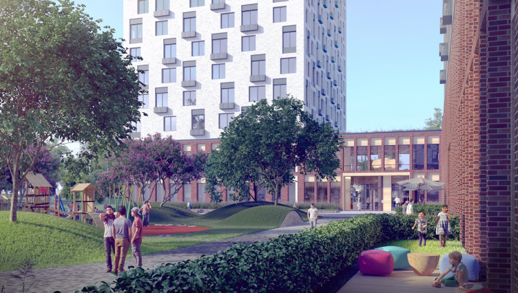
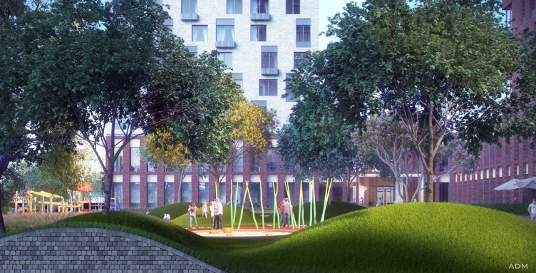
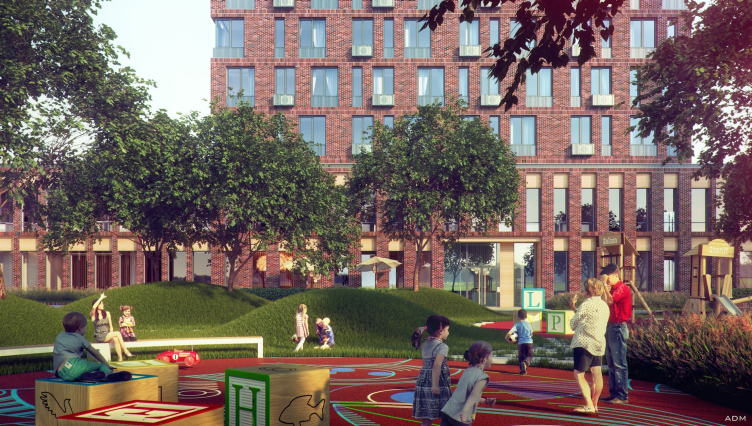
Multifunctional building with residential and other kinds of premises on the Shosse Entuziastov. Yard. Project, 2015 © ADM


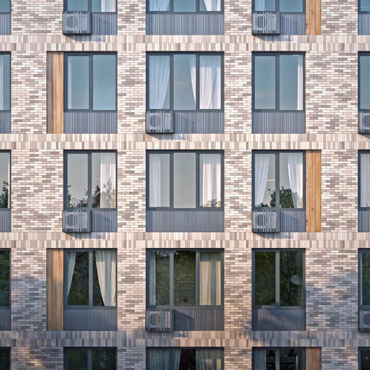
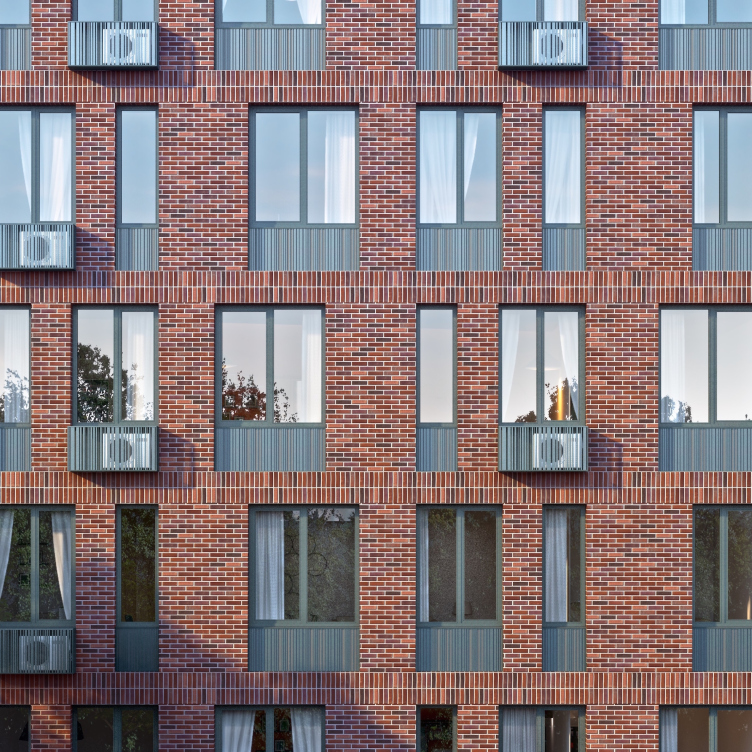
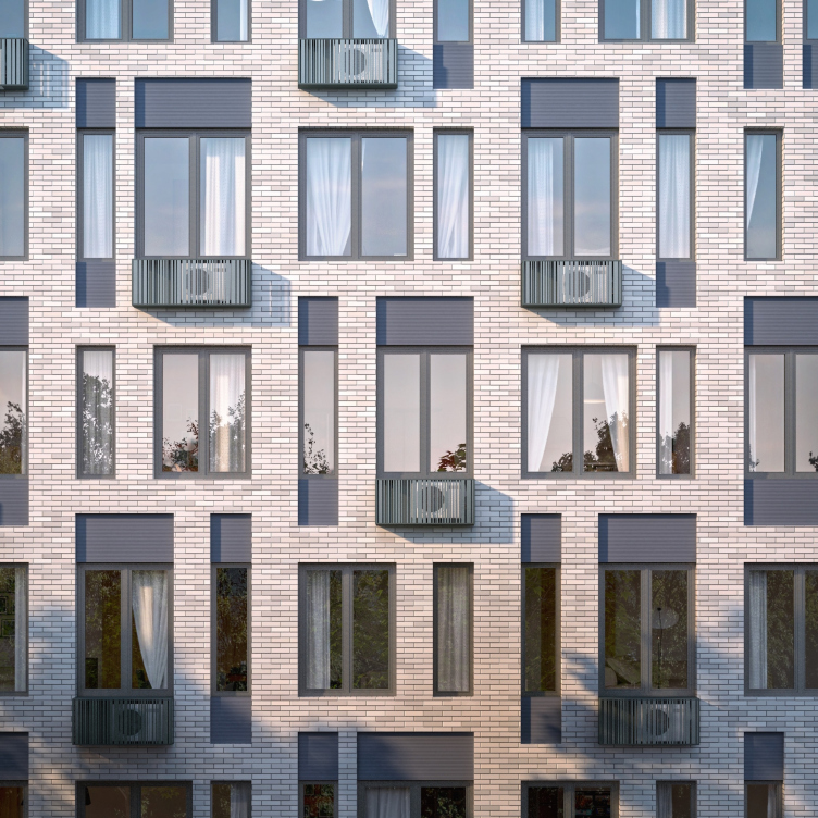
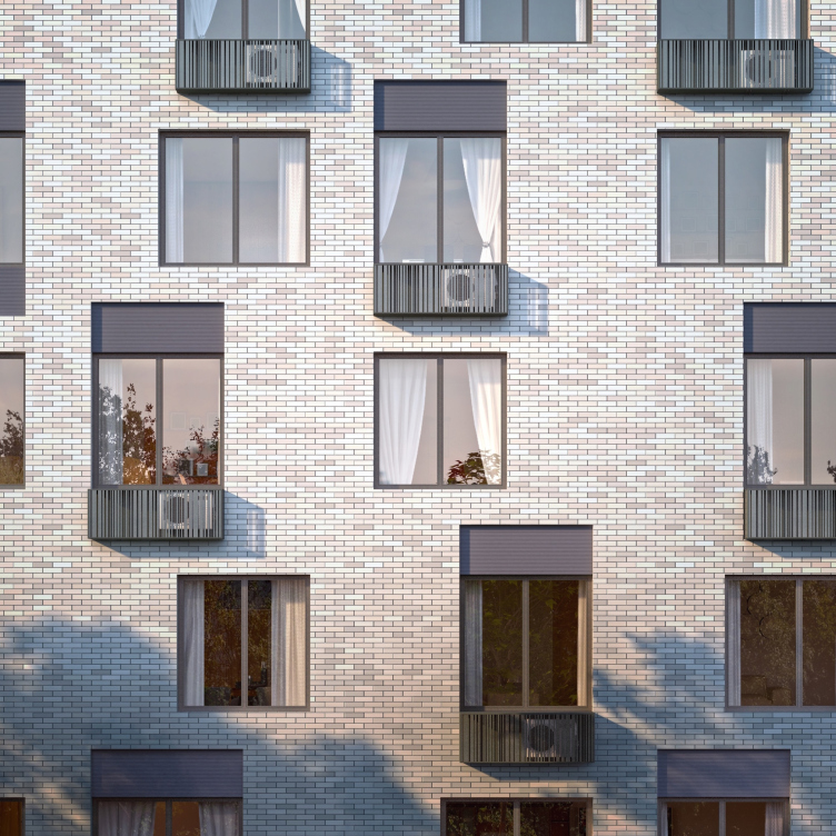
Given the obvious stylistic similarity, the facades of the residential buildings are executed in different sculptural manners. More specifically, there is one topic and many variations. It is partially conditioned by varying apartment layout, arrangement by cardinal points, and partially – by the wish to make each tower block individual. Clinker brick is used for all the facades, but the wide color range of this material allowed to choose a specific tone for every building, animating them with less or more emphasized pixelization which creates a feeling of volume and even movement: slight garishness is better for the eye than blind monotony. The cross-beams in the inter-floor lines are placed vertically forming light unobstrusive frames which can be seen only as a slight hint through the pattern of cladding seams.         

Another tool for the wall arrangement is the rhythm of the windows. Just as in their previous projects, Andrey Romanov and Ekaterina Kuznetsova build it up in a masterful manner. In one of the towers – the red brick one – the windows arranged in vertical rows afford diagonal dynamics, echoing on every other floor with the alternation of nook-windows. The regular but dynamic pattern of the embrasures makes the wall feel lighter compensating the tangible substantiality of red brick. The second tower is brighter and more austere and regular; its embrasures concentrate notably towards the center of the facades, accenting the solidity of the corners. The third tower is even brighter, and its rhythm is complicated by horizontal alternation that turns the façade into a chess pattern. This image is supported by metal-coated horizontal elements on the tops and bottoms of the windows, vertical wooden panels (also used in the second tower) and small grill boxes for ACs.          

The partition walls of the stylobate are noticeably thinner, there is more fenestration and its volume rolled out on the ground feels slender and light. A line of bright wood runs across both parts of the stylobate on its top like a continuous strip. It is inserted deeper than the prominent ribs but above the surface of the windows, conforming to the same effect of multilayer walls applied in the residential towers. In places where the flat surfaces of the stylobate facades extend the lines of tower walls, they are turned into red-brick lattice, genetically connected with the terracotta color of the first tower. In the cavities of mini-squares in front of the entrances, the architects replace the wooden rids with even thinner white ones: this “nibbled apple” effect emphasizes the openness of the entrance areas, invites to come inside, and at the same time, allows to feel the transitional character of these areas, half-enclosed in the geometrical contours of the block, but not yet outside, behind the transparent surface of the glass. The roof of the stylobate is scheduled to be planted with trees, so that the view of it from the windows will not disturb the harmony of the surrounding forest panorama.

Multifunctional building with residential and other kinds of premises on the Shosse Entuziastov. Project, 2015 © ADM


Multifunctional building with residential and other kinds of premises on the Shosse Entuziastov. Fragment of the first unit. Project, 2015 © ADM


Multifunctional building with residential and other kinds of premises on the Shosse Entuziastov. Fragment of the second unit. Project, 2015 © ADM


Multifunctional building with residential and other kinds of premises on the Shosse Entuziastov. Fragment of the third unit. Project, 2015 © ADM


Multifunctional building with residential and other kinds of premises on the Shosse Entuziastov. Fragment of the third unit. Project, 2015 © ADM


Multifunctional building with residential and other kinds of premises on the Shosse Entuziastov. Project, 2015 © ADM


Multifunctional building with residential and other kinds of premises on the Shosse Entuziastov. Project, 2015 © ADM


The thing that Andrey Romanov and Ekaterina Kuznetsova never economize on is the improvement of the living environment. It concerns not only and so much the budget, as ideas and time spent for the development. After all, besides its practical functions (benches for resting, playgrounds for playing, trees for shadowing) a correct design of building surrounding grounds solves serious macrotasks. The architects are sure that a person cannot perceive even the best façade in isolation from the landscape context. “It is a matter of goal-setting, – says Andrey Romanov. – We want to create an environment which a person would find exciting and comfortable even if many details have to be perceived subconsciously”.      

PerovSky complex has to arouse curiosity right at its entrance: in front of the main lobby, there is a picturesque front square with trees, rounded benches and concentric rings or colored tiles. A similar but smaller square will appear at the entrance to the kindergarten. But, of course, the most intricate and thoroughly elaborated landscape design will fall to the complex residents. The architects plan to mound actual hills in the courtyards (since there will be underground parking lots, a certain amount of soil has to be added for planted trees), arrange playgrounds – not to mention flowerbeds, lawns and paths forming images that sometimes remind real specimen of avant-garde. The children raised in such a yard are only to be envied – they will have their own little world, with mountains, gardens, alleys and lanes. Grown-ups will also find where to rest and what to fix their eyes on in this environment. Seeing the rich landscape together with the guarding but light and see-through stylobate a passer-by will perceive it as a fragment of a well-developed city – a comfortable space of a human scale. To some extent, it can be seen as a solution to the problem of a priori “inhumane” sizes of high-rise buildings: the towers step back onto the background; from the outside, only the two-storey part can be perceived and “functions”. And even though, on returning home, the resident will feel the height of the towers, it is felt differently from up here – through the panorama of the surrounding parks and city in the perspective. And our increasingly “less comfortable” time needs both the coziness of the landscape, and the feel of “soaring over the city”.              
Multifunctional building with residential and other kinds of premises on the Shosse Entuziastov. Project, 2015 © ADM
Multifunctional building with residential and other kinds of premises on the Shosse Entuziastov. Kindregarten. Project, 2015 © ADM
Multifunctional building with residential and other kinds of premises on the Shosse Entuziastov. Project, 2015 © ADM
Multifunctional building with residential and other kinds of premises on the Shosse Entuziastov. Kindergarten. Project, 2015 © ADM
Multifunctional building with residential and other kinds of premises on the Shosse Entuziastov. Master plan. Project, 2015 © ADM
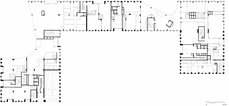
Multifunctional building with residential and other kinds of premises on the Shosse Entuziastov. Plan of the first floor. Project, 2015 © ADM
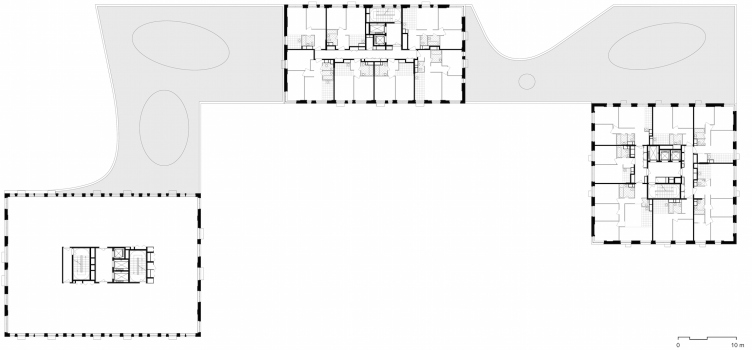
Multifunctional building with residential and other kinds of premises on the Shosse Entuziastov. Plan of the typical floor Project, 2015 © ADM

15 February 2016

Headlines now
The Golden Crown
The concept for a dental clinic in Yekaterinburg, developed by CNTR Studio, revolves around the idea of a “mouth full of gold”: pristine white porcelain stoneware walls are complemented by matte brass details. To avoid an overly literal interpretation, the architects focused on the building’s proportions, skillfully navigating between sunlight requirements and fire safety regulations.
Flexibility and Integration
Not long ago, we covered the project for the fourth phase of the ÁLIA residential complex, designed by APEX. Now, we’ve been shown different fence concepts they developed to enclose the complex’s private courtyards, incorporating a variety of public functions. We believe that the sheer fact that the complex’s architects were involved in such a detail as fencing speaks volumes.
A Step Forward
The HIDE residential complex represents a major milestone for ADM architects and their leaders Andrey Romanov and Ekaterina Kuznetsova in their quest for a fresh high-rise aesthetic – one that is flexible and layered, capable of bringing vibrancy to mass and silhouette while shaping form. Over recent years, this approach has become ADM’s “signature style”, with the golden HIDE tower playing a pivotal role in its evolution. Here, we delve into the project’s story, explore the details of the complex’s design, and uncover its core essence.
Gold in the Sands
A new office for a transcontinental company specializing in resource extraction and processing has opened in Dubai. Designed by T+T Architects, masters of creating spaces that are contemporary, diverse, flexible, and original, this project exemplifies their expertise. On the executive floor, a massive brass-clad partition dominates, while layered textures of compressed earth create a contextually resonant backdrop.
Layers and Levels of Flight
This project goes way back – Reserve Union won this architectural competition at the end of 2011, and the building was completed in 2018, so it’s practically “archival”. However, despite being relatively unknown, the building can hardly be considered “dated” and remains a prime example of architectural expression, particularly in the headquarters genre. And it’s especially fitting for an aviation company office. In some ways, it resembles the Aeroflot headquarters at Sheremetyevo but with its own unique identity, following the signature style of Vladimir Plotkin. In this article, we take an in-depth look at the United Aircraft Corporation (UAC) headquarters in the Moscow agglomeration town of Zhukovsky, supplemented by recent photographs from Alexey Naroditsky – a shoot that became only recently possible due to the fact that improvements were finally made in the surrounding area.
Light and Shadow
In this article, we delve into the architectural design of the “Chaika” house by DNK ag architects, which was recently completed in 2023 as part of the collection of signature designs at ZILArt. As is well-known, all the buildings in this complex follow a design code, yet each one is distinct. This particular building stands out not only for its whiteness and minimalism but also for the refined use of a limited number of techniques that, together, create what can confidently be called synergy.
Casus Novae
A master plan was developed for a large residential area with a name of “DNS City”, but now that its implementation began, the plan has been arbitrarily reformatted and replaced with something that, while similar on the surface, is actually quite different. This is not the first time such a thing happens, but it’s always frustrating. With permission from the author, we are sharing Maria Elkina’s post.
Treasure Hunting
The GAFA bureau, in collaboration with Tegola and Arkhitail, organized an expedition to the island of Kilpola in Karelia as part of Moskomarkhitektura’s “Open City” festival. There, amidst moss and rocks, the students sought answers to questions like: what is the sacred, where does it dwell, and what sustains it? Assisting the participants in this quest were landscape engineer Evgeny Levin, artist Nicholas Roerich, a moose, and the lack of cellular connection. Here’s how the story unfolded.
Depths of the Earth, Streams of Water
In the Malaya Okhta district, the Akzent building, designed by Stepan Liphart, was constructed. It follows a classic tripartite structure, yet it’s what you might call “hand-drawn”: each façade is unique in its form and details, some of which aren’t immediately noticeable. In this article, we explore the context and, together with the architect, delve into how the form was developed.
Fir Tree Dynamics
The “Airports of Region” holding is planning to build an airport in Karachay-Cherkessia, aiming to make the Arkhyz and Dombay resorts more accessible to travelers. The project that won in an invitation-only competition, submitted by Sergey Nikeshkin’s KPLN, blends natural imagery inspired by the shape of a conifer seed, open-air waiting spaces, majestic large trees, and a green roof elevated on needle-like columns. The result is both nature-inspired and WOW.
​A Brick Shell
In the process of designing a clubhouse situated among pine trees in a prestigious suburban area near Moscow, the architectural firm “A.Len” did the façade design part. The combination of different types of brick and masonry correlates with the volumetric and plastique solutions, further enhanced by the inclusion of wood-painted fragments and metal “glazing”.
Word Forms
ATRIUM architects love ambitious challenges, and for the firm’s thirtieth anniversary, they boldly play a game of words with an exhibition that dives deep into a self-created vocabulary. They immerse their projects – especially art installations – into this glossary, as if plunging into a current of their own. You feel as if you’re flowing through the veins of pure art, immersed in a universe of vertical cities, educational spaces – of which the architects are true masters – and the cultural codes of various locations. But what truly captivates is the bold statement that Vera Butko and Anton Nadtochy make, both through their work and this exhibition: architecture, above all, is art – the art of working with form and space.
Flexibility and Acuteness of Modernity
Luxurious, fluid, large “kokoshniks” and spiral barrel columns, as if made from colorful chewing gum: there seem to be no other mansion like this in Moscow, designed in the “Neo-Russian-Modern” style. And the “Teremok” on Malaya Kaluzhskaya, previously somewhat obscure, has “come alive with new colors” and gained visibility after its restoration for the office of the “architectural ecosystem” as the architects love to call themselves. It’s evident that Julius Borisov and the architects at UNK put their hearts into finding this new office and bringing it up to date. Let’s delve into the paradoxes of this mansion’s history and its plasticity. Spoiler: two versions of modernity meet here, both balancing on the razor’s edge of “what’s current”.
Yuri Vissarionov: “A modular house does not belong to the land”
It belongs to space, or to the air... It turns out that 3D printing is more effective when combined with a modular approach: the house is built in a workshop and then adapted to the site, including on uneven terrain. Yuri Vissarionov shares his latest experience in designing tourist complexes, both in central Russia and in the south. These include houseboats, homes printed from lightweight concrete using a 3D printer, and, of course, frame houses.
​Moscow’s First
“The quality of education largely depends on the quality of the educational environment”. This principle of the last decade has been realized by Sergey Skuratov in the project for the First Moscow Gymnasium on Rostovskaya Embankment in the Khamovniki district. The building seamlessly integrates into the complex urban landscape, responding both to the pedestrian flow of the city and the quiet alleyways. It skillfully takes advantage of the height differences and aligns with modern trends in educational space design. Let’s take a closer look.
Looking at the Water
The site of Villa Sonata stretches from the road to the water’s edge, offering its own shoreline, pier, and a picturesque river panorama. To reveal these sweeping views, Roman Leonidov “cut” the façade diagonally parallel to the river, thus getting two main axes for the house and, consequently, “two heads”. The internal core – two double-height spaces, a living room and a conservatory, with a “bridge” above them – makes the house both “transparent” and filled with light.
The White Wing
Well, it’s not exactly white. It’s more of a beige, white-stone structure that plays with the color of limestone – smoother surfaces are lighter, while rougher ones are darker. This wing unites various elements: it absorbs and interprets the surrounding themes. It responds to everything, yet maintains a cohesive expression – a challenging task! – while also incorporating recognizable features of its own, such as the dynamic cuts at the bottom, top, and middle.
Urban Dunes
The XSA Ramps team designed and built a three-part sports hub for a park in Rostov-on-Don, welcoming people of all ages and fitness levels. The skate plaza, pump track, and playground are all meticulously crafted with details that attract a diverse range of visitors. The technical execution of the shapes and slopes transforms this space into a kind of sculptural composition.
Proportional Growth
The project for the fourth phase of the ÁLIA residential area has been announced. The buildings are situated on an elongated plot – almost a “ray” that shoots out from the center of the area towards the river. Their layout reflects both a response to Moscow’s architectural preferences over the past 15 years, shifting “from blocks to towers”, and an interpretation of the neighboring business park designed by SOM. Additionally, the best apartments here are not located at the very top but closer to the middle, forming a glowing “waistline”.
The “Staircase” Building
In designing the “Details” residential complex in New Moscow, Rais Baishev spiced up the now-popular Moscow theme of a “courtyard” building with an idea drawn from the surrealist drawings by Maurits Escher. He envisioned the stepped silhouettes and descending slopes as a metaphysical mega-staircase, creating a key void within the courtyard that gave the project an internal “spine”. This concept is felt both in the building’s silhouette and on its façades.
Projection of the Quarter
No one doubted that the building that Vladimir Plotkin designed as part of the “Garden Quarters” would be the most modernist of all. And it turned out just that way: while adhering to the common design code, the building successfully combines brick and white stone, rhythmically responding to the neighboring building designed by Ostozhenka, yet tactfully and persistently making a few statements of its own. This includes the projection of the ideal urban development composition “14–9–6”, which can be found right next door, mathematical calculations, including those for various types of terraces (and perhaps the only reminder of the Soviet past of the Kauchuk rubber factory!), and the white “cross-stitch” pattern of the façade grid.
Domus Aurea
In this issue, we examine the “Tessinsky-1” house, designed by Sergey Skuratov and completed in 2023. Located in the middle of the Serebryanicheskaya Embankment district, at the intersection of its main streets, this house assumes a sort of “nodal” role: it not only responds to everything around it and preserves many memories of the former EMA factory within itself, but it weaves all this into a newly directed pattern, reconciling bright “gold” and dark-colored brick, largely with the help of the new, modern-yet-archaic Columba brick, which, come to think about it, is the most precious element here.
The Chimney of Nikola-Lenivets
In this issue, we are examining the “Obelisk House” designed by KATARSIS and built for the Arkhstoyanie 2023 festival. However, it was only finished later on, and this is why we are examining it now. It seems to us that after the “Obelisk House” appeared in Nikola-Lenivets, a dialogue and a few inner connections appeared between the temporary structures built here. These houses no longer look like “accidental neighbors”, more of which below.
​Periscope by the Bay
The jury awarded the second place in the competition for a public and cultural center in Petropavlovsk-Kamchatsky to the companies GORA (“Mountain”) and M4. In the consortium’s proposal, the building resembles a sperm whale with a calf swimming next to it or a periscope, whose lenses capture the most spectacular views from the surrounding landscape.
From Arcs to Dolmens
While working on the competition project for Petropavlovsk-Kamchatsky, ASADOV Architects prioritized the value of the natural and urban environment, aiming to preserve the balance of the location while minimizing the resemblance of the volume that they designed to a “traditional building”. The task was challenging, and the architects created three versions, one of which having been developed after the competition, where their main proposal took third place. However, the point of interest here is not the competition result but the continuity of creative thinking.
Hide and Seek
The ID Moskovskiy house, designed by Stepan Liphart in St. Petersburg, in the courtyards near Moskovskiy Avenue beyond the Obvodny Canal and recently completed, is notable for several reasons. Firstly, it has been realized with considerable accuracy, which is particularly significant as this is the first building where the architect was responsible not only for the facades but also for the layouts, allowing for better integration between the two. On the other hand, this building is interesting as an example of the “germination” of new architecture in the city: it draws on the best examples from the neighborhood and becomes an improved and developed sum of ideas found by the architect in the surrounding context.
The Big Twelve
Yesterday, the winners of the Moscow Mayor’s Architecture Award were announced and honored. Let’s take a look at what was awarded and, in some cases, even critique this esteemed award. After all, there is always room for improvement, right?
Above the Golden Horn
The residential complex “Philosophy” designed by T+T architects in Vladivostok, is one of the new projects in the “Golubinaya Pad” area, changing its development philosophy (pun intended) from single houses to a comprehensive approach. The buildings are organized along public streets, varying in height and format, with one house even executed in gallery typology, featuring a cantilever leaning on an art object.
Nuanced Alternative
How can you rhyme a square and space? Easily! But to do so, you need to rhyme everything you can possibly think of: weave everything together, like in a tensegrity structure, and find your own optics too. The new exhibition at GES-2 does just that, offering its visitor a new perspective on the history of art spanning 150 years, infused with the hope for endless multiplicity of worlds and art histories. Read on to see how this is achieved and how the exhibition design by Evgeny Ace contributes to it.
Blinds for Ice
An ice arena has been constructed in Domodedovo based on a project by Yuri Vissarionov Architects. To prevent the long façade, a technical requirement for winter sports facilities, from appearing monotonous, the architects proposed the use of suspended structures with multidirectional slats. This design protects the ice from direct sunlight while giving the wall texture and detail.