This project by Sergey Skuratov won the international competition for the best concept of integrated multifunctional construction on the Sofiyskaya Embankment getting the upper hand of five other finalists: Steven Holl, Benedetta Taglabue of EMBT, Sergey Tchoban, Cino Zucchi, and MLA+ (Markus Appenzeller and others). The projects of the five finalists are available here.
"This is a very mysterious place and one that imposes great responsibility on you - said the architect on the day the results of the contest were announced - I must have walked around it for decades, and I even made attempts to make my first test proposals. In my opinion, transforming this place will be the key to finding a solution for the entire island".
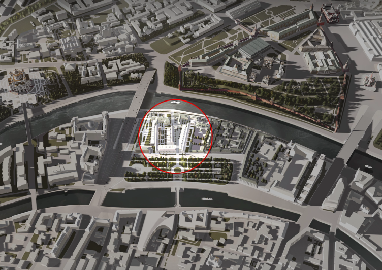
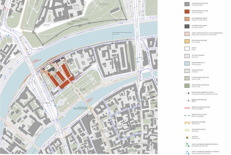
Multifunctional integrated development of the Sofiyskaya Embankment. Location plan © Sergey Skuratov ARCHITECTS
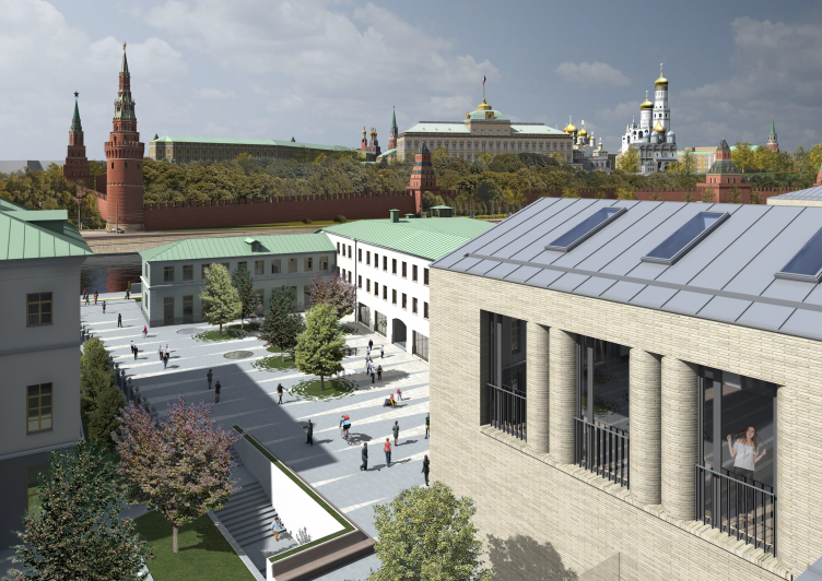
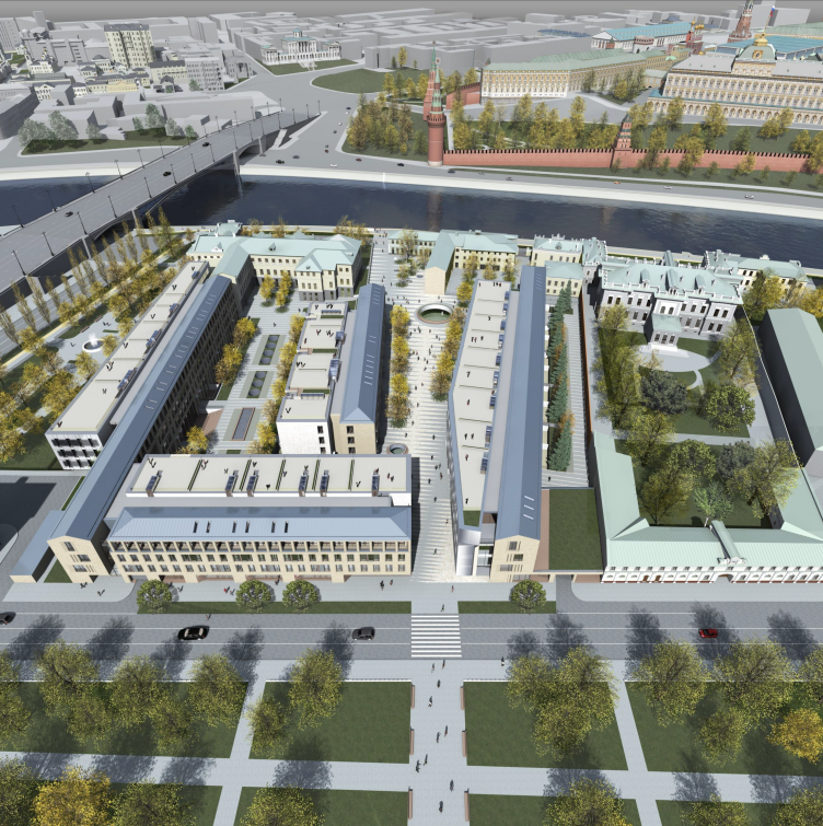
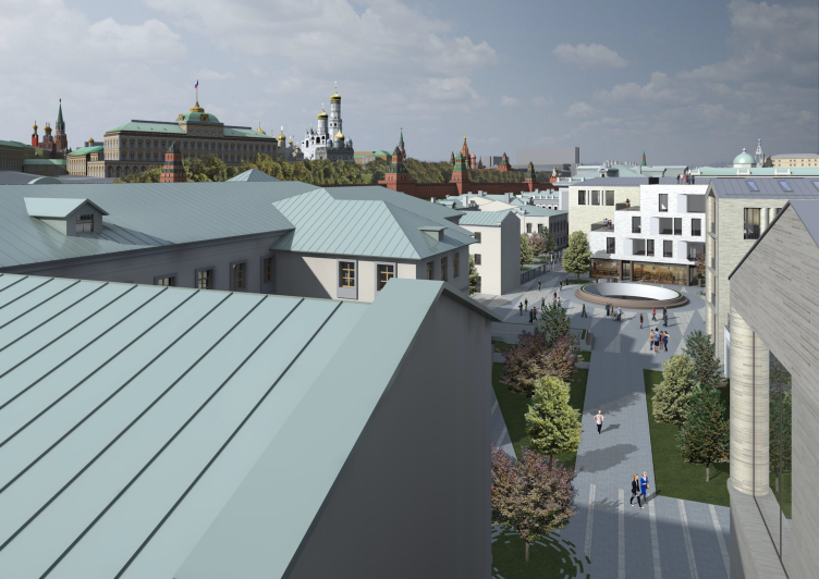
Multifunctional integrated development of the Sofiyskaya Embankment. View from a roof © Sergey Skuratov ARCHITECTS
Thus, the contestants were required to create a project of a multifunctional complex consisting of a residential part, a boutique hotel, shops, cafes, a parking lot, and a fitness center, as well as pay homage to the hot trend of today taking care of the urban environment. The proposals by all the six finalists addressed this part of the task by designing a boulevard that connected the Bolotnaya Square to the embankment running along the Moskva River framing, one way or another, the view of Moscow's main sight - the towers of the Kremlin.
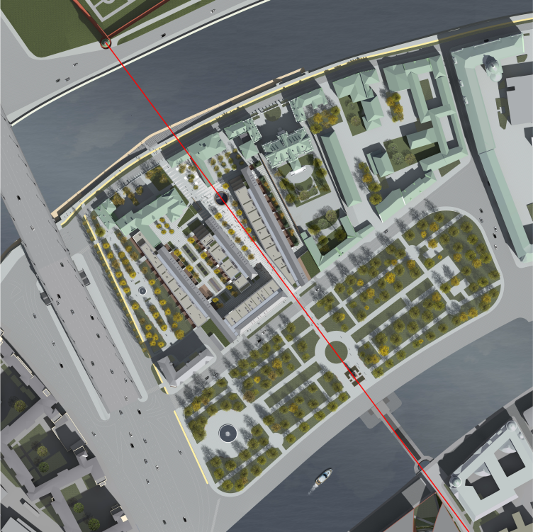
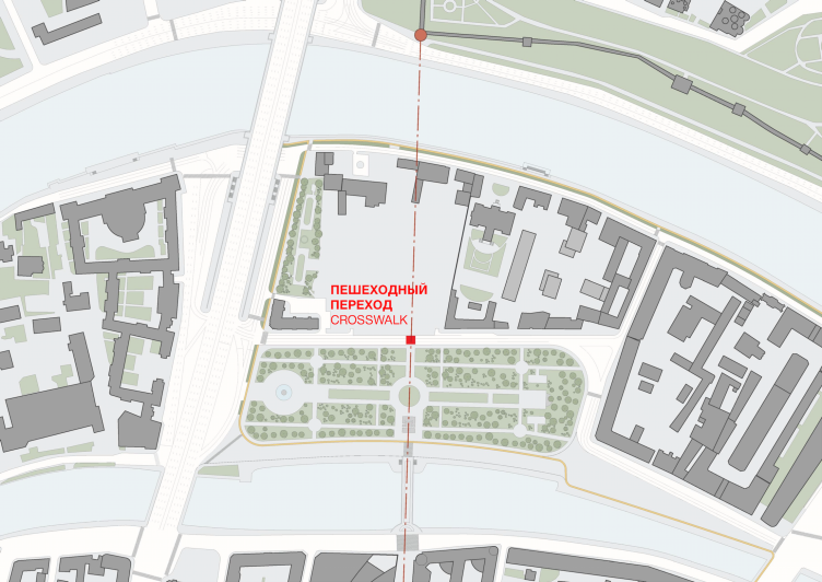
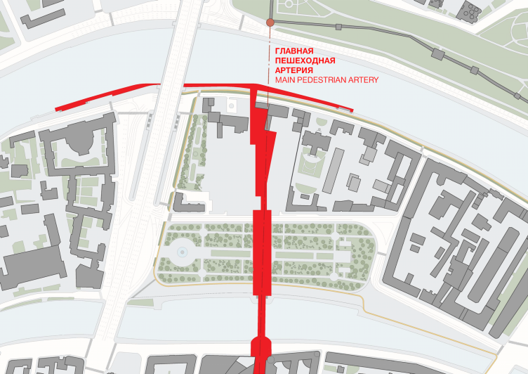
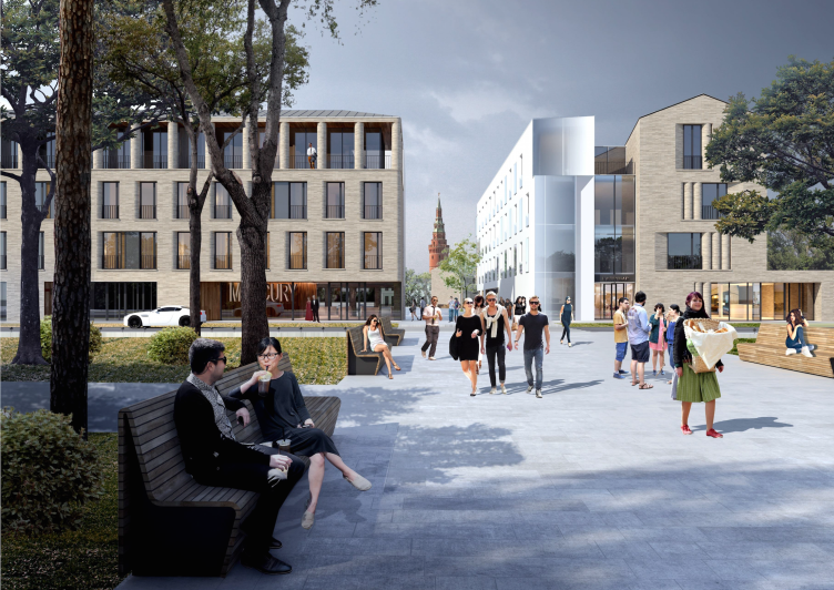
Sergey Skuratov, however, going far beyond the pale of the land site in question, made a perfect match between the public space of the boulevard and the visual pedestrian axis connecting the beginning of the Lavrushinsky Alley to the embankment. This axis will lead an individual who, say, exited from the Tretyakovskaya Gallery and saw in the unfolding perspective the landmark of the Vodovzvodnaya Tower, down the park to the boulevard - where they will immerse themselves into the atmosphere of a bustling tourist city - and then will find themselves on the embankment to enjoy the views of the Tsar's fortress. In order to make this path more smooth, and in order to make the tower always visible in the distance, every detail has been taken care of: the architect draws pedestrian crossings and proposes to prolong and broaden the traverse promenade of the park, and maybe even - still later on - take away the large circular flower bed behind the back of the bronze Repin monument, so that it would not get in the way. Also it is planned that a few hazardous trees will be removed from the line of vision. Ultimately the city is going to get a small but still new and neat tourist route running from the museum passage at the corner of the future new building of the Tretyakovskaya Gallery to the moor on the embankment. For the time being, there is also a hypothetical possibility of getting a reverse tourist route: if the tourists come by boat and make an ascent to the nation's main museum of painting via a small pedestrian street inside the new complex designed by Skuratov.
Multifunctional integrated development of the Sofiyskaya Embankment. Axis. Master plan © Sergey Skuratov ARCHITECTS
Multifunctional integrated development of the Sofiyskaya Embankment © Sergey Skuratov ARCHITECTS
Multifunctional integrated development of the Sofiyskaya Embankment. Pedestrian crossing © Sergey Skuratov ARCHITECTS
Multifunctional integrated development of the Sofiyskaya Embankment. Replanting the trees © Sergey Skuratov ARCHITECTS
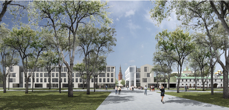
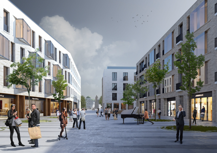
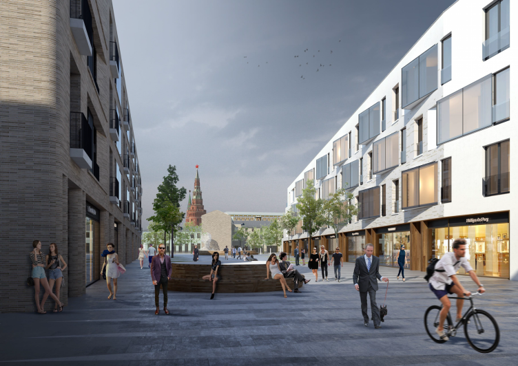
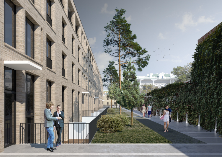
Multifunctional integrated development of the Sofiyskaya Embankment. Boulevard © Sergey Skuratov ARCHITECTS
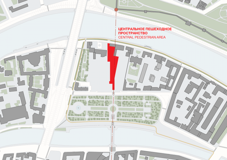
Multifunctional integrated development of the Sofiyskaya Embankment. The central pedestrian area © Sergey Skuratov ARCHITECTS
Multifunctional integrated development of the Sofiyskaya Embankment. The central pedestrian artery © Sergey Skuratov ARCHITECTS
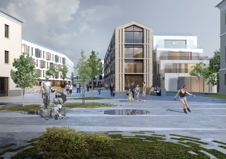
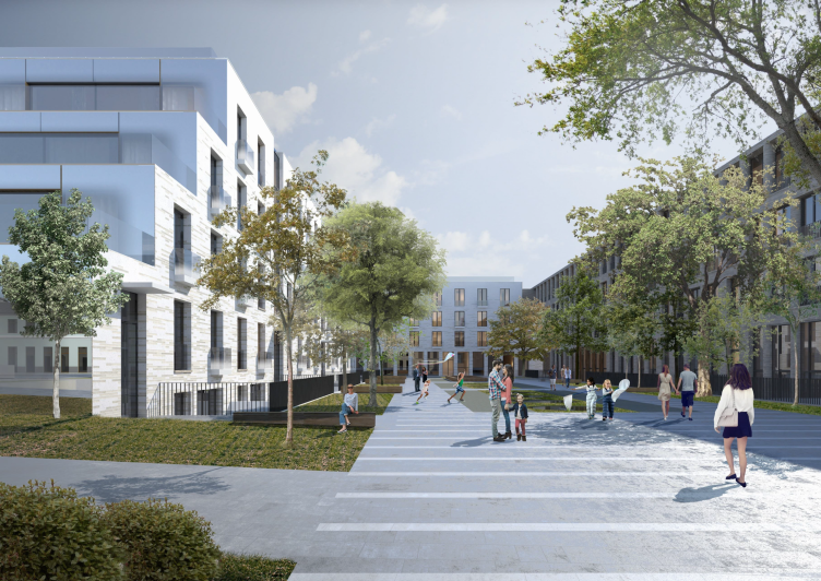
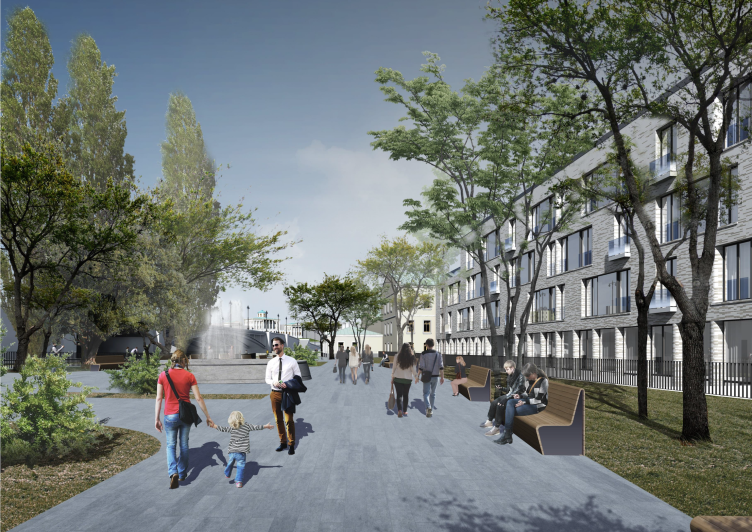
The beam that connects the museum and the tower was prompted by the cityscape itself; meanwhile, it is not the only "starting point" in the project: the architect also carefully "reads out" other peculiar features of the space that he creates out of the territory's details. The almost imperceptible broadening of the borders of the land site in the direction of the river is transferred over to the contours of the pedestrian boulevard through the volumes of residential buildings standing parallel to these borders, one standing parallel to the western, and the other - to the eastern one. Joining at an angle, the walls endow the pedestrian street with a play of perspective, akin to Michelangelo's Stairs in Vatican. It narrows as it approaches the Bolotnaya Square and widens as it gets closer to the Kremlin, forming a wide frame and thus bringing Moscow's main sight even a little closer to the viewer.
Multifunctional integrated development of the Sofiyskaya Embankment © Sergey Skuratov ARCHITECTS
Multifunctional integrated development of the Sofiyskaya Embankment © Sergey Skuratov ARCHITECTS
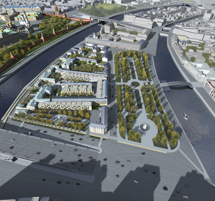
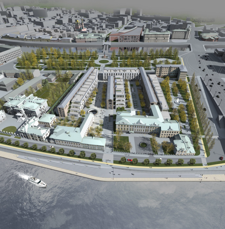
Multifunctional integrated development of the Sofiyskaya Embankment. Bird's height view © Sergey Skuratov ARCHITECTS
Then the architect takes the space which is the result or even a sum total that he derives from the peculiarities of its surroundings and adds some extra faceting to it: specifically, he smoothly cuts off the corner of the eastern building along the line of that same "beam" of vision.
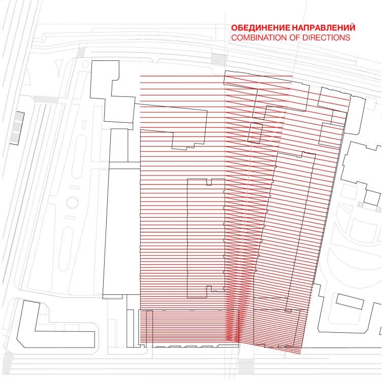
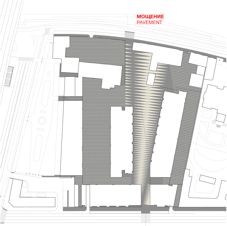
The described theme of merging of the axes graphically manifests itself in the pattern of the pavement that consists of a multitude of strokes perpendicular to these two main axes; when crossing, they form a semblance of a geometric centipede with "beam" legs, the whole thing ultimately looking like a mini-quest for a person standing there and looking down, some sort of code concealing one of the main meanings of this place - the "backbone" of its territory.
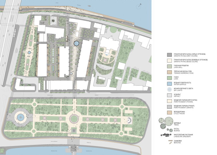
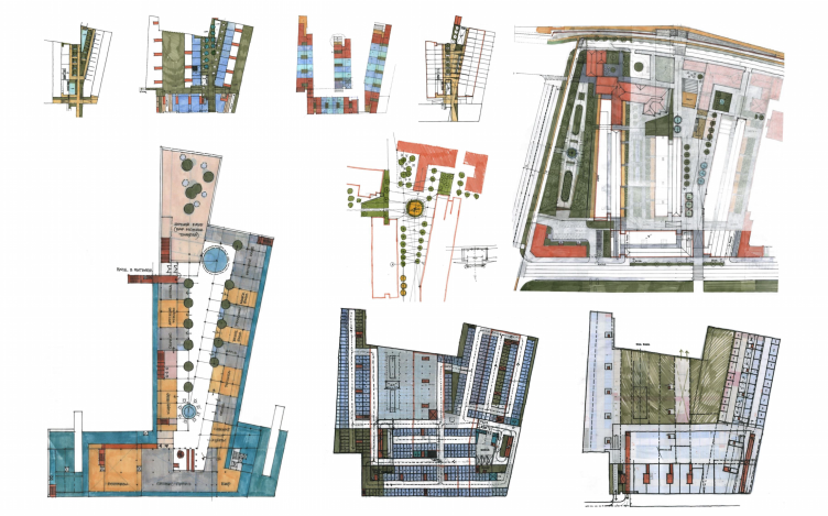
Multifunctional integrated development of the Sofiyskaya Embankment. Paving plan © Sergey Skuratov ARCHITECTS
Multifunctional integrated development of the Sofiyskaya Embankment. Paving plan © Sergey Skuratov ARCHITECTS
Multifunctional integrated development of the Sofiyskaya Embankment. Landscaping plan © Sergey Skuratov ARCHITECTS
Multifunctional integrated development of the Sofiyskaya Embankment. Pedestrian and transport plan © Sergey Skuratov ARCHITECTS
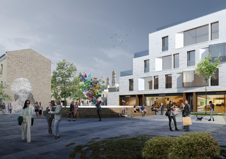
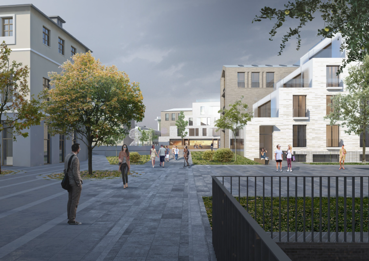
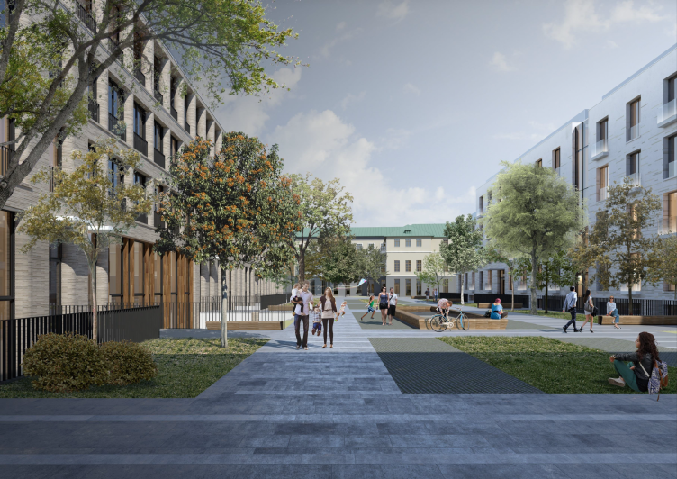
On the whole, Sergey Skuratov ultimately got a very "Moscow" boulevard: the fact that it is tied to the local terrain by a few parameters predictably gave a collection of jagged contours and differently pointed angles with comparatively narrow gates for entering and exiting. Apart from that, a certain difficulty for opening up the boulevard's perspective was posed by the manor house wing and its annex that stood directly on the beam's line - being in fact a low-rise two-story affair, it did not block the entire view, of course, but still was enough to ruin the classical "prism" structure. Exiting from the embankment side is only possible at an angle, through the former courtyard of the Durasov Manor House (that will be remodeled to become a hotel this time), then flanking the wing from the right. The whole thing is anything but a classic avenue - rather, it is a string of Venetian-type squares with deep corners filled by the cozy cafe tables, but at the same time it remains to be a string of classic Moscow yards.
Multifunctional integrated development of the Sofiyskaya Embankment. Bird's height view © Sergey Skuratov ARCHITECTS
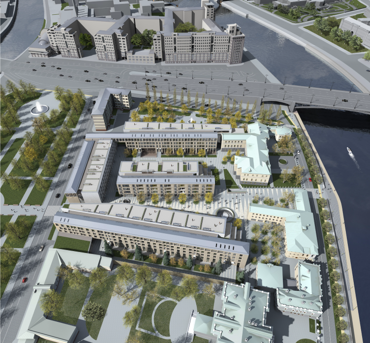
Multifunctional integrated development of the Sofiyskaya Embankment. Bird's height view © Sergey Skuratov ARCHITECTS
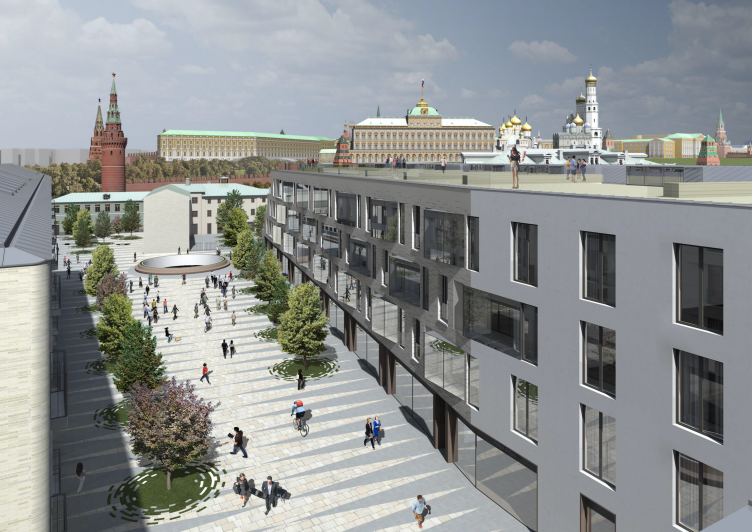
Multifunctional integrated development of the Sofiyskaya Embankment. View from the roof © Sergey Skuratov ARCHITECTS
What is important is the fact that this space is actually the realization of the ultimate dream of Gutnov's school of thought. The echo of the projects of the seventies and eighties that presented this city as being well cared for and looked after, lending itself for pedestrian walks, a bit reminiscent of the coziness of the centers of European cities, and a bit trying to restore the charm of the "village" Moscow, that was right about that time sliced by the scissors of the newly built residential slabs. Here, the center of a European town comes to mind again, which is no surprise, because it is precisely the place that the examples of high quality land organization are to be found at. However, there's still a flavor of a "good old Moscow little yard" in the air. One can even remember that the painting by Polenov is kept nearby, in that same State Tretyakovskaya Gallery to which the southern end of the territorial beam is pointed.
Along the sides of the boulevard, there are shop windows - there is a reason for Sergey Skuratov comparing the space that he invented to Saint-Louis en l'Île, the Parisian island to the Moscow one. And beneath the strolling people's feet, the architect places the atrium of an underground shopping mall lit by the flat circular lamps built into the pavement (some critics of the projects confused (or pretended to confuse) them with puddles drawn on the 3D render to make it look more realistic, but, no, there are lamps, not puddles). The largest of such "downward windows" is a circular sun tube opening in the broad place of the square behind the manor's wing: in the atrium below it, there is a fountain, and this sun tube provides some extra light and fresh air to the underground floor, at the same time connecting the tiers vertically. The pedestrian shopping street, belonging half to the city, half to the underground, leads down to the embankment where, following the idea of reorganizing the Moskva River, in its smooth bend, a stone amphitheater with large-sized steps and a walking trail running along the waterfront is formed - some sort of "tourist climax" that completes the development of the town-planning, environmental, and other intrigues of the central part of the project.
Multifunctional integrated development of the Sofiyskaya Embankment. Bird's height view © Sergey Skuratov ARCHITECTS
Multifunctional integrated development of the Sofiyskaya Embankment. View from the roof © Sergey Skuratov ARCHITECTS
There are also three private residential yards. Here, besides the landscaping, just as detailed as it is on the boulevard, there is yet another peculiarity: in front of the first-floor flats, personal terraces for the residents are organized, sunken into the ground. The "minus two" floor conceals the residents-only parking garage accessible by a special pass, while the "minus one" floor provides a public garage for the general public, first of all, for the shoppers. Also, in the western part, there is a high-ceilinged fitness center.
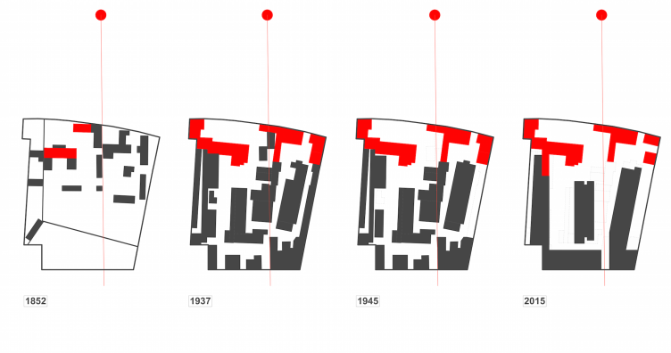
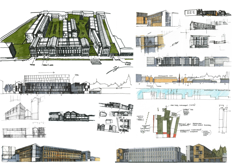
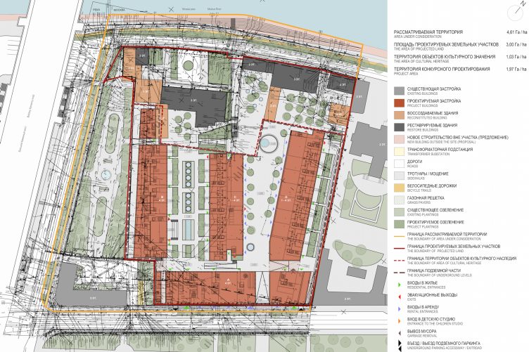
It is remarkable how modern architecture gets one speaking first about the spaces between the buildings, and then only about the buildings themselves. Nevertheless, they are also important. The three long units stand along the perimeter of the land site in a "double L", the fourth one snuggling in the middle, the pedestrian boulevard stretching east, and the residents-only yard lying west of it. From the architect's storyboard, one can easily see that back in the XVIII century this land had fewer houses standing upon it; mostly they stood alongside the embankment, and at the back of the site there were the remnants of the Tsar's gardens. In the XIX century, however, this whole territory was overbuilt with different houses, some of them being residential, some - factory buildings. The planning that is being proposed now is significantly denser - which comes as no surprise - but it still provides more air than the "capitalist" one. The narrow "wells" gave way to the yards of a human-friendly kind.
Multifunctional integrated development of the Sofiyskaya Embankment. Stages of development and transformation of the planning infrastructure © Sergey Skuratov ARCHITECTS
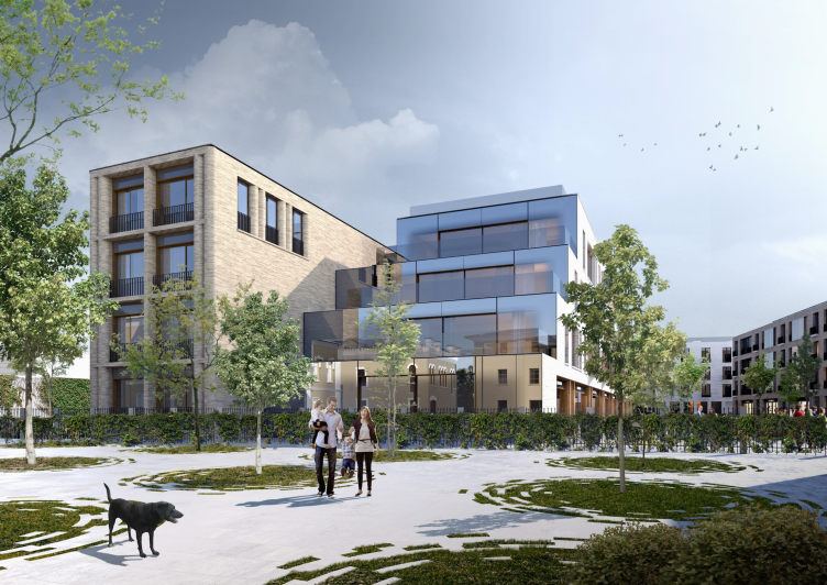
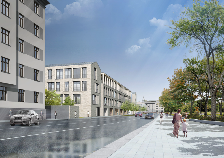
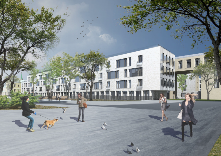
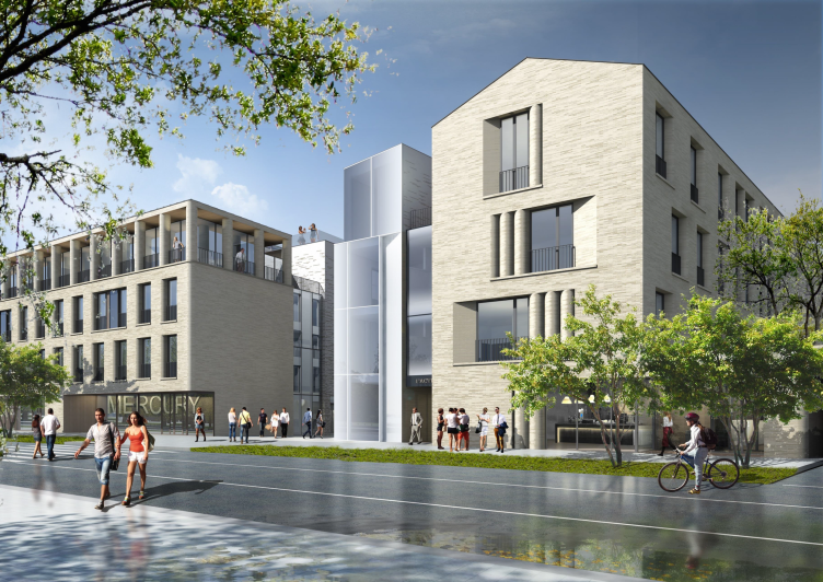
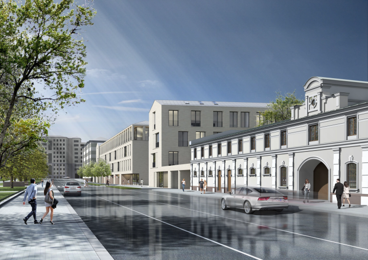
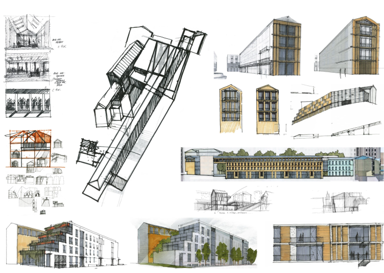
Out of the six contestants, Sergey Skuratov was the only one to opt out of making his project in a more "conservative" or "contemporary" style - what he did was simply slice his volumes in half making one of the halves reservedly conservative and the other half - reservedly modern. Then, according to the architect, he "glued" them together with a layer of glass, thus avoiding the risk of any excessive thickness of the volumes: now each of the halves was no wider than 12 meters. So, this project is in effect a declaration of a mixture of more and less conservative architecture - a phenomenon to be seen in the centers of many historic cities such as Wien, Milan, or Istanbul.
Multifunctional integrated development of the Sofiyskaya Embankment. Hip build © Sergey Skuratov ARCHITECTS
Multifunctional integrated development of the Sofiyskaya Embankment © Sergey Skuratov ARCHITECTS
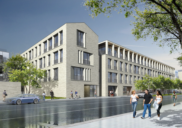
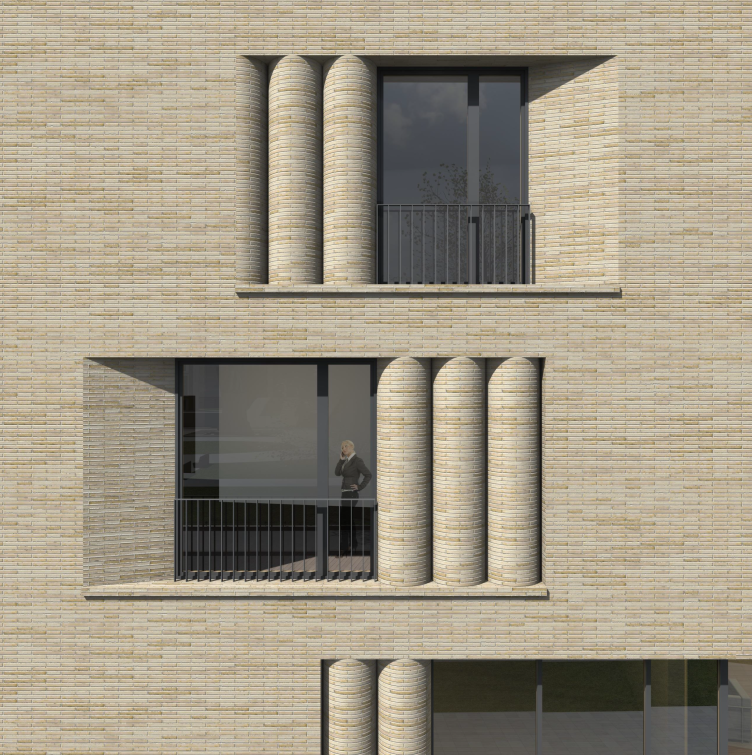
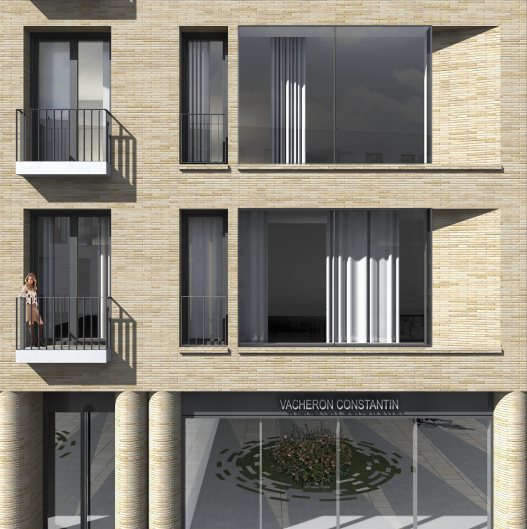
The "conservative" volumes are covered by beige Flemish brick whose proportions remind of plinthiform brick. The window jambs are ostentatiously deep, somewhere perpendicular to the surface of the wall, somewhere gently sloping, going into the perspective, and at some places the corner that turns to the window is circularly rounded, as if a column had "drowned" in it. Then these robust shafts line up to form an even clearer picture turning the window into a sculpture that might even be perceived as the embodiment of the author's meditation on the thickness, the volume, and the plastique of the wall. The architect names two prototypes for this form: the uprights of the Kremlin towers of the XVII century and the "textbook example" of the Roman Tomb of Eurysaces the Baker (MAKE ACTIVE WIKI), from which people usually remember the lines of round openings that the architects Shchuko and Gelfreich repeated in their project of Moscow's Lenin Library. And Sergey Skuratov also noted the close array of the wide round pillars of special proportions. At this point, it is time for us to remember that Moscow is in fact the Third Rome, and the columns turn out to be twice as contextual, mostly because of the antiquated traces of the Ancient Rome that is quite palpable here, just as through some of the intonations of the roman Art Deco supported by the unity of texture and the arrays of pylons on the top floors.
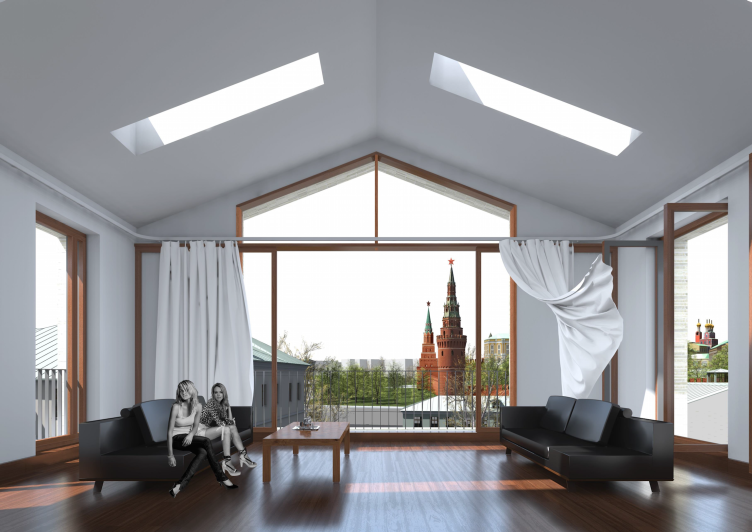
There is enough of "Moscow" here anyway, though: it is represented, among other things, by the gently sloping roof pitches, and the build hips upon the side walls, so much loved by the historic preservation activists - they appear in a few places forming the signs of the tell-tale "attic" silhouette and rhyming with the roofs of the preserved historic buildings nearby. But then again, at the side wall of the penthouse, one of the most expensive ones, commanding the view of the Vodovzvodnaya Tower, making a build hip was impossible: it would be really a bad idea to block such a great view. So, from this side, the side wall looks almost like a temple, framed by pairs of long columns.
Multifunctional integrated development of the Sofiyskaya Embankment © Sergey Skuratov ARCHITECTS
Multifunctional integrated development of the Sofiyskaya Embankment © Sergey Skuratov ARCHITECTS
Multifunctional integrated development of the Sofiyskaya Embankment © Sergey Skuratov ARCHITECTS
Multifunctional integrated development of the Sofiyskaya Embankment. Facade © Sergey Skuratov ARCHITECTS
Multifunctional integrated development of the Sofiyskaya Embankment. Facade © Sergey Skuratov ARCHITECTS
Multifunctional integrated development of the Sofiyskaya Embankment © Sergey Skuratov ARCHITECTS
Multifunctional integrated development of the Sofiyskaya Embankment © Sergey Skuratov ARCHITECTS
The "modernist" units, unlike the brick ones, are snow-white; it is planned that their facades will be covered with polished concrete. However, the facade that is turned to the boulevard - and we should hardly mention that the two walls of the boulevard are different, one being brick red, the other being white - is livened up by brick inserts that help to soften the contrast a little bit and bear a distant resemblance to brickwork showing through the stucco. The roofs of the white volumes will be flat, usable, and accessible to all the residents; the windows also have the smooth cutaways but at some places their glass stands out above the glass prism. Besides the common brick inserts, the resonance between the units is provided by the common proportions of the windows - the "French" floor-to-ceiling kind together with the "French" narrow balconies and the slabs of the windowsills.
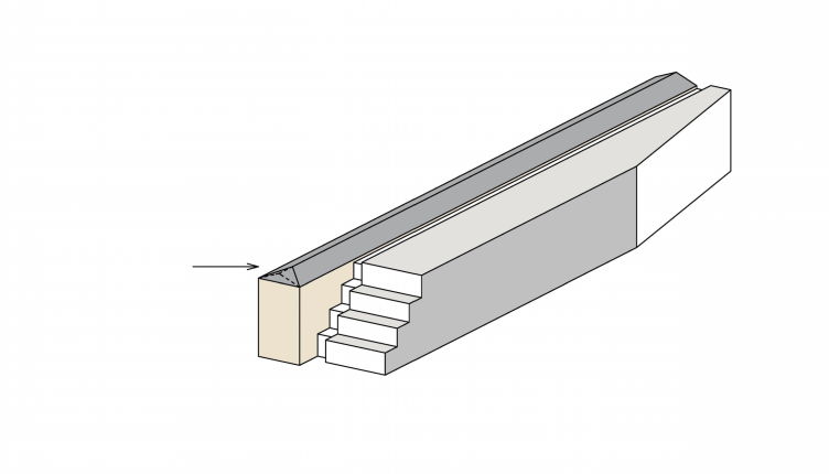
Wherever the side walls of the white volumes are turned to the Kremlin, they are "cut off" by the large steps of the terraces that Sergey Skuratov likens to an ancient theater inscribed into the city. The walls here are completely made of glass, the opaque glass turning into the mirror type in a smooth gradient.
Multifunctional integrated development of the Sofiyskaya Embankment © Sergey Skuratov ARCHITECTS
Multifunctional integrated development of the Sofiyskaya Embankment © Sergey Skuratov ARCHITECTS
Multifunctional integrated development of the Sofiyskaya Embankment © Sergey Skuratov ARCHITECTS
It is obvious that the contrasting architecture of the merged slabs of the residential buildings will be convenient for the people who will live here, them having an opportunity to choose, among other things, which house they ultimately prefer - the snow-white one or the "ancient" red-brick kind. On the other hand, the alternation of the modern and the historical in a striped pattern has long since become the "visiting card" of Moscow architecture, so this artistic device also has certain signs of being contextual.
As of now, it is still too early to judge how often strolling Muscovites or tourists will be "drawn in" by the "beam" that leads to this place from the Lavrushinsky Alley - presently, the Bolotnaya Square draws huge crowds that come here for anti-government rallies but that that does not happen every day; otherwise, the square is all but empty. It is hard to say which will be more convenient for the people who will live here - the busy public space with retail stores or the peaceful environment with views of the Kremlin. However, if we are to judge by some features of this project, as well as by Sergey Skuratov's words, this project could become a "seed" or even some sort of "gauge" for developing the city's downtown area. Or, in any case, help the Moscow island take on some useful features of the Paris one.
***
The author's description of the project (Russian) and still more pictures are available here.
Multifunctional integrated development of the Sofiyskaya Embankment © Sergey Skuratov ARCHITECTS
Multifunctional integrated development of the Sofiyskaya Embankment © Sergey Skuratov ARCHITECTS
Multifunctional integrated development of the Sofiyskaya Embankment. The interior of the penthouse © Sergey Skuratov ARCHITECTS
Multifunctional integrated development of the Sofiyskaya Embankment © Sergey Skuratov ARCHITECTS
Multifunctional integrated development of the Sofiyskaya Embankment © Sergey Skuratov ARCHITECTS
Multifunctional integrated development of the Sofiyskaya Embankment © Sergey Skuratov ARCHITECTS
Multifunctional integrated development of the Sofiyskaya Embankment © Sergey Skuratov ARCHITECTS
Multifunctional integrated development of the Sofiyskaya Embankment © Sergey Skuratov ARCHITECTS
Multifunctional integrated development of the Sofiyskaya Embankment © Sergey Skuratov ARCHITECTS
Multifunctional integrated development of the Sofiyskaya Embankment. Master plan © Sergey Skuratov ARCHITECTS
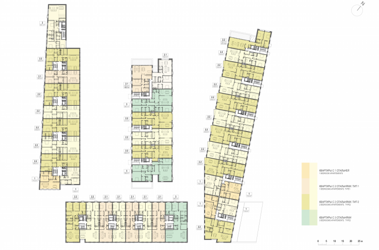
Multifunctional integrated development of the Sofiyskaya Embankment. Plan of the 2nd floor © Sergey Skuratov ARCHITECTS
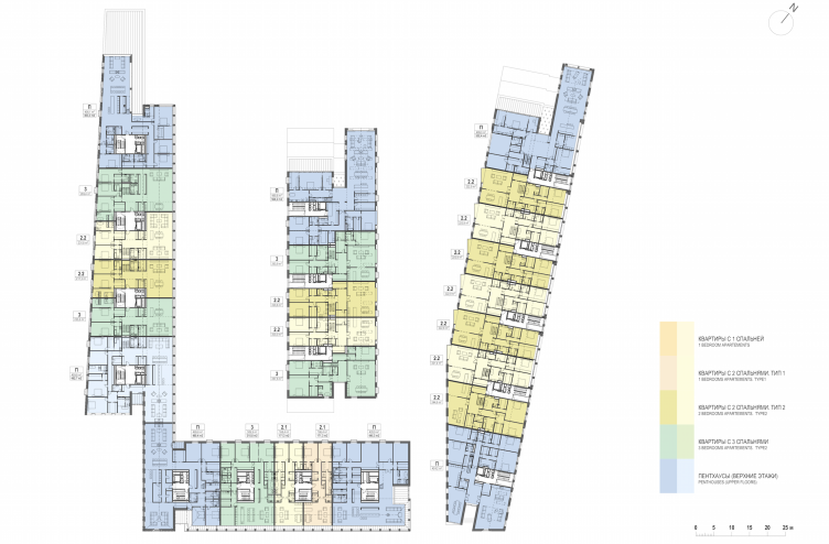
Multifunctional integrated development of the Sofiyskaya Embankment. Plan of the 3rd floor © Sergey Skuratov ARCHITECTS
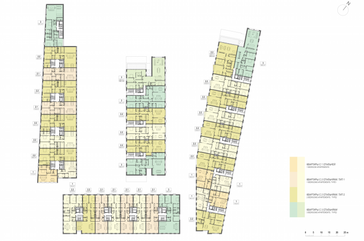
Multifunctional integrated development of the Sofiyskaya Embankment. Plan of the 4th floor © Sergey Skuratov ARCHITECTS
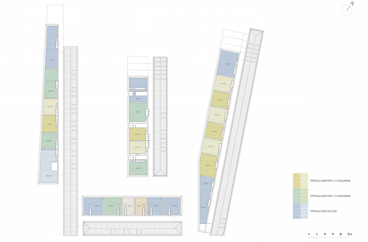
Multifunctional integrated development of the Sofiyskaya Embankment. Plan of the roof © Sergey Skuratov ARCHITECTS
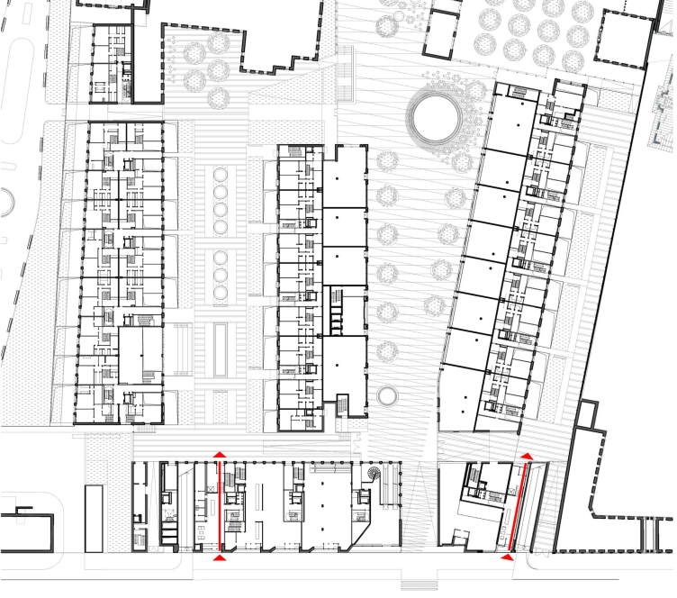
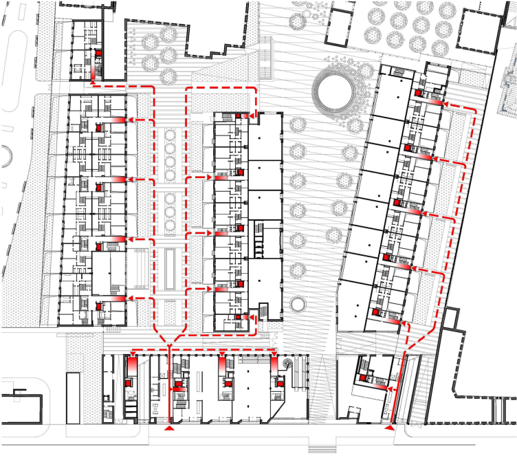
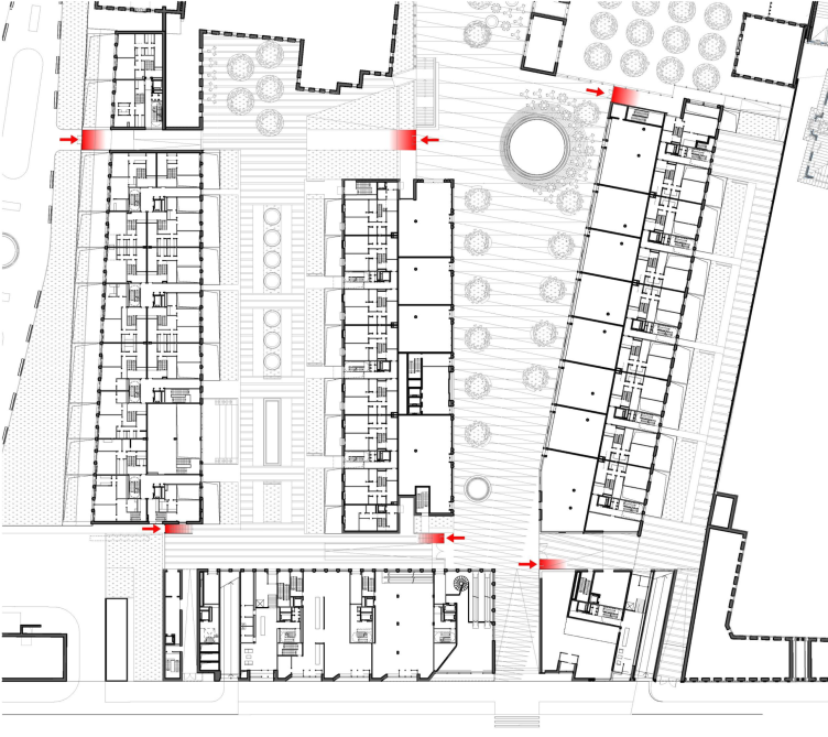
Multifunctional integrated development of the Sofiyskaya Embankment. Entrances for the residents © Sergey Skuratov ARCHITECTS
Multifunctional integrated development of the Sofiyskaya Embankment. Entrances for the residents © Sergey Skuratov ARCHITECTS
Multifunctional integrated development of the Sofiyskaya Embankment. Entrances to the private territory © Sergey Skuratov ARCHITECTS
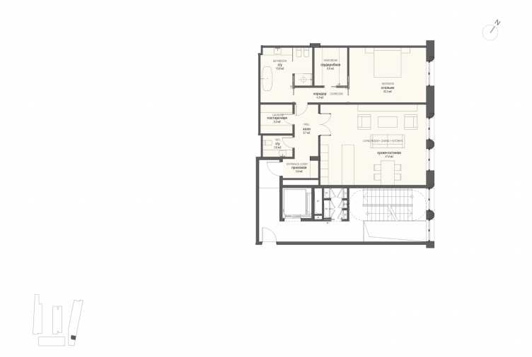
Multifunctional integrated development of the Sofiyskaya Embankment. Plan of the apartment with one bedroom © Sergey Skuratov ARCHITECTS
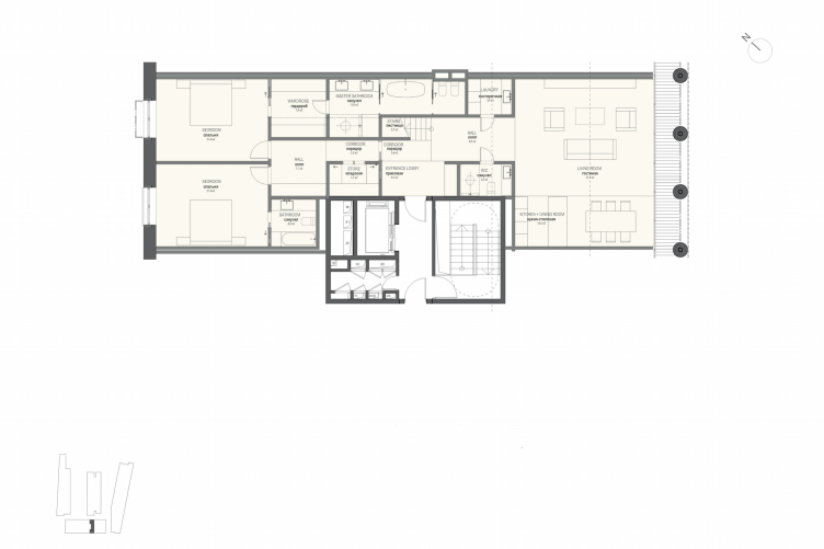
Multifunctional integrated development of the Sofiyskaya Embankment. Plan of the apartment with two bedrooms (Type 1) © Sergey Skuratov ARCHITECTS
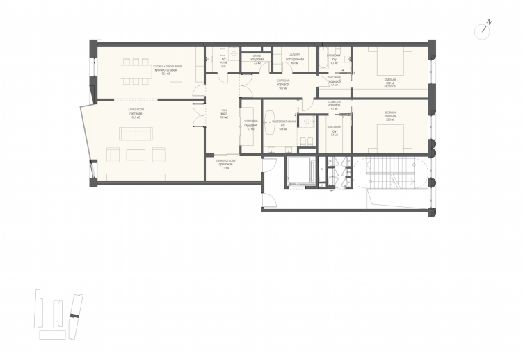
Multifunctional integrated development of the Sofiyskaya Embankment. Plan of the apartment with two bedrooms (Type 2) © Sergey Skuratov ARCHITECTS
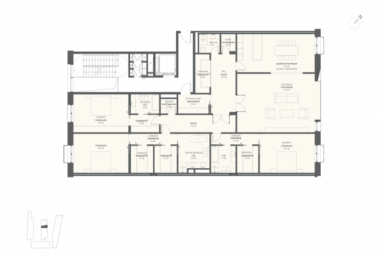
Multifunctional integrated development of the Sofiyskaya Embankment. Plan of the apartment with three bedrooms © Sergey Skuratov ARCHITECTS
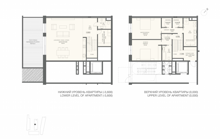
Multifunctional integrated development of the Sofiyskaya Embankment. Plan of the two-level apartment with two bedrooms © Sergey Skuratov ARCHITECTS
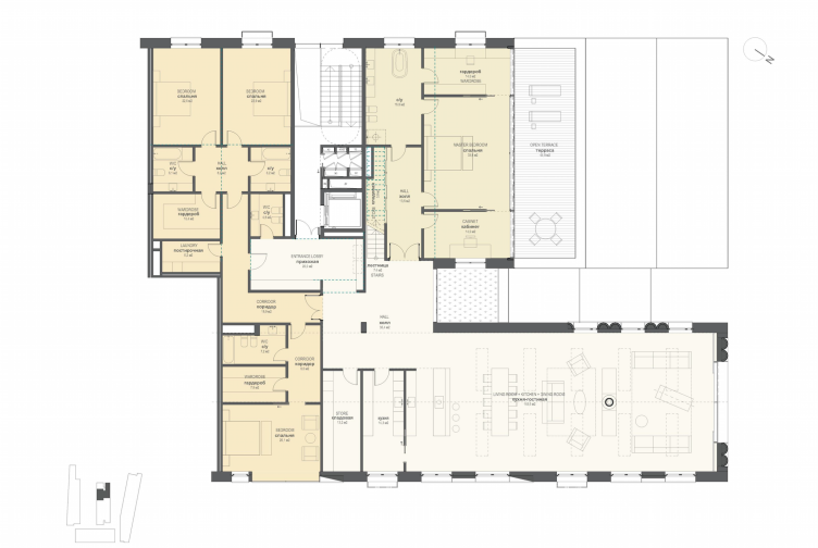
Multifunctional integrated development of the Sofiyskaya Embankment. Penthouse © Sergey Skuratov ARCHITECTS
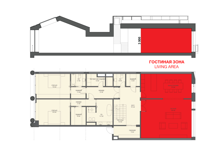
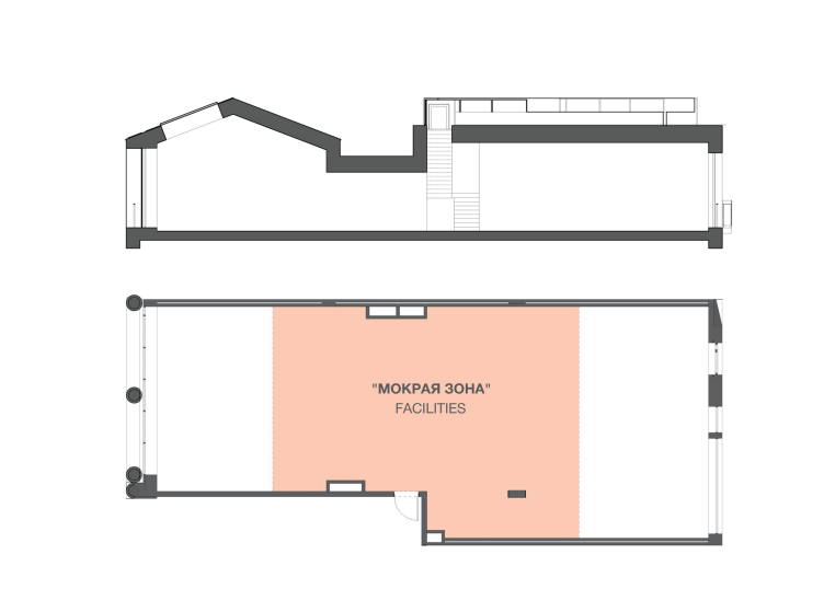
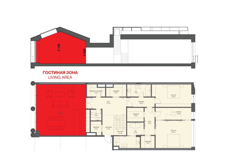
Multifunctional integrated development of the Sofiyskaya Embankment. Option for transforming the apartments © Sergey Skuratov ARCHITECTS
Multifunctional integrated development of the Sofiyskaya Embankment. Option for transforming the apartments © Sergey Skuratov ARCHITECTS
Multifunctional integrated development of the Sofiyskaya Embankment. Option for transforming the apartments © Sergey Skuratov ARCHITECTS


