This issue features the project of "River-Park" residential area on the bank of the Nagatinsky Creek - developed by "Ostozhenka" architectural bureau.
Written by: Lilya Aronova Translated by: Anton Mizonov
25 January 2016
Object
Architect:
Firm:
It so happened that the territory of the bank of the Nagatinsky Creek was developed by "Ostozhenka" twice. The first time around, as it turned out later, it was done a bit prematurely but the second time it was done just at the right moment: immediately after the contest for the development of the territories adjoining the Moskva River, during the epoch of the unquestionable victory of block development over the pinpoint type. One has every reason to suppose that it was with the consideration for these particular circumstances that the land site, also included in the program of renovation of the former industrial territories, got, at the second "attempt", closer attention and an appropriate budget. In this connection, in fact, the architects were asked to "take away from the table" the original, now almost complete, project of a residential complex that was calling for the typical development, and come up with a totally new architectural proposal. This was a rather challenging situation, especially in view of the fact that the construction of the first stage of the typical houses had already begun - but no one said it would be easy for the architects anywhere in the world, much less in Moscow.
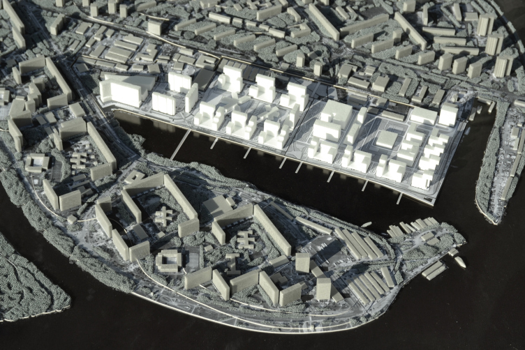
Until recently, the territory between the Nagatinsky Creek and the Rechnikov Street running parallel to it hosted the buildings of a large industrial enterprise - Moscow ship-building yard. Later on it was decided to move the building facilities to a more suitable place - but the eighty-years long "ship-building" narrative seemed to stick forever in most of the local place names, as well as in the city people's memories. Alexander Skokan and his team treated this circumstance as one of the elements of the context into which they were to inscribe their project gracefully. Yet another active factor was the district of Nagatino itself; the new residential complex having to become a part of it. As the chief architect of the project Rais Baishev explains, this district is "really underestimated: the sturdy soviet-era houses, with their human-friendly density, number of floors, and green territories between them; a district that, with a bit of an optimistic stretch can be likened to European and Baltic-states residential areas". So, it was this "quietly existing", very peaceful and comfortable atmosphere that the architects were looking to bring into their project - of course, in a new architectural and ideological quality.
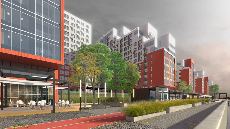
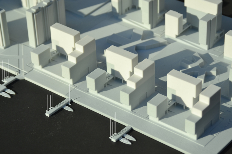
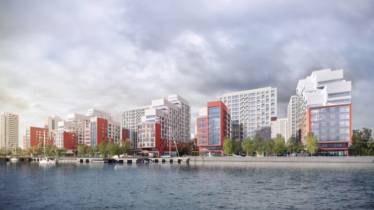
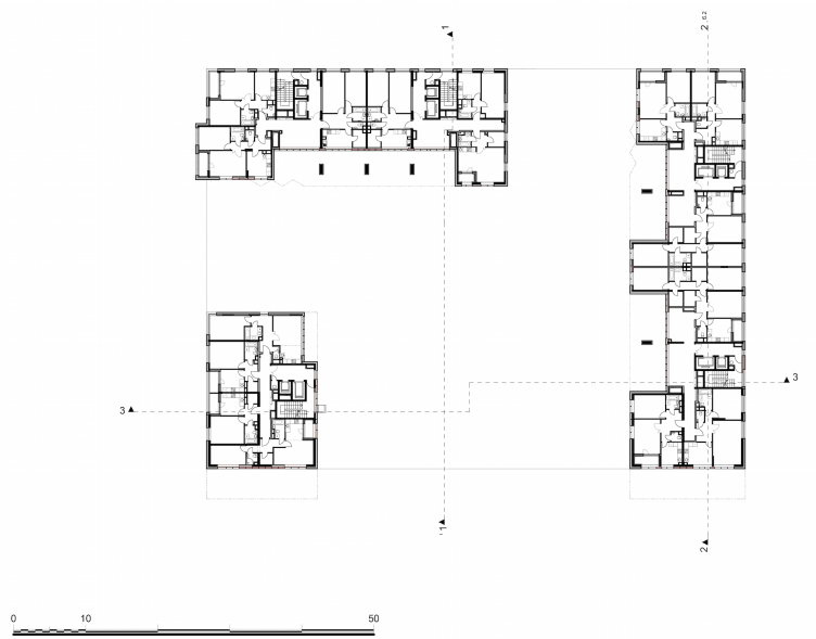
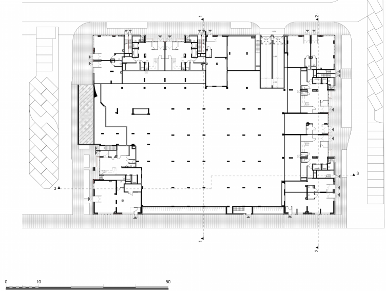
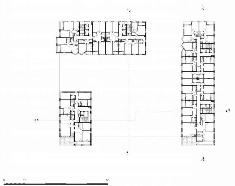
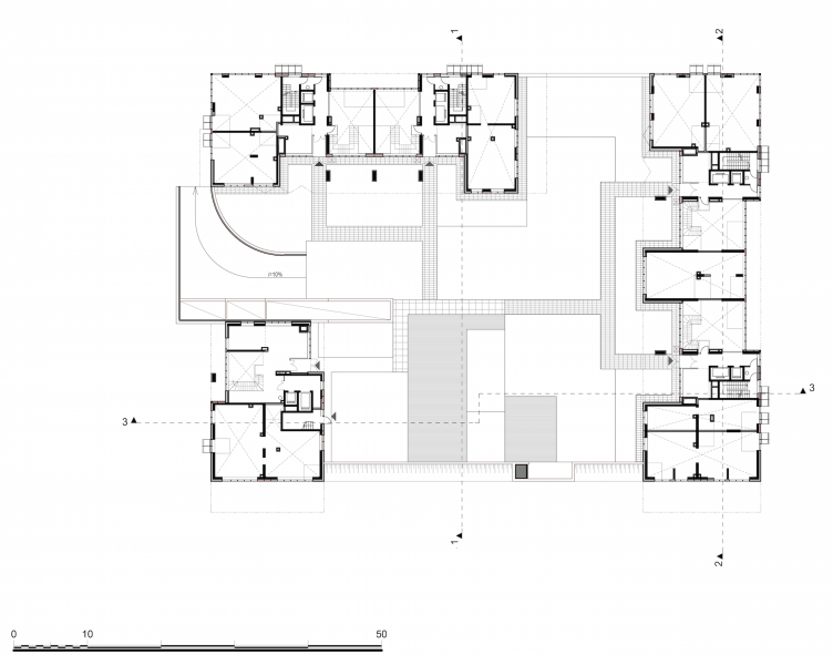
As for the main contextual centerpiece, this was, of course, the immediate proximity of the future residential area to the water. The entire second phase of "River Park" overlooks the creek. Achieving this was quite a tall order - on the plan, it looks like a regular rectangle, almost a square, organized around a large yard, inside of which it was planned to build a school and a kindergarten. The yard is surrounded by a curious merry-go-round of seven residential units - i.e. the composition calls for a centripetal focus rather than a centrifugal one. Still, ignoring such a huge "magnet" as a river would have been an unthinkable thing to do, both from the town-planning and the commercial standpoint. If we take a look at the preliminary models, we will see that initially the architects visualized six out of the seven blocks (the seventh one that closes the yard on the side is different in its position as much as in its architecture) as practically identical but later on - after much deliberation and agreeing with the customer's reasons - introduced changes to the project, and now the front line of the houses is different from the rest in its voluminous and planning solution, the common typology being still preserved. In addition to the obvious realtor advantages, such solution added a new emotion to the area's image: the back-line units look as if they were peeping from the backs of the front ones, standing on their tiptoes and stretching their necks in order to get a better look at the magnificent scenery. Back from poetry to practice, though! It must be noted that achieving this result was akin to solving some complex mathematical problem: considering the increased commercial attractiveness of the front row, the architects were able to make their selling area larger, even though the buildings of the back row are taller.
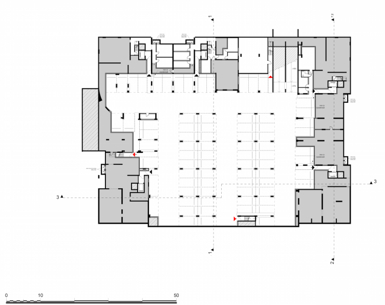
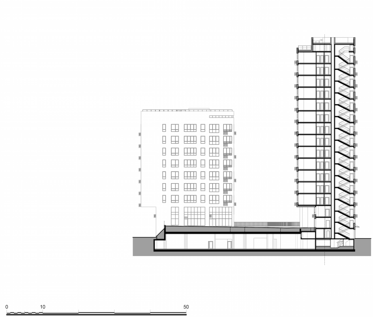
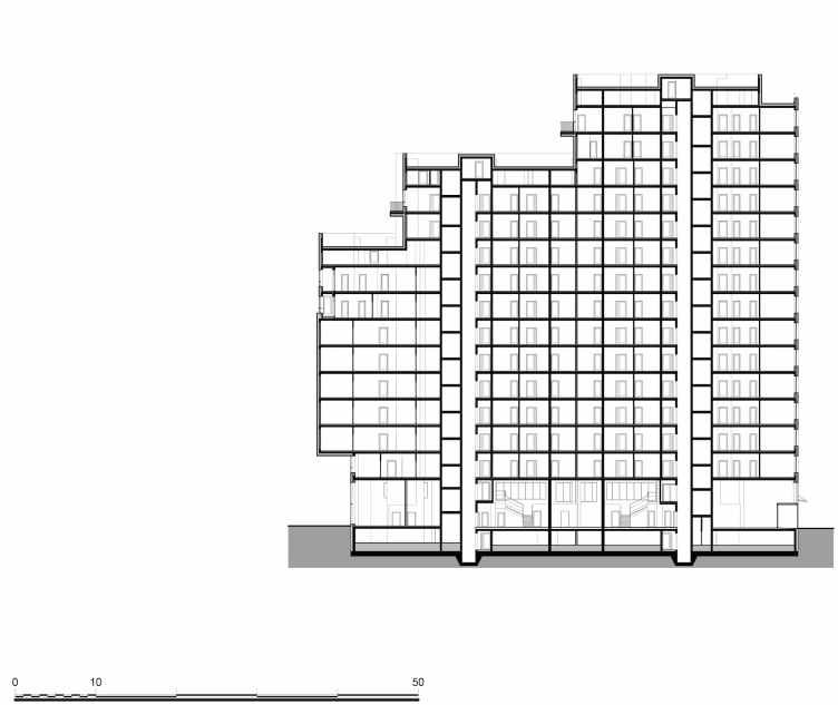
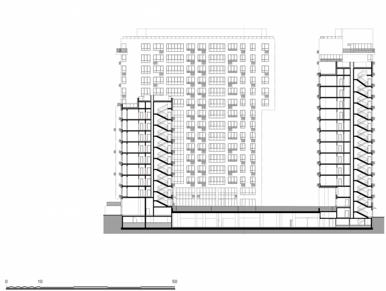
Each of the units looks like a semi-closed space opened up to the river, with a yard raised a little above the embankment level, under which a garage will be built. Typologically, this is something like a cross between a separately standing building - because all of its parts rest on a single stylobate - and a mini-block - consisting of three different units that surround the courtyard. The comfortable safe territory- the height difference between the yard and the outer traffic way makes it physically impossible for the "alien" vehicles to enter the yard unless it's some custom vehicle or special machine - is surrounded by a gallery sunken into the buildings. This way, the generally small territory of the yard gets broader, augmented by the little cozy nooks and crannies where one can find shelter from the rain or just take a seat and breathe in the river air. It is overlooked by the second floors of the double-height lobbies that are connected to the street on the ground level. The orientation to the creek is enhanced by the "terrace" solution: the architects paid special attention to designing terraces, including open-air ones, because this is a rather precarious element in our weather conditions, and provoking architectural vandalism in the form of differently sized "squatter" glazing and other unauthorized things done by the inhabitants was the last thing on the architects' mind. We will add at this point that the front row of the houses does not have a single apartment devoid of the creek view. As a result, all this put together - the embankment, the terraced volumes of the front line, the inner yard with children institutions, and the row of taller buildings closing the composition - comes together to become a clear-cut composition with a prominent gravity vector towards the water.
All the cafés, shops, and other retail points in the project are moved to the outer premises of the front row of houses, the ones overlooking the creek. "We wanted - Rais Baishev shares - the embankment to take on the attraction function, we wanted it to be alive and functionally rich". This desire of the architects resonated with that of the investor and the Moscomarkhitektura board that viewed this zone as part of the single program of improving Moscow's embankments. Of course, strictly speaking, the Nagatinsky Creek is not exactly the Moskva River but "Ostozhenka" views all the numerous small rivers and creeks flowing into the Moskva River as an indispensable part of this water system; this concept was laid down as the foundation of the project with which the company took part in the contest for the riverfront development - which considerably broadened the original contest specifications.
And as far as the Nagatinsky Creek is concerned, it's something that is pretty easy to handle: unlike the many small creeks that both the construction companies and God forgot, you do not have to either dig it out from the underground pipes or search for it through the swampland: here it is, located literally around the corner, deep, picturesque, and even navigable. It would have been a waste to leave its banks unorganized - and this was done in due course on a contest basis. Incidentally, the embankment of "River-Park" became Moscow's first project of landscaping a riverfront territory for which a dedicated contest was organized that started in February 2015. In summer, the winners' names were announced. The first place was won by the company that hardly needs any introduction - WOWhaus - with a project that was about a chain of various venues and a lighthouse as the compositional climax. The chief designer company was also quite satisfied with the future cooperation: still since the days of working on the master plan of the Ostozhenka Street, Alexander Skokan and his colleagues have been looking to attract as many different architects as possible to develop their territories so as to avoid everything being done by "one hand" - because the more creative people on one project the better the result. For example, they are sincerely happy with the unconventional projects of the school and kindergarten buildings based on the works of the participants of the contest "New Image of Kindergartens" showcased two years ago at Vinzavod culture center. And as for the landscaping of the territory of the residential complex, it will be done by "T+T Architects" whose concept of developing the embankment of the Nagatinsky Creek took the second place in the contest. Their task is to tie in lots of various factors within the project - both obvious, such as the connection of the residential area itself (developed by "Ostozhenka") with the embankment (developed by WOWhaus), as well as the ones that are only being forecast now.
Because currently it is only the first stage that has been actually built (the three 19-story units with an inner yard), the solution of this territory must become something like a pilot project that will define the style of landscaping the entire block - both the large inner territory with the school and kindergarten, and the raised little yards of separate blocks, and the yet-in-design office and shopping premises. All this "patchwork" must be somehow spun functionally, in an exciting way, but, most importantly, in the vein of the overall composition of the residential district set by the general designer. If everything goes to plan, the elements of this composition, of different nature and rather clearly zoned, will come together to form a single, cohesive, and integral city environment - something that Alexander Skokan and the architects of "Ostozhenka" particularly value.
The Golden Crown
The concept for a dental clinic in Yekaterinburg, developed by CNTR Studio, revolves around the idea of a “mouth full of gold”: pristine white porcelain stoneware walls are complemented by matte brass details. To avoid an overly literal interpretation, the architects focused on the building’s proportions, skillfully navigating between sunlight requirements and fire safety regulations.
Flexibility and Integration
Not long ago, we covered the project for the fourth phase of the ÁLIA residential complex, designed by APEX. Now, we’ve been shown different fence concepts they developed to enclose the complex’s private courtyards, incorporating a variety of public functions. We believe that the sheer fact that the complex’s architects were involved in such a detail as fencing speaks volumes.
A Step Forward
The HIDE residential complex represents a major milestone for ADM architects and their leaders Andrey Romanov and Ekaterina Kuznetsova in their quest for a fresh high-rise aesthetic – one that is flexible and layered, capable of bringing vibrancy to mass and silhouette while shaping form. Over recent years, this approach has become ADM’s “signature style”, with the golden HIDE tower playing a pivotal role in its evolution. Here, we delve into the project’s story, explore the details of the complex’s design, and uncover its core essence.
Gold in the Sands
A new office for a transcontinental company specializing in resource extraction and processing has opened in Dubai. Designed by T+T Architects, masters of creating spaces that are contemporary, diverse, flexible, and original, this project exemplifies their expertise. On the executive floor, a massive brass-clad partition dominates, while layered textures of compressed earth create a contextually resonant backdrop.
Layers and Levels of Flight
This project goes way back – Reserve Union won this architectural competition at the end of 2011, and the building was completed in 2018, so it’s practically “archival”. However, despite being relatively unknown, the building can hardly be considered “dated” and remains a prime example of architectural expression, particularly in the headquarters genre. And it’s especially fitting for an aviation company office. In some ways, it resembles the Aeroflot headquarters at Sheremetyevo but with its own unique identity, following the signature style of Vladimir Plotkin. In this article, we take an in-depth look at the United Aircraft Corporation (UAC) headquarters in the Moscow agglomeration town of Zhukovsky, supplemented by recent photographs from Alexey Naroditsky – a shoot that became only recently possible due to the fact that improvements were finally made in the surrounding area.
Light and Shadow
In this article, we delve into the architectural design of the “Chaika” house by DNK ag architects, which was recently completed in 2023 as part of the collection of signature designs at ZILArt. As is well-known, all the buildings in this complex follow a design code, yet each one is distinct. This particular building stands out not only for its whiteness and minimalism but also for the refined use of a limited number of techniques that, together, create what can confidently be called synergy.
Casus Novae
A master plan was developed for a large residential area with a name of “DNS City”, but now that its implementation began, the plan has been arbitrarily reformatted and replaced with something that, while similar on the surface, is actually quite different. This is not the first time such a thing happens, but it’s always frustrating. With permission from the author, we are sharing Maria Elkina’s post.
Treasure Hunting
The GAFA bureau, in collaboration with Tegola and Arkhitail, organized an expedition to the island of Kilpola in Karelia as part of Moskomarkhitektura’s “Open City” festival. There, amidst moss and rocks, the students sought answers to questions like: what is the sacred, where does it dwell, and what sustains it? Assisting the participants in this quest were landscape engineer Evgeny Levin, artist Nicholas Roerich, a moose, and the lack of cellular connection. Here’s how the story unfolded.
Depths of the Earth, Streams of Water
In the Malaya Okhta district, the Akzent building, designed by Stepan Liphart, was constructed. It follows a classic tripartite structure, yet it’s what you might call “hand-drawn”: each façade is unique in its form and details, some of which aren’t immediately noticeable. In this article, we explore the context and, together with the architect, delve into how the form was developed.
Fir Tree Dynamics
The “Airports of Region” holding is planning to build an airport in Karachay-Cherkessia, aiming to make the Arkhyz and Dombay resorts more accessible to travelers. The project that won in an invitation-only competition, submitted by Sergey Nikeshkin’s KPLN, blends natural imagery inspired by the shape of a conifer seed, open-air waiting spaces, majestic large trees, and a green roof elevated on needle-like columns. The result is both nature-inspired and WOW.
A Brick Shell
In the process of designing a clubhouse situated among pine trees in a prestigious suburban area near Moscow, the architectural firm “A.Len” did the façade design part. The combination of different types of brick and masonry correlates with the volumetric and plastique solutions, further enhanced by the inclusion of wood-painted fragments and metal “glazing”.
Word Forms
ATRIUM architects love ambitious challenges, and for the firm’s thirtieth anniversary, they boldly play a game of words with an exhibition that dives deep into a self-created vocabulary. They immerse their projects – especially art installations – into this glossary, as if plunging into a current of their own. You feel as if you’re flowing through the veins of pure art, immersed in a universe of vertical cities, educational spaces – of which the architects are true masters – and the cultural codes of various locations. But what truly captivates is the bold statement that Vera Butko and Anton Nadtochy make, both through their work and this exhibition: architecture, above all, is art – the art of working with form and space.
Flexibility and Acuteness of Modernity
Luxurious, fluid, large “kokoshniks” and spiral barrel columns, as if made from colorful chewing gum: there seem to be no other mansion like this in Moscow, designed in the “Neo-Russian-Modern” style. And the “Teremok” on Malaya Kaluzhskaya, previously somewhat obscure, has “come alive with new colors” and gained visibility after its restoration for the office of the “architectural ecosystem” as the architects love to call themselves. It’s evident that Julius Borisov and the architects at UNK put their hearts into finding this new office and bringing it up to date. Let’s delve into the paradoxes of this mansion’s history and its plasticity. Spoiler: two versions of modernity meet here, both balancing on the razor’s edge of “what’s current”.
Yuri Vissarionov: “A modular house does not belong to the land”
It belongs to space, or to the air... It turns out that 3D printing is more effective when combined with a modular approach: the house is built in a workshop and then adapted to the site, including on uneven terrain. Yuri Vissarionov shares his latest experience in designing tourist complexes, both in central Russia and in the south. These include houseboats, homes printed from lightweight concrete using a 3D printer, and, of course, frame houses.
Moscow’s First
“The quality of education largely depends on the quality of the educational environment”. This principle of the last decade has been realized by Sergey Skuratov in the project for the First Moscow Gymnasium on Rostovskaya Embankment in the Khamovniki district. The building seamlessly integrates into the complex urban landscape, responding both to the pedestrian flow of the city and the quiet alleyways. It skillfully takes advantage of the height differences and aligns with modern trends in educational space design. Let’s take a closer look.
Looking at the Water
The site of Villa Sonata stretches from the road to the water’s edge, offering its own shoreline, pier, and a picturesque river panorama. To reveal these sweeping views, Roman Leonidov “cut” the façade diagonally parallel to the river, thus getting two main axes for the house and, consequently, “two heads”. The internal core – two double-height spaces, a living room and a conservatory, with a “bridge” above them – makes the house both “transparent” and filled with light.
The White Wing
Well, it’s not exactly white. It’s more of a beige, white-stone structure that plays with the color of limestone – smoother surfaces are lighter, while rougher ones are darker. This wing unites various elements: it absorbs and interprets the surrounding themes. It responds to everything, yet maintains a cohesive expression – a challenging task! – while also incorporating recognizable features of its own, such as the dynamic cuts at the bottom, top, and middle.
Urban Dunes
The XSA Ramps team designed and built a three-part sports hub for a park in Rostov-on-Don, welcoming people of all ages and fitness levels. The skate plaza, pump track, and playground are all meticulously crafted with details that attract a diverse range of visitors. The technical execution of the shapes and slopes transforms this space into a kind of sculptural composition.
Proportional Growth
The project for the fourth phase of the ÁLIA residential area has been announced. The buildings are situated on an elongated plot – almost a “ray” that shoots out from the center of the area towards the river. Their layout reflects both a response to Moscow’s architectural preferences over the past 15 years, shifting “from blocks to towers”, and an interpretation of the neighboring business park designed by SOM. Additionally, the best apartments here are not located at the very top but closer to the middle, forming a glowing “waistline”.
The “Staircase” Building
In designing the “Details” residential complex in New Moscow, Rais Baishev spiced up the now-popular Moscow theme of a “courtyard” building with an idea drawn from the surrealist drawings by Maurits Escher. He envisioned the stepped silhouettes and descending slopes as a metaphysical mega-staircase, creating a key void within the courtyard that gave the project an internal “spine”. This concept is felt both in the building’s silhouette and on its façades.
Projection of the Quarter
No one doubted that the building that Vladimir Plotkin designed as part of the “Garden Quarters” would be the most modernist of all. And it turned out just that way: while adhering to the common design code, the building successfully combines brick and white stone, rhythmically responding to the neighboring building designed by Ostozhenka, yet tactfully and persistently making a few statements of its own. This includes the projection of the ideal urban development composition “14–9–6”, which can be found right next door, mathematical calculations, including those for various types of terraces (and perhaps the only reminder of the Soviet past of the Kauchuk rubber factory!), and the white “cross-stitch” pattern of the façade grid.
Domus Aurea
In this issue, we examine the “Tessinsky-1” house, designed by Sergey Skuratov and completed in 2023. Located in the middle of the Serebryanicheskaya Embankment district, at the intersection of its main streets, this house assumes a sort of “nodal” role: it not only responds to everything around it and preserves many memories of the former EMA factory within itself, but it weaves all this into a newly directed pattern, reconciling bright “gold” and dark-colored brick, largely with the help of the new, modern-yet-archaic Columba brick, which, come to think about it, is the most precious element here.
The Chimney of Nikola-Lenivets
In this issue, we are examining the “Obelisk House” designed by KATARSIS and built for the Arkhstoyanie 2023 festival. However, it was only finished later on, and this is why we are examining it now. It seems to us that after the “Obelisk House” appeared in Nikola-Lenivets, a dialogue and a few inner connections appeared between the temporary structures built here. These houses no longer look like “accidental neighbors”, more of which below.
Periscope by the Bay
The jury awarded the second place in the competition for a public and cultural center in Petropavlovsk-Kamchatsky to the companies GORA (“Mountain”) and M4. In the consortium’s proposal, the building resembles a sperm whale with a calf swimming next to it or a periscope, whose lenses capture the most spectacular views from the surrounding landscape.
From Arcs to Dolmens
While working on the competition project for Petropavlovsk-Kamchatsky, ASADOV Architects prioritized the value of the natural and urban environment, aiming to preserve the balance of the location while minimizing the resemblance of the volume that they designed to a “traditional building”. The task was challenging, and the architects created three versions, one of which having been developed after the competition, where their main proposal took third place. However, the point of interest here is not the competition result but the continuity of creative thinking.
Hide and Seek
The ID Moskovskiy house, designed by Stepan Liphart in St. Petersburg, in the courtyards near Moskovskiy Avenue beyond the Obvodny Canal and recently completed, is notable for several reasons. Firstly, it has been realized with considerable accuracy, which is particularly significant as this is the first building where the architect was responsible not only for the facades but also for the layouts, allowing for better integration between the two. On the other hand, this building is interesting as an example of the “germination” of new architecture in the city: it draws on the best examples from the neighborhood and becomes an improved and developed sum of ideas found by the architect in the surrounding context.
The Big Twelve
Yesterday, the winners of the Moscow Mayor’s Architecture Award were announced and honored. Let’s take a look at what was awarded and, in some cases, even critique this esteemed award. After all, there is always room for improvement, right?
Above the Golden Horn
The residential complex “Philosophy” designed by T+T architects in Vladivostok, is one of the new projects in the “Golubinaya Pad” area, changing its development philosophy (pun intended) from single houses to a comprehensive approach. The buildings are organized along public streets, varying in height and format, with one house even executed in gallery typology, featuring a cantilever leaning on an art object.
Nuanced Alternative
How can you rhyme a square and space? Easily! But to do so, you need to rhyme everything you can possibly think of: weave everything together, like in a tensegrity structure, and find your own optics too. The new exhibition at GES-2 does just that, offering its visitor a new perspective on the history of art spanning 150 years, infused with the hope for endless multiplicity of worlds and art histories. Read on to see how this is achieved and how the exhibition design by Evgeny Ace contributes to it.
Blinds for Ice
An ice arena has been constructed in Domodedovo based on a project by Yuri Vissarionov Architects. To prevent the long façade, a technical requirement for winter sports facilities, from appearing monotonous, the architects proposed the use of suspended structures with multidirectional slats. This design protects the ice from direct sunlight while giving the wall texture and detail.