По-русски

Face to the City, Roof to the Sea

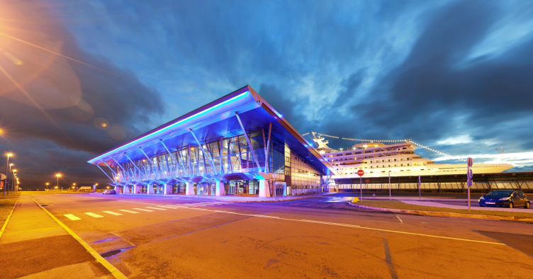
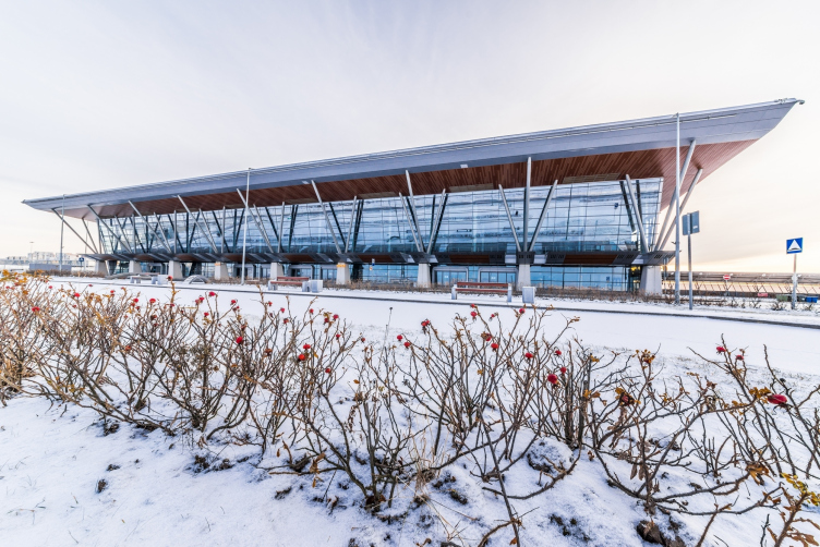
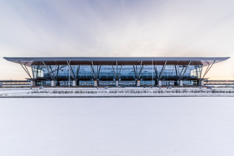
Designed by Sergey Oreshkin, the terminals of Saint Petersburg's passenger port live up to their status of the city's "sea façade". And, while from the city side the guests are met by the facades that are dynamic, "soaring", and hi-tech, the passengers of the cruising liners are met be the port's artistically elaborate roofs.

03 August 2015
Object
mainImg
Architect:
Sergey Oreshkin
Firm:
A-Len
Object:
Complex of buildings and constructions of the Sea passenger terminal
Russia, St. Petersburg

2005 — 2010 / 2008 — 2011

The architectural bureau "A.Len" was building the Sea Passenger Port in the Neva Bay for seven years: the design work started back in 2004, and it was in 2011 that the last terminal was handed over to the city and launched into operation. Each of the four terminals was launched once in a year or a year and a half, the designing was done parallel to the construction work and was accompanied by the inevitable consultations from experts in different fields, so, according to Sergey Oreshkin, the architects neither had to work on a balls-to-the-wall schedule nor felt any particular pressure of extra responsibility. Nevertheless, the end result of this work is nothing more nor less than building and subsequent putting into operation one of the largest in Europe, according to the official reports, cruising ports.

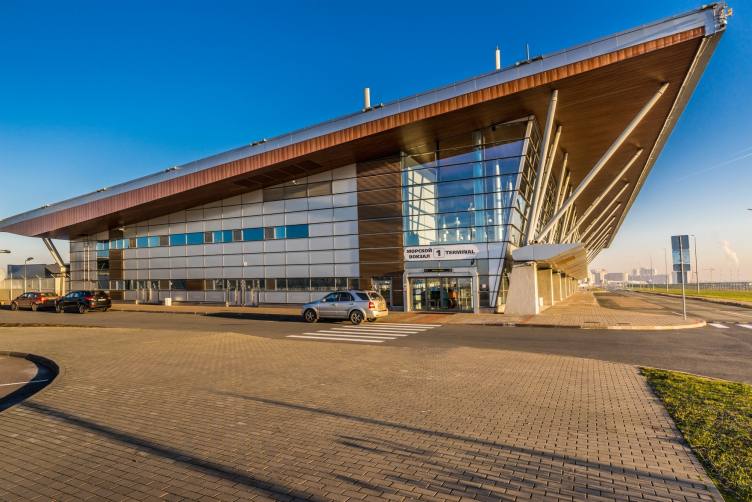
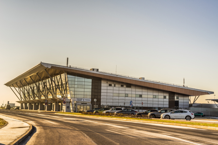
Sea passenger terminal. Terminal #1 (cruise) © "A.Len"
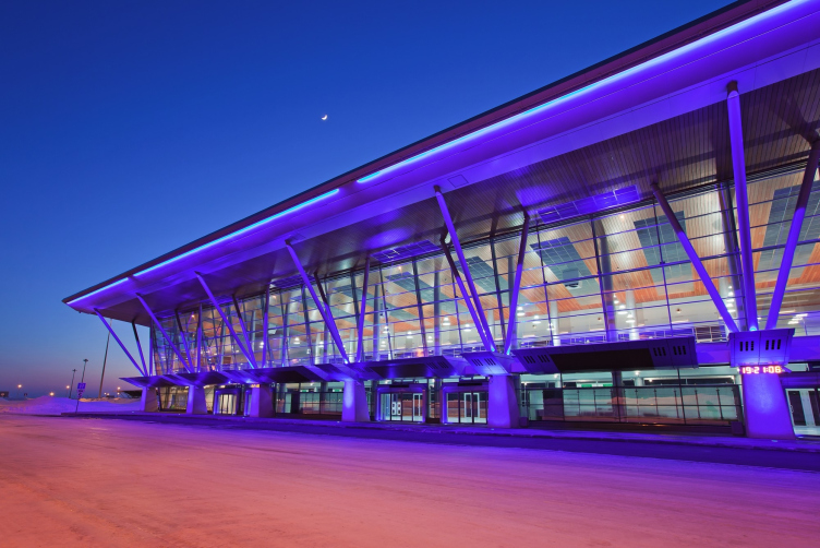
Sea passenger terminal © "A.Len"


Sea passenger terminal © "A.Len"


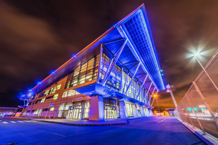
Sea passenger terminal. Terminal #1 (cruise) © "A.Len"


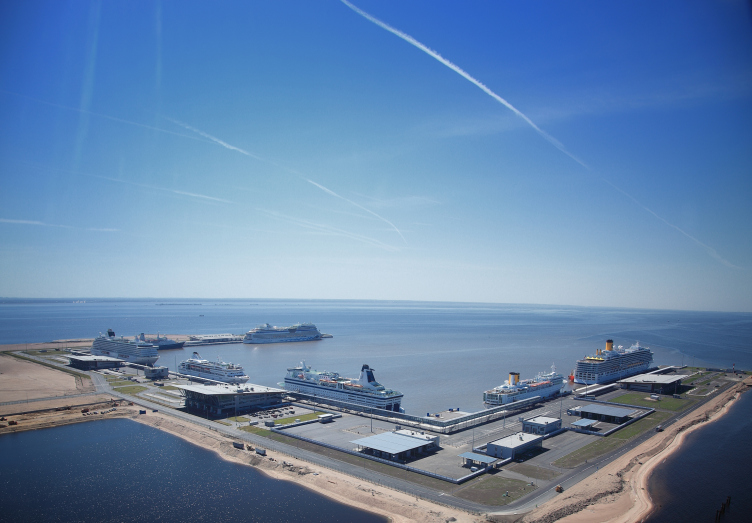
Of course, cruise liners would come to Saint Petersburg before. Entering Neva's estuary, they would moor practically in the city's center, at Morskoy Vokzal: the tourists would get the city's sights within a walking distance, and the city people would get the sight of magnificent liners. The border control and the customs services, however, for this same reason, would run into heaps of difficulties, down to the sheer impossibility of normal work. Furthermore, the Morskoy Vokzal was incapable of accepting ships over 200 meters long, and they had to be forwarded to the commercial sea port that is totally unfit for these purposes.

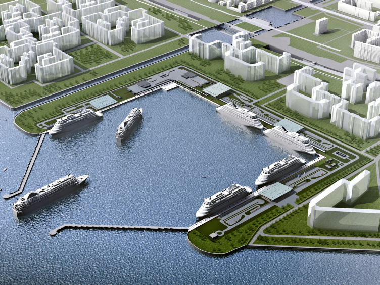
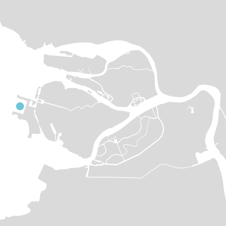
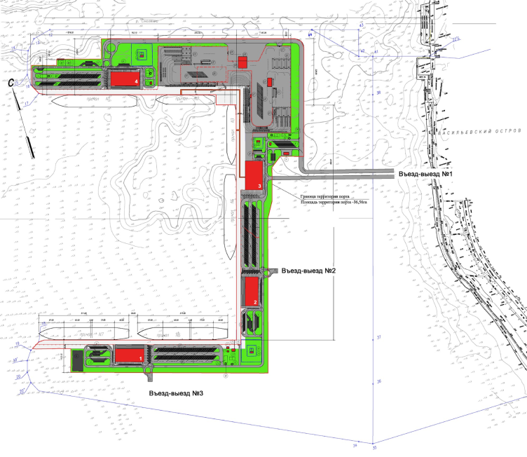
The decision (made in 2005) to build a dedicated passenger port named "Sea Façade" - also on the Vasilyevsky Island, only more to the west - turned out to be the optimum solution that satisfied all the parties. Furthermore, this port was to become a part of a grand-scale strategic project of developing the city that provides for forming more than 476 hectares of new raised beaches, construction of new residential areas, a university, and a new metro station. The seven terminals of "Sea Façade" are capable of taking in cruising liners and ferries up to 330 meters long. The first vessel moored here in 2008; now the port is working to capacity.

Sea passenger terminal. Location plan © "A.Len"


Sea passenger terminal. Terminal #3 (ferry) © "A.Len"


Today, the architecture of cruising terminals is a genre as hot and intriguing as designing airports. In Shanghai, Taiwan, Sidney, and Cartagena, the passenger terminals are designed by world-class architects, win professional awards, and get extensive coverage in the industry media. Thus, over the years, considerable experience has been accumulated in this field, both from the architectural and from the purely technological standpoint. As Sergey Oreshkin shares, "A.Len" got this job after the company, almost on a gratis basis, conducted a few consultations with the experts on the technologies of cruising port construction in Europe and the USA (the company actually also contributed to preparing the technical specifications to the project but that's a different story). And, by the way, "A.Len" agreed to take the job subject to the condition that the appropriate experts must be included into the team: the scientific part was done by an American company, while the chief technologist came from Finland. 

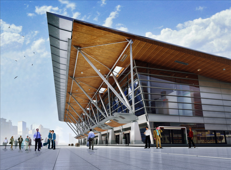
Sergey Oreshkin's original project is significantly different from what ultimately got implemented. When the whole story was just beginning ten years ago, the architectural world's hottest thing was the "rolling" or "band" architecture - when a building, like New York's museum of Eyebeam built upon the project of Diller Scofidio + Renfro, or the HQ of Vacheron Constantin designed by Bernard Tschumi in Geneva, looks as if it was casually rolled up from a giant band - flexible but at the same time capable of holding the shape that the architects intended it to have. Similarly, Sergey Oreshkin came up with a building looking like a "bolt of tarpaper" sliced, like a loaf of bread, into individual terminals and also bringing up associations with a tidal wave. True, the idea is dramatic and expressive but, regretfully, Tschumi's "deconstruction" principles that are all about separating the form from the content do not really go well together with the real-life practice of building transport facilities, at least, in this country. If we are to draw more parallels with the world's top projects, then we must admit that the "airport - railway station - sea port" typology in its classic form is more about Santiago Calatrava with his laid-bare, sometimes even skeleton-like structures or Richard Rogers and other pioneers of architectural hi-tech that consistently accentuated the aesthetics of the functionality of their projects. Furthermore, apart from being different from its archetype, the original "A.Len" proposal was fraught with serious difficulties in servicing the roof, particularly in the wintertime. And so it turned out that the "bolt of tarpaper" turned into a "modular object with dramatically expressed techno design" - Sergey Oreshkin shares. 

Sea passenger terminal. Master plan © "A.Len"


Ferry terminal. Terminal #1 © "A.Len"


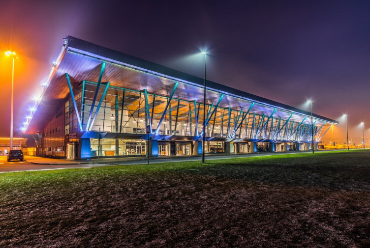
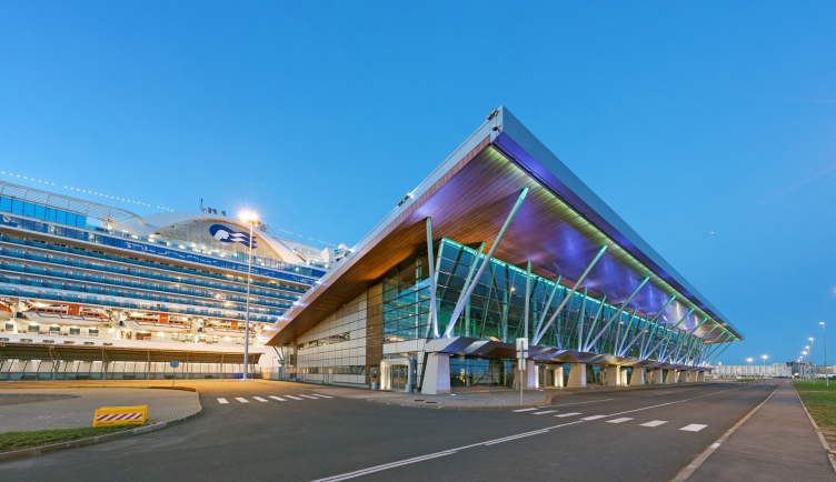
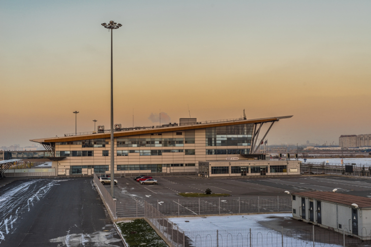
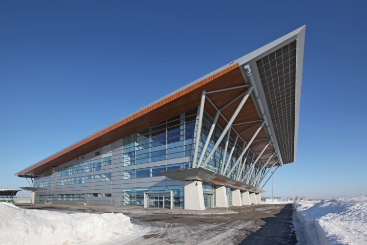
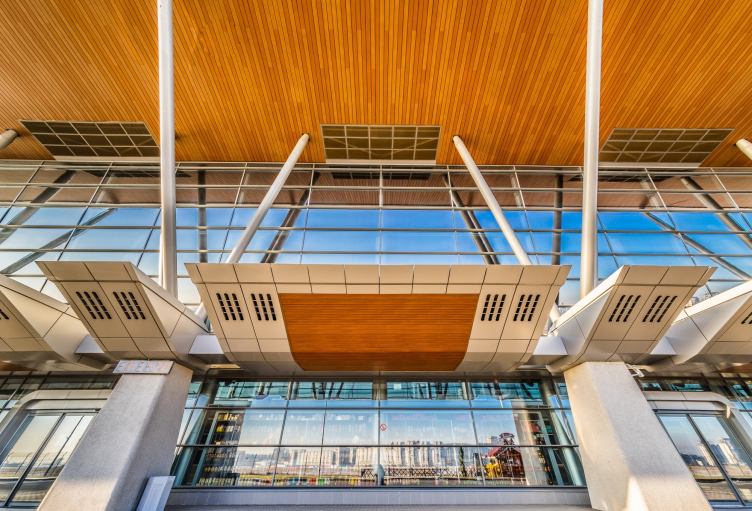
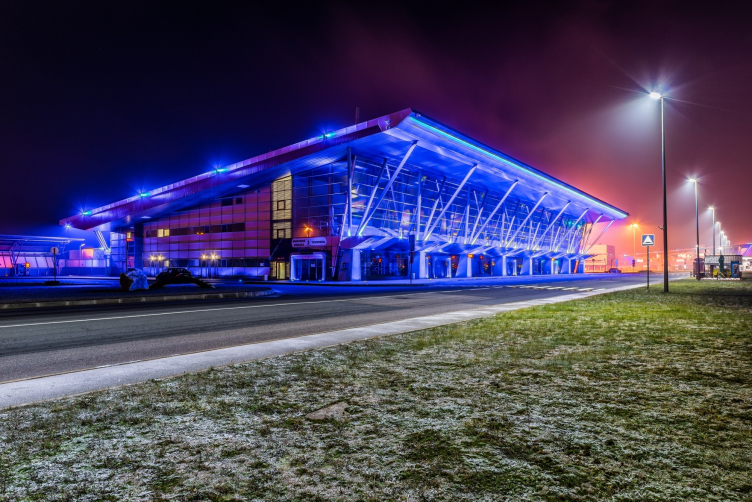
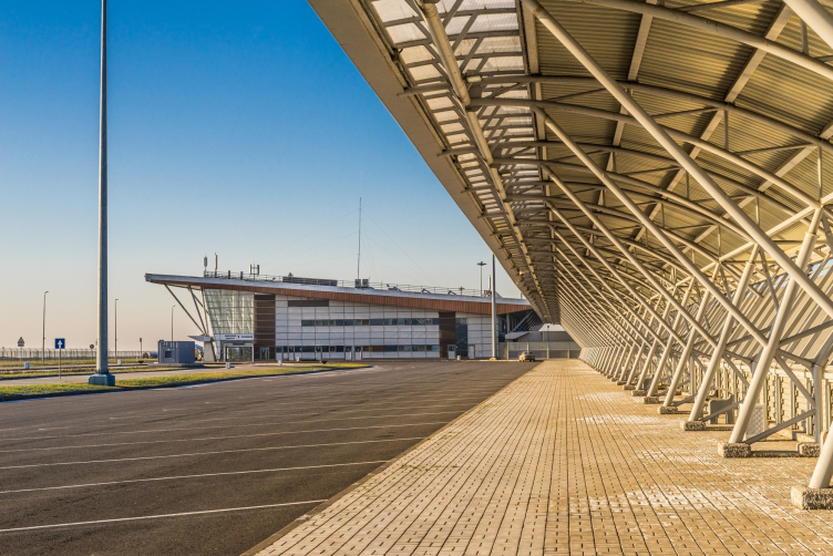
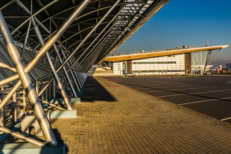
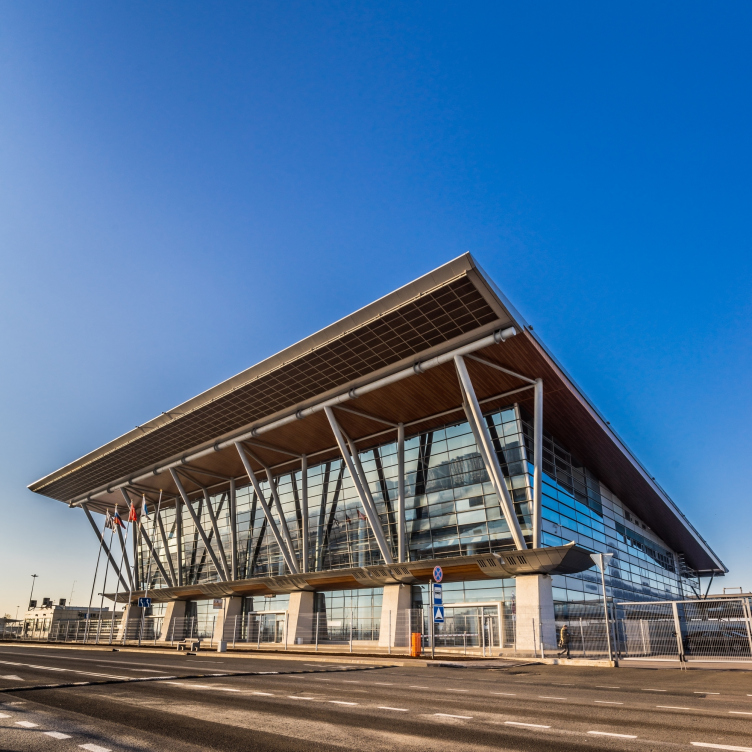
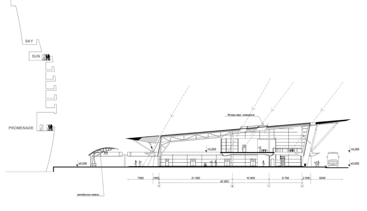
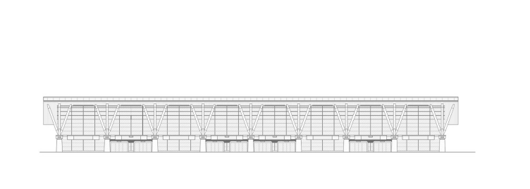
All the four terminals - three cruising ones and one for ferries connected by common above-ground galleries - have a single architectural and engineering solution and are only different in their size: the three-story ferry terminal separates the pedestrian and the automotive flows, the length of the cruising ones being defined by the number of the quays that they serve. Essentially, these are pavilions designed to quickly carry aboard huge numbers of people - within a 30-minute span, under the guidance of tourist agents, about two thousand people can board the ships. The functionality is accentuated by the laconic architectural style. Just like in the "textbook" case of Pompidou Center designed by Renzo Piano and the works by already-mentioned Richard Rogers, the multiple rod construction is carried over to the outside and accentuated. The panoramic glazing of the front and most of the side facades dissected by the grid of the metallic framework makes the inside bearing columns plainly viewable. The bases of the rectangular tetrahedron of the metallic rods that support the marquee above the entrance also support the overhanging awning of the roof. All this put together forms a complex geometric pattern that goes a long way to bring out the best in the building's dynamics that grows half again as high from the back façade to the front one, if we are to consider the marquee. Alternating with the monumental prismatic pilasters, the portals of the pullout doors are limited on top by a cornice of a complex profile, broken down into individual fragments and bringing up associations with an airplane wing. 

Sea passenger terminal. Terminal #1 (cruise) © "A.Len"


Sea passenger terminal. Terminal #2 (cruise) © "A.Len"


Sea passenger terminal. Terminal #2 (cruise) © "A.Len"


Sea passenger terminal. Terminal #3 (ferry) © "A.Len"


Sea passenger terminal. Terminal #4 (cruise) © "A.Len"


Sea passenger terminal. Terminal #4 (cruise) © "A.Len"


Sea passenger terminal. Terminal #1 (cruise) © "A.Len"


Sea passenger terminal. Terminal #3 (ferry) © "A.Len"


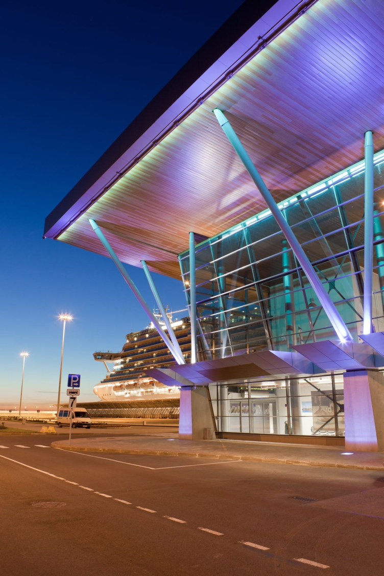
While from the sea side the height of the pavilions is made as low as possible - standing up to the sheer bulk of the sea giants is not realistic anyway - the facades turned to the city look as if they are three or even four stories high, even though in actuality their inside space remains double-height. For all its effectiveness and quite a few practical benefits (decreasing the wind load, to name but one), this solution brought a lot of challenges to the architects: the premises in the center of the terminal turned out to be too high in fact, they lacked the necessary amount of light, and, in order to let the sunlight in, the architects had to provide for special "sun tubes" in the roof. As is often the case in this life, the architects were really able to make a virtue out of necessity: just like all the other construction elements, these "tubes" are also fitted with LED's - in the evening, the purple and green lights sparkle not only on the facades but also on the roofs of the terminals.

Sea passenger terminal. Terminal #2 (cruise) © "A.Len"


Sea passenger terminal. Terminal #2 (cruise) © "A.Len"


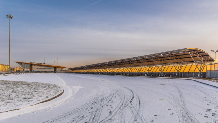
The roofs of the terminals are a whole separate story and a special creative project in themselves. Due to the fact that the main decks of the ships that come into the port are in fact situated significantly higher than the rooftop level, the "A.Len" architects wanted the terminals' "fifth façade" stand up to meeting the guests of the city. They considered these questions still while they were designing the water park in "Pribaltiyskaya" Hotel where the park was designed with consideration to the views from the hotel rooms. Similarly, on the roofs of the ferry and cruising terminals, the sun tubes, the air ducts, and all the technical contents assembled into blocks - all of this, at the architects' will, makes a magnificent graphic picture sparkling with multicolored lights in the nighttime and pleasing the eye with its harmonious pattern by daylight. The chief engineer Alexander Weiner considers these "artistic" roofs to be the main "distinctive feature" of this project, and we cannot but agree with him. 

Sea passenger terminal. Terminal #1 (cruise) © "A.Len"


Sea passenger terminal. Terminal #2 (cruise) © "A.Len"


Sea passenger terminal. Terminal #3 (ferry) © "A.Len"


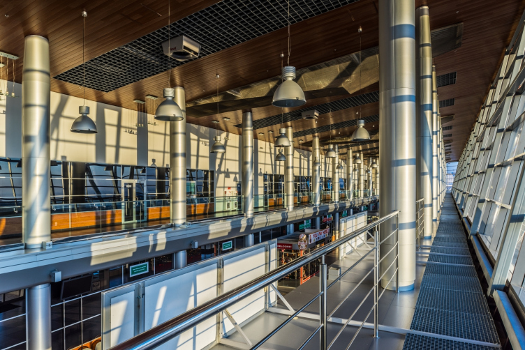
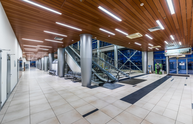
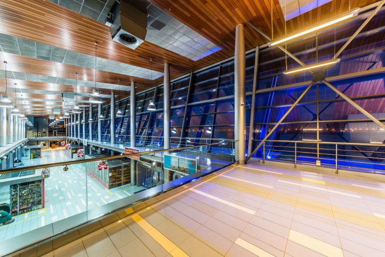
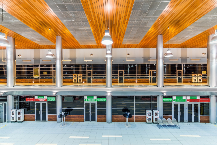
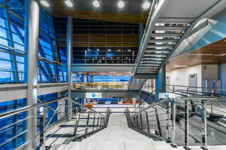
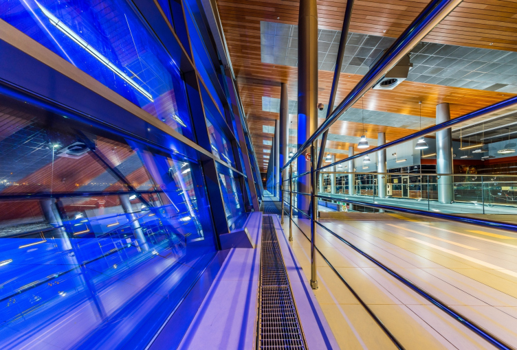
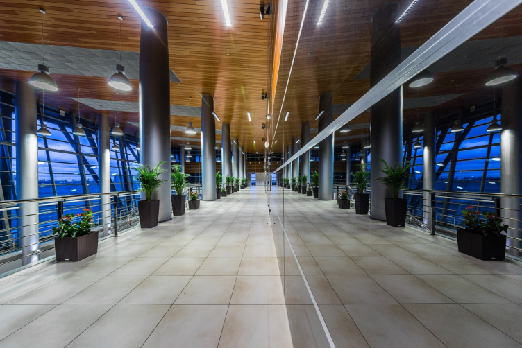
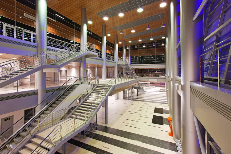
A cruising terminal is a very special building: it has nothing more nor less than a state border running through it. A similar principle is applied in the construction of international airports - they also have in them the state and the extraterritorial areas separated by the line of the customs and the state border control. Hence the inside architecture of the pavilions: the huge open spaces (in the case of cruising terminals, with as few shopping and entertainment premises as possible - the passengers are not supposed to stay here for long), galleries, stairways, and overpasses. 

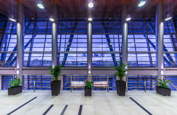
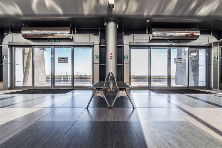
Designing the interiors of the pavilions in the same key of techno design, Sergey Oreshkin could not, of course, overlook the naval theme altogether. The associations that we see here, though, are pretty complex and not of the face-value type: while in the massive "pencil" columns one can still see the features of the ship's chimneys, the rounded surfaces of the color of noble wood that are to be seen on the façade, and on the marquees are but a subtle hint at ships' lines; as for the fact that the designed of the latticed openings was inspired by the image of a boat's bottom - this can only be figured out with Sergey giving you the clue. The architect, incidentally, reminded us that a similar technique was used by Nicolas Grimshaw when the latter designed the new terminal of Pulkovo Airport: in the folded-plate structure of the vaults one can see both the proverbial golden domes of the Orthodox churches, and the boats sailing the Baltic Sea. And, as for high-tech, it is really abundant and quite unambiguous in all the terminals of "Sea Façade": it is all about metal (or, rather, its imitation), and industrial-shape lights, and stairways and galleries of glass and steel that dissect this huge airy space. Even the benches here sport a maximally ergonomic and industrial look. 

Sea passenger terminal. Terminal #2 (cruise) © "A.Len"


Sea passenger terminal. Terminal #3 (ferry) © "A.Len"


Sea passenger terminal. Terminal #2 (cruise) © "A.Len"


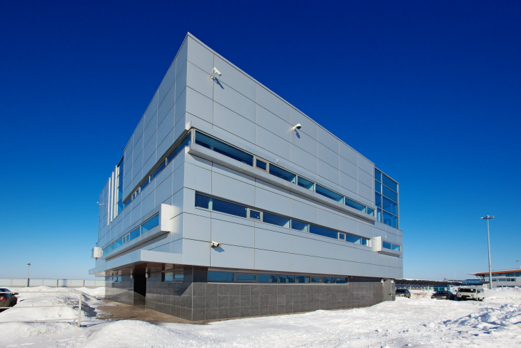
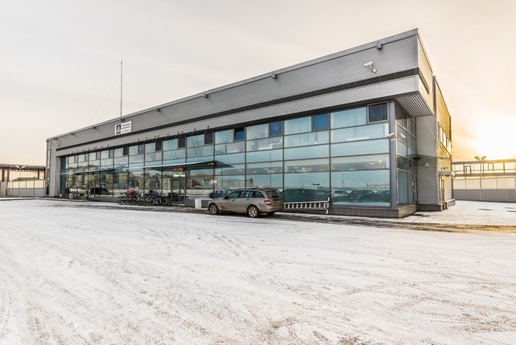
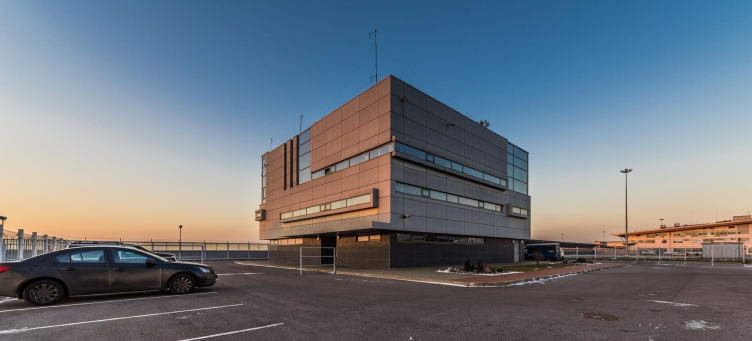
Besides the four terminals, "A.Len" bureau built in the passenger port a few auxiliary buildings: the management center of the port (also rather stylish and modernist with horizontal windows - Sergey Oreshkin comments), and automotive checkpoint and bus stops. The work goes on even now: new you duty-free shops are being completed, and the architects are considering building a new fitness center. Besides - a rare case - according to Alexander Weiner, the management company has drawn up with "A.Len" a ten-year contract on technical supervision and operation of the terminals. This is important because it is all about the raised beaches, although the buildings of the terminals rest upon pales and there is little risk of serious sagging. So, "A.Len" is not letting go of "Sea Façade". 

Sea passenger terminal. Control building © "A.Len"


Sea passenger terminal. Customs office © "A.Len"


Sergey Oreshkin is quite modest in his evaluating the terminal: nothing out of the ordinary, four objects 10 000 square meters each, a magnitude comparable to a regular residential building - but some certain pride for the implemented project, of course, is felt in his words. The recognition of his colleagues was also quick to come, as they were launched into operation, each terminal was winning these or those industry awards. Now the architects have a pleasant opportunity to admire their work from a close range - from the side of their yet another object under construction: on the first line of the raised land, "A.Len" is building the residential area under the poetic name of "Me, Romantic". The windows of the apartments will command a magnificent view of the passenger port terminals, quite small against the background of the steel ships but still plainly visible by day and night. 
Sea passenger terminal. Terminal #1 (cruise) © "A.Len"
Sea passenger terminal. Terminal #2 (cruise) © "A.Len"
Sea passenger terminal. Terminal #3 (ferry) © "A.Len"
Sea passenger terminal. Terminal #4 (cruise) © "A.Len"
Sea passenger terminal. Terminal #1 (cruise) © "A.Len"
Sea passenger terminal. Terminal #3 (ferry) © "A.Len"
Sea passenger terminal. Terminal #4 (cruise) © "A.Len"
Sea passenger terminal. Control building © "A.Len"
Sea passenger terminal. Terminal #1 (cruise) © "A.Len"
zooming
Sea passenger terminal. Terminal #4 (cruise) © "A.Len"
Sea passenger terminal. Facade © "A.Len"


Architect:
Sergey Oreshkin
Firm:
A-Len
Object:
Complex of buildings and constructions of the Sea passenger terminal
Russia, St. Petersburg

2005 — 2010 / 2008 — 2011

03 August 2015

Headlines now
The Golden Crown
The concept for a dental clinic in Yekaterinburg, developed by CNTR Studio, revolves around the idea of a “mouth full of gold”: pristine white porcelain stoneware walls are complemented by matte brass details. To avoid an overly literal interpretation, the architects focused on the building’s proportions, skillfully navigating between sunlight requirements and fire safety regulations.
Flexibility and Integration
Not long ago, we covered the project for the fourth phase of the ÁLIA residential complex, designed by APEX. Now, we’ve been shown different fence concepts they developed to enclose the complex’s private courtyards, incorporating a variety of public functions. We believe that the sheer fact that the complex’s architects were involved in such a detail as fencing speaks volumes.
A Step Forward
The HIDE residential complex represents a major milestone for ADM architects and their leaders Andrey Romanov and Ekaterina Kuznetsova in their quest for a fresh high-rise aesthetic – one that is flexible and layered, capable of bringing vibrancy to mass and silhouette while shaping form. Over recent years, this approach has become ADM’s “signature style”, with the golden HIDE tower playing a pivotal role in its evolution. Here, we delve into the project’s story, explore the details of the complex’s design, and uncover its core essence.
Gold in the Sands
A new office for a transcontinental company specializing in resource extraction and processing has opened in Dubai. Designed by T+T Architects, masters of creating spaces that are contemporary, diverse, flexible, and original, this project exemplifies their expertise. On the executive floor, a massive brass-clad partition dominates, while layered textures of compressed earth create a contextually resonant backdrop.
Layers and Levels of Flight
This project goes way back – Reserve Union won this architectural competition at the end of 2011, and the building was completed in 2018, so it’s practically “archival”. However, despite being relatively unknown, the building can hardly be considered “dated” and remains a prime example of architectural expression, particularly in the headquarters genre. And it’s especially fitting for an aviation company office. In some ways, it resembles the Aeroflot headquarters at Sheremetyevo but with its own unique identity, following the signature style of Vladimir Plotkin. In this article, we take an in-depth look at the United Aircraft Corporation (UAC) headquarters in the Moscow agglomeration town of Zhukovsky, supplemented by recent photographs from Alexey Naroditsky – a shoot that became only recently possible due to the fact that improvements were finally made in the surrounding area.
Light and Shadow
In this article, we delve into the architectural design of the “Chaika” house by DNK ag architects, which was recently completed in 2023 as part of the collection of signature designs at ZILArt. As is well-known, all the buildings in this complex follow a design code, yet each one is distinct. This particular building stands out not only for its whiteness and minimalism but also for the refined use of a limited number of techniques that, together, create what can confidently be called synergy.
Casus Novae
A master plan was developed for a large residential area with a name of “DNS City”, but now that its implementation began, the plan has been arbitrarily reformatted and replaced with something that, while similar on the surface, is actually quite different. This is not the first time such a thing happens, but it’s always frustrating. With permission from the author, we are sharing Maria Elkina’s post.
Treasure Hunting
The GAFA bureau, in collaboration with Tegola and Arkhitail, organized an expedition to the island of Kilpola in Karelia as part of Moskomarkhitektura’s “Open City” festival. There, amidst moss and rocks, the students sought answers to questions like: what is the sacred, where does it dwell, and what sustains it? Assisting the participants in this quest were landscape engineer Evgeny Levin, artist Nicholas Roerich, a moose, and the lack of cellular connection. Here’s how the story unfolded.
Depths of the Earth, Streams of Water
In the Malaya Okhta district, the Akzent building, designed by Stepan Liphart, was constructed. It follows a classic tripartite structure, yet it’s what you might call “hand-drawn”: each façade is unique in its form and details, some of which aren’t immediately noticeable. In this article, we explore the context and, together with the architect, delve into how the form was developed.
Fir Tree Dynamics
The “Airports of Region” holding is planning to build an airport in Karachay-Cherkessia, aiming to make the Arkhyz and Dombay resorts more accessible to travelers. The project that won in an invitation-only competition, submitted by Sergey Nikeshkin’s KPLN, blends natural imagery inspired by the shape of a conifer seed, open-air waiting spaces, majestic large trees, and a green roof elevated on needle-like columns. The result is both nature-inspired and WOW.
​A Brick Shell
In the process of designing a clubhouse situated among pine trees in a prestigious suburban area near Moscow, the architectural firm “A.Len” did the façade design part. The combination of different types of brick and masonry correlates with the volumetric and plastique solutions, further enhanced by the inclusion of wood-painted fragments and metal “glazing”.
Word Forms
ATRIUM architects love ambitious challenges, and for the firm’s thirtieth anniversary, they boldly play a game of words with an exhibition that dives deep into a self-created vocabulary. They immerse their projects – especially art installations – into this glossary, as if plunging into a current of their own. You feel as if you’re flowing through the veins of pure art, immersed in a universe of vertical cities, educational spaces – of which the architects are true masters – and the cultural codes of various locations. But what truly captivates is the bold statement that Vera Butko and Anton Nadtochy make, both through their work and this exhibition: architecture, above all, is art – the art of working with form and space.
Flexibility and Acuteness of Modernity
Luxurious, fluid, large “kokoshniks” and spiral barrel columns, as if made from colorful chewing gum: there seem to be no other mansion like this in Moscow, designed in the “Neo-Russian-Modern” style. And the “Teremok” on Malaya Kaluzhskaya, previously somewhat obscure, has “come alive with new colors” and gained visibility after its restoration for the office of the “architectural ecosystem” as the architects love to call themselves. It’s evident that Julius Borisov and the architects at UNK put their hearts into finding this new office and bringing it up to date. Let’s delve into the paradoxes of this mansion’s history and its plasticity. Spoiler: two versions of modernity meet here, both balancing on the razor’s edge of “what’s current”.
Yuri Vissarionov: “A modular house does not belong to the land”
It belongs to space, or to the air... It turns out that 3D printing is more effective when combined with a modular approach: the house is built in a workshop and then adapted to the site, including on uneven terrain. Yuri Vissarionov shares his latest experience in designing tourist complexes, both in central Russia and in the south. These include houseboats, homes printed from lightweight concrete using a 3D printer, and, of course, frame houses.
​Moscow’s First
“The quality of education largely depends on the quality of the educational environment”. This principle of the last decade has been realized by Sergey Skuratov in the project for the First Moscow Gymnasium on Rostovskaya Embankment in the Khamovniki district. The building seamlessly integrates into the complex urban landscape, responding both to the pedestrian flow of the city and the quiet alleyways. It skillfully takes advantage of the height differences and aligns with modern trends in educational space design. Let’s take a closer look.
Looking at the Water
The site of Villa Sonata stretches from the road to the water’s edge, offering its own shoreline, pier, and a picturesque river panorama. To reveal these sweeping views, Roman Leonidov “cut” the façade diagonally parallel to the river, thus getting two main axes for the house and, consequently, “two heads”. The internal core – two double-height spaces, a living room and a conservatory, with a “bridge” above them – makes the house both “transparent” and filled with light.
The White Wing
Well, it’s not exactly white. It’s more of a beige, white-stone structure that plays with the color of limestone – smoother surfaces are lighter, while rougher ones are darker. This wing unites various elements: it absorbs and interprets the surrounding themes. It responds to everything, yet maintains a cohesive expression – a challenging task! – while also incorporating recognizable features of its own, such as the dynamic cuts at the bottom, top, and middle.
Urban Dunes
The XSA Ramps team designed and built a three-part sports hub for a park in Rostov-on-Don, welcoming people of all ages and fitness levels. The skate plaza, pump track, and playground are all meticulously crafted with details that attract a diverse range of visitors. The technical execution of the shapes and slopes transforms this space into a kind of sculptural composition.
Proportional Growth
The project for the fourth phase of the ÁLIA residential area has been announced. The buildings are situated on an elongated plot – almost a “ray” that shoots out from the center of the area towards the river. Their layout reflects both a response to Moscow’s architectural preferences over the past 15 years, shifting “from blocks to towers”, and an interpretation of the neighboring business park designed by SOM. Additionally, the best apartments here are not located at the very top but closer to the middle, forming a glowing “waistline”.
The “Staircase” Building
In designing the “Details” residential complex in New Moscow, Rais Baishev spiced up the now-popular Moscow theme of a “courtyard” building with an idea drawn from the surrealist drawings by Maurits Escher. He envisioned the stepped silhouettes and descending slopes as a metaphysical mega-staircase, creating a key void within the courtyard that gave the project an internal “spine”. This concept is felt both in the building’s silhouette and on its façades.
Projection of the Quarter
No one doubted that the building that Vladimir Plotkin designed as part of the “Garden Quarters” would be the most modernist of all. And it turned out just that way: while adhering to the common design code, the building successfully combines brick and white stone, rhythmically responding to the neighboring building designed by Ostozhenka, yet tactfully and persistently making a few statements of its own. This includes the projection of the ideal urban development composition “14–9–6”, which can be found right next door, mathematical calculations, including those for various types of terraces (and perhaps the only reminder of the Soviet past of the Kauchuk rubber factory!), and the white “cross-stitch” pattern of the façade grid.
Domus Aurea
In this issue, we examine the “Tessinsky-1” house, designed by Sergey Skuratov and completed in 2023. Located in the middle of the Serebryanicheskaya Embankment district, at the intersection of its main streets, this house assumes a sort of “nodal” role: it not only responds to everything around it and preserves many memories of the former EMA factory within itself, but it weaves all this into a newly directed pattern, reconciling bright “gold” and dark-colored brick, largely with the help of the new, modern-yet-archaic Columba brick, which, come to think about it, is the most precious element here.
The Chimney of Nikola-Lenivets
In this issue, we are examining the “Obelisk House” designed by KATARSIS and built for the Arkhstoyanie 2023 festival. However, it was only finished later on, and this is why we are examining it now. It seems to us that after the “Obelisk House” appeared in Nikola-Lenivets, a dialogue and a few inner connections appeared between the temporary structures built here. These houses no longer look like “accidental neighbors”, more of which below.
​Periscope by the Bay
The jury awarded the second place in the competition for a public and cultural center in Petropavlovsk-Kamchatsky to the companies GORA (“Mountain”) and M4. In the consortium’s proposal, the building resembles a sperm whale with a calf swimming next to it or a periscope, whose lenses capture the most spectacular views from the surrounding landscape.
From Arcs to Dolmens
While working on the competition project for Petropavlovsk-Kamchatsky, ASADOV Architects prioritized the value of the natural and urban environment, aiming to preserve the balance of the location while minimizing the resemblance of the volume that they designed to a “traditional building”. The task was challenging, and the architects created three versions, one of which having been developed after the competition, where their main proposal took third place. However, the point of interest here is not the competition result but the continuity of creative thinking.
Hide and Seek
The ID Moskovskiy house, designed by Stepan Liphart in St. Petersburg, in the courtyards near Moskovskiy Avenue beyond the Obvodny Canal and recently completed, is notable for several reasons. Firstly, it has been realized with considerable accuracy, which is particularly significant as this is the first building where the architect was responsible not only for the facades but also for the layouts, allowing for better integration between the two. On the other hand, this building is interesting as an example of the “germination” of new architecture in the city: it draws on the best examples from the neighborhood and becomes an improved and developed sum of ideas found by the architect in the surrounding context.
The Big Twelve
Yesterday, the winners of the Moscow Mayor’s Architecture Award were announced and honored. Let’s take a look at what was awarded and, in some cases, even critique this esteemed award. After all, there is always room for improvement, right?
Above the Golden Horn
The residential complex “Philosophy” designed by T+T architects in Vladivostok, is one of the new projects in the “Golubinaya Pad” area, changing its development philosophy (pun intended) from single houses to a comprehensive approach. The buildings are organized along public streets, varying in height and format, with one house even executed in gallery typology, featuring a cantilever leaning on an art object.
Nuanced Alternative
How can you rhyme a square and space? Easily! But to do so, you need to rhyme everything you can possibly think of: weave everything together, like in a tensegrity structure, and find your own optics too. The new exhibition at GES-2 does just that, offering its visitor a new perspective on the history of art spanning 150 years, infused with the hope for endless multiplicity of worlds and art histories. Read on to see how this is achieved and how the exhibition design by Evgeny Ace contributes to it.
Blinds for Ice
An ice arena has been constructed in Domodedovo based on a project by Yuri Vissarionov Architects. To prevent the long façade, a technical requirement for winter sports facilities, from appearing monotonous, the architects proposed the use of suspended structures with multidirectional slats. This design protects the ice from direct sunlight while giving the wall texture and detail.