По-русски

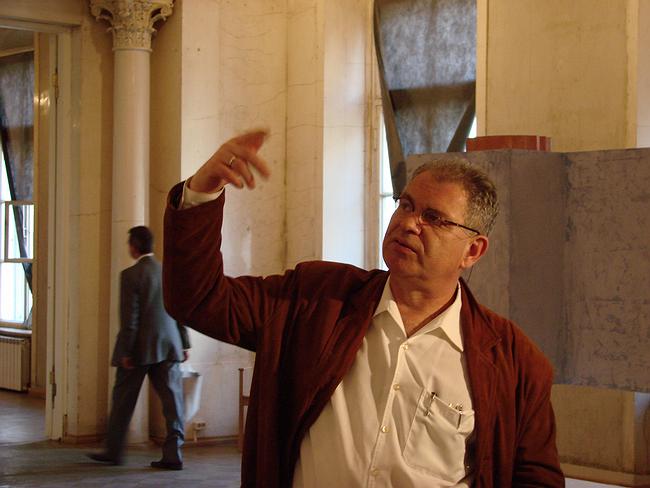
Aleksey Bavykin. Interview by Yuliya Tarabarina

We continue the publication of texts of interview to the architects participating in an exposition of Russian pavilion XI Venetian biennial. Interviews will be placed in the catalogue of the Russian pavilion

11 June 2008
mainImg
How would you define the character of your architecture?

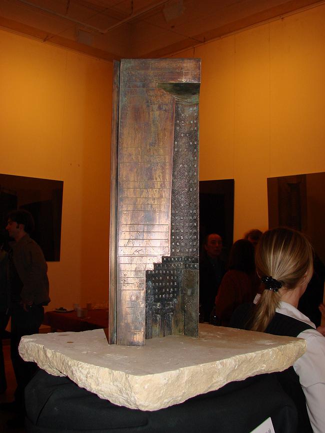
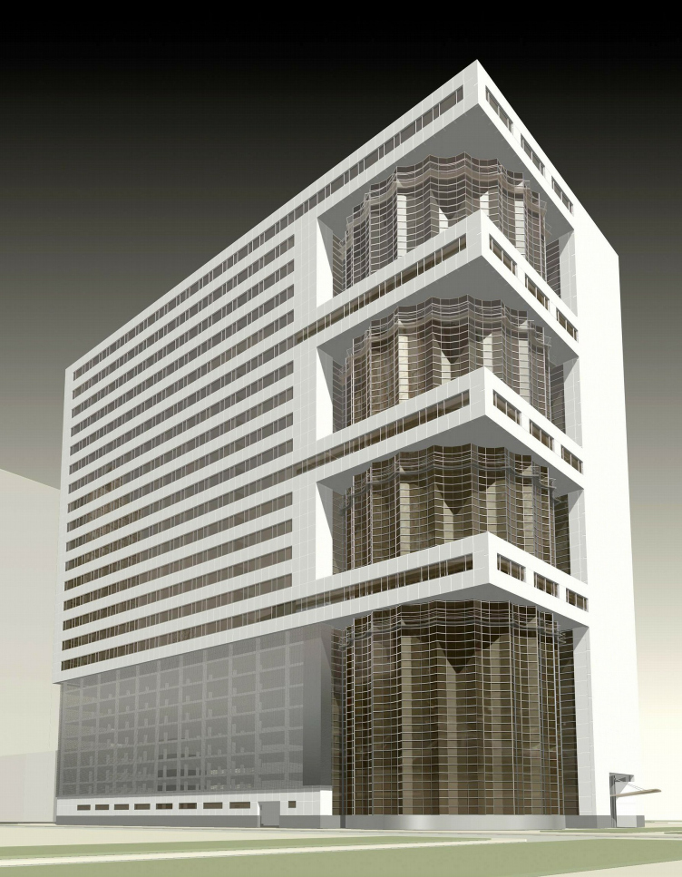
I’m neither a Modernist, nor a Neoclassicist. I would say my theme is the intersection of the two styles. The first thing I did on this theme was 20 years ago for the Japanese competition ‘The Style of 2001’. It was a glass prism in which I inserted a stone print of Adolf Loos’s column. I have always thought that Loos’s tower was the most interesting design at the Chicago Tribune competition of 1922. Gropius’s project for the same competition is fashionable, Modernist, but weaker. And in general I consider Loos’s tower to be the wildest and most advanced project of the 1920s.

Why?

Because Loos was a very far-sighted man. He was the father of all this Modernist architecture – which he engendered by stepping away from Style Moderne. But in 1922 he was already creating his column. Have you read the explanatory notes to his competition design? He wrote: “It may not be by me, it may not be here, in Chicago, but somewhere else – but something like this will definitely be built.” And sooner or later there’ll be people who’ll understand this theme and will establish a new line in architecture. So when Aldo Rossi asked me straight out what I thought regarding a style for 2001, this was the answer I gave. I was awarded one of the second prizes. It’s rumoured that Aldo Rossi, being a European, did all he could to promote my project, but the Japanese just didn’t get it.

Had you tried joining the two styles before the Style for 2001 competition?

No, up to that point I had been a rather rigid Postmodernist. You could say that everything else I’ve done, all my best things, are a continuation of this theme. I don’t know how to define it: I’m not a critic and sometimes muddle my definitions. But to my mind it’s a continuation of the quests of the early 1930s. It was a phenomenal leap forwards, but it was never completely realized because everything got stuck at the level of ideas and drawing-board projects, and there are very few buildings actually built in this style.

You said that you see your task as continuing the formal quests conducted by ASNOVA, the rationalist Association of New Architects …


Naturally, because these people started talking about pure form. But they spent too much time squabbling and arguing with one another. Then Comrade Stalin told them how to draw – and everyone rejoiced and said, ‘Great’!

There is a view that the change of direction that occurred in the 1930s was inevitable…


That’s the point of view taken by Khan-Magomedov, and I don’t agree with it. I think you find a more accurate treatment of this subject in Vladimir Paperny’s book Kul’tura Dva [‘Culture Two’]. Paperny thinks that Russian culture in general – starting from Ivan III and perhaps even earlier – is characterized by the cyclical alternation of two ‘cultures’, Culture One and Culture Two. He classifies the 1920s Avant-garde, for instance, as Culture One and Stalinist Classicism as Culture Two. So no one forced anyone to produce Classicism rather than Avant-garde architecture: it was just that people were fed up with the former! Furthermore, it was very profitable to produce the Stalinist Culture Two. The system by which architects in the Soviet Union were paid was by the sheet. Can you imagine how much Chechulin earned? All that detail: it meant dozens of sketches, which were paid for by the sheet. There was such rejoicing! “The more we draw, the more we earn” – and the more they earned. Contrast that with the Constructivist sketch, which was all on one sheet. This had no place in Culture Two; it didn’t fit with the emphasis on hard work. Mel’nikov was too coarse for them. He was unable to draw filigree things like Alabyan. He was too coarse and too orthodox. So Paperny’s right: there’s Culture One and Culture Two. We should take what’s good in Culture One and its followers and what’s good in Culture Two. And these opposing groups should live in peace.

And what do you do, then?

I’m somewhere in the middle.

Do you bring the two into conflict or reconcile them?

I, for instance, bring them into conflict. Sometimes, I boil both cultures together in the same building.

But I am right in thinking you have no great respect for Culture Two?


I don’t like the kind of frenetic state whereby today we all run this way and tomorrow that way. I don’t want to run in any direction with anyone. I just don’t want to. I find it uninteresting – to run with the herd this way and that.

There are people who consider you an eclecticist.

That’s not quite true. Eclecticism is the arbitrary mixing of styles to meet the client’s wishes. Its birth coincided with the birth of the wealthy bourgeoisie. You had architects who said, “You want a mixture of Rome and Byzantium? Fine.” In this respect I am absolutely not an eclecticist. My theme is not the mixing, but the intersection of two cultures. And there is no other theme in my work.

You began having projects built very early in your career…


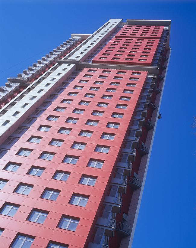
Yes, I always dreamed of having stuff built and I’ve produced a great many buildings, but I like by no means all of them. It’s like Meln’ikov’s series of clubs. One is good: the Rusakov Club is an undoubted masterpiece. But the others are worse, by no means up to that standard. I have many buildings which I never publish. But my Blue House on prospekt Vernadskogo is interesting. Ikonikov even published it in his book Tysacha let russkoy arkhitektury [‘1000 Years of Russian Architecture’]. Although there are angles from which it looks good and angles from which it looks bad. I failed to tie it into to its urban context. There’s a lack of volume. I kept stretching it, added on a tower, but still there’s not enough volume. When you’re travelling towards the centre, it looks good. But when you’re going in the opposite direction, it stands in a dip and is almost invisible.

You place considerable importance on the part your buildings play in the urban context?

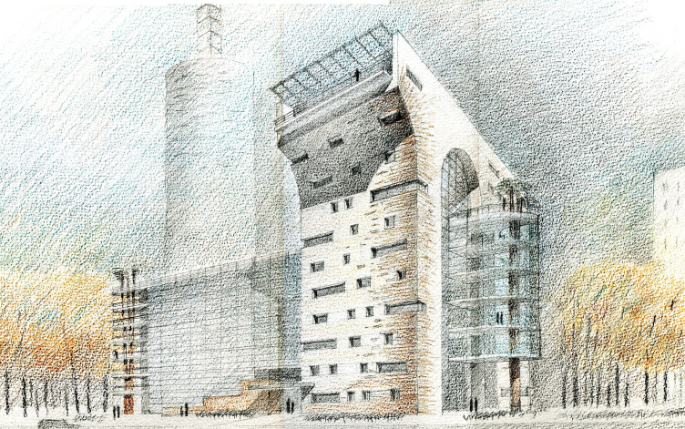
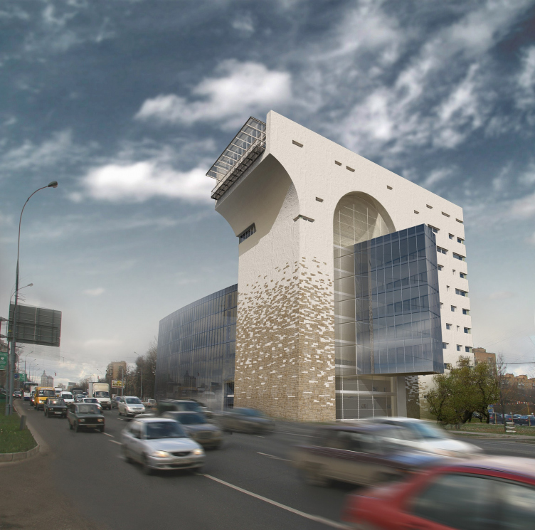
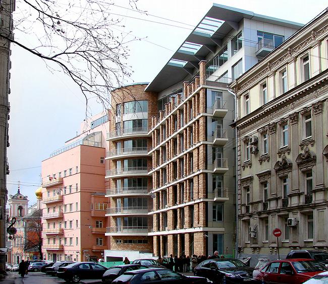
The point is to, wherever possible, restore the city’s flesh to sense from the point of view of urban planning . In my arch building on Mozhayskoe shosse I think I’ve managed this. For me this building is an important reference point: it responds to the city, and in a very active way. It is a splinter of the Stalinist scale of Kutuzov prospekt, but displaced to the periphery – and at the same time it’s a paraphrase of Bove’s triumphal arch, which stands ten kilometres closer to the city centre. You see this arch when you come out here, then you see it again when you go back to the centre. Furthermore, my arch emphasizes the intersection of classical form and a fashionable glass nose, which passes right through it, literally stringing it together. It’s a show. And I hope that in the next few centuries this thing will influence what’s going to be built around it. It will itself dictate, just as the house in Bryusov pereulok will dictate changes occurring on that particular sidestreet. Because the right answer has been supplied to the urban-planning problem.
However, the arch on Mozhayskoe shosse has no cornices, columns, or overt Classical details. In general, its forms are Modernist. But it has a subtext. One that is a reinterpretation, definitely a reinterpretation, but certainly not an explicit one. You know where explicit Classicism ends up?

Where does it end up?


With plastic cornices. All these computer mouldings – it’s now all the rage to scan Palladio and order an identical cornice made out of rubbish of some kind. To my mind, a capital is precious precisely and only because it’s handmade.

But in Moscow there were never Roman arches or aqueducts…

Why not? What about all of those Moscow-Empire-Style buildings. Bove’s arch is outstanding; Rome can’t hold a candle to it. We threw Napoleon out of Moscow and built this arch. Nor does Paris have an arch like it. This one is better. It’s iron and beautiful. An iron empire, you see, is indestructible!

Let’s develop the theme of the cultural empire…


It’s a good theme, but a very complex one. It’s a separate topic for discussion, but the essence of the matter is that our cultural empire is an endless intersection of Culture One and Culture Two in space and time. A binary system, which, I’m convinced, is a typical and distinctive trait of the Russian cultural space.

But you don’t particularly read foreign magazines?


Why not? Of course, I look at them. Everything depends on what angle you look at them from, these magazines. Much of what we see in foreign magazines comes from our own 1920s, and I can produce numerous examples to prove it. I look at the source and the interpretation and see both of them simultaneously – so, when I look at yet another project by Rem Koolhaas, I can see where it comes from.
It’s worse when people look at magazines without knowing the original source. This is a very Russian thing – to do our own people down so as to put fear into foreigners. In short, this is a very simple matter: you need to know the history of architecture and the more thorough your knowledge, the better. Copying things taken from trendy magazines is mere foolishness. What has recently made me mad is that everyone’s crazy about commercial architecture. We want nine by nine, they say, like in Europe. But what makes them think that ‘nine by nine’ is Europe? Or America? Where did they get that from?

You’re not very fond of commercial architecture.

There’s no such thing as commercial architecture! It’s the invention of people who cannot create. Take any building; you can either design it properly, or you can simply say, “Back off from me, I’m doing commercial architecture.” This means the author has no artistic programme. As for me, I’ve been implementing an artistic programme for the last 25 years. If it appeals to people and if people approve of my ideas and go ahead and build them, I say, “Thank you to everyone who’s helped.” But when people get in my way, I can be very tough on them.
When I see that this city and this country are full of people who altogether lack a programme – whether artistic or otherwise, – I have to insist that I come first and they second. And the same with regard to money. People pay for art. Palladio was paid enormous sums for his artistic programme. And in our time too it’s quite possible to ensure that big money is paid for the implementation of an artistic programme and not for commercial architecture. Skokan and Plotkin, for instance, have an artistic programme; they’re closer to Culture One. Culture Two is represented by Utkin, Filippov, Belov, and Barkhin… Brodsky is in a category all of his own. These are people who, apart from wanting to earn money, also want to say something, to fight a case.

What is your formula for good architecture?

I don’t have one. I’m very fond of Palladio. He was absolutely spot on. I absolutely agree with everything he wrote. It all makes good sense.

His tractate is essentially pragmatic…

Absolutely pragmatic. But look what he did in Vicenza. His houses shape the city’s urban character. Instead of each standing on their own, they are closely connected with the structure of the city; they hold it in place. Do you remember how this happened? Vicenza lost its political independence and was overrun by Venetian bandits, although of an enlightened kind. In as far as they were enlightened, they turned to Andrea Palladio. And said, “Andrew, we really like your take on architecture. Here’s a bundle of commissions, and we also want you to design some out-of-town villas for us.” And so, at the same time as working on the city of Vincenza, he built some villas around it, where his clients could live freely and in safety. This is why Palladio is an architectural phenomenon: he turned Vicenza into an amazing city, set some standards. And not because he used a special Classical order of columns. He could have drawn everything differently.

Is your ideal the architecture of the High Renaissance?

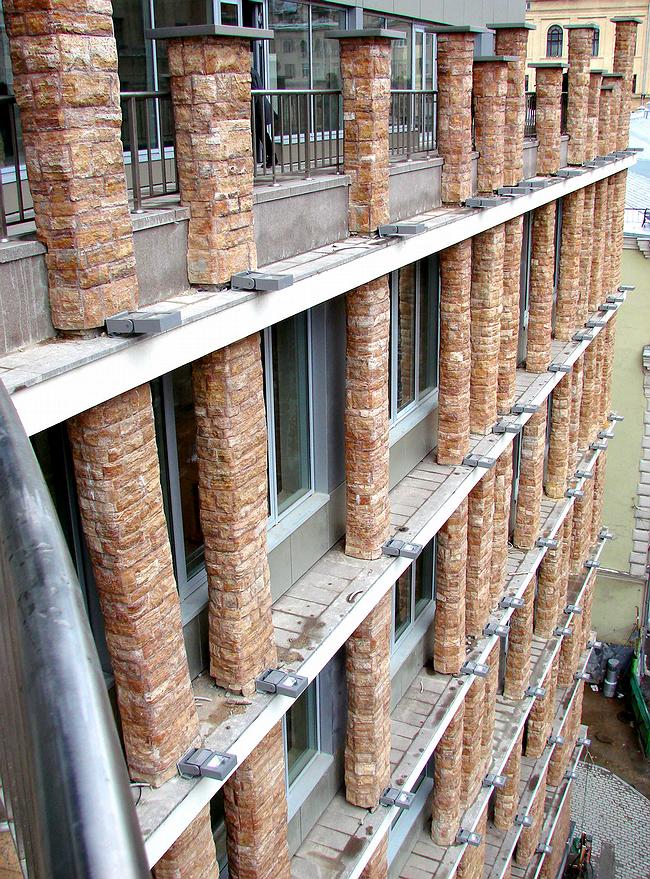
The Middle Renaissance… What’s the difference between the house on Bryusov pereulok and a Florentine palazzo? None at all. Only here the material is aluminium and there’s a canopy of a kind. Well, the Florentine palazzo has a canopy too. Everything’s just as it should be: Classical columns, an inner courtyard. Only it’s been drawn differently. Because I’ve listened and read a great deal. It’s something we were taught at college. They said to us, ‘High Renaissance’ and then they said ‘Russian Classicism’. This is something you can’t forget.

You’re one of the few architects who takes the history of architecture seriously.


Naturally, I root around in architectural history. Palladio likewise rooted around in what might have seemed to be nonsense. Renaissance architecture struck people as extremely simplified after the highly complex Gothic style of the 15th century. Gothic architects designed cathedrals so lavish that Norman Foster and his structural solutions can only sit down and weep. But what I really don’t like about these cathedrals is the way they set about frightening people. All their complex constructional techniques are there to hit you over the head, to tell you, “Sit still, fear God, and hand over your money.” This is the Catholic tradition, which has no relevance for us. The Orthodox churchgoer has no right to bargain with God, whereas it’s different for Catholics. You buy your indulgence and that’s it. Orthodox people, though, would likewise build a small chapel of some kind when they started feeling weakness of the liver. And I’ll probably do the same.

Could you design a church?

I find utterly uninteresting the churches currently commissioned by the Orthodox bosses. We have still to reach the moment when Russian architects will be allowed to continue the creative quest in Russian Orthodox architecture.

Do you like the chapel at Ronchamp?

Yes, of course – because, before departing for another world, Le Corbusier made amends for his past works. He rehabilitated himself for his Radiant City and the unité d’habitation in Marseilles. I believe it’s wrong to design houses with such living conditions and minimal areas. The Modernists were designing not for themselves (for themselves they designed villas), but for others – for those who were supposed to build the bright future collectively. Although this theme – commune houses – is currently very fashionable. People come to look at them. Foreigners, for instance, visit Nikolaev’s commune house in Moscow and live there for a couple of weeks. This is all very well as a kind of adventure holiday, or as the second or third home of an eccentric millionaire. But when you design such houses for people to live in permanently, that’s wrong.

Is your artistic programme a form of patriotism?

Partly, yes. Although I realize that not everything in Russia is in good order. And there is no such thing as everything being in good order. But this is a worthy country and fantastically rich. We need to look around ourselves with more attention, read about Ivan Kalita, Ivan III, there’s a lot we need to read. Right now, it gives me pleasure to trace this chain through from one end to the other and I find it fascinating – it’s a mishmash. The kingdom of Moscow is the golden horde and Orthodoxy. There are books I like and books I don’t. As for my architecture, I would like people to say, “This is a good building and who designed it is unimportant.”

Are you establishing your own architectural movement?

Yes, essentially. I now have some young people working for me. They look around themselves. Who knows, maybe someone will get interested in what I do and there’ll be a continuation. I have no intention of starting a school. That’s all rubbish – imposing things on people. I want to create something that people will look at. Maybe they’ll see something interesting in it, but, if they don’t, that doesn’t really bother me.

11 June 2008

Headlines now
The Golden Crown
The concept for a dental clinic in Yekaterinburg, developed by CNTR Studio, revolves around the idea of a “mouth full of gold”: pristine white porcelain stoneware walls are complemented by matte brass details. To avoid an overly literal interpretation, the architects focused on the building’s proportions, skillfully navigating between sunlight requirements and fire safety regulations.
Flexibility and Integration
Not long ago, we covered the project for the fourth phase of the ÁLIA residential complex, designed by APEX. Now, we’ve been shown different fence concepts they developed to enclose the complex’s private courtyards, incorporating a variety of public functions. We believe that the sheer fact that the complex’s architects were involved in such a detail as fencing speaks volumes.
A Step Forward
The HIDE residential complex represents a major milestone for ADM architects and their leaders Andrey Romanov and Ekaterina Kuznetsova in their quest for a fresh high-rise aesthetic – one that is flexible and layered, capable of bringing vibrancy to mass and silhouette while shaping form. Over recent years, this approach has become ADM’s “signature style”, with the golden HIDE tower playing a pivotal role in its evolution. Here, we delve into the project’s story, explore the details of the complex’s design, and uncover its core essence.
Gold in the Sands
A new office for a transcontinental company specializing in resource extraction and processing has opened in Dubai. Designed by T+T Architects, masters of creating spaces that are contemporary, diverse, flexible, and original, this project exemplifies their expertise. On the executive floor, a massive brass-clad partition dominates, while layered textures of compressed earth create a contextually resonant backdrop.
Layers and Levels of Flight
This project goes way back – Reserve Union won this architectural competition at the end of 2011, and the building was completed in 2018, so it’s practically “archival”. However, despite being relatively unknown, the building can hardly be considered “dated” and remains a prime example of architectural expression, particularly in the headquarters genre. And it’s especially fitting for an aviation company office. In some ways, it resembles the Aeroflot headquarters at Sheremetyevo but with its own unique identity, following the signature style of Vladimir Plotkin. In this article, we take an in-depth look at the United Aircraft Corporation (UAC) headquarters in the Moscow agglomeration town of Zhukovsky, supplemented by recent photographs from Alexey Naroditsky – a shoot that became only recently possible due to the fact that improvements were finally made in the surrounding area.
Light and Shadow
In this article, we delve into the architectural design of the “Chaika” house by DNK ag architects, which was recently completed in 2023 as part of the collection of signature designs at ZILArt. As is well-known, all the buildings in this complex follow a design code, yet each one is distinct. This particular building stands out not only for its whiteness and minimalism but also for the refined use of a limited number of techniques that, together, create what can confidently be called synergy.
Casus Novae
A master plan was developed for a large residential area with a name of “DNS City”, but now that its implementation began, the plan has been arbitrarily reformatted and replaced with something that, while similar on the surface, is actually quite different. This is not the first time such a thing happens, but it’s always frustrating. With permission from the author, we are sharing Maria Elkina’s post.
Treasure Hunting
The GAFA bureau, in collaboration with Tegola and Arkhitail, organized an expedition to the island of Kilpola in Karelia as part of Moskomarkhitektura’s “Open City” festival. There, amidst moss and rocks, the students sought answers to questions like: what is the sacred, where does it dwell, and what sustains it? Assisting the participants in this quest were landscape engineer Evgeny Levin, artist Nicholas Roerich, a moose, and the lack of cellular connection. Here’s how the story unfolded.
Depths of the Earth, Streams of Water
In the Malaya Okhta district, the Akzent building, designed by Stepan Liphart, was constructed. It follows a classic tripartite structure, yet it’s what you might call “hand-drawn”: each façade is unique in its form and details, some of which aren’t immediately noticeable. In this article, we explore the context and, together with the architect, delve into how the form was developed.
Fir Tree Dynamics
The “Airports of Region” holding is planning to build an airport in Karachay-Cherkessia, aiming to make the Arkhyz and Dombay resorts more accessible to travelers. The project that won in an invitation-only competition, submitted by Sergey Nikeshkin’s KPLN, blends natural imagery inspired by the shape of a conifer seed, open-air waiting spaces, majestic large trees, and a green roof elevated on needle-like columns. The result is both nature-inspired and WOW.
​A Brick Shell
In the process of designing a clubhouse situated among pine trees in a prestigious suburban area near Moscow, the architectural firm “A.Len” did the façade design part. The combination of different types of brick and masonry correlates with the volumetric and plastique solutions, further enhanced by the inclusion of wood-painted fragments and metal “glazing”.
Word Forms
ATRIUM architects love ambitious challenges, and for the firm’s thirtieth anniversary, they boldly play a game of words with an exhibition that dives deep into a self-created vocabulary. They immerse their projects – especially art installations – into this glossary, as if plunging into a current of their own. You feel as if you’re flowing through the veins of pure art, immersed in a universe of vertical cities, educational spaces – of which the architects are true masters – and the cultural codes of various locations. But what truly captivates is the bold statement that Vera Butko and Anton Nadtochy make, both through their work and this exhibition: architecture, above all, is art – the art of working with form and space.
Flexibility and Acuteness of Modernity
Luxurious, fluid, large “kokoshniks” and spiral barrel columns, as if made from colorful chewing gum: there seem to be no other mansion like this in Moscow, designed in the “Neo-Russian-Modern” style. And the “Teremok” on Malaya Kaluzhskaya, previously somewhat obscure, has “come alive with new colors” and gained visibility after its restoration for the office of the “architectural ecosystem” as the architects love to call themselves. It’s evident that Julius Borisov and the architects at UNK put their hearts into finding this new office and bringing it up to date. Let’s delve into the paradoxes of this mansion’s history and its plasticity. Spoiler: two versions of modernity meet here, both balancing on the razor’s edge of “what’s current”.
Yuri Vissarionov: “A modular house does not belong to the land”
It belongs to space, or to the air... It turns out that 3D printing is more effective when combined with a modular approach: the house is built in a workshop and then adapted to the site, including on uneven terrain. Yuri Vissarionov shares his latest experience in designing tourist complexes, both in central Russia and in the south. These include houseboats, homes printed from lightweight concrete using a 3D printer, and, of course, frame houses.
​Moscow’s First
“The quality of education largely depends on the quality of the educational environment”. This principle of the last decade has been realized by Sergey Skuratov in the project for the First Moscow Gymnasium on Rostovskaya Embankment in the Khamovniki district. The building seamlessly integrates into the complex urban landscape, responding both to the pedestrian flow of the city and the quiet alleyways. It skillfully takes advantage of the height differences and aligns with modern trends in educational space design. Let’s take a closer look.
Looking at the Water
The site of Villa Sonata stretches from the road to the water’s edge, offering its own shoreline, pier, and a picturesque river panorama. To reveal these sweeping views, Roman Leonidov “cut” the façade diagonally parallel to the river, thus getting two main axes for the house and, consequently, “two heads”. The internal core – two double-height spaces, a living room and a conservatory, with a “bridge” above them – makes the house both “transparent” and filled with light.
The White Wing
Well, it’s not exactly white. It’s more of a beige, white-stone structure that plays with the color of limestone – smoother surfaces are lighter, while rougher ones are darker. This wing unites various elements: it absorbs and interprets the surrounding themes. It responds to everything, yet maintains a cohesive expression – a challenging task! – while also incorporating recognizable features of its own, such as the dynamic cuts at the bottom, top, and middle.
Urban Dunes
The XSA Ramps team designed and built a three-part sports hub for a park in Rostov-on-Don, welcoming people of all ages and fitness levels. The skate plaza, pump track, and playground are all meticulously crafted with details that attract a diverse range of visitors. The technical execution of the shapes and slopes transforms this space into a kind of sculptural composition.
Proportional Growth
The project for the fourth phase of the ÁLIA residential area has been announced. The buildings are situated on an elongated plot – almost a “ray” that shoots out from the center of the area towards the river. Their layout reflects both a response to Moscow’s architectural preferences over the past 15 years, shifting “from blocks to towers”, and an interpretation of the neighboring business park designed by SOM. Additionally, the best apartments here are not located at the very top but closer to the middle, forming a glowing “waistline”.
The “Staircase” Building
In designing the “Details” residential complex in New Moscow, Rais Baishev spiced up the now-popular Moscow theme of a “courtyard” building with an idea drawn from the surrealist drawings by Maurits Escher. He envisioned the stepped silhouettes and descending slopes as a metaphysical mega-staircase, creating a key void within the courtyard that gave the project an internal “spine”. This concept is felt both in the building’s silhouette and on its façades.
Projection of the Quarter
No one doubted that the building that Vladimir Plotkin designed as part of the “Garden Quarters” would be the most modernist of all. And it turned out just that way: while adhering to the common design code, the building successfully combines brick and white stone, rhythmically responding to the neighboring building designed by Ostozhenka, yet tactfully and persistently making a few statements of its own. This includes the projection of the ideal urban development composition “14–9–6”, which can be found right next door, mathematical calculations, including those for various types of terraces (and perhaps the only reminder of the Soviet past of the Kauchuk rubber factory!), and the white “cross-stitch” pattern of the façade grid.
Domus Aurea
In this issue, we examine the “Tessinsky-1” house, designed by Sergey Skuratov and completed in 2023. Located in the middle of the Serebryanicheskaya Embankment district, at the intersection of its main streets, this house assumes a sort of “nodal” role: it not only responds to everything around it and preserves many memories of the former EMA factory within itself, but it weaves all this into a newly directed pattern, reconciling bright “gold” and dark-colored brick, largely with the help of the new, modern-yet-archaic Columba brick, which, come to think about it, is the most precious element here.
The Chimney of Nikola-Lenivets
In this issue, we are examining the “Obelisk House” designed by KATARSIS and built for the Arkhstoyanie 2023 festival. However, it was only finished later on, and this is why we are examining it now. It seems to us that after the “Obelisk House” appeared in Nikola-Lenivets, a dialogue and a few inner connections appeared between the temporary structures built here. These houses no longer look like “accidental neighbors”, more of which below.
​Periscope by the Bay
The jury awarded the second place in the competition for a public and cultural center in Petropavlovsk-Kamchatsky to the companies GORA (“Mountain”) and M4. In the consortium’s proposal, the building resembles a sperm whale with a calf swimming next to it or a periscope, whose lenses capture the most spectacular views from the surrounding landscape.
From Arcs to Dolmens
While working on the competition project for Petropavlovsk-Kamchatsky, ASADOV Architects prioritized the value of the natural and urban environment, aiming to preserve the balance of the location while minimizing the resemblance of the volume that they designed to a “traditional building”. The task was challenging, and the architects created three versions, one of which having been developed after the competition, where their main proposal took third place. However, the point of interest here is not the competition result but the continuity of creative thinking.
Hide and Seek
The ID Moskovskiy house, designed by Stepan Liphart in St. Petersburg, in the courtyards near Moskovskiy Avenue beyond the Obvodny Canal and recently completed, is notable for several reasons. Firstly, it has been realized with considerable accuracy, which is particularly significant as this is the first building where the architect was responsible not only for the facades but also for the layouts, allowing for better integration between the two. On the other hand, this building is interesting as an example of the “germination” of new architecture in the city: it draws on the best examples from the neighborhood and becomes an improved and developed sum of ideas found by the architect in the surrounding context.
The Big Twelve
Yesterday, the winners of the Moscow Mayor’s Architecture Award were announced and honored. Let’s take a look at what was awarded and, in some cases, even critique this esteemed award. After all, there is always room for improvement, right?
Above the Golden Horn
The residential complex “Philosophy” designed by T+T architects in Vladivostok, is one of the new projects in the “Golubinaya Pad” area, changing its development philosophy (pun intended) from single houses to a comprehensive approach. The buildings are organized along public streets, varying in height and format, with one house even executed in gallery typology, featuring a cantilever leaning on an art object.
Nuanced Alternative
How can you rhyme a square and space? Easily! But to do so, you need to rhyme everything you can possibly think of: weave everything together, like in a tensegrity structure, and find your own optics too. The new exhibition at GES-2 does just that, offering its visitor a new perspective on the history of art spanning 150 years, infused with the hope for endless multiplicity of worlds and art histories. Read on to see how this is achieved and how the exhibition design by Evgeny Ace contributes to it.
Blinds for Ice
An ice arena has been constructed in Domodedovo based on a project by Yuri Vissarionov Architects. To prevent the long façade, a technical requirement for winter sports facilities, from appearing monotonous, the architects proposed the use of suspended structures with multidirectional slats. This design protects the ice from direct sunlight while giving the wall texture and detail.