По-русски

Sergey Oreshkin: "Nowadays, the architects should work more with small-scale sport facilities".

A talk about the specifics of the sports architecture and about the experience of "A.Len" Company in this tricky area of architectural design.

06 May 2015
Interview
mainImg
One can hardly say that Saint Petersburg's sports architecture is booming now. The city's largest sports complex - the Ice Palace of Sports - was opened fifteen years ago, back in 2000. All the other large-scale stadiums are even older: the Sports and Concert Complex "Peterburgsky" was built in 1980, the sports complex "Yubileiny" - back in 1967; in 1994 the city reconstructed the Petrovsky stadium that was built as early as in 1925. The new "Zenith" Stadium at the Krestovsky Island has been in construction for more than ten year now. On the other hand, in this country, the interest for designing and building the so called Sports and Recreation Centers abated still in the nineties. Today, though, as part of "Gasprom to Children" program, in many cities, including the suburbs of Saint Petersburg, sports complexes are being built anew: technically, they are equipped quite well but their facades are faceless to the point of being identical. 

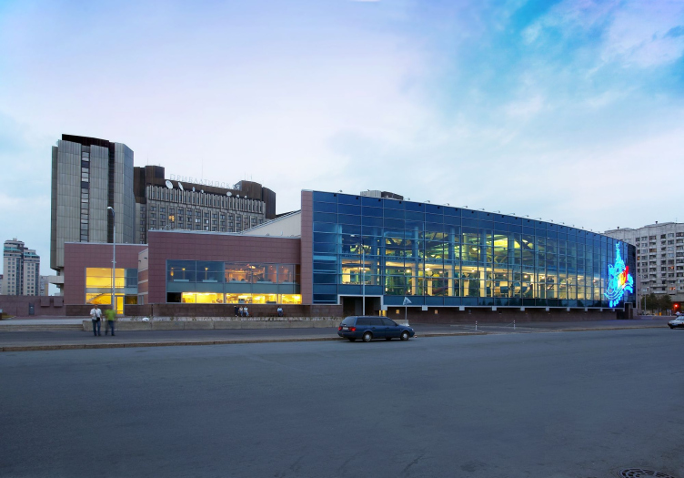
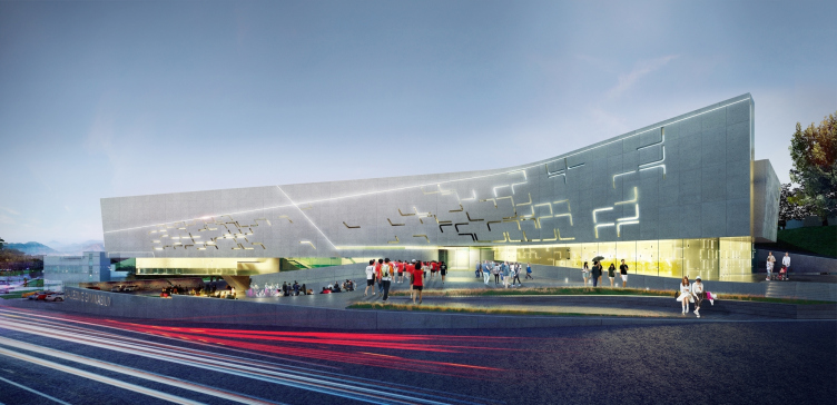
We talked to the leader of "A.Len" Sergey Oreshkin about the sports architecture, its specifics and possible prospects. The company's portfolio includes one of Russia's largest roofed water parks (in spite of the fact that this water park belongs in fact to a hotel) named "Waterville", this park actually being the first one to be ever built in Saint Petersburg; "Reebok" sports complex; a multifunctional spa complex at the Veteranov Avenue; the sports complex of Civil Service Academy; the education and training facility of "Zenith" football club; "Platonov Academy of Volleyball" built in 2006, although with considerable changes made to the project that the authors still regret; and a whole number of other sport facilities. Presently, the architects of "A.Len" perform the construction of SKA ice hockey stadium, while last year Sergey Oreshkin and his bureau for the first time took part in the international contest for a badminton-oriented multifunctional sport complex in South Korea, offering a smooth-stroke "hieroglyph" building. 

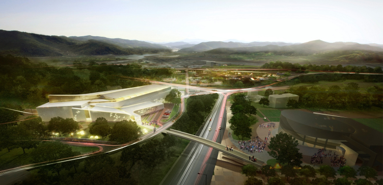
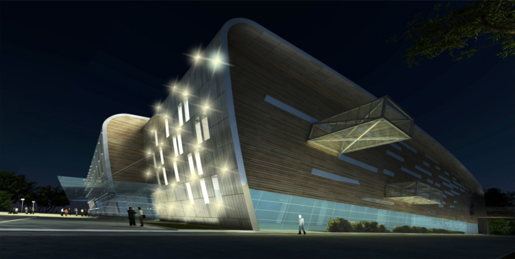
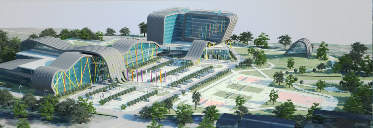
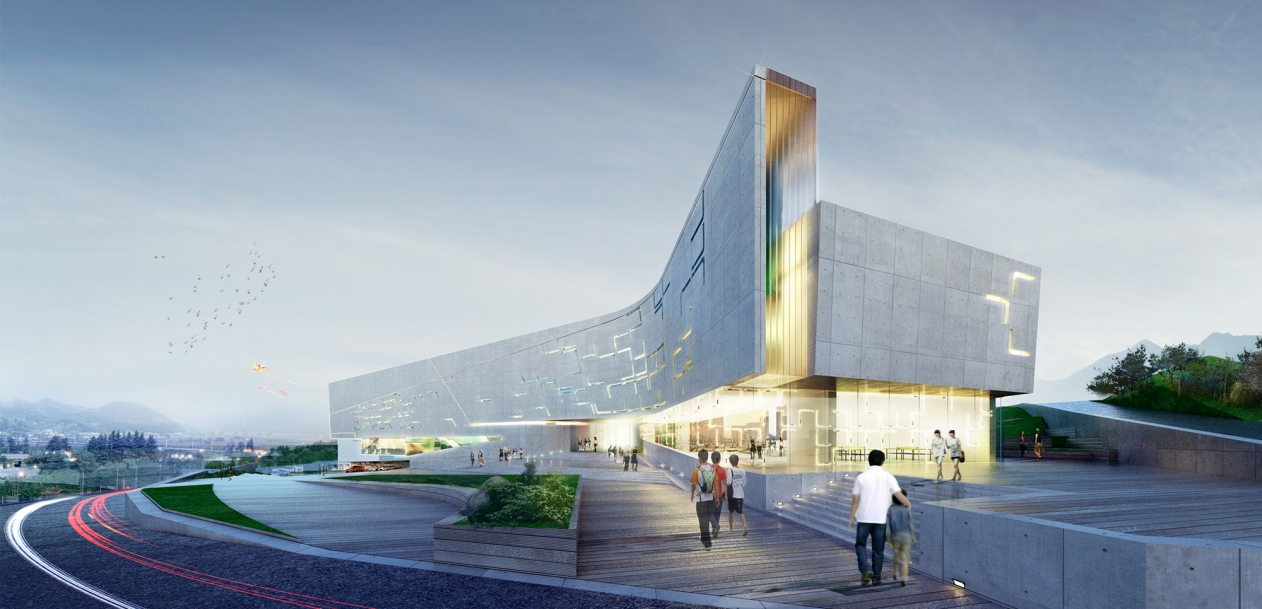
Project of a sport complex for the district of Dalseong-gun,South Korea © "A.Len" Architectural Bureau


Project of a sport complex for the district of Dalseong-gun,South Korea © "A.Len" Architectural Bureau


Archi.ru: 
- Could you please share about your project of this sports complex in South Korea? Why did you decide to take part in it and what were the main conditions of participation?

Sergey Oreshkin:
- The idea to take part in this contest was suggested to us by our German colleagues. At that time, we worked a lot on various sports facilities; besides, South Korea is a small country but it's quickly developing. We examined the land site and we liked the place - though a bit depressing today, it is still beautiful in its own way, and it has a huge potential: next to it, there is a large federally financed residential complex, and a river, too. Besides, this is a region with a rich history; it's got a lot of sanctuaries and museums in it. 

The city wanted to get an interesting bright landmark that would attract everyone's attention. It seemed to us, however, that the contest program significantly digressed from what it was originally meant to be. The world crisis set in; China, that used to build a lot upon the projects of world-class architects, suddenly took the diametrically opposite attitude - against any high-maintenance architecture, for example, Zaha Hadid and other "star" architects. And the Koreans also changed their preferences in favor of functionality, simple "cubes", not to put too fine a point on it. And as for us, we are the advocates of comfortable and context-friendly architecture - if this place does not need an architectural monument, we will not build one here. In that particular case in Korea, however, an architectural monument was exactly what that place needed but ultimately the judging panel opted for the utilitarian "sport goods" warehouse. 

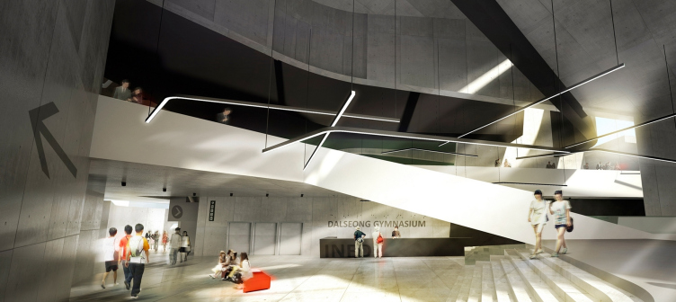
Project of a sport complex for the district of Dalseong-gun,South Korea © "A.Len" Architectural Bureau


Project of a sport complex for the district of Dalseong-gun,South Korea © "A.Len" Architectural Bureau


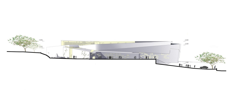
Project of a sport complex for the district of Dalseong-gun,South Korea © "A.Len" Architectural Bureau


zooming
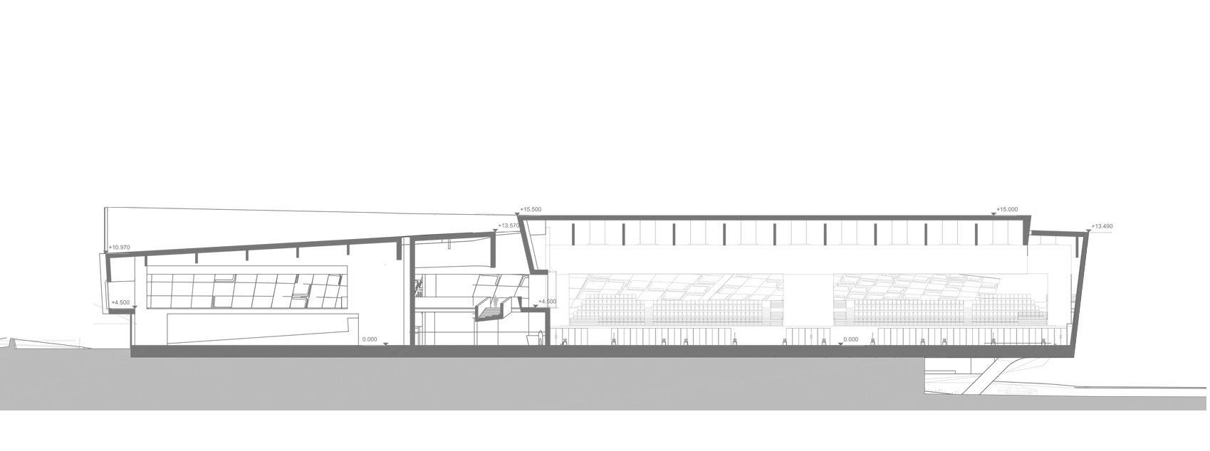
Project of a sport complex for the district of Dalseong-gun,South Korea © "A.Len" Architectural Bureau


To me, this contest was very useful from the ideological standpoint: in this country, we do not design things the way they do over there. The thing is that their buildings are not meant exclusively for sports, you can organize any public event there. The specifications required that a large hall - the size of eight-nine baseball fields - could be used, for a concert, for example. 

The contest was won by a Ukrainian project: a simple building with semitransparent walls of milky glass - a decent, sturdy project. To me, however, these walls will not be able to provide the sufficient amount of light, and in sports, particularly in badminton, light is very important and is subject to rigorous regulations. 

- Do you think your project is better? 

- This is just me, but the winners' projects seemed to me all too "international" and lacking identity. Such buildings could appear just about anywhere. But why build this "interarchitecture"? We tried to approach our project "evolutionally", tried to understand these people's outlook on their lives, tried to find out what had been there at this place in the days past - it was an exciting game of associations. To cap it all, badminton is a "trajectory" sport, the birdie never flies in a straight line, it flies over curved parabolas - which we tried to ultimately get across. I think that our project was executed on a highly professional level. 

- Incidentally, how do you think a great sport facility must look, say, in the context of Saint Petersburg?

- We live in a city that has Scandinavia breathing down its neck, and you feel with your skin that this place was populated by the Finns, Karelians, Ingermanlanders, this is a Finno-Ugric land. Again, that's just me but I feel that it all comes down to you doing architecture that is Scandinavian to a certain degree. 

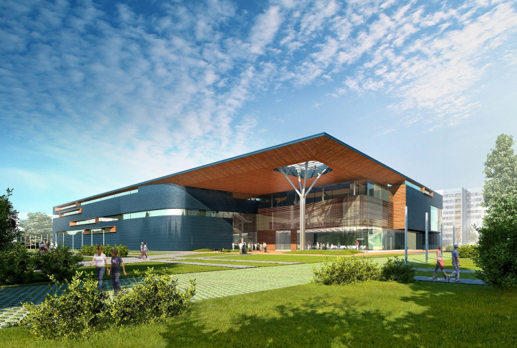
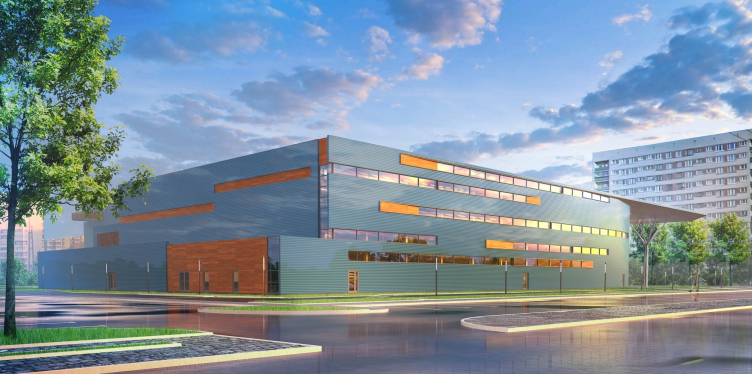
On the other hand, it doesn't seem to make much sense to me trying to combine an expensive bent construction of glued wood with a cheap facade, the way we see it on the children's sports complexes that are now being built in Saint Petersburg on Gasprom's money. To me, this looks a bit ineffective. If we are to speak about a family sport school, the kind that they've got at the Veteranov Avenue, it must be first of all a great place to be, one that you would want to come back to - over and over again. And this is the reason why our philosophy here is all about the wood or wood-imitating materials, a zone with a large marquee, i.e. the entrance element where people can meet and maybe have a conversation securely protected from the rain or snow. And then, the function kicks in - the federal authorities write the specifications for us: we want a skating rink, a swimming pool, and a universal gym - the way it was with the sport school in Sosnovaya Polyana. Essentially, this is an all-purpose gym that anyone can do sports in, including people of limited mobility. It was a great idea, and, I hope we quite succeeded in implementing it. 

Youth Sports School © "A.Len" Architectural Bureau


Youth Sports School © "A.Len" Architectural Bureau


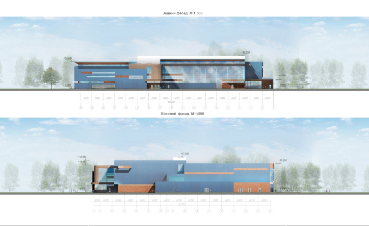
Facades © "A.Len" Architectural Bureau


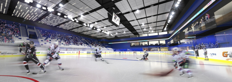
Before that, we had a few go's - we designed a lot for "Zenith" football club, then, also, "Petrotrust" club also ordered something. And then this ice-hockey club came to us, which meant a real large-size commission, so, we have been building this SKA club for three years now. With that project, we do everything there: landscape design, geodesic survey, and exclusive architecture; we also work a lot with the suppliers and do the interior designs as well. 

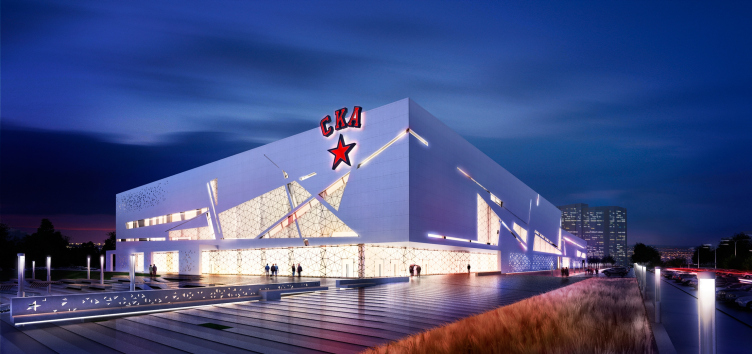
Project of the sport complex SKA © "A.Len" Architectural Bureau


zooming
Project of the sport complex SKA. Facade © "A.Len" Architectural Bureau


Training facility of "Zenith" football club © "A.Len" Architectural Bureau


Training facility of "Zenith" football club © "A.Len" Architectural Bureau


- The project of this SKA sport complex won the tender but then it was significantly redone. Why and in which ways did it change? 

- In our contest project, we wanted to convey the feeling of motion: how an ice hockey player moves about the field, how a hockey stick looks like, what stance he is in when on the attack. Turned out, there are lots of curved lines, so what we ultimately got was curved architecture that consisted of intertwining lamellae. There were also the vertical lamellae - the glowing panels, each one of which could display different motifs. At the end of the day, the customer said that, because thus building is all "skewed and lopsided" it would be very high maintenance. 

Then we came up with a different idea: let it be a huge chunk of ice, with traversing side cuts in it. The result was cubic architecture, a very simple constructivist thing based on the ideas of avant-garde of the twenties. What made our project different, though, was a fair share of symbolism in it: ice blade trails, trajectories of the hockey puck, and so on. We proposed to start off with the most basic girder construction but we wanted to draw it all beautiful and use the ceramics as the finishing material for the facade. 

Project of the sport complex SKA. Project, 2012 © "A.Len" Architectural Bureau


zooming
Project of the sport complex SKA. Section view. Project, 2012 © "A.Len" Architectural Bureau


- What do you think makes designing sports facilities different from other kinds of architecture - how much more difficult are they, for example, than shopping centers? 

- Ten times as difficult. You need at least four venues of different types, and this puts a lot of requirements on ventilation, especially when it comes to the skating ice. I only know a handful of people in Russia who are capable of making correct plans of refrigeration of the ice and routing the cold supply to it. It is very difficult to support the constant ice temperature while the temperature outside is constantly changing, plus the people who come to the competition also emanate a huge amount of warmth in uneven portions, especially when the spectators seats are not evenly distributed. 

There are a lot of subtleties here - the sound, the light, and many more. Plus, the possibilities of today's television also put forth a lot of challenging requirements. There is a growing tendency for using the Full-HD format but in order to make the most of it you need to do the filming in a certain place, put up the lights of specific wattage and type, and they must be oriented in different directions too. You need to keep all these things in mind. The postgame interviews can only be taken in the zones with the correct light, and the reporter that takes the interview must not have access to the locker room - this may sound like a little thing but it's really important. Another important consideration is the acoustic properties of the premises - there must not be so much as a hint at echo. 

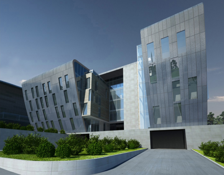
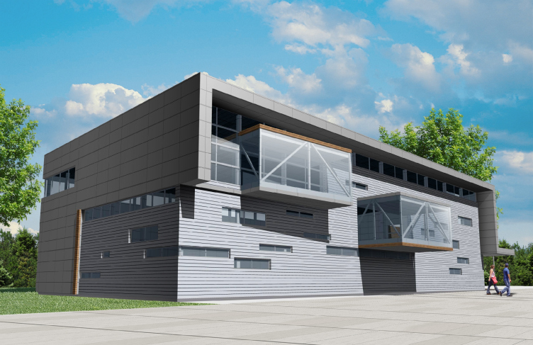
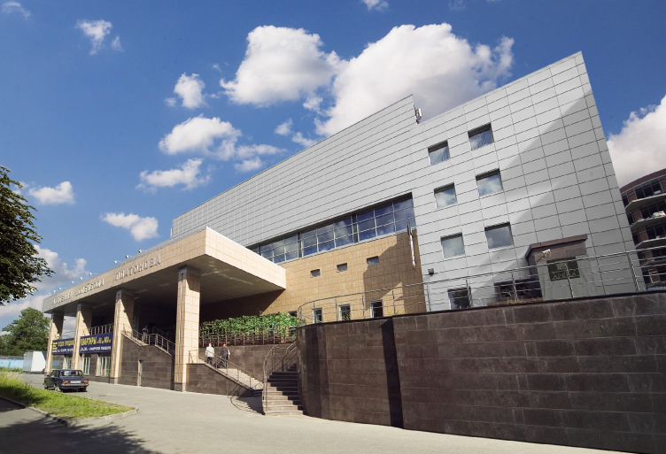
Sport and recreation facility of Civil Service Academy © "A.Len" Architectural Bureau


"Waterville" park © "A.Len" Architectural Bureau


zooming
"Waterville" park © "A.Len" Architectural Bureau


- In which way do you as an architect want to develop within the framework of this genre? Do you dream of building your own stadium one day?

- Building a stadium is not very much of an exciting prospect, to be quite honest. It's all about standardization now; the "clew" theme has already been used by Herzog & de Meuron, the "bubble" theme - "Alliance Arena" is also history now. Inventing something entirely new is very difficult in view of the fact that a stadium is a very large architectural edifice with its shell mounted directly upon the function that in fact sets the configuration of the building. Meaning - the very genre has too little of a resource to it, it must accumulate it before customers finally get fed up with these crates and buckets. 

Today, one would be doing the right thing working with small-scale facilities - designing the small sports objects or even the outdoor gyms - there are few companies that do that. The option for your very own neighborhood! Perhaps, one could think of designing a very stylish, top-quality "designer" gym - the all-purpose kind that you can attach to any senior or junior high school. We did quite a handsome project, the "Baltic States style" kind, and for a long time we tried to pull it through the city council board. We ultimately got some response - it was after that struggle that we got the commission for the project of a sport school in Sosnovaya Polyana. 

It would be interesting to do a project for Gasprom or Rosneft - instead of the "brokeback" stilted architecture that we see almost everywhere now, we could come up with a comfortable thought-out space that is great to be in. We want to do an object with an environment that people will feel like caring about in the years to come. 
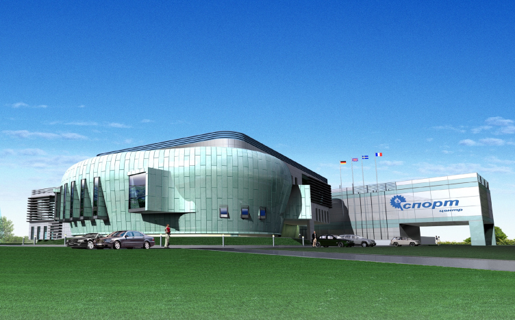
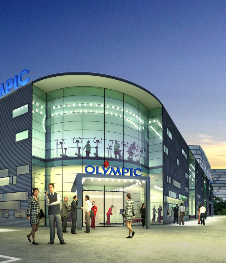
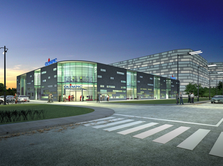
Sports and Recreation complex © "A.Len" Architectural Bureau
A project of a hotel combined with a water park, Nizhny Novgorod © "A.Len" Architectural Bureau
All-purpose gym © "A.Len" Architectural Bureau
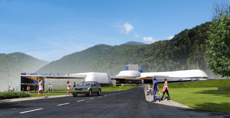
Mountain tourist center with a spa, water park, and a swimming pool, Sochi © "A.Len" Architectural Bureau
Platonov Volleyball Academy © "A.Len" Architectural Bureau

06 May 2015

Headlines now
The Golden Crown
The concept for a dental clinic in Yekaterinburg, developed by CNTR Studio, revolves around the idea of a “mouth full of gold”: pristine white porcelain stoneware walls are complemented by matte brass details. To avoid an overly literal interpretation, the architects focused on the building’s proportions, skillfully navigating between sunlight requirements and fire safety regulations.
Flexibility and Integration
Not long ago, we covered the project for the fourth phase of the ÁLIA residential complex, designed by APEX. Now, we’ve been shown different fence concepts they developed to enclose the complex’s private courtyards, incorporating a variety of public functions. We believe that the sheer fact that the complex’s architects were involved in such a detail as fencing speaks volumes.
A Step Forward
The HIDE residential complex represents a major milestone for ADM architects and their leaders Andrey Romanov and Ekaterina Kuznetsova in their quest for a fresh high-rise aesthetic – one that is flexible and layered, capable of bringing vibrancy to mass and silhouette while shaping form. Over recent years, this approach has become ADM’s “signature style”, with the golden HIDE tower playing a pivotal role in its evolution. Here, we delve into the project’s story, explore the details of the complex’s design, and uncover its core essence.
Gold in the Sands
A new office for a transcontinental company specializing in resource extraction and processing has opened in Dubai. Designed by T+T Architects, masters of creating spaces that are contemporary, diverse, flexible, and original, this project exemplifies their expertise. On the executive floor, a massive brass-clad partition dominates, while layered textures of compressed earth create a contextually resonant backdrop.
Layers and Levels of Flight
This project goes way back – Reserve Union won this architectural competition at the end of 2011, and the building was completed in 2018, so it’s practically “archival”. However, despite being relatively unknown, the building can hardly be considered “dated” and remains a prime example of architectural expression, particularly in the headquarters genre. And it’s especially fitting for an aviation company office. In some ways, it resembles the Aeroflot headquarters at Sheremetyevo but with its own unique identity, following the signature style of Vladimir Plotkin. In this article, we take an in-depth look at the United Aircraft Corporation (UAC) headquarters in the Moscow agglomeration town of Zhukovsky, supplemented by recent photographs from Alexey Naroditsky – a shoot that became only recently possible due to the fact that improvements were finally made in the surrounding area.
Light and Shadow
In this article, we delve into the architectural design of the “Chaika” house by DNK ag architects, which was recently completed in 2023 as part of the collection of signature designs at ZILArt. As is well-known, all the buildings in this complex follow a design code, yet each one is distinct. This particular building stands out not only for its whiteness and minimalism but also for the refined use of a limited number of techniques that, together, create what can confidently be called synergy.
Casus Novae
A master plan was developed for a large residential area with a name of “DNS City”, but now that its implementation began, the plan has been arbitrarily reformatted and replaced with something that, while similar on the surface, is actually quite different. This is not the first time such a thing happens, but it’s always frustrating. With permission from the author, we are sharing Maria Elkina’s post.
Treasure Hunting
The GAFA bureau, in collaboration with Tegola and Arkhitail, organized an expedition to the island of Kilpola in Karelia as part of Moskomarkhitektura’s “Open City” festival. There, amidst moss and rocks, the students sought answers to questions like: what is the sacred, where does it dwell, and what sustains it? Assisting the participants in this quest were landscape engineer Evgeny Levin, artist Nicholas Roerich, a moose, and the lack of cellular connection. Here’s how the story unfolded.
Depths of the Earth, Streams of Water
In the Malaya Okhta district, the Akzent building, designed by Stepan Liphart, was constructed. It follows a classic tripartite structure, yet it’s what you might call “hand-drawn”: each façade is unique in its form and details, some of which aren’t immediately noticeable. In this article, we explore the context and, together with the architect, delve into how the form was developed.
Fir Tree Dynamics
The “Airports of Region” holding is planning to build an airport in Karachay-Cherkessia, aiming to make the Arkhyz and Dombay resorts more accessible to travelers. The project that won in an invitation-only competition, submitted by Sergey Nikeshkin’s KPLN, blends natural imagery inspired by the shape of a conifer seed, open-air waiting spaces, majestic large trees, and a green roof elevated on needle-like columns. The result is both nature-inspired and WOW.
​A Brick Shell
In the process of designing a clubhouse situated among pine trees in a prestigious suburban area near Moscow, the architectural firm “A.Len” did the façade design part. The combination of different types of brick and masonry correlates with the volumetric and plastique solutions, further enhanced by the inclusion of wood-painted fragments and metal “glazing”.
Word Forms
ATRIUM architects love ambitious challenges, and for the firm’s thirtieth anniversary, they boldly play a game of words with an exhibition that dives deep into a self-created vocabulary. They immerse their projects – especially art installations – into this glossary, as if plunging into a current of their own. You feel as if you’re flowing through the veins of pure art, immersed in a universe of vertical cities, educational spaces – of which the architects are true masters – and the cultural codes of various locations. But what truly captivates is the bold statement that Vera Butko and Anton Nadtochy make, both through their work and this exhibition: architecture, above all, is art – the art of working with form and space.
Flexibility and Acuteness of Modernity
Luxurious, fluid, large “kokoshniks” and spiral barrel columns, as if made from colorful chewing gum: there seem to be no other mansion like this in Moscow, designed in the “Neo-Russian-Modern” style. And the “Teremok” on Malaya Kaluzhskaya, previously somewhat obscure, has “come alive with new colors” and gained visibility after its restoration for the office of the “architectural ecosystem” as the architects love to call themselves. It’s evident that Julius Borisov and the architects at UNK put their hearts into finding this new office and bringing it up to date. Let’s delve into the paradoxes of this mansion’s history and its plasticity. Spoiler: two versions of modernity meet here, both balancing on the razor’s edge of “what’s current”.
Yuri Vissarionov: “A modular house does not belong to the land”
It belongs to space, or to the air... It turns out that 3D printing is more effective when combined with a modular approach: the house is built in a workshop and then adapted to the site, including on uneven terrain. Yuri Vissarionov shares his latest experience in designing tourist complexes, both in central Russia and in the south. These include houseboats, homes printed from lightweight concrete using a 3D printer, and, of course, frame houses.
​Moscow’s First
“The quality of education largely depends on the quality of the educational environment”. This principle of the last decade has been realized by Sergey Skuratov in the project for the First Moscow Gymnasium on Rostovskaya Embankment in the Khamovniki district. The building seamlessly integrates into the complex urban landscape, responding both to the pedestrian flow of the city and the quiet alleyways. It skillfully takes advantage of the height differences and aligns with modern trends in educational space design. Let’s take a closer look.
Looking at the Water
The site of Villa Sonata stretches from the road to the water’s edge, offering its own shoreline, pier, and a picturesque river panorama. To reveal these sweeping views, Roman Leonidov “cut” the façade diagonally parallel to the river, thus getting two main axes for the house and, consequently, “two heads”. The internal core – two double-height spaces, a living room and a conservatory, with a “bridge” above them – makes the house both “transparent” and filled with light.
The White Wing
Well, it’s not exactly white. It’s more of a beige, white-stone structure that plays with the color of limestone – smoother surfaces are lighter, while rougher ones are darker. This wing unites various elements: it absorbs and interprets the surrounding themes. It responds to everything, yet maintains a cohesive expression – a challenging task! – while also incorporating recognizable features of its own, such as the dynamic cuts at the bottom, top, and middle.
Urban Dunes
The XSA Ramps team designed and built a three-part sports hub for a park in Rostov-on-Don, welcoming people of all ages and fitness levels. The skate plaza, pump track, and playground are all meticulously crafted with details that attract a diverse range of visitors. The technical execution of the shapes and slopes transforms this space into a kind of sculptural composition.
Proportional Growth
The project for the fourth phase of the ÁLIA residential area has been announced. The buildings are situated on an elongated plot – almost a “ray” that shoots out from the center of the area towards the river. Their layout reflects both a response to Moscow’s architectural preferences over the past 15 years, shifting “from blocks to towers”, and an interpretation of the neighboring business park designed by SOM. Additionally, the best apartments here are not located at the very top but closer to the middle, forming a glowing “waistline”.
The “Staircase” Building
In designing the “Details” residential complex in New Moscow, Rais Baishev spiced up the now-popular Moscow theme of a “courtyard” building with an idea drawn from the surrealist drawings by Maurits Escher. He envisioned the stepped silhouettes and descending slopes as a metaphysical mega-staircase, creating a key void within the courtyard that gave the project an internal “spine”. This concept is felt both in the building’s silhouette and on its façades.
Projection of the Quarter
No one doubted that the building that Vladimir Plotkin designed as part of the “Garden Quarters” would be the most modernist of all. And it turned out just that way: while adhering to the common design code, the building successfully combines brick and white stone, rhythmically responding to the neighboring building designed by Ostozhenka, yet tactfully and persistently making a few statements of its own. This includes the projection of the ideal urban development composition “14–9–6”, which can be found right next door, mathematical calculations, including those for various types of terraces (and perhaps the only reminder of the Soviet past of the Kauchuk rubber factory!), and the white “cross-stitch” pattern of the façade grid.
Domus Aurea
In this issue, we examine the “Tessinsky-1” house, designed by Sergey Skuratov and completed in 2023. Located in the middle of the Serebryanicheskaya Embankment district, at the intersection of its main streets, this house assumes a sort of “nodal” role: it not only responds to everything around it and preserves many memories of the former EMA factory within itself, but it weaves all this into a newly directed pattern, reconciling bright “gold” and dark-colored brick, largely with the help of the new, modern-yet-archaic Columba brick, which, come to think about it, is the most precious element here.
The Chimney of Nikola-Lenivets
In this issue, we are examining the “Obelisk House” designed by KATARSIS and built for the Arkhstoyanie 2023 festival. However, it was only finished later on, and this is why we are examining it now. It seems to us that after the “Obelisk House” appeared in Nikola-Lenivets, a dialogue and a few inner connections appeared between the temporary structures built here. These houses no longer look like “accidental neighbors”, more of which below.
​Periscope by the Bay
The jury awarded the second place in the competition for a public and cultural center in Petropavlovsk-Kamchatsky to the companies GORA (“Mountain”) and M4. In the consortium’s proposal, the building resembles a sperm whale with a calf swimming next to it or a periscope, whose lenses capture the most spectacular views from the surrounding landscape.
From Arcs to Dolmens
While working on the competition project for Petropavlovsk-Kamchatsky, ASADOV Architects prioritized the value of the natural and urban environment, aiming to preserve the balance of the location while minimizing the resemblance of the volume that they designed to a “traditional building”. The task was challenging, and the architects created three versions, one of which having been developed after the competition, where their main proposal took third place. However, the point of interest here is not the competition result but the continuity of creative thinking.
Hide and Seek
The ID Moskovskiy house, designed by Stepan Liphart in St. Petersburg, in the courtyards near Moskovskiy Avenue beyond the Obvodny Canal and recently completed, is notable for several reasons. Firstly, it has been realized with considerable accuracy, which is particularly significant as this is the first building where the architect was responsible not only for the facades but also for the layouts, allowing for better integration between the two. On the other hand, this building is interesting as an example of the “germination” of new architecture in the city: it draws on the best examples from the neighborhood and becomes an improved and developed sum of ideas found by the architect in the surrounding context.
The Big Twelve
Yesterday, the winners of the Moscow Mayor’s Architecture Award were announced and honored. Let’s take a look at what was awarded and, in some cases, even critique this esteemed award. After all, there is always room for improvement, right?
Above the Golden Horn
The residential complex “Philosophy” designed by T+T architects in Vladivostok, is one of the new projects in the “Golubinaya Pad” area, changing its development philosophy (pun intended) from single houses to a comprehensive approach. The buildings are organized along public streets, varying in height and format, with one house even executed in gallery typology, featuring a cantilever leaning on an art object.
Nuanced Alternative
How can you rhyme a square and space? Easily! But to do so, you need to rhyme everything you can possibly think of: weave everything together, like in a tensegrity structure, and find your own optics too. The new exhibition at GES-2 does just that, offering its visitor a new perspective on the history of art spanning 150 years, infused with the hope for endless multiplicity of worlds and art histories. Read on to see how this is achieved and how the exhibition design by Evgeny Ace contributes to it.
Blinds for Ice
An ice arena has been constructed in Domodedovo based on a project by Yuri Vissarionov Architects. To prevent the long façade, a technical requirement for winter sports facilities, from appearing monotonous, the architects proposed the use of suspended structures with multidirectional slats. This design protects the ice from direct sunlight while giving the wall texture and detail.