По-русски

Crystallization of a Junction

At the junction of Moscow Ring Road and the Rublev Shosse, the construction of an administrative and business center designed by Sergey Kiselev has been completed.

11 March 2015
Object
mainImg
Architect:
Igor Shvartsman
Sergey Kisselev
Object:
Pallau RB: Administrative and business centre, 1st km of Rublevo-Uspenskoe highway
Russia, Barvihinsky country disrict, 1st km of Rublevo-Uspenskoe highway

Project Team:
Barmin Viktor (chief project architect)

2007 — 2007 / 2012 — 2014

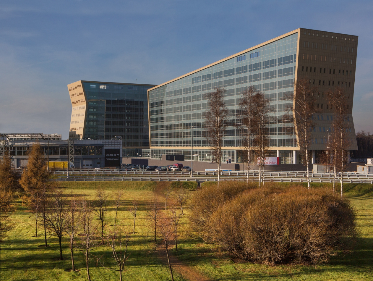
The project of an office complex at the first kilometer of the Rublev Shosse was covered by us back in 2008. Now it is complete; the adjacent territory still looks far from attractive but, when speeding down Moscow Ring road, one will hardly be able to notice these insignificant details; besides, the complex fits in very nicely with the perspective of Moscow's highways. 

I must confess at this point that I was only able to appreciate these buildings now that they have been actually built. Back on 2007 when Sergey Kiselev showed the project to me saying with a fair share of pride in his voice: "just look what we've come up with for the first kilometer of the Rublev Shosse”, I just did not get it. What I saw was two large but nonetheless exquisite buildings, placed, in a VKHUTEMAS fashion, at a right angle to each other, and standing on aluminum Corbusier legs. The broad surfaces of the glass facades - when still on paper - were wrapped into golden copper mesh: the then-fashionable shape of a "sliced roll" was playing a game of its own with the perspective and scale of Moscow Ring Road. The complex was all about modernism, laconism, and the simplicity of design, "as simple as one-two-three", as Sergey Kiselev was prone to explain. A pure shape, a little bit of glitter, lightly but nonetheless expertly drawn contours of the slabs... Somehow I could not help feeling that this form was tell-tale, and now it has become clear to me just what the whole thing is all about, what plastic hint there is in the two interconnected buildings, one that makes them a not-by-chance addition to the road junction. 

The complex is a SIGN. The two giant crystal arrows - precious, in a golden frame, the Cyclopean fairy-tale arrows - are more than appropriate at this Moscow area's “high-class” junction; it is the Rublev Shosse, after all. So, the architects went ahead and revised this theme - with but a hint, of course, how could it be otherwise - neither life nor art allow for more, so, there are no actual arrows here, I just seem to have seen them for a split second, so never mind. There are only the asymmetric "dovetails", the slopes of the facade surfaces six stories high and a three story high slant of the roof enhancing the perspective. Where there could be the arrows, the volumes are slashed sidewise, and it's only the cleavages of the dovetails that remain on the other side; the right thing to do, too, you just could not go and build actual arrows here. However, when seen from a distance, and, furthermore, from a car speeding down the Ring Road, everything inevitably comes together to form a perfect sign. Now nobody will miss this junction marked by such a "sign" building. 

Administrative and business center at the Rublev Shosse. Photo © Aleksey Kholopov
Administrative and business center at the Rublev Shosse. © Sergey Kiselev and Partners


In the original version of the project, the two buildings looked more high-profile and more, let's say, luxury-class. The crystal glitter was enhanced by the slanting marquees, also made of glass, and scattered all over the entire surface: similar "stripes" are used in the facade of Hermitage-Plaza but in this case the architects had to simplify the project, taking away the stripes and simplifying the glass fragments in the fine grid of the window sashes and in the coarse grid of intermediate floors and the sparsely set verticals that fall into a restrained modernist pattern of punctured lines. And still, the slabs of the buildings retained their "crystal" quality and remained completely transparent - only the strokes of the "flaps" were replaced by the 70-style reserved regularity. 

Another detail: many buildings that are still in construction are made in such a way that you first walk past them with pleasure watching the beautiful simplicity of the concrete column grid and later on with a twist of disappointment when this three-dimensional structure is hidden inside a blind shell. In this case, however, thanks to the transparency of the glass, the architects were able to keep the original effect of a 3D grid - well, maybe not entirely but on a sunny day you involuntarily freeze seeing through this whole building end to end. The crystallization of the space, turning from the ethereal into the habitable, and multi-tier takes place easily, without any tectonic overcoming - as if the complex was cut out from a piece of paper by an expert hand and then put to fit in perfectly at the right time and at the right place. This effect is felt particularly strong where the slanting surfaces of the side facades cross with the straight inner grid. 

Administrative and business center at the Rublev Shosse, 2014 Sergey Kiselev and Partners. Photo © Aleksey Kholopov


In the process of streamlining the costs, the framing contour underwent the most dramatic changes of all. Immediately after the crisis of 2008, it lost its ethereal golden glow and gave up its "jewelry" connotations. The new color of the facing panels, now aluminum, was chosen very carefully, by means of a brittle compromise between the customer's wishes and the architects' plans; the architects would try it on on location and tried to estimate how this or that color would look in this or that particular kind of weather. Finally, they opted for the light-beige panels that during an overcast day look moderately opaque and, on a sunny day, glisten on the slanting surfaces endowing the facades with "semi-precious" silver hue. 

Administrative and business center at the Rublev Shosse, 2014 Sergey Kiselev and Partners. Photo © Aleksey Kholopov


The side facades got slits of windows: in 2008, the architects were considering the version with regular rows of "pinpoint" square window sashes - but ultimately (and, justly, in my opinion) they implemented a different one. The former version was from the nineties, and the latter had two meanings to it: on the one hand, the beige color looks a bit like the Jurassic stone and the vertical windows partly match the current moderately-classical trend. On the other hand, however, the rows of small, grouped into pairs vertical windows in a pale-blue wall cause totally different associations, far from glamorous - from a distance, they look like the holes in a punchcard, the cardboard information carrier in the computers from the eighties. A great way to revise the history of the building, as well as the place in the spirit of a notorious spiral: enough of shaking your golden bracelets, guys, time to get back to the "punchcard" ideals and form some foundation in the spirit of Isaac Azimov. 

Administrative and business center at the Rublev Shosse, 2014 Sergey Kiselev and Partners. Photo © Aleksey Kholopov


Administrative and business center at the Rublev Shosse, 2014 Sergey Kiselev and Partners. Photo © Aleksey Kholopov


Administrative and business center at the Rublev Shosse, 2014 Sergey Kiselev and Partners. Photo © Aleksey Kholopov


The architects of "Sergey Kiselev and Partners" also developed the design of the entrance lobbies in pretty much the same key: laconically but with a "resonant" technique employed. The glass walls, the dark floor, the beige walls and the white ceiling slit here and there by the bands of lights whose lines continue in the perspective reflecting in the glittering polished stone. Just in the same way, the two buildings reflect each other. 

Design of the interior of the entrance lobby of the major building. Administrative and business center at the Rublev Shosse. © Sergey Kiselev and Partners


Design of the interior of the entrance lobby of the minor building. Administrative and business center at the Rublev Shosse. © Sergey Kiselev and Partners


Ultimately, the building came out cool, calm, and collected, even though not without a fair share of nobility issuing from the transparency of the slanted surfaces. The architects take special pride in the fact that they were able to persuade the customer not to straighten out the facades to the point of the building turning into a parallelepiped box in the process of streamlining the costs but keep the original curves of the volumes that were specifically calculated to look great when viewed from a car passing by. This is an extraordinary piece of luck: the thing is that Moscow Ring Road is still dominated by shopping malls, warehouses, and, strange though it may seem, strips of woodland: not much to catch the eye but this complex is different. From the highway, the complex does not look particularly large and, thanks to the perpendicular position of the second building, it looks rather shifty - it quickly alternates views and even provokes the driver to make a brief stop to get a better look at it. The clear and concise shape works all by itself with its every stroke thanks to which becomes immune from the consequences of streamlining the decoration costs. Quite often, it's just the other way around: in spite of its expensive decorative finish, the building looks nothing more than a box, and you really pity the fact that so decorative money went to waste. Luckily, here it is not the case - the spreading of perforated wings is just as regal as is they were actually golden. A very appropriate, and, let's say, light-hearted work of architectural art. One of the latest implemented projects that Sergey Kiselev personally worked upon…
Location plan. Administrative and business center at the Rublev Shosse. © Sergey Kiselev and Partners
Plan on the first-floor level. Administrative and business center at the Rublev Shosse. © Sergey Kiselev and Partners
zooming
Plan on the sixth-floor level. Administrative and business center at the Rublev Shosse. © Sergey Kiselev and Partners
zooming
Section views. Administrative and business center at the Rublev Shosse. © Sergey Kiselev and Partners
zooming
Section views. Administrative and business center at the Rublev Shosse. © Sergey Kiselev and Partners


Architect:
Igor Shvartsman
Sergey Kisselev
Object:
Pallau RB: Administrative and business centre, 1st km of Rublevo-Uspenskoe highway
Russia, Barvihinsky country disrict, 1st km of Rublevo-Uspenskoe highway

Project Team:
Barmin Viktor (chief project architect)

2007 — 2007 / 2012 — 2014

11 March 2015

Headlines now
A New Magazine and a New Ranking
The magazine Expert.Urban has only just appeared, apparently timed to coincide with Arch Moscow. It is published with the support of VEB.RF and Strelka KB. We have not yet had time to read it cover to cover, but the impression so far is that it consists of about eighty percent interviews. It also features a distinctly “Strelka-style” initiative: a ranking of the “Best Architect of Moscow in the 21st Century”. So, who came out on top? Sergey Skuratov. Yuri Grigoryan took second place, and Sergei Tchoban came third.
Oleg Shapiro: “We design life as a whole, in all of its diversity”
Wowhaus has long since outgrown its association with “urban improvement” projects alone. One of its newer directions is neo-industrialization. Another is large-scale master planning. Yet work on Gorky Park is once again underway – only now on a more systematic and far-reaching level. In this interview, we simultaneously revisit Rem Koolhaas, Strelka, and the history of attention to the “urban environment”, while also exploring what exactly Wowhaus is working on today and how the company operates – with its nine divisions and approximately 160 employees.
Red Card for Copyright
The development concept for the territory of Shinnik Stadium in Yaroslavl, prepared by PI ARENA, took second place in an open call competition. The architects proposed a unified structure combining a football arena, a hotel, and the headquarters of PSB Bank, with carefully considered usage scenarios. However, the competition was organized in such a way that the team ultimately chose to forgo the prize money in order to retain their copyright.
CinemaHologram
Not long ago, the Moscow authorities approved the project for a new House of Cinema complex by Kleinewelt Architekten. The original 1968 building could not be preserved – yet the architects managed to save its stained-glass panels, metal reliefs, and even the volumetric parameters of the structure, which will continue to house the Union of Cinematographers and cinema halls. The project’s main focal point, however, will be a residential tower. We examine its sculptural qualities and its allusions within the Moscow context.
Form as Method: TPO Reserve
At the core of the concept developed by Vladimir Plotkin and TPO Reserve lies an unconventional morphology that addresses functional challenges beyond purely formal concerns. Above all, however, it serves expressiveness and creates a rare kind of spatial and emotional experience, as becomes evident when examining the project’s key solutions. We studied it in detail, and it was all worth it. Our interpretation is that what drives this project is neither style nor even metaphor, but rather a method.
Mound of Memory
The competition proposal for a memorial complex on the Pulkovo Heights by Studio 44 will not be realized, yet it deserves attention as an intriguing example of how architecture can symbolize traumatic events and thereby contribute to their processing and integration into human experience. The architects also succeed in combining memorial and recreational functions without slipping either into excessive dramatization or oversimplification. The project develops ideas explored in two earlier competition entries that likewise remained unbuilt – the Museum of the Siege of Leningrad and the Tuchkov Buyan park. It also recalls the mound-like hill that Alexander Nikolsky embodied in the form of the now-lost stadium on Krestovsky Island.
Home Base
Working on the new building for Letovo Junior School – opened to students in autumn 2025 in the MSU Valley – the architects of UNK, following the client’s vision, subordinated both façades and interiors to the theme of “home”. Multiple variations of pitched roofs, a city skyline traced across glass balustrades, wooden textures, and a whole series of micro-spaces for retreat within public areas are all at the disposal of primary and middle school students. We take a closer look at the new school building – and at how it interprets current trends in educational environments.
Doubles Match
The architecture of the Tennis Palace built in Luzhniki Olympic Complex, designed by Arena Design Institute, was shaped by three factors: the proximity of the brutalist Druzhba Arena, the closeness of the Moskva River and the metro bridge overpass, as well as the specifics of the function – tennis courts require large spans, abundant light, yet at the same time protection from direct sunlight. The architects divided the building into several blocks, playing on contrast, which is further emphasized by the façades developed in collaboration with TPO Reserve and Vladimir Plotkin.
Microdynamics of Macroprocesses
Given the proximity of the multifunctional complex SOLOS to Sokolniki Park and to a major transport hub, Kleinewelt Architekten embedded in the design of the two high-rise towers a sense of dynamism more characteristic of natural phenomena than of man-made objects. Without the authors’ diagrams, this logic is not easy to decipher, although the eye immediately detects a pattern and tries to grasp it. It seems to us that one tower contains the impulse of a bud about to open, while the other evokes the movement of a lithospheric plate. Let us try to unravel it together.
The Space of Post-Cubism
Sergei Tchoban and Alexandra Sheiner, of Studio CHART, created for the exhibition of “post-cubist” sculpture by Beatrice Sandomirskaya – a talented and even “mainstream” artist, yet almost unknown even to art historians – a space akin to her sculptural language: solidly built, confidently stereometric, and subtly expressive. It curves, emphasizing the mass of the sculpture, envelops the viewer, and guides them from one perspective to another, from a generic “shrine” to a “Madonna”.
The Value of Open Space
For the site near the Barrikadnaya Metro Station, Sergey Skuratov developed five projects between 2020 and 2025. Two of them were ones that won the client’s invitation-only competitions. The fifth was recently selected by the Mayor of Moscow for implementation. The project is vivid and sculptural, expressive, eye-catching, and engaging – very much in line with the spirit of our time. And yet, this project is mid-rise rather than tall. In its northwestern part, near the metro and Druzhinnikovskaya Street, it shapes a comfortable urban environment. On the opposite side, it opens up, allowing sunlight into the courtyard and creating a spatial pause within the dense city fabric. How it is organized, what geometric principles underlie it, and why it takes this form – all this is explored in our article.
Coming From the Cold
The ArchBukhta Festival remains one of the few events in Russia where participants go through the entire process of creating an architectural object – from concept to construction. And they do so on the shores of Lake Baikal, in dedication to it. This year, GAFA took part and shared its experience: a local legend, a team-specific design code, friendship, as well as ice skating and endurance in freezing temperatures all contributed to gaining something more than just an award.
Symphony of Water and Brick
The Alter residential complex, designed by Stepan Liphart and built on a bend of the Okhta River, is an example of a “drawn house”: the number of original architectural details is virtually immeasurable. As a result, ribs, projections, and recesses create a picturesque silhouette even without a significant variation in height. Both composition and material respond to the proximity of the river and to the red-brick factory building dating back to the early 20th century. The project was also significantly shaped by recommendations from the city’s chief architect. More details in our article.
The Penguin House
The building with a curved façade on Brestskaya Street is one of the manifestos of Russian neomodernism of the early 2000s, a sculpture – this is how Anatoly Belov interprets it, speaking of “breaking from the modernist canon and the contextual approach”. We do not fully agree with the author, but his perspective is an interesting one.
Wave and Vertical
The premium residential complex designed by GAFA for a site in the Khoroshevsky District responds to multiple constraints – the arc of a planned roadway, the water protection zone of the Khodynka River, and insolation requirements – through inventive massing. The composition is built on the interplay of two spatial layers: an elongated perimeter block and three towers concealed behind it generate the silhouette and key viewpoints, while also adding semantic depth reinforced by the façade solutions. Another defining feature is a large private courtyard, complemented by a citywide linear park.
Office on Trubnaya
We continue publishing projects by Valery Kanyashin. A building once described, a quarter century ago, as an example of “quiet modernism” has remained just that in some people’s memory. According to Anatoly Belov, its main quality is its unobtrusiveness. The architects from Ostozhenka say the leading role here is played by context and landscape – the change in elevation. Yet is it really so inconspicuous?
The First International
With this publication, we begin a series of texts dedicated to works by the late Valery Kanyashin, one of the founders of Ostozhenka Architects. As it happens, the projects he was involved in largely illustrate our understanding of the firm and its history. The first project in this series is the International Moscow Bank on Prechistenskaya Embankment.
In Memory of Valery Kanyashin
On Friday, February 27, architect Valery Kanyashin passed away – co-founder of Ostozhenka Architects and the author of many significant buildings in Moscow. We publish a text by Anatoly Belov in memory of Valery Kanyashin.
Hypertext in Space
As part of the exhibition “What We Have We (Do Not) Keep”, Sergey Tchoban, the Museum of Architecture, and the CHART studio experiment with an eco-conscious approach to exhibition design, with thematic cross-references and even with publicistic reflections on the necessity of preserving modernism, the roots of contemporary architecture, and the birth of ideas. All of this makes the exhibition, with its light and transparent design, look quite innovative. The elements – both “material” and conceptual – are familiar, yet their combination is far from conventional.
The Outline of “Foundation”
In their competition proposal for the Fili transport hub, the consortium led by Alexey Ilyin proposed an “inhabited arch” – a form that is simple yet complex. The architects emphasize that even at the competition stage, the project’s feasibility was fully calculated, taking into account the minimal nighttime closures of Bagration Avenue. How was this achieved? With what functions? Let us take a closer look. In our view, the building would have suited the heroes of Isaac Asimov’s Foundation novels perfectly.
The Flying Horizontal
“A house in the spirit of Wright”, as architect Roman Leonidov describes it, pointing to his source of inspiration, was built on a challenging wedge-shaped site. To achieve a sense of intimacy and secure good views from the windows, the entire volume had to be shifted toward the far boundary, turning the house “back” to the neighboring mansions. The main façade demonstrates time-tested techniques often employed by the company: articulated horizontals, a weightless roofline, and a triad of materials – light plaster, dark slate, and warm wood.
Needles of Horizon Contemplation
The “House of Horizons”, designed by Kleinewelt Architekten in Krylatskoye, is carefully thought out at the stereometric level – from the logic of how the volumes interlock (and, conversely, how gaps are articulated between them) to the triangular balconies that give the building its striking, slightly bristling silhouette.
The Red Thread
A linear park project prepared by Alexey Ilyin studio for the improvement of a riverbank in one of the residential districts seeks to reconnect people with nature. Two levels of the embankment invite visitors to contemplate the landscape while at the same time protecting the riverbank from excessive human impact. The “aerial street” links functional zones and the opposite banks, creating new points of attraction along the way: balconies, bridges, and even a “grotto”.
Spindle and Thread
The concept of the Waver residential complex in Yekaterinburg draws inspiration from the past of the Parkovy district. In order to preserve the memory of the late-19th-century flax spinning mill once located here, the architectural company KPLN turns to the theme of textiles and weaving. The project’s main expressive device is a system of ribbons made of perforated weathering steel – a material that, in such volumes, has arguably not yet been used in Russian residential projects.
From Ski Resorts to Year-Round Recreation Clusters
In mid-December, several architectural firms gathered to discuss a “seasonal” topic: the prospects for the development of domestic ski tourism. Where is modern infrastructure already in place, where do only remnants of the Soviet legacy remain, and where is there still nothing – but projects are underway and soon to be completed? This article explores these questions.
Woven Into Sokolniki
Over the past few years, high-rise residential construction in former industrial zones has become the main theme of Moscow architecture. Towers are springing up here and there – but the question is what kind of towers they are. The residential complex CODE Sokolniki, designed by Ostozhenka Architects, is a project where every detail has been taken care of. The authors are attentive to the history of the site, the continuity of the urban fabric, the skyline, and visual corridors. They also proposed a motif with the lyrical name “scarf”. We take a closer look at the volumetric composition and the large-scale décor “woven”, in this case, out of terraces and balconies.
Stepan Liphart and Yuri Gerth: “Our Program Is Aesthetic”
The studio of Stepan Liphart, an architect known for his distinctive signature style and one-off projects, now has a partner. Yuri Khitrov, a specialist with a broad range of competencies, will take on the part of the work that distracts one from creativity but drives the business forward. One of the aims of this partnership is to improve the urban environment through dialogue with clients and officials. We spoke with both sides about their ambitions, the firm’s development strategy, shared values, and the need for pragmatism. And why the studio is called “Liphart & Gerth” only became clear at the very end of the interview.
The Copper Mirror
The varied-toned sheen of “unsealed” copper, painterly streaks and fingerprints, exposed concrete, and the unusual proportions – when you study the ZILART Museum building by Sergei Tchoban and SPEECH architects, there is plenty to talk about. However, it seems to us that the most interesting thing is how the museum’s composition responds to the realities of the district itself. The residential district has been realized as an open-air exhibition of façade statements by contemporary architects – but without public access to the inner courtyards of the blocks. This building – that is, the museum – is exactly the opposite: on the outside, it is deliberately restrained, while inside it shines spectacularly, creating its own sunbeams in any weather.
“Strangers” in the City
We asked Alexander Skokan for a comment on the results of 2025 – and he sent us a whole article, moreover one devoted to the discussion we recently began on the “appropriateness of high-rises” – or, more broadly speaking, “contrasting insertions into the urban fabric”. The result is a text that is essentially a question: why here? Why like this?
Dmitry Ostroumov: “To use the language of alchemy, we are involved in the process of “transmutation...
What we ended up having was an extremely unusual conversation with Dmitry Ostroumov. Why? At the very least, because he is not just an architect specializing in the construction of Orthodox churches. And not just – which is an extreme rarity – a proponent of developing contemporary stylistics within this still highly conservative field. Dmitry Ostroumov is a Master of Theology. So in addition to the history and specifics of the company, we speak about the very concept of the temple, about canon and tradition, about the living and the eternal, and even about the Russian Logos.