|
Published on Archi.ru (https://archi.ru) |
|
| 11.03.2015 | |
|
Crystallization of a Junction |
|
|
Julia Tarabarina |
|
| Architect: | |
| Sergey Kisselev | |
| Igor Shvartsman | |
| Studio: | |
| Sergey Kisselev & Partners | |
|
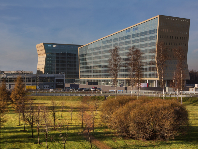
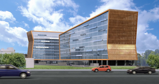
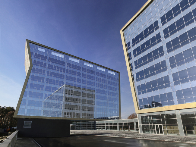
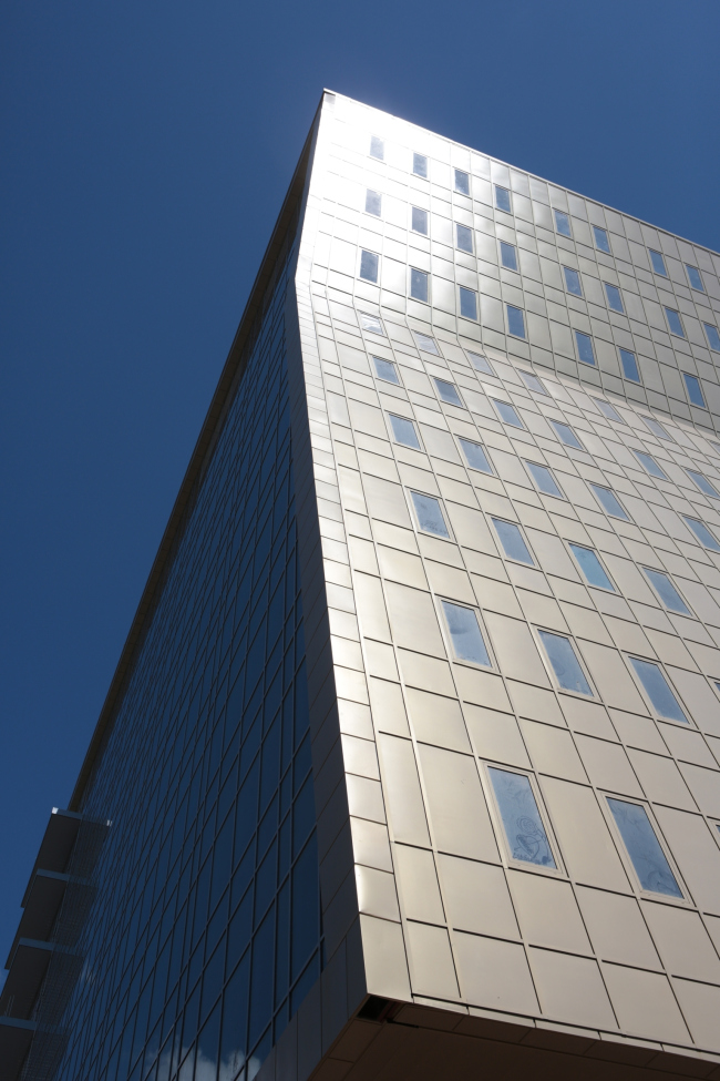
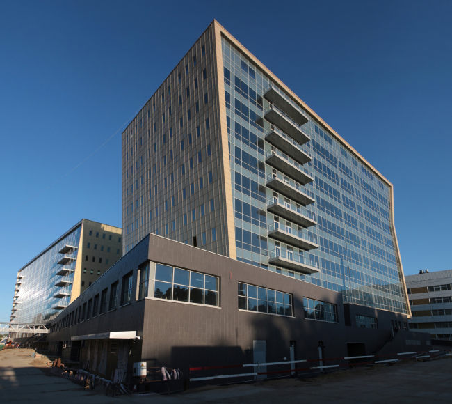
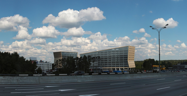
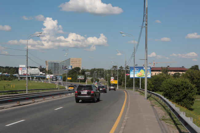
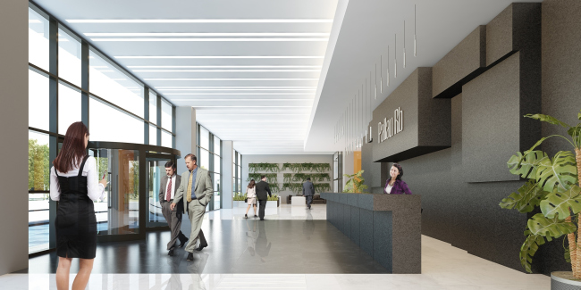
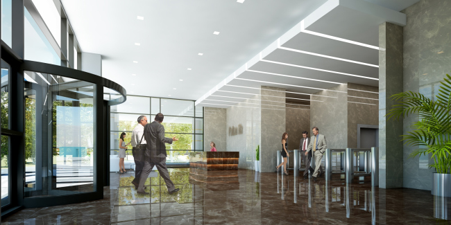
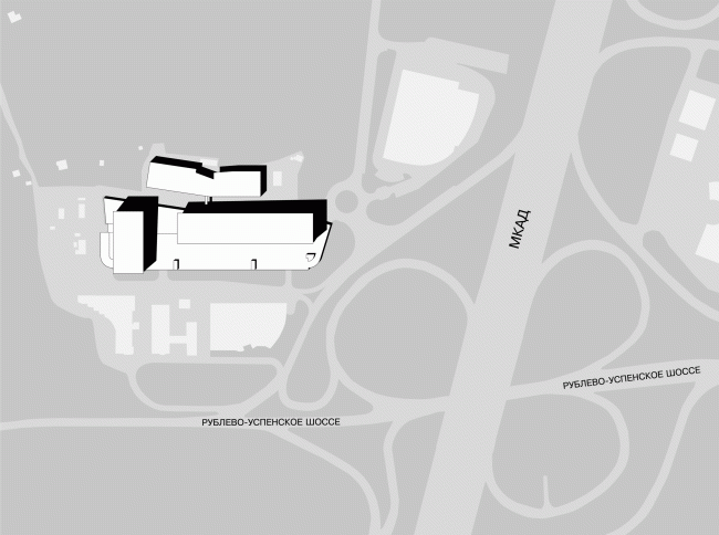
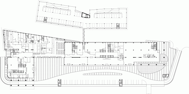
At the junction of Moscow Ring Road and the Rublev Shosse, the construction of an administrative and business center designed by Sergey Kiselev has been completed. Administrative and business center at the Rublev Shosse. Photo © Aleksey KholopovThe project of an office complex at the first kilometer of the Rublev Shosse was covered by us back in 2008. Now it is complete; the adjacent territory still looks far from attractive but, when speeding down Moscow Ring road, one will hardly be able to notice these insignificant details; besides, the complex fits in very nicely with the perspective of Moscow's highways. I must confess at this point that I was only able to appreciate these buildings now that they have been actually built. Back on 2007 when Sergey Kiselev showed the project to me saying with a fair share of pride in his voice: "just look what we've come up with for the first kilometer of the Rublev Shosse”, I just did not get it. What I saw was two large but nonetheless exquisite buildings, placed, in a VKHUTEMAS fashion, at a right angle to each other, and standing on aluminum Corbusier legs. The broad surfaces of the glass facades - when still on paper - were wrapped into golden copper mesh: the then-fashionable shape of a "sliced roll" was playing a game of its own with the perspective and scale of Moscow Ring Road. The complex was all about modernism, laconism, and the simplicity of design, "as simple as one-two-three", as Sergey Kiselev was prone to explain. A pure shape, a little bit of glitter, lightly but nonetheless expertly drawn contours of the slabs... Somehow I could not help feeling that this form was tell-tale, and now it has become clear to me just what the whole thing is all about, what plastic hint there is in the two interconnected buildings, one that makes them a not-by-chance addition to the road junction. The complex is a SIGN. The two giant crystal arrows - precious, in a golden frame, the Cyclopean fairy-tale arrows - are more than appropriate at this Moscow area's “high-class” junction; it is the Rublev Shosse, after all. So, the architects went ahead and revised this theme - with but a hint, of course, how could it be otherwise - neither life nor art allow for more, so, there are no actual arrows here, I just seem to have seen them for a split second, so never mind. There are only the asymmetric "dovetails", the slopes of the facade surfaces six stories high and a three story high slant of the roof enhancing the perspective. Where there could be the arrows, the volumes are slashed sidewise, and it's only the cleavages of the dovetails that remain on the other side; the right thing to do, too, you just could not go and build actual arrows here. However, when seen from a distance, and, furthermore, from a car speeding down the Ring Road, everything inevitably comes together to form a perfect sign. Now nobody will miss this junction marked by such a "sign" building. Administrative and business center at the Rublev Shosse. © Sergey Kiselev and PartnersIn the original version of the project, the two buildings looked more high-profile and more, let's say, luxury-class. The crystal glitter was enhanced by the slanting marquees, also made of glass, and scattered all over the entire surface: similar "stripes" are used in the facade of Hermitage-Plaza but in this case the architects had to simplify the project, taking away the stripes and simplifying the glass fragments in the fine grid of the window sashes and in the coarse grid of intermediate floors and the sparsely set verticals that fall into a restrained modernist pattern of punctured lines. And still, the slabs of the buildings retained their "crystal" quality and remained completely transparent - only the strokes of the "flaps" were replaced by the 70-style reserved regularity. Another detail: many buildings that are still in construction are made in such a way that you first walk past them with pleasure watching the beautiful simplicity of the concrete column grid and later on with a twist of disappointment when this three-dimensional structure is hidden inside a blind shell. In this case, however, thanks to the transparency of the glass, the architects were able to keep the original effect of a 3D grid - well, maybe not entirely but on a sunny day you involuntarily freeze seeing through this whole building end to end. The crystallization of the space, turning from the ethereal into the habitable, and multi-tier takes place easily, without any tectonic overcoming - as if the complex was cut out from a piece of paper by an expert hand and then put to fit in perfectly at the right time and at the right place. This effect is felt particularly strong where the slanting surfaces of the side facades cross with the straight inner grid. Administrative and business center at the Rublev Shosse, 2014 Sergey Kiselev and Partners. Photo © Aleksey KholopovIn the process of streamlining the costs, the framing contour underwent the most dramatic changes of all. Immediately after the crisis of 2008, it lost its ethereal golden glow and gave up its "jewelry" connotations. The new color of the facing panels, now aluminum, was chosen very carefully, by means of a brittle compromise between the customer's wishes and the architects' plans; the architects would try it on on location and tried to estimate how this or that color would look in this or that particular kind of weather. Finally, they opted for the light-beige panels that during an overcast day look moderately opaque and, on a sunny day, glisten on the slanting surfaces endowing the facades with "semi-precious" silver hue. Administrative and business center at the Rublev Shosse, 2014 Sergey Kiselev and Partners. Photo © Aleksey KholopovThe side facades got slits of windows: in 2008, the architects were considering the version with regular rows of "pinpoint" square window sashes - but ultimately (and, justly, in my opinion) they implemented a different one. The former version was from the nineties, and the latter had two meanings to it: on the one hand, the beige color looks a bit like the Jurassic stone and the vertical windows partly match the current moderately-classical trend. On the other hand, however, the rows of small, grouped into pairs vertical windows in a pale-blue wall cause totally different associations, far from glamorous - from a distance, they look like the holes in a punchcard, the cardboard information carrier in the computers from the eighties. A great way to revise the history of the building, as well as the place in the spirit of a notorious spiral: enough of shaking your golden bracelets, guys, time to get back to the "punchcard" ideals and form some foundation in the spirit of Isaac Azimov. Administrative and business center at the Rublev Shosse, 2014 Sergey Kiselev and Partners. Photo © Aleksey KholopovAdministrative and business center at the Rublev Shosse, 2014 Sergey Kiselev and Partners. Photo © Aleksey KholopovAdministrative and business center at the Rublev Shosse, 2014 Sergey Kiselev and Partners. Photo © Aleksey KholopovThe architects of "Sergey Kiselev and Partners" also developed the design of the entrance lobbies in pretty much the same key: laconically but with a "resonant" technique employed. The glass walls, the dark floor, the beige walls and the white ceiling slit here and there by the bands of lights whose lines continue in the perspective reflecting in the glittering polished stone. Just in the same way, the two buildings reflect each other. Design of the interior of the entrance lobby of the major building. Administrative and business center at the Rublev Shosse. © Sergey Kiselev and PartnersDesign of the interior of the entrance lobby of the minor building. Administrative and business center at the Rublev Shosse. © Sergey Kiselev and PartnersUltimately, the building came out cool, calm, and collected, even though not without a fair share of nobility issuing from the transparency of the slanted surfaces. The architects take special pride in the fact that they were able to persuade the customer not to straighten out the facades to the point of the building turning into a parallelepiped box in the process of streamlining the costs but keep the original curves of the volumes that were specifically calculated to look great when viewed from a car passing by. This is an extraordinary piece of luck: the thing is that Moscow Ring Road is still dominated by shopping malls, warehouses, and, strange though it may seem, strips of woodland: not much to catch the eye but this complex is different. From the highway, the complex does not look particularly large and, thanks to the perpendicular position of the second building, it looks rather shifty - it quickly alternates views and even provokes the driver to make a brief stop to get a better look at it. The clear and concise shape works all by itself with its every stroke thanks to which becomes immune from the consequences of streamlining the decoration costs. Quite often, it's just the other way around: in spite of its expensive decorative finish, the building looks nothing more than a box, and you really pity the fact that so decorative money went to waste. Luckily, here it is not the case - the spreading of perforated wings is just as regal as is they were actually golden. A very appropriate, and, let's say, light-hearted work of architectural art. One of the latest implemented projects that Sergey Kiselev personally worked upon… Location plan. Administrative and business center at the Rublev Shosse. © Sergey Kiselev and PartnersPlan on the first-floor level. Administrative and business center at the Rublev Shosse. © Sergey Kiselev and Partners Plan on the sixth-floor level. Administrative and business center at the Rublev Shosse. © Sergey Kiselev and Partners Section views. Administrative and business center at the Rublev Shosse. © Sergey Kiselev and Partners Section views. Administrative and business center at the Rublev Shosse. © Sergey Kiselev and Partners |
|
