По-русски

Antidote for the Evil

Designing a project of the memorial complex on the territory of the former Auschwitz death camp gave "Arch Group" a pause for thought as to what turns millions of people not only into victims but also into executioners. The architects call this memorial complex on the territory of the former death camp "an anti-evil injection".

24 February 2015
Object
mainImg

This year will see the 70th anniversary of liberation of Auschwitz. This date will be commemorated, among other things, by the architectural contest that was announced late last year - the contest offered the architects from around the world to propose a concept of a new memorial center. Now in Auschwitz works the museum complex created shortly after the war in 1947 in the surviving barracks of Auschwitz II - Birkenau - that is considered to be the epicenter of all the horrors that went on in the camp; it was there that three quarters of the total number of the camp's victims died (over a million out of a million and four hundred thousand). 

According to the specifications, the new memorial center is to be situated next to the territory of the former camp Auschwitz I which is now in fact quite a modern center of Oswiecim, a quiet Polish town with a population of some forty thousand people where now nothing is bringing back to memory the events of those years. And, according to the specifications, the future center must include, besides the memorial museum, a lot of public territories and facilities: a large lecture hall, creative workshops, and educational classes. 

Initially inspired by the idea of designing a museum as such, the leaders of Arch Group Aleksey Goryainov and Mikhail Krymon later on came to a conclusion that the contest specifications in fact divert the participants from the memory of the great tragedy - and signed out from the contest. Without taking part in it, though, the architects still developed their own project of the Auschwitz museum, of a solely memorial nature, developing in this work their own vision of such exposition. Thus, this project that is meant neither for implementation nor even for participation in the contest can be arguably referred to the "paper" category - effectively, it is a conceptual study of the important theme. 

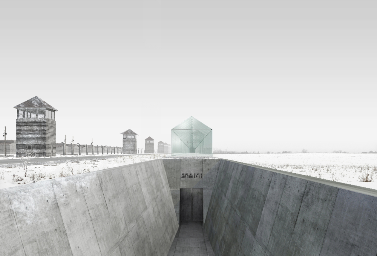
Auschwitz Memorial Complex © Arch group
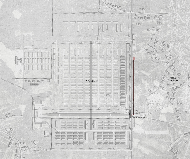
Auschwitz Memorial Complex. Location plan © Arch group


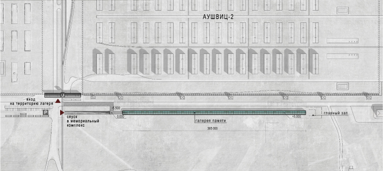
Auschwitz Memorial Complex. Plan © Arch group


In their project, Aleksey Goryainov and Mikhail Krymov placed the museum near the walls of Auschwitz II death camp that is now part of the existing complex. The architects stretched the galleries of their museum in a thin thread running along the road that leads to the camp, hiding the main museum space underground so as not to distract the visitors' attention from the camp itself with its long fences and menacing barracks. It is only the top gallery that is visible above the ground. It is completely made of glass but has the shape of a barrack and thus fits in with the surrounding scenery. 

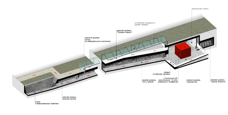
Auschwitz Memorial Complex. Section view © Arch group


Auschwitz Memorial Complex. Section view © Arch group


"Anti-evil" injection - this is the name that the architects gave to their project, offering, as they put it, to reconsider the very essence of all the traditional holocaust museums. As a rule, these museums include the appropriate human records and photographs of the victims; terrified, each visitor involuntarily puts himself into the victim's place in his mind. Psychologically, visiting such museums leaves the visitors depressed and terrified. Not everybody can withstand watching even a small part of these expositions. Mikhail Krymov explains: "The victim does not choose its destiny. Its different with executioners. People turn into them of their own free will, consciously, sometimes without even noticing that they've passed the point of no return. In such places, it is not considered appropriate to speak of executioners but, let's face it, in some certain circumstances, any visitor of this museum can find himself not only in the place of the victim but also in the place of an executioner. The documentary portrayal of the events of those days and of the process that turns ordinary harmless people into the perpetrators of these crimes can hopefully prevent new atrocities". 

The psychological research that was done after the war, as well as recently, successfully proves one of the long-known truths: there is evil in every one of us. For example, in Asch's psychology experiments, 75% of the participants gave an incorrect answer to at least one question if that incorrect answer was backed by the majority of the group. In Milgram experiments, 87,5% of the group "killed" the victim by electricity guided solely by the authority of the scientists. In Stanford "prison" experiment, the students that got the roles of the prison security guards, in two days started showing sadistic traits and inclinations. These experiments were repeated in different countries and proved indisputably the universality of their results. "I am sure that if the participants of the experiment had been told what the experiment was all about in advance, and then asked to repeat the whole thing over again, the share of those who were ready to fulfill the order would have been significantly smaller - says Aleksey Goryainov - And it is the mitigation of these appalling numbers, the antidote against the evil, against accepting it and submitting to it, that must become, in our opinion, the main mission of this museum/memorial complex". 

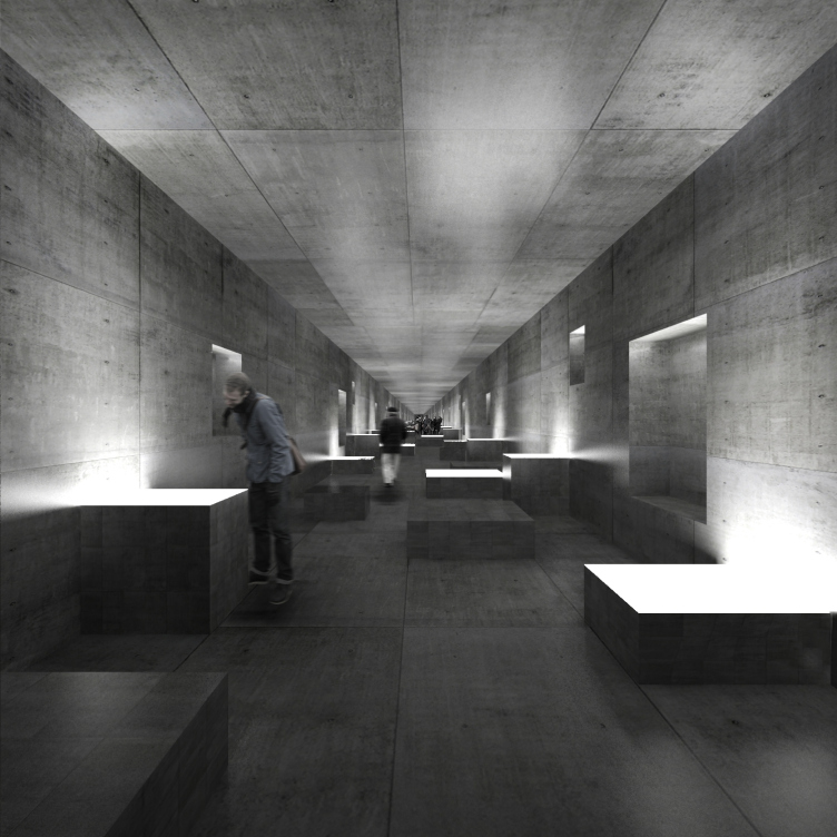
Auschwitz Memorial Complex. "Executioner's Progress" © Arch group


The realization of the fact that the visitors are in for facing a terrible reality comes already at the entrance situated next to the main gate of the camp. The museum entrance group is a gray concrete tunnel going underground. Collapsing into a tiny dot at the end, the long narrow gallery has no natural light in it. The overall length of this oppressive corridor is about 400 meters but the visitor is not offered any other path to go, so everybody who is coming must follow this route. The architects treat it as a kind of purgatory passing through which no one will ever be the same again. Meanwhile, as a matter of fact, apart from the oppressing atmosphere, the corridor does not have in it any terrible documents about the victims of Auschwitz or any details that can frighten or scare the visitors away, cause repugnance or kill the desire to think about the events of those days. 

The underground corridor is the "executioner's progress" that depicts the life of ordinary people. The surviving documents and photographs allow for creating such an exposition from beginning to end: here is a person that lives in a nice little house, he listens to music, plants flowers, gets his education, raises his kids and achieves his share of success. At some moment, there appear the documents of him signing in for the Nazi party, and about his job promotion. Bit by bit, this person becomes a part of a huge machine that crushes everything in its way. Then there is a war, Auschwitz, and an endless nightmare of dead bodies. Thus, in front of the visitor's eyes, unfold the lives of the executioners including those moments where they could have stopped but for some reason or other did not do so. 

The exposition is now and then interrupted by installations displaying the results of the psychological experiments described above - reminding the people about the danger of becoming a part of the evil cause. The visitor gets involved in this process taking a number of simple tests developed by professional psychologists - these tests vividly demonstrate how easy it is to manipulate people and set them on the path of violence. 

Auschwitz Memorial Complex. Monument to the martyrs of the camp © Arch group


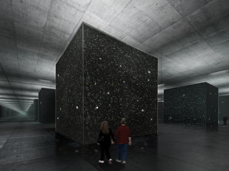
Having gone the whole way, the visitor finds himself in a large mirror hall in the center of which a large six-meter glass cube is installed, filled up to the brim with... mobile telephones! According to the authors, there must be a million and a half of them - which corresponds to the approximate number of people killed in the camp (the exact figure is still unknown). The authors deliberately use this contemporary object as opposed to the real things displayed in the Auschwitz museum - the glasses, toothbrushes, and shaving brushes that the fascist guards wrenched from the prisoners. A mobile phone, something that nowadays everybody has and uses, becomes the link to the present day - it seems to be saying that even today the humanity is not guaranteed against a repetition of this tragedy. The multitude of glittering screens is meant to help the visitors to get the idea of the magnitude of what happened here, multiplying manifold in the countless mirror reflections. The cube is a monument to all the victims of Auschwitz, and its reflections are the memory of all the instances of genocide. 

Auschwitz Memorial Complex. Mirror Hall © Arch group


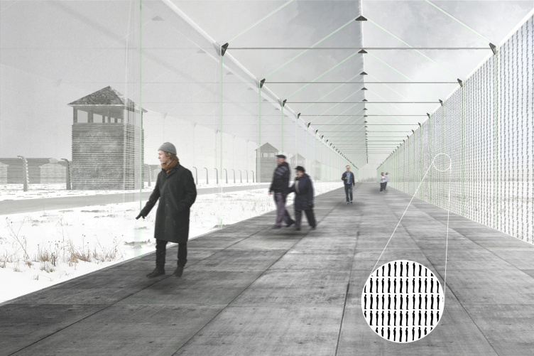
The mirror hall is circled by a ramp that leads back up to the ground surface where, under a glass dome, the architects organize the "Memory Gallery" in commemoration of the victims of the camp. The main "exhibit" of the gallery is the camp itself whose terrifying panorama spreads before the visitors eyes full-scale: the machine-gun towers, the barbed-wire fences, the first line of the barracks where hundreds of thousands of people were held captive, the spots of the foundations, and the forest of incinerator chimneys looming against the sky. It is here that one gets the sense of the reality of the tragedy about which the underground exposition shares, the physical contact with it. The glass wall of the gallery that is opposite to the camp bears the surviving registers and photos of the prisoners. Most of those who got killed were not even registered anywhere - they were thrown in the gas chambers right after they were brought to Auschwitz. The authors of the project decided to honor their memory in the endless rows of small, three cm tall, human silhouettes. This is yet another attempt to help the people of today to get the idea of the atrocities that were done here. Leaving "Memory Gallery", the visitor again finds himself before the main gate of Auschwitz II, from where the guided tour over the territory of the real camp might start. 

Auschwitz Memorial Complex. Memory Gallery © Arch group


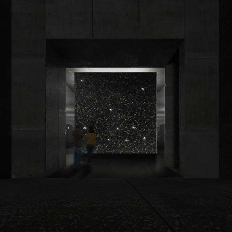
A special part of the exposition is the room named "Black Hall", also underground, behind the mirror hall. It shows the traditional exposition of Holocaust museums that depicts all the horrors of the death camp. This room is deliberately organized in the form of a separate block as an indispensable but still not mandatory part of the exposition. The visitor will decide for himself or herself whether he or she wants to visit that room and take their children along who quite possibly will be shocked by what they are about to see. Here it is very important to make sure that the visitors do not get a sense of repulsion in respect to the pictures of the starving skeleton-like prisoners - that usually keeps the museum visitors from treating them as real people. Repulsion and aversion are natural protective human reactions; they block the empathy center and a number of other sympathetic feelings. All the fascist regimes used this cruel device to foster hatred for this or that "enemy" people by stopping calling a human a human and thus creating a moral justification base for their crimes and atrocities. 

"We do not want the visitor to stop for a minute seeing real people either in the executioners or in their victims. Both of them were people - conclude the authors - We would want the museum to evoke the right emotion so that, after visiting it, the person would get the right experience, however hard or unpleasant, but still making him a better person". 

The experience of designing such a museum, even without going beyond the pale of the conceptual meditation into the sphere of real-life design is, of course, very important, as is the experience of studying the limits to which the human psychology can be bent, twisted, or manipulated, and its helplessness in the face of the almighty propaganda that easily finds and awakes a beast virtually in any human being, a beast that is ready to go and search for the enemies judging by the signs and traits that someone else thrust on him. This theme is acutely painful to the point of intolerable - but all the more relevant. At which exact point do we become accomplices to murder? When do we do the first concession against our conscience for the sake of career, success, and well-being? How solvable at all are the problems of mass psychology and, more importantly, is the "antidote for the evil" described by the authors possible? Can the recurrent disease of blind hate be cured once and for all? Probably no one can answer these questions. But the attempts to cure this disease are still worth trying.

24 February 2015

Headlines now
Scheduled Evolution
ASADOV Architects unveiled the EvyCenter pavilion, a microcultural hub for fostering personal growth, organizing workshops, and doing gymnastics. Additionally, this pavilion serves as a prototype for a scalable country house, drawing inspiration from the “Loskutok” project, and constructed from CLT panels in a factory. This marks the beginning of a developer project initiated by the architectural firm (sic!), which is seeking partners to expand both small Evy settlements and even larger Evy cities, which are, according to Andrey Asadov, aimed at fostering the “evolutionary” development of the people who will inhabit them.
The Golden Crown
The concept for a dental clinic in Yekaterinburg, developed by CNTR Studio, revolves around the idea of a “mouth full of gold”: pristine white porcelain stoneware walls are complemented by matte brass details. To avoid an overly literal interpretation, the architects focused on the building’s proportions, skillfully navigating between sunlight requirements and fire safety regulations.
Flexibility and Integration
Not long ago, we covered the project for the fourth phase of the ÁLIA residential complex, designed by APEX. Now, we’ve been shown different fence concepts they developed to enclose the complex’s private courtyards, incorporating a variety of public functions. We believe that the sheer fact that the complex’s architects were involved in such a detail as fencing speaks volumes.
A Step Forward
The HIDE residential complex represents a major milestone for ADM architects and their leaders Andrey Romanov and Ekaterina Kuznetsova in their quest for a fresh high-rise aesthetic – one that is flexible and layered, capable of bringing vibrancy to mass and silhouette while shaping form. Over recent years, this approach has become ADM’s “signature style”, with the golden HIDE tower playing a pivotal role in its evolution. Here, we delve into the project’s story, explore the details of the complex’s design, and uncover its core essence.
Gold in the Sands
A new office for a transcontinental company specializing in resource extraction and processing has opened in Dubai. Designed by T+T Architects, masters of creating spaces that are contemporary, diverse, flexible, and original, this project exemplifies their expertise. On the executive floor, a massive brass-clad partition dominates, while layered textures of compressed earth create a contextually resonant backdrop.
Layers and Levels of Flight
This project goes way back – Reserve Union won this architectural competition at the end of 2011, and the building was completed in 2018, so it’s practically “archival”. However, despite being relatively unknown, the building can hardly be considered “dated” and remains a prime example of architectural expression, particularly in the headquarters genre. And it’s especially fitting for an aviation company office. In some ways, it resembles the Aeroflot headquarters at Sheremetyevo but with its own unique identity, following the signature style of Vladimir Plotkin. In this article, we take an in-depth look at the United Aircraft Corporation (UAC) headquarters in the Moscow agglomeration town of Zhukovsky, supplemented by recent photographs from Alexey Naroditsky – a shoot that became only recently possible due to the fact that improvements were finally made in the surrounding area.
Light and Shadow
In this article, we delve into the architectural design of the “Chaika” house by DNK ag architects, which was recently completed in 2023 as part of the collection of signature designs at ZILArt. As is well-known, all the buildings in this complex follow a design code, yet each one is distinct. This particular building stands out not only for its whiteness and minimalism but also for the refined use of a limited number of techniques that, together, create what can confidently be called synergy.
Casus Novae
A master plan was developed for a large residential area with a name of “DNS City”, but now that its implementation began, the plan has been arbitrarily reformatted and replaced with something that, while similar on the surface, is actually quite different. This is not the first time such a thing happens, but it’s always frustrating. With permission from the author, we are sharing Maria Elkina’s post.
Treasure Hunting
The GAFA bureau, in collaboration with Tegola and Arkhitail, organized an expedition to the island of Kilpola in Karelia as part of Moskomarkhitektura’s “Open City” festival. There, amidst moss and rocks, the students sought answers to questions like: what is the sacred, where does it dwell, and what sustains it? Assisting the participants in this quest were landscape engineer Evgeny Levin, artist Nicholas Roerich, a moose, and the lack of cellular connection. Here’s how the story unfolded.
Depths of the Earth, Streams of Water
In the Malaya Okhta district, the Akzent building, designed by Stepan Liphart, was constructed. It follows a classic tripartite structure, yet it’s what you might call “hand-drawn”: each façade is unique in its form and details, some of which aren’t immediately noticeable. In this article, we explore the context and, together with the architect, delve into how the form was developed.
Fir Tree Dynamics
The “Airports of Region” holding is planning to build an airport in Karachay-Cherkessia, aiming to make the Arkhyz and Dombay resorts more accessible to travelers. The project that won in an invitation-only competition, submitted by Sergey Nikeshkin’s KPLN, blends natural imagery inspired by the shape of a conifer seed, open-air waiting spaces, majestic large trees, and a green roof elevated on needle-like columns. The result is both nature-inspired and WOW.
​A Brick Shell
In the process of designing a clubhouse situated among pine trees in a prestigious suburban area near Moscow, the architectural firm “A.Len” did the façade design part. The combination of different types of brick and masonry correlates with the volumetric and plastique solutions, further enhanced by the inclusion of wood-painted fragments and metal “glazing”.
Word Forms
ATRIUM architects love ambitious challenges, and for the firm’s thirtieth anniversary, they boldly play a game of words with an exhibition that dives deep into a self-created vocabulary. They immerse their projects – especially art installations – into this glossary, as if plunging into a current of their own. You feel as if you’re flowing through the veins of pure art, immersed in a universe of vertical cities, educational spaces – of which the architects are true masters – and the cultural codes of various locations. But what truly captivates is the bold statement that Vera Butko and Anton Nadtochy make, both through their work and this exhibition: architecture, above all, is art – the art of working with form and space.
Flexibility and Acuteness of Modernity
Luxurious, fluid, large “kokoshniks” and spiral barrel columns, as if made from colorful chewing gum: there seem to be no other mansion like this in Moscow, designed in the “Neo-Russian-Modern” style. And the “Teremok” on Malaya Kaluzhskaya, previously somewhat obscure, has “come alive with new colors” and gained visibility after its restoration for the office of the “architectural ecosystem” as the architects love to call themselves. It’s evident that Julius Borisov and the architects at UNK put their hearts into finding this new office and bringing it up to date. Let’s delve into the paradoxes of this mansion’s history and its plasticity. Spoiler: two versions of modernity meet here, both balancing on the razor’s edge of “what’s current”.
Yuri Vissarionov: “A modular house does not belong to the land”
It belongs to space, or to the air... It turns out that 3D printing is more effective when combined with a modular approach: the house is built in a workshop and then adapted to the site, including on uneven terrain. Yuri Vissarionov shares his latest experience in designing tourist complexes, both in central Russia and in the south. These include houseboats, homes printed from lightweight concrete using a 3D printer, and, of course, frame houses.
​Moscow’s First
“The quality of education largely depends on the quality of the educational environment”. This principle of the last decade has been realized by Sergey Skuratov in the project for the First Moscow Gymnasium on Rostovskaya Embankment in the Khamovniki district. The building seamlessly integrates into the complex urban landscape, responding both to the pedestrian flow of the city and the quiet alleyways. It skillfully takes advantage of the height differences and aligns with modern trends in educational space design. Let’s take a closer look.
Looking at the Water
The site of Villa Sonata stretches from the road to the water’s edge, offering its own shoreline, pier, and a picturesque river panorama. To reveal these sweeping views, Roman Leonidov “cut” the façade diagonally parallel to the river, thus getting two main axes for the house and, consequently, “two heads”. The internal core – two double-height spaces, a living room and a conservatory, with a “bridge” above them – makes the house both “transparent” and filled with light.
The White Wing
Well, it’s not exactly white. It’s more of a beige, white-stone structure that plays with the color of limestone – smoother surfaces are lighter, while rougher ones are darker. This wing unites various elements: it absorbs and interprets the surrounding themes. It responds to everything, yet maintains a cohesive expression – a challenging task! – while also incorporating recognizable features of its own, such as the dynamic cuts at the bottom, top, and middle.
Urban Dunes
The XSA Ramps team designed and built a three-part sports hub for a park in Rostov-on-Don, welcoming people of all ages and fitness levels. The skate plaza, pump track, and playground are all meticulously crafted with details that attract a diverse range of visitors. The technical execution of the shapes and slopes transforms this space into a kind of sculptural composition.
Proportional Growth
The project for the fourth phase of the ÁLIA residential area has been announced. The buildings are situated on an elongated plot – almost a “ray” that shoots out from the center of the area towards the river. Their layout reflects both a response to Moscow’s architectural preferences over the past 15 years, shifting “from blocks to towers”, and an interpretation of the neighboring business park designed by SOM. Additionally, the best apartments here are not located at the very top but closer to the middle, forming a glowing “waistline”.
The “Staircase” Building
In designing the “Details” residential complex in New Moscow, Rais Baishev spiced up the now-popular Moscow theme of a “courtyard” building with an idea drawn from the surrealist drawings by Maurits Escher. He envisioned the stepped silhouettes and descending slopes as a metaphysical mega-staircase, creating a key void within the courtyard that gave the project an internal “spine”. This concept is felt both in the building’s silhouette and on its façades.
Projection of the Quarter
No one doubted that the building that Vladimir Plotkin designed as part of the “Garden Quarters” would be the most modernist of all. And it turned out just that way: while adhering to the common design code, the building successfully combines brick and white stone, rhythmically responding to the neighboring building designed by Ostozhenka, yet tactfully and persistently making a few statements of its own. This includes the projection of the ideal urban development composition “14–9–6”, which can be found right next door, mathematical calculations, including those for various types of terraces (and perhaps the only reminder of the Soviet past of the Kauchuk rubber factory!), and the white “cross-stitch” pattern of the façade grid.
Domus Aurea
In this issue, we examine the “Tessinsky-1” house, designed by Sergey Skuratov and completed in 2023. Located in the middle of the Serebryanicheskaya Embankment district, at the intersection of its main streets, this house assumes a sort of “nodal” role: it not only responds to everything around it and preserves many memories of the former EMA factory within itself, but it weaves all this into a newly directed pattern, reconciling bright “gold” and dark-colored brick, largely with the help of the new, modern-yet-archaic Columba brick, which, come to think about it, is the most precious element here.
The Chimney of Nikola-Lenivets
In this issue, we are examining the “Obelisk House” designed by KATARSIS and built for the Arkhstoyanie 2023 festival. However, it was only finished later on, and this is why we are examining it now. It seems to us that after the “Obelisk House” appeared in Nikola-Lenivets, a dialogue and a few inner connections appeared between the temporary structures built here. These houses no longer look like “accidental neighbors”, more of which below.
​Periscope by the Bay
The jury awarded the second place in the competition for a public and cultural center in Petropavlovsk-Kamchatsky to the companies GORA (“Mountain”) and M4. In the consortium’s proposal, the building resembles a sperm whale with a calf swimming next to it or a periscope, whose lenses capture the most spectacular views from the surrounding landscape.
From Arcs to Dolmens
While working on the competition project for Petropavlovsk-Kamchatsky, ASADOV Architects prioritized the value of the natural and urban environment, aiming to preserve the balance of the location while minimizing the resemblance of the volume that they designed to a “traditional building”. The task was challenging, and the architects created three versions, one of which having been developed after the competition, where their main proposal took third place. However, the point of interest here is not the competition result but the continuity of creative thinking.
Hide and Seek
The ID Moskovskiy house, designed by Stepan Liphart in St. Petersburg, in the courtyards near Moskovskiy Avenue beyond the Obvodny Canal and recently completed, is notable for several reasons. Firstly, it has been realized with considerable accuracy, which is particularly significant as this is the first building where the architect was responsible not only for the facades but also for the layouts, allowing for better integration between the two. On the other hand, this building is interesting as an example of the “germination” of new architecture in the city: it draws on the best examples from the neighborhood and becomes an improved and developed sum of ideas found by the architect in the surrounding context.
The Big Twelve
Yesterday, the winners of the Moscow Mayor’s Architecture Award were announced and honored. Let’s take a look at what was awarded and, in some cases, even critique this esteemed award. After all, there is always room for improvement, right?
Above the Golden Horn
The residential complex “Philosophy” designed by T+T architects in Vladivostok, is one of the new projects in the “Golubinaya Pad” area, changing its development philosophy (pun intended) from single houses to a comprehensive approach. The buildings are organized along public streets, varying in height and format, with one house even executed in gallery typology, featuring a cantilever leaning on an art object.
Nuanced Alternative
How can you rhyme a square and space? Easily! But to do so, you need to rhyme everything you can possibly think of: weave everything together, like in a tensegrity structure, and find your own optics too. The new exhibition at GES-2 does just that, offering its visitor a new perspective on the history of art spanning 150 years, infused with the hope for endless multiplicity of worlds and art histories. Read on to see how this is achieved and how the exhibition design by Evgeny Ace contributes to it.