По-русски

Moscow Institute of Architecture: best "School" projects

In this issue, we continue to feature the best projects done by the students of Moscow Institute of Architecture under the supervision of their academic advisors Vsevolod Medvedev, Mikhail Kanunnikov, and Zurab Basaria

19 November 2014
Overview
mainImg

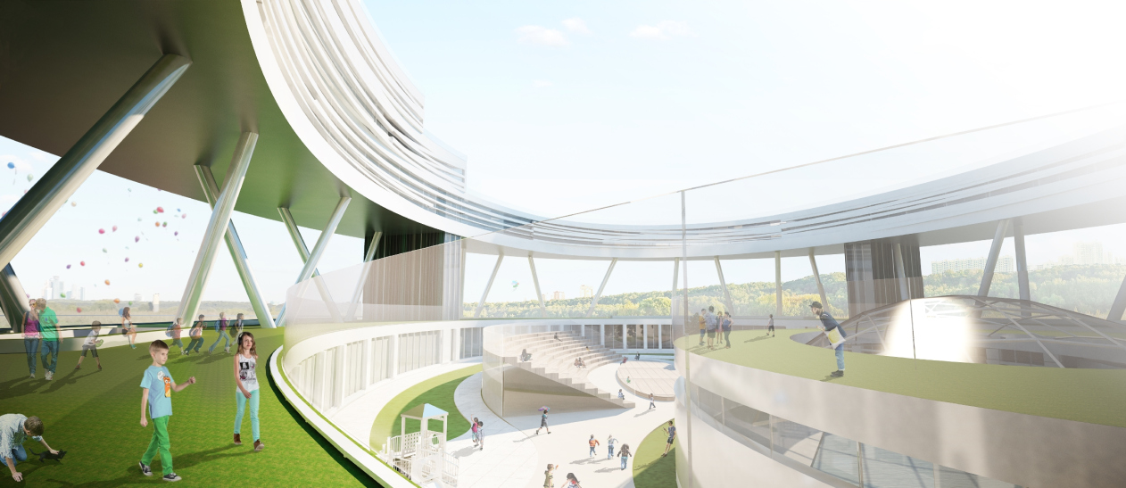
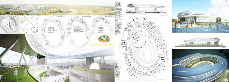
"Nest for the Orphans" project. Boarding school in Moscow's Nizhnie Mnevniki. Author: Polina Yavna, 4th year student of "PROM" department

As part of their term projects, the 4th year students of the "PROM" department were offered to prepare a "School" project, and not just any school but a specialized institution, such as a school for children with disabilities, a juvenile correctional facility, or a foster care home. This was quite a tall order because the students were to consider the specifics of such institutions, such as the protective envelope and the strict group division of the teenagers in the correctional institutions. This is why the students were to first of all comprehend the special regime and mode of life inside such a facility so as to design its training and production center correctly. Just as complex are the specifics of the foster care home. In this case, the students were to provide not only for the school as such but for the residential premises as well. And it was also quite a challenge for the beginner architects to design the school for the disabled children. The students were to delve into a whole range of rigorous communicational, social, and sanitary specifications. 

The design venues were represented by the real land sites in Moscow and its nearest suburbs: the derelict "pioneer camps", the correctional facilities in need of reconstruction, or the unused school or orphanage buildings. 

Vsevolod Medvedev, one of the leaders of the team, shared that the line-up of the project was deliberately expanded in comparison with the basic task set by the institute. Apart from the drawings, the students were for the first time around required to make a presentation video that would fully demonstrate the possibilities of their projects. But the most challenging task, probably, was that of understanding, feeling, and trying to make a positive difference in society's attitude to the young orphans, disabled people, and juvenile offenders.

Usually, based on the results of the defense of the students' projects, the professors would hold an internal competition, awarding the prize-winning places and accordingly giving the valuable gifts. But this time it was decided to change the usual order of things: the judging panel singled out five equally worthy works - and these are the works that we feature in our current issue. 

Polina Yavna "Nest for the Orphans"

Orphan Boarding School in Moscow's Nizhny Mnevniki. 


"Nest for the Orphans" project. Boarding school in Moscow's Nizhnie Mnevniki. Author: Polina Yavna, 4th year student of "PROM" department

The author of the project sets before her a task of creating the ideal environment for the children that were deprived of their parents' love. As a solution, a bright architectural image is proposed, that looks very much like a bird's nest - warm, cozy, and securely protected from the adverse factors of the cruel world outside. The "nest" association runs through the whole project. On the plan, the building has an elliptic shape. The first floor functions as the peculiar "foundation" upon the circle of which the walls of the school grow leaving inside the large courtyard that rests on the used roof on the level of the first floor. To this same place (i.e. to the courtyard) the architect takes the volume of the gym, and the swimming pool, the latter being smooth and round as an egg. The spiral facades look indeed like the twigs woven into a nest. The likeness is enhanced by the proposal to raise the main body of building, i.e. its third and fourth floors on numerous slender metallic supports and five broad "legs" that will include the staircase and elevator blocks. As a result, the "nest" looks as if it was hanging up in the air above the green hill where this hill is in fact the first floor of the school hidden behind the green facade. 
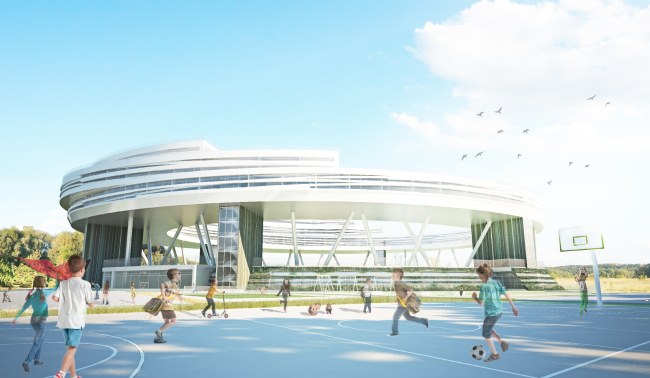

"Nest for the Orphans" project. Boarding school in Moscow's Nizhnie Mnevniki. Author: Polina Yavna, 4th year student of "PROM" department
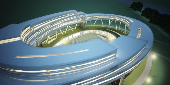

"Nest for the Orphans" project. Boarding school in Moscow's Nizhnie Mnevniki. Author: Polina Yavna, 4th year student of "PROM" department

The functional set of the building includes everything that is necessary for comfortable living and successful studies - one will find here the spacious classrooms and student lounges, a separate elementary-school facility, and the spacious cafeteria, and the rest area commanding a view of the city, and the cozy residential area. The courtyard has in it an open-air amphitheater, as well as the game and sport grounds. On the embankment of the Moskva River, there is also a quay. 

http://www.youtube.com/watch?v=uXvXw918_uo

Yana Ostapchuk. "Juvenile Correctional Facility"

Juvenile correctional facility in Moscow's Bolshaya Pereyaskavskaya Street


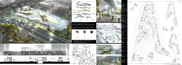
"Correctional Facility". Moscow, Bolshaya Pereyaslavskaya Street. Author: Yana Ostapchuk, 4th year student of "PROM" department

The institution is designed for deviant children and teenagers. The peculiarity of this education institution is all about the fact that it is not just a school but a place of permanent residence and rehab of the young people. 

The complex consists of several interconnected buildings and occupies a rather large territory - which allows for placing all the necessary functions there. For example, the longest building that stretches along the street includes the classrooms, student lounges, and hobby club premises. The entire third floor is occupied by the residential rooms and is linked to the rehab building with an overpass. Yet another volume is designed for the professional training and extra training.
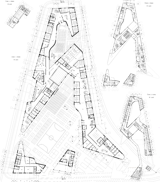

"Correctional Facility". Moscow, Bolshaya Pereyaslavskaya Street. Author: Yana Ostapchuk, 4th year student of "PROM" department

The street facades of the complex are decorated with an openwork grille structure whose pattern is a bit reminiscent of a zebra's stripes. It this sophisticated pattern that "belts" the entire complex that forms its image that, according to its author, is meant to embody the process of positive change and rehabilitation of the young offenders. 

http://www.youtube.com/watch?v=Up21gKM5-u8

Anna Tuzova. "Boarding School for the Orphans"

Foster care home in Moscow, Metrogorodok, Otkrytoe Shosse


"Foster Care Home". Moscow, Metrogorodok, Otkrytoe Shosse. Author: Anna Tuzova, 4th year student of "PROM" department

The foster care facility is located on the territory of the former Foster Care Home №87 which is now a neuropsychiatric clinic №44. The land site neighbors on the national park named "Losiny Ostrov" ("Elk Island), a residential area, and a few forest ranges. The existing buildings of the foster home will be included into the new complex and then renovated. Yet another two buildings will be built from scratch - they will house the residential premises for the students and the necessary medical facilities. 


"Foster Care Home". Moscow, Metrogorodok, Otkrytoe Shosse. Author: Anna Tuzova, 4th year student of "PROM" department

The plan of the volume of the school look like ribbon loosely tied into a bow or maybe two clenched hands which, according to the author, is meant to symbolize tender loving care. The facades are an azure mosaic picture that is composed of the triangular-shaped elements of Venetian blinds. The project provides for all the necessary functions, including the hybrid library, a concert hall, and creative studios. For the very young, a direct exit into the courtyard from the classrooms is provided. The volumes of the studios and the sport nucleus have a usable roof that commands a fine view of the woodland. 

http://www.youtube.com/watch?v=1ROMaESYUbk

Alena Gruzinova. "School for Disabled Children"

A school and a rehabilitation center in the Odintsovo District of Moscow Region


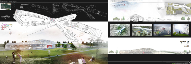
"School for disabled children". Odintsovo District, Moscow Region. Author: Alena Gruzinova, 4th year student of "PROM" department

The school is designed in the place of the former Polushkino health house located next to the operating city clinic. The perforated facades of the complex create a life-affirming architectural image and protect its interior from the direct sunlight, filling the classrooms with soft ambient light. The array of the classrooms is at times interrupted by atrium spaces decorated with stained-glass artwork of sunscreen glass that also provides for the optimum lighting. 
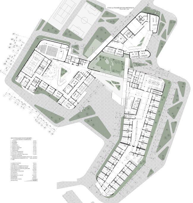

"School for disabled children". Odintsovo District, Moscow Region. Author: Alena Gruzinova, 4th year student of "PROM" department

The students of this school are children with locomotor system deficiencies; this is why the project includes a cyclic plan of finding one's way around the entire school's territory by using a network of ramps and underpasses that let the kids to effortlessly move from one part of the building to another. The load-per-age-bracket has also pre-calculated: it determined the functional zoning and the planning of the school. The very young, for example, will study on the first floor alone, while the kids that are a little older will occupy the second level. Depending on the age of the students, the height and the length of the ramps also varies - in this project, they become not only a means of locomotion but also a symbol of gradual development and moving up physically and spiritually. 

http://www.youtube.com/watch?v=0i-_mMtreAk

Anna Petrova. "Correctional Facility"

The reconstruction of Atlyatsk juvenile correctional facility in Chelyabinsk Region
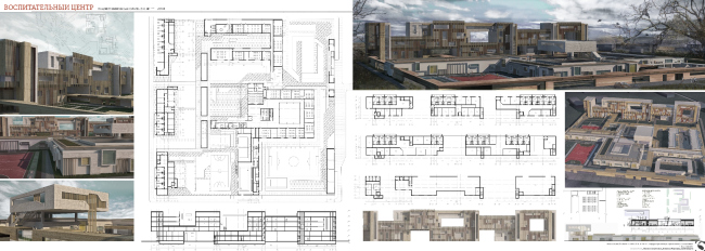

"Correctional Facility". Chelyabinsk Region. Author: Anna Petrova, 4th year student of "PROM" department

As a venue for designing, the now-closed-for-reconstruction Alyatsk correctional facility was chosen in the Chelyabinsk Region. The land site with an area of 12 hectares was divided into two parts: the girls' and the boys'. The center includes a residential complex, the school and professional training center buildings, information center, as well as the administrative and medical block. The single-story has a direct link to the training facility; in its very middle, there is a courtyard covered with a glass roof. 

Forming the strict and austere image of the center, the author of the project uses the technique that consist in cutting away these or those volumes from the main bulk of the building. In their stead, there appear either courtyards, cut inside the square stylobate, or the terraces of the residential block, or fragments of the usable roof that are turned into the walking zones for the teenagers living in the maximum security regime in the disciplinary isolation cells. 

Along the perimeter of the site and along all the buildings, there are galleries that, according to the author's plan, will, on the one hand, stand for the path that would lead the young offenders and, on the other hand, would help to give the structure an "organized" feel, which is particularly important in the conditions of the strict regime. 

http://www.youtube.com/watch?v=poDLFU91K-Q


19 November 2014

Headlines now
The Golden Crown
The concept for a dental clinic in Yekaterinburg, developed by CNTR Studio, revolves around the idea of a “mouth full of gold”: pristine white porcelain stoneware walls are complemented by matte brass details. To avoid an overly literal interpretation, the architects focused on the building’s proportions, skillfully navigating between sunlight requirements and fire safety regulations.
Flexibility and Integration
Not long ago, we covered the project for the fourth phase of the ÁLIA residential complex, designed by APEX. Now, we’ve been shown different fence concepts they developed to enclose the complex’s private courtyards, incorporating a variety of public functions. We believe that the sheer fact that the complex’s architects were involved in such a detail as fencing speaks volumes.
A Step Forward
The HIDE residential complex represents a major milestone for ADM architects and their leaders Andrey Romanov and Ekaterina Kuznetsova in their quest for a fresh high-rise aesthetic – one that is flexible and layered, capable of bringing vibrancy to mass and silhouette while shaping form. Over recent years, this approach has become ADM’s “signature style”, with the golden HIDE tower playing a pivotal role in its evolution. Here, we delve into the project’s story, explore the details of the complex’s design, and uncover its core essence.
Gold in the Sands
A new office for a transcontinental company specializing in resource extraction and processing has opened in Dubai. Designed by T+T Architects, masters of creating spaces that are contemporary, diverse, flexible, and original, this project exemplifies their expertise. On the executive floor, a massive brass-clad partition dominates, while layered textures of compressed earth create a contextually resonant backdrop.
Layers and Levels of Flight
This project goes way back – Reserve Union won this architectural competition at the end of 2011, and the building was completed in 2018, so it’s practically “archival”. However, despite being relatively unknown, the building can hardly be considered “dated” and remains a prime example of architectural expression, particularly in the headquarters genre. And it’s especially fitting for an aviation company office. In some ways, it resembles the Aeroflot headquarters at Sheremetyevo but with its own unique identity, following the signature style of Vladimir Plotkin. In this article, we take an in-depth look at the United Aircraft Corporation (UAC) headquarters in the Moscow agglomeration town of Zhukovsky, supplemented by recent photographs from Alexey Naroditsky – a shoot that became only recently possible due to the fact that improvements were finally made in the surrounding area.
Light and Shadow
In this article, we delve into the architectural design of the “Chaika” house by DNK ag architects, which was recently completed in 2023 as part of the collection of signature designs at ZILArt. As is well-known, all the buildings in this complex follow a design code, yet each one is distinct. This particular building stands out not only for its whiteness and minimalism but also for the refined use of a limited number of techniques that, together, create what can confidently be called synergy.
Casus Novae
A master plan was developed for a large residential area with a name of “DNS City”, but now that its implementation began, the plan has been arbitrarily reformatted and replaced with something that, while similar on the surface, is actually quite different. This is not the first time such a thing happens, but it’s always frustrating. With permission from the author, we are sharing Maria Elkina’s post.
Treasure Hunting
The GAFA bureau, in collaboration with Tegola and Arkhitail, organized an expedition to the island of Kilpola in Karelia as part of Moskomarkhitektura’s “Open City” festival. There, amidst moss and rocks, the students sought answers to questions like: what is the sacred, where does it dwell, and what sustains it? Assisting the participants in this quest were landscape engineer Evgeny Levin, artist Nicholas Roerich, a moose, and the lack of cellular connection. Here’s how the story unfolded.
Depths of the Earth, Streams of Water
In the Malaya Okhta district, the Akzent building, designed by Stepan Liphart, was constructed. It follows a classic tripartite structure, yet it’s what you might call “hand-drawn”: each façade is unique in its form and details, some of which aren’t immediately noticeable. In this article, we explore the context and, together with the architect, delve into how the form was developed.
Fir Tree Dynamics
The “Airports of Region” holding is planning to build an airport in Karachay-Cherkessia, aiming to make the Arkhyz and Dombay resorts more accessible to travelers. The project that won in an invitation-only competition, submitted by Sergey Nikeshkin’s KPLN, blends natural imagery inspired by the shape of a conifer seed, open-air waiting spaces, majestic large trees, and a green roof elevated on needle-like columns. The result is both nature-inspired and WOW.
​A Brick Shell
In the process of designing a clubhouse situated among pine trees in a prestigious suburban area near Moscow, the architectural firm “A.Len” did the façade design part. The combination of different types of brick and masonry correlates with the volumetric and plastique solutions, further enhanced by the inclusion of wood-painted fragments and metal “glazing”.
Word Forms
ATRIUM architects love ambitious challenges, and for the firm’s thirtieth anniversary, they boldly play a game of words with an exhibition that dives deep into a self-created vocabulary. They immerse their projects – especially art installations – into this glossary, as if plunging into a current of their own. You feel as if you’re flowing through the veins of pure art, immersed in a universe of vertical cities, educational spaces – of which the architects are true masters – and the cultural codes of various locations. But what truly captivates is the bold statement that Vera Butko and Anton Nadtochy make, both through their work and this exhibition: architecture, above all, is art – the art of working with form and space.
Flexibility and Acuteness of Modernity
Luxurious, fluid, large “kokoshniks” and spiral barrel columns, as if made from colorful chewing gum: there seem to be no other mansion like this in Moscow, designed in the “Neo-Russian-Modern” style. And the “Teremok” on Malaya Kaluzhskaya, previously somewhat obscure, has “come alive with new colors” and gained visibility after its restoration for the office of the “architectural ecosystem” as the architects love to call themselves. It’s evident that Julius Borisov and the architects at UNK put their hearts into finding this new office and bringing it up to date. Let’s delve into the paradoxes of this mansion’s history and its plasticity. Spoiler: two versions of modernity meet here, both balancing on the razor’s edge of “what’s current”.
Yuri Vissarionov: “A modular house does not belong to the land”
It belongs to space, or to the air... It turns out that 3D printing is more effective when combined with a modular approach: the house is built in a workshop and then adapted to the site, including on uneven terrain. Yuri Vissarionov shares his latest experience in designing tourist complexes, both in central Russia and in the south. These include houseboats, homes printed from lightweight concrete using a 3D printer, and, of course, frame houses.
​Moscow’s First
“The quality of education largely depends on the quality of the educational environment”. This principle of the last decade has been realized by Sergey Skuratov in the project for the First Moscow Gymnasium on Rostovskaya Embankment in the Khamovniki district. The building seamlessly integrates into the complex urban landscape, responding both to the pedestrian flow of the city and the quiet alleyways. It skillfully takes advantage of the height differences and aligns with modern trends in educational space design. Let’s take a closer look.
Looking at the Water
The site of Villa Sonata stretches from the road to the water’s edge, offering its own shoreline, pier, and a picturesque river panorama. To reveal these sweeping views, Roman Leonidov “cut” the façade diagonally parallel to the river, thus getting two main axes for the house and, consequently, “two heads”. The internal core – two double-height spaces, a living room and a conservatory, with a “bridge” above them – makes the house both “transparent” and filled with light.
The White Wing
Well, it’s not exactly white. It’s more of a beige, white-stone structure that plays with the color of limestone – smoother surfaces are lighter, while rougher ones are darker. This wing unites various elements: it absorbs and interprets the surrounding themes. It responds to everything, yet maintains a cohesive expression – a challenging task! – while also incorporating recognizable features of its own, such as the dynamic cuts at the bottom, top, and middle.
Urban Dunes
The XSA Ramps team designed and built a three-part sports hub for a park in Rostov-on-Don, welcoming people of all ages and fitness levels. The skate plaza, pump track, and playground are all meticulously crafted with details that attract a diverse range of visitors. The technical execution of the shapes and slopes transforms this space into a kind of sculptural composition.
Proportional Growth
The project for the fourth phase of the ÁLIA residential area has been announced. The buildings are situated on an elongated plot – almost a “ray” that shoots out from the center of the area towards the river. Their layout reflects both a response to Moscow’s architectural preferences over the past 15 years, shifting “from blocks to towers”, and an interpretation of the neighboring business park designed by SOM. Additionally, the best apartments here are not located at the very top but closer to the middle, forming a glowing “waistline”.
The “Staircase” Building
In designing the “Details” residential complex in New Moscow, Rais Baishev spiced up the now-popular Moscow theme of a “courtyard” building with an idea drawn from the surrealist drawings by Maurits Escher. He envisioned the stepped silhouettes and descending slopes as a metaphysical mega-staircase, creating a key void within the courtyard that gave the project an internal “spine”. This concept is felt both in the building’s silhouette and on its façades.
Projection of the Quarter
No one doubted that the building that Vladimir Plotkin designed as part of the “Garden Quarters” would be the most modernist of all. And it turned out just that way: while adhering to the common design code, the building successfully combines brick and white stone, rhythmically responding to the neighboring building designed by Ostozhenka, yet tactfully and persistently making a few statements of its own. This includes the projection of the ideal urban development composition “14–9–6”, which can be found right next door, mathematical calculations, including those for various types of terraces (and perhaps the only reminder of the Soviet past of the Kauchuk rubber factory!), and the white “cross-stitch” pattern of the façade grid.
Domus Aurea
In this issue, we examine the “Tessinsky-1” house, designed by Sergey Skuratov and completed in 2023. Located in the middle of the Serebryanicheskaya Embankment district, at the intersection of its main streets, this house assumes a sort of “nodal” role: it not only responds to everything around it and preserves many memories of the former EMA factory within itself, but it weaves all this into a newly directed pattern, reconciling bright “gold” and dark-colored brick, largely with the help of the new, modern-yet-archaic Columba brick, which, come to think about it, is the most precious element here.
The Chimney of Nikola-Lenivets
In this issue, we are examining the “Obelisk House” designed by KATARSIS and built for the Arkhstoyanie 2023 festival. However, it was only finished later on, and this is why we are examining it now. It seems to us that after the “Obelisk House” appeared in Nikola-Lenivets, a dialogue and a few inner connections appeared between the temporary structures built here. These houses no longer look like “accidental neighbors”, more of which below.
​Periscope by the Bay
The jury awarded the second place in the competition for a public and cultural center in Petropavlovsk-Kamchatsky to the companies GORA (“Mountain”) and M4. In the consortium’s proposal, the building resembles a sperm whale with a calf swimming next to it or a periscope, whose lenses capture the most spectacular views from the surrounding landscape.
From Arcs to Dolmens
While working on the competition project for Petropavlovsk-Kamchatsky, ASADOV Architects prioritized the value of the natural and urban environment, aiming to preserve the balance of the location while minimizing the resemblance of the volume that they designed to a “traditional building”. The task was challenging, and the architects created three versions, one of which having been developed after the competition, where their main proposal took third place. However, the point of interest here is not the competition result but the continuity of creative thinking.
Hide and Seek
The ID Moskovskiy house, designed by Stepan Liphart in St. Petersburg, in the courtyards near Moskovskiy Avenue beyond the Obvodny Canal and recently completed, is notable for several reasons. Firstly, it has been realized with considerable accuracy, which is particularly significant as this is the first building where the architect was responsible not only for the facades but also for the layouts, allowing for better integration between the two. On the other hand, this building is interesting as an example of the “germination” of new architecture in the city: it draws on the best examples from the neighborhood and becomes an improved and developed sum of ideas found by the architect in the surrounding context.
The Big Twelve
Yesterday, the winners of the Moscow Mayor’s Architecture Award were announced and honored. Let’s take a look at what was awarded and, in some cases, even critique this esteemed award. After all, there is always room for improvement, right?
Above the Golden Horn
The residential complex “Philosophy” designed by T+T architects in Vladivostok, is one of the new projects in the “Golubinaya Pad” area, changing its development philosophy (pun intended) from single houses to a comprehensive approach. The buildings are organized along public streets, varying in height and format, with one house even executed in gallery typology, featuring a cantilever leaning on an art object.
Nuanced Alternative
How can you rhyme a square and space? Easily! But to do so, you need to rhyme everything you can possibly think of: weave everything together, like in a tensegrity structure, and find your own optics too. The new exhibition at GES-2 does just that, offering its visitor a new perspective on the history of art spanning 150 years, infused with the hope for endless multiplicity of worlds and art histories. Read on to see how this is achieved and how the exhibition design by Evgeny Ace contributes to it.
Blinds for Ice
An ice arena has been constructed in Domodedovo based on a project by Yuri Vissarionov Architects. To prevent the long façade, a technical requirement for winter sports facilities, from appearing monotonous, the architects proposed the use of suspended structures with multidirectional slats. This design protects the ice from direct sunlight while giving the wall texture and detail.