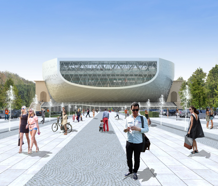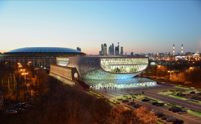
View from the "Metro Bridge", the project of nighttime illumination / Concept of reconstruction of "Luzhniki" swimming complex. DNK.
“A building of such importance and magnitude, located in such a high-profile place, required a clear-cut, accurate, and at the same time dramatic and unique statement. We appreciated that this had to become a milestone event for this city” - share the architects about their project.
The project got a thorough and detailed treatment from the imagery, functional, and construction standpoints - this is one of its strong sides, but what is also very interesting is the architects' ability to merge with the context, find in it a grain of the topical and contemporary content, and make it grow. This project is contemporary and sculptural, and at the same time, if we may say so, it is extremely appreciative of the legacy of the 1950's and its immediate surroundings. On the one side, in their project, the architects kept intact everything that was possible to keep intact from the authentic 1956: the bow of the walls, the figurative relief, and the spectacular "bunches" of columns running along the side facades. On the other side, they contrastingly enhanced this classics with a plastic volume, the new parts not touching the old ones - one can easily tell them from the historical ones.
One will only have all the more exciting time finding in this contemporary project the marks that are quite contextual of the original "Luzhniki" theme. The symmetry and the reserve of the "ship" volume that is threaded onto one of the axis of the ensemble is not what in fact matters here. What really matters is the proximity of the classical column "base" and the technogenic top - something similar we can see in the building of the sports arena where the slender pylons are topped by a dome-shaped marquee that was only built in 1997. The DNK project picks up and develops the theme of opposing the old and the new that had already been introduced at the "Luzhniki" earlier - and this represents the second layer of its contextual nature: in the surroundings, the architects see beyond the mere symmetric ensemble into which they are to "inscribe" their project - they also see an inner contrast in it and take it to a higher level in their concept. Below is the detailed coverage of the project.
Julia Tarabarina
***
The town-planning ensemble of "Luzhniki"
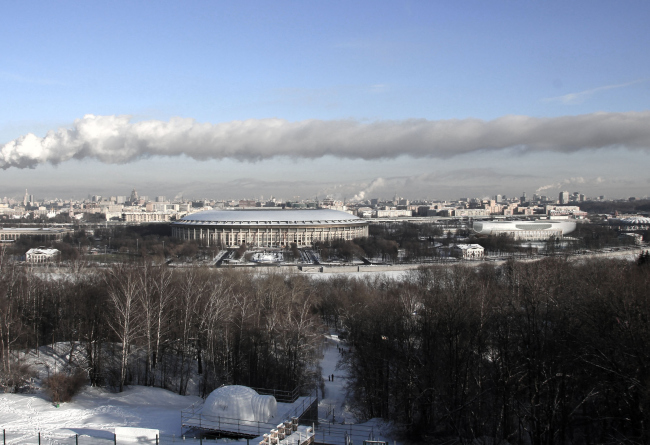
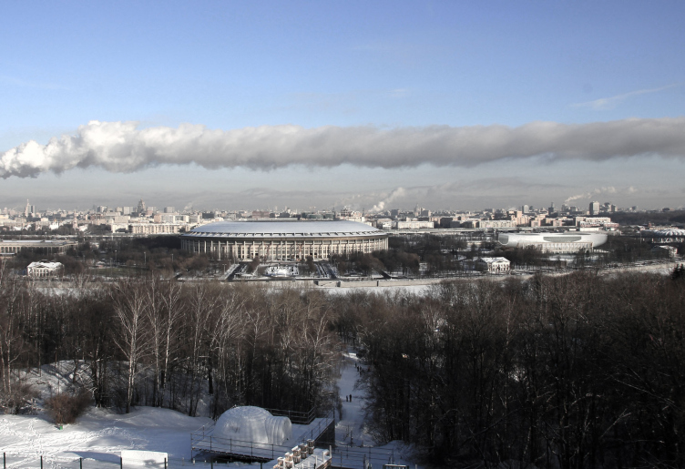
The project inserted ino the Sparrow Hills panorama / Concept of reconstruction of "Luzhniki" swimming complex. DNK.

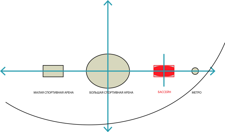
The layout of the main sports objects in "Luzhniki". The swimming complex is shown in red. / Concept of reconstruction of "Luzhniki" swimming complex. DNK.
The building of the swimming complex is plainly viewable from the Sparrow Hills, the Third Transport Ring, and many other sightseeing points. From the composition standpoint, it is "subordinated" to the marquee dome of the Major Sports Arena, and it plays the role of the "right hand" in the tripartite symmetric ensemble. The architects concentrated on the town-planning impact of the complex, and, engaged in the plastic and space dialogue with the central volume, used the stone frame of the already-existing building to host the streamlined volume that looks a lot like a ship - of the sea or maybe of the sky type. Its symmetrical rounded shape agrees with the dome of the Arena, simultaneously supporting it with its considerable mass; the place of the swimming complex in the ensemble becomes a little more prominent than it used to be, even though it does not in the least claim the gigantic magnitude of the Arena. Moreover, the symmetry of new volume agrees with the symmetry of the historical facades of the preserved outline of the building of the complex.
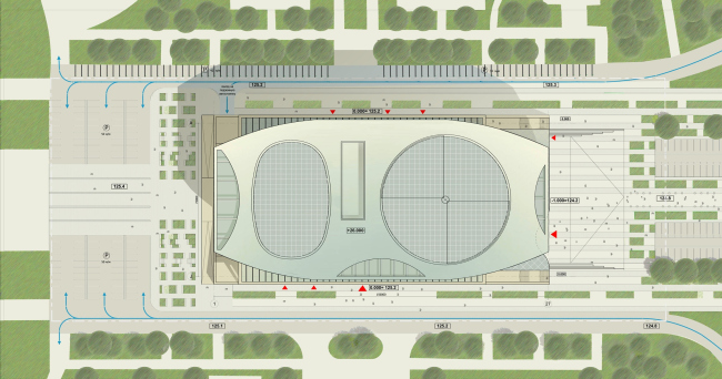
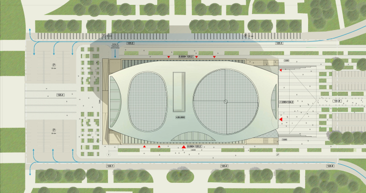
Master plan / Concept of reconstruction of "Luzhniki" swimming complex. DNK.
The basic town-planning idea is supported by the concept of improvement and by the master plan of the land site. According to authors' concept, the visitors must move from the metro station and along the main axis that connects the complex with the Arena (and further on - the Major Arena to the Minor Arena); they emphasized the axis with the paving pattern and the nighttime illumination. The lanes of trees, together with the chain of fountains, are meant to create the atmosphere of aqueous element already on the threshold of the swimming complex. The smooth lowering of the level of the square before the main entrance symbolizes gradual immersion into the world of water elements.
Image and character... clarity and transparency.
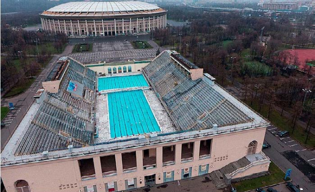
"Luzhniki" swimming complex, current state / Concept of reconstruction of "Luzhniki" swimming complex. DNK.

Concept of shape formation: the space is inverted into a shell / Concept of reconstruction of "Luzhniki" swimming complex. DNK.
While creating the "ship" image, the architects proceeded from the properties of the space that was formed by the spectator's stands of the outdoor pool. Totally, there are three spectator's stands; from the fourth side, the pool opens up in the direction of the Major Arena - the new volume was not formed just out of the blue, but based on the inner properties of the "original" space.
“In our project, what we do is we transform this space into the cup-shaped streamlined facade shell that rests “on the ship's slipway” of the existing gallery with the colonnade - the authors explain. - the internal structure is formed around the large atriums with fully glazed tops whose axis are oriented to the Major Arena and the Third Transport Ring, the cantilever parts of the building forming on the inside the "terrace" spectator stands of the water park. Thus we preserve the three-dimensional feel of the historical building of the complex, in spite of the modification of function, volume and form”.

Project' s logo / Concept of reconstruction of "Luzhniki" swimming complex. DNK.
The main plastic design concept was reflected in the logo of the new building proposed by the authors.
“There appears a distant association with the ship-building” - the authors tentatively comment: “yacht, liner, ark” - they soon specify. The ark comes in very handy on this list - if we just stir our imagination a little bit, we will see the great Noah’s ark, and we will see a picture of water receding and the ark finding a convenient place to rest, complementing the pedestal. Such contrast would have attracted a lot of attention from the Muscovites and guests of the nation's capital…
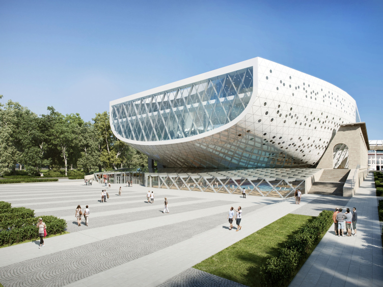
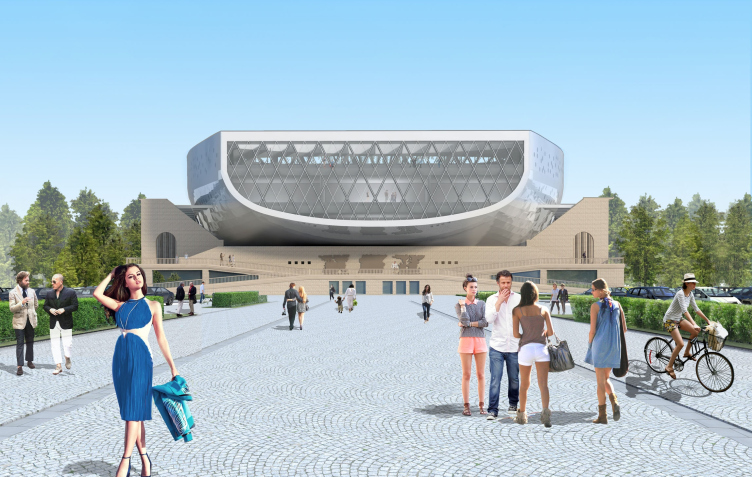
However, the comparison to a spaceship looks more apt in this case: the light curved lines, the neat, but nevertheless intricately curling surface - and the window of the imaginary "captain's feeling" turned to the Komsomolsky Avenue and subordinated to the main axis, upon which the volume is strung, and which leaves no doubt that the Eastern facade is in fact the main one (the entrance located on the left is accentuated with a smooth recession).

Main entrance / Concept of reconstruction of "Luzhniki" swimming complex. DNK.

View from the metro station / Concept of reconstruction of "Luzhniki" swimming complex. DNK.
The architects also developed the project of night illumination that develops their central idea: they emphasized the classicality of historical part by the warm light, after isolating the rhythm of the columns of the gallery and the facade relief. The illumination of the cup accentuates the contemporary status of its rounded form. And as for the gigantic convex and bright cantilever of the main facade - at nighttime it would reflect the flares and even the silhouettes of the swimming people from the water park at the first floor (where the baby zone is located). External illumination alternates with the internal glow of the large glass panes; showing through, the triangular grid of the internal structure contrasts with the curves of the external surfaces, sharpening the feelings and adding to the large-scale shape some ethereal twist.
Dialogue of the new and the old
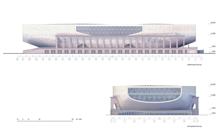
In accordance with the contest specifications, the architects kept intact the classical design of the northwest wall with its bas-reliefs and colonnades of the north and south (side) walls. The dynamic new volume fit itself into the perimeter without even so much as touching the old walls.
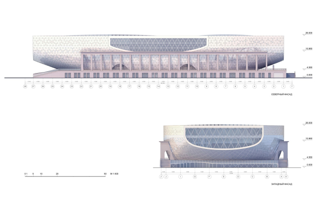
North and West facades / Concept of reconstruction of "Luzhniki" swimming complex. DNK.

View from the Arena / Concept of reconstruction of "Luzhniki" swimming complex. DNK.
“The warm and bright hue of the new volume's shell works in a dialogue with the classic terracotta of the facades of the historical part - the architects share - the space between the curvilinear surface of the new volume's facade and the galleries' colonnade from the north and from the south goes a long way to keep the image of the old spectator stands of the pool running along the colonnade. The interaction of the old and the new is, thus, achieved not by addition or subordination of one part to another - rather, it is based on a dialogue of the equivalent and mutually complementing parts. The spaces of galleries behind the colonnades operate in the summertime as the open-air terraces for the visitors of the swimming complex and as a cafe from the southern side - it is open for the general access from the northern side”.
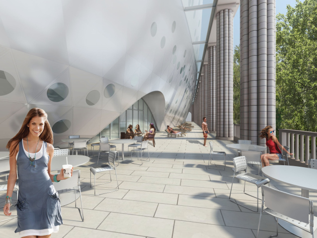
View of the gallery / Concept of reconstruction of "Luzhniki" swimming complex. DNK.
Prospects of implementation (structure and budget)
The authors also met the organizational requirements of the competition: it was required that the participants provide a developed design concept and budgetary estimation, so that after the completion of the contest it would be immediately possible to embark on further design and subsequent building.
Below, the DNK architects share in detail about the constructive solutions employed in their project:
“The budgetary estimation of primary constructions and facade finishing showed that our project actually met the parameters designated by the organizers. Moreover, understanding the uniqueness of our solution, we, in order to provide a backup, counted the production of our facades by three different manufacturers, both Russian and foreign.
The structures for our project were developed by the group of Russian engineers under the most experienced designer Vladimir Ilyich Travush's supervision. And in spite of the conceptuality of the building's form, its design concept is rather simple and totally realistic.

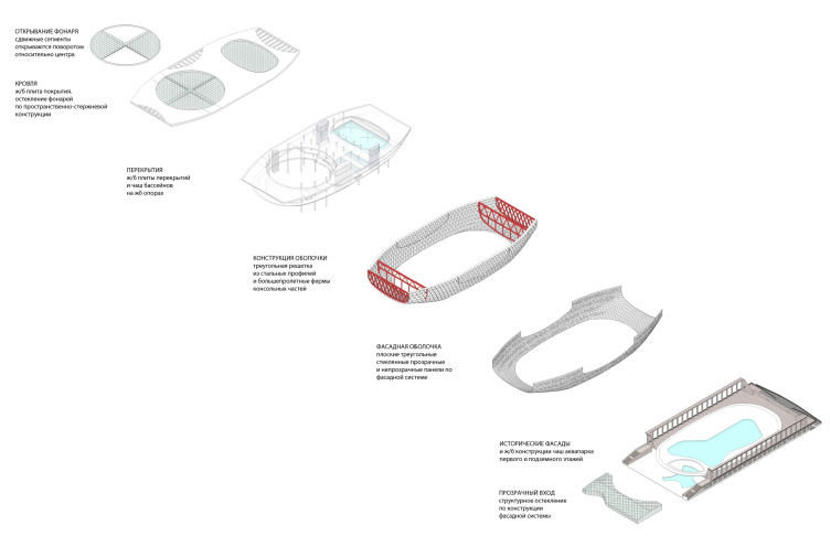
Structural solutions / Concept of reconstruction of "Luzhniki" swimming complex. DNK.
The internal design concept of the building is based on the ferroconcrete monolithic body that consists of the columns of different section; the walls of vertical communications also function as the stiffening core. The slabs of the intermediate floors, including the pool cups are reinforced concrete; they are based upon this framework. For the cantilevers, the architects provided long-span girders that also function as the bindings over the upper belts of the bearing retina. Further on, upon this steel framework, the facade coating is fastened.
The transparent coatings of the atriums (the span of one of them is 36*54 m, the other being 60 m in the diameter) are made of the three-dimensional pivotal construction.
In accordance with the specifications, the building also provides for the pull-out roof over the water park. Two out of four segments of the round light are installed at a little higher level and can be pulled out. Folds are shifted at a 90° turn relative to the center of the circle above the fixed segments, opening the dome by 45%. The displacement of the folds is done in the horizontal plane by the guide ring rails, located in the circle of the cupola and near its center.

Elements of the facade / Concept of reconstruction of "Luzhniki" swimming complex. DNK.
The external walls of the volume of the “cup” are in fact the carrying lattice steel frame of the shell with a thickness of 1,8 meters and the size of the cell of 3 meters. The three-dimensional construction of the shell helps to provide cantilever protrusions with a length of 36 meters. It was planned that from the outside the shell would be coated with flat panels of two different degrees of transparency but of the same triangular shape. 15% of the panels are meant to be fully transparent to function as insulating glass: the outside pane, partially painted white around the circular "window" will form a semi-transparent pattern. In the interior such panels are perceived as bull's eyes. The panels are fastened to the system of facade structural glazing, which is fixed to the carrying lattice frame of shell. 85% of panels are opaque. They are installed together with insulating sandwich panels, closing them out.
Internal Structure. Atriums and courtyards

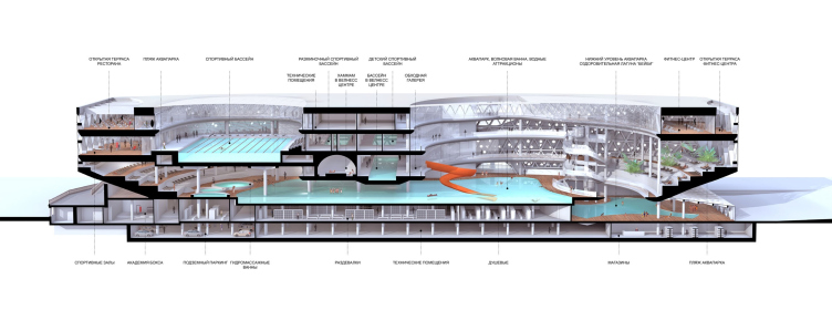
3D-section along the longitudinal axis / Concept of reconstruction of "Luzhniki" swimming complex. DNK.
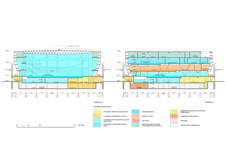
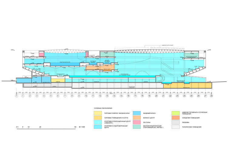
On the inside, the swimming complex is divided into two parts with different functions grouped around two large atriums with translucent lamps. This space is transparent: being in one of its parts, one can see the other: the wellness, fitness, and the kids' pool are viewable directly from the water park, while from the swimming pool one can see the gyms and the restaurant. The connection of all the ground-based zones and their free accessibility is also ensured by the central core that consists of the panoramic elevators and the main stairway. These can be used by any of the visitors so as to be introduced to the structure of the complex or to get on the spectator platforms of swimming pool. Further, on the floors, the visitors will meet the reception desks of the various zones of the complex. The restaurant and the fitness center are also accessible from the outside; they have their own elevators and independent entrances. The “wet zones” (aqua and wellness centers, as well as sports swimming pools) are interconnected by a "dry" vertical nucleus: having undressed at the bottom level, one can move around these areas in his or her swimming garments.
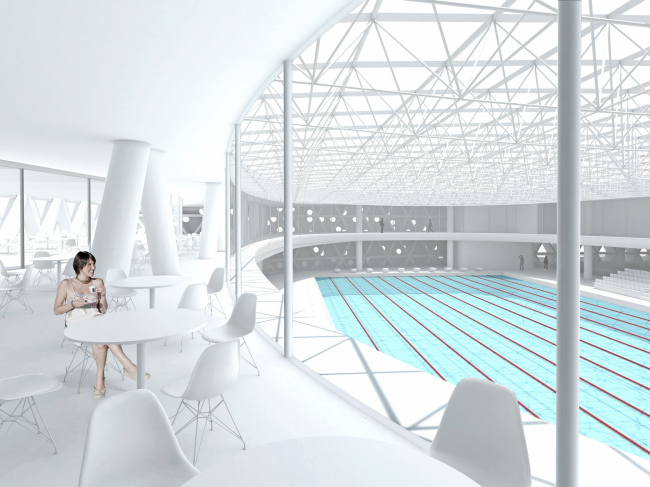
View of the swimming pool from the restaurant / Concept of reconstruction of "Luzhniki" swimming complex. DNK.
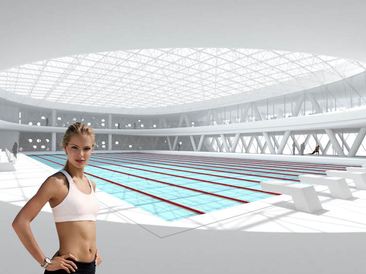
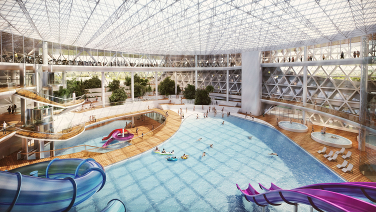
The restaurant hall is organized in such a way as to give the maximum number of guests an opportunity to enjoy the beautiful scenery. The indoor stained-glass panel that opens up to the double-height space of the sports section, give the guests of the restaurant an opportunity to watch the competitions and practices below.
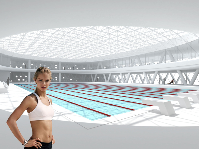
Interior of the sports swimming pool / Concept of reconstruction of "Luzhniki" swimming complex. DNK.
Function
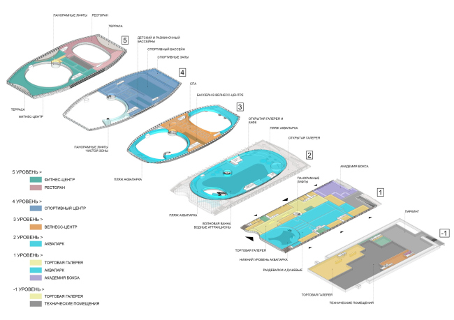
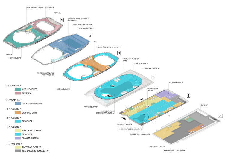
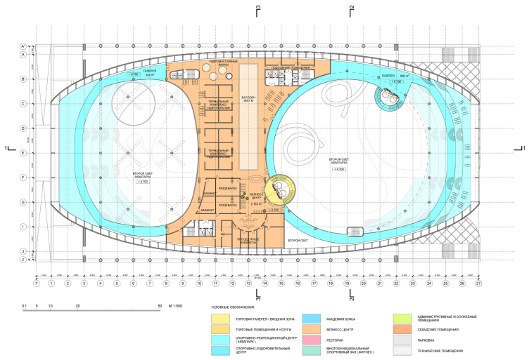
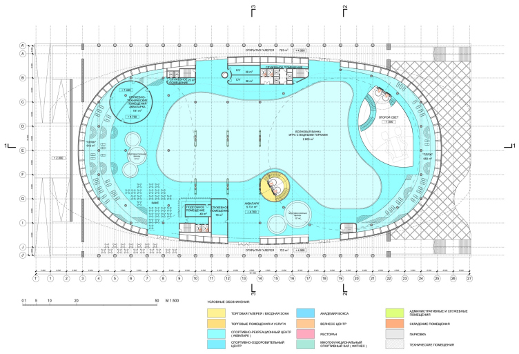
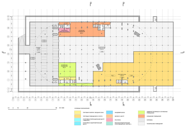
Functional layouts / Concept of reconstruction of "Luzhniki" swimming complex. DNK.
The building of the swimming center includes: a water park with a wellness center, a sports center with a 50-meter swimming pool and kids' practice ones, a fitness center, a restaurant, and a shopping gallery with shops and cafes.
Generally, when they were organizing the functions, the architects guided themselves on the specifications, but they were still able to introduce some improvements of their own that would help the visitors to easier find their way around inside the building: moved from the third level to the second one and closer to the water park, the wellness center became the continuation of the terrace beaches. As for the sports pools, however, the authors raised them to be on the same level with the practice gym - thus separating sports and entertainment over the different horizontals. Under the conditions, when the upper mark of building was rigidly fixed, the described improvement made it possible to increase the ceiling height in the water park, thus making it much more spacious.
Scenery spots and orientation in the cardinal directions
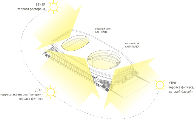
Cardinal directions orientation / Concept of reconstruction of "Luzhniki" swimming complex. DNK.
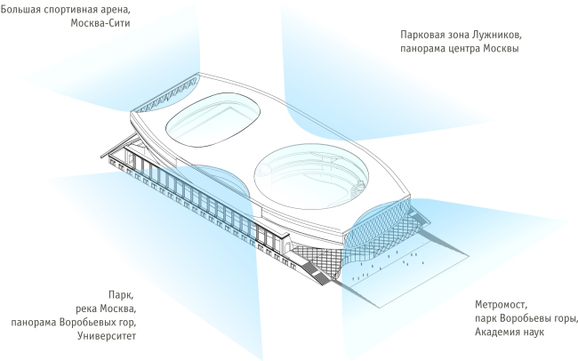
Scenery spots / Concept of reconstruction of "Luzhniki" swimming complex. DNK.
From within the building, one can see the breathtaking views of the surrounding scenery - which the architects could not omit considering when forming the insides structure of the functional zones and terraces. The architects also took into consideration the building's orientation in the cardinal directions: the restaurant in the western part got the views of the sunset, the Major Arena, and the Moscow City - augmented by the exit to the southern terrace. The eastern part includes the fitness center and the multifunctional gym with a panoramic view of the Leninsky Avenue. On the south, there is the fito-bar and the terrace that commands a fine view of the Sparrow Hills.
Interior
In the interior solutions we tried to follow the general concept of project. Bright, dynamic and at the same time comfortable and suggestive of leisure, their atmosphere can be associated with the images of contemporary yachts and cruise liners”.
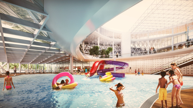
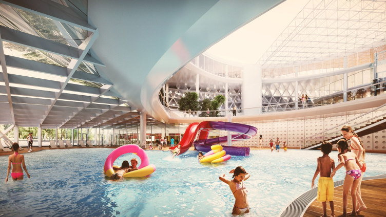
View of the first floor of the water park / Concept of reconstruction of "Luzhniki" swimming complex. DNK.

Interior of the water park / Concept of reconstruction of "Luzhniki" swimming complex. DNK.
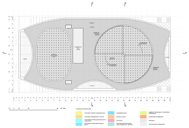
Roof layout / Concept of reconstruction of "Luzhniki" swimming complex. DNK.
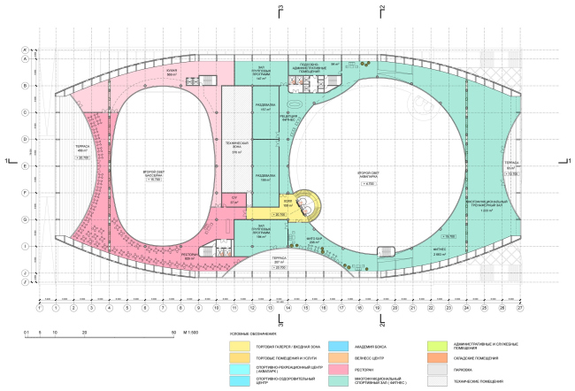
Fifth level / Concept of reconstruction of "Luzhniki" swimming complex. DNK.
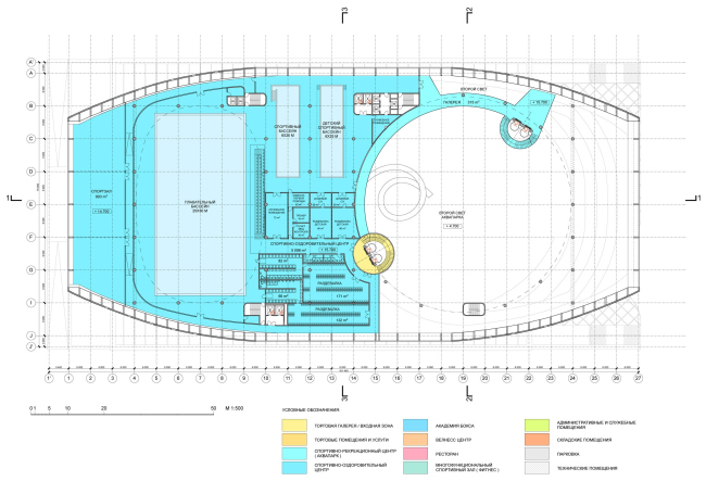
Fourth level / Concept of reconstruction of "Luzhniki" swimming complex. DNK.

Third level / Concept of reconstruction of "Luzhniki" swimming complex. DNK.

Second level / Concept of reconstruction of "Luzhniki" swimming complex. DNK.

First level / Concept of reconstruction of "Luzhniki" swimming complex. DNK.

Section 2-2 and 3-3 / Concept of reconstruction of "Luzhniki" swimming complex. DNK.
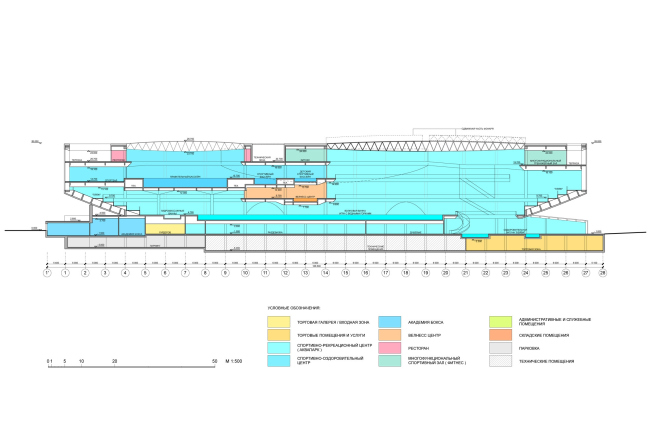
Section 1-1 / Concept of reconstruction of "Luzhniki" swimming complex. DNK.


