По-русски

​Sergey Oreshkin: our motto is pure architecture that keeps its identity with a healthy share of naivety.

The leader of A.Len Architects Sergey Oreshkin shares about the evolution of his company, working in the regions, and defending his creative ego.

26 June 2014
Interview
mainImg

Archi.ru:
– How did it all start for A.Len? 

Sergei Oreshkin:
– In the west, it is often the case that an architect makes it big out of the blue, and pretty quick. Many of the famous European architectural companies made themselves known via various competitions when still in the budding years – Bjarke Ingels from BIG, the guys from Snøhetta, to name but a few. Another group consists of large companies that came around after the Second World War: gmp Architekten, Foster, and so on. These were created by people who are well into their seventies now. Russia, on the other hand, is a different matter – we have different ways of growing. For example, we've got architects who made it big after they landed a job at this or that project institute because they quickly secured large-scale serious projects. This is one narrative. The other narrative – and this is how it worked for A.Len – is when a company grows by degrees: you start with designing small private residences, then your orders grow ever bigger until you get to the peak of your career, which I hope is our case. I began studying architecture at 14 (college-work-army-university), and finished at 28; now I am 54. Right after I graduated from the university (probably, I looked mature still at that tender age) I was offered a position of the chief architect of the cities of Vologda and Cherepovets but I opted for the project institute where, it should be said, they valued me very highly. Meanwhile, after I started my own company [A.Len was created in 1991 – editor’s note] at the outset of our career we had to do small-time orders – private residences, little settlements, and we never were out of work. This was a great educational experience for us, and in this connection I often recollect Frank Lloyd Wright whose career was a revelation to me. The path of Wright has something in common with ours, when you know the author for his mature works, and then you learn that he designed private residences in his formative years.

– In which direction does your company evolve, and how would you describe the current stage of your development?

– The question that I am asking myself today most of all is whether we will be able to keep up the further growth of our company in spite of all the economic crises that keep shaking this country. I am also worried if I will have enough health and creative energy to face the new challenges. You grow by degrees – experience comes with years, and only way later on down the line you begin to feel at home with the profession, begin to know what should be done and how, and the difficulties of construction no longer scare you away. Today I have a feeling that we are indeed getting to a whole new level. It’s strange but this economic crisis also brought a feeling of relief to us. Maybe it’s because you cannot make any forecasts anymore: we have work – fine, we don’t – no problem, we will create some ourselves. Today, we design things the way we want. If, at the moment, the client is not OK with what we are showing to him, that’s alright as well because we’ll be able to prove our point later; if the client likes what we do – great! Such attitude helps us to elevate our company to a higher level. If you try too hard to please the client you will hardly be able to get the best result you’re possibly capable of. Luckily, today’s clients have also changed for the better – they are ready to listen to what we say. And as for the projects that can possibly spoil our portfolio and be detrimental to our reputation – we just don’t do them. Right now, we have a great period, and we’ve got some young talent, the guys that really live on architecture. I would say that we are going through a phase of “defending our creative ego”.

– And what is the essence of your creative ego?

– Oh, it’s the classic narrative: when you’re under forty, you want to impress people, but when you grow older and wiser you want to do things that are well-balanced, clear and dignified, and at the same time well-reasoned. But it will be a pity for me if, trying to achieve this clarity, I lose the young straightforwardness and even some certain naivety. I believe this is very important to me. When still in my college years, I was after creating unpredictable things. And today, 90% of the Russian architecture is depressingly predictable. And don’t get me wrong – an unpredictable building doesn’t necessarily have to be all lopsided or eccentric-looking, not at all! Today, we see a lot of young (and not only young) architects that, say, working in the economy-class segment, their only resource a bucket of stucco, come up with the right things. This is practically the way it was in the 1930’s when they had little resource but the architects worked with the volume, town-planning ideas, and, as a result, an unbelievable emotional effect was achieved. So, today our motto is: maturity without losing the well-balanced architecture, pure architecture that keeps its identity with a healthy share of naivety.

– The name of “A.Len” stands for “Architectural Leningrad”. Is it worth our while looking for some little nostalgic notes in it, and how did it come around, anyway?

– Our company was founded in the early 90’s when Saint Petersburg was still called Leningrad. Pretty much any company name was an acronym back then: Lenspetssmu, Lentech, A.Len, for that matter. These companies marketed themselves as regional. Later on, we decided to stick to our name, and I was never into waving my personal name around. Today, our company name clearly states that our company is not a young one.

– Do you have any favorite projects or buildings?

– I stand by my performance, and we haven’t failed a single project. There are things that grow better with time. You do have a feeling of regret from time to time when somebody gets in your way – it is either the approving organization or the construction company that is eager to make its “contribution”, and ultimately leaves the project devoid of any individuality. Sometimes we cannot convince the client that the solution which we are proposing is in fact the best one – but such instances are getting fewer and farther between because we always act in our client’s best interests.

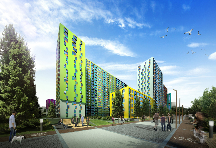
You do change with age, of course: at thirty I would have done it this way, at forty in another – nobody does architecture from nineteen to eighty in exactly the same style. The whole point that I’m trying to make is that, probably, my most favorite works are the latest ones. Because you are into them! The project of the residential complex “Me, Romantic” which we did in the economy class is something that I really like. It was underestimated but I already noticed that some of the ideas that we came up with when we were designing that project have already inspired some of my architectural colleagues.


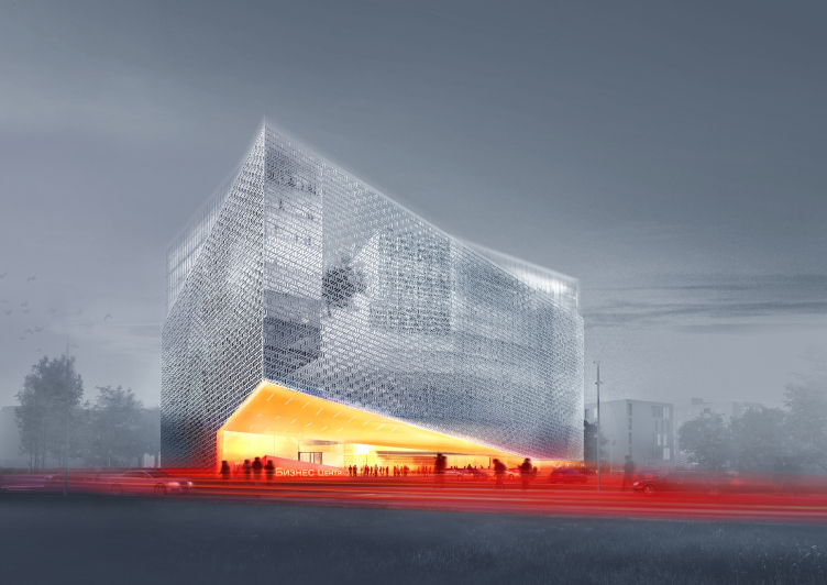
I would also mention the Gasprom business center on the Varshavskaya Street – its morphology has already been tested by various architectural teams, each one of them doing it in their own unique way: this is a grid shell inside of which we placed a huge ball of volumes. It is a rather mysterious project, just as its client.


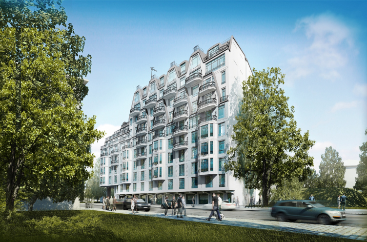
Sometimes you have a nostalgia trip and try your hand at Art Nouveau: we are currently doing a house for YIT developers in the Chapaeva Street – it’s the fairy tale sort of a “castle” house, a pileup of volumes and masses, this “knitted” or “lacy” kind of architecture. Then, there is this romanticism of the Petrograd side, and I sometimes feel like working in this line. This is not quite our approach because we associate ourselves more with the avant-garde tradition but I think there is definitely something about the romanticism architecture.


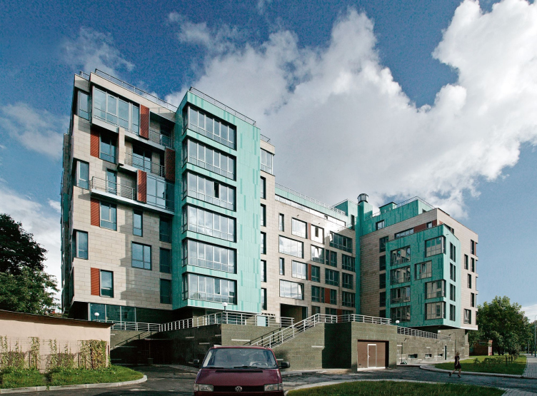
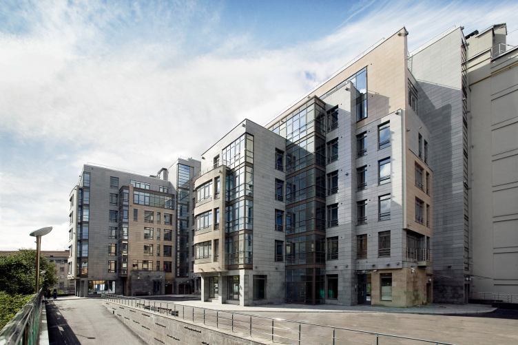
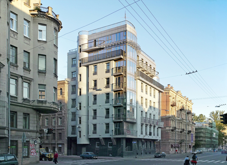
Then there is this house at the Konstantinovsky Avenue – we drew it like an obvious piece of European modernism. We used copper and natural stone, and what we ultimately got was a very lively and picturesque façade. This house even has a fan club of its own because such architecture is rarely to be found in this city. It is mostly drawn by quite young architects that do not even always get to doing the real city projects, while if we are to look for acclaimed architects working in this line, they are only to be found in Moscow: Skuratov, Levyant, Skokan. The modernism of this house is based on the Russian avant-garde and constructivism, 3D design, and working with the form.


Another interesting project is the house in the Graftio Street – it is a “slab” of a house, yet, at the same time, it’s a “cabbage” of a house – it has a lot of layers, each of which slightly peels off and exposes the next one, the depth of the space. It has something from Paul Rudolph, something from Richard Meyer. This house keeps on winning various awards, and last year it was awarded the Diamond Diploma of The Worldwide Club of Petersburgers


– Do you enjoy building your projects in the historical center?

– Yes, of course! This is the place where the magic aura gets straight under your skin. There are two basic approaches here: either you want to stand out from the historical background or you want to merge with it. It’s either contextual or non-contextual work. And it is the non-contextual architecture that usually gets slammed, with the architect labeled as a parvenu, but, on the other hand, you can recall positive examples as well: the “dancing house” by Frank Gehry in Prague, or the “mirror house” by Hans Hollein in Vienna across from the cathedral. There is also another approach: you come to the place and find out if it’s in need of accentuation. If it is, you come up with some sort of a centerpiece, and if the environment is saturated as it is, and you see that building something bold would lead to over-saturation, you try to handle it as delicately as you can. For example, we did this “Egoist” house – there is a really rich environment there, everything is decorated, and we wanted to ultimately get a peaceful house; Leonid Lavrov later on termed it as “eclectic constructivism”. In effect, it was indeed originally designed as a constructivist building but later on in the course of the negotiation with the city officials and the Committee on State Control, Use and Protection of Historical and Cultural Landmarks we had to listen to them and make a few changes so as the house would meet their requirements.


– You work a lot in the regions. What’s different about working in the regions from working in Saint Petersburg?

– We’ve been getting a lot of invitations recently – Saransk, Ufa, Kazan, Yaroslavl, Novosibirsk – and these are the result of our professional acclaim. For the regional clients this means prestige; sometimes they even mistake us for a Moscow company. In the regions, a Saint Petersburg architect gets a lot more respect than he does in his hometown. In this city, the client may start teaching you how to draw façades and do all sorts of nasty stuff; it’s different in the regions.

– What are you working on now? 

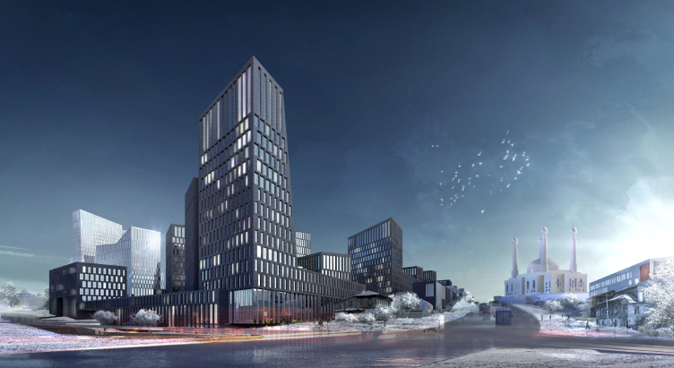
– Currently, we are doing a large-scale residential area in Ufa; it’s a very interesting project, and I’m sure it will turn out great. We do not get down to actual work until we have studied a whole lot of historical literature in order to find out just what had been going on upon this particular land site in the past centuries. In Ufa, we got a location that for some reason would scare the local architects away. It turned out that there used to be a Kremlin on that spot, a few rivers would bleed into one, a new 3000-strong mosque had recently been built, there is a mountain nearby, everything is pretty odious, and the terrain is just terrible, to cap it all. But we still entered that competition. Ufa has a very progressive atmosphere in it; if the city keeps up the great work it will in no time rival Moscow in terms of architecture. People there draw some really right things. This is the way that back in the day the strong Nizhny Novgorod school was formed which has seen better days, regretfully. Under the governor Boris Nemtsov and the then-main-architect-of-the-city Alexander Kharitonov it was flourishing. Today the bright architectural works in Nizhny Novgorod are ever fewer, and at those days it was brimming with architecture – a comparatively small city with about a dozen of competing architectural companies, five of them being really good. Currently, Ufa is in the same situation as Nizhny Novgorod was about 15 years ago.


– What is your opinion of the architectural competitions and contests?

– For the last two years, we've been actively participating in competitions, no fewer than 10 ones a year. We appreciate this experience: an average competition does not weigh us down at all, we can do whatever we want, and some of the competition projects come out really brilliant.

– You have a Livejournal blog (oreshkin.livejournal.com), why did you decide to start it?

– We process a very large flow of information, some of which, I believe, could be interesting to a large number of people. I make a lot of posts when we do a competition project – this is the first sign that we are up to something; and some of the materials “leak” into our blog. This is a great tool; it is chronologically organized, it is current, and you form the subject with the tags. Our Livejournal blog is also an education tool for the budding architects, and my colleagues read it too. Initially, it was my personal blog about my work in A.Len but now it predominantly covers the materials that serve as the basis for the architectural design. We select the architecture that does not bring about any issues in terms of quality. If somebody is interested, they could read our blog and see where A.Len is going, what we like and what we don’t like.

26 June 2014

Headlines now
The Golden Crown
The concept for a dental clinic in Yekaterinburg, developed by CNTR Studio, revolves around the idea of a “mouth full of gold”: pristine white porcelain stoneware walls are complemented by matte brass details. To avoid an overly literal interpretation, the architects focused on the building’s proportions, skillfully navigating between sunlight requirements and fire safety regulations.
Flexibility and Integration
Not long ago, we covered the project for the fourth phase of the ÁLIA residential complex, designed by APEX. Now, we’ve been shown different fence concepts they developed to enclose the complex’s private courtyards, incorporating a variety of public functions. We believe that the sheer fact that the complex’s architects were involved in such a detail as fencing speaks volumes.
A Step Forward
The HIDE residential complex represents a major milestone for ADM architects and their leaders Andrey Romanov and Ekaterina Kuznetsova in their quest for a fresh high-rise aesthetic – one that is flexible and layered, capable of bringing vibrancy to mass and silhouette while shaping form. Over recent years, this approach has become ADM’s “signature style”, with the golden HIDE tower playing a pivotal role in its evolution. Here, we delve into the project’s story, explore the details of the complex’s design, and uncover its core essence.
Gold in the Sands
A new office for a transcontinental company specializing in resource extraction and processing has opened in Dubai. Designed by T+T Architects, masters of creating spaces that are contemporary, diverse, flexible, and original, this project exemplifies their expertise. On the executive floor, a massive brass-clad partition dominates, while layered textures of compressed earth create a contextually resonant backdrop.
Layers and Levels of Flight
This project goes way back – Reserve Union won this architectural competition at the end of 2011, and the building was completed in 2018, so it’s practically “archival”. However, despite being relatively unknown, the building can hardly be considered “dated” and remains a prime example of architectural expression, particularly in the headquarters genre. And it’s especially fitting for an aviation company office. In some ways, it resembles the Aeroflot headquarters at Sheremetyevo but with its own unique identity, following the signature style of Vladimir Plotkin. In this article, we take an in-depth look at the United Aircraft Corporation (UAC) headquarters in the Moscow agglomeration town of Zhukovsky, supplemented by recent photographs from Alexey Naroditsky – a shoot that became only recently possible due to the fact that improvements were finally made in the surrounding area.
Light and Shadow
In this article, we delve into the architectural design of the “Chaika” house by DNK ag architects, which was recently completed in 2023 as part of the collection of signature designs at ZILArt. As is well-known, all the buildings in this complex follow a design code, yet each one is distinct. This particular building stands out not only for its whiteness and minimalism but also for the refined use of a limited number of techniques that, together, create what can confidently be called synergy.
Casus Novae
A master plan was developed for a large residential area with a name of “DNS City”, but now that its implementation began, the plan has been arbitrarily reformatted and replaced with something that, while similar on the surface, is actually quite different. This is not the first time such a thing happens, but it’s always frustrating. With permission from the author, we are sharing Maria Elkina’s post.
Treasure Hunting
The GAFA bureau, in collaboration with Tegola and Arkhitail, organized an expedition to the island of Kilpola in Karelia as part of Moskomarkhitektura’s “Open City” festival. There, amidst moss and rocks, the students sought answers to questions like: what is the sacred, where does it dwell, and what sustains it? Assisting the participants in this quest were landscape engineer Evgeny Levin, artist Nicholas Roerich, a moose, and the lack of cellular connection. Here’s how the story unfolded.
Depths of the Earth, Streams of Water
In the Malaya Okhta district, the Akzent building, designed by Stepan Liphart, was constructed. It follows a classic tripartite structure, yet it’s what you might call “hand-drawn”: each façade is unique in its form and details, some of which aren’t immediately noticeable. In this article, we explore the context and, together with the architect, delve into how the form was developed.
Fir Tree Dynamics
The “Airports of Region” holding is planning to build an airport in Karachay-Cherkessia, aiming to make the Arkhyz and Dombay resorts more accessible to travelers. The project that won in an invitation-only competition, submitted by Sergey Nikeshkin’s KPLN, blends natural imagery inspired by the shape of a conifer seed, open-air waiting spaces, majestic large trees, and a green roof elevated on needle-like columns. The result is both nature-inspired and WOW.
​A Brick Shell
In the process of designing a clubhouse situated among pine trees in a prestigious suburban area near Moscow, the architectural firm “A.Len” did the façade design part. The combination of different types of brick and masonry correlates with the volumetric and plastique solutions, further enhanced by the inclusion of wood-painted fragments and metal “glazing”.
Word Forms
ATRIUM architects love ambitious challenges, and for the firm’s thirtieth anniversary, they boldly play a game of words with an exhibition that dives deep into a self-created vocabulary. They immerse their projects – especially art installations – into this glossary, as if plunging into a current of their own. You feel as if you’re flowing through the veins of pure art, immersed in a universe of vertical cities, educational spaces – of which the architects are true masters – and the cultural codes of various locations. But what truly captivates is the bold statement that Vera Butko and Anton Nadtochy make, both through their work and this exhibition: architecture, above all, is art – the art of working with form and space.
Flexibility and Acuteness of Modernity
Luxurious, fluid, large “kokoshniks” and spiral barrel columns, as if made from colorful chewing gum: there seem to be no other mansion like this in Moscow, designed in the “Neo-Russian-Modern” style. And the “Teremok” on Malaya Kaluzhskaya, previously somewhat obscure, has “come alive with new colors” and gained visibility after its restoration for the office of the “architectural ecosystem” as the architects love to call themselves. It’s evident that Julius Borisov and the architects at UNK put their hearts into finding this new office and bringing it up to date. Let’s delve into the paradoxes of this mansion’s history and its plasticity. Spoiler: two versions of modernity meet here, both balancing on the razor’s edge of “what’s current”.
Yuri Vissarionov: “A modular house does not belong to the land”
It belongs to space, or to the air... It turns out that 3D printing is more effective when combined with a modular approach: the house is built in a workshop and then adapted to the site, including on uneven terrain. Yuri Vissarionov shares his latest experience in designing tourist complexes, both in central Russia and in the south. These include houseboats, homes printed from lightweight concrete using a 3D printer, and, of course, frame houses.
​Moscow’s First
“The quality of education largely depends on the quality of the educational environment”. This principle of the last decade has been realized by Sergey Skuratov in the project for the First Moscow Gymnasium on Rostovskaya Embankment in the Khamovniki district. The building seamlessly integrates into the complex urban landscape, responding both to the pedestrian flow of the city and the quiet alleyways. It skillfully takes advantage of the height differences and aligns with modern trends in educational space design. Let’s take a closer look.
Looking at the Water
The site of Villa Sonata stretches from the road to the water’s edge, offering its own shoreline, pier, and a picturesque river panorama. To reveal these sweeping views, Roman Leonidov “cut” the façade diagonally parallel to the river, thus getting two main axes for the house and, consequently, “two heads”. The internal core – two double-height spaces, a living room and a conservatory, with a “bridge” above them – makes the house both “transparent” and filled with light.
The White Wing
Well, it’s not exactly white. It’s more of a beige, white-stone structure that plays with the color of limestone – smoother surfaces are lighter, while rougher ones are darker. This wing unites various elements: it absorbs and interprets the surrounding themes. It responds to everything, yet maintains a cohesive expression – a challenging task! – while also incorporating recognizable features of its own, such as the dynamic cuts at the bottom, top, and middle.
Urban Dunes
The XSA Ramps team designed and built a three-part sports hub for a park in Rostov-on-Don, welcoming people of all ages and fitness levels. The skate plaza, pump track, and playground are all meticulously crafted with details that attract a diverse range of visitors. The technical execution of the shapes and slopes transforms this space into a kind of sculptural composition.
Proportional Growth
The project for the fourth phase of the ÁLIA residential area has been announced. The buildings are situated on an elongated plot – almost a “ray” that shoots out from the center of the area towards the river. Their layout reflects both a response to Moscow’s architectural preferences over the past 15 years, shifting “from blocks to towers”, and an interpretation of the neighboring business park designed by SOM. Additionally, the best apartments here are not located at the very top but closer to the middle, forming a glowing “waistline”.
The “Staircase” Building
In designing the “Details” residential complex in New Moscow, Rais Baishev spiced up the now-popular Moscow theme of a “courtyard” building with an idea drawn from the surrealist drawings by Maurits Escher. He envisioned the stepped silhouettes and descending slopes as a metaphysical mega-staircase, creating a key void within the courtyard that gave the project an internal “spine”. This concept is felt both in the building’s silhouette and on its façades.
Projection of the Quarter
No one doubted that the building that Vladimir Plotkin designed as part of the “Garden Quarters” would be the most modernist of all. And it turned out just that way: while adhering to the common design code, the building successfully combines brick and white stone, rhythmically responding to the neighboring building designed by Ostozhenka, yet tactfully and persistently making a few statements of its own. This includes the projection of the ideal urban development composition “14–9–6”, which can be found right next door, mathematical calculations, including those for various types of terraces (and perhaps the only reminder of the Soviet past of the Kauchuk rubber factory!), and the white “cross-stitch” pattern of the façade grid.
Domus Aurea
In this issue, we examine the “Tessinsky-1” house, designed by Sergey Skuratov and completed in 2023. Located in the middle of the Serebryanicheskaya Embankment district, at the intersection of its main streets, this house assumes a sort of “nodal” role: it not only responds to everything around it and preserves many memories of the former EMA factory within itself, but it weaves all this into a newly directed pattern, reconciling bright “gold” and dark-colored brick, largely with the help of the new, modern-yet-archaic Columba brick, which, come to think about it, is the most precious element here.
The Chimney of Nikola-Lenivets
In this issue, we are examining the “Obelisk House” designed by KATARSIS and built for the Arkhstoyanie 2023 festival. However, it was only finished later on, and this is why we are examining it now. It seems to us that after the “Obelisk House” appeared in Nikola-Lenivets, a dialogue and a few inner connections appeared between the temporary structures built here. These houses no longer look like “accidental neighbors”, more of which below.
​Periscope by the Bay
The jury awarded the second place in the competition for a public and cultural center in Petropavlovsk-Kamchatsky to the companies GORA (“Mountain”) and M4. In the consortium’s proposal, the building resembles a sperm whale with a calf swimming next to it or a periscope, whose lenses capture the most spectacular views from the surrounding landscape.
From Arcs to Dolmens
While working on the competition project for Petropavlovsk-Kamchatsky, ASADOV Architects prioritized the value of the natural and urban environment, aiming to preserve the balance of the location while minimizing the resemblance of the volume that they designed to a “traditional building”. The task was challenging, and the architects created three versions, one of which having been developed after the competition, where their main proposal took third place. However, the point of interest here is not the competition result but the continuity of creative thinking.
Hide and Seek
The ID Moskovskiy house, designed by Stepan Liphart in St. Petersburg, in the courtyards near Moskovskiy Avenue beyond the Obvodny Canal and recently completed, is notable for several reasons. Firstly, it has been realized with considerable accuracy, which is particularly significant as this is the first building where the architect was responsible not only for the facades but also for the layouts, allowing for better integration between the two. On the other hand, this building is interesting as an example of the “germination” of new architecture in the city: it draws on the best examples from the neighborhood and becomes an improved and developed sum of ideas found by the architect in the surrounding context.
The Big Twelve
Yesterday, the winners of the Moscow Mayor’s Architecture Award were announced and honored. Let’s take a look at what was awarded and, in some cases, even critique this esteemed award. After all, there is always room for improvement, right?
Above the Golden Horn
The residential complex “Philosophy” designed by T+T architects in Vladivostok, is one of the new projects in the “Golubinaya Pad” area, changing its development philosophy (pun intended) from single houses to a comprehensive approach. The buildings are organized along public streets, varying in height and format, with one house even executed in gallery typology, featuring a cantilever leaning on an art object.
Nuanced Alternative
How can you rhyme a square and space? Easily! But to do so, you need to rhyme everything you can possibly think of: weave everything together, like in a tensegrity structure, and find your own optics too. The new exhibition at GES-2 does just that, offering its visitor a new perspective on the history of art spanning 150 years, infused with the hope for endless multiplicity of worlds and art histories. Read on to see how this is achieved and how the exhibition design by Evgeny Ace contributes to it.
Blinds for Ice
An ice arena has been constructed in Domodedovo based on a project by Yuri Vissarionov Architects. To prevent the long façade, a technical requirement for winter sports facilities, from appearing monotonous, the architects proposed the use of suspended structures with multidirectional slats. This design protects the ice from direct sunlight while giving the wall texture and detail.