По-русски

"Pantheon" of QR-codes to work for "Zaryadye"

We examined the new pavilion and talked to Sergey Kuznetsov, the author of the idea of its recreation on the new spot and in the new capacity.

30 April 2014
Object
mainImg
Information pavilion of "Zaryadye" Park. Photo by Ilia Ivanov.


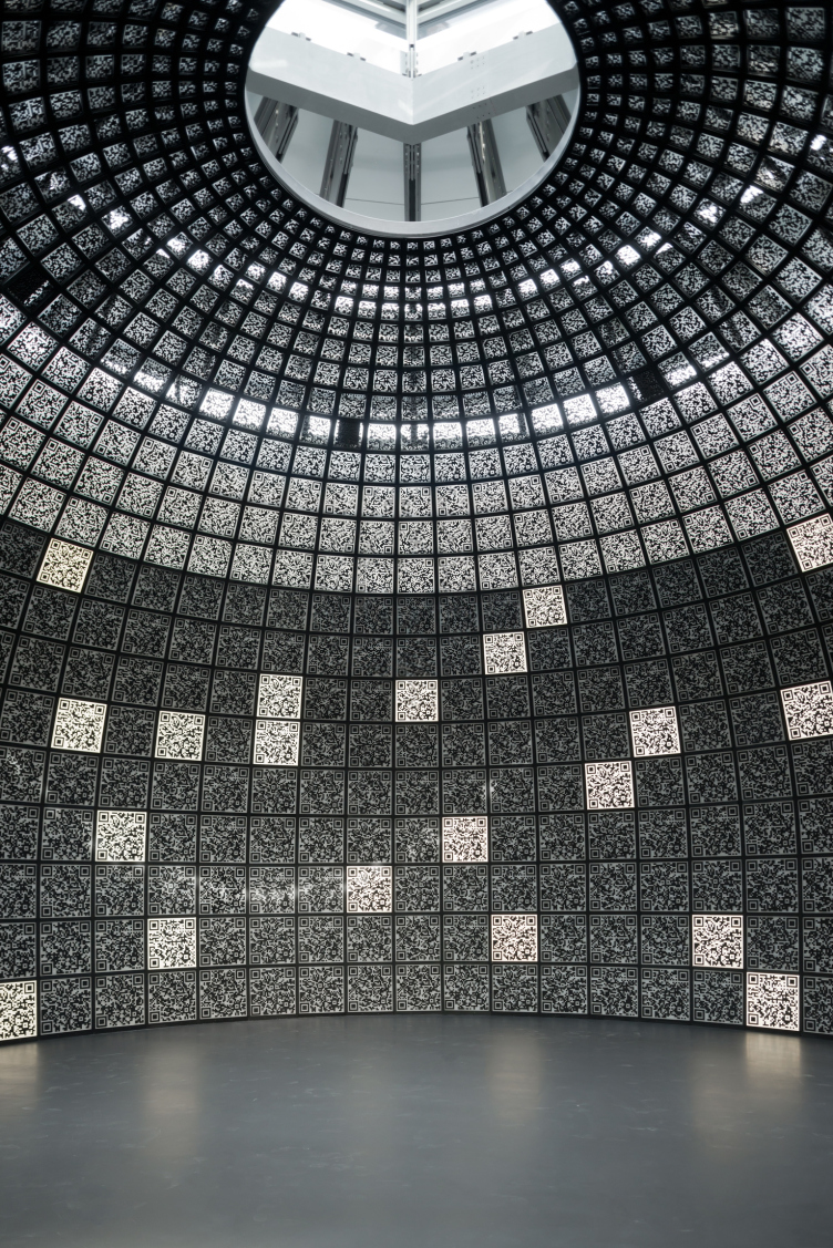
Yesterday, there took place the inauguration of the information pavilion dedicated to the project of "Zaryadye" Park. This solution seems to make a lot of sense: next to the Vassilyevsky Descent, there will appear, if not a fragment of the future park, then at least its representative. And, this new pavilion is not just any info-kiosk: with the effort from SPEECH company, it recreates a copy of the central part of the Russian pavilion at Venice Biennale 2012. 

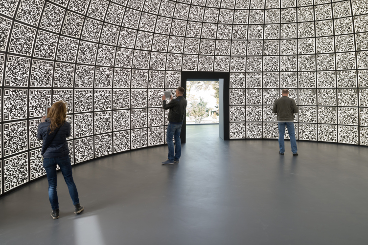
The Venice pavilion of 2012, one that caused a lot of discussion and controversial responses but still noticed by absolutely everybody (incidentally, it got a special mention from the Venice Biennale), was in fact a strikingly-looking hybrid of the classical architectural tradition and modern technology: its central part featured a veritable Pantheon composed of the squares of QR-codes - or, rather, the geometric construct of Pantheon, stripped of all the columns and εἶδος of the roman masterpiece. 

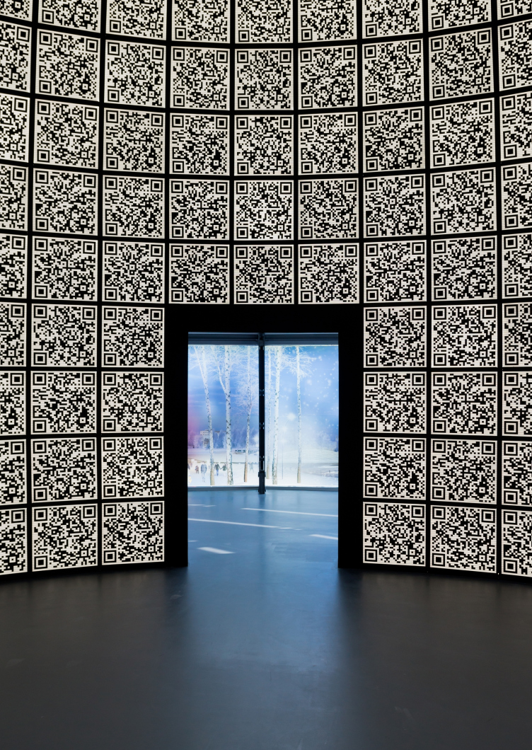
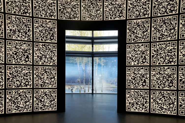
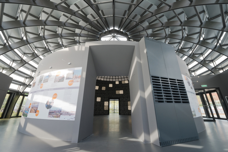
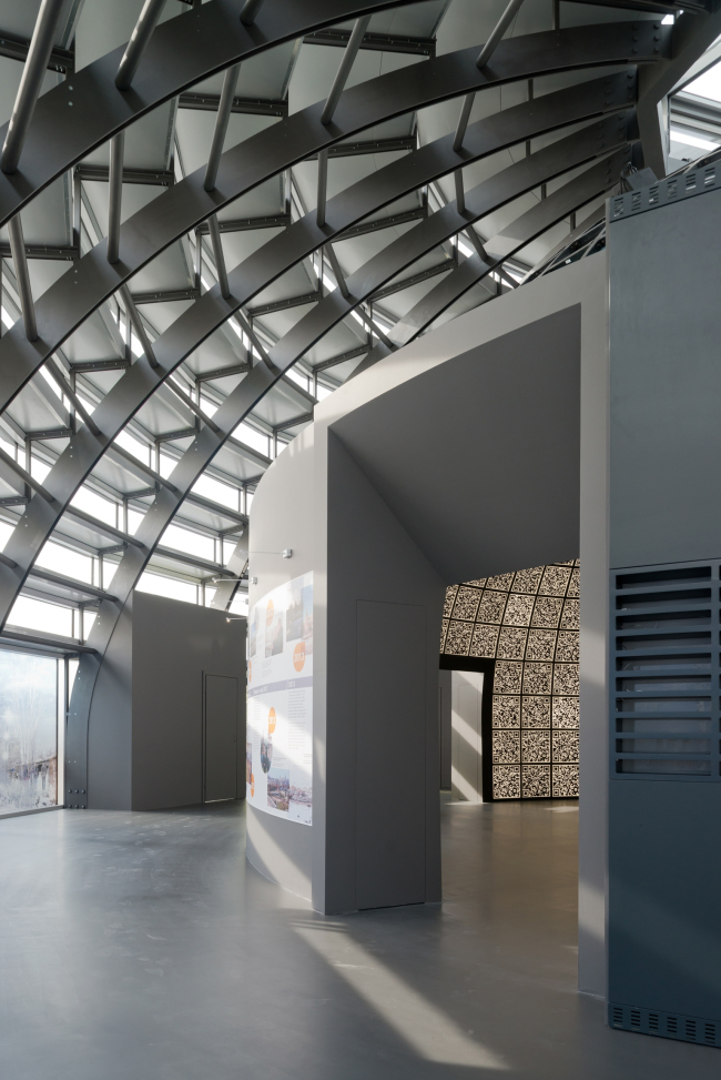
And it was this dome core of the Venetian exposition that the architects have now been able to recreate (exactly, on a 1:1 scale) in Zaryadye, filling its QR- codes with a new meaning: back in 2012, in Venice, they showed the projects of Skolkovo science town, while now the fourteen sections are dedicated to the contest projects of Zaryadye park and the history of this area, and the fifteenth tells about the recreated pavilion and its authors. The recreated pavilion became thus a fully-fledged part of the exposition. 
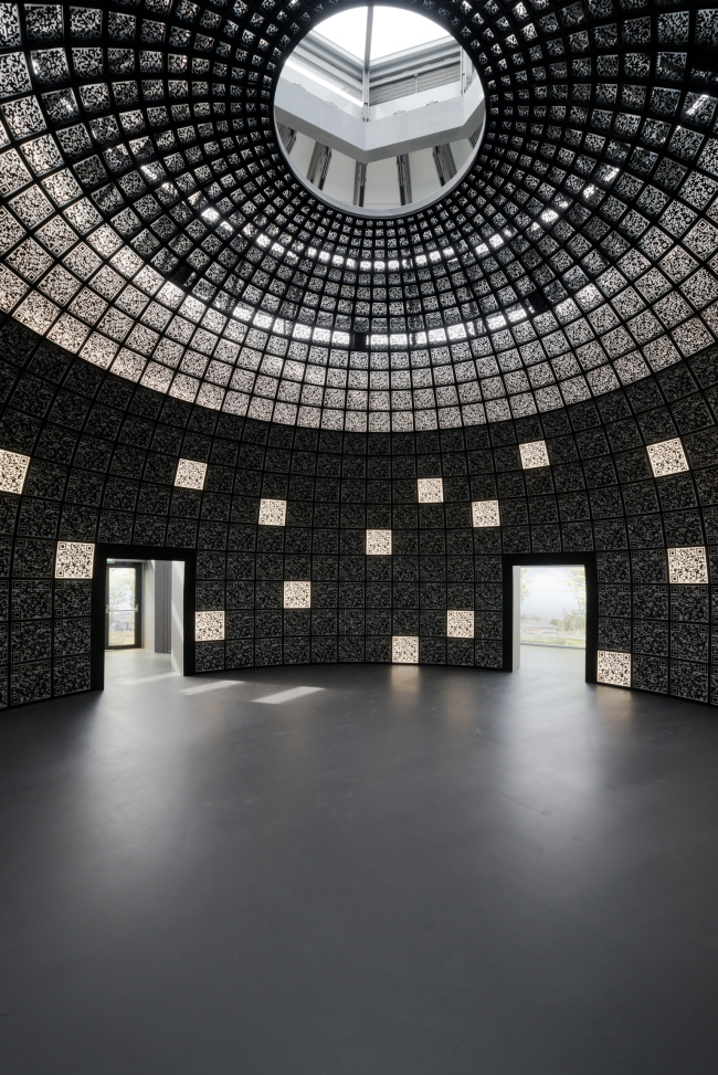
Information pavilion of "Zaryadye" Park. Photo by Ilia Ivanov.
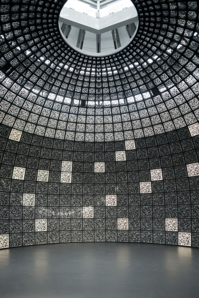
Information pavilion of "Zaryadye" Park. Photo by Ilia Ivanov.
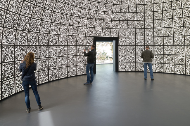
Information pavilion of "Zaryadye" Park. Photo by Ilia Ivanov.

Information pavilion of "Zaryadye" Park. Photo by Ilia Ivanov.
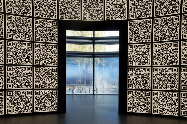
Information pavilion of "Zaryadye" Park. Photo by Ilia Ivanov.

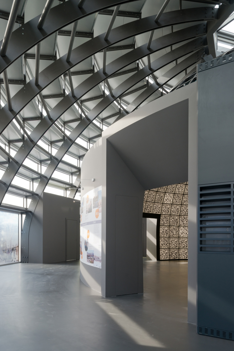
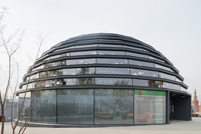
Everything looks as much - from the outside, the digital "Pantheon" looks like a valuable exhibit, it is encased into a glass-and-metal-casing that looks a bit like the Reichstag dome - the modern semi-transparent structure, supported from the inside by the powerful metallic ribs. 
Information pavilion of "Zaryadye" Park. Photo by Ilia Ivanov.
Information pavilion of "Zaryadye" Park. Photo by Ilia Ivanov.

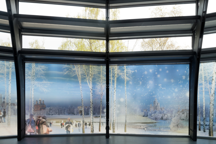
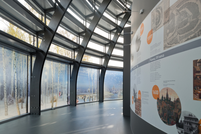
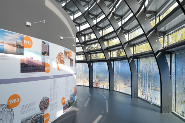
The outside casing considerably "stands back" from the walls of the inner "Venetian" hall - and this results in a spacious circular walkway that in fact serves as a second expo hall (which was not the case in Venice). The inside walls display a short history of Zaryadye, and the outside wall is pasted with semi-transparent film that displays the park, visualized by Diller&Scofidio. Backlit by sunlight, the picture looks almost like the real thing (especially when watched from the very center, through one of the three doors) - and comes into the accurately calculated game with its real surroundings: above the Saint Basil Cathedral, through the glass band, one can see the domes and the turrets of the real cathedral, the painted trees are continued by the branches of the living ones, and in the far perspective some surrealistic twist is added by the fact that half of the painted park is winter, half summer, and it's actually spring outside. If for no other reason, one must visit this pavilion to feel this play if meanings, superimposed on one another like onion peals. On the outside, incidentally, the play of reflections carries on: this is enhanced by the glittering surroundings where the glass facets reflect sometimes the cathedral, sometimes the St. Barbara Church, sometimes the Kremlin Tower, and sometimes just a photograph. 

Information pavilion of "Zaryadye" Park. Photo by Ilia Ivanov.
Information pavilion of "Zaryadye" Park. Photo by Ilia Ivanov.
Information pavilion of "Zaryadye" Park. Photo by Ilia Ivanov.
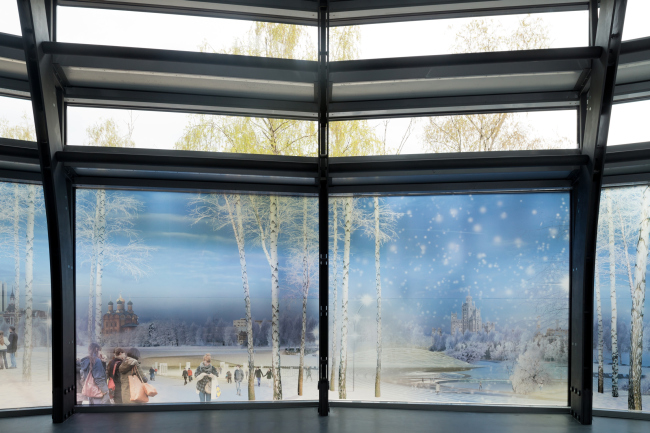
Information pavilion of "Zaryadye" Park. Photo by Ilia Ivanov.
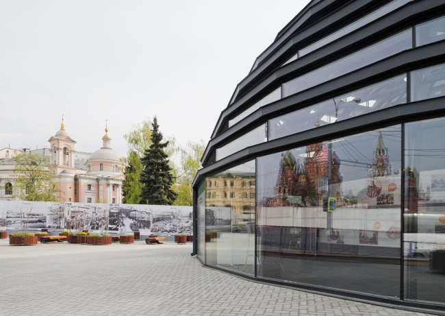
Information pavilion of "Zaryadye" Park. Photo by Ilia Ivanov.

Before the pavilion, there is a small park with flower beds and benches that enhances the impression of a "beginning park". 

The pavilion is designed to be a temporary structure but at its inauguration Sergey Kuznetsov expressed his hope that, possibly, his architecture will fit in the future park and will remain there forever. We asked Sergey Kuznetsov, the prime mover of the idea of restoring the Venetian pavilion within the framework of Zaryadye, a few questions. 

***
Sergey Kuznetsov, 
Chief architect of Moscow:

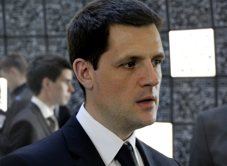
Sergey Kuznetsov at the inauguration of the pavilion in Zaryadye. Photo by Julia Tarabarina


- How was the idea born of recreating the Venetian pavilion 2012? Why specifically here and now?

- The idea occurred to me in 2013, when I, celebrating my birthday (I generally try to find myself in Venice on my birthdays) was doing a picture of the San-Marco domes. They are really dramatic; it was at that moment that I thought that such a shape would look great in Zaryadye. A dome has a great feature to it: it never conflicts with its surroundings. In relation to the outside space it is pretty universal, and inside it is dramatic... I continued working with this idea and soon came to a conclusion that if I place one dome inside of another, the way Brunelleschi did in Santa-Maria del Fiore, it will be an interesting idea. It took me about a year to implement it. The first pavilion of 2012, as is known, was developed by a fairly large team, and I was only a member of it: I was the co-curator and the co-author of the Venetian pavilion. 

Back then, the prime mover behind the whole idea was Sergey Tchoban: Gregory Revzin, Konstantin Chernozatonsky - lots of people participated in this project, to whom I want to say thank you for making thus whole thing possible. 

Recreating the pavilion on this particular spot, however, was proposed by me because at this stage I am responsible for the implementation of "Zaryadye" project. 

- Isn't there a risk that the classic idea of the dome will conflict the modernist vision of the park proposed by Diller&Scofidio?

- The way I see it, this dome is a totally today's structure. I firmly believe that the best examples of contemporary architecture bear the mark of classicism. 

- As the co-author of the first pavilion, do you have any problems with the very fact if repeating, or even cloning your creation?

- We do everything in our power to honor the history of this project and the continuity of the 2012 pavilion. One of the fifteen information sections is in fact dedicated to the Venetian pavilion. I would even say that we use the success of the Russian pavilion at the Biennale to build the new success of "Zaryadye" park. I think this is the right thing to do because history gets stored in layers - just like in Rome. 

Basically, I view the recreation of the Venetian pavilion more like carrying it over here from Venice to Moscow. Otherwise it would only have been kept on pictures and in books, not to be seen with one' sown eyes. It can be put on a par with the Montreal pavilion at the All-Russia Exhibition Center or the "Worker and a Woman Farmer" sculpture by Vera Mukhina. Now it was our turn and we recreated the Venetian pavilion 2012. 

- As a co-author of the pavilion and the author of the idea of its recreation, what would you think of its further copies? Does today's replica presuppose any further replication or does it not?

- Theoretically, you can put the "Worker and a Woman Farmer" next to the already existing one and then copy-paste them to infinity. Still, nobody would do it, of course, because this would not make any sense. Same thing here. For me, this is a one-time recreation of a specific piece of architecture. And this particular piece of architecture has every right to be considered original because all its authors are good and well, and they took part in its recreation. Should this become necessary, will will be able to use the QR-codes in a different way but the dome itself is a unique work of art, and it cannot be repeated. It's just that for some time it stood in another country and now it will stand here. 

***
Information:
The international contest for design project of the architectural concept of "Zaryadye" park was closed in November 2013. The contest was won by the consortium headed by the company Diller Scofidio + Renfro (USA), and including the landscape architects Нargreaves Associates (USA), and Russian urbanists Citymakers (Russia-Denmark).

The information pavilion in which one can find out more about the "Zaryadye" project, as well as see for himself or herself the main part of the Venetian pavilion 2012, is open on the weekdays 11 am - 8 pm, and on the weekend 10 am - 7 pm. 
Information pavilion of "Zaryadye" Park. Photo by Ilia Ivanov.
Sergey Kuznetsov at the inauguration of the pavilion in Zaryadye. Photo by Julia Tarabarina


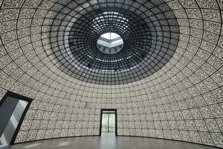
30 April 2014

Headlines now
The Golden Crown
The concept for a dental clinic in Yekaterinburg, developed by CNTR Studio, revolves around the idea of a “mouth full of gold”: pristine white porcelain stoneware walls are complemented by matte brass details. To avoid an overly literal interpretation, the architects focused on the building’s proportions, skillfully navigating between sunlight requirements and fire safety regulations.
Flexibility and Integration
Not long ago, we covered the project for the fourth phase of the ÁLIA residential complex, designed by APEX. Now, we’ve been shown different fence concepts they developed to enclose the complex’s private courtyards, incorporating a variety of public functions. We believe that the sheer fact that the complex’s architects were involved in such a detail as fencing speaks volumes.
A Step Forward
The HIDE residential complex represents a major milestone for ADM architects and their leaders Andrey Romanov and Ekaterina Kuznetsova in their quest for a fresh high-rise aesthetic – one that is flexible and layered, capable of bringing vibrancy to mass and silhouette while shaping form. Over recent years, this approach has become ADM’s “signature style”, with the golden HIDE tower playing a pivotal role in its evolution. Here, we delve into the project’s story, explore the details of the complex’s design, and uncover its core essence.
Gold in the Sands
A new office for a transcontinental company specializing in resource extraction and processing has opened in Dubai. Designed by T+T Architects, masters of creating spaces that are contemporary, diverse, flexible, and original, this project exemplifies their expertise. On the executive floor, a massive brass-clad partition dominates, while layered textures of compressed earth create a contextually resonant backdrop.
Layers and Levels of Flight
This project goes way back – Reserve Union won this architectural competition at the end of 2011, and the building was completed in 2018, so it’s practically “archival”. However, despite being relatively unknown, the building can hardly be considered “dated” and remains a prime example of architectural expression, particularly in the headquarters genre. And it’s especially fitting for an aviation company office. In some ways, it resembles the Aeroflot headquarters at Sheremetyevo but with its own unique identity, following the signature style of Vladimir Plotkin. In this article, we take an in-depth look at the United Aircraft Corporation (UAC) headquarters in the Moscow agglomeration town of Zhukovsky, supplemented by recent photographs from Alexey Naroditsky – a shoot that became only recently possible due to the fact that improvements were finally made in the surrounding area.
Light and Shadow
In this article, we delve into the architectural design of the “Chaika” house by DNK ag architects, which was recently completed in 2023 as part of the collection of signature designs at ZILArt. As is well-known, all the buildings in this complex follow a design code, yet each one is distinct. This particular building stands out not only for its whiteness and minimalism but also for the refined use of a limited number of techniques that, together, create what can confidently be called synergy.
Casus Novae
A master plan was developed for a large residential area with a name of “DNS City”, but now that its implementation began, the plan has been arbitrarily reformatted and replaced with something that, while similar on the surface, is actually quite different. This is not the first time such a thing happens, but it’s always frustrating. With permission from the author, we are sharing Maria Elkina’s post.
Treasure Hunting
The GAFA bureau, in collaboration with Tegola and Arkhitail, organized an expedition to the island of Kilpola in Karelia as part of Moskomarkhitektura’s “Open City” festival. There, amidst moss and rocks, the students sought answers to questions like: what is the sacred, where does it dwell, and what sustains it? Assisting the participants in this quest were landscape engineer Evgeny Levin, artist Nicholas Roerich, a moose, and the lack of cellular connection. Here’s how the story unfolded.
Depths of the Earth, Streams of Water
In the Malaya Okhta district, the Akzent building, designed by Stepan Liphart, was constructed. It follows a classic tripartite structure, yet it’s what you might call “hand-drawn”: each façade is unique in its form and details, some of which aren’t immediately noticeable. In this article, we explore the context and, together with the architect, delve into how the form was developed.
Fir Tree Dynamics
The “Airports of Region” holding is planning to build an airport in Karachay-Cherkessia, aiming to make the Arkhyz and Dombay resorts more accessible to travelers. The project that won in an invitation-only competition, submitted by Sergey Nikeshkin’s KPLN, blends natural imagery inspired by the shape of a conifer seed, open-air waiting spaces, majestic large trees, and a green roof elevated on needle-like columns. The result is both nature-inspired and WOW.
​A Brick Shell
In the process of designing a clubhouse situated among pine trees in a prestigious suburban area near Moscow, the architectural firm “A.Len” did the façade design part. The combination of different types of brick and masonry correlates with the volumetric and plastique solutions, further enhanced by the inclusion of wood-painted fragments and metal “glazing”.
Word Forms
ATRIUM architects love ambitious challenges, and for the firm’s thirtieth anniversary, they boldly play a game of words with an exhibition that dives deep into a self-created vocabulary. They immerse their projects – especially art installations – into this glossary, as if plunging into a current of their own. You feel as if you’re flowing through the veins of pure art, immersed in a universe of vertical cities, educational spaces – of which the architects are true masters – and the cultural codes of various locations. But what truly captivates is the bold statement that Vera Butko and Anton Nadtochy make, both through their work and this exhibition: architecture, above all, is art – the art of working with form and space.
Flexibility and Acuteness of Modernity
Luxurious, fluid, large “kokoshniks” and spiral barrel columns, as if made from colorful chewing gum: there seem to be no other mansion like this in Moscow, designed in the “Neo-Russian-Modern” style. And the “Teremok” on Malaya Kaluzhskaya, previously somewhat obscure, has “come alive with new colors” and gained visibility after its restoration for the office of the “architectural ecosystem” as the architects love to call themselves. It’s evident that Julius Borisov and the architects at UNK put their hearts into finding this new office and bringing it up to date. Let’s delve into the paradoxes of this mansion’s history and its plasticity. Spoiler: two versions of modernity meet here, both balancing on the razor’s edge of “what’s current”.
Yuri Vissarionov: “A modular house does not belong to the land”
It belongs to space, or to the air... It turns out that 3D printing is more effective when combined with a modular approach: the house is built in a workshop and then adapted to the site, including on uneven terrain. Yuri Vissarionov shares his latest experience in designing tourist complexes, both in central Russia and in the south. These include houseboats, homes printed from lightweight concrete using a 3D printer, and, of course, frame houses.
​Moscow’s First
“The quality of education largely depends on the quality of the educational environment”. This principle of the last decade has been realized by Sergey Skuratov in the project for the First Moscow Gymnasium on Rostovskaya Embankment in the Khamovniki district. The building seamlessly integrates into the complex urban landscape, responding both to the pedestrian flow of the city and the quiet alleyways. It skillfully takes advantage of the height differences and aligns with modern trends in educational space design. Let’s take a closer look.
Looking at the Water
The site of Villa Sonata stretches from the road to the water’s edge, offering its own shoreline, pier, and a picturesque river panorama. To reveal these sweeping views, Roman Leonidov “cut” the façade diagonally parallel to the river, thus getting two main axes for the house and, consequently, “two heads”. The internal core – two double-height spaces, a living room and a conservatory, with a “bridge” above them – makes the house both “transparent” and filled with light.
The White Wing
Well, it’s not exactly white. It’s more of a beige, white-stone structure that plays with the color of limestone – smoother surfaces are lighter, while rougher ones are darker. This wing unites various elements: it absorbs and interprets the surrounding themes. It responds to everything, yet maintains a cohesive expression – a challenging task! – while also incorporating recognizable features of its own, such as the dynamic cuts at the bottom, top, and middle.
Urban Dunes
The XSA Ramps team designed and built a three-part sports hub for a park in Rostov-on-Don, welcoming people of all ages and fitness levels. The skate plaza, pump track, and playground are all meticulously crafted with details that attract a diverse range of visitors. The technical execution of the shapes and slopes transforms this space into a kind of sculptural composition.
Proportional Growth
The project for the fourth phase of the ÁLIA residential area has been announced. The buildings are situated on an elongated plot – almost a “ray” that shoots out from the center of the area towards the river. Their layout reflects both a response to Moscow’s architectural preferences over the past 15 years, shifting “from blocks to towers”, and an interpretation of the neighboring business park designed by SOM. Additionally, the best apartments here are not located at the very top but closer to the middle, forming a glowing “waistline”.
The “Staircase” Building
In designing the “Details” residential complex in New Moscow, Rais Baishev spiced up the now-popular Moscow theme of a “courtyard” building with an idea drawn from the surrealist drawings by Maurits Escher. He envisioned the stepped silhouettes and descending slopes as a metaphysical mega-staircase, creating a key void within the courtyard that gave the project an internal “spine”. This concept is felt both in the building’s silhouette and on its façades.
Projection of the Quarter
No one doubted that the building that Vladimir Plotkin designed as part of the “Garden Quarters” would be the most modernist of all. And it turned out just that way: while adhering to the common design code, the building successfully combines brick and white stone, rhythmically responding to the neighboring building designed by Ostozhenka, yet tactfully and persistently making a few statements of its own. This includes the projection of the ideal urban development composition “14–9–6”, which can be found right next door, mathematical calculations, including those for various types of terraces (and perhaps the only reminder of the Soviet past of the Kauchuk rubber factory!), and the white “cross-stitch” pattern of the façade grid.
Domus Aurea
In this issue, we examine the “Tessinsky-1” house, designed by Sergey Skuratov and completed in 2023. Located in the middle of the Serebryanicheskaya Embankment district, at the intersection of its main streets, this house assumes a sort of “nodal” role: it not only responds to everything around it and preserves many memories of the former EMA factory within itself, but it weaves all this into a newly directed pattern, reconciling bright “gold” and dark-colored brick, largely with the help of the new, modern-yet-archaic Columba brick, which, come to think about it, is the most precious element here.
The Chimney of Nikola-Lenivets
In this issue, we are examining the “Obelisk House” designed by KATARSIS and built for the Arkhstoyanie 2023 festival. However, it was only finished later on, and this is why we are examining it now. It seems to us that after the “Obelisk House” appeared in Nikola-Lenivets, a dialogue and a few inner connections appeared between the temporary structures built here. These houses no longer look like “accidental neighbors”, more of which below.
​Periscope by the Bay
The jury awarded the second place in the competition for a public and cultural center in Petropavlovsk-Kamchatsky to the companies GORA (“Mountain”) and M4. In the consortium’s proposal, the building resembles a sperm whale with a calf swimming next to it or a periscope, whose lenses capture the most spectacular views from the surrounding landscape.
From Arcs to Dolmens
While working on the competition project for Petropavlovsk-Kamchatsky, ASADOV Architects prioritized the value of the natural and urban environment, aiming to preserve the balance of the location while minimizing the resemblance of the volume that they designed to a “traditional building”. The task was challenging, and the architects created three versions, one of which having been developed after the competition, where their main proposal took third place. However, the point of interest here is not the competition result but the continuity of creative thinking.
Hide and Seek
The ID Moskovskiy house, designed by Stepan Liphart in St. Petersburg, in the courtyards near Moskovskiy Avenue beyond the Obvodny Canal and recently completed, is notable for several reasons. Firstly, it has been realized with considerable accuracy, which is particularly significant as this is the first building where the architect was responsible not only for the facades but also for the layouts, allowing for better integration between the two. On the other hand, this building is interesting as an example of the “germination” of new architecture in the city: it draws on the best examples from the neighborhood and becomes an improved and developed sum of ideas found by the architect in the surrounding context.
The Big Twelve
Yesterday, the winners of the Moscow Mayor’s Architecture Award were announced and honored. Let’s take a look at what was awarded and, in some cases, even critique this esteemed award. After all, there is always room for improvement, right?
Above the Golden Horn
The residential complex “Philosophy” designed by T+T architects in Vladivostok, is one of the new projects in the “Golubinaya Pad” area, changing its development philosophy (pun intended) from single houses to a comprehensive approach. The buildings are organized along public streets, varying in height and format, with one house even executed in gallery typology, featuring a cantilever leaning on an art object.
Nuanced Alternative
How can you rhyme a square and space? Easily! But to do so, you need to rhyme everything you can possibly think of: weave everything together, like in a tensegrity structure, and find your own optics too. The new exhibition at GES-2 does just that, offering its visitor a new perspective on the history of art spanning 150 years, infused with the hope for endless multiplicity of worlds and art histories. Read on to see how this is achieved and how the exhibition design by Evgeny Ace contributes to it.
Blinds for Ice
An ice arena has been constructed in Domodedovo based on a project by Yuri Vissarionov Architects. To prevent the long façade, a technical requirement for winter sports facilities, from appearing monotonous, the architects proposed the use of suspended structures with multidirectional slats. This design protects the ice from direct sunlight while giving the wall texture and detail.