По-русски

Black-and-White Duo

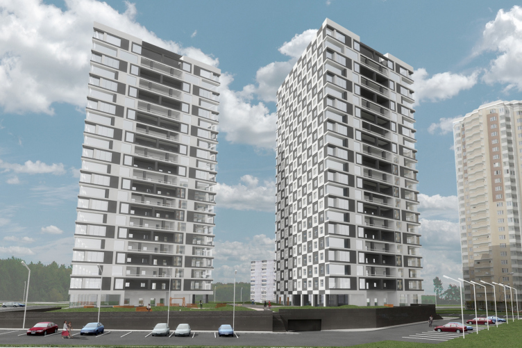
Next to "Nagornaya" metro station, upon the project of "Sergey Kisselev and Partners", soon there will start the construction of two residential towers attracting one's attention with their dramatic checkered coating.

16 May 2014
Object
mainImg
Object:
Architectural and planning solution of Buildings 5 and 6 of “Nagornaya” residential complex
Russia, Moscow, Elektrolinty Driveway, 16

Project Team:
Architects: A.Nikiforov, A.Breslavtsev, N.Anisimov.A. Busalov. Engineers: I. Schwartzman, K. Spiridonov

2013 — 2014

ZAO "Kotelsky Zavod"
Architectural proposal for Buildings 5 and 6 of the residential complex "Nagorny" © "Sergey Kisselev and partners"


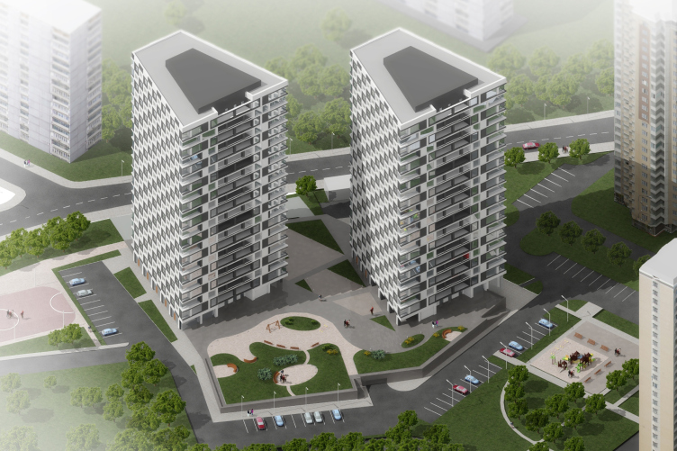
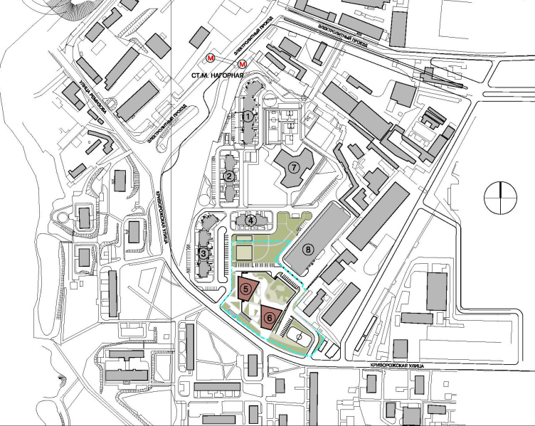
This project has been in the making since January 2013, when the company "Vedis-Group" turned to "Sergey Kisselev and Partners" with a request to come up with an architectural solution for the two "flagship" towers of the new block in construction. Built next to "Nagornaya" metro station, in the place of the former "Kotelsky Factory", this block consists of six residential buildings, a kindergarten, and a multilevel parking. The four other buildings that stretch immediately from the metro station down the Elektrolitny Driveway, are in fact the typical 25-floor section houses, while the towers standing along the southern border of the site at the bend of the Krivorozhskaya Street, were slow to materialize and were present in the project but nominally. The developer realized that in this particular case typical solutions would not do - both because of their location and class of the housing the towers were asking to become high-profile objects capable of giving dime character not only to the new block but also to the whole neighborhood with its rather chaotically placed buildings. 


Architectural proposal for Buildings 5 and 6 of the residential complex "Nagorny" © "Sergey Kisselev and partners"

"We found this task interesting from the very start. On the one side, it was the opportunity to create the "face" of the block, and on the other side - a possibility to work in an interesting environment. The neighborhood that is there now can hardly be called attractive - but it doubtlessly has a potential that we wanted to bring out in our project" - shares the main architect of the project Andrew Nikiforov. 

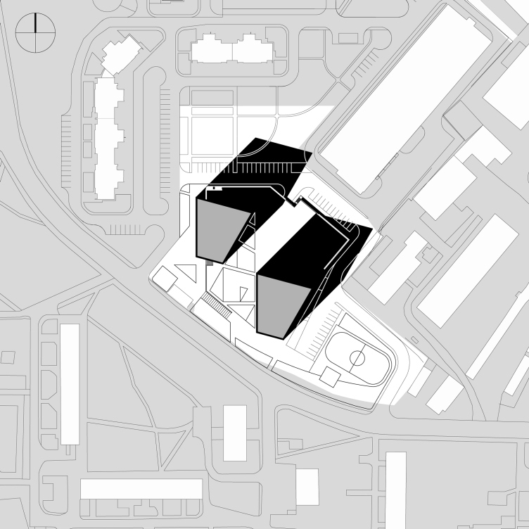
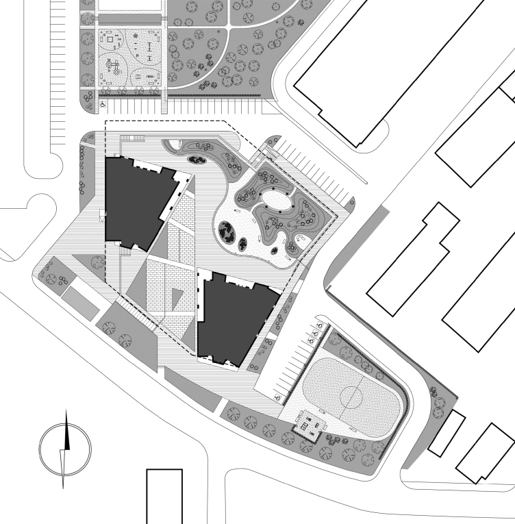
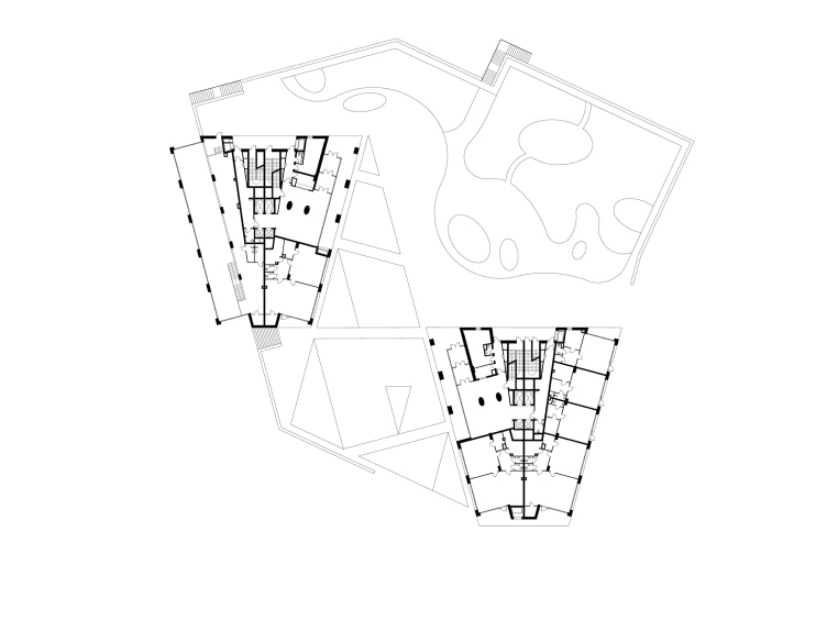
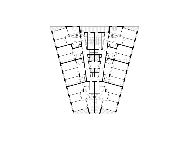
On the plan, both towers got a shape of equilateral trapezes. This was by far not the first option that the architects developed: they experimented with a square and a triangle but it was only with the trapezes that the high-rises took on the desired dramatic and self-sufficient look. It also took the architects a rather long time to try and find the optimum angle of turning the trapezes to the neighboring streets: they tried to tie the houses in to the winding Krivorozhskaya, and to the Elektrolitny Driveway, and to the residential houses located across - but, strictly speaking, none of these grids could be perceived as the prevailing one on the territory. Thus ultimately the architects opted for the solution that consisted in the the western facades of both towers being parallel to the already-in-construction long buildings of the block. 


Architectural proposal for Buildings 5 and 6 of the residential complex "Nagorny" © "Sergey Kisselev and partners"

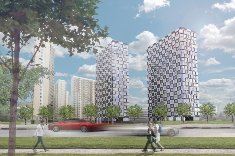
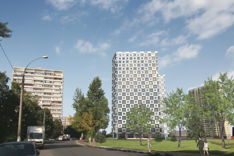
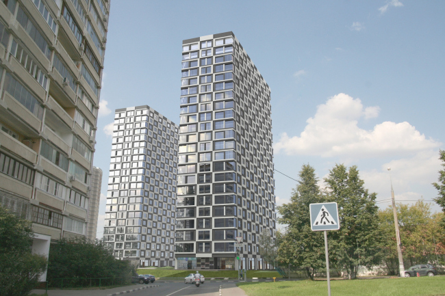
Concurrently to that, a thorough search for the facade design solution was on. "We generally believe that your facade must reflect your 3D solution and be its logical continuation, highlighting the shape and the structure of the building - and in the situation of such a loose urban environment as in the Nagornaya area, this is vitally important" - the chief architect of the project firmly believes. The authors of the project tried both various options of single design got the towers, and the contrast finish, playing on the difference of colors and textures of the materials. At the end of the day, the battle was won by the modular checkered pattern of black and white squares. On the side facades, they frame each of the windows, making up dramatic diagonals and enlarging the scale, while on the side walls, following the logic of the theme chosen by the authors, the "fields" stretch horizontally and lose some of their height.

Architectural proposal for Buildings 5 and 6 of the residential complex "Nagorny" © "Sergey Kisselev and partners"

The color accents are only used in this project in the design of the entrance groups of the public zone. For coating the main volumes, the architects deliberately opted for the monochrome scale, looking to offset the garishness of the immediate environment of the high-rises - the typical residential buildings whose bright color solution is meant to make up for the monotony of their architectural solutions. The black-and-white facades, however, do not get lost against this background at all - both thanks to the dramatic shape of the towers, and thanks to the micro relief: the dark elements are pushed deeper inside, and the light ones, on the other hand, are "extruded" outward a bit. Such a technique gives volume to the checkered surfaces, and, as Andrew Nikiforov explains, saves them from of a "cardboard" feel that is the problem of so many contemporary facades. The architects had a hard time, however, implementing this solution: making the concave and convex squares from concrete was not practicable, and, with the usage of the traditional system of ventilated facades, the "frames" had to be split into four separate plaques - which automatically meant noticeable seams between them. There was also quite a challenge of finding a technological solution for executing the relief of concave and "extruded" elements. The most "justified" solution for the unit was the one where the black and white HPL-panels of the facade surface are framed with metallic profiles of the corresponding color.


Architectural proposal for Buildings 5 and 6 of the residential complex "Nagorny" © "Sergey Kisselev and partners"

On the first floors of both towers, there are small lots, each one with an entrance of its own from the outside contour of the building. As for the apartments, the architects got a very wide range of them - because the residential premises are grouped along the side walls of trapezes and are divided into modules corresponding to sizes of the facades. The partitions can be moved around in any direction, thus changing the square footage of not only some rooms but also whole apartments. What is also important is the fact that the wet zones are grouped into separate lines that "embrace" the elevator nucleus - which will allow the people who will live here to rearrange even these parts of their apartments without having to "infringe" their neighbors' premises.


Architectural proposal for Buildings 5 and 6 of the residential complex "Nagorny" © "Sergey Kisselev and partners"

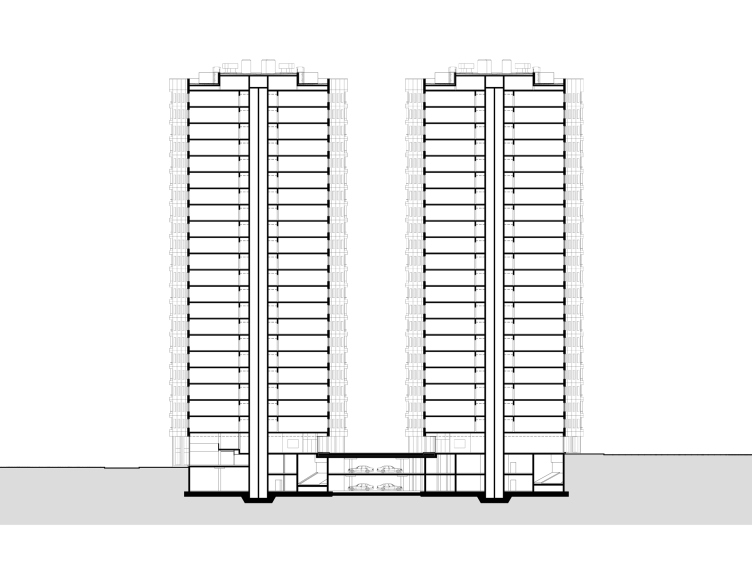
The broad backside facade holds the technical stanza with the fire escape stairs. The stanza also includes the air conditioning blocks - thus protecting the facades of unwelcome "outlaw" intrusions. Andrew Nikiforov laments the fact that the architects were not fully able to forego the balconies: from the fire safety standpoint, the two staircases render them redundant but the promoters insisted on there being a few stanzas - knowing that this way the apartments would sell better. The "balcony" compromise, though, was reached in the planning of large side-end apartments - the stanzas appear in the spots where the square "fields" on the checkered facades stretch into rectangles. 


Architectural proposal for Buildings 5 and 6 of the residential complex "Nagorny" © "Sergey Kisselev and partners"

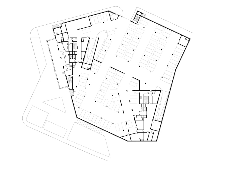
A great deal of attention in this project the architects paid to landscaping the territory around the towers. Due to the fact that they are part of a larger housing block, fencing their yards would have been wrong - but the architects still wanted to propose some zoning of the territory, and in this case the existing relief drop came in very handy: the towers are built not only on the bend of the Krivorozhskaya Street but also on the slope that goes down in the direction of a picturesque ravine. Thus, the towers face the street with a rather austere yard whose high-profile function is enhanced by the geometrical paving pattern, while the entrance zone of the complex is a lot lower and it serves as a sort of a border between the rational urban tissue and the picturesque natural one: between the houses and the multilevel parking, the architects design a bit of a nice little garden (on the roof of the parking) that, when still further away from the road, turns into a fully-fledged park. Yet another strip of land - the islet of the Krivorozhskaya Street that is also the property of the developer - the architects separated with a screen of trees and used it for making a sports ground. 


Architectural proposal for Buildings 5 and 6 of the residential complex "Nagorny" © "Sergey Kisselev and partners"

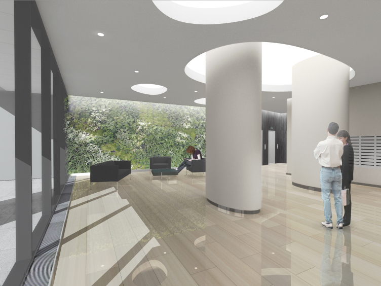
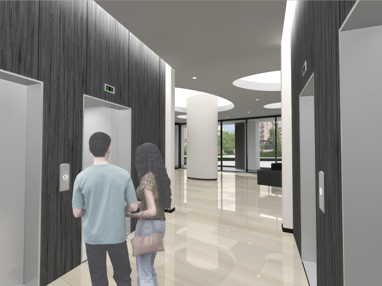
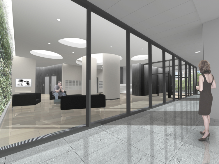
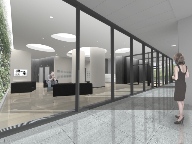
Besides the landscaping project, "Sergey Kisselev" developed for the towers the interior designs of the entrance areas and the public corridors. And, just like the facades are the logic continuation of the 3D solutions of the buildings, so their interiors harmoniously develop the artistic techniques of the architecture of the complex. Specifically, the authors borrow the black-and-white design from the facades: the dark-color material is used to finish the walls of the entrance lobbies and corridors, white is used to finish the ceilings and the bearing columns. The pristine geometry of the facade grid, though, gives way here to the smooth curves of the ceiling niches, and the black-and-white palette is "diluted" with the floors of light beige hue and the phitowall whose rich green color will be provided by the living plants.


Architectural proposal for Buildings 5 and 6 of the residential complex "Nagorny" © "Sergey Kisselev and partners"

Architectural proposal for Buildings 5 and 6 of the residential complex "Nagorny" © "Sergey Kisselev and partners"


Architectural proposal for Buildings 5 and 6 of the residential complex "Nagorny" © "Sergey Kisselev and partners"


Architectural proposal for Buildings 5 and 6 of the residential complex "Nagorny" © "Sergey Kisselev and partners"


Architectural proposal for Buildings 5 and 6 of the residential complex "Nagorny" © "Sergey Kisselev and partners"
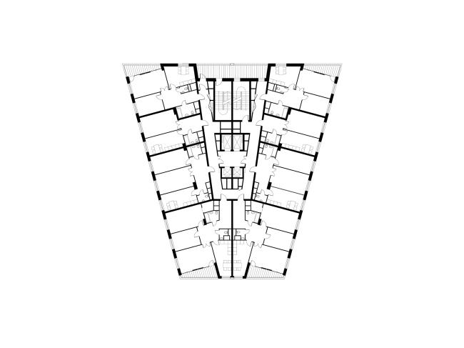

Architectural proposal for Buildings 5 and 6 of the residential complex "Nagorny" © "Sergey Kisselev and partners"


Architectural proposal for Buildings 5 and 6 of the residential complex "Nagorny" © "Sergey Kisselev and partners"


Object:
Architectural and planning solution of Buildings 5 and 6 of “Nagornaya” residential complex
Russia, Moscow, Elektrolinty Driveway, 16

Project Team:
Architects: A.Nikiforov, A.Breslavtsev, N.Anisimov.A. Busalov. Engineers: I. Schwartzman, K. Spiridonov

2013 — 2014

ZAO "Kotelsky Zavod"

16 May 2014

Headlines now
The Golden Crown
The concept for a dental clinic in Yekaterinburg, developed by CNTR Studio, revolves around the idea of a “mouth full of gold”: pristine white porcelain stoneware walls are complemented by matte brass details. To avoid an overly literal interpretation, the architects focused on the building’s proportions, skillfully navigating between sunlight requirements and fire safety regulations.
Flexibility and Integration
Not long ago, we covered the project for the fourth phase of the ÁLIA residential complex, designed by APEX. Now, we’ve been shown different fence concepts they developed to enclose the complex’s private courtyards, incorporating a variety of public functions. We believe that the sheer fact that the complex’s architects were involved in such a detail as fencing speaks volumes.
A Step Forward
The HIDE residential complex represents a major milestone for ADM architects and their leaders Andrey Romanov and Ekaterina Kuznetsova in their quest for a fresh high-rise aesthetic – one that is flexible and layered, capable of bringing vibrancy to mass and silhouette while shaping form. Over recent years, this approach has become ADM’s “signature style”, with the golden HIDE tower playing a pivotal role in its evolution. Here, we delve into the project’s story, explore the details of the complex’s design, and uncover its core essence.
Gold in the Sands
A new office for a transcontinental company specializing in resource extraction and processing has opened in Dubai. Designed by T+T Architects, masters of creating spaces that are contemporary, diverse, flexible, and original, this project exemplifies their expertise. On the executive floor, a massive brass-clad partition dominates, while layered textures of compressed earth create a contextually resonant backdrop.
Layers and Levels of Flight
This project goes way back – Reserve Union won this architectural competition at the end of 2011, and the building was completed in 2018, so it’s practically “archival”. However, despite being relatively unknown, the building can hardly be considered “dated” and remains a prime example of architectural expression, particularly in the headquarters genre. And it’s especially fitting for an aviation company office. In some ways, it resembles the Aeroflot headquarters at Sheremetyevo but with its own unique identity, following the signature style of Vladimir Plotkin. In this article, we take an in-depth look at the United Aircraft Corporation (UAC) headquarters in the Moscow agglomeration town of Zhukovsky, supplemented by recent photographs from Alexey Naroditsky – a shoot that became only recently possible due to the fact that improvements were finally made in the surrounding area.
Light and Shadow
In this article, we delve into the architectural design of the “Chaika” house by DNK ag architects, which was recently completed in 2023 as part of the collection of signature designs at ZILArt. As is well-known, all the buildings in this complex follow a design code, yet each one is distinct. This particular building stands out not only for its whiteness and minimalism but also for the refined use of a limited number of techniques that, together, create what can confidently be called synergy.
Casus Novae
A master plan was developed for a large residential area with a name of “DNS City”, but now that its implementation began, the plan has been arbitrarily reformatted and replaced with something that, while similar on the surface, is actually quite different. This is not the first time such a thing happens, but it’s always frustrating. With permission from the author, we are sharing Maria Elkina’s post.
Treasure Hunting
The GAFA bureau, in collaboration with Tegola and Arkhitail, organized an expedition to the island of Kilpola in Karelia as part of Moskomarkhitektura’s “Open City” festival. There, amidst moss and rocks, the students sought answers to questions like: what is the sacred, where does it dwell, and what sustains it? Assisting the participants in this quest were landscape engineer Evgeny Levin, artist Nicholas Roerich, a moose, and the lack of cellular connection. Here’s how the story unfolded.
Depths of the Earth, Streams of Water
In the Malaya Okhta district, the Akzent building, designed by Stepan Liphart, was constructed. It follows a classic tripartite structure, yet it’s what you might call “hand-drawn”: each façade is unique in its form and details, some of which aren’t immediately noticeable. In this article, we explore the context and, together with the architect, delve into how the form was developed.
Fir Tree Dynamics
The “Airports of Region” holding is planning to build an airport in Karachay-Cherkessia, aiming to make the Arkhyz and Dombay resorts more accessible to travelers. The project that won in an invitation-only competition, submitted by Sergey Nikeshkin’s KPLN, blends natural imagery inspired by the shape of a conifer seed, open-air waiting spaces, majestic large trees, and a green roof elevated on needle-like columns. The result is both nature-inspired and WOW.
​A Brick Shell
In the process of designing a clubhouse situated among pine trees in a prestigious suburban area near Moscow, the architectural firm “A.Len” did the façade design part. The combination of different types of brick and masonry correlates with the volumetric and plastique solutions, further enhanced by the inclusion of wood-painted fragments and metal “glazing”.
Word Forms
ATRIUM architects love ambitious challenges, and for the firm’s thirtieth anniversary, they boldly play a game of words with an exhibition that dives deep into a self-created vocabulary. They immerse their projects – especially art installations – into this glossary, as if plunging into a current of their own. You feel as if you’re flowing through the veins of pure art, immersed in a universe of vertical cities, educational spaces – of which the architects are true masters – and the cultural codes of various locations. But what truly captivates is the bold statement that Vera Butko and Anton Nadtochy make, both through their work and this exhibition: architecture, above all, is art – the art of working with form and space.
Flexibility and Acuteness of Modernity
Luxurious, fluid, large “kokoshniks” and spiral barrel columns, as if made from colorful chewing gum: there seem to be no other mansion like this in Moscow, designed in the “Neo-Russian-Modern” style. And the “Teremok” on Malaya Kaluzhskaya, previously somewhat obscure, has “come alive with new colors” and gained visibility after its restoration for the office of the “architectural ecosystem” as the architects love to call themselves. It’s evident that Julius Borisov and the architects at UNK put their hearts into finding this new office and bringing it up to date. Let’s delve into the paradoxes of this mansion’s history and its plasticity. Spoiler: two versions of modernity meet here, both balancing on the razor’s edge of “what’s current”.
Yuri Vissarionov: “A modular house does not belong to the land”
It belongs to space, or to the air... It turns out that 3D printing is more effective when combined with a modular approach: the house is built in a workshop and then adapted to the site, including on uneven terrain. Yuri Vissarionov shares his latest experience in designing tourist complexes, both in central Russia and in the south. These include houseboats, homes printed from lightweight concrete using a 3D printer, and, of course, frame houses.
​Moscow’s First
“The quality of education largely depends on the quality of the educational environment”. This principle of the last decade has been realized by Sergey Skuratov in the project for the First Moscow Gymnasium on Rostovskaya Embankment in the Khamovniki district. The building seamlessly integrates into the complex urban landscape, responding both to the pedestrian flow of the city and the quiet alleyways. It skillfully takes advantage of the height differences and aligns with modern trends in educational space design. Let’s take a closer look.
Looking at the Water
The site of Villa Sonata stretches from the road to the water’s edge, offering its own shoreline, pier, and a picturesque river panorama. To reveal these sweeping views, Roman Leonidov “cut” the façade diagonally parallel to the river, thus getting two main axes for the house and, consequently, “two heads”. The internal core – two double-height spaces, a living room and a conservatory, with a “bridge” above them – makes the house both “transparent” and filled with light.
The White Wing
Well, it’s not exactly white. It’s more of a beige, white-stone structure that plays with the color of limestone – smoother surfaces are lighter, while rougher ones are darker. This wing unites various elements: it absorbs and interprets the surrounding themes. It responds to everything, yet maintains a cohesive expression – a challenging task! – while also incorporating recognizable features of its own, such as the dynamic cuts at the bottom, top, and middle.
Urban Dunes
The XSA Ramps team designed and built a three-part sports hub for a park in Rostov-on-Don, welcoming people of all ages and fitness levels. The skate plaza, pump track, and playground are all meticulously crafted with details that attract a diverse range of visitors. The technical execution of the shapes and slopes transforms this space into a kind of sculptural composition.
Proportional Growth
The project for the fourth phase of the ÁLIA residential area has been announced. The buildings are situated on an elongated plot – almost a “ray” that shoots out from the center of the area towards the river. Their layout reflects both a response to Moscow’s architectural preferences over the past 15 years, shifting “from blocks to towers”, and an interpretation of the neighboring business park designed by SOM. Additionally, the best apartments here are not located at the very top but closer to the middle, forming a glowing “waistline”.
The “Staircase” Building
In designing the “Details” residential complex in New Moscow, Rais Baishev spiced up the now-popular Moscow theme of a “courtyard” building with an idea drawn from the surrealist drawings by Maurits Escher. He envisioned the stepped silhouettes and descending slopes as a metaphysical mega-staircase, creating a key void within the courtyard that gave the project an internal “spine”. This concept is felt both in the building’s silhouette and on its façades.
Projection of the Quarter
No one doubted that the building that Vladimir Plotkin designed as part of the “Garden Quarters” would be the most modernist of all. And it turned out just that way: while adhering to the common design code, the building successfully combines brick and white stone, rhythmically responding to the neighboring building designed by Ostozhenka, yet tactfully and persistently making a few statements of its own. This includes the projection of the ideal urban development composition “14–9–6”, which can be found right next door, mathematical calculations, including those for various types of terraces (and perhaps the only reminder of the Soviet past of the Kauchuk rubber factory!), and the white “cross-stitch” pattern of the façade grid.
Domus Aurea
In this issue, we examine the “Tessinsky-1” house, designed by Sergey Skuratov and completed in 2023. Located in the middle of the Serebryanicheskaya Embankment district, at the intersection of its main streets, this house assumes a sort of “nodal” role: it not only responds to everything around it and preserves many memories of the former EMA factory within itself, but it weaves all this into a newly directed pattern, reconciling bright “gold” and dark-colored brick, largely with the help of the new, modern-yet-archaic Columba brick, which, come to think about it, is the most precious element here.
The Chimney of Nikola-Lenivets
In this issue, we are examining the “Obelisk House” designed by KATARSIS and built for the Arkhstoyanie 2023 festival. However, it was only finished later on, and this is why we are examining it now. It seems to us that after the “Obelisk House” appeared in Nikola-Lenivets, a dialogue and a few inner connections appeared between the temporary structures built here. These houses no longer look like “accidental neighbors”, more of which below.
​Periscope by the Bay
The jury awarded the second place in the competition for a public and cultural center in Petropavlovsk-Kamchatsky to the companies GORA (“Mountain”) and M4. In the consortium’s proposal, the building resembles a sperm whale with a calf swimming next to it or a periscope, whose lenses capture the most spectacular views from the surrounding landscape.
From Arcs to Dolmens
While working on the competition project for Petropavlovsk-Kamchatsky, ASADOV Architects prioritized the value of the natural and urban environment, aiming to preserve the balance of the location while minimizing the resemblance of the volume that they designed to a “traditional building”. The task was challenging, and the architects created three versions, one of which having been developed after the competition, where their main proposal took third place. However, the point of interest here is not the competition result but the continuity of creative thinking.
Hide and Seek
The ID Moskovskiy house, designed by Stepan Liphart in St. Petersburg, in the courtyards near Moskovskiy Avenue beyond the Obvodny Canal and recently completed, is notable for several reasons. Firstly, it has been realized with considerable accuracy, which is particularly significant as this is the first building where the architect was responsible not only for the facades but also for the layouts, allowing for better integration between the two. On the other hand, this building is interesting as an example of the “germination” of new architecture in the city: it draws on the best examples from the neighborhood and becomes an improved and developed sum of ideas found by the architect in the surrounding context.
The Big Twelve
Yesterday, the winners of the Moscow Mayor’s Architecture Award were announced and honored. Let’s take a look at what was awarded and, in some cases, even critique this esteemed award. After all, there is always room for improvement, right?
Above the Golden Horn
The residential complex “Philosophy” designed by T+T architects in Vladivostok, is one of the new projects in the “Golubinaya Pad” area, changing its development philosophy (pun intended) from single houses to a comprehensive approach. The buildings are organized along public streets, varying in height and format, with one house even executed in gallery typology, featuring a cantilever leaning on an art object.
Nuanced Alternative
How can you rhyme a square and space? Easily! But to do so, you need to rhyme everything you can possibly think of: weave everything together, like in a tensegrity structure, and find your own optics too. The new exhibition at GES-2 does just that, offering its visitor a new perspective on the history of art spanning 150 years, infused with the hope for endless multiplicity of worlds and art histories. Read on to see how this is achieved and how the exhibition design by Evgeny Ace contributes to it.
Blinds for Ice
An ice arena has been constructed in Domodedovo based on a project by Yuri Vissarionov Architects. To prevent the long façade, a technical requirement for winter sports facilities, from appearing monotonous, the architects proposed the use of suspended structures with multidirectional slats. This design protects the ice from direct sunlight while giving the wall texture and detail.